11 Broken Heart Effect
The “Broken Heart” effect is the phenomenon whereby ‘mortality rates increase after the death of a partner, and, in addition, that this phenomenon diminishes over time’ [38]. This paper uses a dataset from a large Canadian insurance company - it was originally provided for research by the Society of Actuaries, and is now hosted as part of the CASDatasets R library [39].
While analysing this short-term dependence, the paper provides the following Mortality (\(q_x\)) Rates for those who have been recently widowed versus those who haven’t:
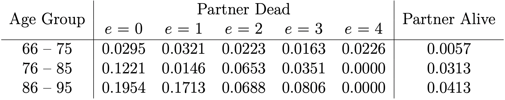
Figure 11.1: Mortality Rates for Married Women and Widows, with \(e\) Denoting the Number of Years since Partner’s Death
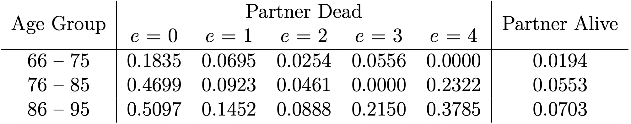
Figure 11.2: Mortality Rates for Married Men and Widowers, with \(e\) Denoting the Number of Years since Partner’s Death
While many of these \(q_x\) rates are shocking even on paper, it was felt that to truly get across the impact of the Broken Heart Effect, an interactive R Shiny page could be created to visualise the findings of this paper. This could serve both an educational tool, and as a demonstration of R’s versatility in calculating and displaying data.
Using the data from Figures 11.1 & 11.2, a base life table was extrapolated using LifeContingencies [22], which would allow for “standard” life expectancies to be calculated and used as a comparison.
In building the User Interface, a “Parameters” box was created (Figure 11.3). As the effect has a far greater impact on males than females, a “Gender” radio button was added, along with the options to enter a “Current Age” and “Widowed Age.” A modified life table is generated based on the parameters specified, using the increases in \(q_x\) rates seen in the dataset, and swapping in the appropriate \(q_x\) rates for the provided ages and gender.
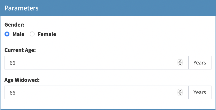
Figure 11.3: Parameters
Once this information has been provided and the life tables have been adapted, comparisons can now be made between life expectancies. For the given parameters, the life expectancy given that the person has been widowed as specified is shown, along with their life expectancy if they had not been widowed (Figure 11.4).
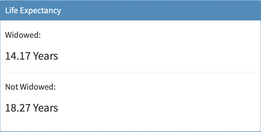
Figure 11.4: Life Expectancies
Next, to distinctly highlight the impact of this dependancy, an info-box displaying the difference in life expectancy is displayed (Figure 11.5). The style of this box stands out from the others, so that the user’s attention is immediately drawn to it. Using shinyjs’s ability to edit CSS elements, the colour of the broken-heart icon changes from blue to pink depending on the gender specified, so as to highlight the difference in the amplitude of the effect.
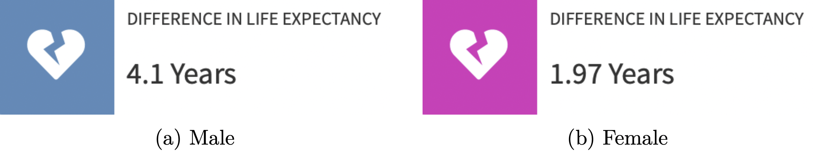
Figure 11.5: Difference in Life Expectancies
Two graphs are then displayed. First, using ggplot2 [9], a graph showing the progression of \(q_x\) rates after being widowed over time is shown (Figure 11.6). The baseline probabilities of death are also shown to act as a comparison. This graph was once again made interactive using plotly [12], so one can inspect the true \(q_x\) rates at any given time point.
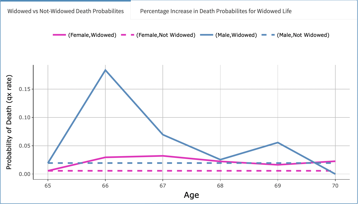
Figure 11.6: Widowed vs Non-Widowed Death Probabilities
Finally, a bar chart showing the percentage increase in the \(q_x\) rates once widowed is show in the second tab of the visualisations tab-box (once again changing colour based on gender) (Figure 11.7).
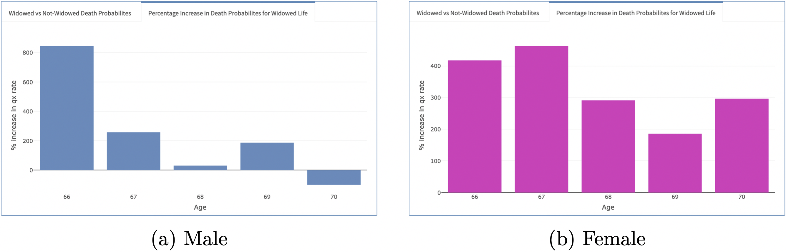
Figure 11.7: Widowed vs Non-Widowed Death Probabilities
While there are valid criticisms of the original paper [38], most notably that the data set is not very large, leading to some spurious \(q_x\) rates, the take-home message of short-term dependeance is clear - and is made even clearer thanks to this interactive R Shiny page.