Chapter 3 Visualising data
3.1 Introduction
We have seen different ways of creating numerical summaries:
- Measures of location: Mean, median, mode.
- Measures of spread: Variance, standard deviation, interquartile range.
A numerical summary is useful but a single number (or a few numbers) can only tell us so much about the data.
Studying the data values if there are hundreds or thousands of observations is going to be hard to take in.
Therefore, “if a picture paints a thousand words” then “a plot captures a thousand data points”!
In this chapter we’ll start by talking about some data features to look out for, then some particular types of plots. In Section 3.2, we discuss basic features of the data such as multimodality, symmetry and outliers. In Section 3.3, we present a wide range of different graphical ways of presenting data and we summarise the pros and cons of the different methods in a summary. Finally, in Section 3.4, we draw together the considerations in summarising and visualising data.
3.2 Some data features
In describing either the way in which observations in a sample are dispersed, or the features of a random variable, we talk about the distribution of the observations or random variable.
The observations are our sample of data, whereas the random variable represents the population from which the data are drawn.
It is important at this stage to distinguish between describing the sample of data and making inferences about the population from which the data are drawn. Plotting the data and obtaining numerical summaries for the data should give some idea of the equivalent features in the population, provided the sample size is large enough.
Hence when describing features in plots, the description should pick out features of the data itself but it should also include inferences about the population distribution the data are drawn from. If the sample size is very small then we may comment that few or no inferences can be made. When displaying data graphically we can see not only where the data are located and how they are dispersed but also the general shape of the distribution and if there are any interesting features.
3.2.1 Multimodal distributions
We also use the word mode to describe where a distribution has a local maximum. Then we can call a distribution unimodal (one peak), bimodal (two peaks) or multimodal (multiple peaks), e.g. as shown in Figure 3.1.

Figure 3.1: Distributions with different numbers of modes.
Sometimes there are gaps in the data, like in Figure 3.2

Figure 3.2: A bimodal distribution with a gap.
This can suggest the data are grouped in some way and it may be difficult to summarise the data with single summary statistics. (Imagine Figure 3.2 represents heights of people on a school trip—what could explain the distribution looking gappy like that?)
In such cases, then it may be appropriate to give, for example, more than one measure of location.
3.2.2 Symmetry
The summary statistics we looked at previously were all measures of location or spread—they tell us nothing about the symmetry of the distribution.
There is another summary statistic called skewness which measures the assymmetry of a distribution.
The sample skewness for a sample \(x_1 , x_2 , \ldots , x_n\), of observations is defined as:where \(\bar{x}\) and \(s\) are the sample mean and standard deviation respectively.
A perfectly symmetric distribution has a skewness of zero.
A distribution with skewness greater than zero is said to be positively skewed, or skewed to the right (meaning the right ‘tail’ is longer).
A distribution with skewness less than zero is said to be negatively skewed, or skewed to the left (the left ‘tail’ is longer).

Figure 3.3: Symmetric and asymmetric (skewed) distributions.
3.2.3 Outliers
An outlier is an observation which is in some sense extreme. In the context of a single sample of observations on one random variable, outliers are observations that are well above or well below the other values in the data. For example, the observation of 3.83 in the Cavendish dataset considered in Section 2.3. All such extreme observations should be checked if possible to ensure they are correct values. It is important to identify any outliers in a data set as they can considerably distort numeric summaries or analytical methods (robustness).
In cases when an observation appears to be an outlier and no reason for the extreme measurement is found, the data could be analysed both with the outlier included and once it has been removed. Thus the distortion due to the outlier can be fully assessed.
3.3 Basic plot types
3.3.1 Histogram and bar charts
Whenever more than about twenty observations are involved, it is often helpful to group the observations in a frequency table. Frequency tables are also helpful when constructing histograms as we shall see in a moment. We write \(f_i\) for the frequency of observation \(x_i\) (\(i = 1,\ldots,k)\). A frequency table shows how many observations fall into various classes defined by categorising the observations into groups, see the Coursework marks example. The choice of which classes to use is somewhat arbitrary, but since it affects the visual impression given by the data when forming a histogram, the choice should be made with care.
The following are guidelines:
For continuous data, we usually choose consecutive intervals of the same width. For discrete data, the individual values are used if this is reasonable, but if the data are sparse it may be necessary to classify the observations into consecutive groups of values with the same number of values in each group. In either case, care is needed when specifying the intervals so that ambiguities are avoided.
Interval or group sizes should be chosen so that most frequencies (of observations in a class) are of a moderate size compared with the total number of observations. For example, data on the heights of 100 individuals which range from 160cm to 190cm might be grouped easily in intervals of 2cm or possibly 5cm but not 1mm or 50cm.
Once we have constructed a frequency table we can construct a histogram easily as the data have already been grouped. When drawing a histogram the classification intervals are represented by the scale on the abscissa (‘x-axis’) of a graph (N.B. sometimes the midpoints of the intervals are used as the scale on the abscissa) and rectangles are drawn on this base so that the area of the rectangle is proportional to the frequency of observations in the class. The unit on the ordinate (‘y-axis’) is the number of observations per unit class interval. Note that the heights of the rectangle will be proportional to frequencies if and only if class intervals of equal size are used.
Histograms are usually given in terms of frequency (number of occurrences) but can alternatively be given in terms of density. Density rescales the histogram so that the area in the rectangles sum to one. The shape of the histogram is thus not affected but the y-axis is rescaled. Frequency has a simple interpretation whereas density allows us to compare two samples of different size (heights of the population of Nottingham, approximately 337,000 individuals with heights of the population of Long Eaton, approximately 39,000 individuals) and to compare with probability distributions.
IQ Scores The I.Q. of 100 people chosen at random was measured, resulting in the following frequency table:
| I.Q. | # of people (frequency) |
| IQ \(\leq\) 80 | 0 |
| 80 \(<\) IQ \(\leq\) 90 | 12 |
| 90 \(<\) IQ \(\leq\) 100 | 37 |
| 100 \(<\) IQ \(\leq\) 110 | 30 |
| 110 \(<\) IQ \(\leq\) 120 | 19 |
| 120 \(<\) IQ \(\leq\) 130 | 2 |
A histogram of these data is:
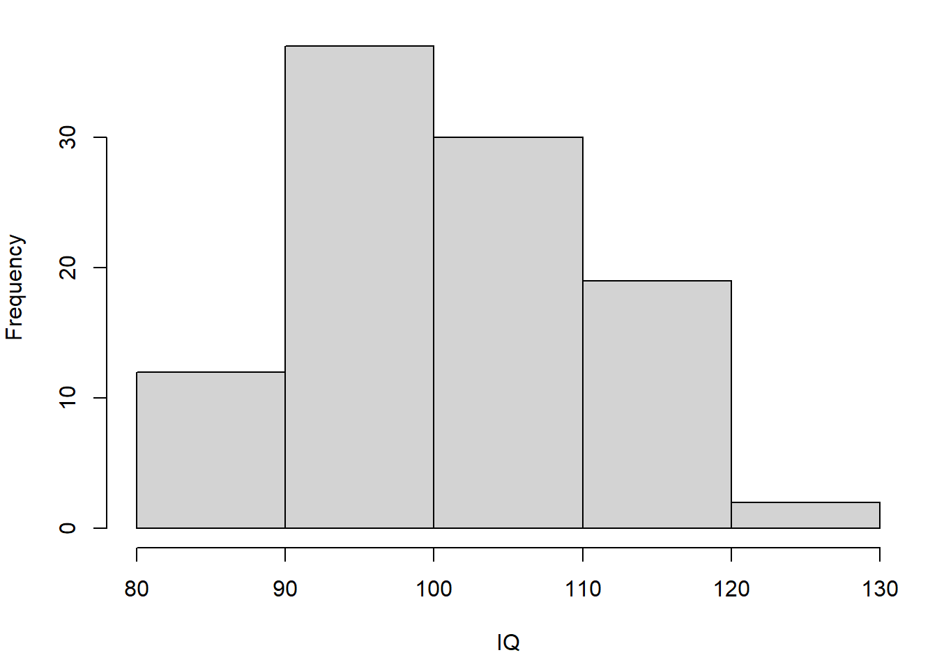
Figure 3.4: Histogram of the IQ data
Remember: frequency should be proportional to area, and so for unequal class widths one should plot the frequency density. For the IQ data, if we wanted 110-130 to be one class, compare:
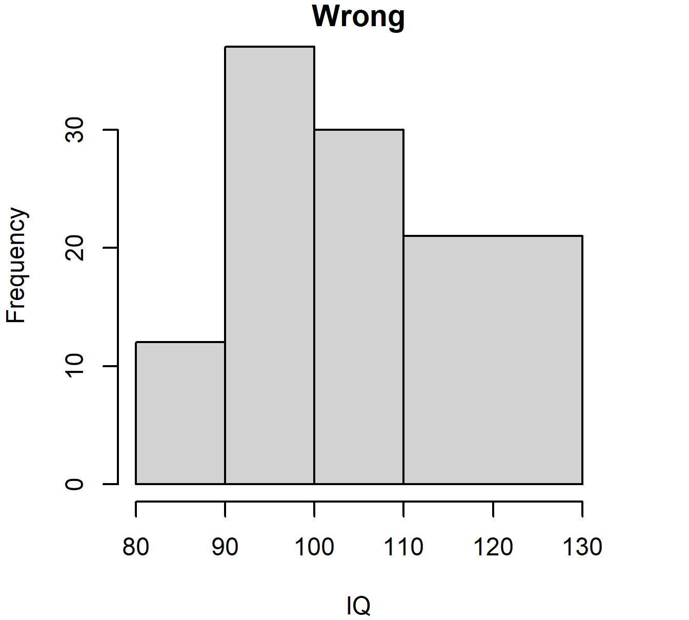
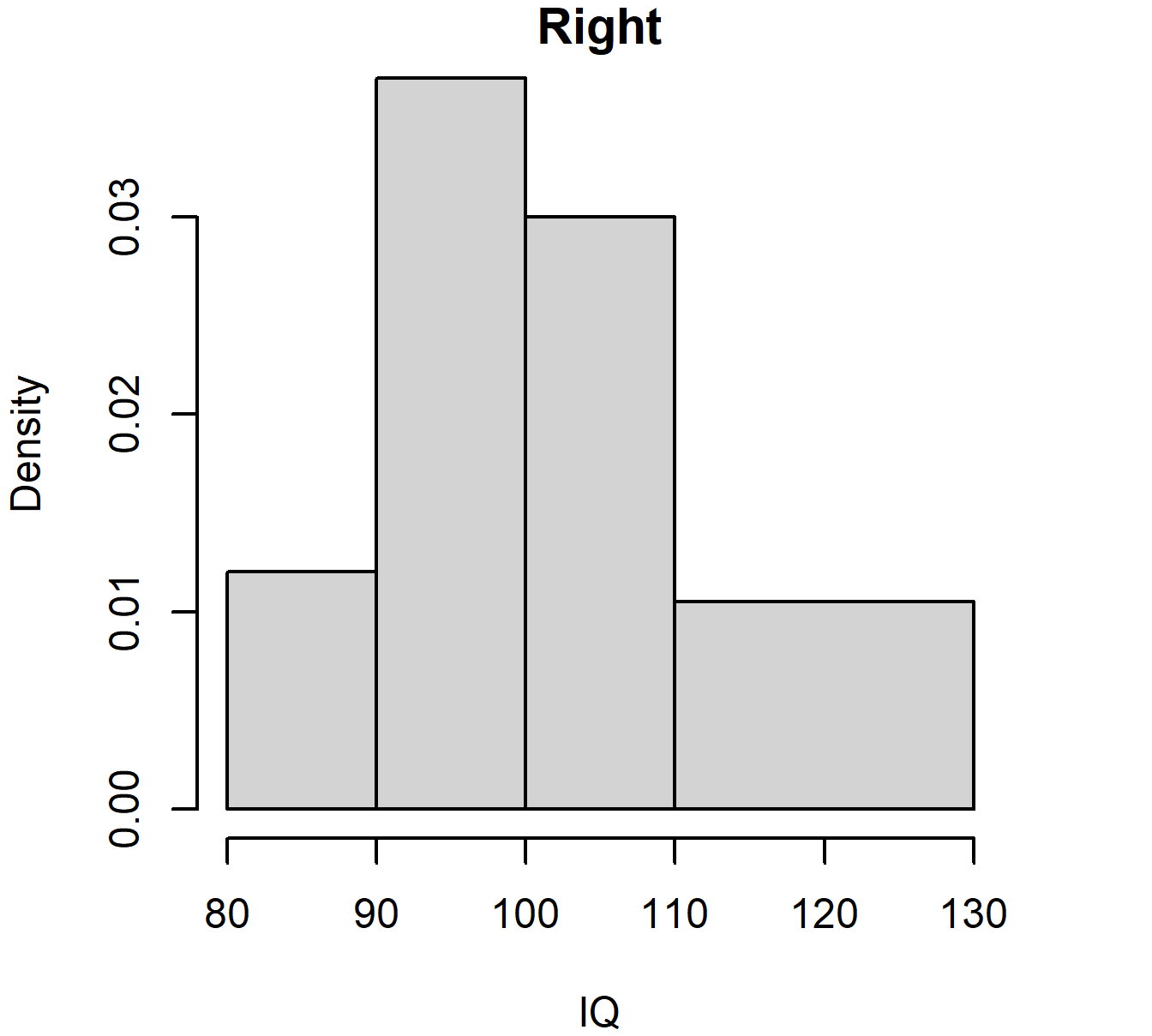
Figure 3.5: Histogram of IQ data with unequal bar widths: wrong and right versions
When the data are discrete an alternative and better form of graphical representation is a bar chart with the heights of the bars representing frequencies, see Figure 3.6.
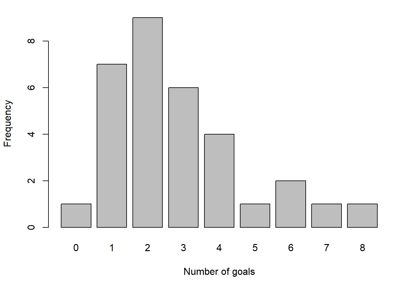
Figure 3.6: Goals scored in each of 32 FA Cup third round matches
3.3.2 Density plots
For continuous data, the histogram gives an approximation of the underlying distribution. The width and choice of endpoints of the intervals for the histogram affect the plot. Also for most continuous distributions we assume that a small change in value leads to a small change, up or down, in the likelihood of the value occurring. For example, the chance of an adult male being 169.9cm tall is unlikely to be very different to the chance of being 170.1cm tall. However, if we break the histogram into 5cm intervals with intervals 165cm-170cm and 170cm-175cm the height of the bars could be significantly different suggesting a big change in the likelihood of the heights.
In Figure 3.7 are 3 histograms for the same data, a sample of heights (cm) of 100 UK adult males. Histograms 1 and 3 use intervals of length 5cm but different starting points for the intervals. Histogram 2 uses intervals of length 2cm.

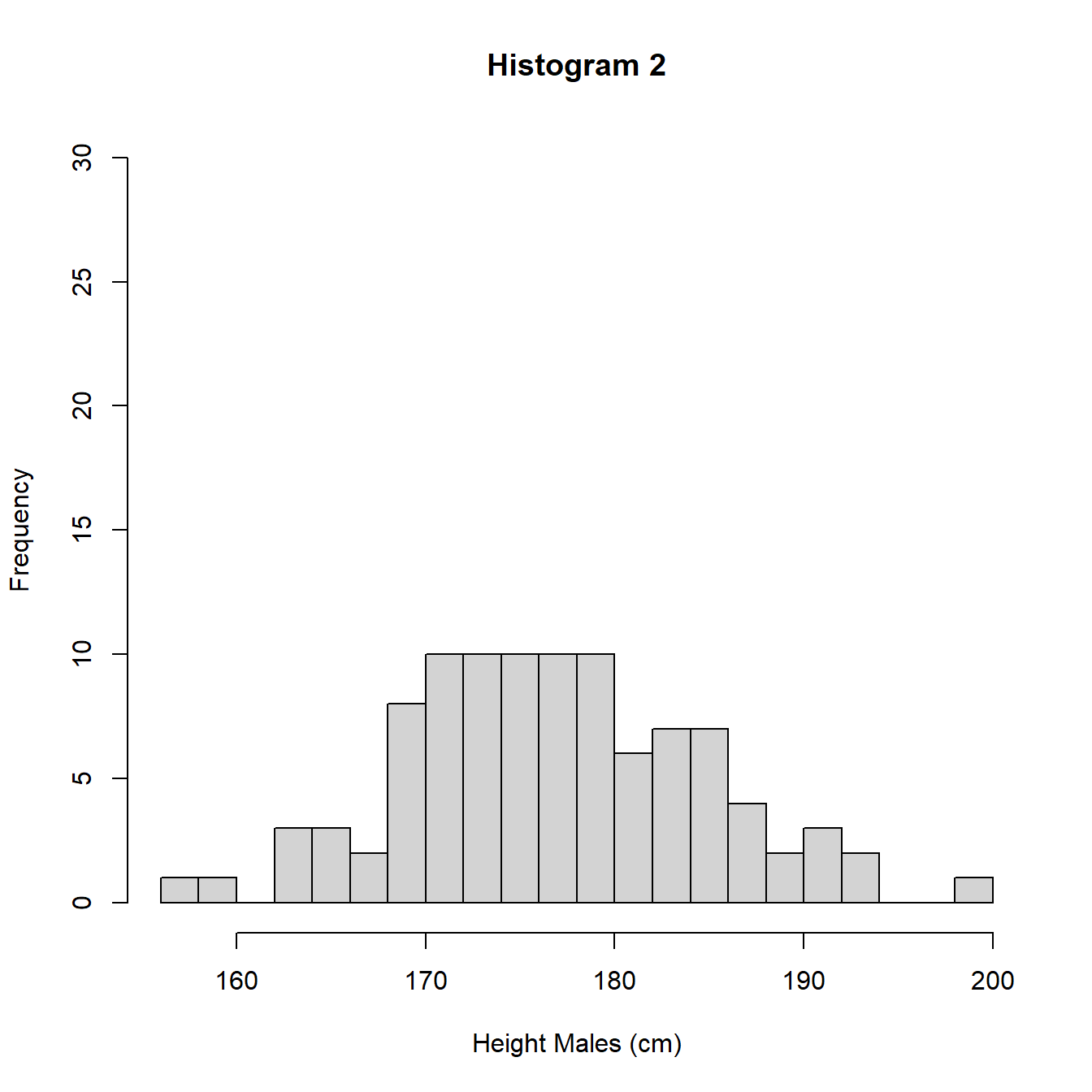

Figure 3.7: Histograms with different intervals
The heights (frequencies) differ between histograms 1 and 3 and histogram 2 due to the different interval widths. In Figure 3.8 we re-plot the histograms using density so the areas sum to 1 and we can perform a direct comparison.
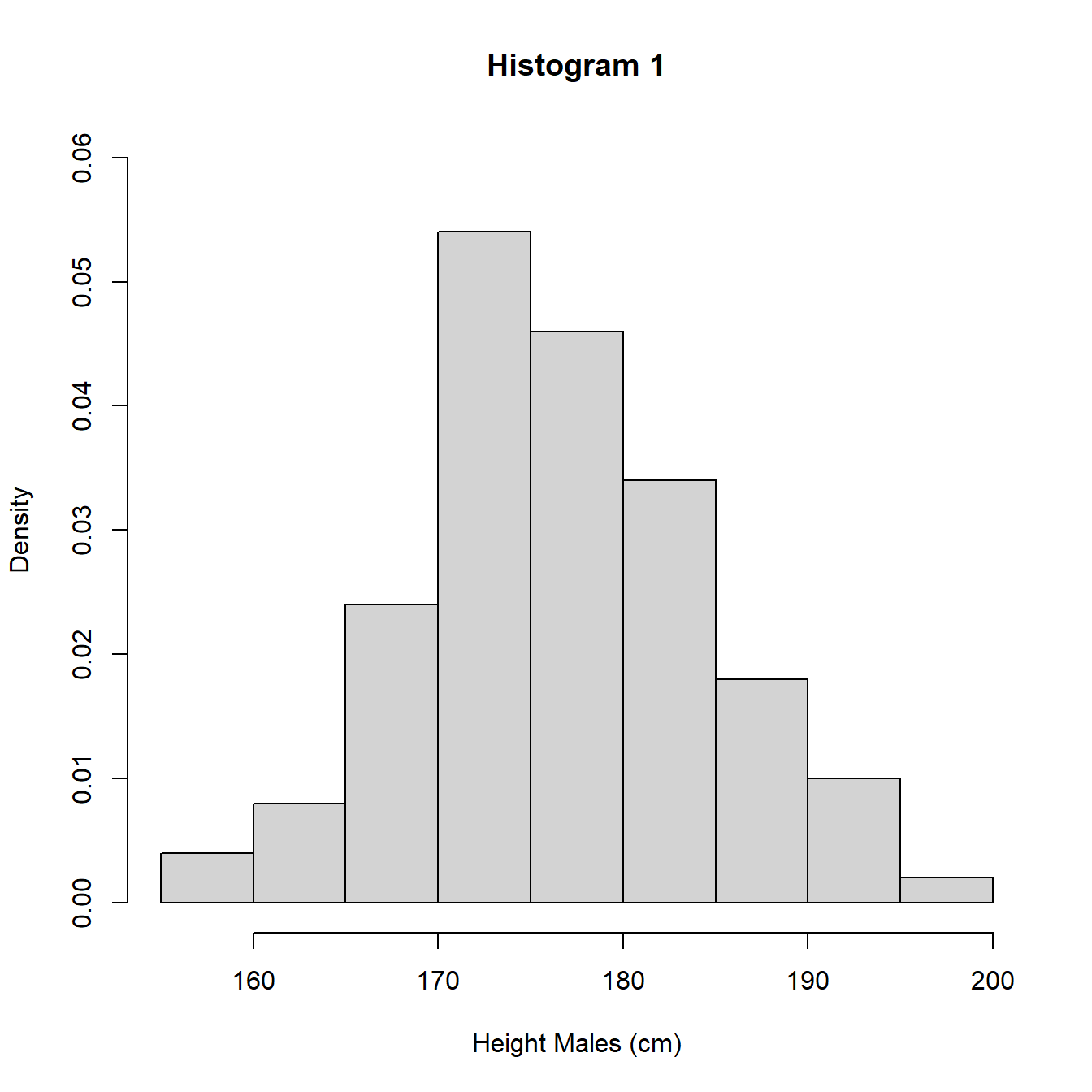
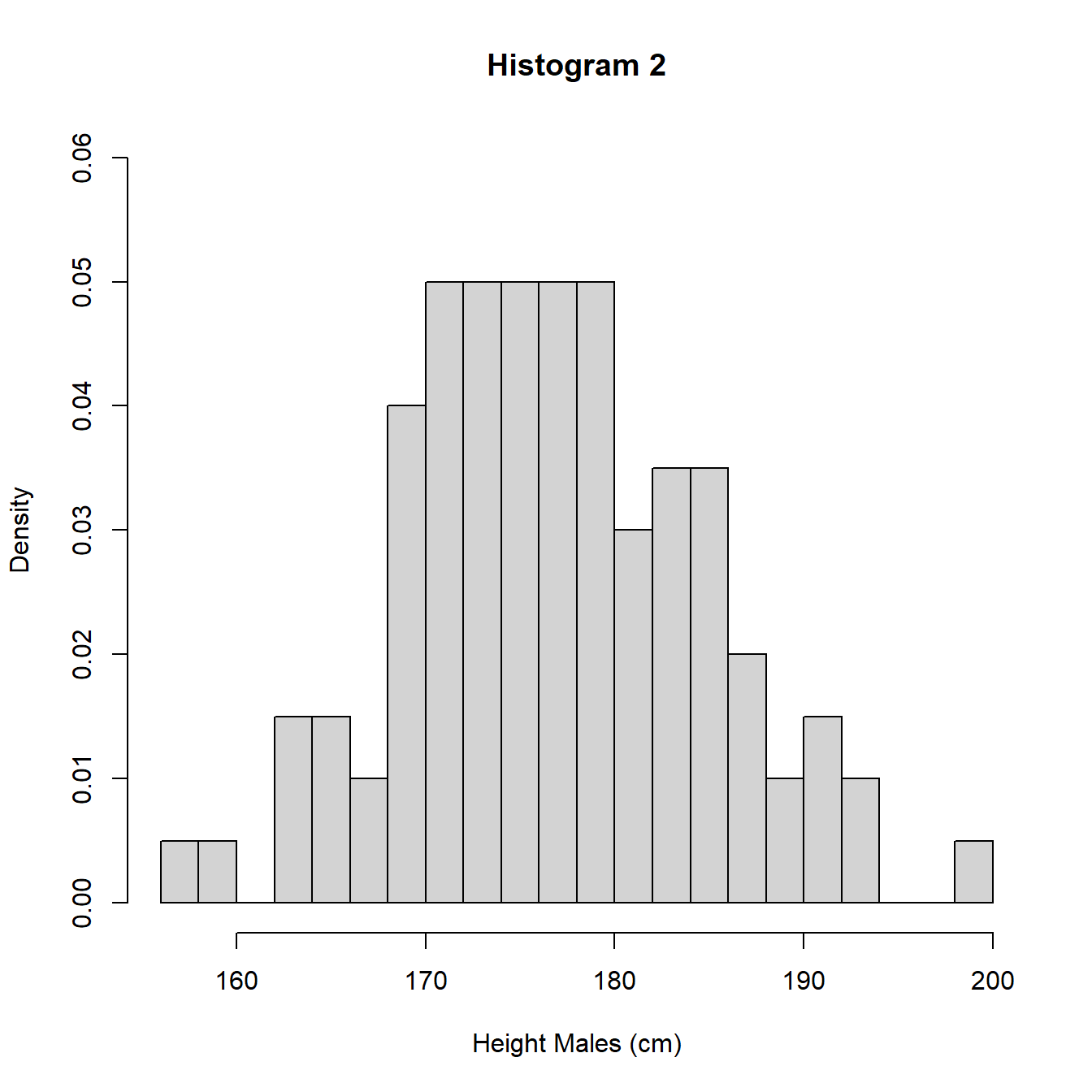
Figure 3.8: Histograms with different intervals
An alternative to the histogram is a density plot. A density plot uses the data to estimate the distribution of the population using an approach known as kernel smoothing. Kernel smoothing estimates the probability density function (pdf) of the distribution of the population which is a measure of how likely a particular value is to occur. We will give a formal definition of the pdf in Section 5.2. This approach removes the need to specify intervals for values as for the histogram and produces a continuous approximation of the density, how likely values are. In Figure 3.9, we illustrate with the UK adult male height data and also superimpose the density plot on histogram 1 to show the similarities.
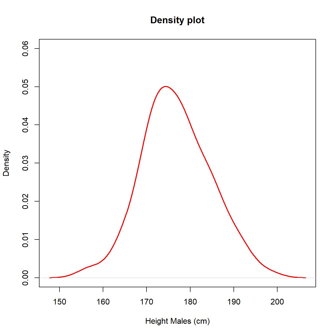
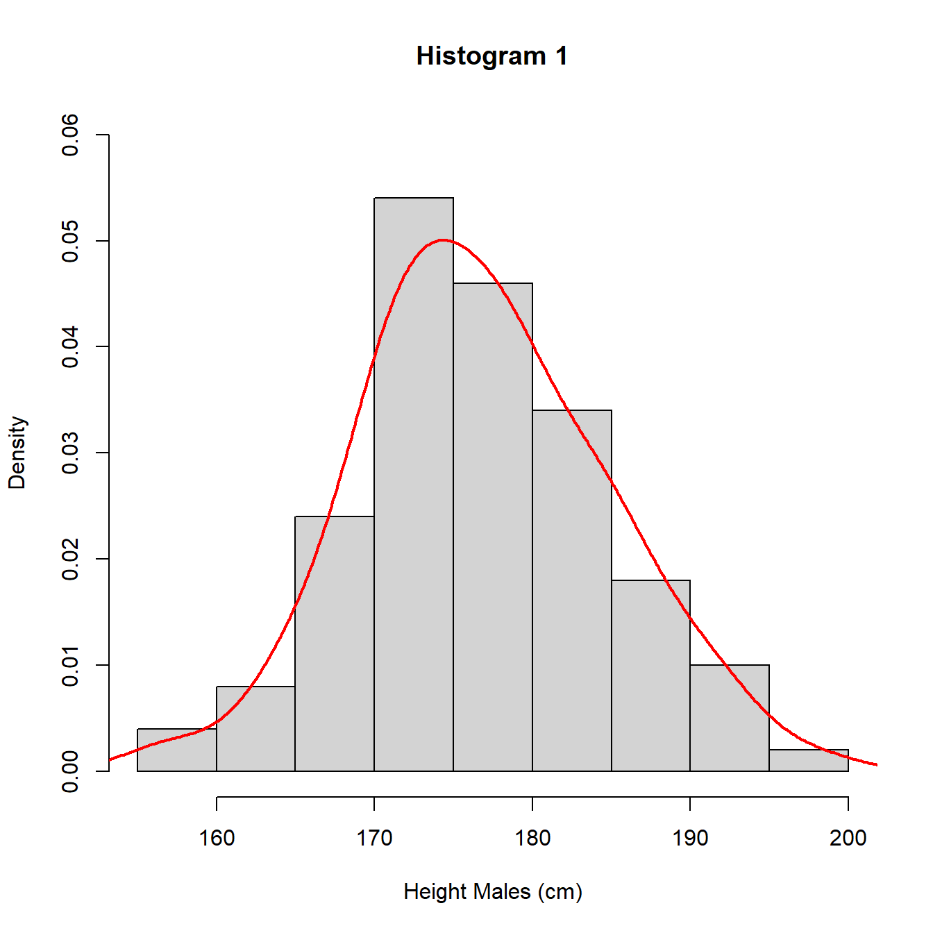
Figure 3.9: Histograms with different intervals
NB. Histograms and density plots of data may not bear much resemblance to distribution of population when the sample size, \(n\), is small, although as \(n\) increases the histogram and density plot should resemble the population distribution more closely.
In Figure 3.10, we plot histograms of random samples of sizes \(n = 15, 100, 1000\) of UK adult males with the true population distribution’s pdf superimposed (red).
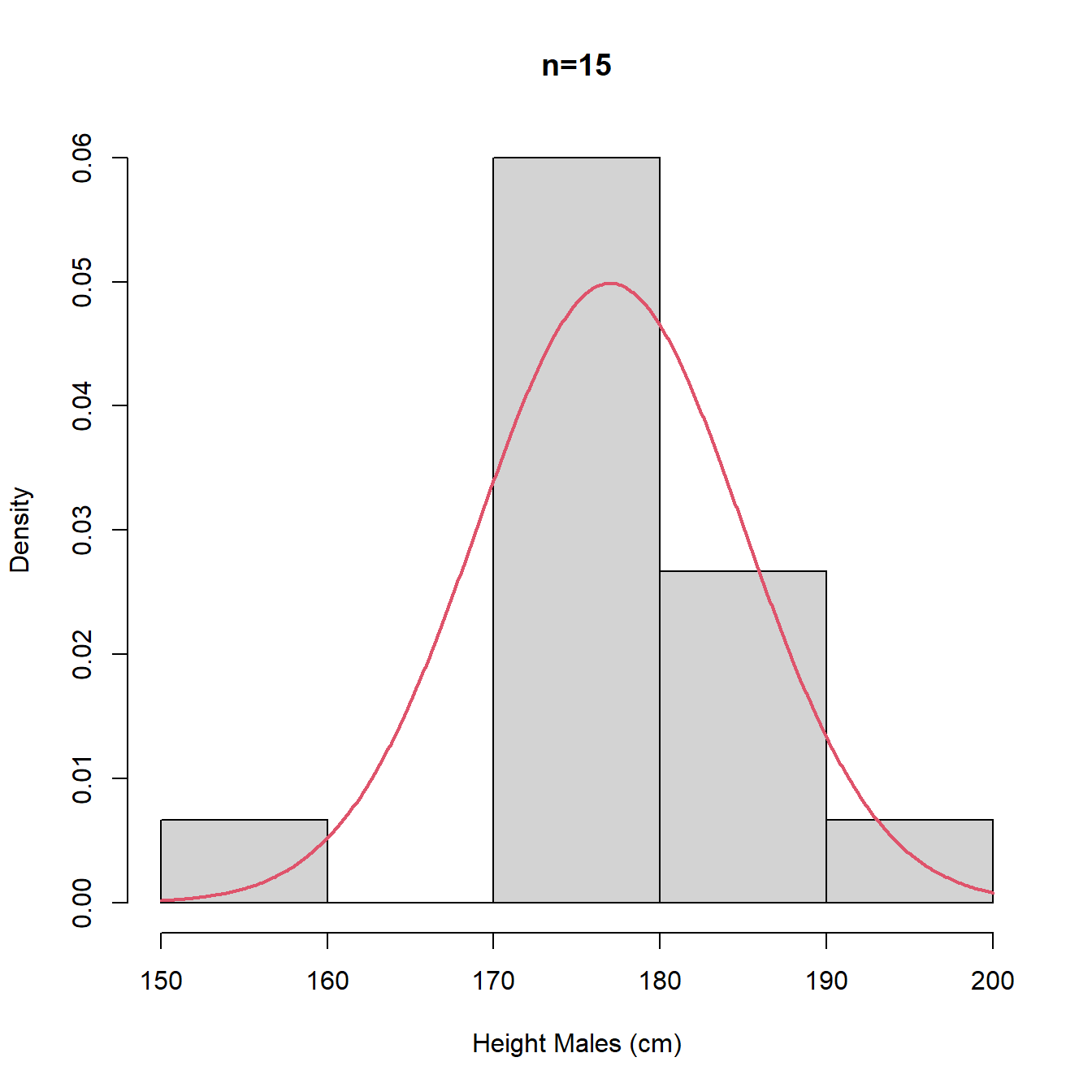
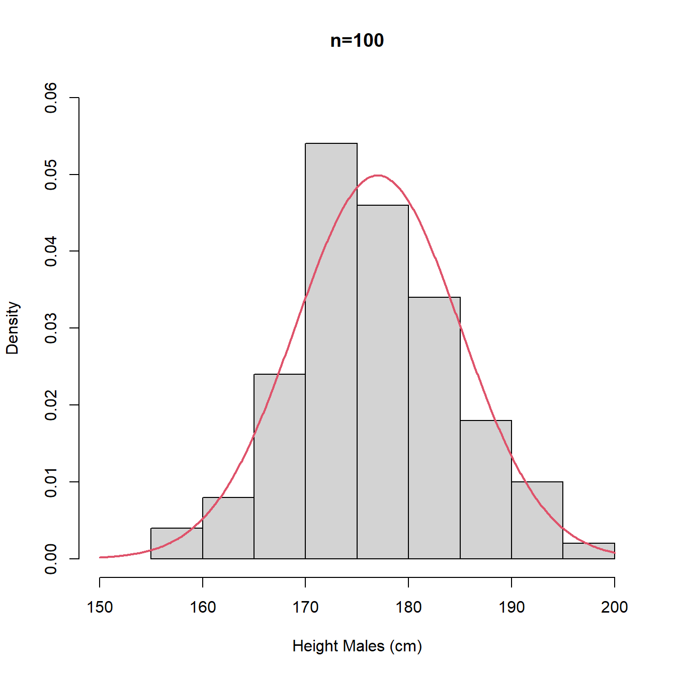
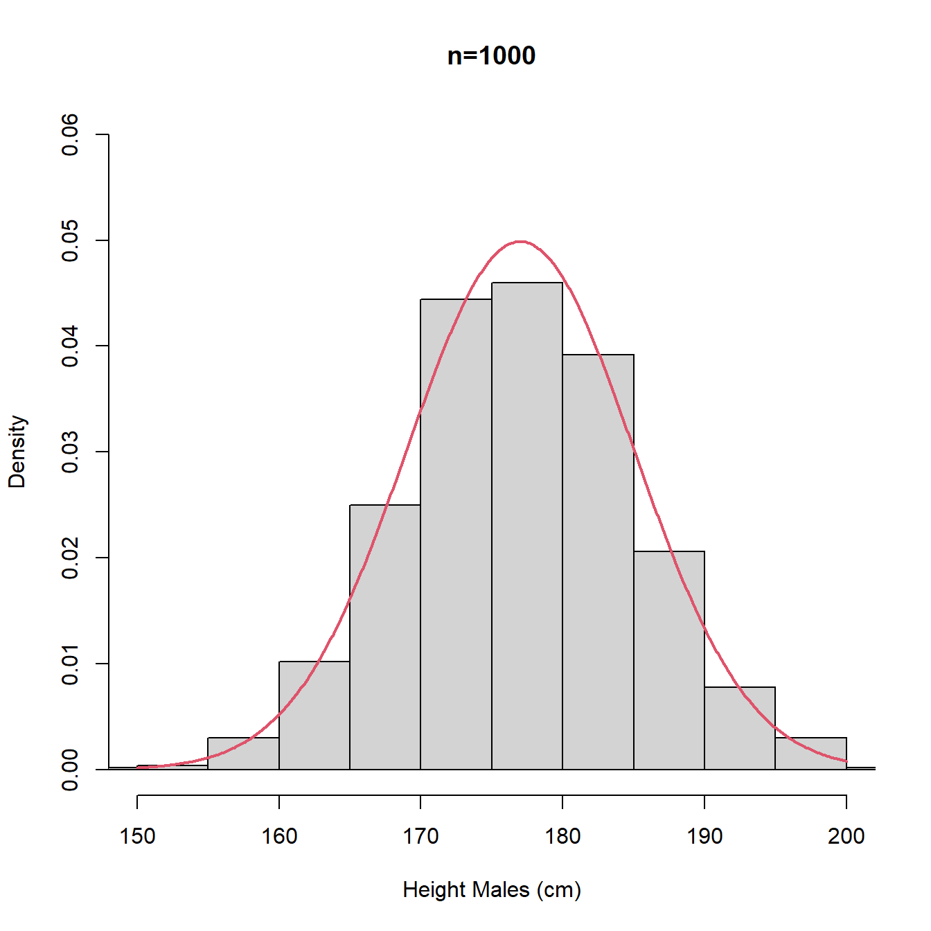
Figure 3.10: Histograms with different intervals
The plots in Figure 3.10 are repeated in Figure 3.11 using density plot instead of histogram. We note that for small \(n\) the density plot (estimate of the pdf) is rather bumpy with multiple modes and we would probably prefer the stability and unimodality of the histogram, whereas for large \(n\), the density plot (estimate of the pdf) offers a better approximation for the underlying continuous distribution (true population pdf).
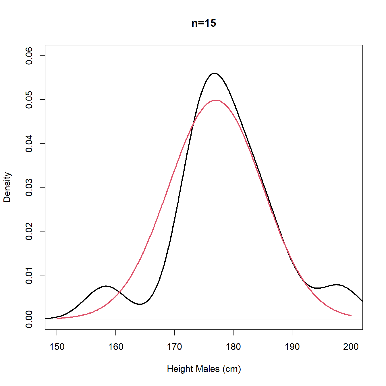
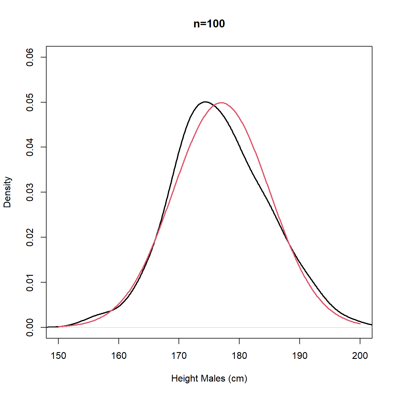
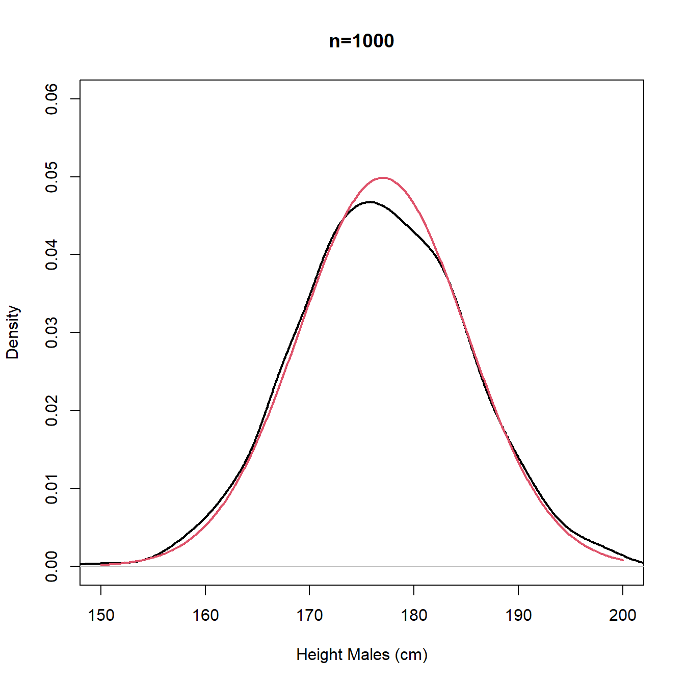
Figure 3.11: Density plots - sample (black) and population (red)
The following R Shiny app allows you to investigate data features along with histograms and density plots further for a data set comprising of marks of 3 groups of students on a maths test.
A summary of Maths Test data
The R Shiny app allows you to explore the data for the score (out of 120) on a Maths test for 1500 students.
The data is comprised of 500 students in each of three categories;
- A-level mathematics students;
- No A-level mathematics students;
- Undergraduate students in mathematics.
Any combination of the three groups of students can be viewed with a histogram and/or density plot of the marks shown. The histogram and/or density plots can be plotted using frequency (counts of observations in each bin of the histogram) or density (the area in the histogram/under the density plot sums to 1).
The mean, median and interquartile range of the data can also be plotted.
This data exhibits a range of behaviours depending upon what subsets of the data are considered. These include:
- Symmetry
- Skewness (positive and negative)
- Unimodality
- Bi and multiple-modality
3.3.3 Boxplot
We have already seen that the lower quartile, median and upper quartile split the data into four portions. Together with the lowest value in the sample and the highest value in the sample, these statistics form the five-number summary:
Coursework marks
The five-number summary for the coursework marks data given in @ref(course_data) are:
| min | \(Q_1\) | median | \(Q_3\) | max |
|---|---|---|---|---|
| 34 | 44 | 46 | 48 | 50 |
Between each statistic fall 25% of the observations. The simplest form of the boxplot is simply a visual presentation of the five number summary as follows:
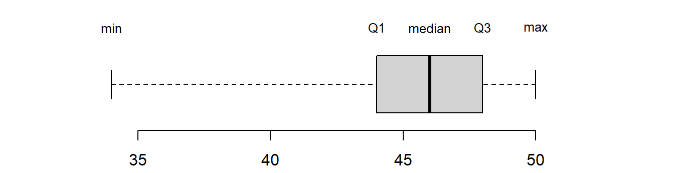
Figure 3.12: A boxplot depicting the five-number summary
Here the box is drawn with its left hand edge at the lower quartile
and right hand edge at the upper quartile. A line is drawn at the median
that divides the box in two. From the centre of each end of the box, a
line is drawn to the minimum and maximum of the values in the sample.
These lines are sometimes called whiskers and the plots are
sometimes called box-and-whisker plots. There are other variations of
the boxplot but this is the simplest version. Sometimes
extreme observations called outliers (see later) are picked out and denoted
with either a ‘*’ or ‘o’ to stop them from influencing the whiskers too
much. In fact, the boxplot function in R does this by default:
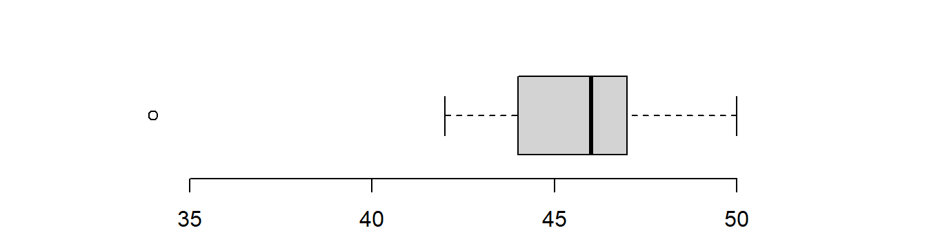
Figure 3.13: A boxplot with outliers picked out
3.3.4 Cumulative frequency diagrams, and the empirical CDF
The cumulative frequency at \(x\) is defined as the number of observations less than or equal to \(x\). The relative cumulative frequency, often written as \(\hat{F}(x)\), is the cumulative frequency of \(x\) divided by the total number of observations \(n\).
\(\hat{ F}(x)\) is also called the empirical cumulative distribution function (empirical cdf). The cumulative distribution function (cdf) for the population, denoted \(F(x)\), is the probability of observing an observation taking a value of \(x\) or less in the population. \(F(x)\) is an increasing (strictly non-decreasing) function in \(x\) with the rate of change in the cdf determined by the pdf introduced in discussions of the density plot. We will introduce the cdf formally in Section 5.2.
A cumulative frequency diagram involves plotting the cumulative frequency at \(x\) versus \(x\). If the data are grouped continuous data (IQ scores) then straight lines are drawn between the upper class boundaries, and if the data are discrete,goals per FA cup match, Figure 3.6, or ungrouped data then a step function is used. This is illustrated in Figure 3.14.
IQ Scores (revisited)
The cumulative frequency and relative cumulative
frequency for the I.Q. data above are:
| \(x\) | Cum. freq. | \(\hat F(x)\) |
| 80 | 0 | 0 |
| 90 | 12 | 0.12 |
| 100 | 49 | 0.49 |
| 110 | 79 | 0.79 |
| 120 | 98 | 0.98 |
| 130 | 100 | 1.00 |
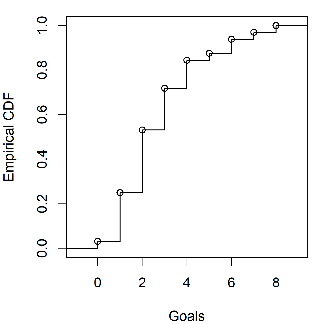
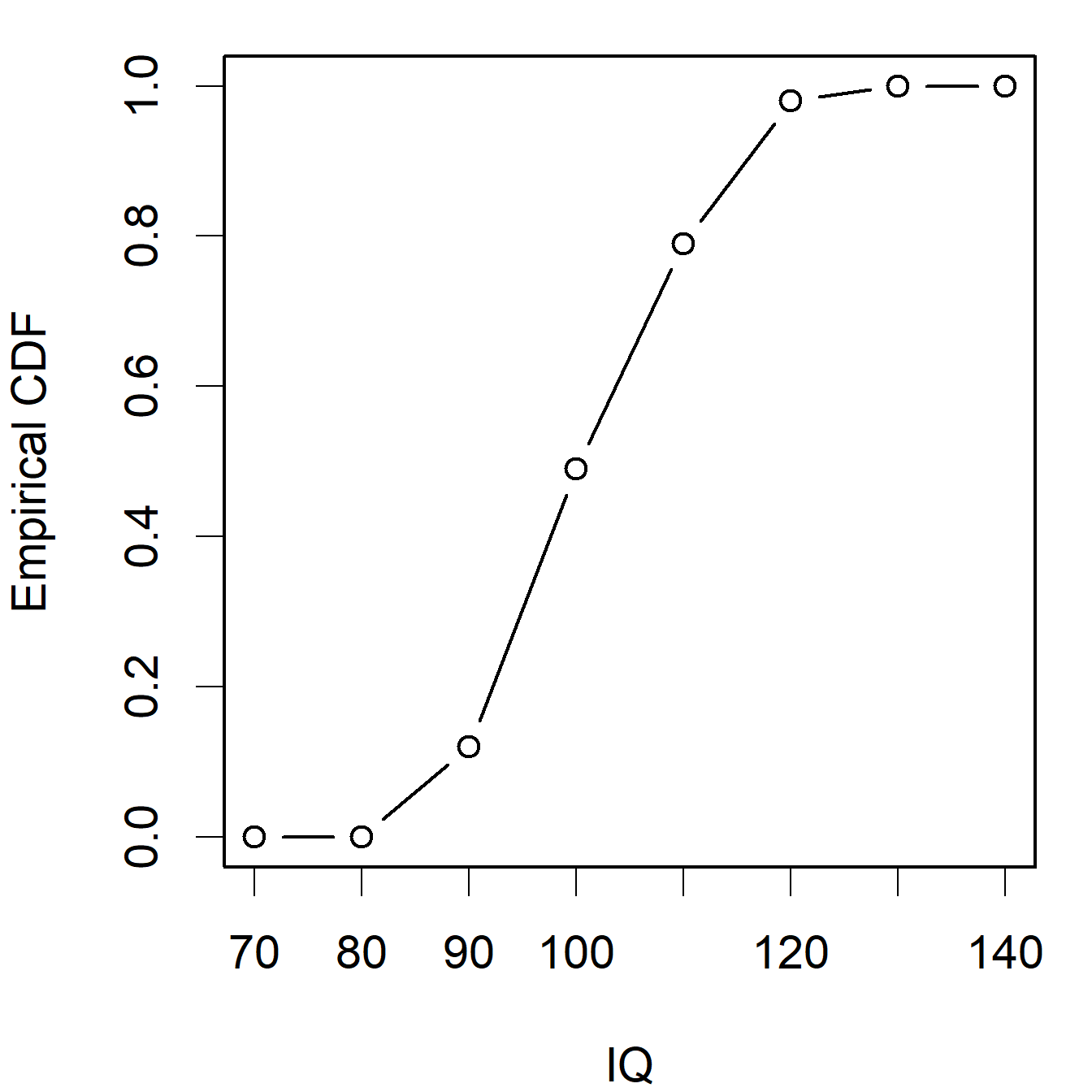
Figure 3.14: Empirical cdf plots for the ‘Goals’ and ‘IQ’ data sets
The median can be estimated from a cumulative frequency diagram by finding the value \(x\) corresponding to cumulative frequency of \(n/2\) (or \(\hat F(x) = 0.5\) if using the empirical CDF).
In Video 5 we study comparing the empriical distribution (pdf and cdf) with the random variable (population) the observations come from. This comparison is done using an R Shiny app which gives the histogram and estimate of the probability density function. A link to the R Shiny app is provided after the video to allow you to explore these features for yourself.
Video 5: Empirical pdf and cdf
3.3.5 Stem and leaf
One way of representing both discrete or continuous data is to use a stem-and-leaf plot. This plot is similar to a bar chart/histogram but contains more information. It is best described by way of an example.
Seeds data In the routine testing of consignments of seeds, the following procedure is used. From a consignment 100 seeds are selected and kept under controlled conditions. The number of seeds which have germinated after 14 days is counted. This procedure is repeated 40 times with the following results:
| 88 | 87 | 85 | 91 | 93 | 91 | 94 | 87 | 90 | 91 |
| 92 | 87 | 91 | 89 | 87 | 90 | 88 | 85 | 90 | 92 |
| 89 | 86 | 91 | 92 | 91 | 91 | 93 | 93 | 87 | 90 |
| 91 | 91 | 89 | 90 | 90 | 91 | 91 | 93 | 92 | 85 |
The range of data is \(94 - 85 = 9\) and we divide this range into intervals of fixed length as we would for a histogram.
For a stem-and-leaf plot we usually make the class interval either 0.5, 1 or 2 times a power of ten and aim for between 4 and 10 intervals. Of course, this is sometimes not possible for very small data sets. For these data an interval of two seems appropriate as this will give us 5 or 6 intervals. Next we draw a vertical line. On the left of this vertical line we mark the interval boundaries in increasing order but note only the first few digits that are in common to the observation in the interval. This is called the stem. We then go through the observations one by one, noting down the next significant digit on the right-hand side of the appropriate stem. This forms the leaves. Here we obtain:
| 8 | | | 5 | 5 | 5 | ||||||||||||||
| 8 | | | 7 | 7 | 7 | 7 | 6 | 7 | |||||||||||
| 8 | | | 8 | 9 | 8 | 9 | 9 | ||||||||||||
| 9 | | | 1 | 1 | 0 | 1 | 1 | 0 | 0 | 1 | 1 | 1 | 0 | 1 | 1 | 0 | 0 | 1 | 1 |
| 9 | | | 3 | 2 | 2 | 2 | 3 | 3 | 3 | 2 | |||||||||
| 9 | | | 4 |
The first stem (line) contains any values of 84 and 85, the second stem of 86 and 87, and so on. Note that by allowing the first stem to represent 84 & 85 we have ensured that there are stems for 88 & 89 and 90 & 91 and no stem for 89 & 90 — a stem which would be very difficult to enter on a plot! A final version of the plot is found by ordering the digits within each stem. For these data the final stem-and-leaf plot is
| 8 | | | 5 | 5 | 5 | ||||||||||||||
| 8 | | | 6 | 7 | 7 | 7 | 7 | 7 | |||||||||||
| 8 | | | 8 | 8 | 9 | 9 | 9 | ||||||||||||
| 9 | | | 0 | 0 | 0 | 0 | 0 | 0 | 1 | 1 | 1 | 1 | 1 | 1 | 1 | 1 | 1 | 1 | 1 |
| 9 | | | 2 | 2 | 2 | 2 | 3 | 3 | 3 | 3 | |||||||||
| 9 | | | 4 |
3.3.6 Pie charts
When we wish to display proportions of observations in a sample that take each of a discrete number of values, a pie chart is sometimes used:
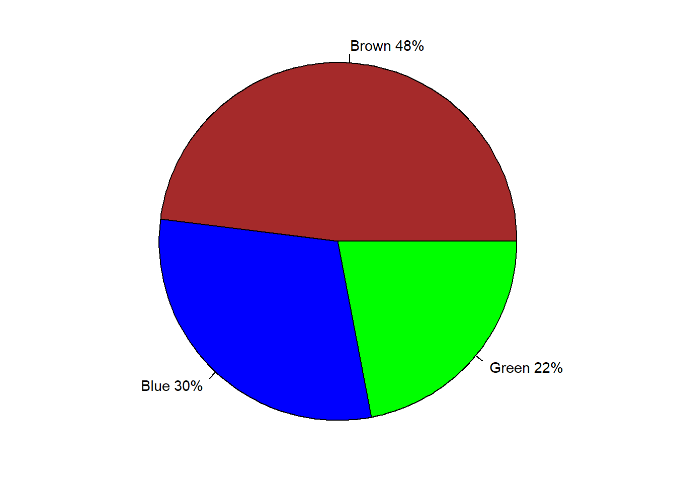
Figure 3.15: Pie chart of eye colour of people in Britain
However, there are many drawbacks with pie charts, especially when the number of categories is large, or when some categories have small frequencies, and the comparison of groups with similar proportions is difficult. If you’re thinking about using a pie chart then I suggest: stop, and ask yourself whether a bar chart would be clearer!
Figure 3.16 is a pie chart showing the proportion of oil production by different OPEC countries in 2016.
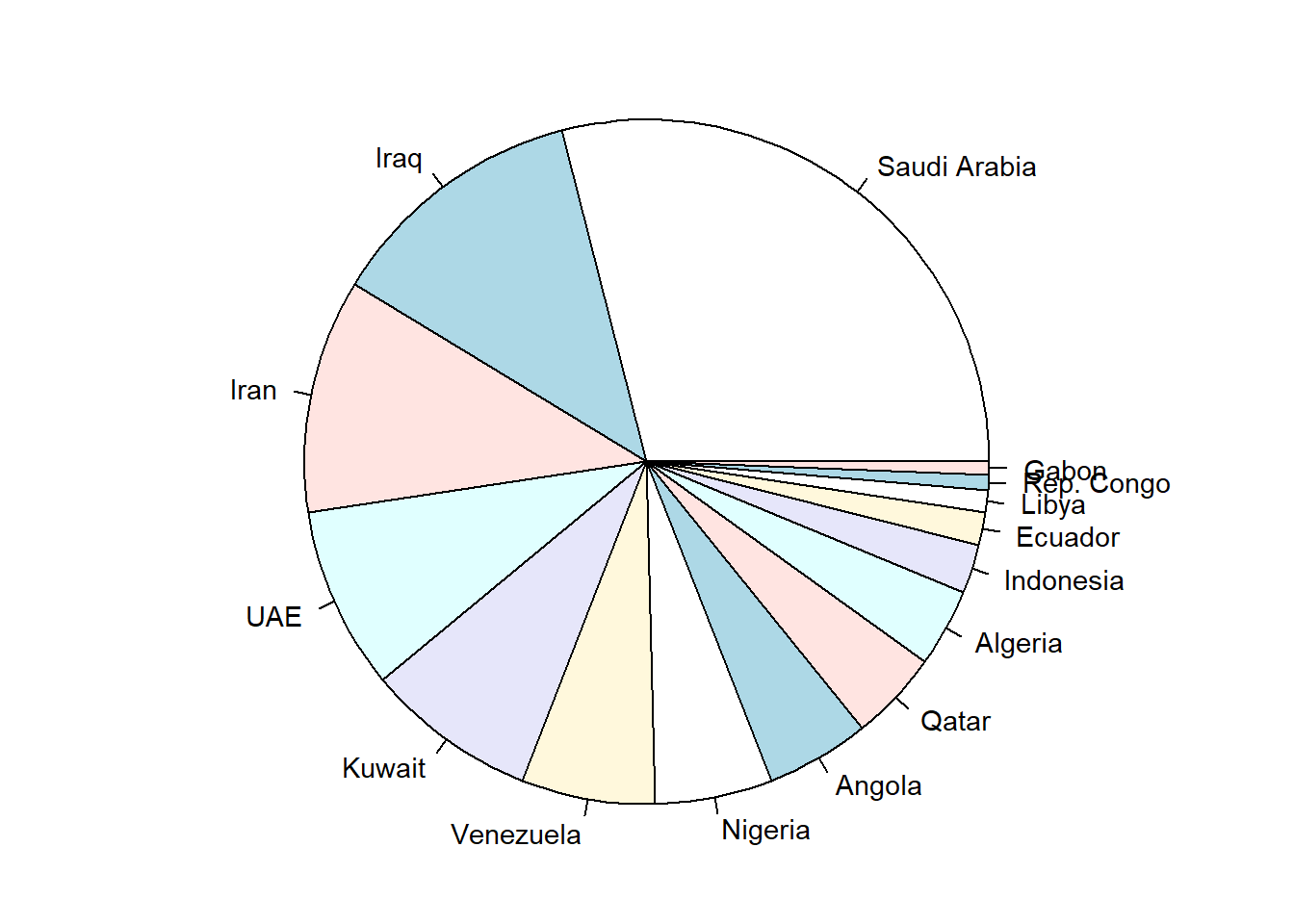
Figure 3.16: Pie chart of oil production by OPEC members
And Figure 3.17 is a bar chart showing the same data. Which do you find the clearer?
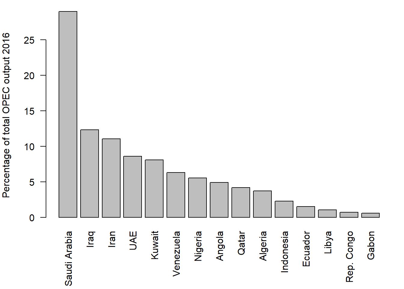
Figure 3.17: Bar chart of oil production by OPEC members
3.3.7 Dotplots
A dotplot displays each data value as a dot, and is used for both continuous and discrete data. It is usually used only when the sample size is small, otherwise the plot quickly gets overcrowded. Here is a dotplot for the \(n=29\) Cavendish data values.
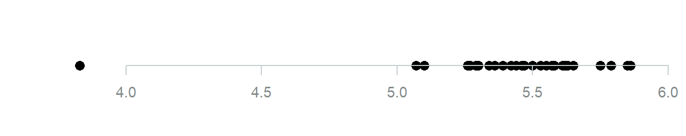
Figure 3.18: Simple dot plot of the Cavendish data
The ‘overplotting’ makes it difficult to see how many data values there are in the middle of the data set. Sometimes to make things a bit clear some ‘jitter’ (randomness) is added in the y direction and/or the points are made slightly transparent, both of which help a lot in this case:
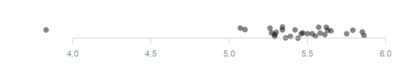
Figure 3.19: Dot plot of the Cavendish data with some jitter and transparency
For discrete data the dots are stacked above the horizontal axis. The result is something similar to a bar chart, but showing individual points. Here is a dotplot for the seed data:
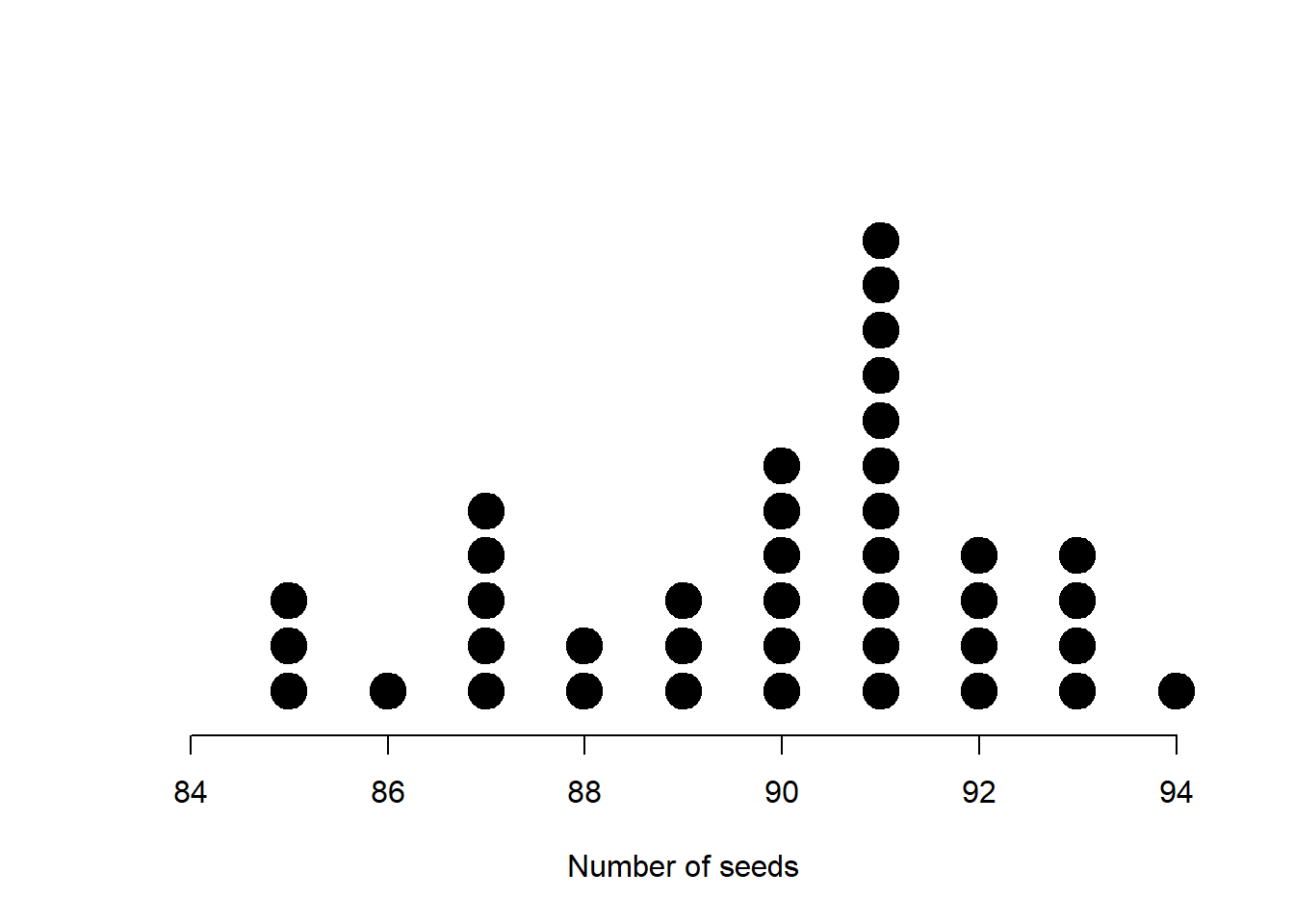
Figure 3.20: Dot plot of some discrete seed count data
3.3.8 Scatterplots
In addition to displaying the data on each random variable as above, when we have data that consists of observations on two or more random variables, it is useful to try and assess any relationships between random variables by using a scatterplot. A scatterplot is simply a graph with one random variable as abscissa and another random variable as ordinate. A point is plot on the graph for each element of data at the observed values of the two random variables (see Fig 3.21).
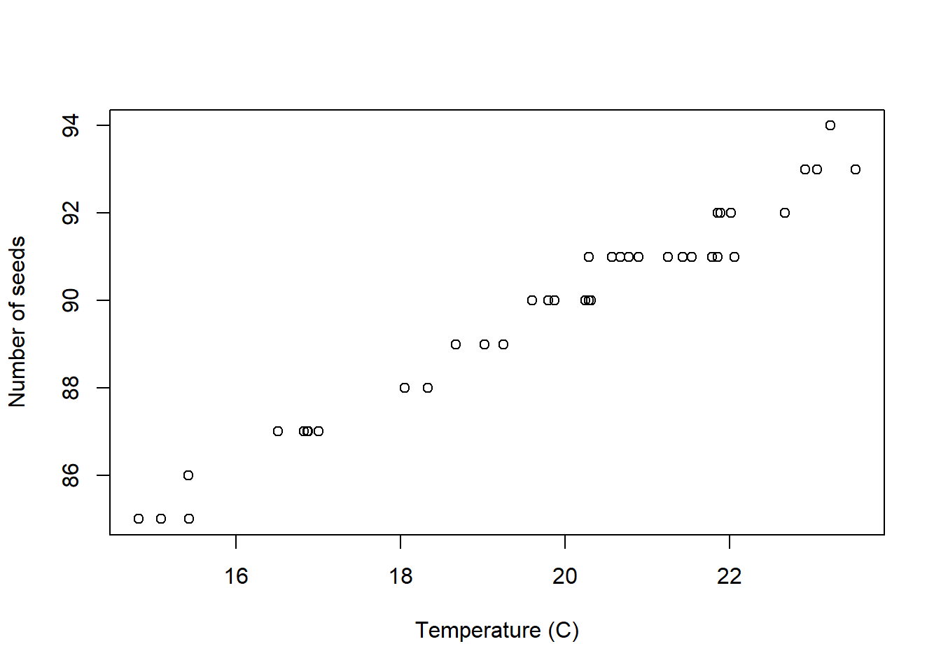
Figure 3.21: Scatter plot of number of seeds versus average temperature (40 observations)
This is very useful for exploring the relationship between two variables. In the above example we observe that the number of seeds which germinate increases linearly with temperature. We can extend the approach to comparing more than two variables by producing a scatterplot matrix which consists of scatterplots for every pair of random variables (see Figure 3.22)).
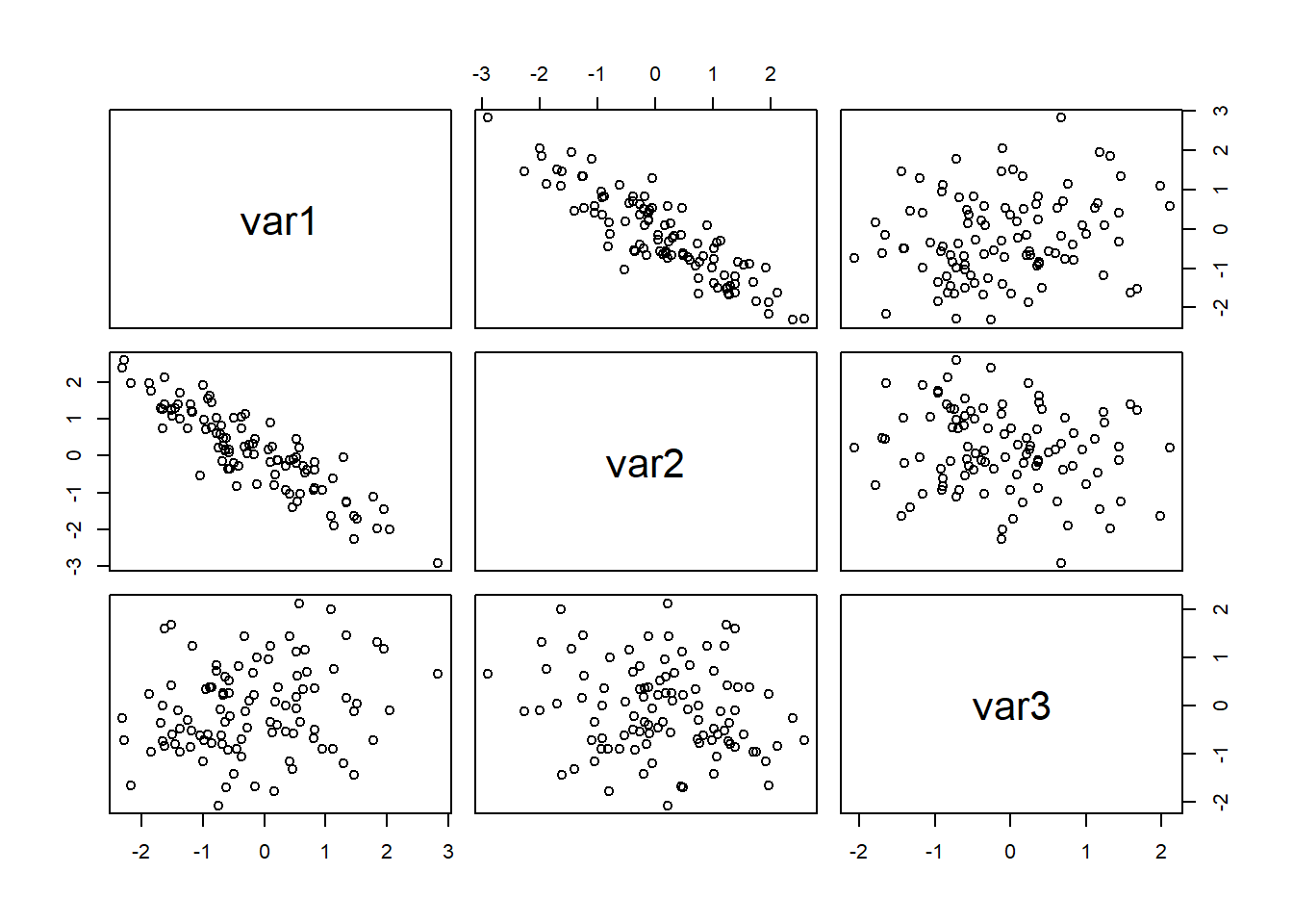
Figure 3.22: A scatterplot matrix for three variables (100 observations)
3.3.9 Summary
Histogram/Dotplot
Pros: Gives a good impression of the distribution of the data.
Cons: The histogram is sensitive to the classes chosen to group observations – giving only a vague impression of the data.
Density plot
Pros: Represents continuous distribution by a continuous function (density) aoviding the discretisation of histograms.
Cons: Over-interprets individual observations for small sample sizes often leading to erroneous multi-modality.
Boxplot
Pros: Good for comparing different samples or groups of observations on the same random variable. Gives a good quick summary of the data.
Cons: Gives no feel for the number of observations involved. Hides multiple modes.
Stem and leaf plot
Pros: Gives indication of general shape and other distributional features while allowing actual data values to be recovered.
Cons: Difficult to use for comparative purposes – suffers from lack of clarity.
Pie chart
Pros: Looks nice.
Cons: Only useful for comparing the relative proportions of observations in a small number of categories. Difficult to compare categories with similar frequencies, or very small frequencies.
3.4 Commenting on data
When we describe a data set in words, often to complement a plot, here are some things worth commenting about:
- Location - what is a typical value?
- Spread - how dispersed are the observations?
- Multiple modes - is there one or more ‘peaks’ (and why)?
- Symmetry/skewness - is skewness positive, negative, roughly zero?
- Outliers - are there any unusual observations?
- Any other interesting patterns or features - e.g. are two variables related?
We have given an overview of summarising data, both numerically (location and spread) and graphically. We are now in position to consider the mathematical underpinnings of statistics through the introduction of probability.
Task: Lab 2
In Section 24, an introduction using to R Markdown is given.
Work through Section 24 and then attempt to complete the R Markdown file for Lab 2:
Lab 2: Plots in R