Chapter 6 Repeated analysis
이번 시간에는 반복 작업을 줄이는 방법에 대해 이야기 해보겠습니다. 반복 작업을 코드로 단순화 하는 것은 여러 장점이 있습니다. 무엇보다 실수를 줄일수 있습니다. 그리고 시간도 절약할 수 있고요. 몇가지 알아보도록 하겠습니다.
동영상은 여기에 있습니다.
6.1 추출
일자별로 미세먼지가 높은 날(Dusty)과 미세먼지가 없이 맑은 날(Clean)이 반복된다고 생각해보겠습니다. dusty가 4일, clean 이 6일 이라면 아래와 같습니다.
##  [1] "dusty" "dusty" "dusty" "dusty" "clean" "clean" "clean" "clean" "clean"
## [10] "clean"
그냥 무작위로 오늘은 어떤 날씨일지 해보겠습니다.
## [1] "dusty"이를 10000번 해보면 어떻게 될까요? 어떤 가요 거의 4:6의 비율로 나타나나요?
## events
## clean dusty
## 5955 4045## events
## clean dusty
## 0.5955 0.4045중복 추출을 10000번 시행해 보면 어떻게 될 까요? 다음과 같이 시행해 볼 수 있습니다. 4:6의 비율이 유지되고 있나요?
## events
##  clean  dusty
## 0.6013 0.3987
6.2 파일 불러오기
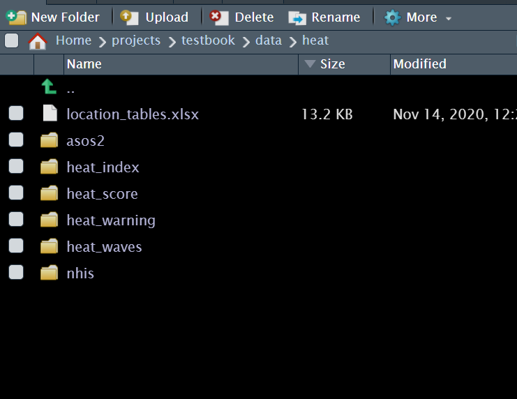
반복 작업 중 미세먼지 데이터 등을 불러오면 매일 엑셀이 하나씩 형성이 됩니다. 이를 모두 불러오는 것은 매우 힘든일입니다. 반복 작업을 통해 불러오겠습니다.
우선 여러 종류의 액셀을 형성해 보겠습니다. 구글클래스에서 heat.zip 파일을 다운 받고 폴더에 넣어 주세요.
 이중 ASOS 파일을 부러오겠습니다.
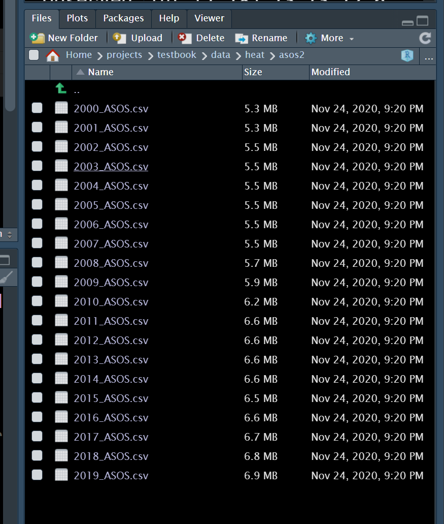 년도별 자료입니다. 현제는 몇년치 자료이고 모두 *.csv 파일 형태로 되어 있습니다. 이를 반복해서 불러보도록 하겠습니다.
우선 현제 폴더 위치를 알아야 합니다. 그리고 데이터가 있는 폴더 위치를 알아야 합니다. 현제 폴더는 /home/sehnr/projects/testbook 이네요.
## [1] "/home/sehnr/projects/testbook"여기에 /data/heat/asos2 에 파일이 있습니다. 즉, 아래와 같이 파일 폴더를 찾을 수 있습니다.
## [1] "/home/sehnr/projects/testbook/data/heat/asos2"설정된 경로에 들어 있는 파일 목록을 보도록 하겠습니다.
lpwd <- paste(getwd(),"/data/heat/asos2/", sep = "" )
ldas <- list()
ldas <- dir(path = lpwd,
            pattern = '*.*')
ldas
## [1] "2000_ASOS.csv" "2001_ASOS.csv" "2002_ASOS.csv" "2003_ASOS.csv"
## [5] "2004_ASOS.csv" "2005_ASOS.csv" "2006_ASOS.csv" "2007_ASOS.csv"
## [9] "2008_ASOS.csv" "2009_ASOS.csv" "2010_ASOS.csv" "2011_ASOS.csv"
## [13] "2012_ASOS.csv" "2013_ASOS.csv" "2014_ASOS.csv" "2015_ASOS.csv"
## [17] "2016_ASOS.csv" "2017_ASOS.csv" "2018_ASOS.csv" "2019_ASOS.csv"우선 첫번째 파일을 불러와보도록 하겠습니다.
빠른 속도를 위해서 fread 명령을 수행하겠습니다.
잘 불러와 졌나요? 그럼 모두 불러와 보겠습니다. 이때 이번 시간의 목적인 반복 작업이 수행됩니다.
asos <- list() # list 형식의 asos 만들기
st <-Sys.time()
asos <- lapply(ldas,
               function(dat){
                 fread(paste0(lpwd, dat ))
               })
et <- Sys.time()
et-st
## Time difference of 0.7009518 secs반복 작업이 되었습니다. 형성된 asos를 보도록 하겠습니다. 20개의 파일이 각각 list로 되어 있네요.
##       Length Class      Mode
##  [1,] 60     data.table list
##  [2,] 60     data.table list
##  [3,] 60     data.table list
##  [4,] 60     data.table list
##  [5,] 60     data.table list
##  [6,] 60     data.table list
##  [7,] 60     data.table list
##  [8,] 60     data.table list
##  [9,] 60     data.table list
## [10,] 60     data.table list
## [11,] 60     data.table list
## [12,] 60     data.table list
## [13,] 60     data.table list
## [14,] 60     data.table list
## [15,] 60     data.table list
## [16,] 60     data.table list
## [17,] 60     data.table list
## [18,] 60     data.table list
## [19,] 60     data.table list
## [20,] 60     data.table list
이제 모두 합쳐 하나의 데이터 프레임으로 만들어 보겠습니다.
## Time difference of 0.4911058 secs이제 하나의 데이터가 되었습니다. 여기서 중요한 것은 dir을 통해 모든 데이터 list를 구하고, 이것을 lapply를 통해 한꺼번에 데이터를 불러온 다음, do.call을 통해 모두 rbind하는 것입니다. 매우 자주 사용되는 전처리 작업이므로 꼭 익숙해 지시기 바랍니다.
6.2.1 과제
heat_warning 데이터를 모두 불러와 보세요! 코드를 제출하시면 됩니다.
6.3 분석 반복하기
threshold를 찾는 방법 중에 threshold point마다, piecewise regression을 반복해서 구하고, 최적의 모델을 찾는 방법을 사용할 수 있습니다. piecewise regression 의 간단한 설명은 다음과 같습니다
| threshold points (piecewise regression) | codes |
|---|---|
| total | Resp = α + β1 · Dose + β2 ·( Dose – Ɵ) + + Ɛ0 |
| If Dose < Ɵ | Resp= α + β1 · Dose + Ɛ0 |
| If Dose > Ɵ | Resp= α - β2 ·Ɵ +( β1 + β2 )· Dose + Ɛ0 |
| model selection | minimal AIC value |
6.3.1 자료 생성
아래 처럼 임로 데이터를 생성해 보았습니다. 어떤 유해물질 노출 (Dose) 에 따라 건강영향 (Resp) 가 나타났다고 생각해 보겠습니다. 그리고 일정량에서 threshold가 있다고 생각해보겠습니다.
## [1] 101pb<-c(rnorm(50, 0, 0.001), rnorm(30, 0, 0.01), rnorm(10, 0.1, 0.05),rnorm(11, -0.1, 0.05))
resp <-1/(1+exp(-(dose-5)))+rnorm(length(dose), 0, 0.1)+pb
plot(dose, resp, xlab='Dose', ylab='Response', cex.lab=1.5, cex.axis=1.5, cex.main=1.5, cex.sub=1.5)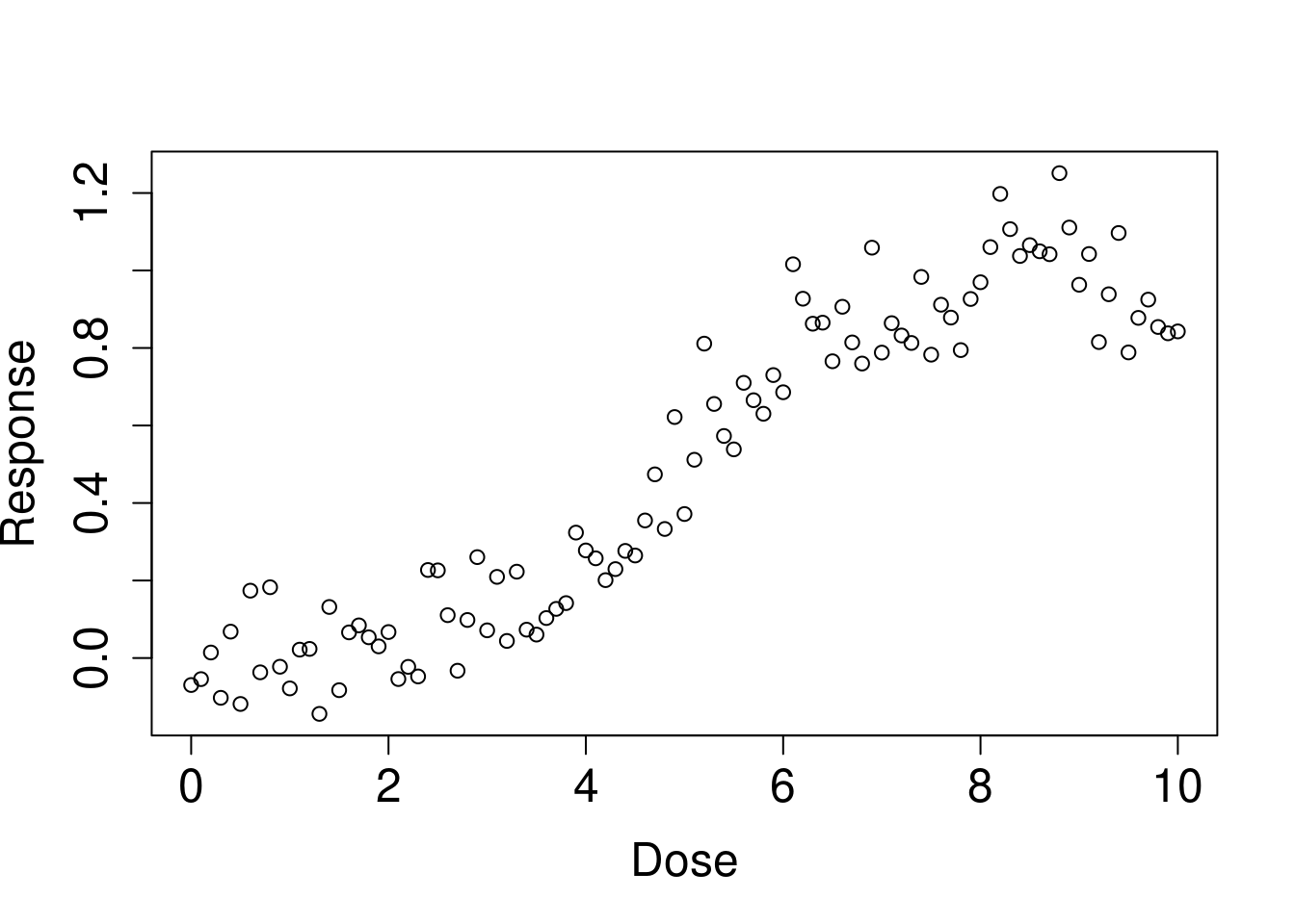
6.3.2 가상의 threshold 값 수행해보기
한 1에서 5 사이에 있어 보입니다. 이를 통해 예상되는 matrix (outdata)를 구해보았습니다.
outdata의 행의 이름을 threshold point에 따라 intercept, beta for before threshold, and its p value, beta for post threshold and its pvalue와 그때은 AIC 값을 구해보겠습니다 .
우선 하나만 구해보겠습니다. therhold가 1일때와 5일때를 를 가정해 보겠습니다.
## [1] -92.20184## [1] -86.9744어떤 가정이 모델 적합도를 높이나요? 네 threshold가 1일 때 입니다. 그럼 2랑도, 2.5랑도 비교해 봐야겠지요. 이때 반복 분석을 수행해보도록 하겠습니다.
위의 모델을 함수로 만들었습니다
thr_fun <- function(thres){
cpdose <- ifelse(dose - thres >0, dose - thres, 0)
cpm    <- glm(resp ~ dose + cpdose)
aic    <- summary(cpm)$aic
data.frame(
  'threshold' = thres,
  'aic'       = aic)
}
이것을 돌릴 범위를 정해보겠습니다.
##  [1] 1.0 1.1 1.2 1.3 1.4 1.5 1.6 1.7 1.8 1.9 2.0 2.1 2.2 2.3 2.4 2.5 2.6 2.7 2.8
## [20] 2.9 3.0 3.1 3.2 3.3 3.4 3.5 3.6 3.7 3.8 3.9 4.0 4.1 4.2 4.3 4.4 4.5 4.6 4.7
## [39] 4.8 4.9 5.0
이제 반복해서 작업해 보겠습니다.
이제 데이터 프레임으로 만들어 보겠습니다.
그림을 그려보겠습니다.
library(ggplot2)
opt.thres <- simul_dat$threshold[which.min(simul_dat$aic)]

simul_dat %>%
  ggplot(aes(x = threshold, y = aic)) +
  geom_line() +
  geom_vline(xintercept = opt.thres) +
  geom_text(x = opt.thres + 0.8, y = -90, color = 'red',
            label = paste0(round(opt.thres, 3), '점에서 최소 AIC를 보입니다.' )) +
  theme_minimal()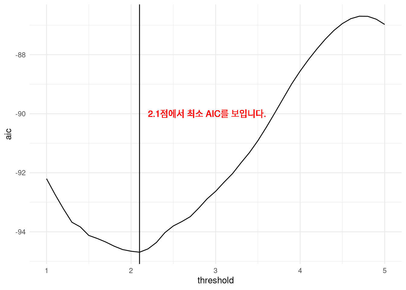
즉 2.1에서 threshold를 잡아 모델을 그리면 가장 적합함을 알 수 있습니다.
thres = 2.1
f_cpdose <- ifelse(dose - thres >0, dose - thres, 0)
f_cpm    <- glm(resp ~ dose + f_cpdose)
prepwlm <- predict(f_cpm)
scaleFUN <- function(x) sprintf("%.2f", x)
cohort %>%
ggplot(aes(x= dose, y = resp)) +
geom_point() +
theme_minimal() +
scale_y_continuous(labels = scaleFUN) +
geom_line(aes(y = prepwlm), color ='red')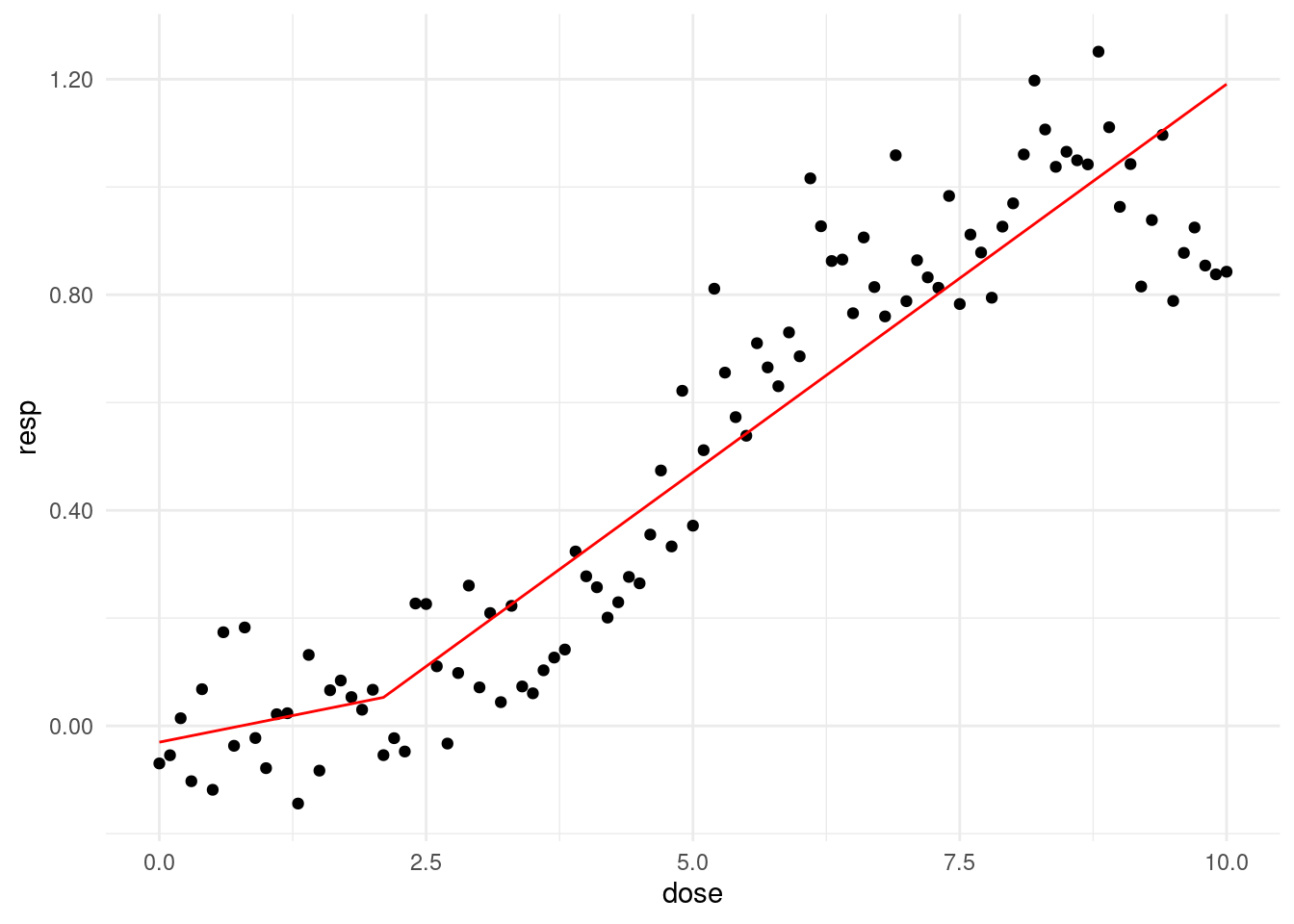
6.3.3 과제
dose가 6부터 10사일에서 change point 가 있다고 가정하고 반복 분석해서 AIC값이 최저인 change point를 찾아 부세요 code를 올려주시면 됩니다.