Chapter 7 Basic plot with R
7.1 data steps for visualization basic with ggplot
data import from research tutor, now use ‘international COVID19 survey: post new normal life’ the leader of this project is ‘Laura, Univ of Michigan’. And this tutorial data is only for 1st wave survey of Korea (Jun).
| youtube | url |
|---|---|
| yonsei | https://youtu.be/85HuqHX3JlY |
covid<-readxl::read_xlsx('data/covid_korea.XLSX', sheet =1)
dic<-readxl::read_xlsx('data/dic_kor.xlsx')
dic.eng<-readxl::read_xlsx('data/dic_eng.xlsx')
dic.eng <- dic.eng %>%
  rename('variables' = 변수명)
overview of data (just 10 rows)
overview of codebook (writed in Korea) overview of codebook (english)7.1.1 create basic variables
create basic variables for tutor, and list of variables.
| new.variables | origianal variables | methods |
|---|---|---|
| age | SQ2 | 2020-SQ2 |
| gender | SQ1 | 1 ~ men, 2~ women |
| Q6 | Q6 | How long do you think you will be able to maintain your current level of social distancing? |
| Q7 | Q7 | Q7. How difficult is it for you to maintain your current level of social distancing? |
| Q8 | Q8 | Q8. When do you think your community will be “safe” from the COVID-19 pandemic? |
7.2 ggplot2
7.2.1 bar and histograph
bar and histographs display the distribution according to user defined data points (x-axis).
covid %>%
  ggplot(aes(x=Q6)) +
  geom_histogram(col ="red",
                 fill="grey") +
  labs(title ="histogram for keep social distancing")
## `stat_bin()` using `bins = 30`. Pick better value with `binwidth`.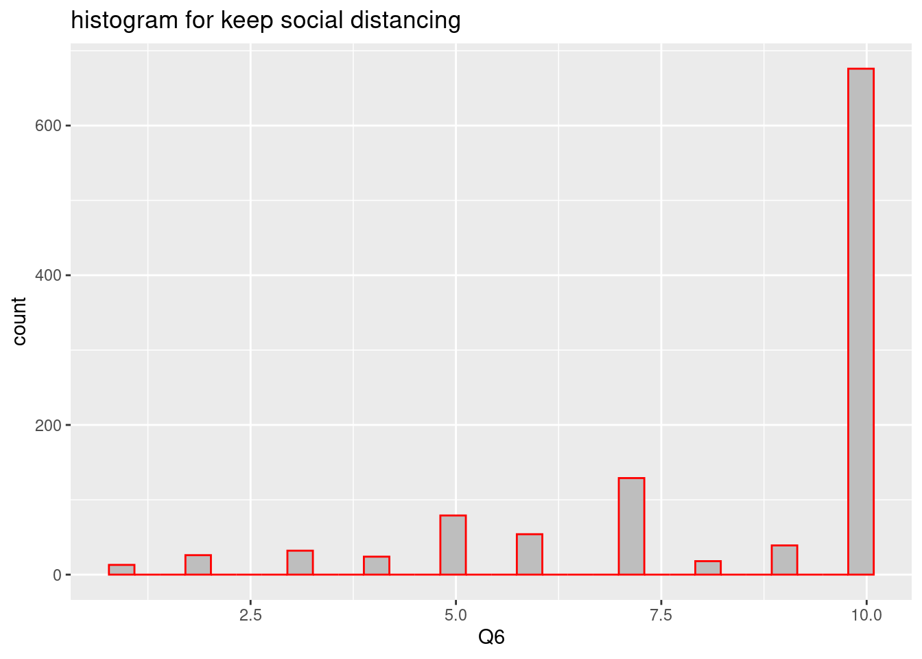
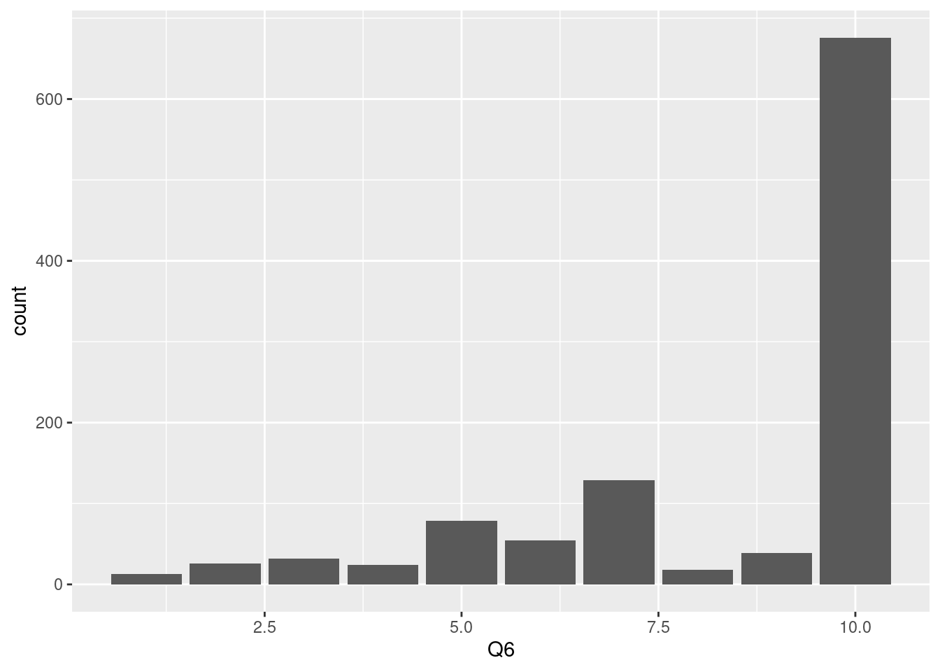
In the same context, We can make bar plot just add geom_bar(), as below. Almost responses are that ‘6 months or more’.
 10 means ‘6 month or more’ so, we can change the x axis label to easy for following. This step is very import to communicate with collaborators. please keep in kind to communicate with your friend using labeling.
covid %>%
  ggplot(aes(x=Q6)) +
geom_bar() +
scale_x_continuous(breaks = c(3, 5, 8, 10),
labels = c(
#'1' = '1-2days',
#'2' = 'less than 1 weeks',
'3' = '1-2 week',
#'4' = '3-4 weeks',
'5' = '1 month',
#'6' = '2 months',
#'7' = '3 months',
'8' = '4 months',
#'9' = '5 months',
'10' = '6 months or more'
))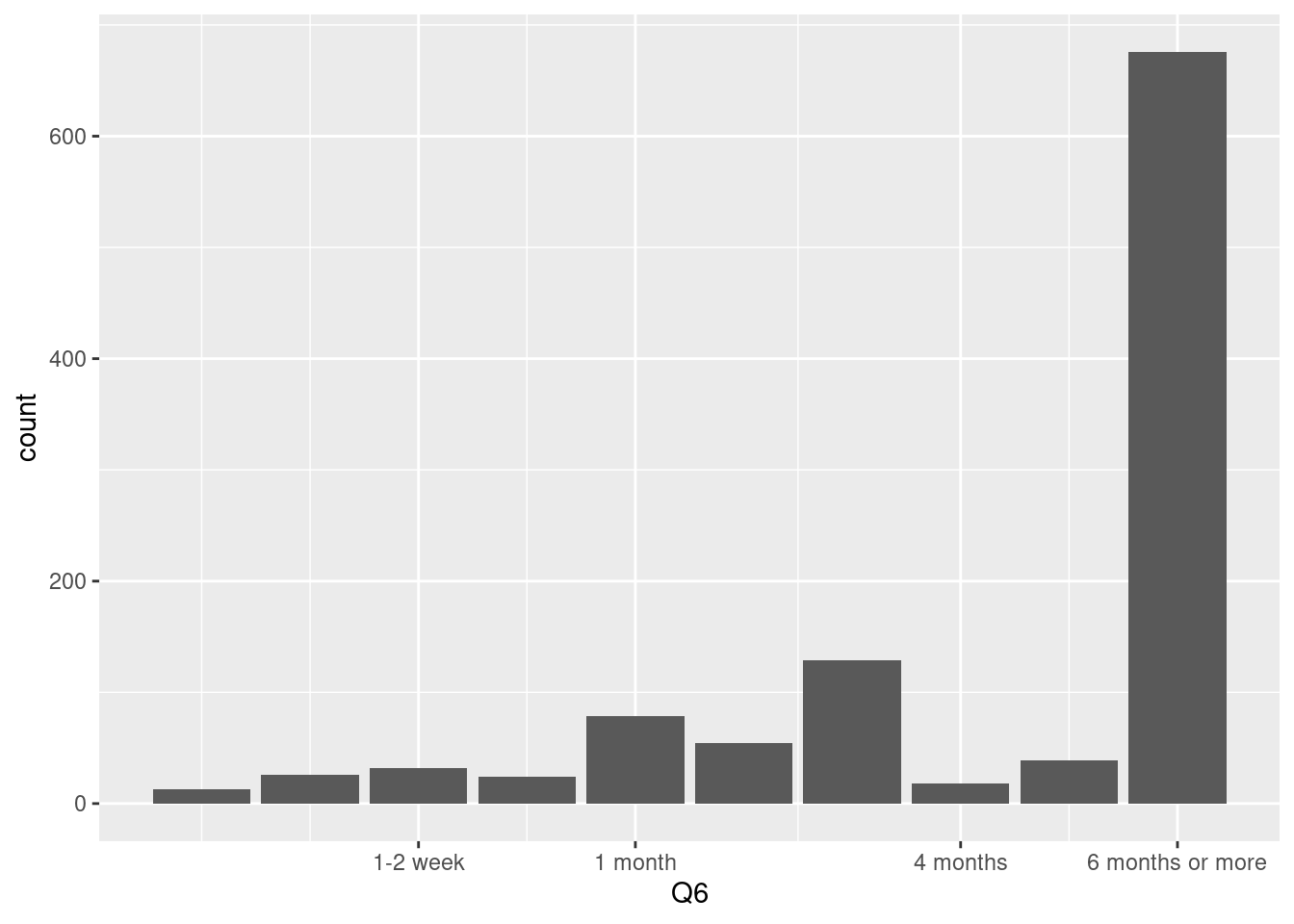 We usually used
 group_by, count code for data summary, so now we plot summarized data using stat='identity' in ggplot. This process are more conbinience because I usually want to overview my summarized data.

7.2.2 Boxplot
What are characteristics related to levels of keeping social distancing. To find related characteristics, we can draw boxplot, too. First, let’s find variables which have large difference of expectance of keeping social distance. Now, I assumed that 6 months and more is good indicator of keeping social distance. So, if some expected they can keep social distancing more than 6 months, they will categorized into ‘keeping social distancing’, if else ‘non-keeping social dstancing’ (keeping vs non-keeping). In code book, we can match that 1 means 1-2 days, and 10 means 6 months or more. so we can change it per months while 6 months or more into just 6 months. Although it is measurement error when we used below mutate, but now we use new variable ’keep_sdist, social distancing" just for data overview. I made keep_sdist (unit is months scale), and keep_sdistgp for grouping data.
covid2 <- covid %>%
  mutate(keep_sdist=case_when(
    Q6  ==1  ~ 1.5/30,
    Q6  ==2  ~ 7/30,
    Q6  ==3  ~ (7+3.5)/30,
    Q6  ==4  ~ (21+3.5)/30,
    Q6  ==5  ~ 1,
    Q6  ==6  ~ 2,
    Q6  ==7  ~ 3,
    Q6  ==8  ~ 4,
    Q6  ==9  ~ 5,
    Q6  ==10 ~ 6,
    TRUE ~ NA_real_
  ))
class(covid2$keep_sdist)
## [1] "numeric"covid2 <- covid2 %>%
mutate(keep_sdist_gp = ifelse(Q6 %in% c(10), 1, 0)) %>%
mutate(keep_sdist_ft = ifelse(Q6 %in% c(10), 'Yes', 'No')) Here are box plot with gender stratification about the age (median, inter quartile) and
figbox<- covid2 %>%
  ggplot(aes(x=keep_sdist_ft, y = age)) +
  geom_boxplot()+
  facet_wrap(gender~.) +
  theme_minimal()+
  xlab('keeping social distancing more than 6 months')

library(plotly)
##
## Attaching package: 'plotly'## The following object is masked from 'package:ggplot2':
##
## last_plot## The following object is masked from 'package:stats':
##
## filter## The following object is masked from 'package:graphics':
##
## layout## Warning: `group_by_()` is deprecated as of dplyr 0.7.0.
## Please use `group_by()` instead.
## See vignette('programming') for more help
## This warning is displayed once every 8 hours.
## Call `lifecycle::last_warnings()` to see where this warning was generated.7.2.3 scatter plot
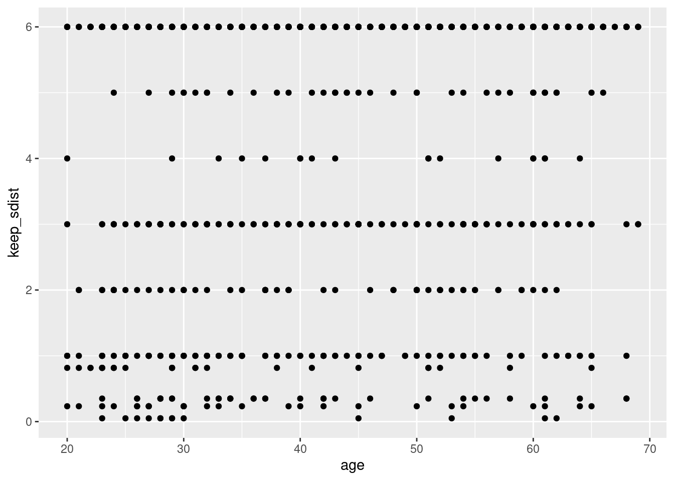
Scatter plot display association two variables. Now I want display association between age and “How long do you think you will be able to maintain your current level of social distancing?”. Add geom_point() make scatter plot in ggplot2.
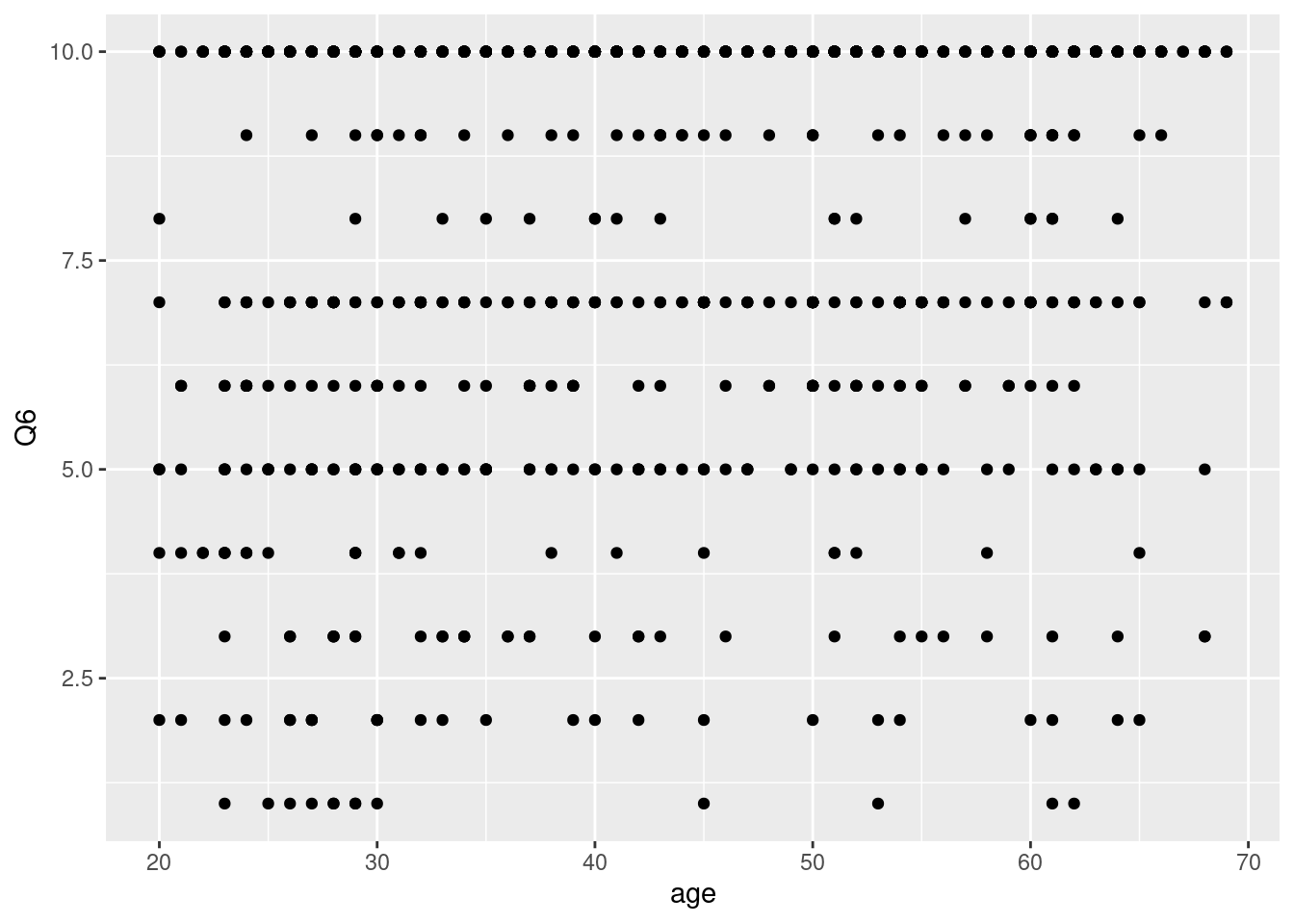
The scatter plot is below.
 However, it is not easy to overview the relationships between age and perceive response of keeping social distancing. Now we added regression line using
 geom_smooth()
## `geom_smooth()` using method = 'gam' and formula 'y ~ s(x, bs = "cs")'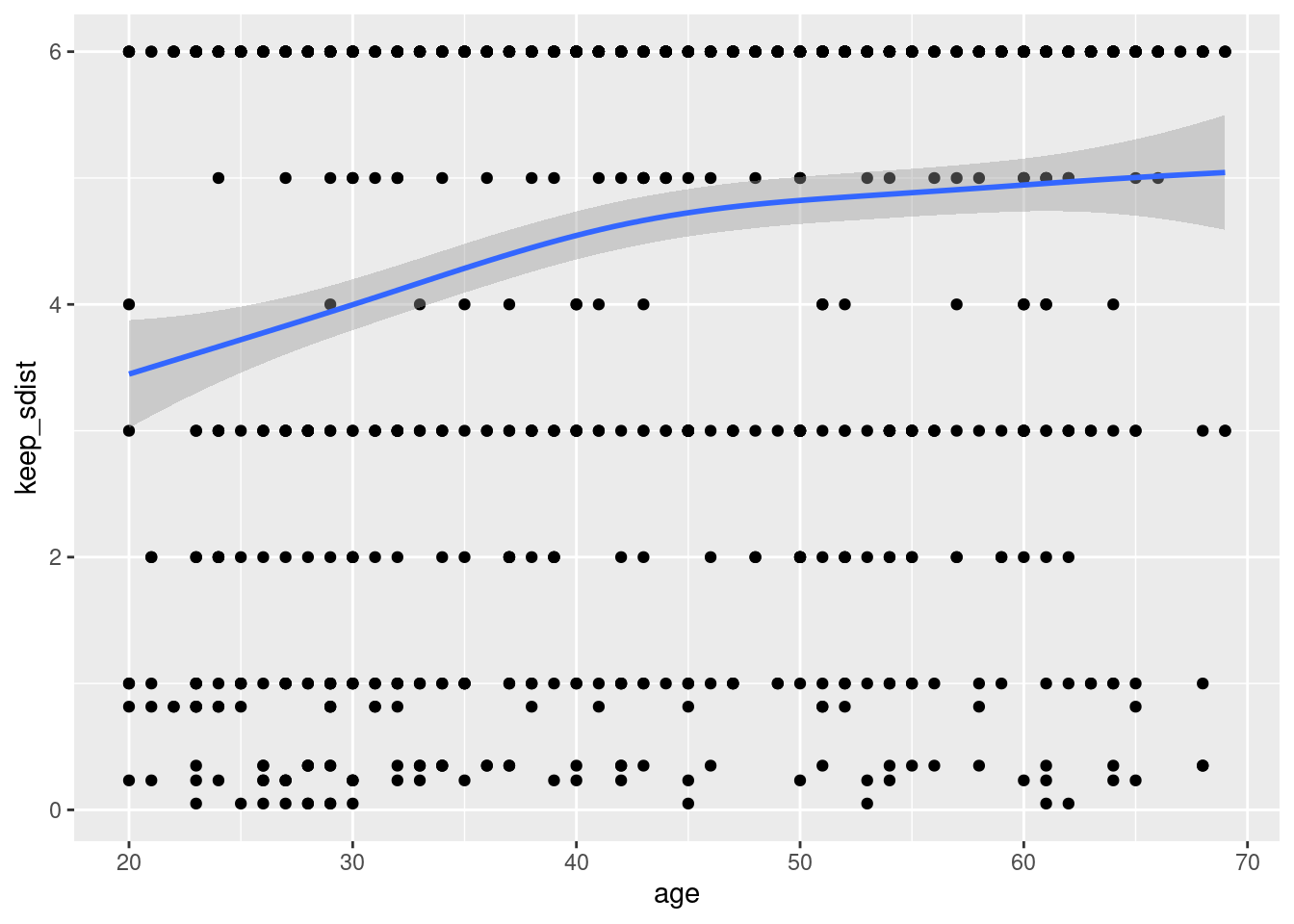 That graphs show that older age responded that they could keep more months of social distancing.
7.2.3.1 add regression line
How about added linear regression lines? or user defined model?
For linear model, we can use method ='lm'
## linear regression line
covid2 %>%
  ggplot(aes(x=age, y = keep_sdist)) +
geom_point() +
geom_smooth(method ='lm', se = FALSE)## `geom_smooth()` using formula 'y ~ x'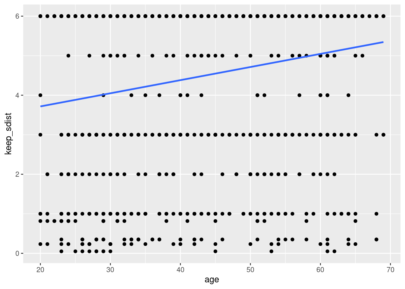
for user define model, we can plot predicted value or fitted.values value as manually.
## regression model
lm_fit<-lm(data=covid2,
           keep_sdist ~ age)

covid2 %>%
  ggplot(aes(x=age, y = keep_sdist)) +
  geom_point()+
  geom_line(aes(x=age, y = predict(lm_fit)), color ='red')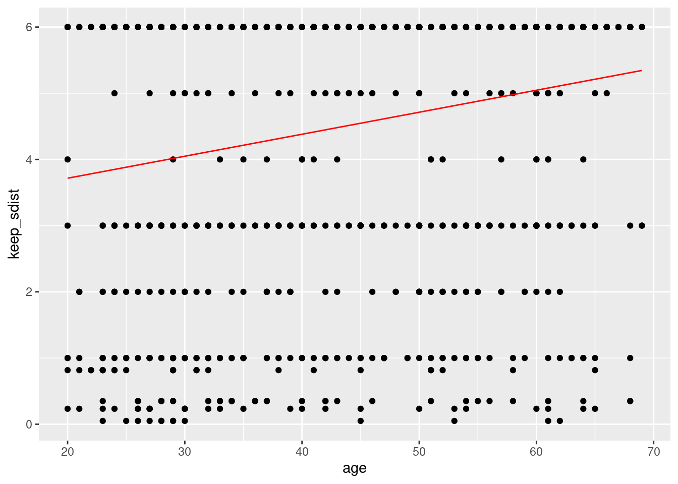
7.2.4 scatter plot of summary stat
Now I want measure the percent of '6 month or more' response according to age## # A tibble: 99 x 3
## # Groups: age [50]
## age `Q6 == 10` n
## <dbl> <lgl> <int>
## 1 20 FALSE 6
## 2 20 TRUE 4
## 3 21 FALSE 5
## 4 21 TRUE 2
## 5 22 FALSE 2
## 6 22 TRUE 5
## 7 23 FALSE 13
## 8 23 TRUE 12
## 9 24 FALSE 12
## 10 24 TRUE 11
## # … with 89 more rowsTRUE in column of Q6==10 means that participant responded as ‘6 month or more’, and the n means number of count. I want estimate proportion prob as n/sum(n)
## # A tibble: 99 x 4
## # Groups: age [50]
## age `Q6 == 10` n prob
## <dbl> <lgl> <int> <dbl>
## 1 20 FALSE 6 60
## 2 20 TRUE 4 40
## 3 21 FALSE 5 71.4
## 4 21 TRUE 2 28.6
## 5 22 FALSE 2 28.6
## 6 22 TRUE 5 71.4
## 7 23 FALSE 13 52
## 8 23 TRUE 12 48
## 9 24 FALSE 12 52.2
## 10 24 TRUE 11 47.8
## # … with 89 more rowsCan you find what I exact want in above output? for bar_plot?. Yes, the row of ’TRUE in Q6 == 10 column is what we want to know. So, I remain only TRUE raw.
covid %>%
  group_by(age) %>%
  count(Q6==10) %>%
mutate(prob = n/sum(n)*100) %>%
filter(`Q6 == 10` == TRUE) %>%
ggplot(aes(x = age, y = prob)) +
geom_point()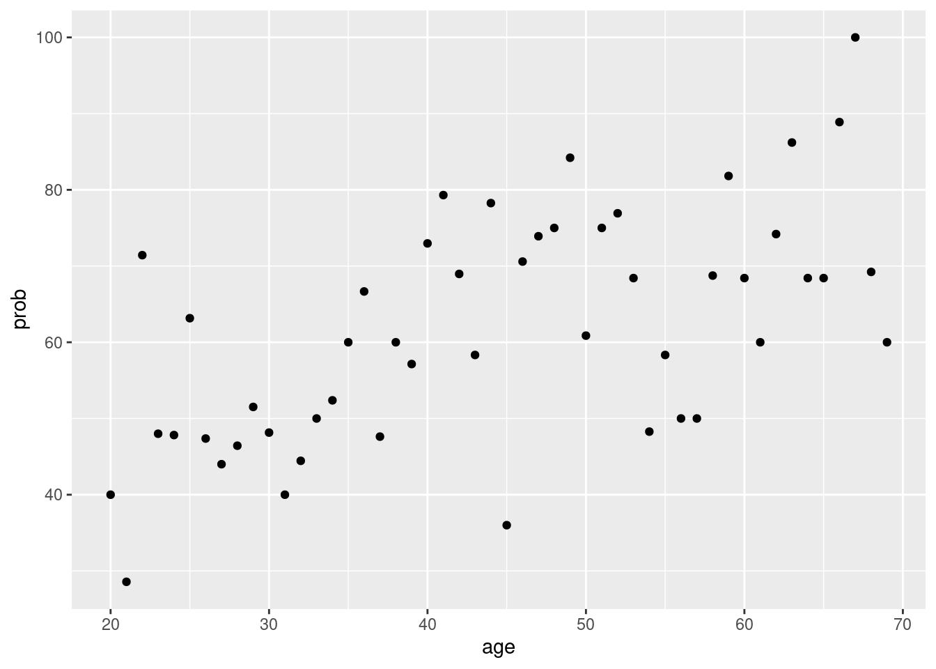
Again, we can plot regression line.
covid %>%
  group_by(age) %>%
  count(Q6==10) %>%
  mutate(prob = n/sum(n)*100) %>%
  filter(`Q6 == 10` == TRUE) %>%
  ggplot(aes(x = age, y = prob)) +
geom_point() +
geom_smooth(se=FALSE, color = 'grey')+
geom_smooth(method='lm', color ='red', se=FALSE)## `geom_smooth()` using method = 'loess' and formula 'y ~ x'## `geom_smooth()` using formula 'y ~ x'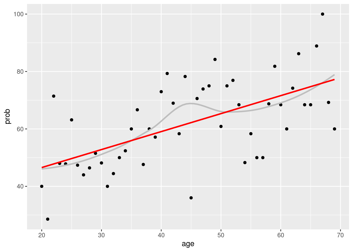
How about gender stratified graphs? We can use
group_by(gender, age) and facet_wrap(gender ~.)
covid %>%
  group_by(gender, age) %>%
  count(Q6==10) %>%
  mutate(prob = n/sum(n)*100) %>%
  filter(`Q6 == 10` == TRUE) %>%
  ggplot(aes(x = age, y = prob)) +
  geom_point() +
  geom_smooth(se=FALSE, color = 'grey')+
  geom_smooth(method='lm', color ='red', se=FALSE)+
  facet_wrap(gender ~.)
## `geom_smooth()` using method = 'loess' and formula 'y ~ x'## `geom_smooth()` using formula 'y ~ x'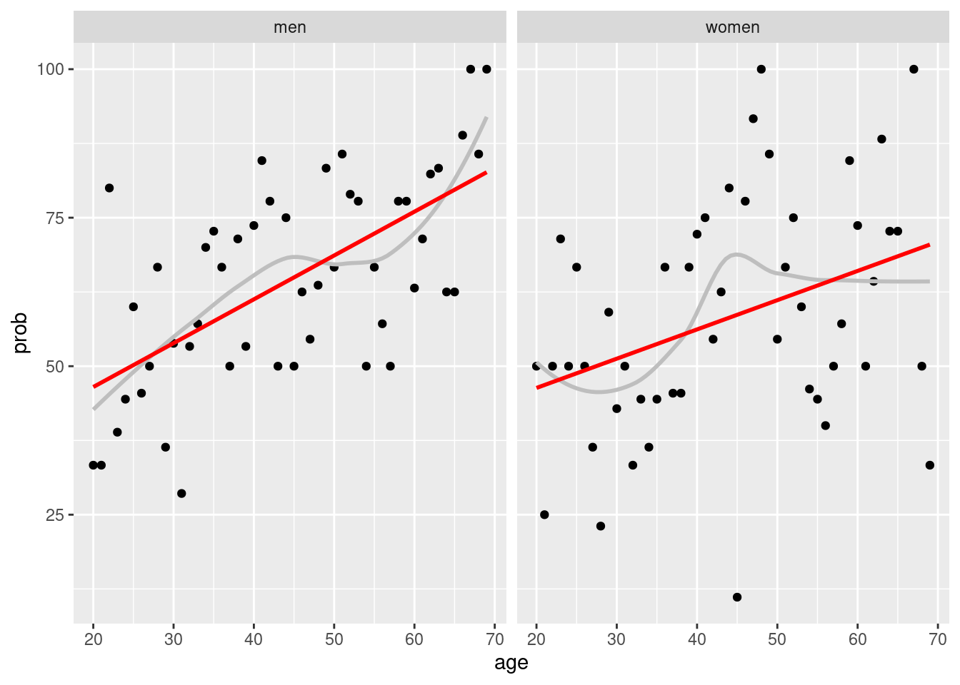
When I review above data, I want compare the gender difference according to age
covid %>%
group_by(gender, age) %>%
count(Q6==10) %>%
mutate(prob = n/sum(n)*100) %>%
filter(`Q6 == 10` == TRUE) %>%
ggplot(aes(x = age, y = prob, group = gender)) +
geom_point(aes(color = gender, size = n), alpha = 0.5) +
geom_smooth(method ='loess',
formula = y ~ x,
se=FALSE, aes(color = gender))+
theme_minimal()+
xlab('Age') +ylab('Keeping Social Distance')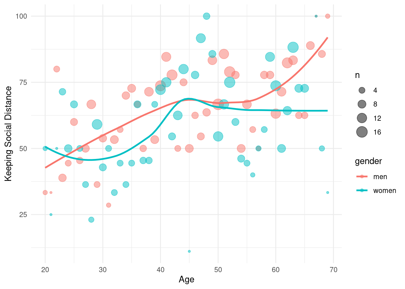 There were gender difference, women show different two groups of around 30 years old and 50 years old.
covid %>%
  group_by(gender, age) %>%
  count(Q6==10) %>%
  mutate(prob = n/sum(n)*100) %>%
  filter(`Q6 == 10` == TRUE) %>%
  ggplot(aes(x = age, y = prob, group = gender)) +
  geom_point(aes(color = gender, size = n), alpha = 0.5) +
  geom_smooth(method ='loess',
              formula = y ~ x,
              se=FALSE, aes(color = gender))+
  theme_minimal()+
  xlab('Age') +ylab('Keeping Social Distance')+
  facet_wrap(gender~.)+
  stat_density2d()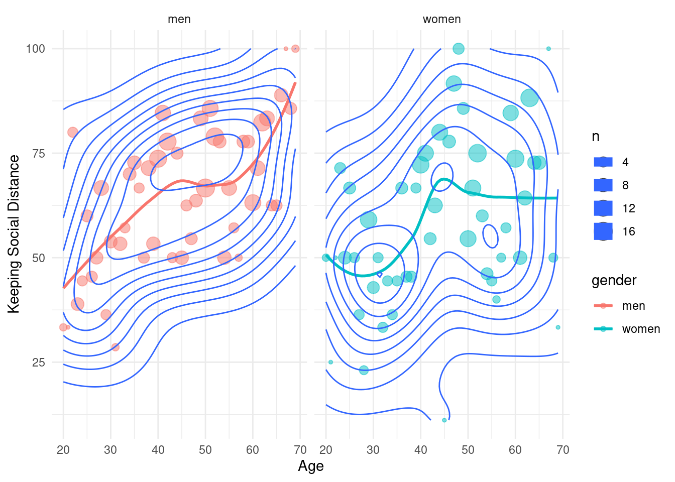
7.2.5 line chart
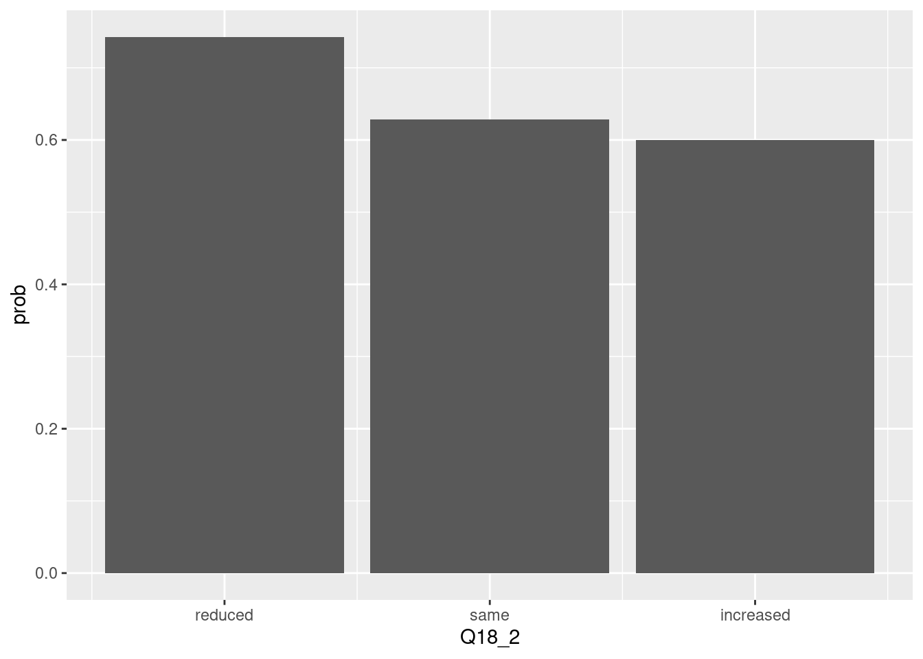
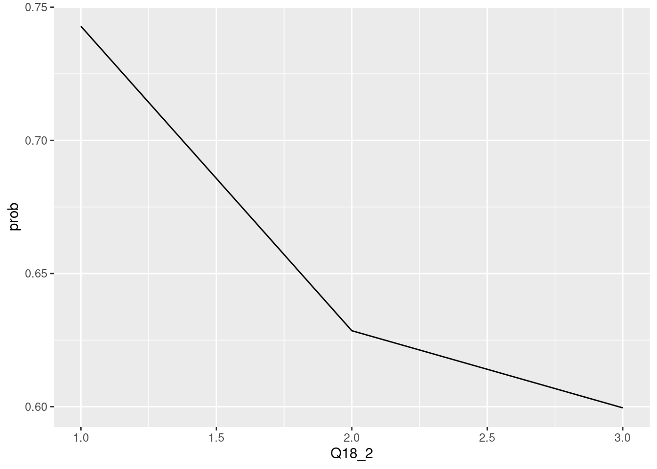
The chis-quare test is sometimes displayed via line chart. Particularly, the proportion of True and it trend can be highlighted by line chart. let’s compare the line chart and bar chart.
## <ScaleContinuousPosition>
##  Range:
##  Limits:    0 --    1
If there are multiple plot, the line chart can highlight the trends of value change.
emotion <- covid2 %>%
  select(gender, keep_sdist_ft, contains('Q18'),
     )
lifepattern <- covid2 %>%
  select(gender, keep_sdist_ft, contains('Q19'),
     )

head(emotion)
## # A tibble: 6 x 9
## gender keep_sdist_ft Q18_1 Q18_2 Q18_3 Q18_4 Q18_5 Q18_6 Q18_7
## <chr> <chr> <dbl> <dbl> <dbl> <dbl> <dbl> <dbl> <dbl>
## 1 women Yes 3 3 3 2 1 2 2
## 2 women No 2 2 2 2 2 2 2
## 3 men Yes 2 2 2 2 2 2 2
## 4 women No 2 2 2 3 1 1 2
## 5 women Yes 3 2 3 2 2 1 2
## 6 men Yes 2 2 2 2 2 2 2## # A tibble: 6 x 20
## gender keep_sdist_ft Q19_1 Q19_2 Q19_3 Q19_4 Q19_5 Q19_6 Q19_7 Q19_8 Q19_9
## <chr> <chr> <dbl> <dbl> <dbl> <dbl> <dbl> <dbl> <dbl> <dbl> <dbl>
## 1 women Yes 3 2 1 2 1 3 2 2 3
## 2 women No 2 2 1 2 2 2 2 2 2
## 3 men Yes 2 2 2 2 2 2 2 2 2
## 4 women No 2 2 2 1 2 3 2 2 2
## 5 women Yes 1 2 2 2 2 3 1 2 3
## 6 men Yes 2 2 2 1 2 2 2 2 2
## # … with 9 more variables: Q19_10 <dbl>, Q19_11 <dbl>, Q19_12 <dbl>,
## # Q19_13 <dbl>, Q19_14 <dbl>, Q19_15 <dbl>, Q19_16 <dbl>, Q19_17 <dbl>,
## # Q19_18 <dbl>colnames(emotion) <-c(
'Gender',
'keep social distancing',
'lonely',
'depressive',
'anxious',
'angry',
'Happy',
'Relaxed',
'Focused')
colnames(lifepattern)<-c(
'Gender',
'keep social distancing',
'Exercising',
'Engaging in creative activities',
'Sleeping',
'Avoiding the news',
'Helping others',
'Reading\nlistening to the news',
'Using alcohol or other drugs',
'Seeking emotional \nsupport from others',
'Spending time on social media',
'Playing games',
'Sharing funny memes\n and videos',
'Eating due to stress or boredom',
'Connecting with family\nfriends',
'Watching movies\nTV',
'Praying or meditating',
'Feeling grateful',
'Journaling',
'Working\ndoing schoolwork'
)transfome the data from wide to long
em.long <- emotion %>%
gather(-`keep social distancing`,-Gender, key ='emotion', value ='trend')
## wide to long transform will be introduced in common data model part
em.long %>%
filter(Gender =='men') %>%
group_by(emotion, trend) %>%
count(`keep social distancing`) %>%
mutate(prob = n/sum(n)) %>%
filter(`keep social distancing` == 'Yes') %>%
ggplot(aes(x=trend, y = prob)) +
geom_line()+
facet_wrap(emotion~., scales = 'free') +
theme_minimal() +
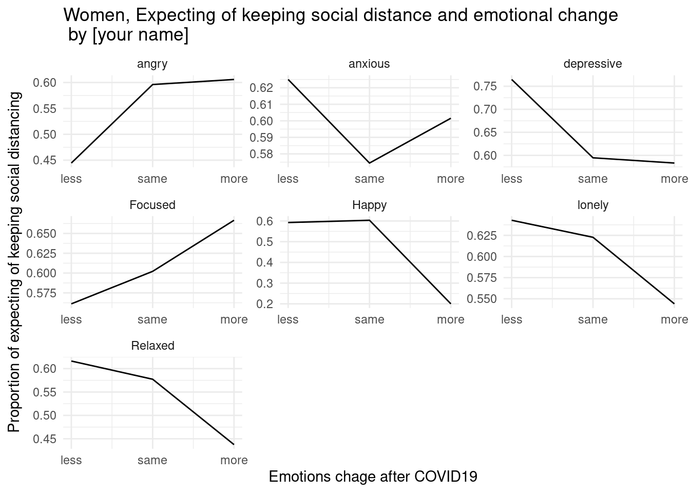
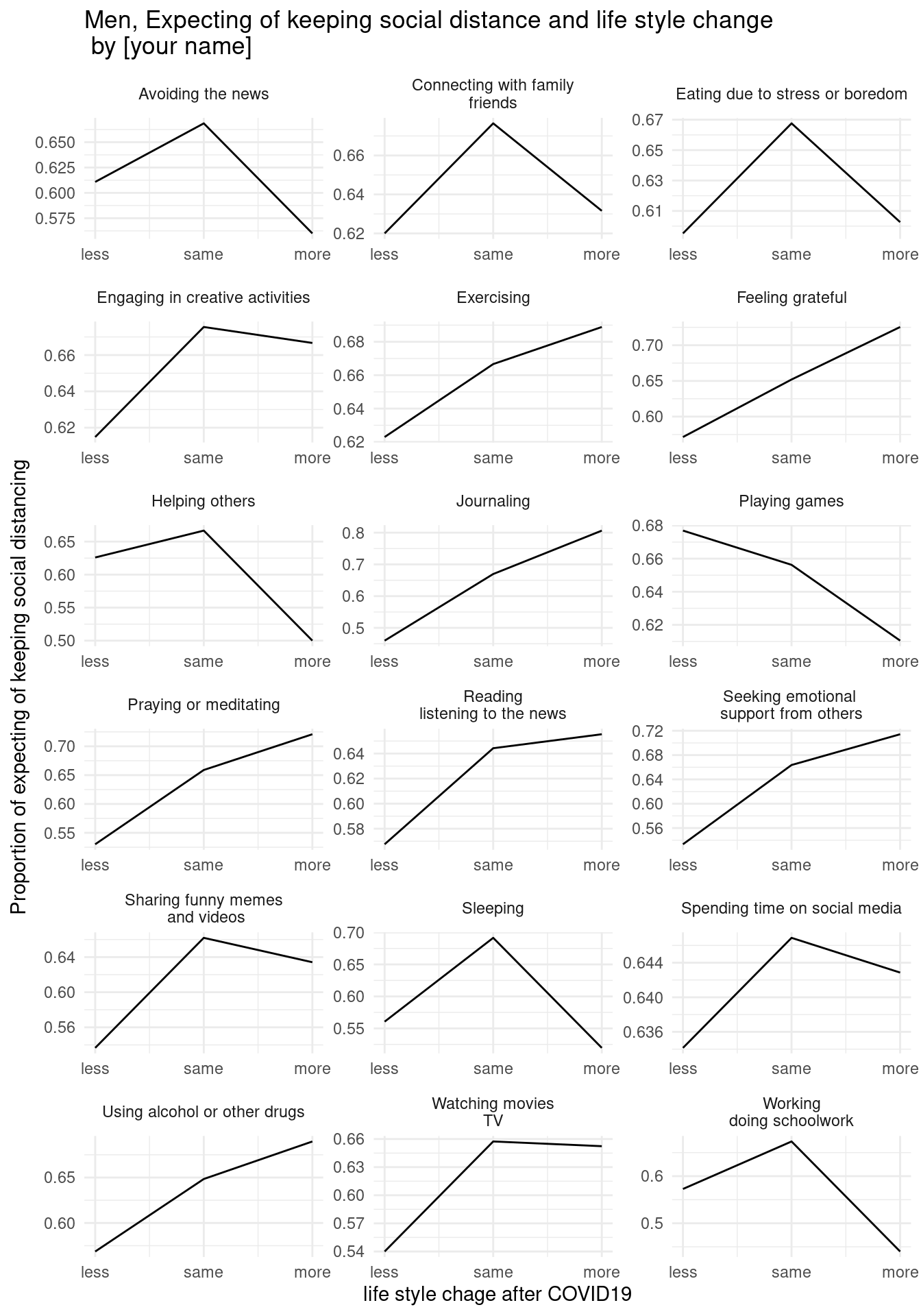
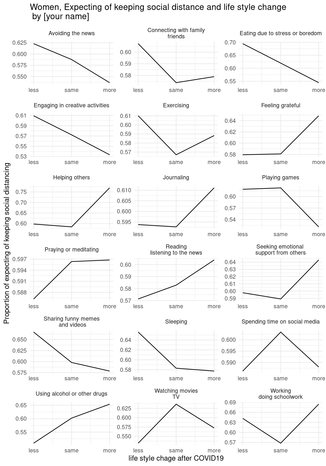
ggtitle('Men, Expecting of keeping social distance and emotional change')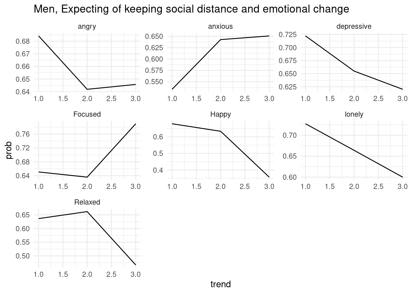
7.2.6 home work
draw below three graphs (x scale, x lab, y lab, and title changes.) and insert your name in title.
7.2.6.1 first home work
7.2.6.2 second home work
7.2.6.3 third home work
7.3 Diagram
| 동영상 | link |
|---|---|
| jinhaslab | https://youtu.be/VU6z2sc9WEY |
순서도를 그리는 것을 간략 정리하겠습니다. A -> B 로 순서도를 그립니다.
여기에 박스 모양등 여러가지 옵션을 정할 수 있습니다.
DiagrammeR::grViz("
digraph boxes_and_circles {

  # 노드를 어떻게 할지 설정
  node [shape = box]
  A; B; C

  node [shape = circle]
  1; 2; 3;4

  # 연결을 어떻게 할지 설정
  A->1 B->2 C ->3
  A->4
  }
")
순서와 위치, 그리고 색
DiagrammeR::grViz("
digraph boxes_and_circles {

  # 박스 모양 할것 정하기
  node [shape = box]
  A; B; C
  # 원 모양 할 것 정하기
  node [shape = circle]
  1; 2; 4
  #색
  abc[style = filled, fillcolor = Yellow]
  # 연결 부분
  A->1 C->2 B ->C
  A->4 C-> 4
  abc -> 3


  # 위치
  subgraph{
  rank = same; A;B;C
  }
  }
")
위아래 TB (top buttom), 왼쪽 오른쪽 (LR)에 대해 지정해 줄 수 있습니다.
DiagrammeR::grViz("digraph {

graph [layout = dot, rankdir = LR] # 왼쪽 오른쪽 방향

# 일반거 스타이 미리 지정
node [shape = rectangle, style = filled, fillcolor = grey]

dat1 [label = 'A 사업장 검진', shape = folder, fillcolor = Yellow]
dat2 [label = 'B 사업장 검진', shape = folder, fillcolor = Yellow]
dat3 [label = 'C 사업장 검진', shape = folder, fillcolor = Yellow]

cdm1 [label = '표준화1', shape = circle, fillcolor = Beige]
cdm2 [label = '표준화2', shape = circle, fillcolor = Beige]
cdm3 [label = '표준화3', shape = circle, fillcolor = Beige]

process [label =  '공통 변수/값']
statistical [label = '분산형 계산']
results [label= '결과']

# edge definitions with the node IDs
dat1 -> cdm1 dat2 -> cdm2 dat3 -> cdm3

{cdm1 cdm2 cdm3} -> process -> statistical -> results
}")
기존의 데이터의 값을 불러와서 사용할 수 있습니다. 보건학 표 만들기에서 가장 많이 사용될 만한 코드입니다. 예를 들어 1000명의 inclusion에서 100명씩 exclusion되어 800명이 남는 상황을 표현해 보겠습니다.
# Define some sample data
library(tidyverse)
data <- tibble(inc1=1000,
             exc1=100) %>%
          mutate(inc2 = inc1 - exc1)

DiagrammeR::grViz("
digraph graph2 {
node [shape=box, fontsize = 12];
    inc1;inc2;exc1
node [shape = point, width = 0, height = 0]
    ''
graph [layout = dot]

inc1 [label = '@@1']
inc2 [label = '@@2']
exc1 [label = '@@3']

inc1 -> '' [arrowhead = none]
''   -> exc1
''   -> inc2

subgraph {
      rank = same; ''; exc1;
    }
}

[1]: paste0('Total population (n = ', data$inc1, ')')
[2]: paste0('Economic activity (n = ', data$inc2, ')')
[3]: paste0('No economic activity (n = ', data$exc1, ')')


")
7.4 과제
위 digram 에서 남녀를 나누어 보세요. 아래의 그래프가 나오도록 코드를 작성하십시오. 코드를 올려주세요