2 Summarizing data
Summarizing data is an important initial step for gaining insights into addressing research questions. Data can be summarized visually and numerically. Data visualization is a well-developed field and can be the subject of a course of its own. Here we only go over the most commonly used graphs for summarizing variables and their relationships.
To illustrate concepts and examples throughout this chapter, we use the babies dataset, found in the openintro package, which is part of the Child Health and Development Studies, a comprehensive study of all pregnancies that occurred between 1960 and 1967 among women in the Kaiser Foundation Health Plan in the San Francisco-East Bay area6. The families in the study represent a broad range in economic, social and educational characteristics. To load the data, run the following command:
The dataset has the following variables:
| Variable | Description |
|---|---|
| case | Birth identifier |
| bwt | Birth weight in ounces |
| gestation | Length of pregnancy in days |
| parity | 0 = first born, 1 = not first born |
| age | Mother’s age in years |
| height | Mother’s height in inches |
| weight | Mother’s prepregnancy weight in pounds |
| smoke | Smoking status of mother; 0 = not now, 1 = yes now |
2.1 Data Wrangling
Before summarizing data, we often need to prepare them for analysis. We’ll introduce a series of functions from the dplyr package that will allow you to take a data frame and “wrangle” it (transform it) to suit your needs. Begin by calling its library:
2.1.1 filter()
The filter() function allows you to keep rows based on the values of the columns. The first argument is the data frame. The second and subsequent arguments are the conditions that must be true to keep the row. For example, we could find all births from mothers that are 35 or more years old who are having their first child, and save the filtered data in a new variable called babies2:
To view the data in R’s data viewer, type View(babies2) in your console (never use View() in an R Markdown code chunk! you will get issues when knitting the document)
2.1.2 mutate()
The job of mutate() is to add or modify columns that are calculated from the existing columns. For example, let’s compute the gestation time in weeks, and name this variable gestation_wk. We save the resulting data as babies, that is, we are simply updating the existing data:
The input .after = gestation means that we want the new column to go after the column names gestation.
2.1.3 group_by() and summarize()
Now we focus on two very important functions: group_by() and summarize().
Use group_by() to divide your dataset into groups meaningful for our analysis. This allows for summaries to be computed by groups using the function summarize().
For example, let’s compute the average gestation length (in weeks) by parity and smoke:
## `summarise()` has grouped output by 'parity'.
## You can override using the `.groups` argument.
## # A tibble: 5 × 3
## # Groups: parity [2]
## parity smoke avg_gestation
## <int> <int> <dbl>
## 1 0 0 39.9
## 2 0 1 39.6
## 3 0 NA 40.3
## 4 1 0 40.3
## 5 1 1 40.0Notice that the resulting data was not saved in any variable.
Are there any other summaries besides means? Next, we explore ways to summarize one quantitative variable.
2.2 One quantitative variable
Throughout this section, \(X_1, X_2, \dots, X_n\) denotes a numeric sample (which can be thought of as a sample of values of a quantitative variable), and its ascending ordering is written as \(X_{(1)}, X_{(2)}, \dots, X_{(n)}\). That is, \(X_{(1)}\) is the smallest value in the sample and \(X_{(n)}\) is the largest value.
2.2.1 Measures of location
Measures of location describe the tendencies of quantitative data. The most common measures of location are the mean and the median, which describe central tendency.
Definition 2.1 (Sample mean) For a numeric sample of size \(n\), the sample mean is defined as \[\overline{X} = \frac{X_1+X_2+\cdots+X_n}{n} = \frac{1}{n}\sum_{i=1}^n X_i.\]
Definition 2.2 (Sample median) For an ordered sample of size \(n\), the sample median \(\tilde{X}\) is the middle observation (if \(n\) is odd) or the average between the two middle values (if \(n\) is even). That is, \[ \tilde{X} = \left\{ \begin{array}{l} X_{(\lceil n/2 \rceil)}, \mbox{ if n is odd}\\ \frac{X_{(n/2)} + X_{(n/2+1)}}{2}, \mbox{ if n is even,} \end{array} \right. \] where the notation \(\lceil x \rceil\) represents the smallest integer greater than \(x\).
Example 2.1 (heights) Consider a sample of heights (in cm): 160, 168, 153, 172, 151. The ordered sample is 151, 153, 160, 168, 172. The mean and the median height are: \(\overline{X} = \frac{151+153+160+168+172}{5} = 160.8\) and \(\tilde{X} = X_{(3)} = 160\) (since \(n\) is odd).
In R, the functions mean and median are used to find the sample mean and median:
## [1] 160.8## [1] 160Often times, samples have missing values, and in those cases R returns an error, unless we remove the missing cells prior to calculating the mean and median. This can be done by adding na.rm = TRUE (which means remove NA’s) to the functions:
## [1] 160.8## [1] 160What if the tallest person in the sample from example 2.1 was 180 cm instead of 172 cm? How about 200 cm instead of 172 cm? How would the sample mean and median change?
It turns out that the mean is sensitive to extreme observations (outliers), while the median is not. Statistics that are not unduly affected by extreme observations or strong skewness are said to be robust.
Which one to use? In the presence of extreme values and/or strong skew, the median should be reported. Reporting both is also appropriate.
Definition 2.3 (Quantiles and quartiles) For a number \(0<p<1\), the \(p\)-quantile of a numerical sample, denoted \(Q_p\), is a value such that approximately a proportion \(p\) of the data are less than or equal \(Q_p\). For a sample of size \(n\), a p-quantile will be a value between (and possibly including) \(X_{(\lfloor p(n-1)+1 \rfloor)}\) and \(X_{(\lfloor p(n-1)+1 \rfloor + 1)}.\) The quantiles \(Q_{0.25}\), \(Q_{0.5},\) and \(Q_{0.75}\) are called quartiles (because they partition the data into four groups) and are also denoted by \(Q_1\), \(Q_2\), and \(Q_3\), respectively. There are many ways to arrive at a possible value for \(Q_p\). Here we use R’s choice of quantile function. In case you are curious, this function is:
\[Q_p = (\lfloor p(n-1)+1 \rfloor - p(n-1)) X_{(\lfloor p(n-1)+1 \rfloor)} + (1 - \lfloor p(n-1)+1 \rfloor + p(n-1)) X_{(\lfloor p(n-1)+1 \rfloor + 1)}.\]
Remarks:
If \(p(n-1)\) is an integer, then \(Q_p = X_{(\lceil pn \rceil)},\)
If \(pn\) is an integer, then \(Q_p = pX_{(pn)} + (1-p)X_{(pn+1)}.\)
\(Q_2\) is the sample median.
The notation \(\lfloor a \rfloor\) stands for the floor of \(a\), which is the highest integer less than or equal to \(a\). notation \(\lceil a \rceil\) stands for the ceiling of \(a\), which is the lowest integer higher than or equal to \(a\).
It is not important to memorize this function, but it is important to understand what we get from the sample quantiles.
Example 2.2 (quartiles of a small sample) Consider the ordered sample 3, 8, 9, 12, 15, 19, 24.
In R, the function quantile is used to find sample quantiles. The inputs are the sample and which quantiles should be returned, that is, the values of \(p\) should be provided. If no quantiles are specified, the quartiles are returned. For the current example, the quartiles are obtained by:
##   0%  25%  50%  75% 100%
##  3.0  8.5 12.0 17.0 24.0
Notice that R also returns the minimum and maximum values of sample. This tells us that approximately 25% of the sample is below 8.5 (and 75% is above). Let’s check how accurate this is: There are two values in the sample below 8.5, which means that \(2/7 \approx 28.6%\) of the sample is below 8.5. Even though this proportion is not 25%, it is close enough for such a small sample. For larger samples, this proportion will be even closer to the intended value.
If we want \(Q_{0.3}\) and \(Q_{0.7}\), the call for quantile is:
##  30%  70%
##  8.8 15.8
The 5-number summary of a quantitative variable is its minimum, maximum, \(Q_1\), \(Q_2\) (median), and \(Q_3\). The function summary in R returns the 5-number summary plus the mean of all quantitative variables in a dataset. The number of missing values is also provided. For the babies dataset this gives:
##       case             bwt          gestation      gestation_wk
##  Min.   :   1.0   Min.   : 55.0   Min.   :148.0   Min.   :21.14
##  1st Qu.: 309.8   1st Qu.:108.8   1st Qu.:272.0   1st Qu.:38.86
##  Median : 618.5   Median :120.0   Median :280.0   Median :40.00
##  Mean   : 618.5   Mean   :119.6   Mean   :279.3   Mean   :39.91
##  3rd Qu.: 927.2   3rd Qu.:131.0   3rd Qu.:288.0   3rd Qu.:41.14
##  Max.   :1236.0   Max.   :176.0   Max.   :353.0   Max.   :50.43
##                                   NA's   :13      NA's   :13
##      parity            age            height          weight
##  Min.   :0.0000   Min.   :15.00   Min.   :53.00   Min.   : 87.0
##  1st Qu.:0.0000   1st Qu.:23.00   1st Qu.:62.00   1st Qu.:114.8
##  Median :0.0000   Median :26.00   Median :64.00   Median :125.0
##  Mean   :0.2549   Mean   :27.26   Mean   :64.05   Mean   :128.6
##  3rd Qu.:1.0000   3rd Qu.:31.00   3rd Qu.:66.00   3rd Qu.:139.0
##  Max.   :1.0000   Max.   :45.00   Max.   :72.00   Max.   :250.0
##                   NA's   :2       NA's   :22      NA's   :36
##      smoke
##  Min.   :0.0000
##  1st Qu.:0.0000
##  Median :0.0000
##  Mean   :0.3948
##  3rd Qu.:1.0000
##  Max.   :1.0000
##  NA's   :10
Notice that even though parity and smoke are categorical variables, R is reading them as quantitative because we are using the numbers 0 and 1 for its levels. In this case, the mean of these variables are the proportions of 1s. If we would like for R to read these variables as categorical, we can apply the following commands:
R calls categorical variables factors. Let’s run the summary function again:
##       case             bwt          gestation      gestation_wk   parity
##  Min.   :   1.0   Min.   : 55.0   Min.   :148.0   Min.   :21.14   0:921
##  1st Qu.: 309.8   1st Qu.:108.8   1st Qu.:272.0   1st Qu.:38.86   1:315
##  Median : 618.5   Median :120.0   Median :280.0   Median :40.00
##  Mean   : 618.5   Mean   :119.6   Mean   :279.3   Mean   :39.91
##  3rd Qu.: 927.2   3rd Qu.:131.0   3rd Qu.:288.0   3rd Qu.:41.14
##  Max.   :1236.0   Max.   :176.0   Max.   :353.0   Max.   :50.43
##                                   NA's   :13      NA's   :13
##       age            height          weight       smoke
##  Min.   :15.00   Min.   :53.00   Min.   : 87.0   0   :742
##  1st Qu.:23.00   1st Qu.:62.00   1st Qu.:114.8   1   :484
##  Median :26.00   Median :64.00   Median :125.0   NA's: 10
##  Mean   :27.26   Mean   :64.05   Mean   :128.6
##  3rd Qu.:31.00   3rd Qu.:66.00   3rd Qu.:139.0
##  Max.   :45.00   Max.   :72.00   Max.   :250.0
##  NA's   :2       NA's   :22      NA's   :36
Now instead of finding the 5-number summary for parity and smoke, R returns the frequencies in which the levels of the variables occur, which is a useful summary for categorical variables.
Looking at the summary of a dataset prior to any analysis is a good way to quickly check how R is reading each variable and to get a sense for their distributions.
2.2.2 Measures of dispersion
Summarizing data with only measures of location may leave out important features of the data. For instance, consider these two samples:
Sample 1: \(-3, -2, -1, 0, 1, 2, 3\)
Sample 2: \(-300, -200, -100, 0, 100, 200, 300\).
Both the mean and median of the samples are 0, but the values in one sample have a much larger spread than the other. Therefore, to give a more complete description of these data, one should provide measures of location and dispersion. Here we define the most common measures of dispersion. For a sample of size \(n\):
Definition 2.4 The sample range is the distance between the smallest and the largest values in the sample, that is, \(X_{(n)} - X_{(1)}\).
Definition 2.5 The sample variance is given by \(S^2 = \frac{1}{n-1}\sum_{i=1}^n (X_i-\overline{X})^2\).
Definition 2.6 The sample standard deviation is the square root of the variance, that is, \(S=\sqrt{S^2} = \sqrt{\frac{1}{n-1}\sum_{i=1}^n (X_i-\overline{X})^2}\). The units of the standard deviation are the same as the units of the \(X_i's\).
Definition 2.7 The interquartile range is defined as the difference between the third and first quartiles, that is, \(IQR = Q_3 - Q_1\).
Example 2.3 Consider the sample of 5 heights from example 2.1: 151, 153, 160, 168, 172. Recall that \(\overline{X} = 160.8.\) Then:
Range = \(X_{(5)} - X_{(1)} = 172 - 151 = 21.\)
\(S^2 = \frac{(151-160.8)^2 + (153-160.8)^2 + (160-160.8)^2 + (168-160.8)^2 + (172-160.8)^2}{5-1} = 83.7.\)
\(S = \sqrt{83.7} = 9.15.\)
\(Q_1 = X_{(2)} = 153\) and \(Q_3 = X_{(4)} = 168\), which gives \(IQR = 168 - 153 = 15.\)
In R, these measures of dispersion are calculated with the functions range, var, sd, and IQR. The function range returns the minimum and maximum values of the sample instead of the difference between them.
## [1] 151 172## [1] 83.7## [1] 9.14877## [1] 15Note: The range, variance, and standard deviation are all sensitive to outliers, while the IQR is robust.
2.2.3 Histograms
A histogram is a plot that visualizes the distribution of a quantitative variable as follows:
We first divide the x-axis into a series of equally-sized bins, where each bin represents a range of values.
For each bin, we count the number of observations that fall in the range corresponding to that bin, including the lowest endpoint of the bin, but not the highest (one can also choose to include the highest instead of the lowest endpoint, but R’s default is the lowest).
Then for each bin, we draw a bar whose height marks the corresponding count.
We’ll use the package ggplot2 for plotting, so let’s call it:
Example 2.4 Histogram for length of pregnancy:
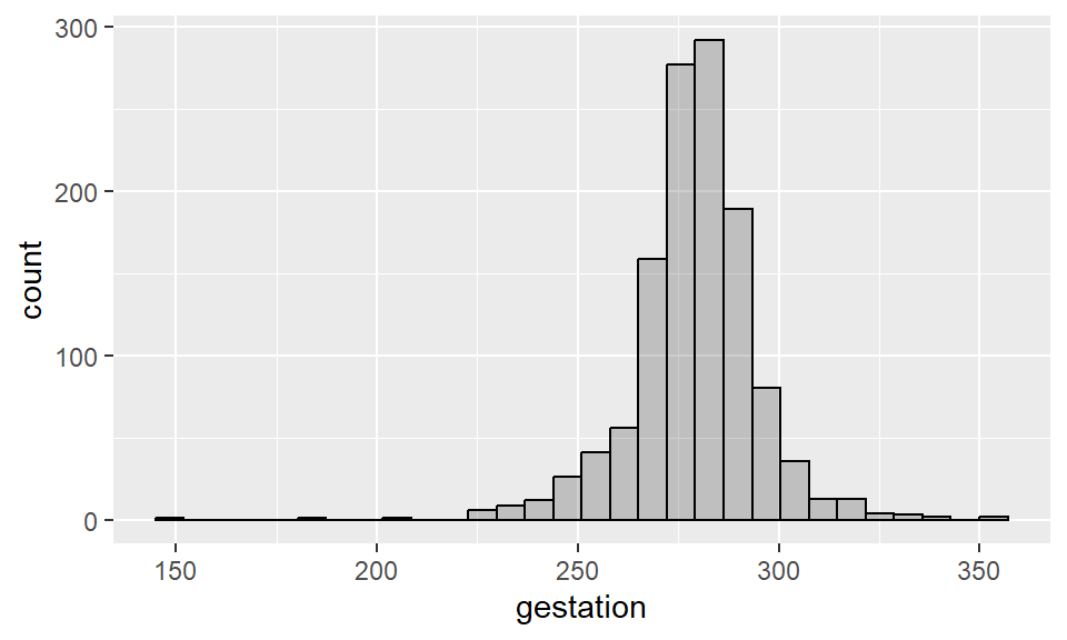
Recall that the input alpha = 0.3 sets the transparency of the geometry (in this case, the bars) to be 0.3. The input col = black sets the borders of the bars to black.
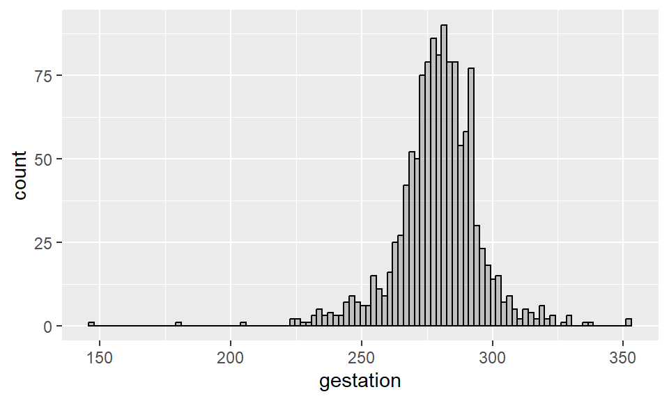
By default, R tries to use 30 bins when constructing a histograms. To change the number of bins, use the input bins = ? within the function geom_histogram().
Example 2.5 Histogram for length of pregnancy (more bins):
Sometimes it is convenient to plot a histogram such that the sum of the areas of all bars equals 1. This is a way to connect histograms with probability distributions (which we will talk about later) by adding a density to it. To make such histogram in R, add aes(y = ..density..) as one of the inputs of geom_histogram().
Example 2.6 Density histogram for length of pregnancy (total area is 1):
ggplot(data = babies, aes(x = gestation)) +
  geom_histogram(aes(y = ..density..), alpha = 0.3, col = "black")
Notice that the shape of this histogram is identical to the first one we built - the only difference is the y-axis scale, which has changed to that the areas of the bins sum to 1. We can also add a “kernel density” to this histogram, as follows:
ggplot(data = babies, aes(x = gestation)) +
  geom_histogram(aes(y = ..density..), alpha = 0.3, col = "black") +
  geom_density()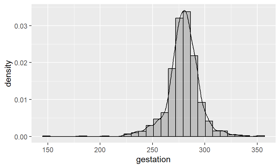
2.2.4 Density plots
A density plot, or kernel density plot, is a variation of a density histogram that uses smoothing to plot the distribution of values. In R, we use the same commands as the previous example, but without the histogram, to obtain a density plot.
Example 2.7 Density plot for length of pregnancy (total area is 1):

2.2.5 Boxplots
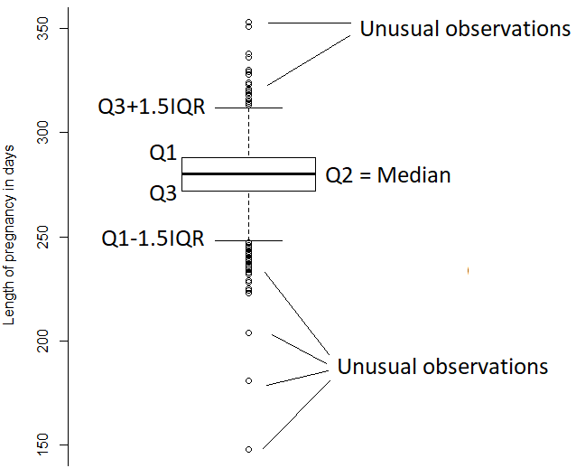
A boxplot is a chart constructed from the information provided in the five-number summary of a quantitative variable. More specifically, it displays \(Q_1\), \(Q_2\) (median), \(Q_3\), the largest between the minimum and \(Q_1-1.5\times IQR\), and the smallest between the maximum and \(Q_3+1.5\times IQR\). In R, we use the layer geom_boxplot to construct such chart.
Example 2.8 Boxplot for length of pregnancy:

You can also ask for a horizontal boxplot by providing the x-coordinate in aes(), instead of the y-coordinate:

Here are the components of the plot:
2.2.6 Shapes of distributions
If the shape of the histogram or density plot of a quantitative variable has a longer tail to the right, we say that the variable is right skewed or positively skewed. If there’s a longer tail to the left we say that the variable is left skewed or negatively skewed. If the histogram or density plot show no clear skewness, then the variable is said to have a symmetric distribution.
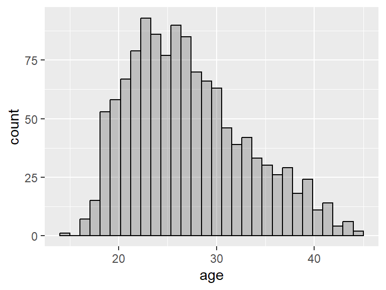
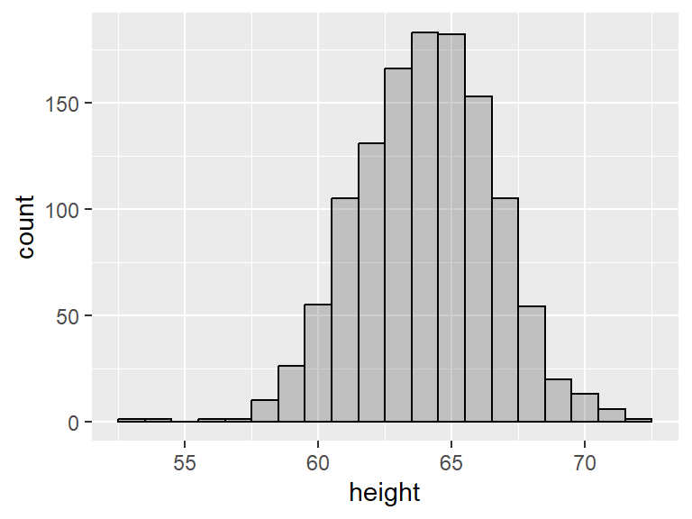
For example, the variable age in the babies dataset is slightly right skewed, while the variable height is fairly symmetric.
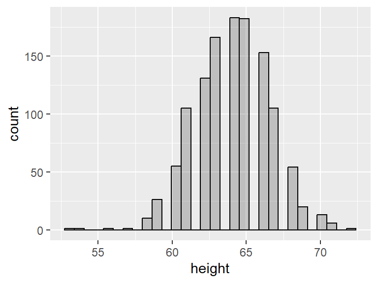
Notice the gaps in the histogram. This is because R has chosen a bin width that is less than 1 and most people report their heights as integers. We can ask for a bin of a specific size by adding binwidth = as an input of geom_histogram():
For symmetric distributions, the mean tends to be fairly close to the median, while for skewed distributions, the mean and the median are further apart. More specifically, for right-skewed distributions, the mean tends to be greater than the median, and the opposite is true for left-skewed distributions. Here we use geom_vline() to add vertical lines to the histograms. The blue line shows the mean and red line shows the median:
ggplot(data = babies, aes(x = age)) +
geom_histogram(alpha = 0.3, col = "black") +
geom_vline(xintercept = mean(babies$age, na.rm = T), col = "blue", size = 1.5) +
geom_vline(xintercept = median(babies$age, na.rm = T), col = "red", size = 1.5)
ggplot(data = babies, aes(x = height)) +
geom_histogram(alpha = 0.3, col = "black", binwidth = 1) +
geom_vline(xintercept = mean(babies$height, na.rm = T), col = "blue", size = 1.5) +
geom_vline(xintercept = median(babies$height, na.rm = T), col = "red", size = 1.5)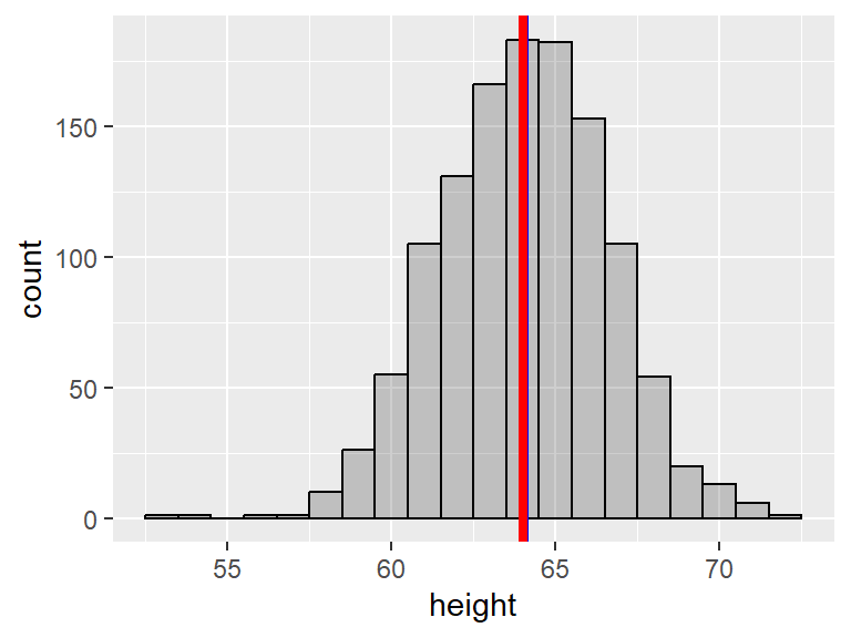
Notice how the mean and the median nearly coincide in the last plot.
2.3 One categorical variable
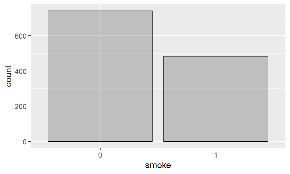
The most common way to summarize a single categorical variable is to list its possible categories (levels) together with how often they occur (as a frequency or proportion), as we have seen in the last summary example from section 2.2.1. For example, the number of smokers and non-smokers in the babies dataset are:
## # A tibble: 3 × 2
##   smoke     n
##   <fct> <int>
## 1 0       742
## 2 1       484
## 3 <NA>     10
To compute the relative frequency of each category, we can add a variable to this table that divides n by the sum of all n. We’ll make use of the pipe operator, since we’ll apply a sequence of functions to the data:
## # A tibble: 3 × 3
##   smoke     n proportion
##   <fct> <int>      <dbl>
## 1 0       742    0.600
## 2 1       484    0.392
## 3 <NA>     10    0.00809
2.3.1 Barplots
Barplots summarize the counts of each level in a categorical variable. In R, we can construct a barplot using the layer geom_bar.
Example 2.9 Barplot for smoking status of the mother:

If you don’t want to show the additional column for missing values (NA), we can filter the data to only include non-missing values for the variable smoke:
The expression !is.na(smoke) selects non-missing values for smoke. Here we also made use of the pipe operator |>, which assigns the object preceding the pipe as the first input of the function to the right of the pipe. For instance, the previous command could also have been written without pipes, in the following (less clear) way:

2.4 Two quantitative variables
2.4.1 Scatterplots
Scatterplots allow us to visualize the relationship between two numerical variables by using the x-axis for one variable and the y-axis for the other. It’s a convention to place an explanatory variable on the x-axis. In ggplot, we use the layer geom_point() to construct a scatterplot.
Example 2.10 Scatterplot for birth weight vs pregnancy length:
ggplot(data = babies, aes(x = gestation, y = bwt)) +
  geom_point(alpha = 0.3) +
  xlab("Length of pregnancy in days") +
  ylab("Birth weight in ounces")
Notice how we also changed the x a y labels here.
2.4.2 Correlations
A correlation is a numerical summary for the relationship between two quantitative variables. We will present it under simple linear regression (chapter 3) since there’s a natural connection between correlations and the slope of a line.
2.5 Two categorical variables
2.5.1 Contingency tables
A contingency table is a convenient way to summarize two categorical variables. In such a table, we count the occurrences of the levels of one variable split by the levels of the other variable. In R, the function table is used (with two input variables).
Example 2.11 Contingency table for parity vs mother’s smoking status:
##
##       0   1
##   0 548 363
##   1 194 121
Since both variables have the same 2 levels (0 and 1), it can be difficult to tell which one is which. We can add labels using dnn = and we can also ask R to include a count for NAs in these two variables:
##       smoke
## parity   0   1 <NA>
##      0 548 363   10
##      1 194 121    0
2.5.2 Stacked barplots
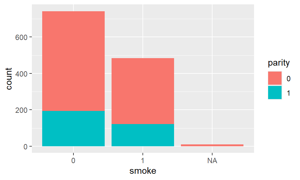
Stacked barplots can summarize two categorical variables by splitting the bars of a barplot into the levels of another variable. Within the asthetics in ggplot, add fill = parity to fill the bars with the levels of parity. We use the layer geom_bar to construct such graph.
Example 2.12 Stacked barplot for smoking_status and parity:
2.5.3 Mosaic plots
Mosaic plots also summarize two categorical variables. The lengths and widths of the mosaic bars represent the counts for the levels of the two categorical variables. In R, we use the package ggmosaic to build such plot.
Example 2.13 Mosaic plot for parity vs mother’s smoking status:
library(ggmosaic)
ggplot(babies) +
  geom_mosaic(aes(x = product(smoke), fill = parity)) +
  theme_mosaic()
The plot above is typical of two variables that are likely independent, which is indicated by the tiles being very aligned.
2.6 One quantitative and one categorical variable
2.6.1 Side-by-side boxplots
Side-by-side boxplots are great for displaying the distribution of a quantitative variable by the levels of a categorical variable. That is, a boxplot is constructed for each of the levels. In ggplot, the layer geom_boxplot() has the capability of doing such graph.
Example 2.14 Side-by-side boxplot for birth weight vs mother’s smoking status:
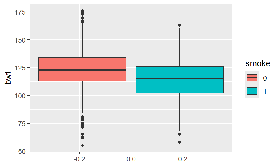
It appears to be the case that birth weight is on average lower for mothers who smoke.
2.6.2 Side-by-side density plots
Side-by-side density plots can also display the distribution of a quantitative variable by the levels of a categorical variable; it makes a density plot for each of the levels. In R, we can use the same geom_density() function we used to make one density plot.
Example 2.15 Side-by-side density plot for birth weight vs mother’s smoking status:

This plot also indicates that birth weight is on average lower for mothers who smoke.
In summary:
Visualizing one Variable:
Numerical: Histogram, density plot, boxplot
Categorical: bar plot
Visualizing two variables:
Numerical x Numerical: scatter plot
Categorical x Numerical: side-byside boxplots, side-by-side density plots
Categorical x Categorical: stacked bar plots, mosaic plot
2.7 A word on statistical inference
So far, we have looked at ways to summarize data, but we have not attempted to carry out any statistical inference, which is the practice of using probability to draw conclusions about populations (or processes) from sample data. Statistical inference can be grounded in theoretical or simulated results - we save the theoretical approach for the later part of the course and provide a simulation-based example in section 2.7.1.
Statistical inference usually falls into two categories: hypothesis testing or parameter estimation. For now, let’s look at an example that illustrates how simulation can help perform hypothesis testing.
2.7.1 Malaria vaccine example
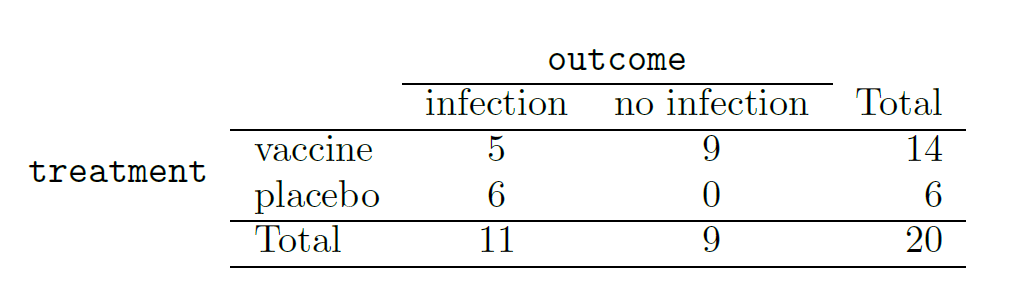
We consider a study on a new malaria vaccine called PfSPZ.7 In this study, volunteer patients were randomized into one of two groups: 14 patients received an experimental vaccine and 6 patients received a placebo vaccine. Nineteen weeks later, all 20 patients were exposed to a drug-sensitive malaria virus strain. The motivation of using a drug-sensitive strain of the virus was for ethical considerations, allowing any infections to be treated effectively. The results are summarized in the table below, where 9 of the 14 treatment patients remained free of signs of infection while all of the 6 patients in the control group patients showed some baseline signs of infection.
Is this an observational study or an experiment? What implications does the study type have on what can be inferred from the results?8
In this study, a smaller proportion of patients who received the vaccine showed signs of an infection (35.7% versus 100%). However, the sample is very small, and it is unclear whether the difference provides convincing evidence that the vaccine is effective.
Statisticians are sometimes called upon to evaluate the strength of evidence. When looking at the rates of infection for patients in the two groups in this study, what comes to mind as we try to determine whether the data show convincing evidence of a real difference? The observed infection rates (35.7% for the treatment group versus 100% for the control group) suggest the vaccine may be effective. However, we cannot be sure if the observed difference represents the vaccine’s efficacy or is just from random chance. Generally there is a little bit of fluctuation in sample data, and we wouldn’t expect the sample proportions to be exactly equal, even if the truth was that the infection rates were independent of getting the vaccine. Additionally, with such small samples, perhaps it’s common to observe such large differences when we randomly split a group due to chance alone!9
This is a reminder that the observed outcomes in the data sample may not perfectly reflect the true relationships between variables since there is random noise. While the observed difference in rates of infection is large, the sample size for the study is small, making it unclear if this observed difference represents effcacy of the vaccine or whether it is simply due to chance. We label these two competing claims, \(H_0\) and \(H_A\), which are called the null and alternative hypotheses.
\(H_0\): Independence model. The variables treatment and outcome are independent. They have no relationship, and the observed difference between the proportion of patients who developed an infection in the two groups, 64.3%, was due to chance.
\(H_A\): Alternative model. The variables are not independent. The difference in infection rates of 64.3% was not due to chance, and vaccine affected the rate of infection.
What would it mean if the independence model, which says the vaccine had no influence on the rate of infection, is true? It would mean 11 patients were going to develop an infection no matter which group they were randomized into, and 9 patients would not develop an infection no matter which group they were randomized into. That is, if the vaccine did not affect the rate of infection, the difference in the infection rates was due to chance alone in how the patients were randomized.
Now consider the alternative model: infection rates were influenced by whether a patient received the vaccine or not. If this was true, and especially if this influence was substantial, we would expect to see some difference in the infection rates of patients in the groups. We choose between these two competing claims by assessing if the data conflict so much with \(H_0\) that the independence model cannot be deemed reasonable. If this is the case, and the data support \(H_A\), then we will reject the notion of independence and conclude that the vaccine affected the rate of infection.
2.7.2 Simulating the study
We’re going to implement simulations, where we will pretend we know that the malaria vaccine being tested does not work. Ultimately, we want to understand if the large difference we observed is common in these simulations. If it is common, then maybe the difference we observed was purely due to chance. If it is very uncommon, then the possibility that the vaccine was helpful seems more plausible. The results table from section 2.7.1 shows that 11 patients developed infections and 9 did not. For our simulation, we will suppose the infections were independent of the vaccine and we were able to rewind back to when the researchers randomized the patients in the study. If we happened to randomize the patients differently, we may get a different result in this hypothetical world where the vaccine doesn’t influence the infection. Let’s complete another randomization using a simulation.
In this simulation, we take 20 notecards to represent the 20 patients, where we write down “infection” on 11 cards and “no infection” on 9 cards. In this hypothetical world, we believe each patient that got an infection was going to get it regardless of which group they were in, so let’s see what happens if we randomly assign the patients to the treatment and control groups again. We thoroughly shuffle the notecards and deal 14 into a vaccine pile and 6 into a placebo pile. Finally, we tabulate the results, which are shown in the table below.
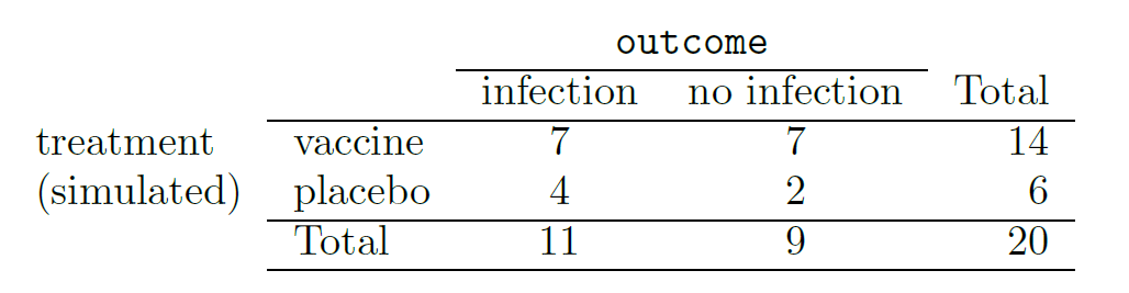
What is the difference in infection rates between the two simulated groups in the table above? How does this compare to the observed 64.3% difference in the actual data?10
While in this first simulation, we physically dealt out notecards to represent the patients, it is more efficient to perform this simulation using a computer. Repeating the simulation on a computer several times, we have a good idea of what represents the distribution of differences from chance alone. The following plot shows a stacked dot plot of the differences found from 100 simulations, where each dot represents a simulated difference between the infection rates (control rate minus treatment rate). Note that the distribution of these simulated differences is centered around 0. We simulated these differences assuming that the independence model was true, and under this condition, we expect the difference to be “near” zero with some random fluctuation, where near is pretty generous in this case since the sample sizes are so small in this study.
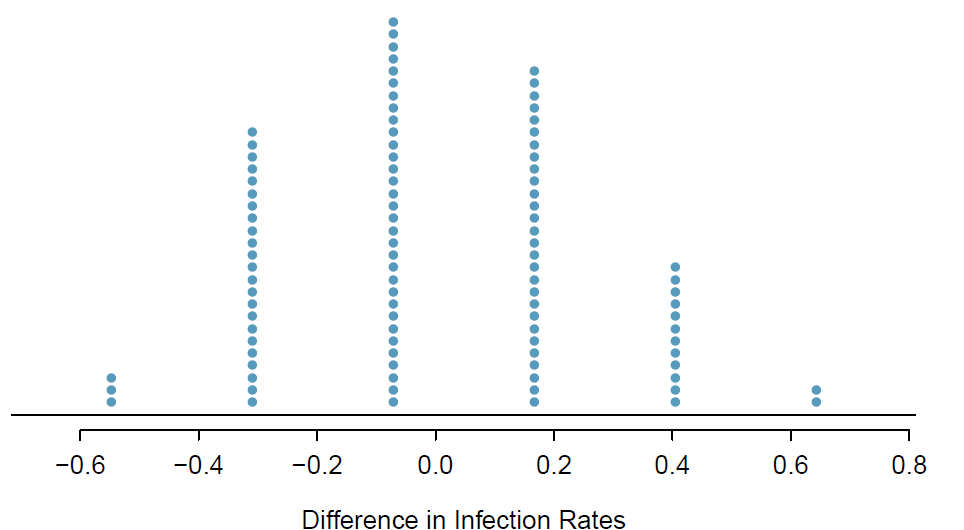
How often would you observe a difference of at least 64.3% (0.643) according to the figure above? Often, sometimes, rarely, or never?
It appears that a difference of at least 64.3% due to chance alone would only happen about 2% of the time according to the stacked dot plot. Such a low probability indicates a rare event.
The difference of 64.3% being a rare event suggests two possible interpretations of the results of the study:
\(H_0\): Independence model. The vaccine has no effect on infection rate, and we just happened to observe a difference that would only occur on a rare occasion.
\(H_A\): Alternative model. The vaccine has an effect on infection rate, and the difference we observed was actually due to the vaccine being effective at combatting malaria, which explains the large difference of 64.3%.
Based on the simulations, we have two options. (1) We conclude that the study results do not provide strong evidence against the independence model. That is, we do not have sufficiently strong evidence to conclude the vaccine had an effect in this clinical setting. (2) We conclude the evidence is sufficiently strong to reject \(H_0\) and assert that the vaccine was useful. When we conduct formal studies, usually we reject the notion that we just happened to observe a rare event. So in this case, we reject the independence model in favor of the alternative. That is, we are concluding the data provide evidence that the vaccine provides some protection against malaria in this clinical setting.
The practice of statistical inference is built on evaluating whether such differences are due to chance. When performing statistical inference, one evaluates which model is most reasonable given the data. Errors do occur, just like rare events, and we might choose the wrong model. While we do not always choose correctly, statistical inference gives us tools to control and evaluate how often these errors occur. We spend two chapters (5 and 6) building a foundation of probability and the theory necessary to make that discussion more rigorous.
J. Yerushalmy. The relationship of parents’ cigarette smoking to outcome of pregnancy - implications as to the problem of inferring causation from observed associations. Am. J. Epidemiol., 93:443-456, 1971.↩︎
This is currently one of the most promising malaria vaccines. A news release for this preliminary study can be found at the National Institutes of Health website (nih.gov - use the search bar to find studies on PfSPZ).↩︎
The study is an experiment, as patients were randomly assigned an experiment group. Since this is an experiment, the results can be used to evaluate a causal relationship between the malaria vaccine and whether patients showed signs of an infection.↩︎
To grasp why smaller samples tend to have more variable results, think of the intuitive example of flipping coins: the proportion of heads in 10 coin flips is more variable than the proportion of heads in 100 coin flips. That is, suppose Juliana was to flip 10 coins 10 times and Carol was to flip 10 coins 100 times, with both recording the proportion of heads obtained for each coin. Which 10 proportions would be more variable, Juliana’s (small sample) or Carol’s (large sample)? Which one is more likely to see 70% of heads, for example? If the coins are not biased, they both have the same chance of getting heads, but the number of flips say something about how variable those proportions can be.↩︎
4/6 - 7/14 = 0.167 or about 16.7% in favor of the vaccine. This difference due to chance is much smaller than the difference observed in the actual groups.↩︎