Chapter 12 Analysis of a two-group RCT
![]()
12.1 Learning objectives
By the end of this chapter, you will be able to:
- Interpret output from a t-test
- Understand why Analysis of Covariance is often recommended to analyze outcome data
12.2 Planning the analysis
Statisticians often complain that researchers will come along with a set of data and ask for advice as to how to analyse it. In his Presidential Address to the First Indian Statistical Congress in 1938, Sir Ronald Fisher (one of the most famous statisticians of all time) commented:
“To consult the statistician after an experiment is finished is often merely to ask him to conduct a post mortem examination. He can perhaps say what the experiment died of.”
His point was that very often the statistician would have advised doing something different in the first place, had they been consulted at the outset. Once the data are collected, it may be too late to rescue the study from a fatal flaw.
Many of those who train as allied health professionals get rather limited statistical training. We suspect it is not common for them to have ready access to expert advice from a statistician. We have, therefore, a dilemma: many of those who have to administer interventions have not been given the statistical training that is needed to evaluate their effectiveness.
We do not propose to try to turn readers of this book into expert statisticians, but we hope to instill a basic understanding of some key principles that will make it easier to read and interpret the research literature, and to have fruitful discussions with a statistician if you are planning a study.
12.3 Understanding p-values
When we do an intervention study, we want to find out whether a given intervention works. Most studies use an approach known as Null Hypothesis Significance Testing, which gives us a rather roundabout answer to the question. Typically, findings are evaluated in terms of p-values, which tell us what is the probability (p) that our result, or a more extreme one, could have arisen if there is no real effect of the intervention - or in statistical jargon, if the null hypothesis is true. The reason why we will sometimes find an apparent benefit of intervention, even when there is none, is down to random variation, as discussed in Chapter @ref{intro}. Suppose in a hypothetical world we have a totally ineffective drug, and we do 100 studies in large samples to see if it works. On average, in five of those studies (i.e. 5 per cent of them), the p-value would be below .05. And in one study (1 per cent), it would be below .01. The way that p-values are calculated assumes certain things hold true about the nature of the data (“model assumptions”): we will say more about this later on.
P-values are very often misunderstood, and there are plenty of instances of wrong definitions being given even in textbooks. The p-value is the probability of the observed data or more extreme data, if the null hypothesis is true. It does not tell us the probability of the null hypothesis being true. And it tells us nothing about the plausibility of the alternative hypothesis, i.e., that the intervention works.
An analogy might help here. Suppose you are a jet-setting traveller and you wake up one morning confused about where you are. You wonder if you are in Rio de Janiero - think of that as the null hypothesis. You look out of the window and it is snowing. You decide that it is very unlikely that you are in Rio. You reject the null hypothesis. But it’s not clear where you are. Of course, if you knew for sure that you were either in Reykjavík or Rio, then you could be pretty sure you were in Reykjavík. But suppose it was not snowing. This would not leave you much the wiser.
A mistake often made when interpreting p-values is that people think it tells us something about the probability of a hypothesis being true. That is not the case. There are alternative Bayesian methods that can be used to judge the relativel likelihood of one hypothesis versus another, given some data, but they do not involve p-values.
A low p-value allows us to reject the null hypothesis with a certain degree of confidence, but this does no more than indicate “something is probably going on here - it’s not just random” - or, in the analogy above, “I’m probably not in Rio”.
Criticisms of the use of p-values
There are many criticisms of the use of p-values in science, and a good case can be made for using alternative approaches, notably methods based on Bayes theorem. Our focus here is on Null Hypothesis Significance Testing in part because such a high proportion of studies in the literature use this approach, and it is important to understand p-values in order to evaluate the literature. It has also been argued that p-values are useful provided people understand what they really mean (Lakens, 2021).
One reason why many people object to the use of p-values is that they are typically used to make a binary decision: we either accept or reject the null hypothesis, depending on whether the p-value is less than a certain value. In practice, evidence is graded, and it can be more meaningful to express results in terms of the amount of confidence in alternative interpretations, rather than as a single accept/reject cutoff (Quintana & Williams, 2018).
In practice, p-values are typically used to divide results into “statistically significant” or “non-significant”, depending on whether the p-value is low enough to reject the null hypothesis. We do not defend this practice, which can lead to an all-consuming focus on whether p-values are above or below a cutoff, rather than considering effect sizes and strength of evidence. However, it is important to appreciate how the cutoff approach leads to experimental results falling into 4 possible categories, as shown in Table 12.1.
| Intervention effective | Intervention ineffective | |
|---|---|---|
| Reject Null hypothesis | True Positive | False Positive (Type I error) |
| Do Not Reject Null Hypothesis | False Negative (Type II error) | True Negative |
The ground truth is the result that we would obtain if we were able to administer the intervention to the whole population - this is of course impossible, but we assume that there is some general truth that we are aiming to discover by running our study on a sample from the population. We can see that if the intervention really is effective, and the evidence leads us to reject the null hypothesis, we have a True Positive, and if the intervention is ineffective and we accept the null hypothesis, we have a True Negative. Our goal is to design our study so as to maximize the chances that our conclusion will be correct, but there two types of outcome that we can never avoid, but which we try to minimize, known as Type I and Type II errors. We will cover Type II errors in Chapter 13 and Type I in Chapter 14.
12.4 What kind of analysis is appropriate?
The answer to the question “How should I analyse my data?” depends crucially on what hypothesis is being tested. In the case of an intervention trial, the hypothesis will usually be “did intervention X improve the outcome Y in people with condition Z?” There is, in this case, a clear null hypothesis – that the intervention was ineffective, and the outcome of the intervention group would have been just the same if it had not been done. The null hypothesis significance testing approach answers just that question: it tells you how likely your data are if the the null hypothesis was true. To do that, you compare the distribution of outcome scores in the intervention group and the control group. And as emphasized earlier, we don’t just look at the difference in mean outcomes between two groups, we consider whether that difference is greater than you’d expect given the variation within the two groups. (This is what the term “analysis of variance” refers to).
If the observed data indicate a difference between groups that is unlikely to be due to chance, this could be because the intervention group does better than the control group, or because they do worse than the control group. If you predict that the two groups might differ but you are not sure whether the control group or the intervention group will be superior, then it is appropriate to do a two-tailed test, that considers the probability of both outcomes. If, however, you predict that any difference is likely to be in favour of the intervention group, you can do a one-tailed test, which focuses only on differences in the predicted direction.
12.5 Sample dataset with illustrative analysis
To illustrate data analysis, we will use a real dataset that can be retrieved from the ESRC data archive (Burgoyne et al., 2016). We will focus only on a small subset of the data, which comes from an intervention study in which teaching assistants administered an individual reading and language intervention to children with Down syndrome. A wait-list RCT design was used (see Chapter 19), but we will focus here on just the first two phases, in which half the children were randomly assigned to intervention, and the remainder formed a control group. Several language and reading measures were included in the study, giving a total of 11 outcomes. Here we will illustrate the analysis with just one of the outcomes - letter-sound coding - which was administered at baseline (t1) and immediately after the intervention (t2). Results from the full study have been reported by Burgoyne et al. (2012).
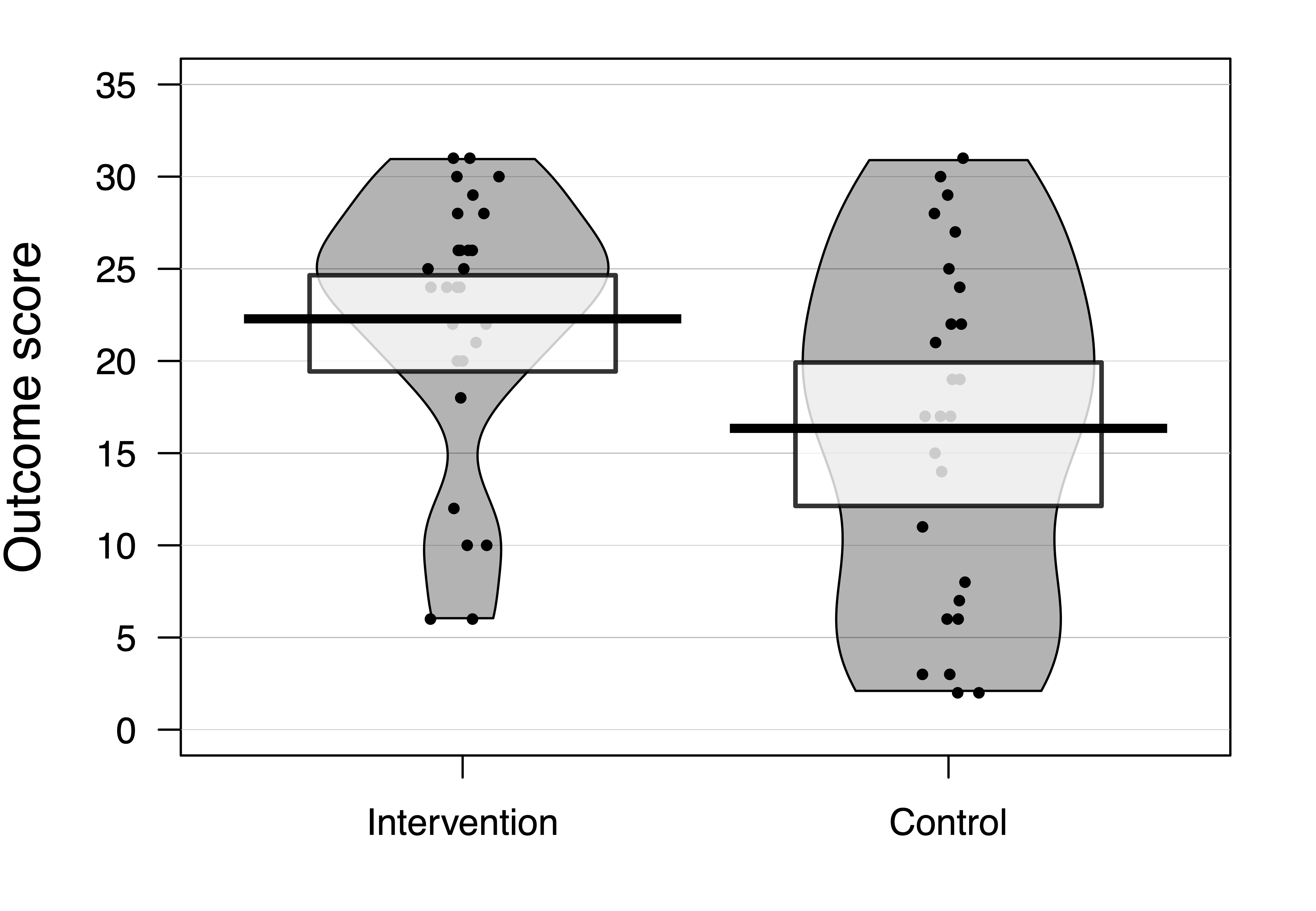
Figure 12.1: Data from RCT on language/reading intervention for Down syndrome by Burgoyne et al, 2012
Figure 12.1 shows results on letter-sound coding after one group had received the intervention. This test had also been administered at baseline, but we will focus first just on the outcome results.
Raw data should always be inspected prior to any data analysis, in order to just check that the distribution of scores looks sensible. One hears of horror stories where, for instance, an error code of 999 got included in an analysis, distorting all the statistics. Or where an outcome score was entered as 10 rather than 100. Visualizing the data is useful when checking whether the results are in the right numerical range for the particular outcome measure. There are many different ways of visualizing data: it is best to use one that shows the distribution of data, and even individual data points if the sample is not too big. S. Zhang et al. (2022) showed that the traditional way of presenting only means and error bars in figures can be misleading, and leads people to overestimate group differences. A pirate plot such as that in Figure 12.1 is one useful way of showing means and distributions as well as individual data points (Phillips, 2017). A related step is to check whether the distribution of the data meets the assumptions of the proposed statistical analysis. Many common statistical procedures assume that data are normally distributed on an interval scale (see Chapter 3). Statistical approaches to checking of assumptions are beyond the scope of this book, but there are good sources of information on the web, such as this website for linear regression: http://www.sthda.com/english/articles/39-regression-model-diagnostics/161-linear-regression-assumptions-and-diagnostics-in-r-essentials/. But just eyeballing the data is useful, and can detect obvious cases of non-normality, cases of ceiling or floor effects, or “clumpy” data, where only certain values are possible. Data with these features may need special treatment and it is worth consulting a statistician if they apply to your data. For the data in Figure 12.1, although neither distribution has a classically normal distribution, we do not see major problems with ceiling or floor effects, and there is a reasonable spread of scores in both groups.
| Group | N | Mean | SD |
|---|---|---|---|
| Intervention | 28 | 22.286 | 7.282 |
| Control | 26 | 16.346 | 9.423 |
The next step is just to compute some basic statistics to get a feel for the effect size. Table 12.2 shows the mean and standard deviation on the outcome measure for each group. The mean is the average of the individual datapoints shown in Figure 12.1, obtained by just summing all scores and dividing by the number of cases. The standard deviation gives an indication of the spread of scores around the mean, and as we have seen, is a key statistic for measuring an intervention effect. In these results, one mean is higher than the other, but there is overlap between the groups. Statistical analysis gives us a way of quantifying how much confidence we can place in the group difference: in particular, how likely is it that there is no real impact of intervention and the observed results just reflect the play of chance. In this case we can see that the difference between means is around 6 points and the average SD is around 8.
12.5.1 Simple t-test on outcome data
The simplest way of measuring the intervention effect is to just compare outcome measures on a t-test. We can use a one-tailed test with confidence, assuming that we anticipate outcomes will be better after intervention. One-tailed tests are often treated with suspicion, because they can be used by researchers engaged in p-hacking (see Chapter 14), but where we predict a directional effect, they are entirely appropriate and give greater power than a two-tailed test: see this blogpost by Daniël Lakens: http://daniellakens.blogspot.com/2016/03/one-sided-tests-efficient-and-underused.html[lakens2016b].
When reporting the result of a t-test, researchers should always report all the statistics: the value of t, the degrees of freedom, the means and SDs, and the confidence interval around the mean difference, as well as the p-value. This not only helps readers understand the magnitude and reliability of the effect of interest: it also allows for the study to readily be incorporated in a meta-analysis. Results from a t-test for the data in Table 12.2 are shown in Table 12.3. Note that with a one-tailed test, the confidence interval on one side will extend to infinity (denoted as Inf): this is because a one-tailed test assumes that the true result is greater than a specified mean value, and disregards results that go in the opposite direction.
| t | df | p | mean diff. | lowerCI | upperCI |
|---|---|---|---|---|---|
| 2.602 | 52 | 0.006 | 5.94 | 2.117 | Inf |
12.5.2 T-test on difference scores
The t-test on outcomes is easy to do, but it misses an opportunity to control for one unwanted source of variation, namely individual differences in the initial level of the language measure. For this reason, researchers often prefer to take difference scores: the difference between outcome and baseline measures, and apply a t-test to these. In fact, that is what we did in the fictional examples of dietary intervention above: we reported weight loss rather than weight for each group before and after intervention. That seems sensible, as it means we can ignore individual differences in initial weights in the analysis.
While this had some advantages over reliance on raw outcome measures, it also has disadvantages, because the amount of change that is possible from baseline to outcome is not the same for everyone. A child with a very low score at baseline has more “room for improvement” than one who has an average score. For this reason, analysis of difference scores is not generally recommended.
12.5.3 Analysis of covariance on outcome scores
Rather than taking difference scores, it is preferable to analyse differences in outcome measures after making a statistical adjustment that takes into account the initial baseline scores, using a method known as analysis of covariance or ANCOVA. In practice, this method usually gives results that are similar to those you would obtain from an analysis of difference scores, but the precision is greater, making it easier to detect a true effect. However, the data do need to meet certain assumptions of the method.
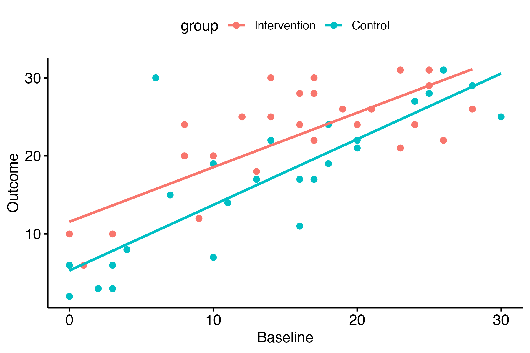
Figure 12.2: Baseline vs outcome scores in the Down syndrome data
This website walks through the steps for performing an ANCOVA in R, starting with a plot to check that there is a linear relationship between pretest vs posttest scores in both groups - i.e. the points cluster around a straight line, as shown in Figure 12.2.
Inspection of the plot confirms that the relationship between pretest and outcome looks reasonably linear in both groups. Note that it also shows that there are rather more children with very low scores at pretest in the control group. This is just a chance finding - the kind of thing that can easily happen when you have relatively small numbers of children randomly assigned to groups.
| Effect | DFn | DFd | F | p | ges |
|---|---|---|---|---|---|
| group | 1 | 52 | 6.773 | 0.012 | 0.115 |
| Effect | DFn | DFd | F | p | ges |
|---|---|---|---|---|---|
| baseline | 1 | 51 | 94.313 | 0.000 | 0.649 |
| group | 1 | 51 | 9.301 | 0.004 | 0.154 |
The effect size is shown as ges, which stands for “generalized eta squared”. You can see there is a large ges value, and correspondingly low p-value for the baseline term, reflecting the strong correlation between baseline and outcome shown in Figure 12.2. In effect, with ANCOVA, we adjust scores to remove the effect of the baseline on the outcome scores; in this case, we can then see a slightly stronger effect of the intervention: the effect size for the group term is higher and the p-value is lower than with the previous ANOVA.
For readers who are not accustomed to interpreting statistical output, the main take-away message here is that you get a better estimate of the intervention effect if the analysis uses a statistical adjustment that takes into account the baseline scores.
T-tests, analysis of variance, and linear regression
Mathematically, the t-test is equivalent to two other methods: analysis of variance and linear regression. When we have just two groups, all of these methods achieve the same thing: they divide up the variance in the data into variance associated with group identity, and other (residual) variance, and provide a statistic that reflects the ratio between these two sources of variance. This is illustrated with the real data analysed in Table 12.4. The analysis gives results that are equivalent to the t-test in Table 12.3: if you square the t-value it is the same as the F-test. In this case, the p-value from the t-test is half the value of that in the ANOVA: this is because we specified a one-tailed test for the t-test. The p-value would be identical to that from ANOVA if a two-tailed t-test had been used.
12.5.4 Non-normal data
We’ve emphasised that the statistical methods reviewed so far assume that data will be reasonably normally distributed. This raises the question of what to do if we have results that don’t meet that assumption. There are two answers that are typically considered. The first is to use non-parametric statistics, which do not require normally-distributed data (Corder & Foreman, 2014). For instance, the Mann-Whitney U test can be used in place of a t-test. An alternative approach is to transform the data to make it more normal. For instance, if the data is skewed with a long tail of extreme values, a log transform may make the distribution more normal. This is often appropriate if, for instance, measuring response times. Many people are hesitant about transforming data - they may feel it is wrong to manipulate scores in this way. There are two answers to that. First, it does not make sense to be comfortable with nonparametric statistics and uncomfortable with data transformation, because nonparametric methods involve transformation - typically they work by rank ordering data, and then working with the ranks, rather than the original scores. Second, there is nothing inherently correct about measuring things on a linear scale: scientists often use log scales to measure quantities that span a wide range, such as the Richter scale for earthquakes or the decibel scale for sound volume. So, provided the transformation is justified as helping make the data more suited for statistical analysis, it is a reasonable thing to do. Of course, it is not appropriate to transform data just to try and nudge data into significance. Nor is it a good idea to just wade in and apply a data transformation without first looking at the data to try and understand causes of non-normality. For instance, if your results showed that 90% of people had no effect of intervention, and 10% had a huge effect, it might make more sense to consider a different approach to analysis altogether, rather than shoe-horning results into a more normal distribution. We will not go into details of nonparametric tests and transformations here, as there are plenty of good sources of information available. We recommend consulting a statistician if data seem unsuitable for standard parametric analysis.
12.5.5 Linear mixed models (LMM) approach
Increasingly, reports of RCTs are using more sophisticated and flexible methods of analysis that can, for instance, cope with datasets that have missing data, or where distributions of scores are non-normal.
An advantage of the LMM approach is that it can be extended in many ways to give appropriate estimates of intervention effects in more complex trial designs - some of which are covered in Chapter 17 to Chapter 20. Disadvantages of this approach are that it is easy to make mistakes in specifying the model for analysis if you lack statistical expertise, and the output is harder for non-specialists to understand. If you have a simple design, such as that illustrated in this chapter, with normally distributed data, a basic analysis of covariance is perfectly adequate (O’Connell et al., 2017).
Table 12.6 summarises the pros and cons of different analytic approaches.
| Method | Features | Ease of understanding | Flexibility |
|---|---|---|---|
| t-test | Good power with 1-tailed test. Suboptimal control for baseline. Assumes normality. | High | Low |
| ANOVA | With two-groups, equivalent to t-test, but two-tailed only. Can extend to more than two groups. | … | … |
| Linear regression/ ANCOVA | Similar to ANOVA, but can adjust outcomes for covariates, including baseline. | … | … |
| LMM | Flexible in cases with missing data, non-normal distributions. | Low | High |
12.6 Check your understanding
- Figure 12.3 shows data from a small intervention trial in the form of a boxplot. If you are not sure what this represents, try Googling for more information. Check your understanding of the annotation in the top left of the plot. How can you interpret the p-value? What does the 95% CI refer to? Is the “mean.diff” value the same as shown in the plot?
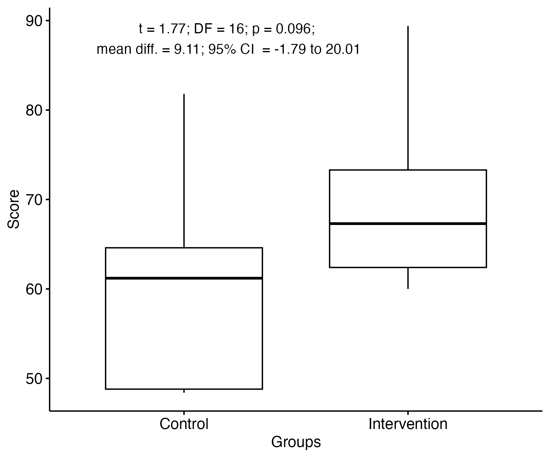
Figure 12.3: Sample data for t-test in boxplot format
- Find an intervention study of interest and check which analysis method was used to estimate the intervention effect. Did the researchers provide enough information to give an idea of the effect size, or merely report p-values? Did the analysis method take into account baseline scores in an appropriate way?