4 Chapter 4: Supervised Learning
4.1 Introduction
- Sometimes, you know the ‘labels’ of the subjects, or objects under study.
- These may be biological features, as in the penguins and crabs data
- These may be clinical outcomes, such as lived or died.
- In a classification problem, we want to be able to make good predictions of the subject labels using the available feature set.
- This is distinctly different from cluster label assignment, say in model-based clustering
- Here, we don’t know the labels, and just want to make an assignment that separates homogeneous groups.
- We can borrow some of the notions of similarity that we developed in cluster analysis to exploit similarity to classify observations.
- This is distinctly different from cluster label assignment, say in model-based clustering
4.1.1 Training vs. Test data
- Typical classification problems involve a training set of data, in which a model is fit that attempts to capture enough of the structure in the features of the process so that new observations from a test (or withheld) data set may be classified.
- For some of our discussion, we will not have a test set; the data as a whole will be used to build the model, and the predictions for each observation form the ‘test’ much as in regression modeling.
- However, just as in regression, this is likely to be overfitting to a specific dataset, if there are new samples or simply new observations expected, or if predictive (rather than descriptive) modeling is the goal
- The goal of description is non-trivial, and sometimes leads to insights in and of itself.
- Procedures to prevent overfitting will be discussed subsequently.
- The goal of description is non-trivial, and sometimes leads to insights in and of itself.
4.2 K-Nearest Neighbor (K-NN) Classification
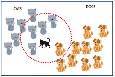
- Imagine a dataset in which you have the labels of ALL observations except for one. What would be a good guess as to the label of the remaining observation?
- Answer: the label of the nearest neighbor, which would be the observation with the minimum distance to the new point.
- As we discussed in the case of clustering, there are many choices for distance, but we often use the Euclidean distance, with properly rescaled variables (often called features in this context).
4.2.1 K-NN Illustration with penguins data
- Visualized in 2-D.
- Observation 68 is surrounded by a blue triangle to indicate that we (pretend we) don’t know its label, and then we take wider and wider radius circles until we ‘hit’ the nearest neighbor.
- The circle would be a hyper-sphere in 3-D space
- Note: it looks like we might assign the ‘blue’ observation to the red group, but that point is actually ‘black’.
- Observation 68 is surrounded by a blue triangle to indicate that we (pretend we) don’t know its label, and then we take wider and wider radius circles until we ‘hit’ the nearest neighbor.
Code
plot(penguins[,c(3,4)],col=penguins$species,cex=.8,pch=16)
#possible points: 60  68  76
points(penguins[68,c(3,4)],pch=2,col=4,cex=1)
points(penguins[68,c(3,4)],pch=1,col=4,cex=8.6)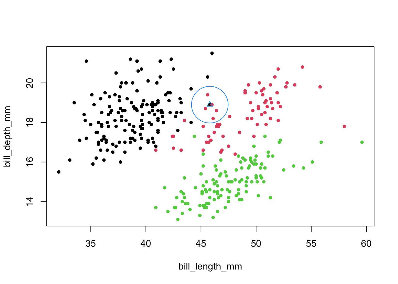
- We repeat this idea on the whole dataset, looking for the nearest neighbor and assigning the ‘new’ observation its group.
- The newly assigned label is the outer circle.
Code
newLabel <- class::knn.cv(penguins[,3:5],cl=penguins$species,k=1)
plot(penguins[,c(3,4)],col=penguins$species,pch=16,cex=.8)
points(penguins[,c(3,4)],pch=1,col=as.numeric(newLabel),cex=1.1)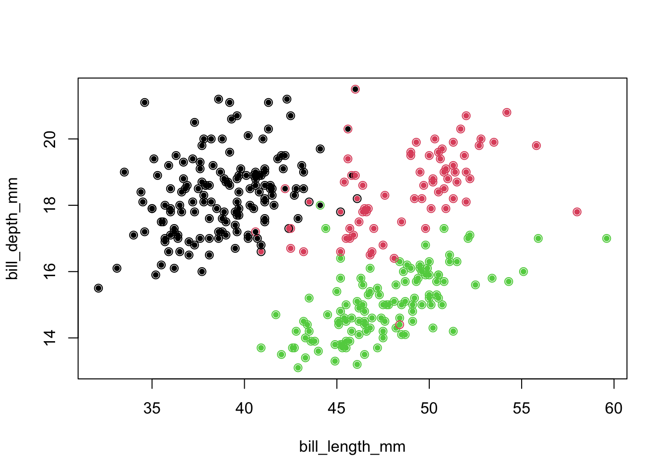
4.2.2 Confusion matrix
- We assess the ‘success’ of this approach to classification with a confusion matrix
- This is a crosstab of truth to assigned labels
- Note: we include all species, even though some are easy to classify, for completeness
- This is a crosstab of truth to assigned labels
Code
table(penguins$species,newLabel)## newLabel
## Adelie Chinstrap Gentoo
## Adelie 140 5 1
## Chinstrap 5 63 0
## Gentoo 0 1 118- We assigned twelve observations incorrectly.
4.2.4 K-NN with \(K>1\)
- One can take the nearest neighbor idea a bit further, with \(K>1\)
- We look at 5, or 7 nearest neighbors and take the majority vote for the label
- The use of odd \(K\) tends to remove ‘ties’.
- There are principled ways to choose \(K\) (e.g., cross-validation), which we discuss in subsequent handouts.
- We look at 5, or 7 nearest neighbors and take the majority vote for the label
Code
newLabel5 <- knn.cv(penguins[,3:5],cl=penguins$species,k=5)
newLabel7 <- knn.cv(penguins[,3:5],cl=penguins$species,k=7)
Code
par(mfrow=c(1,2))
plot(penguins[,c(3,4)],col=penguins$species,pch=16,cex=.8,main='knn; k=5')
points(penguins[,c(3,4)],pch=1,col=as.numeric(newLabel5),cex=1.1)
plot(penguins[,c(3,4)],col=penguins$species,pch=16,cex=.8,main='knn; k=7')
points(penguins[,c(3,4)],pch=1,col=as.numeric(newLabel7),cex=1.1)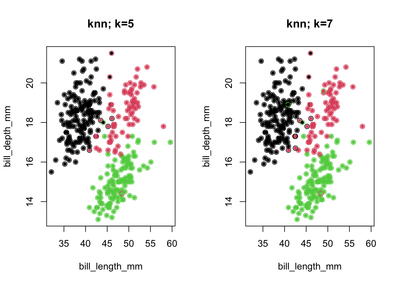
4.2.5 Confusion matrices
Code
table(penguins$species,newLabel5)## newLabel5
## Adelie Chinstrap Gentoo
## Adelie 142 3 1
## Chinstrap 5 63 0
## Gentoo 0 1 118Code
table(penguins$species,newLabel7)## newLabel7
## Adelie Chinstrap Gentoo
## Adelie 141 3 2
## Chinstrap 7 60 1
## Gentoo 0 1 118- Note that the overall success rate for 7 NN was worse than for 5 NN!
- We merely did a better job with one species at the expense of another
- What might we have done differently in terms of the feature metric (knowing that nearest neighbor is defined by Euclidean distance)?
- Perhaps standardize to prevent one feature from dominating?
- You can try it: classification could be worse!
- Would replacing features with a full set of PCs from a PCA have changed anything?
- No, because (a full) PCA preserves distances.
- Perhaps standardize to prevent one feature from dominating?
4.3 Projection-based methods
- Many classification methods produce a lower-dimensional projection of the information contained in the feature set and use these new components to guide the assignment of observations to groups.
- Logistic regression example: we try to predict sex from the five features given in the crabs data.
- One logistic regression model is: \({\mathop{\rm logit}\nolimits} (\Pr (sex = Male)) = {b_0} + {b_1}{\rm{FL + }}{b_2}{\rm{RW + }}{b_3}{\rm{CL + }}{b_4}{\rm{CW + }}{b_5}{\rm{BD}}\)
- We can use the inverse logit function \(\frac{{{e^{\hat y}}}}{{1 + {e^{\hat y}}}}\) to convert any predictions \(\hat{y}\), which will be in logit ‘units’ to probabilities.
- Logistic regression example: we try to predict sex from the five features given in the crabs data.
4.3.1 Example
- After fitting this model, we get the following prediction equation, for the logit: \({\rm{\hat y = 24.6 - 6.2FL - 20.0RW + 9.7CL - 0.6CW + 2.9BD}}\)
- \(\frac{{{e^{\hat y}}}}{{1 + {e^{\hat y}}}}\) will yield predicted probabilities in the range 0 to 1 as we require.
- These values for the 200 crabs are mostly near 0 or 1
- In other words, they classify with a fair amount of certainty
- But in the cases in which they are closer to 0.5, we have a good chance of misclassification.
- Below is a plot that reveals correct and incorrect classification.
- It is a ‘superimposed’ set of the classification probabilities.
Code
crabs <- read.dta("./Datasets/crabs.dta")
inv.logit <- function(x) exp(x)/(1+exp(x))
logit.fit1 = glm(I(sex=="Male")~FL+RW+CL+CW+BD,data=crabs,family='binomial')
probMale <- inv.logit(predict(logit.fit1))
df <- data.frame(sex=crabs$sex,prob=probMale)
gg <- ggplot(df, aes(x=prob, color=sex)) + geom_histogram(fill="white", alpha=0.5, position="identity") + labs(x="Prob(Male)",y='Frequency')
Code
gg## `stat_bin()` using `bins = 30`. Pick better value with `binwidth`.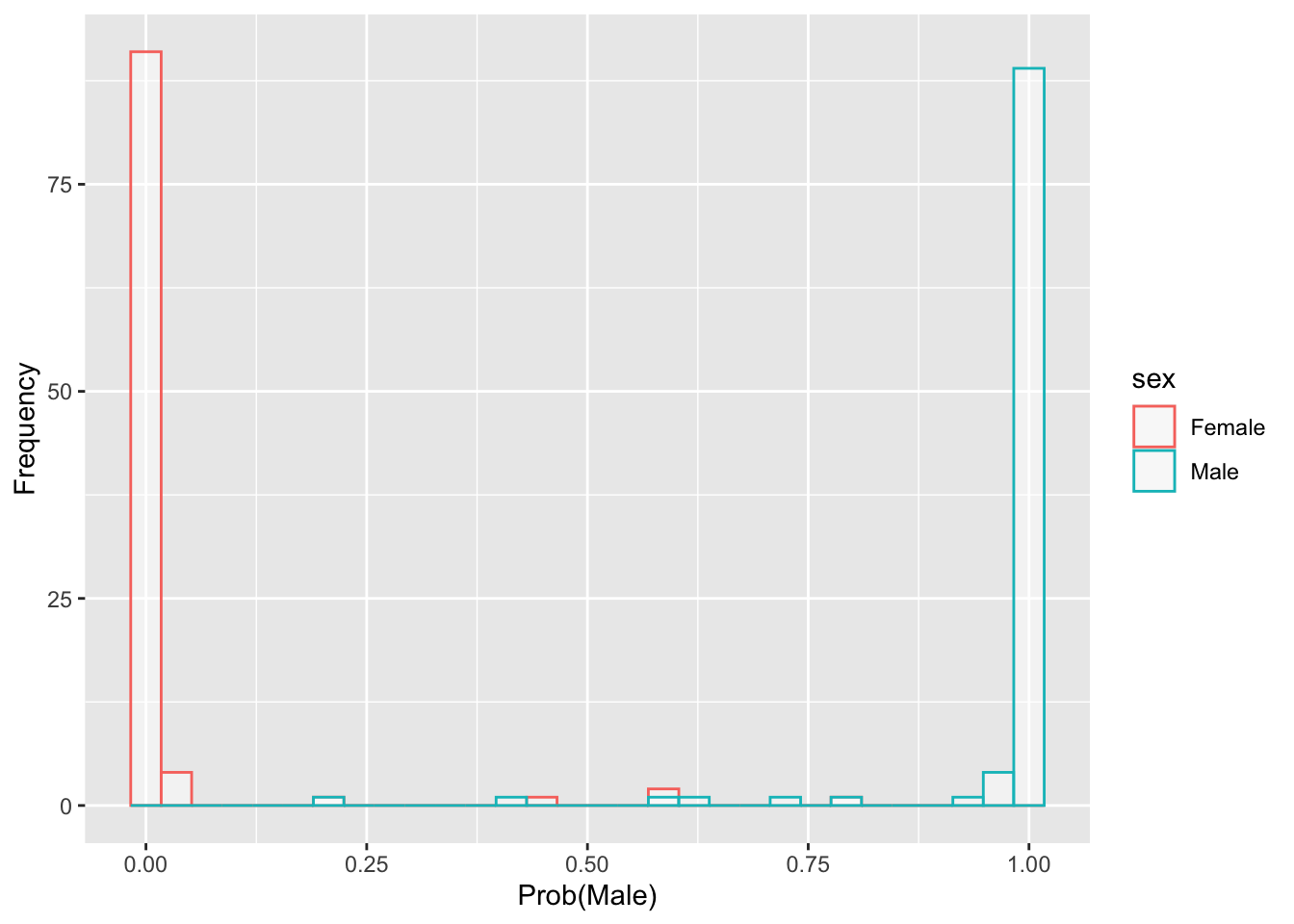
4.4 Multinomial Logistic Regression example
- We try to predict species (Adelie, Chinstrap, Gentoo), from the three features given in the penguins data.
- The multinomial logistic regression model (2 formulas) is:
\[ \begin{array}{l} \log (\Pr (species = Ch)/\Pr (species = Ad)) = \\ {b_{01}} + {b_{11}}{\rm{BL + }}{b_{21}}{\rm{BD + }}{b_{31}}{\rm{FL}} \\ \\ \log (\Pr (species = Ge)/\Pr (species = Ad)) = \\ {b_{02}} + {b_{12}}{\rm{BL + }}{b_{22}}{\rm{BD + }}{b_{32}}{\rm{FL}} \end{array} \]
- We chose ‘Adelie’ as the reference group because it was listed first in alphabetical order.
- There can be challenges with the model fits
- Logit models don’t handle perfect or near perfect prediction very well.
- When one group is completely separated from the other, regression coefficients tend toward \(\pm\infty\) and standard errors are unreliable.
- Logit models don’t handle perfect or near perfect prediction very well.
- One workaround in data of this type is to remove the Adelie from the analysis and do binary logistic regression.
- You get about the same results, but it is more stable.
- Another approach involves Bayesian methods, which keep the estimates away from perfect prediction (see glmBayes, chapter 1).
- Nevertheless, we visualize the predictions from the multinomial logit models:
4.4.1 MNlogit example
Code
multinom.fit <- nnet::multinom(species~bill_length_mm+bill_depth_mm+ flipper_length_mm,data=penguins)## # weights: 15 (8 variable)
## initial value 365.837892
## iter 10 value 13.577492
## iter 20 value 8.807802
## iter 30 value 7.830394
## iter 40 value 7.645109
## iter 50 value 7.639216
## final value 7.637947
## convergedCode
preds <- predict(multinom.fit,type='probs')
df <- reshape2::melt(data.frame(preds,TrueSpecies=penguins$species))
## Using TrueSpecies as id variablesCode
gg<-ggplot(df, aes(x=value, color=TrueSpecies)) + geom_histogram(fill="white", alpha=0.5, position="dodge") + labs(x='Prob(facet species)',y='Frequency') + facet_grid(variable~"Facet")Code
gg## `stat_bin()` using `bins = 30`. Pick better value with `binwidth`.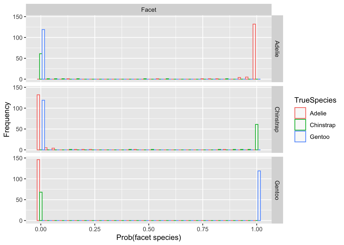
- Note how the Pr(Facet) is near 1 for nearly all blue points in the Gentoo facet.
- Similarly for the other facet rows, which are predictions for the probability of the species labeled on that row.
- There are only a few points (red or green) for which there is some ambiguity.
4.5 Discriminant function as a projection
- Above, we conceptualized logistic regression as a projection onto the probability space 0-1.
- When we are only discriminating between two groups, the closer the projection is to 1, the more likely the observation belongs to the non-reference (‘event’) group.
- We can write down a formal approach to projecting so as to maximize discriminatory power
- Let \(Z = {a_1}{X_1} + {a_2}{X_2} + \ldots + {a_p}{X_p}\) assuming \(p\) predictor or feature variables.
- We want coefficients \({a_1},{a_2}, \ldots ,{a_p}\) such that the distributions of \(Z\) for each group are ‘maximally’ separated.
- One of the most direct ways to do this is to come up with a projection \(Z\), then run an ANOVA on \(Z\) using the known groupings.
- Then try different projections until you find coefficients that maximize the F-statistic in the ANOVA.
4.5.1 Example: penguins data
- Using only two features, bill length and bill depth, we will try three different projections
- These \(Z_1\), \(Z_2\), \(Z_3\) are to be ‘tested’:
\[ \begin{array}{l} Z_1 = +0.4 BL - 1.0 BD \\ Z_2 = +0.3 BL - 0.9 BD \\ Z_3 = +0.352 BL - 0.904 BD \end{array} \]
- Which of these three is best?
- Here are densities resulting from the projections:
Code
z1 = 0.4*penguins$bill_length_mm - 1.0*penguins$bill_depth_mm
z2 = 0.3*penguins$bill_length_mm - 0.9*penguins$bill_depth_mm
z3 = 0.352*penguins$bill_length_mm  - 0.904*penguins$bill_depth_mm
Code
plot(density(c(z1,z2,z3)),type='n',ylim=c(0,.5),xlab='Z1',main='Density of Projection')
by(penguins,penguins$species,function(x,a1,a2) lines(density(a1*x$bill_length_mm+a2*x$bill_depth_mm),col=x$species),a1=0.4,a2=-1.0)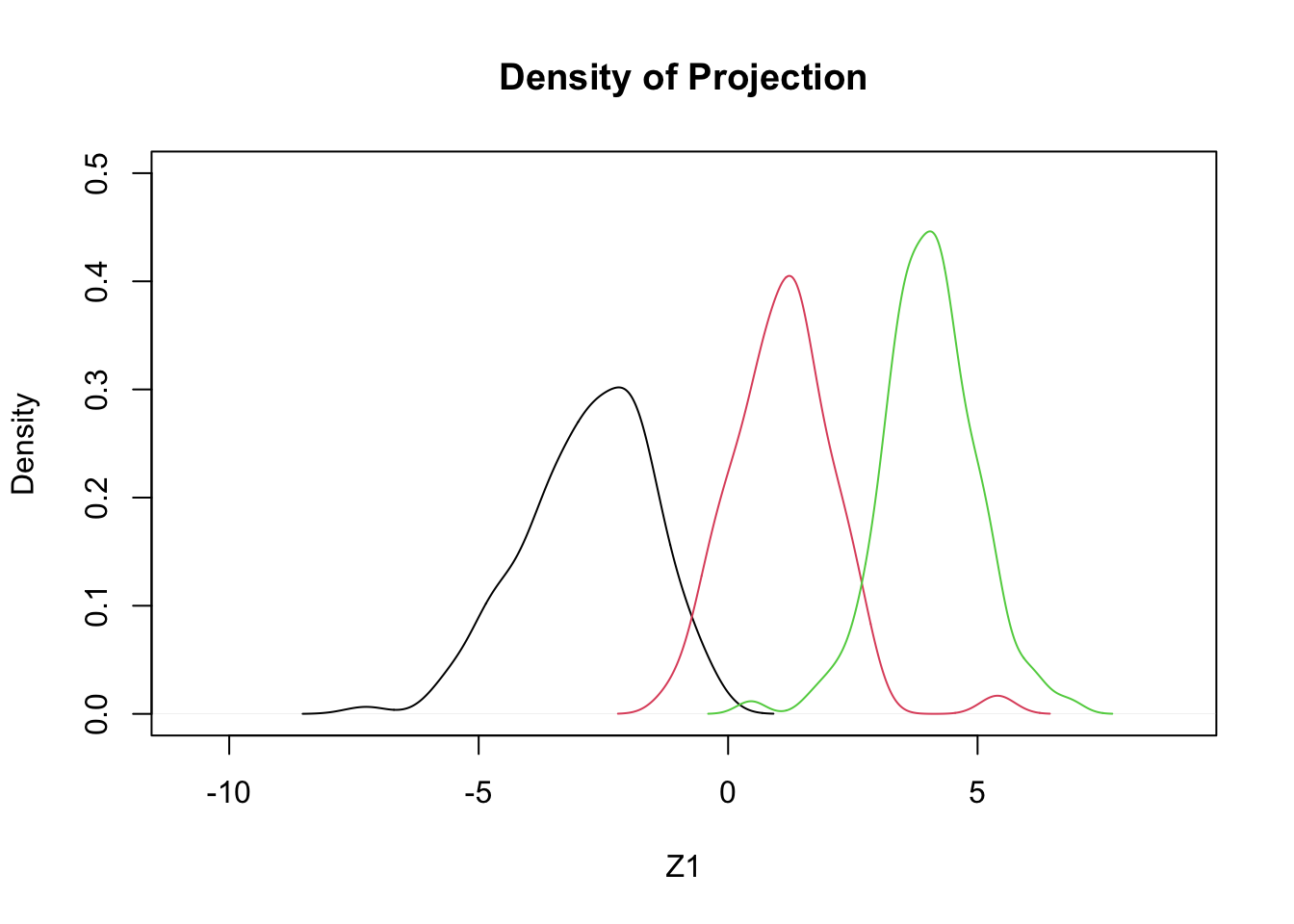
## penguins$species: Adelie
## NULL
## ------------------------------------------------------------
## penguins$species: Chinstrap
## NULL
## ------------------------------------------------------------
## penguins$species: Gentoo
## NULL
Code
plot(density(c(z1,z2,z3)),type='n',ylim=c(0,.5),xlab='Z2',main='Density of Projection')
by(penguins,penguins$species,function(x,a1,a2) lines(density(a1*x$bill_length_mm+a2*x$bill_depth_mm),col=x$species),a1=0.3,a2=-0.9)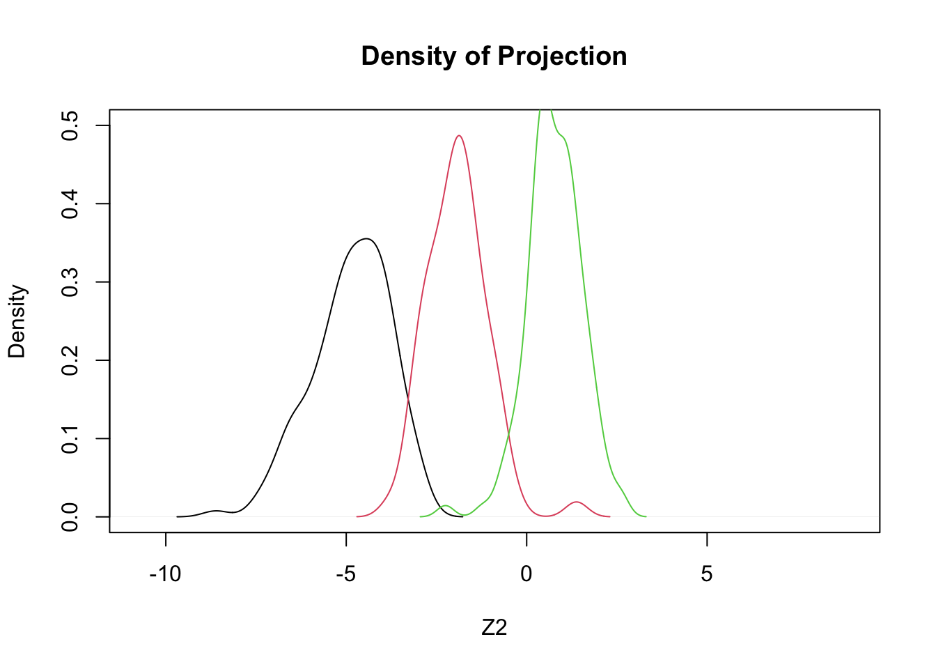
## penguins$species: Adelie
## NULL
## ------------------------------------------------------------
## penguins$species: Chinstrap
## NULL
## ------------------------------------------------------------
## penguins$species: Gentoo
## NULL
Code
plot(density(c(z1,z2,z3)),type='n',ylim=c(0,.5),xlab='Z3',main='Density of Projection')
by(penguins,penguins$species,function(x,a1,a2) lines(density(a1*x$bill_length_mm+a2*x$bill_depth_mm),col=x$species),a1=0.352,a2=-0.904)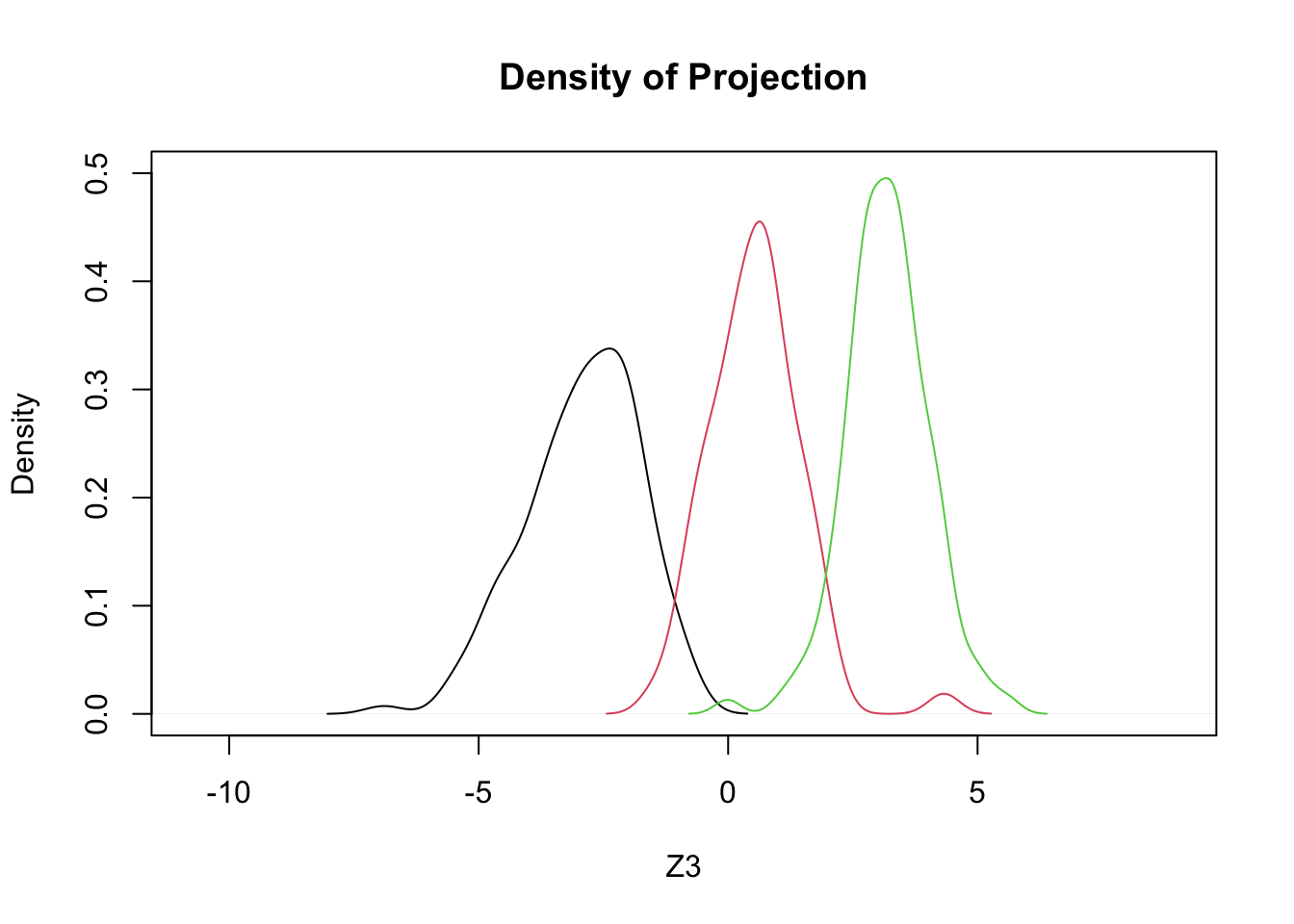
## penguins$species: Adelie
## NULL
## ------------------------------------------------------------
## penguins$species: Chinstrap
## NULL
## ------------------------------------------------------------
## penguins$species: Gentoo
## NULL4.6 Comparison via ANOVA
Code
summary(aov(cbind(z1,z2,z3)~penguins$species))## Response z1 :
## Df Sum Sq Mean Sq F value Pr(>F)
## penguins$species 2 3114.37 1557.19 1236.3 < 2.2e-16 ***
## Residuals 330 415.64 1.26
## ---
## Signif. codes: 0 '***' 0.001 '**' 0.01 '*' 0.05 '.' 0.1 ' ' 1
##
## Response z2 :
## Df Sum Sq Mean Sq F value Pr(>F)
## penguins$species 2 2093.48 1046.74 1214.7 < 2.2e-16 ***
## Residuals 330 284.37 0.86
## ---
## Signif. codes: 0 '***' 0.001 '**' 0.01 '*' 0.05 '.' 0.1 ' ' 1
##
## Response z3 :
## Df Sum Sq Mean Sq F value Pr(>F)
## penguins$species 2 2472.73 1236.4 1236.9 < 2.2e-16 ***
## Residuals 330 329.85 1.0
## ---
## Signif. codes: 0 '***' 0.001 '**' 0.01 '*' 0.05 '.' 0.1 ' ' 1- Suggests that \(Z_3\) is (barely) the best of these 3}.
4.6.1 Notes
- The point in choosing the coefficients that maximize the F-value is that this maximizes the ratio of between groups to within groups variation.
- This is maximal separation as compared to the homogeneity within groups
- Recall one definition of C(g)=(\(\Sigma\) msb)/(\(\Sigma\) msw).
- In the projection approach described above, we are trying to find a linear combination of our features that maximizes msb/msw.
- The summation is removed, because we have projected down to a single value through the transformation.
- In the projection approach described above, we are trying to find a linear combination of our features that maximizes msb/msw.
4.6.2 Geometric View: The two-group case
- Z is the ‘projection’ - a line containing the linear combination of features that maximally separates the two groups.
- Line L is defined by the two points of intersection of the two ellipses and represents a boundary between the two groups
- This is the ‘cutoff’ point to the left of which we would predict membership in one group, and to the right the other.
4.7 Discriminant analysis (details)
- Recall the definition of B and W:
\[ B=\sum\limits_{m=1}^{g}{n_m}(\bar{\mathbf{x}}_m - \bar{\mathbf{x}})(\bar{\mathbf{x}}_m-\bar{\mathbf{x}})' \] \[ W=\sum\limits_{m=1}^{g}\sum\limits_{l=1}^{n_m}(\mathbf{x}_{ml}-\bar{\mathbf{x}}_m)(\mathbf{x}_{ml}-\bar{\mathbf{x}}_m)' \] and let \({\bf{a}} = ({a_1},{a_2}, \ldots ,{a_p})'\),
- \(B\) and \(W\) are \(p\times p\) matrices, and as such they can be pre- and post-multiplied by a vector of length, \(1\times p\) and \(p\times 1\), respectively.
- It turns out that finding the vector a that maximizes the discriminant criterion \(\lambda = \frac{{{\bf{a'Ba}}}}{{{\bf{a'Wa}}}}\) (under some assumptions) provides us with the optimal weights to project our feature set into one dimension (\(Z = {a_1}{X_1} + {a_2}{X_2} + \ldots + {a_p}{X_p}\)) with maximal separation.
- Side note: the linear combination defining \(Z\) can be written \(Z = {\bf{a'X}}\), where \({\bf{X}} = ({X_1},{X_2}, \ldots ,{X_p})\).
- This is a new coordinate space, analogous to PCA-space.
- Side note: the linear combination defining \(Z\) can be written \(Z = {\bf{a'X}}\), where \({\bf{X}} = ({X_1},{X_2}, \ldots ,{X_p})\).
4.7.1 Notes
- There are slightly different definitions of the discriminant criterion, involving sample vs. population divisors for the degrees of freedom (i.e., n vs. n-1).
- We will ignore this detail.
- With only two groups, there can be only one linear composite (projection) and one discriminate criterion.
- With more than two groups, however, there will be more than one linear composite and, hence, more than one ratio \(\lambda\).
- In particular, the number of linear composites and associated ratios, \(\lambda\), equals the number of predictor variables \(p\), or the number of groups minus one \((m-1)\), whichever is smaller.
- To identify a set of projections, they are generated sequentially, so that the second one is constrained to be uncorrelated with the first, and so forth.
- Just as in a principal components analysis.
- With m=3 and p=5, for example, there will be two distinct linear composites and therefore two corresponding ratios, \(\lambda_1\) and \(\lambda_2\).
- The amount each linear composite will separate the groups is given in decreasing order by its respective \(\lambda\) (i.e., \(\lambda_1 > \lambda_2\)).
- So the first linear composite (or dimension) creates the greatest separation among the groups and the next linear composite (or dimension) creates the next greatest separation.
- The amount each linear composite will separate the groups is given in decreasing order by its respective \(\lambda\) (i.e., \(\lambda_1 > \lambda_2\)).
4.7.2 Discriminant function as classifier
- As suggested by the geometric representation above, projection to a line allows us to choose a cut point (a value on the line), location above or below which determines group membership.
- This can be extended to more than two groups using the following procedure (we will assume three groups for the discussion):
- Form the projections: \[{Z_1} = {a_{11}}{X_1} + {a_{21}}{X_2} + \ldots + {a_{p1}}{X_p}\] and \[{Z_2} = {a_{12}}{X_1} + {a_{22}}{X_2} + \ldots + {a_{p2}}{X_p}\]
- These are determined by maximizing \(\lambda = \frac{{{\bf{a'Ba}}}}{{{\bf{a'Wa}}}}\) sequentially, under the constraint that \(Z_1\) and \(Z_2\) are uncorrelated.
- Compute the means of these projections, \(Z_1\), \(Z_2\) within each known group, let us label the mean pair for the \(g^{th}\) group \(({\bar Z_{1g}},{\bar Z_{2g}})\).
- These are centroids of the groups in the projection space.
- For any observation, \[({X_1},{X_2}, \ldots ,{X_p})\] compute \(Z_1\) and \(Z_2\) and then compute the squared Euclidean distance between \(Z_1\) and \(Z_2\) from each of the group means contained in \(({\bar Z_{1g}},{\bar Z_{2g}})\); that is, \({d_g} = {({Z_1} - {\bar Z_{1g}})^2} + {({Z_2} - {\bar Z_{2g}})^2}\).
- With \(m\) groups, there will be \(m\) distances, \[({d_1},{d_2}, \ldots ,{d_m})\].
- Assign the observation to the group to which it is closest.
4.7.3 Example I: penguins data – discriminate between Chinstrap and Gentoo
- Use R’s lda function in the MASS library.
- We subset, removing the Adelie species using the subset option (subset works when the data are a dataframe, but it can be finicky).
- We show the basic result, along with a classification table.
- Properly managed, the classification table will not suffer from label switching - why?
Code
penguins.lda <-MASS::lda(species ~bill_length_mm+bill_depth_mm+flipper_length_mm, data=penguins,na.action="na.omit", CV=FALSE,subset=species!="Adelie")
print(penguins.lda)
## Call:
## lda(species ~ bill_length_mm + bill_depth_mm + flipper_length_mm,
## data = penguins, CV = FALSE, subset = species != "Adelie",
## na.action = "na.omit")
##
## Prior probabilities of groups:
## Chinstrap Gentoo
## 0.3636364 0.6363636
##
## Group means:
## bill_length_mm bill_depth_mm flipper_length_mm
## Chinstrap 48.83382 18.42059 195.8235
## Gentoo 47.56807 14.99664 217.2353
##
## Coefficients of linear discriminants:
## LD1
## bill_length_mm 0.02052193
## bill_depth_mm -1.18982389
## flipper_length_mm 0.17401721Code
xtabs(~predict(penguins.lda)$class+penguins$species[penguins$species!="Adelie"])## penguins$species[penguins$species != "Adelie"]
## predict(penguins.lda)$class Adelie Chinstrap Gentoo
## Adelie 0 0 0
## Chinstrap 0 68 0
## Gentoo 0 0 1194.7.5 Notes
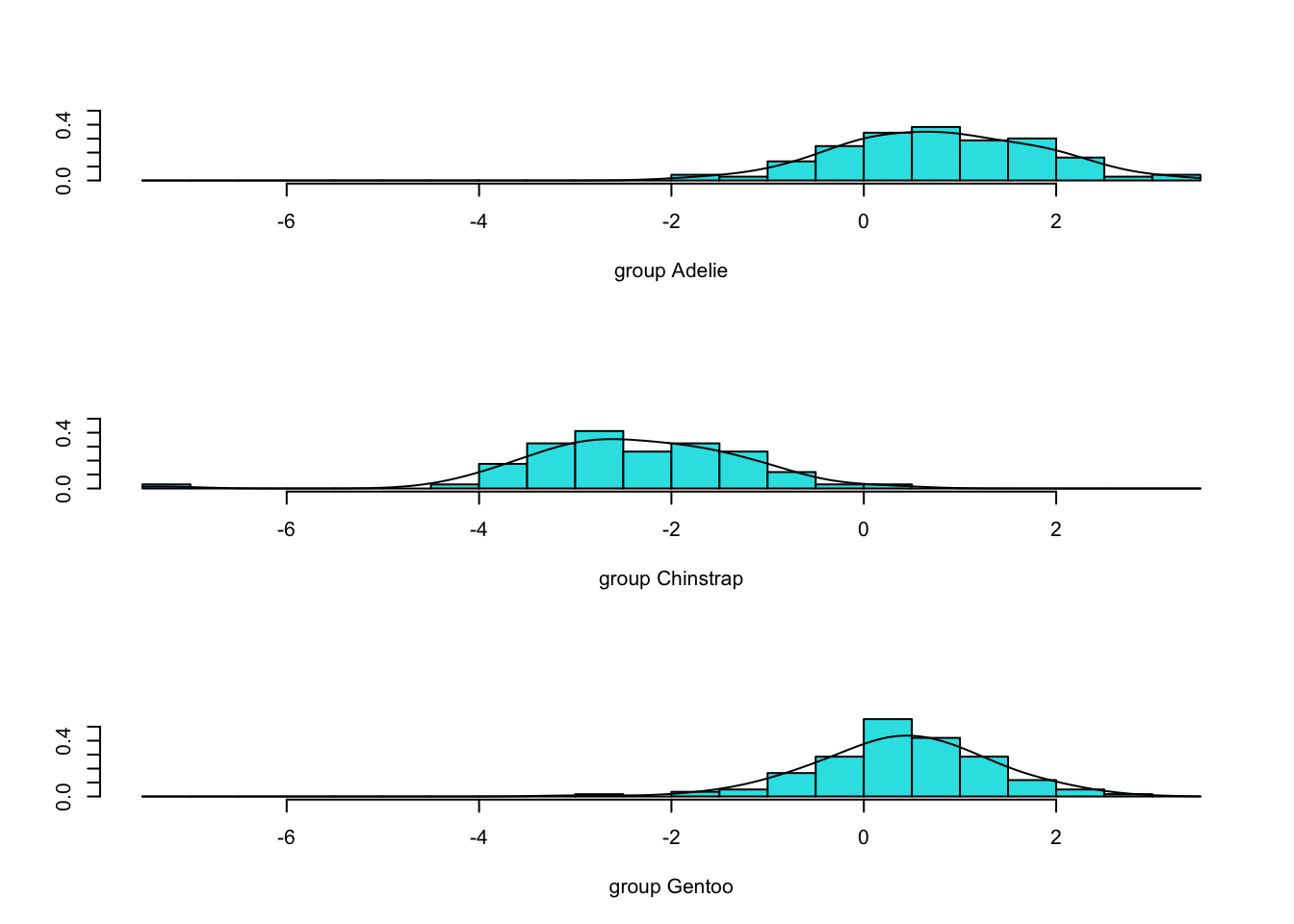
- So \(Z=-0.02BL-1.19BD+0.17FL\) (it’s called LD1 by the function lda).
- R computes these scores for you (and shifts the mean to 0 by subtracting a constant, in this case 18.11 - derived independently).
- Next are the densities of the scores, colored by group.
- NOTE: they are WELL-SEPARATED!
Code
subdat <- subset(penguins,species!="Adelie")
penguins.scores <- predict(penguins.lda)$x
plot(density(penguins.scores,bw=.5),col=8,ylim=c(0,.24))
dns.s <- density(penguins.scores[subdat$species=="Chinstrap"])
dns.c <- density(penguins.scores[subdat$species=="Gentoo"])
lines(dns.s$x,dns.s$y/2,col=2) #rescaling to sum to one, once combined
lines(dns.c$x,dns.c$y/2,col=3) #rescaling to sum to one, once combined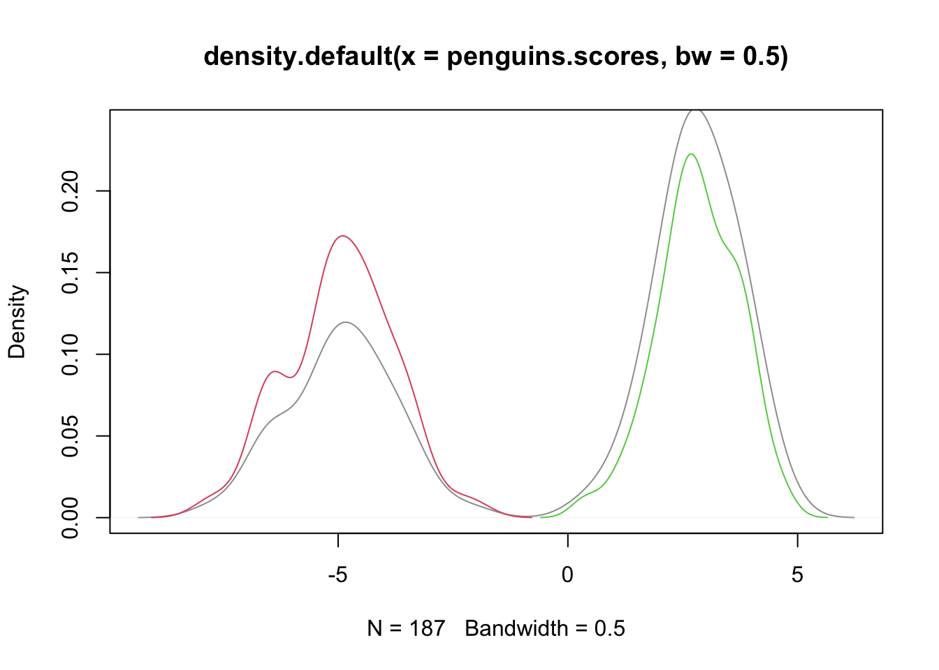
4.7.6 Assumptions
- These methods do require some assumptions (listed below), and some are testable.
- The observations are independent of each other.
- The observations on the continuous predictor (feature) variables follow a multivariate normal distribution in each group.
- There are several tests and diagnostics for (univariate) normality, e.g., Shapiro-Wilks
- The population covariance matrices for the p continuous variables in each group are equal.
- More About Assumption (3):
- In the two-group case with one continuous measure, assumption (3) is analogous to the t-test’s homogeneity of variance assumption.
- With more than one continuous variable, not only are there variances to consider, but also covariances between all pairs of the \(p\) variables.
- A test for the equality of two or more covariance matrices that is based on the familiar F statistic is due to Box (1949), and is referred to as Box’s M test.
- It tends to be a bit overly sensitive (rejects too often).
- Failure to meet assumption (3) is common (and there are some alternative approaches in this case), but one implication is that ‘model selection’ techniques will be less reliable.
- This matters because if we are building a discriminating tool step-wise (add one projection after the other, if justified), we will rely on tests of significance that require assumption (3).
- For this discussion, we do not pursue step-wise approaches.
- In the two-group case with one continuous measure, assumption (3) is analogous to the t-test’s homogeneity of variance assumption.
- We might first ask, ‘Is there evidence of separate groups?’ (otherwise, why proceed with an LDA?)
- Wilks’ Lambda is one test of significance for the equality of group centroids.
- Wilks’ lambda, \(\Lambda\), is a general statistic for testing the significance of K group centroids (represented by multivariate \(\mu\)) differences. The hypotheses are:
\[\begin{array}{l} {H_0}:\underline {{\mu _1}} = \underline {{\mu _2}} = \underline {{\mu _3}} = ... = \underline {{\mu _K}} \\ {H_1}:not\;\;{H_0} \end{array}\]
- The statistic is defined as the ratio of two determinants (W, B, T defined as before):
\[ \Lambda = \frac{{\left| W \right|}}{{\left| {\rm{T}} \right|}} = \frac{{\left| W \right|}}{{\left| {B + W} \right|}} \]
- The smaller \(\Lambda\), the greater the between-group variability relative to the within-group variability, and the greater the separation between groups.
- When K=2 or 3, or p=1 or 2, a function of \(\Lambda\) is distributed exactly as F.
- In all other cases, the distribution of \(\Lambda\) under H0 must be approximated.
4.8 Example: penguins data - all three species
Code
penguins.lda3 <-MASS::lda(species ~bill_length_mm+bill_depth_mm+flipper_length_mm, data=penguins,na.action="na.omit", CV=FALSE)
penguins.lda3
## Call:
## lda(species ~ bill_length_mm + bill_depth_mm + flipper_length_mm,
## data = penguins, CV = FALSE, na.action = "na.omit")
##
## Prior probabilities of groups:
## Adelie Chinstrap Gentoo
## 0.4384384 0.2042042 0.3573574
##
## Group means:
## bill_length_mm bill_depth_mm flipper_length_mm
## Adelie 38.82397 18.34726 190.1027
## Chinstrap 48.83382 18.42059 195.8235
## Gentoo 47.56807 14.99664 217.2353
##
## Coefficients of linear discriminants:
## LD1 LD2
## bill_length_mm 0.1700022 -0.37676677
## bill_depth_mm -0.9373808 -0.04268019
## flipper_length_mm 0.1191061 0.10195863
##
## Proportion of trace:
## LD1 LD2
## 0.8915 0.10854.8.2 Notes
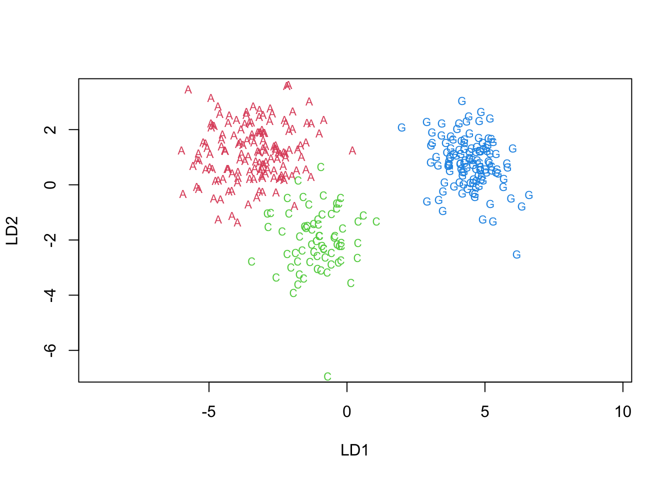
- This yields two projections, named LD1 and LD2, above.
- We called them \(Z_1\) and \(Z_2\) in our derivation.
- The ‘proportion of trace’ given represents the extent to which each projection explains the differences between groups.
- Analogous to eigenvalues in PCA.
- Most (99%) of the discrimination occurs in the first function.
- The LD1 coefficients suggest that the contrast between bill depth and the remaining two is of importance (look at signs).
- If we wish to compute the \(\lambda = \frac{{{\bf{a'Ba}}}}{{{\bf{a'Wa}}}}\) associated with each projection, we need the \(B\) and \(W\) matrices.
- These are a by-product of running a MANOVA on the predictor set over the given groups.
- Since we need to do this to compute Wilk’s Lambda (a different Lambda), we do this now.
Code
manova.fit <- manova(as.matrix(penguins[,3:5])~penguins$species)
summary(manova.fit,test="Wilks")
## Df Wilks approx F num Df den Df Pr(>F)
## penguins$species 2 0.029328 529.1 6 656 < 2.2e-16 ***
## Residuals 330
## ---
## Signif. codes: 0 '***' 0.001 '**' 0.01 '*' 0.05 '.' 0.1 ' ' 1Code
#lambdas associated with each LD projection:
B<-summary(manova.fit)$SS[[1]]
W<-summary(manova.fit)$SS[[2]]
B.xprod <- t(penguins.lda3$scaling)%*%B%*%penguins.lda3$scaling
W.xprod <- t(penguins.lda3$scaling)%*%W%*%penguins.lda3$scaling
lambdas <- diag(B.xprod/W.xprod)
lambdas
## LD1 LD2
## 12.512768 1.523362- Wilks’ Lambda, \(\lambda\), is highly significant
- The \(\lambda\)s associated with each projection are 12.5 and 1.5S.
- Wilks’ Lambda, \(\lambda\), is highly significant
4.8.3 Examine LD1xLD2 space
- We can show the densities of the scores (projections) for each species in 1 and 2 dimensions.
- We use some manual and some built-in approaches to plotting decision boundaries
- First, we show the LD1 projection, then LD2 and lastly the LD1xLD2 coordinate plane.
4.8.4 LD1
Code
#the Z1 & Z2 projections are computed and saved with this command.
penguins.LDs <- predict(penguins.lda3)$x
#show 1-D discrimination (LD1):
plot(penguins.lda3,dimen=1)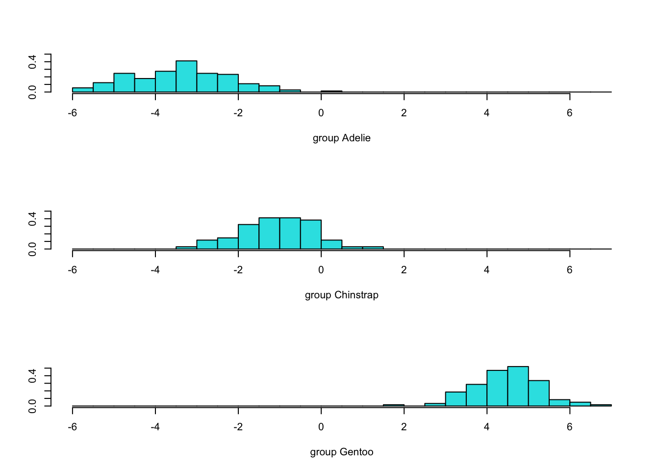
4.9 Territorial map
- A territorial map is used to delineate which portions of the 2-D discriminant function space ‘belongs’ to which group.
- Really, it’s a map of which values are predicted to be in which group.
- The group centroids are given as reference.
- The default functions to produce these maps do so for the ORIGINAL feature set
- What would happen if you tried to use those features DIRECTLY and used a line as boundary between pairs of groups?
- What would happen if you tried to use those features DIRECTLY and used a line as boundary between pairs of groups?
- With some custom R coding, we can also produce this map for the LD1 and LD2 space, so we give these after the default map.
Code
klaR::partimat(species ~bill_length_mm+bill_depth_mm+flipper_length_mm, data=penguins,method="lda",gs=c("a","c","g")[penguins$species])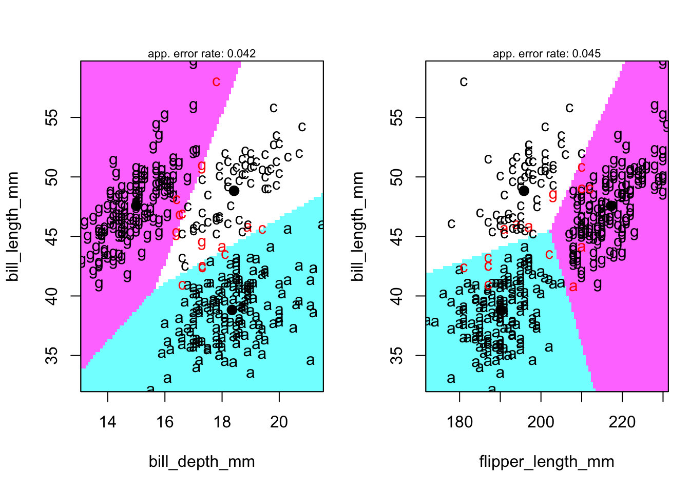
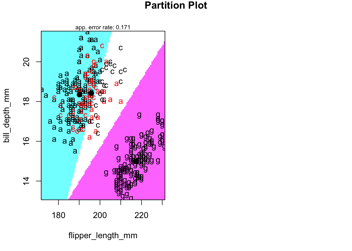
4.9.1 Territorial map in LD-space
Code
newpenguins <- data.frame(cbind(penguins,predict(penguins.lda3)$x))
klaR::partimat(species ~LD2+LD1, data=newpenguins,method="lda",gs=c("a","c","g")[penguins$species]) 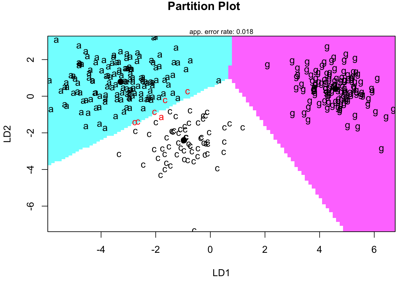
4.9.3 Test of assumption
- For completeness, returning to an assumption of a DFA, we examine the homogeneity of covariance across the groups using Box’s M test.
Code
heplots::boxM(penguins[,3:5],penguins$species)##
## Box's M-test for Homogeneity of Covariance Matrices
##
## data: penguins[, 3:5]
## Chi-Sq (approx.) = 58.149, df = 12, p-value = 4.899e-08- The p-value suggests ‘reject’ the homogeneity assumption.
- This matters much more when out of sample prediction is a goal.
- We ignore it here.
- This matters much more when out of sample prediction is a goal.
- The p-value suggests ‘reject’ the homogeneity assumption.
4.9.4 Confusion matrix
- The summary table below tells us how many observations we classified correctly:
Code
xtabs(~predict(penguins.lda3)$class+penguins$species)## penguins$species
## predict(penguins.lda3)$class Adelie Chinstrap Gentoo
## Adelie 145 5 0
## Chinstrap 1 63 0
## Gentoo 0 0 119- Notice that three observations that are misclassified using LDA. - You can see them in the prior plot.- Note: we could use a ‘leave one out’ approach to classification as well.
- We will explore this idea further in the next set of notes.
4.11 Appendix
4.11.1 Comparison of model accuracy
- In this section, we will use both unsupervised and supervised learning models to predict outcome values and compare them all together. Here, we will use built-in
penguinsdataset in R.
Code
# import penguin dataset
data("penguins")
# selecting complete cases only
penguins<- penguins[complete.cases(penguins),] %>%
  mutate(island = as.numeric(island),
         sex = as.numeric(sex))
head(penguins)
## # A tibble: 6 × 8
## species island bill_length_mm bill_depth_mm flipper_leng…¹ body_…² sex year
## <fct> <dbl> <dbl> <dbl> <int> <int> <dbl> <int>
## 1 Adelie 3 39.1 18.7 181 3750 2 2007
## 2 Adelie 3 39.5 17.4 186 3800 1 2007
## 3 Adelie 3 40.3 18 195 3250 1 2007
## 4 Adelie 3 36.7 19.3 193 3450 1 2007
## 5 Adelie 3 39.3 20.6 190 3650 2 2007
## 6 Adelie 3 38.9 17.8 181 3625 1 2007
## # … with abbreviated variable names ¹flipper_length_mm, ²body_mass_g- Next, lets set up the models that we are going to use.
Code
library(class)
library(caret)
library(MASS)
library(ROCR)
library(pROC)
library(ggrepel)
library(factoextra)
library(ggpubr)

# 1. Unsupervised learning method
  # K-means clustering
kmean_pred <-kmeans(penguins[,-1], centers = 3)$cluster

  # Hierarchical clustering method
hclust_model <- cutree(hclust(dist(penguins[,-1],method="manhattan"),method="ward.D2"), k = 3)

# 2. Supervised learning
  # K-Nearest Neighbor (KNN) method
knn_model <- knn(penguins[,-1],penguins[,-1],cl=penguins$species,k=3)

  # Linear Discriminant Analysis (LDA) method
lda_model <-MASS::lda(species ~ island + bill_length_mm + bill_depth_mm + flipper_length_mm + body_mass_g+sex+year, data=penguins, CV=FALSE) - For unsupervised learning methods, visualization of clusters can be helpful. We use
fviz_clusterfunction fromfactoextralibrary to do it.
Code
# kmean clustering
kmean_viz <- fviz_cluster(kmeans(penguins[,-1], centers = 3), penguins[, -1],
   palette = "Set2", ggtheme = theme_minimal(), main = "Kmeans clustering")

# hierarchical clustering
hclust_viz <- fviz_cluster(list(data = penguins[, -1], palette = "Set2",
                  cluster = hclust_model), ggtheme = theme_minimal(), main = "Hierarchical clustering")

two_figures <- ggarrange(kmean_viz, hclust_viz,ncol = 2, nrow = 1)
two_figures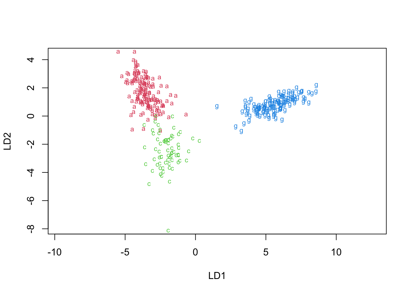
- In addition to the setting, having a helper function is useful. Here, we create a helper function to compute the accuracy of the model.
Code
check_perf <- function(model,type){
  if (type=="unsuper"){
  acc <- confusionMatrix(data=model,
                reference=factor(as.numeric(penguins$species)))$overall[[1]]
  } else{
  acc <- confusionMatrix(data=model,
                reference=factor(penguins$species))$overall[[1]]
  }
  auc <- auc( multiclass.roc( as.numeric(model),
                     as.numeric(penguins$species)) )[1]
  list(round(acc,4),round(auc,4) )
}- Finally, we will gather all information and visualize all predictions by different machine learning models.
Code
data.frame(method = c("kmean","hclust","knn","lda"),
           accuracy = c(check_perf( factor(kmean_pred),"unsuper")[[1]],
                        check_perf( factor(hclust_model),"unsuper")[[1]],
                        check_perf( factor(knn_model),"super")[[1]],
                        check_perf( factor(predict(lda_model)$class),"super")[[1]]),
           auc = c(check_perf( factor(kmean_pred),"unsuper")[[2]],
                        check_perf( factor(hclust_model),"unsuper")[[2]],
                        check_perf( factor(knn_model),"super")[[2]],
                        check_perf( factor(predict(lda_model)$class),"super")[[2]])
           ) %>%  melt(id=c("method")) %>%
  ggplot(aes(x=method, y=value, color=variable)) +
  geom_line(aes(group=variable)) + geom_point(size=2) + theme_classic() +
  geom_text_repel(aes(label=round(value,2)), position="dodge") +
  labs(title="Comparison of prediction - accuracy and AUC score")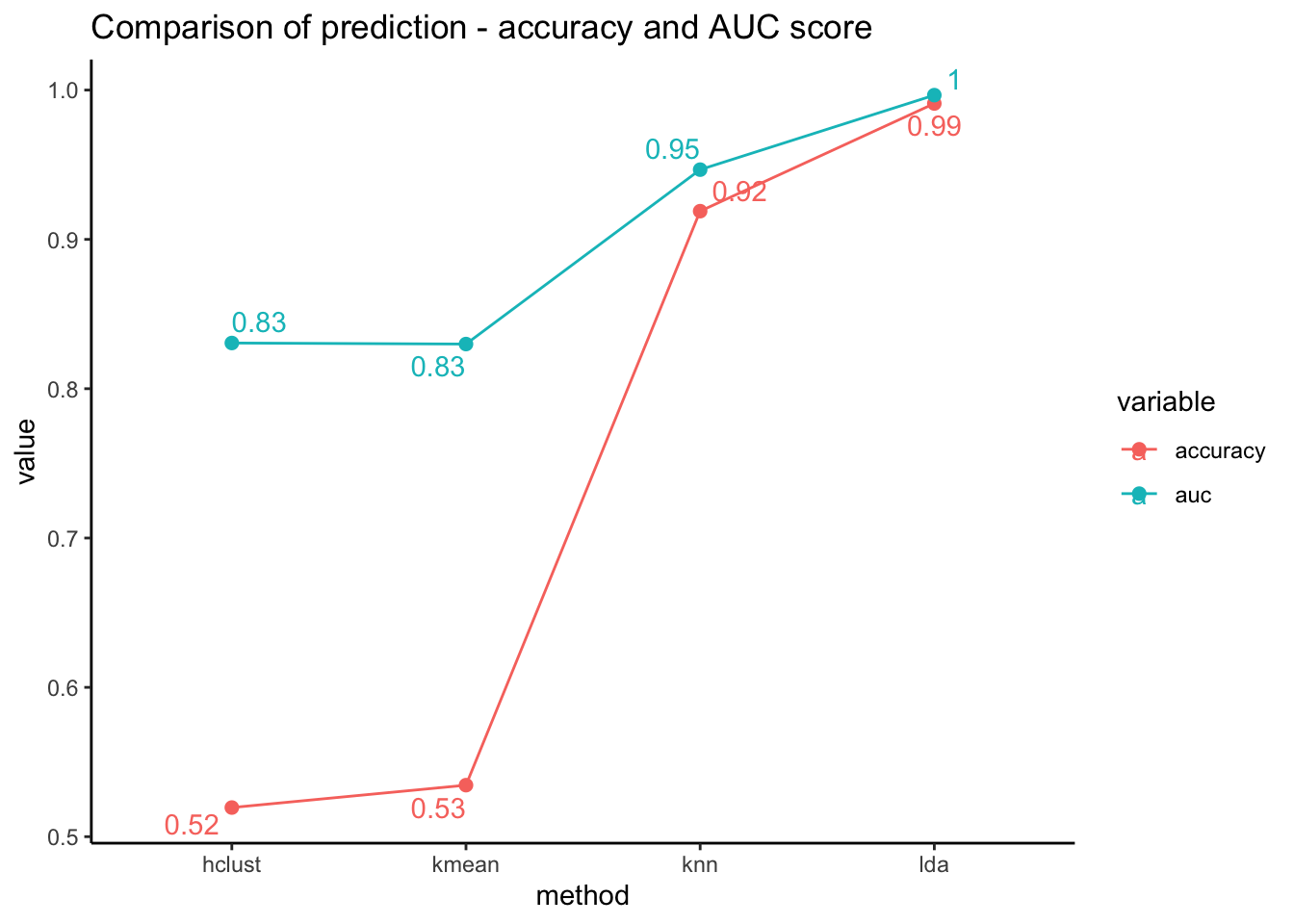
Plot above shows that the supervised learning methods (both knn and lda) performed better than the unsupervised learning methods. (hierarchical clustering and k means clustering methods)
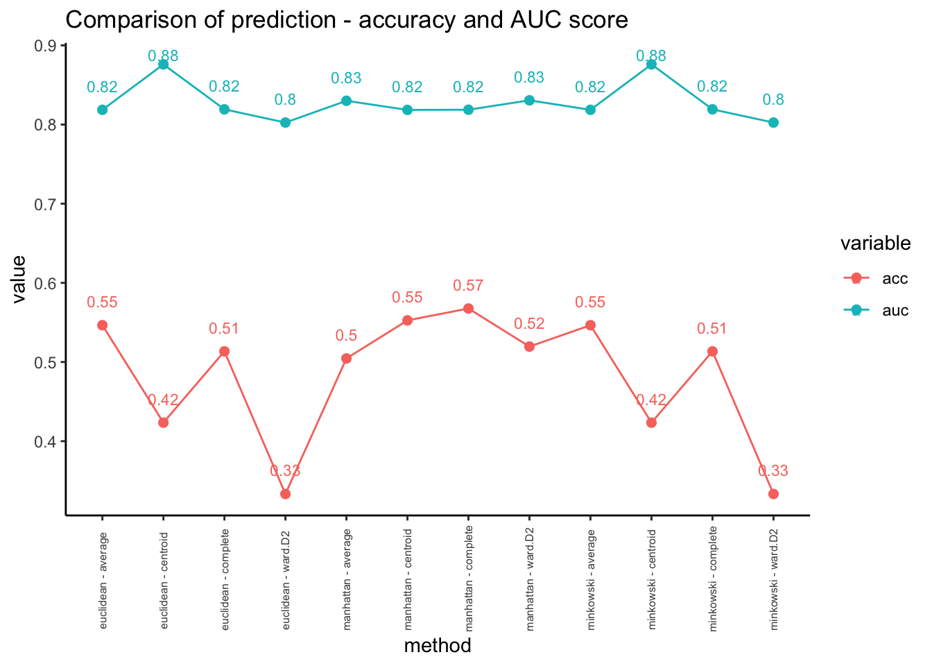
- In this case, we can try different parameters to improve the performance. Here, we will change distance measures and linkages for hierarchical clustering methods.
Code
# using different distance measures and linkages
distances <- c("euclidean","manhattan","minkowski")
linkage <-c("ward.D2","complete","average","centroid")
data_unsuper <- data.frame(matrix(ncol = 3, nrow = 0))
colnames(data_unsuper)<-c("method","acc","auc")
for (distance in distances){
  for (link in linkage){
    hclust_model <- cutree(hclust(dist(penguins[,-1],method=distance),method=link), k=3)
    method = paste(distance,"-",link)
    acc = check_perf(factor(hclust_model),"unsuper")[[1]]
    auc = check_perf( factor(hclust_model),"unsuper")[[2]]
    data_unsuper = rbind(data_unsuper, cbind(method,acc,auc))
  }
}

# visualization
data_unsuper %>%
  mutate(acc = as.numeric(acc), auc = as.numeric(auc)) %>%
  melt(id=c("method")) %>%
  ggplot(aes(x=method, y=value, color=variable)) +
  geom_line(aes(group=variable)) + geom_point(size=2) + theme_classic() +
  geom_text_repel(aes(label=round(value,2)), nudge_y=0.03, size=3, ) +
  labs(title="Comparison of prediction - accuracy and AUC score") +
  theme(axis.text.x = element_text(angle = 90, vjust = 0.5, hjust=0.3, size=6))