1 Chapter 1: Introduction
1.1 Multivariate data
- We have multivariate data—many different measurements have been made of objects or subjects, and we may or may not have a specific outcome in mind. In other words, we have recorded a lot of features of our subjects and we want to do something with them.
- What types of questions might we ask of the data?
- What is the ``downstream’’ goal of the analysis (e.g., classification [segmentation], prediction, …)?
- Sometimes, there is an outcome that we wish to model so that we can make good predictions when new observations of the feature set arise. This is often called supervised learning.
- Continuous outcome: If we want to try to predict the expected level of the outcome given different levels of the features, this may be accomplished using regression. Linear regression is a model for \(E(Y|X)\) – viewing it as conditional expectation broadens our understanding of it as one of many techniques with the same goal.
- Discrete or nominally valued outcome: each nominal level can be interpreted as the group in which the subject belongs. Examples:
- Survived, died
- Graduated high school, dropped out
- Car make: Toyota, Honda, Ford, etc.
- Live in an apartment, a multi-family home, a single-family home
- Commute via car, train, bus, walk, bicycle
- Species of plants or animals
- We can use variants of regression to classify subjects into discrete groups using feature sets (other names: predictors, covariates, independent variables).
- E.g., binary & multinomial logistic regression
- Supervised learning of labeled groups is also called classification.
- Sometimes, we don’t have an outcome. What could we possibly do?
- Explore relationships between features.
- Correlation tables – sometimes these are quite revealing, particularly in finding features that are highly correlated with each other.
- Scatterplots – these can be very helpful, as long as the relationships are largely revealed at the bivariate level (2-D)
- 3-D relationships may be identified using software that can ``spin’’ around the data, yielding 2-D projections at different angles.
- We can look for groups (we’ll come back to why we might want to find groups later) – clumps of observations that are `near’ each other in an unexpected manner.
- Explore relationships between features.
- Since you already know regression, which can be used for supervised learning, the first idea we explore in this course is finding groups in data, which is unsupervised learning or searching for clusters.
- The goal of these techniques is to identify homogenous groups within a heterogeneous population. Why do this?
- To find the `true’ (or natural) groups (e.g., create a typology)
- For data reduction (it is easier to explore or summarize smaller groupings). E.g., how would you describe the set of all careers in the U.S.?
- To discover unexpected groupings/patterns
- Once groups are found, we often wish to know what is similar/different in the members of that group.
- The goal of these techniques is to identify homogenous groups within a heterogeneous population. Why do this?
- For some disciplines, this idea of examining features post-clustering is common; for others, it is novel.
- One might examine features used in the clustering to understand/describe it better; features not used in the clustering characterize the correlates of the clustering.
- In unsupervised learning, you do not know (or do not use information) as to which group each subject should be assigned at the outset.
- If you knew the groups, then it’s a supervised learning (classification) problem.
- Example: Palmer Penguins data. Bill length and depth, flipper length and body mass were measured on 344 penguins. We removed 11 penguins with missing data. We have four measurements, and since we cannot visualize 4-D space, we can instead plot ``all pairs’’ of bivariate relationships.
Code
pairs(penguins[,3:6])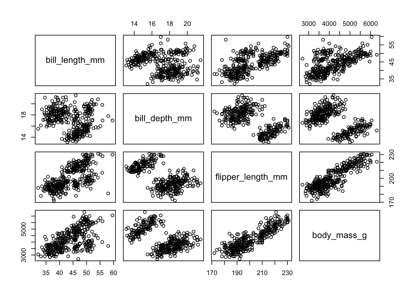
- There are clearly two groups, maybe even three or four. Some plots reveal two distinct groups.
- We probably have a scaling problem with body mass. There are many solutions to this (e.g., rescaling to z-scores), but we’ll drop that measure for most of our analyses.
- Intuitively, if we identified the center of each clump, and then tried to place each observation in a single clump based on proximity, we’d have little ambiguity as to where to place each.
- We did this (using one known species versus all of the rest – cheating, in other words), for the bill length vs. flipper length plot, and this is what we see:
Code
x1<-tapply(penguins[,"bill_length_mm",drop=T],penguins$species=="Gentoo",mean)
y1<-tapply(penguins[,"flipper_length_mm",drop=T],penguins$species=="Gentoo",mean)
plot(penguins[,c("bill_length_mm","flipper_length_mm")])
points(x1,y1,pch=16,cex=2,col=2)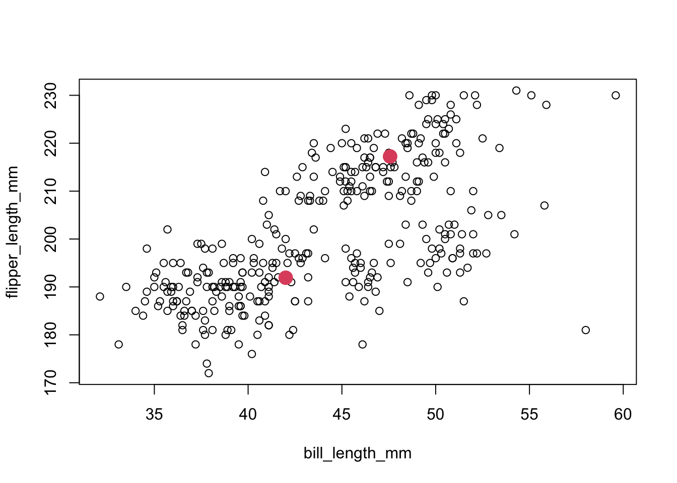
1.1.1 Exercise 1
- Comments:
- Arguably, setting those two centers leads us to potentially identify two more groups, to the right and near the bottom, as well as a potential outlier (far right bottom). One approach to “finding groups” involves placing a point somewhere in the space, and building a cluster from points close to it.
- Pairs of these plots examine only two features at a time. Since we cannot easily plot in multiple dimensions, a good way to visualize more of the multivariate information is to use the principal components of the measurements, for which perhaps two dimensions capture the bulk of the variation.
1.2 Dimensionality reduction
- Principal Components (PCs) are linear combinations of the features that systematically capture their variation. A rough sketch of the idea follows.
- We start with \(p\) covariates or features, \(X_1,\ldots,X_p\).
- The first principal component is a linear combination of the \(p\) covariates: \(F_1 = a_{11}X_1+a_{12}X_2+\ldots+a_{1p}X_p\), such that \(\mbox{Var}(F_1)\) is maximized, under the constraint that \(\sum\limits_{i=1}^{p}{a_{_{1i}}^{2}=1}\).
- If we did not impose a constraint, we could keep making the linear combination larger and larger.
- The next components are defined with respect to those that come before them, so the \(2^{nd}\) component is a linear combination of the \(p\) covariates: \(F_2 = a_{21}X_1+a_{22}X_2+\ldots+a_{2p}X_p\), such that \(\mbox{Var}(F_2)\) is maximized, under two constraints:
- These are: 1) \(\sum\limits_{i=1}^{p}{a_{_{2i}}^{2}=1}\) and 2) \(\sum\limits_{i=1}^{p}{a_{_{1i}}^{{}}a_{_{2i}}^{{}}=0}\).
- The second constraint is known as orthogonality, and insures that \(\mbox{Cor}(F_1,F_2)=0\)
- It also insures identifiably and that the variation captured by each component sums to the total variation in all features.
- A smaller number of components generated in this manner tends to represent both the variation and the covariation (relationships in the data) quite well (with some loss of information).
- NOTE: With PCs, we sometimes we use standardized covariates to prevent any one feature from dominating the components simply due to its larger variance. This puts all measures on the same scale in the sense that one unit change is one standard deviation change.
- SIDE NOTE: This is equivalent to constructing the PCs from the correlation rather than the covariance matrix, since the former is scale invariant.
- For 2-D & 3-D visualizations of PCA, look here: http://setosa.io/ev/principal-component-analysis/ .
- NOTE: With PCs, we sometimes we use standardized covariates to prevent any one feature from dominating the components simply due to its larger variance. This puts all measures on the same scale in the sense that one unit change is one standard deviation change.
- Example: Palmer Penguins data. Construct PCs from the covariance matrix (removing body mass, which is on a very different scale).
- The ``loadings’’ or coefficients on each component indicate the relative importance of that feature in the component:
Code
penguins.pc <- princomp(penguins[,3:5],cor=F)
print(penguins.pc$loadings,cutoff=.1)
##
## Loadings:
## Comp.1 Comp.2 Comp.3
## bill_length_mm 0.266 0.958 0.112
## bill_depth_mm 0.136 -0.988
## flipper_length_mm 0.961 -0.254 -0.110
##
## Comp.1 Comp.2 Comp.3
## SS loadings 1.000 1.000 1.000
## Proportion Var 0.333 0.333 0.333
## Cumulative Var 0.333 0.667 1.0001.2.1 Exercise 2
- Note that the \(1^{st}\) component is primarily flipper length, while the \(2^{nd}\) is mostly bill length. The importance of components (and contribution to total variance) is given by:
Code
summary(penguins.pc)## Importance of components:
## Comp.1 Comp.2 Comp.3
## Standard deviation 14.523479 4.02858260 1.54064949
## Proportion of Variance 0.918953 0.07070604 0.01034093
## Cumulative Proportion 0.918953 0.98965907 1.00000000- Comment: The cumulative proportion of variance ``explained’’ or captured in the first \(k\) components \((k=1,2,3)\) is based on the eigenvalue/vector decomposition of the covariance or correlation matrix of the feature set (a 4x4 matrix in this case) and suggests that at most 2 components are needed to explain 99% of the variation. In other words, PC1 x PC2 should summarize the bulk of the relationships between (collapsed) features.
- In this instance, the results are not terribly different from the pairs plot. The PC1xPC2 plot has 2 well separated clusters, perhaps even 3 or 4. Adding PC3 seems to cleanly split off one group, but obscures the other two.
Code
pairs(penguins.pc$scores,cex=.4)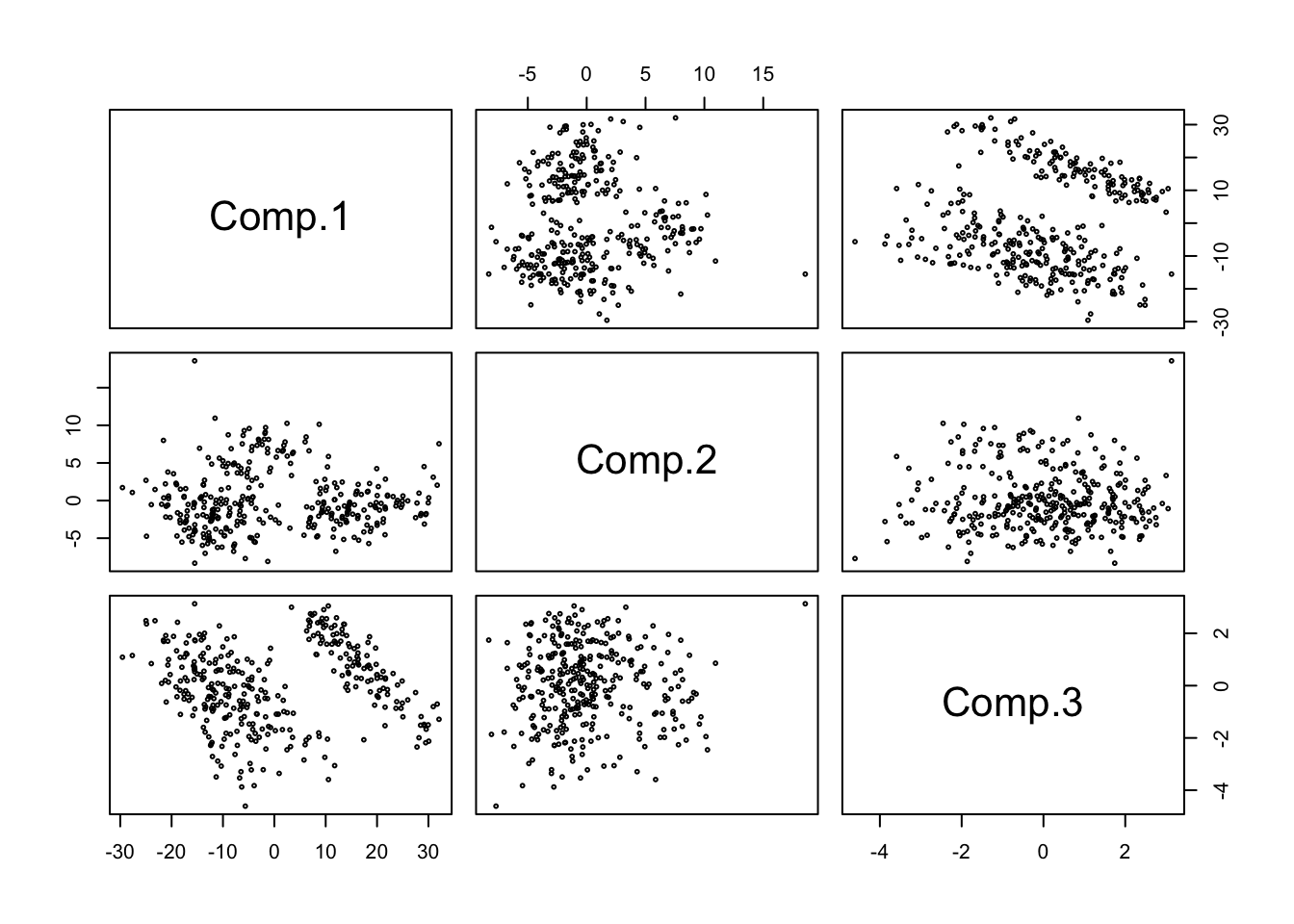
1.2.2 Exercise 3
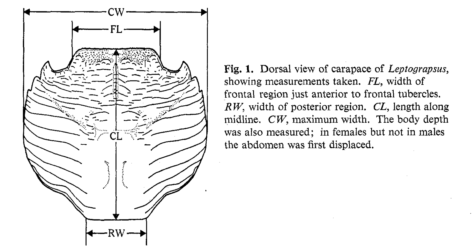
- Example: Australian Leptograpsus Crabs
- Collected at Fremantle, Western Australia (Campbell and Mahon, 1974). Each specimen has measurements on:
- Frontal Lip (FL), in mm
- Rear Width (RW), in mm
- Length of midline of the carapace (CL), in mm
- Maximum width of carapace (CW), in mm
- Body Depth (BD), in mm
- Collected at Fremantle, Western Australia (Campbell and Mahon, 1974). Each specimen has measurements on:
- How many clusters are there, considering pairwise relationships (next page)?
- This seems like a fairly hard problem.
- Compare RW x CL: do those two sections that diverge represent distinct clusters?
- Where would they start and stop?
- This seems like a fairly hard problem.
Code
crabs <- read.dta("./Datasets/crabs.dta")

pairs(crabs[,-(1:3)])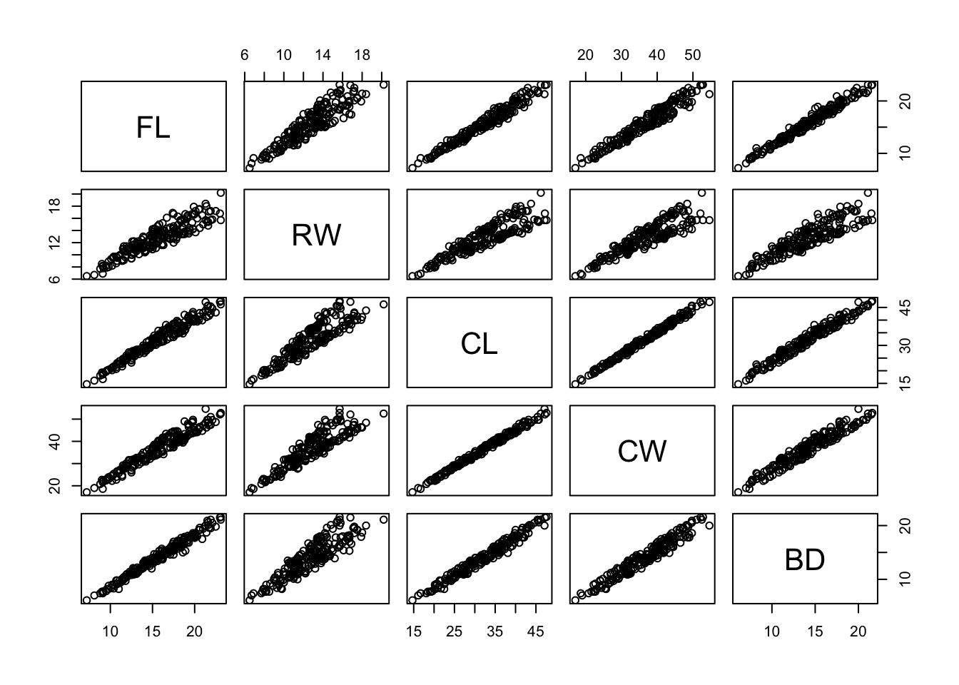
- Using the same idea as before, that we can effectively use PCs to capture the bulk of variation, we examine principal-component based plots.
- We will use `standardized’ features, or the correlation matrix to generate the PCs
- For the most part, we do not explore the ``loadings’’ (what features are emphasized) in the PCs, but this could be of interest.
Code
pairs(princomp(crabs[,-(1:3)],cor=T)$scores) 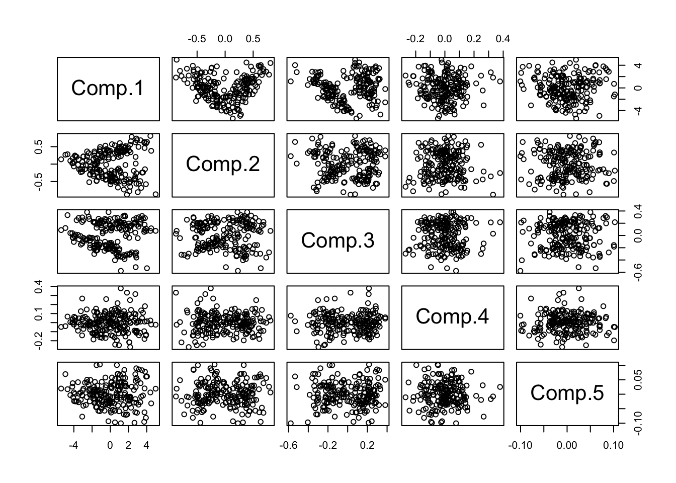
1.2.3 Exercise 4
- Now Look closely at components 1 through 3:
Code
pc.crabs <- princomp(crabs[,-(1:3)],cor=T)$scores
pairs(pc.crabs[,1:3],col=1)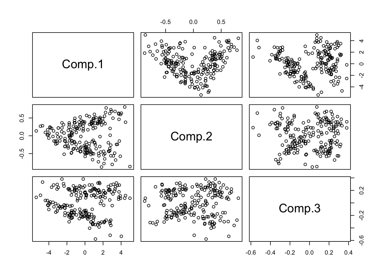
- Now how many clusters would you say?
- At least 3. Why do I say this? Can you circle them?
- It’s particularly hard to tell in the plot of components 2 vs. 3, whether the bottom cluster might be divisible.
- We applied model-based clustering (in later handouts) to the PCs, and this method generated a six-cluster solution, below.
- Note: analysis on original features or the full PC set based on covariance should yield the same clustering.
- However, algorithms that use these data may be sensitive to ordering and other concerns (think: greedy algorithms)
- It is sometimes useful to substitute PCs for the original data when fits using the latter fail, e.g.
- Or it might be easier to visualize results in PC space, so using them with other packages could be efficient. This is true for model-based clustering.
- It is sometimes useful to substitute PCs for the original data when fits using the latter fail, e.g.
- Ask whether you believe this ‘solution’? Why should you or shouldn’t you?
- Note: analysis on original features or the full PC set based on covariance should yield the same clustering.
Code
#standardized version of crab measurements, then PCA, then Mclust
pc.crabs <- princomp(crabs[,-(1:3)],cor=T)$scores
mcl <- mclust::Mclust(pc.crabs)
plot(mcl,what="classification",dimens=c(2,3))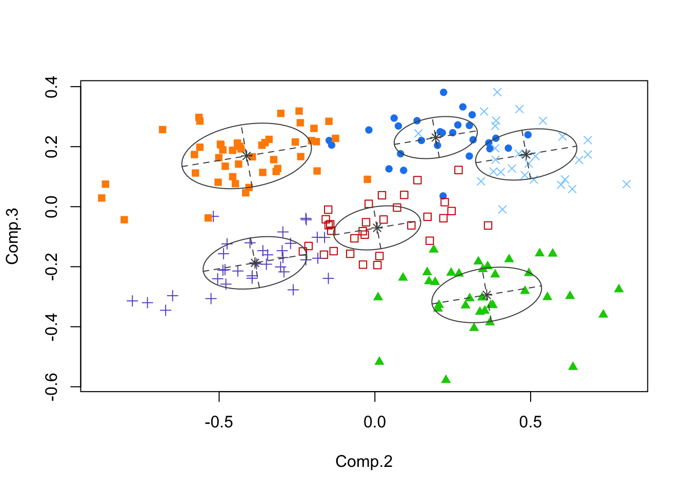
1.2.5 Example
- Example: growth curves. Data were collected yearly over a period of 10 years on an unspecified, positive outcome.
- The inherent time-structure of the data ought to be included in any visualization.
- The 120 growth curves, superimposed:
- The inherent time-structure of the data ought to be included in any visualization.
Code
mm <- read.dta("./Datasets/simNagin.dta")
matplot(t(mm[,13:22]),type='l',col=1,pch=1,xlab='Time',ylab='Outcome')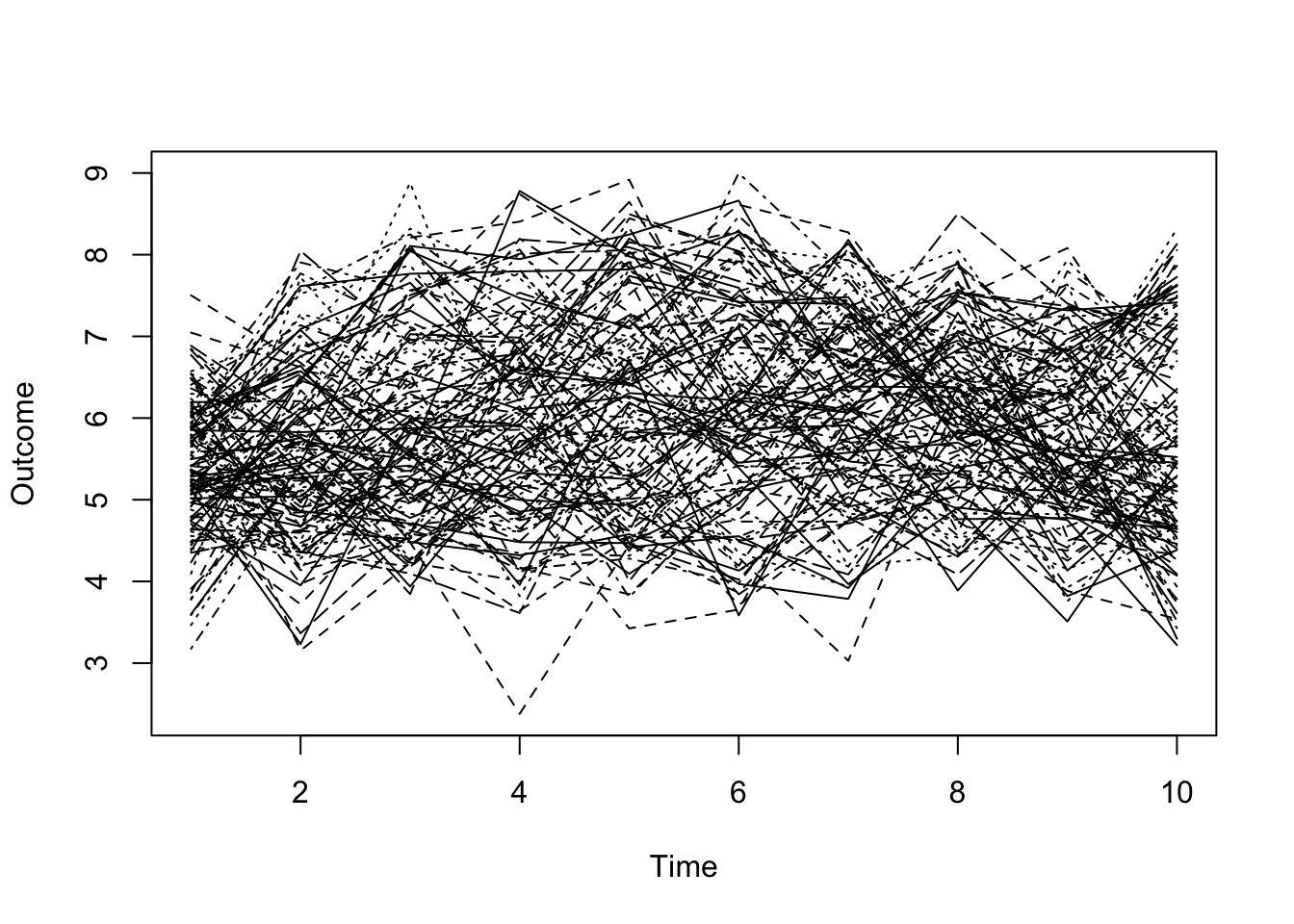
- Can you separate signal from noise?
- What would a regression model tell you about such data?
- What about a Multi-Level Model?
- Is there an alternative that might reveal distinct groups (if any are present)?
- What would a regression model tell you about such data?
- We once again applied model-based clustering (MBC) to the responses only
- Technical note: we can do this because the design of the study is balanced and complete. There are 10 outcomes measured at the same 10 time points for each subject. The multivariate feature set we examine is a vector of 10 responses.
- The fact that they are a time-series is effectively ignored. It is a profile analysis of the multivariate outcome.
- Technical note: we can do this because the design of the study is balanced and complete. There are 10 outcomes measured at the same 10 time points for each subject. The multivariate feature set we examine is a vector of 10 responses.
- The MBC method generated a three-cluster solution.
- The analysis was performed on the responses only, so the MBC built-in visualization of the clusters is quite awkward.
- For example, we show the first five years of responses in an all pairs plot, and color code to reflect the groups `discovered’ by the clustering algorithm:
- The analysis was performed on the responses only, so the MBC built-in visualization of the clusters is quite awkward.
Code
mcl <- mclust::Mclust(mm[,13:22])
plot(mcl,what="classification",dimens=1:5)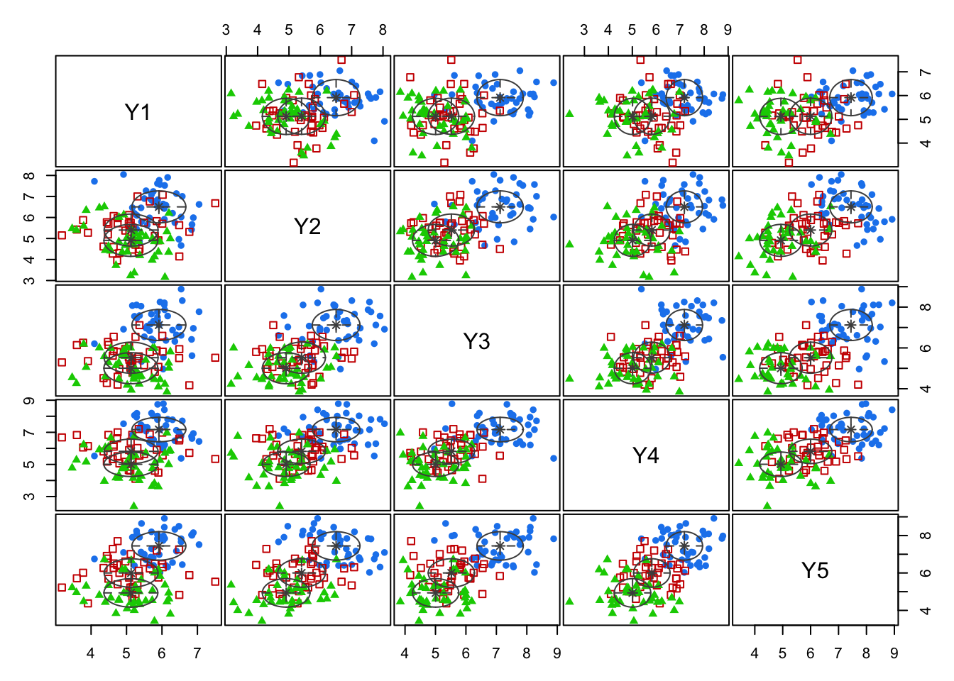
- Contrast this visualization of those same three groups to one that actually reflects the time-structure:
Code
matplot(t(mm[,13:22]),type='l',col=(c(4,2,3))[mcl$class],pch=1,xlab='Time',ylab='Outcome')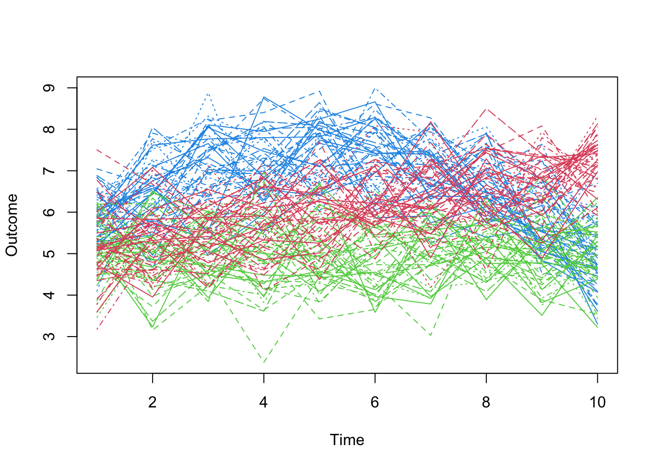
- Questions to be resolved:
- Can we do better? E.g., use the longitudinal nature of the data more directly?
- What about missing data and unevenly spaced measurement?
- We will discuss Model-Based Clustering – a tool that is useful in this context – in subsequent lectures.
1.3 Distance measures
- In one part of our analysis, we need to judge how far a particular point is from a clump that we may think defines a cluster.
- A natural metric for continuous measures is Euclidean distance.
- Let’s say that we have measured four features, \((W,X,Y,Z)\), at two different points \(P_1=(W_1,X_1,Y_1,Z_1)\) and \(P_2=(W_2,X_2,Y_2,Z_2)\).
- Then the Euclidean distance between point \(P_1\) and point \(P_2\) is:
- A natural metric for continuous measures is Euclidean distance.
\[ \left| {{P}_{1}}-{{P}_{2}} \right|=\sqrt{{{({{W}_{1}}-{{W}_{2}})}^{2}}+{{({{X}_{1}}-{{X}_{2}})}^{2}}+{{({{Y}_{1}}-{{Y}_{2}})}^{2}}+{{({{Z}_{1}}-{{Z}_{2}})}^{2}}} \]
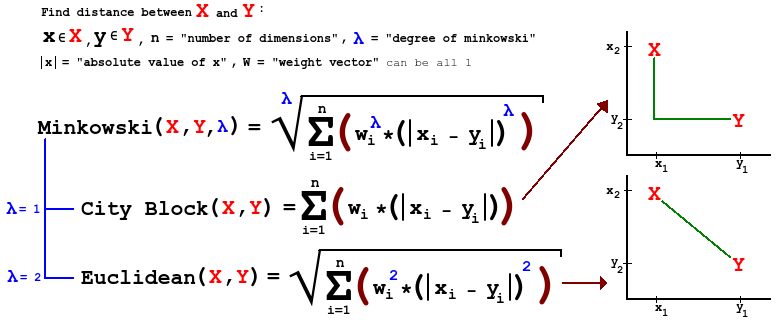
- A general form of distance is known as Minkowski, which differs depending on the order \(m\), a parameter. Using our example, we have:
\[d({{P}_{1}},{{P}_{2}})={{\left[ {{\left| {{W}_{1}}-{{W}_{2}} \right|}^{m}}+{{\left| {{X}_{1}}-{{X}_{2}} \right|}^{m}}+{{\left| {{Y}_{1}}-{{Y}_{2}} \right|}^{m}}+{{\left| {{Z}_{1}}-{{Z}_{2}} \right|}^{m}} \right]}^{1/m}}\]
- Comments:
- For \(m=1\), this is city-block distance.
- For \(m=2\) this is Euclidean distance.
- As we increase \(m\), we give larger weight to larger differences. What does this do, in terms of identifying ‘clumps’?
- If the variance in the components of our features varies dramatically from feature to feature, we are implicitly weighting features with more variation more heavily in these measures of distance.
- If the measures are all equivalent, this may be fine
- We can standardize to give equal weight to each feature.
 -
- 
1.4 Distance-only analyses
- Sometimes all we have is a measure of proximity or distance between pairs of objects.
- We lack the original feature set that may have generated these proximities.
- Perhaps the features are latent, and a panel of experts was used to generate the proximities (e.g., Q-Sort responses).
- However they were determined, we will briefly discuss methods for visualizing these proximities
- We lack the original feature set that may have generated these proximities.
- Example: We examine the distances between selected European cities. These summarize proximity in the literal sense.
- We ask ourselves, could there be two sets of features (such as latitude and longitude!) that if we were to place these cities on a plot at those points, the distances that we know would be closely replicated?
- Here is the result of a two-dimensional ‘solution’ (based only on the distance matrix):
Code
eurodist <- read.dta("./Datasets/eurodist.dta")
mds <- cmdscale(eurodist)
plot(mds,type='n',xlim=c(-2100,2300),xlab='Dimension 1',ylab='Dimension 2')
text(mds,dimnames(eurodist)[[2]],cex=1)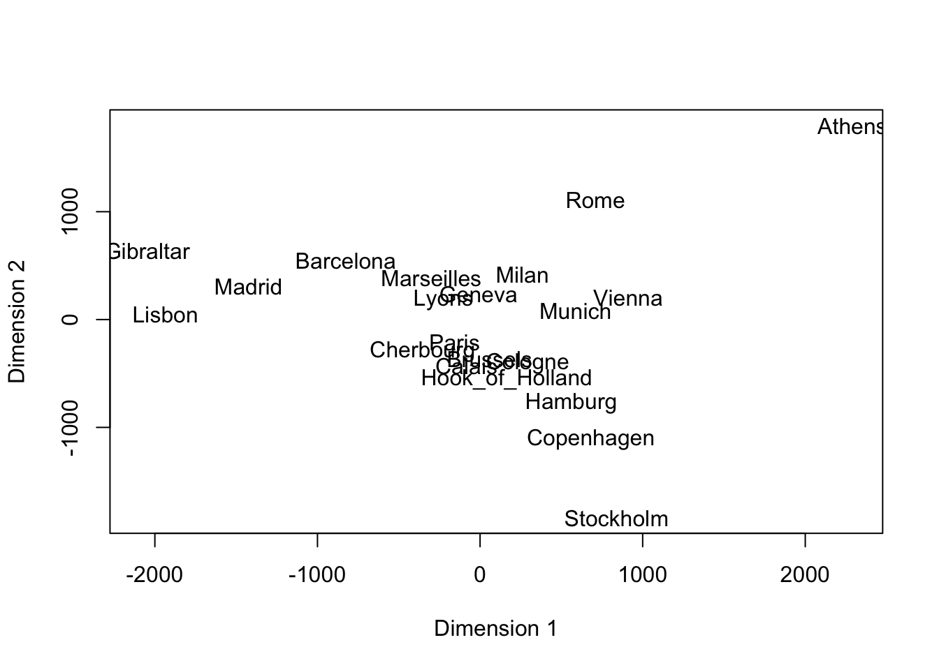
1.4.1 Exercise 6
- Notes:
- North and South are inverted (wrt the true map). Why would an algorithm know anything about the geography!
- One way to visualize this type of data (i.e., only distances are known) is via Multidimensional Scaling (MDS), which is what we used, above.
- In the case of European cities, it doesn’t tell us anything new.
- But if we don’t have any prior knowledge on a set of subjects, and we can ‘map’ proximities to a two- or three-dimensional plane, we might learn something new, or discover clusters.
1.5 Visualization using MDS
- Quick overview of MDS
- In the analyses of Penguins or Crabs data, we had the raw feature set and wish to visualize the variation in a lower-dimensional space.
- However, sometimes all we have is a measure of proximity or distance between pairs of objects.
- As previously stated, perhaps we lack the original feature set that may have generated these proximities, or none existed.
- A visualization technique for such data involves Multidimensional Scaling (MDS).
- The idea is to generate a set of observations (in a reasonably low-dimensional space) that matches the given proximities (or distances) as closely as possible.
- In the analyses of Penguins or Crabs data, we had the raw feature set and wish to visualize the variation in a lower-dimensional space.
- We are given proximities, or distances between observation \(i\) and \(j\): call them \(d_{ij}\)
- We want to construct a new dataset of features with representative or constructed elements (for observations \(i\) and \(j\)),\(({{X}_{1i}},{{X}_{2i}},\ldots ,{{X}_{pi}})\), \(({{X}_{1j}},{{X}_{2j}},\ldots ,{{X}_{pj}})\), such that \({{d}_{ij}}\approx \sqrt{\sum\limits_{k=1}^{p}{{{\left( {{X}_{ki}}-{{X}_{kj}} \right)}^{2}}}}\) for any \(i\), \(j\).
- This assumes Euclidean distance is consistent with \(d_{ij}\).
- We want to construct a new dataset of features with representative or constructed elements (for observations \(i\) and \(j\)),\(({{X}_{1i}},{{X}_{2i}},\ldots ,{{X}_{pi}})\), \(({{X}_{1j}},{{X}_{2j}},\ldots ,{{X}_{pj}})\), such that \({{d}_{ij}}\approx \sqrt{\sum\limits_{k=1}^{p}{{{\left( {{X}_{ki}}-{{X}_{kj}} \right)}^{2}}}}\) for any \(i\), \(j\).
- Notes:
- \(p\) is usually small, e.g., 2 or 3, so we are projecting into a lower dimensional space.
- Plots in this reduced dimensional space (usually 2-D or 3-D) may well separated, and thus may be suggestive of clusters otherwise not detected.
- Conversely, imagine you have a high-dimensional feature space, along with an algorithm that led to a \(K\)-cluster solution that is hard to assess visually in the raw feature space (due to its high dimensionality).
- It may be easier to form the distance matrix of all pairs of observations, and then visualize the clusters in ‘MDS Space’.
- This is because ‘MDS Space’ takes into account as much of the information (recorded as proximities) as possible, but is constrained to be in a lower-dimensional space.
- The hope is that some noise and little to no signal is removed.
- What is the difference between PCA and MDS?
1.5.1 EXAMPLE - Crabs data
- Example: crabs data
- It’s clearly hard to visualize in 5-Dimensional space.
- We use Euclidean distance to generate a 200 x 200 matrix of distances of crabs from each other.
- These distances capture the relationships, even in higher dimensional space, which we cannot easily visualize.
- We compare 2-D PC plots to 2-D MDS plots.
- One advantage the MDS has over PCA is that they are not simply linear combinations of the existing measures (warping, and non-linear relationships are possible).
- What follows is the PCA solution followed by the MDS solution
- Given that we are using the Euclidean distance in MDS (in the classical solution), the two appear nearly identical, up to translation or rotation.
- This is not guaranteed, but depends a lot on the algorithm used for MDS and the number of dimensions certainly should be the same.
- You need MDS particularly when you do not have the original measures, or there were none, but you wish to visualize.
- This is especially useful when the data are nominal!
- Given that we are using the Euclidean distance in MDS (in the classical solution), the two appear nearly identical, up to translation or rotation.
Code
pc.crabs <- princomp(crabs[,-(1:3)])$scores
plot(pc.crabs[,1],pc.crabs[,2],col=1,pch=c(3,1)[crabs$sex],cex=1.2,lwd=1.5)
legend("topleft",pch=c(3,1),legend=c("female","male"))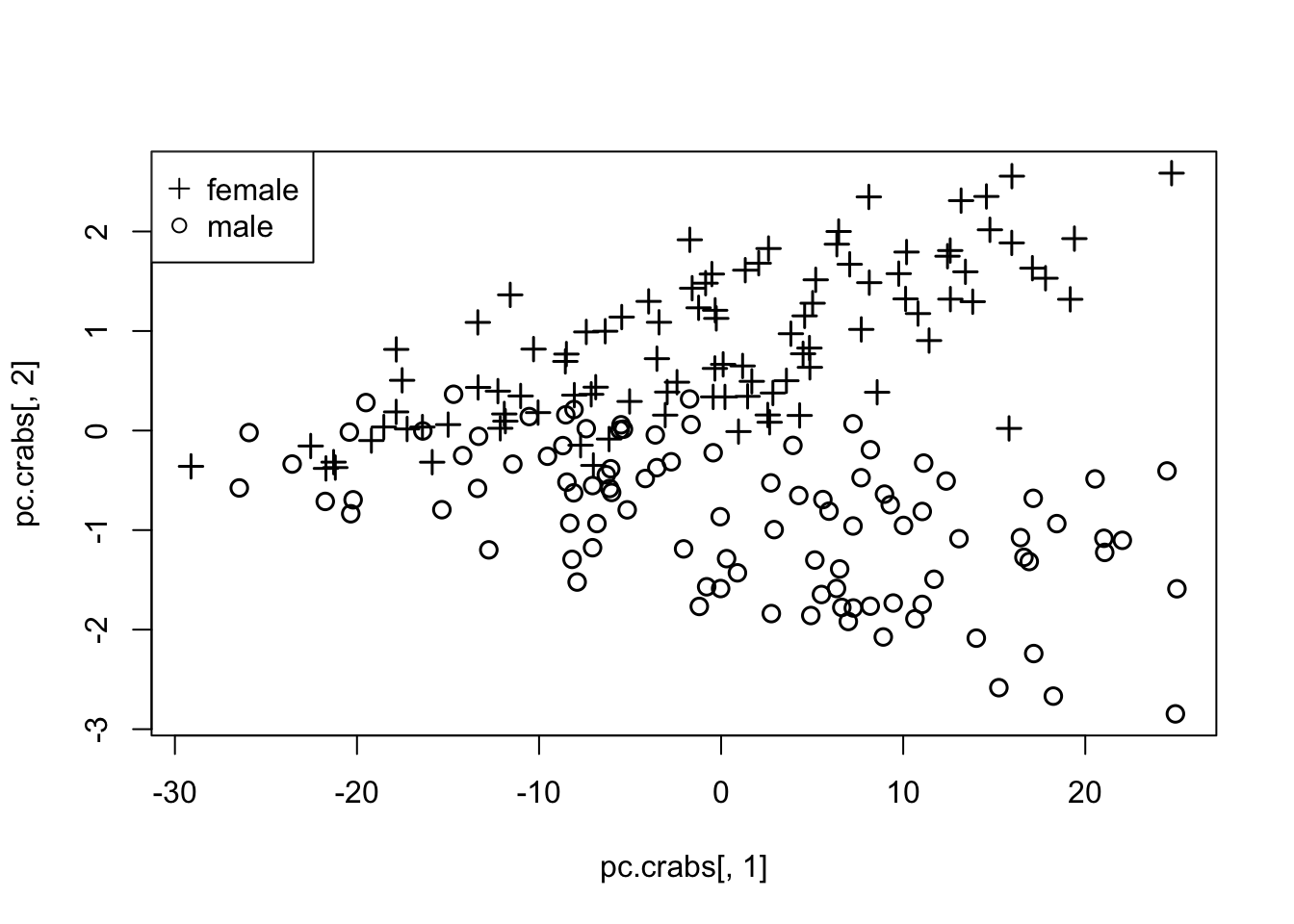
Code
mds <- cmdscale(dist(crabs[,-(1:3)]),eig=F)
plot(-mds[,1],-mds[,2],col=1,pch=c(3,1)[crabs$sex],cex=1.2,lwd=1.5)
legend("topright",pch=c(3,1),legend=c("female","male"))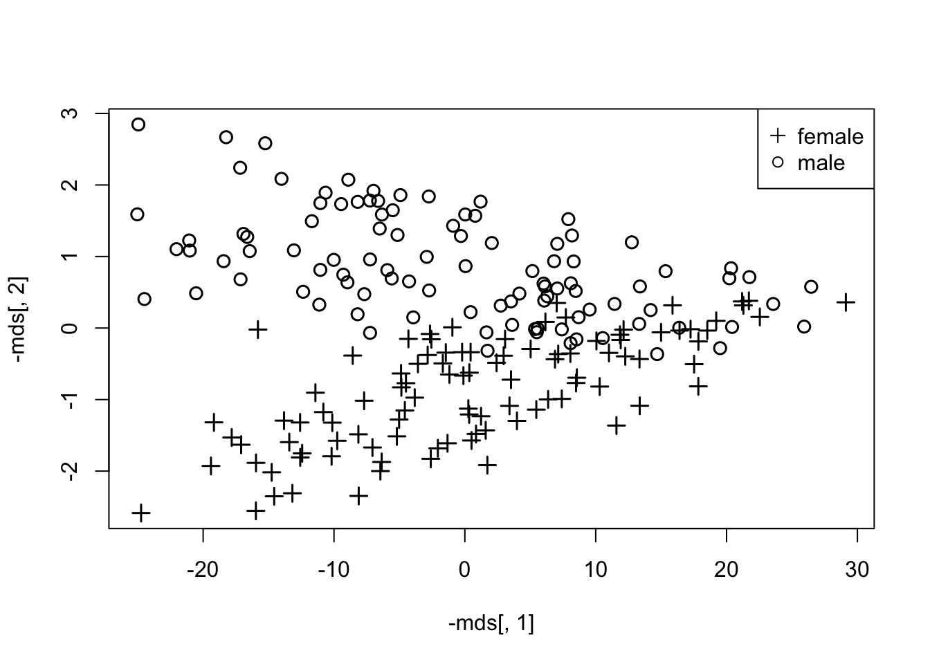
1.5.2 EXAMPLE - Political poll data
- As another example, we introduce a dataset that records the percentage of Republican votes, by state, in the elections from 1856 (Buchanan) to 1976 (Carter).
- This dataset offers an unusual challenge: some states did not exist during the 19th Century, so we have a form of missing data.
- Handling missing data is more subtle in the context of clustering because the choice of model for the missing values depends on the cluster to which it belongs.
- But we cannot determine the cluster due to missing information.
- This is known colloquially as a ‘Catch-22’ (from a Joseph Heller novel about WW-II).
- In practice, an iterative approach may be used, in which cluster assignments are made, imputations are made conditional on those assignments, then clusters are reassigned based on the imputation, and so forth.
- But we cannot determine the cluster due to missing information.
- Notes:
- One common alternative is to limit the distance metric to features that are never missing.
- A variant on this is to scale up the distance to reflect the missing features (this is a form of mean substitution).
- We will examine this issue using the Republican votes dataset.
- Another consideration with these data is that we are comparing a time series of percentages.
- These lend themselves well to a certain metric: Manhattan distance (city block; Minkowski with \(m=1\)).
- By taking the absolute value of component-wise differences in these percentages, we end up with a highly interpretable measure of ‘discordance’ between two time series, the percentage difference.
- Absolute differences make a bit more sense than Euclidean, in this context – ‘how far’ translates to ‘how much of the distribution must move’ to make the two equivalent?
- One common alternative is to limit the distance metric to features that are never missing.
- Our first set of runs attempts a multi-dimensional scaling into 2 dimensions.
- Based on a dissimilarity matrix computed from the Manhattan distance metric across all available elections.
- To understand the distances, or dissimilarities, between states, we give the percent Republican vote for 1968-1976 and the corresponding metric for 4 states in the file.
Code
  data(votes.repub)
  round(votes.repub[30:33,29:31],1)
## X1968 X1972 X1976
## New Jersey 46.1 61.6 51.0
## New Mexico 51.8 61.0 51.0
## New York 44.3 58.5 47.8
## North Carolina 39.5 69.5 44.4Code
round(dist(votes.repub[30:33,29:31],method='manhattan'),1)## New Jersey New Mexico New York
## New Mexico 6.3
## New York 8.1 13.2
## North Carolina 21.1 27.4 19.21.5.3 Exercise 7
- Notes:
- The comparison of NM and NJ is based on the following formula: \(diss=|46.1-51.8|+|61.6-61.0|+|51.0-51.0|=5.7+0.6+0=6.3\).
- When we compute that same metric based on all elections (by selecting all columns in the data), we get (for NJ,NM,NY):
Code
round(dist(votes.repub[30:33,],method='manhattan'),1)## New Jersey New Mexico New York
## New Mexico 185.0
## New York 106.1 152.6
## North Carolina 319.7 291.3 289.3- Notes:
- Even though NM was not a state in 1856, the average of available year-based differences is simply scaled up.
- As mentioned, this is one way to deal with missing values and is similar to mean substitution
- Across the years 1856-1976, NY and NJ are seen to be the most similar (of these 4 states), rather than NM and NJ.
- Use of a common metric across all election years is problematic in political data, as both the landscape (players, or states, and importantly, their populations) and alignments are changing dynamically over time (it’s a non-stationary process).
- Even though NM was not a state in 1856, the average of available year-based differences is simply scaled up.
- MDS based on the dissimilarity matrix for all 50 states and all elections from 1856-1976, projected onto 2 dimensions, yields:
Code
#prep for MDS:
lbls0 <- dimnames(votes.repub)[[1]]
lbls <- c("AL","AK","AZ","AR","CA","CO","CT","DE","FL","GA","HI","ID","IL","IN","IA","KS","KY","LA","ME","MD","MA","MI","MN","MS","MO","MT","NE","NV","NH","NJ","NM","NY","NC","ND","OH","OK","OR","PA","RI","SC","SD","TN","TX","UT","VT","VA","WA","WV","WI","WY")
#First MDS:
mdist.votes <- dist(votes.repub,method='manhattan')
mds1 <- cmdscale(mdist.votes)
len <- length(lbls)
Code
plot(mds1,type='n',xlab='MDS Dimension 1',ylab='MDS Dimension 2')
for (i in 1:len) text(mds1[i,1],mds1[i,2],lbls[i],cex=1,col=rainbow(len)[i]) #colors are pretty basic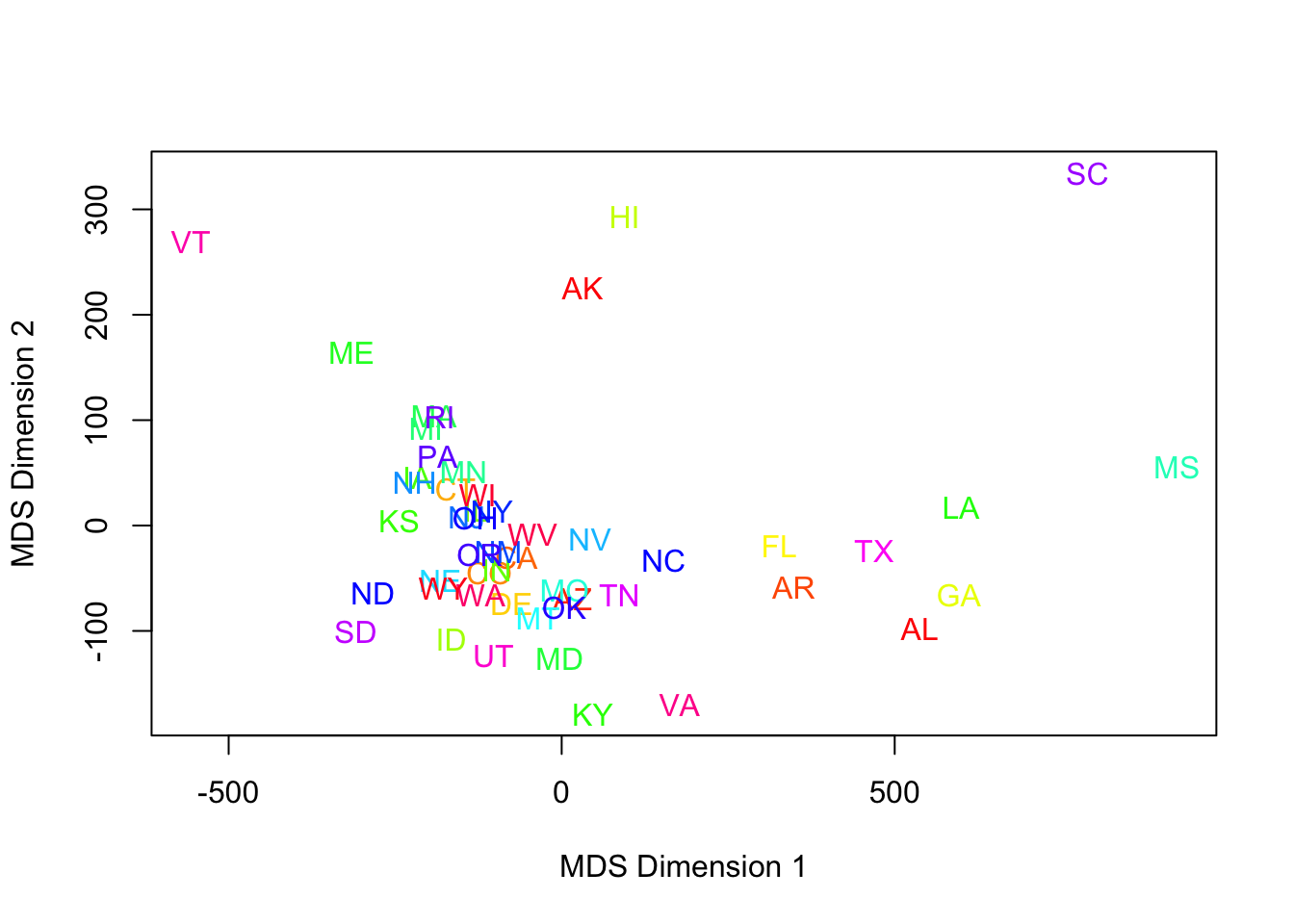
- This is a poor use of color.
- Better choices would be region-based, or the more modern attribute, ‘red state/blue state.’
- Assigning a state to red (leaning Republican) or blue (leaning Democrat) proved harder than expected.
- The election of 1976 was pretty close to the current alignment, but the South was completely different (some of you may know the political history).
- Another challenge is that looking back historically, states like California weren’t always ‘blue.’
- The election of 1976 was pretty close to the current alignment, but the South was completely different (some of you may know the political history).
- Solution: use Wikipedia based assignments: red, blue, and purple (mixed nearly 50/50 Republican/Democrat) states have been assigned for us, based on the elections from 1992-2008.
- Here is the same MDS run with a new color scheme:
Code
#red state blue state improvement:
blueStates <- c("MA","RI","NY","HI","VT","MD","IL","CT","CA","DE","ME","NJ","WA","MI","MN","OR","PA","NM","WI","IA","NH")
purpleStates <- c("NV","WV","AR","CO","FL","MO","OH")
b.blue <- !is.na(match(lbls,blueStates))
b.purp <- !is.na(match(lbls,purpleStates))
col.state <- 1+1*b.blue+2*b.purp
Code
plot(mds1,type='n',xlab='MDS Dimension 1',ylab='MDS Dimension 2')
for (i in 1:len) text(mds1[i,1],mds1[i,2],lbls[i],cex=1,col=c("red","blue","purple")[col.state[i]])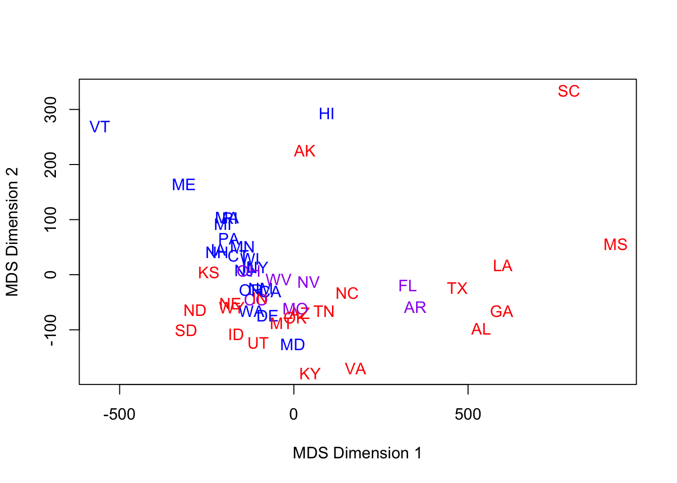
- Viewed through this modern lens, MDS latent dimensions pick up some of the structure we might expect.
- Red & Blue aren’t perfectly separated, but it’s not too bad.
- Purple are in the middle, for the most part.
- Red & Blue aren’t perfectly separated, but it’s not too bad.
- When we talk about latent dimensions, we have to be careful
- They may reflect a latent factor, but initially we have no evidence one way or the other about this.
- Reminder: the metric generating the dissimiliarity has at least 2 potential flaws
- Spanning too many years
- Scaling up missing data through something like a mean substitution.
- Our next set of runs attempts a multi-dimensional scaling into 2 dimensions, based on a dissimilarity matrix computed from the Manhattan distance metric across ONLY the 1960-1976 elections.
- No state is missing in these years, so the metric is well-defined.
- The period is short enough that political alignment may be somewhat stationary.
- The Nixon landslide election of 1972 looks dramatic, in terms of electoral votes, but in terms of relative voting patterns, we would expect NY & NJ to still be more ‘blue’ than a traditionally ‘red’ state.
- The MDS run follows, with the same color-coding:
Code
mds2 <- cmdscale(dist(votes.repub[,27:31],method='manhattan'))
plot(mds2,type='n',xlab='MDS Dimension 1',ylab='MDS Dimension 2')
for (i in 1:len) text(mds2[i,1],mds2[i,2],lbls[i],cex=1,col=c("red","blue","purple")[col.state[i]])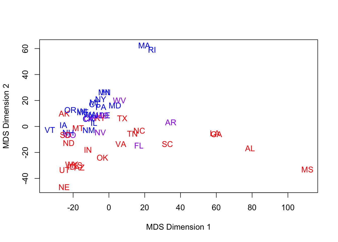
- Notes:
- Did the axes ‘flip’?
- It’s not that important – they are arbitrary.
- However, if we have ascribed some latent factor to these dimensions, then we must reassess these labels upon successive re-scaling.
- Are red & blue better separated? Maybe a little.
- Did the axes ‘flip’?
1.6 Principal components, revisited
- Could we have skipped this whole MDS approach and just used principal components?
- IMPORTANT: we can only consider this option because we have the original metric.
- In many situations in which one utilizes dissimilarity, we do not have the ‘raw’ features.
- IMPORTANT: we can only consider this option because we have the original metric.
- We now compute PCs based on 1960-1976 elections and plot the first two principal components color- and state-coded.
Code
pc2 <- princomp(votes.repub[,27:31])$scores
plot(pc2[,1:2],type='n',xlab='PC 1',ylab='PC 2')
for (i in 1:len) text(pc2[i,1],pc2[i,2],lbls[i],cex=1,col=c("red","blue","purple")[col.state[i]])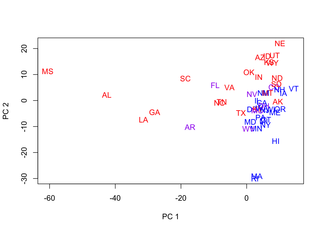
- Notes:
- They do not look quite as good.
- What we mean is that they don’t reveal very much structure, separate the states into groups, etc.
- Recall that MDS was based on Manhattan distance.
- Maybe we’re looking at the wrong 2 PCs!
- Let’s look at the full set of PCs for the 5 election years.
- PCs 2 & 3 look good for separation in general
- We now revisit the plot of the 50 states, color-coded, using PCs 2 & 3.
- They do not look quite as good.
Code
plot(pc2[,2:3],type='n',xlab='PC 2',ylab='PC 3')
for (i in 1:len) text(pc2[i,2],pc2[i,3],lbls[i],cex=1,col=c("red","blue","purple")[col.state[i]])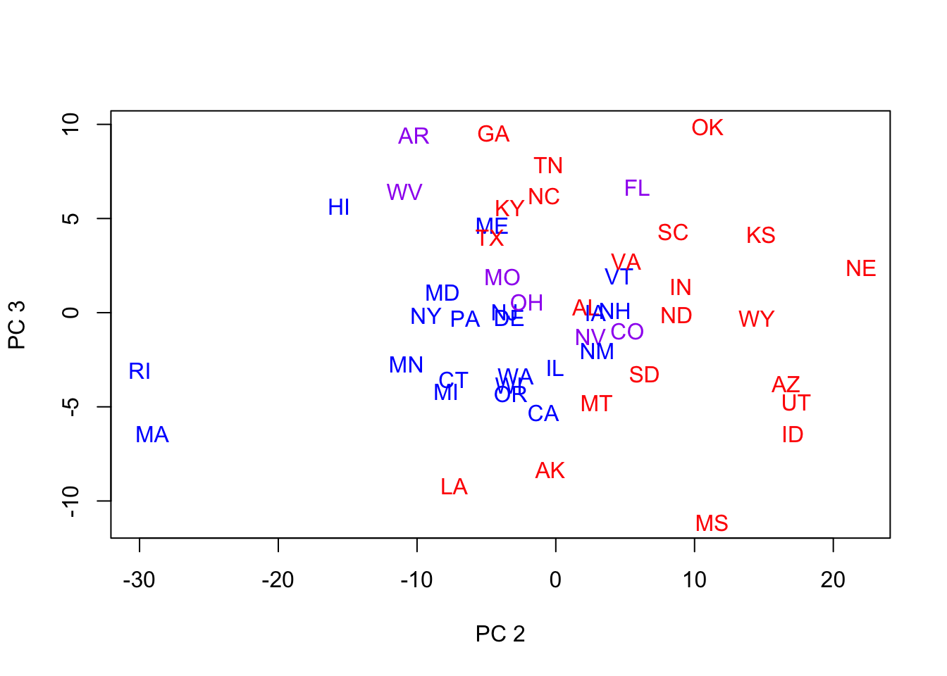
- This is reasonably good separation
- But the ‘dimensions’ of the PCs do not reflect obvious political factors (latent, orthogonal factors), since the blues are mostly surrounded by the reds.
- Reminders:
- We’re ignoring PC 1, which contains most of the variation
- We won’t always have the raw data from which to derive these PCs.
- This is a different political period than the red/blue state distinction quantifies.
1.7 Supervised Learning (intro)
- We now briefly discuss discriminant analysis, a form of supervised learning.
- This is the situation in which you know the groups to which subjects belong
- You wish to determine which features (or combination of features) predict group membership well.
- Discriminant analysis is a method of classification.
- It can be used for predictions of future observations, but often the objective is to understand a single dataset (rather than a training/test pair).
- Example: For the Penguins data, the species were known (reveal).
- There were THREE species represented in different numbers in the data: Adelie, Chinstrap, Gentoo.
- MDS Visualization (one of many ways to viz.) now color coded by species reveals a challenge in separating two of the three species from each other (there is some overlap):
Code
mds.penguins <- cmdscale(dist(penguins[,3:5]),k=3)
pairs(mds.penguins,col=(2:4)[penguins$species],labels=paste0("LatDim",1:3), oma=c(6,3,3,3))
par(xpd=T)
legend("bottom",col=2:4,pch=rep(16,3),legend = sort(unique(penguins$species)),horiz=T,cex=.7)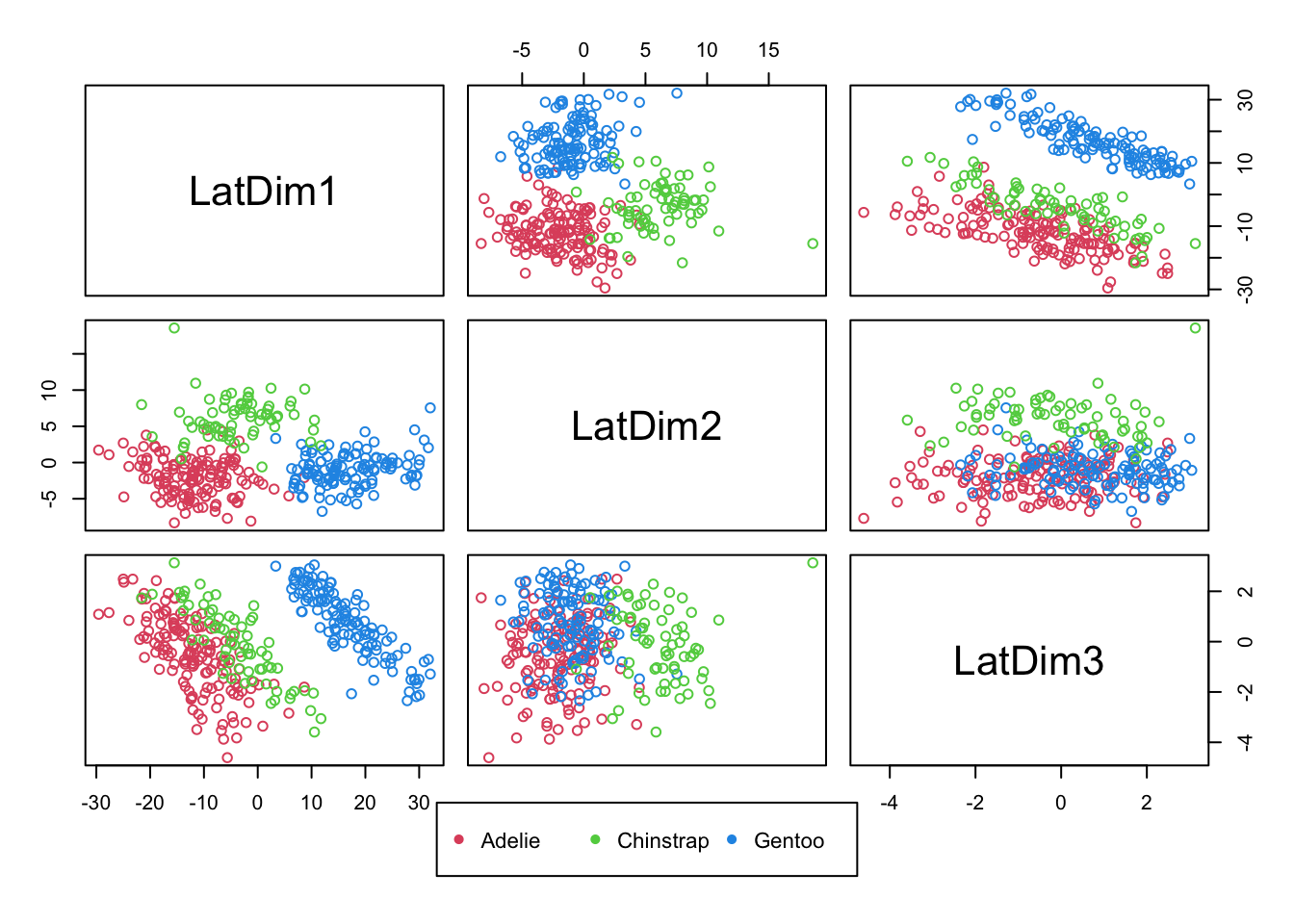
Code
par(xpd=F)1.7.1 Exercise 8
- Is there a projection of these (three) features that allows us, perhaps in one dimension, to separate the known groups from each other?
- For Penguins data, it seems that with these features, it is possible to separating Gentoo from the remaining two species.
- We can use logistic regression as a classifier, as it yields the predicted probability of being in one of two classes.
- For Penguins data, it seems that with these features, it is possible to separating Gentoo from the remaining two species.
- Recall the logistic regression model
- The log-odds, or logit, of event \(Y_i\) is a linear function of predictors
- We can extend this approach to more than two groups using multinomial logit models.
- From prior pairs plots (and this one), it seems Gentoo could be perfectly separated out with the right projection of features
- In the case of logistic regression, this can be a problem
- What happens when you take the log of odds, and the odds are zero?
- We will fit a model with all three predictors with outcome gentoo species (or not – so a 0/1 outcome).
- In the case of logistic regression, this can be a problem
Code
penguins$gentoo <- penguins$species=='Gentoo'
fit <- glm(gentoo~bill_length_mm+bill_depth_mm+flipper_length_mm,data=penguins,family=binomial)
## Warning: glm.fit: algorithm did not converge## Warning: glm.fit: fitted probabilities numerically 0 or 1 occurredCode
summary(fit)##
## Call:
## glm(formula = gentoo ~ bill_length_mm + bill_depth_mm + flipper_length_mm,
## family = binomial, data = penguins)
##
## Deviance Residuals:
## Min 1Q Median 3Q Max
## -6.609e-05 -2.100e-08 -2.100e-08 2.100e-08 6.429e-05
##
## Coefficients:
## Estimate Std. Error z value Pr(>|z|)
## (Intercept) -2.481e+02 3.954e+05 -0.001 0.999
## bill_length_mm -2.908e-01 3.971e+03 0.000 1.000
## bill_depth_mm -2.047e+01 1.170e+04 -0.002 0.999
## flipper_length_mm 2.902e+00 1.175e+03 0.002 0.998
##
## (Dispersion parameter for binomial family taken to be 1)
##
## Null deviance: 4.3415e+02 on 332 degrees of freedom
## Residual deviance: 1.4830e-08 on 329 degrees of freedom
## AIC: 8
##
## Number of Fisher Scoring iterations: 25- Notes:
- You should be suspicious: std. errors are unusually large and deviance (a function of the loglikelihood) is effectively 0.
- A reasonable way to approach logistic modeling in the presence of perfect prediction (or near perfect prediction), a phenomenon known as `separation,’ is to use a Bayesian approach
- By putting priors on the regression coefficients basically doesn’t allow them to be so large that they perfectly predict.
Code
fit <- arm::bayesglm(gentoo~bill_length_mm+bill_depth_mm+flipper_length_mm,data=penguins,family=binomial)
summary(fit)
##
## Call:
## arm::bayesglm(formula = gentoo ~ bill_length_mm + bill_depth_mm +
## flipper_length_mm, family = binomial, data = penguins)
##
## Deviance Residuals:
## Min 1Q Median 3Q Max
## -0.46726 -0.01901 -0.00416 0.02352 0.41890
##
## Coefficients:
## Estimate Std. Error z value Pr(>|z|)
## (Intercept) -40.28442 28.56373 -1.410 0.15844
## bill_length_mm 0.04663 0.16642 0.280 0.77931
## bill_depth_mm -2.19771 0.74561 -2.948 0.00320 **
## flipper_length_mm 0.36013 0.12279 2.933 0.00336 **
## ---
## Signif. codes: 0 '***' 0.001 '**' 0.01 '*' 0.05 '.' 0.1 ' ' 1
##
## (Dispersion parameter for binomial family taken to be 1)
##
## Null deviance: 434.1538 on 332 degrees of freedom
## Residual deviance: 1.7827 on 329 degrees of freedom
## AIC: 9.7827
##
## Number of Fisher Scoring iterations: 301.8 More visualization and disc. of standardization
1.8.1 EXAMPLE
- Male life expectancy at ages 0 (birth), 25, 50, and 75 for 15 nations.
Code
maleLifeExp <- read.dta("./Datasets/malelifeexp.dta")  #may be case sensitive
maleLifeExp
## country expage0 expage25 expage50 expage75
## 1 Algeria 53 51 30 13
## 2 Costa Rica 65 48 26 9
## 3 El Salvador 56 44 25 10
## 4 Greenland 60 44 22 6
## 5 Grenada 61 45 22 8
## 6 Honduras 59 42 22 6
## 7 Mexico 59 44 24 8
## 8 Nicaragua 65 48 28 14
## 9 Panama 65 48 26 9
## 10 Trinidad 64 43 21 6
## 11 Chile 59 47 23 10
## 12 Ecuador 57 46 25 9
## 13 Argentina 65 46 24 9
## 14 Tunisia 56 46 24 11
## 15 Dom. Repub. 64 50 28 11- It’s hard to imagine ‘natural’ groupings without visualization and/or some sense of what is near and far.
- One thing we have ignored, up to now are the marginal distributions.
- For example, do we find evidence of bimodality (two groups) across some feature?
- The small sample size in this data will limit our ability to detect much here, but we can at least take a look.
- Note: any evidence that we accumulate here (through density plots) will suggest at least this many groups, but there could certainly be more (why?).
- One thing we have ignored, up to now are the marginal distributions.
Code
par(mfrow=c(2,2))
plot(density(maleLifeExp$expage0),main='Life expectancy at birth')
plot(density(maleLifeExp$expage25),main='Life expectancy at age 25')
plot(density(maleLifeExp$expage50),main='Life expectancy at age 50')
plot(density(maleLifeExp$expage75),main='Life expectancy at age 75')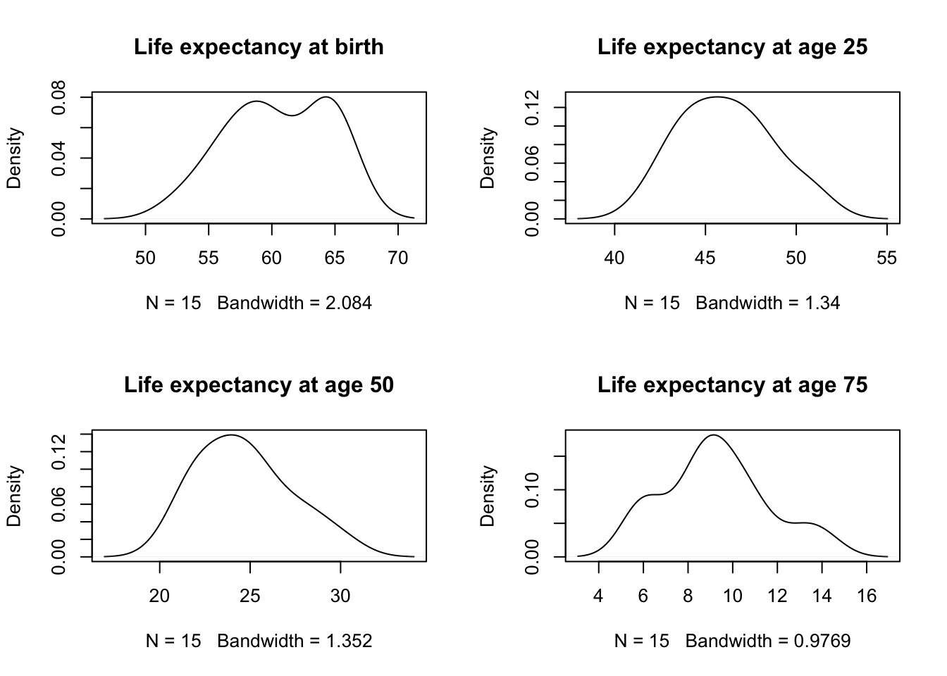
Code
par(mfrow=c(1,1))- Notes:
- Perhaps there are two modes for ExpAge0?
- Parallel Coordinate plot
- We now visualize this data using a parallel coordinate plot.
- In this graphic, each measure is assigned to a categorical slot on a single axis
- Each observation is a line connecting the levels of those measures in the same way we construct ‘profile plots’ in RMANOVA.
- Another way to think of this plot is that it is like a stacked boxplot
- And the variables are given a unique position on the x-axis, with the y-axis representing level.
- And the variables are given a unique position on the x-axis, with the y-axis representing level.
- In the parallel coordinate plot, we play ‘connect the dots’ with the observations for each subject.
- Our first attempt at a parallel coordinate plot for the above dataset ignores any scaling difference between measures.
Code
matplot(1:4,t(maleLifeExp[,2:5]),type='b',ylab='value',xlab='feature')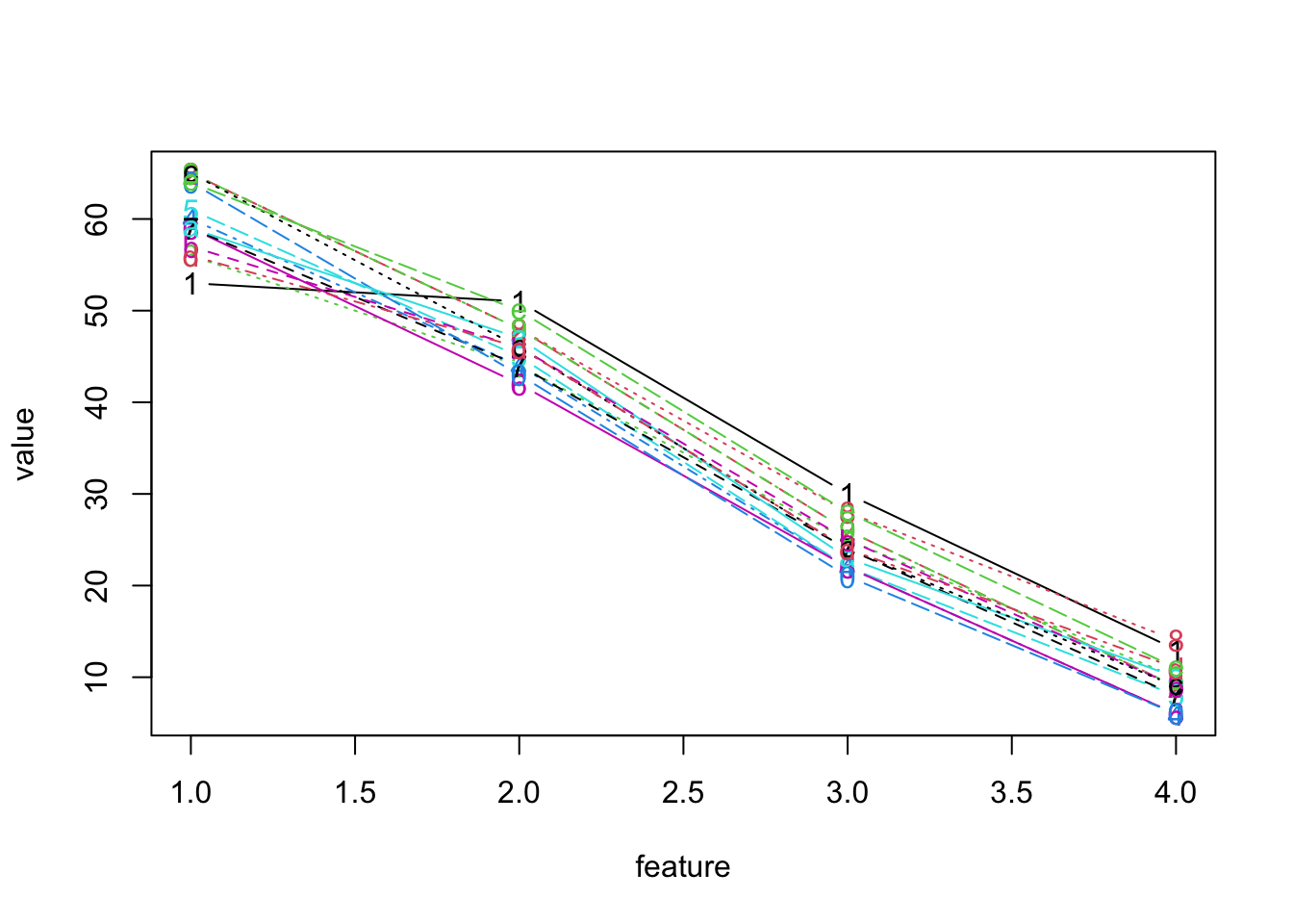
- Notes:
- The problem with this plot, of course is the scaling
- Also, the x-axis is poorly labeled, but that could be fixed
- Clearly, we would benefit from standardizing each measure first.
- Below, we report a ‘standardized plot’
- It has been rescaled so that the maximum and minimum are aligned across measures (rather than scaled by each measure’s standard deviation)
- It is also rotated by 90 degrees.
Code
lattice::parallelplot(maleLifeExp[,2:5])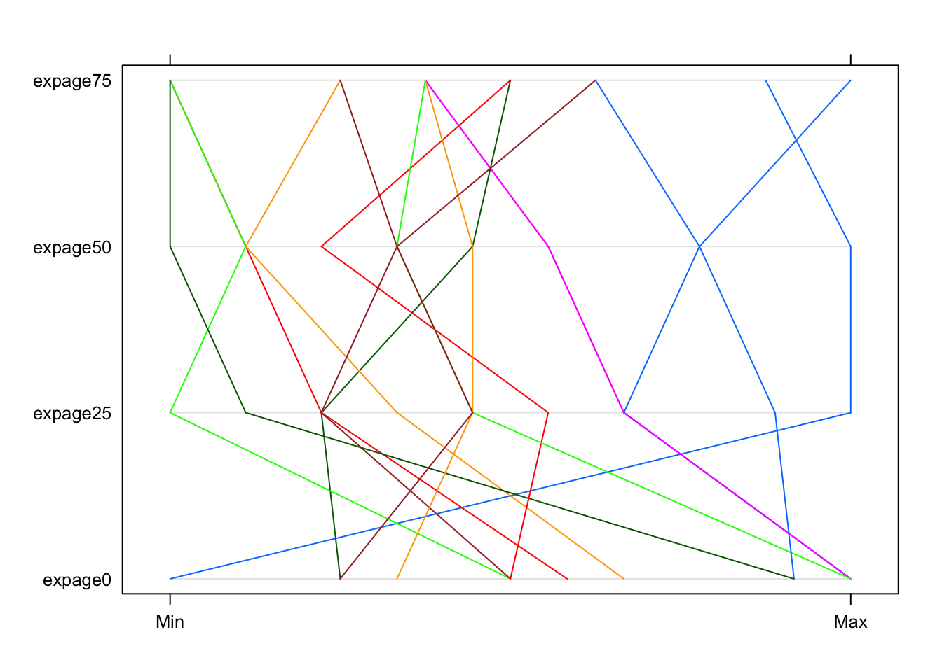
1.8.2 Exercise 10
- Notes:
- Clearly, this is much better.
- However, a better understanding of the groupings still eludes us.
- In part because the parallel coord. plots were not very informative, we return to bivariate plots, which reveal more.
- Note: we did not standardize (with z-scores), nor use PCs.
- With such a small number of observations, the benefits of PCs may be limited
- More to the point, problems with the scales will be immediately apparent, as in the first attempt at a parallel coord. plot.
- Clearly, this is much better.
Bivariate plots: number of clusters?
Code
pairs(maleLifeExp[,2:5],pch=16)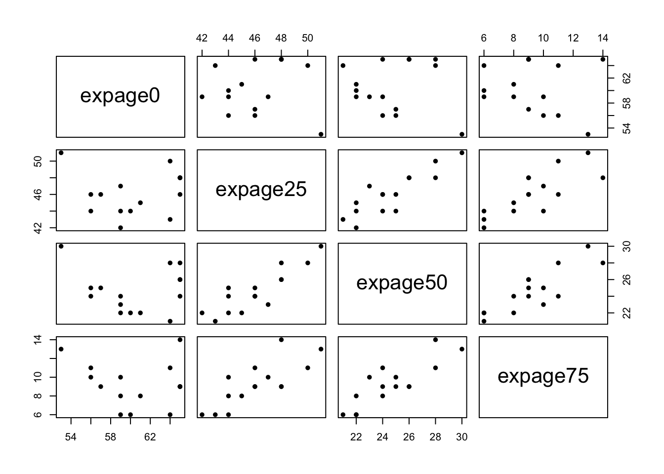
- Notes:
- While a 2 cluster solution is viable, better separation might be visible in 3 or more dimensional space.
- We always have this problem.
- A partial solution is to forge ahead and try to identify clusters using one of the many techniques that have been developed.
- We might not be able to ‘see’ clusters, but we can often find potential clusters using these techniques.