3 Chapter 3: Hierarchical & Model-Based Clustering (MBC)
3.1 Choosing the number of clusters – another approach & metric
- Silhouette Width Plots
- Another way to ‘assess’ cluster adequacy is through a plot that depicts the degree of homogeneity within each cluster.
- One advantage Silhouette Plots have over other methods of evaluation is that they require only a dissimilarity or distance measure.
- They do not require a feature set, as \(C(g)\) does
- They do not require a feature set, as \(C(g)\) does
- Note: Why does \(C(g)\) require a feature set? Recall the definition.
\[ C(g)=\frac{\frac{tr(B)}{g-1}}{\frac{tr(W)}{n-g}} \]
3.1.1 Silhouette Width (cont.)
\[ B=\sum\limits_{m=1}^{g}{n_m}(\bar{\mathbf{x}}_m - \bar{\mathbf{x}})(\bar{\mathbf{x}}_m-\bar{\mathbf{x}})' \]
\[ W=\sum\limits_{m=1}^{g}\sum\limits_{l=1}^{n_m}(\mathbf{x}_{ml}-\bar{\mathbf{x}}_m)(\mathbf{x}_{ml}-\bar{\mathbf{x}}_m)' \]
- For each point, we can evaluate its average dissimilarity, or distance from every other point in the cluster.
- Say we are using Euclidean distance (but it can be any distance metric on pairs \((i,j)\):
\[ a(m,i)=\frac{1}{{{n}_{m}}-1}\sum\limits_{l\in \{1,\ldots ,{{n}_{m}}\}\backslash i}^{{}}{\sqrt{\sum\limits_{k=1}^{p}{({{x}_{m,ik}}-{{x}_{m,lk}}}{{)}^{2}}}} \]
- \(a(m,i)\) is the average (Euclidean) distance of the \(i^{th}\) point in the \(m^{th}\) cluster from all remaining points in that cluster.
- The square root term is the distance of the \(i^{th}\) point from the \(l^{th}\) point in that same cluster.
- \(a(m,i)\) is the average (Euclidean) distance of the \(i^{th}\) point in the \(m^{th}\) cluster from all remaining points in that cluster.
- For any other cluster:
- take that same point \(i\) and evaluate its average dissimilarity, or distance, from all the points in that other cluster.
- We’ll call this measurement ‘D’:
- take that same point \(i\) and evaluate its average dissimilarity, or distance, from all the points in that other cluster.
\[ D(C,m,i)=\frac{1}{n_C}\sum\limits_{l\in \{1,\ldots ,n_C\}\backslash i}^{{}}{\sqrt{\sum\limits_{k=1}^{p}{({{x}_{m,ik}}-{{x}_{C,lk}}}{{)}^{2}}}} \]
- \(D(C,m,i)\) is the average distance of point \(i\) in cluster \(m\) from every point in cluster \(C\).
- The square root term is the Euclidean distance of the \(i^{th}\) point cluster m from the \(l^{th}\) point in cluster \(C\).
- \(D(C,m,i)\) is the average distance of point \(i\) in cluster \(m\) from every point in cluster \(C\).
- Next, we find a neighboring cluster that is ‘closest’ to point \(i\) in cluster \(m\), and call that \(b\): \(b(m,i)=\underset{c}{\mathop{\min }}\,D(c,m,i)\)
- \(b(m,i)\) is the average distance of point \(i\) in cluster \(m\) from every point in the nearest cluster to \(i\), other than the cluster it’s in.
- The idea is to compare \(a(m,i)\) and \(b(m,i)\). Homogenous clusters have large \(b(m,i)\) relative to a(m,i).
- The silhouette width \(SW_{im}\) for point \(i\) in cluster \(m\) is defined: \[ SW_{im}= \frac{b(m,i)-a(m,i)}{max\{a(m,i),b(m,i)\}} \]
3.2 Silhouette width properties
- Scaled between -1 and 1.
- Can be negative
- Why could this happen? Shouldn’t the point have be classified to the ‘closer’ cluster?
- Think: what would happen if you moved the point?
- It is rare that it is negative for a lot of observations.
- Why could this happen? Shouldn’t the point have be classified to the ‘closer’ cluster?
- Plots of silhouette width, organized by cluster are often informative, and can be used to choose an appropriate cluster ‘solution.’
- Average silhouette width across all clusters and observations is also used as a global measure of goodness of fit.
3.3 Silhoutte plots
- We look at silhouette width plots for penguins and crabs data.
- Think about which ‘solution’ you would choose.
Look for label switching (some crosstabs might help)
- Think about which ‘solution’ you would choose.
Code
set.seed(2011001)
crabs <- read.dta("./Datasets/crabs.dta")
km.penguins.3<-kmeans(penguins[,3:5],3,nstart=100)
km.penguins.4<-kmeans(penguins[,3:5],4,nstart=100)
xtabs(~km.penguins.3$clust+km.penguins.4$clust)
## km.penguins.4$clust
## km.penguins.3$clust 1 2 3 4
## 1 1 0 0 114
## 2 0 73 52 0
## 3 89 4 0 0Code
km.crabs.4<-kmeans(crabs[,-(1:3)],4,nstart=100)
km.crabs.7<-kmeans(crabs[,-(1:3)],7,nstart=100)
xtabs(~km.crabs.4$clust+km.crabs.7$clust)
## km.crabs.7$clust
## km.crabs.4$clust 1 2 3 4 5 6 7
## 1 0 0 24 39 0 0 4
## 2 0 18 0 0 0 0 19
## 3 19 0 0 0 0 15 0
## 4 0 0 14 0 37 11 03.3.1 Silhoutte plots: penguins
Code
par(mfrow=c(1,2))
plot(silhouette(km.penguins.3$clust,dist(penguins[,3:5])))
plot(silhouette(km.penguins.4$clust,dist(penguins[,3:5])))
3.4 Partitioning About Medoids (PAM)
- Clustering from dissimilarity matrices using PAM
- PAM is similar to the k-means algorithm in that it involves building a partition of the data into \(k\) groups
- \(k\) is specified from the outset.
- hclust can also operate on a dissimilarity matrix as long as the agglomeration rule does not require the original data
- In the centroid and Ward’s methods you need to construct a mean of features. R’s implemention of the centroid method works around this.
- PAM is similar to the k-means algorithm in that it involves building a partition of the data into \(k\) groups
- PAM differs from k-means in at least 2 ways
- The dissimilarity matrix used to establish the clustering can be arbitrary.
- It can reflect subjective opinions (e.g., which cereals are most similar; even Q-sort results).
- The objective criterion – what makes a clustering ‘good’ – is different
- We can’t use \(C(g)\) unless we use the version revised for distances without raw feature vectors.
- While k-means minimizes the sum of the squared Euclidean distances between observations and their group mean, PAM minimizes the dissimilarities between the current medoid and all other observations in its assigned cluster.
- The dissimilarity matrix used to establish the clustering can be arbitrary.
- How PAM works:
- There is an initial phase in which \(k\) ‘centers’ or medoids are assigned.
- These medoids are specific observations that appear ‘close’ (in terms of dissimilarity) to a subset of the other observations (medoid \(\approx\) centroid).
- The process of choosing the initial \(k\) medoids is somewhat complex, but basically involves sequentially adding new ‘seeds’ that pull away some observations from existing seeds, because the new seeds are closer to some subset of observations.
- This repeats until all \(k\) seeds are chosen.
- There is a swap phase, in which alternative choices for medoids are examined.
- The algorithm will swap a medoid choice if that swap improves an objective function that is based on terms in component \(a\) of the silhouette width calculation.
- The average distance between medoid and all cluster elements must improve if a medoid is to be swapped out.
- The algorithm will swap a medoid choice if that swap improves an objective function that is based on terms in component \(a\) of the silhouette width calculation.
- There is an initial phase in which \(k\) ‘centers’ or medoids are assigned.
- Once all \(k\) medoids have been (re-)chosen, each observation is assigned to a group based on the nearest medoid.
- So an observation may be closest to group A’s medoid, but its average dissimilarity with observations in group A is actually larger than its average dissimilarity with observations in another group, B.
- This results in a negative silhouette width.
- The problem is that it isn’t close enough to the medoid of B to be placed in that cluster.
- Thus, the choice of medoids is quite important, which is why the swap phase is so extensive (and sometimes time-consuming).
- In some sense, the clustering is the easy part, given the medoids.
- So an observation may be closest to group A’s medoid, but its average dissimilarity with observations in group A is actually larger than its average dissimilarity with observations in another group, B.
3.5 Model-based Clustering
- Mixtures of densities
- The difference between model-based clustering (MBC) and most of the methods that have preceded this:
- A plausible generating mechanism is fully developed
- Cluster assignments are based on these
- What is a generating mechanism?
- It’s a statistical rule for creating new observations
- Called Data Generating Process (DGP)
- It’s a statistical rule for creating new observations
- The difference between model-based clustering (MBC) and most of the methods that have preceded this:
3.5.1 MBC/DGP Example
- Assume two groups
- No matter which group you are in, the observation is a draw from a binomial distribution with n=100.
- This is the count of heads in 100 ‘coin flips,’ but the probability of heads depends on which group you are in.
- This is the count of heads in 100 ‘coin flips,’ but the probability of heads depends on which group you are in.
- In group 1, Pr(Heads)=0.25
- Typical observations are 25, 27, etc. The mean, or expected value is 25.
- In group 2, Pr(Heads)=0.75
- Expected value 75 (out of 100).
- No matter which group you are in, the observation is a draw from a binomial distribution with n=100.
- Look at a sample with 50 observations from group 1 and 50 from group 2.
Code
set.seed(2011)
y1 <- rbinom(50,100,.25)
y2 <- rbinom(50,100,.75)
plot(density(c(y1,y2)),main='Mixture of two binomials')
- If we believe that a proposed generating mechanism could represent the data reasonably well, then we can build a statistical model with ‘open’ parameters that govern the way observations occur.
- We can find the best fitting version of that model that is consistent with the data.
- Example of a DGP from another course
- If we believe that a simple linear model (DGP) for Y is: \(Y=b_0+b_1X_1+b_2X_2+\varepsilon\), and assuming \(\varepsilon \sim N(0,{{\sigma }^{2}})\).
- Then we can find the ‘best’ values of \(b_0\), \(b_1\), \(b_2\), and \(\sigma^2\) that are consistent with our observations.
- If we believe that a simple linear model (DGP) for Y is: \(Y=b_0+b_1X_1+b_2X_2+\varepsilon\), and assuming \(\varepsilon \sim N(0,{{\sigma }^{2}})\).
- One version of this process, searching for the ‘best’ values of the parameters that are consistent with the observations is known as maximum likelihood estimation, or MLE.
- We call these ‘best’ estimates MLEs, and usually denote them with a ‘hat,’ as in \({{\hat{\sigma }}^{2}}\), once the model is fit, because they are estimated.
- We define ‘best’ in terms of a likelihood function, which is a mathematical representation of the generating mechanism.
- In words, we want to find the parameters that were most likely to generate these observations.
- Continuing with this example, in regression, we implicitly assume that data are generated as follows:
- Take the value of \(X_1\) and \(X_2\), scale them by \(b_1\), and \(b_2\), sum them along with \(b_0\).
- This is \(b_0+b_1X_1+b_2X_2\).
- Take this sum \((b_0+b_1X_1+b_2X_2)\) and add a ‘random error’ drawn from a normal distribution with mean zero and variance \(\sigma^2\).
- Call this random error \(\varepsilon\).
- Then a new observation \(Y\), given \(X_1\) and \(X_2\), is \(b_0+b_1X_1+b_2X_2+\varepsilon\).
- Take the value of \(X_1\) and \(X_2\), scale them by \(b_1\), and \(b_2\), sum them along with \(b_0\).
- If the data are generated this way, then the distribution of an observation, given parameters \(b_0\), \(b_1\), and \(b_2\) and \(\sigma^2\) can be written down as follows: \[ Y|{{X}_{1}},{{X}_{2}},{{b}_{0}},{{b}_{1}},{{b}_{2}},{{\sigma }^{2}}\sim N({{b}_{0}}+{{b}_{1}}{{X}_{1}}+{{b}_{2}}{{X}_{2}},{{\sigma }^{2}}) \]
- You read this: \(Y\) given \(X_1\), \(X_2\),\(b_0\), \(b_1\), \(b_2\), \(\sigma^2\) is distributed as a normal with mean \(b_0+b_1X_1+b_2X_2\) and variance \(\sigma^2\).
- This conditional probability of observing a specific \(Y\), given everything else, is a specific normal density:
- You read this: \(Y\) given \(X_1\), \(X_2\),\(b_0\), \(b_1\), \(b_2\), \(\sigma^2\) is distributed as a normal with mean \(b_0+b_1X_1+b_2X_2\) and variance \(\sigma^2\).
\[ P(Y|{{X}_{1}},{{X}_{2}},{{b}_{0}},{{b}_{1}},{{b}_{2}},{{\sigma }^{2}})=\frac{1}{\sqrt{2\pi }\sigma }\exp \left( -\frac{{{(Y-({{b}_{0}}+{{b}_{1}}{{X}_{1}}+{{b}_{2}}{{X}_{2}}))}^{2}}}{2{{\sigma }^{2}}} \right) \]
- We have a candidate value for \(Y\), \(X_1\), \(X_2\),\(b_0\), \(b_1\), \(b_2\), and \(\sigma^2\), and we just want to know the value of the above density at this point.
3.5.2 Example
- Set \(Y=2; X_1=1; X_2=1; b_0=1; b_1=1; b_2=1; \sigma^2=1\).
Then \(b_0+b_1X_1+b_2X_2 = 3\), and the above expression reduces to \(\tfrac{1}{\sqrt{2\pi }}{{e}^{-\tfrac{1}{2}{{\left( 2-3 \right)}^{2}}}}=\tfrac{1}{\sqrt{2\pi }}{{e}^{-\tfrac{1}{2}}}=0.242\).
The goal is to find ‘good’ (even ‘best’) values for \(b_0, b_1, b_2\), \(\sigma^2\).
- So let’s also try \(b_0=0; b_1=1; b_2=1\) \(\sigma^2\)=1, which yields: \(b_0+b_1X_1+b_2X_2 = 2\), so when \(Y=2\), the estimated error term is 0, and the above expression reduces to \(\tfrac{1}{\sqrt{2\pi }}{{e}^{-\tfrac{1}{2}{{\left( 2-2 \right)}^{2}}}}=\tfrac{1}{\sqrt{2\pi }}{{e}^{0}}=0.399\).
- The second set of parameters is ‘better’ than the first – for this single observation Y=2.
3.5.4 Likelihood-based estimation (cont.)
- We ‘invert’ the notation associated with the probability of observing the outcome and say that the likelihood of parameters \(b_0\), \(b_1\), \(b_2\), and \(\sigma^2\) given the data (observations \(X_1\), \(X_2\), and \(Y\)) is \[ L({{b}_{0}},{{b}_{1}},{{b}_{2}},{{\sigma }^{2}}|Y,{{X}_{1}},{{X}_{2}})= \] \[ \frac{1}{\sqrt{2\pi }\sigma }\exp \left( -\frac{{{(Y-({{b}_{0}}+{{b}_{1}}{{X}_{1}}+{{b}_{2}}{{X}_{2}}))}^{2}}}{2{{\sigma }^{2}}} \right) \]
3.5.5 Likelihood for mixture of binomials
- The mixture of binomials prior example, in which observations come from one of two different binomials (e.g., one with probability of success 0.25, and one with 0.75) can be used to generate data, and thus can also be expressed as a likelihood
Its form is a bit more complicated, because there are two different generating mechanisms, depending on the cluster.
If underlying success probability is \(p_1\)=0.25, and we observe Y successes out of T binomial trials, then: \[ \Pr(Y|T,{{p}_{1}}=.25)=\left( \begin{matrix} T \\ Y \\ \end{matrix} \right)p_{1}^{Y}{{(1-{{p}_{1}})}^{T-Y}}=\left( \begin{matrix} T \\ Y \\ \end{matrix} \right)(.25)_{{}}^{Y}{{(.75)}^{T-Y}} \]
If underlyi success probability is \(p_2\)=0.75, and we observe Y successes out of T binomial trials, then: \[ \Pr (Y|T,{{p}_{2}}=.75)=\left( \begin{matrix} T \\ Y \\ \end{matrix} \right)p_{2}^{Y}{{(1-{{p}_{2}})}^{T-Y}}=\left( \begin{matrix} T \\ Y \\ \end{matrix} \right)(.75)_{{}}^{Y}{{(.25)}^{T-Y}} \]
3.5.6 Notes:
- They are not identical (look closely at exponents).
- Let’s write these two probably formulas down as likelihoods:
\[ {{L}_{1}}({{p}_{1}}|T,Y)=\left( \begin{matrix} T \\ Y \\ \end{matrix} \right)p_{1}^{Y}{{(1-{{p}_{1}})}^{T-Y}} \]
\[ {{L}_{2}}({{p}_{2}}|T,Y)=\left( \begin{matrix} T \\ Y \\ \end{matrix} \right)p_{2}^{Y}{{(1-{{p}_{2}})}^{T-Y}} \]
If we also assign cluster memberships \(C_1,C_2,\ldots,C_N\) to our \(N\) observations \(Y_1,Y_2,\ldots,Y_N\), then the likelihood of observing all \(N\) observations (given known cluster memberships) is: \[ L({{p}_{1}},{{p}_{2}},{{C}_{1}},\ldots ,{{C}_{N}}|T,{{Y}_{1}},\ldots ,{{Y}_{N}})=\prod\limits_{i=1}^{N}{{{L}_{{{C}_{i}}}}}({{p}_{{{C}_{i}}}}|T,{{Y}_{i}}) \].
Our goal is to find the ‘best choices’ for memberships: \(C_1,C_2,\ldots,C_N\), and ‘best’ probabilities \(p_1\) and \(p_2\), that plausible generated our observed data.
3.5.7 Example: mixture of three binomials.
- We have three different probabilities generating the binomial draws.
- Say, \(p_1\)=0.3, \(p_2\)=0.5, and \(p_3\)=0.7.
- We will generate 25 with \(p_1\)=0.3, 25 with \(p_2\)=0.5, and 50 with \(p_3\)=0.7.
- Say, \(p_1\)=0.3, \(p_2\)=0.5, and \(p_3\)=0.7.
- Here is the density (distribution of outcomes in 100 trials, split into 3 clusters, as just described) under this simulation example:
Code
set.seed(2011)
dat <- simBinomMix(c(25,25,50),100,c(.3,.5,.7),2011)
plot(density(dat[,1],bw=3),main='Density: three groups',xlab='Mixture of three binomials (Sample)')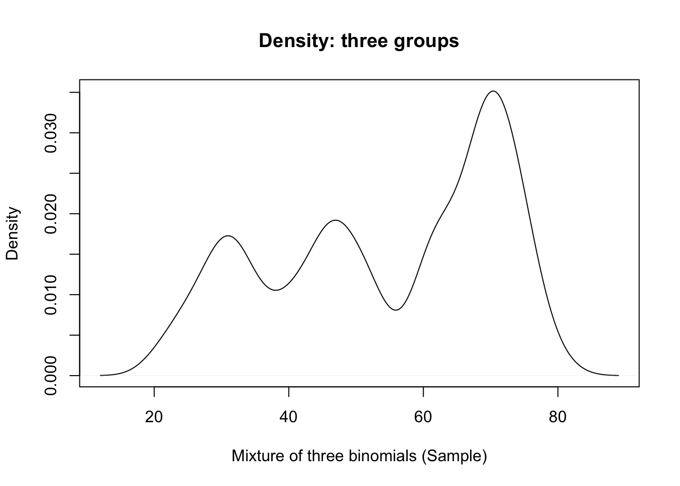
3.6 Iterative algorithm
- Algorithm for identifying the clusters and binomial probabilities:
- You choose the number of groups
- You set relative size of each group, but it’s a starting value only
- You can assume they are equal sized, to initialize.
- Assign each observation to one of the groups - arbitrarily (yes, randomly).
- Evaluate the MLE for \(p_1\), \(p_2\), \(p_3\) given the cluster assignments.
- Identify new ML (best) cluster assignments given ‘new’ \(p_1\), \(p_2\), \(p_3\).
- Re-assign the clusters based on these MLEs
- Go back to 2
- Stop after a fixed number of iterations, or when no new reassignments occur, whichever comes first.
3.6.1 Example (cont.)
- Four iterations of this algorithm with the data used for illustrative purposes.
- The x-axis is ‘jittered’ about zero to reveal the density.
- Binomial trial values are on the y-axis.
- The random assignment is in the top left panel.
- Current \(p_1, p_2, p_3\) estimates are given by arrows to the right.
3.6.2 Example (4 iterations of the learning alg.)
Code
par(mfrow=c(2,2))
learnBinMix.single(dat[,1],3,plot=T,n.iter=4)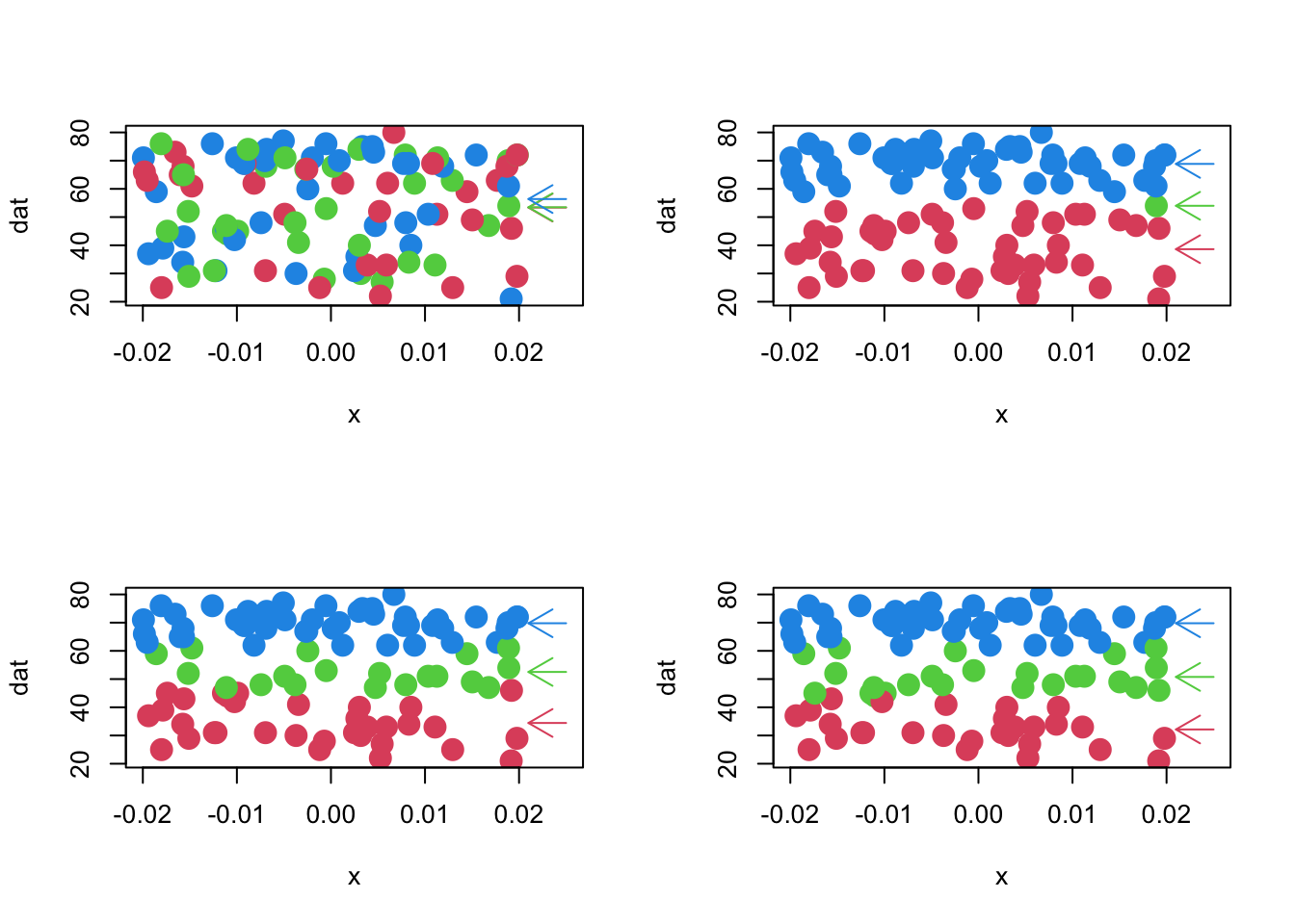
## $probs
##        1        2        3
## 31.34615 49.28000 69.42857
##
## $cluster
##   [1] 1 1 1 1 1 1 1 1 1 1 1 1 1 1 1 1 1 1 1 1 1 1 1 1 1 2 2 1 2 2 2 2 2 2 2 2 2
##  [38] 2 2 2 2 2 2 2 2 2 2 2 2 2 3 3 3 3 3 3 2 3 3 3 3 3 3 3 3 3 3 3 3 3 3 3 3 3
##  [75] 3 3 3 3 3 3 3 3 3 3 3 3 3 3 3 3 3 3 3 3 3 3 3 3 3 3
Code
par(mfrow=c(1,1))3.6.3 Notes
- The final clustering has \(p_1\)=0.697, \(p_2\)=0.503, and \(p_3\)=0.295.
- The number in each group is: 49, 26, 25.
- ‘label switching’ occurs, which is not unusual.
- Why would an algorithm ‘care’ about the order of the probabilities?
- Why would an algorithm ‘care’ about the order of the probabilities?
- The size of each cluster is about right, which is remarkable.
- Things don’t always work out as nicely as in this example.
- We might recover the probabilities well, but not the proportions in each group, etc., depending on the separation of the clusters.
- The number in each group is: 49, 26, 25.
3.6.4 MBC: Mixture densities – soft clustering
We make a subtle adjustment to the use of a ‘mixture’ to generate data.
- What if assignment to the different groups happens in some random way?
- For example, first we flip a coin:
- if it is heads, you are in group 1; tails, group 2.
- if it is heads, you are in group 1; tails, group 2.
- Once we know what group you are in, you get a binomial draw with a group-specific probability, as before.
This subtle difference in the generating mechanism leads to a difference in the likelihood.
- In particular, we no longer include the specific cluster memberships in the likelihood function.
- Each observation \(Y_i\) could have been in any of the two groups, so the likelihood is assessed by exploring both possibilities.
- In particular, we no longer include the specific cluster memberships in the likelihood function.
Reusing \(L_1\) and \(L_2\) from the binomial draws example, above, we write a different mixture density likelihood: \[ L({{p}_{1}},{{p}_{2}},{{\pi }_{1}},{{\pi }_{2}}|T,{{Y}_{1}},\ldots ,{{Y}_{N}})=\prod\limits_{i=1}^{N}{\sum\limits_{j=1}^{2}{{{\pi }_{j}}{{L}_{j}}({{p}_{j}}|T,{{Y}_{i}})}} \]
The mixing proportions are \(\pi_1, \pi_2\). The rates of success are \(p_1\), \(p_2\).
The term \[ \sum\limits_{j=1}^{2}{{{\pi }_{j}}{{L}_{j}}({{p}_{j}}|T,{{Y}_{i}})} \] can be understood as follows:
- Observation \(Y_i\) has a probability \(\pi_1\) of being in group 1, and conditional likelihood \(L_1(p_1|T,Y_i)\), given group (cluster) 1 membership.
- Similarly, \(Y_i\) has a probability \(\pi_2\) of being in group 2, and conditional likelihood \(L_2(p_1|T,Y_i)\), given that cluster membership.
- Since cluster membership is mutually exclusive and exhaustive (\(\pi_1\)+ \(\pi_2\) = 1), the total likelihood for observation \(Y_i\) is the sum of these two likelihoods
- (using the law of total probability)
- Observation \(Y_i\) has a probability \(\pi_1\) of being in group 1, and conditional likelihood \(L_1(p_1|T,Y_i)\), given group (cluster) 1 membership.
3.6.5 Iterative algorithm
- The MLEs for these likelihoods can be obtained iteratively
- Often with the use of an ‘EM’ algorithm (described below)
- EM proceeds in a manner similar to the prior, ‘hard clustering’ approach.
- EM proceeds in a manner similar to the prior, ‘hard clustering’ approach.
- Often with the use of an ‘EM’ algorithm (described below)
- Here is a sketch for the mixture of two binomials:
- You fix the number of groups
- You set a ‘prior’ set of beliefs about the mixing proportions \(\pi_1, \pi_2\).
- We often use a prior of ‘equal proportions’ when we don’t know a better choice. (\(\pi_1\)=\(\pi_2\)=0.5)
- You must also have a set of initial guesses for the parameters \(p_1\), \(p_2\).
Start by assigning an observation-specific set of ‘membership probabilities’ to each observation.
- We might begin by giving them all equal probability of being in any group.
- We call these \(z_i\) and they are vectors; every observation has a probability corresponding to each of the possible groups.
- For the example, there are two groups, so for observation \(Y_1\), we might set \(z_1\)=(0.5,0.5).
- These z’s are sometimes called hidden data.
- We might begin by giving them all equal probability of being in any group.
Determine the MLE for \(p_1\), \(p_2\) given these cluster assignment probabilities. This is based on a slightly different likelihood:
- The \(z_i\) are ‘missing data’ of a sort.
- We don’t really know to which cluster each observation belongs, but our best guess is maintained in the \(z_i\) (\(z\approx\)weight).
- The \(z_i\) are ‘missing data’ of a sort.
Use the MLE (current best) for \(p_1\), \(p_2\) to generate an improved set of guesses for the \(z_i\).
- Use the \(z_i\) to update \(\pi_1,\pi_2\).
Go back to 2
- Stop after a fixed number of iterations, or when the change in the likelihood is extremely small, whichever comes first.
3.6.6 Notes
- We never assign observations to clusters
- But we do change our beliefs about cluster membership, so that eventually, we may have \(z_1\)=(0.99,0.01) when we are fairly certain that \(Y_1\) belongs to cluster 1.
- This approach is called ‘soft’ clustering because we never are completely sure where each observation belongs.
- We allow for the chance that it might belong in any of the clusters.
- We allow for the chance that it might belong in any of the clusters.
- Contrast it to the ‘hard’ clustering we did in the first discussion, where we assigned cluster membership at each stage.
- An implementation of mixture models for a variety of generating mechanisms is available in the R
'flexmix'package.- We are able to fit the data from the previous mixture of 3 binomials as follows:
3.6.7 Flexmix example
Code
newDat <- data.frame(successes=dat[,1],failures=100-dat[,1])
fitMix3 <- flexmix::flexmix(cbind(successes,failures)~1,data=newDat,k=3,model=list(FLXMRglm(cbind(successes,failures)~.,family='binomial')))
summary(fitMix3)
##
## Call:
## flexmix::flexmix(formula = cbind(successes, failures) ~ 1, data = newDat,
## k = 3, model = list(FLXMRglm(cbind(successes, failures) ~
## ., family = "binomial")))
##
## prior size post>0 ratio
## Comp.1 0.222 22 41 0.537
## Comp.2 0.264 26 60 0.433
## Comp.3 0.514 52 63 0.825
##
## 'log Lik.' -395.996 (df=5)
## AIC: 801.992 BIC: 815.0178Code
print(lapply(fitMix3@components,"[[",1))## $Comp.1
## $coef
## (Intercept)
## -0.8463143
##
##
## $Comp.2
## $coef
## (Intercept)
## -0.1236218
##
##
## $Comp.3
## $coef
## (Intercept)
## 0.7971141Code
expit <- function(x) exp(x)/(1+exp(x))
probs <- rep(NA,3)
for(i in 1:3) probs[i] <- expit(fitMix3@components[[i]][[1]]@parameters$coef)
round(probs,2)
## [1] 0.30 0.47 0.69- Taking the inverse-logit on the 3 constants yields success probabilities of 0.47, 0.69, 0.30, respectively.
- If you match these to their counts, you can see that these estimates are quite close to the ‘truth’ as described by our data generating process.
3.7 MBC as finite mixture of multivariate normals
- In practice, with continuous outcomes, and multiple features, we use a mixture of multivariate normal densities as our plausible generating mechanism, and our model for the likelihood, given the data.
- Each multivariate normal potentially has its own, unique mean vector and covariance structure, with the \(g^{th}\) group’s structure specified by, \(\Sigma_g\).
- \(\mu_g\) is a vector that identifies the center of the cluster, and \(\Sigma_g\) describes the shape of the spread around that center through its covariance.
- The mixing proportions, \(\pi\), play the same role as before.
- It uses ‘missing data’ z’s, as before, to maintain our best guesses as to cluster membership as the algorithm proceeds.
- Because this method is likelihood based, we can compare potential ‘solutions’ using information criteria (this is a lot like using a likelihood ratio test with nested models).
- We can even choose the number of groups using these information criteria.
- Each multivariate normal potentially has its own, unique mean vector and covariance structure, with the \(g^{th}\) group’s structure specified by, \(\Sigma_g\).
3.8 Mclust
- This has been implemented as ‘Mclust’ in R
- Mclust is unique in the parsimony of its covariance structures
- gmm in Python’s sklearn (mixture) library is a general implementation.
- The likelihood, for the mixture of normals, model-based clustering approach, for m clusters, is: \[ L({{\mu }_{1}},\ldots ,{{\mu }_{m}},{{\Sigma }_{1}},\ldots ,{{\Sigma }_{m}},{{\pi }_{1}},\ldots ,{{\pi }_{m}}|{{Y}_{1}},\ldots ,{{Y}_{N}})= \] \[ \prod\limits_{i=1}^{N}{\sum\limits_{g=1}^{m}{{{\pi }_{g}}{{L}_{g}}({{\mu }_{g}},{{\Sigma }_{g}}|{{Y}_{i}})}} \] Where \[{{L}_{g}}({{\mu }_{g}},{{\Sigma }_{g}}|{{Y}_{i}})=\tfrac{1}{{{\left( 2\pi \right)}^{k/2}}{{\left| {{\Sigma }_{g}} \right|}^{1/2}}}\exp \left( -\tfrac{1}{2}({{Y}_{i}}-{{\mu }_{g}}{)}'{{\Sigma_g }^{-1}}({{Y}_{i}}-{{\mu }_{g}}) \right)\]and \(k\) is the number of features in each observation \(Y_i\).
3.8.1 Mclust implementation
- An important variant of this general form for the model is to reparameterize cluster-specific covariance \(\Sigma_g\) so that simpler forms are possible. Sketch:
- The most general form of an eigenvalue/eigenvector decomposition is \({{\Sigma }_{g}}={{\lambda }_{g}}{{D}_{g}}{{A}_{g}}D_{g}^{T}\).
- \({{\lambda }_{g}}\) controls the volume of the covariance ellipsoid.
- \({{D}_{g}}\) controls the orientation (rotation wrt coordinate axes).
- \({{A}_{g}}\) controls the shape (spherical, football-shaped, cigar-shaped, etc.)
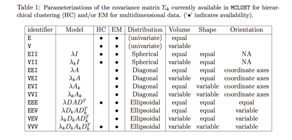
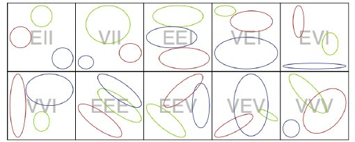
- Letter codes are used that refer to Volume, Shape and Orientation being Equal, Variable, or in some instances Identity (the simplest shape or orientation), reproduced here (their ‘\(k\)’ is our ‘\(g\)’):
- The most general form of an eigenvalue/eigenvector decomposition is \({{\Sigma }_{g}}={{\lambda }_{g}}{{D}_{g}}{{A}_{g}}D_{g}^{T}\).
3.8.3 Exercise 4
- Mclust examines a wide range of covariance structures and a range of choices for the number of groups, and selects the best one using the Bayesian Information Criterion known as BIC. The result includes:
- The means and covariance structures for the different multivariate normals that define the clusters
- The probability of membership in each group for each subject.
- The ‘best’ choice for the number of groups.
3.9 Example: penguins (pairs plot)
Code
pairs(penguins[,3:5],col=1+mcl.penguins$class) #1+ starts at red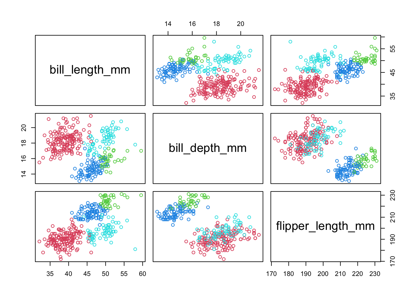
- Mclust picked a 4 cluster solution (we know that the ‘truth’ is 3, but the data point to 4)
- The cluster assignment is based on the highest probability within the ‘z’ vector for that observation.
3.9.1 Mclust example: penguins
Code
par(mfrow=c(1,2))
plot(mcl.penguins,dimen=c(1,3),what="classification")
plot(mcl.penguins,dimen=c(1,3),what="uncertainty")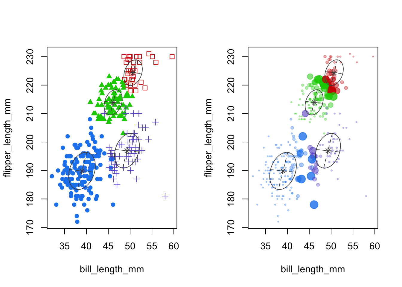
- Left panel: cluster means and shape of the covariance (scatterplot of first two features)
- Right panel: uncertainty is given by the size of the point.
- It’s plotted as a relative measure, based on the 1-probabilty of most likely group.
- In this case about 90% of the cases have over 90% probability of belonging to the assigned cluster, according to Mclust (details not shown).
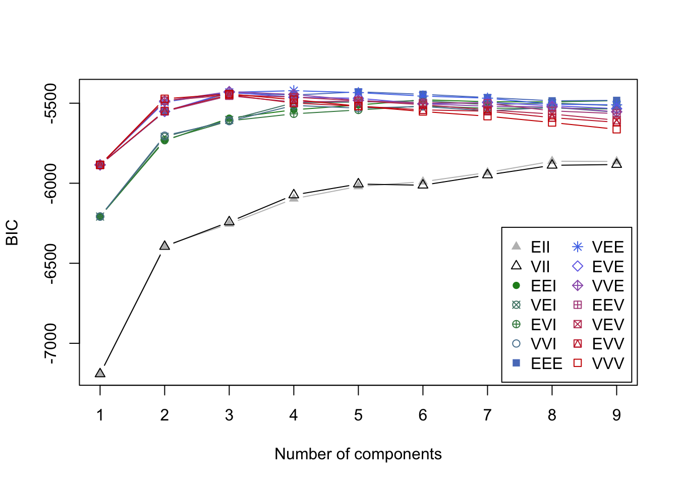
3.9.2 Mclust example: crabs
Code
mcl.crabs <- Mclust(crabs[,-(1:3)])
plot(mcl.crabs,dimen=c(2,3), what="BIC")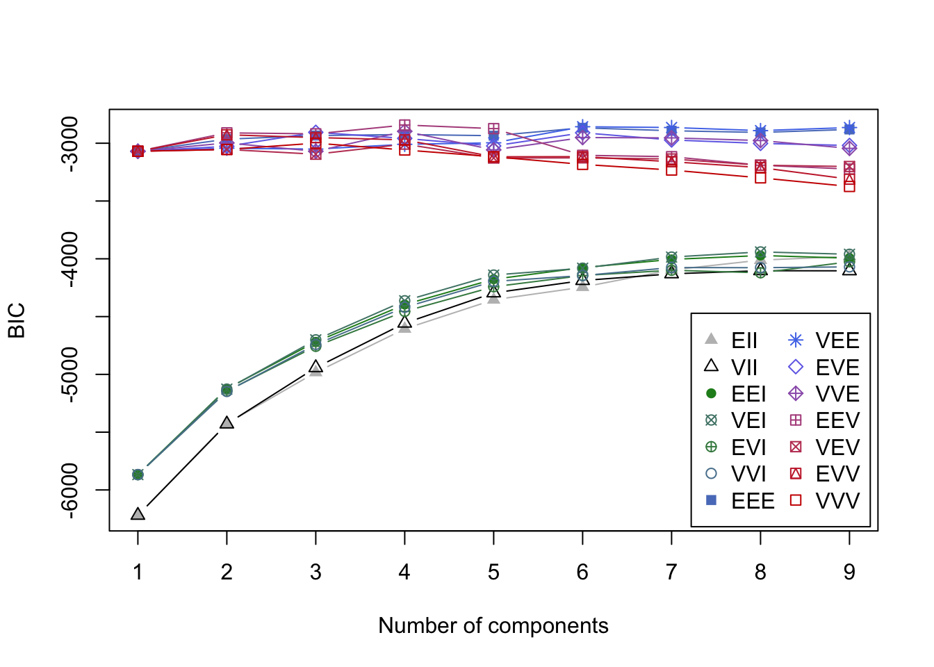
- BIC values in the search for best model.
- It is a bad sign when the best model is at the ‘boundary’ with 9 groups.
- You can see how a variety of solutions might work for this data.
- It is a bad sign when the best model is at the ‘boundary’ with 9 groups.
Code
cols <- mclust.options("classPlotColors")
syms <- mclust.options("classPlotSymbols")
par(mfrow=c(1,2))
plot(mcl.crabs,dimen=c(2,3), what="classification")
plot(mcl.crabs,dimen=c(2,3), what="uncertainty")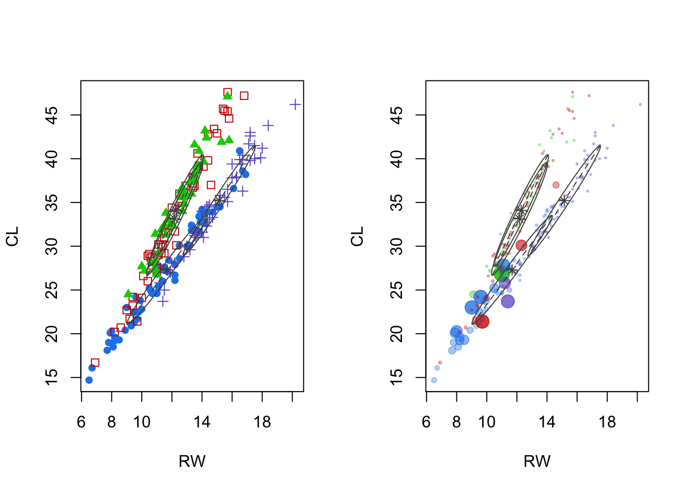
- Left panel: cluster means and shape of the covariance (scatterplot of features two and three reveal the most).
- Notice that these do not ‘cross’ the space between, unlike other methods.
- Right panel: uncertainty.
- For this data, some clusters have observations with 30% or 40% uncertainty (could easily be misclassified).
3.9.3 Example: crabs (PC space)
Code
pc.crabs <- princomp(crabs[,-(1:3)],cor=T)$scores
par(mfrow=c(1,2))
plot(pc.crabs[,c(2,3)],col=cols[mcl.crabs$class],pch=syms[mcl.crabs$class],main='Classification')
plot(pc.crabs[,c(2,3)],col=cols[mcl.crabs$class],pch=16,cex=pmax(.3,sqrt(6*mcl.crabs$uncertainty)),main='Classification Uncertainty')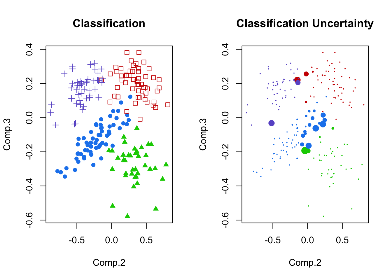
- Left panel: Principal components 2 and 3, shaded by cluster membership.
- These seem fairly separated (for the crabs data, anyway).
- Right panel: uncertainty plotted for principal components 2 and 3.
- Notice the areas of overlap are most uncertain.
3.9.4 Example: Male Life Expectancy
Code
maleLifeExp <- read.dta("./Datasets/malelifeexp.dta")
mcl.life<-Mclust(maleLifeExp[,2:5])
plot(mcl.life,what="BIC")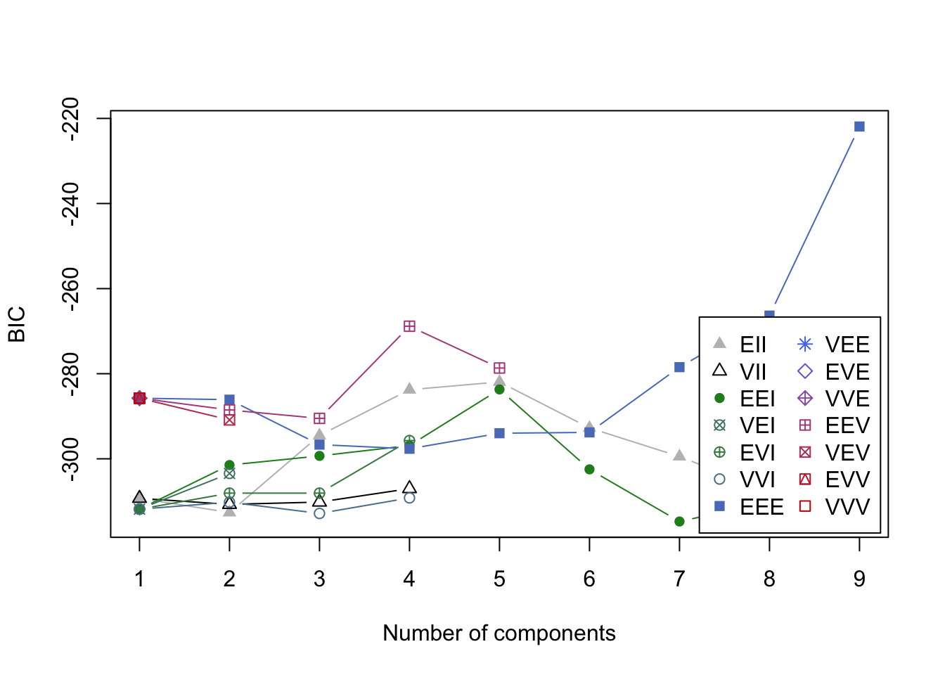
- BIC values in the search for a good model.
- Nine cluster model is chosen over the 2 cluster model.
- This is a problem.
- This is a problem.
- DO OVER, restricting to 5 clusters max
- Nine cluster model is chosen over the 2 cluster model.
3.9.5 Example: Male Life Expectancy (G in 2 to 5)
Code
mcl.life<-Mclust(maleLifeExp[,2:5],G=2:5)
plot(mcl.life,what="BIC")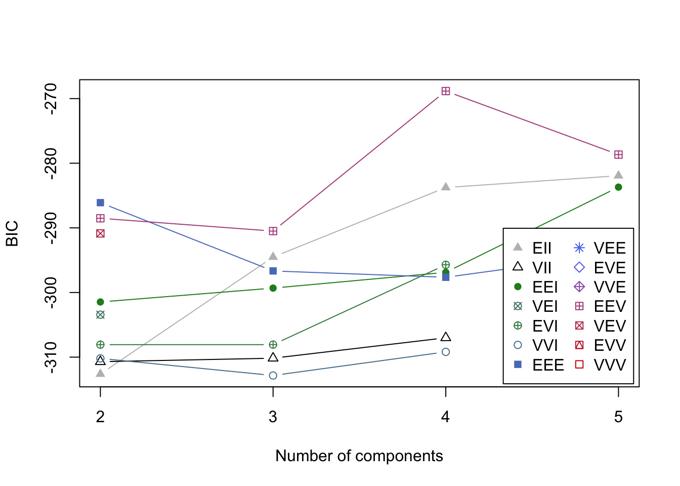
Code
plot(mcl.life,what="classification")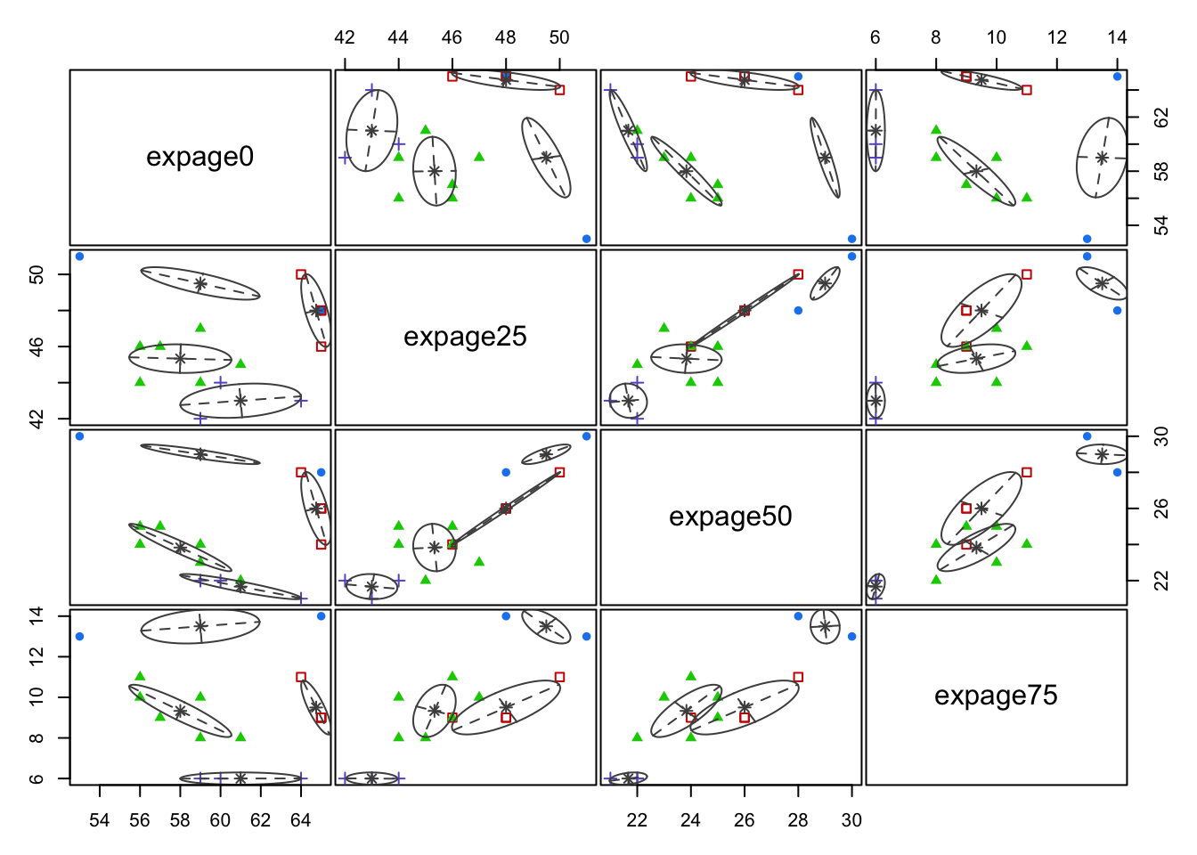
- Clusters are fairly well separated in some of these plots.
Code
par(mfrow=c(1,2))
plot(mcl.life,dimen=c(1,3),what="classification")
plot(mcl.life,dimen=c(1,3),what="uncertainty")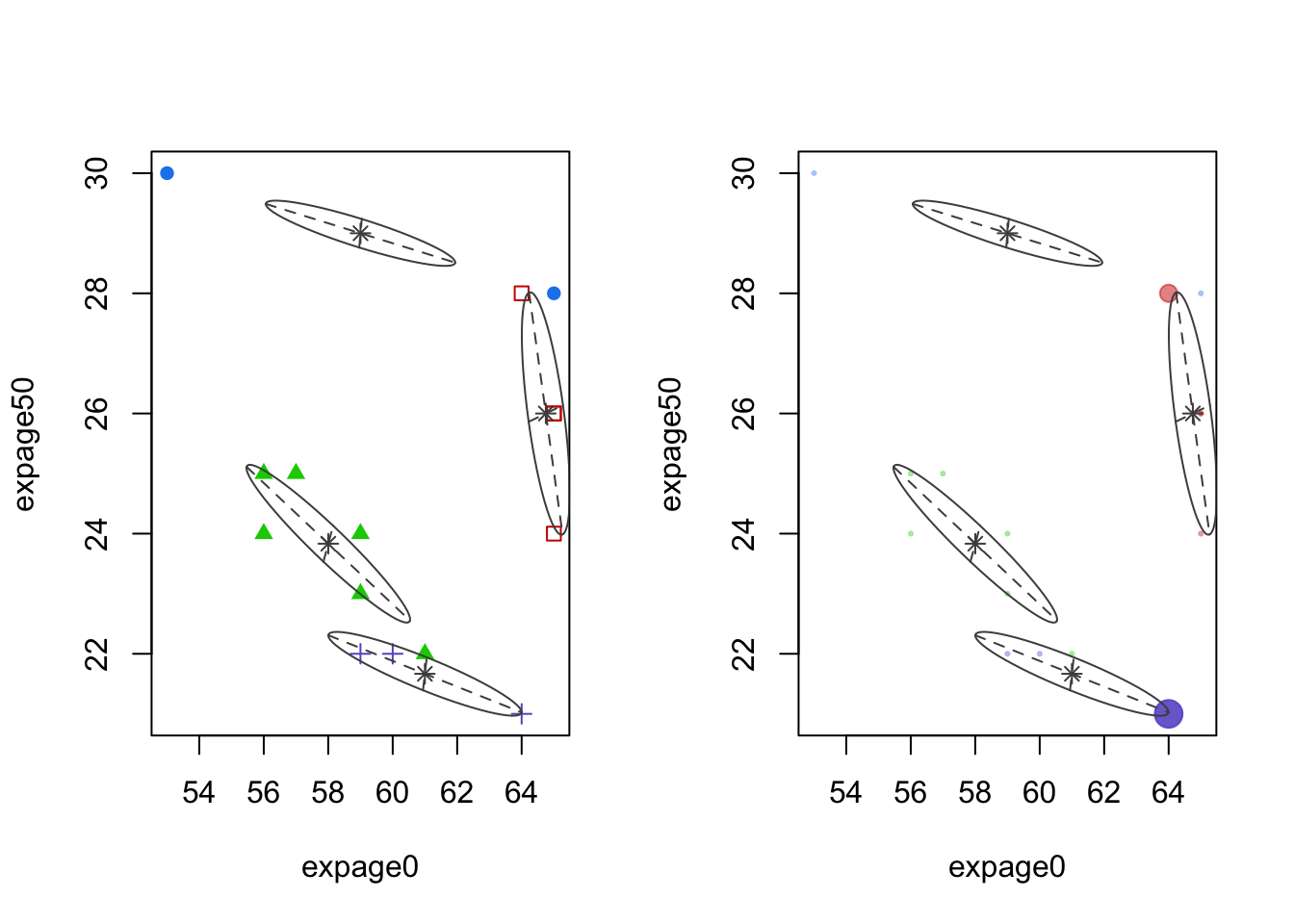
- Left panel: cluster means and shape of the covariance (scatterplot of features 1 and 3)
- Right panel: uncertainty plot. No point has large uncertainty.
3.9.6 Example: Eurowork
Code
eurowork <- read.dta("./Datasets/eurowork.dta")
mcl.euro<-Mclust(eurowork[,-1])
plot(mcl.euro,what="BIC")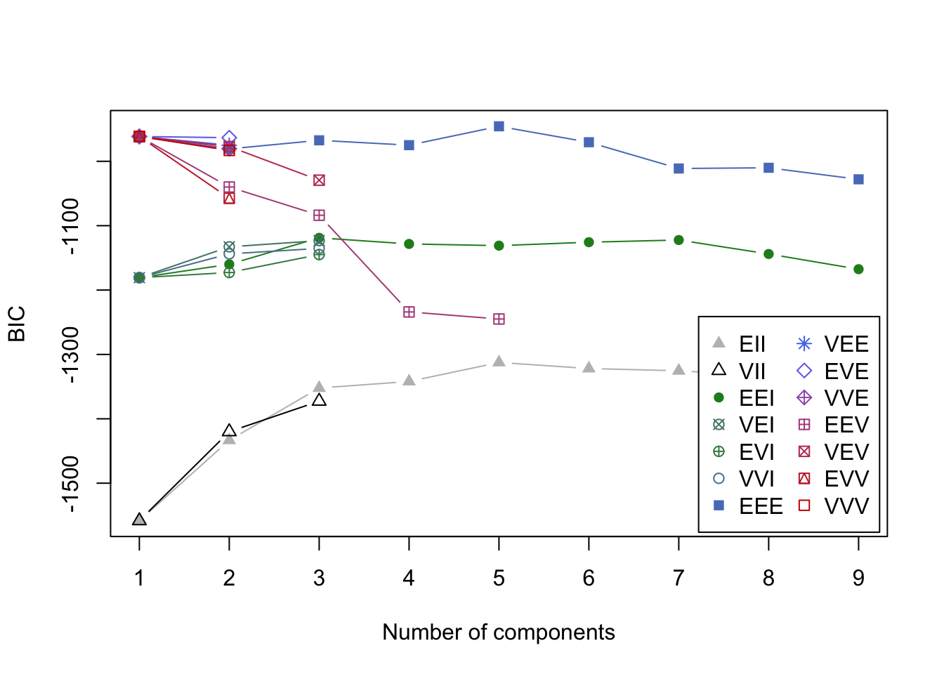
- BIC values in the search for best model.
- It looks like a 5 group solution.
Code
par(mfrow=c(1,2))
plot(mcl.euro,dimen=5:6,what="classification")
plot(mcl.euro,dimen=5:6,what="uncertainty")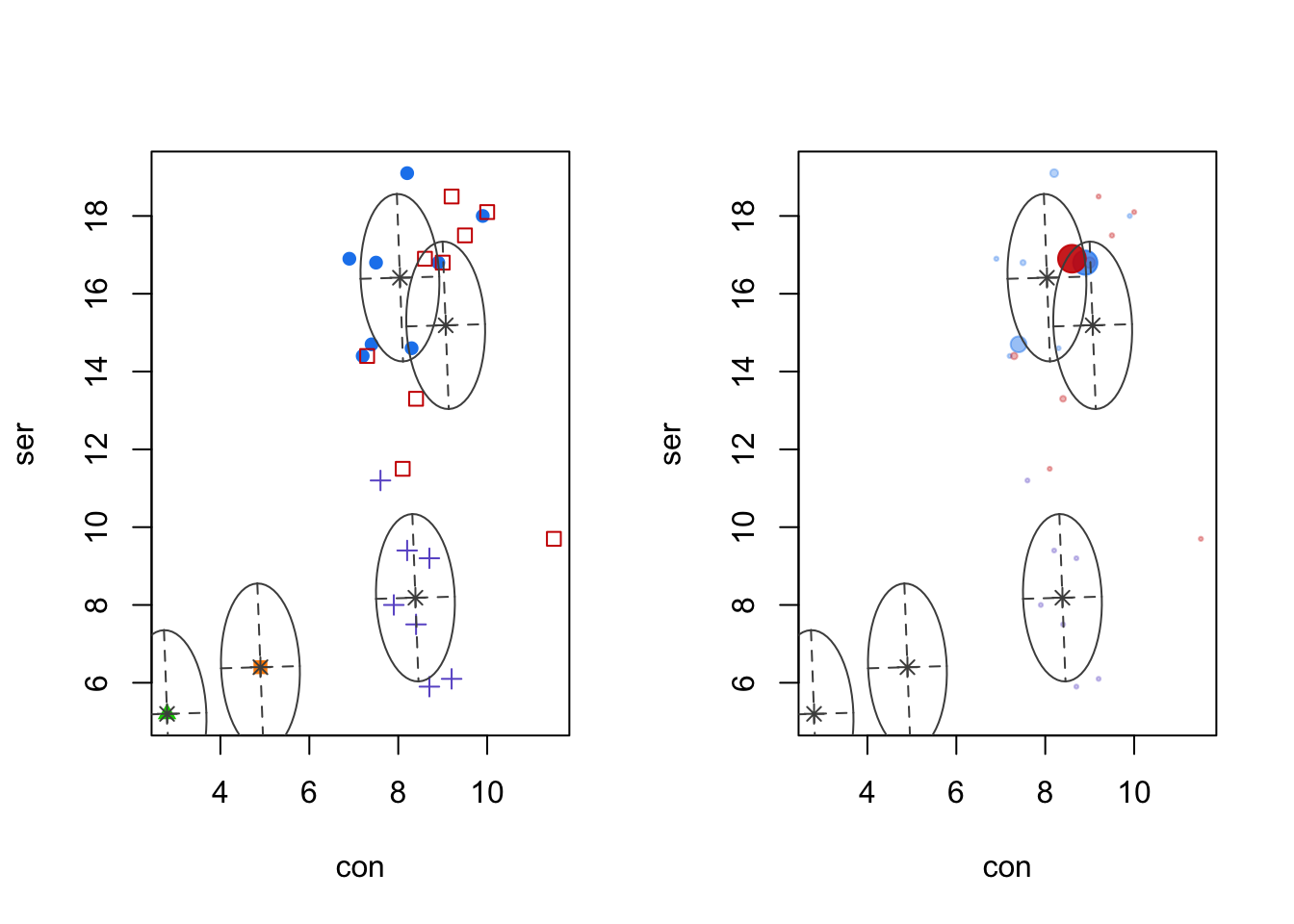
- Left panel: SER vs. CON, with colors and symbols denoting different clusters.
- Right panel: uncertainty is extremely low here, but it is happening in an expected - border - case.
- Maybe its clearer in high dimensional space
Code
pc.euro <- princomp(eurowork[,-1])$scores
plot(pc.euro[,2:3],col=1+mcl.euro$class,pch='.',type='n')
text(pc.euro[,2:3],as.character(eurowork[,1]),col=cols[mcl.euro$class],cex=.8)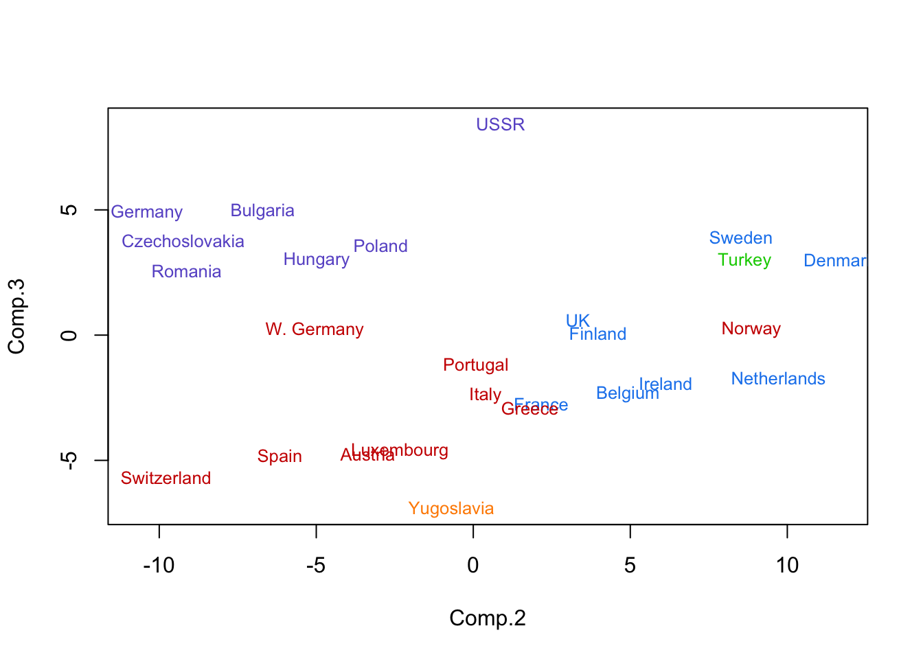
- Principal component plot with names of countries given.
- Some sorting is on the east/west divide.