Chapter 3 Plotting with R Base Code
In this chapter we are going to explore some basic plotting techniques using R base code. In Chapter 4, we will use the popular ggplot2 package to create even more elegant and insightful plots. I will also show you how to create random data for the plotting exercises and when necessary, how to upload data into RStudio (these will be Excel files with two different extensions, .xlxs or .csv).
3.1 Bar Plots
Let’s start with simple Bar Plots. Later on in this section, we’ll get back to bar plots when constructing Pareto charts.
3.1.1 Data Source
We’ll start by creating a simple vector with some hypothetical data. Let’s use the function rep (replicate) for this code:
mydata <- rep(LETTERS[1:5], c(7,4,2,9,11))Let’s then check the contents of this newly created vector. We can do that by running the object itself in our script file or in our console pane:
mydata## [1] "A" "A" "A" "A" "A" "A" "A" "B" "B" "B" "B" "C" "C" "D"
## [15] "D" "D" "D" "D" "D" "D" "D" "D" "E" "E" "E" "E" "E" "E"
## [29] "E" "E" "E" "E" "E"As you can see above, mydata is just a vector with a list of letters and their correspondent frequency (count of events). That’s because I’ve asked R for this setup in the line of code: replicate LETTERS from A to E (1 to 5), and repeat them in this order: 7 times, 4 times, and so on. What we need to do in this case is to turn this vector into a table. We can easily achieve this by running this code:
mytable <- table(mydata)Let’s see what’s inside mytable:
mytable## mydata
## A B C D E
## 7 4 2 9 11We can now proceed to creating our bar plot.
3.1.2 Basic Bar Plot
Now that we have our data frame prepared, let’s simply run the following code to create a bar plot:
barplot(mytable)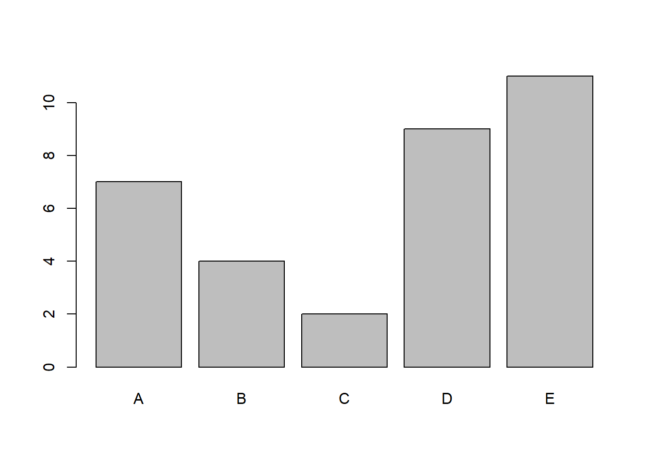
A simple yet very clean bar plot is created. This is the basic standard of a bar plot in R, columns are shaded in grey and contoured by a black solid line.
3.1.3 Bar Plot Customization
We can transform this simple bar plot into something much more visually-appealing. Let’s try a few things to get us started on customization. Consider the following code, and have a look at the new bar plot (same data).
barplot(mytable,
        main = "A Nicer Bar Plot",
        xlab = "My Random Letters",
        ylab = "Occurrences",
        col = "lightblue",
        border = "grey")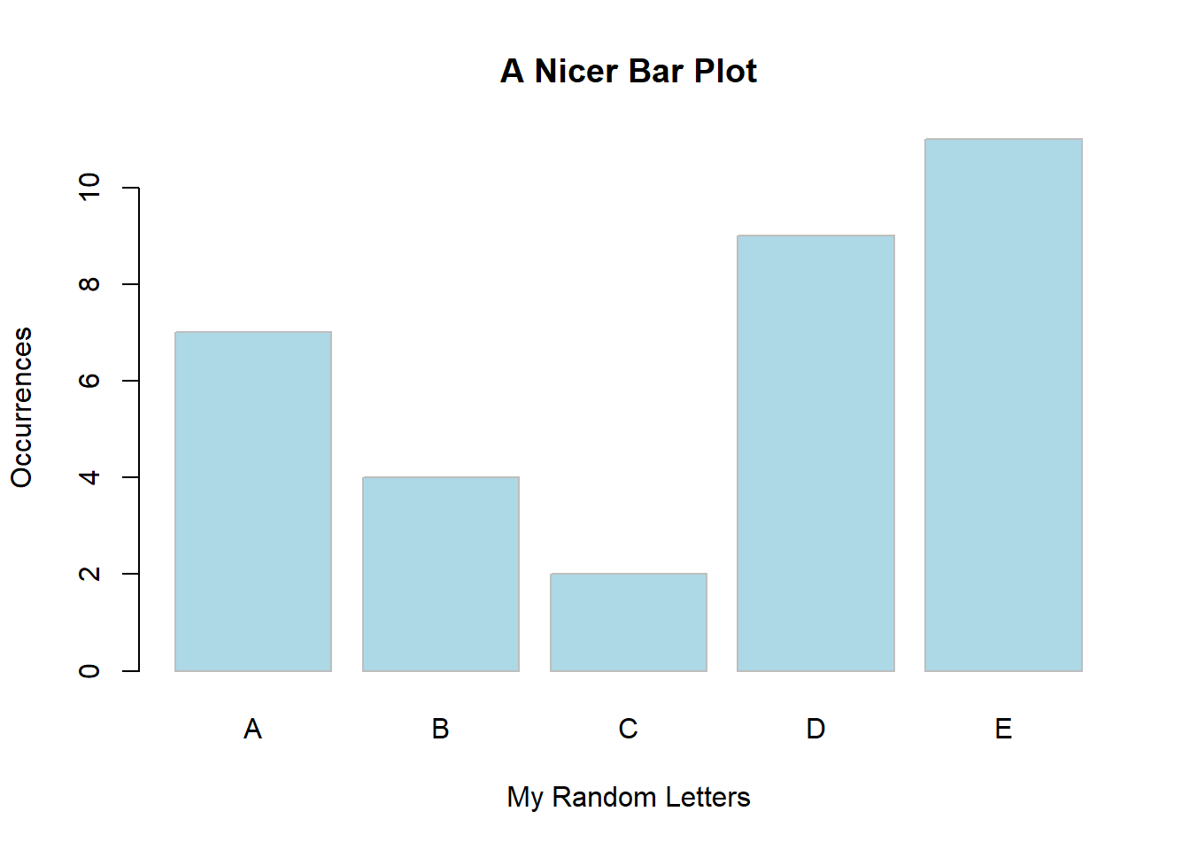
In this example, we added x and y axis’ titles, we coloured the bars with a nice touch of blue and created a light grey border. We also gave the plot a title. How much nicer is this plot?
3.1.4 Ordering the Bars
We can also easily sort the order of the bars. We will be doing this later on with the Pareto charts, but here’s how it is done.
Let’s create another object, mytable2 and in it, place the previous mytable object with the data sorted from highest to lowest. Here’s the code:
mytable2 <- sort(mytable, decreasing = TRUE)
mytable2
## mydata
## E D A B C
## 11 9 7 4 2We can then re-run our bar plot with the sorted data:
barplot(mytable2,
        main = "An Ordered Bar Plot (Highest to Lowest)\n",
        xlab = "My Random Letters",
        ylab = "Occurrences",
        col = "bisque",
        border = "orange")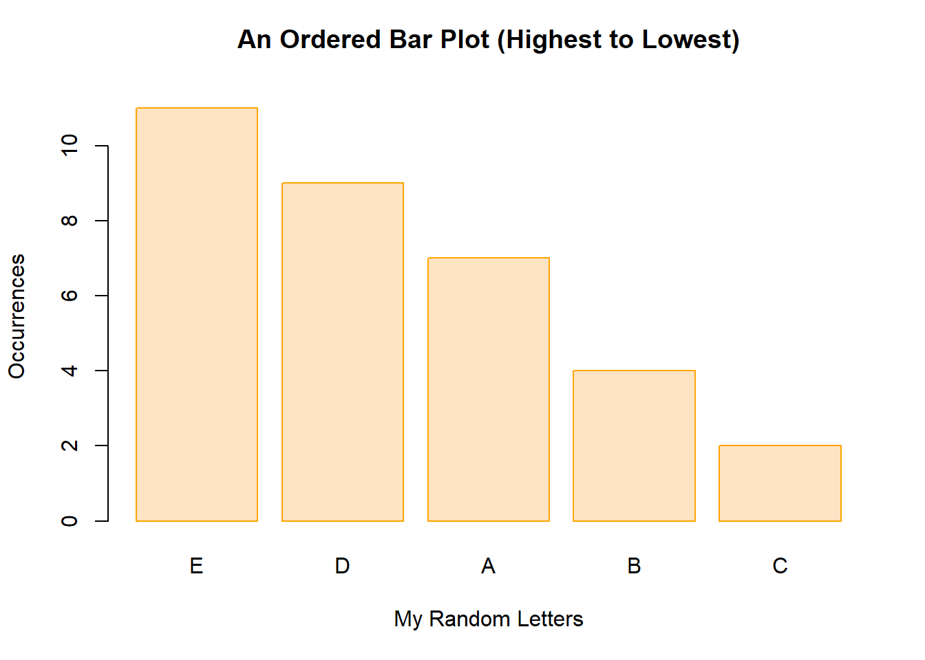
Similarly, we can sort the data and run a new plot from lowest to highest, like this:
mytable3 <- sort(mytable, decreasing = FALSE)
mytable3
## mydata
## C B A D E
## 2 4 7 9 11barplot(mytable3,
main = "An Ordered Bar Plot (Lowest to Highest)\n",
xlab = "My Random Letters",
ylab = "Occurrences",
col = "lightgreen",
border = "black")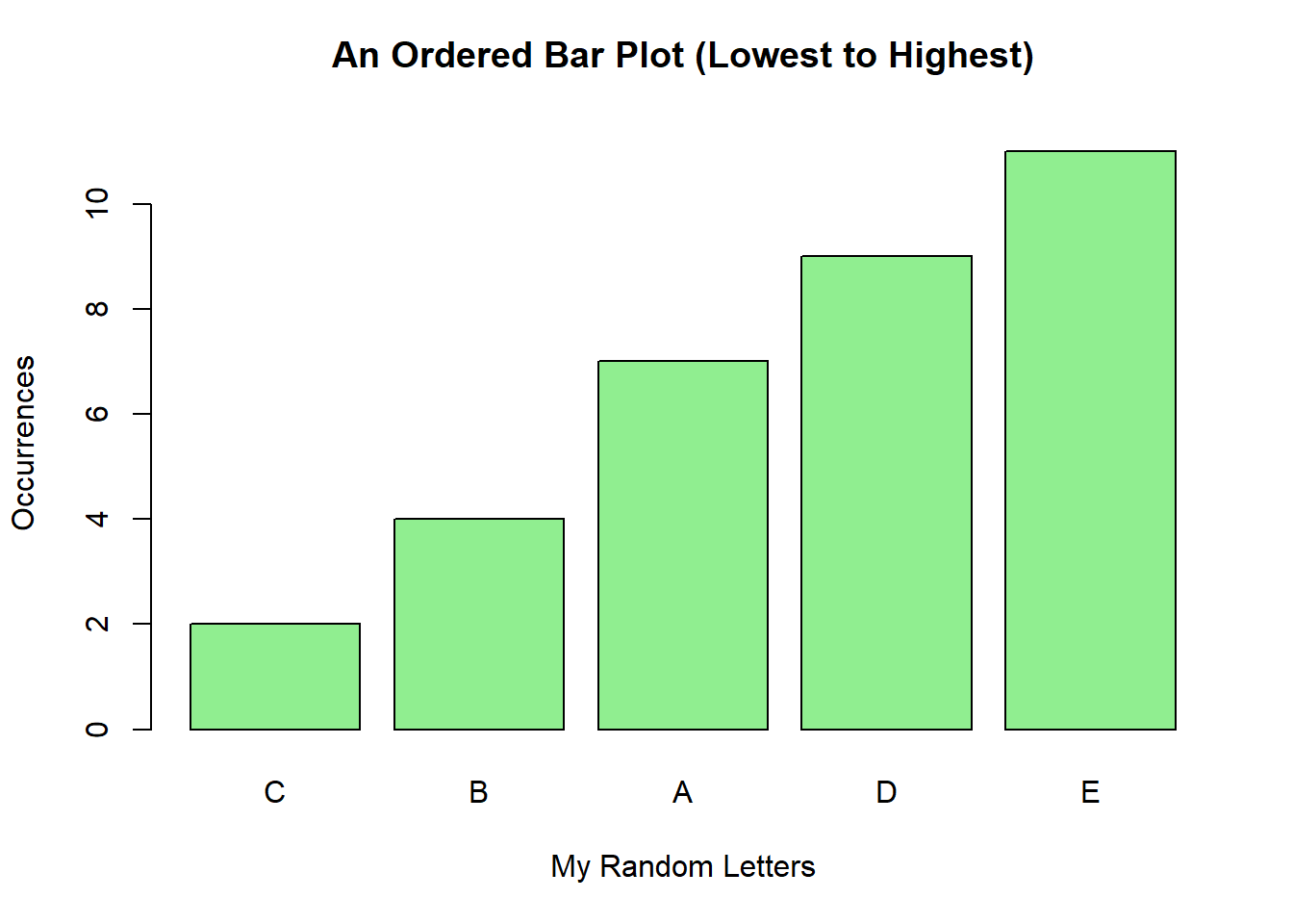
3.2 Histograms
Histograms are an easy-to-build and very important tool in the Measure and Analyze phases. I have actually used it in the Define phase as well, for example, just to help me to identify distributions from a data set during the preliminary analysis and baseline phases (pre-DMAIC) of a project to support and justify its launch.
3.2.1 Data Source
To start off, let’s create some simple random data using R base code. We can use the function rnorm to randomly generate normally distributed data based on the size of our sample, the mean, and the standard deviation, like this:
set.seed(1)
men_height <- rnorm(100,72,2)
Notice that I’ve simply stored the data into an object named men_height; this is a random distribution of heights for men. From the function, I’ve asked for 100 data points, a mean of 72 (inches) and a standard deviation of 2 (inches). The rnorm function works with the following syntax: rnorm(sample size, mean, standard deviation). Also, I’ve used the function set.seed so that the data pattern created for this plot is the same as the other histograms in this example.
To quickly see what the data stored look like, simply type the name of your object and run the code in your script or console pane:
men_height## [1] 70.74709 72.36729 70.32874 75.19056 72.65902 70.35906
## [7] 72.97486 73.47665 73.15156 71.38922 75.02356 72.77969
## [13] 70.75752 67.57060 74.24986 71.91013 71.96762 73.88767
## [19] 73.64244 73.18780 73.83795 73.56427 72.14913 68.02130
## [25] 73.23965 71.88774 71.68841 69.05850 71.04370 72.83588
## [31] 74.71736 71.79442 72.77534 71.89239 69.24588 71.17001
## [37] 71.21142 71.88137 74.20005 73.52635 71.67095 71.49328
## [43] 73.39393 73.11333 70.62249 70.58501 72.72916 73.53707
## [49] 71.77531 73.76222 72.79621 70.77595 72.68224 69.74127
## [55] 74.86605 75.96080 71.26556 69.91173 73.13944 71.72989
## [61] 76.80324 71.92152 73.37948 72.05600 70.51345 72.37758
## [67] 68.39008 74.93111 72.30651 76.34522 72.95102 70.58011
## [73] 73.22145 70.13180 69.49273 72.58289 71.11342 72.00221
## [79] 72.14868 70.82096 70.86266 71.72964 74.35617 68.95287
## [85] 73.18789 72.66590 74.12620 71.39163 72.74004 72.53420
## [91] 70.91496 74.41574 74.32081 73.40043 75.17367 73.11697
## [97] 69.44682 70.85347 69.55077 71.05320From the table above, notice that our simple code generated one hundred normally distributed data points.
3.2.2 Basic Histogram
Now let’s build a simple histogram based on the data (vector) we created previously. For that, we can simply type and run this code:
hist(men_height)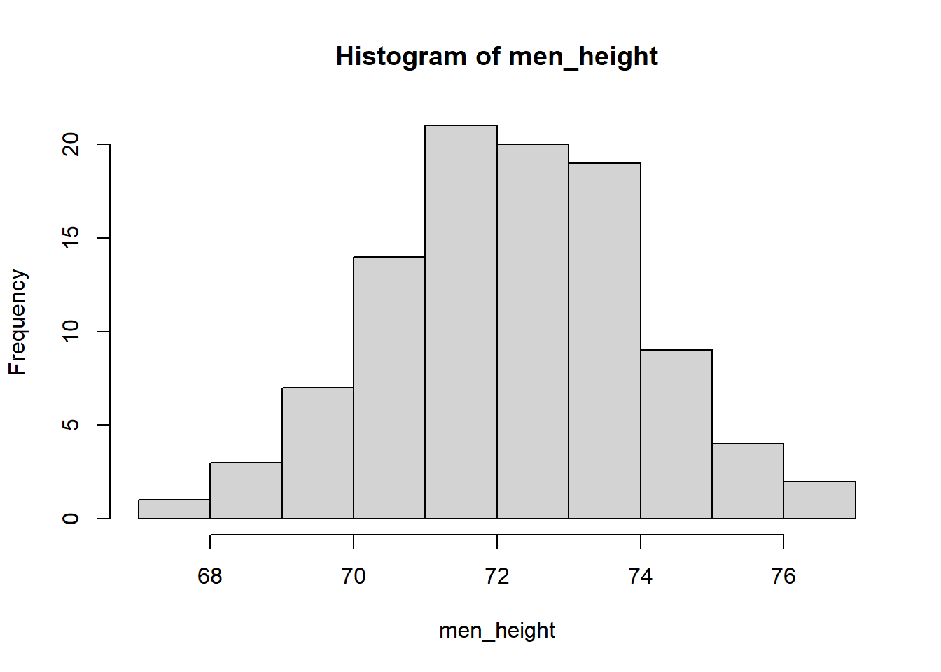
As you can see, a simple histogram is displayed. The x axis is for the heights data set we created and the y axis is for the frequency, or count, of how many of each of those values we find in this distribution. Let’s move on to customizing this histogram a bit more.
3.2.3 Histogram Customization
We can do much better than a basic histogram! Let’s create the same histogram with a title, labels for the x and y axes, and a different colour for the bars.
hist(men_height,
     main = "Histogram of Men Heights",
     xlab = "Height in inches",
     ylab = "Frequency",
col = "bisque") 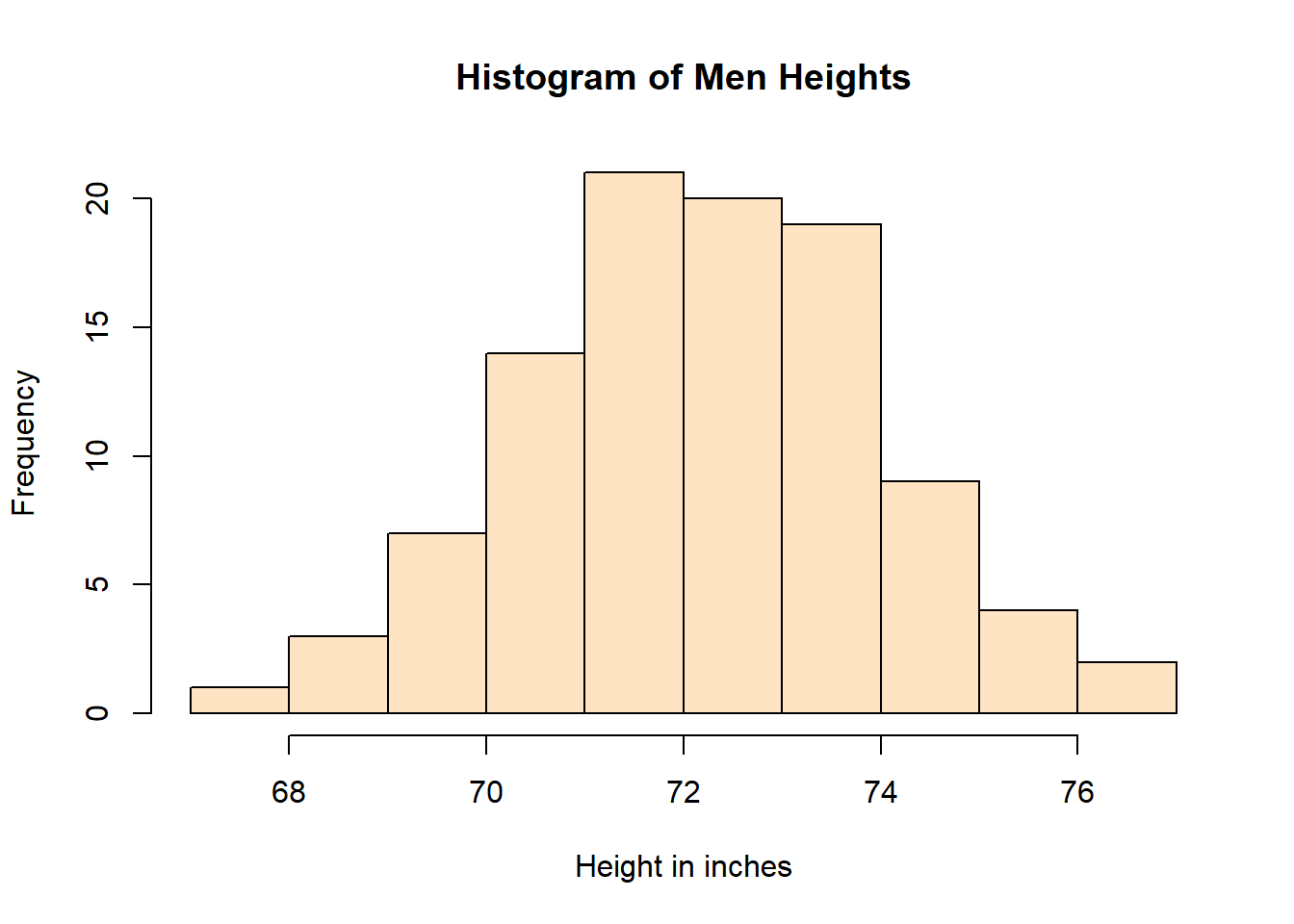
As seen in the above histogram, these elements really change the plot from a “bare plot” to a more elegant, clean, and informative graph. Notice that I used the argument col to define the colour of the bars.
TIP: Sometimes colour is also used, depending on the package and type of plot being built.
And here’s another beautiful way you can display a histogram by adjusting the colour scheme of it. In this case, we’ll be using the colour (col) rainbow (30). Notice how this line of code is written:
hist(men_height,
     main = "Histogram of Men Heights",
     xlab = "Height in inches",
     ylab = "Frequency",
col = rainbow(30)) 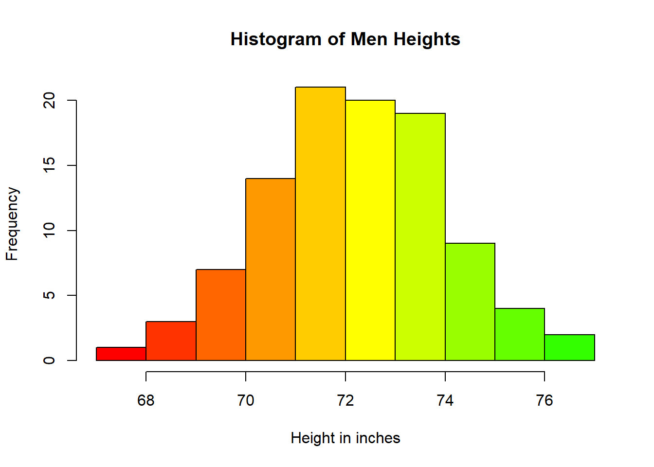
The colour scheme rainbow automatically applies a gradient from red to green. Try different numbers and see how the plot changes. At this point, it’s all about making a visually-appealing plot for your audience.
3.3 Density Curves
Histograms are a great way of checking the distribution of your data. Density Curves though, are even better. Think of density curves as super fine histograms. Because of their aesthetics, they can be much more insightful than a regular histogram. Notice that density curves plot the density function (curve) not the count and bins that a histogram displays. The distribution of data however, follows the same pattern.
3.3.1 Data Source
For the density curve, I am going to use the same data as in the histogram from the previous section. Let’s run the code once again:
set.seed(1)
men_height <- rnorm(100,72,2)
Then let’s create an object d with the density kernel function, like this:
d <- density(men_height)TIP: Be careful when naming your objects. Try to be as concise as possible, and always use lower case and underscore between words if you need more than one word to define your object.
3.3.2 Basic Density Curve
Density curves work a little differently than most R base plots. In this case, we’ve already created the object d with the density of the data. We can now simply plot it by running this code:
plot(d, main="Men's Height Density Curve")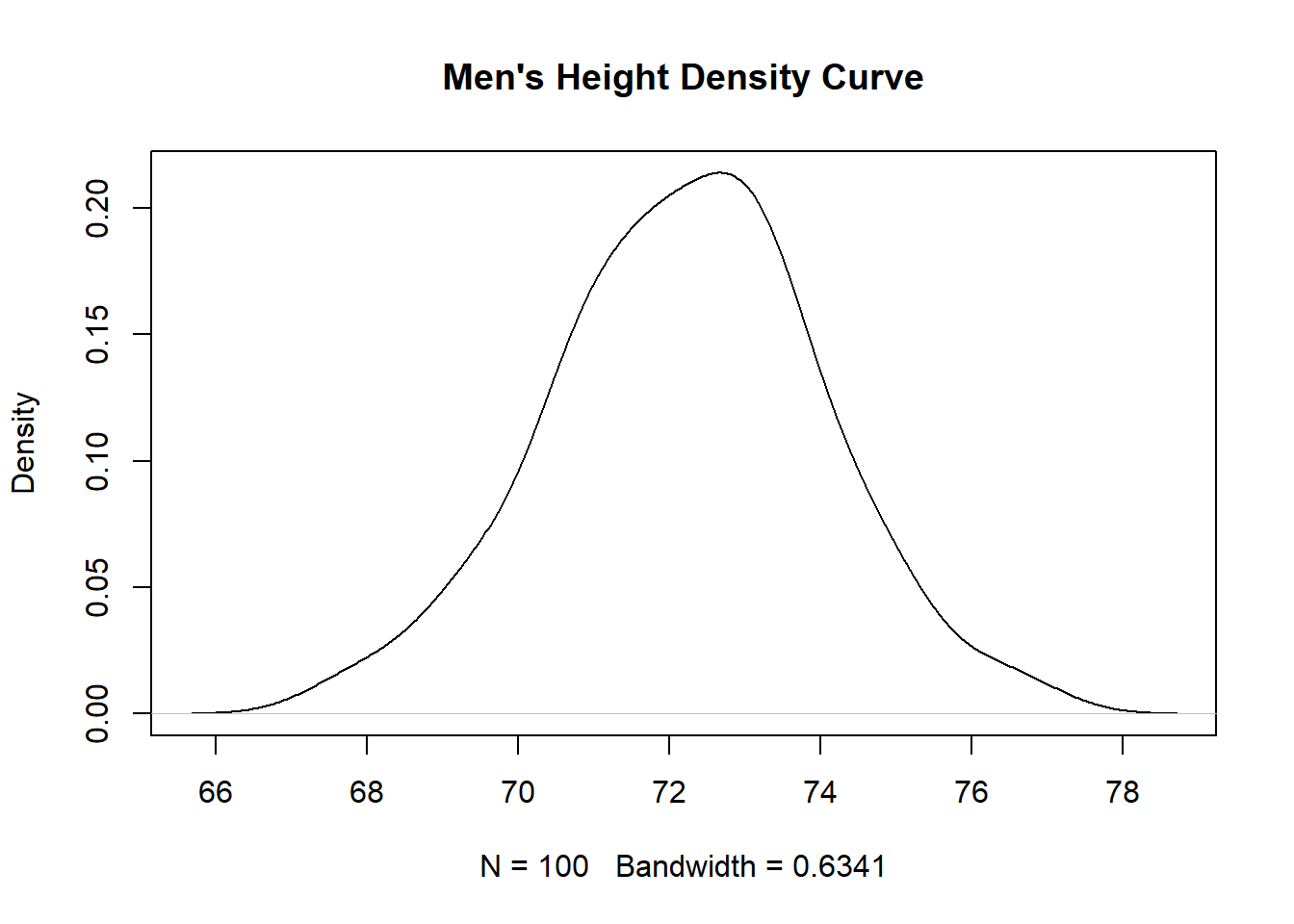
Notice that I’ve also added a title to this plot, using the argument main= in the code. We’ll be adding more as we build a more customized plot.
3.3.3 Density Curve Customization
For this example, let’s add the polygon function to the plot so that we can shade the area under the curve. We will then simply fill the density curve with the colour cyan, and add a blue border.
plot(d, main="Men's Height Density Curve")
polygon(d, col="cyan", border="blue")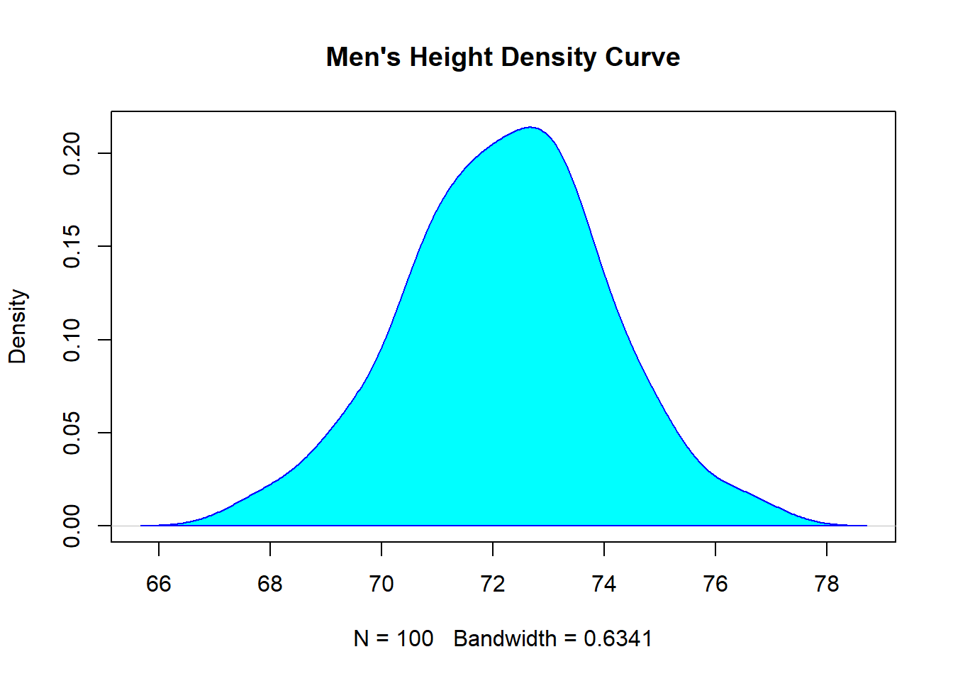
Now let’s adjust the colour of the fill one more time. Let’s try the colour coral for the shading of the curve, the colour chocolate for the main title, (yes, chocolate is a colour in R!). Let’s also adjust the thickness of the line around the density curve by adding the lwd (line width) argument, and setting it at 2.
plot(d, main="Men's Height Density Curve", col.main = "chocolate")
polygon(d, col="coral", border="black", lwd = 2)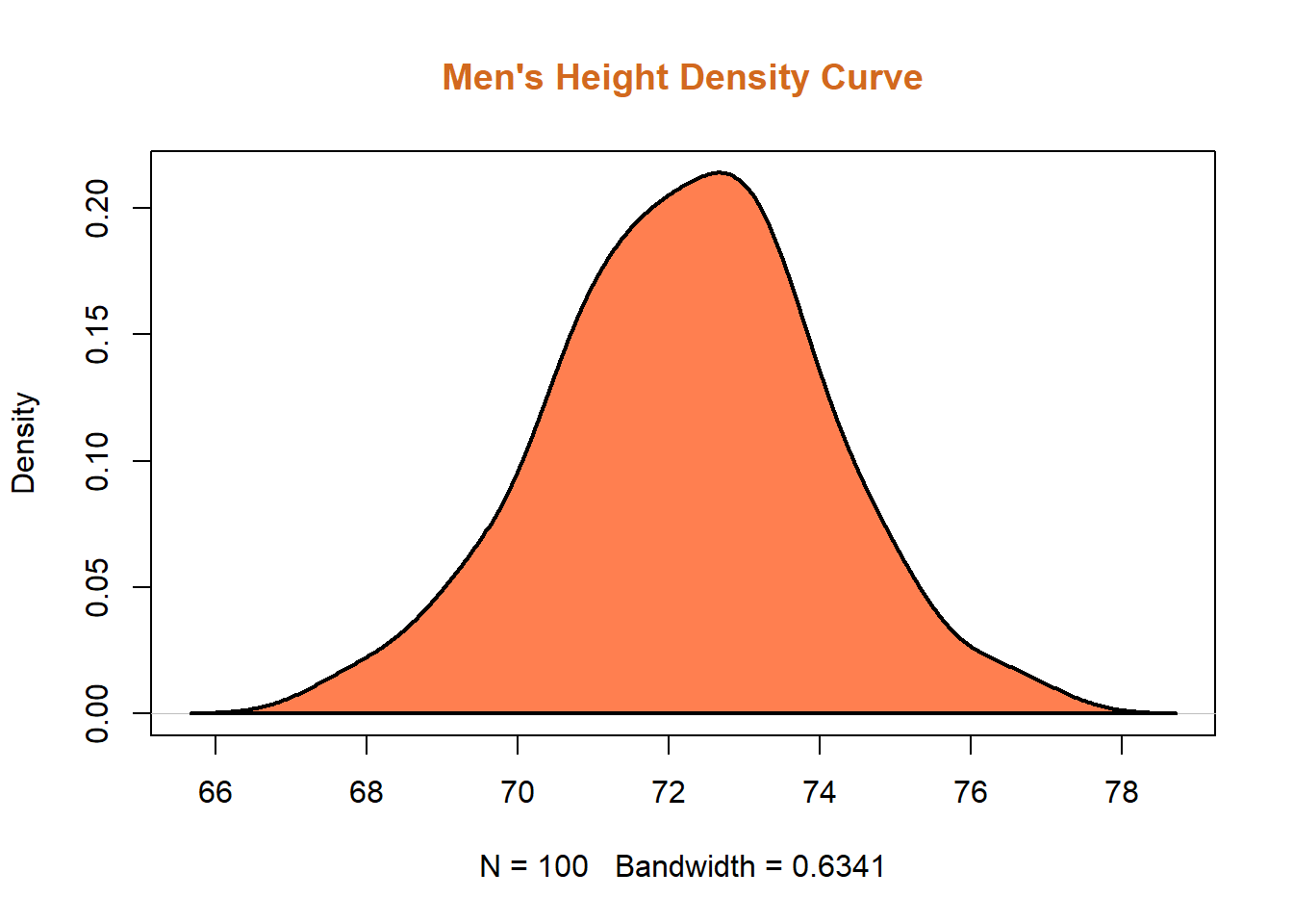
3.4 Line Plots (Run Charts)
Let’s now build a simple yet professional Line Plot (also referred to as Run Charts in the Six Sigma body of knowledge). Run charts are normally used to track data points over time; they are the “backbone” of Control Charts.
3.4.1 Data Source
Once again, let’s use the function rnorm to create 100 data points, with a mean of 60 (km/hour) and a standard deviation of 6 (km/hour). We will call this object speed.
speed <- rnorm(100,60,6)To view the first six records of this vector, let’s use the function head().
head(speed)## [1] 56.27780 60.25270 54.53447 60.94817 56.07249 70.603723.4.2 Basic Line Plot
For the basic line plot, we’ll be using the following code. Notice that I am specifying the type of plot, in this case a line plot, or simply “l.”
plot(speed, type="l")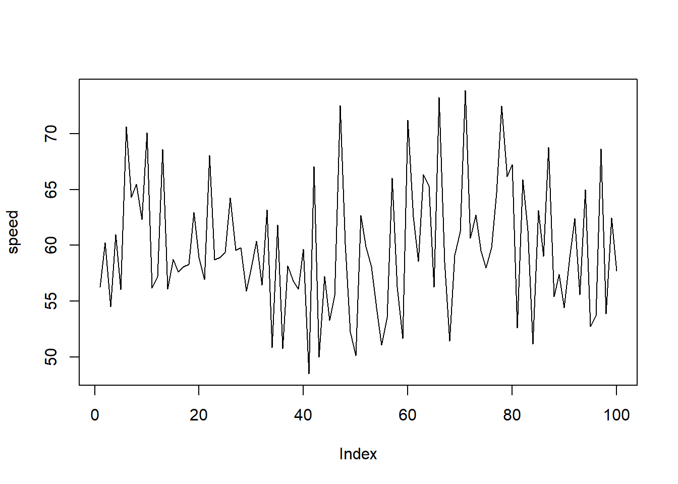
3.4.3 Line Plot Customization
Let’s add more elements to this basic plot by running the following code:
plot(speed, main="Speed Study | Line Plot",
     col.main="red",
     ylab ="km/hour",
     xlab = "Sampled Drivers 2020 Holidays | Dec 15 to Jan 5",
     col="blue", type="line", lwd=2, lty="dashed")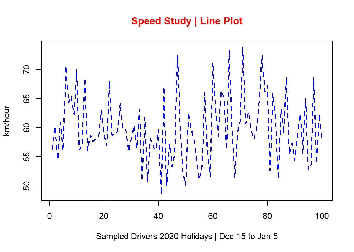
As you can see in this line plot, a title was added and coloured in red, axis’ labels were also added, and I specifically defined the type, colour, and line width for the plot.
3.5 Scatter Diagrams
Scatter Diagrams showcase the relationship between two continuous variables, x and y. The x axis represents the independent variable (or predictor). The y axis represents the dependent variable (or response). As a Six Sigma practitioner, I use scatter diagrams all the time.
TIP: Always remember that correlation does not necessarily mean causation!
3.5.1 Data Source
For this example, let’s create our data sets in a different way. We’re going to use the combine function in R (represented by the letter c, lower case). This is another way we can create a vector of values or characters.
For the x axis, let’s create a data set for temperatures in Celsius.
temp <- c(12,15,9,13,12,25,11,5,9,2,19,24,29,15,31)A quick check by running the name of the object (in this case temp) in your script or console will confirm the data set in it:
temp## [1] 12 15 9 13 12 25 11 5 9 2 19 24 29 15 31For the y axis, let’s create this object:
sales <- c(350,400,250,410,380,1050,350,100,
           150,50,560,850,900,650,1160)
This object represents the sales of ice cream over a certain period of time, in Canadian dollars.
3.5.2 Basic Scatter Plot
By running the function plot in RStudio, we get the following scatter diagram.
plot(temp,sales)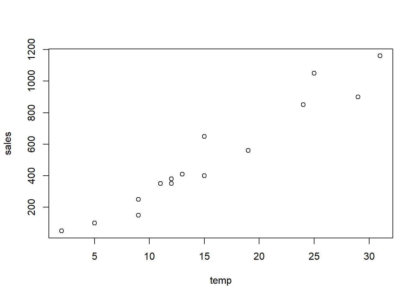
Notice that although we still don’t have customized axis’ titles, the x axis contains the temperatures we previously defined in temp and the y axis contains the sales in Canadian dollars, also previously defined, in sales. This is because the function plot automatically displays the names of the objects we created.
3.5.3 Scatter Plot Customization
Now let’s add the much needed additional information to this scatter diagram. The following code is used for this task:
plot(temp,sales,
     main="Scatter Diagram | Ice Cream Sales vs Temperature",
     pch = 21, cex=1.5, col="blue", bg="grey", lwd=2,
     xlab="Temperature in Celsius",
     ylab="Ice Cream Sales in $",
     col.lab="blue")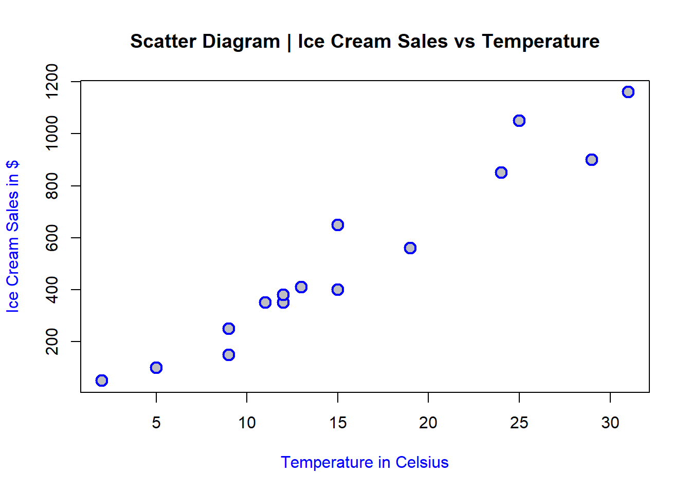
Notice how much more informative and visually-appealing this plot is. Besides adding a main title (as discussed in previous sections) and specifying the colour of the axis’ labels, there is an entire line of code to specify the type of plot character (pch) the scatter diagram showcases:
pch = 21: this is the type of pch (search up all different types you can use)
cex=1.5: this is the size of the pch
col=“blue”: colour of pch
bg=“grey”: colour of the background or the fill of pch
lwd=2: line width of pch
Fun, isn’t it? You can always try different sizes, background, and pch styles to see which ones better represent your analysis.
3.6 Boxplots
Boxplots are extremely informative and they are very useful when comparing distributions between two or more data sets. I use boxplots for just about every project I lead as a Six Sigma Black Belt. You can learn more about how they are built, but for now just remember that:
The lower whisker contains 25% of the data (first quartile)
The box itself contains 50% of the data (inter-quartile range)
The upper whisker contains 25% of the data (third quartile)
The line right in the middle of the box is normally the median (although some statistical software may also display the mean).
3.6.1 Data Source
For this example, let’s create three new vectors, all using the rnorm function in R, like this:
set.seed(1)
A <- rnorm(100,4,2)
B <- rnorm(100,6,1)
C <- rnorm(100,5.2,1.2)
Let’s assume that each one of these three vectors represents a call center. All call centers (A, B, and C) have 100 data points, means of 4, 6, and 5.2 minutes and standard deviations of 2, 1, and 1.2 minutes respectively. In this example, I am using comparative boxplots to look into the central tendency (median) and spread (variation) of waiting times at these three call centers.
There are different ways to create this plot. I’ll be using the function boxplot with R base code in this example. For this task, firstly I need to create a data frame with these three vectors (A, B, and C).
To create a data frame in R we can use this code:
df <- data.frame(A,B,C)Of note, I’ve simply named my data frame df. You can use whatever name you’d like but there are certain constraints. Search it up, but in the meantime, just stick with lower case, simple and easy-to-remember naming convention. Let’s check what this data frame looks like by running the first six rows of the data frame into which the three vectors A, B, and C were placed:
head(df)## A B C
## 1 2.747092 5.379633 5.691282
## 2 4.367287 6.042116 7.226648
## 3 2.328743 5.089078 7.103906
## 4 7.190562 6.158029 4.802911
## 5 4.659016 5.345415 2.457717
## 6 2.359063 7.767287 8.197194As you can see, now I have a data frame that contains the three call centers A, B, and C as columns, along with their respective values (waiting time).
3.6.2 Basic Boxplots
Let’s now run the following code to produce our most basic set of boxplots, also known as Comparative Boxplots.
boxplot(df)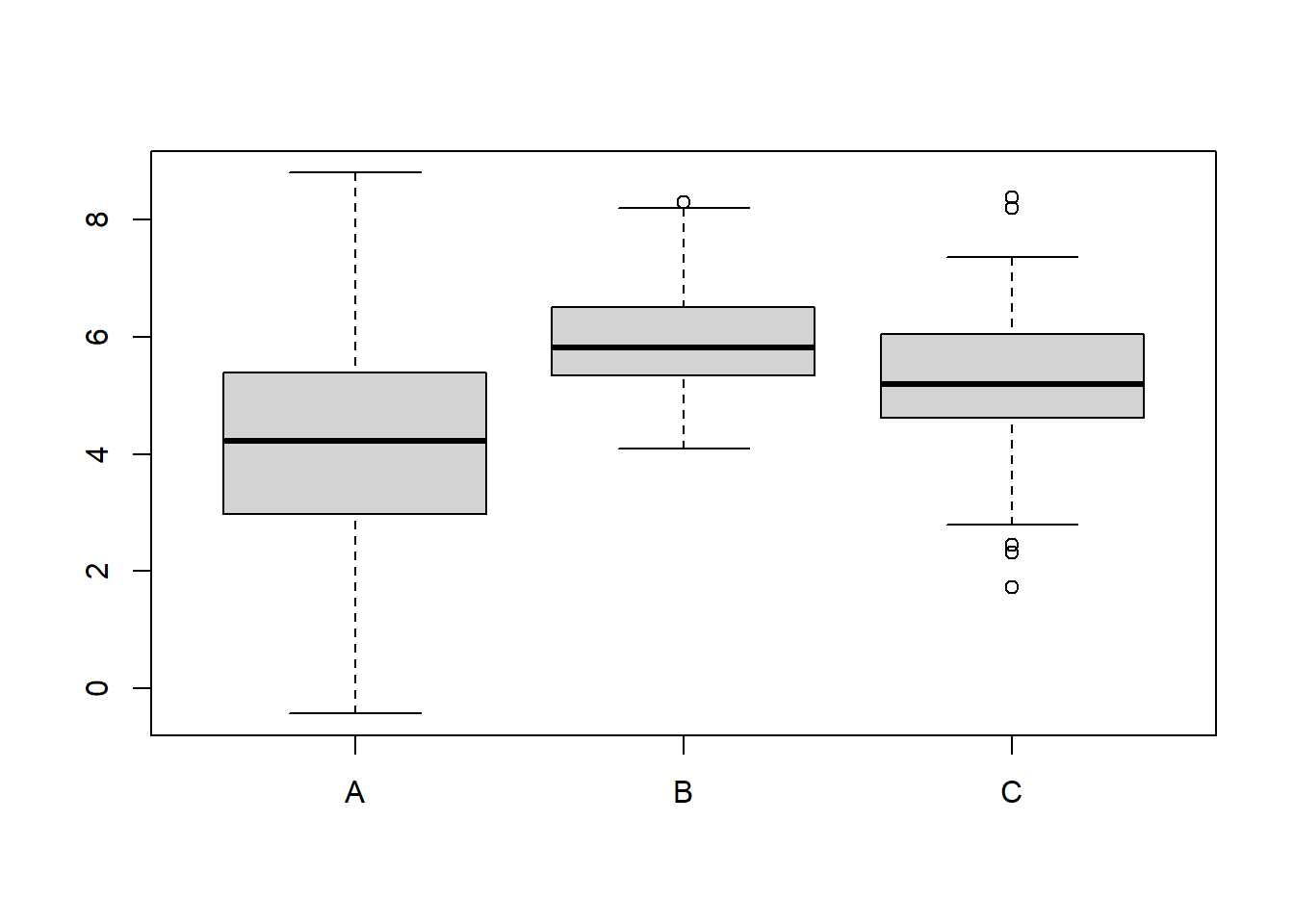
R simply created a set of Comparative Boxplots for the three different call centers. On the x axis, the labels for call centers A, B, and C and on the y axis, the waiting time.
3.6.3 Boxplots Customization
There is so much more we can do with this plot! Let’s add customization by running the same comparative boxplots, but this time with the following code:
boxplot(df, main="Waiting Time | Comparative Boxplots",
        xlab="Call Centres",
        ylab="Waiting Time in minutes",
        outpch=18, outcex=1.7, outcol="red",
        col="lightblue")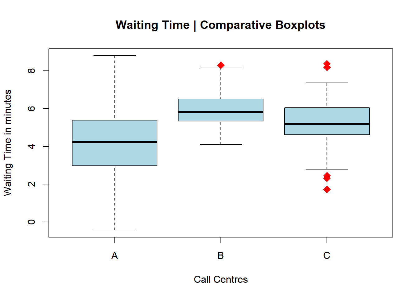
As I did with the scatter diagrams, I am now controlling the overall aesthetics of the plot, including the outliers via the pch argument (for plot character).
Let’s now try changing the orientation of the boxplots to horizontal. We can do that by adding the code horizontal = TRUE, like this:
boxplot(df, main="Waiting Time | Comparative Boxplots",
        xlab="Waiting Time in minutes",
        ylab="Call Centers",
        outpch=18, outcex=1.5, outcol="blue",
        col="bisque",
        horizontal = TRUE)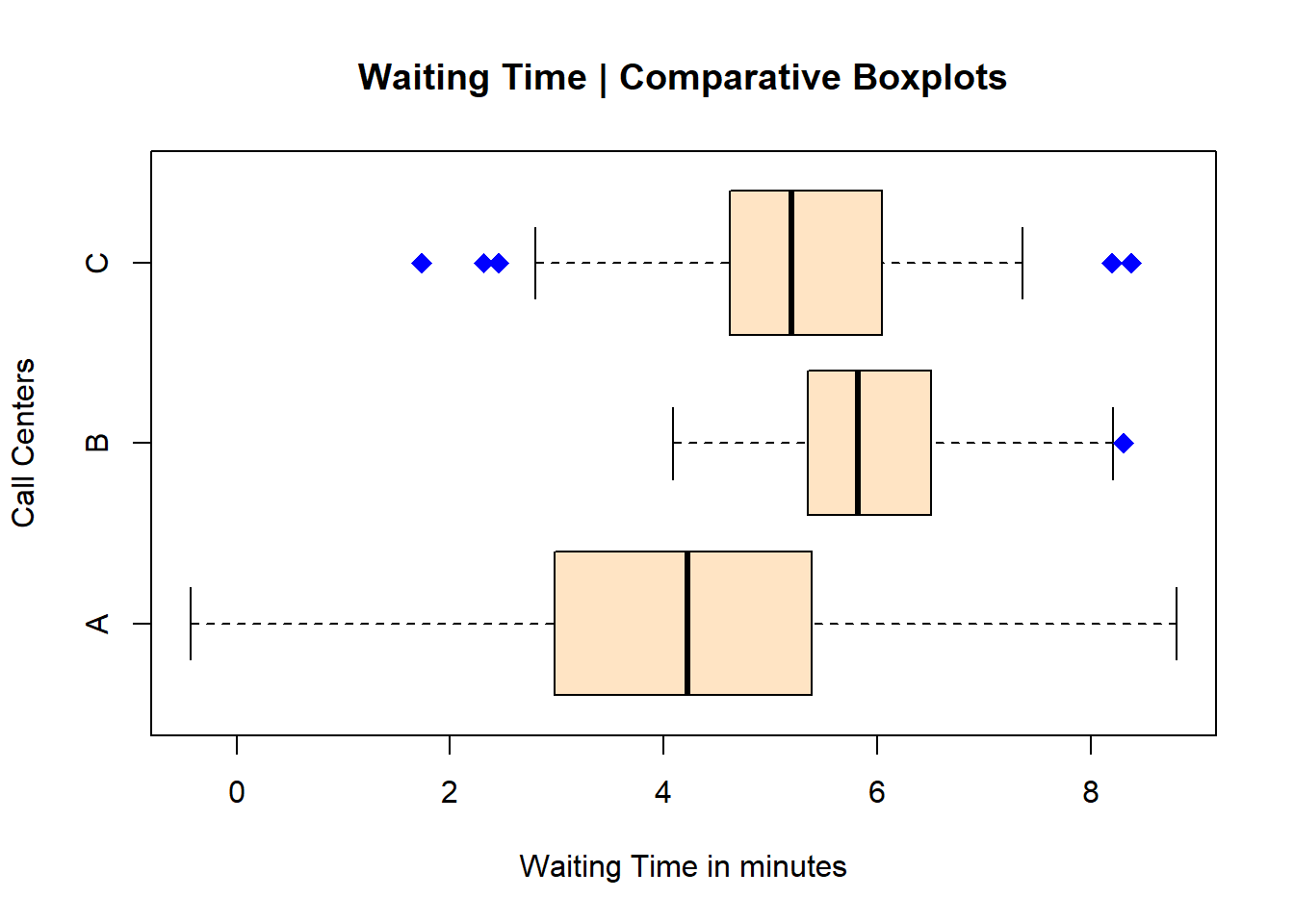
Notice however that I needed to switch the x and y titles (or labels for the axes). I’ve also changed the colour one more time; the colour bisque is one my favourites. Then I changed the type of pch, its size, and its colour.
3.7 Pareto Charts
Pareto Charts are essential to any Continuous Improvement professional. They showcase the 80/20 rule described by Italian economist Vilfredo Pareto during his studies about the unequal distribution of wealth in Europe in the early 1900s. Pareto charts are basically ordered bar plots (highest to lowest count or frequency of occurrences) with the cumulative line in percentages linked to a secondary y axis.
3.7.1 Data Source
Let’s start with some data created in R. We will then upload two different files for more examples on how to create an elegant and useful Pareto chart in RStudio.
We can use this line of code to create categorical data. I’ve simply placed the data into an object named a.
a <- rep(LETTERS[1:5], c(720,412,297,341,265))Checking for a:
str(a)## chr [1:2035] "A" "A" "A" "A" "A" "A" "A" "A" "A" "A" ...To create the bar plot, let’s first use the function table in R, and place the results in an object named tab, like this:
tab <- table(a)Checking the contents of the object tab:
tab## a
## A B C D E
## 720 412 297 341 265Notice however that this simple table is not yet ordered from highest to lowest. Let’s do that by using the function sort. We will then create a new object df with the ordered data.
df <- sort(tab, decreasing = TRUE)Checking df contents:
df## a
## A B D C E
## 720 412 341 297 265Now my data contents (table above) are ordered from highest to lowest.
One last step. I’m creating a custom axis and for that piece I need to overwrite my object a (alternatively you can create another object), specifically for the y axis (primary and secondary). Let’s use the function cumsum to create a cumulative table.
a <- cumsum(tab)
a
## A B C D E
## 720 1132 1429 1770 20353.7.2 Basic Pareto
Let’s start creating our Pareto Chart. First, the bare bones:
barplot(df, width = 1, space = 0.1, border = NA, axes = F,
        col = "grey",
        ylim = c(0, 1.05 * max(a, na.rm = T)),
        ylab = "Counts" , cex.names = 1,
        main = "Pareto Chart | Bars Only")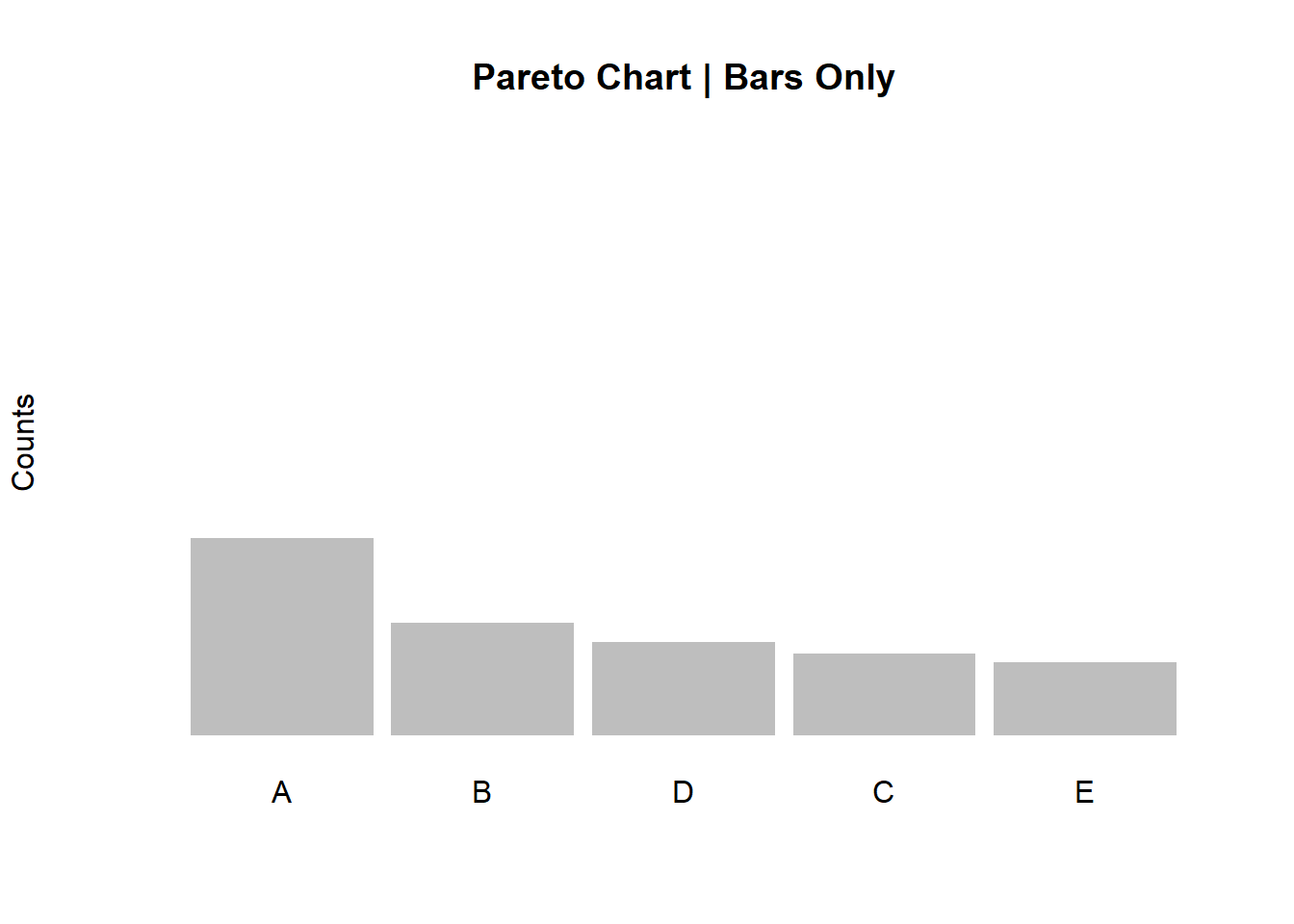
To add the secondary axis as well as the cumulative curve with the percentages, let’s create another object b and let’s calculate the cumulative percentages, like this:
b <- cumsum(tab)/sum(tab)Checking for “b”:
b## A B C D E
## 0.3538084 0.5562654 0.7022113 0.8697789 1.0000000To add the cumulative line, we can use a code like this:
barplot(df, width = 1, space = 0.1, border = NA, axes = F,
        ylim = c(0, 1.05 * max(a, na.rm = T)),
        ylab = "Count" , cex.names = 1)

lines(a, type = "b", cex = 0.9, pch = 19, col="cyan4")

axis(side = 2, at = c(0, a), las = 1, col.axis = "cyan4",
     col = "cyan4", cex.axis = 0.8)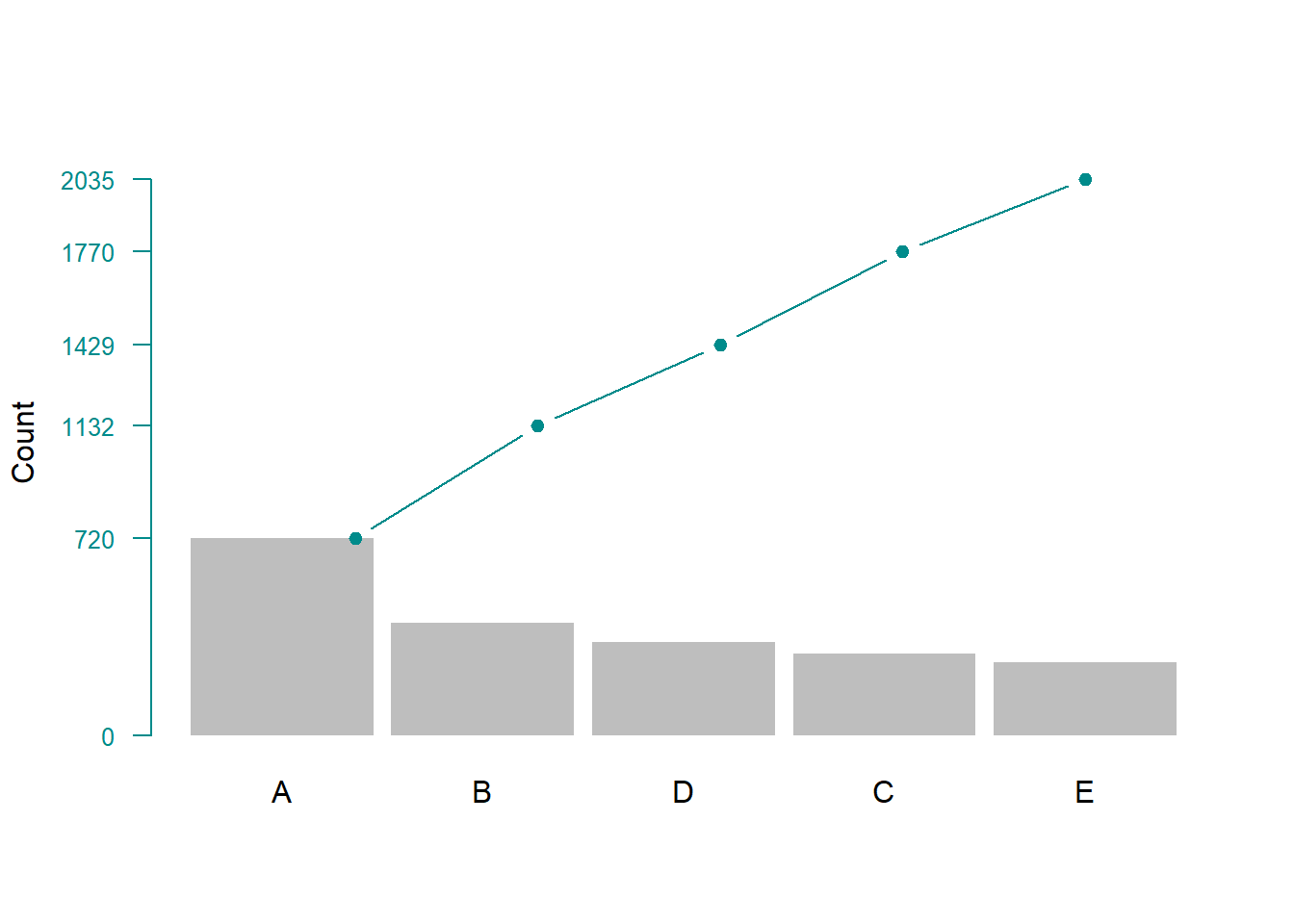
3.7.3 Pareto Charts Customization
Now let’s add the secondary y axis with the percentages, change the colour of the bars and add a title.
par(mar=c(5,5,4,5))

barplot(df, width = 1, space = 0.1, axes = F,
        col = "bisque", border="black",
        ylim = c(0, 1.05 * max(a, na.rm = T)),
        ylab = "Count" , cex.names = 0.7,
        main = "Customized Pareto Chart")

lines(a, type = "b", cex = 0.9, pch = 19, col="red")

axis(side = 2, at = c(0, a), las = 1, col.axis = "black",
     col = "black", cex.axis = 0.7)

axis(side = 4, at = c(0, a),
     labels = paste(c(0, round(b * 100)),"%", sep=""),
     las = 1, col.axis = "black", col = "black", cex.axis = 0.7)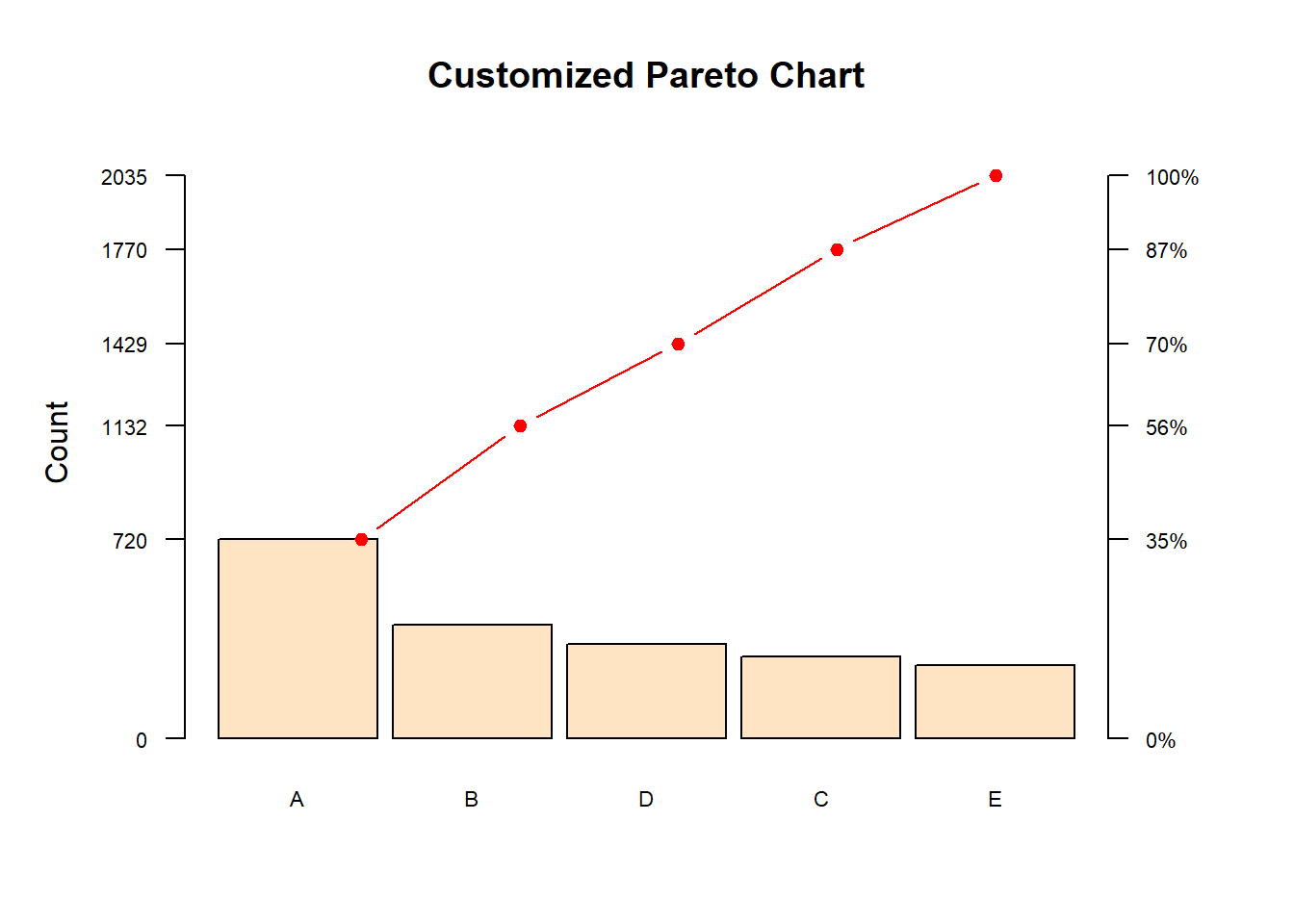
The result is a complete Pareto chart that showcases the ordered frequencies (highest to lowest) with a cumulative percentage line along with its secondary y axis.
Next let’s look at how to create Pareto charts with uploaded files. We’ll explore two different ways of doing this. The first one is by simply loading a list of occurrences, listed in a single column from an Excel file. The second one, by uploading data that have been summarized.
3.7.4 Creating Paretos with an Uploaded File
3.7.4.1 Method 1 - Attribute List
Let’s create two exact same Pareto charts, but with two different options with regards to how your data have been collected. In both examples, we’ll be using a simple Excel file. For the first method, we’ll be using data that have been listed in one single column. These are just hypothetical reasons for someone being late for work.
First things first, let’s upload the file into RStudio.
TIP: Make sure that your file is in the proper directory, your working directory in this case.
library(readxl)
pareto1_r <- read_excel("pareto1_r.xlsx")
Then, by using the dollar sign, let’s “grab” the defects column from the file and place it into an object a
a <- pareto1_r$DefectChecking for a:
a## [1] "Oversight" "Weather" "Traffic"
## [4] "Traffic" "Child care" "Oversight"
## [7] "Weather" "Traffic" "Traffic"
## [10] "Oversight" "Traffic" "Emergency"
## [13] "Child care" "Child care" "Traffic"
## [16] "Weather" "Child care" "Traffic"
## [19] "Child care" "Traffic" "Traffic"
## [22] "Traffic" "Traffic" "Traffic"
## [25] "Traffic" "Traffic" "Oversight"
## [28] "Traffic" "Oversight" "Oversight"
## [31] "Traffic" "Traffic" "Child care"
## [34] "Child care" "Oversight" "Child care"
## [37] "Traffic" "Traffic" "Child care"
## [40] "Emergency" "Traffic" "Traffic"
## [43] "Emergency" "Traffic" "Child care"
## [46] "Traffic" "Traffic" "Traffic"
## [49] "Weather" "Child care" "Traffic"
## [52] "Traffic" "Traffic" "Traffic"
## [55] "Weather" "Oversight" "Child care"
## [58] "Weather" "Emergency" "Oversight"
## [61] "Traffic" "Traffic" "Traffic"
## [64] "Child care" "Traffic" "Traffic"
## [67] "Traffic" "Traffic" "Child care"
## [70] "Traffic" "Traffic" "Weather"
## [73] "Traffic" "Weather" "Oversight"
## [76] "Child care" "Child care" "Traffic"
## [79] "Traffic" "Traffic" "Emergency"
## [82] "Child care" "Emergency" "Oversight"
## [85] "Oversight" "Emergency" "Traffic"
## [88] "Oversight" "Emergency" "Weather"
## [91] "Oversight" "Child care" "Traffic"
## [94] "Traffic" "Emergency" "Weather"
## [97] "Traffic" "Weather" "Emergency"
## [100] "Oversight" "Weather" "Oversight"
## [103] "Emergency" "Oversight" "Child care"
## [106] "Weather" "Emergency" "Weather"
## [109] "Alarm failure" "Child care" "Oversight"
## [112] "Traffic" "Child care" "Emergency"
## [115] "Weather" "Alarm failure" "Emergency"
## [118] "Alarm failure" "Weather" "Emergency"
## [121] "Traffic" "Emergency" "Weather"
## [124] "Oversight" "Child care" "Alarm failure"
## [127] "Alarm failure" "Oversight" "Child care"
## [130] "Alarm failure" "Emergency" "Child care"
## [133] "Oversight" "Weather" "Traffic"
## [136] "Alarm failure" "Weather" "Alarm failure"
## [139] "Oversight" "Emergency" "Weather"
## [142] "Oversight" "Emergency" "Oversight"
## [145] "Alarm failure" "Alarm failure" "Oversight"
## [148] "Emergency" "Alarm failure" "Weather"It’s a long list, but I wanted to make sure you see what’s in it: just a simple record of each event, no summarized data here. In this example, method 1, R will summarize the data for us.
Next, let’s table this list with the table function, order it from highest to lowest, and finally place it in an object named tab.
tab <- sort(table(a), decreasing = T)Checking tab contents:
tab## a
## Traffic Oversight Child care Weather
## 49 25 24 21
## Emergency Alarm failure
## 20 11As you can see, now we have our long list of records summarized as a table, ordered from highest to lowest.
As we did with the first example of this section on Pareto charts, let’s create the cumulative data by running the following codes:
a <- cumsum(tab)
b <- cumsum(tab)/sum(tab)
Checking for a and b:
a## Traffic Oversight Child care Weather
## 49 74 98 119
## Emergency Alarm failure
## 139 150b## Traffic Oversight Child care Weather
## 0.3266667 0.4933333 0.6533333 0.7933333
## Emergency Alarm failure
## 0.9266667 1.0000000Object a represents the absolute cumulative figures and b represents the percentages.
Finally, our Pareto chart:
par(mar=c(5,5,4,5))

barplot(tab, width = 1, space = 0.1, border = NA, axes = F,
        col = "grey",
        ylim = c(0, 1.05 * max(a, na.rm = T)),
        ylab = "Counts" , cex.names = 0.7,
        las = 2,
        main = "Pareto Chart | Being Late for Work")

lines(a, type = "b", cex = 0.9, pch = 19, col="cyan4")

axis(side = 2, at = c(0, a), las = 1, col.axis = "cyan4",
     col = "cyan4", cex.axis = 0.8)

axis(side = 4, at = c(0, a),
     labels = paste(c(0, round(b * 100)),"%", sep=""),
     las = 1, col.axis = "cyan4", col = "cyan4", cex.axis = 0.8)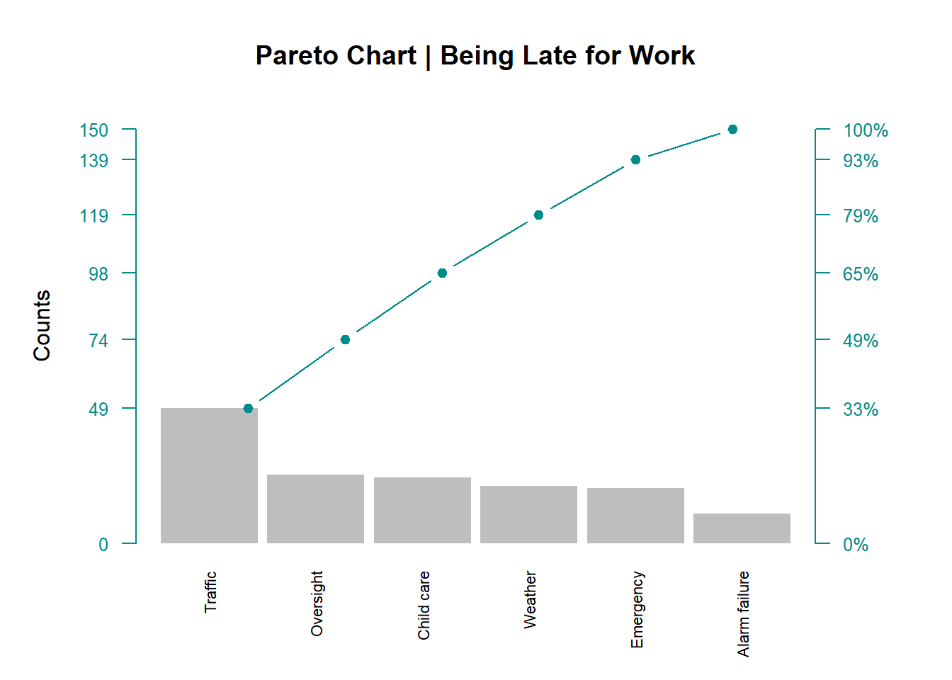
TIP: Sometimes, depending on the plot and the amount of customization, R needs a gentle re-formatting of the margins. That is what the first line of code in this plot (par()) is doing.
3.7.4.2 Method 2 - Summarized Data
We are now going to create the exact same Pareto chart. The difference here is not in the Pareto itself, but in how the data have been collected. Instead of a long list of categorical data (as discussed in the previous section), we’ll be dealing with summarized data.
As we did in method 1, let’s load our data into RStudio. This time, let’s name our object pareto2_r.
library(readxl)
pareto2_r <- read_excel("pareto2_r.xlsx")
Now let’s see what we have in this object:
pareto2_r## # A tibble: 6 x 2
## Defect_unit Count
## <chr> <dbl>
## 1 Traffic 49
## 2 Oversight 25
## 3 Child care 24
## 4 Weather 21
## 5 Emergency 20
## 6 Alarm failure 11A tibble, 6 x 2. That means 6 rows and 2 columns as you’d find in Excel. In R, these are variables (columns) and observations (rows).
What we need to do next to create our Pareto chart is to transform this tibble into a proper data frame, like this:
data <- data.frame(pareto2_r)Checking this data frame:
data## Defect_unit Count
## 1 Traffic 49
## 2 Oversight 25
## 3 Child care 24
## 4 Weather 21
## 5 Emergency 20
## 6 Alarm failure 11We do this so it’s easier to manipulate the data in a data frame although they both look the same. From here on, it’s basically the same procedure as in method 1. It just depends on the type of data structure we are dealing with.
Let’s create our cumulative data:
a <- cumsum(data$Count)
b <- a/(sum(data$Count))
df <- sort(data$Count,decreasing = TRUE)
Then plot our Pareto:
par(mar=c(5,5,4,5))

barplot(df, width = 1, space = 0.1, border = NA, axes = F,
        names.arg = data$Defect_unit,
        col = "grey",
        cex.axis = 0.5,
        las = 2,
        ylim = c(0, 1.05 * max(a, na.rm = T)),
        ylab = "Counts" , cex.names = 0.7,
        main = "Pareto Chart | Being Late for Work")

lines(a, type = "b", cex = 0.9, pch = 19, col="cyan4")

axis(side = 2, at = c(0, a), las = 1, col.axis = "cyan4",
     col = "cyan4", cex.axis = 0.8)

axis(side = 4, at = c(0, a),
     labels = paste(c(0, round(b * 100)),"%", sep=""),
     las = 1, col.axis = "cyan4", col = "cyan4", cex.axis = 0.8)
3.8 Control Charts
Control Charts are very useful when we need to look into the causes of variation of any given process (common or special) over time. Common (or normal) causes of variation are those that naturally belong to the process as no process is 100% perfect. In fact, it is expected to see some common cause variation within a process. Special (or assignable) causes of variation are those that signal an undesirable outcome, or something that does not seem to belong to the commonality of the variation in the process.
Although not comprehensive, in this section we’ll cover a few of the most common control charts the CI practitioner uses during a DMAIC-based project.
For this, we’ll be using the very well built package qicharts2, developed by Jacob Anhoej. You can find more information about this package in the link below:
https://cran.r-project.org/web/packages/qicharts2/index.html
3.8.1 I-MR Control Charts
Let’s start with Individual-Moving Range control charts.
3.8.1.1 Data Source
As usual, let’s create some random data for this example. Our data is placed in an object named cc.
cc <- rnorm(36,72,2)Checking for cc:
cc## [1] 73.78735 69.90540 75.94267 71.23274 75.30829 75.02443
## [7] 72.16593 73.13444 69.95090 72.64601 74.08722 72.19816
## [13] 71.09173 70.68844 71.92816 74.13832 71.03205 71.75798
## [19] 69.41172 72.98863 74.61580 74.99408 73.62941 68.26042
## [25] 72.96406 72.91227 71.29320 72.34098 70.27193 73.35846
## [31] 71.34580 68.86184 71.26510 74.72887 71.33144 73.46550Before we create the control charts we want, let’s load the library qicharts2:
library(qicharts2)3.8.1.2 Basic I-MR Charts
The qicharts2 library facilitates the construction of control charts. For the Individual Values control chart, the code looks like this:
qic(cc, chart = "i")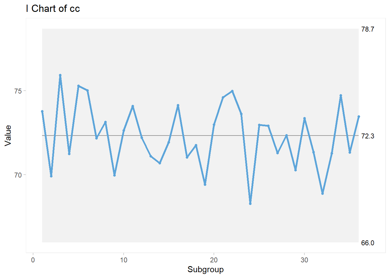
For the Moving Range control chart, the code looks like this:
qic(cc, chart = "mr")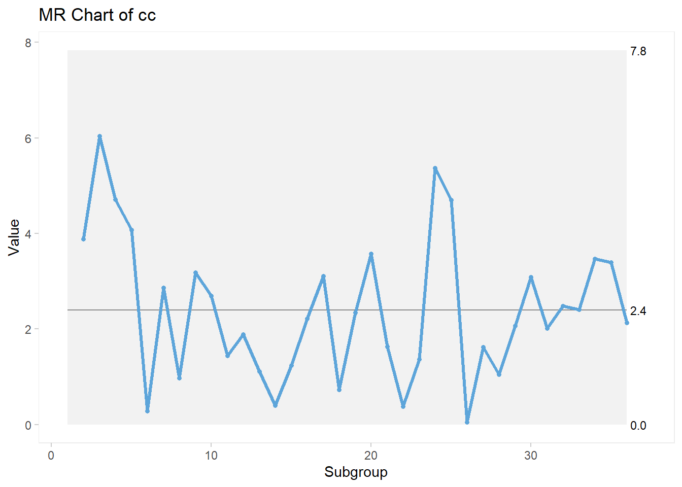
3.8.1.3 I-MR Chart Customization
Recall that we are using a specific package for these plots therefore, the elements for customization are limited to the arguments found in the package itself; in other words, we can only execute arguments that belong to the package.
TIP: You can see all arguments in the package documentation online, via link shared previously. Alternatively, you can use the help menu in R by typing ?qicharts2. The vignet from the package has detailed explanations on all charts and all arguments available!
There are a few things we can do to customize this plot a bit more. I will use the individual control chart, but the same arguments are applied to any of the qicharts2 package, with a few exceptions.
qic(cc, chart ="i",
    title = "Men Heights in Canada",
    xlab = "\nSample",
    ylab = "\nHeight in inches")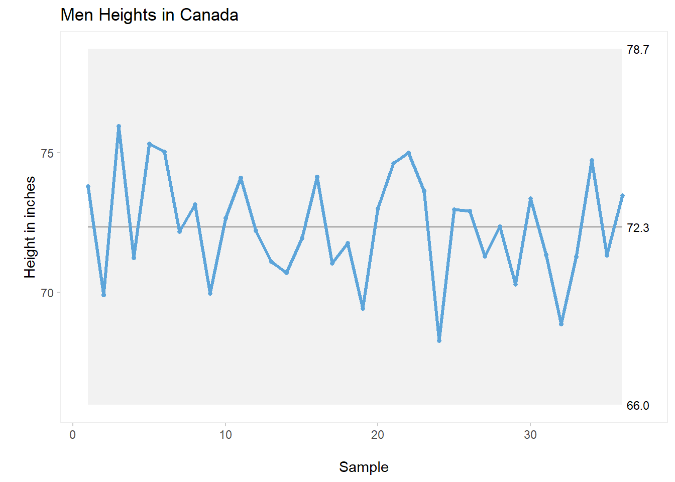
For this first plot, I’ve simply added a proper title as well as specific names for the x and y axes.
3.8.1.4 Splitting the Plot
Very often, we need to showcase the improvement between the before and after of initiatives developed during a DMAIC project, especially throughout the Improvement phase. We can visually show this when we split (or part) the plot according to the time in which the improvement started to happen. For example, let’s assume that a certain measurement was considered to be too high and the project team needed to introduce improvements to reduce it.
Let’s create a set of data that purposely shows this improvement. We’ll be using the function sample nested inside the combine function to create a set of data that (intentionally in this case) moves from a mean of 11.6 to 4.7.
Here’s the code, followed by a quick check on the object created.
set.seed(1)
cc <- c((sample(10:20,20,replace = TRUE)),
          (sample(4:7,10,replace = TRUE)))
cc
## [1] 18 13 16 10 11 16 20 11 20 12 10 14 14 19 15 19 16 18
## [19] 14 14 4 4 5 4 4 5 5 5 4 7Notice that the dataset above is showing the drop in value towards the end.
A regular Individual (I) control chart would look like this:
qic(cc, chart ="i",
    title = "Individual Control Chart",
    xlab = "\nSamples",
    ylab = "\nVariable of Interest")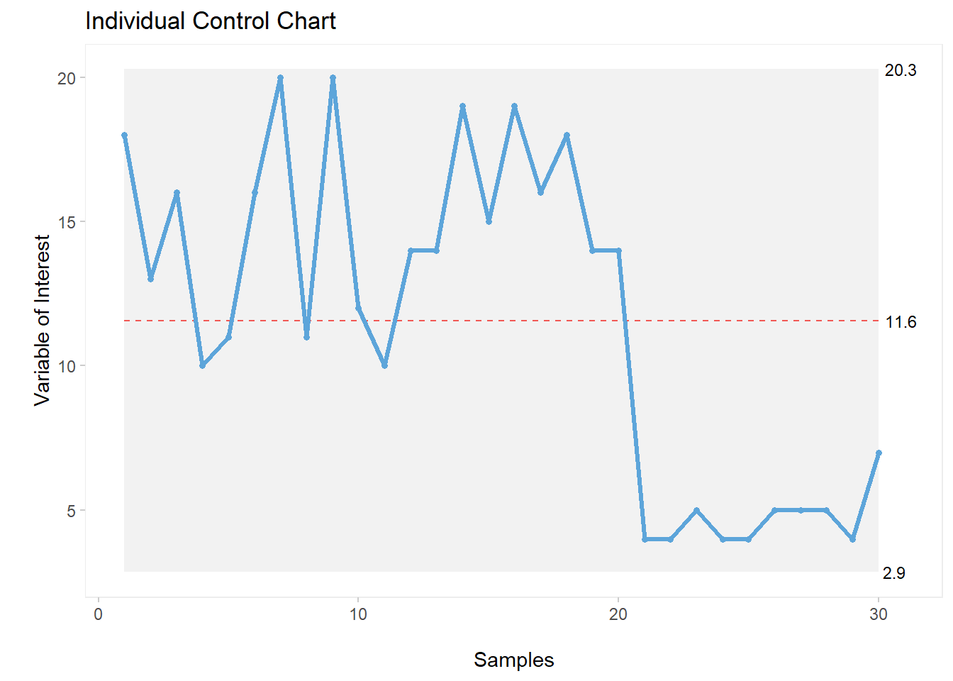
You can see the drop in the plot, however we can add a few more elements for clarity. For example, let’s add a dotted line at the intervention moment and add the partition labels, like this:
qic(cc, chart ="i",
    freeze = 20,
    part.labels = c("Baseline", "Intervention"),
    title = "Individual Control Chart",
    xlab = "\nSamples",
    ylab = "\nVariable of Interest")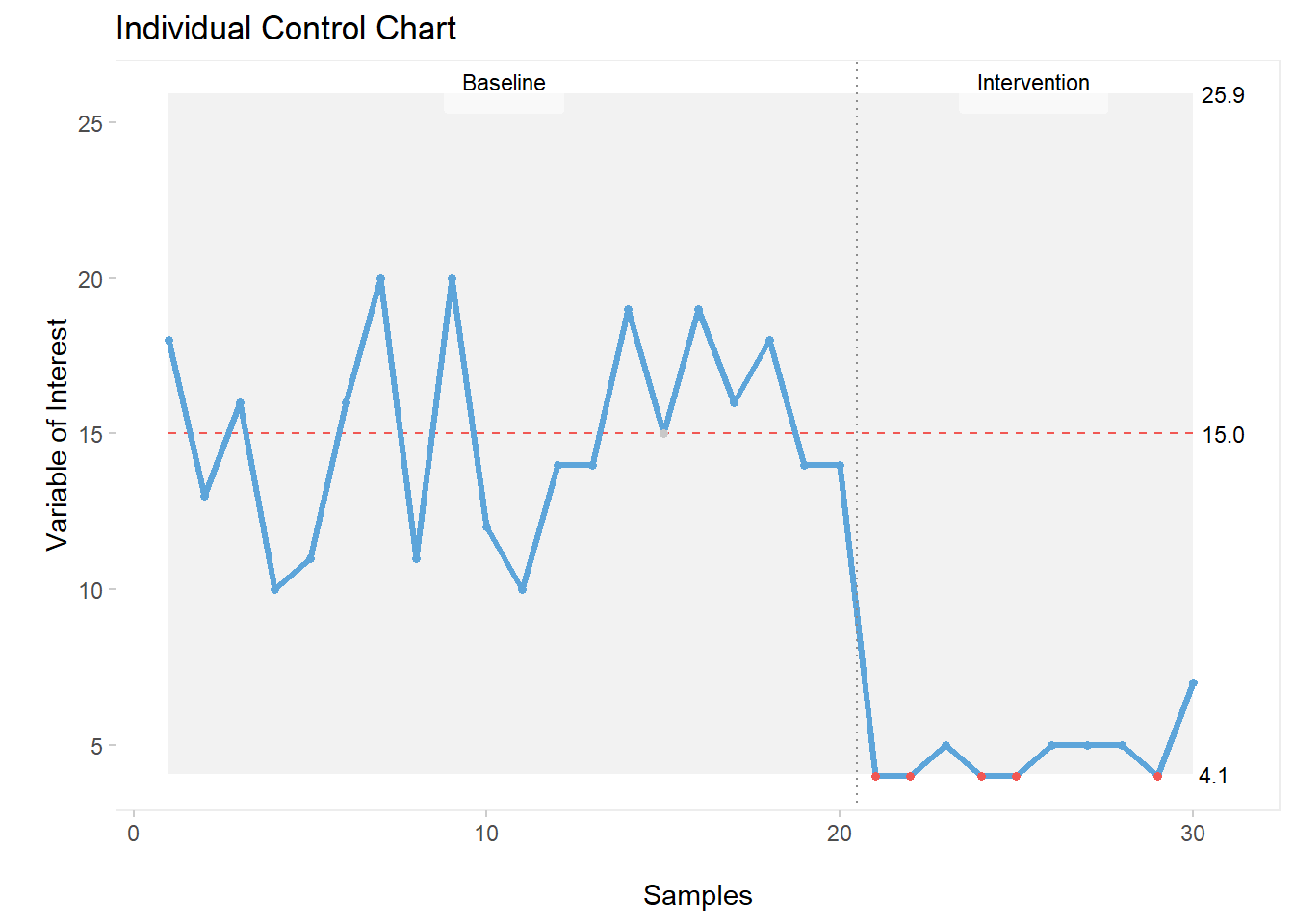
Alternatively, we can split the plot at the moment that we introduced improvement (in this case, hypothetically at moment 20, which could have been a specific date or time). With this code, we actually break off the control chart and recalculate the mean and control limits.
Here’s the code:
qic(cc, chart ="i",
    part = 20,
    part.labels = c('Baseline', 'Intervention'),
    title = "Split Individual Control Chart",
    xlab = "\nSamples",
    ylab = "\nVariable of Interest")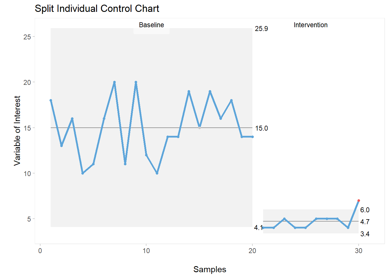
The split plot is much more visually-appealing. One can clearly identify the introduction of improvement as well as the reduction in value achieved and sustained post moment 20.
As mentioned previously, these custom settings also apply to other charts within the qicharts2 package. For example, the moving range control chart.
Here’s the exact same code used for the individual values control chart, now applied to the moving range (MR) chart:
qic(cc, chart ="mr",
    part = 20,
    part.labels = c('Baseline', 'Intervention'),
    title = "Split Moving Range Control Chart",
    xlab = "\nSamples",
    ylab = "\nVariable of Interest")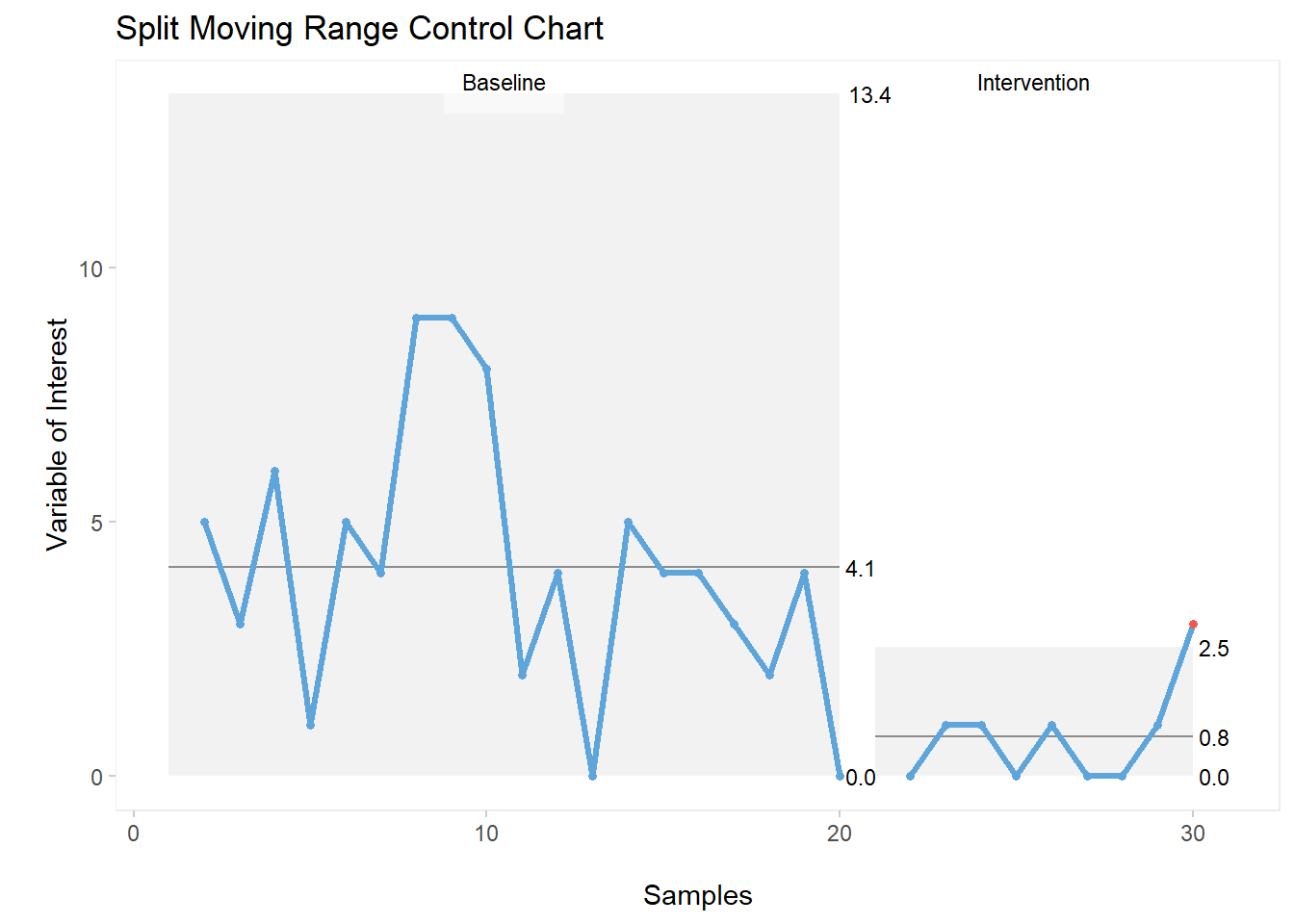
3.8.2 Xbar-s Control Charts
Xbar Charts are normally used when rational grouping is used for the sampling of a set of numbers, as opposed to using each individual number like we did in the previous section with the I-MR control charts. With Xbar charts, means from each sample are calculated, then plotted on the control chart.
There are different methods for grouping. Some are well defined within the industry (sometimes even regulated) and some are more open to how the data are being collected.
In this example, let’s use a data base from an Excel file. These data were collected over a certain period of time, and we’re going to run their Xbar chart, along with its accompanying s (standard deviation) chart, based on the mean of each day the data were collected.
3.8.2.1 Data Source
First, let’s load our Excel file into RStudio:
library(readxl)
GA_kickoff_r <- read_excel("GA_kickoff_r.xlsx")
Then let’s have a quick look at what is inside this file:
head(GA_kickoff_r)## # A tibble: 6 x 7
## Sample Date Ref_weight_g Sample_weight_g
## <dbl> <dttm> <dbl> <dbl>
## 1 1 2021-05-03 00:00:00 454. 463.
## 2 2 2021-05-03 00:00:00 454. 460.
## 3 3 2021-05-03 00:00:00 454. 466
## 4 4 2021-05-03 00:00:00 454. 472.
## 5 5 2021-05-03 00:00:00 454. 453
## 6 6 2021-05-03 00:00:00 454. 456.
## # ... with 3 more variables: Variance_g <dbl>,
## # Variance_p <dbl>, Type <chr>We’ll be using the variable “Variance_g” (variance in grams) for this example.
Here’s the code for the XBar chart:
qic(Date, Variance_g,
    data = GA_kickoff_r,
    chart = "xbar")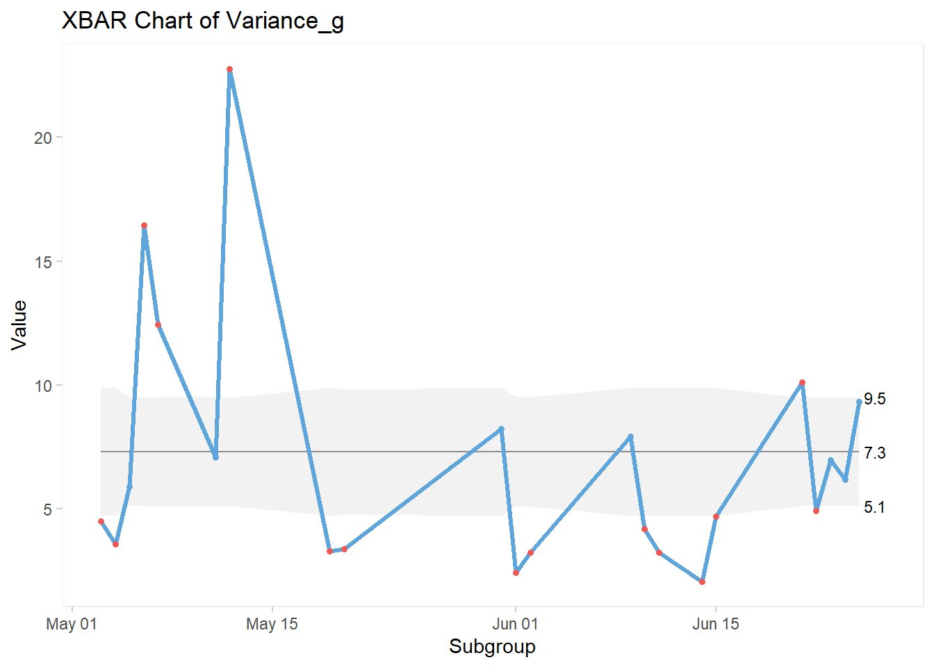
And here’s the code for the accompanying s Chart:
qic(Date, Variance_g,
    data = GA_kickoff_r,
    chart = "s")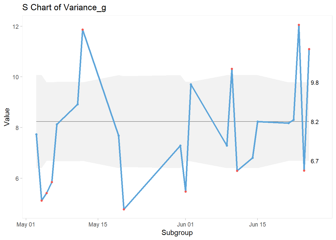
3.8.2.2 Xbar-s Chart Customization
We can apply the exact same custom elements to these charts, just as we did with the I-MR charts.
3.8.2.3 Splitting the Chart
qic(Date, Variance_g, data = GA_kickoff_r,
    part = 10,
    chart = "xbar",
    title = "Xbar Control Chart",
    xlab = "\nSamples",
    ylab = "\nVariable of Interest")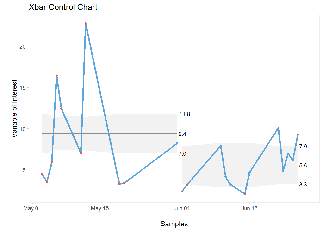
3.8.2.4 Adding Partition Labels
qic(Date, Variance_g, data = GA_kickoff_r,
    part = 10,
    part.labels = c("Before DMAIC", "After DMAIC"),
    chart = "xbar",
    title = "Xbar Control Chart",
    xlab = "\nSamples",
    ylab = "\nVariable of Interest")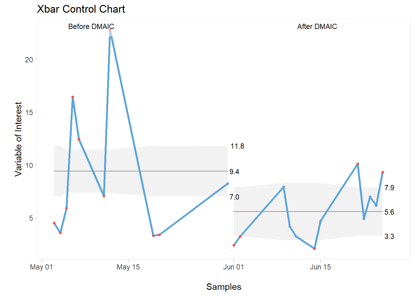
3.8.3 C Charts
C Charts are used to display process behaviour for defects count, in our example, in a given sample size.
3.8.3.1 Data Source
Let’s create a simple database for this example. We’ll have 20 lots of production (Lot), all of them with the same sample size SS of 500 units. The defects count will be stored in an variable named Defects. We’ll be looking at defects found in chocolate chip cookies.
Here’s the code for the entire data frame:
mydata <- data.frame("Lot" = c(1:20),
                  "SS" = rep(500,times=20),
                  "Defects" = c(24,27,28,36,32,29,21,24,66,32,
                    36,31,29,25,32,36,24,38,36,37))
As usual, let’s have a quick look at the data frame we’ve just created:
head(mydata, n = 7)## Lot SS Defects
## 1 1 500 24
## 2 2 500 27
## 3 3 500 28
## 4 4 500 36
## 5 5 500 32
## 6 6 500 29
## 7 7 500 213.8.3.2 Customized C Chart
All elements previously used in our I-MR and Xbar-s examples are applicable to this chart. So let’s get straight into a fully built C chart.
qic(Lot,Defects,
    data = mydata,
    chart = "c",
    title = "C Chart for Defects in Cookies",
    ylab = "Defects\n",
    xlab = "\nSampled Lot")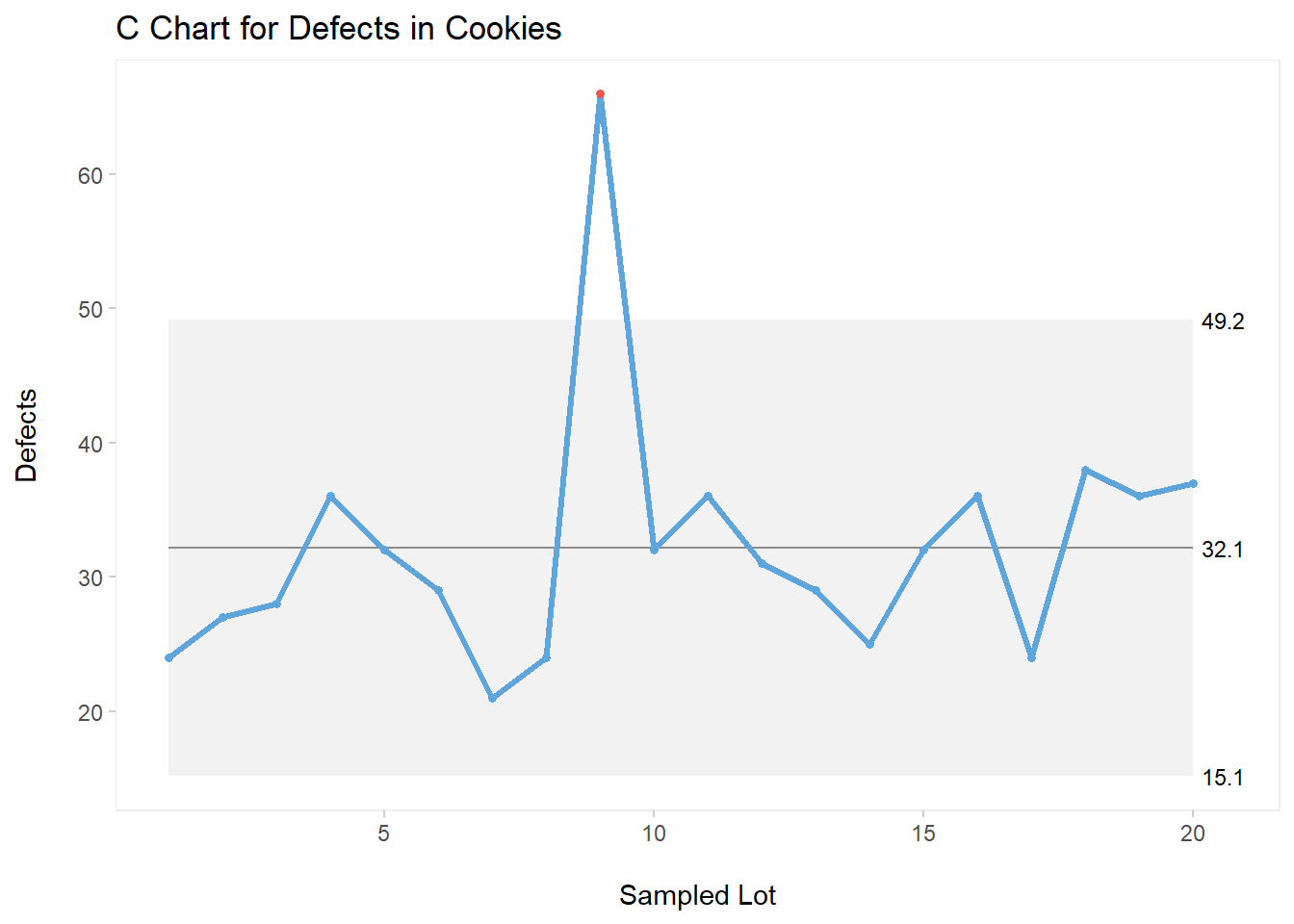
As shown on the above C chart, we can see a special cause of variation half way through our plot (Lot 9).
3.8.4 P, U, and Other Control Charts
We’ve only covered three types of control charts in this section, the ones that I believe a Six Sigma practitioner uses the most. Be sure to check out all other charts via the help menu in R. Simply type ?qicharts2 in your console. This call for help will take you to the detailed qicharts2 package with many more examples, according to the specific chart that you’re looking for.
The syntax and customization are basically the same for all of them.
3.9 Placing 4 Plots On One Page
To wrap up this section, let’s look into how we can create a clean, great-looking one-page display for four different plots.
3.9.1 Data Source
Creating vectors:
Let’s generate some data to represent three different Teams: A, B, and C. We’ll place these data into an object named teams.
teams <- as.factor(rep(c(LETTERS[1:3]),times=15))
teams
## [1] A B C A B C A B C A B C A B C A B C A B C A B C A B C A
## [29] B C A B C A B C A B C A B C A B C
## Levels: A B CThen, let’s create some data to represent scores for these teams. This list of values will be placed into another object named scores.
scores <- sample(0:100,45, replace=TRUE)
scores
## [1] 78 32 83 34 69 73 41 37 19 27 19 43 86 69 39 43 24 69
## [19] 38 50 41 5 23 31 13 1 44 17 21 77 64 69 86 69 74 80
## [37] 99 12 39 88 47 88 22 83 28Finally, a vector with heights in inches.
height <- rnorm(45,70,2)
height
## [1] 69.77531 71.76222 70.79621 68.77595 70.68224 67.74127
## [7] 72.86605 73.96080 69.26556 67.91173 71.13944 69.72989
## [13] 74.80324 69.92152 71.37948 70.05600 68.51345 70.37758
## [19] 66.39008 72.93111 70.30651 74.34522 70.95102 68.58011
## [25] 71.22145 68.13180 67.49273 70.58289 69.11342 70.00221
## [31] 70.14868 68.82096 68.86266 69.72964 72.35617 66.95287
## [37] 71.18789 70.66590 72.12620 69.39163 70.74004 70.53420
## [43] 68.91496 72.41574 72.32081Notice that I’ve purposely created three vectors of forty-five data points, just to explore a few different plots in this example.
3.9.2 Creating 4 Plots On 1 Page
Firstly, we’ll use the function par from R base to setup our page. What the par function is doing here is very simple: it is creating a 2 x 2 matrix behind the scene, that is, a 2 columns by 2 rows page. To “fill” this invisible matrix, we’ll be running 4 different line of codes, one for each plot on the 2 x 2 matrix.
par(mfrow=c(2,2))
plot(scores, type="line", lwd=2,
main="Line Plot of Scores (Run Chart)", col="blue",
xlab="Samples", ylab="Scores")
points(scores, col="red", pch=19)
hist(height, main="Histogram of Heights", col="aquamarine3",
xlab="Height")
plot(teams,scores, main="Comparative Boxplots | Scores by Teams",
col="lightskyblue1",
xlab="Teams", ylab="Scores")
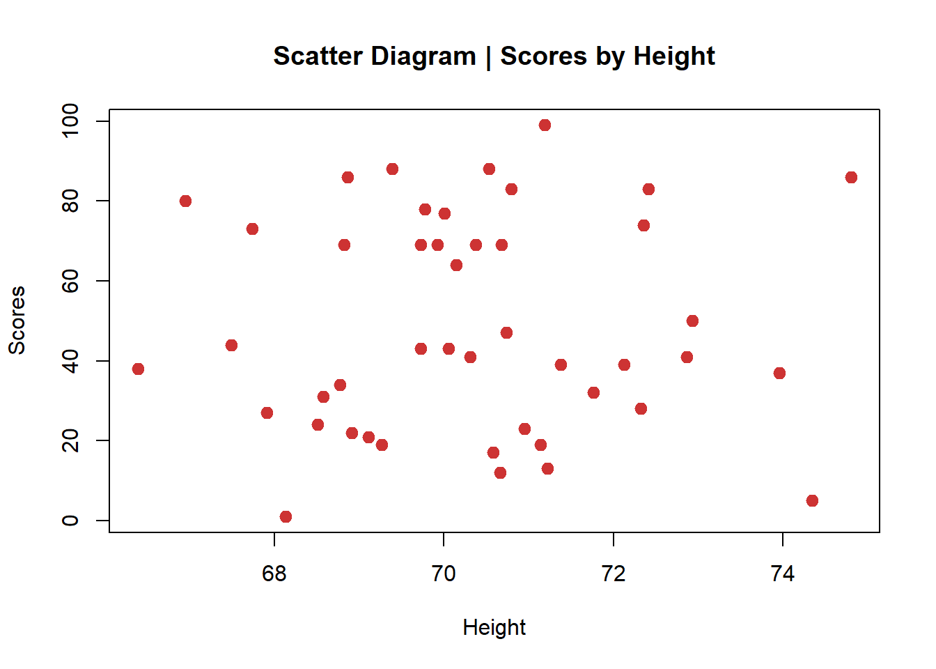
plot(scores~height, main="Scatter Diagram | Scores by Height",
col="brown3",
xlab="Height", ylab="Scores", pch=19, cex=1.2)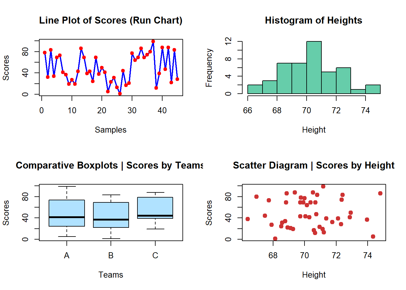
Important Note: if you want to go back to the regular parameters, that is, displaying one plot at a time, you need to clear the parameters set previously to create the 2 x 2 matrix.
To clear the parameters, simply run this code:
par(mfrow=c(1,1))Now if you run the same plots again, you will see them displayed individually.
The line plot:
plot(scores, type="line", lwd=2,
     main="Line Plot of Scores (Run Chart)", col="blue",
     xlab="Samples", ylab="Scores")
points(scores, col="red", pch=19)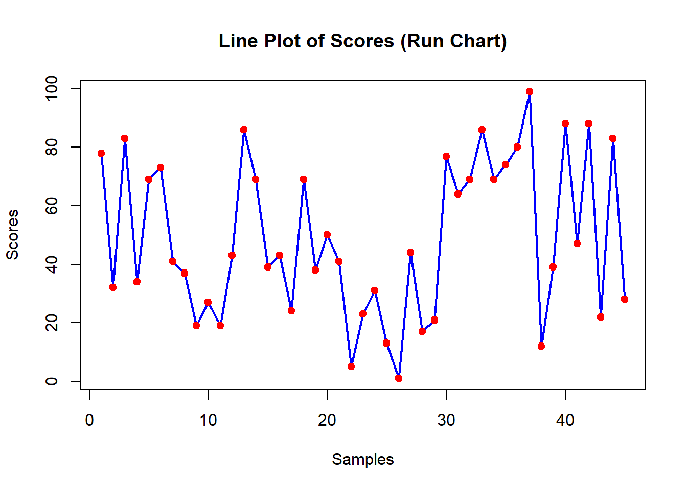
The histogram:
hist(height, main="Histogram of Heights", col="aquamarine3",
     xlab="Height")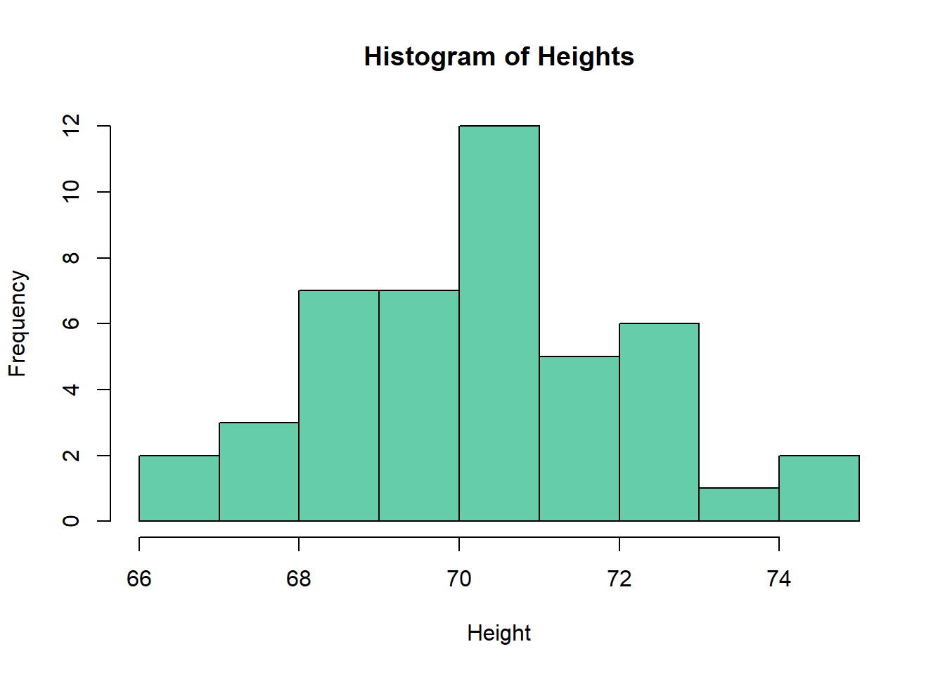
The comparative boxplots:
plot(teams,scores, main="Comparative Boxplots | Scores by Teams",
     col="lightskyblue1", xlab="Teams", ylab="Scores")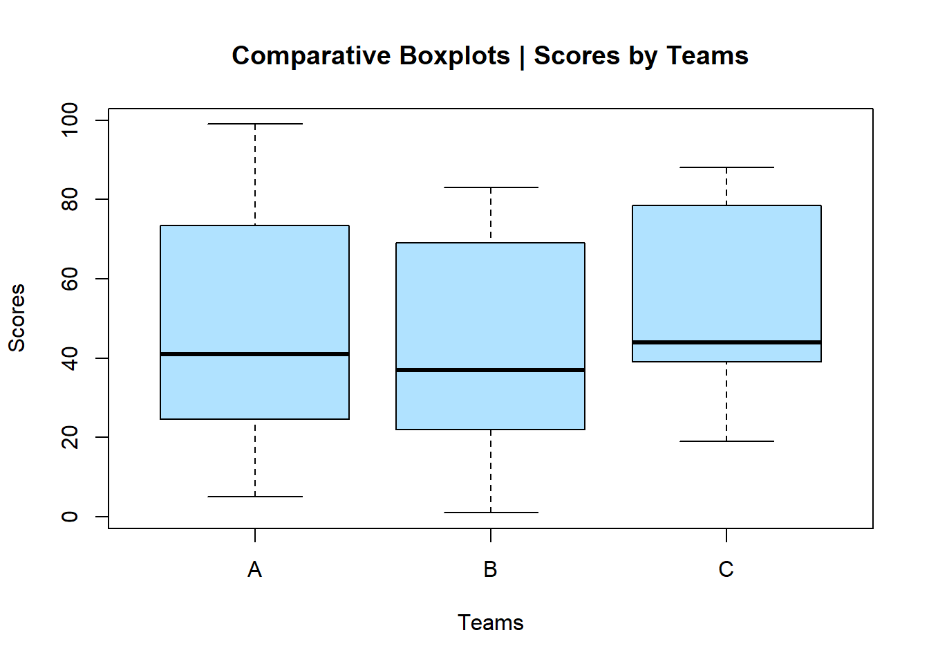
The scatter diagram:
plot(scores~height, main="Scatter Diagram | Scores by Height",
     col="brown3", xlab="Height", ylab="Scores", pch=19, cex=1.2)