Chapter 4 Plotting with ggplot2
For this section of the book, I’ll be using the powerful and extremely popular package ggplot2 (or just ggplot). First, let’s load the library tidyverse, which contains ggplot2 and other helpful packages. I’ll also be using the awesome ggthemes package as well as reshape2 to work with some data manipulation.
library(tidyverse)
library(reshape2)
library(ggthemes)
4.1 Line Plots
Let’s create a simple Line Plot (also known as Run Charts in the Six Sigma Body of Knowledge, or BOK). Normally, run charts are useful when dealing with data that are spread over a certain period of time.
4.1.1 Data Source
For our x axis, let’s generate a time period between Jan 1, 2021 and Dec 31, 2021. Notice how I use the seq function in this line of code.
period <- seq(as.Date("2021/1/1"), by = "month", length.out = 12)For our y axis, we will use the sample function. In this case, we’re simply asking R to give us 12 data points, randomly between 500 and 1000, with an argument to replace any already drawn value. These are the sales of any given product.
sales <- sample(500:1000,12,replace = TRUE)Finally, let’s create a data frame with the two vectors above. The code for this task looks like this:
df <- data.frame(period,sales)Checking for df:
df## period sales
## 1 2021-01-01 519
## 2 2021-02-01 876
## 3 2021-03-01 907
## 4 2021-04-01 550
## 5 2021-05-01 552
## 6 2021-06-01 899
## 7 2021-07-01 966
## 8 2021-08-01 855
## 9 2021-09-01 629
## 10 2021-10-01 803
## 11 2021-11-01 564
## 12 2021-12-01 7994.1.2 Basic Plot
The geom used for a line plot is geom_line. ggplot has a way of building layers over the plot. gg means “grammar of graphics.” A simple line plot using ggplot is built like this:
ggplot(df, aes(x=period, y=sales))+
  geom_line(size=1)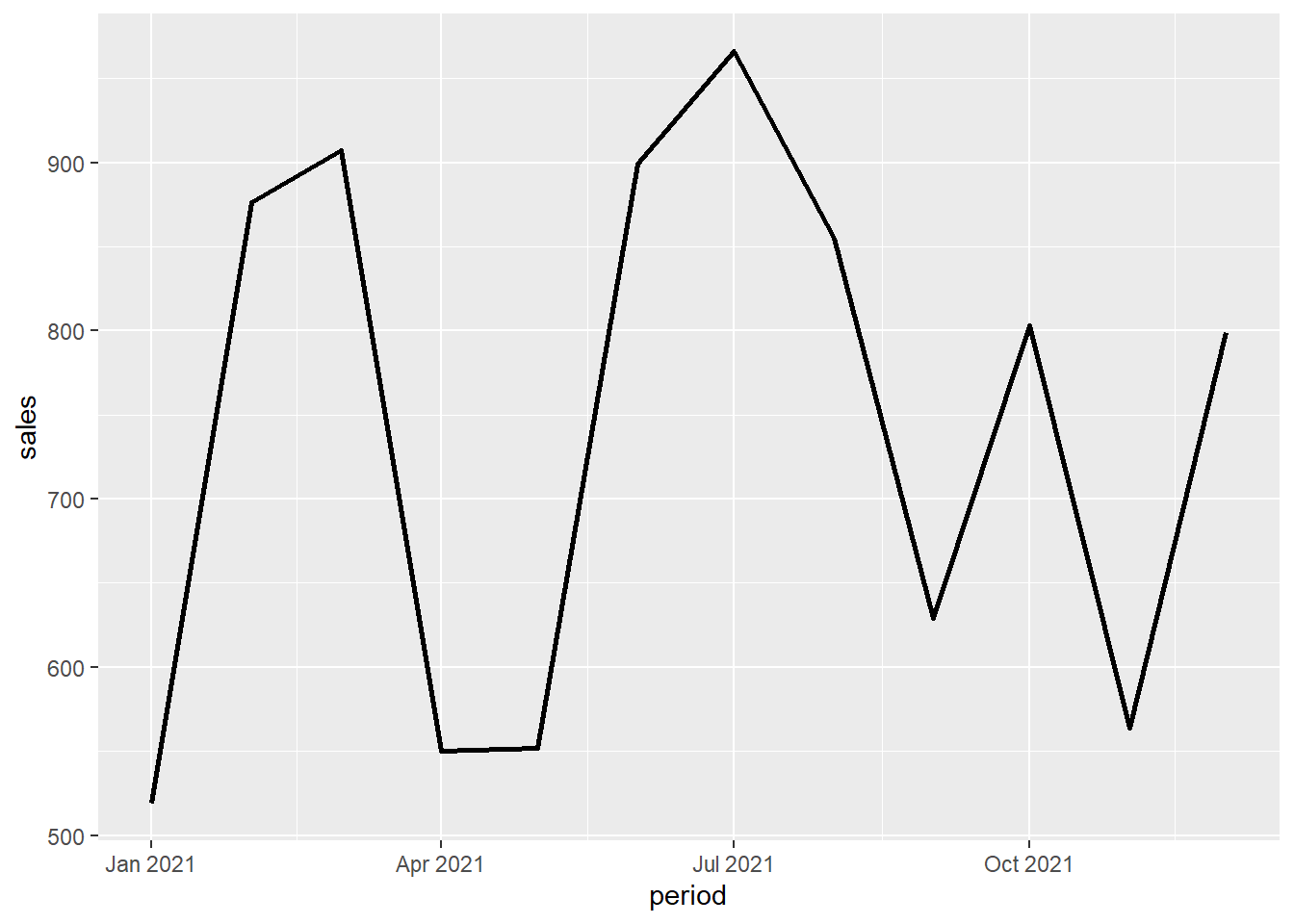
4.1.3 Line Plot Customization
Let’s now add some customization: a title, a sub-title, a different theme (using the ggthemes package) and even a small caption at the bottom right corner of the plot.
ggplot(df, aes(x=period, y=sales))+
  geom_line(size=1, colour="black", lty="dashed")+
  labs(title="Sales by Month (CAD)",
       subtitle = "Jan to Dec, 2021",
       caption = "Created with RStudio")+
  theme_solarized()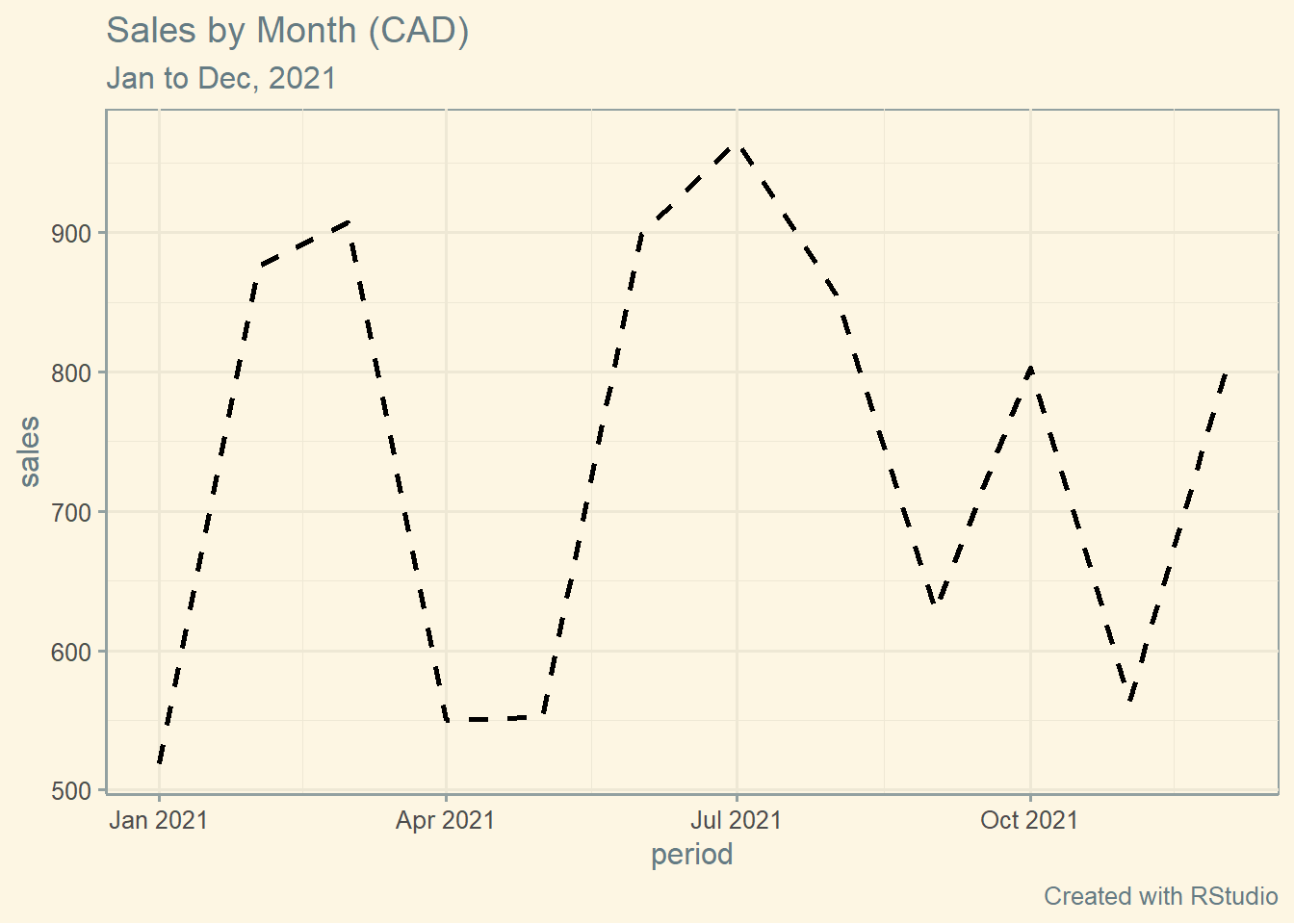
4.2 Bar Plots
4.2.1 Data Source
I have downloaded the publicly available Covid-19 data base from the Government of Ontario for this example. The file used in this example can be found here:
https://data.ontario.ca/en/dataset/confirmed-positive-cases-of-covid-19-in-ontario
The name of the file is conposcovidloc and its extension is .csv. It is a large file so let’s learn how to handle a few things first.
As usual, let’s make sure that we load the libraries that we are going to need for this bar plot example. Here they are:
library(readr)
library(tidyverse)
library(ggthemes)
TIP: If you do not have these libraries already installed, use the install.packages() function to install them.
TIP: Make sure that your data source files are saved in the same folder where your codes (scripts) are saved.
Let’s read this file, and place its contents into an object named covid, like this:
covid <- read_csv("conposcovidloc.csv")##
## -- Column specification ------------------------------------
## cols(
## Row_ID = col_double(),
## Accurate_Episode_Date = col_date(format = ""),
## Case_Reported_Date = col_date(format = ""),
## Test_Reported_Date = col_date(format = ""),
## Specimen_Date = col_date(format = ""),
## Age_Group = col_character(),
## Client_Gender = col_character(),
## Case_AcquisitionInfo = col_character(),
## Outcome1 = col_character(),
## Outbreak_Related = col_character(),
## Reporting_PHU_ID = col_double(),
## Reporting_PHU = col_character(),
## Reporting_PHU_Address = col_character(),
## Reporting_PHU_City = col_character(),
## Reporting_PHU_Postal_Code = col_character(),
## Reporting_PHU_Website = col_character(),
## Reporting_PHU_Latitude = col_double(),
## Reporting_PHU_Longitude = col_double()
## )For simplicity, and to avoid values that are not necessarily representative in terms of sample, let’s filter the data a bit using this code:
covid <- filter(covid,
                Age_Group!="UNKNOWN" & Client_Gender!="GENDER DIVERSE",
                Client_Gender!="UNSPECIFIED")
By running this code, I’ve simply removed “UNKNOWN” from the variable Age_Group and “GENDER DIVERSE” and “UNSPECIFIED” from the variable Client_Gender.
The last thing we are going to do with this data set is to extract the fatal cases only. You will see what I am going to do with this shortly. To achieve this, let’s run the following code:
covid_fatal <- filter(covid, Outcome1=="Fatal")4.2.2 Basic Plot
We are set to go. Let’s run the plot of fatal cases by Age_Group. The following code will create a bare bar plot.
ggplot(covid_fatal, aes(Age_Group))+
  geom_bar()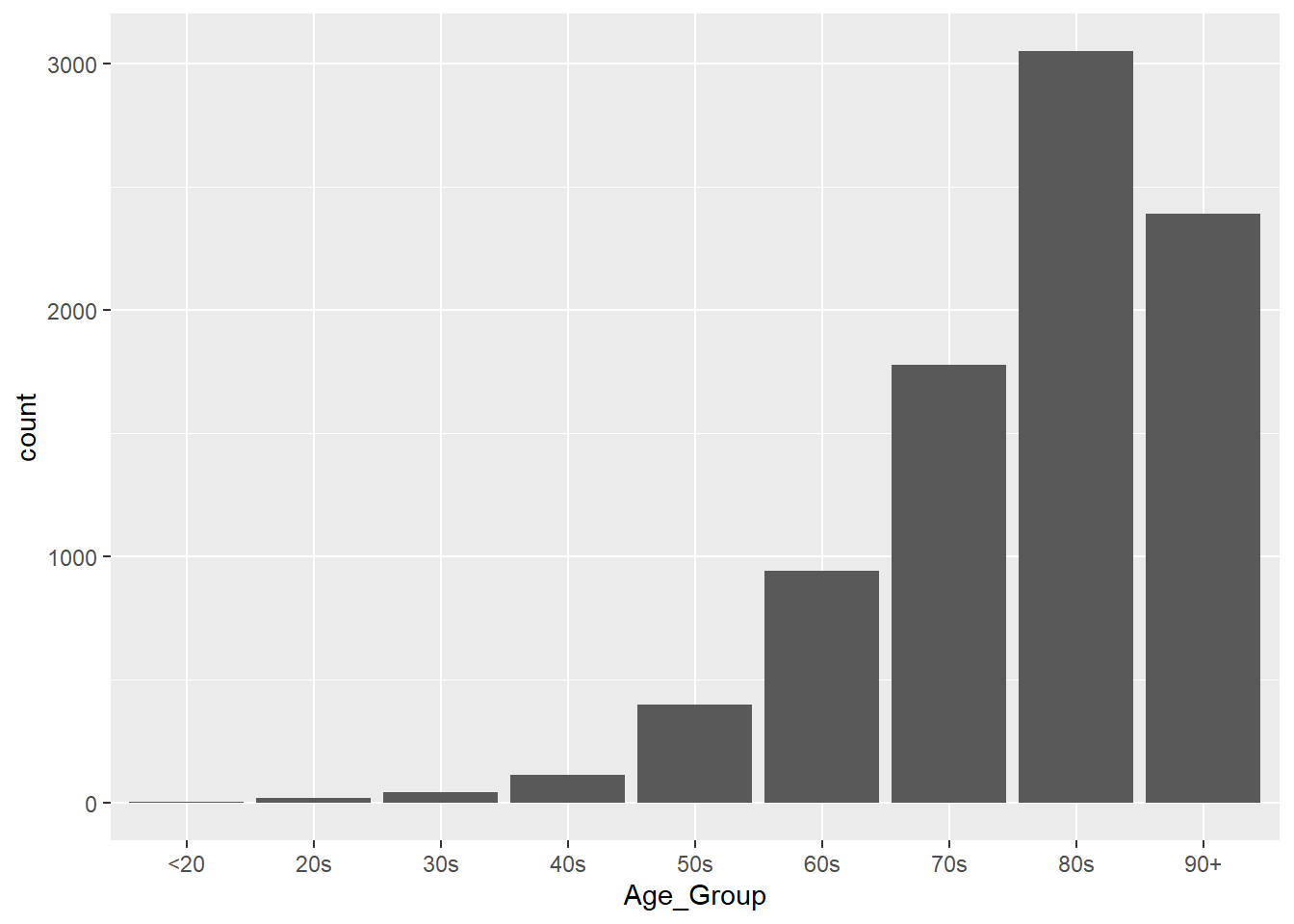
4.2.3 Bar Plot Customization
Let’s break this plot down further by gender and once again, add more customization to it so that it is much more visually-appealing for the reader.
Notice that I am using a different colour scheme here. I’ve called the scale_fill_brewer() function with the palette Set2 to customize the colours of this specific plot.
Here’s our code:
ggplot(covid_fatal, aes(Age_Group, fill=Client_Gender))+
  labs(title ="ON COVID-19 Cases | FATAL Only",
       subtitle = "Jan 23, 2020 to Jun 3, 2021",
       caption = "\nSource: data.ontario.ca",
       x = "\nAge Group",
       y = "Count\n")+
  scale_fill_brewer(palette="Set2")+
  theme_minimal()+
  geom_bar()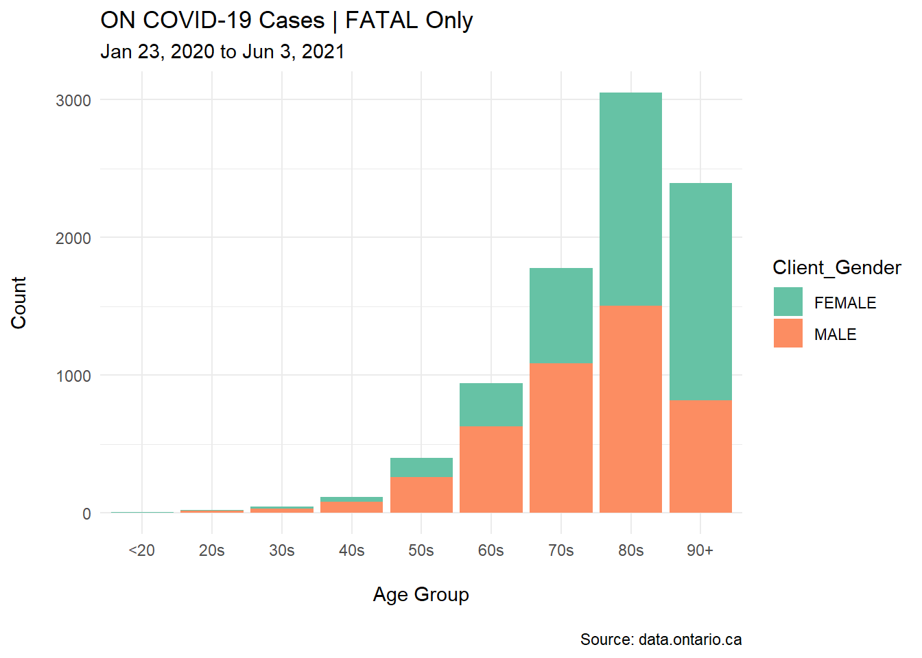
I’ve also added other elements to this customized plot: the time period for the analysis, the source of data (as a caption at the bottom of the plot), and a proper title along with the colour-coded break down for the Client_Gender subsets.
TIP: Aesthetics and presentation are important when building these plots. For example, the y axis in the basic plot has a lower case title, “count.” I’ve replaced it with an upper case title, “Count.” These small details show quality in your work!
4.3 Stacked Bar Plots
4.3.1 Data Source
Twelve professionals of four different levels of Six Sigma positions were interviewed about years of experience and current industry placement.
These levels are:
- WB: White Belt
- GB: Green Belt
- BB: Black Belt
- MBB: Master Black Belt
Here’s the code for our vectors:
set.seed(4)
position <- c(rep("WB",3),
              rep("GB",3),
              rep("BB",3),
              rep("MBB",3))
Industry <- rep(c("Food", "Aerospace", "Recycling"),4)
years <- round(rnorm(12,10,2))
And here’s the code for our data frame:
ci <- data.frame(position,Industry,years)Checking for ci:
head(ci, n=7)## position Industry years
## 1 WB Food 10
## 2 WB Aerospace 9
## 3 WB Recycling 12
## 4 GB Food 11
## 5 GB Aerospace 13
## 6 GB Recycling 11
## 7 BB Food 7Let’s use the geom_bar and a few more elements to create a basic Stacked Bar Plot.
ggplot(ci, aes(colour=Industry, y=years, x=position))+
    geom_bar(position="stack",
             stat="identity")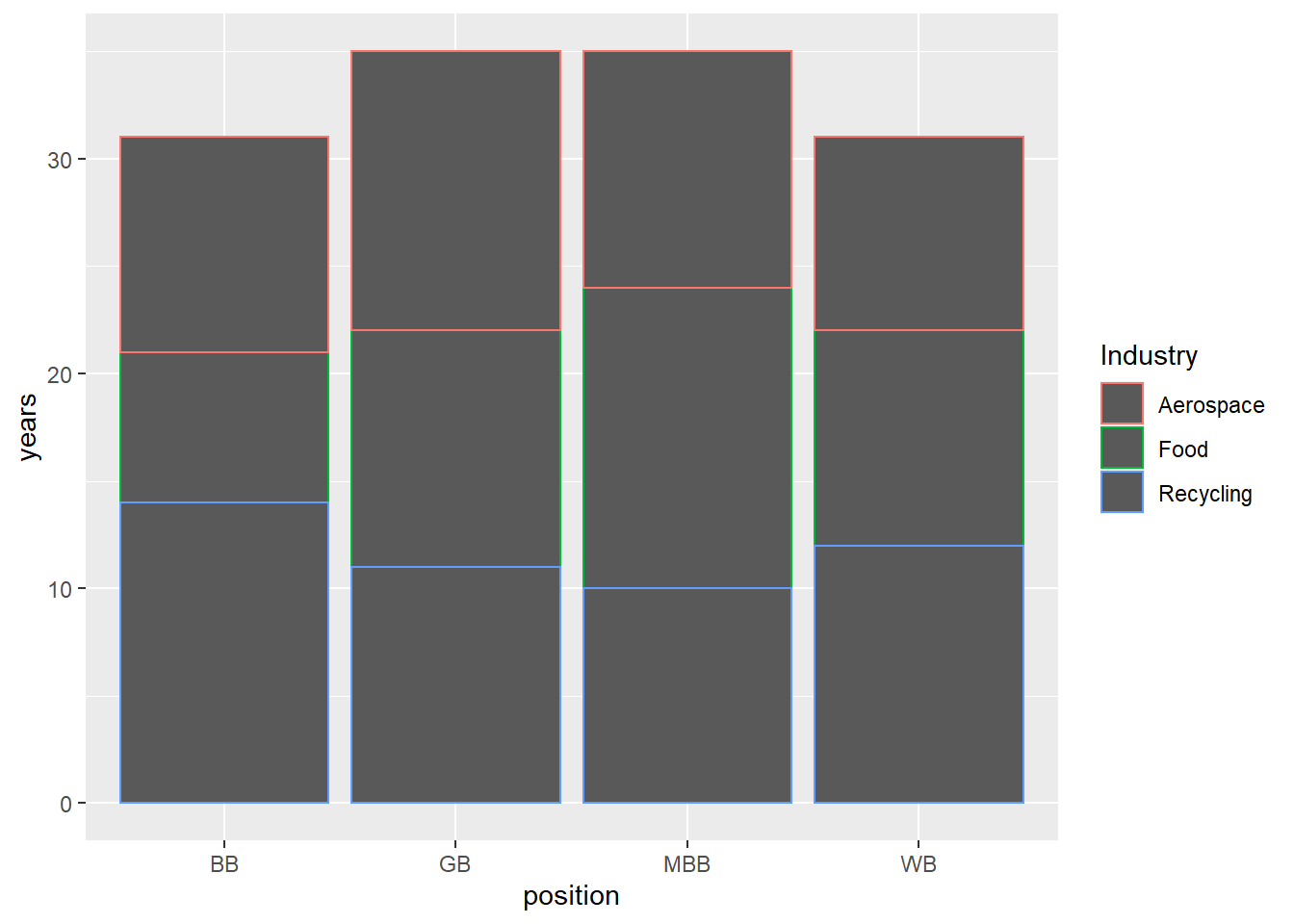
4.3.2 Stacked Bar Customization
Adding more arguments to this code will turn the basic stacked bar plot into a more elegant graph.
ggplot(ci, aes(position, years, fill=Industry))+
    geom_bar(position="stack", stat="identity")+
  labs(title = "Six Sigma Positions Summary",
       subtitle = "By years of experience and industry",
       caption = "Created with RStudio",
       x = "\nPosition",
       y = "Years of Experience\n")+
  theme_excel()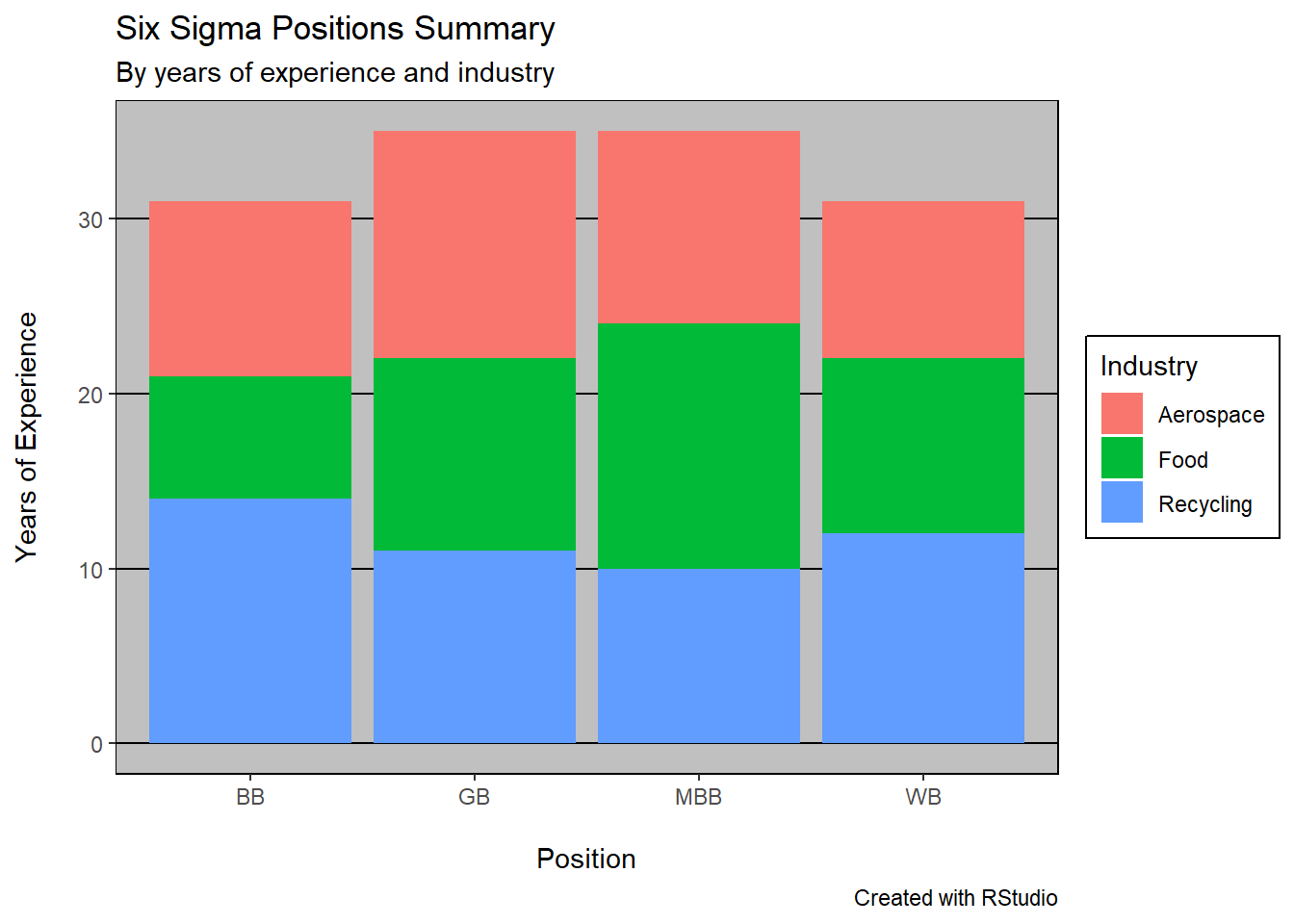
For this newly created stacked bar plot, I’ve added a title, a sub-title, and a theme (theme_excel). I’ve also refreshed the x and y axis’ titles.
4.4 Boxplots
4.4.1 Data Source
Let’s create three distinct vectors for our Boxplots example using ggplot. These are the heights for a group of males, females, and NBA players (male or female). Once again, I’ve used the handy rnorm function to create normally distributed random data.
Male <- rnorm(100,70,4)
Female <- rnorm(100,65,3.5)
NBA_Player <- rnorm(100,80.4,5)
As in previous examples, I’ve created a data frame for these vectors then “melted” the data frame into a long form. The codes for these two tasks are here:
df <- data.frame(Male,Female,NBA_Player)
df <- melt(df)
head(df)
## variable value
## 1 Male 71.53223
## 2 Male 69.81945
## 3 Male 70.13741
## 4 Male 70.67611
## 5 Male 74.66011
## 6 Male 69.82318Notice that I did not give the original variables and values any specific names when I first deployed the melt function. I will be doing that in later examples.
4.4.2 Basic Plot
Let’s now run our boxplots in ggplot. There are many different ways to accomplish this task. For example, I could use the pipe syntax (%>%), but I want to intentionally build this plot in the most systematic way I know, to show you each element and how to use ggplot in its simplest way.
Here’s the code for the simple boxplots:
ggplot(df, aes(x=value, y=variable))+
  geom_boxplot()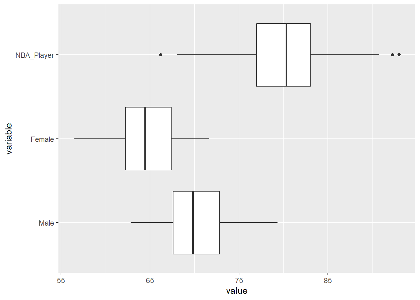
4.4.3 Boxplots Customization
Let’s add much needed information and customization to this simple and bare set of boxplots. In this example, we will add a title, a sub-title, and a legend. We will also colour-code the boxplots with the call fill in the aesthetics of the function ggplot. Finally, we will use a ggtheme called classic.
ggplot(df, aes(x=value, y=variable, fill=variable))+
  geom_boxplot()+
  theme_classic()+
  coord_flip()+
  scale_fill_brewer(palette = "Pastel2")+
  labs(title = "Comparative Boxplots | Height (in)",
       subtitle = "by Group",
       caption = "Proudly built with RStudio",
       x="Height in inches\n",
       y="\nGroup")+
  scale_x_continuous(breaks=seq(60,95,5))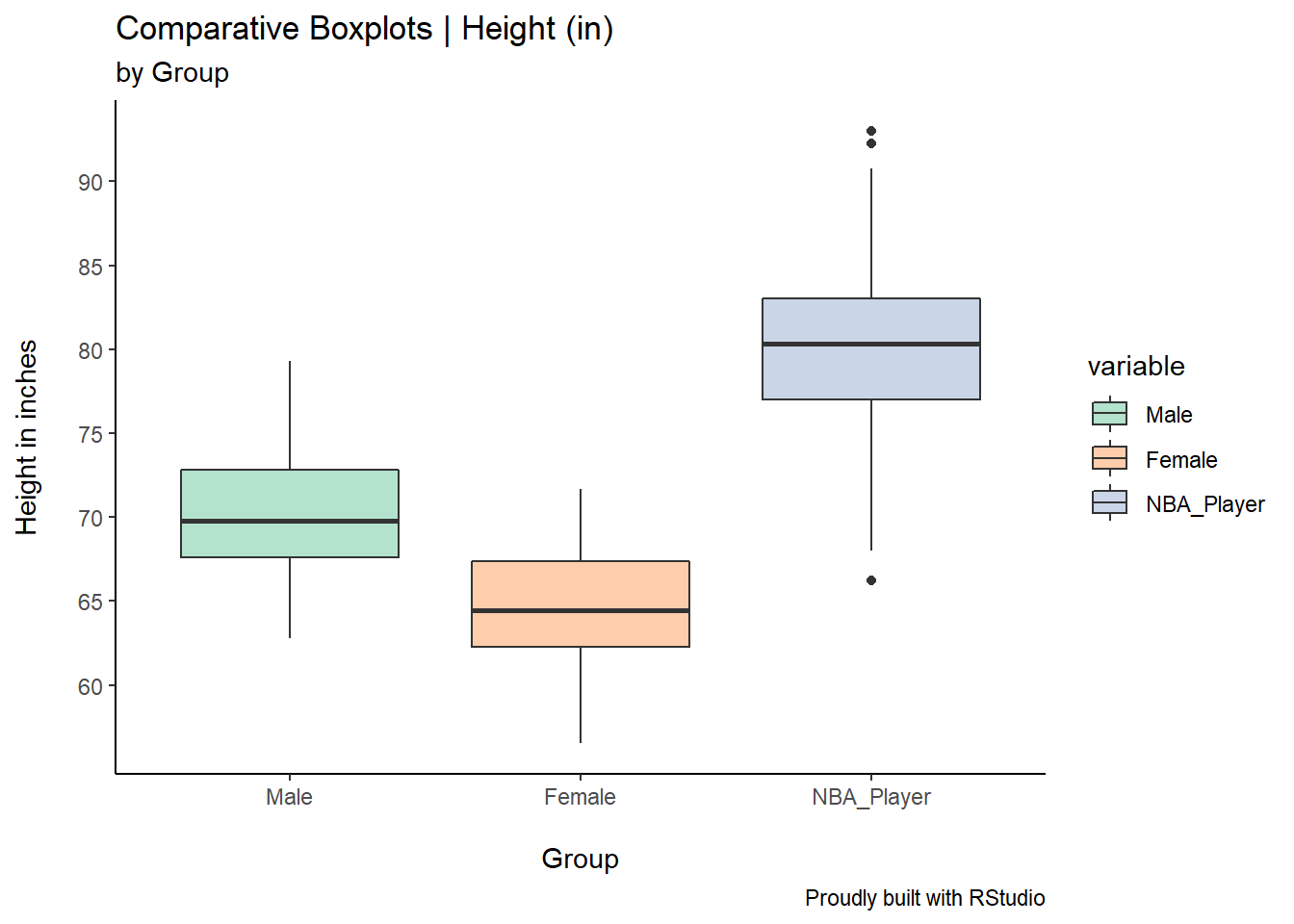
There are a couple of interesting pieces of code here. I’ve used the coord_flip() to flip the boxplots and the scale_x_continuous() to define my y axis scale (I’ve defined breaks of 5 increments from 60 to 95.)
4.5 Density Curves
As discussed in Chapter 3, Density Curves are very helpful when investigating the shape, central tendency, and spread of the data. Think of them as super fine histograms.
4.5.1 Data Source
For this example, we will use the same data frame created for the boxplots in this section, previously named df.
4.5.2 Basic Plot
ggplot(df, aes(x=value, color=variable))+
  geom_density()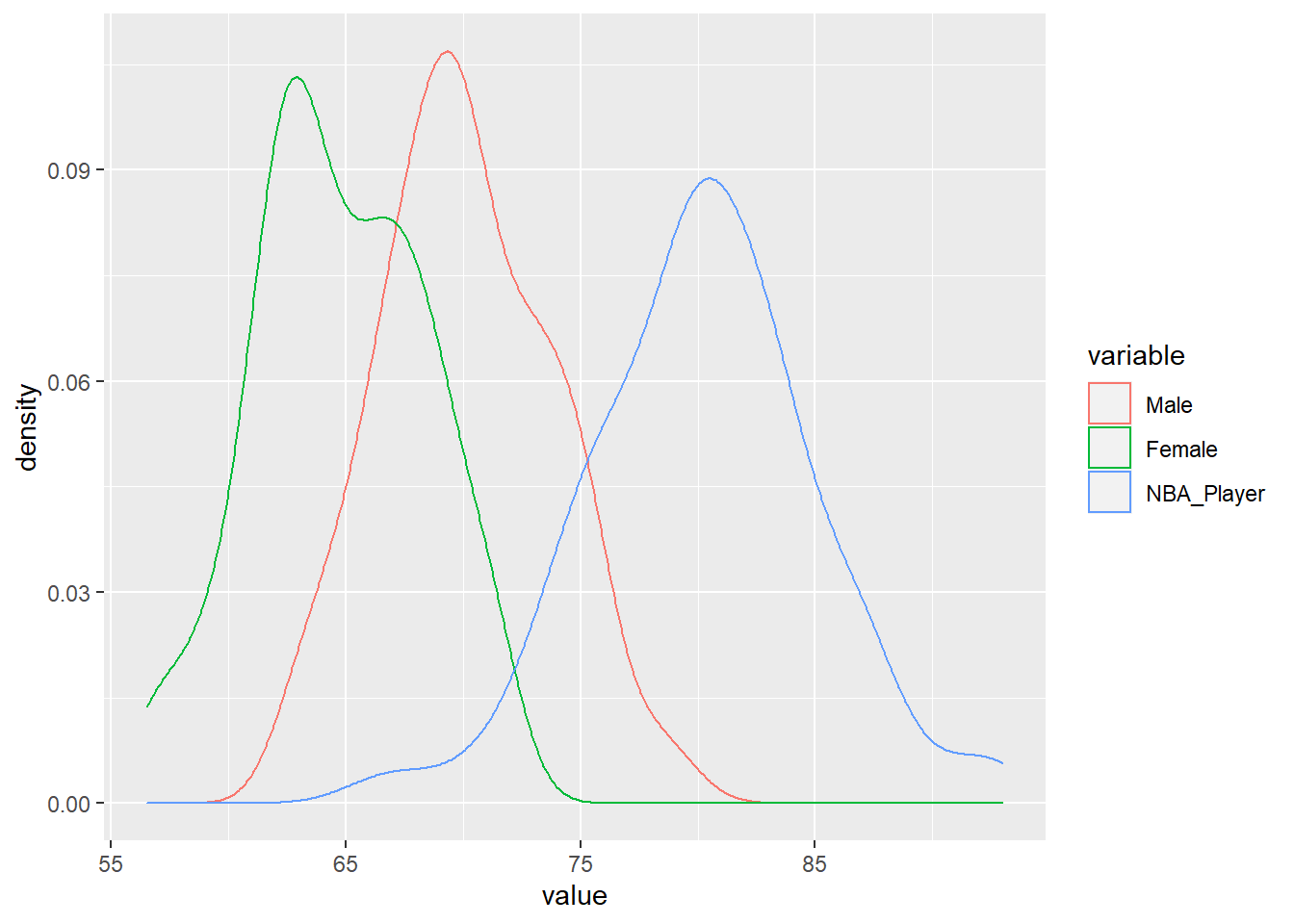
You can see that the only change I’ve made here was the geom, from geom_boxplot() to geom_density().
4.5.3 Density Curves Customization
As done earlier with the boxplots example, we’ll add a title, a sub-title, and most importantly, we will shade the area under the curves. Notice how I’ve used the argument alpha inside the geom_density to specify the intensity of the shading. Finally, I’ve used the scale_fill_brewer() function to define the colour scheme I want to apply to these density curves.
ggplot(df, aes(x=value, fill=variable))+
  geom_density(alpha=0.7)+
  theme_classic()+
  scale_fill_brewer(palette = "Set3")+
  labs(title = "Building Simple Comparative Density Curves",
       subtitle = "by Group",
       caption = "Proudly built with RStudio",
       x="\nHeight in inches",
       y="Density\n")+
  scale_x_continuous(breaks=seq(60,95,5))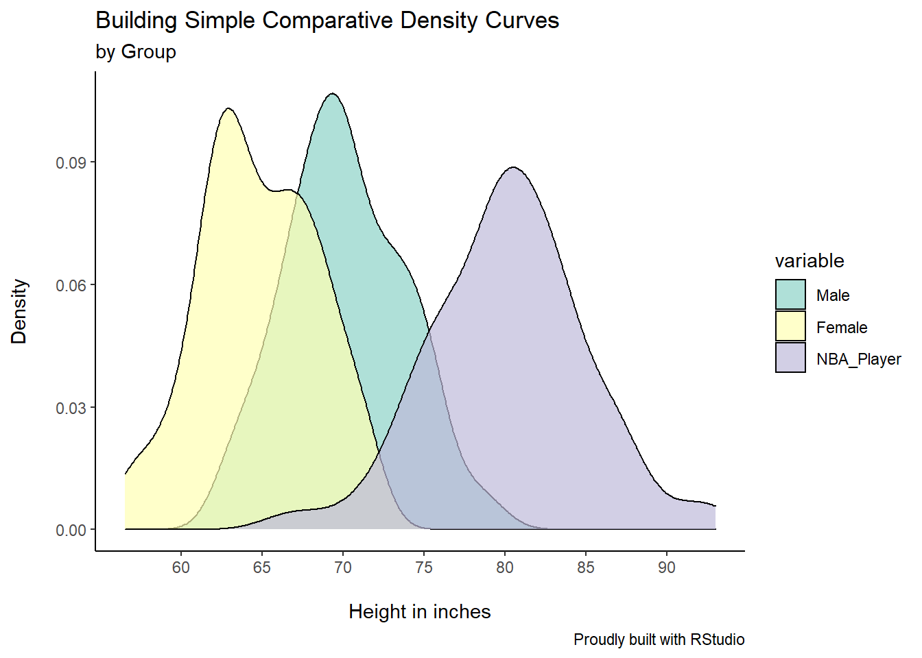
4.6 Histograms
4.6.1 Data Source
Let’s create another simple data set for this example. Consider the amount of rain (in mm) recorded in the past spring, say between April and June. The code is written like this:
set.seed(2)

rainfall <- data.frame(Month=factor(rep(c("April","May","June"),
                                        each=100)),
  Rain=c(rnorm(100, mean=20, sd=5),
         rnorm(100, mean=15, sd=3),
         rnorm(100,mean=25,sd=7)))
Checking the contents of the object rainfall:
head(rainfall)## Month Rain
## 1 April 15.51543
## 2 April 20.92425
## 3 April 27.93923
## 4 April 14.34812
## 5 April 19.59874
## 6 April 20.662104.6.2 Basic Plot
Let’s use this code for this basic plot:
ggplot(rainfall, aes(x=Rain))+
  geom_histogram(binwidth = 2)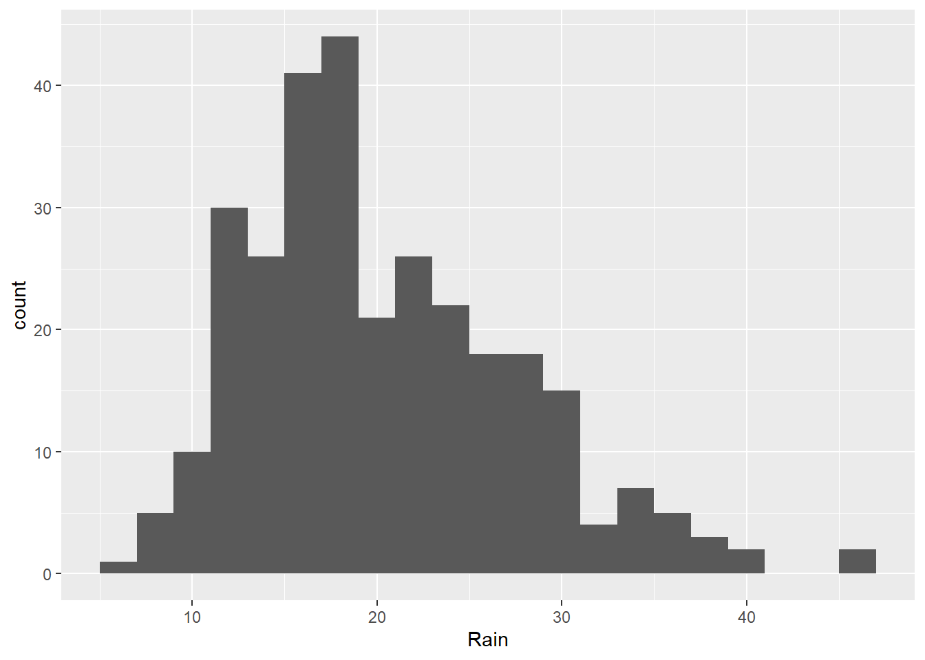
4.6.3 Histogram Customization
In this example, we’ve simply created a plot for all rain fall measurements for the three months combined. We can add customization and break down the visualization by running this code:
ggplot(rainfall, aes(x=Rain, fill=Month))+
  geom_histogram(binwidth = 2, alpha=0.8)+
  theme_economist()+
  scale_fill_brewer(palette = "Accent")+
  labs(title = "Past Spring Rainfall",
       subtitle = "\nby Month",
       caption = "Proudly built with RStudio",
       x="\nRainfall in mm",
       y="Count\n")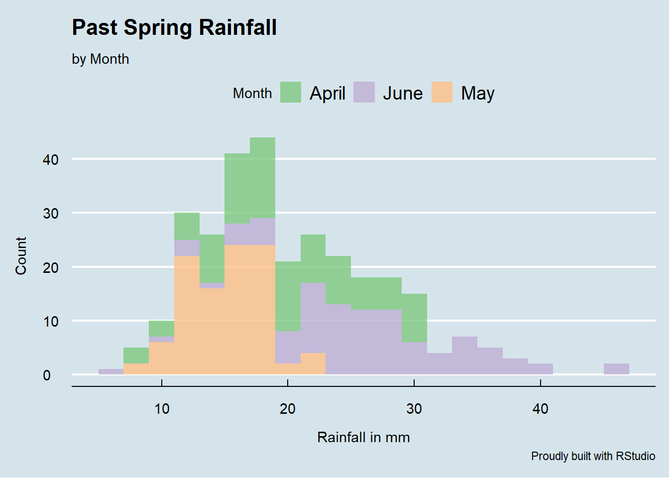
Notice the theme we’ve used here: theme_economist(). There are other awesome themes available in the library ggthemes. Make sure that you download this package to call the great themes available from this library.
4.7 Violin Plots
Violin Plots are very useful in the way that they can (if you wish to) showcase boxplots, and therefore each data set’s 5-number summary (minimum, first quartile, median, third quartile, and maximum) as well as the density of the data via the kernel density curve.
4.7.1 Data Source
For this example, let’s create the following data, using the functions rnorm and sample:
A <- rnorm(30,72,2)
B <- rnorm(30,69,5)
C <- rnorm(30,75,7)
D <- sample(68:75,30, replace = TRUE)
The letters A, B, C, and D represent four different teams. Scores are created randomly using the function rnorm for Teams A, B, and C. For Team D, we’ve used a different way to create random data in R, via the function sample. The function sample works like this: sample(range, number of samples, and a call to replace or not the numbers that have already been sampled).
ggplot works best with long form data. So we need to do two things here.
Firstly, let’s create a simple data frame based on the data sets for the four teams.
df <- data.frame(A,B,C,D)Let’s see what this data frame, named df here, looks like:
head(df)## A B C D
## 1 71.36376 73.74009 85.88755 75
## 2 71.36902 68.56164 84.96281 72
## 3 73.76864 68.03137 72.48870 68
## 4 68.22916 72.64620 71.51580 70
## 5 73.46436 74.14202 61.80508 68
## 6 73.58109 67.46405 67.02262 73Secondly, I am going to use the function melt from the package reshape2 to melt the data into a long form format.
df <- melt(df, id.vars = NULL,
           variable.name = "Team",
           value.name = "Score")
head(df)
## Team Score
## 1 A 71.36376
## 2 A 71.36902
## 3 A 73.76864
## 4 A 68.22916
## 5 A 73.46436
## 6 A 73.58109You can learn more about the function melt online, but the arguments here suffice for our exercise. I’ve simply asked the function melt to create two columns for my data frame, one named Team and another named Score. Recall that when I first created the data frame each team had its own column. Now melted, the values for the variable Team go under one column and the values for the variable Score under another. Ok, we are now ready to create the violin plots using ggplot. Here’s the code:
4.7.2 Basic Plot
ggplot(df, aes(Team, Score))+
  geom_violin()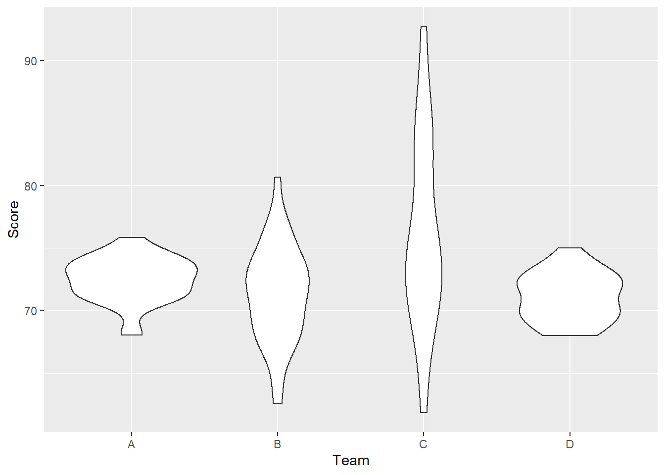
4.7.3 Violin Plots Customization
Lots of customization will be added with the following lines of code. Most of them have been mentioned in other sections of the book. I’ll let you read, research, and ultimately learn about some other pieces. Of note, look at how useful the chunk of code labs is.
ggplot(df, aes(Team, Score))+
  geom_violin(fill="gray", trim = FALSE, alpha = 0.7)+
  geom_boxplot(width=0.1, lwd = 1, fill="blue", alpha=0.7,
               outlier.colour = "red", outlier.shape = 23,
               outlier.size = 3, outlier.fill = "red")+
  theme_bw()+
  labs(title = "Violin Plots for Teams' Scores",
       subtitle = "with boxplots",
       caption = "Created with RStudio",
       x="Teams",
       y="Scores")+
  theme(plot.title=element_text(size=22,hjust=0.5,face="bold"),
        plot.subtitle=element_text(hjust=0.5,size=16,color="red"),
        plot.caption=element_text(size=12),
        axis.title.x=element_text(size=14,color="blue"),
        axis.title.y=element_text(size=14,color="blue"),
        axis.text.x = element_text(size=12))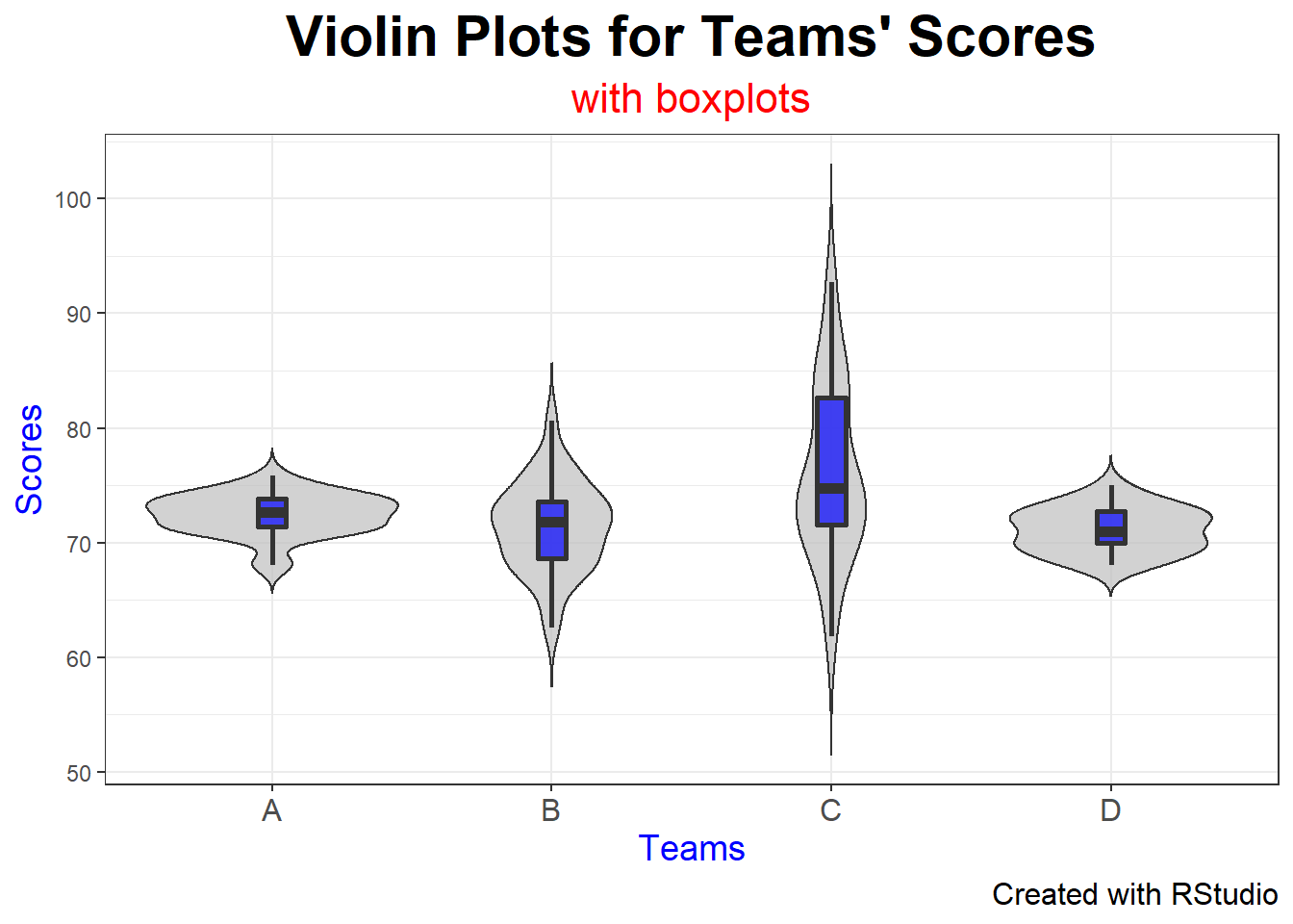
The resulting violin plots display both the measure of central tendency (in this case, the median) as well as the spread of the data through both the boxplots and the density curves of each team.
4.8 Scatter Diagrams
4.8.1 Data Source
Now let’s see how Scatter Diagrams work with ggplot. For this example, I will upload a .csv file from my working directory, a simple table like this one shown here:
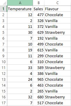
This screen shot only shows the first 16 rows, but you get the point. I’ll upload the file using the following code (notice that I also get a structural summary of the file).
TIP: Make sure that your Excel files are always “clean”; that is, they just have the basic rows and columns, and the data you need for plotting.
To upload this file, let’s run the following code:
library(readr)
icecreamR <- read_csv("icecreamR.csv")
##
## -- Column specification ------------------------------------
## cols(
## Temperature = col_double(),
## Sales = col_double(),
## Flavour = col_character()
## )4.8.2 Basic Plot
We can create a scatter diagram with a simple line of code, like this:
ggplot(icecreamR, aes(x=Temperature, y=Sales))+
  geom_point()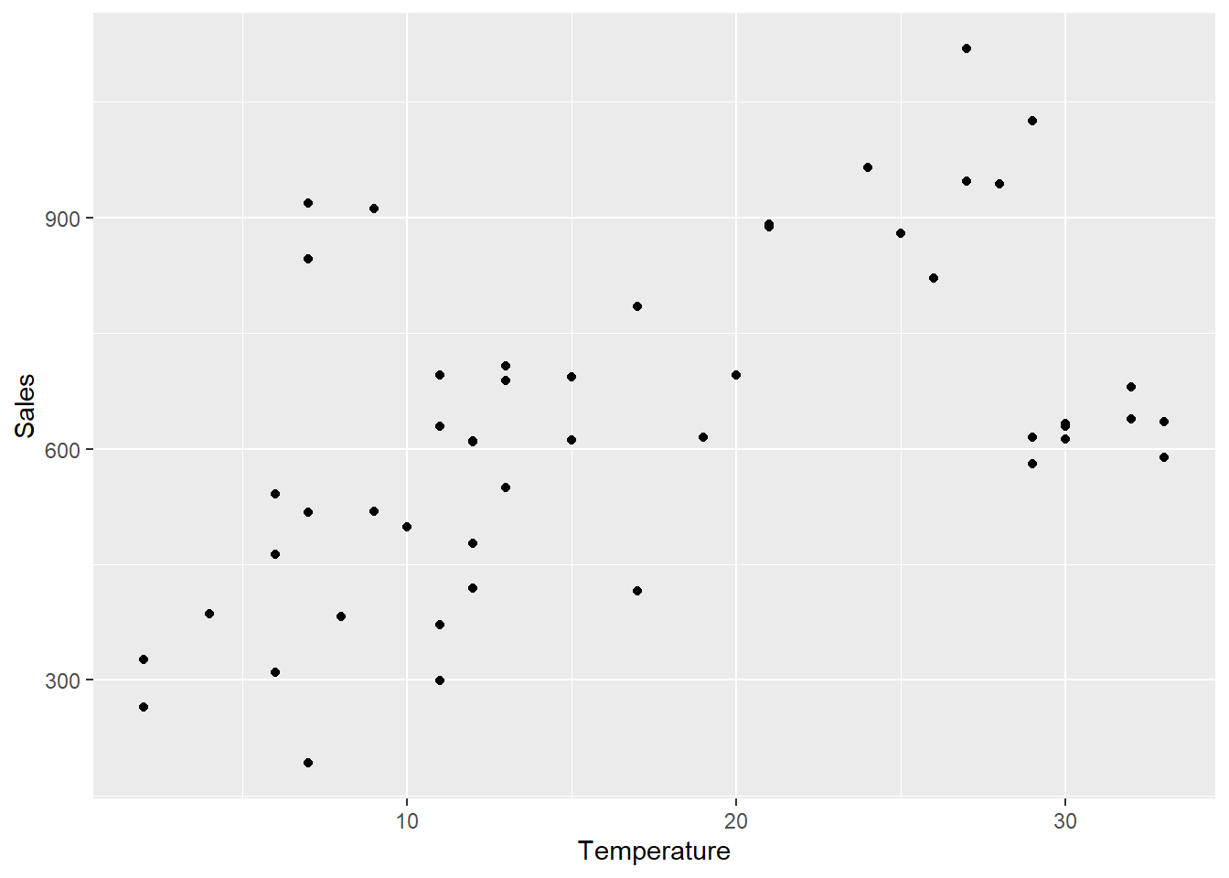
4.8.3 Scatter Diagram Customization
Let’s run the following code to create a much more customized plot:
ggplot(icecreamR, aes(x=Temperature, y=Sales, colour=Flavour))+
  geom_point(size=3)+
  ggtitle("Ice Cream Sales by Flavour Given Temperature")+
  xlab("\nTemperature in Celsius")+
  ylab("Sales in Canadian $\n")+
  theme_minimal() +
  theme(plot.title = element_text(hjust = 0.5, size=14,
                                  face='bold', color='black'))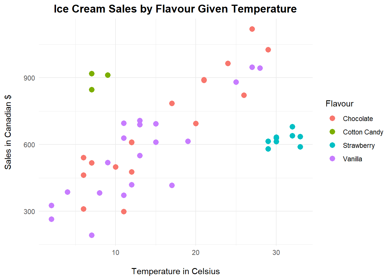
TIP: The backslash n piece of code you have probable noticed in many of my plots throughout the book is a gentle “spacer.” It adds a line before or after the titles, offsetting them just a little bit more from the plot itself.
This is an interesting plot. By using the colour argument as our grouping for flavour, not only have we created a much more interesting plot to visualize, but we’ve also coloured each flavour for better analysis. This is helpful when you are looking for clusters. Look at the strawberry cluster, or the cotton candy cluster. They have particular sales according to a certain temperature of the year while the other two flavours (chocolate and vanilla) follow a more linear and straightforward pattern: the higher the temperature the higher the sales.
4.9 Dot Plots
Sometimes all we need is to look at simple Dot Plots to visualize the distribution of data. Consider the following example. Let’s create some hypothetical data for a fast food calories study conducted by a team of researchers in the past week.
4.9.1 Data Source
Creating vectors of interest:
Nachos <- rnorm(20,250,75)
Fries <- rnorm(20,500,120)
Burgers <- rnorm(20,350,50)
Creating and melting a data frame:
fastfood <- data.frame(Nachos,Fries,Burgers)
fastfood <- melt(fastfood,
                 id.vars = NULL,
                 variable.name = "Food",
                 value.name = "Calories")
4.9.2 Basic Plot
With the following code, we can plot the individual data points for calories count from each type of fast food:
ggplot(fastfood, aes(x=Food, y=Calories))+
  geom_dotplot(binaxis='y')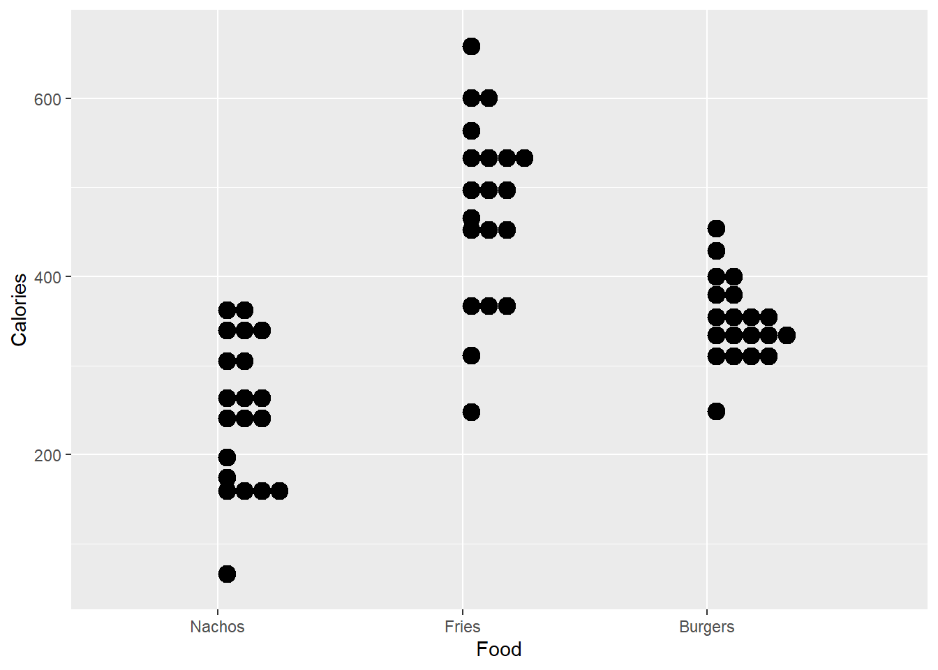
4.9.3 Dot Plot Customization
Let’s add more customization to this set of dot plots. We start with the proper main title and axis’ labels. Then we colour each type of food for better aesthetics. Next we display the dots in a better way, stacked and centered with a smaller dot size. You can tell from these dot plots where the calories count are more concentrated for each type of researched fast food.
ggplot(fastfood, aes(x=Food, y=Calories, fill=Food))+
  ggtitle("Fast Food Calories Study")+
  xlab("\nFood")+
  ylab("Calories count\n")+
  theme_economist_white()+
  geom_dotplot(binaxis='y',
               stackdir='center',
               stackratio=1.5,
               dotsize=1)+
  theme(legend.title = element_blank())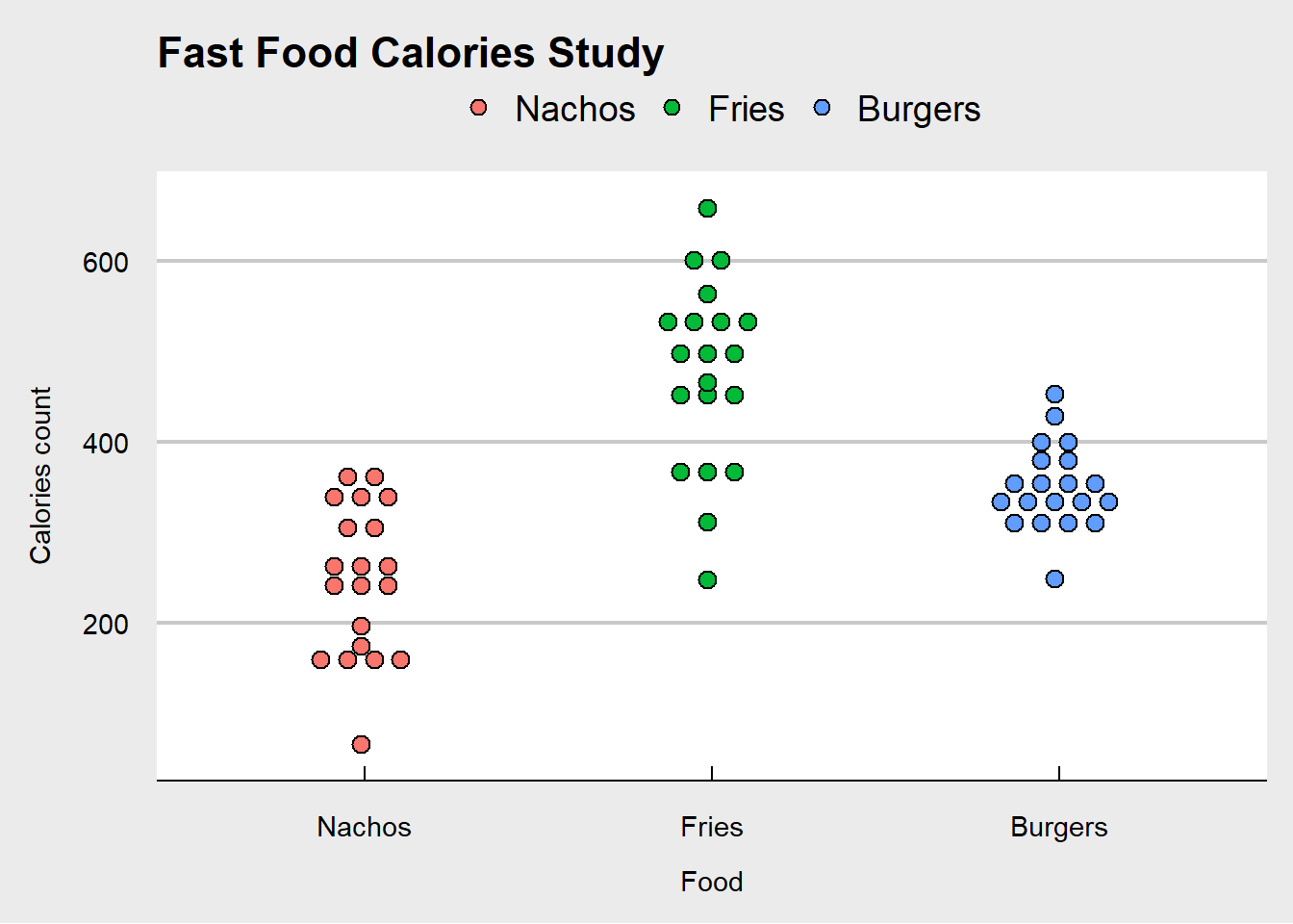
4.10 Bubble Charts
Bubble Charts are essentially scatter diagrams with added dimensions. Let’s work through an example.
4.10.1 Data Source
A company is studying how favourability scores and revenues correlate to each other, and at the same time, this organization wishes to understand how large each product’s margins are. All of this coloured by product, on the same plot.
Let’s run the following code to create our data frame. Recall that we used set.seed() before; this is just to “lock-in” the same data pattern through the process of random data creation.
First, let’s set a seed for this data set:
set.seed(5)Then, let’s write the code to create our data frame:
bubble <- data.frame("Product" = rep(LETTERS[1:4], times = 10),
                     "Sales" = sample(500:1000,40,replace = TRUE),
                     "Scores" = rnorm(40,65,5),
                     "Margins" = c(rnorm(40,30,15)))
Checking for the newly created data frame bubble:
head(bubble, n = 10)## Product Sales Scores Margins
## 1 A 821 65.42005 46.863732
## 2 B 862 65.62571 4.115067
## 3 C 684 57.56509 40.736998
## 4 D 706 66.69644 23.558100
## 5 A 702 65.83446 16.118788
## 6 B 876 74.87603 45.175727
## 7 C 796 63.48786 -8.117121
## 8 D 712 61.74439 27.540621
## 9 A 721 59.51683 33.632926
## 10 B 570 60.30266 19.8199454.10.2 Basic Plot
ggplot(bubble, aes(x=Scores, y=Sales, size = Margins))+
  geom_point()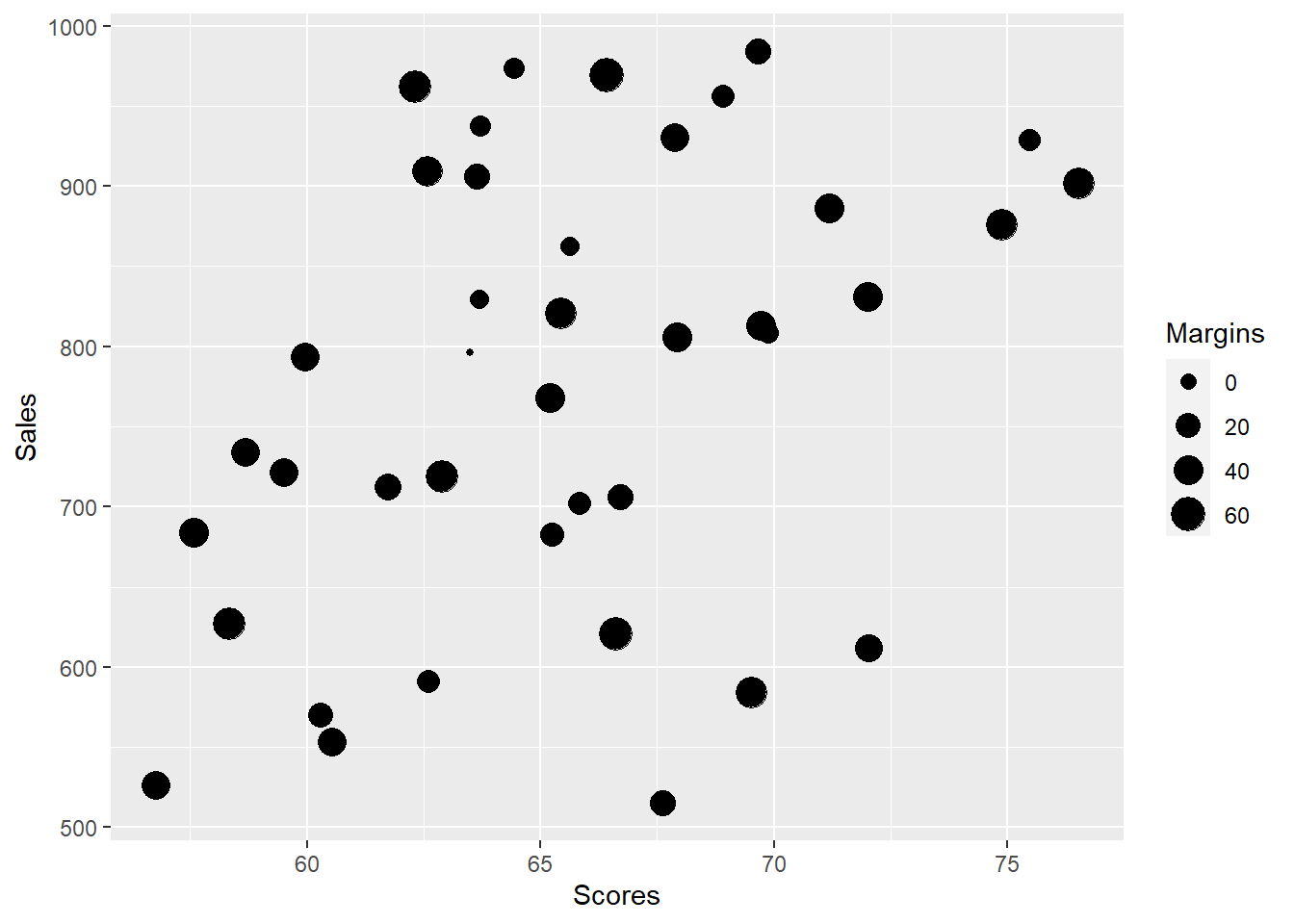
4.10.3 Bubble Chart Customization
ggplot(bubble, aes(x=Scores, y=Sales, size=Margins, colour=Product))+
  geom_point(alpha=0.5)+
  scale_size(range = c(.1, 12))+
  labs(title = "Bubble Chart | Scores and Revenues",
       subtitle = "Bubbled by Margins | Coloured by Product\n",
       caption = "Proudly built with RStudio",
       x = "\nScores",
        y = "Sales (CAD)")+
  theme_bw()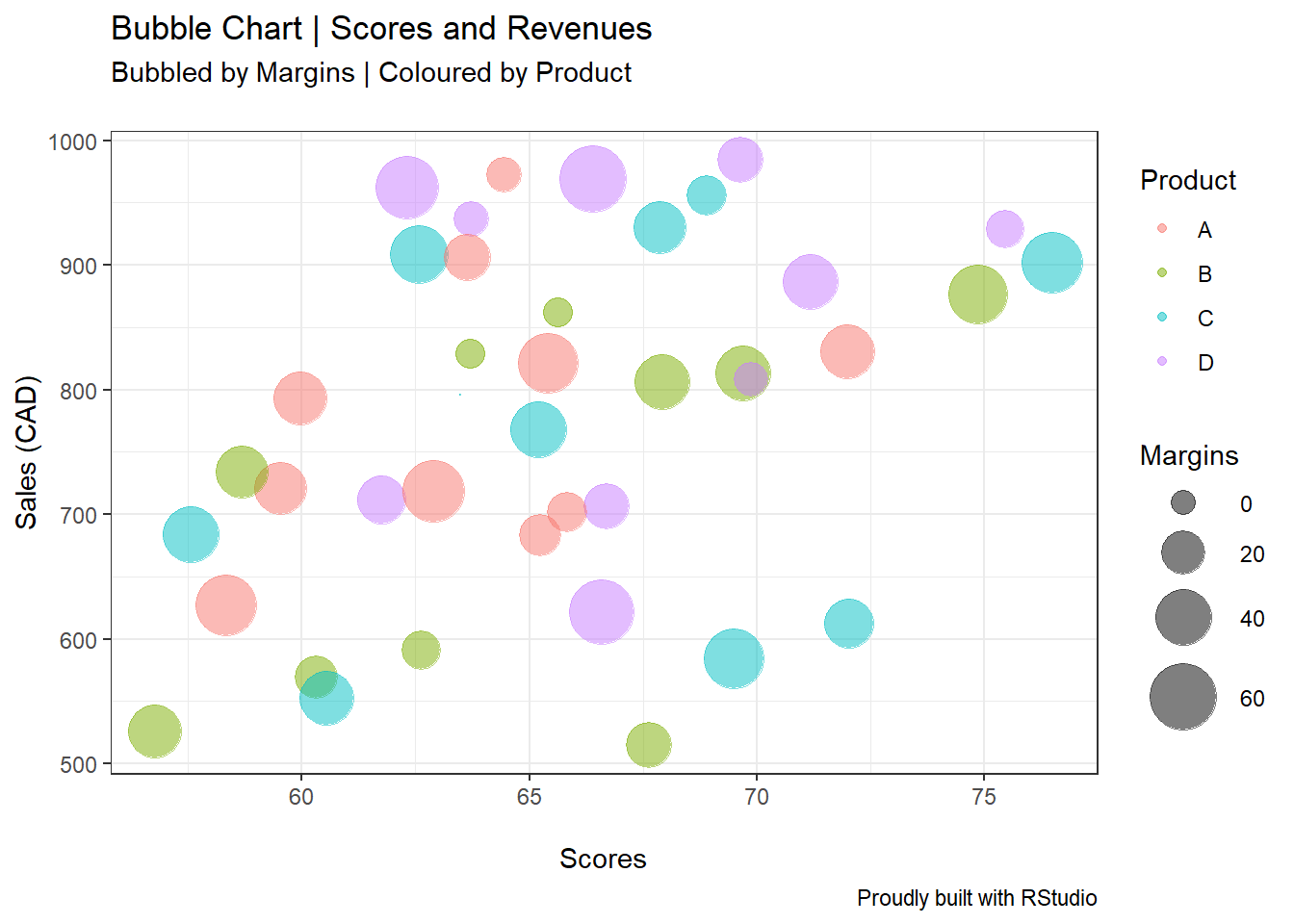
From the plot above, we are able to distinguish the different products’ margins “size,” as well as their correlationships based on sales and scores.
4.11 Faceting with ggplot
To wrap up this section, let me show you how you can use the facet functions for ggplot. Faceting allows you to better visualize plots (such as the density curves in this example), especially when comparing before and after improvement efforts. We will look at the weight variation (in grams) in a chocolate cookie factory.
4.11.1 Data Source
Once again, we set the seed at a given number (three in this case) to lock-in the number generation pattern. Next, we create two different vectors Run and Weight. I’m simply calling the different production runs 1, 2, 3, and 4. For the vector Weight, I’m creating four different normal random distributions with different means and standard deviations using the rnorm function.
Here’s the code:
set.seed(3)
Run <- rep(c("1","2","3","4"), times = 50)
Weight = c(rnorm(50,60,6),
           rnorm(50,61,10),
           rnorm(50,58.5,2),
           rnorm(50,62,2))
Next, let’s create a data frame with these vectors, and name it facet_e for “facet example.”
facet_e <- data.frame(Run,Weight)Checking for facet_e:
head(facet_e, n = 5)## Run Weight
## 1 1 54.22840
## 2 2 58.24485
## 3 3 61.55273
## 4 4 53.08721
## 5 1 61.17470Time to run the code and create the plots. We will use two types of faceting: facet_wrap() and facet_grid().
4.11.2 Facet Wrap
ggplot(facet_e, aes(Weight, fill=Run))+
  geom_density(alpha=0.5)+
  facet_wrap("Run")+
  theme_bw()+
  labs(x="\nWeight in grams",
       y="Density\n",
       title="Chocolate Chip Cookies Weight Density Curves",
       subtitle="By Run",
       caption="Proudly Built with RStudio")+
  theme(legend.position = "right",
        axis.text.y = element_blank())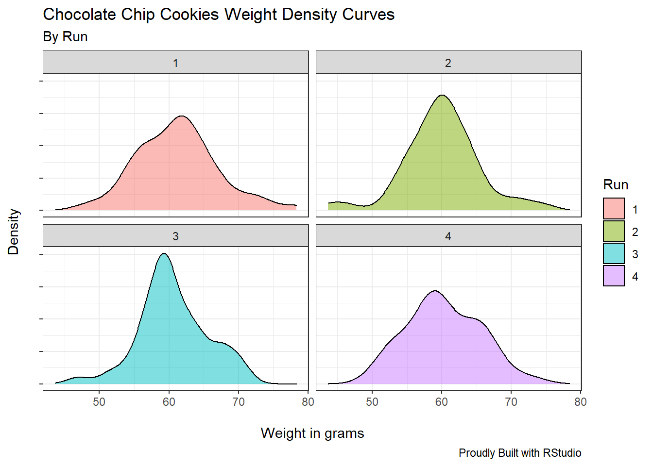
ggplot has neatly placed each production run in a separated plot. We’ve achieved this result by specifying inside the facet_wrap function the argument “Run.”
4.11.3 Facet Grid
ggplot(facet_e, aes(Weight, fill=Run))+
  geom_density(alpha=0.5)+
  facet_grid("Run")+
  theme_bw()+
  labs(x="\nWeight in grams",
       y="Density\n",
       title="Chocolate Chip Cookies Weight Density Curves",
       subtitle="By Run",
       caption="Proudly Built with RStudio")+
  theme(legend.position = "right",
        axis.text.y = element_blank())
Similarly, the facet_grid function returns the four different runs, now in a per row fashion.
Notice all the other pieces of code I’ve used in this section to make these plots even more elegant. Most of these codes have been used extensively throughout the book.