Chapter 4 Data Visuallization II
9월 17일 목요일, 202AIE17 송채은
1. Annotations 주석
1) Adding Text Annotations
annotations are extra contextual information
##   eruptions waiting
## 1     3.600      79
## 2     1.800      54
## 3     3.333      74
## 4     2.283      62
## 5     4.533      85
## 6     2.883      55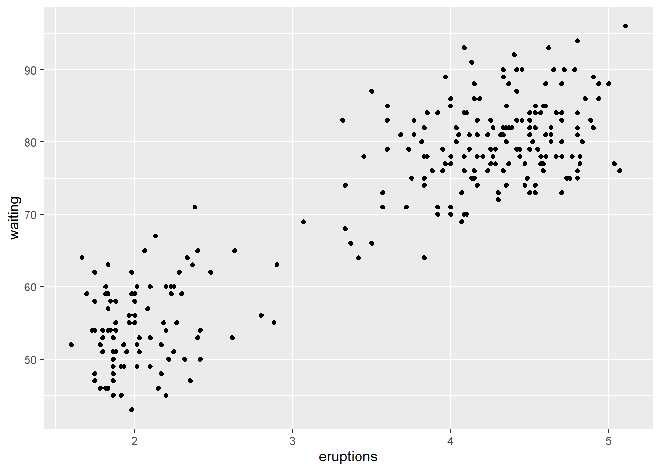
annotate() function can be used to add any type of geometric object
p +
  annotate("text", x = 3, y = 48, label = "Group 1") +
  annotate("text", x = 4.5, y = 66, label = "Group 2")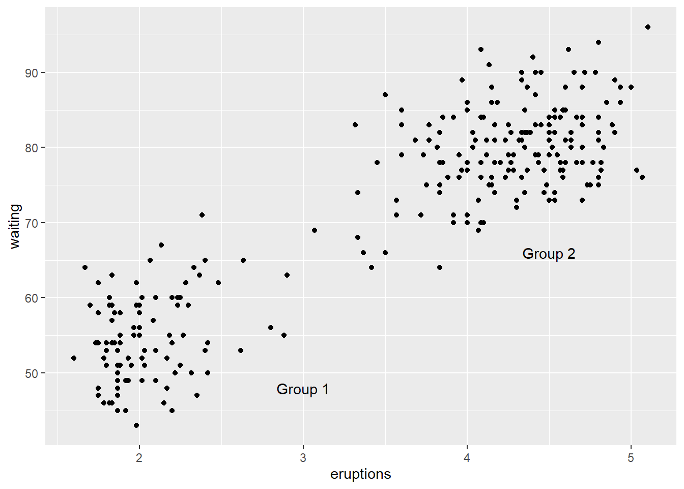
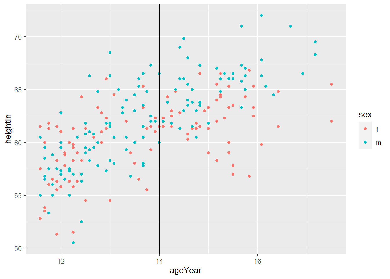
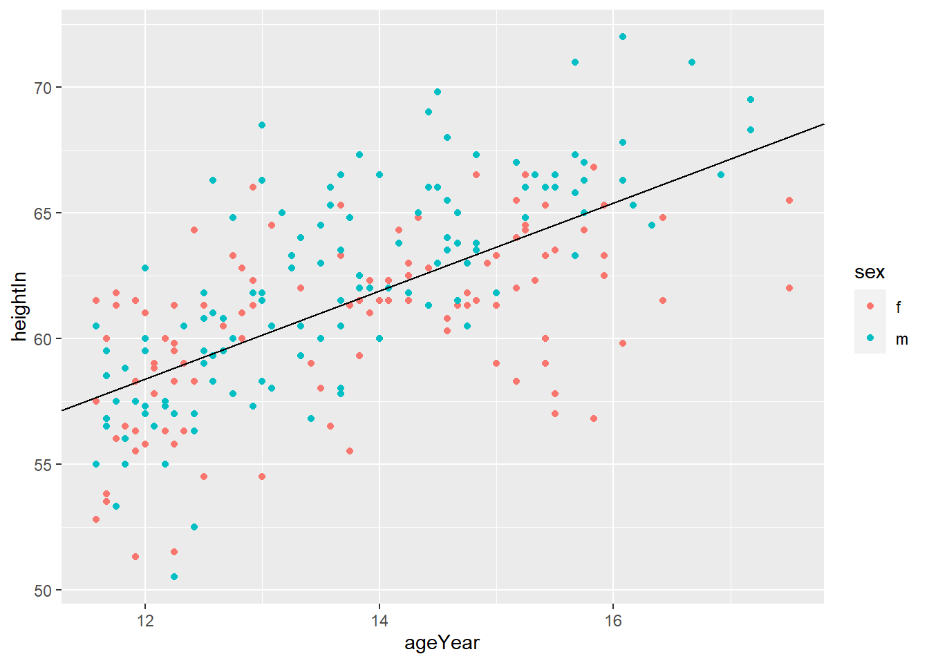
2) Adding Lines
##   sex ageYear ageMonth heightIn weightLb
## 1   f   11.92      143     56.3     85.0
## 2   f   12.92      155     62.3    105.0
## 3   f   12.75      153     63.3    108.0
## 4   f   13.42      161     59.0     92.0
## 5   f   15.92      191     62.5    112.5
## 6   f   14.25      171     62.5    112.0
geom_hline(yintercept = y) adds horizontal line at y
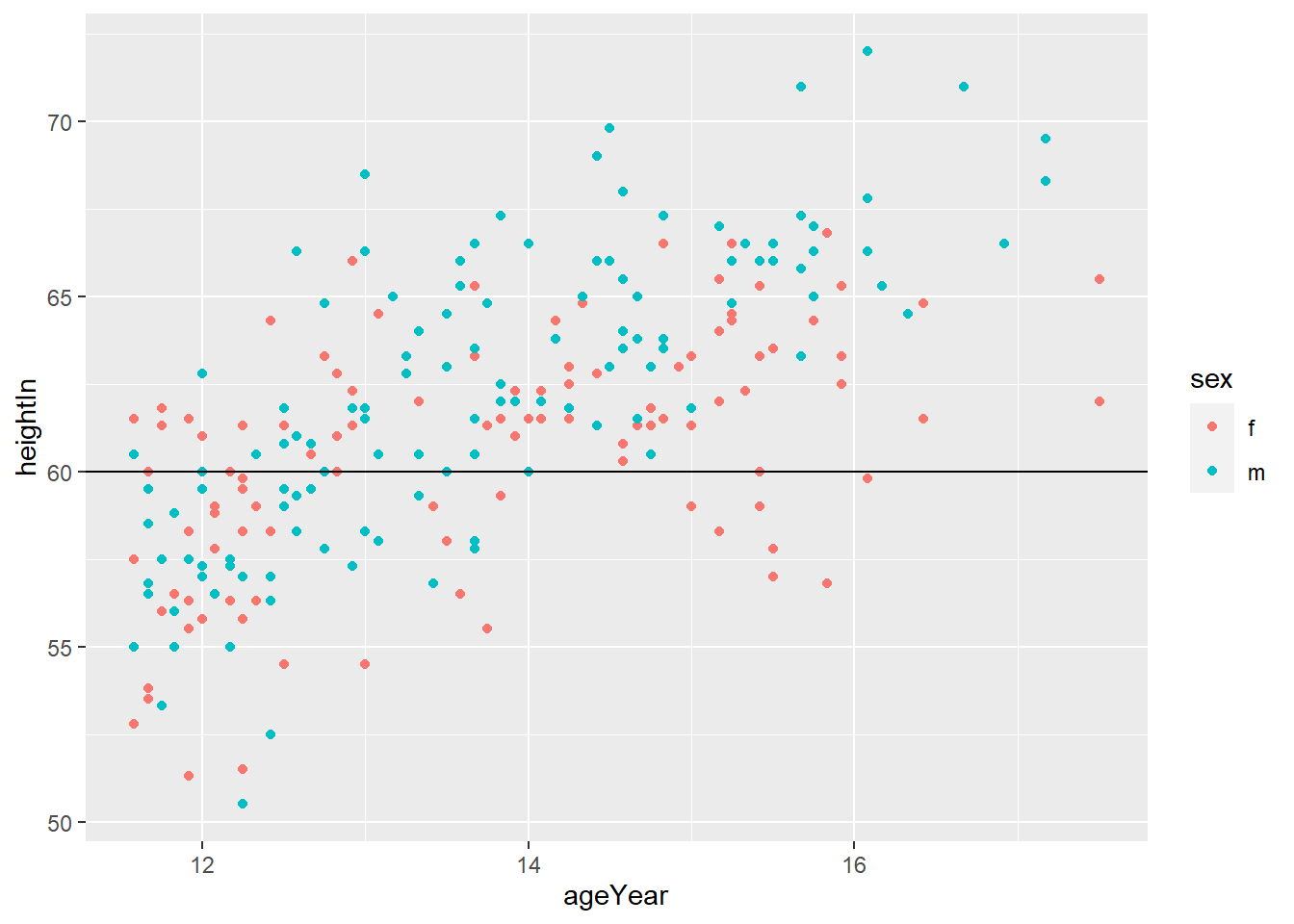
geom_vline(xintercept = x) adds horizontal line at x
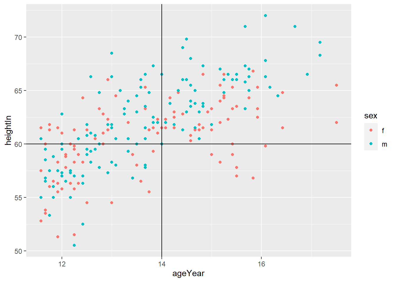
geom_abline(intercept = i, slope = s) adds horizontal line with y = i + s*x
## # A tibble: 234 x 11
## manufacturer model displ year cyl trans drv cty hwy fl class
## <chr> <chr> <dbl> <int> <int> <chr> <chr> <int> <int> <chr> <chr>
## 1 audi a4 1.8 1999 4 auto(l5) f 18 29 p compact
## 2 audi a4 1.8 1999 4 manual(m5) f 21 29 p compact
## 3 audi a4 2 2008 4 manual(m6) f 20 31 p compact
## 4 audi a4 2 2008 4 auto(av) f 21 30 p compact
## 5 audi a4 2.8 1999 6 auto(l5) f 16 26 p compact
## 6 audi a4 2.8 1999 6 manual(m5) f 18 26 p compact
## 7 audi a4 3.1 2008 6 auto(av) f 18 27 p compact
## 8 audi a4 quattro 1.8 1999 4 manual(m5) 4 18 26 p compact
## 9 audi a4 quattro 1.8 1999 4 auto(l5) 4 16 25 p compact
## 10 audi a4 quattro 2 2008 4 manual(m6) 4 20 28 p compact
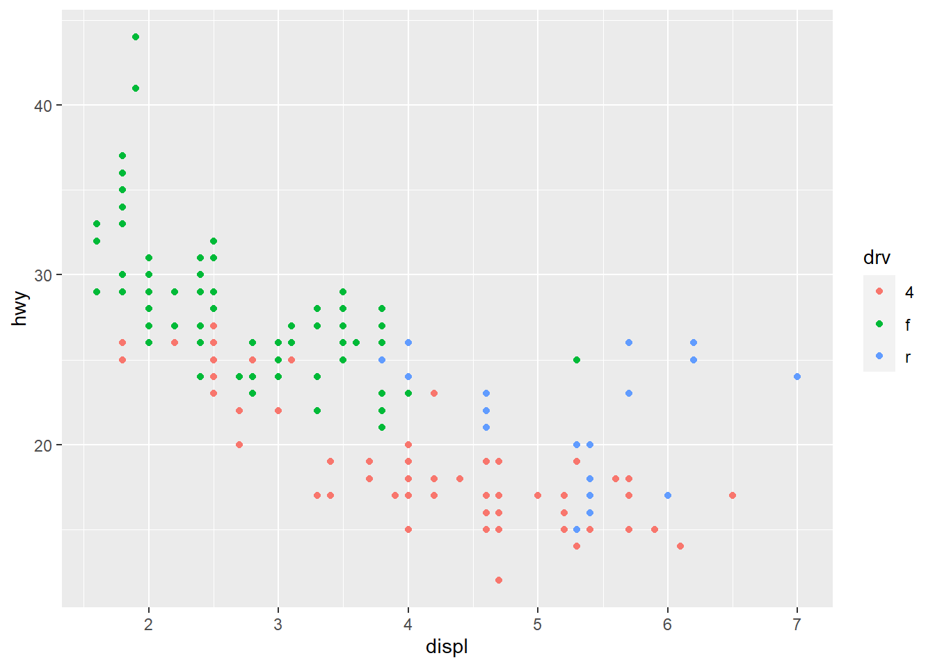
## # ... with 224 more rows2. Axes 축
1) Swapping X- and Y-Axes
coord_flip() flips the axes

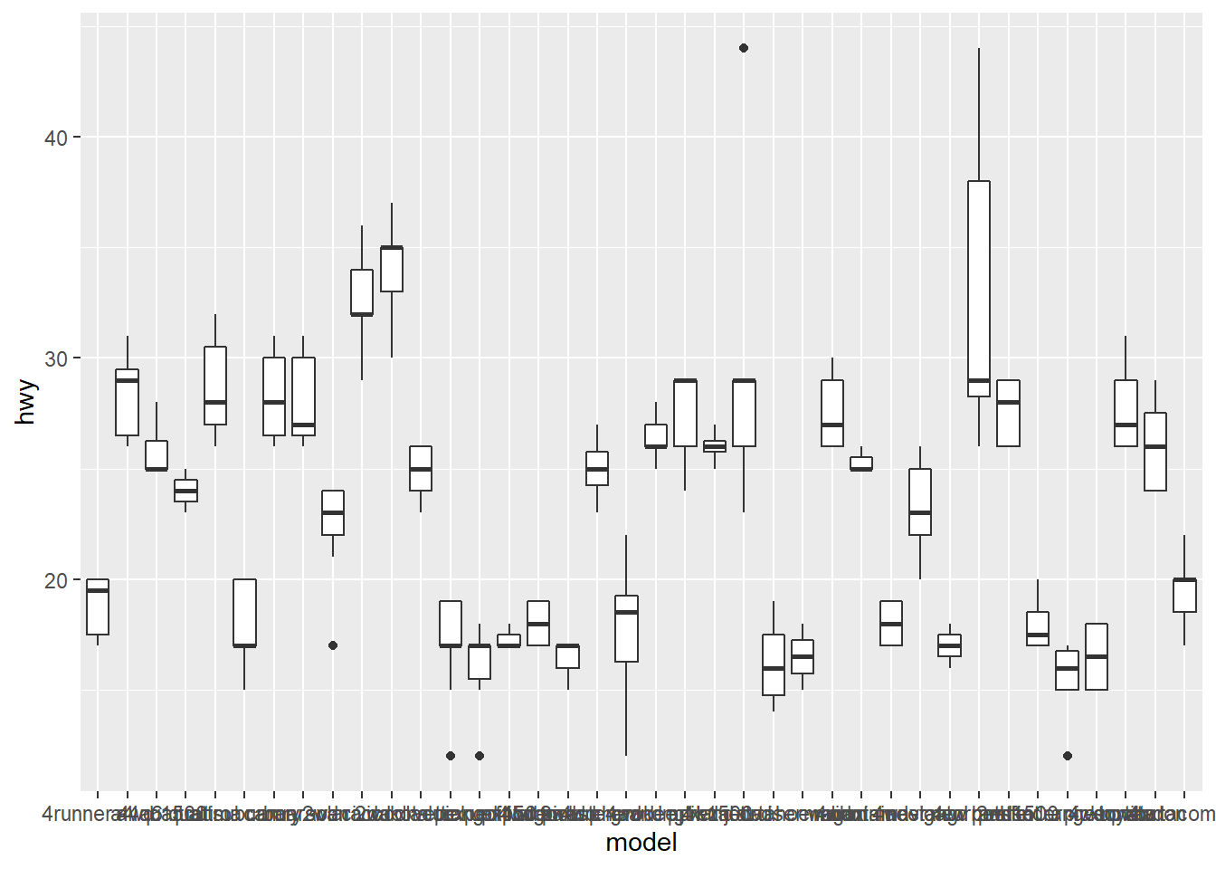
2) Setting the Position of Tick Marks
“breaks” sets the tick mark
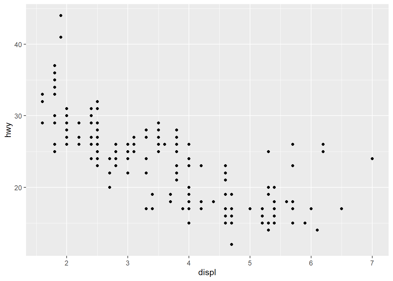
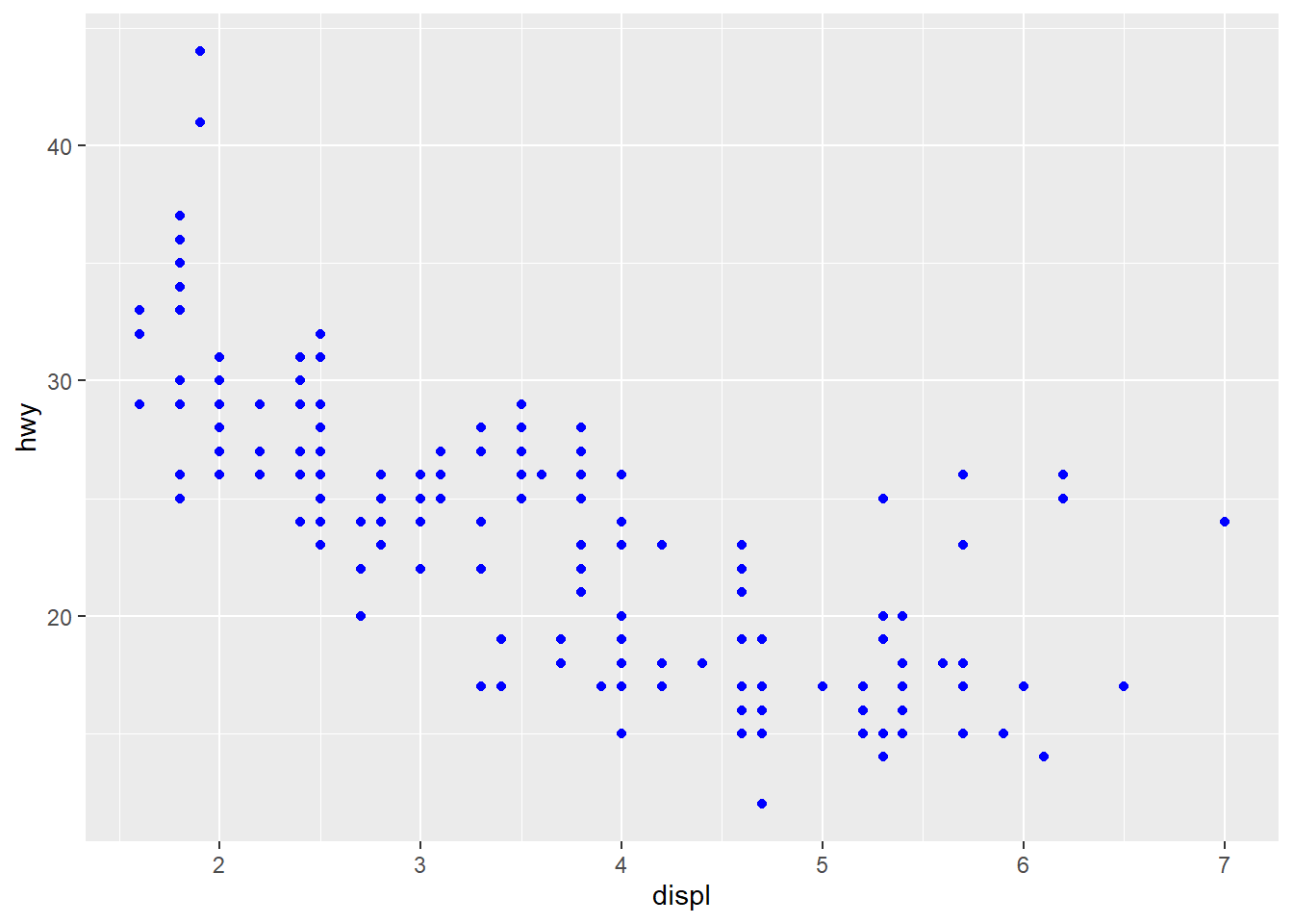
ggplot(mpg, aes(x = displ, y = hwy)) +
geom_point() +
scale_x_continuous(breaks = c(2,4,6)) +
scale_y_continuous(breaks = c(15, 25, 35, 45))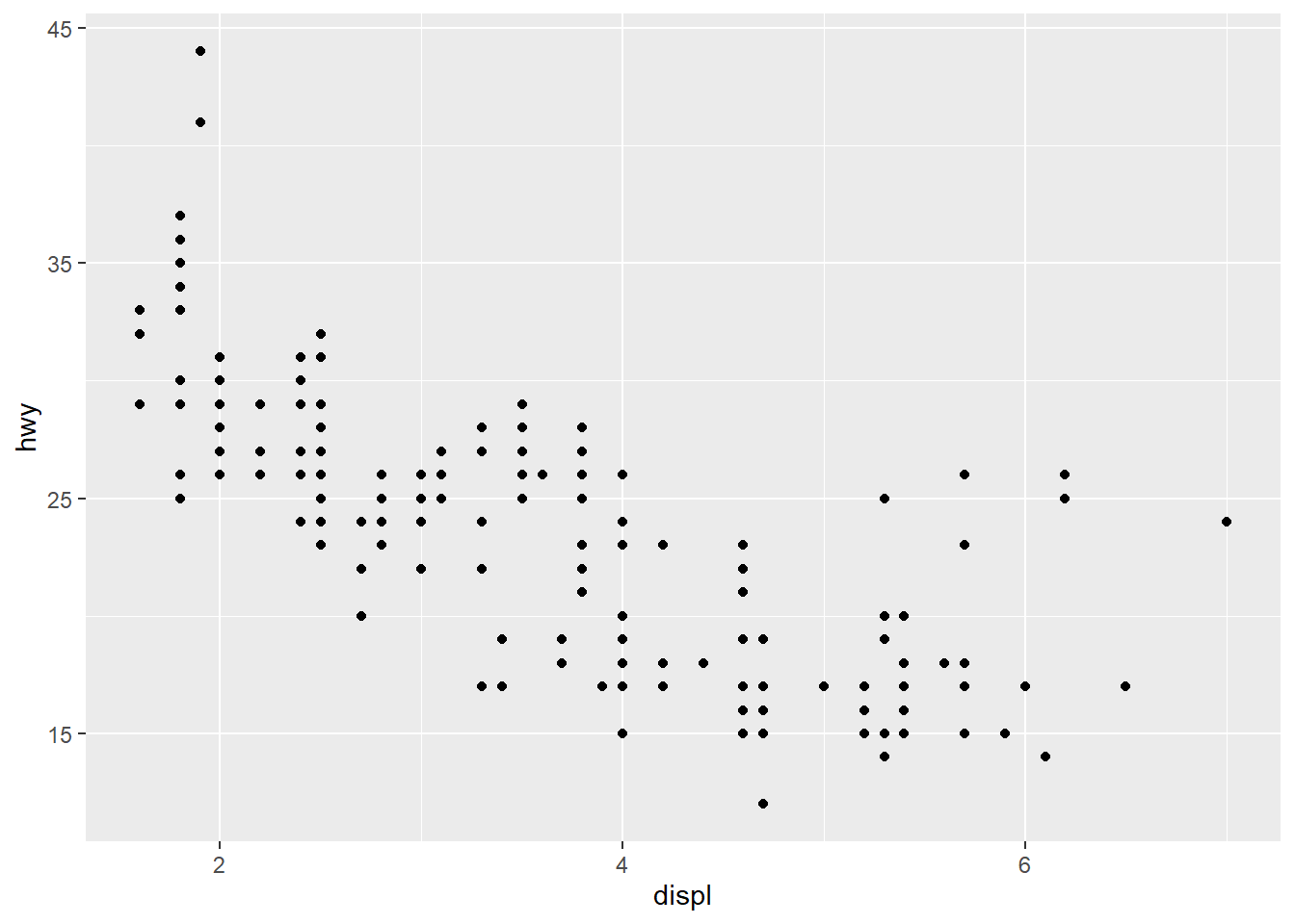
3) Changing the Text of Tick Labels
“labels” sets the tick labels
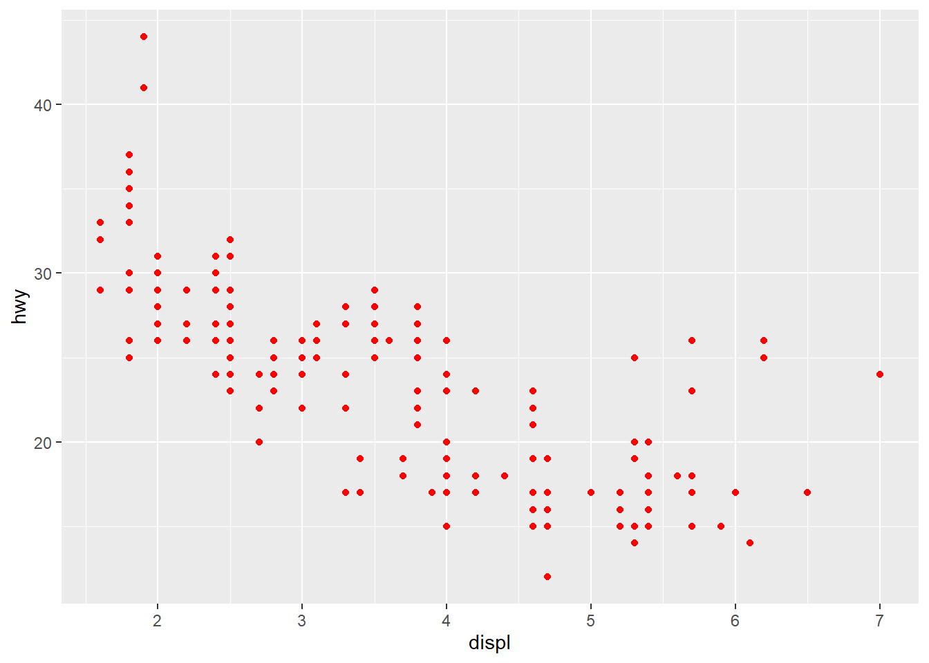
ggplot(mpg, aes(x = displ, y = hwy)) +
geom_point() +
scale_x_continuous(breaks = c(2,4,6), labels = c("2 cylinders", "4 cylinders", "6 cylinders")) +
scale_y_continuous(breaks = c(15, 25, 35, 45))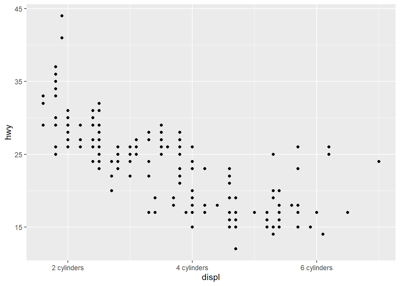
4) Changing the Appearance of Tick Labels
theme() can rotate your tick labels

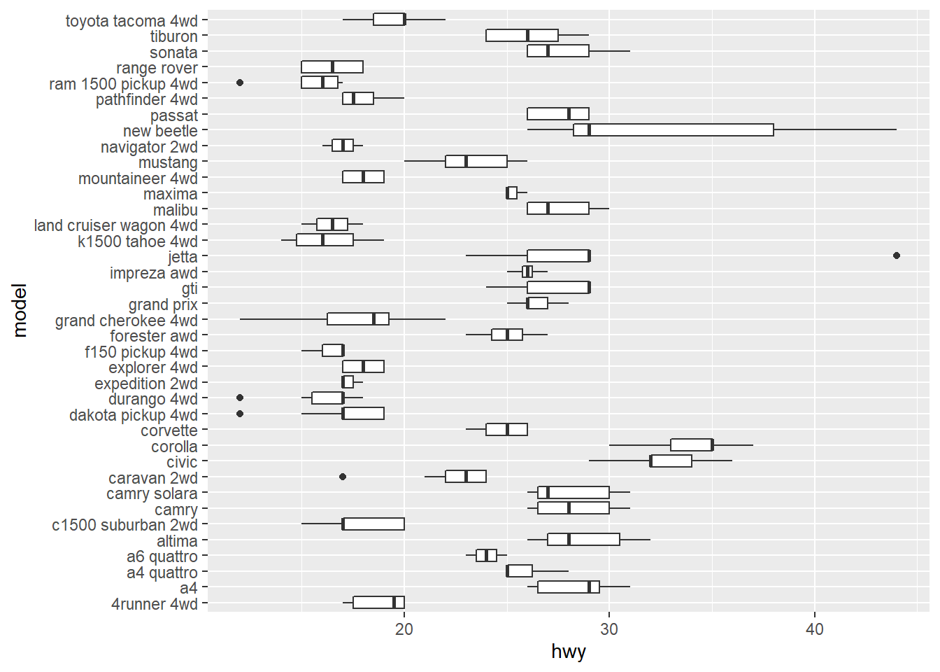
ggplot(mpg, aes(x = model, y = hwy)) +
geom_boxplot() +
theme(axis.text.x = element_text(angle = 30))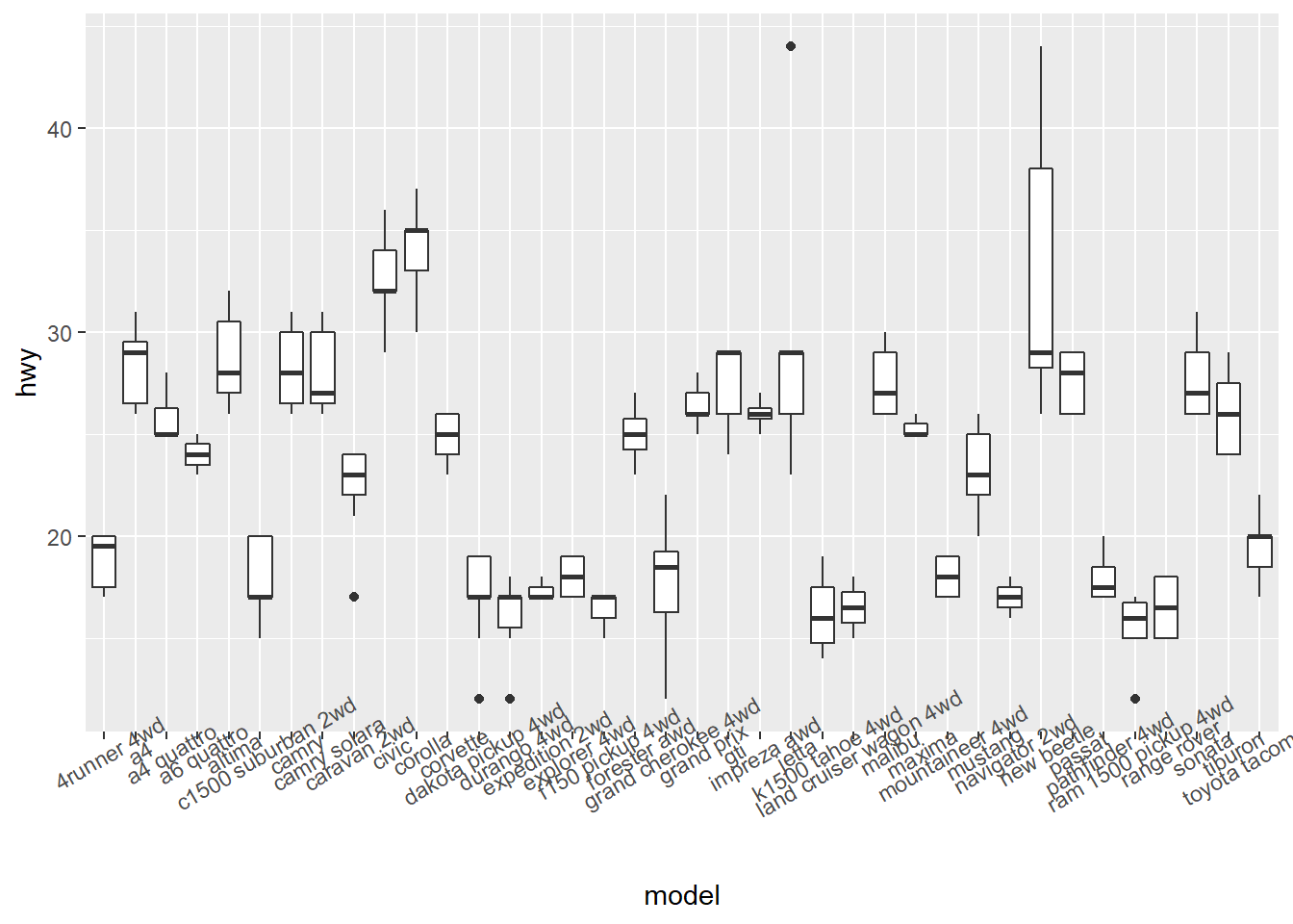
ggplot(mpg, aes(x = model, y = hwy)) +
  geom_boxplot() +
  theme(axis.text.x = element_text(angle = 90))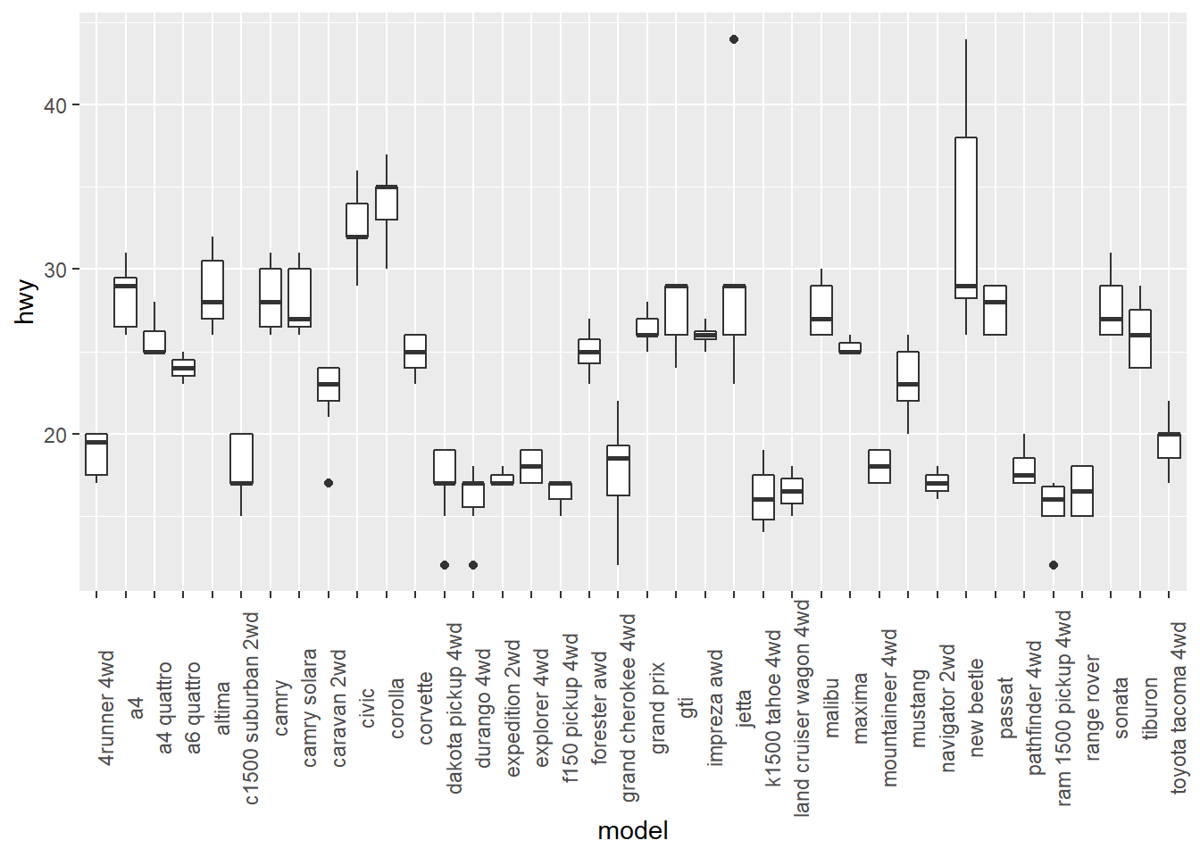
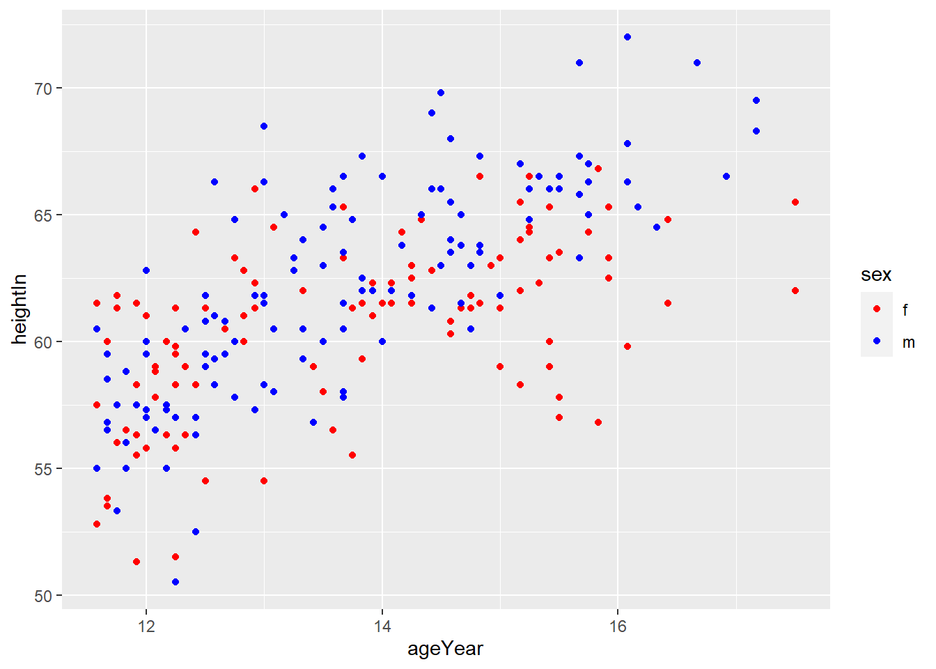
3. Using Colors in Plots
1) Setting and Mapping the Colors of Objects
- setting : aesthetics to a constant
- mapping : aesthetics to a variable
setting : fix the value of aesthetics to a constant value
mapping : use different colors depending on the value of the variable
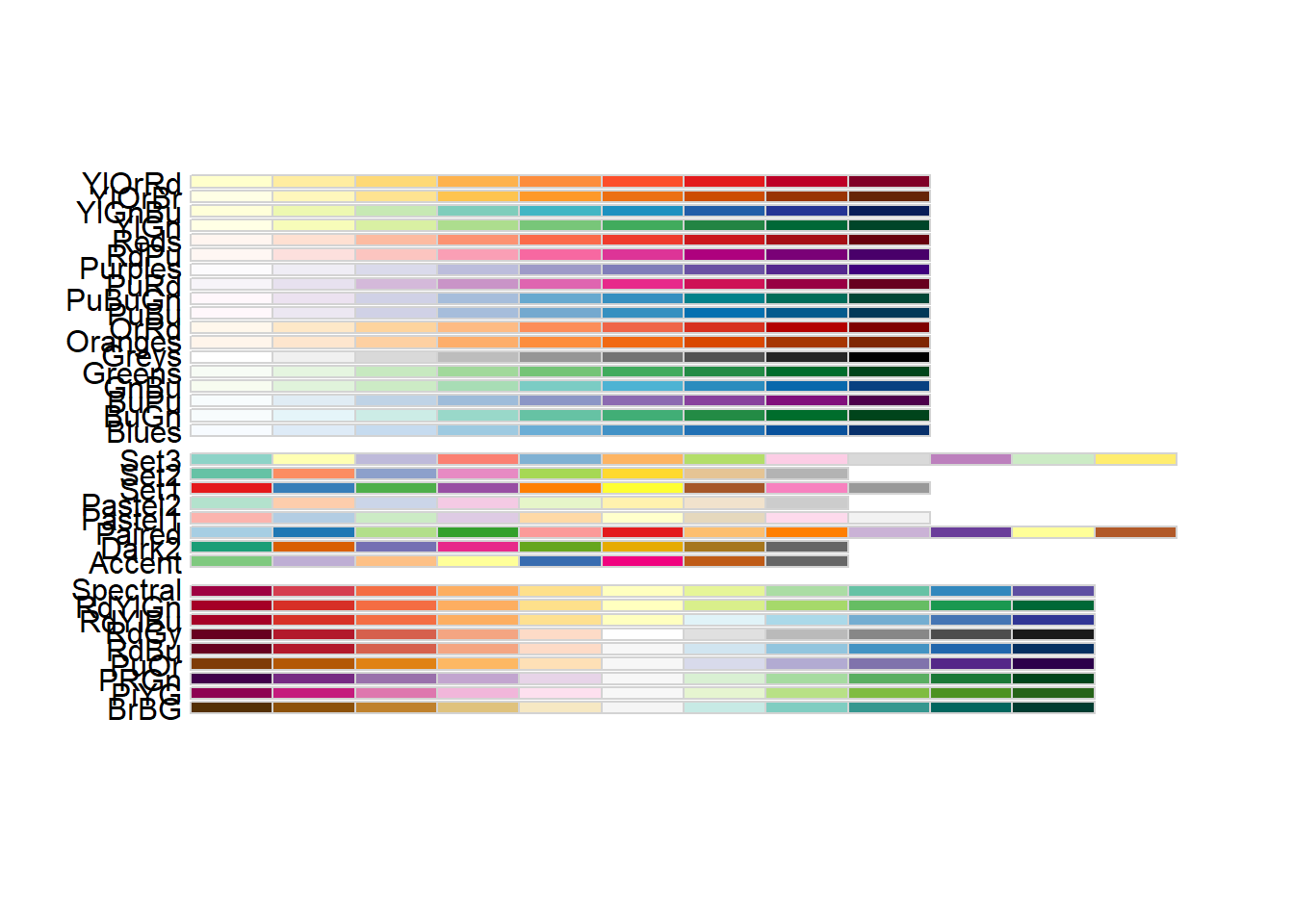
2) Using a Different Palette for a Discrete Variable
To use different color scheme, color palettes are available from the RColorBrewer package
display.brewer.all() generates available palette

3) Using a Manually Defined Palette for a Discrete Variable
scale_colour_manual() sets the values of color
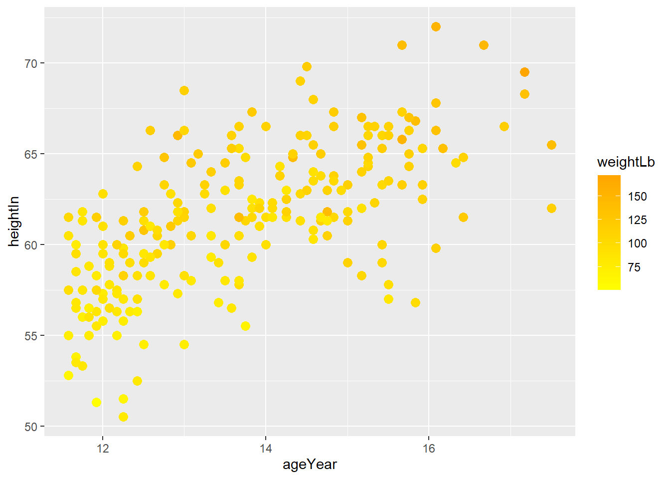
4) Using a Manuallly Defined Palette for a Continuous Variable
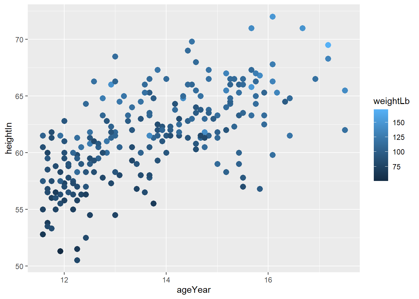
scale_colour_gradient() sets the low and high values of a color gradient
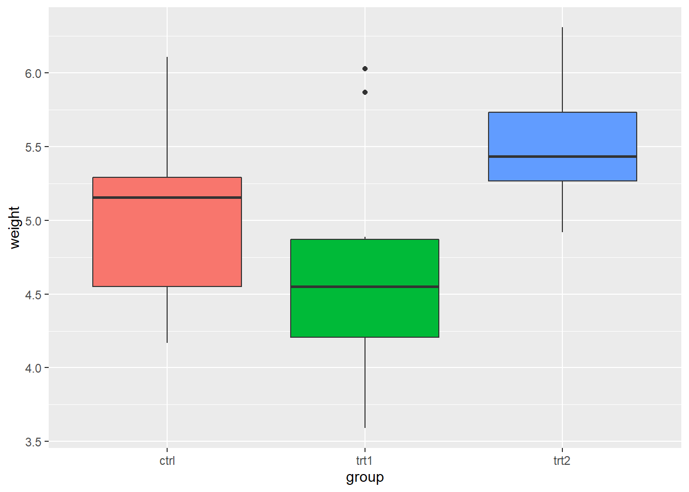
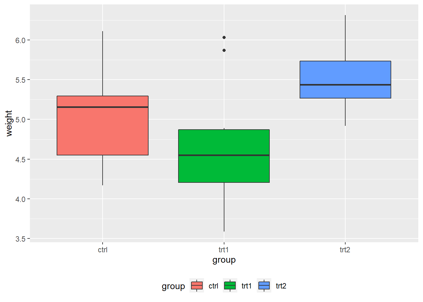
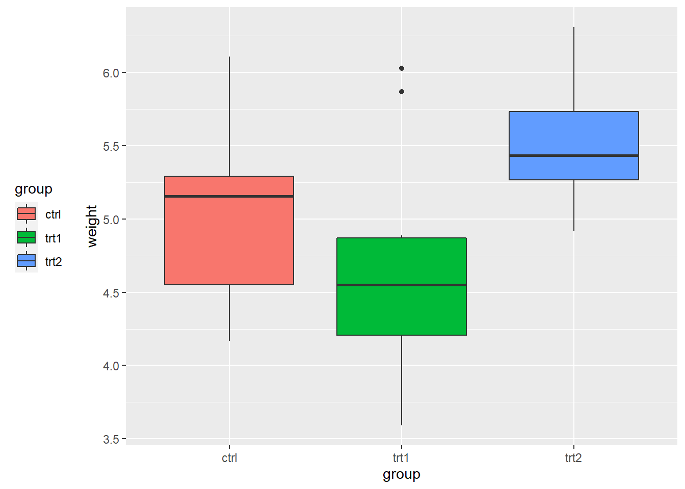
4. Legends
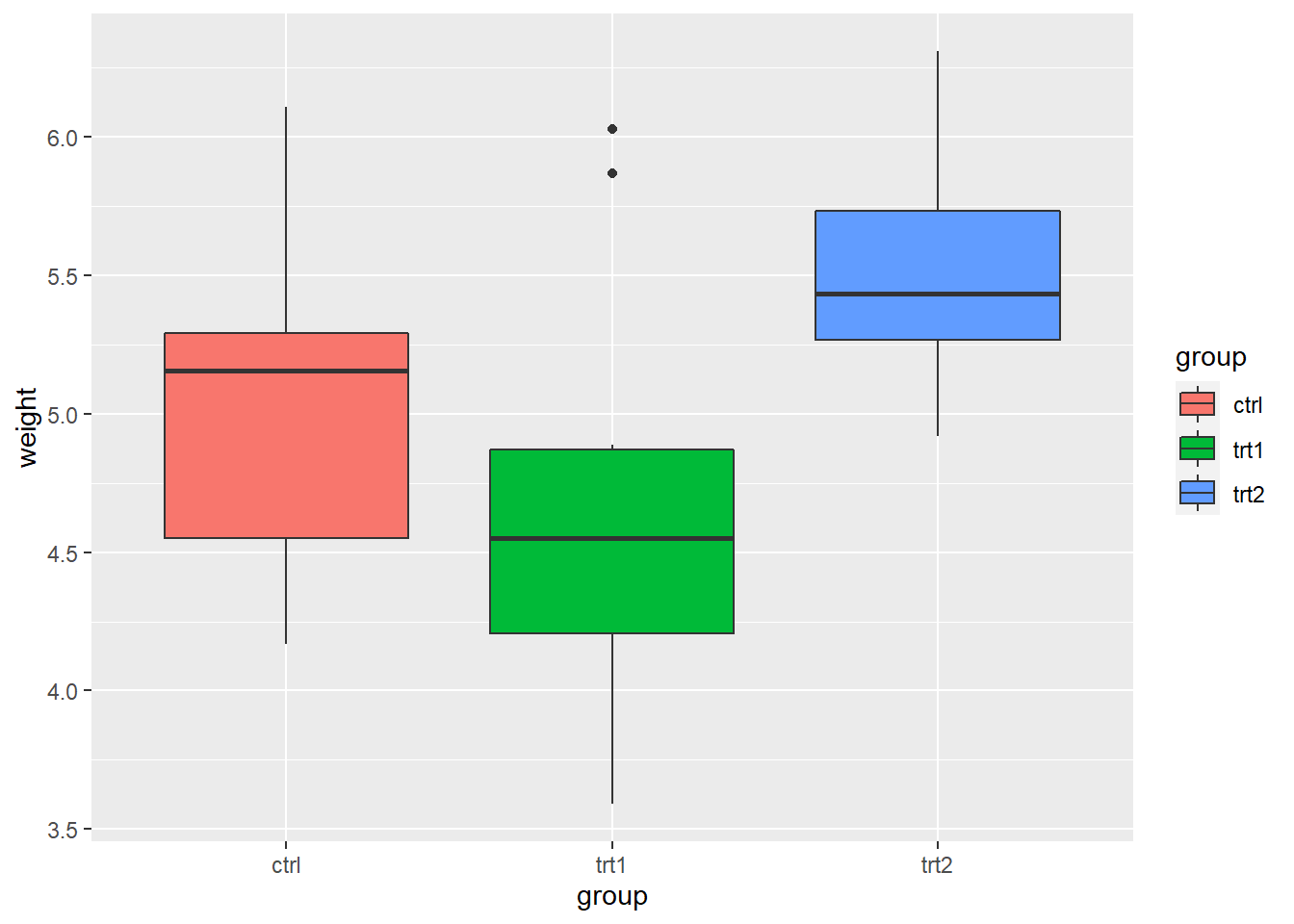
Use labs() and set the value of fill, colour, shape, or whatever aesthetic is appropriate for the legend
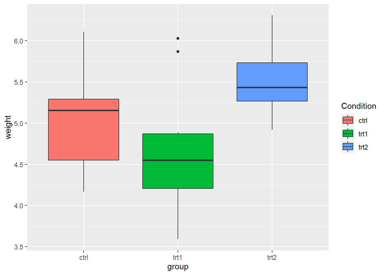
labs() sets the title, subtitle, caption, x-axis label, y-axis label, and the title of the legend
pg_plot +
  labs(title = "Weight of Plants",
       subtitle = "By Experimental Conditions",
       caption = "source: PlantGrowth",
       x = "Experimental Conditions",
       y = "Weight (pounds)",
       fill = "Condition")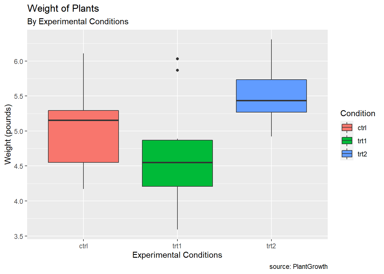

4.1 Exercise 3-1
##   sex ageYear ageMonth heightIn weightLb
## 1   f   11.92      143     56.3     85.0
## 2   f   12.92      155     62.3    105.0
## 3   f   12.75      153     63.3    108.0
## 4   f   13.42      161     59.0     92.0
## 5   f   15.92      191     62.5    112.5
## 6   f   14.25      171     62.5    112.0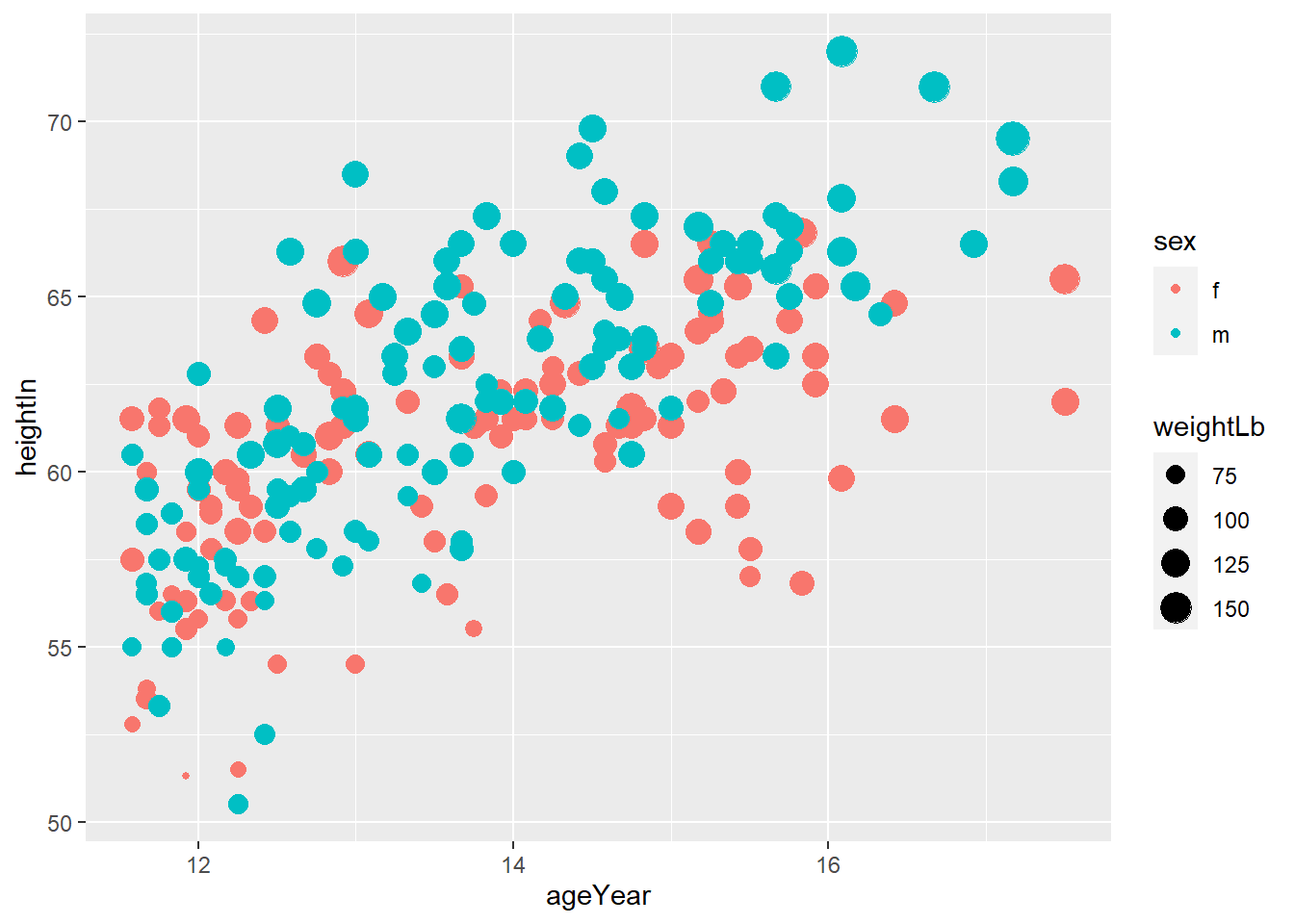
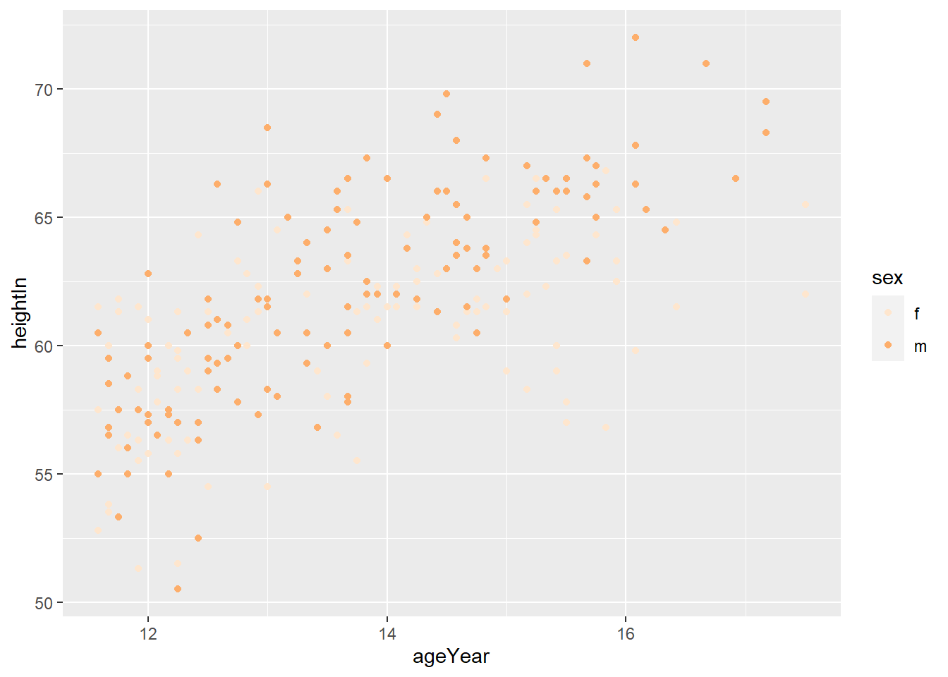
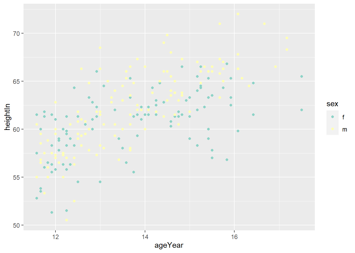
ggplot(heightweight, aes(ageYear, heightIn, size = weightLb, color = sex)) +
  geom_point(alpha = 0.3)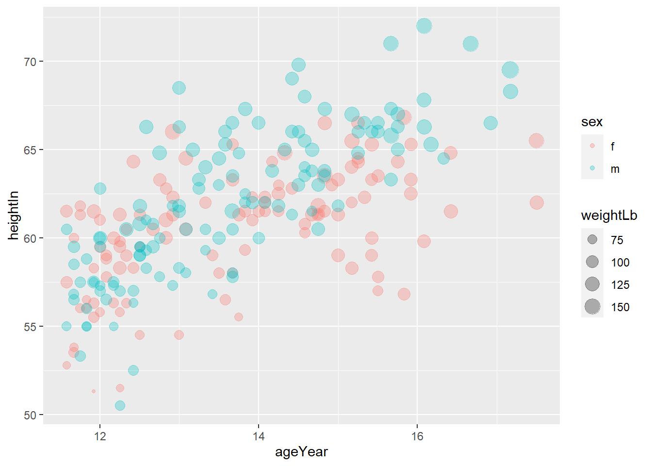
ggplot(heightweight, aes(ageYear, heightIn, size = weightLb, color = sex)) +
  geom_point(alpha = 0.3) +
  labs(title = "Height and weight of school children",
       subtitle = "Height vs Weight",
       caption = "Source: heightweight",
       x = "Age (year)",
       y = "Height (inches)",
       size = "Weight (Lb)",
       color = "Gender")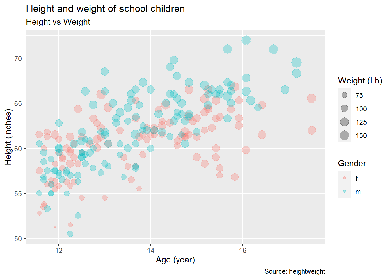
ggplot(heightweight, aes(x = ageYear, y = heightIn, size = weightLb, color = sex)) +
  geom_point(alpha = 0.3) +
  labs(title = "Height and weight of school children",
       subtitle = "Height vs Weight",
       caption = "Source: heightweight",
       x = "Age (year)",
       y = "Height (inches)",
       size = "Weight (Lb)",
       color = "Gender") +
  theme_classic()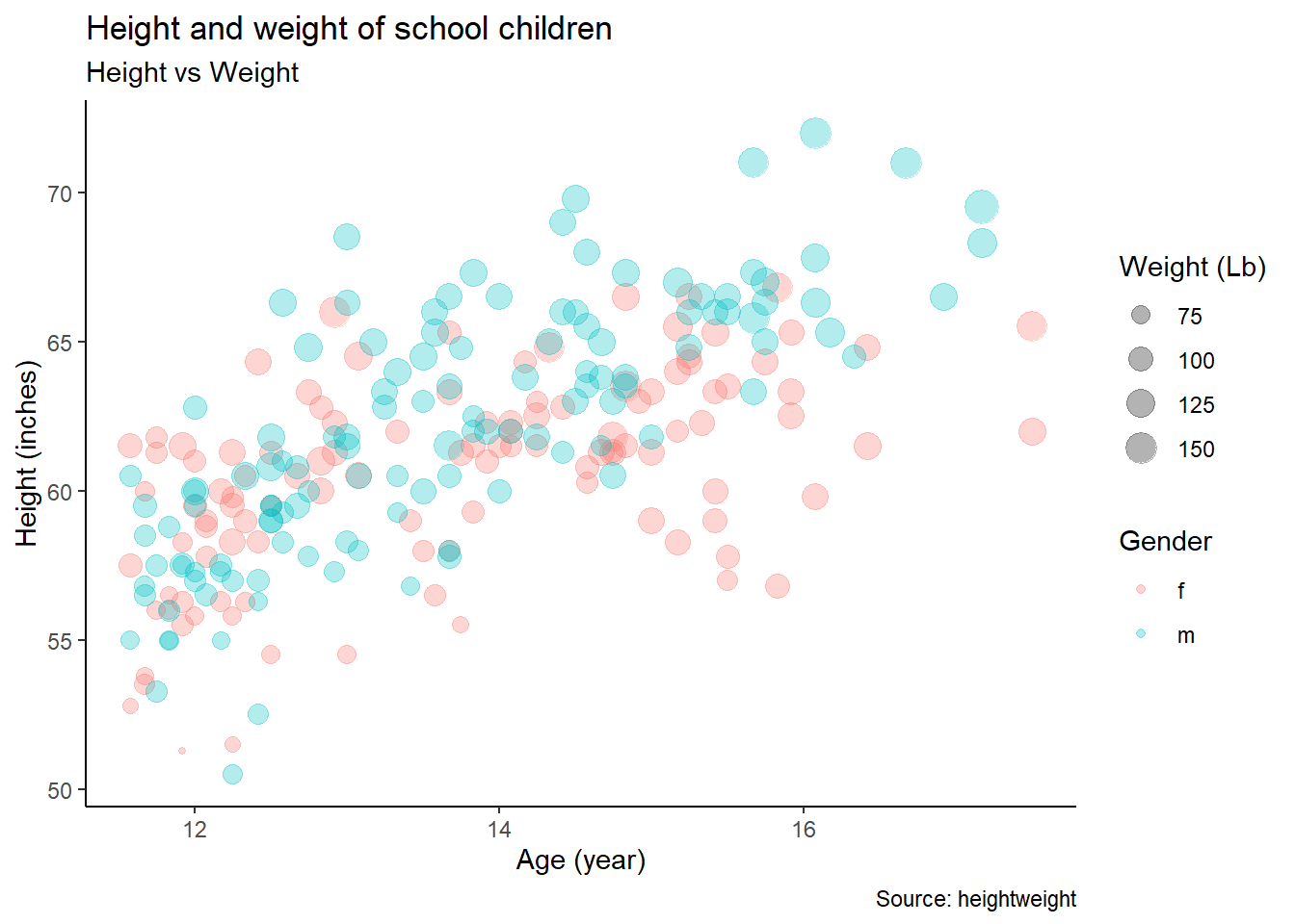
4.2 Exercise 3-2
## sex ageYear ageMonth heightIn weightLb
## 1 f 11.92 143 56.3 85.0
## 2 f 12.92 155 62.3 105.0
## 3 f 12.75 153 63.3 108.0
## 4 f 13.42 161 59.0 92.0
## 5 f 15.92 191 62.5 112.5
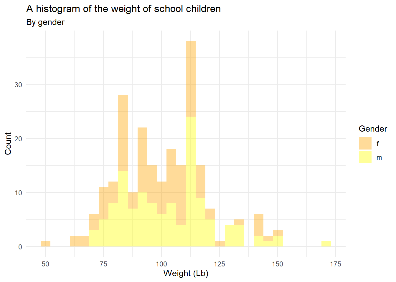
## 6 f 14.25 171 62.5 112.0geom_histogram() displays a histogram to display the distribution of a variable
## `stat_bin()` using `bins = 30`. Pick better value with `binwidth`.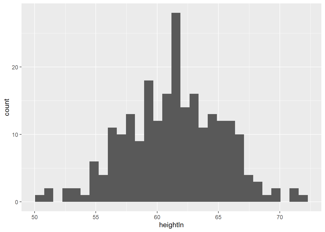
## `stat_bin()` using `bins = 30`. Pick better value with `binwidth`.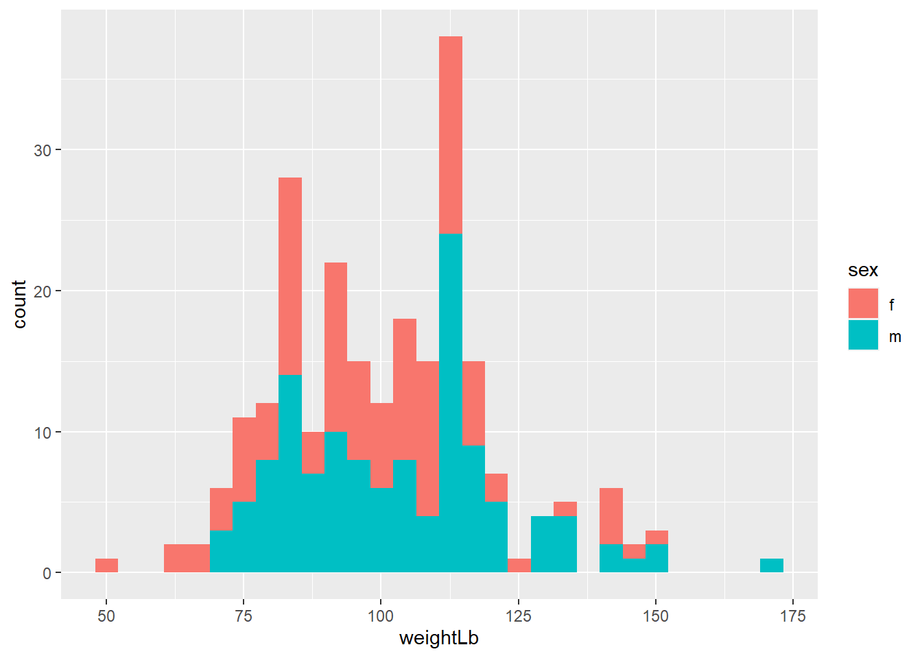
ggplot(heightweight, aes(x = weightLb, fill = sex)) +
  geom_histogram(alpha = 0.4) +
  scale_fill_manual(values = c("orange", "yellow"))
## `stat_bin()` using `bins = 30`. Pick better value with `binwidth`.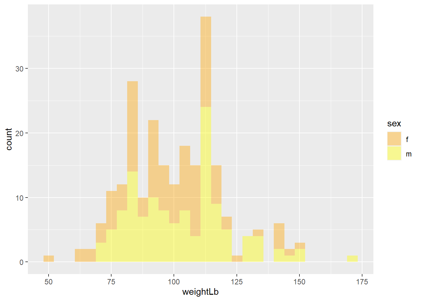
ggplot(heightweight, aes(x = weightLb, fill = sex)) +
  geom_histogram(alpha = 0.4) +
  scale_fill_manual(values = c("orange", "yellow")) +
  labs(title = "A histogram of the weight of school children",
       subtitle = "By gender",
       x = "Weight (Lb)",
       y = "Count",
       fill = "Gender") +
  theme_minimal()
## `stat_bin()` using `bins = 30`. Pick better value with `binwidth`.