Chapter 3 Data Visuallization I
9월 10일 목요일, 202AIE17 송채은
What is ggplot2? ggplot2 was developed to create a graphic by combining few graphical components based on grammar of graphics adding layers representing geometric objects the aesthetic properties of the geometric objects can be controlled by mapping data to the asthetic properties
create data
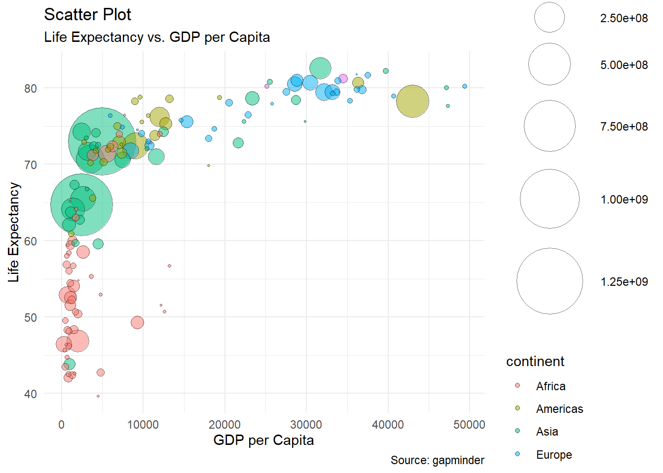
gdp <- gapminder %>%
  filter(year=="2007") %>%
  dplyr::select(-year) %>%
  arrange(desc(pop)) %>%
  mutate(country = factor(country, country))
create a bubble plot
ggplot(gdp, aes(gdpPercap, lifeExp, size = pop, fill = continent)) +
  geom_point(alpha = 0.5, shape = 21, color = "black") +
  scale_size(range = c(.1, 24), name = "Population (M)") +
  theme_minimal() +
  theme(legend.position = "right") +
  labs(
     subtitle = "Life Expectancy vs. GDP per Capita",
     y = "Life Expectancy",
     x = "GDP per Capita",
     title = "Scatter Plot",
     caption = "Source: gapminder"
  )
1. graphical components of the grammar of graphics
1) data
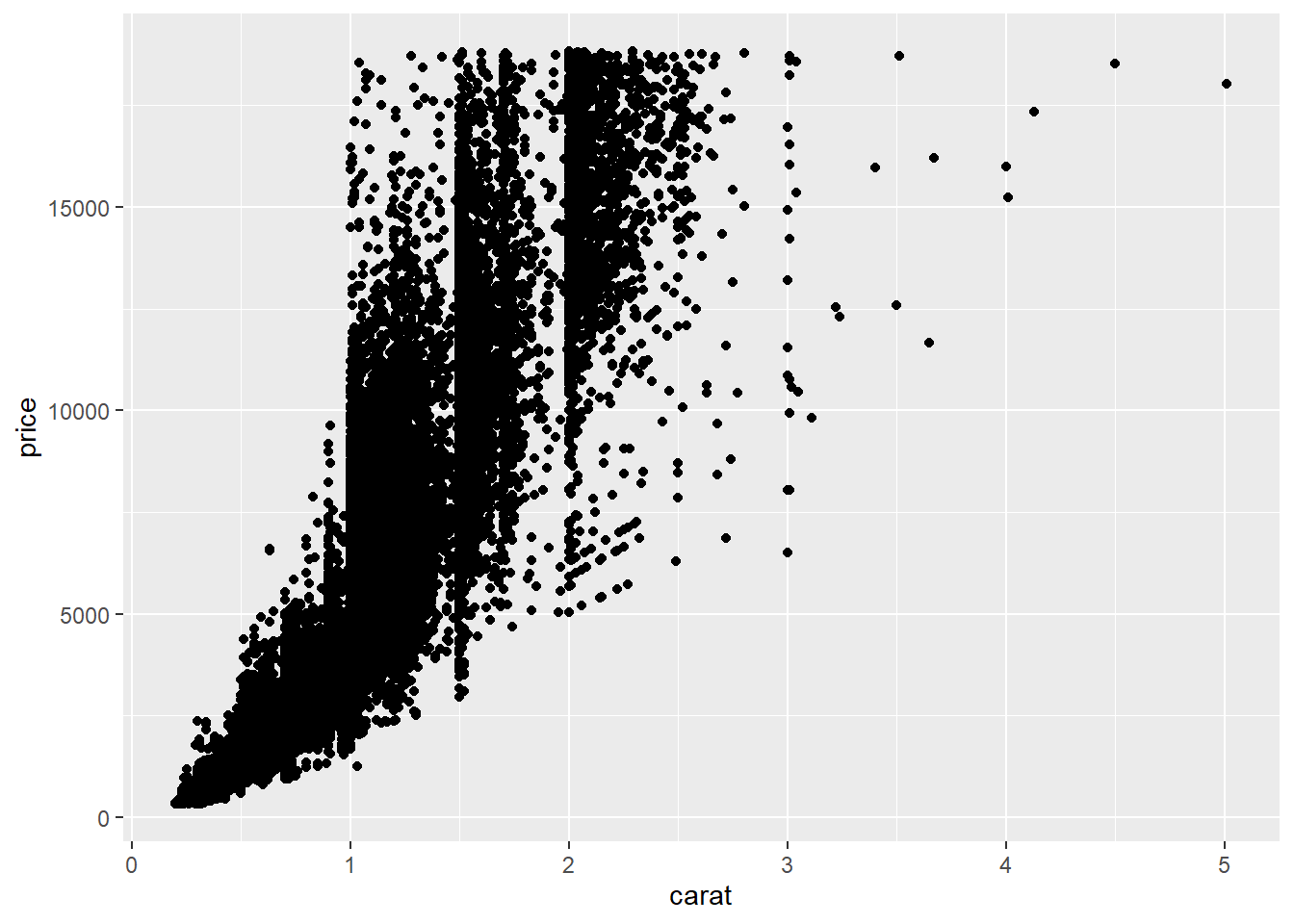
the thing which I want to visualize
## # A tibble: 53,940 x 10
##    carat cut       color clarity depth table price     x     y     z
##    <dbl> <ord>     <ord> <ord>   <dbl> <dbl> <int> <dbl> <dbl> <dbl>
##  1 0.23  Ideal     E     SI2      61.5    55   326  3.95  3.98  2.43
##  2 0.21  Premium   E     SI1      59.8    61   326  3.89  3.84  2.31
##  3 0.23  Good      E     VS1      56.9    65   327  4.05  4.07  2.31
##  4 0.290 Premium   I     VS2      62.4    58   334  4.2   4.23  2.63
##  5 0.31  Good      J     SI2      63.3    58   335  4.34  4.35  2.75
##  6 0.24  Very Good J     VVS2     62.8    57   336  3.94  3.96  2.48
##  7 0.24  Very Good I     VVS1     62.3    57   336  3.95  3.98  2.47
##  8 0.26  Very Good H     SI1      61.9    55   337  4.07  4.11  2.53
##  9 0.22  Fair      E     VS2      65.1    61   337  3.87  3.78  2.49
## 10 0.23  Very Good H     VS1      59.4    61   338  4     4.05  2.39
## # ... with 53,930 more rows
2) geometric objects(geom)
that appear on the plot (ex. circles, lines, polygons etc.) can be added to a plot as a new layer using a geom function
## `geom_smooth()` using method = 'gam' and formula 'y ~ s(x, bs = "cs")'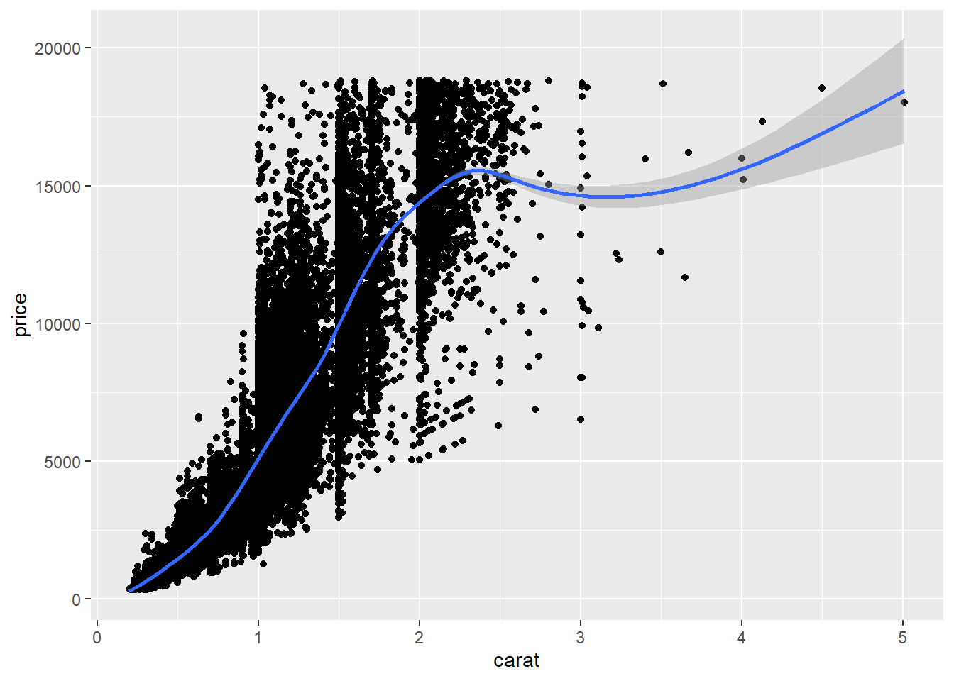
3.1 Exercise 2-1. Your first ggplot2 plot
##                      mpg cyl  disp  hp drat    wt  qsec vs am gear carb
## Mazda RX4           21.0   6 160.0 110 3.90 2.620 16.46  0  1    4    4
## Mazda RX4 Wag       21.0   6 160.0 110 3.90 2.875 17.02  0  1    4    4
## Datsun 710          22.8   4 108.0  93 3.85 2.320 18.61  1  1    4    1
## Hornet 4 Drive      21.4   6 258.0 110 3.08 3.215 19.44  1  0    3    1
## Hornet Sportabout   18.7   8 360.0 175 3.15 3.440 17.02  0  0    3    2
## Valiant             18.1   6 225.0 105 2.76 3.460 20.22  1  0    3    1
## Duster 360          14.3   8 360.0 245 3.21 3.570 15.84  0  0    3    4
## Merc 240D           24.4   4 146.7  62 3.69 3.190 20.00  1  0    4    2
## Merc 230            22.8   4 140.8  95 3.92 3.150 22.90  1  0    4    2
## Merc 280            19.2   6 167.6 123 3.92 3.440 18.30  1  0    4    4
## Merc 280C           17.8   6 167.6 123 3.92 3.440 18.90  1  0    4    4
## Merc 450SE          16.4   8 275.8 180 3.07 4.070 17.40  0  0    3    3
## Merc 450SL          17.3   8 275.8 180 3.07 3.730 17.60  0  0    3    3
## Merc 450SLC         15.2   8 275.8 180 3.07 3.780 18.00  0  0    3    3
## Cadillac Fleetwood  10.4   8 472.0 205 2.93 5.250 17.98  0  0    3    4
## Lincoln Continental 10.4   8 460.0 215 3.00 5.424 17.82  0  0    3    4
## Chrysler Imperial   14.7   8 440.0 230 3.23 5.345 17.42  0  0    3    4
## Fiat 128            32.4   4  78.7  66 4.08 2.200 19.47  1  1    4    1
## Honda Civic         30.4   4  75.7  52 4.93 1.615 18.52  1  1    4    2
## Toyota Corolla      33.9   4  71.1  65 4.22 1.835 19.90  1  1    4    1
## Toyota Corona       21.5   4 120.1  97 3.70 2.465 20.01  1  0    3    1
## Dodge Challenger    15.5   8 318.0 150 2.76 3.520 16.87  0  0    3    2
## AMC Javelin         15.2   8 304.0 150 3.15 3.435 17.30  0  0    3    2
## Camaro Z28          13.3   8 350.0 245 3.73 3.840 15.41  0  0    3    4
## Pontiac Firebird    19.2   8 400.0 175 3.08 3.845 17.05  0  0    3    2
## Fiat X1-9           27.3   4  79.0  66 4.08 1.935 18.90  1  1    4    1
## Porsche 914-2       26.0   4 120.3  91 4.43 2.140 16.70  0  1    5    2
## Lotus Europa        30.4   4  95.1 113 3.77 1.513 16.90  1  1    5    2
## Ford Pantera L      15.8   8 351.0 264 4.22 3.170 14.50  0  1    5    4
## Ferrari Dino        19.7   6 145.0 175 3.62 2.770 15.50  0  1    5    6
## Maserati Bora       15.0   8 301.0 335 3.54 3.570 14.60  0  1    5    8
## Volvo 142E 21.4 4 121.0 109 4.11 2.780 18.60 1 1 4 2## `geom_smooth()` using method = 'loess' and formula 'y ~ x'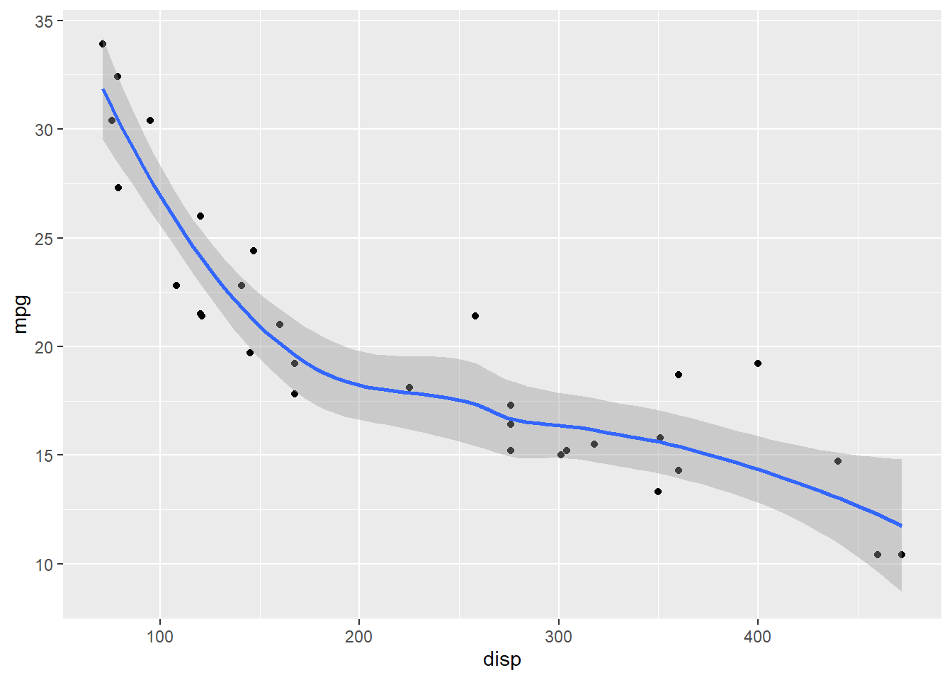
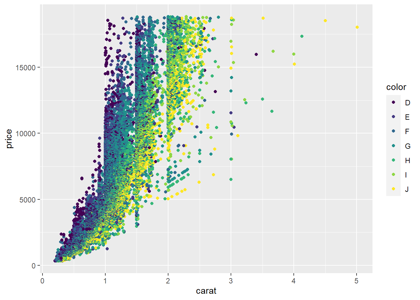
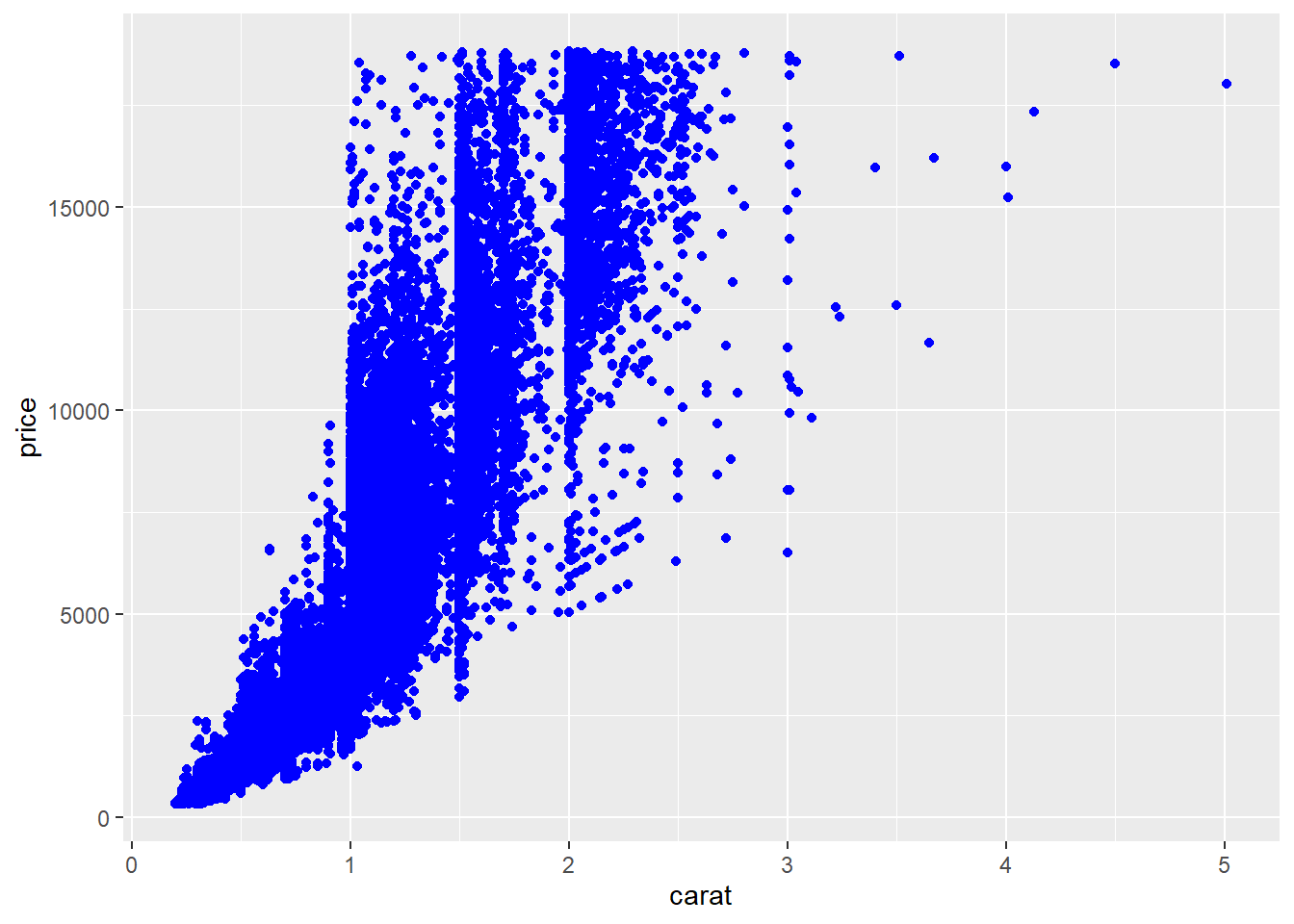
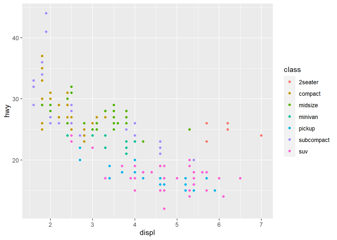
3) aesthetic mappings
that describe how variables in the data are mapped to aesthetic properties(ex.color, shape, linetype) of the geometric objects
- Aesthetic properties in ggplot2 include
- position : x and y coordinates
- color : outside color
- fill : inside color
- linetype : ex) solid line, dotted iine
- size
- alpha : transparency
## Warning: Using shapes for an ordinal variable is not advised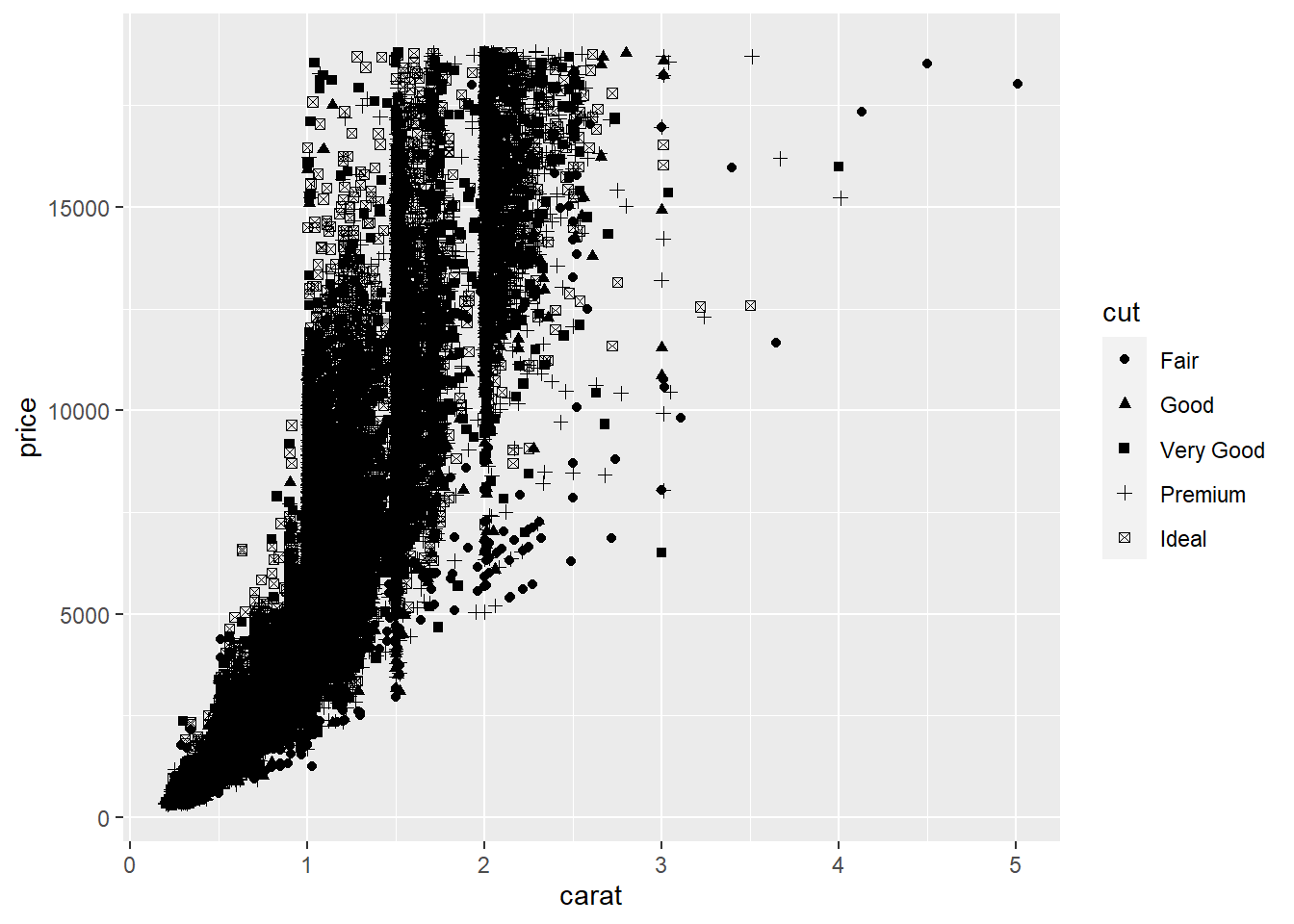
3.2 Exercise 2-2. Aesthetic mapping
## # A tibble: 234 x 11
##    manufacturer model      displ  year   cyl trans      drv     cty   hwy fl    class
##    <chr>        <chr>      <dbl> <int> <int> <chr>      <chr> <int> <int> <chr> <chr>
##  1 audi         a4           1.8  1999     4 auto(l5)   f        18    29 p     compact
##  2 audi         a4           1.8  1999     4 manual(m5) f        21    29 p     compact
##  3 audi         a4           2    2008     4 manual(m6) f        20    31 p     compact
##  4 audi         a4           2    2008     4 auto(av)   f        21    30 p     compact
##  5 audi         a4           2.8  1999     6 auto(l5)   f        16    26 p     compact
##  6 audi         a4           2.8  1999     6 manual(m5) f        18    26 p     compact
##  7 audi         a4           3.1  2008     6 auto(av)   f        18    27 p     compact
##  8 audi         a4 quattro   1.8  1999     4 manual(m5) 4        18    26 p     compact
##  9 audi         a4 quattro   1.8  1999     4 auto(l5)   4        16    25 p     compact
## 10 audi         a4 quattro   2    2008     4 manual(m6) 4        20    28 p     compact
## # ... with 224 more rows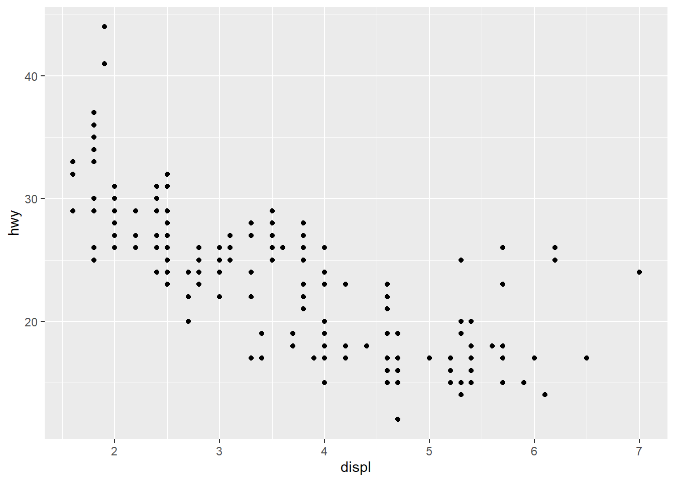
4) scale
for each aesthetic mapping used The mapping from the data to the final values that computers can use to display aesthetics is called a scale a scale controls aesthetic mapping from data to aesthetics

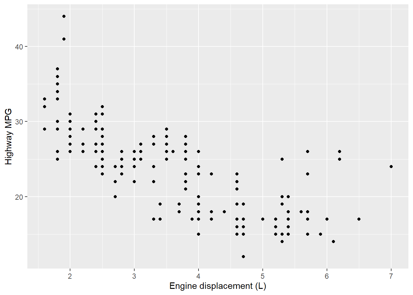
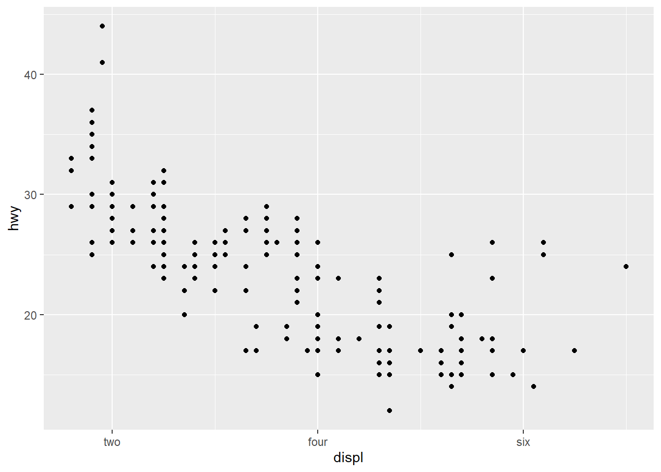
scale functions allow you to change the name, break points, limits, etc. of the continuous x and y axis scale_x_continuous : 연속형 변수의 x축 지정 scale_x_discrete : 범주형 변수의 x축 지정
label(labs) : 각 눈금에 해당하는 문자명 조정

limits(lim) = 축의 크기
## Warning: Removed 27 rows containing missing values (geom_point).
use the short hand functions “xlim()” and “ylim()”
## Warning: Removed 27 rows containing missing values (geom_point).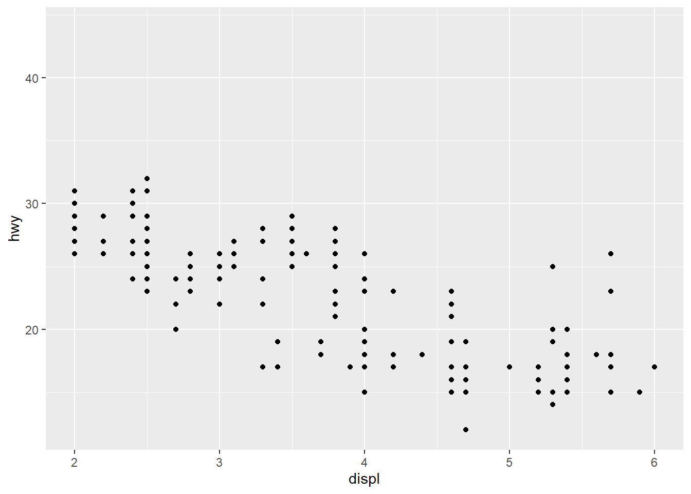
breaks : 축 눈금의 위치와 일정 구간마다 표시할 값

ggplot(mpg, aes(displ, hwy, color = drv)) +
  geom_point() + geom_smooth(method = "lm") +
  labs(title = "MPG vs Engine size", x = "Engine size", y = "MPG")
## `geom_smooth()` using formula 'y ~ x'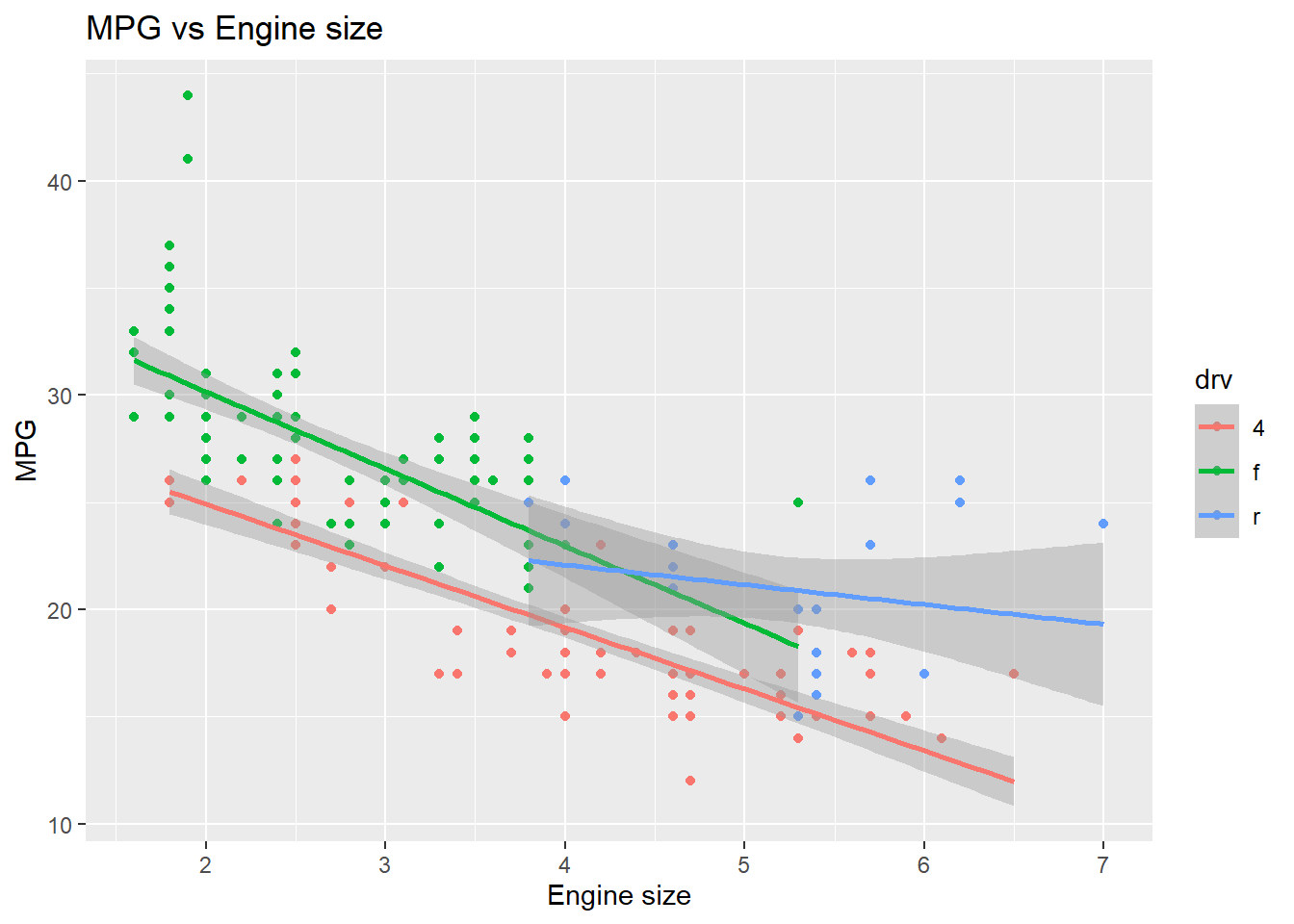
create your own discrete scale
ggplot(mpg, aes(displ, hwy, color = drv)) +
  geom_point() + geom_smooth(method = "lm") +
  labs(title = "MPG vs Engine size", x = "Engine size", y = "MPG") +
  scale_color_manual(name = "Drive", values = c("lightpink", "darkseagreen", "lightblue"))
## `geom_smooth()` using formula 'y ~ x'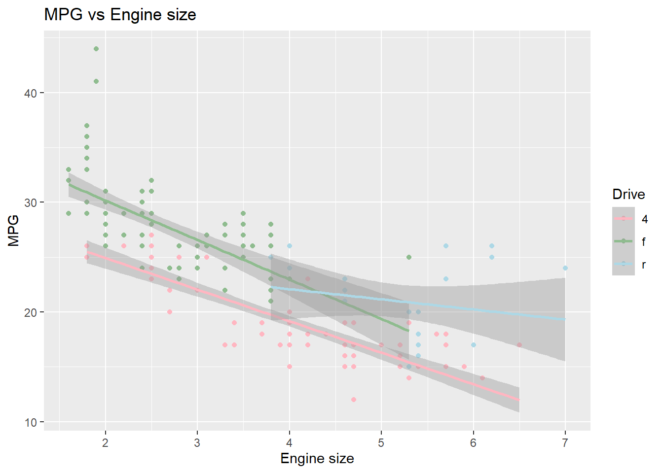
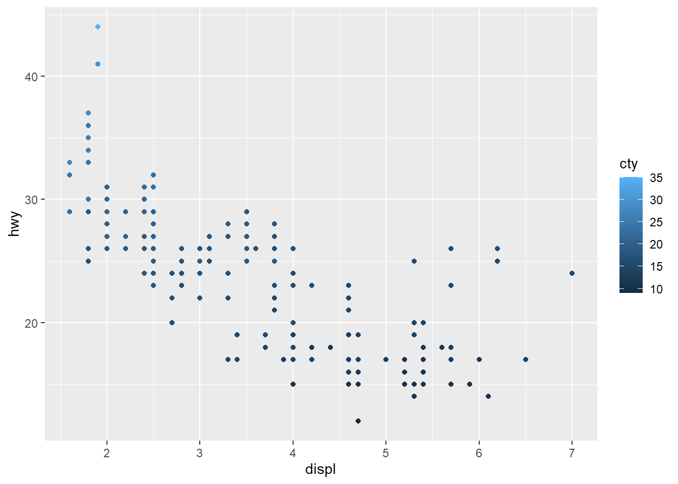
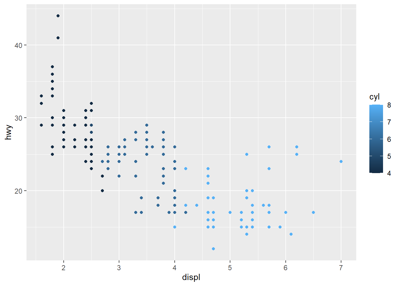
ggplot(mpg, aes(displ, hwy, color = cty)) + geom_point() +
  scale_color_gradient(name = "City MPG", low = "yellow", high = "red")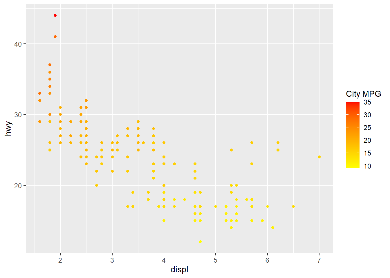
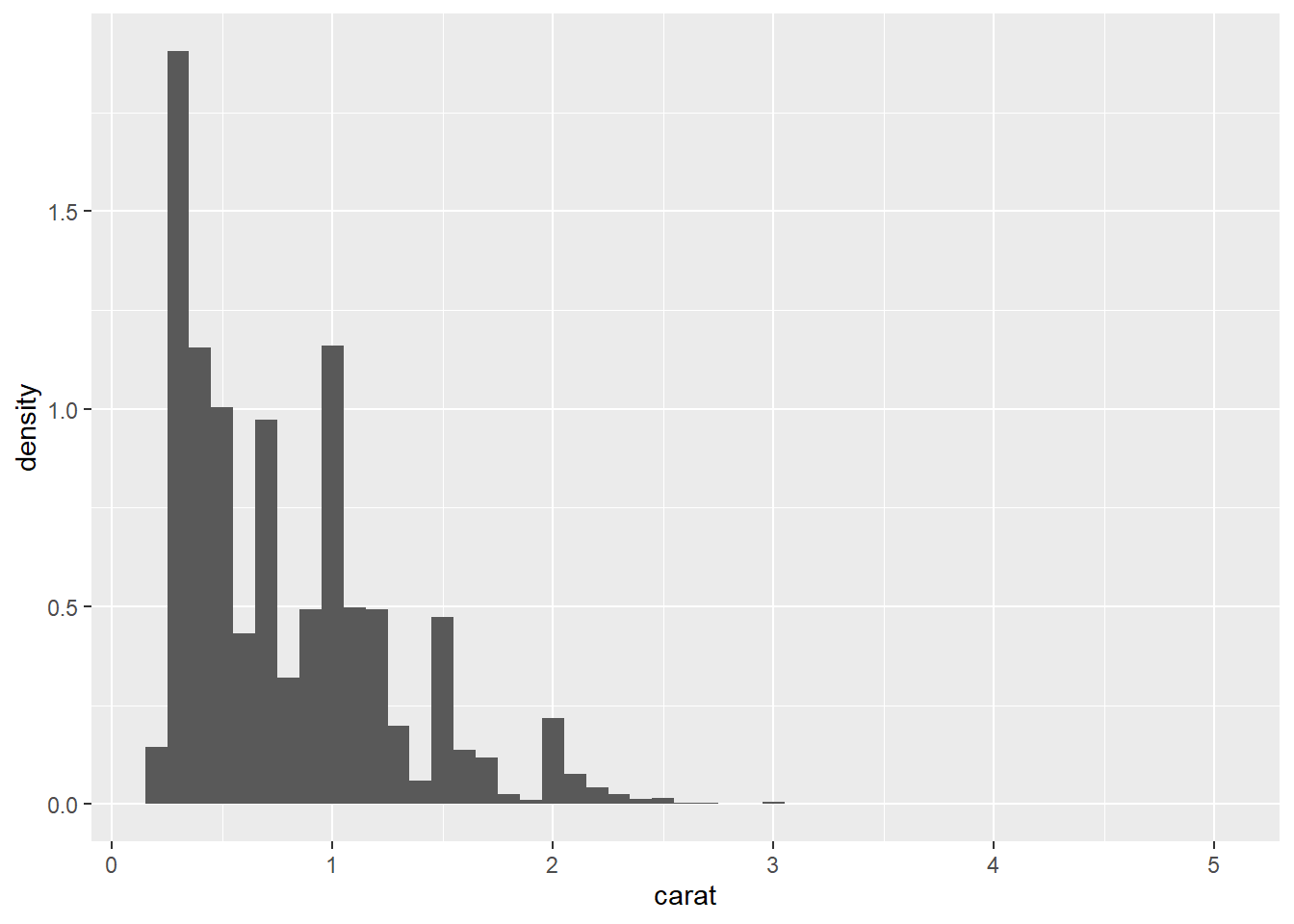
5) statistical transformation(stats)
used to calculate the data values used in the plot historam shows the distribution of a single variable Statistical transformations create new variables to plot These generated variables can be used instead of the variables present in the original dataset * To map the variable created by stats to aesthetics, the names of generated variables must be surrounded with “..” + count : the number of observations in each bin + density : the density of observations in each bin (percentage of total / bar width) + x : the center of the bin
## `stat_bin()` using `bins = 30`. Pick better value with `binwidth`.
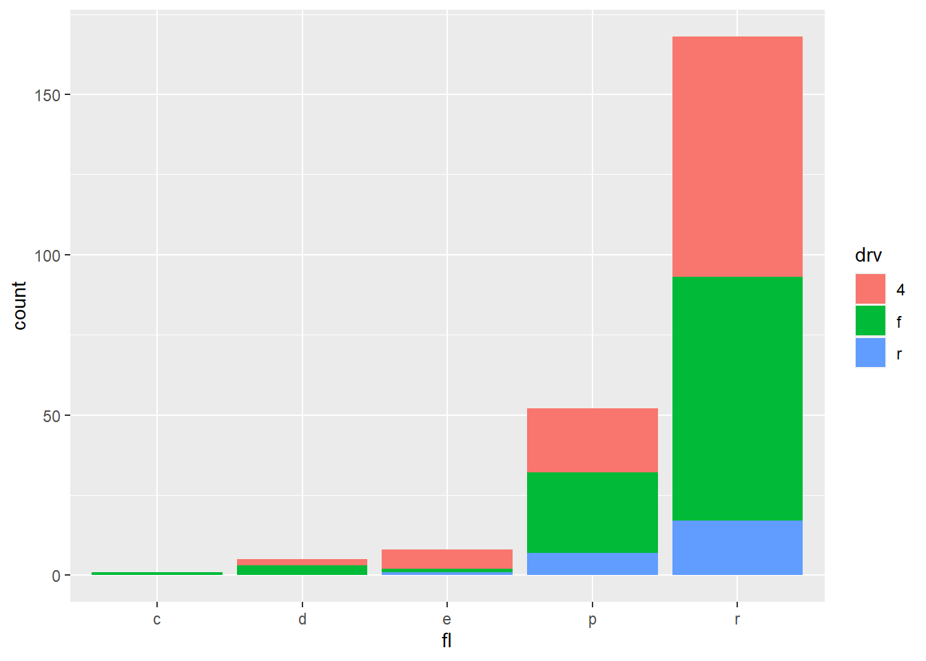
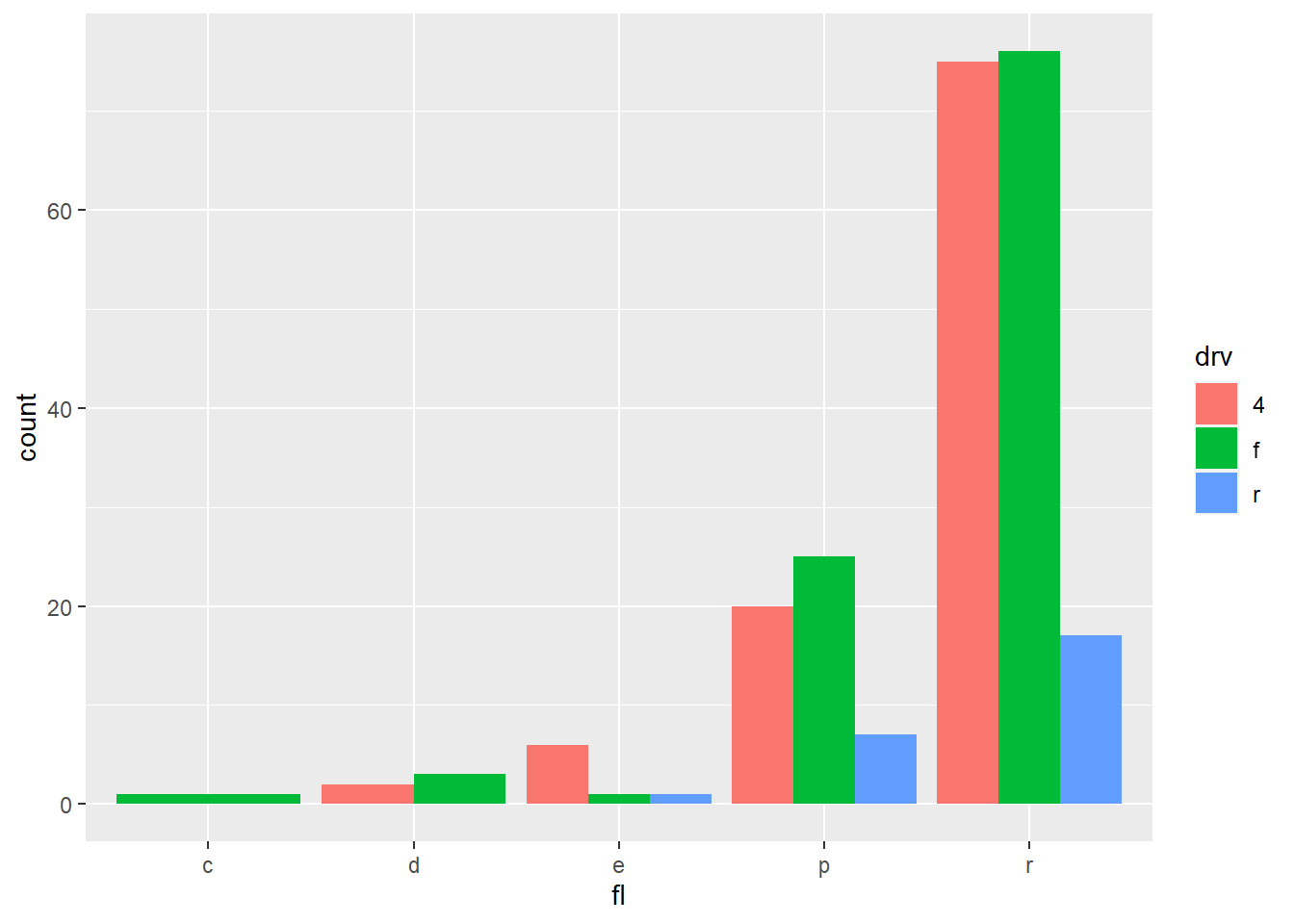
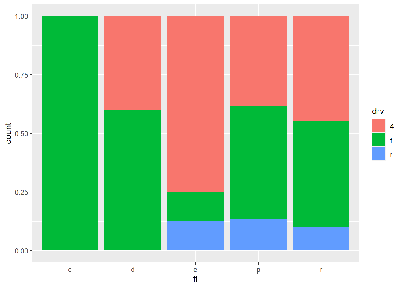
6) position adjustment
for arranging each geometric object on the plot determine how to arrange geoms that would otherwise occupy the same space

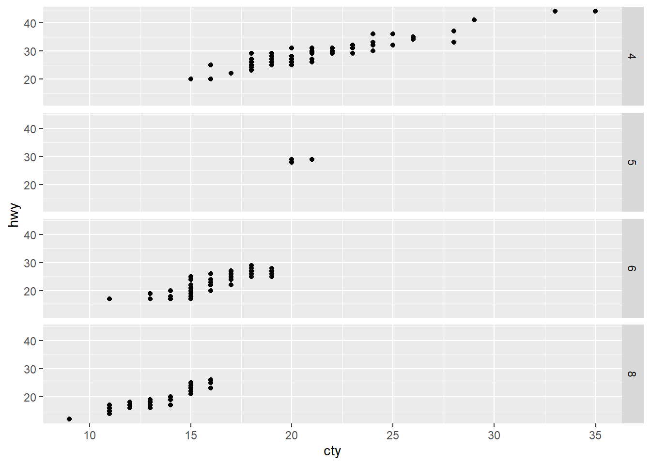
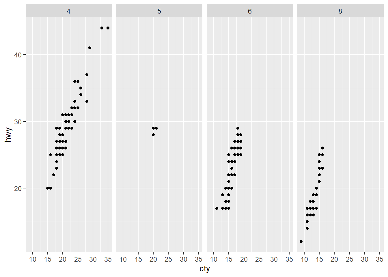
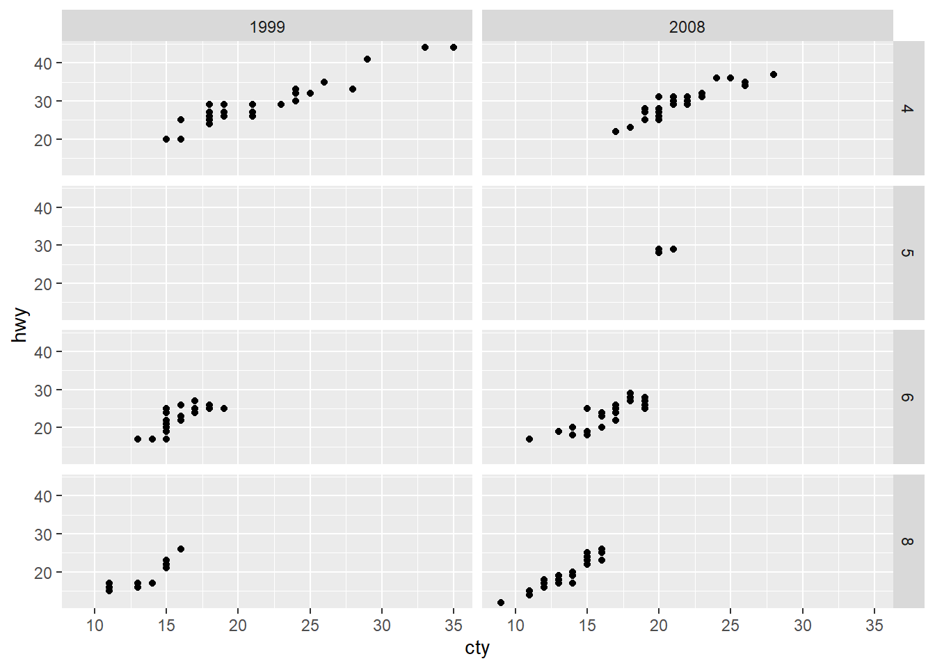
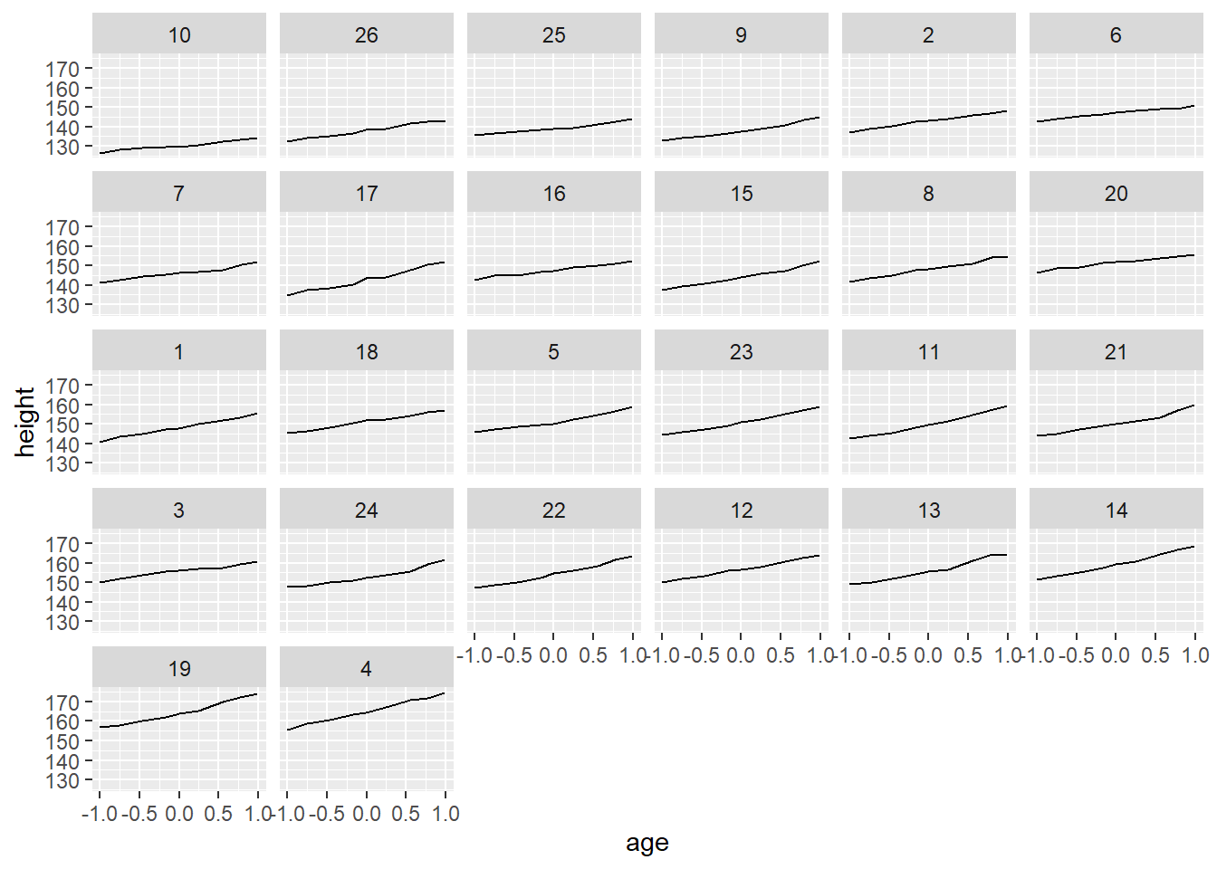
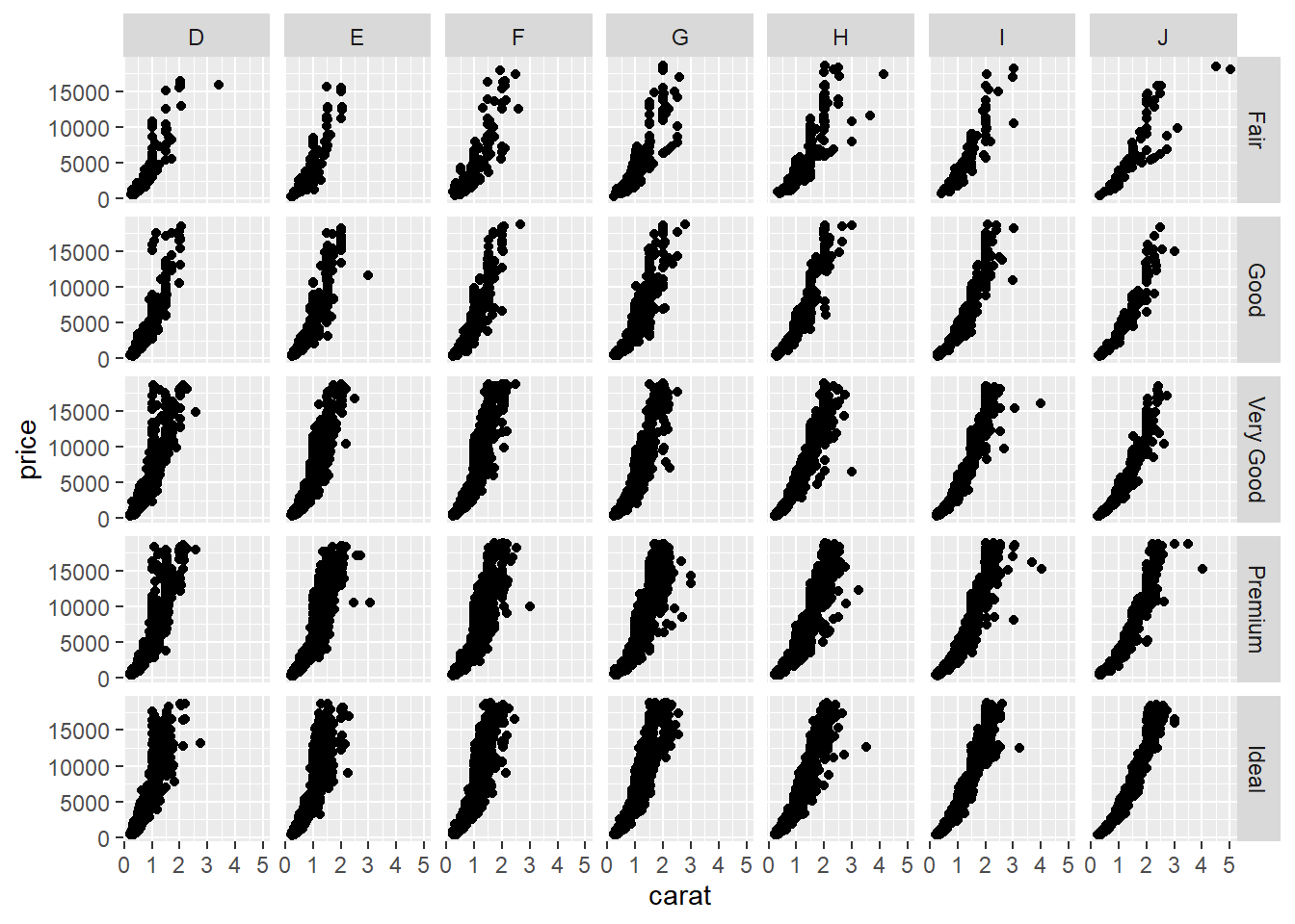
7) facet
how to break up the data into sbusets and how to display those subsets as a samll multiples faceting is also known as conditioning facet_grid : produce 2D grid of panel defined by variables which form the rows and columns facet_wrap : produces a 1D ribbon of panels that is wrapped into 2D
## `stat_bin()` using `bins = 30`. Pick better value with `binwidth`.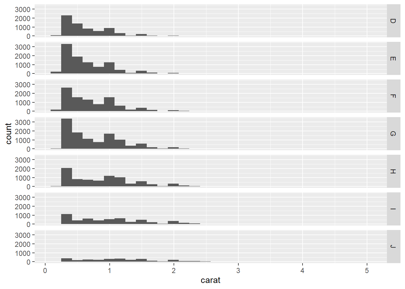
## `stat_bin()` using `bins = 30`. Pick better value with `binwidth`.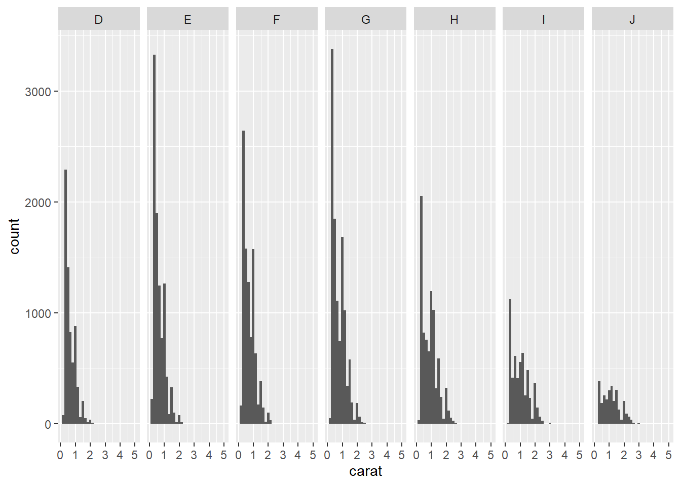
3.3 Exercise 2-3. A faceting

8) Grouping
separate your data into groups, but render them in the same way
## Grouped Data: height ~ age | Subject
##   Subject     age height Occasion
## 1       1 -1.0000  140.5        1
## 2       1 -0.7479  143.4        2
## 3       1 -0.4630  144.8        3
## 4       1 -0.1643  147.1        4
## 5       1 -0.0027  147.7        5
## 6       1  0.2466  150.2        6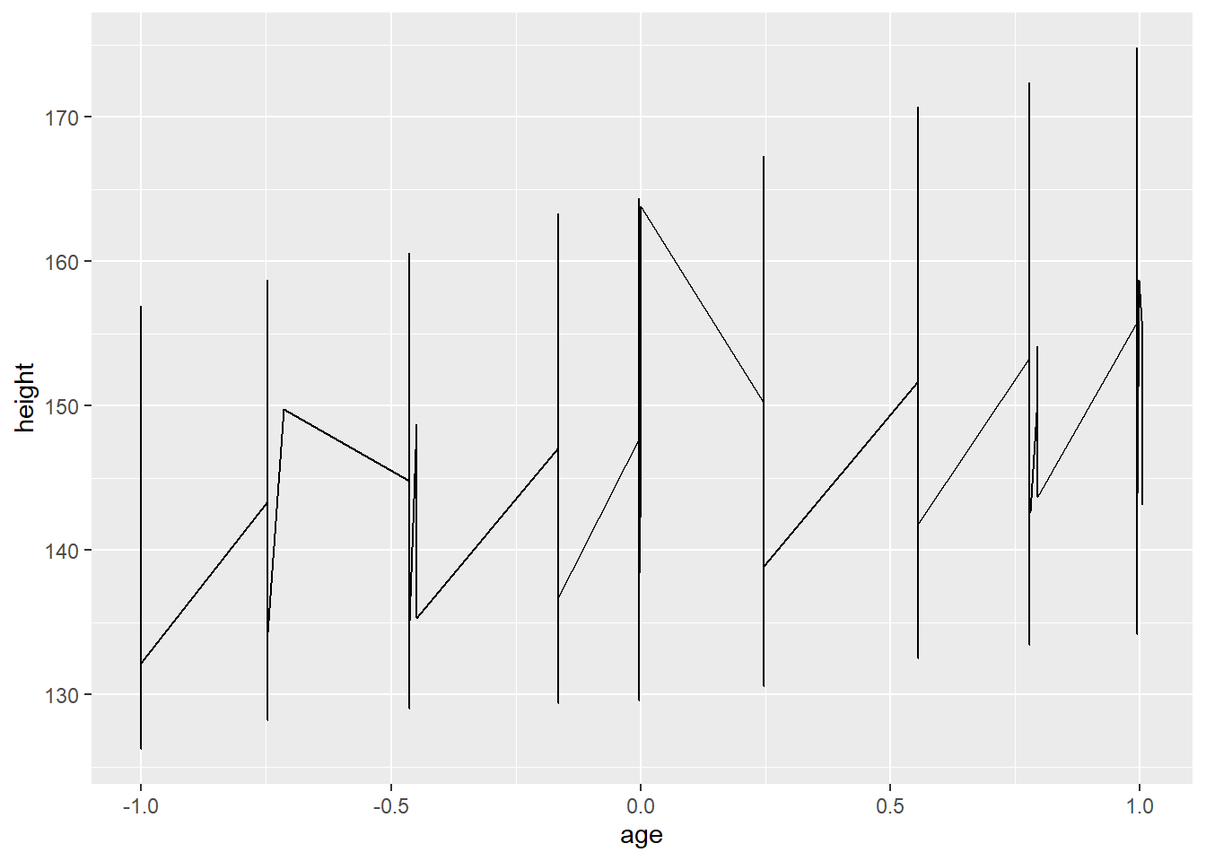
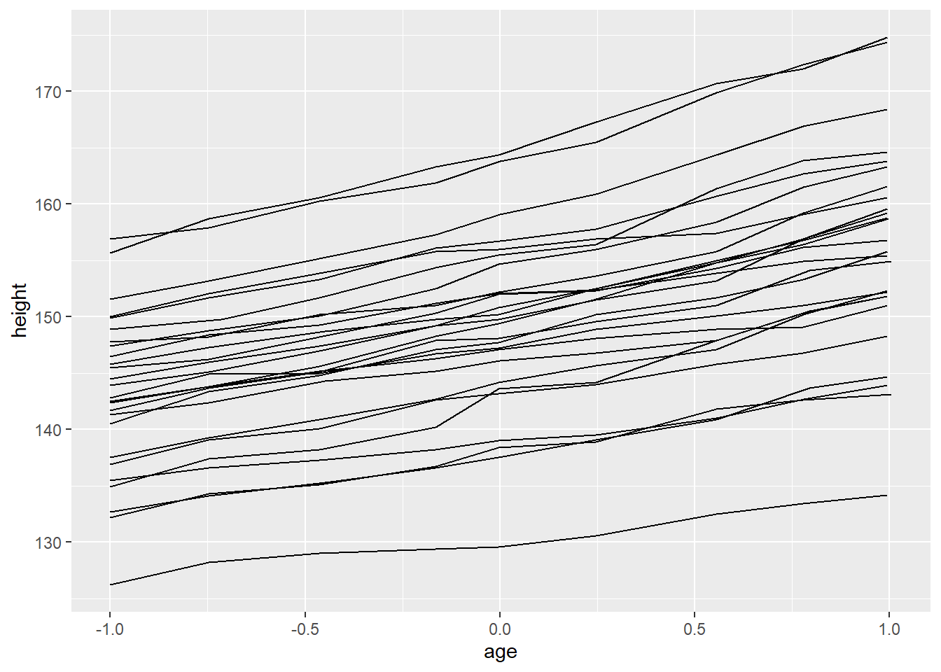
It will affect all the geom functions. Therefore, a smoothed line is created for each subject but in many cases, this is not what we need. We need a single smoothed line for entire subjects
## `geom_smooth()` using method = 'loess' and formula 'y ~ x'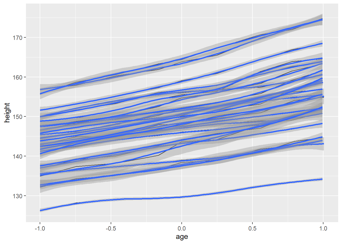
“group = 1” override the default grouping
## `geom_smooth()` using method = 'loess' and formula 'y ~ x'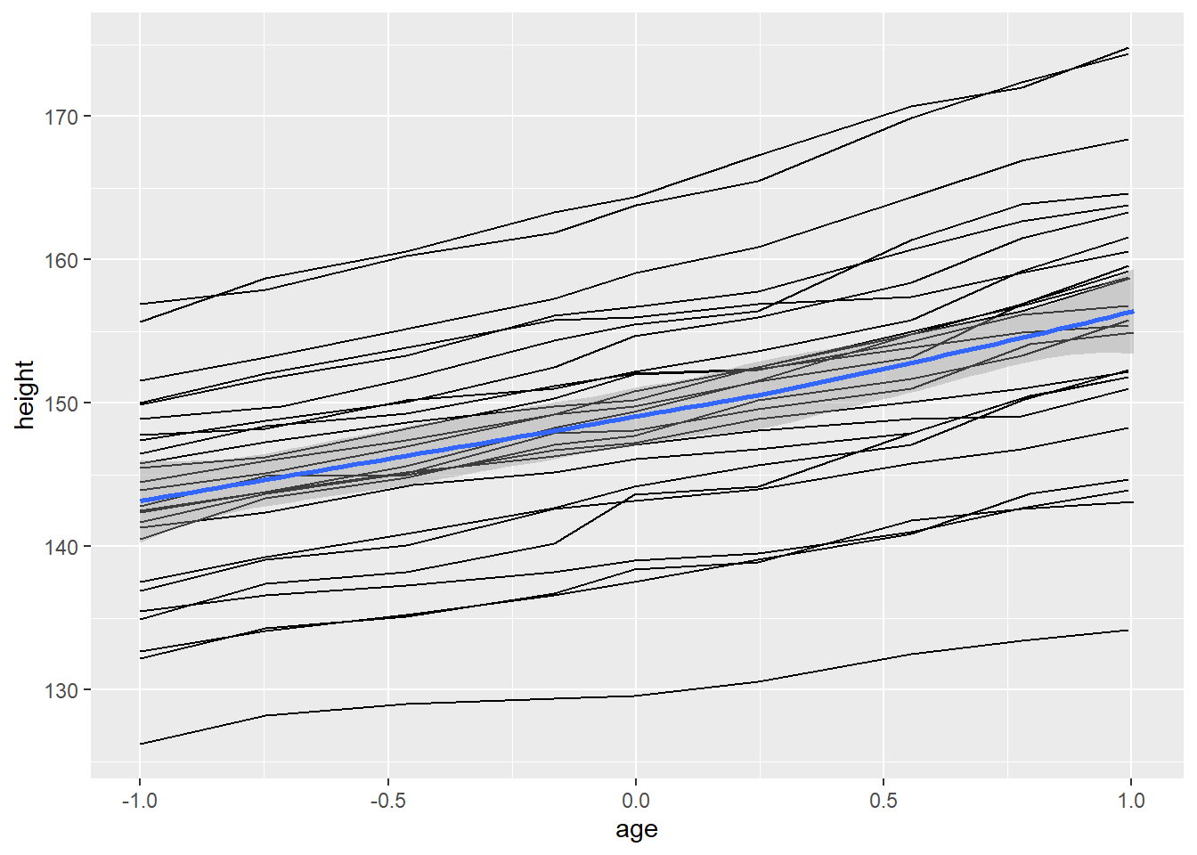
facet is also useful for visualizing longitudinal data
9) coordinate system(coords)
used to organize the geometric objects
2. qplot()
qplot() makes it easy to produce complex plots
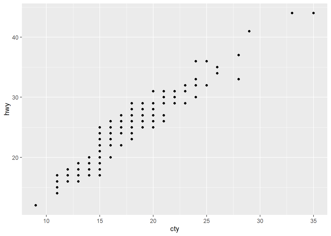
1) Scatterplots
used to show the relationship between two numerical variables


## `geom_smooth()` using formula 'y ~ x'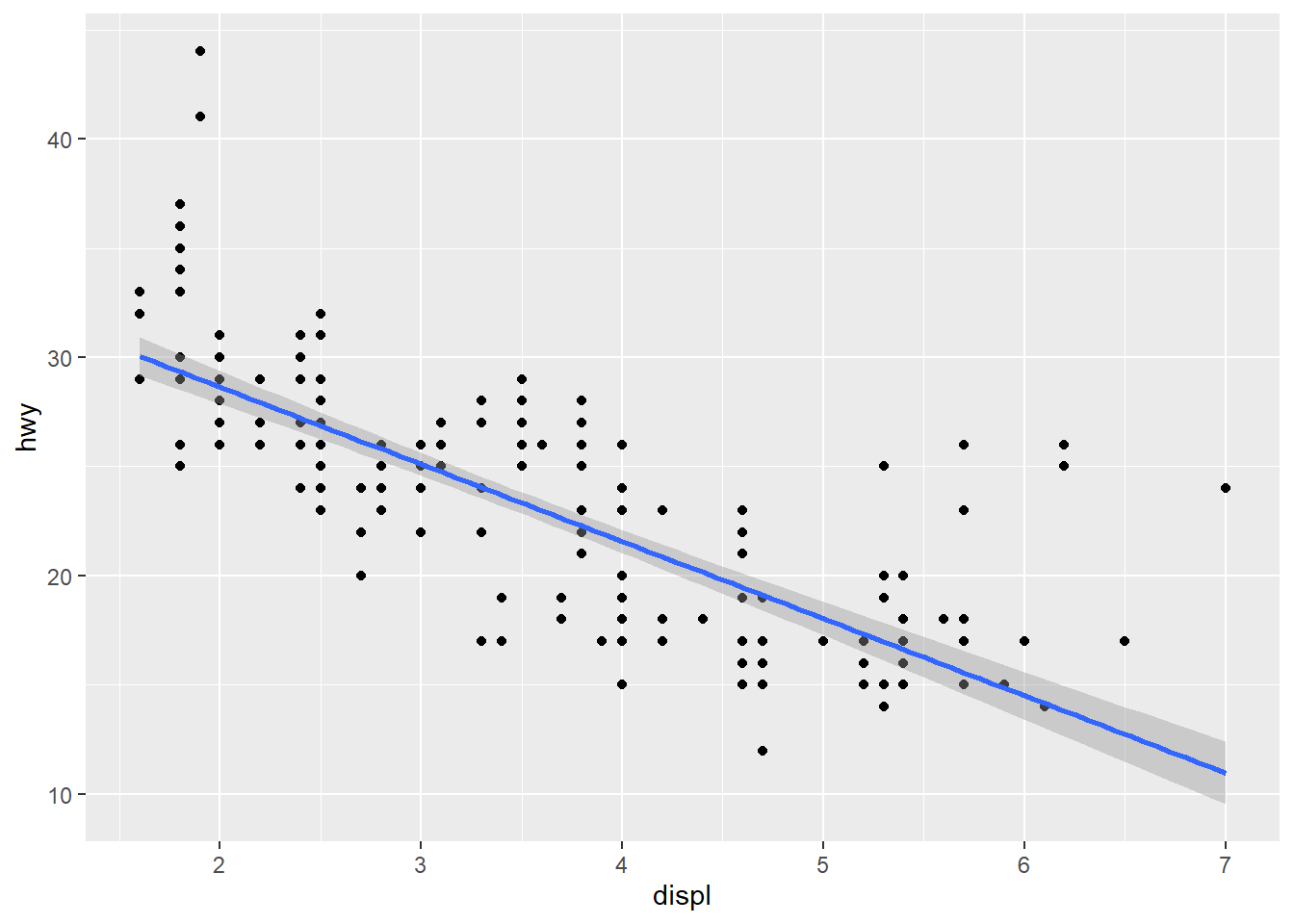
## `geom_smooth()` using method = 'loess' and formula 'y ~ x'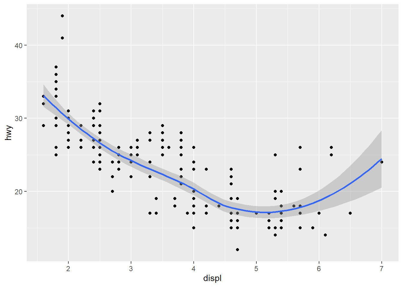
2) Histogram
used to show the distribution of a numerical variable
## `stat_bin()` using `bins = 30`. Pick better value with `binwidth`.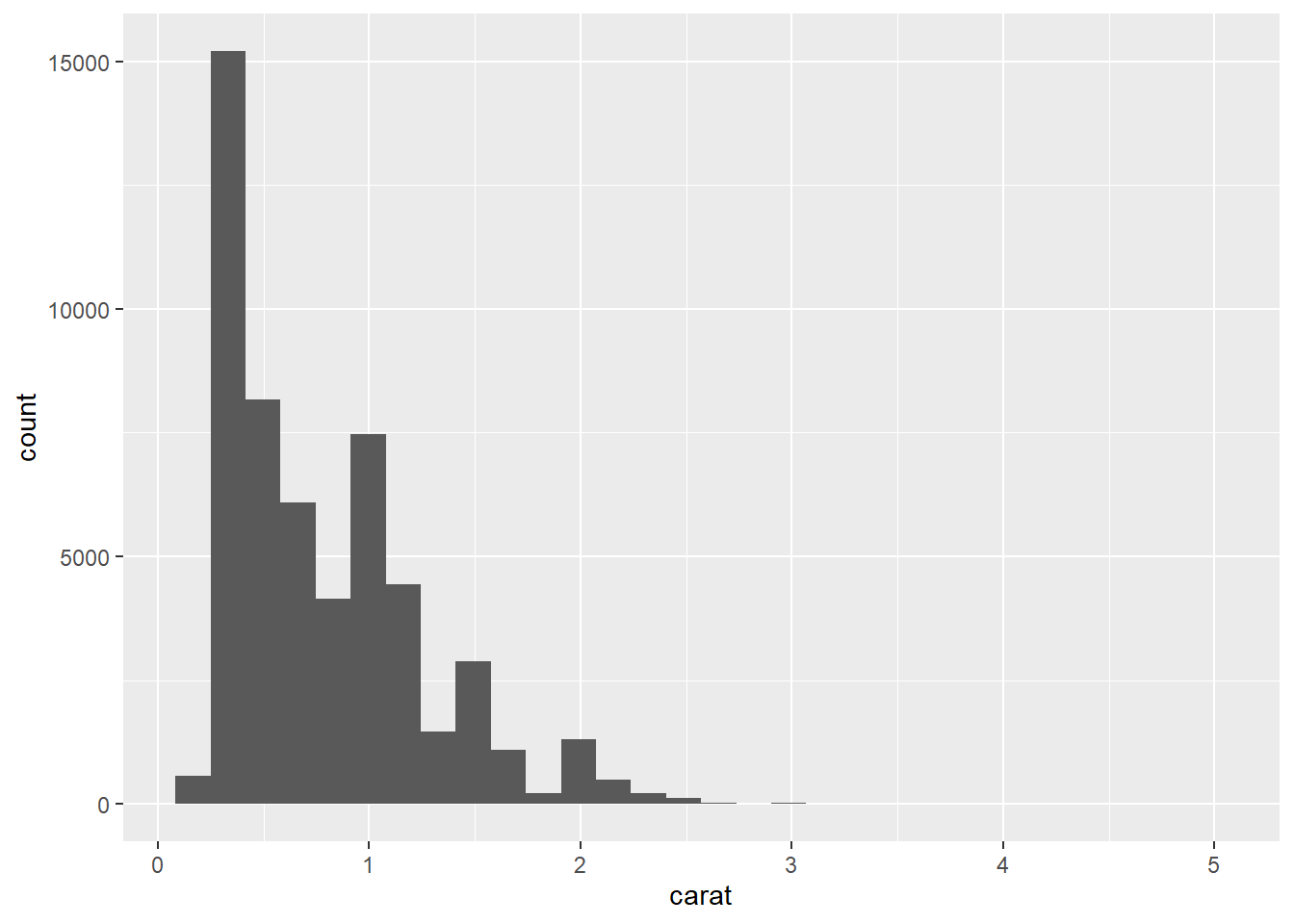
## `stat_bin()` using `bins = 30`. Pick better value with `binwidth`.
## Warning: Removed 32 rows containing non-finite values (stat_bin).## Warning: Removed 2 rows containing missing values (geom_bar).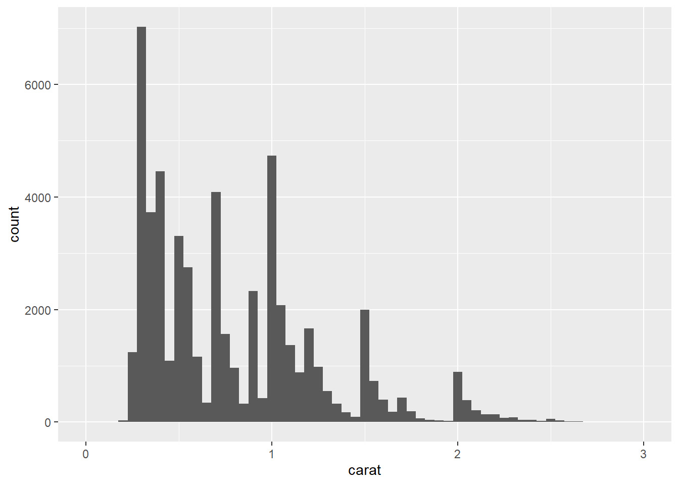
## Warning: Removed 32 rows containing non-finite values (stat_bin).## Warning: Removed 2 rows containing missing values (geom_bar).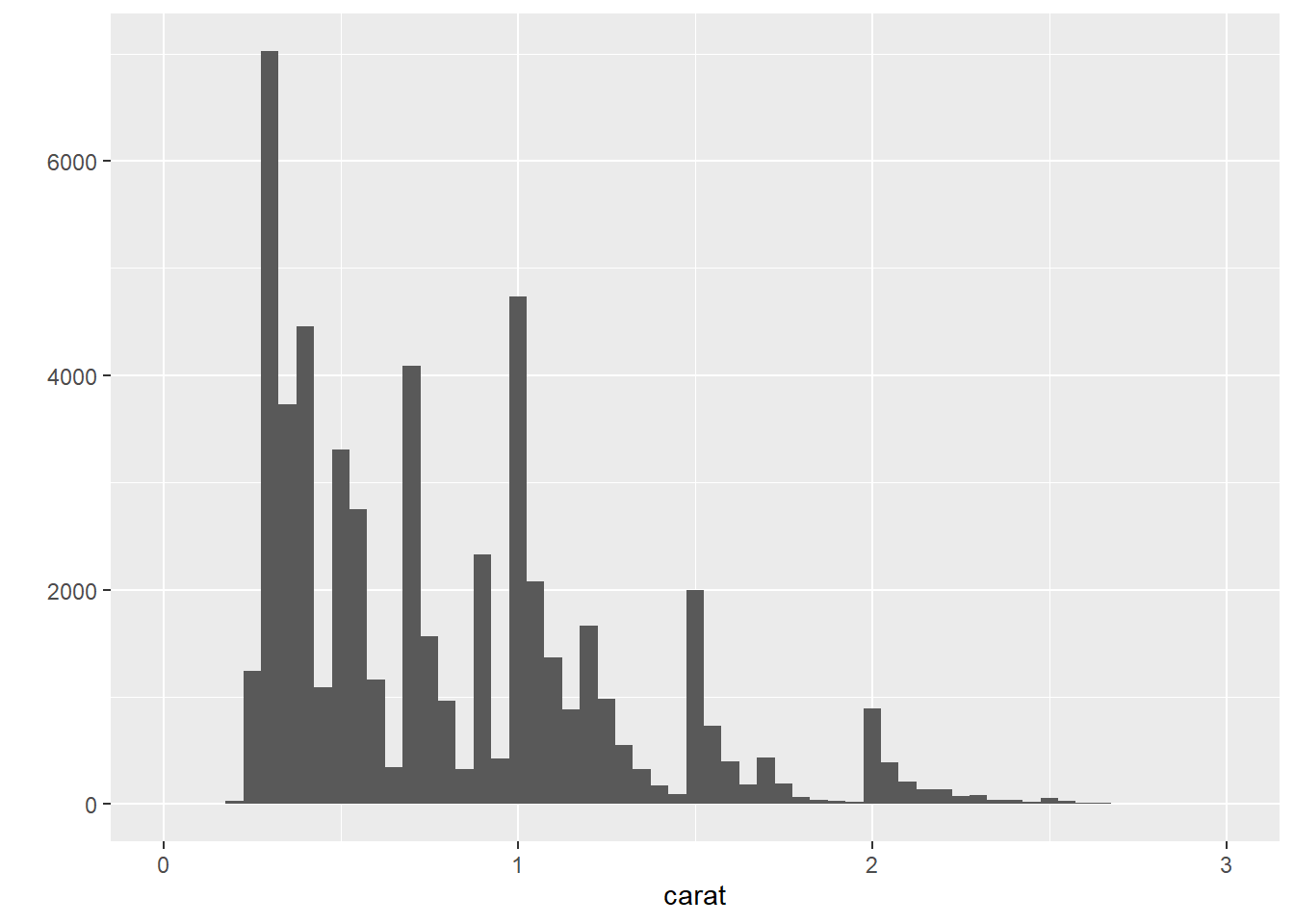
## `stat_bin()` using `bins = 30`. Pick better value with `binwidth`.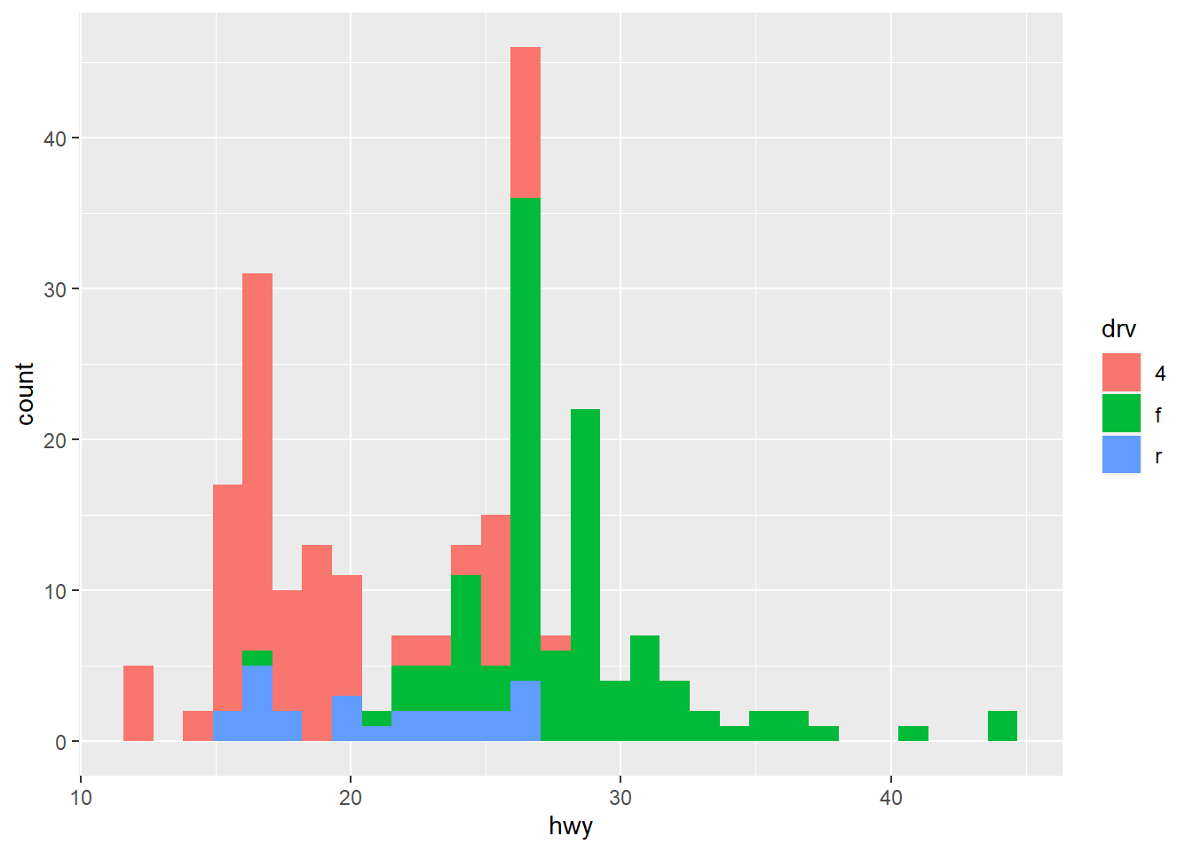
## `stat_bin()` using `bins = 30`. Pick better value with `binwidth`.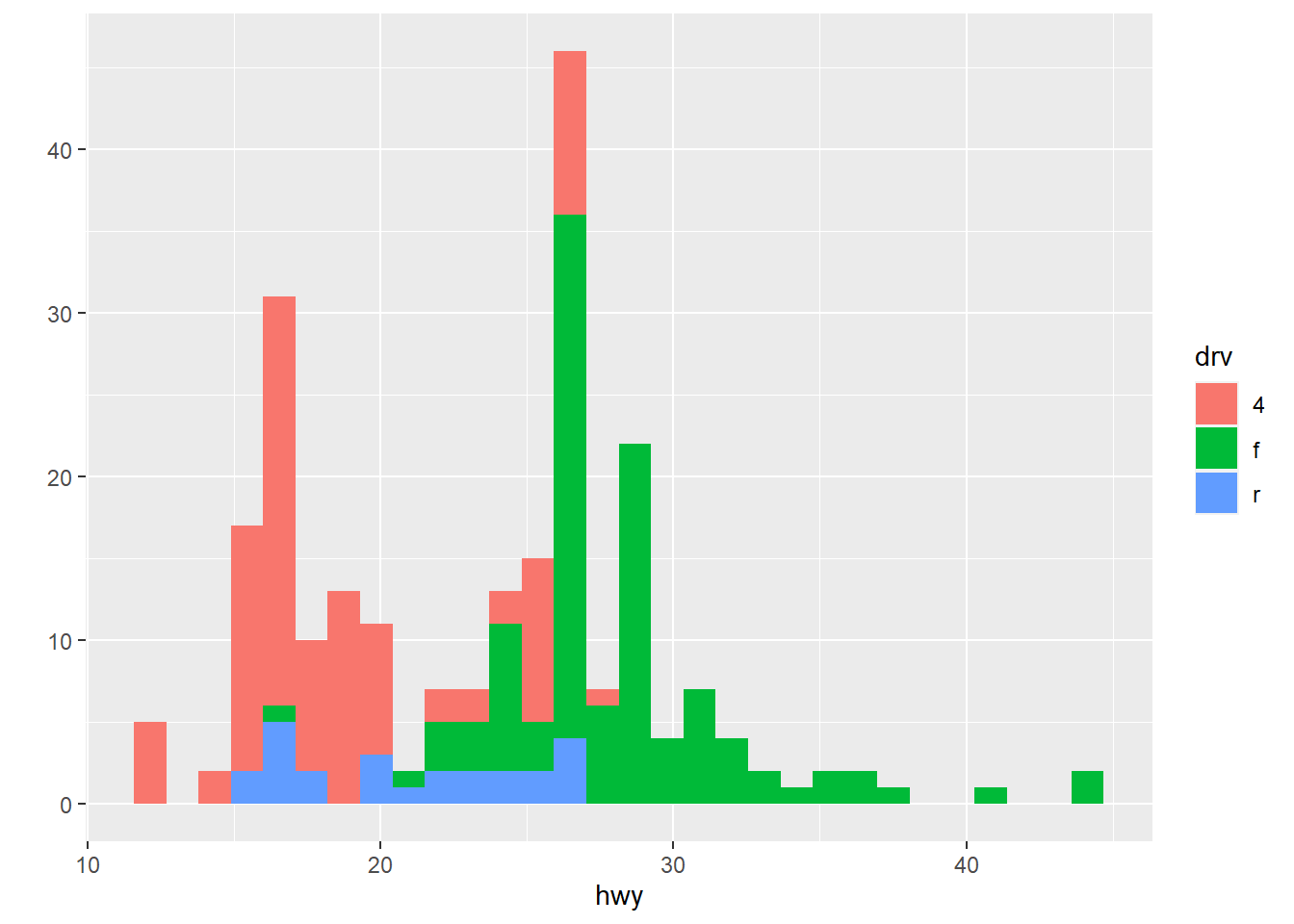
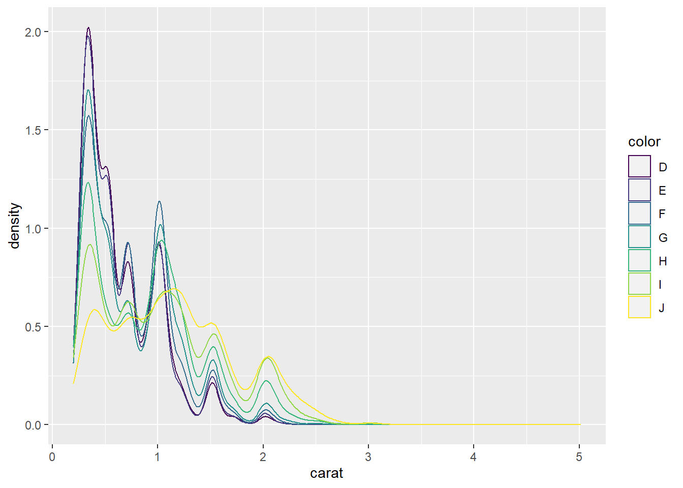
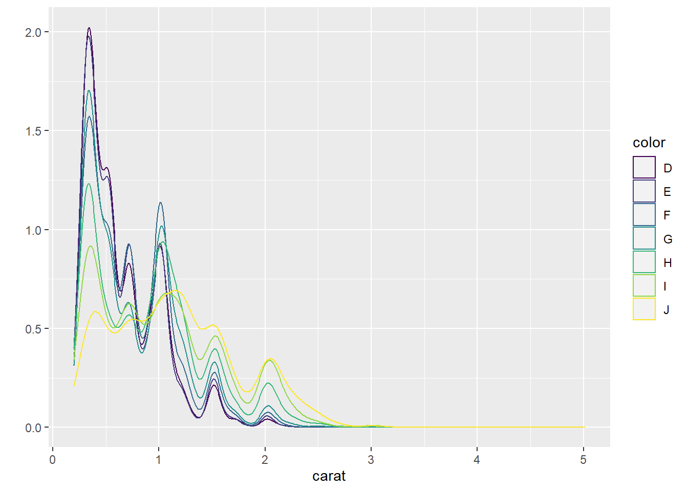
3) Density plots
used to show the distribution of a numerical variable
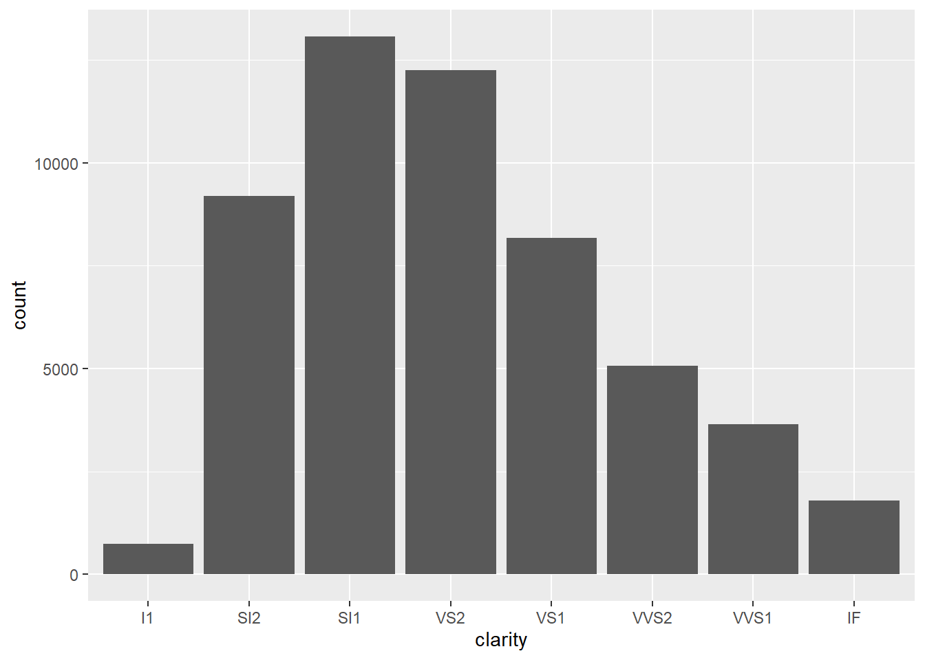
4) Barplots
used to show the distribution of a categorical variable
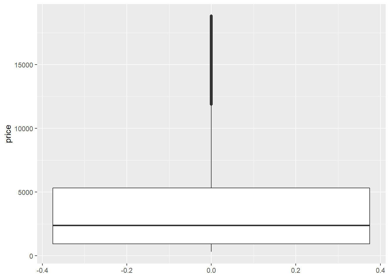
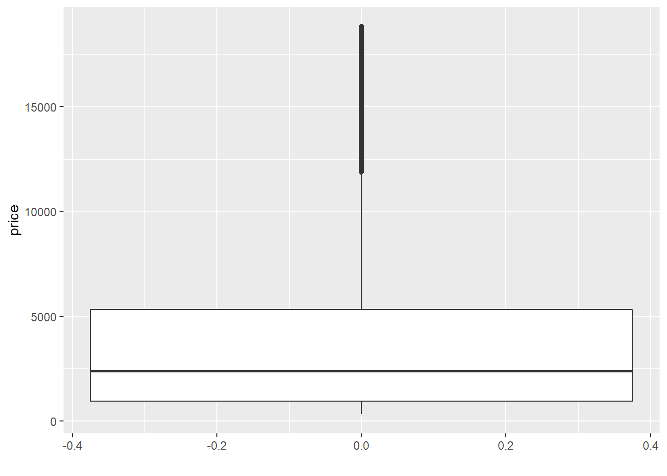
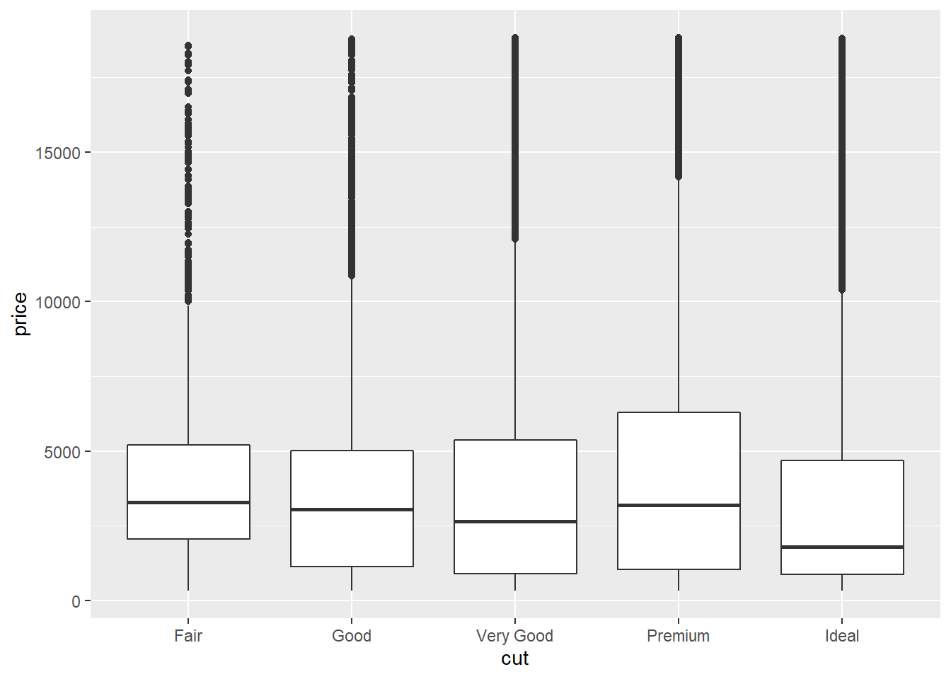
5) Boxplots
used to show a distribution of a numerical data based on five number summary(minimum, first quartile Q1, median, third quartile Q3, and maximum)
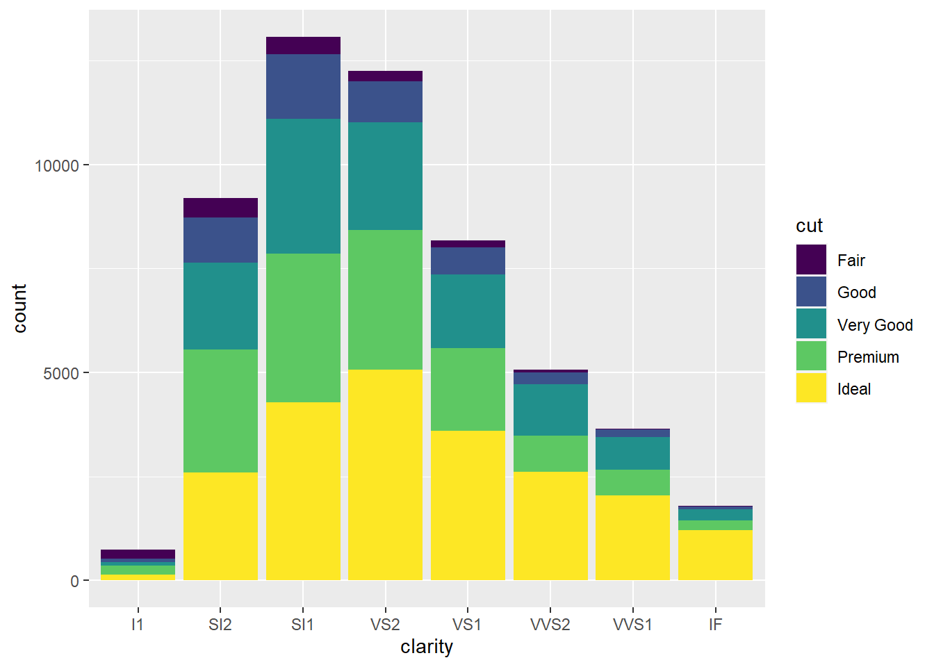
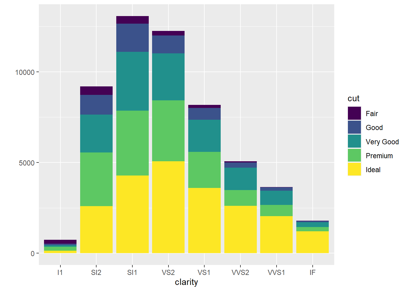
6) Faceting

3. Themes
way to customize the non-data components of your plots (ex. titles, labels, fonts, background, gridlines, and legends)
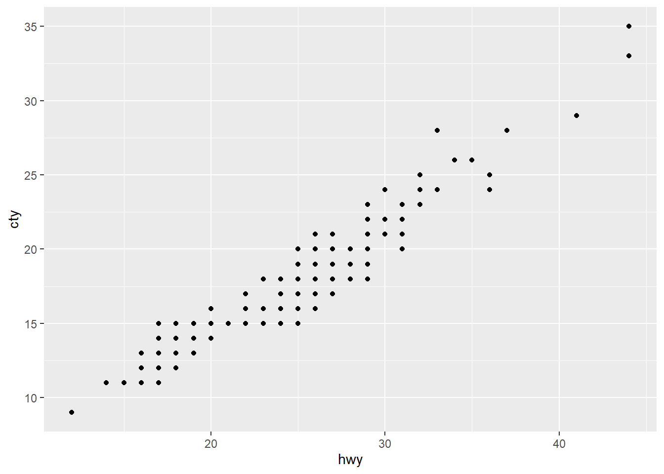
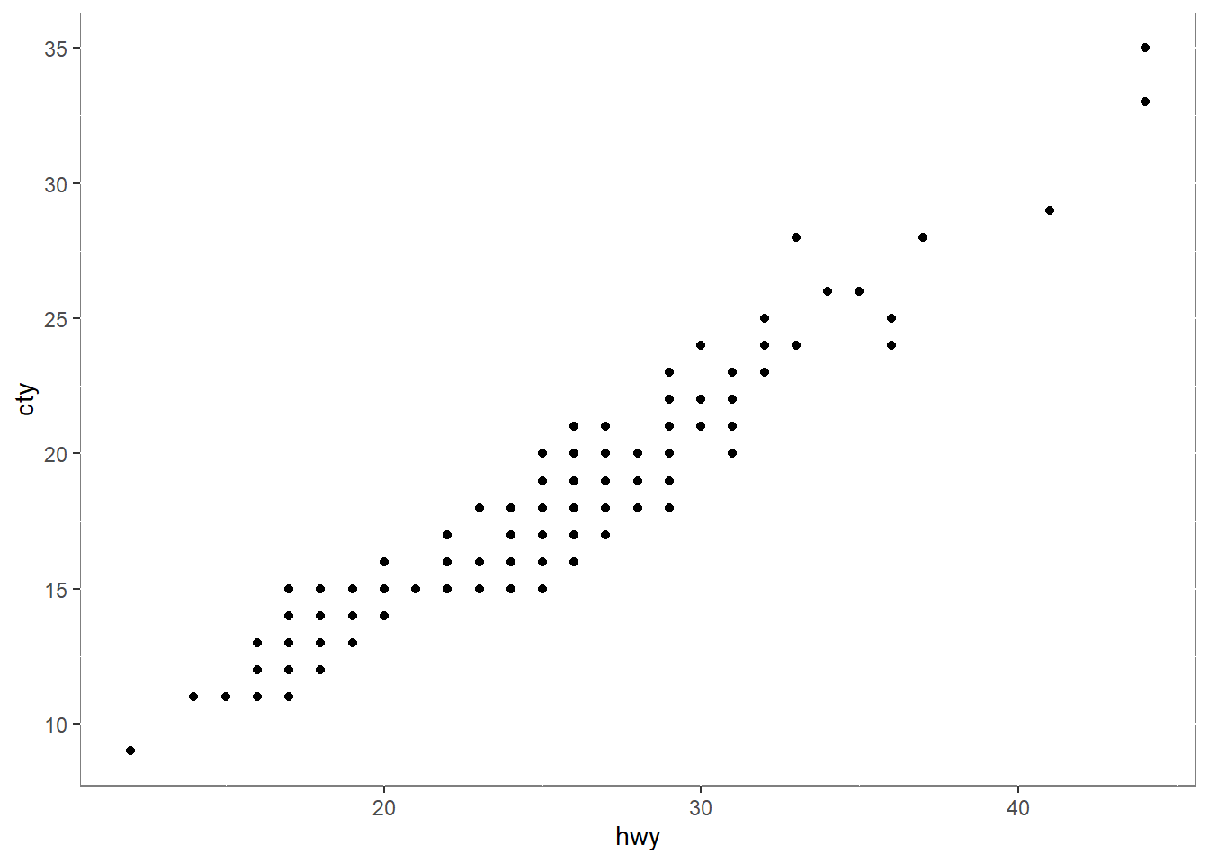
ggplot(mpg, aes(x = hwy, y = cty)) + geom_point() +
  theme(panel.background = element_rect(fill = "white", colour = "grey50"))