Chapter 8 Data visualisation
One of R’s main strengths is undoubtedly its wide arsenal of data visualisation functions. There are multiple packages dedicated to all sorts of visualisation techniques, from basic plots, to complex graphs, maps, and animations. Arguably the most popular package in psychology and data science is ggplot2 (gg stands for “grammar of graphics”) we’ve already briefly mentioned. It is a part of the tidyverse suite so once you’ve installed and loaded that, you don’t need to worry about ggplot2.
8.1 qplot()
ggplot2 provides two main plotting functions: qplot() for quick plots useful for data exploration and ggplot() for fully customisable publication-quality plots. Let’s first look at qplot()
This is basically a ggplot2 alternative to base R’s general purpose plotting function plot(). When you use it, it will try to guess what kind of plot you likely want based on the type of data you provide. If we give it a single numeric vector (or column), we will get a histogram:
qplot(rnorm(100))## `stat_bin()` using `bins = 30`. Pick better value with `binwidth`.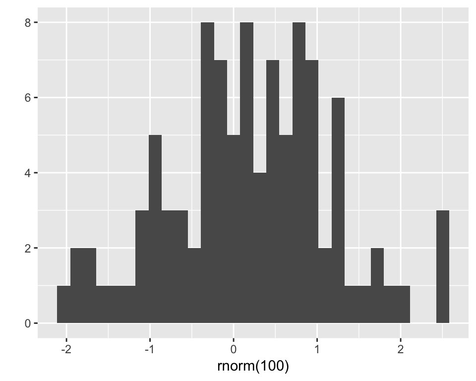
If we give it a categorical variable (character vector or factor), it will give us a bar chart:
x <- sample(LETTERS[1:4], 100, replace = T)
x
## [1] "C" "D" "A" "D" "D" "C" "B" "D" "A" "C" "D" "B" "C" "C" "B" "C" "C"
## [18] "C" "C" "D" "B" "B" "D" "B" "C" "A" "B" "D" "D" "A" "A" "D" "A" "D"
## [35] "C" "C" "A" "C" "B" "D" "B" "C" "B" "B" "A" "D" "C" "D" "C" "B" "D"
## [52] "D" "C" "B" "B" "D" "D" "A" "D" "D" "D" "D" "B" "D" "D" "A" "D" "D"
## [69] "B" "D" "A" "B" "A" "C" "A" "B" "D" "D" "B" "A" "A" "B" "A" "B" "A"
## [86] "B" "B" "D" "A" "B" "A" "D" "C" "C" "D" "A" "A" "D" "C" "A"qplot(x)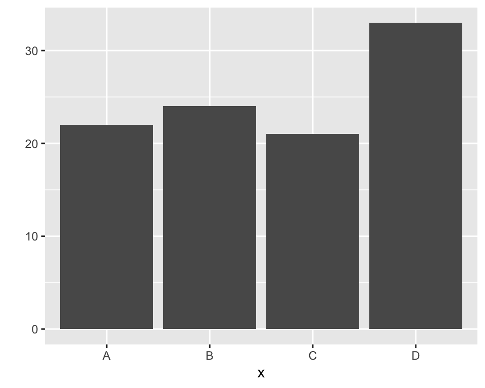
Two continuous variables will produce a scatterplot:
y <- rnorm(100)
z <- .7 * y + rnorm(100) # two correlated variables

qplot(y, z)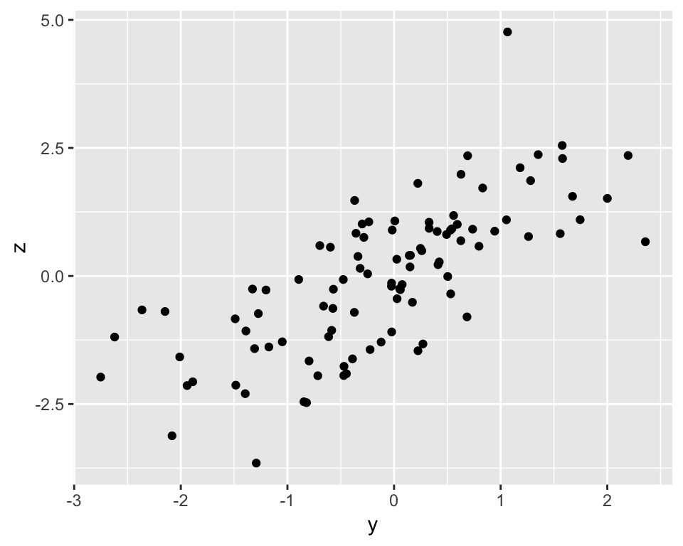
The function takes many arguments that can be used to customise the plots and select what type of plot to display (see ?qplot for details). The geom = argument specifies which plotting element (geom) to use. For instance, if we want a boxplot of a continuous variable by categorical variable, we can do:
qplot(x, y, geom = "boxplot")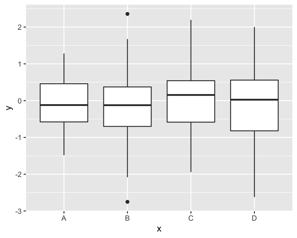
We can specify several geoms in a single qplot. For example, we may want to overlay a regression line over our scatterplot. To do this, we need to tell qplot() to use both geom point and geom smooth. Moreover, we want to specify that the method for the smoother (the function that draws the line) is the linear model “lm”. (Try omitting the method = argument and see what happens)
qplot(y, z, geom = c("point", "smooth"), method = "lm")## Warning: Ignoring unknown parameters: method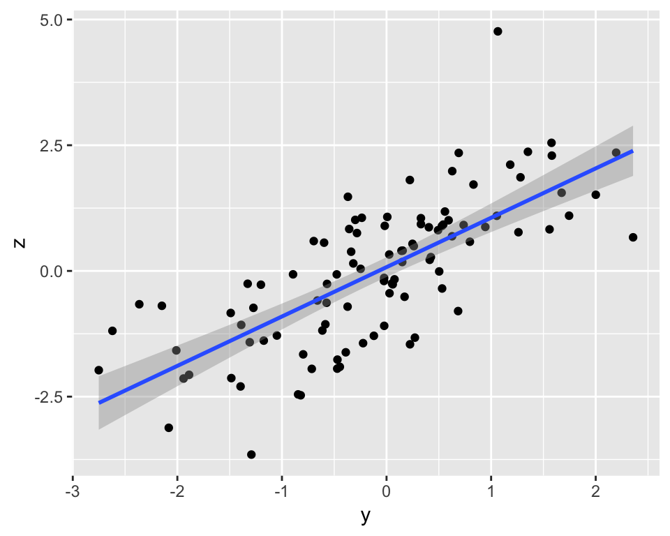
You can actually do quite a bit more with just qplot() but the main workhorse of the package is the ggplot() function.
8.2 ggplot()
Unlike qplot(), plots with ggplot() are constructed in a layered fashion. The bottom layer constructs the plotting space to which you then add layers of geoms, legends, axes, and what not. Let’s use our df_long data set from earlier to illustrate this system of layers.
To refresh your memory, this is what the first 6 rows of the data set look like:
head(df_long)## ID age time score
## 1 1 27.40234 1 1
## 2 2 22.26648 1 1
## 3 3 21.51467 1 2
## 4 4 27.07017 1 3
## 5 5 26.21972 1 2
## 6 1 27.40234 2 2Let’s start with a simple histogram of the score variable:
ggplot(df_long, aes(score)) +
  geom_histogram()
## `stat_bin()` using `bins = 30`. Pick better value with `binwidth`.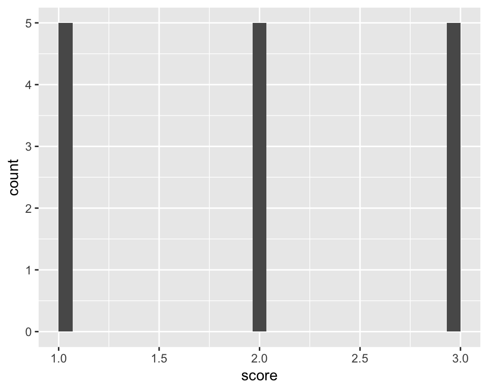
First, we used the ggplot() function to define the plotting space. We told it to work with df_long and map the score variable as the only “aesthetic”. In ggplot2 jargon, any variable that’s supposed to be responsive to various plotting functions needs to be defined as an aesthetic, inside the aes() function. The second layer tells ggplot() to add a histogram based on the variable in aes(), i.e., score.
Similarly to qplot(), we can create a scatterplot by mapping 2 variables to aes() and choosing geom_point() as the second layer:
ggplot(df_long, aes(age, score)) +
  geom_point()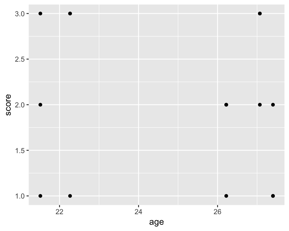
Do we want to change the colour, size, or shape of the points? No problem:
ggplot(df_long, aes(age, score)) +
  geom_point(colour = "blue", size = 4, pch = 2)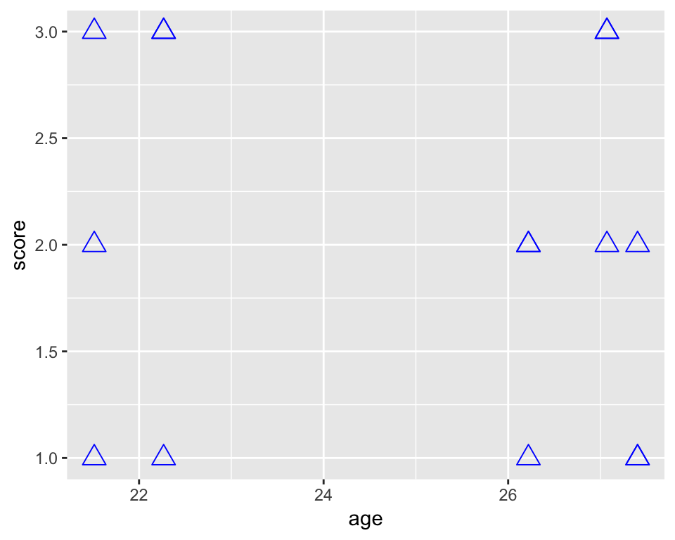
What if you want to colour the points by measurement time? To do this, we need to specify colour as an aesthetic mapping it to the desired variable:
ggplot(df_long, aes(age, score)) +
  geom_point(aes(colour = time))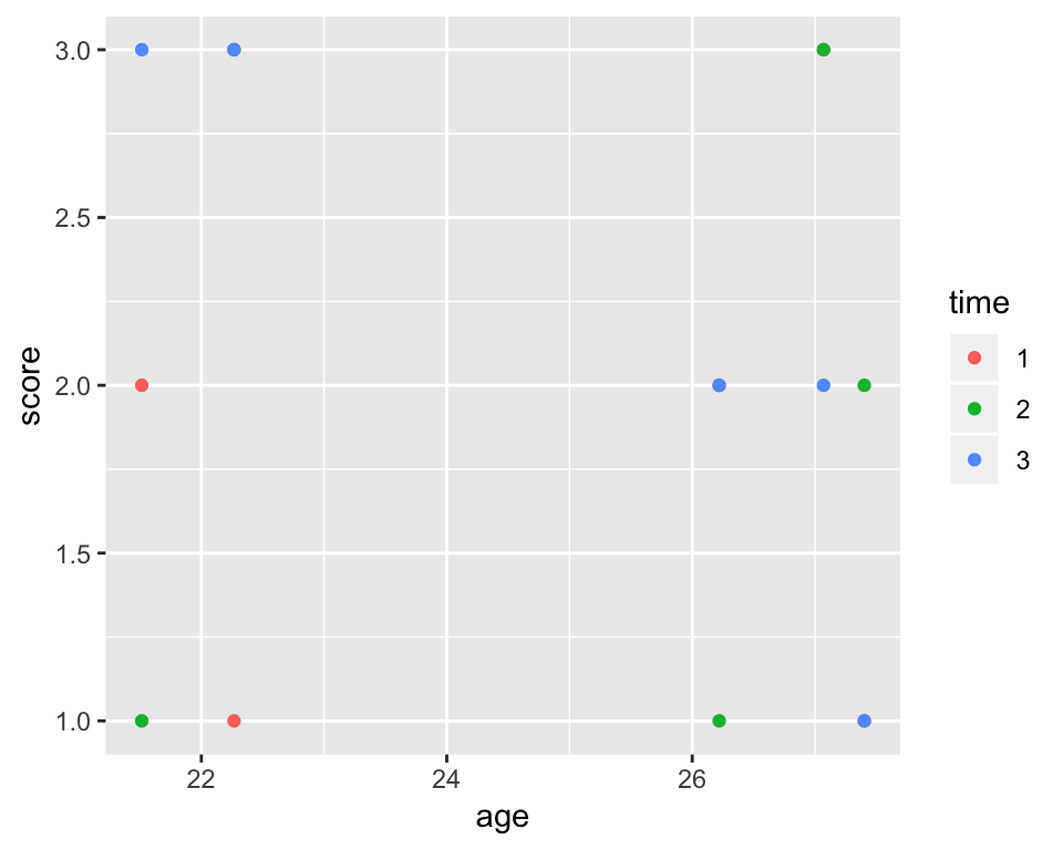
In this case, it doesn’t really matter if you put the individual aesthetics inside of the ggplot() or the geom_point() function. The difference is that whatever you put into the topmost layer (ggplot()) will get passed on to all the subsequent geoms, while the aesthetic you give to a particular geom will only apply to it. To illustrate this point, let’s add a regression line:
ggplot(df_long, aes(age, score)) +
  geom_point(aes(colour = time)) + geom_smooth(method = "lm")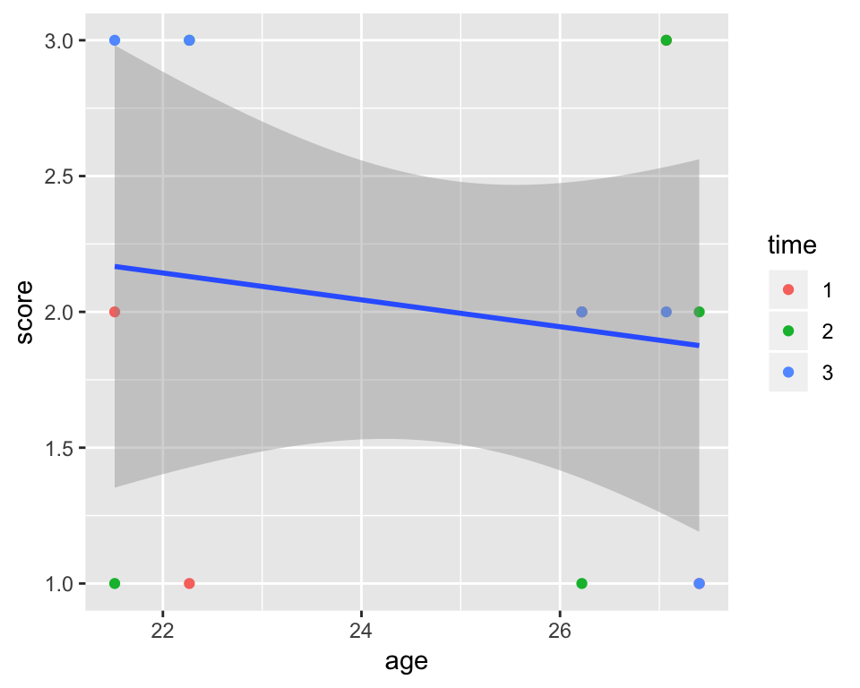
Since colour = time is given to geom_point(), it doesn’t impact geom_smooth() which only draws one line. If we want geom_smooth to draw one line per time point, we can just move the colour = argument to the topmost ggplot() layer:
ggplot(df_long, aes(age, score, colour = time)) +
  geom_point() + geom_smooth(method = "lm")
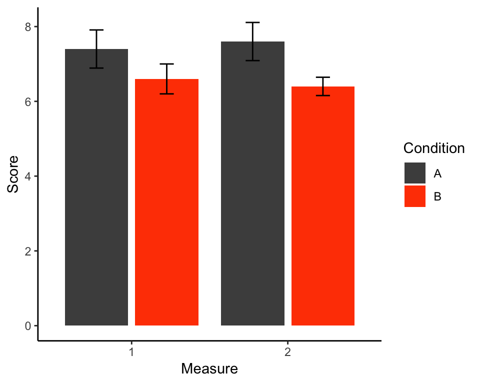
Here is an example of a standard publication-ready grouped bar plot with error bars presenting a neat representation of a \(2\times 2\) design. The data we’re plotting comes from the my_data_long data set we created at the bottom of the “Wide to long” section above.
Recall that the data set looks like this:
head(my_data_long)## id age condition measure score
## 1 1 23.71973 A 1 9
## 2 2 24.32916 A 1 7
## 3 3 27.15282 A 1 7
## 4 4 27.52434 A 1 8
## 5 5 24.61493 A 1 6
## 6 1 23.71973 A 2 8Let’s walk through the creation of this plot step by step. First of all, we need to create the summary data used for the plot. We need the mean score per condition per measure which determines the heights of the bars. For the error bars, we need to calculate the standard error according to the formula:
\[SE = \frac{\sigma}{\sqrt{n}}\]
where \(\sigma\) is the standard deviation and \(n\) is the number of observations per each combination of condition and measure.
To do this, we can use the tidyverse functions group_by() and describe() introduce earlier:
plot_data <- my_data_long %>% group_by(condition, measure) %>%
  summarise(mean_score = mean(score),
            se = sd(score)/sqrt(n())) # n() - function that counts number of cases

plot_data
## # A tibble: 4 x 4
## # Groups: condition [2]
## condition measure mean_score se
## <chr> <int> <dbl> <dbl>
## 1 A 1 7.4 0.510
## 2 A 2 7.6 0.510
## 3 B 1 6.6 0.40
## 4 B 2 6.4 0.245Currently the measure column of plot_data is a numeric variable. Let’s change it to factor:
plot_data$measure <- factor(plot_data$measure)OK, that’s the preparation done. Let’s start building our plot, saving it into an object called p. The lowest layer will define the variables we’re plotting and specify grouping by condition:
p <- ggplot(plot_data, aes(x = measure, y = mean_score, fill = condition))

p
As you can see, this layer prepares the groundwork for the plot. The fill = argument is used to tell ggplot() that we want the bars to be filled using different colour by condition. Lets add the first plotting layer containing the bars and see what happens:
p + geom_bar(stat = "identity")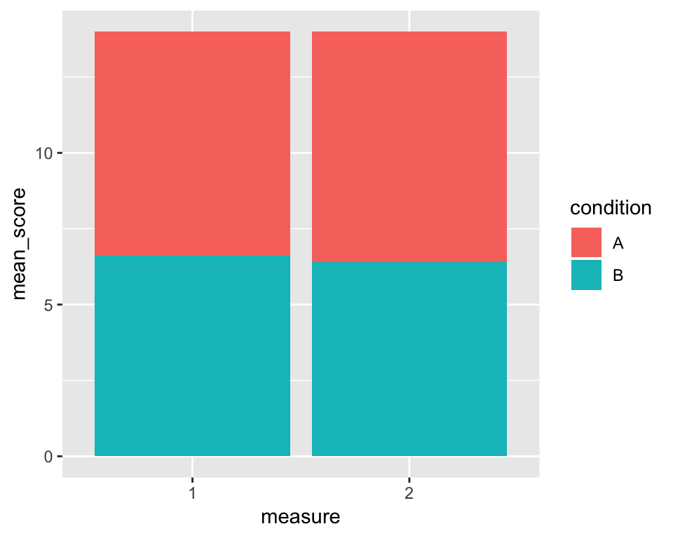
Cool, we have ourselves a stacked bar chart. The stat = argument tells R what statistical transformation to perform on the data. If we were working with raw data, we could use the mean, for example. But since our plot_data data frame contains the means we want to plot, we need to tell R to plot these values (“identity”).
We also want the bars to be side by side rather than stacked atop one another. To do that, we specify the position = argument to the value “dodge2”. This will put them side by side but, as opposed to “dodge” will put a small gap between the unstacked bars (it just looks a bit nicer that way):
p <- p +  geom_bar(stat = "identity", position = "dodge2")
p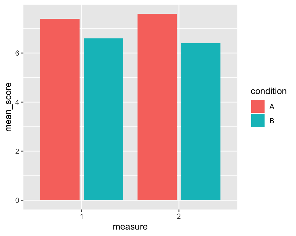
Nice! Now to add the error bars, we need to provide new aesthetics to the geom_errorbar layer, namely ymin and ymax defining the lower and upper edges of the bars respectively. The lower bound of the bars should be the mean \(-\) standard deviation and the upper bound mean + standard deviation:
p + geom_errorbar(aes(ymin = mean_score - se, ymax = mean_score + se))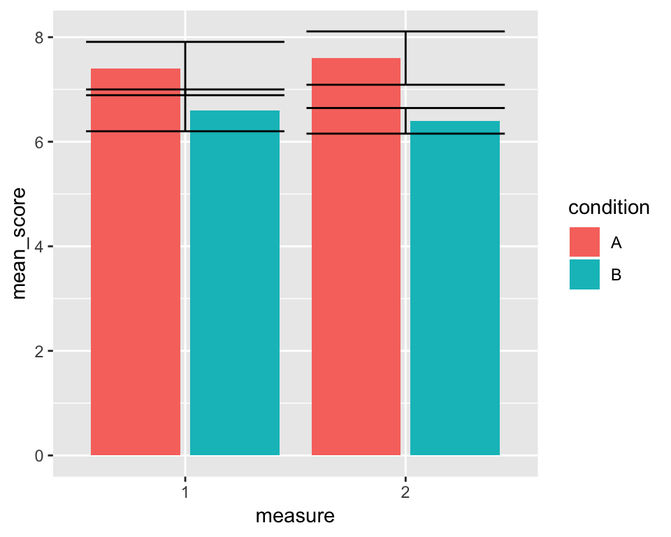
Not quite perfect… The 4 error bars are drawn in 2 positions rather than in the middle of each corresponding bar. To get them in the right place, we need to specify the position = argument using the position_dodge2() function. The difference between "dodge2" and position_dodge2() is that the former is only a shorthand for the latter and it doesn’t allow us to change the default settings of the function. However, we don’#t just want to put the error bars in the right place, we also want them to be a little thinner. To do that, we can say, that 80% of the space they now occupy should be just padding, thereby shrinking the width of the error bars:
p <- p + geom_errorbar(aes(ymin = mean_score - se, ymax = mean_score + se),
                       position = position_dodge2(padding = .8))

p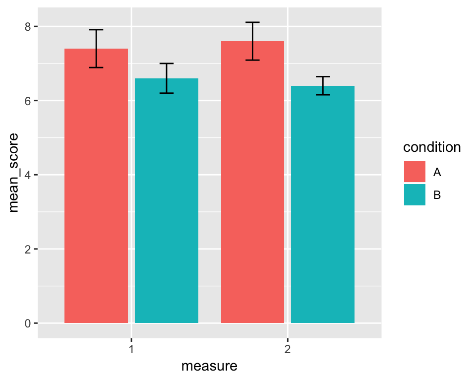
Much better. In fact, this is all the hard work done, the rest is just cosmetics. For instance, we can change the axis labels to make them look better:
p <- p + labs(x = "Measure", y = "Score")

p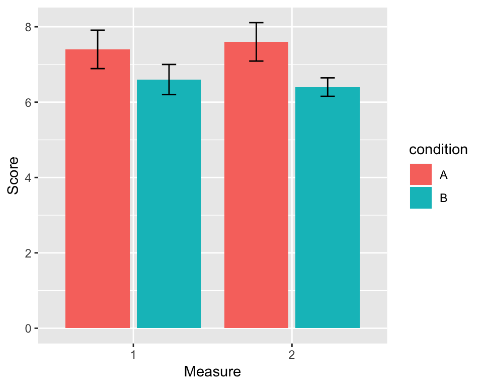
Next, we can manually change the colours and the title of the legend like this:
p <- p + scale_fill_manual(values = c("grey30", "orangered"), name = "Condition")

p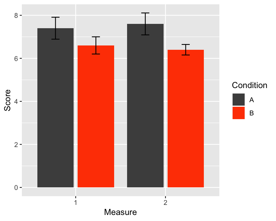
And finally, we can give the plot a bit more of a classic look using theme_classic() (other themes are available and you can even create your own):
p <- p + theme_classic()
p
If we now want to, we can export the plot as a .png file using the ggsave() function.
ggsave("pretty_plot.png", p)Because ggplot2 is designed to work well with the rest of tidyverse, we can create the whole plot including the data for it in a single long pipeline starting with my_data_long (or even my_data, if you want):
my_data_long %>%
  group_by(condition, measure) %>%
  summarise(mean_score = mean(score),
            se = sd(score)/sqrt(n())) %>%
  mutate(measure = as.factor(measure)) %>%
  ggplot(aes(x = measure, y = mean_score, fill = condition)) +
  geom_bar(stat = "identity", position = "dodge2") +
  geom_errorbar(aes(ymin = mean_score - se, ymax = mean_score + se),
                position = position_dodge2(padding = .8)) +
  labs(x = "Measure", y = "Score") +
  scale_fill_manual(values = c("grey30", "orangered"), name = "Condition") +
  theme_classic()
An interesting thing to point out about ggplot() is that the layers are literally built one on top of another and they are not transparent. So, if you want the error bars to be sticking out of the columns without the lower halves of the bars visible, you can first build the geom_errorbar() layer and put the geom_bar() layer on top of it:
plot_data %>%
  ggplot(aes(x = measure, y = mean_score, fill = condition)) +
  geom_errorbar(aes(ymin = mean_score - se, ymax = mean_score + se),
                position = position_dodge2(padding = .8)) +
  geom_bar(stat = "identity", position = "dodge2") +
  labs(x = "Measure", y = "Score") +
  scale_fill_manual(values = c("grey30", "orangered"), name = "Condition") +
  theme_classic()
The logic behind building ggplot() graphs should now start making sense. Admittedly, it takes a little practice and a lot of online resources to feel reasonably confident with the package but once you get there, you will be able to create really pretty plots of arbitrary level of complexity. A good resource to refer to is the ggplot2 website, where you can find all the other geoms we don’t have the space to cover along with examples.