Chapter 15 Data visualization
15.1 Introduction
Effective data visualization is essential for presenting findings in research papers. A well-crafted figure conveys complex data quickly and clearly, enabling readers to grasp key insights at a glance. This chapter explores how to create common figure types—bar plots, scatter plots, line charts, and violin plots—using R’s versatile ggplot2 package.
15.2 Setting Up the Environment
Install and load ggplot2 if it’s not already available:
15.2.1 Bar Plot
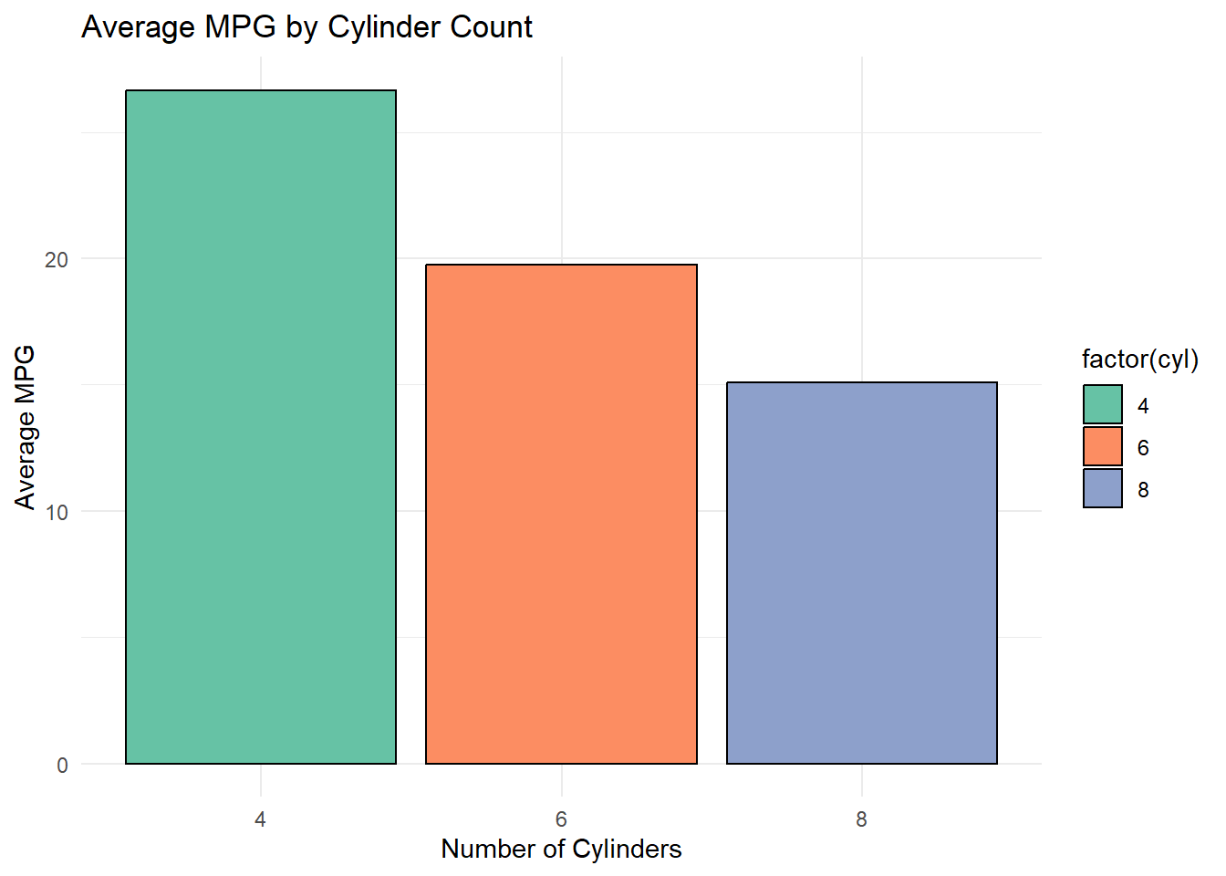
Bar plots are widely used to compare categorical data or summary statistics like means.
Example Dataset:
We’ll use the built-in mtcars dataset to visualize the average miles-per-gallon (mpg) grouped by the number of cylinders.
# Summarize data
data_bar <- mtcars %>%
  group_by(cyl) %>%
  summarise(mean_mpg = mean(mpg))

# Create bar plot
ggplot(data_bar, aes(x = factor(cyl), y = mean_mpg, fill = factor(cyl))) +
  geom_bar(stat = "identity", color = "black") +
  labs(title = "Average MPG by Cylinder Count",
       x = "Number of Cylinders",
       y = "Average MPG") +
  theme_minimal() +
  scale_fill_brewer(palette = "Set2")
15.2.2 Scatter Plot
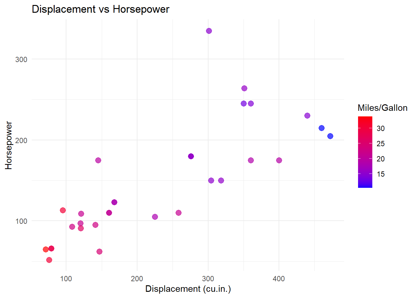
Scatter plots are used to display the relationship between two continuous variables.
Example Dataset:
We’ll examine the relationship between engine displacement (disp) and horsepower (hp).
# Create scatter plot
ggplot(mtcars, aes(x = disp, y = hp, color = mpg)) +
  geom_point(size = 3, alpha = 0.7) +
  labs(title = "Displacement vs Horsepower",
       x = "Displacement (cu.in.)",
       y = "Horsepower",
       color = "Miles/Gallon") +
  theme_minimal() +
  theme(legend.position = "right") +
  scale_color_gradient(low = "blue", high = "red")
15.2.3 Line Chart
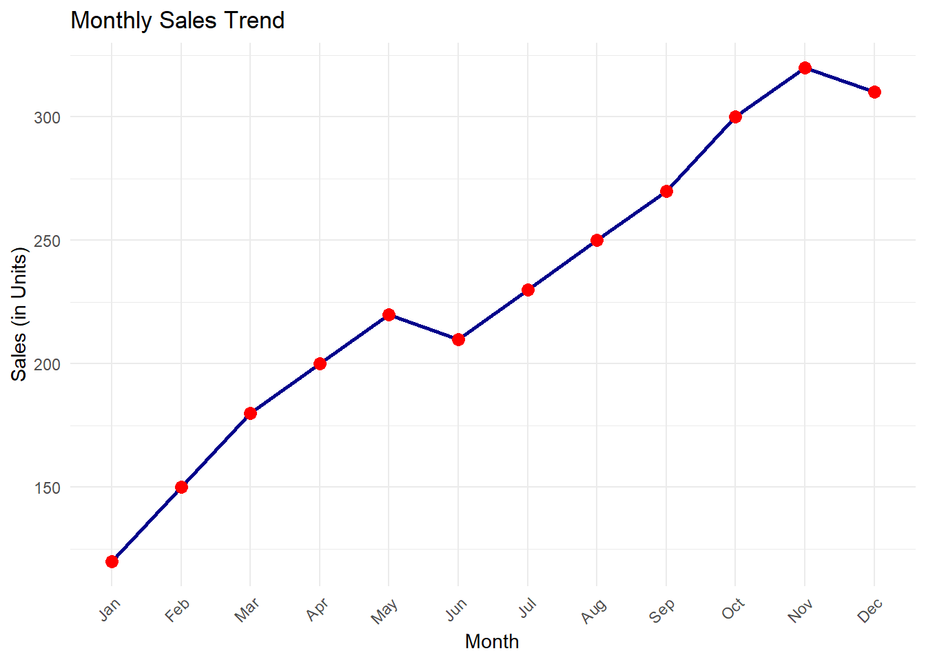
Line charts are ideal for visualizing trends over time or sequences.
Example Dataset:
We’ll use a custom dataset simulating a time series of sales data.
# Create sample time series data
time_series <- data.frame(
  Month = factor(1:12, labels = month.abb),
  Sales = c(120, 150, 180, 200, 220, 210, 230, 250, 270, 300, 320, 310)
)

# Create line chart
ggplot(time_series, aes(x = Month, y = Sales, group = 1)) +
  geom_line(color = "darkblue", size = 1) +
  geom_point(size = 3, color = "red") +
  labs(title = "Monthly Sales Trend",
       x = "Month",
       y = "Sales (in Units)") +
  theme_minimal() +
  theme(axis.text.x = element_text(angle = 45, hjust = 1))
15.2.4 Violin Plot
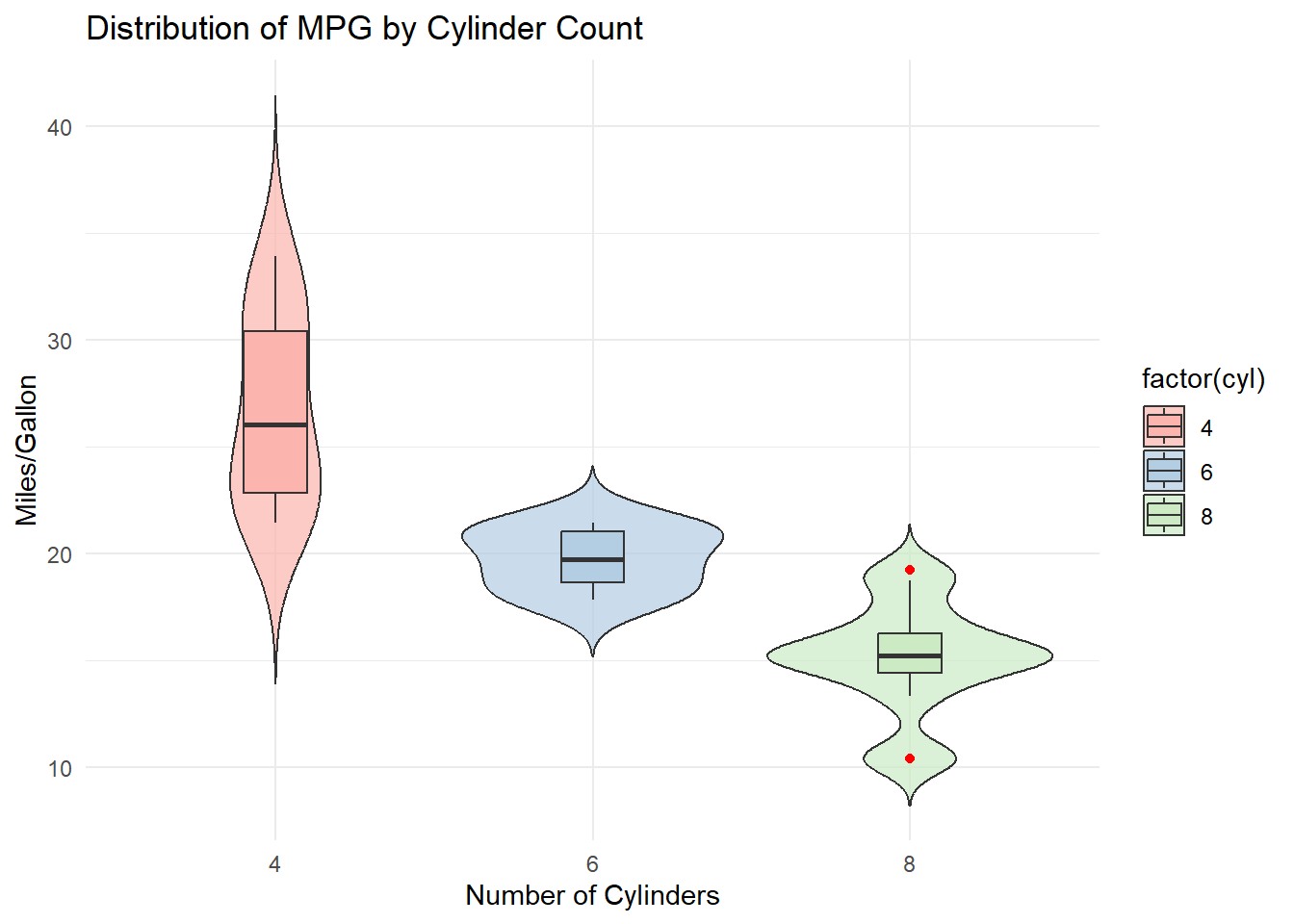
Violin plots combine boxplot-like information with density estimation, offering a detailed view of data distributions.
Example Dataset:
We’ll visualize the distribution of miles-per-gallon (mpg) for cars grouped by the number of cylinders.
# Create violin plot
ggplot(mtcars, aes(x = factor(cyl), y = mpg, fill = factor(cyl))) +
  geom_violin(trim = FALSE, alpha = 0.7) +
  geom_boxplot(width = 0.2, outlier.color = "red") +
  labs(title = "Distribution of MPG by Cylinder Count",
       x = "Number of Cylinders",
       y = "Miles/Gallon") +
  theme_minimal() +
  scale_fill_brewer(palette = "Pastel1")
15.2.5 Customizing Figures for Publication
To ensure figures meet the standards for research papers, consider these tips:
Use Readable Fonts: Increase font sizes for axes and titles using
theme()options, such asaxis.textandaxis.title.Choose Publication-Ready Colors: Use color-blind-friendly palettes from packages like
RColorBrewerorviridis.Save High-Resolution Images: Export plots with high resolution for publication:
15.3 Summary
This chapter demonstrated how to create and customize bar plots, scatter plots, line charts, and violin plots using ggplot2. These versatile tools allow researchers to produce publication-ready figures that effectively communicate their findings.
In your own research, experiment with these visualization techniques to uncover patterns, highlight insights, and share results with clarity and impact.