Chapter 16 Significant Analysis and Visualization
16.1 Introduction
In scientific research, analyzing and presenting significant differences among data groups is a common and critical task. Particularly in the context of publishing SCI papers, the rigor of data analysis and the clarity of its presentation are paramount. Accurate computation of means, variances, and significance levels not only supports experimental conclusions but also provides essential references for future research.
This chapter introduces an efficient workflow using R to perform significance analysis, multiple comparisons, and data visualization. The workflow ensures accuracy and reproducibility while automating tedious steps such as statistical calculations and figure generation. By following this guide, researchers—especially early-career scientists—can streamline their data analysis and visualization tasks.
16.2 Key Concepts in Multiple Comparisons
Before diving into implementation, let’s revisit some fundamental concepts:
Mean and Variance:
Mean represents the central tendency of a dataset, reflecting its overall trend.
Variance measures the dispersion within the data; higher variance indicates greater data variability.
Significance Analysis:
Significance testing determines whether differences among groups are statistically meaningful. Methods like Tukey’s HSD (Honestly Significant Difference) test are commonly used for multiple comparisons, allowing researchers to analyze mean differences across groups.
16.3 Challenges in Manual Analysis
Manual data analysis often involves:
Using multiple software tools (e.g., SAS, SPSS for statistics, Origin for plotting).
Repeatedly transferring results between tools, increasing the risk of errors.
Such workflows are time-consuming and error-prone, especially when analyzing large datasets or complex experimental designs.
16.4 3. Automated Workflow in R
Using R, we can automate the following steps:
Data simulation or preprocessing.
Descriptive statistics (mean and standard deviation).
Significance analysis using ANOVA and Tukey’s HSD test.
Data visualization with annotations for significance levels.
16.5 Data Simulation and Preparation
We’ll simulate an experimental dataset with four groups and three concentration levels, each repeated ten times.
# Load required libraries
library(dplyr)
library(ggplot2)
library(ggpubr)
library(multcomp)
library(multcompView)

# Set random seed for reproducibility
set.seed(123)

# Simulate dataset
groups <- c("Control", "Drug", "Positive", "Negative")
concentrations <- c("Low", "Medium", "High")

data <- expand.grid(Group = groups, Concentration = concentrations, Replicate = 1:10) %>%
  mutate(AntioxidantActivity = rnorm(n(),
                                     mean = 50 + as.numeric(factor(Group)) * 5 +
                                            as.numeric(factor(Concentration)) * 2,
                                     sd = 5))

# Preview the dataset
head(data)
## Group Concentration Replicate AntioxidantActivity
## 1 Control Low 1 54.19762
## 2 Drug Low 1 60.84911
## 3 Positive Low 1 74.79354
## 4 Negative Low 1 72.35254
## 5 Control Medium 1 59.64644
## 6 Drug Medium 1 72.5753216.6 Descriptive Statistics
Compute means and standard deviations for each group and concentration level.
16.7 ANOVA and Tukey’s HSD Test
Perform ANOVA to analyze group and concentration effects, followed by Tukey’s HSD test to identify pairwise differences.
# Perform ANOVA
anova_model <- aov(AntioxidantActivity ~ Group * Concentration, data = data)

# Conduct Tukey HSD test
tukey_result <- TukeyHSD(anova_model)

# Extract significance labels
tukey_letters <- multcompLetters4(anova_model, tukey_result)

# Add significance labels to summary data
summary_data$SigLabel <- NA
summary_data$SigLabel <- with(tukey_letters$`Group:Concentration`,
                              Letters[match(paste(summary_data$Group, summary_data$Concentration, sep = ":"),
                                            names(Letters))])
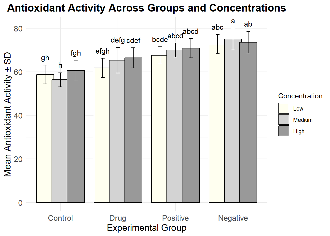
16.8 Visualization with Significance Labels
Generate a grouped bar plot with error bars and annotate it with significance labels.
# Custom color palette
custom_colors <- c("#FFFFF0", "#D3D3D3", "#999999")

# Plot the bar chart
ggplot(summary_data, aes(x = Group, y = Mean, fill = Concentration)) +
  geom_bar(stat = "identity", position = position_dodge(0.8), color = "black") +
  geom_errorbar(aes(ymin = Mean - SD, ymax = Mean + SD),
                position = position_dodge(0.8), width = 0.2) +
  geom_text(aes(y = Mean + SD + 1, label = SigLabel),
            position = position_dodge(0.8), vjust = -0.5, size = 4) +
  scale_fill_manual(values = custom_colors) +
  labs(title = "Antioxidant Activity Across Groups and Concentrations",
       x = "Experimental Group",
       y = "Mean Antioxidant Activity ± SD") +
  theme_minimal() +
  theme(
    plot.title = element_text(hjust = 0.5, size = 16, face = "bold"),
    axis.title = element_text(size = 14),
    axis.text = element_text(size = 12)
  )
16.9 Exporting Results
For publication purposes, save the generated plot and export the summary table.
16.10 Summary
This workflow demonstrates a streamlined approach to significance analysis and visualization using R. By automating calculations, annotations, and figure generation, researchers can focus on interpreting their data rather than navigating cumbersome workflows. This chapter equips you with a reproducible, efficient method to perform robust statistical analyses and generate publication-ready figures for your research.