8 Mapping with R: Geocode and Map the British Library’s Newspaper Collection
R is great for making maps, whether for visualising historical material or doing more advanced analysis. Using an openly available list of British Library titles, with some additional coordinate information, it’s possible to very quickly make high-quality, publishable maps.
8.1 Mapping with ggplot2 and mapdata
8.1.1 A map of British Newspapers by City
With R and ggplot2, it’s possible to quickly map and understand the geographic coverage of the newspapers held by the British Library.
To do this we’ll need three elements:
A background map of the UK and Ireland
A count of the total titles for each city
A list of coordinates for each place mentioned in the title list.
8.2 Drawing a background map. `
The first thing needed, is a background back of the UK, to which points, sized by number of titles, will be added.
The plotting library ggplot2, which is part of the tidyverse package, contains a function called map_data() which turns data from the maps library into a dataframe. The usual functions of ggplot2 can then be used to draw a map. First you’ll need to install the maps package using install.packages(). This package contains the actual data which can then be called with the ggplot2 function map_data().
Next load ggplot2 and the maps library
library(ggplot2)
library(maps)
First create a dataframe called ‘worldmap’ with a function called map_data(). map_data() takes an argument with the name of the map you want to load, in inverted commas. Some of the choices are ‘world’, ‘usa’, ‘france’, ‘italy’. We’ll use the ‘world’ map.
worldmap = map_data('world')Take a look at the dataframe we’ve created:
knitr::kable(head(worldmap, 20))| long | lat | group | order | region | subregion | |
|---|---|---|---|---|---|---|
| 1 | -69.89912 | 12.45200 | 1 | 1 | Aruba | NA |
| 2 | -69.89571 | 12.42300 | 1 | 2 | Aruba | NA |
| 3 | -69.94219 | 12.43853 | 1 | 3 | Aruba | NA |
| 4 | -70.00415 | 12.50049 | 1 | 4 | Aruba | NA |
| 5 | -70.06612 | 12.54697 | 1 | 5 | Aruba | NA |
| 6 | -70.05088 | 12.59707 | 1 | 6 | Aruba | NA |
| 7 | -70.03511 | 12.61411 | 1 | 7 | Aruba | NA |
| 8 | -69.97314 | 12.56763 | 1 | 8 | Aruba | NA |
| 9 | -69.91181 | 12.48047 | 1 | 9 | Aruba | NA |
| 10 | -69.89912 | 12.45200 | 1 | 10 | Aruba | NA |
| 12 | 74.89131 | 37.23164 | 2 | 12 | Afghanistan | NA |
| 13 | 74.84023 | 37.22505 | 2 | 13 | Afghanistan | NA |
| 14 | 74.76738 | 37.24917 | 2 | 14 | Afghanistan | NA |
| 15 | 74.73896 | 37.28564 | 2 | 15 | Afghanistan | NA |
| 16 | 74.72666 | 37.29072 | 2 | 16 | Afghanistan | NA |
| 17 | 74.66895 | 37.26670 | 2 | 17 | Afghanistan | NA |
| 18 | 74.55899 | 37.23662 | 2 | 18 | Afghanistan | NA |
| 19 | 74.37217 | 37.15771 | 2 | 19 | Afghanistan | NA |
| 20 | 74.37617 | 37.13735 | 2 | 20 | Afghanistan | NA |
| 21 | 74.49796 | 37.05722 | 2 | 21 | Afghanistan | NA |
It’s a big table with about 100,000 rows. Each row has a latitude and longitude, and a group. Each region and sub-region in the dataframe has its own group number. We’ll use a function geom_polygon which tells ggplot to draw a polygon (a bunch of connected lines) for each group, and display it.
With the aes(), x tells ggplot2 the longitude of each point, y the latitude, and group makes sure the polygons are grouped together correctly.
ggplot() +
  geom_polygon(data = worldmap,
                        aes(x = long, y = lat, group = group))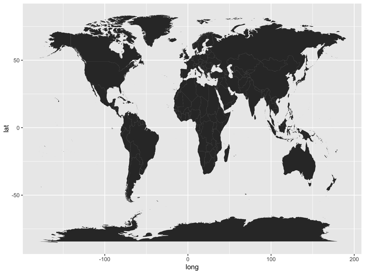
Right, it needs a bit of tweaking. First, we only want to plot points in the UK. There’s obviously way too much map for this, so the first thing we should do is restrict it to a rectangle which includes those two countries.
We can do that with coord_fixed(). coord_fixed() is used to fix the aspect ratio of a coordinate system, but can be used to specify a bounding box by using two of its arguments: xlim= and ylim=. These each take a vector (a series of numbers) with two items A vector is created using c(). Each item in the vector specifies the limits for that axis. So xlim = c(0,10) means restrict the x-axis to 0 and 10. The axes correspond to the lines of longitude (x) and latitude (y). We’ll restrict the x-axis to c(-10, 4) and the y-axis to c(50.3, 60) which should just about cover the UK and Ireland.
ggplot() + geom_polygon(data = worldmap,
                        aes(x = long,
                            y = lat,
                            group = group)) +
  coord_fixed(xlim = c(-10,3),
              ylim = c(50.3, 59))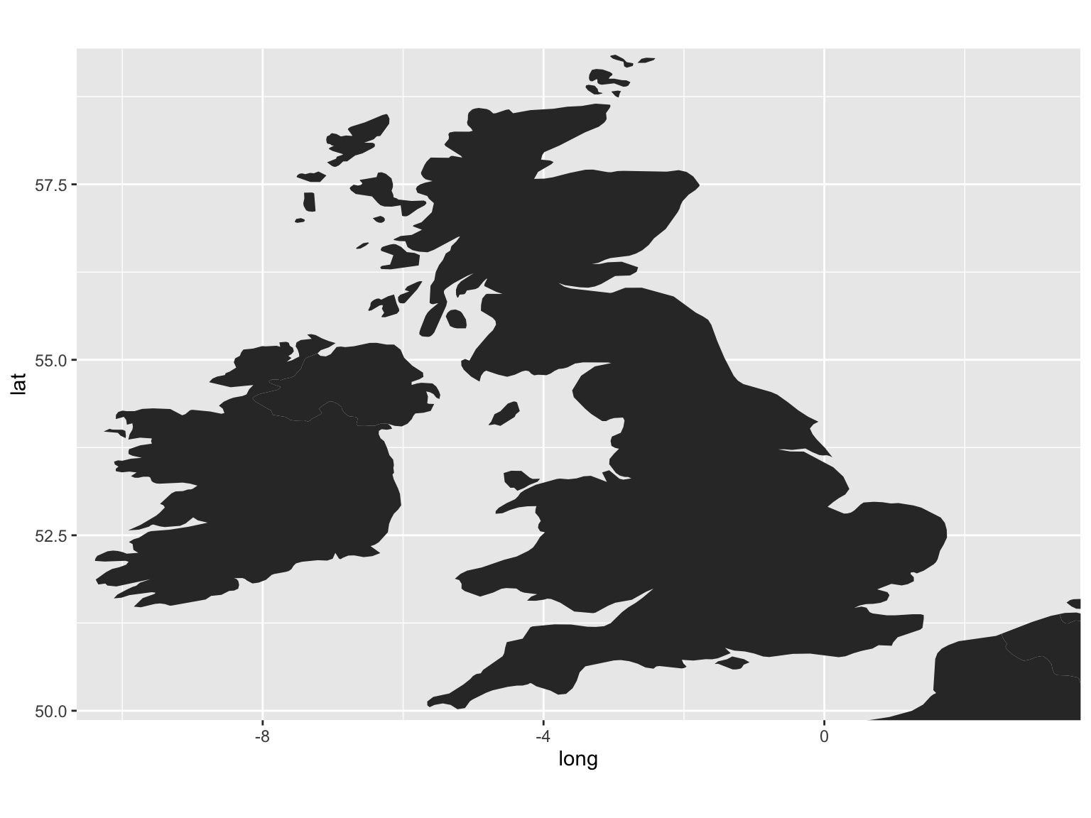
Figure 8.1: Empty Map
You can also change the aspect ratio of the coordinates using another ggplot function, coord_fixed(). The default is 1, but by specifying a different one with the argument ratio =, that can be changed. Using ratio = 1.3 results in a less squashed-looking map.
ggplot() +
  geom_polygon(data = worldmap,
               aes(x = long,
                   y = lat,
                   group = group)) +
  coord_fixed(ratio = 1.3,
              xlim = c(-10,3),
              ylim = c(50, 59))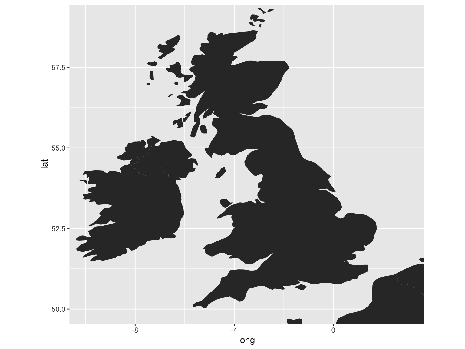
Figure 8.2: Aspect Ratio Adjustment
A couple more things, which I’ll run through quickly.
You can specify fill and line colors usings fill = and color = inside geom_polygon() but outside aes().
ggplot() +
  geom_polygon(data = worldmap,
               aes(x = long, y = lat,
                   group = group),
               fill = 'gray90',
               color = 'black') +
  coord_fixed(ratio = 1.3,
              xlim = c(-10,3),
              ylim = c(50, 59))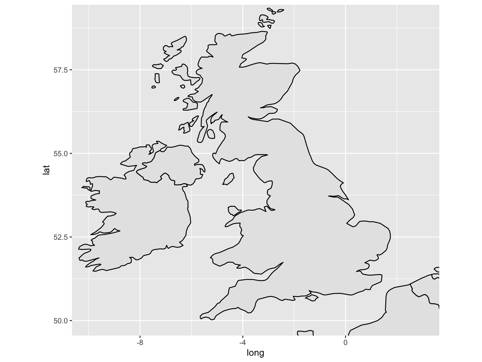
Figure 8.3: Colours and Fill
We probably don’t need the grids or panels in the background. We can get rid of these with + theme_void().
ggplot() +
  geom_polygon(data = worldmap,
               aes(x = long, y = lat,
                   group = group),
               fill = 'gray90',
               color = 'black') +
  coord_fixed(ratio = 1.3,
              xlim = c(-10,3),
              ylim = c(50, 59)) +
  theme_void()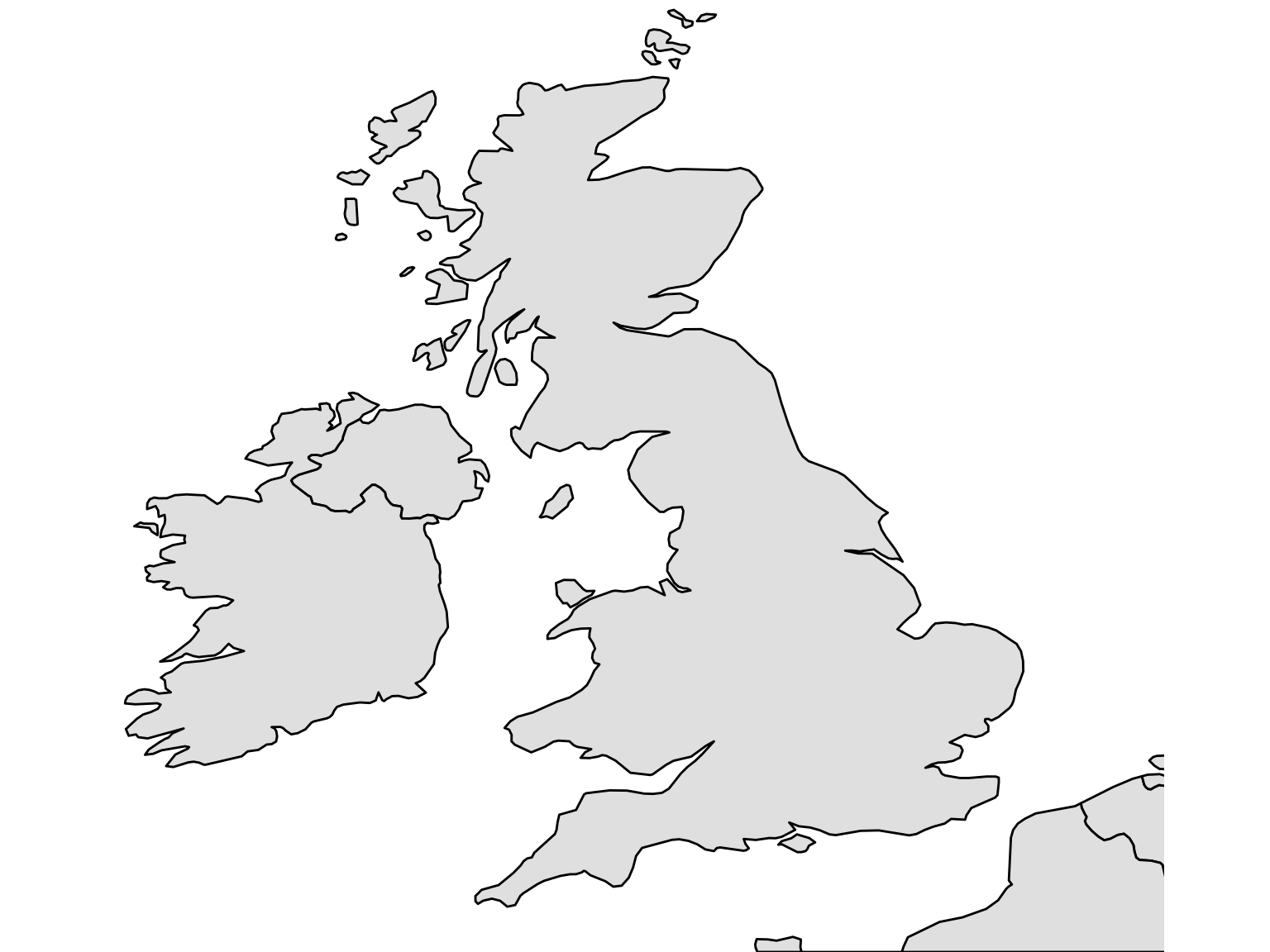
8.3 Add Sized Points By Coordinates
8.3.1 Get a count of the total titles for each city
This next bit uses some of the functions demonstrated in the introduction to R and the tidyverse, namely group_by() and tally().
First load the rest of the tidyverse packages.
library(tidyverse)Next, load the title list, which can be dowloaded from the British Library’s Open Repository
title_list = read_csv('data/BritishAndIrishNewspapersTitleList_20191118.csv')We can quite easily make a new data frame, which will just include each location and the total number of instances in the dataset.
location_counts = title_list %>%
  group_by(country_of_publication,
           general_area_of_coverage,
           coverage_city) %>%
  tally()
Arranging these in descending order of their count shows how many of each we have:
knitr::kable(location_counts %>%
arrange(desc(n)) %>% head(10))| country_of_publication | general_area_of_coverage | coverage_city | n |
|---|---|---|---|
| England | London | London | 5781 |
| Ireland | Dublin (Ireland : County) | Dublin | 415 |
| Scotland | Strathclyde | Glasgow | 309 |
| England | Greater Manchester | Manchester | 265 |
| England | West Midlands | Birmingham | 260 |
| England | Merseyside | Liverpool | 220 |
| England | Avon | Bristol | 175 |
| Scotland | Lothian | Edinburgh | 162 |
| England | South Yorkshire | Sheffield | 133 |
| England | Nottinghamshire | Nottingham | 127 |
8.3.2 Get hold of a list of geocoordinates
These coordinates have been produced in cooperation with another project with the Library, Living with Machines. We used smart annotations to quickly correct and train a georeferencer, to generate coordinates with much higher accuracy than, say, geonames or a google georeferencer.
These can be joined to the title list downloaded from the repository, and then easily mapped.
geocorrected = read_csv('https://raw.githubusercontent.com/networkingarchives/networkingarchives.github.io/main/geocorrected.csv')The file is also available here if you’d prefer to store it locally: https://github.com/networkingarchives/networkingarchives.github.io/blob/main/geocorrected.csv. This will bring you to a Github page, with a download button on the right-hand side. Download the file, and then modify the code below to point to the location of the file on you computer.
Change the column names:
library(snakecase)
colnames(geocorrected) = to_snake_case(colnames(geocorrected))
Do a bit of pre-processing to this. Change some column names further, select just the relevant columns, change the NA values and get rid of any empty entries.
colnames(geocorrected)[7:9] = c('wikititle',
                                'lat',
                                'lng')

geocorrected = geocorrected %>%
  select(-1, -10,-11, -12)

geocorrected = geocorrected %>%
  mutate(country_of_publication = replace(country_of_publication,
                                          country_of_publication == 'na', NA)) %>%
  mutate(general_area_of_coverage = replace(general_area_of_coverage,
                                            general_area_of_coverage == 'na', NA)) %>%
  mutate(coverage_city = replace(coverage_city,
                                 coverage_city == 'na', NA))

geocorrected = geocorrected %>%
  mutate(lat = as.numeric(lat)) %>%
  mutate(lng = as.numeric(lng)) %>%
  filter(!is.na(lat)) %>% filter(!is.na(lng))
The result is a dataframe with a set of longitude and latitude points (they come from Wikipedia, which is why they are prefixed with wiki) for every combination of city/county/country in the list of titles. These can be joined to the full title list with the following method:
Using left_join() we will merge these dataframes, joining up each set of location information to its coordinates and standardised name. left_join() is a very common command in data analysis. It merges two sets of data by matching a value known as a key.
Here the key is three values - city, county and country, and it matches up the two sets of data by ‘joining’ two rows together, if they share all three of these values. Store this is a new variable called lc_with_geo.
lc_with_geo = location_counts %>%
  left_join(geocorrected,
            by = c('coverage_city' ,
                   'general_area_of_coverage',
                   'country_of_publication'))
If you look at this new dataset, you’ll see that now the counts of locations have merged with the geocorrected data. Now we have an amount and coordinates for each place.
head(lc_with_geo, 10)## # A tibble: 10 × 10
## # Groups: country_of_publication, general_area_of_coverage [9]
## country_of_publi… general_area_of… coverage_city n code places wikititle
## <chr> <chr> <chr> <int> <dbl> <chr> <chr>
## 1 Bermuda Islands <NA> Hamilton 23 NA <NA> <NA>
## 2 Bermuda Islands <NA> Saint George 1 NA <NA> <NA>
## 3 Cayman Islands <NA> Georgetown 1 NA <NA> <NA>
## 4 England Aberdeenshire (… Peterhead 1 NA <NA> <NA>
## 5 England Acton (London, … Ealing (Lond… 1 NA <NA> <NA>
## 6 England Aintree |Merse… Maghull 3 NA <NA> <NA>
## 7 England Alford (Lincoln… Mablethorpe 1 NA <NA> <NA>
## 8 England Alford (Lincoln… Skegness 1 NA <NA> <NA>
## 9 England Alfriston |Eas… Newhaven 1 NA <NA> <NA>
## 10 England Altrincham |Gr… Sale 2 NA <NA> <NA>
## # … with 3 more variables: lat <dbl>, lng <dbl>, status <chr>Right, now we’re going to use group_by() and tally() again, this time on the the wikititle, wikilat and wikilon columns. This is because the wikititle is a standardised title, which means it will group together cities properly, rather than giving a different row for slightly different combinations of the three geographic information columns (incidentally, it could also be used to link to wikidata)
lc_with_geo_counts = lc_with_geo %>%
  group_by(wikititle, lat, lng) %>%
  tally(n)
Now we’ve got a dataframe with counts of total newspapers, for each standardised wikipedia title in the dataset.
knitr::kable(head(lc_with_geo_counts,10))| wikititle | lat | lng | n |
|---|---|---|---|
| Abbots_Langley | 51.7010 | -0.4160 | 1 |
| Aberavon_(UK_Parliament_constituency) | 51.6000 | -3.8120 | 1 |
| Aberdare | 51.7130 | -3.4450 | 20 |
| Aberdeen | 57.1500 | -2.1100 | 82 |
| Abergavenny | 51.8240 | -3.0167 | 9 |
| Abergele | 53.2800 | -3.5800 | 8 |
| Abersychan | 51.7239 | -3.0587 | 2 |
| Abertillery | 51.7300 | -3.1300 | 2 |
| Aberystwyth | 52.4140 | -4.0810 | 31 |
| Abingdon-on-Thames | 51.6670 | -1.2830 | 23 |
OK, lc_with_geo_counts is what we want to plot. This contains the city title, coordinates and counts for all the relevant places in our dataset. But first we need the map we created earlier.
ggplot() +
  geom_polygon(data = worldmap, aes(x = long,
                                    y = lat,
                                    group = group),
               fill = 'gray90',
               color = 'black') +
  coord_fixed(ratio = 1.3,
              xlim = c(-10,3),
              ylim = c(50, 59)) +
  theme_void()
Figure 8.4: Blank Map of UK and Ireland
8.4 Bringing it all together
Now we will plot the cities using geom_point() We’ll specify the lc_with_geo_counts as the argument to data = within geom_point(). The x axis position of each point is the longitude, and the y axis the latitude. We’ll also use the argument size = n within the aes(), to tell ggplot2 to size the points by the column n, which contains the counts for each of our locations, and the argument alpha = .7 outside the aes(), to make the points more transparent and slightly easier to read overlapping ones.
One last thing we’ll add is +scale_size_area(). This sizes the points using their radius rather than diameter, which is a more correct way of representing numbers using circles!
Using labs(), add a title, and with scale_size_area() and scale_color_viridis_c(), make some changes to the size and colours, respectively.
ggplot() +
  geom_polygon(data = worldmap,
               aes(x = long, y = lat, group = group),
               fill = 'gray90', color = 'black') +
  coord_fixed(ratio = 1.3, xlim = c(-10,3), ylim = c(50, 59)) +
  theme_void() +
  geom_point(data = lc_with_geo_counts,
             aes(x = as.numeric(lng),
                 y = as.numeric(lat), size = n, color = log(n)), alpha = .7) +
  scale_size_area(max_size = 8) +
  scale_color_viridis_c() +
  theme(legend.position = 'none') +
  theme(title = element_text(size = 12))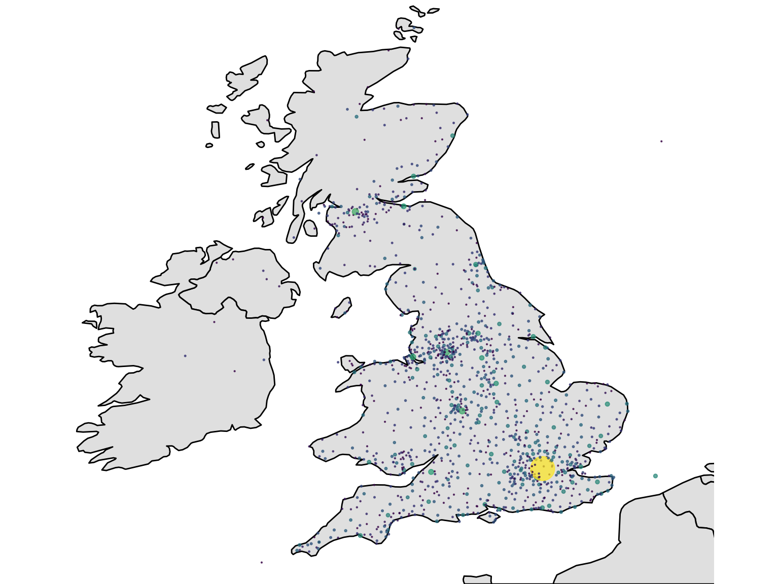
Figure 8.5: Finished Map
8.5 Drawing a newspaper titles ‘Choropleth’ map with R and the sf package

Another type of map is known as a ‘choropleth’. This is where the data is visualised by a certain polygon area rather than a point. Typically these represent areas like parishes, counties or countries. Using the library sf, which stands for Simple Features, a choropleth map can be made quite quickly. A choropleth map uses a shapefile, which is a list of polygons and a projection.
The trick here is to use the coordinates to correctly situate each set of points within the correct county, as found in the shapefile. Then, count up the titles by this corrected county, and use this total to color or shade the map. The good thing about this method is that once you have a set of coordinates, they can be situated within any shapefile - a historic map, for example. This is particularly useful for anything to do with English counties, which tend to be changed pretty regularly.
This section uses data from .visionofbritain.co.uk, which needs to be downloaded separately. You could also use the free boundary data here: https://www.ordnancesurvey.co.uk/business-government/products/boundaryline, which contains bondaries for both modern and historic counties. This is an excellent source, and the file includes a range of boundaries including counties but also districts and constituencies, under an ‘Open Government Licence’. ## Choropleth map steps
The steps to create this type of map:
- Download shapefiles for england and scotland from here
- Turn into sf object Download list of points, turn into sf object Use st join to get county information Join to the title list and deselect everything except county and titles - maybe 19th century only.. Join that to the sf object Plot using geom_sf()
Load libraries
library(tidyverse)
library(sf)
8.6 Get county information from the title list
Next, download (if you haven’t already) the title list from the British Library open repository.
title_df = read_csv('data/BritishAndIrishNewspapersTitleList_20191118.csv')8.7 Make the points object using geom_sf()
8.7.1 Download shapefiles
First, download the relevant shapefiles. These don’t necessarily have to be historic ones. Use st_read() to read the file, specifying its path. Do this for England, Wales and Scotland (we don’t have points for Ireland).
8.8 Transform from UTM to lat/long using st_transform()
These shapefiles use points system known as UTM, which stands for ‘Universal Transverse Mercator’. According to wikipedia,
it differs from global latitude/longitude in that it divides earth into 60 zones and projects each to the plane as a basis for its coordinates.
It needs to be transformed into lat/long coordinates, because the coordinates we have are in that format. This is easy with st_transform(). To transform correctly, the correct crs is needed. This is the code for which of the 60 zones this UTM comes from. Britain is 4326.
eng_1851 = st_transform(eng_1851, crs = 4326)scot_1851 = st_transform(scot_1851, crs = 4326)Bind them both together, using rbind() to make one big shapefile for Great Britain.
gb1851 = rbind(eng_1851, scot_1851 %>%
                 select(-UL_AUTH))
8.9 Download and merge the title list with a set of coordinates.
Next, load and pre-process the set of coordinates:
geocorrected = read_csv('data/geocorrected.csv')Change the column names:
library(snakecase)
colnames(geocorrected) = to_snake_case(colnames(geocorrected))
Change some column names further, select just the relevant columns, change the NA values and get rid of any empty entries.
colnames(geocorrected)[6:8] = c('wikititle', 'lat', 'lng')

geocorrected = geocorrected %>% select(-1, -9,-10, -11, -12)

geocorrected = geocorrected %>%
  mutate(country_of_publication = replace(country_of_publication,
                                          country_of_publication == 'na', NA)) %>% mutate(general_area_of_coverage = replace(general_area_of_coverage,
                                                                                                                             general_area_of_coverage == 'na', NA)) %>%
  mutate(coverage_city = replace(coverage_city,
                                 coverage_city == 'na', NA))

geocorrected = geocorrected %>%
  mutate(lat = as.numeric(lat)) %>%
  mutate(lng = as.numeric(lng)) %>%
  filter(!is.na(lat)) %>%
  filter(!is.na(lng))
Next, join these points to the title list, so that every title now has a set of lat/long coordinates.
title_df = title_df %>%
  left_join(geocorrected) %>%
  filter(!is.na(lat)) %>%
  filter(!is.na(lng))
8.10 Using st_join to connect the title list to the shapefile
To join this to the shapefile, we need to turn it in to an simple features item. To do this we need to specify the coordinates and the CRS. The resulting file will contain a new column called ‘geometry’, containing the lat/long coordaintes in the correct simple features format.
st_title = st_as_sf(title_df, coords = c('lng', 'lat'))

st_title = st_title  %>% st_set_crs(4326)
Now, we can use a special kind of join, which will join the points in the title list, if they are within a particular polygon. The resulting dataset now has the relevant county, as found in the shapefile.
st_counties = st_join(st_title, gb1851)Make a new dataframe, containing just the counties and their counts.
county_tally = st_counties %>%
  select(G_NAME) %>%
  group_by(G_NAME) %>%
  tally() %>%
  st_drop_geometry()
8.11 Draw using ggplot2 and geom_sf()
Join this to the shapefile we made earlier, which gives a dataset with the relevant counts attached to each polygon. This can then be visualised using the geom_sf() function from ggplot2, and all of ggplot2’s other features can be used.
gb1851 %>%
  left_join(county_tally) %>%
  ggplot() +
  geom_sf(lwd = .2,color = 'black', aes(fill = n)) +
  theme_void() +
  lims(fill = c(10,4000)) +
  scale_fill_viridis_c(option = 'plasma') +
  labs(title = "British Library Newspaper\nTitles, by County",
       fill = 'No. of Titles:') +
  theme(legend.position = 'left') +
  theme(title = element_text(size = 12),
        legend.title = element_text(size = 8))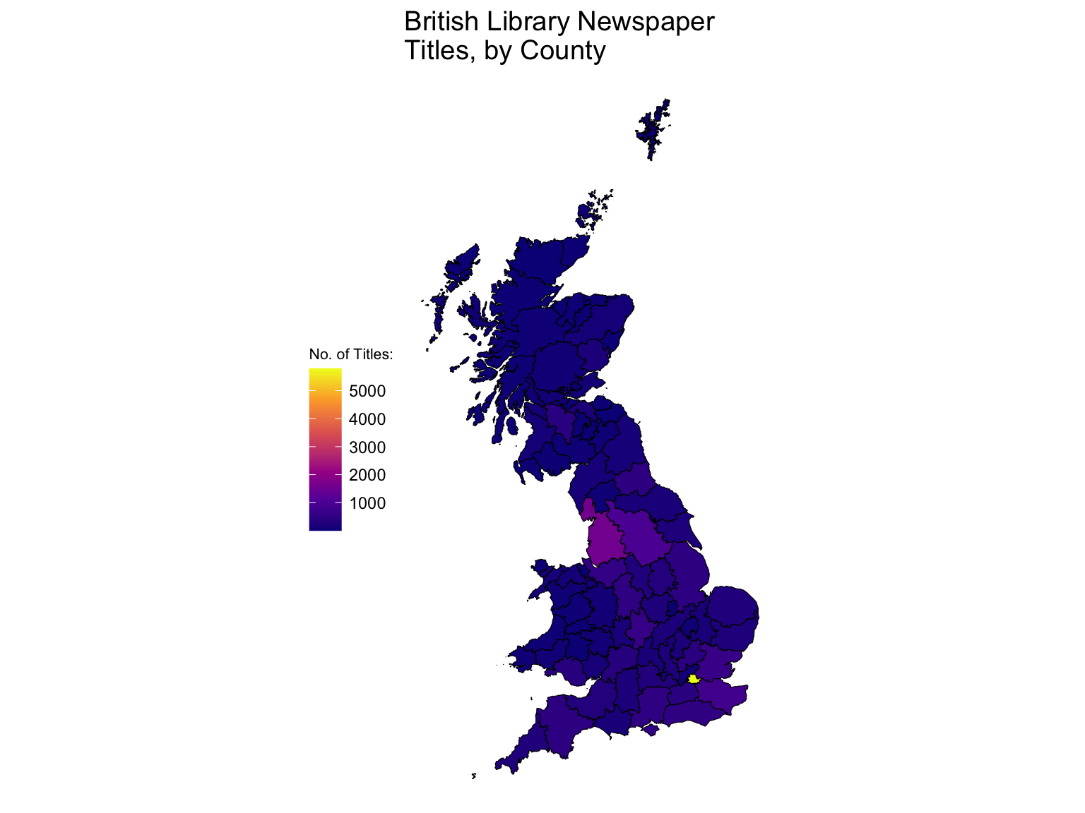
Figure 8.6: Choropleth Made with geom_sf()
Further reading:
The book ‘Geocomputation with R’ is a fantastic resource for learning about mapping: https://geocompr.robinlovelace.net. It’s surprisinly easy to read even though it goes through some pretty advanced topics.