Chapter 8 Operational Risk and Extreme Finance
8.1 Imagine This
Remember that company we just acquired? Not only is customer creditworthiness apt to cost us another $80 million, but our walk-through of distribution, call-center, and production facilities had a raft of negatively impacting issues with health and safety, environmental, and intellectual property all located in places rife with fraud and corruption.
Not only that, but recent (5 years ago!) hurricane damage has still not been rectified. Our major insurance carrier has also just pulled out of underwriting your fire-related losses. To seemingly top it all off, three VP’s of regional manufacturing have just been indicted for padding vendor accounts for kickbacks. To add insult to injury, employee turnover rates are over 40%.
Previously we studied the stylized facts of financial variables, market risk, and credit risk. A common theme runs through this data and outcomes: thick tails, high Value at Risk and Expected Shortfall. Rare events can have strong and persistent effects. Then there is the probability of contagion that allows one bad market to infect other markets.
Now we need to consider more formally the impact of extreme, but rare events on financial performance. To do this we will start off with modeling potential loss in two dimensions, frequency of loss and severity. Frequency of losses, modeled with a Poisson process. The Poisson process is at the heart of Markov credit risks. Each transition probability stems from an average hazard rate of defaults in a unit of time and a segment of borrowers. Here we will use a simplified sampling of frequencies of events drawn from a Poisson process similar to the one we used in credit risk measurement.
Severity is defined as currency based loss. In credit this is the unrecoverable face value, accrued interest, and administrative expenses of a defaulted credit instrument such as a loan. In operational risk this loss could be the value of customers lost due to a cyber breach, or suppliers failing to deliver critical goods and services resulting in unmet demand, or reputation with investors leading to a flight of capital. We will typically use gamma or generalized Pareto distributions to help us model severity. In some equity markets, the log-normal distribution is prevailing practice.
- Mean Excess Loss from reliability and vulnerability analysis
- Historical data
- VaR and ES again
8.2 What is Operational Risk?
This is a third major category of risk that includes everything from the possibility of process failure, to fraud, to natural (and our own homemade) disaster, errors, omissions, in other words, having lots of really bad days.
In a nutshell we measure operational risk using frequency and severity. Again there is analogy to credit risk where the frequency is the probability of default and severity is recoverable exposure. Here we think of the probability of loss as how often a loss could occur, its likelihood. Infused into likelihood are opinions about “how often,” “how fast,” “how long” (before detection, response, correction), “how remote” (or “imminent”), among other potential suspects.
On the other hand We think of severity as the monetary loss itself. This loss is beyond a threshold, and thus the focus on “extreme” value methods of dealing with distributions. The “extreme” will be the tail of the distribution where probably but rare events with large magnitudes roam.
In typical experience in most organizations, there is no good time series or cross-sections of data on which to rely for measurements of operational risk. For example, the emerging and immanent risks of botnets wreaking havoc in our computer operating systems have really only a little loss data available for analysis. The problem with this data is that only certain aspects of the data are disclosed, they are supremely idiosyncratic, that is, applicable to highly specialized environments, and often seem far to much an estimate of enterprise-wide loss. Where we do have some data, we have established ways of working with severity distributions that make will sense of the shape of the data.
8.2.1 A working example
Suppose management, after much discussion and challenge by subject matter experts, determines that
The median loss due to a vulnerability of a known cyber breach is $60 million
With an average (or median) frequency of 25%,
All in a 12 month cycle.
Management also thinks that the variation in their estimates is about $20 million.
We sometimes call this the “volatility of the estimate” as it expresses the degree of managerial uncertainty about the size of the loss.
- How would we quantify this risk?
- How would we manage this risk?
Here are some steps management might take to measure and mitigate this operational risk:
- Develop a cyber risk taxonomy, For example look at NIST and ISO for guidance.
- Develop clear definitions of frequency and severity in terms of how often and how much. Calibrate to a metric like operational income.
- Develop range of operational scenarios and score their frequency and severity of impact on operating income.
- Aggregate and report ranges of median and quantile potential loss.
- Develop mitigation scenarios and their value. Subtract this value from potential loss and call it retained risk.
- Given the organization’s risk tolerance, determine if more mitigation needs to be done.
This last step puts a “value” on operational risk scenarios using a rate of error that, if exceeded, would put the organization at ongoing risk that management is not willing to tolerate. This “significance level” in data analytics is often called “alpha” or \(\alpha\). An \(\alpha = 5\%\) indicates that management, in a time frame such as one year, is not willing to be wrong more than 1 in 20 times about its experience of operational risk. Management believes that they are 95% (\(1-\alpha\)) confident in their measurement and management of risk. It is this sort of thinking that is at the heart of statistically based confidence intervals and hypothesis testing.
8.3 How Much?
Managers can use several probability distributions to express their preferences for risk of loss. A popular distribution is the gamma severity function. This function allows for skewness and “heavy”" tails. Skewness means that loss is attenuated and spread away from the mean or median, stretching occurrences further into the tail of the loss distribution.
The gamma disstribution is fully specified by shape, \(\alpha\), and scale, \(\beta\), parameters. The shape parameter is a dimensionless number that affects the size and skewness of the tails. The scale parameter is a measure of central tendency “scaled” by the standard deviation of the loss distribution. Risk specialists find this distribution to be especially useful for time-sensitive losses.
We can specify the \(\alpha\) shape and \(\beta\) scale parameters using the mean, \(\mu\), and standard deviation, \(\sigma\) of the random severities, \(X\) as
\[ \beta = \mu / \sigma^2 , \]
and
\[ \alpha = \mu \beta \]
and this is the same as
\[ \alpha = \mu^2 / \sigma^2 \]
Here \(\beta\) will have dimension of \(LOSS^{-1}\), while \(\alpha\) is dimensionless. The probability that a loss will be exactly \(x\), conditional on \(\alpha\) and \(\beta\) is
\[ f(x | alpha, \beta) = \frac{\beta^{\alpha}x^{\alpha-1}e^{-x\beta}}{\Gamma(\alpha)} \]
Where
\[ \Gamma(x) = \int_{0}^{\infty} x^{t-1} e^{-x} dx \]
Enough of the math, although very useful for term structure interpolations, and transforming beasts of expressions into something tractable. Let’s finally implement into R.
set.seed(1004)
n.sim <- 1000
mu <- 60  ## the mean
sigma <- 20  ## management's view of how certain they think their estimates are
sigma.sq <- sigma^2
beta <- mu/sigma.sq
alpha <- beta * mu
severity <- rgamma(n.sim, alpha, beta)
summary(severity)
## Min. 1st Qu. Median Mean 3rd Qu. Max.
## 12.54 45.44 57.48 60.30 73.47 152.23The distribution is dispersed from a low of 15 to a high of over 120 million dollars. We might check with management that this low and high (and intermediate levels) are reasonable. Let’s graph the distribution. Here we form a data frame in gamma.sev to create factor values for the ggplot fill.
require(ggplot2)
gamma.sev <- data.frame(Severity = severity,
    Distribution = rep("Gamma", each = n.sim))
ggplot(gamma.sev, aes(x = Severity, fill = Distribution)) +
    geom_density(alpha = 0.3)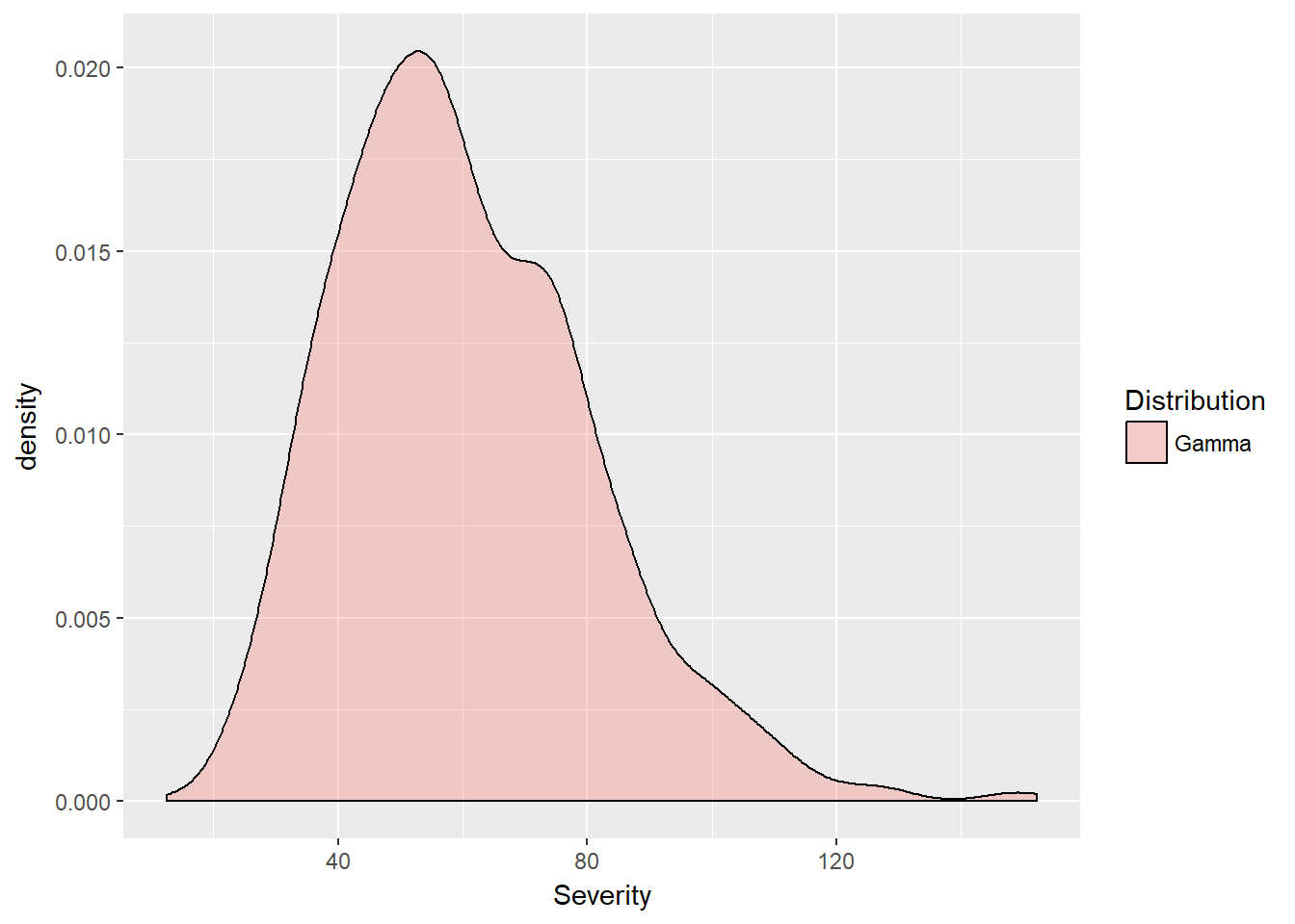
8.3.1 Severity thresholds
We can add thresholds based on value at risk (VaR) and expected shortfall ES. Here we calculate VaR.sev as the quantile for a confidence level of \(1-\alpha\).
alpha.tolerance <- 0.05
(VaR.sev <- quantile(severity, 1 - alpha.tolerance))
(ES.sev <- mean(gamma.sev$Severity[gamma.sev$Severity >
    VaR.sev]))
Plot them onto the distribution using the geom_vline feature in ggplot2. What is the relationship between VaR and ES?
ggplot(gamma.sev, aes(x = Severity, fill = Distribution)) +
    geom_density(alpha = 0.3) + geom_vline(xintercept = VaR.sev,
    color = "red") + geom_vline(xintercept = ES.sev,
    color = "blue")
Here are the results of these two exercises.
alpha.tolerance <- 0.95
(VaR.sev <- quantile(severity, alpha.tolerance))
## 95%
## 98.05779(ES.sev <- mean(gamma.sev$Severity[gamma.sev$Severity >
VaR.sev]))## [1] 110.2134ggplot(gamma.sev, aes(x = Severity, fill = Distribution)) +
geom_density(alpha = 0.3) + geom_vline(xintercept = VaR.sev,
color = "red") + geom_vline(xintercept = ES.sev,
color = "blue")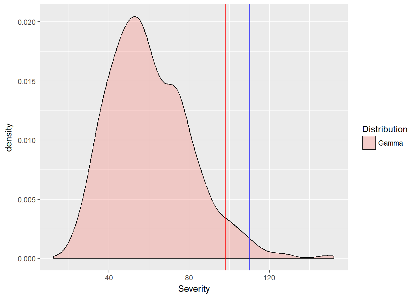
What is the relationship between Var and ES? As it should be, the VaR is less than the ES. For this risk of potential cyber breach vulnerability, management might think of setting aside capital proportional to ES.sev - quantile(severity, 0.50)), that is, the difference between the expected shortfall and the median potential loss. The modifier “proportional” needs some further specification. We have to consider the likelihood of such a risk event.
8.4 How Often?
We usually model the frequency of a loss event with a poisson distribution. This is a very basic counting distribution defined by the rate of arrival of an event, \(\lambda\) in a unit of time. This rate is jus what we struggled to estimate for credit rating transitions.
Again for completeness sake and as a reference, we define the probability of exactly \(x\) risk events arriving at a rate of \(\lambda\) as
\[ Probability[x | \lambda] = \frac{\lambda^x e^{-\lambda}}{x!} \]
Management might try to estimate the count of events in a unit of time using hazard rate models (same \(\lambda\) as in credit migration transitions). Here we simulate management’s view with \(\lambda = 0.25\). Our interpretation of this rating is that management believes that a vulnerability event will happen in the next 12 months once every 3 months (that is once every four months).
We simulate by using n.sim trials drawn with the rpois() function conditional on \(\lambda = 0.25\).
n.sim <- 1000
lambda <- 0.25
frequency <- rpois(n.sim, lambda)
summary(frequency)
## Min. 1st Qu. Median Mean 3rd Qu. Max.
## 0.000 0.000 0.000 0.241 0.000 3.000summary is not very informative so we also plot this distribution using this code:
poisson.freq <- data.frame(Frequency = frequency,
    Distribution = rep("Poisson", each = n.sim))
ggplot(poisson.freq, aes(x = frequency,
    fill = Distribution)) + geom_density(alpha = 0.3)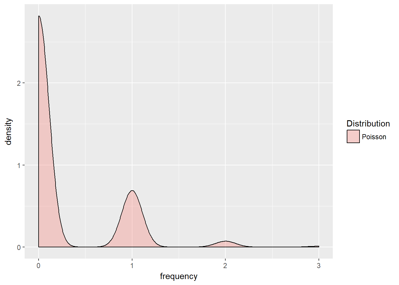
This shows a smooth version of the discrete event count: more likely zero, then one event, then two , then three events, all of which devides the 12 months into four, 3-month event intervals.
8.5 How Much Potential Loss?
Now we get to the nub of the matter, how much potentially can we lose? This means we need to combine frequency with severity. We need to “convolve” the frequency and severity distributions together to form one loss distribution. “To convolve” means that for each simulated cyber dollar loss scenario we see whether the scenario occurs at all using the many poisson frequency scenarios.
This convolution can be accomplished in the following code:
loss <- rpois(n.sim, severity * lambda)
summary(loss)
## Min. 1st Qu. Median Mean 3rd Qu. Max.
## 2.00 10.00 14.00 15.02 19.00 44.00Some notes are in order:
- This code takes each of the
gammadistributed severities (n.simof them) asks how often one of them will occur (lambda). - It then simulates the frequency of these risk events scaled by the
gammaseverities of the loss size. - The result is a convolution of all
n.simof the severities with alln.simof the frequencies. We are literally combining each scenario with every other scenario.
Let’s visualize our handiwork and frame up the data. Then calculate the risk measures for the potential loss as
loss.rf <- data.frame(Loss = loss, Distribution = rep("Potential Loss",
    each = n.sim))
(VaR.loss.rf <- quantile(loss.rf$Loss,
    1 - alpha.tolerance))
## 5%
## 6(ES.loss.rf <- mean(loss.rf$Loss[loss.rf$Loss >
VaR.loss.rf]))## [1] 15.65462Again VaR is a quantile and ES is the mean of a filter on the convolved losses in excess of the VaR quantile.
8.5.1 Try this exercise
- Plot the loss function and risk measures with
ggplot(loss.rf, aes(x = Loss, fill = Distribution)) +
    geom_density(alpha = 0.3) + geom_vline(xintercept = VaR.loss.rf,
    color = "red") + geom_vline(xintercept = ES.loss.rf,
color = "blue")- What would you advise management about how much capital might be needed to underwrite these losses?
Some results using this code:
ggplot(loss.rf, aes(x = Loss, fill = Distribution)) +
    geom_density(alpha = 0.3) + geom_vline(xintercept = VaR.loss.rf,
    color = "red") + geom_vline(xintercept = ES.loss.rf,
    color = "blue")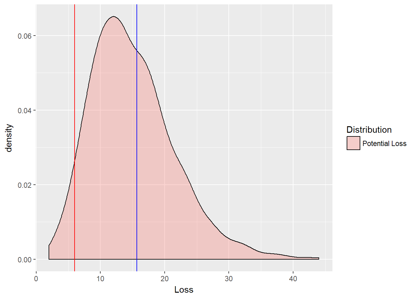
Management should consider different risk tolerances first. Then the organization can decide on the difference between the VaR (or ES) and the median loss.
loss.rf <- data.frame(Loss = loss, Distribution = rep("Potential Loss",
    each = n.sim))
(VaR.loss.rf <- quantile(loss.rf$Loss,
    1 - alpha.tolerance))
## 5%
## 6(ES.loss.rf <- mean(loss.rf$Loss[loss.rf$Loss >
VaR.loss.rf]))## [1] 15.65462(Reserve.loss.rf <- ES.loss.rf - quantile(loss.rf$Loss,
0.5))## 50%
## 1.654623If this were a bank, then managers would have calculated the capital requirement (almost a la Basle III).
8.6 We Have History
Now suppose we have some history of losses. In this context, we use an extreme tail distribution called the Generalized Pareto Distribution (GPD) to estimate historical loss parameters. This distribution models the the tails of any other distribution. We would have split a poisson-gamma loss distribution into two parts, a body, and a tail. The tail would begin at a specified threshold.
The GPD is especially well-known for a single property: for very high thresholds, GPD not only well describes the behavior in excess of the threshold, but the mean excess over the threshold is linear in the threshold. From this property we get more intuition around the use of Expected Shortfall as a coherent risk measure. In recent years we well exceeded all Gaussian and Student’s t thresholds in distressed markets.
For a random variate \(x\), the GPD distribution is defined for The scale parameter \(\beta\) and shape parameter \(\xi \geq 0\) as:
\[ g(x; \xi \geq 0) = 1- (1 + x \xi/\beta)^{-1/\xi} \]
and when the shape parameter \(\xi = 0\), the GPD becomes the exponential distribution dependent only on the scale parameter \(\beta\):
\[ g(x; \xi = 0) = 1 - exp(-x / \beta) \]
Now for the infamous property. If \(u\) is an upper (very high) threshold, then the excess of threshold function for the GPD is
\[ e(u) = \frac{\beta + \xi u}{1 - \xi} \]
This simple measure is linear in thresholds. It will allow us to visualize where rare events begin (See McNeil, Embrechts, Frei (2015, Chapter 5)). We will use as a threshold the exceedance that begins to make the excesses linear.
8.7 Fire Losses
Now to get to some data. The first thing we do is load the well researched Danish fire claims data set in millions of Danish Kroner collected from 1980 to 1990 as a time series object. Then we will plot the Mean Excesses (of thresholds). These are simply the mean of \(e(u)\), a function of the parameters of the GPD.(We will follow very closely the code and methodology used by McNeil et al. currently on the qrmtutorial site at http://www.qrmtutorial.org/r-code)
library(QRM)
## Load Danish fire loss data and look
## at structure and content
data(danish)
str(danish)
## Time Series:
## Name: object
## Data Matrix:
## Dimension: 2167 1
## Column Names: FIRE.LOSSES
## Row Names: 1980-01-03 ... 1990-12-31
## Positions:
## Start: 1980-01-03
## End: 1990-12-31
## With:
## Format: %Y-%m-%d
## FinCenter: GMT
## Units: FIRE.LOSSES
## Title: Time Series Object
## Documentation: Wed Mar 21 09:48:58 2012head(danish, n = 3)## GMT
## FIRE.LOSSES
## 1980-01-03 1.683748
## 1980-01-04 2.093704
## 1980-01-05 1.732581tail(danish, n = 3)## GMT
## FIRE.LOSSES
## 1990-12-30 4.867987
## 1990-12-30 1.072607
## 1990-12-31 4.125413## Set Danish to a numeric series
## object if a time series
if (is.timeSeries(danish)) danish <- series(danish)
danish <- as.numeric(danish)We review the dataset.
summary(danish)## Min. 1st Qu. Median Mean 3rd Qu. Max.
## 1.000 1.321 1.778 3.385 2.967 263.250Our next task is to sort out the losses and rank order unique losses with this function.
n.danish <- length(danish)
## Sort and rank order unique losses
rank.series <- function(x, na.last = TRUE) {
    ranks <- sort.list(sort.list(x, na.last = na.last))
    if (is.na(na.last))
        x <- x[!is.na(x)]
    for (i in unique(x[duplicated(x)])) {
        which <- x == i & !is.na(x)
        ranks[which] <- max(ranks[which])
    }
    ranks
}
Now we use the rank.series function to create the mean excess function point by point through the sorted series of loss data. In the end we want to cumulatively sum data in a series of successive thresholds.
danish.sorted <- sort(danish)  ## From low to high
## Create sequence of high to low of
## indices for successive thresholds
n.excess <- unique(floor(length(danish.sorted) -
    rank.series(danish.sorted)))
points <- unique(danish.sorted)  ## Just the unique losses
n.points <- length(points)
## Take out last index and the last
## data point
n.excess <- n.excess[-n.points]
points <- points[-n.points]
## Compute cumulative sum series of
## losses
excess <- cumsum(rev(danish.sorted))[n.excess] -
    n.excess * points
excess.mean <- excess/n.excess  ## Finally the mean excess loss series
So much happened here. Let’s spell this out again:
- Sort the data
- Construct indices for successive thresholds
- With just unique losses throw out the last data point, and its index
- Now for the whole point of this exercise: calculate the cumulative sum of losses by threshold (the
[n.excess]operator) in excess of the cumulative thresholdn.excess*points - Then take the average to get the mean excess loss series.
8.7.1 Try this exercise
- Build a data frame with components
Excess.Mean,Thresholds, and type ofDistribution.
library(ggplot2)
omit.points <- 3
excess.mean.df <- data.frame(Excess.Mean = excess.mean[1:(n.points -
    omit.points)], Thresholds = points[1:(n.points -
    omit.points)], Distribution = rep("GPD",
    each = length(excess.mean[1:(n.points -
omit.points)])))- plot the mean excess series against the sorted points. In this case we will omit the last 3 mean excess data points.
## Mean Excess Plot
ggplot(excess.mean.df, aes(x = Thresholds,
    y = Excess.Mean)) + geom_line() +
    geom_point(size = 1, shape = 22,
        colour = "red", fill = "pink") +
    geom_vline(xintercept = 40) + geom_vline(xintercept = 60)
## Plot density
ggplot(excess.mean.df, aes(x = Excess.Mean,
    fill = Distribution)) + geom_density() +
    xlim(0, 75)
Some results using this code:
library(ggplot2)
omit.points <- 3
excess.mean.df <- data.frame(Excess.Mean = excess.mean[1:(n.points -
    omit.points)], Thresholds = points[1:(n.points -
    omit.points)], Distribution = rep("GPD",
    each = length(excess.mean[1:(n.points -
        omit.points)])))
We can interpret this data by using the [1:(n.points - omit.points)] throughout to subset the mean excess series, the thresholds, and an indicator of the type of distribution.
## Mean Excess Plot
ggplot(excess.mean.df, aes(x = Thresholds,
    y = Excess.Mean)) + geom_line() +
    geom_point(size = 1, shape = 22,
        colour = "red", fill = "pink") +
    geom_vline(xintercept = 40) + geom_vline(xintercept = 60)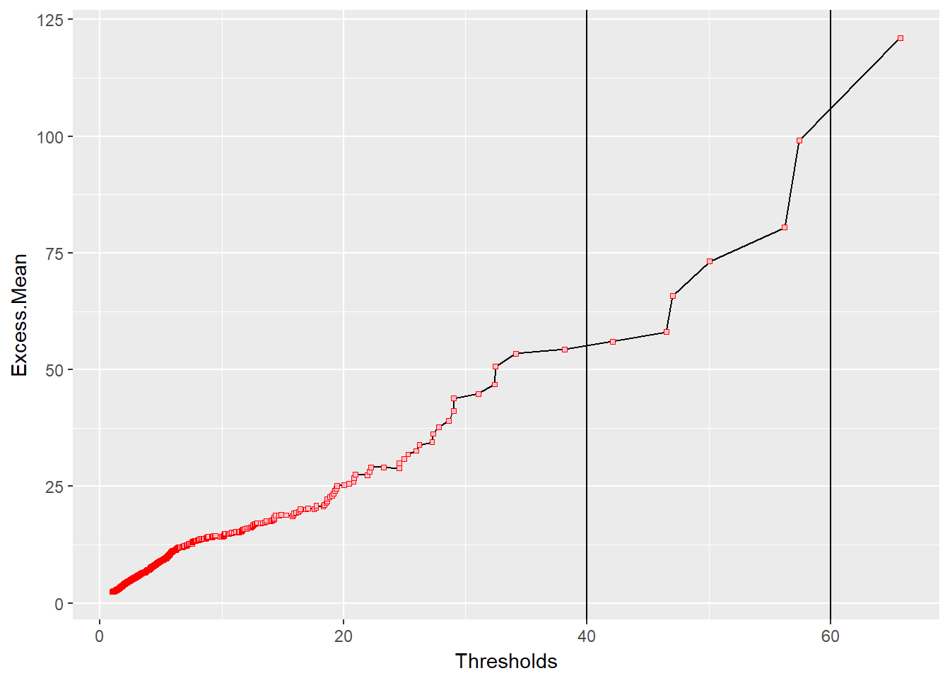
This plot shows that the mean of any excess over each and every point grows linearly with each threshold. As the mean excesses get larger, they also become more sparse, almost like outliers. They are the rare events we might want to mitigate. We might look at the vertical lines at 40 and 60 million kroner to possibly design retention and limits for a contract to insure against experiencing loss in this region.
## Plot density
ggplot(excess.mean.df, aes(x = Excess.Mean,
    fill = Distribution)) + geom_density() +
    xlim(0, 75)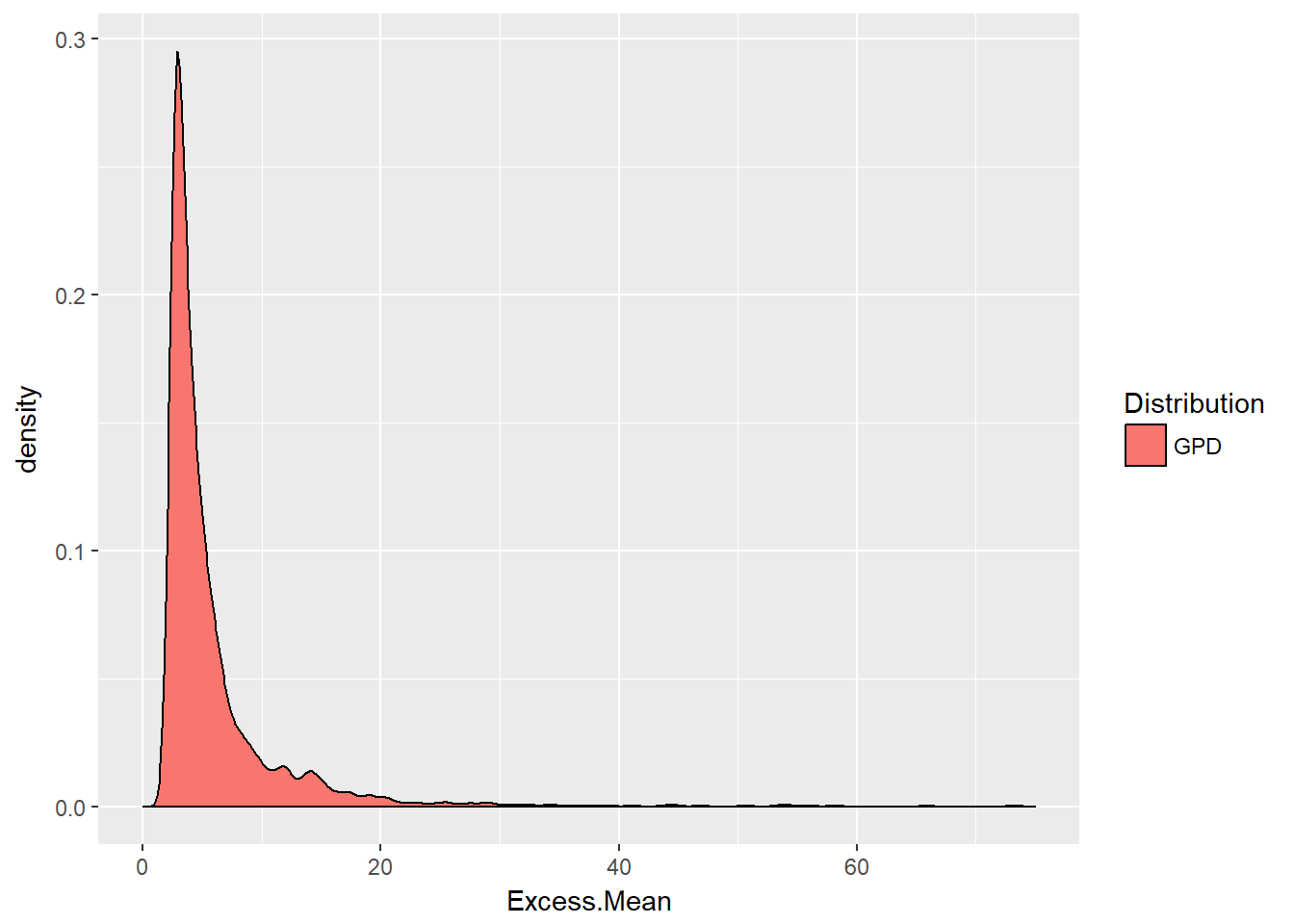
This density plot confirms the pattern of the mean excess plot. The mean excess distribution is understood by engineers as the mean residual life of a physical component. In insurance on the other hand, if the random variable X is a model of insurance losses, like the danish data set, then the conditional mean \(E(X - u \lvert X > u)\) is the expected claim payment per loss given that the loss has exceeded the deductible of \(u\). In this interpretation, the conditional mean \(E(X - t \lvert X > t)\) is called the mean excess loss function.
8.8 Estimating the Extremes
Now we borrow some Generalized Pareto Distribution code from our previous work in market risk and apply it to the danish data set.
## library(QRM)
alpha.tolerance <- 0.95
u <- quantile(danish, alpha.tolerance,
    names = FALSE)
fit.danish <- fit.GPD(danish, threshold = u)  ## Fit GPD to the excesses
(xi.hat.danish <- fit.danish$par.ses[["xi"]])  ## fitted xi
## [1] 0.1351274(beta.hat.danish <- fit.danish$par.ses[["beta"]]) ## fitted beta## [1] 1.117815Let’s put these estimates to good use. Here are the closed form calculations for value at risk and expected shortfall (no random variate simulation!) using McNeil, Embrechts, Frey (2015, chapter 5) formulae:
## Pull out the losses over the
## threshold and compute excess over
## the threshold
loss.excess <- danish[danish > u] - u  ## compute the excesses over u
n.relative.excess <- length(loss.excess)/length(danish)  ## = N_u/n
(VaR.gpd <- u + (beta.hat.danish/xi.hat.danish) *
    (((1 - alpha.tolerance)/n.relative.excess)^(-xi.hat.danish) -
        1))
## [1] 9.979336(ES.gpd <- (VaR.gpd + beta.hat.danish -
xi.hat.danish * u)/(1 - xi.hat.danish))## [1] 11.27284Using these risk measures we can begin to have a discussion around the size of reserves, the mitigation of losses, and the impact of this risk on budgeting for the allocation of risk tolerance relative to other risks.
How good a fit? Let’s run this code next.
z <- pGPD(loss.excess, xi = xi.hat.danish,
    beta = beta.hat.danish)  ## should be U[0,1]
plot(z, ylab = "Fitted GPD applied to the excesses")  ## looks fine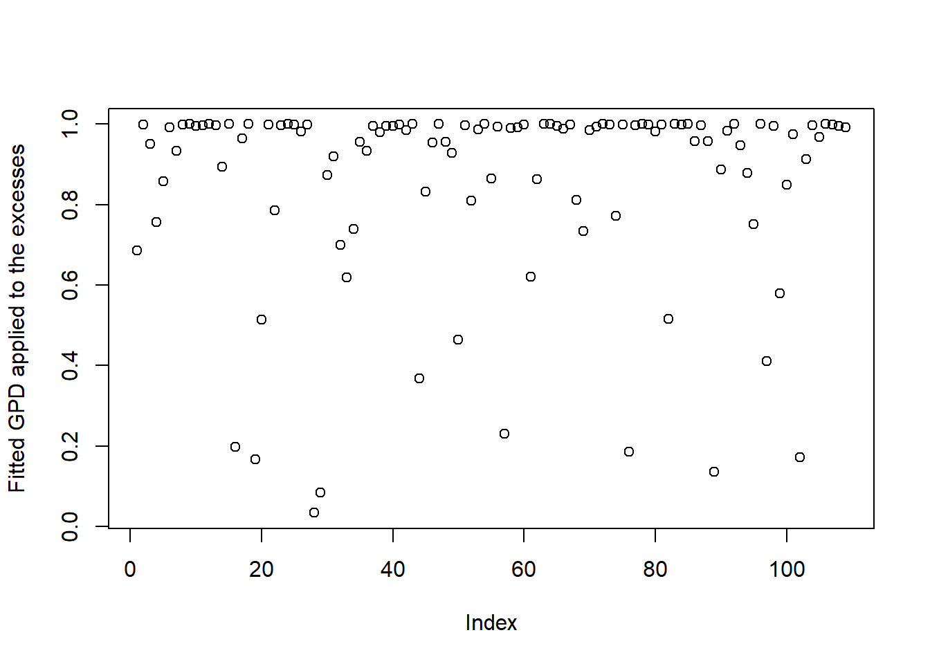
hist(z, xlab = "z = prob(loss.excess)",
    ylab = "Count of Excess", main = "GPD Goodness of Fit")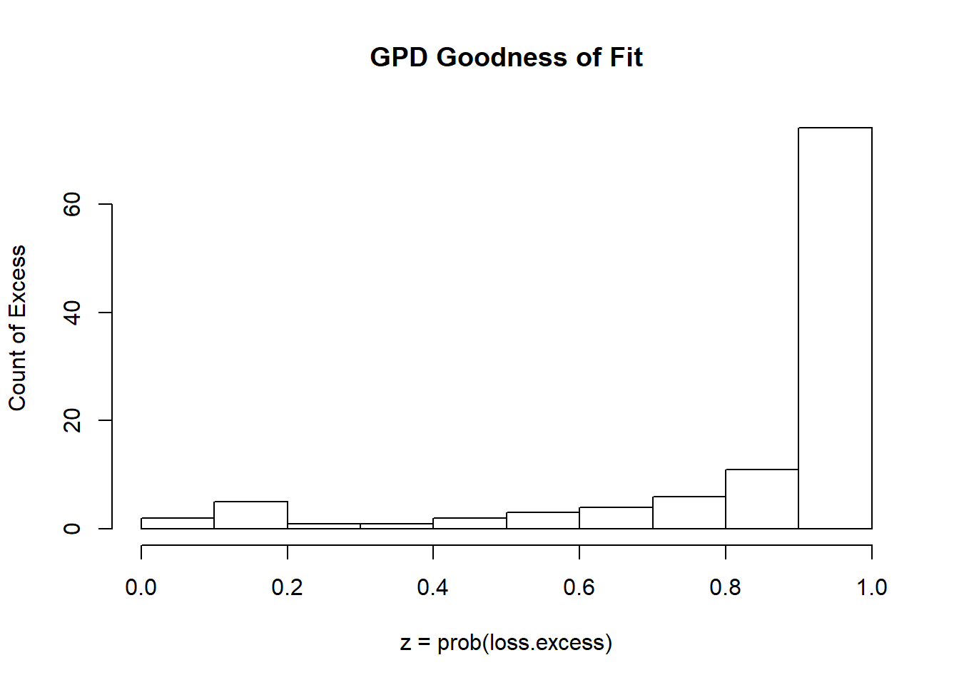
And it is as most of the excesses are in the tail!
8.8.1 Try this exercise
Let’s try other thresholds to sensitize ourselves to the GPD fit and coefficients.
## Fit GPD model above 10
u <- 10
fit.danish <- fit.GPD(danish, threshold = u)
(RM.danish <- RiskMeasures(fit.danish,
    c(0.99, 0.995)))
## p quantile sfall
## [1,] 0.990 27.28640 58.22848
## [2,] 0.995 40.16646 83.83326Now let’s look at the whole picture with these exceedances. On the vertical axis we have the probabilities that you are in the tail … the extreme loss of this operation. On the vertical axis we have the exceedances (loss over the threshold u). The horizontal line is our risk tolerance (this would be h percent of the time we don’t want to see a loss…)
plotFittedGPDvsEmpiricalExcesses(danish,
    threshold = u)
abline(h = 0.01)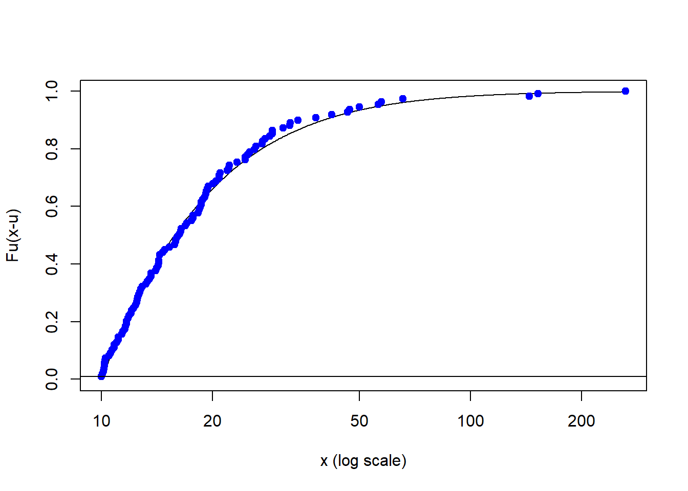
Let’s use the showRM function in the QRM package to calculate the expected shortfall confidence intervals. The initial alpha.tolerance is 1 - h risk tolerance. We are only looking at the expected shortfall and could also have specified value at risk. What we really want to see is the range of ES as we wander into the deep end of the pool with high exceedances. The BFGS is described technically here: https://en.wikipedia.org/wiki/Broyden%E2%80%93Fletcher%E2%80%93Goldfarb%E2%80%93Shanno_algorithm.
alpha.tolerance <- 0.05
showRM(fit.danish, alpha = 1 - alpha.tolerance,
    RM = "ES", method = "BFGS")
CI stands for “confidence interval” and we answer this question:
For each level of tolerance for loss (vertical axis) what is the practical lower and upper limit on the expected shortfall of 23.95 million?
Practically speaking how much risk would managers be willing to retain (lower bound) and how much would you underwrite (upper - lower bounds)?
8.8.2 The shape of things to come
Let’s now plot the GPD shape parameter as a function of the changing threshold.
## Effect of changing threshold on xi
xiplot(danish)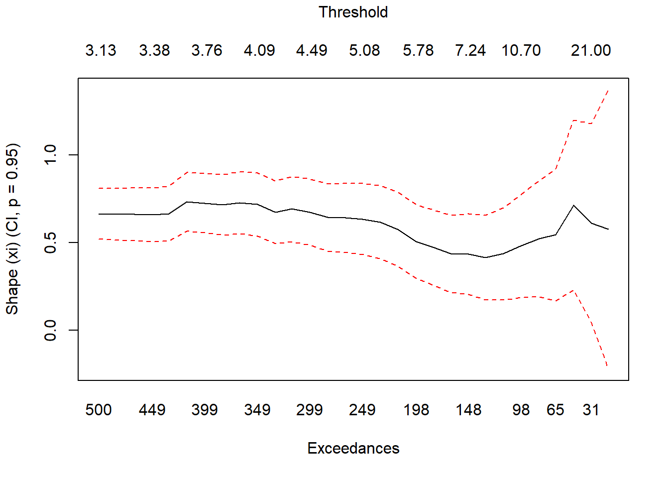
What does xi tell us? Mainly information about the relationship between our risk measures. The ratio of VaR to ’ES` is \((1 - \xi)^{-1}\) if \(0 \leq \xi \geq 1\). How bent the tail will be: higher \(\xi\) means a heavier tail, and a higher frequency of very large losses.
Again the upper and lower bounds help us diagnose what is happening to our exceedances. The Middle line is the shape parameter at variour thresholds and their corresponding exceedances. Dashed red lines are the “river banks” bounding the upper and lower edges of the tail (by threshold) distribution of the estimated risk measure. Fairly stable?
8.8.3 Example
We can run this code to throw the two popular risk measures together.
## Fit GPD model above 20
mod2 <- fit.GPD(danish, threshold = 20)
mod2$par.ests
## xi beta
## 0.6844366 9.6341385mod2$par.ses## xi beta
## 0.2752081 2.8976652mod2$par.ests/mod2$par.ses## xi beta
## 2.486978 3.324794plotFittedGPDvsEmpiricalExcesses(danish,
threshold = 20)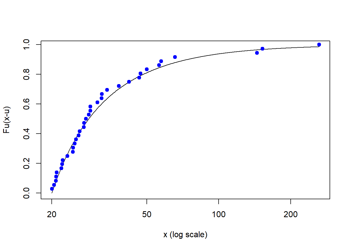
(RMs2 <- RiskMeasures(mod2, c(0.99, 0.995)))## p quantile sfall
## [1,] 0.990 25.84720 69.05935
## [2,] 0.995 37.94207 107.38721RMs2## p quantile sfall
## [1,] 0.990 25.84720 69.05935
## [2,] 0.995 37.94207 107.38721plotTail(mod2)
showRM(mod2, alpha = 0.99, RM = "VaR",
method = "BFGS")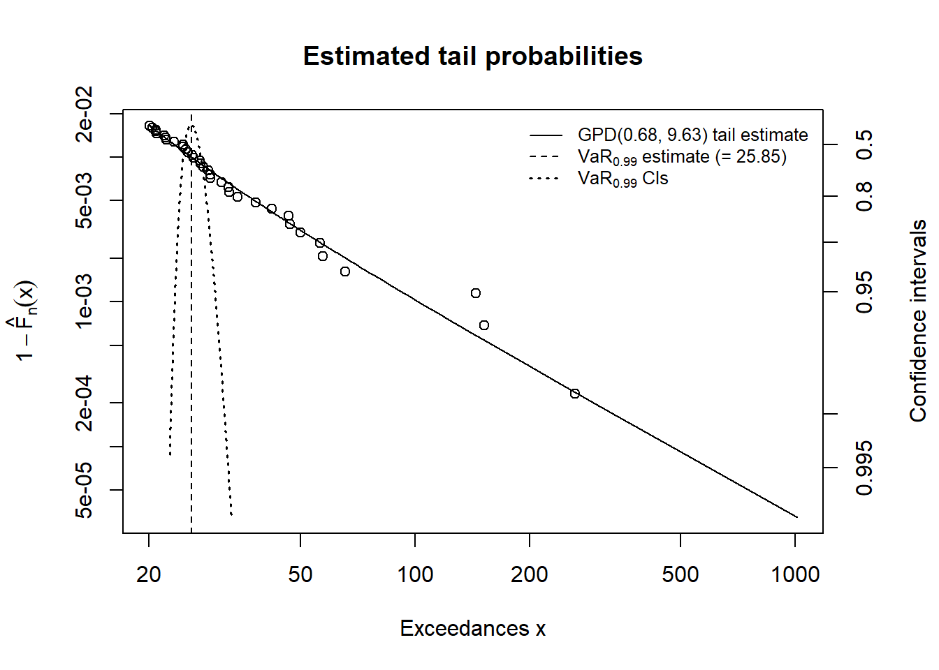
showRM(mod2, alpha = 0.99, RM = "ES",
method = "BFGS")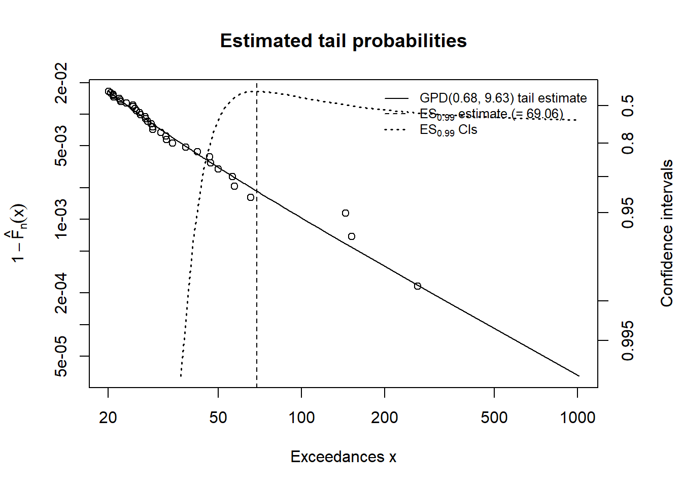
We are just doubling the threshold. Here is the workflow:
- Interpret the fit with
mod2$par.ests/mod2$par.ses - Interpret the empiral excesses for this threshold.
- Compute the risk measures.
- Relate risk tolerance to exceedance.
- Compare value at risk with expected shortfall.
Some results follow
Run this code first. This is the cumulative probability of an exceedance over a threshold, here 20.
plotFittedGPDvsEmpiricalExcesses(danish,
    threshold = 20)
Let’s interpret across various threshold regions:
- From 20 to about 40, fairly dense and linear
- From about 40 to 60, less dense and a more bent slope (\(\xi\) is bigger than for lower threshold)
- Big and less frequent outliers from about 60 to well over 200.
Some managerial implications to spike the discussion could include:
- Budget for loss in region 1
- Buy insurance for region 2
- Consider some loss reserves for region 3
mod2 <- fit.GPD(danish, threshold = 20)
mod2$par.ests## xi beta
## 0.6844366 9.6341385mod2$par.ses## xi beta
## 0.2752081 2.8976652(t.value <- mod2$par.ests/mod2$par.ses)## xi beta
## 2.486978 3.324794The ratio of the parameter estimates to the standard errors of those estimates gives up an idea of the rejection of the hypothesis that the parameters are no different than zero. In R we can do this:
(p.value = dt(t.value, df = length(danish) -
2))## xi beta
## 0.018158771 0.001604948Here df is the degrees of freedom for 2 estimated parameters. Thep.values are very low, meaning there is a very small chance that the estimates are zero. Various risk measures and tail plots can elucidate more interpretation. Here we can use two confidence levels.
(RMs2 <- RiskMeasures(mod2, c(0.99, 0.995)))## p quantile sfall
## [1,] 0.990 25.84720 69.05935
## [2,] 0.995 37.94207 107.38721plotTail(mod2)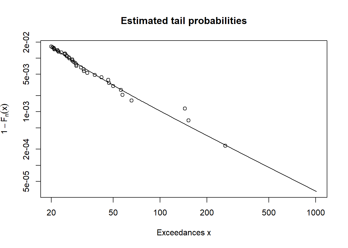
A comparison for the mod2 run is shown here.
showRM(mod2, alpha = 0.99, RM = "VaR",
method = "BFGS")
showRM(mod2, alpha = 0.99, RM = "ES",
    method = "BFGS")
8.9 Summary
Operational risk is “extreme” finance with (of course) extreme value distributions, methods from reliability and vulnerability analysis thrown in for good measure, and numerous regaultory capital regulations. We just built both simulation and estimation models that produced data driven risk thresholds of an operational nature. That nature means:
- Heavy tail loss severity distributions,
- Often with frequencies that may vary considerably over time, and
- Random losses over time
Application of robuswt risk measures is an ongoing exercise, especially as we learn more about loss and its impact on operations and strategy.
8.10 Further Reading
Much of the operational risk methodologies have been developed around insurance, bank supervision, and reliability engineering. Useful references are the textbooks of Cruz (2004) and Panjer (2006). The material in this chapter derives from these and prominently from McNeil et al. (2015, chapters 5 and 13) with R code from their QRM, qrmtools, and evir packages on CRAN.
8.11 Practice Laboratory
8.11.1 Practice laboratory #1
8.11.1.1 Problem
8.11.1.2 Questions
8.11.2 Practice laboratory #2
8.11.2.1 Problem
8.11.2.2 Questions
8.12 Project
8.12.1 Background
8.12.2 Data
8.12.3 Workflow
8.12.4 Assessment
We will use the following rubric to assess our performance in producing analytic work product for the decision maker.
The text is laid out cleanly, with clear divisions and transitions between sections and sub-sections. The writing itself is well-organized, free of grammatical and other mechanical errors, divided into complete sentences, logically grouped into paragraphs and sections, and easy to follow from the presumed level of knowledge.
All numerical results or summaries are reported to suitable precision, and with appropriate measures of uncertainty attached when applicable.
All figures and tables shown are relevant to the argument for ultimate conclusions. Figures and tables are easy to read, with informative captions, titles, axis labels and legends, and are placed near the relevant pieces of text.
The code is formatted and organized so that it is easy for others to read and understand. It is indented, commented, and uses meaningful names. It only includes computations which are actually needed to answer the analytical questions, and avoids redundancy. Code borrowed from the notes, from books, or from resources found online is explicitly acknowledged and sourced in the comments. Functions or procedures not directly taken from the notes have accompanying tests which check whether the code does what it is supposed to. All code runs, and the
R Markdownfileknitstopdf_documentoutput, or other output agreed with the instructor.Model specifications are described clearly and in appropriate detail. There are clear explanations of how estimating the model helps to answer the analytical questions, and rationales for all modeling choices. If multiple models are compared, they are all clearly described, along with the rationale for considering multiple models, and the reasons for selecting one model over another, or for using multiple models simultaneously.
The actual estimation and simulation of model parameters or estimated functions is technically correct. All calculations based on estimates are clearly explained, and also technically correct. All estimates or derived quantities are accompanied with appropriate measures of uncertainty.
The substantive, analytical questions are all answered as precisely as the data and the model allow. The chain of reasoning from estimation results about the model, or derived quantities, to substantive conclusions is both clear and convincing. Contingent answers (for example, “if X, then Y , but if A, then B, else C”) are likewise described as warranted by the model and data. If uncertainties in the data and model mean the answers to some questions must be imprecise, this too is reflected in the conclusions.
All sources used, whether in conversation, print, online, or otherwise are listed and acknowledged where they used in code, words, pictures, and any other components of the analysis.
8.13 References
Cruz, M.G. 2004. Operational Risk Modelling and Analysis: Theory and Practice. London: Risk Books.
McNeill, Alexander J., Rudiger Frey, and Paul Embrechts. 2015. Quantitative Risk Management: Concepts, Techniques and Tools. Revised Edition. Princeton: Princeton University Press.
Panjer, H.H. 2006. Operational Risk: Modeling Analytics. New York: Wiley.