Chapter 5 Descriptive Statistics and Data Visualization
Below are some basic commands to calculate descriptive statistics and generate associated graphs. Below that I showcase the table1 package/function, which makes calculating and automatically generating a table of summary statistics easy. Lastly, I include some links to some helpful data visualization resources and showcase the patchwork package, which allows one to combine multiple graphs into a single display.
5.1 Packages Needed for Descriptive Statistics and Data Visualization
This code will check that required packages for this chapter are installed, install them if needed, and load them into your session.
req <- substitute(require(x, character.only = TRUE))
libs<-c("psych", "ggplot2", "table1", "patchwork")
sapply(libs, function(x) eval(req) || {install.packages(x); eval(req)})
5.2 Interval or Continuous Variables
There are a variety of packages and commands that will return various descriptive statistics. Here are some options:
psych::describe(mydata, digits = 2)
psych::describe(mydata$intvar, digits = 2)
You can also get descriptive statistics for interval variables broken out by groups (categorical variable).
psych::describe.by(mydata, mydata$groupvar, digits = 2)Histograms (and related density and area plots) and boxplots are all useful for visualizing continuous variables. All of these can be refined by adding/changing arguments.
ggplot2::ggplot(data = mydata, aes(x = intvar)) + geom_histogram(binwidth = 5)

ggplot2::ggplot(data = mydata, aes(x = intvar)) + geom_density(kernel = "gaussian")

ggplot2::ggplot(data = mydata, aes(x = intvar)) + geom_area(stat = "bin"))

ggplot2::ggplot(data = mydata, aes(x = intvar)) + geom_boxplot()
5.3 Categorical Variables
For simple frequency counts:
table(mydata$catvar)To calculate proportions for a categorical variable, it is a two step process:
object <- table(mydata$catvar)
prop.table(object)
Bar charts are most often used to visualize categorical variables. You can have the bars reflect frequencies or percentages/proportions.
# Frequency Bar Graph

ggplot2::ggplot(data = mydata, aes(x = catvar)) +
   geom_bar() +
   xlab("X-axis label") +
   ylab("Frequency")

# Percentage/Proportion Bar Graph

ggplot2::ggplot(data = mydata, aes(x = catvar)) +
   geom_bar(aes(y = (..count..)/sum(..count..))) +
   xlab("X-axis label") +
   scale_y_continuous(labels = scales::percent_format(), name = "Proportion")
5.4 Generating a Summary Statistics Table
There are a variety of packages that have been created to facilitate the production of summary statistics tables. I’ll showcase table1 here. This site offers some helpful insights on how to make the most of the table1 package/function.
Before attempting to generate a table, you will want to first reclassify your categorical variables as factor variables.
# Classify your categorical variables as factor variables

mydata$catvar <- factor(mydata$catvar)

# If you want to add value labels at the same time:

mydata$catvar <- factor(mydata$catvar, levels = c(1,2,3),
   labels = c("label1", "label2", "label3"))

# If using only some of the variables in a dataset, create a subset of your data.

mydata2 <- subset(mydata, select = c(var1, var2, var3))

# If you only need to exclude a variable or two (here var1 and var2):

mydata2 <- subset(mydata, select = -c(var1, var2))

# Generate your table of summary statistics (I'm including some arguments you may want to change)

table1::table1(~var1 + var2 + var3, data = mydata, na.rm = TRUE, digits = 1, format.number = TRUE)

# If you want to break out your summary statistics by groups:

table1::table1(~var1 + var2 + var3 | groupvar, data = mydata, na.rm = TRUE, digits = 1, format.number = TRUE)

# Copy and paste the table into your document!
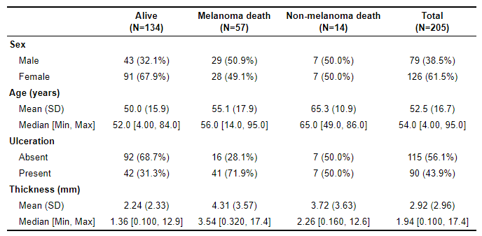
Here’s an example of a summary statistics table generated by table1.
5.5 Additional Graphing Resources
Additional graphing commands for bivariate analyses and multiple regression results are included in the the subsequent chapters. Here are some helpful links related to graphing and visualizing data in R. Most focus on ggplot2.
- A friendly r-blogger posting on ggplot2
- R graph gallery
- ggplot2 reference page
- ggplot2 cheat sheet
- ggplot2 Rdocumentation page
- plotly graph library
- Hadley Wickham’s book, ggplot2: Elegant Graphics for Data Analysis
- Kieran Healy’s book, Data Visualization: A Practical Introduction
- Winston Chang’s book, R Graphics Cookbook, 2nd edition
5.6 Patchwork for Combining Graphs
The patchwork package is also quite useful for displaying multiple graphs at once. Each graph is assigned to an object. They are then simply patched together using a few different options.
# Generate graphs, assigning each to a distinct object
p1 <- ggplot2::ggplot(data = mydata, aes(x = intvar1, y = intvar2)) + geom_point() + ggtitle("Graph title")
p2 <- ggplot2::ggplot(data = mydata, aes(x = catvar, y = intvar)) + geom_boxplot() + ggtitle("Graph title")
p3 <- ggplot2::ggplot(data = mydata, aes(x = intvar)) + geom_smooth() + ggtitle("Graph title")
p4 <- ggplot2::ggplot(data = mydata, aes(x = catvar)) + geom_bar() + ggtitle("Graph title")
# Patch the objects together
p1 / p2 / p3 # This stacks the graphs vertically
p1 + p2 + p3 # This aligns them horizontally
p1 / (p2 + p3) # p1 is placed above p2 and p3, which are horizontal to one another
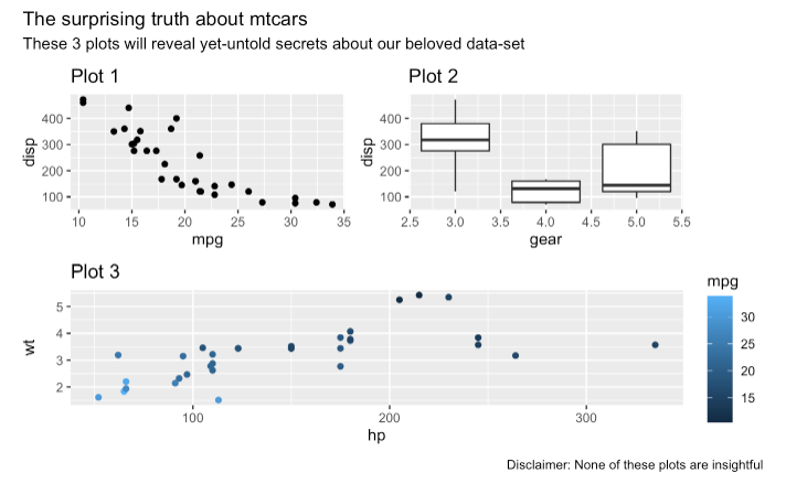
# To add an overall title, subtitle, and caption:
object <- p1 / (p2 + p3)
object + plot_annotation(title = "Title of overall graph", subtitle = "Subtitle if desired",
caption = "Caption at bottom of graph if desired", )
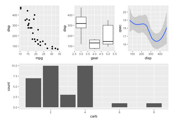
Here’s are a couple of examples of patchwork at work:
(p1 + p2 + p3) / p4
Check out Little Miss Data’s r-bloggers post on patchwork for more information and examples.
This webpage is useful for adding titles, subtitles, captions, and tags. An example from that page: