Chapter 9 Correlation and Simple OLS Regression
Placeholders that need replacing:
- mydata – name of your dataset
- var1, var2, 3rdvar, etc – general variable(s)
- xvar, yvar, zvar – x and y variables; z-axis variable
- depvar, indvar1, indvar2, etc – general variables
- catvar – name of your categorical variable
- intvar – name of your interval or continuous variable
- object(s) – whatever you want to call your object(s))
- filename – whatever you want to call your html file
- labels/title – any titles, axis labels, category labels
9.1 Packages Needed for Correlation and Simple OLS Regression
This code will check that required packages for this chapter are installed, install them if needed, and load them into your session.
req <- substitute(require(x, character.only = TRUE))
libs<-c("tidyverse", "ggplot2", "GGally", "plotly", "ggstatsplot", "car", "rgl", "sjPlot")
sapply(libs, function(x) eval(req) || {install.packages(x); eval(req)})
9.2 Basic Correlation Command
Note that the “complete.obs” portion of the command helps R deal with situations of missing data. Without it, missing data (NA) may cause the function to return “NA” as a result. Although these basic commands work just fine for a pair of variables, you have much better options for producing a correlation matrix further below (e.g., sjPlot::tab_corr).
cor(mydata$var1, mydata$var2, use = "complete.obs")
cor.test(mydata$var1, mydata$var2, use = "complete.obs")
9.3 Correlation Matrix
I find sjPlot’s tab_corr function to offer the easiest path to creating a correlation matrix (in pre-formatted table!). This command produces a html file that is saved to your working directory. You can copy/paste the table into a Word document. If you want the actual p-values, include ‘p.numeric = TRUE’ as an argument in the command.
sjPlot::tab_corr(mydata[, c("var1", "var2", "var3")], na.deletion = "listwise",
corr.method = "pearson", title = "Title of Table", show.p = TRUE, digits = 2, triangle = "lower", file = "filename.htm")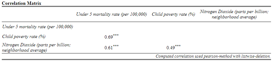
9.4 Graphing Options for Correlation
There are a few graphing options to choose from: Scatterplot (and fitted line) in bivarate analysis situations; a correlogram for correlation matrix situations; a scatterplot matrix and correlation matrix; a 3D scatterplot; and an interactive scatterplot.
I also encourage you to check out the R Graph Gallery, a website that showcases different graphs and provides their associated code.
9.4.1 Scatterplot and Fitted Line
Here are the basic commands for a scatterplot and a fitted line (and then the combination of the two with more options). If you have a lot of cases, the “alpha” argument can help show concentrated areas.
ggplot(data = mydata, aes(x = xvar, y = yvar)) + geom_point()

ggplot(data = mydata, aes(x = xvar, y = yvar)) + geom_smooth(method = "lm")

ggplot(data = mydata, aes(x = xvar, y = yvar, color = 3rdvar)) +
  geom_point(alpha = .3, size = 3) +
  geom_smooth(method = "lm", aes(group = 1), color = "black") +
  labs(title = "Title of Graph", x = "X-axis label", y = "Y-axis label")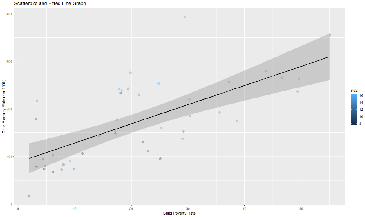
9.4.2 Correlogram for Correlation Matrix
If you want listwise deletion to be used, you will first have to create a subset dataset and drop those cases that have NA in any of the variables.
mydata2 <- mydata[complete.cases(mydata[ c("var1", "var2", "var3")]),]
ggstatsplot::ggcorrmat(data = mydata2, cor.vars = c(var1, var2, var3),
  cor.vars.names = c("var1 name", "var2 name", "var3 name"), title = "Title of Graph", matrix.type = "lower")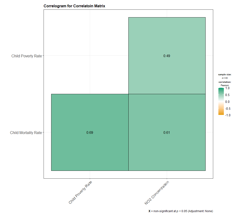
9.4.3 Scatterplot Matrix and Correlation Matrix
To generate a scatterplot matrix and a correlation matrix, we can use either GGally’s ggpairs() function (which can accommodate a categorical variable) or sjPlot’s tab_corr() function. The tab-corr function produces a document (.htm works best; saves to the working directory). If you want the actual p-values instead of asterisks, include ‘p.numeric = TRUE’ as an argument in the sjPlot::tab_corr command.
If you are including a categorical variable, be sure to declare it as a factor variable if you haven’t already done so.
mydata$catvar <- factor(mydata$catvar)

GGally:ggpairs(data = subset(mydata, select = c(var1, var2, var3, var4), title = "Graph Title"))

GGally::ggpairs(data = subset(mydata, select = c(var1, var2, var3, catvar)), +
  ggplot2::aes(group = 1, color = catvar, alpha = .5))

sjPlot::tab_corr(mydata[, c("var1", "var2", "var3")], na.deletion = "listwise", corr.method = "pearson",
  title = "Title of Table", show.p = TRUE, digits = 2, triangle = "lower", file = "filename.htm")
9.4.4 3D Scatterplot
The car and rgl packages makes possible an interactive 3d scatterplot. You can also create separate planes based on a factor variable (catvar). I do find that I often switch the xvar and zvar variables to correspond with how I think the 3D scatterplot should look. Note! To get this to display more intuitively, your “z-axis label” should be attached to xlab and your “x-axis label” should be the label for your zlab. Weird, I know.
scatter3d(yvar ~ zvar + xvar, data = mydata, xlab = "z-axis label", ylab = "y-axis label", zlab = "x-axis label")

scatter3d(yvar ~ zvar + xvar | catvar, data = mydata, xlab = "z-axis label", ylab = "y-axis label", zlab = "x-axis label")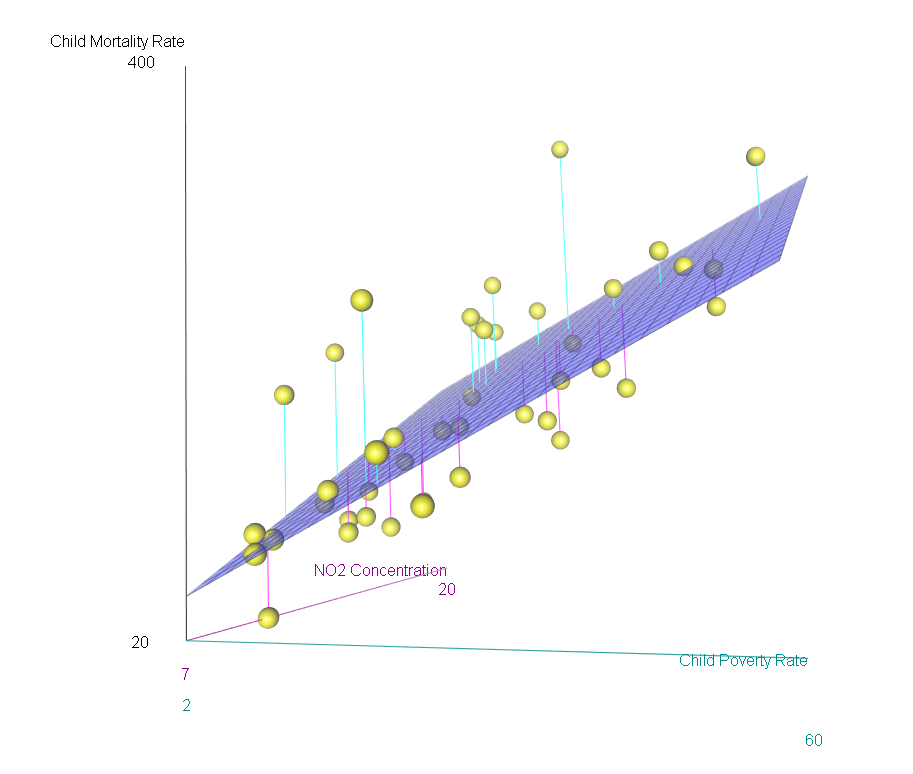
9.4.5 Interactive Scatterplot
This interactive scatterplot uses the plotly package. You can either create an object first with ggplot and then use plotly’s ggplotly function, or can use the plot_ly function directly.
object <- ggplot(data = mydata, aes(x = xvar, y = yvar, color = 3rdvar)) +
  geom_point(alpha = .3, size = 3) +
  geom_smooth(method = "lm", aes(group = 1), color = "black") +
  labs(title = "Title of Graph", x = "X-axis label", y = "Y-axis label")
plotly::ggplotly(object)

plotly::plot_ly(data = mydata, x = ~xvar, y = ~yvar, type = "scatter")
9.5 Consolidated Code for Correlation and Simple OLS Regression
Below is the consolidated code from this chapter. One could transfer this code into an empty RScript, which also offers the option of find/replace terms. You can also download this generic correlation and simple OLS regression RScript file here
Placeholders that need replacing:
- mydata – name of your dataset
- var1, var2, 3rdvar, etc – general variable(s)
- xvar, yvar, zvar – x and y variables; z-axis variable
- depvar, indvar1, indvar2, etc – general variables
- catvar – name of your categorical variable
- intvar – name of your interval or continuous variable
- object(s) – whatever you want to call your object(s))
- filename – whatever you want to call your html file
- labels/title – any titles, axis labels, category labels
# Correlation and Simple Regression -- Generic RScript

# 8.1 Packages Needed

  req <- substitute(require(x, character.only = TRUE))
  libs<-c("tidyverse", "ggplot2", "GGally", "plotly", "ggstatsplot", "car", "rgl", "sjPlot")
  sapply(libs, function(x) eval(req) || {install.packages(x); eval(req)})


# 8.2 Basic correlation command

  cor(mydata$var1, mydata$var2, use = "complete.obs")
  cor.test(mydata$var1, mydata$var2, use = "complete.obs")


# 8.3 Correlation Matrix

## if want the actual p-values, include p.numeric = TRUE as an argument in the command.

  sjPlot::tab_corr(mydata[, c("var1", "var2", "var3")], na.deletion = "listwise",
    corr.method = "pearson", title = "Title of Table", show.p = TRUE, digits = 2,
    triangle = "lower", file = "filename.htm")


# 8.4   Graphing Options

## 8.4.1 Scatterplot and fitted line

  ggplot(data = mydata, aes(x = xvar, y = yvar)) + geom_point()

  ggplot(data = mydata, aes(x = xvar, y = yvar)) + geom_smooth(method = "lm")

  ggplot(data = mydata, aes(x = xvar, y = yvar, color = 3rdvar)) +
    geom_point(alpha = .3, size = 3) +
    geom_smooth(method = "lm", aes(group = 1), color = "black") +
    labs(title = "Title of Graph", x = "X-axis label", y = "Y-axis label")


## 8.4.2 Correlogram for Correlation Matrix

## If you want listwise deletion to be used, you will first have to create a subset data set and drop those cases that have NA in any of the variables.

  mydata2 <- mydata[complete.cases(mydata[ c("var1", "var2", "var3")]),]

  ggstatsplot::ggcorrmat(data = mydata2, cor.vars = c(var1, var2, var3), cor.vars.names =
    c("var1 name", "var2 name", "var3 name"), title = "Title of Graph", matrix.type = "lower")


## 8.4.3 Scatterplot Matrix and Correlation Matrix

## Can use either GGally’s ggpairs() function (which can accommodate a categorical variable) or sjPlot’s tab_corr() function)

## If using a categorical variable, be sure to declare it as a factor variable if you haven’t already done so.

  mydata$catvar <- factor(mydata$catvar)

  GGally:ggpairs(data = subset(mydata, select = c(var1, var2, var3, var4), title = "Graph Title"))

  GGally::ggpairs(data = subset(mydata, select = c(var1, var2, var3, catvar)), +
    ggplot2::aes(group = 1, color = catvar, alpha = .5))

## output to .htm works best; saves to working directory
## if want the actual p-values, include p.numeric = TRUE as an argument.

  sjPlot::tab_corr(mydata[, c("var1", "var2", "var3")], na.deletion = "listwise",
    corr.method = "pearson", title = "Title of Table", show.p = TRUE, digits = 2,
    triangle = "lower", file = "filename.htm")


## 8.4.4 3D Scatterplot

## The car and rgl packages makes possible an interactive 3d scatterplot. You can also create separate plans
## based on a factor variable (catvar). Link to scatter3d page. I do find that I often switch the xvar and zvar
## variables to correspond with how I think the 3d scatterplot should look. Note! To get this to display more
## intuitively, your "z-axis label" should be attached to xlab and your "x-axis label" should be the label for
## your zlab.

  scatter3d(yvar ~ zvar + xvar, data = mydata, xlab = "z-axis label", ylab = "y-axis label", zlab = "x-axis label")

  scatter3d(yvar ~ zvar + xvar | catvar, data = mydata, xlab = "z-axis label", ylab = "y-axis label", zlab = "x-axis label"))


## 8.4.5 Interactive Scatterplot (using plotly package)

## Can either create an object first with ggplot and then use plotly’s ggplotly function, or can use the plot_ly function directly.

  object <- ggplot(data = mydata, aes(x = xvar, y = yvar, color = 3rdvar)) +
    geom_point(alpha = .3, size = 3) +
    geom_smooth(method = "lm", aes(group = 1), color = "black") +
    labs(title = "Title of Graph", x = "X-axis label", y = "Y-axis label")
  plotly::ggplotly(object)

## Or can use

  plotly::plot_ly(data = mydata, x = ~xvar, y = ~yvar, type = "scatter")