Chapter 7 ANOVA
This chapter provides generic code for carrying out an analysis of variance (ANOVA). It is recommended that you proceed through the sections in the order they appear. If, however, you want to do a quick analysis, I recommend loading the packages, prepping your data, and then running the ggstatsplot::ggbetweenstats command in section 7.6. You can find the consolidated code from this chapter in the last section.
Placeholders that need replacing:
- mydata – name of your dataset
- catvar – name of your categorical variable
- intvar – name of your interval or continuous variable
- object – whatever you want to call your object(s))
- label – any titles, axis labels, category labels
- 1, 2, 3 – For the ggplot command to generate bar graphs, you may need to change these numbers to fit your variable.
7.1 Packages Needed for ANOVA
This code will check that required packages for this chapter are installed, install them if needed, and load them into your session.
req <- substitute(require(x, character.only = TRUE))
libs<-c("ggplot2", "ggstatsplot", "patchwork", "GGally", "moments", "Rmisc", "DescTools", "ggpubr")
sapply(libs, function(x) eval(req) || {install.packages(x); eval(req)})
7.2 Data Prep for ANOVA
One of the key preparations you need to make is to declare (classify) your categorical variable as a factor variable. In the generic commands below, the ‘class’ function tells you how R currently sees the variable (e.g., double, factor, character). The second command will reclassify the specified categorical variable as a factor variable.
class(mydata$catvar)
mydata$catvar <- factor(mydata$catvar)
7.3 Checking Data for Violations of Assumptions for ANOVA
There are generally three assumptions researchers check when conducting ANOVA: 1) Relatively equal group sizes; 2) Relatively equal variances; 3) That the interval or continuous variable is normally distributed. The following generic commands offer insights on each.
7.3.1 Group Frequencies for ANOVA
table(mydata$catvar)7.3.2 Checking Equal Variances for ANOVA
Group means and standard deviations (Note: the ‘aggregate’ and ‘by’ functions give you the same results):
aggregate(mydata$intvar, by = list(mydata$catvar), FUN = mean, na.rm = TRUE)
aggregate(mydata$intvar, by = list(mydata$catvar), FUN = sd, na.rm = TRUE)

by(mydata$intvar, mydata$catvar, mean, na.rm = TRUE)
by(mydata$intvar, mydata$catvar, sd, na.rm = TRUE)
You can also use the Rmisc package to produce a simple bar graph of group means and CIs. This command is repeated further below in the graphing section. Note: The ggplot command will vary depending on the number of categories in the grouping variable and how they are valued (i.e., your values may not be 1, 2, 3…k).
object <- Rmisc::summarySE(mydata, measurevar = "intvar", groupvars = c("catvar"), na.rm = TRUE)
ggplot2::ggplot(object, aes(x = factor(catvar), y = intvar)) +
  geom_bar(stat = "Identity", fill = "gray", width = 0.8) +
  geom_errorbar(aes(ymin = intvar - se, ymax = intvar + se), width = .2, color = "black") +
  xlab("Overall label for x-axis groups") + ylab("Y-axis label") + scale_x_discrete(breaks =
    c("1", "2", "3"), labels = c("category 1 label", "category 2 label", "category 3
label")) 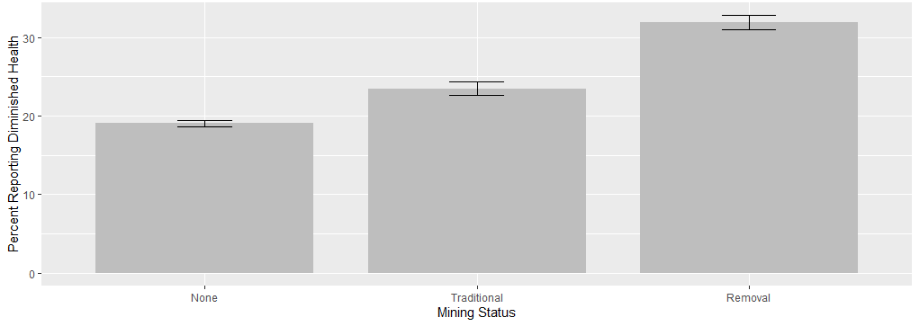
If you wish to run a Bartlett’s test for equal variances:
bartlett.test(intvar ~ catvar, data = mydata)7.3.3 Checking Normality for ANOVA
The following generic commands can be used to check for skewness and kurtosis (skewness of 0 and kurtosis of 3 are considered normal). You can also visually inspect the data by looking at a density graph and quantile-quantile (qqplot) (the qqplot draws a correlation between a sample and a normal distribution; the dots should form a relatively straight 45 degree line if there is a normal distribution).
moments::skewness(mydata$intvar, na.rm = TRUE)
moments::kurtosis(mydata$intvar, na.rm = TRUE)
ggpubr::ggdensity(mydata$intvar, fill = "lightgray")
ggpubr::ggqqplot(mydata$intvar)
Beyond a visual inspection, you can conduct a Shapiro-Wilk’s test of normality, where a p < .05 indicates a non-normal distribution and a p > .05 indicates normally distributed data. This can be a sensitive test, particularly with a large N, so use in conjunction with other information. It is also limited to a sample of 5000.
shapiro.test(mydata$intvar)7.4 The Analysis of Variance and Effect Size
The lines of code are the basic commands for running an ANOVA and calculating effect size (eta-squared). The first assigns the results to the object. The second displays the results contained in the object, while the EtaSq function calculates a measure of effect size. You can follow the basic ANOVA with a pairwise t-test (bonferroni), where the results show the p-values associated with the difference in means between each pairing. Better still, jump straight to the ggstatsplot::ggbetweenstats option in section 6, which produces all of this ouput and more (and a graph!) in a single line of code. I include it here for convenience.
object <- aov(intvar ~ catvar, data = mydata)
summary(object)
DescTools::EtaSq(object, type = 2, anova = FALSE)
pairwise.t.test(mydata$intvar, mydata$catvar, p.adj = "bonf")
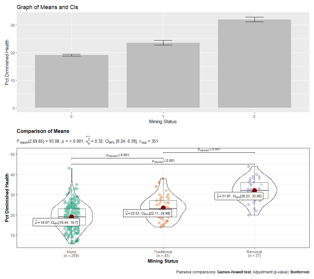
ggstatsplot::ggbetweenstats(data = mydata, x = catvar, y = intvar, effsize.type = "partial_eta",
mean.ci = TRUE, pairwise.comparisons = TRUE, p.adjust.method = "bonferroni",
bf.message = FALSE, title = "Title of Graph",
xlab = "X-axis label", ylab = "Y-axis label")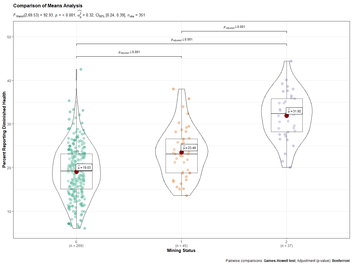
7.5 Kruskal-Wallis Non-Parametric Test
If you have violated one or more of the assumptions, you can run a Kruskal-Wallis rank sum test as a check on your ANOVA conclusions.
kruskal.test(intvar ~ catvar, data = mydata)7.6 Graphing Options for ANOVA
Boxplots and Violin plots are probably the most complementary graphs for ANOVA, though you can also do simple bar graphs of the group means with CIs. The ggplot2 package is generally the go-to package for graphs. The ggstatsplot package, however, provides a one-stop shop for graphing and conducting ANOVA and pairwise comparisons. It produces your boxplot/violin plot graph and calculates your ANOVA, while indicating whether the differences in means between any two groups is statisticallly significant.
I also encourage you to check out the R Graph Gallery, a website that showcases different graphs and provides their associated code.
The ggplot2 commands are as follows (the first shows code for a basic boxplot; the second adds a marker for means to the boxplot; and the third shows a violin plot/boxplot combination). More arguments/options exist within the ggplot2 package to customize your graphs.
ggplot2::ggplot(data = mydata, aes(x = catvar, y = intvar)) +
  geom_boxplot() +
  labs(title = "Title of Graph", x = "X-axis label", y = "Y-axis label")

ggplot2::ggplot(data = mydata, aes(x = catvar, y = intvar)) +
  geom_boxplot() + stat_summary(fun.y = mean, geom = "point", shape = 8, size = 4, color = "blue", fill = "blue") +
  labs(title = "Title of Graph", x = "X-axis label", y = "Y-axis label")

ggplot2::ggplot(data = mydata, aes(x = catvar, y = intvar)) +
  geom_violin() + geom_boxplot() +
  labs(title = "Title of Graph", x = "X-axis label", y = "Y-axis label")
The ggstatsplot package command offers a one-stop shop for ANOVA, producing not only the desired statistics, but a graph as well. Note: If variances are equal, you can include var_equal = TRUE as an additional argument in the command. You can find helpful webpages on ggstatsplot::ggstatsbetween here, here, and here.
ggstatsplot::ggbetweenstats(data = mydata, x = catvar, y = intvar, effsize.type = "partial_eta",
  mean.ci = TRUE, pairwise.comparisons = TRUE, p.adjust.method = "bonferroni",
  bf.message = FALSE, title = "Title of Graph",
  xlab = "X-axis label", ylab = "Y-axis label")
GGally’s ggpairs() function offers another way to look at the relationship.
GGally::ggpairs(data = subset(mydata, select = c(intvar, catvar)), ggplot2::aes(color = catvar, alpha = .5))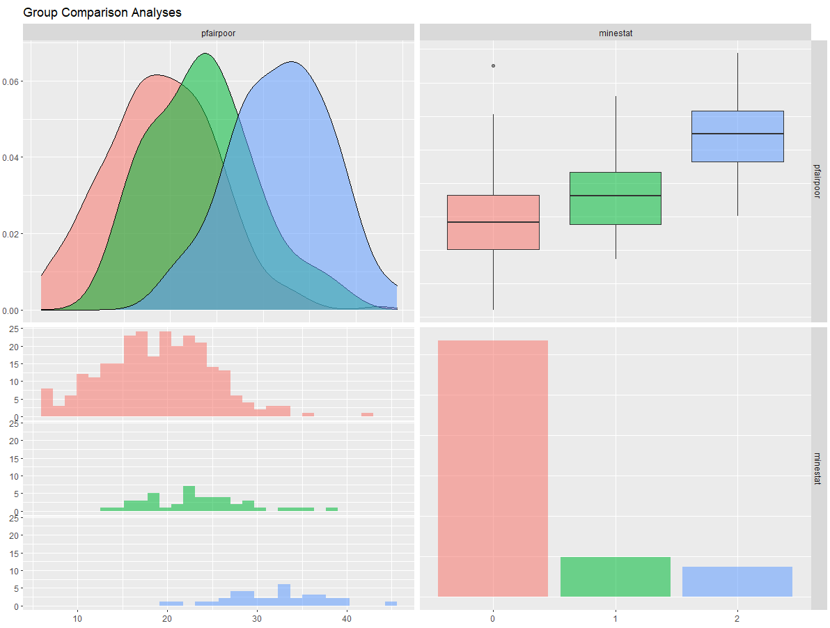
The Rmisc package, along with ggplot2, allows us to also produce a simple bar graph of group means and their CIs. Note: The ggplot command will vary depending on the number of categories in the grouping variable and how they are valued (i.e., your values may not be 1, 2, 3…k).
object <- Rmisc::summarySE(mydata, measurevar = "intvar", groupvars = c("catvar"), na.rm = TRUE)
object
ggplot2::ggplot(object, aes(x = factor(catvar), y = intvar)) +
geom_bar(stat = "Identity", fill = "gray", width = 0.8) +
geom_errorbar(aes(ymin = intvar - se, ymax = intvar + se), width = .2, color = "black") +
xlab("Overall x-axis groups label") + ylab("Y-axis label") + scale_x_discrete(breaks =
c("1", "2", "3"), labels = c("category 1 label", "category 2 label", "category 3
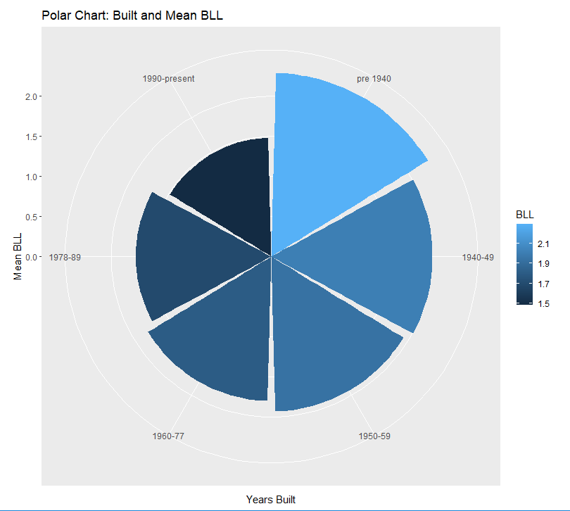
label")) An alternative to the bar graph is a polar chart. It can borrow from much of the same code as above.
# Make sure your categorical variable is classified as a factor variable and has value labels

mydata$catvar <- factor(mydata$catvar, levels = c(1, 2, 3, 4, 5, 6),
  labels = c("1 label", "2 label", "3 label", "4 label", "5 label", "6 label"))

# Calculate summary statistics, assigning them to an object.

object <- Rmisc::summarySE(mydata, measurevar = "intvar", groupvars = c("catvar"), na.rm = TRUE)

object

# If there is a NA row you want to exclude (where number is the row number to be exluded)

object <- object[-c(number), ]

# Use that object in a ggplot

object2 <- ggplot(object2, aes(x = catvar, y = intvar, fill = intvar, na.rm = TRUE)) +
  geom_bar(stat = "identity", width = .95) +
  coord_polar() +
  labs(title = "Polar Chart Title", x = "X Label", y = "Y Label", fill = "fill legend label) +

plot2
The above commands produce a polar chart like this:
Lastly, you may consider “patching” your desired graphs together with the patchwork. You’d only need to assign each graph to an object to do so. Here is an example of patching a bar graph and a ggstatsplot graph together.
7.7 Consolidated Code for ANOVA
Below is the consolidated code from this chapter. One could transfer this code into an empty RScript, which also offers the option of find/replace terms. You can also download this generic ANOVA RScript file here.
Placeholders that need replacing:
- mydata – name of your dataset
- catvar – name of your categorical variable
- intvar – name of your interval or continuous variable
- object – whatever you want to call your object(s))
- label – any titles, axis labels, category labels
- 1, 2, 3 – For the ggplot command to generate bar graphs, you may need to change these numbers to fit your variable.
- number – specified number
# 6.1 Packages Needed

  req <- substitute(require(x, character.only = TRUE))
  libs<-c("ggplot2", "ggstatsplot", "patchwork", "GGally", "moments", "Rmisc", "DescTools", "ggpubr")
  sapply(libs, function(x) eval(req) || {install.packages(x); eval(req)})


# 6.2 Prep Work -- Declare factor variables as such

    class(mydata$catvar)    # this tells you how R currently sees the variable (e.g., double, factor)
    mydata$catvar <- factor(mydata$catvar)  #Will declare the specified variable as a factor variable


# 6.3 Checking data for violations of assumptions

## 6.3.1 Group sizes

  table(mydata$catvar)


## 6.3.2 Checking Equal Variances (Note: the aggregate and by commands give you the same results):

  aggregate(mydata$intvar, by = list(mydata$catvar), FUN = mean, na.rm = TRUE)
  aggregate(mydata$intvar, by = list(mydata$catvar), FUN = sd, na.rm = TRUE)
  by(mydata$intvar, mydata$catvar, mean, na.rm = TRUE)
  by(mydata$intvar, mydata$catvar, sd, na.rm = TRUE)

## A simple bar graph of group means and CIs (using Rmisc package). The ggplot command will vary depending on the number of
## categories in the grouping variable. Your catvar values may not be 1, 2, 3, etc. They could be any number of values;
## adjust accordingly.

  object <- Rmisc::summarySE(mydata, measurevar = "intvar", groupvars = c("catvar"), na.rm = TRUE)
    ggplot2::ggplot(object, aes(x = factor(catvar), y = intvar)) +
        geom_bar(stat = "Identity", fill = "gray", width = 0.8) +
        geom_errorbar(aes(ymin = intvar - se, ymax = intvar + se), width = .2, color = "black") +
        xlab("Overall label for x-axis groups") +
        ylab("Y-axis label") +
        scale_x_discrete(breaks = c("1", "2", "3"), labels = c("category 1 label", "category 2 label", "category 3 label"))

## Bartlett’s test for equal variances:

  bartlett.test(intvar ~ catvar, data = mydata)


## 6.3.3 Checking Normality

  moments::skewness(mydata$intvar, na.rm = TRUE)
  moments::kurtosis(mydata$intvar, na.rm = TRUE)
  ggpubr::ggdensity(mydata$intvar, fill = "lightgray")
  ggpubr::ggqqplot(mydata$intvar)

  shapiro.test(mydata$intvar)


# 6.4 The analysis of variance and effect size (eta-squared)

  object <- aov(intvar ~ catvar, data = mydata)
  summary(object)
  DescTools::EtaSq(object, type = 2, anova = FALSE)

## Conducting follow-up pairwise t-tests (Bonferroni):

  pairwise.t.test(mydata$intvar, mydata$catvar, p.adj = "bonf")

## I actually recommend jumping straight to the ggstatsplot::ggbetweenstats command:

  ggstatsplot::ggbetweenstats(data = mydata, x = catvar, y = intvar,
    pairwise.comparisons = TRUE, mean.ci = TRUE, effsize.type = "partial_eta",
    p.adjust.method = "bonferroni", bf.message = FALSE, title = "Title of Graph",
    xlab = "X-axis label", ylab = "Y-axis label")


# 6.5 Kruskal-Wallis non-parametric test (if needed).

  kruskal.test(intvar ~ catvar, data = mydata)


# 6.6 Graphing Options.

  ggplot2::ggplot(data = mydata, aes(x = catvar, y = intvar)) +
    geom_boxplot() +
    labs(title = "Title of Graph", x = "X-axis label", y = "Y-axis label")

  ggplot2::ggplot(data = mydata, aes(x = catvar, y = intvar)) +
    geom_boxplot() +
    stat_summary(fun.y = mean, geom = "point", shape = 8, size = 4,color = "blue", fill = "blue") +
    labs(title = "Title of Graph", x = "X-axis label", y = "Y-axis label")

  ggplot2::ggplot(data = mydata, aes(x = catvar, y = intvar)) +
    geom_violin() + geom_boxplot() +
    labs(title = "Title of Graph", x = "X-axis label", y = "Y-axis label")

## The ggstatsplot package command. If variances are equal, you can include var_equal = TRUE as an argument.

  ggstatsplot::ggbetweenstats(data = mydata, x = catvar, y = intvar, mean.ci = TRUE,
    effsize.type = "partial_eta", pairwise.comparisons = TRUE,
    p.adjust.method = "bonferroni", bf.message = FALSE, title = "Title of Graph",
    xlab = "X-axis label", ylab = "Y-axis label")

## GGally’s ggpairs() function offers another way to look at the relationship.

    GGally::ggpairs(data = subset(mydata, select = c(intvar, catvar)), ggplot2::aes(color = catvar,
      alpha = .5), title = "Title of Graph")

## A simple bar graph of group means and CIs (using Rmisc package).Your catvar values may not be 1, 2, 3, etc.
## They could be any number of values; adjust accordingly.

    object <- Rmisc::summarySE(mydata, measurevar = "intvar", groupvars = c("catvar"), na.rm = TRUE)
    object
    ggplot2::ggplot(object, aes(x = factor(catvar), y = intvar)) +
        geom_bar(stat = "Identity", fill = "gray", width = 0.8) +
        geom_errorbar(aes(ymin = intvar - se, ymax = intvar + se), width = .2, color = "black") +
        xlab("Overall x-axis groups label") +
        ylab("Y-axis label") +
        scale_x_discrete(breaks = c("1", "2", "3"), labels = c("category 1 label", "category 2 label", "category 3 label"))

## An alternative to the bar graph is a polar chart. It can borrow from much of the same code as above.

## Make sure your categorical variable is classified as a factor variable and has value labels

mydata$catvar <- factor(mydata$catvar, levels = c(1,2,3,4,5,6), labels = c("1 label", "2 label", "3 label", "4 label", "5 label", "6 label"))

## Calculate summary statistics, assigning them to an object.

plot <- Rmisc::summarySE(data = lead, measurevar = "intvar", groupvars = "catvar", na.rm = TRUE)

plot

## If there is a NA row you want to exclude (where number is the row number to be exluded)

plot <- plot[-c(7), ]

plot

## Use that object in a ggplot

plot2 <- ggplot(plot, aes(x = catvar, y = intvar, fill = intvar, na.rm = TRUE)) +
  geom_bar(stat = "identity", width = .95) + coord_polar() +
  labs(title = "Title of Polar Chart", x = "X Label", y = "Y Label", fill = "Legend Label")

plot2