Chapter 3 Exploratory Data Analysis using R
3.1 Introduction
Exploratory Data Analysis, abbreviated and also simply referred to as EDA, combines very powerful and naturally intuitive graphical methods as well as insightful quantitative techniques for analysis of data arising from random experiments. The direction for EDA was probably laid down in the expository article of Tukey (1962), “The Future of Data Analysis.” The dictionary meaning of the word “explore” means to search or travel with the intent of some kind of useful discovery, and in similar spirit EDA carries a search in the data to provide useful insights. EDA has been developed to a very large extent by the Tukey school of statisticians. We can probably refer to EDA as a no-assumptions paradigm. To understand this we recall how the model-based statistical approaches work. We include both the classical and Bayesian schools in the model-based framework, see Chapters 7 to 9. Here, we assume that the data is plausibly generated by a certain probability distribution, and that a few parameters of such a distribution are unknown. In a different fashion, EDA places no assumptions on data-generating mechanism. This approach also gives an advantage to the analyst of making an appropriate guess of the underlying true hypothesis rather than speculating on it. The classical methods are referred by Tukey as “Confirmatory Data Analysis.” EDA is more about attitude and not simply a bundle of techniques. No, these are not our words. More precisely, Tukey (1980) explains “Exploratory data analysis is an attitude, a flexibility, and a reliance on display, NOT a bundle of techniques, and should be so taught.” The major work of EDA has been compiled in the beautiful book of Tukey (1977). The enthusiastic reader must read the thought-provoking sections “How far have we come?” which is there in almost all the chapters. Mosteller and Tukey (1977) have further developed regression methods in this domain. Most of the concepts of EDA detailed in this chapter have been drawn from Velleman and Hoaglin (1984). Hoaglin, et al. (1991) extend further the Analysis of Variance method in this school of thought. Albert’s R package LearnEDA is useful for the beginner. Further details about this package can be found at http://bayes.bgsu.edu/EDA/R/Reda.html. From a regression modeling perspective, Part IV, Rousseeuw and Leroy (1987) offer very useful extensions.
In this chapter, we focus on two approaches of EDA. The preliminary aspects are covered in Section 3.2. The first approach is the graphical methods. We address several types of graphical methods here of visualizing the data. Those graphical methods omitted are primarily due to space restrictions and the author’s limitations. These visualization techniques are addressed in Section 3.3. The quantitative methods of EDA are taken up in Section 3.4. Finally, exploratory regression models are considered in Section 3.5. Sections 3.3 and 3.4 form the second approach.
3.2 Essential Summaries of EDA
A reason for writing this section is that the summary statistics of EDA are often different from basic statistics. The emphasis is, more often than not, on summaries such as median, quartiles, percentiles, etc. Also, we define here a few summaries which we believe useful to gain insight into exploratory analyses. The concept of median, quartiles, and Tukey’s five numbers, have already been illustrated in Section 2.3.
3.3 Graphical Techniques in EDA
3.3.1 Boxplot
The boxplot is essentially a one-dimensional plot, sometimes known as the box-and-whisker plot. The boxplot may be displayed vertically or horizontally, without any value changes in the information conveyed. Box and whiskers are two important parts here. The boxplot is always based on three quantities. The top and bottom of the box are determined by the upper and lower quartiles, and the band inside the box is the median. The whiskers are created according to the purpose of the analyses and defined according to the convenience of the experimenter and in line with the goals of the experiment. If complete representation of the data is required, then the whiskers are produced by connecting the end points of the box with the minimum and maximum value of the data. The rational of box and whiskers is that the quartiles divide the dataset into four parts, with each part containing one-quarter of the sample. The middle line of the box, the box, and the whiskers hence give an appropriate visual representation of the data. If the goal is to find the outliers, also known as extreme values, below 𝛼L and above 𝛼U percentiles, the ends of the whiskers may be defined as data points which respectively gives us these percentile points. All observations below the lower whisker and those above the upper whisker may be treated as outliers. Some of the common choices of the cut-off percentiles are 𝛼L= 0.02 and 0.09, and 𝛼U = 0.98 and 0.91 respectively. Sometimes such percentiles may be based on the inter-quartile range IQR.
The role of NOTCHES: Inference for significant difference between medians can be made based on a boxplot which exhibit notches. The top and bottom notches for a dataset is defined by \[ \text{median} \pm 1.57\times \dfrac{IQR}{\sqrt{n}}\]
A useful interpretation for notched boxplots is the following. If the notches of two boxplots do not overlap, we can interpret this as strong evidence that the medians of the two samples are significantly different. For more details about notches, we refer the reader to Section 3.4 of Chambers, et al. (1983).
Example: The Youden-Beale Experiment. We have used this dataset in Chapter 2, Section 4, and in a few other places too. We need to compare here if the two virus extracts have a varying effect on the tobacco leaf or not. We have already read this dataset into R on more than one occasion. First, the boxplot is generated without the notches for yb data.frame using the boxplot function. The median for Preparation_1 certainly appears higher than for Preparation_2, see Part A of Figure 3.1. Thus, we are tempted to check whether the medians for the two preparations are significantly different with the notched boxplot. Now, the boxplot is generated to produce the notches with the option notch=TRUE. Appropriate headers for a figure are specified with the title function. Most importantly, we have used a powerful graphical technique of R through par, which is useful in setting graphical parameters. Here, mfrow indicates that we need a multi-row figure with one row and two columns(Tattar 2015).
library(ACSWR)
data(yb)
par(mfrow=c(1,2))
boxplot(yb)
title("A: Boxplot for Youden-Beale Data")
boxplot(yb,notch=TRUE)
title("B: Notched Boxplots Now")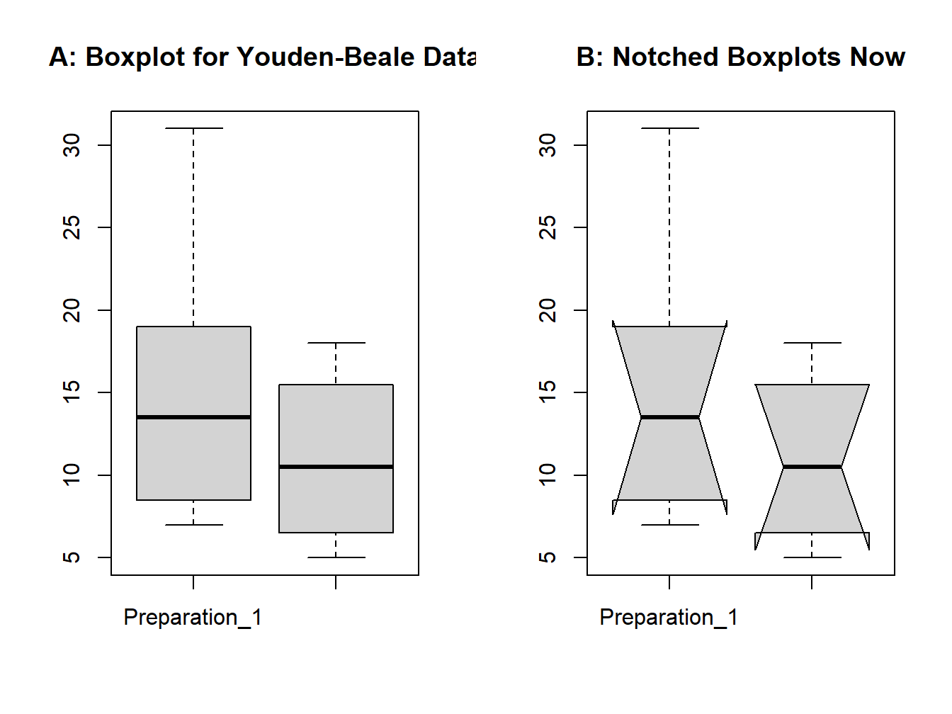
Figure 3.1: Boxplot for the Youden-Beale Experiment
Now just observe the iris data through the kalidoscope of boxplot.
data(iris)
boxplot(iris$Sepal.Length~iris$Species, notch=TRUE)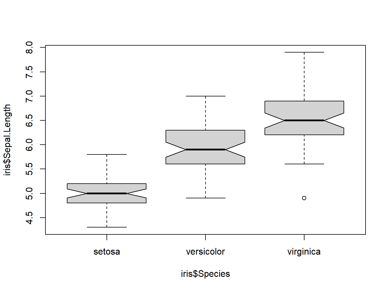
Figure 3.2: Boxplot for iris dataset
3.3.2 Histogram
The histogram was invented by the eminent statistician Karl Pearson and is one of the earliest types of graphical display. It goes without saying that its origin is earlier than EDA, at least the EDA envisioned by Tukey, and yet it is considered by many EDA experts to be a very useful graphical technique, and makes it to the list of one of the very useful practices of EDA. The basic idea is to plot a bar over an interval proportional to the frequency of the observations that lie in that interval. If the sample size is moderately good in some sense and the sample is a true representation of a population, the histogram reveals the shape of the true underlying uncertainty curve. Though histograms are plotted as two-dimensional, they are essentially one-dimensional plots in the sense that the shape of the uncertainty curve is revealed without even looking at the range of the x-axis. Furthermore, the Pareto chart, stem-and-leaf plot, and a few others may be shown as special cases of the histogram.We begin with a “cooked” dataset for understanding a range of uncertainty curves.
Understanding Histogram of Various Uncertainty Curves. In the dataset sample, we have data from five different probability distributions. Towards understanding the plausible distribution of the samples, we plot the histogram and see how useful it is.
data(sample)
layout(matrix(c(1,1,2,2,3,3,0,4,4,5,5,0), nrow=2, ncol=6, byrow=TRUE),respect=FALSE)
#matrix(c(1,1,2,2,3,3,0,4,4,5,5,0), nrow=2, ncol=6, byrow=TRUE)
hist(sample[,1],main="Histogram of Sample 1",xlab="sample1",  ylab="frequency")
hist(sample[,2],main="Histogram of Sample 2",xlab="sample2", ylab="frequency")
hist(sample[,3],main="Histogram of Sample 3",xlab="sample3", ylab="frequency")
hist(sample[,4],main="Histogram of Sample 4",xlab="sample4", ylab="frequency")
hist(sample[,5],main="Histogram of Sample 5",xlab="sample5", ylab="frequency")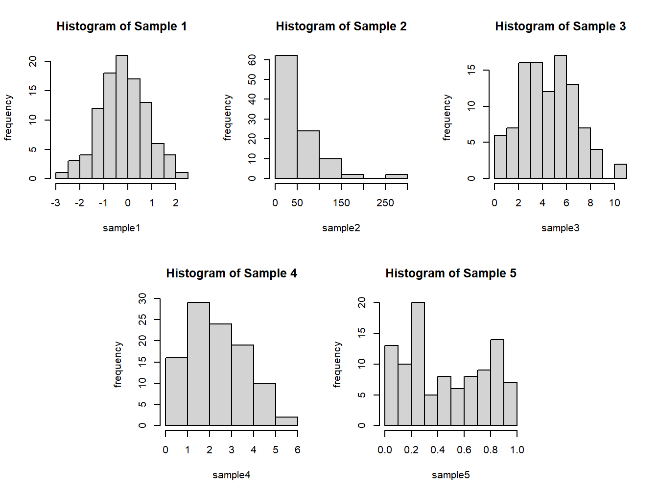
Figure 3.3: Histogram from the data sample
In the present case, we need five plots on a single graphical framework, and using par with either mfrow=c(2,3) ormfrow=c(3,2) leaves an empty plot. The layout graphics function helps to specify a complex plot. In the above R code, the graphical device is divided into 12 parts across 2 rows and 6 columns. The first plot of the device is plotted on first two parts of the first row, the second third and fourth part of first row, and so forth. The option of 0 says that such parts should not be used for plots. The hist function works on a numeric vector. The option main helps in specifying a title
for the histogram, and xlab and ylab can be used to specify labels for the axes. Figure 3.3 is the output of the previous R program. The histogram of sample 1 is bell-shaped, and its peak (mode) is near 0. The mean and median are respectively -0.1845 and -0.1450,
again closer to 0. The standard deviation and variance are respectively 0.9714806 and 0.9437745. Verify these numbers! The shape indicated by the histogram and the summaries indicate that the distribution of the sample may be a normal distribution.
The histogram of Sample 2 is tailing off very fast after the value of 50. The distribution indicates positive skewness, and also the variance 2933.388 is approximately the square of the mean 53.27. Furthermore, all the values are non-negative, which leads us to believe that the sampling distribution may be an exponential distribution. An important feature of Samples 3 and 4 is that all the values are non-negative integers. This makes us believe that the sampling distribution may be a discrete distribution. The mean and variance of Sample 3 is 4.98 and 5.2117, whereas these numbers for Sample 4 are 2.83 and 1.7384. The mean and variance of Sample 3 are almost equal, which is a characteristic of Poisson distribution and the variance being larger rules out the possibility of the sample being from a binomial distribution. Similarly, the variance of Sample 4 being less than its mean is a reflection that this sample may be from a binomial distribution. The interpretation of the fifth sample is left to the reader.
The hist function offers three options for the bin width/number based on the formulas given by Sturges, Scott, and Freedman-Diaconis:
\[\begin{equation} k=[\log_2 n+1] \end{equation}\]
\[\begin{equation} h=\dfrac{3.5\sigma}{\sqrt[3]{n}} \end{equation}\]
\[\begin{equation} h=\dfrac{2IQR}{\sqrt[3]{n}} \end{equation}\]
where \(n\) is the number of observations and \(\sigma\) is the sample standard deviation. The formulas above are respectively specified to the hist function with breaks="Sturges", breaks="Scott", and breaks="FD". The other options include directly specifying the number of breaks with a numeric, say breaks=10, or through a vector breaks=seq(-10,10,0.5).
Example: The Galton Data. The histogram gives a nice display of the variables. Here the goalwould be to obtain a histogram for the height of parent and child on the same plot. However, we would clearly like to see all the frequency bars for parent as well as child. That is, if the frequency of the height for the parent is larger than for the child for a certain interval, it should be reflected the same as well as for the height of the variable of lesser frequency. The histograms should cover the range of both variables.With these technicalities in mind, the next program gives the required figure. The reader can first go through the program and follow it up with the description and the resulting figure (Verzani 2022).
library(UsingR)
data(galton)
hist(galton$parent,freq=FALSE,col="green",density=10,xlim=c(60,75),xlab="height",main="Histograms for AD5")
hist(galton$child,freq=F,col="red",add=TRUE,density=10,angle=-45)
legend(x=c(71,73),y=c(0.2,0.17),c("parent","child"),col=c("green",+ "red"),pch="-")
In the event of two variables having an unequal number of observations, the option freq=FALSE will ensure that the heights of two variables over an interval remain the same if their overall percentage of the bin remains equal. The limits for the height values is contained with xlim=c(60,75). The histogram of the parent’s height is identified with col=“green,”density=10, and add=TRUE,density=10,angle=-45 ensures that the embossed histogram is identifiable from that of the preceding one. The legend had been added to suitably complement the program. The reader should further interpret the results from Figure ??.
3.3.3 Histogram Extensions and the Rootogram
The histogram displays the frequencies over the intervals and for moderately large number of observations, it reflects the underlying probability distribution. The boxplot shows how evenly the data is distributed across the five important measures, although it cannot reveal the probability distribution in a better way than a boxplot. The boxplot helps in identifying the outliers in a more apparent way than the histogram. Hence, it would be very useful if we could bring together both these ideas in a closer way than look at them differently for outliers and probability distributions. An effective way of obtaining such a display is to place the boxplot along the x-axis of the histogram. This helps in clearly identifying outliers and also the appropriate probability distribution.
The R package sfsmisc contains a function histBxp, which nicely places the boxplot along the x-axis of the histogram.
Example: Understanding Histogram of Various Uncertainty Curves. The short program for this problem is given below.
library(sfsmisc)
par(mfrow=c(1,3))
histBxp(sample$Sample_1,col="blue",boxcol="blue",xlab="x")
histBxp(sample$Sample_2,col="grey",boxcol="grey",xlab="x")
histBxp(sample$Sample_3,col="brown",boxcol="brown",xlab="x")
title("Boxplot and Histogram Complementing",outer=TRUE,line=-1)
The combination of histogram and boxplot gives a very nice display of both the concepts, as seen in Figure ??. Generally, in histograms, bar height varies more in bins with long bars than in bins with short bars. In frequency terms, the variability of the counts increases as their typical size increases. Hence, a re-expression can approximately remove the tendency for the variability of a count to increase with its typical size. The rootogram arises on taking the re-expression as the square root of the frequencies. This observation is important towards an understanding of the transformations.
3.3.4 Pareto Chart
The Pareto chart has been designed to address the implicit questions answered by the Pareto law. The common understanding of the Pareto law is that “majority resources” is consumed by a “minority user.” The most common of the percentages is the 80–20 rule, implying that 80% of the effects come from 20% of the causes. The Pareto law is also known as the law of vital few, or the 80–20 rule. The Pareto chart gives very smart answers by completely answering how much is owned by how many. Montgomery (2005), page 148, has listed the Pareto chart as one of the seven major tools of Statistical Process Control.
A Pareto chart is a bar graph. The lengths of the bars represent frequency or cost (time or money), and are arranged with longest bars on the left and the shortest to the right. In this way the chart visually depicts which situations are more significant. This cause analysis tool is considered one of the seven basic quality tools (Scrucca 2004).
WHEN TO USE A PARETO CHART
When analyzing data about the frequency of problems or causes in a process
When there are many problems or causes and you want to focus on the most significant
When analyzing broad causes by looking at their specific components
When communicating with others about your data
R did not have any function for this plot and neither was there any add-on package which would have helped the user until 2004. However, one R user posed this question to the “list” in 2001 and an expert on the software promptly prepared exhaustive codes over a period of about two weeks. The codes are available at <https://stat.ethz.ch/pipermail/r-help/2002- January/018406.html>. The Pareto chart can be plotted using pareto.chart from the R package qcc. We will use Wingate’s program and assume here that the reader has copied the codes from the web mentioned above and compiled it in the R session.
The Pareto chart contains three axes on a two-dimensional plot only. Generally, causes/users are arranged along the horizontal axis and the frequencies of such categories are conveyed through a bar for each of them. The bars are arranged in a decreasing order of the frequency. The left-hand side of the vertical axis denotes the frequencies. The cumulative frequency curve along the causes are then simultaneously plotted with the right-hand side of the vertical axis giving the cumulative counts. Thus, at each cause we know precisely its frequency and also the total issues up to that point of time.
library(qcc)## Package 'qcc' version 2.7## Type 'citation("qcc")' for citing this R package in publications.freq <- c(14,2,1,2,3,8,1)
names(freq) <- c("Contamination","Corrosion","Doping", "Metallization", "Miscellaneous", "Oxide Effect","Silicon Effect")
pareto.chart(freq)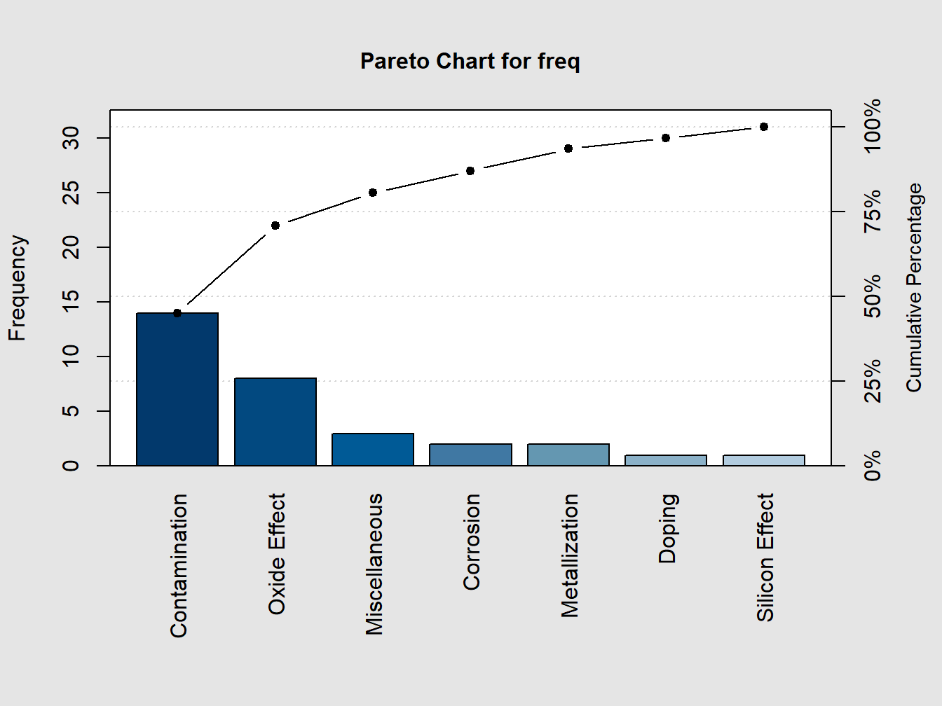
Figure 3.4: A Pareto Chart for Understanding The Cause-Effect Nature
##
## Pareto chart analysis for freq
##                   Frequency  Cum.Freq. Percentage Cum.Percent.
##   Contamination   14.000000  14.000000  45.161290    45.161290
##   Oxide Effect     8.000000  22.000000  25.806452    70.967742
##   Miscellaneous    3.000000  25.000000   9.677419    80.645161
##   Corrosion        2.000000  27.000000   6.451613    87.096774
##   Metallization    2.000000  29.000000   6.451613    93.548387
##   Doping           1.000000  30.000000   3.225806    96.774194
##   Silicon Effect   1.000000  31.000000   3.225806   100.000000
The following example shows various options in pareto chart.
library(qcc)
defect <- c(80, 27, 66, 94, 33)
names(defect) <- c("price code", "schedule date", "supplier code", "contact num.", "part num.")
pareto.chart(defect, ylab = "Error frequency")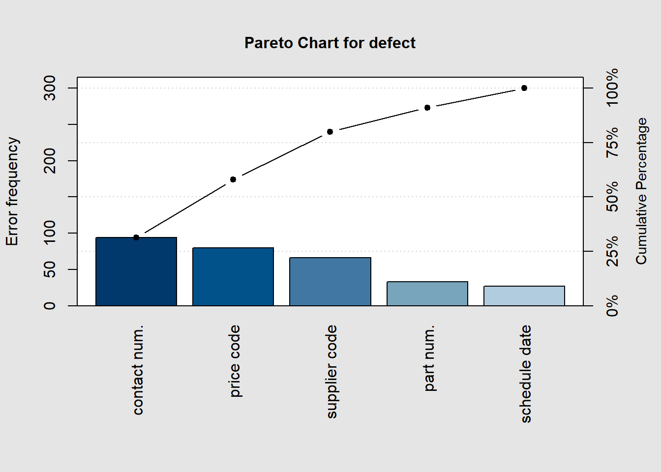
##
## Pareto chart analysis for defect
##                 Frequency Cum.Freq. Percentage Cum.Percent.
##   contact num.   94.00000  94.00000   31.33333     31.33333
##   price code     80.00000 174.00000   26.66667     58.00000
##   supplier code  66.00000 240.00000   22.00000     80.00000
##   part num.      33.00000 273.00000   11.00000     91.00000
## schedule date 27.00000 300.00000 9.00000 100.00000pareto.chart(defect, ylab = "Error frequency", xlab = "Error causes", las=1)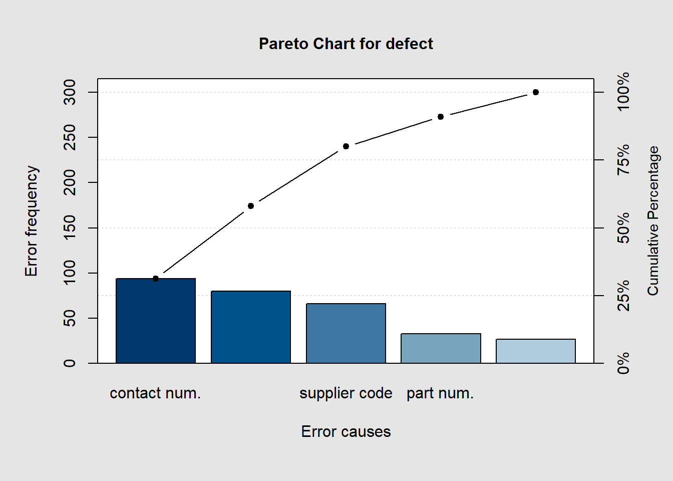
##
## Pareto chart analysis for defect
##                 Frequency Cum.Freq. Percentage Cum.Percent.
##   contact num.   94.00000  94.00000   31.33333     31.33333
##   price code     80.00000 174.00000   26.66667     58.00000
##   supplier code  66.00000 240.00000   22.00000     80.00000
##   part num.      33.00000 273.00000   11.00000     91.00000
## schedule date 27.00000 300.00000 9.00000 100.00000pareto.chart(defect, ylab = "Error frequency", col=rainbow(length(defect)))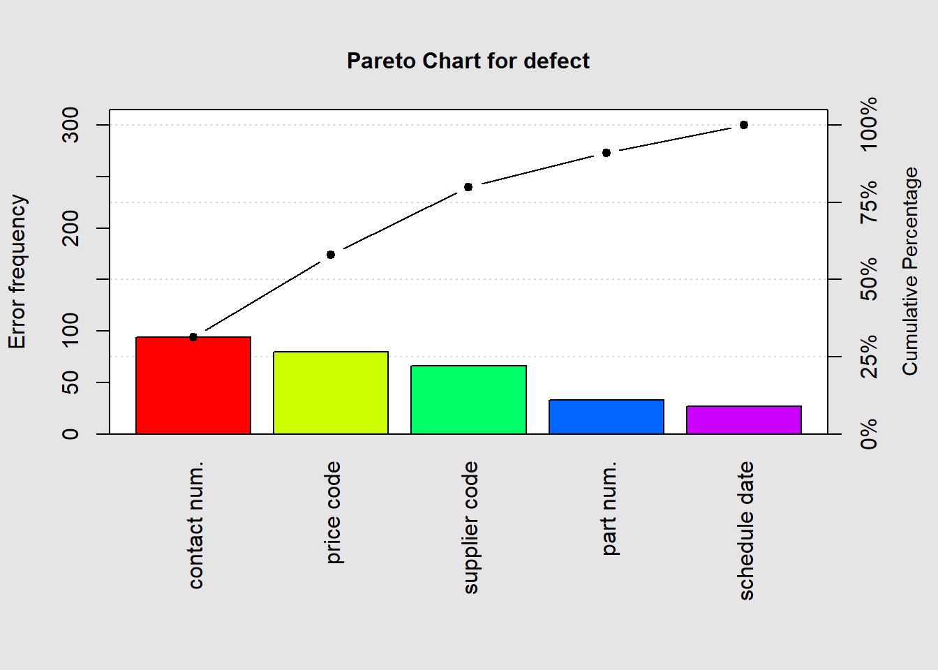
##
## Pareto chart analysis for defect
##                 Frequency Cum.Freq. Percentage Cum.Percent.
##   contact num.   94.00000  94.00000   31.33333     31.33333
##   price code     80.00000 174.00000   26.66667     58.00000
##   supplier code  66.00000 240.00000   22.00000     80.00000
##   part num.      33.00000 273.00000   11.00000     91.00000
## schedule date 27.00000 300.00000 9.00000 100.00000pareto.chart(defect, cumperc = seq(0, 100, by = 5), ylab2 = "A finer tickmarks grid")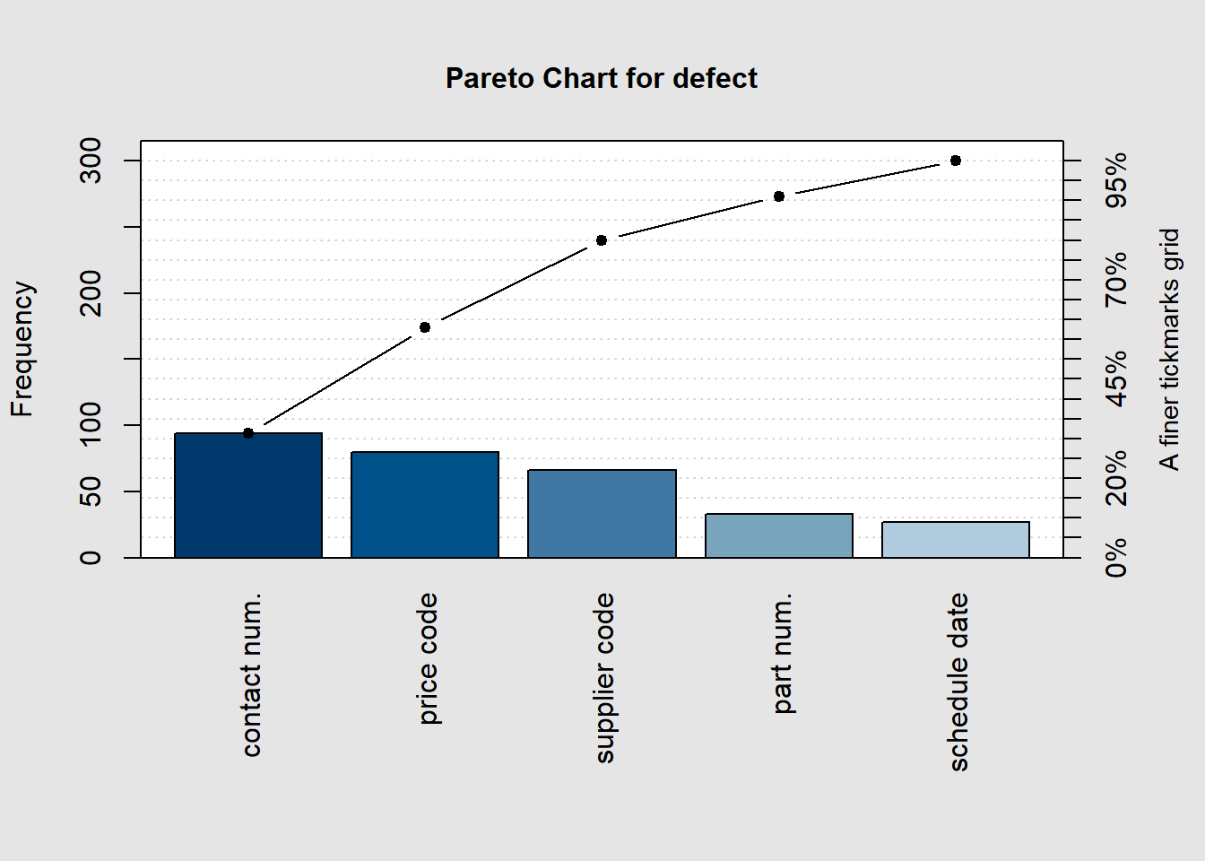
##
## Pareto chart analysis for defect
##                 Frequency Cum.Freq. Percentage Cum.Percent.
##   contact num.   94.00000  94.00000   31.33333     31.33333
##   price code     80.00000 174.00000   26.66667     58.00000
##   supplier code  66.00000 240.00000   22.00000     80.00000
##   part num.      33.00000 273.00000   11.00000     91.00000
##   schedule date  27.00000 300.00000    9.00000    100.00000
It can be clearly seen from the Pareto chart in Figure 3.4 that Contamination and Oxide Effect account for more than 80% of the causes in this experiment. > Alternate approach to create a pareto chart (Grey 2018)
library(ggplot2)## Warning: package 'ggplot2' was built under R version 4.1.3library(ggQC)## Warning: package 'ggQC' was built under R version 4.1.3Data4Pareto <- data.frame(
KPI = c("Customer Service Time", "Order Fulfillment", "Order Processing Time",
"Order Production Time", "Order Quality Control Time", "Rework Time",
"Shipping"),
Time = c(1.50, 38.50, 3.75, 23.08, 1.92, 3.58, 73.17))
ggplot2::ggplot(Data4Pareto, aes(x = KPI, y = Time)) +
ggQC::stat_pareto(point.color = "red",
point.size = 3,
line.color = "black",
bars.fill = c("blue", "orange")) +
theme(axis.text.x = element_text(angle = 90, hjust = 1, vjust=0.5))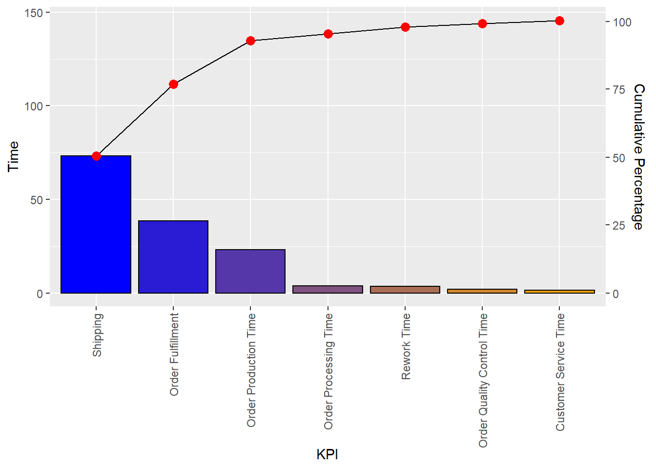
3.3.5 Run Chart
The run chart is also known as the run-sequence plot. In the run chart, the data value is simply
plotted against its index number. For example, if \(x_1, x_2, \ldots , x_t\) is the data, plot \(x_1, x_2, \ldots , x_t\)
against their index \(1, 2,\cdots , t\). The run charts can be plotted in R using the function plot.ts, which is very commonly used in time-series analysis.
Example: AD9. The Air Passengers Dataset. Consider the dataset of “Airline Passengers” in the US for the period 1949–1960. Plot the number of passengers against the month of the year label to obtain the run chart. The run chart in Part A of Figure 3.5 clearly shows that there is an increasing trend in the number of users. It may be seen that there is a seasonal variation whose size is roughly equal to the local mean.
par(mfrow=c(1,2))
plot.ts(AirPassengers)
title("A: Run Chart for AD9")
data(insurance)
plot(insurance$Claim,insurance$Days,"l",xlab="Claim Sequence", ylab="Time to Settle the Claim")
title("B: Run Chart for Insurance Claim Settlement")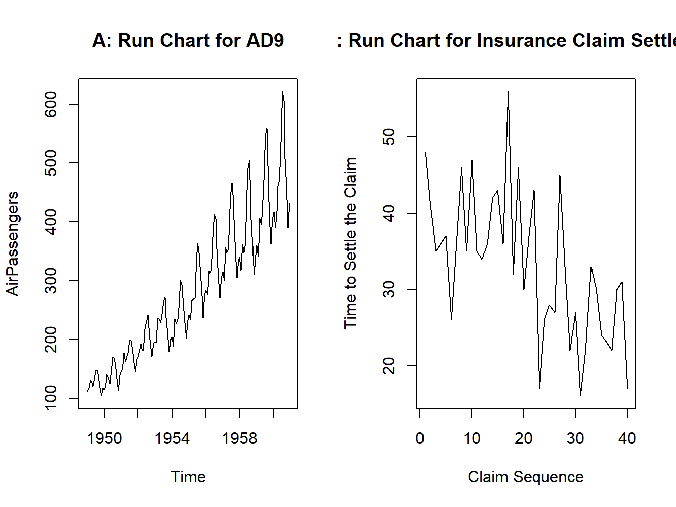
Figure 3.5: A Time Series Plot for Air Passengers Dataset
We can see in Part B of Figure 3.5 that though there is a lot of upward and downward movements across the claims, it is gradually decreasing and thus shows that as the experience of the company increases in handling the claims, it is able to settle the claims in less time.
3.3.6 Scatter plot
The reader is most certainly familiar with this very basic format of plots. Whenever we have paired data and there is a belief that the variables are related, its only natural to plot them against one other. Such a display is, of course, known as the scatter plot or the x-y plot. There is a subtle difference between them, see Velleman and Hoaglin (1984). We will straightaway start with examples.
Example: The Galton Data. As has been described in Section 4 of Chapter 2, we attempt an initial understanding of the relationship between the height of the child and the parent.
library(UsingR)## Loading required package: MASS## Loading required package: HistData## Loading required package: Hmisc## Loading required package: lattice## Loading required package: survival## Loading required package: Formula##
## Attaching package: 'Hmisc'## The following objects are masked from 'package:base':
##
## format.pval, units##
## Attaching package: 'UsingR'## The following object is masked from 'package:survival':
##
## cancerdata(galton)
plot(galton[,2],galton[,1],xlim=range(galton[,2]),ylim=range(galton[,1]),xlab="Parent’s Height",ylab="Child’s Height")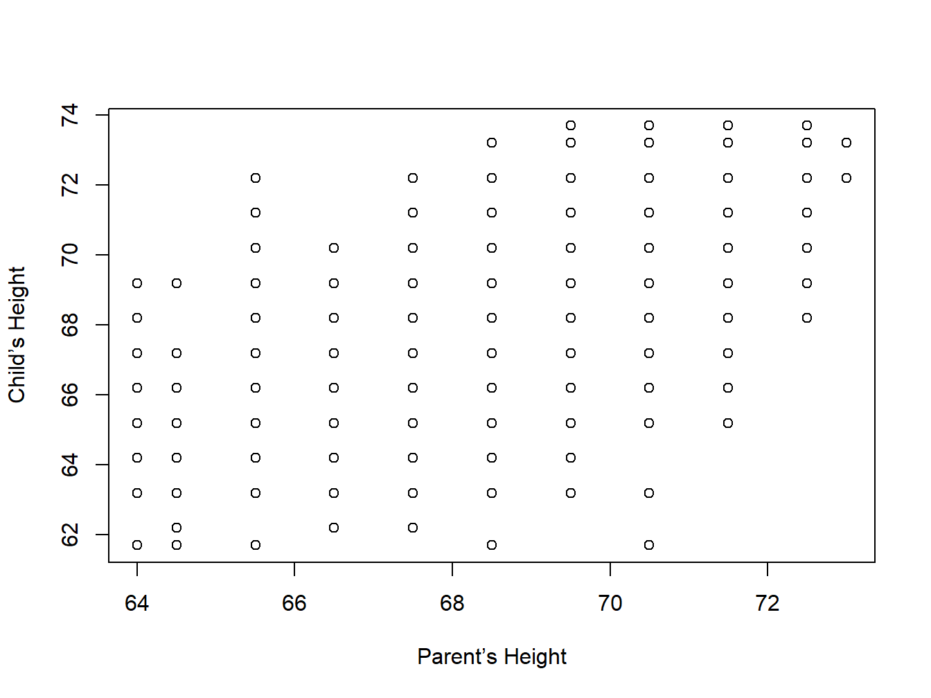
Figure 3.6: A Scatter Plot for Galton Dataset
The display, Figure 3.6, does not suggest a strong correlation between the two variables here.
Example: Scatter Plots for Understanding Correlations. We consider a cooked data tailor-made for the use of scatter plots towards understanding correlations.
x1=seq(-3,4,0.5)
y1=-0.05*x1+1.2
x2=seq(-4,5,0.33)
x3=seq(-3.5,4.1,0.115)
x4=seq(-3,3,0.345)
x5=0.1*x1
y5=2*x5+x1
y2=0.5*x2+1
y3=0.123*x3
y4=0.181*x4-0.001
x6=0.3*x5
y6=0.1*x1+0.01*x5
par(mfrow=c(2,3))
plot(x1,y1,main="Sample I",xlim=c(-4,4),ylim=c(-4,4))
plot(x2,y2,main="Sample II",xlim=c(-4,4),ylim=c(-4,4))
plot(x3,y3,main="Sample III",xlim=c(-4,4),ylim=c(-4,4))
plot(x4,y4,main="Sample IV",xlim=c(-4,4),ylim=c(-4,4))
plot(x5,y5,main="Sample V",xlim=c(-4,4),ylim=c(-4,4))
plot(x6,y6,main="Sample VI",xlim=c(-4,4),ylim=c(-4,4))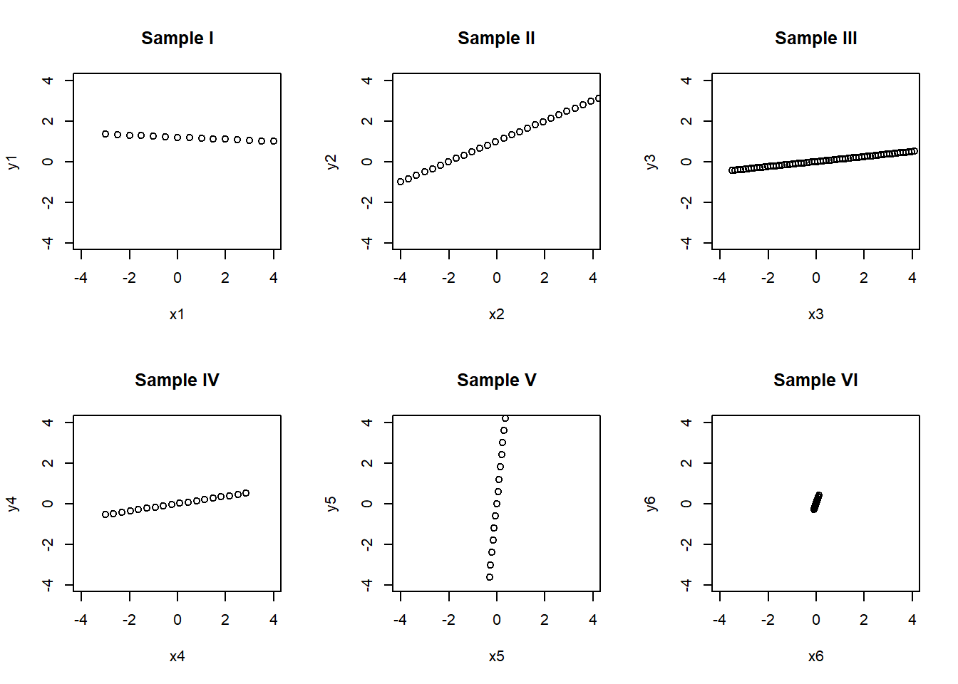 ## Additional tools for data analysis using R
3.3.7 Tables
Tables can be created from given data. An example is shown bellow: Let’s work with the builtin data set iris.
iris## Sepal.Length Sepal.Width Petal.Length Petal.Width Species
## 1 5.1 3.5 1.4 0.2 setosa
## 2 4.9 3.0 1.4 0.2 setosa
## 3 4.7 3.2 1.3 0.2 setosa
## 4 4.6 3.1 1.5 0.2 setosa
## 5 5.0 3.6 1.4 0.2 setosa
## 6 5.4 3.9 1.7 0.4 setosa
## 7 4.6 3.4 1.4 0.3 setosa
## 8 5.0 3.4 1.5 0.2 setosa
## 9 4.4 2.9 1.4 0.2 setosa
## 10 4.9 3.1 1.5 0.1 setosa
## 11 5.4 3.7 1.5 0.2 setosa
## 12 4.8 3.4 1.6 0.2 setosa
## 13 4.8 3.0 1.4 0.1 setosa
## 14 4.3 3.0 1.1 0.1 setosa
## 15 5.8 4.0 1.2 0.2 setosa
## 16 5.7 4.4 1.5 0.4 setosa
## 17 5.4 3.9 1.3 0.4 setosa
## 18 5.1 3.5 1.4 0.3 setosa
## 19 5.7 3.8 1.7 0.3 setosa
## 20 5.1 3.8 1.5 0.3 setosa
## 21 5.4 3.4 1.7 0.2 setosa
## 22 5.1 3.7 1.5 0.4 setosa
## 23 4.6 3.6 1.0 0.2 setosa
## 24 5.1 3.3 1.7 0.5 setosa
## 25 4.8 3.4 1.9 0.2 setosa
## 26 5.0 3.0 1.6 0.2 setosa
## 27 5.0 3.4 1.6 0.4 setosa
## 28 5.2 3.5 1.5 0.2 setosa
## 29 5.2 3.4 1.4 0.2 setosa
## 30 4.7 3.2 1.6 0.2 setosa
## 31 4.8 3.1 1.6 0.2 setosa
## 32 5.4 3.4 1.5 0.4 setosa
## 33 5.2 4.1 1.5 0.1 setosa
## 34 5.5 4.2 1.4 0.2 setosa
## 35 4.9 3.1 1.5 0.2 setosa
## 36 5.0 3.2 1.2 0.2 setosa
## 37 5.5 3.5 1.3 0.2 setosa
## 38 4.9 3.6 1.4 0.1 setosa
## 39 4.4 3.0 1.3 0.2 setosa
## 40 5.1 3.4 1.5 0.2 setosa
## 41 5.0 3.5 1.3 0.3 setosa
## 42 4.5 2.3 1.3 0.3 setosa
## 43 4.4 3.2 1.3 0.2 setosa
## 44 5.0 3.5 1.6 0.6 setosa
## 45 5.1 3.8 1.9 0.4 setosa
## 46 4.8 3.0 1.4 0.3 setosa
## 47 5.1 3.8 1.6 0.2 setosa
## 48 4.6 3.2 1.4 0.2 setosa
## 49 5.3 3.7 1.5 0.2 setosa
## 50 5.0 3.3 1.4 0.2 setosa
## 51 7.0 3.2 4.7 1.4 versicolor
## 52 6.4 3.2 4.5 1.5 versicolor
## 53 6.9 3.1 4.9 1.5 versicolor
## 54 5.5 2.3 4.0 1.3 versicolor
## 55 6.5 2.8 4.6 1.5 versicolor
## 56 5.7 2.8 4.5 1.3 versicolor
## 57 6.3 3.3 4.7 1.6 versicolor
## 58 4.9 2.4 3.3 1.0 versicolor
## 59 6.6 2.9 4.6 1.3 versicolor
## 60 5.2 2.7 3.9 1.4 versicolor
## 61 5.0 2.0 3.5 1.0 versicolor
## 62 5.9 3.0 4.2 1.5 versicolor
## 63 6.0 2.2 4.0 1.0 versicolor
## 64 6.1 2.9 4.7 1.4 versicolor
## 65 5.6 2.9 3.6 1.3 versicolor
## 66 6.7 3.1 4.4 1.4 versicolor
## 67 5.6 3.0 4.5 1.5 versicolor
## 68 5.8 2.7 4.1 1.0 versicolor
## 69 6.2 2.2 4.5 1.5 versicolor
## 70 5.6 2.5 3.9 1.1 versicolor
## 71 5.9 3.2 4.8 1.8 versicolor
## 72 6.1 2.8 4.0 1.3 versicolor
## 73 6.3 2.5 4.9 1.5 versicolor
## 74 6.1 2.8 4.7 1.2 versicolor
## 75 6.4 2.9 4.3 1.3 versicolor
## 76 6.6 3.0 4.4 1.4 versicolor
## 77 6.8 2.8 4.8 1.4 versicolor
## 78 6.7 3.0 5.0 1.7 versicolor
## 79 6.0 2.9 4.5 1.5 versicolor
## 80 5.7 2.6 3.5 1.0 versicolor
## 81 5.5 2.4 3.8 1.1 versicolor
## 82 5.5 2.4 3.7 1.0 versicolor
## 83 5.8 2.7 3.9 1.2 versicolor
## 84 6.0 2.7 5.1 1.6 versicolor
## 85 5.4 3.0 4.5 1.5 versicolor
## 86 6.0 3.4 4.5 1.6 versicolor
## 87 6.7 3.1 4.7 1.5 versicolor
## 88 6.3 2.3 4.4 1.3 versicolor
## 89 5.6 3.0 4.1 1.3 versicolor
## 90 5.5 2.5 4.0 1.3 versicolor
## 91 5.5 2.6 4.4 1.2 versicolor
## 92 6.1 3.0 4.6 1.4 versicolor
## 93 5.8 2.6 4.0 1.2 versicolor
## 94 5.0 2.3 3.3 1.0 versicolor
## 95 5.6 2.7 4.2 1.3 versicolor
## 96 5.7 3.0 4.2 1.2 versicolor
## 97 5.7 2.9 4.2 1.3 versicolor
## 98 6.2 2.9 4.3 1.3 versicolor
## 99 5.1 2.5 3.0 1.1 versicolor
## 100 5.7 2.8 4.1 1.3 versicolor
## 101 6.3 3.3 6.0 2.5 virginica
## 102 5.8 2.7 5.1 1.9 virginica
## 103 7.1 3.0 5.9 2.1 virginica
## 104 6.3 2.9 5.6 1.8 virginica
## 105 6.5 3.0 5.8 2.2 virginica
## 106 7.6 3.0 6.6 2.1 virginica
## 107 4.9 2.5 4.5 1.7 virginica
## 108 7.3 2.9 6.3 1.8 virginica
## 109 6.7 2.5 5.8 1.8 virginica
## 110 7.2 3.6 6.1 2.5 virginica
## 111 6.5 3.2 5.1 2.0 virginica
## 112 6.4 2.7 5.3 1.9 virginica
## 113 6.8 3.0 5.5 2.1 virginica
## 114 5.7 2.5 5.0 2.0 virginica
## 115 5.8 2.8 5.1 2.4 virginica
## 116 6.4 3.2 5.3 2.3 virginica
## 117 6.5 3.0 5.5 1.8 virginica
## 118 7.7 3.8 6.7 2.2 virginica
## 119 7.7 2.6 6.9 2.3 virginica
## 120 6.0 2.2 5.0 1.5 virginica
## 121 6.9 3.2 5.7 2.3 virginica
## 122 5.6 2.8 4.9 2.0 virginica
## 123 7.7 2.8 6.7 2.0 virginica
## 124 6.3 2.7 4.9 1.8 virginica
## 125 6.7 3.3 5.7 2.1 virginica
## 126 7.2 3.2 6.0 1.8 virginica
## 127 6.2 2.8 4.8 1.8 virginica
## 128 6.1 3.0 4.9 1.8 virginica
## 129 6.4 2.8 5.6 2.1 virginica
## 130 7.2 3.0 5.8 1.6 virginica
## 131 7.4 2.8 6.1 1.9 virginica
## 132 7.9 3.8 6.4 2.0 virginica
## 133 6.4 2.8 5.6 2.2 virginica
## 134 6.3 2.8 5.1 1.5 virginica
## 135 6.1 2.6 5.6 1.4 virginica
## 136 7.7 3.0 6.1 2.3 virginica
## 137 6.3 3.4 5.6 2.4 virginica
## 138 6.4 3.1 5.5 1.8 virginica
## 139 6.0 3.0 4.8 1.8 virginica
## 140 6.9 3.1 5.4 2.1 virginica
## 141 6.7 3.1 5.6 2.4 virginica
## 142 6.9 3.1 5.1 2.3 virginica
## 143 5.8 2.7 5.1 1.9 virginica
## 144 6.8 3.2 5.9 2.3 virginica
## 145 6.7 3.3 5.7 2.5 virginica
## 146 6.7 3.0 5.2 2.3 virginica
## 147 6.3 2.5 5.0 1.9 virginica
## 148 6.5 3.0 5.2 2.0 virginica
## 149 6.2 3.4 5.4 2.3 virginica
## 150 5.9 3.0 5.1 1.8 virginica## Frequency table with table() function in R
table(iris$Species)##
## setosa versicolor virginica
## 50 50 50table(iris$Species,iris$Sepal.Length)##
## 4.3 4.4 4.5 4.6 4.7 4.8 4.9 5 5.1 5.2 5.3 5.4 5.5 5.6 5.7 5.8 5.9
## setosa 1 3 1 4 2 5 4 8 8 3 1 5 2 0 2 1 0
## versicolor 0 0 0 0 0 0 1 2 1 1 0 1 5 5 5 3 2
## virginica 0 0 0 0 0 0 1 0 0 0 0 0 0 1 1 3 1
##
## 6 6.1 6.2 6.3 6.4 6.5 6.6 6.7 6.8 6.9 7 7.1 7.2 7.3 7.4 7.6 7.7
## setosa 0 0 0 0 0 0 0 0 0 0 0 0 0 0 0 0 0
## versicolor 4 4 2 3 2 1 2 3 1 1 1 0 0 0 0 0 0
## virginica 2 2 2 6 5 4 0 5 2 3 0 1 3 1 1 1 4
##
## 7.9
## setosa 0
## versicolor 0
## virginica 13.3.8 Frequency Table with Proportion:
proportion of the frequency table is created using prop.table() function. Table is passed as an argument to the prop.table() function. so that the proportion of the frequency table is calculated
## Frequency table with with proportion using table() function in R
table1 = as.table(table(iris$Species))
prop.table(table1)
##
## setosa versicolor virginica
## 0.3333333 0.3333333 0.33333333.3.9 Frequency table with condition:
We can also create a frequency table with predefined condition using R table() function.For example lets say we need to get how many obervations have Sepal.Length>1.0 in iris table.
table(iris$Sepal.Length>1.0)##
## TRUE
## 1503.3.10 2 way cross table in R:
Table function also helpful in creating 2 way cross table in R. For example lets say we need to create cross tabulation of gears and carb in mtcars table
mtcars## mpg cyl disp hp drat wt qsec vs am gear carb
## Mazda RX4 21.0 6 160.0 110 3.90 2.620 16.46 0 1 4 4
## Mazda RX4 Wag 21.0 6 160.0 110 3.90 2.875 17.02 0 1 4 4
## Datsun 710 22.8 4 108.0 93 3.85 2.320 18.61 1 1 4 1
## Hornet 4 Drive 21.4 6 258.0 110 3.08 3.215 19.44 1 0 3 1
## Hornet Sportabout 18.7 8 360.0 175 3.15 3.440 17.02 0 0 3 2
## Valiant 18.1 6 225.0 105 2.76 3.460 20.22 1 0 3 1
## Duster 360 14.3 8 360.0 245 3.21 3.570 15.84 0 0 3 4
## Merc 240D 24.4 4 146.7 62 3.69 3.190 20.00 1 0 4 2
## Merc 230 22.8 4 140.8 95 3.92 3.150 22.90 1 0 4 2
## Merc 280 19.2 6 167.6 123 3.92 3.440 18.30 1 0 4 4
## Merc 280C 17.8 6 167.6 123 3.92 3.440 18.90 1 0 4 4
## Merc 450SE 16.4 8 275.8 180 3.07 4.070 17.40 0 0 3 3
## Merc 450SL 17.3 8 275.8 180 3.07 3.730 17.60 0 0 3 3
## Merc 450SLC 15.2 8 275.8 180 3.07 3.780 18.00 0 0 3 3
## Cadillac Fleetwood 10.4 8 472.0 205 2.93 5.250 17.98 0 0 3 4
## Lincoln Continental 10.4 8 460.0 215 3.00 5.424 17.82 0 0 3 4
## Chrysler Imperial 14.7 8 440.0 230 3.23 5.345 17.42 0 0 3 4
## Fiat 128 32.4 4 78.7 66 4.08 2.200 19.47 1 1 4 1
## Honda Civic 30.4 4 75.7 52 4.93 1.615 18.52 1 1 4 2
## Toyota Corolla 33.9 4 71.1 65 4.22 1.835 19.90 1 1 4 1
## Toyota Corona 21.5 4 120.1 97 3.70 2.465 20.01 1 0 3 1
## Dodge Challenger 15.5 8 318.0 150 2.76 3.520 16.87 0 0 3 2
## AMC Javelin 15.2 8 304.0 150 3.15 3.435 17.30 0 0 3 2
## Camaro Z28 13.3 8 350.0 245 3.73 3.840 15.41 0 0 3 4
## Pontiac Firebird 19.2 8 400.0 175 3.08 3.845 17.05 0 0 3 2
## Fiat X1-9 27.3 4 79.0 66 4.08 1.935 18.90 1 1 4 1
## Porsche 914-2 26.0 4 120.3 91 4.43 2.140 16.70 0 1 5 2
## Lotus Europa 30.4 4 95.1 113 3.77 1.513 16.90 1 1 5 2
## Ford Pantera L 15.8 8 351.0 264 4.22 3.170 14.50 0 1 5 4
## Ferrari Dino 19.7 6 145.0 175 3.62 2.770 15.50 0 1 5 6
## Maserati Bora 15.0 8 301.0 335 3.54 3.570 14.60 0 1 5 8
## Volvo 142E 21.4 4 121.0 109 4.11 2.780 18.60 1 1 4 2table(mtcars$gear,mtcars$carb)##
## 1 2 3 4 6 8
## 3 3 4 3 5 0 0
## 4 4 4 0 4 0 0
## 5 0 2 0 1 1 13.3.11 3 way cross table in R:
Similar to 2 way cross table we can create a 3 way cross table in R with the help of table function.
table(mtcars$gear,mtcars$carb,mtcars$cyl)## , , = 4
##
##
## 1 2 3 4 6 8
## 3 1 0 0 0 0 0
## 4 4 4 0 0 0 0
## 5 0 2 0 0 0 0
##
## , , = 6
##
##
## 1 2 3 4 6 8
## 3 2 0 0 0 0 0
## 4 0 0 0 4 0 0
## 5 0 0 0 0 1 0
##
## , , = 8
##
##
## 1 2 3 4 6 8
## 3 0 4 3 5 0 0
## 4 0 0 0 0 0 0
## 5 0 0 0 1 0 13.4 Data visialization using advanced library ggplot2 in R
# This R environment comes with all of CRAN preinstalled, as well as many other helpful packages
# The environment is defined by the kaggle/rstats docker image: https://github.com/kaggle/docker-rstats
# For example, here's several helpful packages to load in
library(ggplot2) # Data visualization
library(readr) # CSV file I/O, e.g. the read_csv function
## Warning: package 'readr' was built under R version 4.1.3library(gridExtra)## Warning: package 'gridExtra' was built under R version 4.1.3library(grid)
library(plyr)##
## Attaching package: 'plyr'## The following objects are masked from 'package:Hmisc':
##
## is.discrete, summarizeiris=iris
# First let's get a random sampling of the data
iris[sample(nrow(iris),10),]## Sepal.Length Sepal.Width Petal.Length Petal.Width Species
## 3 4.7 3.2 1.3 0.2 setosa
## 32 5.4 3.4 1.5 0.4 setosa
## 5 5.0 3.6 1.4 0.2 setosa
## 43 4.4 3.2 1.3 0.2 setosa
## 118 7.7 3.8 6.7 2.2 virginica
## 80 5.7 2.6 3.5 1.0 versicolor
## 135 6.1 2.6 5.6 1.4 virginica
## 138 6.4 3.1 5.5 1.8 virginica
## 1 5.1 3.5 1.4 0.2 setosa
## 117 6.5 3.0 5.5 1.8 virginica3.4.1 Density plots
# Density & Frequency analysis with the Histogram,
# Sepal length
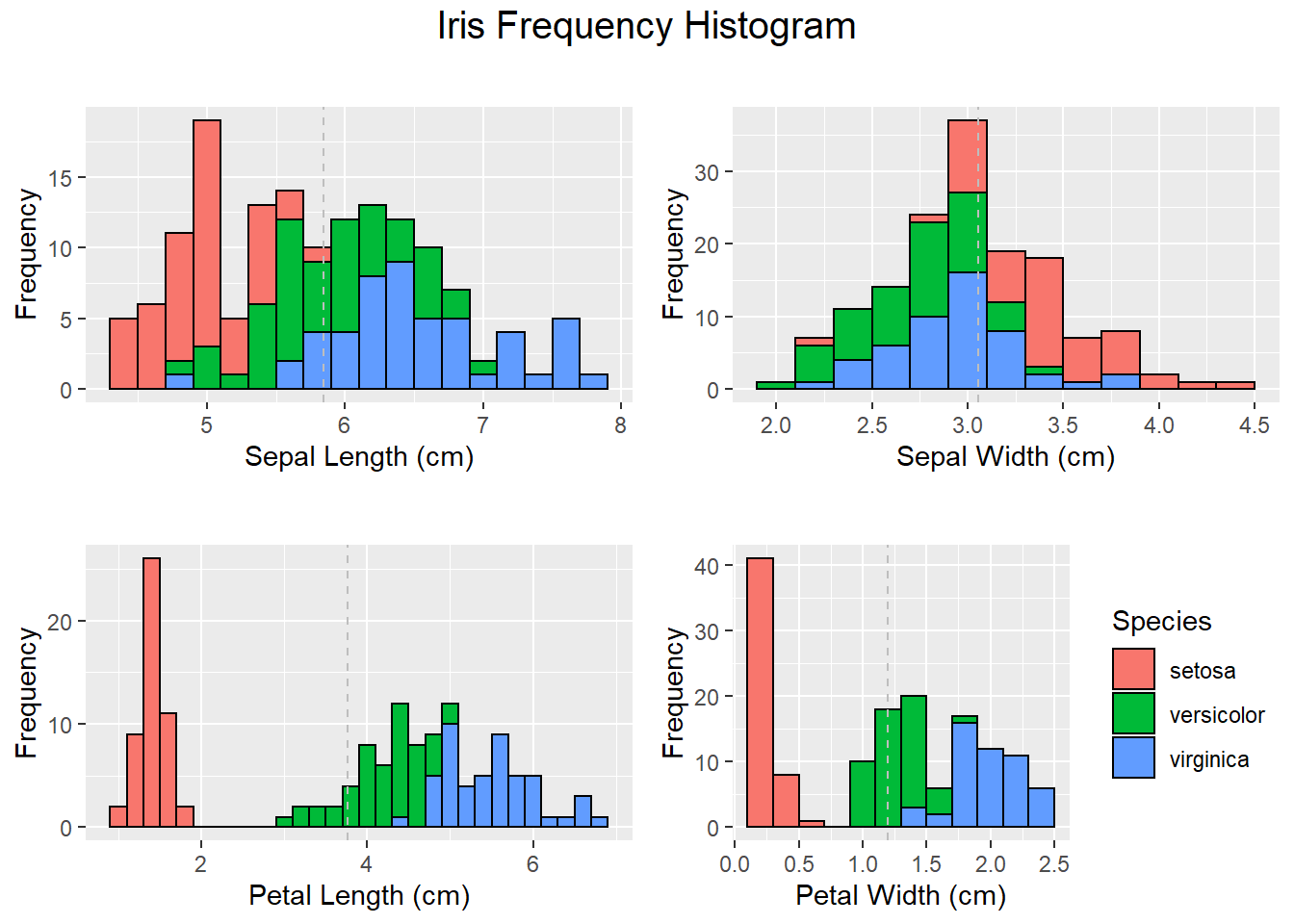
HisSl <- ggplot(data=iris, aes(x=Sepal.Length))+
geom_histogram(binwidth=0.2, color="black", aes(fill=Species)) +
xlab("Sepal Length (cm)") +
ylab("Frequency") +
theme(legend.position="none")+
ggtitle("Histogram of Sepal Length")+
geom_vline(data=iris, aes(xintercept = mean(Sepal.Length)),linetype="dashed",color="grey")
#HisSl# Sepal width
HistSw <- ggplot(data=iris, aes(x=Sepal.Width)) +
geom_histogram(binwidth=0.2, color="black", aes(fill=Species)) +
xlab("Sepal Width (cm)") +
ylab("Frequency") +
theme(legend.position="none")+
ggtitle("Histogram of Sepal Width")+
geom_vline(data=iris, aes(xintercept = mean(Sepal.Width)),linetype="dashed",color="grey")
# Petal length
HistPl <- ggplot(data=iris, aes(x=Petal.Length))+
geom_histogram(binwidth=0.2, color="black", aes(fill=Species)) +
xlab("Petal Length (cm)") +
ylab("Frequency") +
theme(legend.position="none")+
ggtitle("Histogram of Petal Length")+
geom_vline(data=iris, aes(xintercept = mean(Petal.Length)),
linetype="dashed",color="grey")
# Petal width
HistPw <- ggplot(data=iris, aes(x=Petal.Width))+
geom_histogram(binwidth=0.2, color="black", aes(fill=Species)) +
xlab("Petal Width (cm)") +
ylab("Frequency") +
theme(legend.position="right" )+
ggtitle("Histogram of Petal Width")+
geom_vline(data=iris, aes(xintercept = mean(Petal.Width)),linetype="dashed",color="grey")Creating the plots
# Plot all visualizations
grid.arrange(HisSl + ggtitle(""),
             HistSw + ggtitle(""),
             HistPl + ggtitle(""),
             HistPw  + ggtitle(""),
             nrow = 2,
             top = textGrob("Iris Frequency Histogram",
                            gp=gpar(fontsize=15))
)
3.4.2 Creating Distribution plots in R
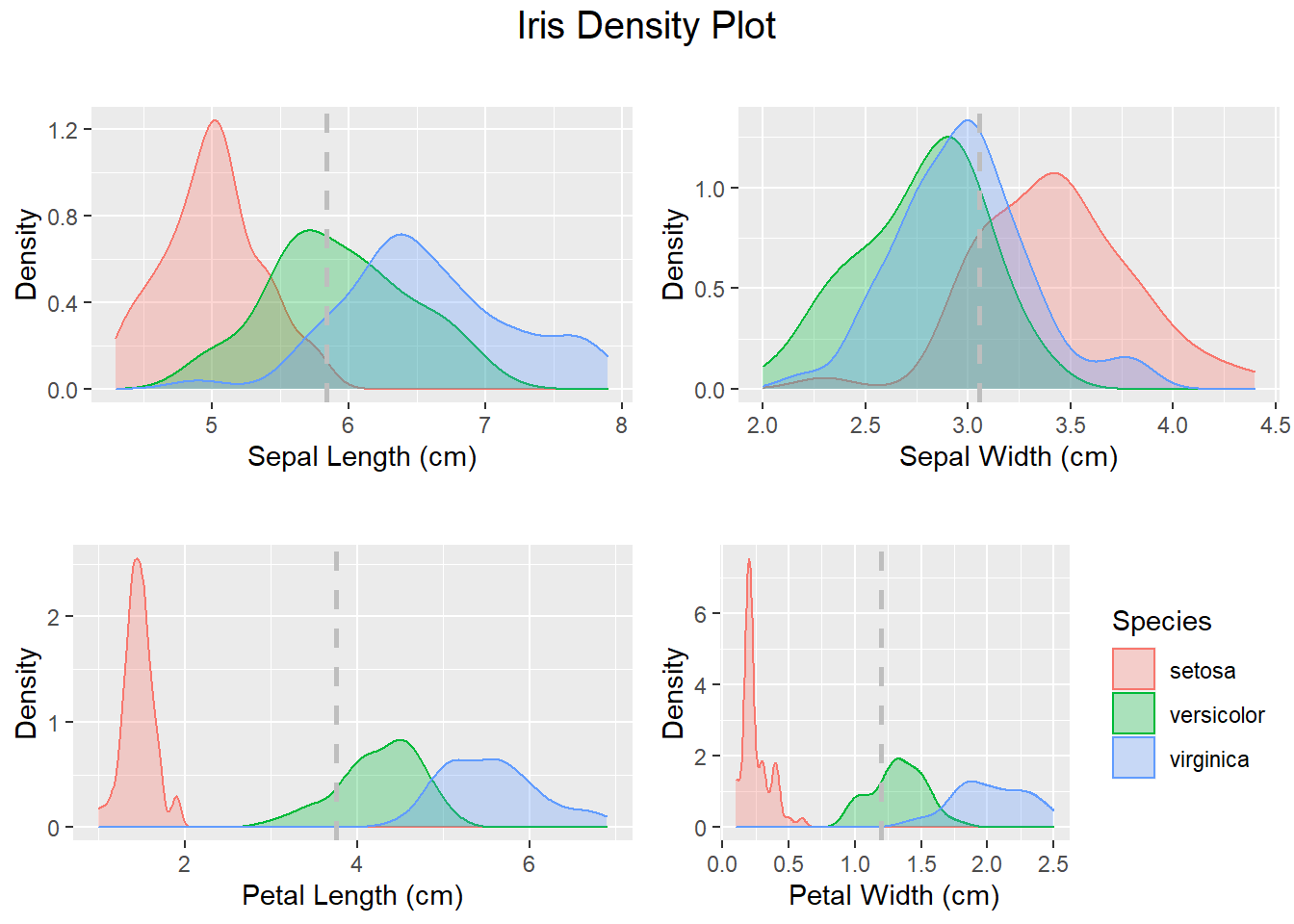
# Notice the shape of the data, most attributes exhibit a normal distribution.
# You can see the measurements of very small flowers in the Petal width and length column.
# We can review the density distribution of each attribute broken down by class value.
# Like the scatterplot matrix, the density plot by class can help see the separation of classes.
# It can also help to understand the overlap in class values for an attribute.
DhistPl <-    ggplot(iris, aes(x=Petal.Length, colour=Species, fill=Species)) +
  geom_density(alpha=.3) +
  geom_vline(aes(xintercept=mean(Petal.Length),  colour=Species),linetype="dashed",color="grey", size=1)+
  xlab("Petal Length (cm)") +
  ylab("Density")+
  theme(legend.position="none")
DhistPw <- ggplot(iris, aes(x=Petal.Width, colour=Species, fill=Species)) +
  geom_density(alpha=.3) +
  geom_vline(aes(xintercept=mean(Petal.Width),  colour=Species),linetype="dashed",color="grey", size=1)+
  xlab("Petal Width (cm)") +
  ylab("Density")

DhistSw <- ggplot(iris, aes(x=Sepal.Width, colour=Species, fill=Species)) +
  geom_density(alpha=.3) +
  geom_vline(aes(xintercept=mean(Sepal.Width),  colour=Species), linetype="dashed",color="grey", size=1)+
  xlab("Sepal Width (cm)") +
  ylab("Density")+
  theme(legend.position="none")
DhistSl <- ggplot(iris, aes(x=Sepal.Length, colour=Species, fill=Species)) +
  geom_density(alpha=.3) +
  geom_vline(aes(xintercept=mean(Sepal.Length),  colour=Species),linetype="dashed", color="grey", size=1)+
  xlab("Sepal Length (cm)") +
  ylab("Density")+
  theme(legend.position="none")
# Plot all density visualizations
grid.arrange(DhistSl + ggtitle(""),
             DhistSw  + ggtitle(""),
             DhistPl + ggtitle(""),
             DhistPw  + ggtitle(""),
             nrow = 2,
             top = textGrob("Iris Density Plot",
                            gp=gpar(fontsize=15))
)
3.4.3 Box plot to visualize variation using ggplot2
# Next with the bloxplot we will identify some outliers. As you can see some classes do not overlap at all (e.g. Petal Length)
# where as with other attributes there are hard to tease apart (Sepal Width).
ggplot(iris, aes(Species, Petal.Length, fill=Species)) +
  geom_boxplot()+
  scale_y_continuous("Petal Length (cm)", breaks= seq(0,30, by=.5))+
  labs(title = "Iris Petal Length Box Plot", x = "Species")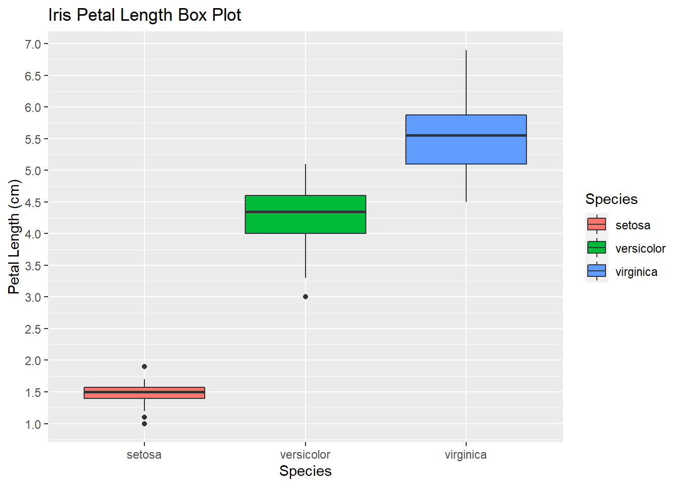
3.4.4 Grid-plot of Box plots
# Let's plot all the variables in a single visualization that will contain all the boxplots
BpSl <- ggplot(iris, aes(Species, Sepal.Length, fill=Species)) +
        geom_boxplot()+
        scale_y_continuous("Sepal Length (cm)", breaks= seq(0,30, by=.5))+
        theme(legend.position="none")
BpSw <-  ggplot(iris, aes(Species, Sepal.Width, fill=Species)) +
          geom_boxplot()+
          scale_y_continuous("Sepal Width (cm)", breaks= seq(0,30, by=.5))+
          theme(legend.position="none")
BpPl <- ggplot(iris, aes(Species, Petal.Length, fill=Species)) +
        geom_boxplot()+
        scale_y_continuous("Petal Length (cm)", breaks= seq(0,30, by=.5))+
        theme(legend.position="none")

BpPw <-  ggplot(iris, aes(Species, Petal.Width, fill=Species)) +
        geom_boxplot()+
        scale_y_continuous("Petal Width (cm)", breaks= seq(0,30, by=.5))+
        labs(title = "Iris Box Plot", x = "Species")
# Plot all visualizations
grid.arrange(BpSl  + ggtitle(""),
             BpSw  + ggtitle(""),
             BpPl + ggtitle(""),
             BpPw + ggtitle(""),
             nrow = 2,
             top = textGrob("Sepal and Petal Box Plot",
                            gp=gpar(fontsize=15))
)
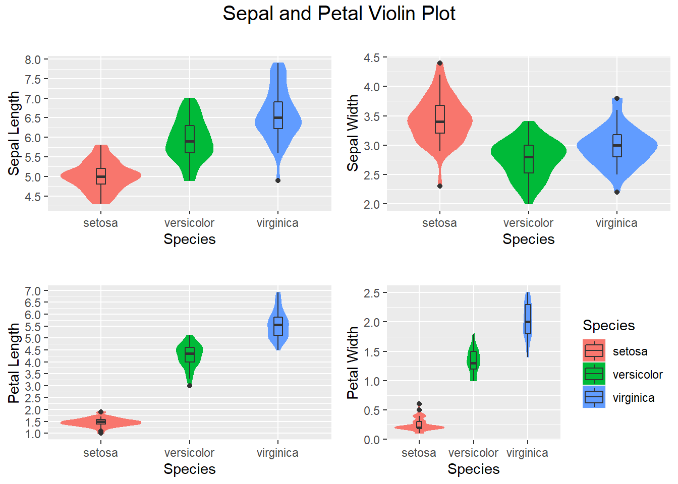
3.4.5 Violin plot- Another visualization method
Violin plots are an alternative to box plots that solves the issues regarding displaying the underlying distribution of the observations, as these plots show a kernel density estimate of the data. In this tutorial, we will show you how to create a violin plot in base R from a vector and from data frames, how to add mean points and split the R violin plots by group. Tthey show the number of points at a particular value by the width of the shapes. They can also include the marker for the median and a box for the interquartile range (Auguie 2017).
VpSl <-  ggplot(iris, aes(Species, Sepal.Length, fill=Species)) +
        geom_violin(aes(color = Species), trim = T)+
        scale_y_continuous("Sepal Length", breaks= seq(0,30, by=.5))+
        geom_boxplot(width=0.1)+
        theme(legend.position="none")
VpSw <-  ggplot(iris, aes(Species, Sepal.Width, fill=Species)) +
        geom_violin(aes(color = Species), trim = T)+
        scale_y_continuous("Sepal Width", breaks= seq(0,30, by=.5))+
        geom_boxplot(width=0.1)+
        theme(legend.position="none")

VpPl <-  ggplot(iris, aes(Species, Petal.Length, fill=Species)) +
        geom_violin(aes(color = Species), trim = T)+
        scale_y_continuous("Petal Length", breaks= seq(0,30, by=.5))+
        geom_boxplot(width=0.1)+
        theme(legend.position="none")

VpPw <-  ggplot(iris, aes(Species, Petal.Width, fill=Species)) +
        geom_violin(aes(color = Species), trim = T)+
        scale_y_continuous("Petal Width", breaks= seq(0,30, by=.5))+
        geom_boxplot(width=0.1)+
        labs(title = "Iris Box Plot", x = "Species")

# Plot all visualizations
grid.arrange(VpSl  + ggtitle(""),
             VpSw  + ggtitle(""),
             VpPl + ggtitle(""),
             VpPw + ggtitle(""),
             nrow = 2,
             top = textGrob("Sepal and Petal Violin Plot",
                            gp=gpar(fontsize=15))
)
3.4.6 Scatter plots using ggplot2
Now let’s create a scatterplot of petal lengths versus petal widths with the color & shape by species. There is also a regression line with a 95% confidence band. Notice the petal length of the setosa is clearly a differenciated cluster so it will be a good predictor for ML.
ggplot(data = iris, aes(x = Petal.Length, y = Petal.Width))+
  xlab("Petal Length")+
  ylab("Petal Width") +
  geom_point(aes(color = Species,shape=Species))+
  geom_smooth(method='lm')+
  ggtitle("Petal Length vs Width")
## `geom_smooth()` using formula 'y ~ x'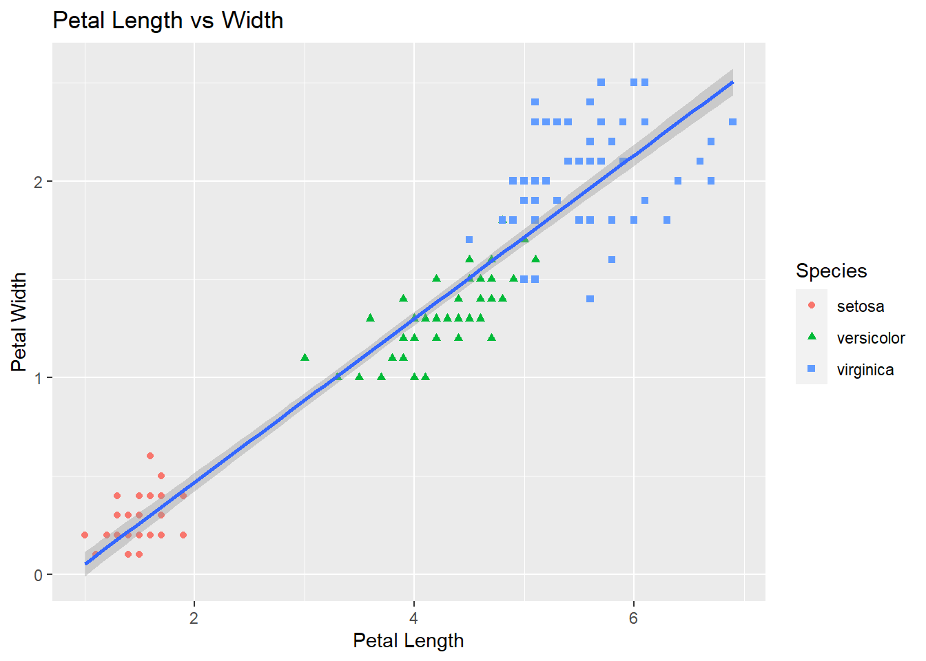
Here is a similar plot with more details on the regression line.
library(car)## Warning: package 'car' was built under R version 4.1.3## Loading required package: carData## Warning: package 'carData' was built under R version 4.1.3scatterplot(iris$Petal.Length,iris$Petal.Width)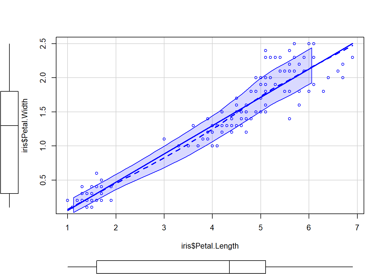
# Now check the Sepal Length vs Width. Notice the sepal of the Virginica and Versicolor species is more mixed, this feature might not be a good predictor.
ggplot(data=iris, aes(x = Sepal.Length, y = Sepal.Width)) +
  geom_point(aes(color=Species, shape=Species)) +
  xlab("Sepal Length") +
  ylab("Sepal Width") +
  ggtitle("Sepal Length vs Width")
3.4.7 Correlation Plots
Based on all the plots we have done we can see there is certain correlation. Let’s take a look at the pairwise correlation numerical values to ascertain the relationships in more detail (Schloerke et al. 2021).
library(GGally)## Warning: package 'GGally' was built under R version 4.1.3## Registered S3 method overwritten by 'GGally':
## method from
## +.gg ggplot2ggpairs(data = iris[1:4],
title = "Iris Correlation Plot",
upper = list(continuous = wrap("cor", size = 5)),
lower = list(continuous = "smooth")
)