Chapter 5 Correlation and Regression Analysis in R
This chapter contains R methods for computing and visualizing correlation analyses. Recall that, correlation analysis is used to investigate the association between two or more variables. A simple example, is to evaluate whether there is a link between maternal age and child’s weight at birth.
5.1 Correlation analysis
There are different methods to perform correlation analysis:
Pearson correlation (r), which measures a linear dependence between two variables (x and y). It’s also known as a parametric correlation test because it depends to the distribution of the data. It can be used only when x and y are from normal distribution. The plot of \(y = f(x)\) is named the linear regression curve. The Pearson correlation formula is: \[r = \frac{\sum{(x-m_x)(y-m_y)}}{\sqrt{\sum{(x-m_x)^2}\sum{(y-m_y)^2}}}\] where \(m_x\) and \(m_y\) are means of the distributions x and y respectively.
Kendall tau and Spearman rho, which are rank-based correlation coefficients (non-parametric)
The Spearman correlation method computes the correlation between the rank of x and the rank of y variables.
\[ rho = \frac{\sum(x' - m_{x'})(y'_i - m_{y'})}{\sqrt{\sum(x' - m_{x'})^2 \sum(y' - m_{y'})^2}}\]
where \(x'=rank(x)\) and \(y'=rank(y)\).
The Kendall correlation method measures the correspondence between the ranking of x and y variables. The total number of possible pairings of x with y observations is n(n−1)/2, where n is the size of x and y.
The procedure is as follow:
Begin by ordering the pairs by the x values. If x and y are correlated, then they would have the same relative rank orders.
Now, for each \(y_i\), count the number of \(y_j>y_i\) (concordant pairs (c)) and the number of \(y_j<y_i\) (discordant pairs (d)).
Kendall correlation distance is defined as follow:
\[tau = \frac{n_c - n_d}{\frac{1}{2}n(n-1)}\]
Where,
- \(n_c\): total number of concordant pairs
- \(n_d\): total number of discordant pairs
- \(n\): size of x and y
5.1.1 R method to find correlation coefficient
Correlation coefficient can be computed using the functions cor() or cor.test():
Syntax:
cor(x, y, method = c("pearson", "kendall", "spearman"))cor.test(x, y, method=c("pearson", "kendall", "spearman"))
Note: If your data contain missing values, use the following R code to handle missing values by case-wise deletion.
cor(x, y, method = "pearson", use = "complete.obs")
As an illustration Here, we’ll use the built-in R data set mtcars as the first example.
The R code below computes the correlation between mpg and wt variables in mtcars data set:
my_data <- mtcars
head(my_data, 6)
## mpg cyl disp hp drat wt qsec vs am gear carb
## Mazda RX4 21.0 6 160 110 3.90 2.620 16.46 0 1 4 4
## Mazda RX4 Wag 21.0 6 160 110 3.90 2.875 17.02 0 1 4 4
## Datsun 710 22.8 4 108 93 3.85 2.320 18.61 1 1 4 1
## Hornet 4 Drive 21.4 6 258 110 3.08 3.215 19.44 1 0 3 1
## Hornet Sportabout 18.7 8 360 175 3.15 3.440 17.02 0 0 3 2
## Valiant 18.1 6 225 105 2.76 3.460 20.22 1 0 3 15.1.2 Visualizing the relationship using scatter plot
We can show the correlation in the form of scatter plot as follows:
library("ggpubr")## Loading required package: ggplot2ggscatter(my_data, x = "mpg", y = "wt",
add = "reg.line", conf.int = TRUE,
cor.coef = TRUE, cor.method = "pearson",
xlab = "Miles/(US) gallon", ylab = "Weight (1000 lbs)")## `geom_smooth()` using formula 'y ~ x'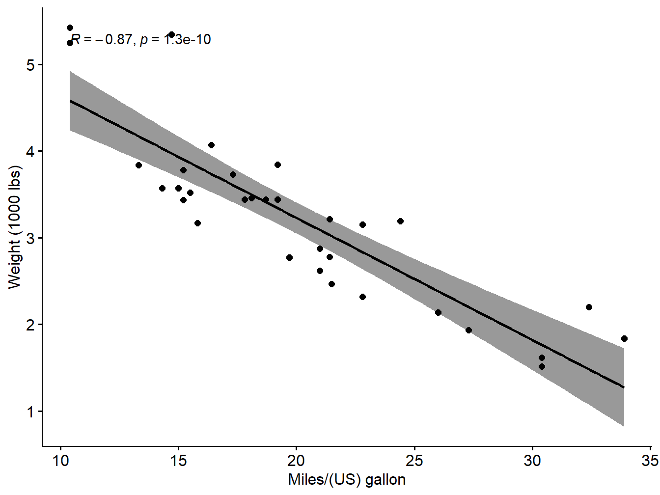
Figure 5.1: Scatter plot with smooth fit curve
5.1.3 Preliminary checks before finding the Pearson correlation coefficient
Inorder to apply the Pearson correlation test, the data should satisfy some conditions
Preleminary test to check the test assumptions
Is the covariation linear? Yes, form the plot above, the relationship is linear. In the situation where the scatter plots show curved patterns, we are dealing with nonlinear association between the two variables.
Are the data from each of the 2 variables (x, y) follow a normal distribution?
- Use Shapiro-Wilk normality test –> R function:
shapiro.test()and look at the normality plot —> R function:ggpubr::ggqqplot()
Shapiro-Wilk test can be performed as follow:
Null hypothesis: the data are normally distributed
Alternative hypothesis: the data are not normally distributed
If the p-value is less than 0.05, the null hypothesis is rejected
# Shapiro-Wilk normality test for mpg
shapiro.test(my_data$mpg) # => p = 0.1229>0.05 so null is accepted
##
## Shapiro-Wilk normality test
##
## data: my_data$mpg
## W = 0.94756, p-value = 0.1229# Shapiro-Wilk normality test for wt
shapiro.test(my_data$wt) # => p = 0.09>0.05 so null is accepted##
## Shapiro-Wilk normality test
##
## data: my_data$wt
## W = 0.94326, p-value = 0.09265Visual inspection of the data normality using Q-Q plots (quantile-quantile plots). Q-Q plot draws the correlation between a given sample and the normal distribution.
par(mfrow=c(1,2))
ggqqplot(my_data$mpg, ylab = "MPG")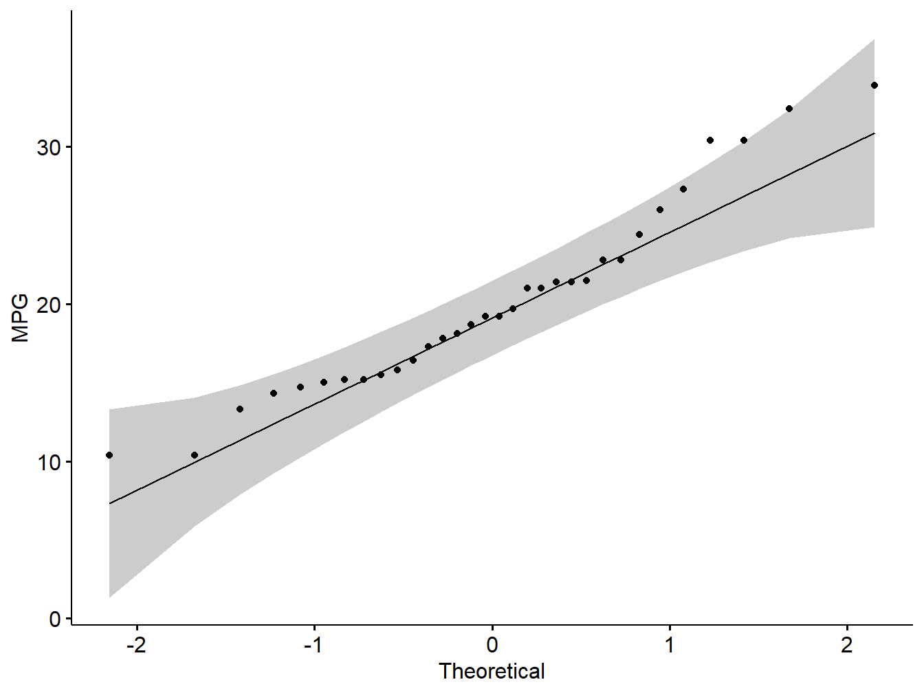
Figure 5.2: Q-Q plot showing normality of variables
# wt
ggqqplot(my_data$wt, ylab = "WT")
Figure 5.3: Q-Q plot showing normality of variables
Note: From the normality plots, we conclude that both populations may come from normal distributions.
Pearson correlation test
Correlation test between mpg and wt variables:
res <- cor.test(my_data$wt, my_data$mpg,
                    method = "pearson")
res
##
## Pearson's product-moment correlation
##
## data: my_data$wt and my_data$mpg
## t = -9.559, df = 30, p-value = 1.294e-10
## alternative hypothesis: true correlation is not equal to 0
## 95 percent confidence interval:
## -0.9338264 -0.7440872
## sample estimates:
## cor
## -0.8676594Similarly the Kendall rank correlation coefficient or Kendall’s tau statistic is used to estimate a rank-based measure of association. This test may be used if the data do not necessarily come from a bivariate normal distribution.
res2 <- cor.test(my_data$wt, my_data$mpg, method="kendall")## Warning in cor.test.default(my_data$wt, my_data$mpg, method = "kendall"): Cannot
## compute exact p-value with tiesres2##
## Kendall's rank correlation tau
##
## data: my_data$wt and my_data$mpg
## z = -5.7981, p-value = 6.706e-09
## alternative hypothesis: true tau is not equal to 0
## sample estimates:
## tau
## -0.7278321Further Spearman’s rho statistic is also used to estimate a rank-based measure of association. This test may be used if the data do not come from a bivariate normal distribution.
res3 <-cor.test(my_data$wt, my_data$mpg, method = "spearman")## Warning in cor.test.default(my_data$wt, my_data$mpg, method = "spearman"):
## Cannot compute exact p-value with tiesres3##
## Spearman's rank correlation rho
##
## data: my_data$wt and my_data$mpg
## S = 10292, p-value = 1.488e-11
## alternative hypothesis: true rho is not equal to 0
## sample estimates:
## rho
## -0.8864225.1.3.1 Interpreting correlation test
Result of a correlation test can be interpreted using the correlation coefficient and p-value of the test. Correlation coefficient is comprised between -1 and 1:
- -1 indicates a strong negative correlation : this means that every time x increases, y decreases (left panel figure)
- 0 means that there is no association between the two variables (x and y) (middle panel figure)
- 1 indicates a strong positive correlation : this means that y increases with x (right panel figure)
Figure 5.4: Interpret correlation coefficient
Use of p-value statistics: If the p-value of correlation test is less than 0.05, the null hypothesis of no significant correlation will be accepted at 5% significant level.
Problem 1: From the following data, compute Karl Pearson’s coefficient of correlation.
\(\begin{array}{|l|ccccccc|}\hline \text{Price(Rupees)}:& 10& 20& 30& 40& 50& 60& 70\\\hline \text{Supply(Units)}:& 8& 6& 14& 16& 10& 20& 24\\\hline \end{array}\)
Solution: As the first step read the variables price and supply and use cor.test function on the variable pair. The R code and the result are shown below:
price=c(10,20,30,40,50,60,70)
supply=c(8,6,14,16,10,20,24)
resp1=cor.test(price,supply,method='pearson')
resp1
##
## Pearson's product-moment correlation
##
## data: price and supply
## t = 3.6145, df = 5, p-value = 0.01531
## alternative hypothesis: true correlation is not equal to 0
## 95 percent confidence interval:
## 0.2707625 0.9774828
## sample estimates:
## cor
## 0.8504201Interpretation: Since the Pearson coefficient is 0.8504201. Also p-value is 0.015308 <0.05. So the null hypothesis is accepted. So it is statistically reasonable to conclude that there is a significant positive correlation between the price and supply based on the sample.
Problem: From the following data compute correlation between height of father and height of daughters by Karl Pearson’s coefficient of correlation.
\(\begin{array}{|l|cccccccc|}\hline \text{Height of Father(Cms)}& 65& 66& 67& 67& 68& 69& 71& 73\\ \text{Height of Daughter(Cms)}& 67& 68& 64& 69& 72& 70& 69& 73\\\hline \end{array}\)
Solution: As the first step read the variables price and supply and use cor.test function on the variable pair. The R code and the result are shown below:
height_F=c(65,66,67,67,68,69,71,73)
height_D=c(67,68,64,69,72,70,69,73)
resp2=cor.test(height_F,height_D,method='pearson')
resp2
##
## Pearson's product-moment correlation
##
## data: height_F and height_D
## t = 2.0717, df = 6, p-value = 0.08369
## alternative hypothesis: true correlation is not equal to 0
## 95 percent confidence interval:
## -0.1080788 0.9281049
## sample estimates:
## cor
## 0.6457766Interpretation: Since the Pearson coefficient is 0.6457766. Also p-value is 0.0836865 >0.05. So the null hypothesis is accepted. So it is statistically reasonable to conclude that there is no significant positive correlation between the price and supply based on the sample.
We can show the correlation in the form of scatter plot as follows:
library("ggpubr")
data1=data.frame(height_F,height_D)
ggscatter(data1, x = "height_F", y = "height_D",
          add = "reg.line", conf.int = TRUE,
          cor.coef = TRUE, cor.method = "pearson",
          xlab = "Height of Father (cm)", ylab = "Height of Daughter (cm)")
## `geom_smooth()` using formula 'y ~ x'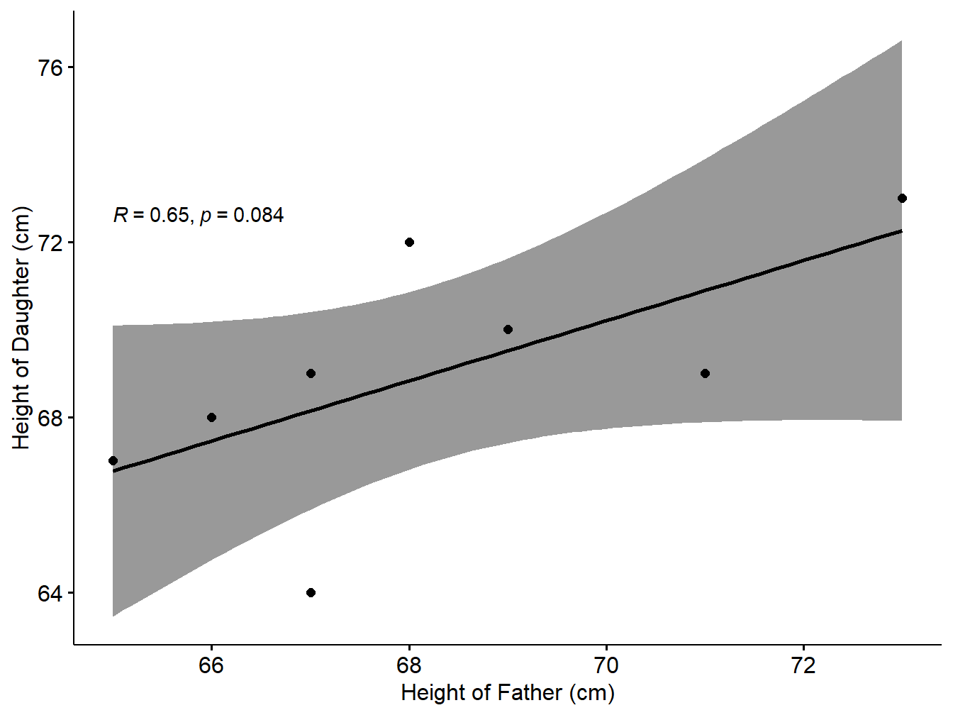
Figure 5.5: Scatter plot with smooth fit curve
Problem: The scores for nine students in history and algebra are as follows:
\(\begin{array}{|l|cccccccc|}\hline \text{History}:&35& 23& 47& 17& 10& 43& 9& 6&28\\\hline \text{Algebra}:&30& 33&45&23&8&49&12&4&31\\\hline \end{array}\)
Compute the Spearman rank correlation.
SOlution: As the first step read the variables price and supply and use cor.test function on the variable pair. The R code and the result are shown below:
History=c(35,23,47,17,10,43,9,6,28)
Algebra=c(30,33,45,23,8,49,12,4,31)
ress3=cor.test(History,Algebra,method='spearman')
ress3
##
## Spearman's rank correlation rho
##
## data: History and Algebra
## S = 12, p-value = 0.002028
## alternative hypothesis: true rho is not equal to 0
## sample estimates:
## rho
## 0.9Interpretation: Since the correlation coefficient is 0.9. Also p-value is 0.0020282 <0.05. So the null hypothesis is rejected So it is statistically reasonable to conclude that there is a significant positive correlation between the price and supply based on the sample.
We can show the correlation in the form of scatter plot as follows (Kassambara 2020):
library("ggpubr")
data2=data.frame(History,Algebra)
ggscatter(data2, x = "History", y = "Algebra",
          add = "reg.line", conf.int = TRUE,
          cor.coef = TRUE, cor.method = "spearman",
          xlab = "Marks in History", ylab = "Marks in Algebra")
## `geom_smooth()` using formula 'y ~ x'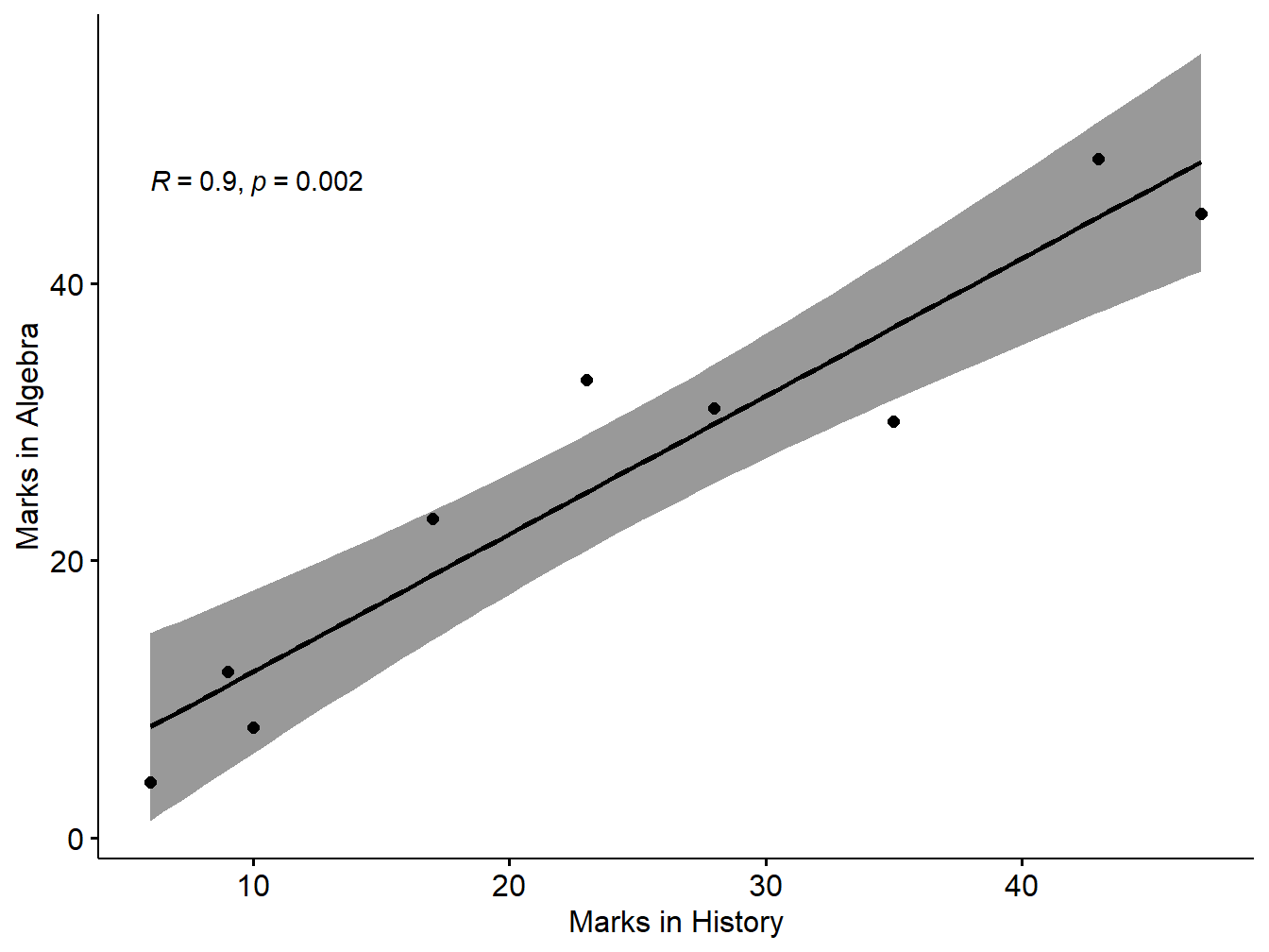
Figure 5.6: Scatter plot with smooth fit curve
5.1.4 Correlation Matrix
Previously, we described how to perform correlation test between two variables. In this section, you’ll learn how to compute a correlation matrix, which is used to investigate the dependence between multiple variables at the same time. The result is a table containing the correlation coefficients between each variable and the others.
There are different methods for correlation analysis : Pearson parametric correlation test, Spearman and Kendall rank-based correlation analysis. These methods are discussed in the next sections.
Compute correlation matrix in R
As you may know, The R function cor() can be used to compute a correlation matrix. A simplified format of the function is :
syntax
cor(x, method = c("pearson", "kendall", "spearman"))
Example: Here, we’ll use a data ( few numeric columns) derived from the built-in R data set mtcars as the first example:
# Load data
data("mtcars")
my_data <- mtcars[, c(1,3,4,5,6,7)]
# print the first 6 rows
head(my_data, 6)
## mpg disp hp drat wt qsec
## Mazda RX4 21.0 160 110 3.90 2.620 16.46
## Mazda RX4 Wag 21.0 160 110 3.90 2.875 17.02
## Datsun 710 22.8 108 93 3.85 2.320 18.61
## Hornet 4 Drive 21.4 258 110 3.08 3.215 19.44
## Hornet Sportabout 18.7 360 175 3.15 3.440 17.02
## Valiant 18.1 225 105 2.76 3.460 20.22Compute correlation matrix
The R code to compute the correlation matrix is:
rescm <- cor(my_data)
round(rescm, 2)
## mpg disp hp drat wt qsec
## mpg 1.00 -0.85 -0.78 0.68 -0.87 0.42
## disp -0.85 1.00 0.79 -0.71 0.89 -0.43
## hp -0.78 0.79 1.00 -0.45 0.66 -0.71
## drat 0.68 -0.71 -0.45 1.00 -0.71 0.09
## wt -0.87 0.89 0.66 -0.71 1.00 -0.17
## qsec 0.42 -0.43 -0.71 0.09 -0.17 1.00Unfortunately, the function cor() returns only the correlation coefficients between variables. In the next section, we will use Hmisc R package to calculate the correlation p-values. The function rcorr() [in Hmisc package] can be used to compute the significance levels for pearson and spearman correlations. It returns both the correlation coefficients and the p-value of the correlation for all possible pairs of columns in the data table.
Syntax
rcorr(x, type = c("pearson","spearman"))
The following R code illustrate the use of rcorr() function on my_data.
library("Hmisc")## Loading required package: lattice## Loading required package: survival## Loading required package: Formula##
## Attaching package: 'Hmisc'## The following objects are masked from 'package:base':
##
## format.pval, unitsresH <- rcorr(as.matrix(my_data))
resH## mpg disp hp drat wt qsec
## mpg 1.00 -0.85 -0.78 0.68 -0.87 0.42
## disp -0.85 1.00 0.79 -0.71 0.89 -0.43
## hp -0.78 0.79 1.00 -0.45 0.66 -0.71
## drat 0.68 -0.71 -0.45 1.00 -0.71 0.09
## wt -0.87 0.89 0.66 -0.71 1.00 -0.17
## qsec 0.42 -0.43 -0.71 0.09 -0.17 1.00
##
## n= 32
##
##
## P
## mpg disp hp drat wt qsec
## mpg 0.0000 0.0000 0.0000 0.0000 0.0171
## disp 0.0000 0.0000 0.0000 0.0000 0.0131
## hp 0.0000 0.0000 0.0100 0.0000 0.0000
## drat 0.0000 0.0000 0.0100 0.0000 0.6196
## wt 0.0000 0.0000 0.0000 0.0000 0.3389
## qsec 0.0171 0.0131 0.0000 0.6196 0.3389A more readable form with updated format can be generated with the following custom R function:
# ++++++++++++++++++++++++++++
# flattenCorrMatrix
# ++++++++++++++++++++++++++++
# cormat : matrix of the correlation coefficients
# pmat : matrix of the correlation p-values
flattenCorrMatrix <- function(cormat, pmat) {
  ut <- upper.tri(cormat)
  data.frame(
    row = rownames(cormat)[row(cormat)[ut]],
    column = rownames(cormat)[col(cormat)[ut]],
    cor  =(cormat)[ut],
    p = pmat[ut]
    )
}flattenCorrMatrix(resH$r, resH$P)## row column cor p
## 1 mpg disp -0.84755138 9.380328e-10
## 2 mpg hp -0.77616837 1.787835e-07
## 3 disp hp 0.79094859 7.142679e-08
## 4 mpg drat 0.68117191 1.776240e-05
## 5 disp drat -0.71021393 5.282022e-06
## 6 hp drat -0.44875912 9.988772e-03
## 7 mpg wt -0.86765938 1.293958e-10
## 8 disp wt 0.88797992 1.222311e-11
## 9 hp wt 0.65874789 4.145827e-05
## 10 drat wt -0.71244065 4.784260e-06
## 11 mpg qsec 0.41868403 1.708199e-02
## 12 disp qsec -0.43369788 1.314404e-02
## 13 hp qsec -0.70822339 5.766253e-06
## 14 drat qsec 0.09120476 6.195826e-01
## 15 wt qsec -0.17471588 3.388683e-01Note: Easy method to choose a dataset from the system with filechoose method:
# If .txt tab file, use this
my_data <- read.delim(file.choose())
# Or, if .csv file, use this
my_data <- read.csv(file.choose())
Visualize correlation matrix
There are different ways for visualizing a correlation matrix in R software :
symnum()functioncorrplot()function to plot a correlogram- scatter plots
- heatmap
Use symnum() function: Symbolic number coding
The R function symnum() replaces correlation coefficients by symbols according to the level of the correlation. It takes the correlation matrix as an argument :
syntax
symnum(x, cutpoints = c(0.3, 0.6, 0.8, 0.9, 0.95),
       symbols = c(" ", ".", ",", "+", "*", "B"),
       abbr.colnames = TRUE)
x: the correlation matrix to visualize
cutpoints: correlation coefficient cutpoints. The correlation coefficients between 0 and 0.3 are replaced by a space (” “); correlation coefficients between 0.3 and 0.6 are replace by.”“; etc …
symbols : the symbols to use.
abbr.colnames: logical value. If TRUE, colnames are abbreviated.
We can create the symbolic number coding using forllowing R code:
symnum(rescm, abbr.colnames = FALSE)## mpg disp hp drat wt qsec
## mpg 1
## disp + 1
## hp , , 1
## drat , , . 1
## wt + + , , 1
## qsec . . , 1
## attr(,"legend")
## [1] 0 ' ' 0.3 '.' 0.6 ',' 0.8 '+' 0.9 '*' 0.95 'B' 1Use corrplot() function: Draw a correlogram
The function corrplot(), in the package of the same name, creates a graphical display of a correlation matrix, highlighting the most correlated variables in a data table (Wei and Simko 2021).
In this plot, correlation coefficients are colored according to the value. Correlation matrix can be also reordered according to the degree of association between variables.
Correlogram of the given correlation matrix can be created using the following R code:
library(corrplot)## corrplot 0.92 loadedcorrplot(rescm, type = "upper", order = "hclust",
tl.col = "black", tl.srt = 45)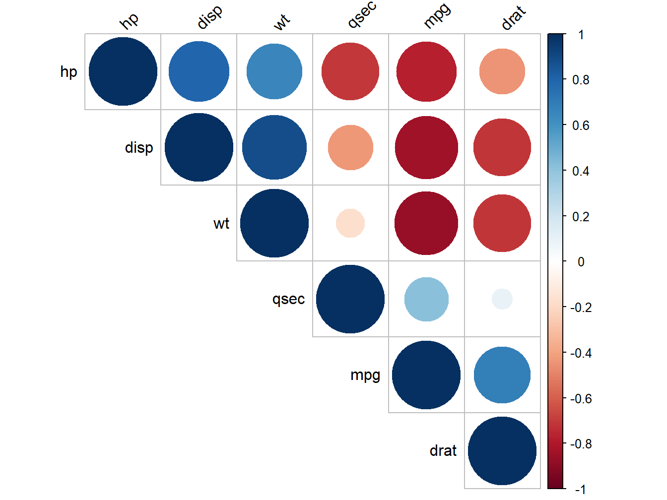
Figure 5.7: Correlogram of mtcars attributes
Positive correlations are displayed in blue and negative correlations in red color. Color intensity and the size of the circle are proportional to the correlation coefficients. In the right side of the correlogram, the legend color shows the correlation coefficients and the corresponding colors.
The correlation matrix is reordered according to the correlation coefficient using “hclust” method. tl.col (for text label color) and tl.srt (for text label string rotation) are used to change text colors and rotations. Possible values for the argument type are : “upper,” “lower,” “full.”
It’s also possible to combine correlogram with the significance test. We’ll use the result resH generated in the previous section with rcorr() function [in Hmisc package]:
#Insignificant correlation are crossed
#corrplot(resH$r, type="upper", order="hclust",p.mat = resH$P, sig.level = 0.05, insig = "blank")
# Insignificant correlations are leaved blank
#corrplot(resH$r, type="upper", order="hclust", p.mat = resH$P, sig.level = 0.01, insig = "blank")Use chart.Correlation(): Draw scatter plots
The function chart.Correlation()[ in the package PerformanceAnalytics], can be used to display a chart of a correlation matrix (Peterson and Carl 2020).
library("PerformanceAnalytics")## Loading required package: xts## Loading required package: zoo##
## Attaching package: 'zoo'## The following objects are masked from 'package:base':
##
## as.Date, as.Date.numeric##
## Attaching package: 'PerformanceAnalytics'## The following object is masked from 'package:graphics':
##
## legendmy_data <- mtcars[, c(1,3,4,5,6,7)]
chart.Correlation(my_data, histogram=TRUE, pch=19)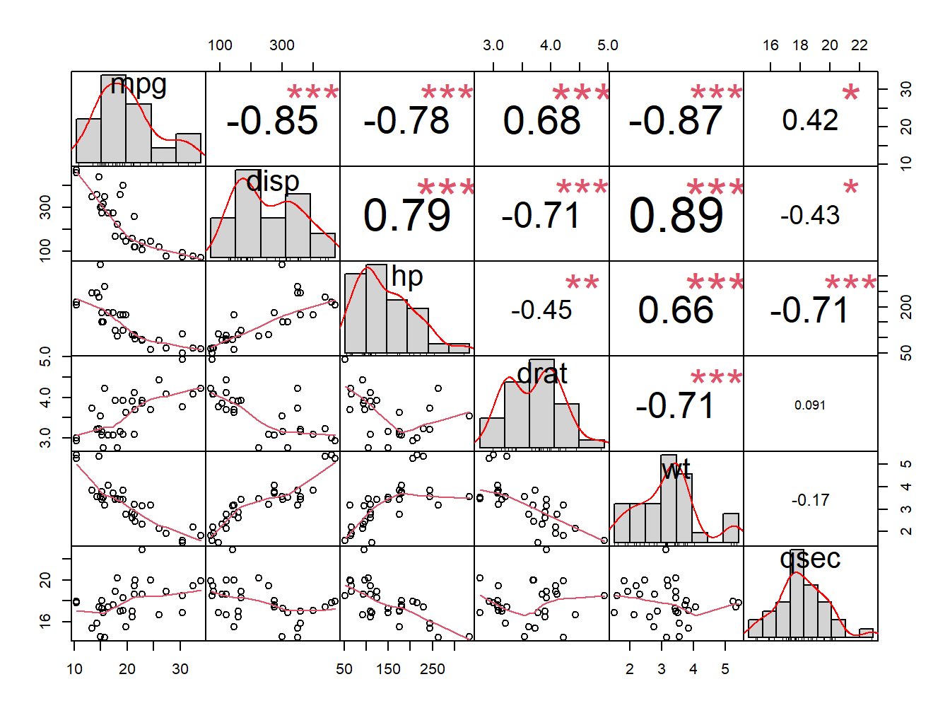
Figure 5.8: Correlation chart
In the above plot:
- The distribution of each variable is shown on the diagonal.
- On the bottom of the diagonal : the bivariate scatter plots with a fitted line are displayed
- On the top of the diagonal : the value of the correlation plus the significance level as stars
- Each significance level is associated to a symbol : p-values(0, 0.001, 0.01, 0.05, 0.1, 1) <=> symbols(“”, “”, “,” “.” ” “)
5.2 Regression Analysis
Linear regression (or linear model) is used to predict a quantitative outcome variable (y) on the basis of one or multiple predictor variables (x) (James et al. 2014,P. Bruce and Bruce (2017)).
The goal is to build a mathematical formula that defines y as a function of the x variable. Once, we built a statistically significant model, it’s possible to use it for predicting future outcome on the basis of new x values.
In this chapter, you will learn:
- the basics and the formula of linear regression,
- how to compute simple and multiple regression models in R,
- how to make predictions of the outcome of new data,
- how to assess the performance of the model
Regression assumptions
Linear regression makes several assumptions about the data, such as :
- Linearity of the data. The relationship between the predictor (x) and the outcome (y) is assumed to be linear.
- Normality of residuals. The residual errors are assumed to be normally distributed.
- Homogeneity of residuals variance. The residuals are assumed to have a constant variance (homoscedasticity)
- Independence of residuals error terms.
You should check whether or not these assumptions hold true. Potential problems include:
- Non-linearity of the outcome - predictor relationships
- Heteroscedasticity: Non-constant variance of error terms.
- Presence of influential values in the data that can be:
- Outliers: extreme values in the outcome (y) variable
- High-leverage points: extreme values in the predictors (x) variable
All these assumptions and potential problems can be checked by producing some diagnostic plots visualizing the residual errors.
When you build a regression model, you need to assess the performance of the predictive model. In other words, you need to evaluate how well the model is in predicting the outcome of a new test data that have not been used to build the model.
Two important metrics are commonly used to assess the performance of the predictive regression model:
- Root Mean Squared Error, which measures the model prediction error. It corresponds to the average difference between the observed known values of the outcome and the predicted value by the model. RMSE is computed as \(RMSE = mean((observeds - predicteds)^2) %>% sqrt()\). The lower the RMSE, the better the model.
- R-square, representing the squared correlation between the observed known outcome values and the predicted values by the model. The higher the R2, the better the model.
Formula: The mathematical formula of the linear regression can be written as follow:
\[y = b_0 + b_1*x + e\]
We read this as “y is modeled as beta1 (b1) times x, plus a constant beta0 (b0), plus an error term e.”
When you have multiple predictor variables, the equation can be written as \(y = b_0 + b_1*x_1 + b_2*x_2 + \cdots + b_n*x_n\), where:
- \(b_0\) is the intercept,
- \(b_1, b_2,\ldots, b_n\) are the regression weights or coefficients associated with the predictors \(x_1, x_2, \ldots, x_n\).
- \(e\) is the error term (also known as the residual errors), the part of y that can be explained by the regression model.
The figure below illustrates a simple linear regression model, where:
- the best-fit regression line is in blue
- the intercept (b0) and the slope (b1) are shown in green
- the error terms (e) are represented by vertical red lines
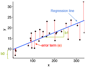
Figure 5.9: A simple Linear Regression Model
From the scatter plot in Figure 5.9, it can be seen that not all the data points fall exactly on the fitted regression line. Some of the points are above the blue curve and some are below it; overall, the residual errors (e) have approximately mean zero.
The sum of the squares of the residual errors are called the Residual Sum of Squares or RSS.
The average variation of points around the fitted regression line is called the Residual Standard Error (RSE). This is one the metrics used to evaluate the overall quality of the fitted regression model. The lower the RSE, the better it is.
Since the mean error term is zero, the outcome variable y can be approximately estimated as follow:
\[y\sim b_0 + b_1*x\]
Mathematically, the beta coefficients (\(b_0\) and \(b_1\)) are determined so that the RSS is as minimal as possible. This method of determining the beta coefficients is technically called least squares regression or ordinary least squares (OLS) regression.
Once, the beta coefficients are calculated, a t-test is performed to check whether or not these coefficients are significantly different from zero. A non-zero beta coefficients means that there is a significant relationship between the predictors (x) and the outcome variable (y).
5.2.1 Computing linear regression
The R function lm() is used to compute linear regression model.
Simple linear regression: The simple linear regression is used to predict a continuous outcome variable (y) based on one single predictor variable (x).
In the following example, we’ll build a simple linear model to predict sales units based on the advertising budget spent on youtube. The regression equation can be written as sales = b0 + b1*youtube.
The R function lm() can be used to determine the beta coefficients of the linear model, as follow:
marketing=data.frame(sales=c(2,4,6,9,12,34,45),youtube=c(1,2,4,7,9,11,15))
model <- lm(sales ~ youtube, data = marketing)
summary(model)$coef
## Estimate Std. Error t value Pr(>|t|)
## (Intercept) -5.363636 4.6607638 -1.150806 0.30185618
## youtube 3.051948 0.5531309 5.517587 0.00267729The output above shows the estimate of the regression beta coefficients (column Estimate) and their significance levels (column Pr(>|t|). The intercept (b0) is -5.3636364 and the coefficient of youtube variable is 3.0519481.
The estimated regression equation can be written as follow: sales = -5.3636364 + 3.0519481* youtube. Using this formula, for each new youtube advertising budget, you can predict the number of sale units.
For example:
For a youtube advertising budget equal zero, we can expect a sale of -5.3636364 units. For a youtube advertising budget equal 1000, we can expect a sale of -5.363636 + 3.051948*1000 = 3046.584 units. Predictions can be easily made using the R function predict(). In the following example, we predict sales units for two youtube advertising budget: 0 and 1000.
newdata <- data.frame(youtube = c(0,  1000))
model %>% predict(newdata)
## 1 2
## -5.363636 3046.584416Interpretation
Before using a model for predictions, you need to assess the statistical significance of the model. This can be easily checked by displaying the statistical summary of the model.
Model summary:Display the statistical summary of the model as follow:
summary(model)##
## Call:
## lm(formula = sales ~ youtube, data = marketing)
##
## Residuals:
## 1 2 3 4 5 6 7
## 4.3117 3.2597 -0.8442 -7.0000 -10.1039 5.7922 4.5844
##
## Coefficients:
## Estimate Std. Error t value Pr(>|t|)
## (Intercept) -5.3636 4.6608 -1.151 0.30186
## youtube 3.0519 0.5531 5.518 0.00268 **
## ---
## Signif. codes: 0 '***' 0.001 '**' 0.01 '*' 0.05 '.' 0.1 ' ' 1
##
## Residual standard error: 6.864 on 5 degrees of freedom
## Multiple R-squared: 0.8589, Adjusted R-squared: 0.8307
## F-statistic: 30.44 on 1 and 5 DF, p-value: 0.002677The summary outputs shows 6 components, including:
- Call. Shows the function call used to compute the regression model.
- Residuals. Provide a quick view of the distribution of the residuals, which by definition have a mean zero. Therefore, the median should not be far from zero, and the minimum and maximum should be roughly equal in absolute value.
- Coefficients. Shows the regression beta coefficients and their statistical significance. Predictor variables, that are significantly associated to the outcome variable, are marked by stars.
- Residual standard error (RSE), R-squared (R2) and the F-statistic are metrics that are used to check how well the model fits to our data.
The first step in interpreting the multiple regression analysis is to examine the F-statistic and the associated p-value, at the bottom of model summary.
In our example, it can be seen that p-value of the F-statistic is 0.002, which is highly significant. This means that, at least, one of the predictor variables is significantly related to the outcome variable.
Coefficients significance:To see which predictor variables are significant, you can examine the coefficients table, which shows the estimate of regression beta coefficients and the associated t-statistic p-values.
summary(model)$coef## Estimate Std. Error t value Pr(>|t|)
## (Intercept) -5.363636 4.6607638 -1.150806 0.30185618
## youtube 3.051948 0.5531309 5.517587 0.00267729For a given the predictor, the t-statistic evaluates whether or not there is significant association between the predictor and the outcome variable, that is whether the beta coefficient of the predictor is significantly different from zero.
It can be seen that, changing in youtube advertising budget are significantly associated to changes in sales.
For a given predictor variable, the coefficient (b) can be interpreted as the average effect on y of a one unit increase in predictor, holding all other predictors fixed.
For example, for a fixed amount of advertising budget, spending an additional 1 000 dollars on Youtube advertising leads to an increase in sales by approximately 3.051948*1000 = 3051.948 sale units, on average.
5.2.2 Conclusion
This section describes the basics of linear regression and provides practical examples in R for computing simple linear regression models. We also described how to assess the performance of the model for predictions.
Note that, linear regression assumes a linear relationship between the outcome and the predictor variables. This can be easily checked by creating a scatter plot of the outcome variable vs the predictor variable.
For example, the following R code displays sales units versus youtube advertising budget. We’ll also add a smoothed line:
ggplot(marketing, aes(x = youtube, y = sales)) +
  geom_point() +
  stat_smooth()
## `geom_smooth()` using method = 'loess' and formula 'y ~ x'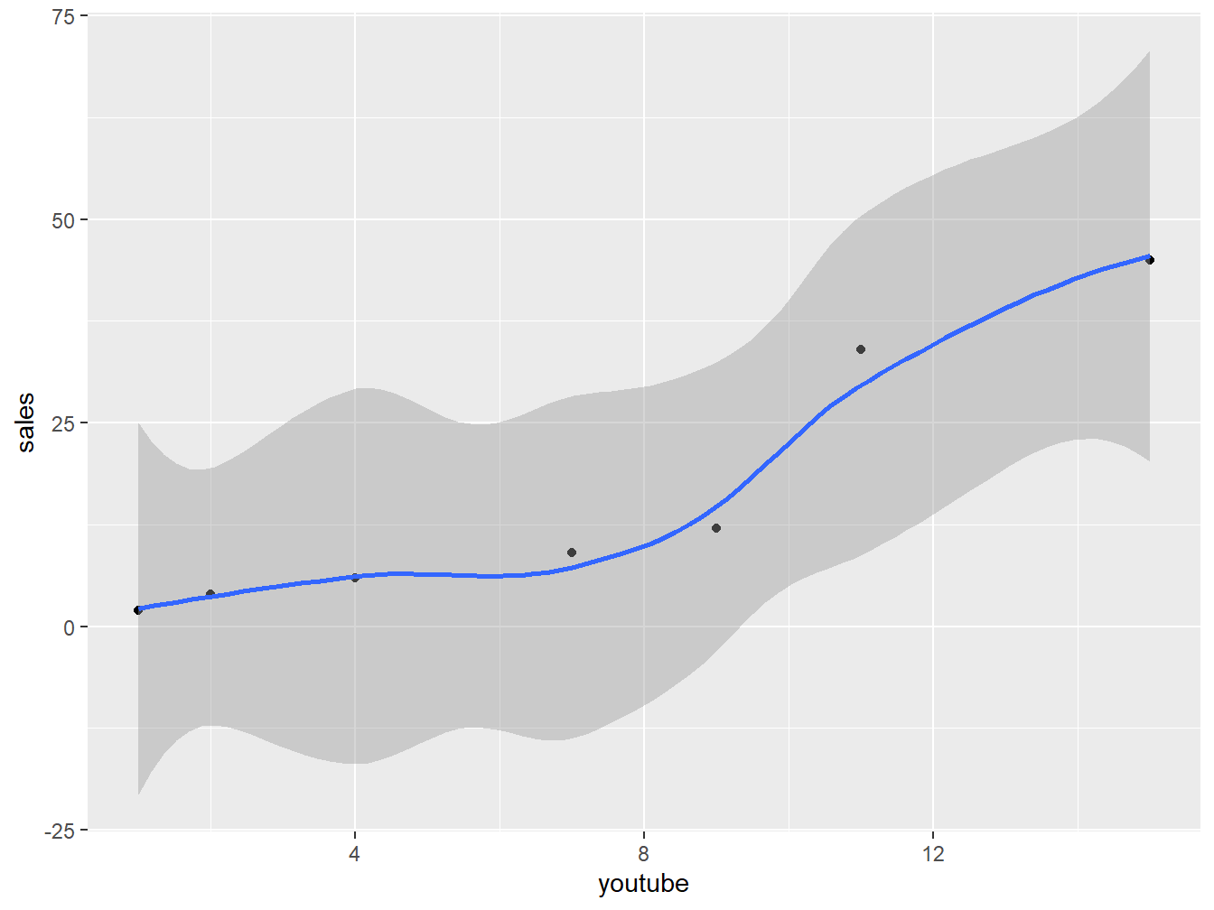
Figure 5.10: Scatter plot to show fitting of a Model
Regression diagnostics
Diagnostic plots: Regression diagnostics plots can be created using the R base function plot() or the autoplot() function [ggfortify package], which creates a ggplot2-based graphics.
Create the diagnostic plots with the R base function:
par(mfrow = c(2, 2))
plot(model)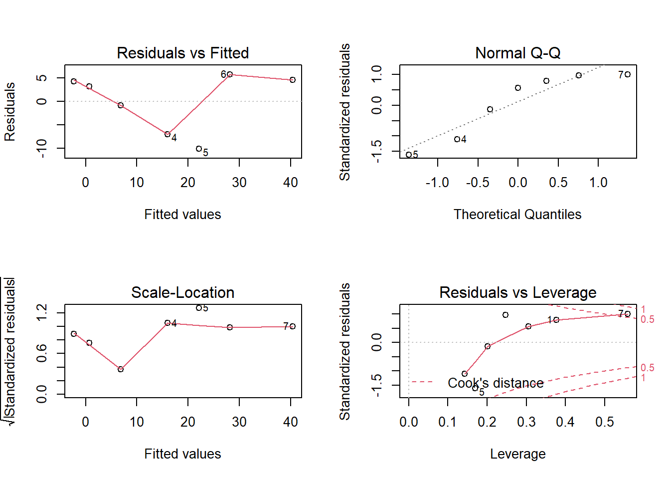 The diagnostic plots show residuals in four different ways:
Residuals vs Fitted. Used to check the linear relationship assumptions. A horizontal line, without distinct patterns is an indication for a linear relationship, what is good. This is not the case in our example.
Normal Q-Q. Used to examine whether the residuals are normally distributed. It’s good if residuals points follow the straight dashed line. This is not the case in our example.
Scale-Location (or Spread-Location). Used to check the homogeneity of variance of the residuals (homoscedasticity). Horizontal line with equally spread points is a good indication of homoscedasticity. This is not the case in our example, where we have a heteroscedasticity problem.
Residuals vs Leverage. Used to identify influential cases, that is extreme values that might influence the regression results when included or excluded from the analysis. The plot-4 above highlights the top 2 most extreme points (#10 and #7), with a standardized residuals above 0.5. However, there is no outliers that exceed 3 standard deviations, what is good.
Additionally, there is no high leverage point in the data. That is, all data points, have a leverage statistic below 2(p + 1)/n = 4/7 = 0.5714286. This is the case in our example.
The plot-4 show the top 2 most extreme data points labeled with with the row numbers of the data in the data set. They might be potentially problematic. You might want to take a close look at them individually to check if there is anything special for the subject or if it could be simply data entry errors.
Influential values: An influential value is a value, which inclusion or exclusion can alter the results of the regression analysis. Such a value is associated with a large residual. Not all outliers (or extreme data points) are influential in linear regression analysis.
Statisticians have developed a metric called Cook’s distance to determine the influence of a value. This metric defines influence as a combination of leverage and residual size.
A rule of thumb is that an observation has high influence if Cook’s distance exceeds 4/(n - p - 1)(P. Bruce and Bruce 2017), where n is the number of observations and p the number of predictor variables.
The Residuals vs Leverage plot can help us to find influential observations if any. On this plot, outlying values are generally located at the upper right corner or at the lower right corner. Those spots are the places where data points can be influential against a regression line.
The following plots illustrate the Cook’s distance and the leverage of our model:
# Cook's distance
plot(model, 4)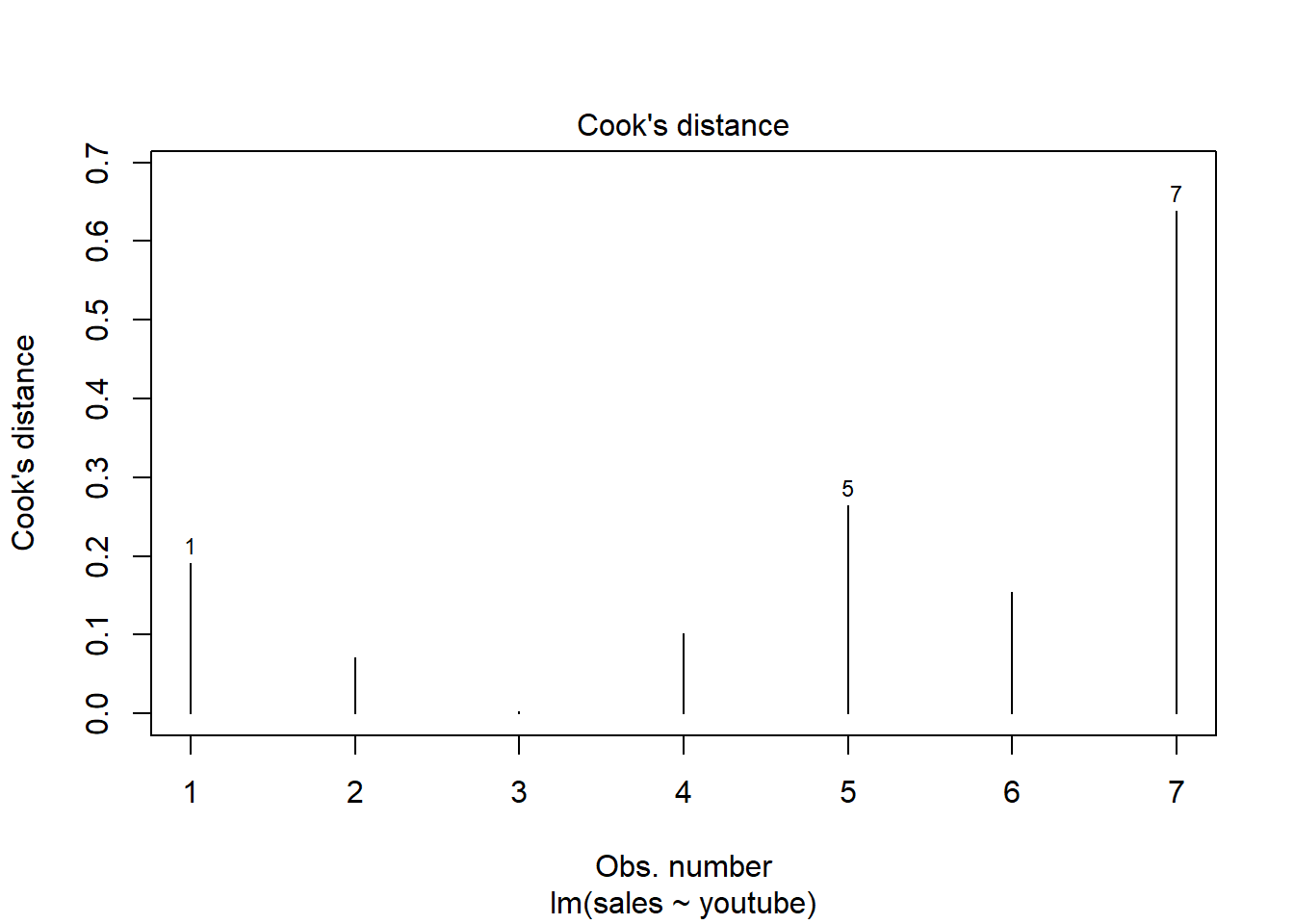
# Residuals vs Leverage
plot(model, 5)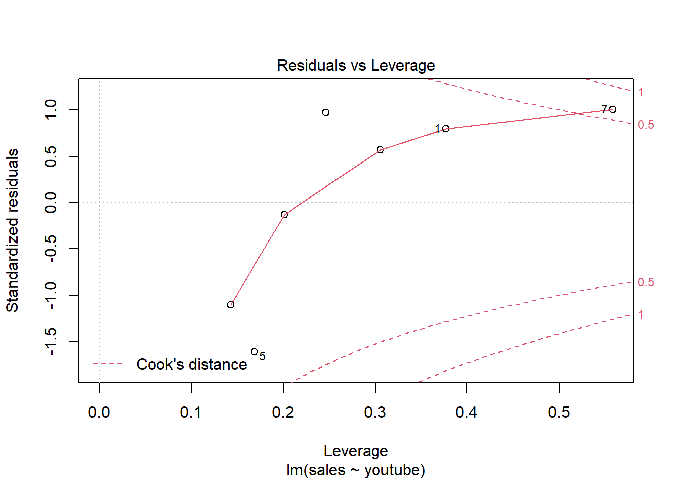
So there is only one item (#7) is influential. Remodel after removing this item may give a better solution.
5.2.3 Diagnosis
This section describes linear regression assumptions, modelling OLR and shows how to diagnostic potential problems in the model. The diagnostic is essentially performed by visualizing the residuals. Having patterns in residuals is not a stop signal. Your current regression model might not be the best way to understand your data. Potential problems might be:
A non-linear relationships between the outcome and the predictor variables. When facing to this problem, one solution is to include a quadratic term, such as polynomial terms or log transformation.
Existence of important variables that you left out from your model. Other variables you didn’t include (e.g., age or gender) may play an important role in your model and data. .
Presence of outliers. If you believe that an outlier has occurred due to an error in data collection and entry, then one solution is to simply remove the concerned observation.