3 Descriptive Statistics
3.1 Examining numerical data (1.6)
In section 1, chapter 2, we distinguished different types of variables. We said that we care whether a variable is quantitative or categorical. We also care whether a quantitative variable is discrete or continuous. We care about these distinctions because the method used to analyze a data set will depend on the type of variable the data represent. In this section, we will learn some tools for summarizing numerical (also called quantitative) data graphically, and numerically.
3.1.1 Graphical summary of numerical data
Once a dataset has been collected, the first step in analysing the data is to use graphical tools to explore the data. We will go over a few tools here.
3.1.1.1 Scatterplots
The scatterplot, also called scatter diagram, is a graphical display of the relationship between two quantitative variables. One variable is shown on the horizontal axis and the other variable is shown on the vertical axis. Each of the n cases is represented with a dot in the x-y plane. The general pattern of the dots suggests the overall relationship between the variables. Moreover, we can draw a trendline to approximate the relationship between the two variables.
Example: Data were collected (actually simulated) on a restaurant’s bills and tips over a few weeks on a couple of days per week. Shown below is a couple of cases.
install.packages("openintro") # Copy and paste this code in your RStudio console window. Then hit enter to install the openintro package. The data come with the openintro library. Executing library(openintro) loads the elements (data and codes) of the openintro library into memory.
library(openintro)
head(tips[,c("bill", "tip")], n=10)
## bill tip
## 1 17.99 2.0000
## 2 26.05 4.0000
## 3 79.49 14.3082
## 4 32.69 5.5000
## 5 29.97 6.0000
## 6 23.91 7.5000
## 7 18.18 3.0600
## 8 41.23 8.5000
## 9 25.19 8.5000
## 10 19.22 3.0000We want to see if there is a relationship between the size of the bill and the size of the tip. We can use a scatterplot for that purpose.
plot(x = tips$bill, y = tips$tip, main="Relationship between bill and tip",
    xlab="bill", ylab="tip")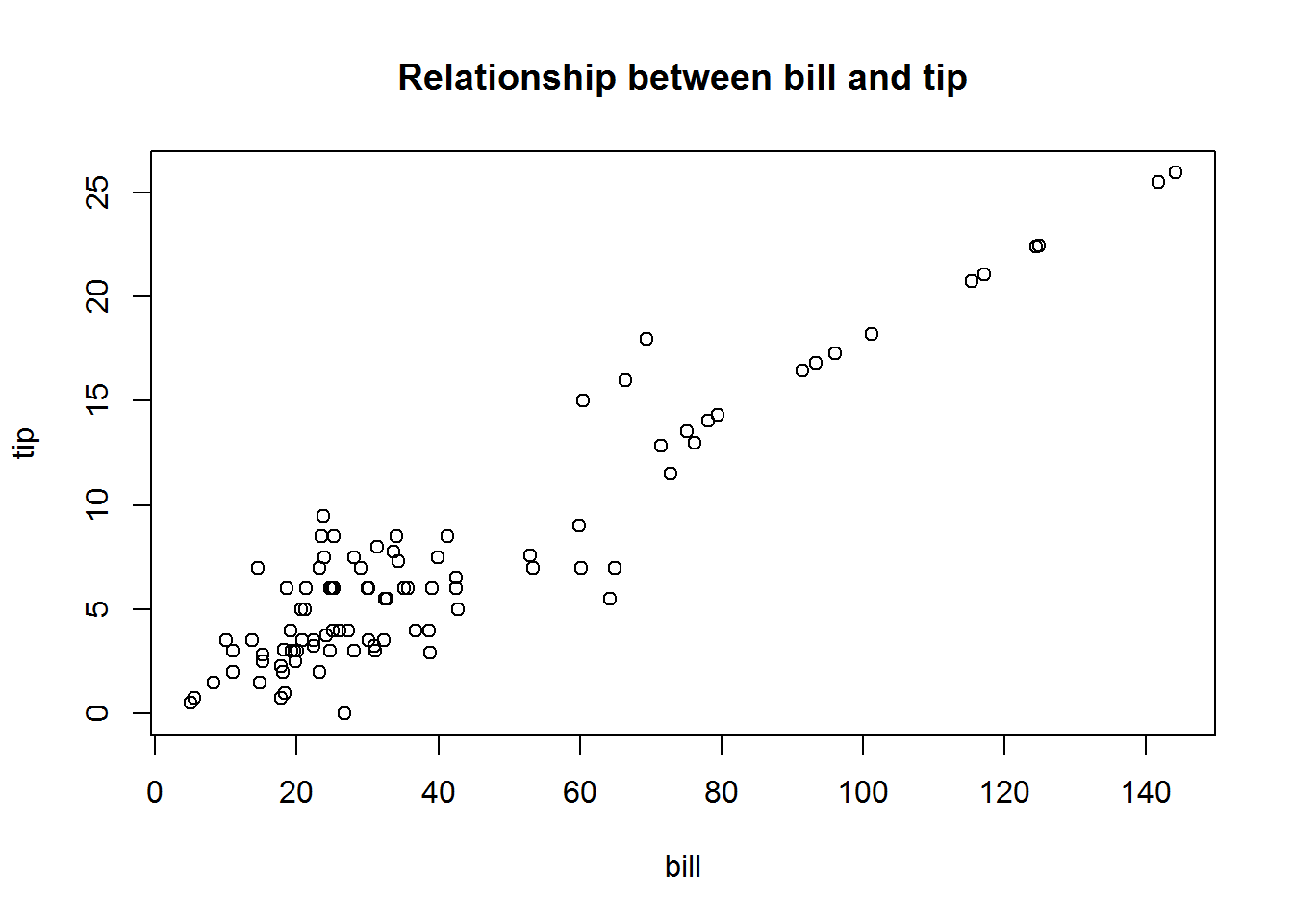
A question for you: What story can you tell based on the above graph?
We can add a trendline to the graph. A trendline is particularly useful when the relationship between the two variables is not clear.
plot(x = tips$bill, y = tips$tip,
    xlab="bill", ylab="tip",
    main="Relationship between bill and tip")
abline(lm(tips$tip~tips$bill), col="red") # add a trendline of the form y = a + bx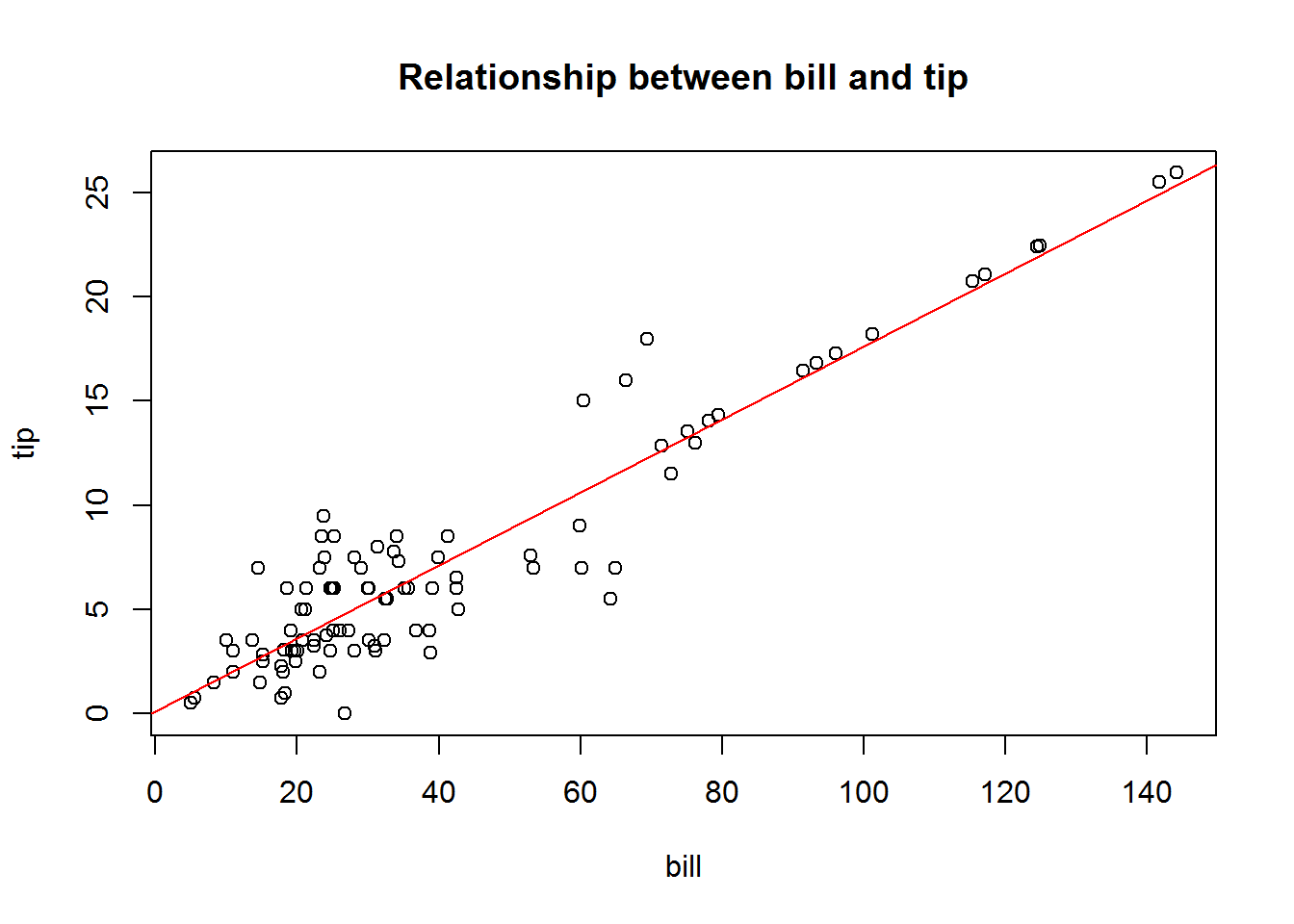
3.1.1.2 Time series plot: displaying data over time
For some variables, observations occur over time. A data set collected over time is called time series. We can display time series data graphically using time series plot.
Example: A data on estimates of The US unemployment rate from 1890 to 2010 was compiled from two sources. The following tables shows a few cases, at the top and at the bottom:
library(openintro)
head(unempl, n = 5) # shows the first 5 observations
## year unemp usData
## 1 1890 3.97 0
## 2 1891 4.77 0
## 3 1892 3.72 0
## 4 1893 8.09 0
## 5 1894 12.33 0tail(unempl, n = 5) # shows the last 5 observations## year unemp usData
## 117 2006 4.6 1
## 118 2007 4.6 1
## 119 2008 5.8 1
## 120 2009 9.3 1
## 121 2010 9.7 1Now, let’s construct a time series plot of the unemployment rate from 1890 to 2010.
plot(x = unempl$year, y = unempl$unemp, type="l",
     col = "blue", xlab = "year",
     ylab = "Unemployment rate in %",
     main = "The U.S unemployment rate 1890-2010")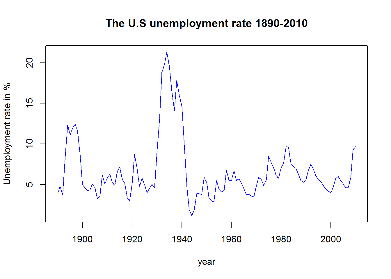
Can you tell a story from this graph?
3.1.1.3 Histograms
A common graphical presentation of a single numerical variable is a histogram. To understand how histograms are constructed, we will introduce the concept of frequency here.
A frequency table is a listing of possible classes for a variable, together with the number of observations for each class. For a quantitative variable, a frequency table usually divides the possible values into a set of classes and displays the number of observations in each class (see table below).
| Age class | Frequency |
|---|---|
| 15 - 20 | 29 |
| 21 - 25 | 80 |
| 26 - 30 | 64 |
| 31 - 35 | 23 |
| 36 - 40 | 3 |
| 40 - 45 | 1 |
| Total | 200 |
The relative frequency of a class is the fraction or proportion of the total number of data items belonging to the class.
We may find it helpful to represent the relative frequency in term of percentage. The percent is the proportion multiplied by 100; hence the name percent frequency.
Example: the data below is a portion of a data on age at first marriage of 5,534 US women who responded to the National Survey of Family Growth (NSFG) conducted by the CDC in the 2006 and 2010 cycle. We will work with the first 200 observations for this example.
library(openintro) # Needed because the data are in the openintro library
first200obs = head(ageAtMar$age, n = 200) # To select the first 200 cases
first200obs # print out the data
## [1] 32 25 24 26 32 29 23 23 29 27 23 21 29 40 22 20 31 21 25 24 23 31 30
## [24] 34 29 29 35 25 22 26 26 21 25 22 19 24 22 26 27 29 25 22 29 21 23 28
## [47] 25 29 27 25 21 20 31 33 32 24 33 24 22 33 33 25 24 23 20 27 28 23 27
## [70] 25 22 29 27 19 27 17 29 23 27 24 27 31 30 19 24 28 15 19 26 22 19 19
## [93] 22 26 24 20 30 18 22 21 17 27 27 31 34 32 22 28 25 24 18 23 17 16 23
## [116] 24 21 30 23 24 26 25 22 27 19 24 24 22 26 22 23 33 28 20 24 20 26 28
## [139] 24 19 41 34 23 33 39 27 23 26 18 28 34 31 18 18 22 21 29 29 27 30 25
## [162] 27 23 29 22 23 22 22 26 18 22 33 19 21 29 29 18 27 27 23 20 25 25 25
## [185] 23 28 30 20 28 27 29 27 29 40 23 29 32 24 23 27Looking at 200 observations (200 cases) is not very helpful. It may be more helpful to classify these data into classes.
| Age class | Frequency | Relative Frequency | Percent Frequency |
|---|---|---|---|
| 15 - 20 | 29 | 0.145 | 14.5 |
| 21 - 25 | 80 | 0.4 | 40 |
| 26 - 30 | 64 | 0.32 | 32 |
| 31 - 35 | 23 | 0.115 | 11.5 |
| 36 - 40 | 3 | 0.015 | 1.5 |
| 40 - 45 | 1 | 0.005 | 0.5 |
| Total | 200 | 1 | 100 |
The above table was constructed by hand. Here is how you will construct it using R.
library(openintro) # Needed because the data are in the openintro library
first200obs = head(ageAtMar$age, n = 200) # To select the first 200 cases
breaks = c(14, 20, 25, 30, 35, 40, 45) # defines the break points
first200Cut = cut(first200obs, breaks) # Assigns the cases into intervals
FreqTable = table(first200Cut) # Constructs a frequency table
FreqTable # Prints out the frequency table
## first200Cut
## (14,20] (20,25] (25,30] (30,35] (35,40] (40,45]
## 29 80 64 23 3 1FreqRelTable = FreqTable/200 # Constructs a relative frequency table
FreqRelTable # Prints out the relative frequency table## first200Cut
## (14,20] (20,25] (25,30] (30,35] (35,40] (40,45]
## 0.145 0.400 0.320 0.115 0.015 0.005FreqPercTable = (FreqTable/200)*100 # Constructs a percent frequency table
FreqPercTable # Prints out the percent frequency table## first200Cut
## (14,20] (20,25] (25,30] (30,35] (35,40] (40,45]
## 14.5 40.0 32.0 11.5 1.5 0.5Table = data.frame(FreqTable, FreqRelTable, FreqPercTable) # Collects all tables into one table
Table = Table[, c(1,2,4,6)] # Selects the columns needed for the final table
varnames = c("Classes", "Frequency", "Relative Frequency", "Percent Frequency %") # Names
names(Table) = varnames # Edit the columns names of the table
Table # Print out the combined table## Classes Frequency Relative Frequency Percent Frequency %
## 1 (14,20] 29 0.145 14.5
## 2 (20,25] 80 0.400 40.0
## 3 (25,30] 64 0.320 32.0
## 4 (30,35] 23 0.115 11.5
## 5 (35,40] 3 0.015 1.5
## 6 (40,45] 1 0.005 0.5Now that we know what a frequency means, we can return to the construction of histograms, which is a single numerical variable plot. In histogram plot, the classes are placed in the horizontal axis, and a rectangle is drawn above each class interval with the height corresponding to the interval’s frequency, relative frequency, or percent frequency. In the R lingo, we call a class a bin. For now let’s look at some examples of histogram plots.
par(mfrow=c(2,2)) # to get 4 graphs in one frame
library(openintro) # Needed because the data are in the openintro package
first_200 = head(ageAtMar$age, n = 200) # To subset the data set
hist(x= first_200) # default of R
hist(x= first_200, breaks = 6, main = "Breaks = 6") # use breaks to control the number of bins. Note: The number of bins you get is different from the number you set.
hist(x= first_200, breaks = 6, main = "Women Age at First Mariage",
     col = "lightblue", xlab = "Age class") # A plot with color and title
hist(x= first_200, breaks = c(14, 18, 22, 26, 30, 34, 38, 42, 46),
     main = "breaks = c(14, 18, 22, 26, 30, 34, 38, 42, 46)",
     col = "lightgreen", xlab = "Age class") # A stringent way to control the number of bins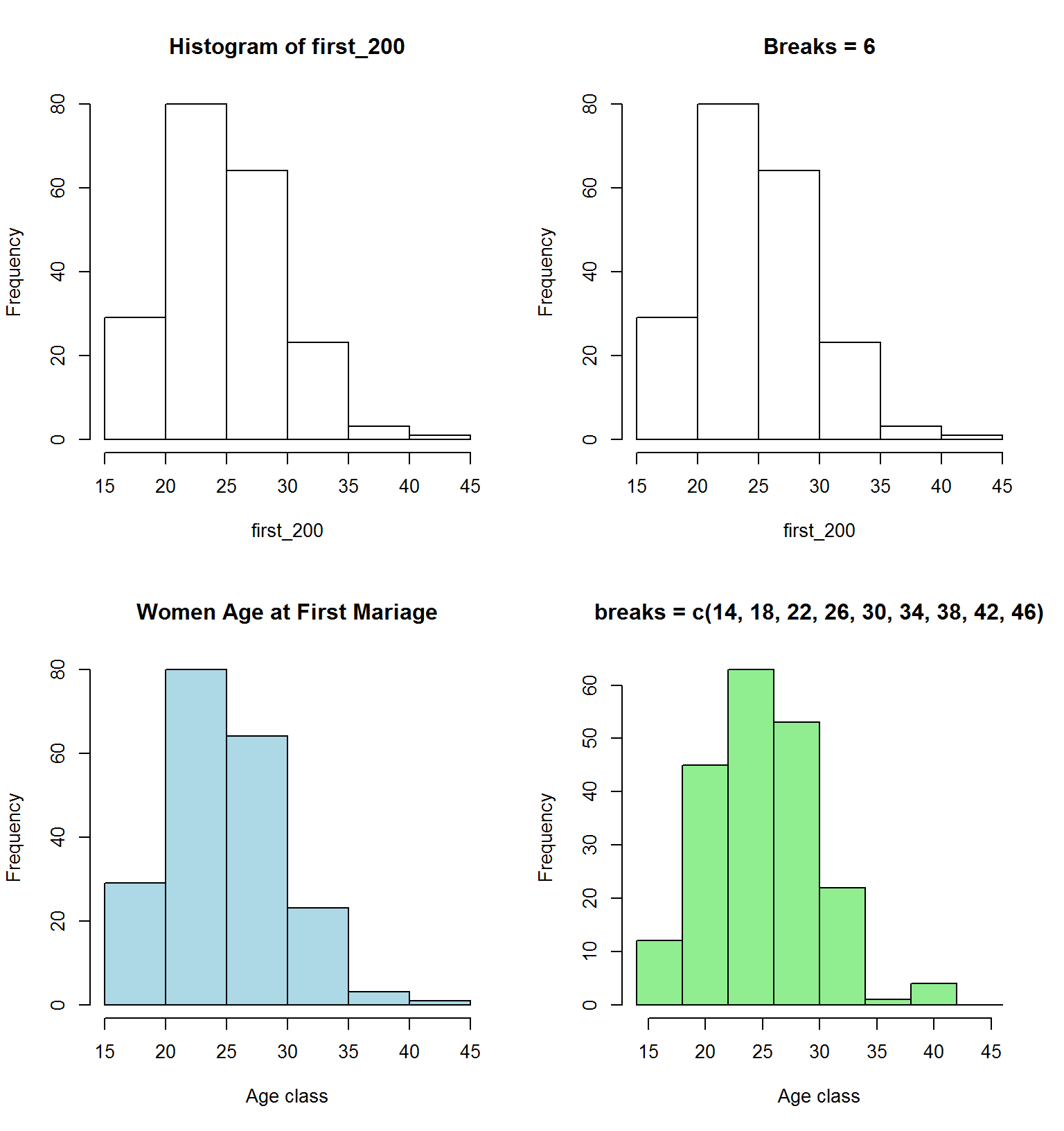
Histograms are particularly convenient for describing the shape of the data distribution. We often use the word skewness to describe the shape of the distribution.
Skewness: the data are “skewed” if it tends to have a long tail on one side or the other.
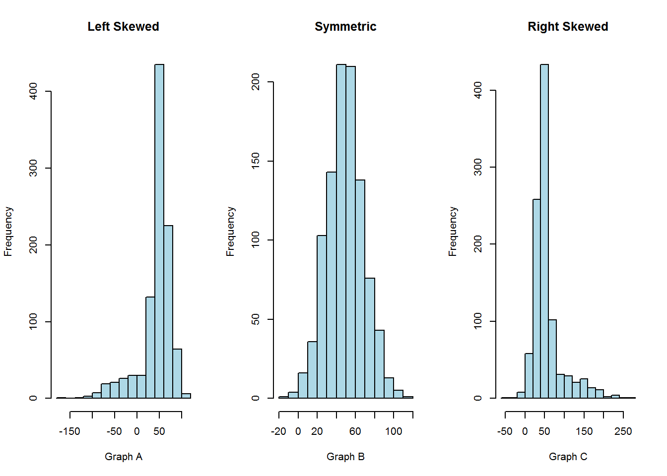
The graph A is left skewed: Example: exam scores
The graph B is symmetric: Examples: heights and weights of people
The graph C is right skewed: Example: executive salaries
3.1.1.4 Cumulative or ogive plot
Another useful graphical tool for analysing quantitative (numerical) data is the cumulative or ogive plot.
The Cumulative frequency plot shows the number of items with values less than or equal to the upper limit of each class.
If we use percent values instead of frequency, then we get the cumulative percent frequency.
par(mfrow=c(1,2)) # to get two graphs side by side
library(openintro) # Needed because the data are in the openintro package
first200 = head(ageAtMar$age, n = 200) # To subset the data set
breaks = c(14, 20, 25, 30, 35, 40, 45)
first200Cut = cut(first200, breaks)
first200Freq = table(first200Cut) # Construct a frequency table
cumFreq = c(0, cumsum(first200Freq)) # Construct a cumulative variable
# ============================================================
# =========== Construct the cumulative frequency plot ========
plot(breaks, cumFreq,            # plot the data
        main="Plot of Cumulative distribution",  # main title
        xlab="Age class",        # x axis label
        ylab="Cumulative Frequency")   # y axis label
lines(breaks, cumFreq)           # join the points

# =============================================================
# ==== Construct the cumulative percent frequency plot ========
cumPercFreq = (c(0, cumsum(first200Freq))/200)*100 # Construct a cumulative variable

plot(breaks, cumPercFreq,            # plot the data
     main="Plot of Cumulative distribution",  # main title
     xlab="Age class",        # x axis label
     ylab="Cumulative Percent Freq")   # y axis label
lines(breaks, cumPercFreq)           # join the points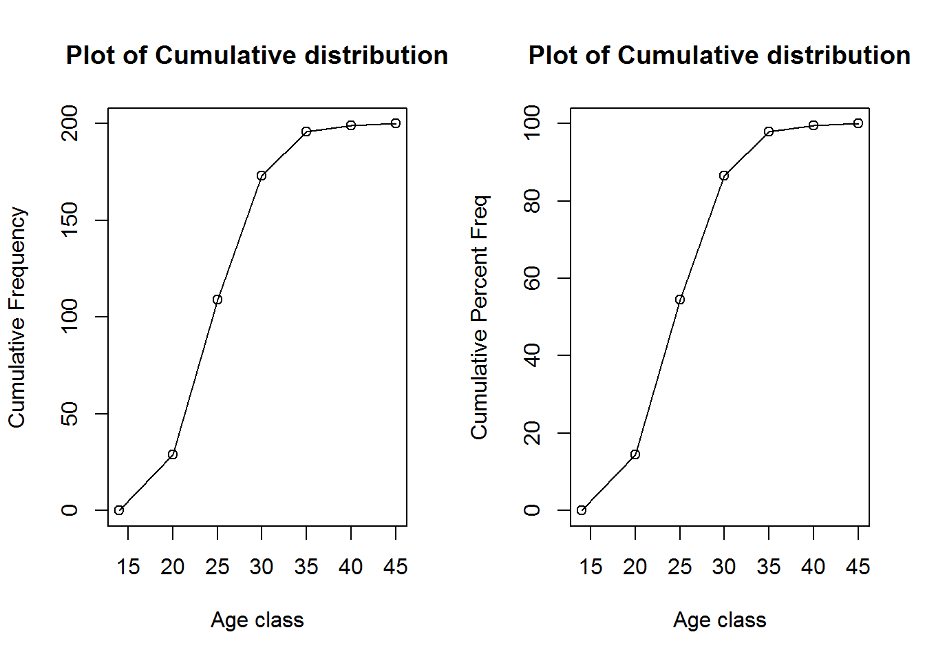
3.1.2 Numerical Summary of numerical data
In section 1, we learned several tools for summarizing data graphically. In this section, we will learn statistical tools for summarizing data numerically. Part of the goal in learning statistics is to avail oneself with diverse statistical tools. Then, for a given data analysis problem, one decides which of the tools may be useful in helping us gain insight from the data. In this section, we will learn measures of centrality (mean mode median.), and measures of dispersion (variance, standard deviation, and ranges).
3.1.2.1 Measures of Centrality
A measure of centrality refers to the idea that there is one number that best summarizes the entire data.
3.1.2.1.1 The mean
The best-known and most frequently used numerical summary measure of a quantitative variable is the mean. It is found by averaging the observations. That is, the mean is the sum of the observations divided by the number of observations. Put differently, the mean refers to adding up the data points and dividing by the number of subject (or elements). Expressed mathematically, the mean is: \[\bar X = \frac{1}{n}\sum_{i=1}^{n} x_{i}\] or, in extended format, \[ \bar X = \frac{x_1 + x_2 + x_3 + ... + x_n}{n}\] In plain English, the mean is the summation of n numbers divided by n.
Example: 15 students were surveyed to find out the amount they pay for rent every month. Following is a table showing their answers:
rent_data1 = read.csv("data/rent_data1.csv")
rent_data1 # Print rent data
## Student Rent
## 1 1 445
## 2 2 440
## 3 3 465
## 4 4 450
## 5 5 600
## 6 6 570
## 7 7 510
## 8 8 615
## 9 9 440
## 10 10 450
## 11 11 470
## 12 12 485
## 13 13 515
## 14 14 575
## 15 15 440So, the average rent (mean of the rent) is: \[\bar X = \frac{445+440+465+450+600+570+510+615+440+450+470+485+515+575+440}{15} = \frac{7470}{15} = 498\] The average rent for the fifteen students is 498.
The function (or the code) for computing the mean in R is rightly named mean()
mean(rent_data1$Rent) # Computes the mean## [1] 498Question: Why do we have the dollar sign in this code?
Aside: Variables are often symbolized by letters, most commonly x and y.
\(\sum\) is the Mathematical symbol for “sum”
3.1.2.1.2 The Median
The median is another popular measure of centrality. The median is the point that splits the data in two parts; half the data below it and half the data above it. Put differently, the median is the midpoint of the observations when they are ordered from the smallest to the largest (or from the largest to the smallest).
The Rent Example continued: The data of the rent example have been sorted from the smallest to the largest.
sort(rent_data1$Rent) # Sorts the rent variable by increasing order## [1] 440 440 440 445 450 450 465 470 485 510 515 570 575 600 615Thus, the median is: 470, that is the value of the midpoint. So, we can say that, of the 15 students surveyed, half of them pay a rent less or equal to 470, and half of them pay a rent greater or equal 470.
How to determine the median?
Sort the n observations in increasing (or decreasing) order;
When the number of observations n is odd, the median is the middle observation in the ordered sample;
When the number of observations is even, two observations from the sample fall in the middle; and the median is their average.
Your turn: Find the median of the following data set. Provide an interpretation of the median.
rent_data2 = read.csv("data/rent_data2.csv")
rent_data2 # prints out the data
## Student Rent
## 1 1 445
## 2 2 440
## 3 3 465
## 4 4 450
## 5 5 600
## 6 6 570
## 7 7 510
## 8 8 615
## 9 9 440
## 10 10 450
## 11 11 470
## 12 12 485
## 13 13 515
## 14 14 575
## 15 15 440
## 16 16 390To help you out, here is the sorted data.
sort(rent_data2$Rent, decreasing = TRUE) # Note that the data are sorted in descending order by using the argument decreasing = TRUE.## [1] 615 600 575 570 515 510 485 470 465 450 450 445 440 440 440 390The function for computing the median in R is rightly named median()
median(rent_data2$Rent) # will give you the medianComments on mean vs median: The mean is very sensitive to outliers. For that reason, the median is often preferred in the presence of outliers in the data. Outliers do not affect the median.
What do we mean by an outlier? An outlier is an observation that falls well below or well above most of the data.
3.1.2.1.3 The Mode
The mode of a data set is the value that occurs with greatest frequency. Note that the greatest frequency can occur at two or more different values. The mode is most often used to describe the category of a categorical variable that has the highest frequency.
FYI: If the data have exactly two modes, the data are said to be bimodal. If the data have more than two modes, the data are said to be multimodal.
Question: Why someone may want to know the mode?
Answer: It may be useful to report the most common outcome (or observation).
Note: strictly speaking, the mode is not necessarily a measure of centrality. The mode need not be the center of the data.
Unfortunately, R does not have straightforward function for computing the mode. Click here to find a bunch of ways to compute the mode. Let’s use one of them.
This is a function someone created to help us out.
Mode <- function(x) {
  ux <- unique(x)
  ux[which.max(tabulate(match(x, ux)))]}
You don’t need to understand the function. Just learn how to use it. To use the function, run the three lines of codes once, then use the function Mode() the way you use the function mean():
Mode(rent_data2$Rent)## [1] 4403.1.2.1.4 Practice Question
I. The table below presents the grades of the first statistics exam of 13 students.
##    Students Grades
## 1         1     73
## 2         2     52
## 3         3     87
## 4         4     88
## 5         5     91
## 6         6     96
## 7         7     94
## 8         8     83
## 9         9     82
## 10       10     86
## 11       11     79
## 12       12     82
## 13 13 100- For the above data, compute the following measures.
- The mean
- The median
- The mode
- One student who missed the exam was given a make-up exam. The student got a grade of 47. Add this student to the list, and compute a, b, and c.
Using the data set, women age at first mariage (ageAtMar), compute the followings:
- The mean age at first mariage;
- The median age at first mariage;
- The mode age at first mariage.
- Interpret each of your answer.
Hint: Run the following code first, in order to bring up the data into your R session. Install the openintro package first, if you havn’t done so. One way to install a package is to run this code: install.packages(“openintro”) by copying and pasting it on your console window, then hit Enter:
library(openintro) # The age at first mariage (ageAtMar) are in the openintro package
head(ageAtMar$age, n = 10) # print out few observation of the variable age
## [1] 32 25 24 26 32 29 23 23 29 27# Answer the questions now!3.1.2.2 Measures of Dispersion
The measure of centrality tells us how a typical observation looks like. It tells us nothing about the dispersion (or the spread) of the data. In this section, we will look at some popular measures of dispersion (range, variance, and standard deviation).
3.1.2.2.1 The Range
The range is the difference between the largest and the smallest observations (cases). It is the simplest measure of dispersion. \[Range = largest\ value - smallest\ value\]
Example: the sorted “apartment rent” data is as followed:
[1] 440 440 440 445 450 450 465 470 485 510 515 570 575 600 615
The largest observation is 615, and the smallest observation is 440. So, the range is: \[ Range = 615 - 440 = 175 \]
The R functions for the getting the maximum and minimum values are max() and min(), respectively. Therefore, to find the range, we can go as follows:
Range = max(rent_data1$Rent) - min(rent_data1$Rent)
Range # prints answer
## [1] 1753.1.2.2.2 The Standard Deviation
The range uses only the largest and the smallest observations. A more appropriate measure of dispersion should use all the data. The standard deviation is a measure of dispersation that uses all the observations. It is a measure of how spread out the observations are. It does this by summarizing the deviations from the mean. The deviation of an observation from the mean is the difference between the observation and the mean \((\bar x - x)\).
Note that the sum of the deviations is always zero. Summary measures of dispersion use either the squared deviation or their absolute values. The average of the squared deviation is called the variance. Because the variance uses the square of the units of measurement for the original data, its square root is easier to interpret. This is called the standard deviation. The standard deviation is the square root of the variance. The formula of the variance \(s^2\) is: \[ s^2 = \frac{\sum_{i=1}^{n}(\bar x - x_i)^2}{n-1}\] And the square root of the variance is the standard deviation, noted \((s)\)
That is, \[s =\sqrt{\frac{\sum_{i=1}^{n}(\bar x - x_i)^2}{n-1}}\] Here is how you can interpret the standard deviation: the standard deviation is a typical distance of an observation from the mean. Note that, the larger the standard deviation s, the greater the spread of the data.
Example: we want to calculate the variance \((s^2)\) and standard deviation (s) of the apartment rent data. The R function for computing the variance, and the standard deviation are, respectively, var() and sd().
Thus, we get the variance \(s^2\) of the rent variable with the following code:
rent_data1 = read.csv("data/rent_data1.csv")
rent_data1 # prints out the data
## Student Rent
## 1 1 445
## 2 2 440
## 3 3 465
## 4 4 450
## 5 5 600
## 6 6 570
## 7 7 510
## 8 8 615
## 9 9 440
## 10 10 450
## 11 11 470
## 12 12 485
## 13 13 515
## 14 14 575
## 15 15 440var(rent_data1$Rent)## [1] 3942.143So, the variance of the rent variable is: 3942.143.
The standard deviation is obtained with the following R code:
sd(rent_data1$Rent)## [1] 62.78649# or take the square root of the variance
sqrt(var(rent_data1$Rent))## [1] 62.78649Manually, you could get the same answers by first computing the deviations to the mean, then square those deviation, add them up, and devide by n-1, n being the number of observations.
Here is the manual way of getting the same thing:
| Observations | Deviation | Squared.Deviation |
|---|---|---|
| 445 | 445-498= -53 | 2809 |
| 440 | 440-498= -58 | 3364 |
| 465 | 465-498= -33 | 1089 |
| 450 | 450-498= -48 | 2304 |
| 600 | 600-498= 102 | 10404 |
| 570 | 570-498= 72 | 5184 |
| 510 | 510-498= 12 | 144 |
| 615 | 615-498= 117 | 13689 |
| 440 | 440-498= -58 | 3364 |
| 450 | 450-498= -48 | 2304 |
| 470 | 470-498= -28 | 784 |
| 485 | 485-498= -13 | 169 |
| 515 | 515-498= 17 | 289 |
| 575 | 575-498= 77 | 5929 |
| 440 | 440-498= -58 | 3364 |
| Totals | - | 55190 |
So, the variance \(s^2\) is: \[s^2 = \frac{55190}{15-1}=3942.143\], and the standart deviation \(s\) is: \[s=\sqrt{s^2} = \sqrt{3942.143} = 62.78649\]
Note: the standard deviation is more informative than the range. It provides a description of the spread of the observations around the mean \((\bar x- x_i)\). Moreover, the standard deviation is very useful when comparing different groups. For instance, when looking at income data, we may find that the income spread of male is higher than the income spread of female.
Caution: The standard deviation is sensitive to the presence of outliers (why?).
3.1.2.3 Measure of Position
The mean and median describe the center of the data. The range and the standard deviation describe the spread. We will now learn about some other ways of describing the data using measures of position.
3.1.2.3.1 The quartiles and Other Percentiles
The median is a special case of a more general set of measures of position called percentiles. The pth percentile is a value such that p percent of the observations fall below or at that value. The three most used percentiles are known as the quartiles.
The first quartile has p=25, the \(25^{th}\) percentile. The lowest 25% of the data fall below it.
The second quartile has p=50, the \(50^{th}\) percentile, which is the median.
The third quartile has p=75, the \(75^{th}\) percentile. The highest 25% of the data fall above it.
The quartiles split the data into four parts, each containing one quarter (25%) of the observation. The quartiles are denoted by Q1 for the first quartile, Q2 for the second quartile, and Q3 for the third quartile.
To find the quartiles,
- Arrange the data in order
- Consider the median (the midpoint). This is the second quartile, Q2.
- Consider the lower half of the observations, the median of these observations is the first quartile, Q1.
- Consider the upper half of the observations. Their median is the third quartile, Q3.
Example: Below are the rent data. The first set (rent15) has 15 observations, and the second set (rent16) has 16 observation. You are asked to find Q1, Q2, and Q3 for both data set. Do it by hand first.
## [1] 445 440 465 450 600 570 510 615 440 450 470 485 515 575 440## [1] 445 440 465 450 600 570 510 615 440 450 470 485 515 575 440 390Check your results to see if it matches the results provided by the R function quantile(). The R quantile function is used to compute any percentile value.
Example usage:
quantile(rent_15_cases, c(0.25, 0.5, 0.75))## 25% 50% 75%
## 447.5 470.0 542.5quantile(rent_16_cases, c(0.25, 0.5, 0.75))## 25% 50% 75%
## 443.75 467.50 528.75When the number of observation is even, you (most like) will not get the same exact answer using the manual way and the quantile() function in R. Don’t worry about that difference if your answer is not widely different. For an even sample, any number between the two midpoints is a reasonable approximation of the quartile.
Question: How would you use the quantile() function to compute the \(10^{th}\) and \(90^{th}\) percentiles?
3.1.2.3.2 The Interquartile Range
The interquartile range is the distance between the third and first quartiles. It is denoted by IQR. \[IQR = Q3-Q1\] Example: Using the set of 15 observations of the rent data, the interquartile range is \(IQR = Q3-Q1 = 542.5 - 447.5 = 95\)
Guess the name of the function in R to compute the interquartile range.
You guessed rigth! The function in R for interquartile range IQR is: IQR(). Are you starting to love R yet?
IQR(rent_data1$Rent)## [1] 953.1.2.3.3 Detecting Potential outliers
An outlier is an observation that falls well below or well above most of the data. What do we mean by “well below” or “well above”? In a statistical analysis, we should examine the data for unusual observations (outliers). A formal way for flagging out an observation as potential outlier is the 1.5xIQR criterion for identifying potential outliers. An observation is a potential outlier if it falls more than 1.5xIQR below the first quartile or more than 1.5xIQR above the third quartile.
Example: Checking for potential outliers in the rent data set (rent15).
\(IQR=100,\ so \ 1.5*IQR=1.5*100=150\).
\(Q1-150 = 292.5\). There is no observation with such low value in the dataset, so there are no potential outliers in the lowest side of the dataset.
\(Q3+150= 692.5\). There is no observation with such high value in the dataset, so there are no potential outliers in the highest side of the dataset.
3.1.2.3.4 The Box Plot: Graphing a Five-Number Summary
Wouldn’t that be great if we could summarize the elements we have been defining over the last two sections in one picture? Yes! There is something called box plot or the five number summary, and it summarizes five summary statistics into one plot, as you might have guessed by the name.
The five-number summary of a dataset is the minimum value, first quartile Q1, median Q2, third quartile Q3, and the maximum value.
Example: The five-number summary of the rent data (rent15) is:
| Min.value | Q1 | Q2.or.Median | Q3 | Max.value |
|---|---|---|---|---|
| 440 | 447.5 | 470 | 542.5 | 615 |
The graphical display of the five number summary is called box plot. The box of a box plot contains the central 50% of the observations, from the first quartile to the third quartile. A line inside the box marks the median. The lines extending from the box are called whiskers. These extend to encompass the rest of the data, except the potential outliers, which are shown separately.
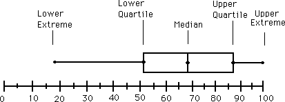
boxplot
The figure was download at: http://ellerbruch.nmu.edu/cs255/jnord/boxplot.html
I guess you know how to do it manually. Let’s see which functions in R can do the same for you.
You can use either of the following two functions to get the numbers: fivenum(), or summary(). Look at their outputs below. Which function do you prefer?
rent_data1 <- read.csv("data/rent_data1.csv")
rent_15_cases = rent_data1$Rent # print out the rent variable
The function fivenum() gives you:
fivenum(rent_15_cases)## [1] 440.0 447.5 470.0 542.5 615.0And the function summary() gives you:
summary(rent_15_cases)## Min. 1st Qu. Median Mean 3rd Qu. Max.
## 440.0 447.5 470.0 498.0 542.5 615.0To plot the box plot, you can use the function boxplot() as follows:
boxplot(rent_15_cases, horizontal = TRUE, col = "blue")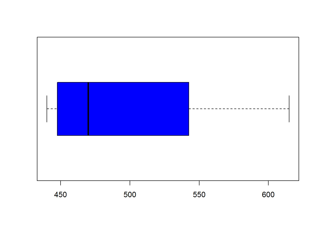
A more advanced example: the Current Population Survey (CPS) collects data on a sample of US households every month. Below is an exerpt of this data set. We focus on the data collected in March of 2013, in Nebraska. The variables hourly wage, education, and gender are of interest for our example.
Nebraska2013 = read.csv("data/Nebraska.csv") # Read in the data.
head(Nebraska2013) # Print out a few observations
## Gender Education HourlyWage
## 1 Female HSD 19.230770
## 2 Male Asso 11.250000
## 3 Female HSD 21.634615
## 4 Female HSD 10.187500
## 5 Female Asso 9.401710
## 6 Male Asso 9.134615dim(Nebraska2013) # Use dim to get the number of rows and columns## [1] 1160 3Let’s use the summary function to get numerical summaries of our hourly wage variable.
Nebraska2013 = read.csv("data/Nebraska.csv") # read in the data
summary(Nebraska2013$HourlyWage) # get the summary table of a single variable
## Min. 1st Qu. Median Mean 3rd Qu. Max.
## 2.058 12.020 16.880 21.070 25.770 192.300summary(Nebraska2013) # get summary of all variables at onces ## Gender Education HourlyWage
## Female:555 Asso :157 Min. : 2.058
## Male :605 Bach :281 1st Qu.: 12.019
## GBach:137 Median : 16.875
## HSD :491 Mean : 21.073
## LHSC : 94 3rd Qu.: 25.769
## Max. :192.308Now, let’s use the boxplot() function to draw a box plot of the hourly wage variable.
Nebraska2013 = read.csv("data/Nebraska.csv") # read in the data
boxplot(Nebraska2013$HourlyWage, horizontal =TRUE, col = "lightblue")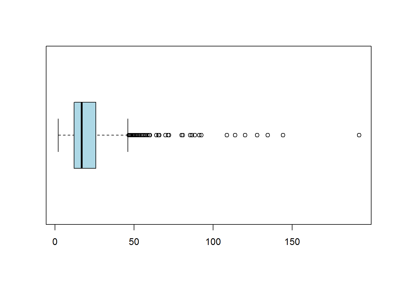
Let’s us get fancy here. We will plot the box plot by gender, and by education level.
Nebraska2013 = read.csv("data/Nebraska.csv") # read in the data
boxplot(HourlyWage~Gender , data = Nebraska2013, horizontal = TRUE, col = c("pink", "lightblue"))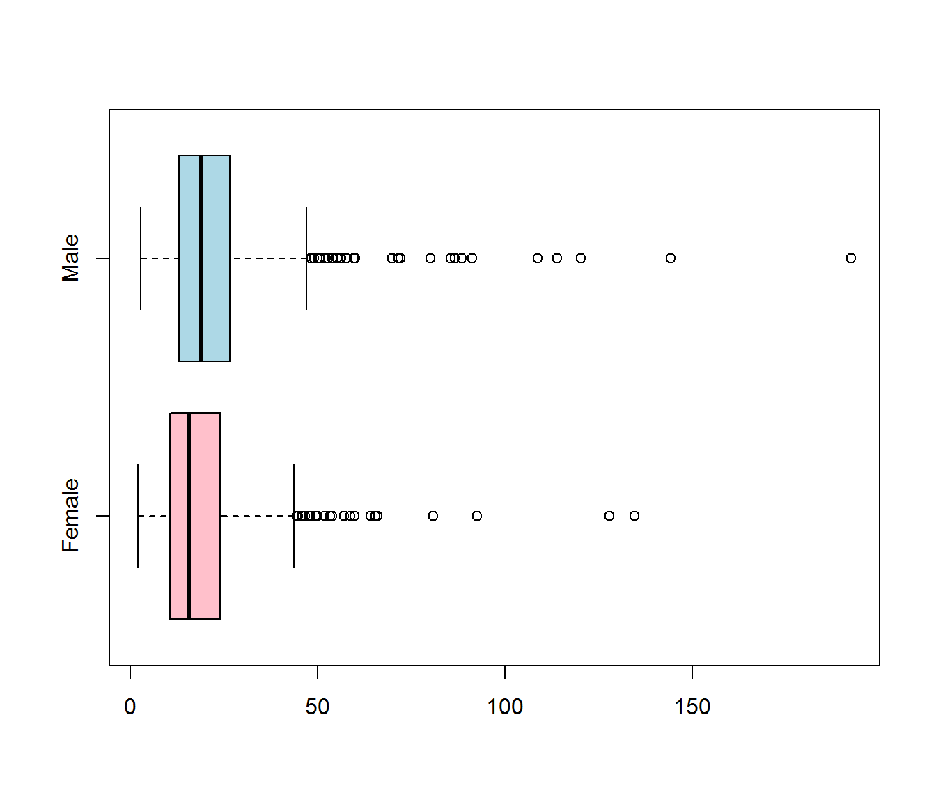
boxplot(HourlyWage~Education , data = Nebraska2013, horizontal = TRUE,
        col = c("turquoise", "springgreen", "tan", "orchid", "lightblue")) # fancy colors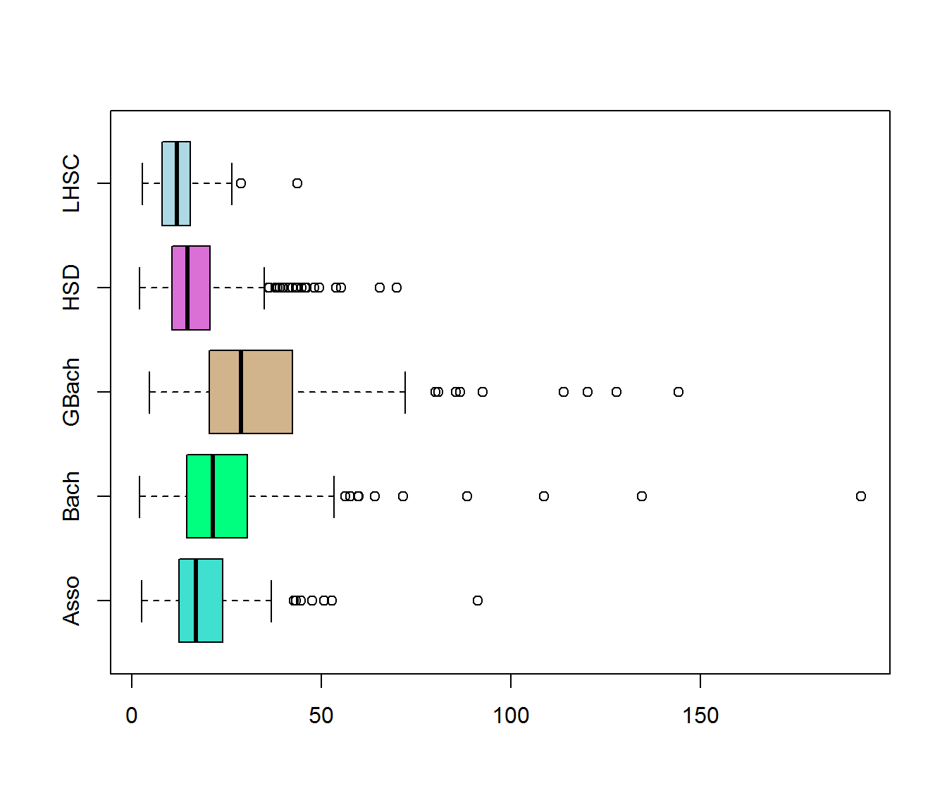
Check this link for more colors options.
Practice: Similar data for Iowa can be found on blackboard, in a folder called data, which is located in the chapter 1 folder. Using these data, provide the summary table, and provide a boxplot by gender, and a boxplot by education level. Interpret your work.
Further, compare your plots with the example plots above. What conclusions can you draw?
3.1.2.3.5 The z-score and the identification of relative positions
The z-score is a useful tool for comparing an observation to the mean.
Definition: The z-score, also called the standardized value, is the number of standard deviations an observation \(x_i\) is from the mean.
The z-score is obtained by the following formula: \[z = \frac{observation - mean}{standard \ deviation} = \frac{x_i-\bar x}{s}\] An observation’s z-score is a measure of the relative location of the observation in a data set.
- A data value less than the mean will have a z-score less than zero.
- A data value greater than the mean will have a z-score greater than zero.
- A data value equal to the mean will have a z-score of zero.
Example: Applying the z-core formula to the rent data, we have: \[z = \frac{observation - mean}{standard \ deviation} = \frac{x_i-\bar x}{s}\] with \(\bar x = 498\), and \(s = 62.78649\).
| rent \(x_i\) | 445 | 440 | 465 | 450 | 600 | 570 | 510 | 615 | 440 | 450 | 470 | 485 | 515 | 575 | 440 |
|---|---|---|---|---|---|---|---|---|---|---|---|---|---|---|---|
| \(z-score\) | -0.84 | 1.226 |
Practice: The remaining is left for you to complete.
The value 1.226 says that that particular observation is 1.226 standard deviation above the mean; and the value -0.84 says that that particular observation is 0.84 standard deviation below the mean.
Understanding the z-score formula: Can you see that the definition of the z-score, and its mathematical formulation say the same thing?
3.1.2.3.6 The Empirical Rule
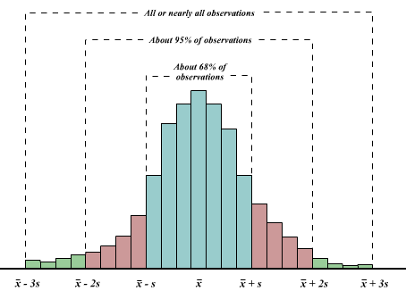
The empirical rule says that, if the histogram of the data has a bell-shaped form, then:
About 68% of the observations fall within 1 standard deviation of the mean, that is between \((\bar x - s)\) and \((\bar x + s)\) (denoted \(\bar x \pm s\)).
About 95% of the observations fall within 2 standard deviation of the mean (\(\bar x \pm 2s\)).
All, or nearly all observations fall within 3 standard deviation of the mean (\(\bar x \pm 2s\)).
Aside: Where did the name empirical rule come from? It turns out that, in practice, many data distributions are approximately bell-shaped.
empiricalRule
3.1.2.3.7 Z-Score and detecting outliers
Recall that an outlier is an unusually small or unusually large value in a data set. What do we mean by unusually small or unusually large? We can all agree that an observation with a z-score less than -3 or greater than +3 might be considered an outlier (why?). When there are outliers in the data, we should try to understand those unusual observations. Maybe they were recorded with errors.
3.2 Examining categorical data (1.7)
In section 1.6, we looked at graphical and numerical tools for summarizing numerical data. In this section, we will look at tools for analysing categorical data.
3.2.1 Frequency tables
We covered frequency tables when we introduced histograms in section 1.6.1.2 (see lecture notes chapter1_II). Except that classes are called categories when dealing with cathegorical data, the process to constructing a frequency table for a categorical variables is similar to that of a quantitative variable.
Example 1: Marada Inn
Guests staying at Marada Inn were asked to rate the quality of their accommodations as being excellent, above average, average, below average, or poor. The ratings provided by a sample of 20 guests are:
| Below Average | Average | Above Average |
| Above Average | Above Average | Above Average |
| Above Average | Below Average | Below Average |
| Average | Poor | Above Average |
| Above Average | Excellent | Poor |
| Average | Above Average | Average |
| Above Average | Average |
The frequency table for these data is left for you to construct. Also, add a column for the relative frequency, and another colums for the percent frequency for this table.
In R, the function table() will construct the frequency table for you. Let’s call our variable “Ratings”, then the table() function is applied as follows:
Ratings_data = read.csv("data/ratings.csv")
Ratings = Ratings_data$Ratings
table(Ratings)
## Ratings
## Above Average Average Below Average Excellent Poor
## 9 5 3 1 2And, to get the relative frequecy, we can use the following code:
table(Ratings)/20 # We have 20 observations## Ratings
## Above Average Average Below Average Excellent Poor
## 0.45 0.25 0.15 0.05 0.10Further, we get the percent frequency as follows:
(table(Ratings)/20)*1003.2.1.1 Practice questions:
- Thirty students in the School of Business were asked what their majors were. The following represents their responses (M = Management; A = Accounting; E = Economics; O = Others).
A M M A M M E M O A
E E M A O E M A M A
M A O A M E E M A M
You may combine question a, b, and c into a single table.
a. Construct a frequency distribution (table)
b. Construct a relative frequency distribution.
c. Construct a percent frequency distribution
3.2.2 Bar plots, and pie charts
The two primary graphical displays for summarizing a categorical variable are the bar graph and the pie Chart.
- A bar graph (or bar chart) displays a vertical bar for each category. The height of the bar for a category is the frequency, relative frequency, or the percent frequency of that category.
Example 1 continued: A barplot of the rating data: 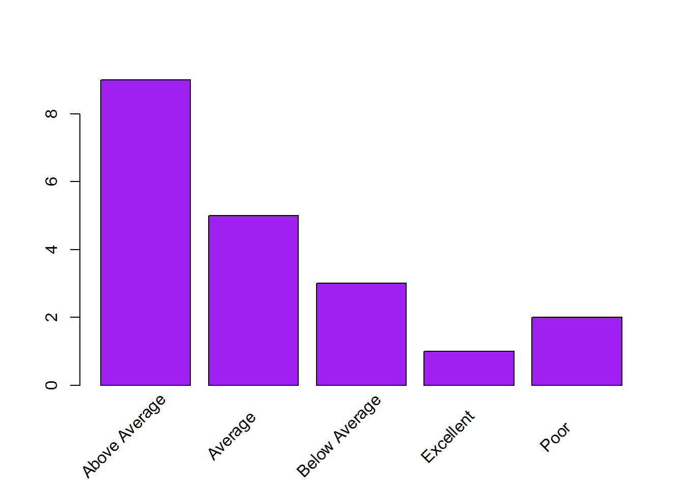
The R function for ploting a barplot is barplot(). And can be used as follows:
freq_tab = table(Ratings)
barplot(freq_tab, col = "purple")- The pie chart is another device for presenting relative frequency and percent frequency. A pie chart is a circle having a “slice of the pie” for each category. The size of a slice corresponds to the percentage of observations in the category.
Example 1 continued: A pie chart of the rating data:
freq_tab = table(Ratings)
pie(freq_tab)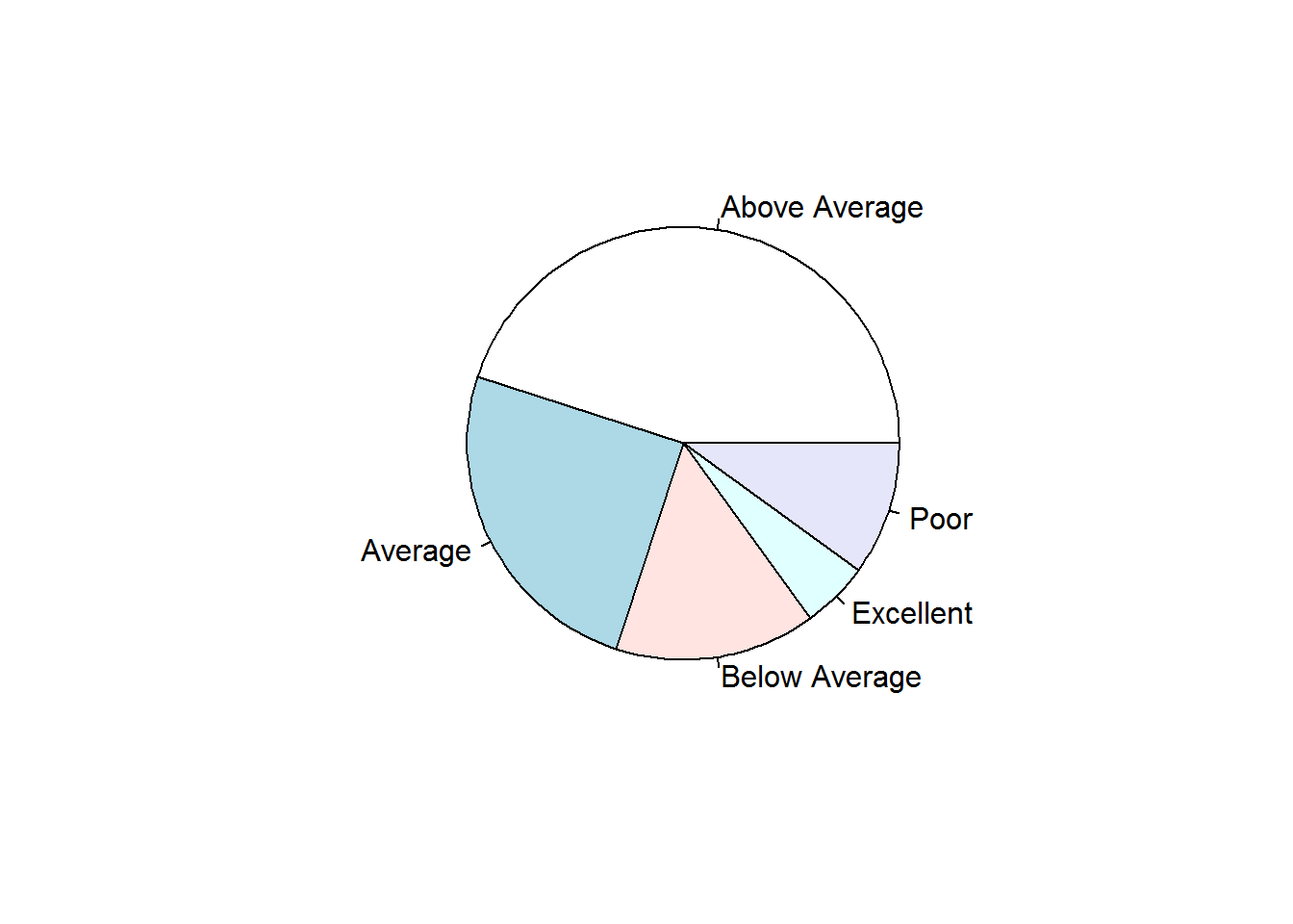
Of course, the example above is a very simple graph. For more options in drawing your pie charts, see this link. You may also google this: “fancy pie chart in R”
Use the code below to get a simple 3d pie chart.
#install.packages("plotrix") # This code needs to be run only once.
library(plotrix) # needed for the 3d plot.
freq_tab = table(Ratings)
pie3D(freq_tab)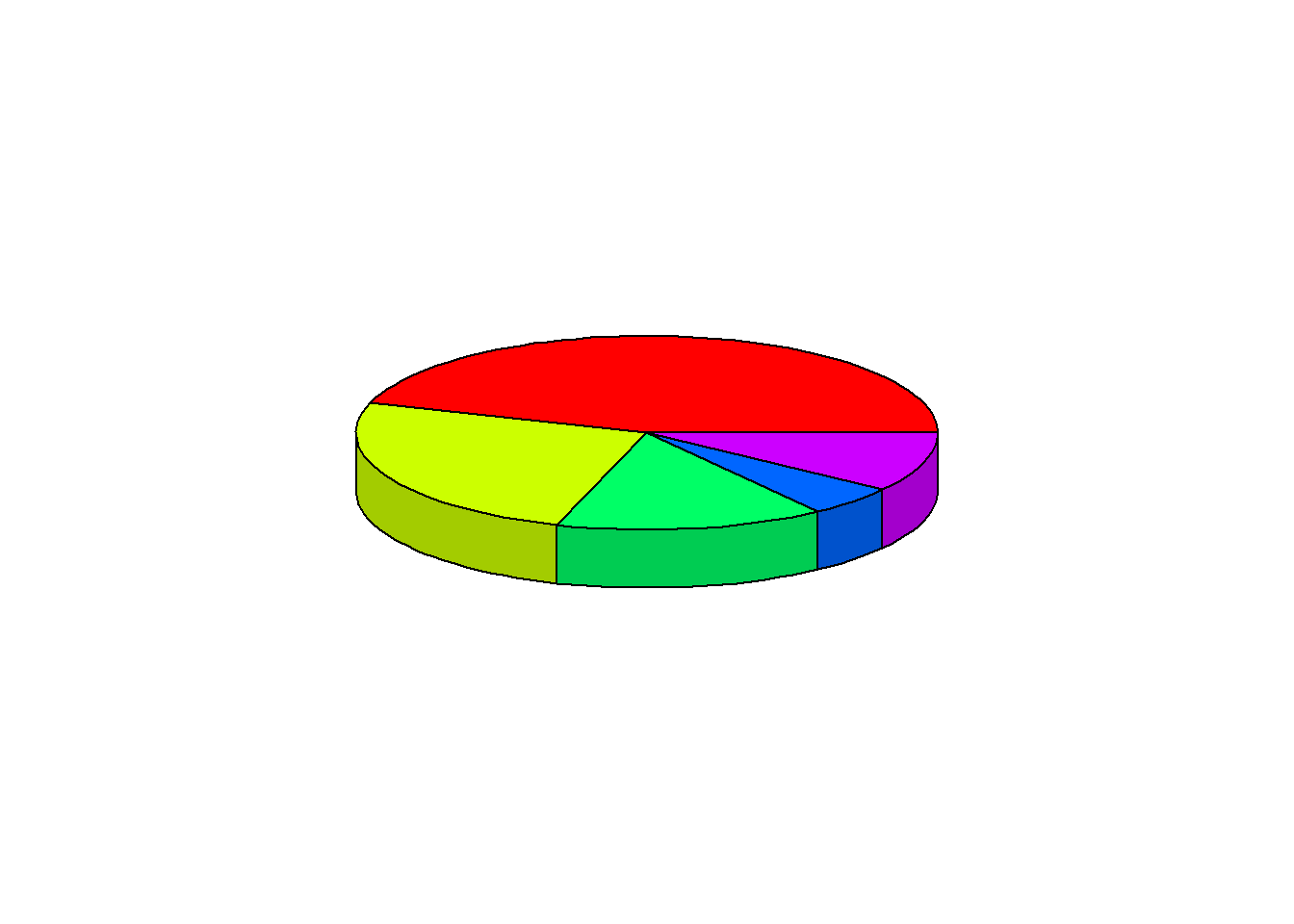
Steps to drawing a pie chart:
Step 1: draw a circle
Step 2: create a table of correspondence between the frequency and the 360 degrees that constitutes the circle:
| Ratings | Relative Frequency | Degrees correspondence |
|---|---|---|
| Poor | 0.1 | 36 |
| Below Average | 0.15 | 54 |
| Average | 0.25 | 90 |
| Above Average | 0.45 | 162 |
| Excellent | 0.05 | 18 |
| Total | 100 | 360 |
Since there are 360 degrees in a circle, a class with a relative frequency of .25 would consume .25(360) = 90 degrees of the circle.
3.2.2.1 Practice question:
For the practice question above (section 3.2.1.1), construct a barplot and a pie chart.
Question: What is the (visual) difference between a histogram, and a barplot?
3.2.3 Contingency table (or Crosstabulation table)
A Contingency table is a table showing the frequencies of one variable in rows and another in columns. It is mostly used to summarize categorical data.
Example 3: Marada Inn example continued:
Guests staying at Marada Inn were asked to rate the quality of their accommodations as being excellent, above average, average, below average, or poor. Also, Marada Inn collected information on the gender of the guests. The ratings and the gender provided by a sample of 20 guests are:
Marada Inn data
| Ratings | Gender |
|---|---|
| Below Average | Male |
| Above Average | Female |
| Above Average | Female |
| Average | Female |
| Above Average | Male |
| Average | Female |
| Above Average | Female |
| Average | Female |
| Above Average | Female |
| Below Average | Male |
| Poor | Female |
| Excellent | Male |
| Above Average | Male |
| Average | Female |
| Above Average | Female |
| Above Average | Female |
| Below Average | Male |
| Poor | Male |
| Above Average | Female |
| Average | Male |
Following is the contengency table of the ratings by gender data.
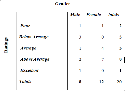
Contingency Table
Question: What insight can we gain from this table? Put differently, what story can you tell from this table?
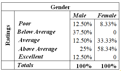
We may find the table easier to read if we use percent frequencies in the table. In other words, converting the entries in the table into row percentages or column percentages can provide additional insight about the relationship between the two variables.
Assume we want to analyze our data by gender. The following “column percentage” table will be appropriate:
Contingency Table
Insight: Clearly, most female seem to like the services the company provides (at least 58% of females like the services). 50% percent of males gave a rating of below average.
Question: Why is it that females tended to provide more positive review than males?
Statistics cannot answer that question. Statistics will show you some interesting facts. Your interpretation of these facts will depend on your domain knowledge.
The R code for constructing the contingency table is:
table(first_variable, second_variable)An application to our data is:
Here are the data:
MaradaInn <- read.csv("data/MaradaIn.csv") # reads in the data
MaradaInn # prints out the data
## Ratings Gender
## 1 Below Average Male
## 2 Above Average Female
## 3 Above Average Female
## 4 Average Female
## 5 Above Average Male
## 6 Average Female
## 7 Above Average Female
## 8 Average Female
## 9 Above Average Female
## 10 Below Average Male
## 11 Poor Female
## 12 Excellent Male
## 13 Above Average Male
## 14 Average Female
## 15 Above Average Female
## 16 Above Average Female
## 17 Below Average Male
## 18 Poor Male
## 19 Above Average Female
## 20 Average MaleHere is the application:
table(MaradaInn$Ratings, MaradaInn$Gender)##
## Female Male
## Above Average 7 2
## Average 4 1
## Excellent 0 1
## Poor 1 1
## Below Average 0 3Practice question: The SAT scores of a sample of business school students and their genders are shown below.
SAT Scores
| Gender | Less than 20 | 20 up to 25 | 25 and more | Total |
|---|---|---|---|---|
| Female | 24 | 168 | 48 | 240 |
| Male | 40 | 96 | 24 | 160 |
| Total | 64 | 264 | 72 | 400 |
- How many students scored less than 20?
- How many students were female?
- Of the male students, how many scored 25 or more?
- Compute row percentages and comment on any relationship that may exist between SAT scores and gender of the individuals.
- Compute column percentages.
3.2.4 Mosaic plot
The mosaic plot is a graphical display of a contengency table. It allows you to explore the relationship between two categorical variables.
The mosaic plot starts by deviding a rectangle (or a square) into several stripes, each stripe being proportional to the count of a category in your first variable.
mosaicplot(table(MaradaInn$Ratings), color = "cyan")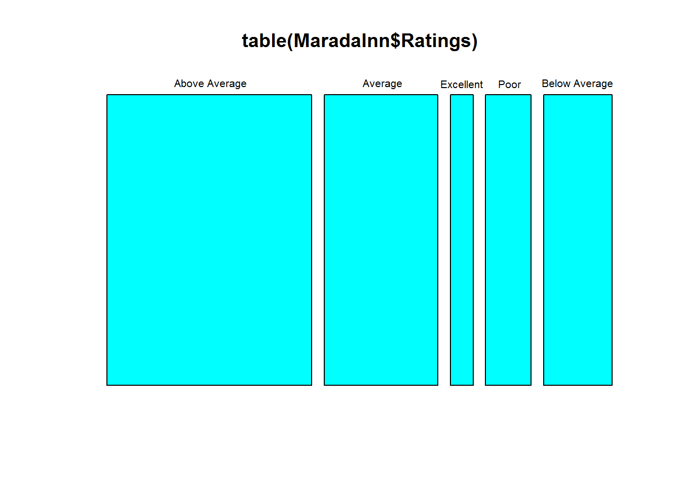
Then each stripe is divided proportionaly to the categories in the second variable, given the first variable.
cont_table = table(MaradaInn$Ratings, MaradaInn$Gender)
mosaicplot(cont_table, color = c("blue", "green"))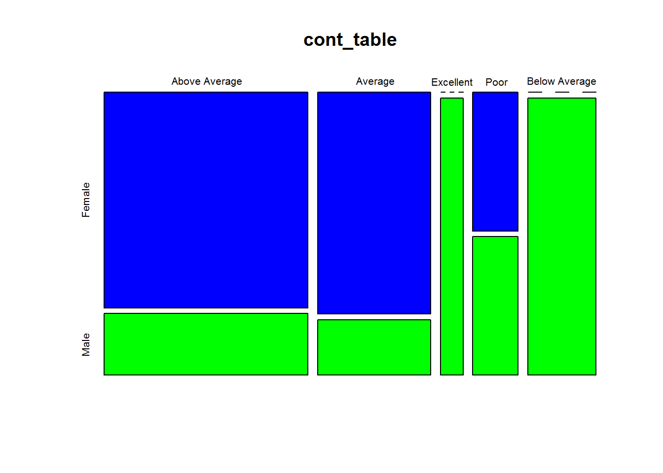
Interpreting the mosacic plot: Based on the first variable, ratings in our example, “Above average”" seems to be the most prevelent rating, follow by “Average”. Few people rated the services as “Excellent”.
Based on the second variable, gender in our example, we can note the following: Of those who gave a rate of “Above average”, female are disproportionately represented; and only male rated the services as “below average”. Interestingly, only male rated the services as “Excellent”. Moreover, male and female equally rated the services as poor.