Chapter 6 Create your own custom markers
6.1 Setting the base
Hope you didn’t trash away the cities we created in the last chapter. In this chapter, we shall focus on creating your own custom markers. We love a clean job, so we will create a new JavaScript file and name it custom-markers.js. We understand the previous chapter was quite long but believe you me, although creating custom markers sounds easier, it took us way longer to get the hang around it. Good news, we received enough punches on the face to teach you how to dodge the pain points.
The very first thing to do is to create a basemap.
var map = L.map('myMap').setView([-1.295287148, 36.81984753], 7);
L.tileLayer('https://tile.openstreetmap.org/{z}/{x}/{y}.png', {
maxZoom: 19,
attribution: '© <a href="http://www.openstreetmap.org/copyright">OpenStreetMap</a>'
}).addTo(map);We will create a new variable called cities that mimics the GeoJson file saved to Github only this time round the population values have been tweaked a bit. Paste the below code to your custom-markers.js.
var cities = {
    "type": "FeatureCollection",
    "features": [
      {
        "type": "Feature",
        "properties": {
          "City": "Nairobi",
          "Population": 4300000
        },
        "geometry": {
          "coordinates": [
            36.8198475311531,
            -1.2952871483350066
          ],
          "type": "Point"
        }
      },
      {
        "type": "Feature",
        "properties": {
          "City": "Kisumu",
          "Population": 610082
        },
        "geometry": {
          "coordinates": [
            34.74657469430895,
            -0.10402992528247523
          ],
          "type": "Point"
        }
      },
      {
        "type": "Feature",
        "properties": {
          "City": "Mombasa",
          "Population": 1440000
        },
        "geometry": {
          "coordinates": [
            39.66358575335434,
            -4.041883912902392
          ],
          "type": "Point"
        }
      },
      {
        "type": "Feature",
        "properties": {
          "City": "Nakuru",
          "Population": 422000
        },
        "geometry": {
          "coordinates": [
            36.06412271026528,
            -0.2754534004690896
          ],
          "type": "Point"
        }
      },
      {
        "type": "Feature",
        "properties": {
          "City": "Nyeri",
          "Population": 759164
        },
        "geometry": {
          "coordinates": [
            36.957036675396154,
            -0.42345404217887506
          ],
          "type": "Point"
        }
      },
      {
        "type": "Feature",
        "properties": {
          "City": "Machakos",
          "Population": 1422000
        },
        "geometry": {
          "coordinates": [
            37.25780808801821,
            -1.518874011494134
          ],
          "type": "Point"
        }
      },
      {
        "type": "Feature",
        "properties": {
          "City": "Malindi",
          "Population": 119859
        },
        "geometry": {
          "coordinates": [
            40.10521499751357,
            -3.2138767356491655
          ],
          "type": "Point"
        }
      }
    ]
  }
Can you notice any difference on the Population property compared to the code in Chapter 5? If you are hawkeyed, you will notice that the Population values this time round are integers compared to the string values used in the previous chapter. It sounds superflous to create population values as strings only to convert them to integers now, but please do remember the geojson.io site did that for us, not this author. Here is the raw geojson script customized for this chapter. It is also available here.
Just a small note before going on. When the GeoJSON file has the population values enclosed in strings "", they are automatically rendered on a map on the Github server as shown below.
However, when the strings are removed, and the population values remain as integers, they are no longer rendered on a webmap as shown below.

No map rendered, just a dictionary containing other dictionaries.
6.2 The icons
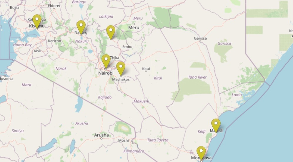
Alright. Let’s create a map of our cities but with custom markers this time round. The below code creates our custom markers.
// Yellow Icon
var yellowIcon = new L.Icon({
    iconUrl: 'https://raw.githubusercontent.com/pointhi/leaflet-color-markers/master/img/marker-icon-2x-yellow.png',
    shadowUrl: 'https://cdnjs.cloudflare.com/ajax/libs/leaflet/0.7.7/images/marker-shadow.png',
    iconSize: [25, 41],
    iconAnchor: [12, 41],
    popupAnchor: [1, -34],
    shadowSize: [41, 41]
  });

// Orange Icon
var orangeIcon = new L.Icon({
    iconUrl: 'https://raw.githubusercontent.com/pointhi/leaflet-color-markers/master/img/marker-icon-2x-orange.png',
    shadowUrl: 'https://cdnjs.cloudflare.com/ajax/libs/leaflet/0.7.7/images/marker-shadow.png',
    iconSize: [25, 41],
    iconAnchor: [12, 41],
    popupAnchor: [1, -34],
    shadowSize: [41, 41]
  });

// Red Icon
var redIcon = new L.Icon({
    iconUrl: 'https://raw.githubusercontent.com/pointhi/leaflet-color-markers/master/img/marker-icon-2x-red.png',
    shadowUrl: 'https://cdnjs.cloudflare.com/ajax/libs/leaflet/0.7.7/images/marker-shadow.png',
    iconSize: [25, 41],
    iconAnchor: [12, 41],
    popupAnchor: [1, -34],
    shadowSize: [41, 41]
  });
We created three markers in order of importance: yellow, orange, red. You will see the significance (not so much) of these colors later.
Time to create GeoJSON markers out of this.
L.geoJSON(cities, {
    pointToLayer(feature, latlng) {
        return L.marker(latlng, {icon: yellowIcon});
    }
}).bindPopup(function (layer) {
    return layer.feature.properties.City;
}).addTo(map);
We got this.
All cities are marked yellow irrespective of their population or jurisdictional significance. From a cartographer’s perspective, the webmap needs more styling but before we get there, what was the purpose of the pointToLayer() function? According to the Leaflet guide, the pointToLayer() function is a special function for GeoJSON variables that specifies how they should be drawn. To be more descriptive, the function parses the return L.marker... function to every Lat-Lon coordinate to make a marker appear at that point.
6.3 Differentiate custom markers on a webmap
Now to the city markers. We would appreciate if the markers would differentiate the cities based on a particular variable, say population. By the way, size of cities is generally determined by population. The below code shall categorize cities by the size of circle markers which shall be based on the city’s population. If you’ve seen point symbols in Qgis, get ready to see them in action in Leaflet!
Comment out the earlier code and insert this:
L.geoJSON(cities, {
pointToLayer: function (feature, latlng) {
if (feature.properties.Population <= 250000) {
return L.circleMarker(latlng, {
radius: 4,
fillColor: '#FFFF00',
color: '#000',
weight: 1,
opacity: 1,
fillOpacity: 0.8
});
} else if (feature.properties.Population <= 800000) {
return L.circleMarker(latlng, {
radius: 8,
fillColor: '#ff9900',
color: '#000',
weight: 1,
opacity: 1,
fillOpacity: 0.8
});
} else {
return L.circleMarker(latlng, {
radius: 12,
fillColor: '#FF0000',
color: '#000',
weight: 1,
opacity: 1,
fillOpacity: 0.8
});
}
}
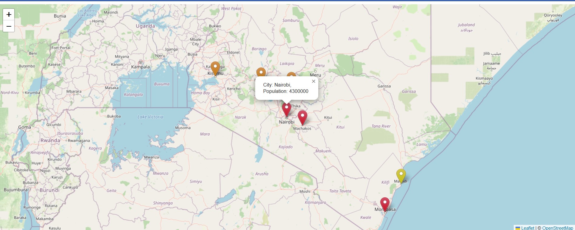
}).bindPopup(function (layer) {
return `City: ${layer.feature.properties.City},<br>
Population: ${layer.feature.properties.Population}`;
}).addTo(map);
What you get is a map where the size of the circle markers has been defined by the city’s population. This time round, the pointToLayer() function body worked with if/else if statement to differentiate the radius and color of each circle marker. Under the if/else if code statement block, different circle marker specifications of radius and fillColor were inserted for each population category. Any city with a population beyond 800000 was fitted into the else block.
This brings us to why we changed the population values from strings to integers. If we were to work with the original string values (like “1000000” in quotes), any value beyond 1, 000, 000 would receive the settings of feature.properties.Population <= 250000. That is, it would be displayed in the same color scheme of yellow as a city with a population say, 25, 000 people and below. That would be passing a wrong message. The explanation for this glaring error arising from use of string values is this: when ordering numbers enclosed in strings in JavaScript, they will be ordered by their first character irrespective of the size of the value. In other words, 1 is greater than 9 even though the latter is more. Thus a city of “800, 000” people will be treated as bigger than a city of “1, 000, 000”. Now you see the logic of working without the quotes around the Population variable, as is the case with our GeoJSON file.
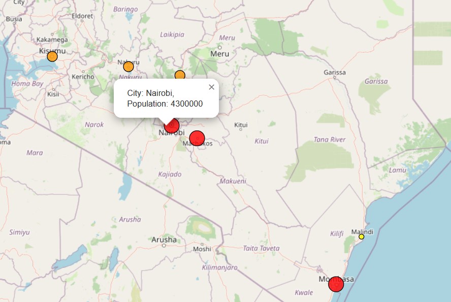
In the next code sample, we shall create city marker icons whose colors shall be determined by the size of the city’s population. We will work with three colors: yellow, orange and red. Yellow shall mark the smallest city while red shall indicate the largest. The below code shows how this categorization is worked out.
L.geoJSON(cities, {
  pointToLayer: function (feature, latlng) {
    if (feature.properties.Population <= 250000) {
      return L.marker(latlng, {
        icon: yellowIcon
      });
    } else if (feature.properties.Population <= 800000) {
      return L.marker(latlng, {
        icon: orangeIcon
      });
    } else {
      return L.marker(latlng, {
        icon: redIcon
      });
    }

  }
}).bindPopup(function (layer) {
  return `City: ${layer.feature.properties.City},<br>
  Population: ${layer.feature.properties.Population}`;
}).addTo(map);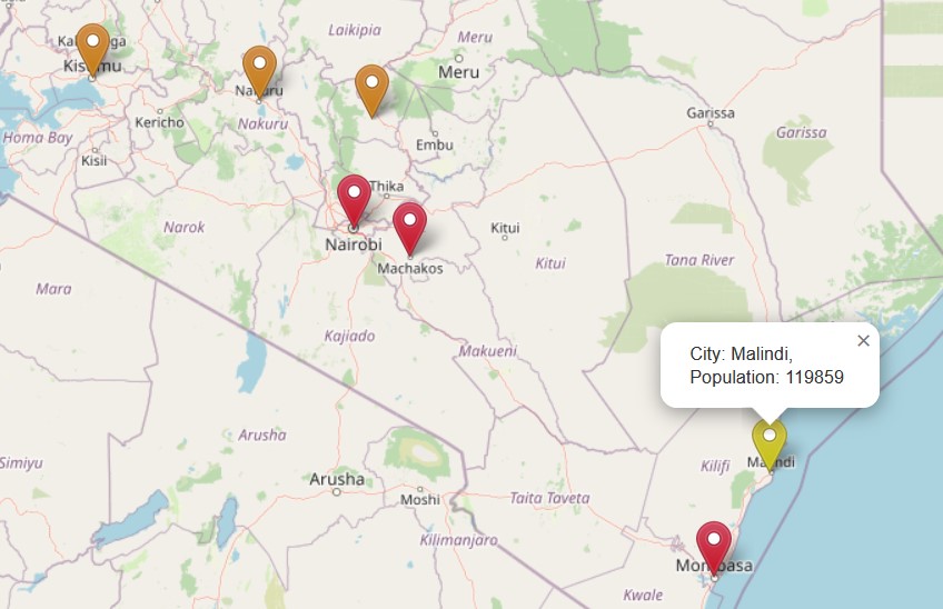
In the above map, large cities with populations above 800, 000 have been categorized with a red marker, those with populations below 250, 000 with a yellow marker and those in between with an orange marker. In all cases, our bindPopup() still contains the same settings of showing both the city name and population size.
The value to the pointToLayer() key was assigned a function that checks if a city’s population is within a specific range. If a city falls within the range specified by the if statement, a particular icon –whether yellowIcon, orangeIcon or redIcon is returned by the L.marker() function.
6.4 Using fetch
Remember how fetch helped us retrieve data from a server in a previous chapter? Whereas we won’t repeat the entire process again (you can breathe a sigh of relief), the same iterations of differentiating a marker icon can also be inserted into the fetch API. All this is done right within the options of L.geoJson(data, {options}).
fetch("https://raw.githubusercontent.com/sammigachuhi/geojson_files/main/cities-geojson2.geojson.txt")
    .then((response) =>{
        return response.json()
    })
    .then((data) => {
        L.geoJson(data, {
          pointToLayer: function (feature, latlng) {
            if (feature.properties.Population <= 250000) {
              return L.marker(latlng, {
                icon: yellowIcon
              });
            } else if (feature.properties.Population <= 800000) {
              return L.marker(latlng, {
                icon: orangeIcon
              });
            } else {
              return L.marker(latlng, {
                icon: redIcon
              });
            }

          }
        }).bindPopup((layer) => {
            return `City: ${layer.feature.properties.City},<br>
            Population: ${layer.feature.properties.Population}`}).addTo(map);
    })
    .catch((error) => {
        console.log(`This is the error: ${error}`)
    })
The resulting map should look like the previous one.
6.5 Unique custom markers
This part may not be necessary, but it has been inserted to show you that there are various markers apart from the defaults provided by Leaflet. One can create custom markers outside of Leaflet using the Leaflet.Awesome.Markers plugin. Just like in the case of Ajax, you will need to provide the path to the plugin’s dependencies using the <script> tag. Insert the following <script> tags into map.html.
<script src="Leaflet.awesome-markers-2.0-develop\Leaflet.awesome-markers-2.0-develop\dist\leaflet.awesome-markers.js"></script>

<script src="Leaflet.awesome-markers-2.0-develop\Leaflet.awesome-markers-2.0-develop\dist\leaflet.awesome-markers.css"></script>
And also this <link> tag:
<link href="http://netdna.bootstrapcdn.com/font-awesome/4.0.0/css/font-awesome.css" rel="stylesheet">
To make the best use of time, following the example on their site, we simply replace the value of our icon keys with the new L.AwesomeMarkers.icon. We also tweaked the colors for each icon to match those used previously. Because these markers signify various amenities, we made some overly simplified assumptions for the sake of demonstrating their use ie. big cities with a population above 1, 000, 000 have the best malls, those with a population between 250, 000 and 800, 000 must be having good coffee places, and those with populations below 250, 000 obviously have respectable industries. We assume fair play has been exercised in our assumptions. So here is the code.
L.geoJSON(cities, {
    pointToLayer: function (feature, latlng) {
      if (feature.properties.Population <= 250000) {
        return L.marker(latlng, {
          icon: L.AwesomeMarkers.icon({icon: 'cog', prefix: 'fa', markerColor: 'purple', iconColor: 'yellow'})
        });
      } else if (feature.properties.Population <= 800000) {
        return L.marker(latlng, {
          icon: L.AwesomeMarkers.icon({icon: 'coffee', prefix: 'fa', markerColor: 'red', iconColor: 'orange'})
        });
      } else {
        return L.marker(latlng, {
          icon: L.AwesomeMarkers.icon({icon: 'shopping-cart', prefix: 'fa', markerColor: 'blue', iconColor: 'red'})
        });
      }

    }
  }).bindPopup(function (layer) {
    return `City: ${layer.feature.properties.City},<br>
    Population: ${layer.feature.properties.Population}`;
  }).addTo(map);
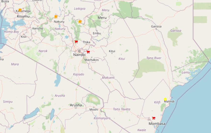
The custom markers are also clickable!
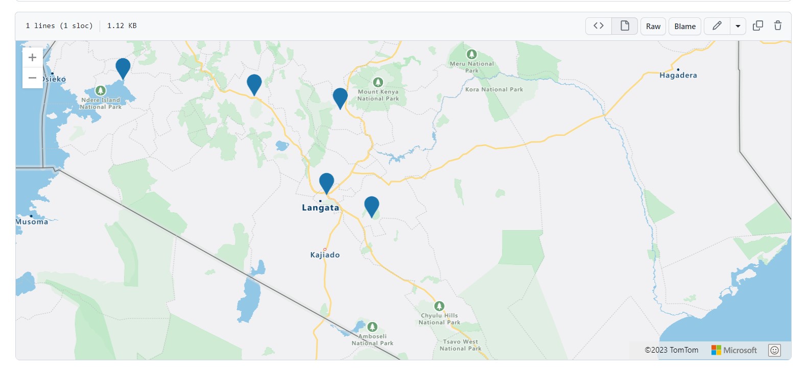
6.6 Image overlays
Sometimes an image can act as good a marker. Overlaying images on a map is fairly easy. The below code inserts an image above a historical monument located in the Kenyan capital, Nairobi.
// Image overlays
var imageUrl = 'https://pbs.twimg.com/media/DddQBk5WsAAlbdJ?format=jpg&name=large';
var errorOverlayUrl = 'https://pbs.twimg.com/media/DddQBk5WsAAlbdJ?format=jpg&name=large';
var altText = 'The Galton - Fenzi Memorial: Source: Google and Twitter';
var latLngBounds = L.latLngBounds([[-1.2861259,36.8172709], [-1.2886193,36.8230413]]);

var imageOverlay = L.imageOverlay(imageUrl, latLngBounds, {
    opacity: 0.8,
    errorOverlayUrl: errorOverlayUrl,
    alt: altText,
    interactive: true
}).addTo(map);
However, finding an image of just one location over the wide earth can be laborious, so we envelope it with a rectangle. The map.fitBounds function enables the browser to automatically zoom to where our image is placed.
L.rectangle(latLngBounds).addTo(map);
map.fitBounds(latLngBounds);
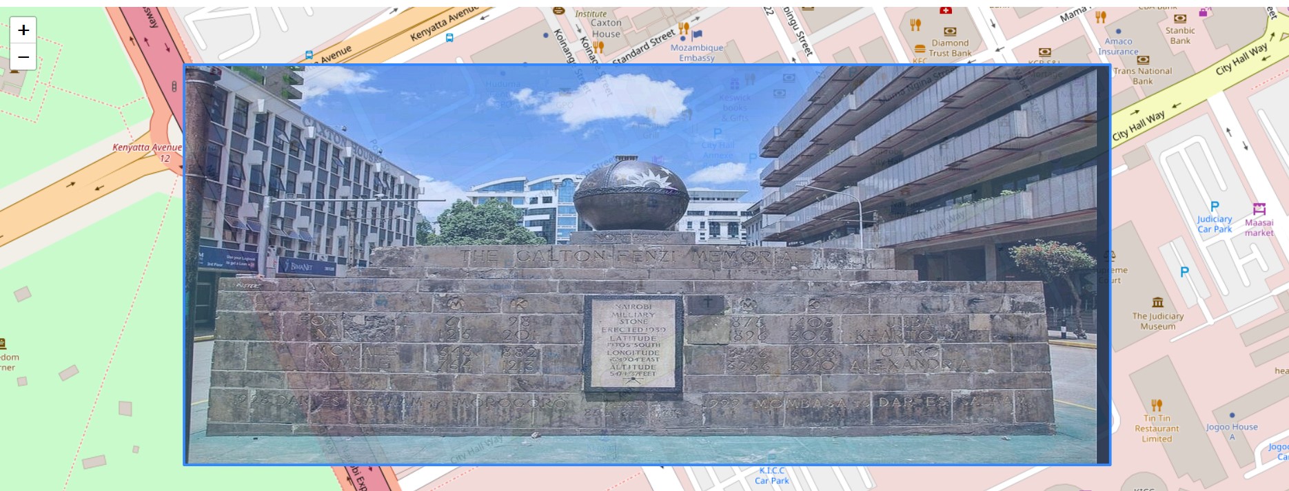
Mind you that landmark was set up in 1939 in honour of Lionel Douglas Galton-Fenzi; the first motorist to drive from Nairobi to Mombasa as early as 1926. The landmark is also inscribed with bearings to various East African cities but enough history for today.
Anyway, here is a quick breakdown of the attributes used in L.imageOverlay: a) the var latLngBounds uses the L.latLngBounds class to set the lat-lon coordinates. Notice they are two coordinate lists bound with a single []. Failing to enclose the two coordinates with [] results in an error. b) var ImageUrl is the image source.
For the additional options parsed to the L.imageOverlay() class, they are described below:
opacity- defines the opacity of the image overlay, it equals to 1.0 by default. Decrease this value to make an image overlay transparent and to expose the underlying map layer.errorOverlayUrl- is a URL to the overlay image to show in place of the overlay that failed to load.alt- sets the HTML alt attribute to provide an alternative text description of the image. It is quite helpful in describing an image in text form just in case it fails to load due to poor network connectivity. Moreover, it can improve the Search Engine Optimization (SEO) of the website it is hosted in.interactive- is false by default. If true, the image overlay will emit mouse events when clicked or hovered.
Full codes and files are here.
6.7 Summary
This was quite a long chapter that rendered justice on how to customize GeoJSON markers in Leaflet. Through the various exercises you encountered in this chapter, you have learnt the following:
GeoJSON files, if in the correct format, can be rendered as a standalone map from Github. An example is here.
One can customize marker colour or size based on the GeoJSON’s file attributes. In this chapter, the city population values were used to define the marker’s size and colour.
The
pointToLayerkey, when used as an option inL.geoJSON, will parse a particular function to every Lat-Lon coordinate of the GeoJSON object.It is also possible to customize markers in the
fetchAPI by simply specifying how they should appear, in form of functions, within theL.geoJsonoptions environment.There exist plenty of custom made icons outside of, but compatible with Leaflet. An example of such a library is Leaflet Awesome Markers.
Images can also be overlayed on a Leaflet map. This was done in the sub-chapter of Image Overlays.