Chapter 8 Price Sensitivity Meter (Van Westendorp)
The Price Sensitivity Meter (PSM), developed by Peter Van Westendorp in the 1970s, is a widely recognized and applied market research technique used to determine consumers’ price sensitivity for a product or service. PSM offers insights into pricing strategies by analyzing how different price points affect consumer preferences and purchase behavior. This chapter will delve into the key concepts, methodology, interpretation, and practical applications of the Price Sensitivity Meter.
The core of PSM lies in assessing consumers’ willingness to pay by presenting them with a series of price-related questions. The key questions typically asked include:
- At what price would you consider the product/service to be so expensive that you would not consider buying it? (Too Expensive)
- At what price would you consider the product/service to be priced so low that you would feel the quality couldn’t be very good? (Too Cheap)
- At what price would you consider the product/service starting to get expensive, so it is not out of the question, but you would have to give some thought to buying it? (Expensive)
- At what price would you consider the product/service to be a bargain—a great buy for the money? (Cheap)
By gathering responses to these questions from a representative sample of potential customers, PSM constructs what is known as the Price Sensitivity Meter graph.
The Price Sensitivity Meter graph is a scatter plot that displays the cumulative percentages of respondents who view the product as “Too Expensive,” “Too Cheap,” “Not Expensive,” and “Not Cheap” at different price levels (the last two curves are derived from “Cheap” and “Expensive”). The intersecting points of these cumulative percentages create four curves, forming an “X” shape on the graph. These curves represent the perceived value thresholds of consumers.
The four intersecting curves on the Price Sensitivity Meter graph have distinct points of intersection. These points are interpreted as follows:
Lower Price Threshold: Referred to as the “Point of Marginal Cheapness” (MGP), this marks the lowest viable pricing for your product. If priced below this point, a higher number of respondents regard it as “too cheap” rather than “not cheap”.
Upper Price Threshold: Known as the “Point of Marginal Expensiveness” (MEP), this represents the highest reasonable pricing for your product. If priced above this point, more respondents view it as “too expensive” rather than “not expensive”.
Indifference Price Point (IDP): At this juncture, an equal percentage of respondents regard the price as both “cheap” and “expensive”.
Optimal Price Point (OPP): An equal proportion of respondents find the price both “too cheap” and “too expensive”. Termed “optimal,” this price point is considered to have the least purchase resistance among customers.
Let’s do a practical example to better understand how does it work. We have a dataset with four columns and N respondents. Each column is the price at which the respondent indicated at what price the product/service is too cheap, cheap, expensive and too expensive. Here are the first 5 observations.
##     tch    ch    ex   tex
## 1  8.60  9.04 13.27 13.43
## 3  9.22 10.50 12.21 13.90
## 11 8.26 11.56 12.16 12.89
## 12 9.36 10.60 12.83 13.97
## 13 9.10  9.53 11.81 12.69
This methodology implicitly assumes that the price stated at the “too cheap” questions is lower than the price stated at the “cheap” question which is lower than the price stated at the “expensive” question and so on. It is reasonable to make such an assumption but respondents may answer the questionnaire without carefully reading the questions, or for other reasons, this assumption may be not respected. Let’s drop such respondents from the dataset.
The price sensitivity meter graph represents the cumulative frequencies of respondents that think a specific price x is “too expensive”, “too cheap”, “not cheap” and “not expensive”, the curves “too cheap” and “not expensive” are reversed in the chart.
The (empirical) cumulative distribution function F(t) is defined as: \[\begin{equation} F(t)=\frac{\text{number of elements}\leq\text{t}}{\text{n}} \end{equation}\]
Basically we sort the data in increasing order and for each price we count how many respondents stated a lower price and divide this number by the total number of respondents. From this we calculate six curves: (i) ecdf(too cheap): \(1-\text{F(toocheap)}\); (ii) ecdf(cheap) \(1-\text{F(cheap)}\); (iii) ecdf(expensive) F(expensive); (iv) ecdf(too expensive) F(tooexpensive) and (v) ecdf(notcheap) \(1-\text{ecdf(cheap)}\) (vi) ecdf(notexpensive) \(1-\text{ecdf(expensive)}\)
data_ecdf <- data.frame(price = sort(unique(c(psm.data.valid$tch,
                                              psm.data.valid$ch,
                                              psm.data.valid$ex,
                                              psm.data.valid$tex))))

ecdf_psm <- ecdf(psm.data.valid$tch)
data_ecdf$tch <- 1 - ecdf_psm(data_ecdf$price)

ecdf_psm <- ecdf(psm.data.valid$ch)
data_ecdf$ch <- 1 - ecdf_psm(data_ecdf$price)

ecdf_psm <- ecdf(psm.data.valid$ex)
data_ecdf$ex <- ecdf_psm(data_ecdf$price)

ecdf_psm <- ecdf(psm.data.valid$tex)
data_ecdf$tex <- ecdf_psm(data_ecdf$price)

# "not cheap" and "not expensive"
data_ecdf$not.ch <- 1 - data_ecdf$ch
data_ecdf$not.ex <- 1 - data_ecdf$ex
And derive the price range, which is given by the lower and upper bound derived from the intersections between “too cheap” and “not cheap” curve and “too expensive” and “not expensive” curve; the indifference point (where “cheap” and “expensive” intersects) and the optimal price point (“too expensive” and “too cheap”).
## lower bound:
# Below this point more respondents consider the price as “too cheap” than “not cheap”.
lower.bound <- data_ecdf$price[tail(which(data_ecdf$tch>data_ecdf$not.ch), n = 1)]

## upper bound:
#Above this point and more respondents consider the price as “too expensive” than “not expensive”
upper.bound <- data_ecdf$price[head(which(data_ecdf$tex>data_ecdf$not.ex), n = 1)]

## indifference point
# equal proportion of respondents consider the price as “cheap” and “expensive”
ind.point <- data_ecdf$price[which.min(abs(data_ecdf$ch - data_ecdf$ex))]

## optimal price
# equal proportion of respondents consider the price as “too cheap” and “too expensive”
opt.point <- data_ecdf$price[which.min(abs(data_ecdf$tch - data_ecdf$tex))]


points.psm <- c(lower.bound, upper.bound, ind.point, opt.point)
names(points.psm) <- c("Lower.bound", "Upper.bound", "Indifference.point", "Optimal.point")
points.psm
## Lower.bound Upper.bound Indifference.point Optimal.point
## 9.25 12.51 11.10 11.07We can finally display the psm graph
8.1 Newton-Miller-Smith Extension to PSM
Newton-Miller-Smith extended the PSM methodology to try to infer the demand. Assuming no buying on the too expensive and too cheap curve, it adds two additional questions to infer the probability of purchasing at the expensive and cheap price.
- At the
how likely are you to purchase the product in the next six months? Scale 1 (unlikely) to 5 (very likely). - At the
how likely are you to purchase the product in the next six months? Scale 1 (unlikely) to 5 (very likely). (example questions taken from wikipedia)
Usually the probability assigned to these values are:
##   value prob
## 1     1  0.0
## 2     2  0.1
## 3     3  0.3
## 4     4  0.5
## 5     5  0.7
Practically what we do is to create a matrix with N rows equal to the number of respondents and k columns equal to all the prices stated by respondents. For all the prices lower than the respondent “too cheap” price we set the probability of purchasing at 0, we do the same for all the prices above the respondent “too expensive” price. While for all the values that are between the too cheap-cheap-expensive-too expensive we calculate the probabilities by linearly interpolating the known probabilities (cheap and expensive). Let’s do it for the first respondent:
prices <- data_ecdf$price
prob <- rep(NA, length(prices))
## first respondent

### price too cheap
price.tch <- psm.data.valid$tch[1]
### price cheap
price.ch <- psm.data.valid$ch[1]
## price expensive
price.ex <- psm.data.valid$ex[1]
## price too expensive
price.tex <- psm.data.valid$tex[1]


### everything before too cheap and after to expensive set to 0
prob[prices<=price.tch|prices>=price.tex]=0
### prob cheap
prob[prices==price.ch]=psm.data.valid$itb.chp[1]
## prob expensive
prob[prices==price.ex]=psm.data.valid$itb.ex[1]

## values to interpolate

price.val <- prices[prices>=price.tch&prices<=price.tex]
prob.val <- prob[prices>=price.tch&prices<=price.tex]
## linear interpolation# too cheap - cheap - expensive - too expensive
prob.val.int <- approx(price.val, prob.val, xout = price.val)$y
prob[prices>=price.tch&prices<=price.tex] <- prob.val.int


ggplot(NULL, aes(x = prices, y = prob)) +
  geom_line(color = "steelblue") +
  labs(x = "Price", y = "Probability") +
  theme_minimal()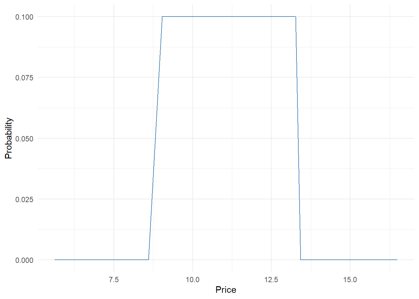
To get the probability distribution at each price we compute the purchase probability for each respondent and average them. We can easily do it wrapping the above code within a for loop.
mat.res <- matrix(data = NA, nrow = nrow(psm.data.valid),  ncol = length(prices))
colnames(mat.res) <- prices

##by respondent
for(i in 1:nrow(mat.res)){
### price too cheap
price.tch <- psm.data.valid$tch[i]
### price cheap
price.ch <- psm.data.valid$ch[i]
## price expensive
price.ex <- psm.data.valid$ex[i]
## price too expensive
price.tex <- psm.data.valid$tex[i]


### everything before too cheap and after to expensive set to 0
mat.res[i,as.numeric(colnames(mat.res))<=price.tch|as.numeric(colnames(mat.res))>=price.tex]=0
### prob cheap
mat.res[i,as.numeric(colnames(mat.res))==price.ch]=psm.data.valid$itb.chp[i]
## prob expensive
mat.res[i,as.numeric(colnames(mat.res))==price.ex]=psm.data.valid$itb.ex[i]

## values to interpolate

price.val <- as.numeric(colnames(mat.res)[as.numeric(colnames(mat.res))>=price.tch&as.numeric(colnames(mat.res))<=price.tex])
prob.val <- mat.res[i,as.numeric(colnames(mat.res))>=price.tch&as.numeric(colnames(mat.res))<=price.tex]
## linear interpolation# too cheap - cheap - expensive - too expensive
prob.val.int <- approx(price.val, prob.val, xout = price.val)$y
mat.res[i, as.numeric(colnames(mat.res))>=price.tch&as.numeric(colnames(mat.res))<=price.tex] <- prob.val.int
}


mat.res.avg <- apply(mat.res, 2, mean)
opt.price <- as.numeric(names(which.max(mat.res.avg)))
mat.res.avg <- data.frame(price = as.numeric(names(mat.res.avg)),
                          prob = as.numeric(mat.res.avg))

ggplot(mat.res.avg, aes(x = price, y = prob)) +
  geom_line(color = "steelblue") +
  geom_vline(xintercept = opt.price,
             linetype = "dotted", color = "black") +
  labs(x = "Price", y = "Avg. Probability") +
  theme_minimal()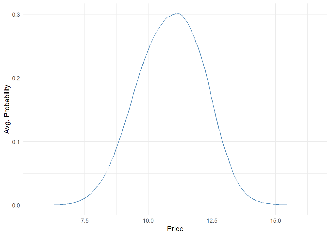
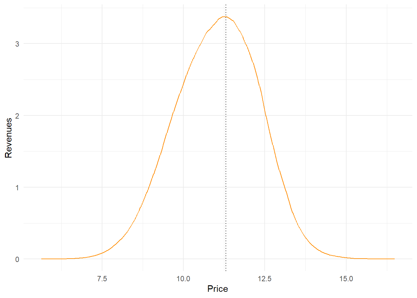
We can additionally compute the revenue probability curve multiplying price by probability of purchasing
### Revenues
mat.res.avg$revenue <- mat.res.avg$price*mat.res.avg$prob
opt.rev <- mat.res.avg$price[mat.res.avg$revenue==max(mat.res.avg$revenue)]

ggplot(mat.res.avg, aes(x = price, y = revenue)) +
  geom_line(color = "darkorange") +
  geom_vline(xintercept = opt.rev,
             linetype = "dotted", color = "black") +
  labs(x = "Price", y = "Revenues") +
  theme_minimal()