Chapter 8 R Lab 7 - 31/05/2021
In this lecture we will learn how to estimate non-linear regression models.
The following packages are required: MASS, splines and tidyverse.
For this lab we will use the Boston dataset contained in the MASS library and already introduced in Lab. 6. We start by loading the data:
## Rows: 506
## Columns: 14
## $ crim    <dbl> 0.00632, 0.02731, 0.02729, 0.03237, 0.06905, 0.02985, 0.08829,…
## $ zn      <dbl> 18.0, 0.0, 0.0, 0.0, 0.0, 0.0, 12.5, 12.5, 12.5, 12.5, 12.5, 1…
## $ indus   <dbl> 2.31, 7.07, 7.07, 2.18, 2.18, 2.18, 7.87, 7.87, 7.87, 7.87, 7.…
## $ chas    <int> 0, 0, 0, 0, 0, 0, 0, 0, 0, 0, 0, 0, 0, 0, 0, 0, 0, 0, 0, 0, 0,…
## $ nox     <dbl> 0.538, 0.469, 0.469, 0.458, 0.458, 0.458, 0.524, 0.524, 0.524,…
## $ rm      <dbl> 6.575, 6.421, 7.185, 6.998, 7.147, 6.430, 6.012, 6.172, 5.631,…
## $ age     <dbl> 65.2, 78.9, 61.1, 45.8, 54.2, 58.7, 66.6, 96.1, 100.0, 85.9, 9…
## $ dis     <dbl> 4.0900, 4.9671, 4.9671, 6.0622, 6.0622, 6.0622, 5.5605, 5.9505…
## $ rad     <int> 1, 2, 2, 3, 3, 3, 5, 5, 5, 5, 5, 5, 5, 4, 4, 4, 4, 4, 4, 4, 4,…
## $ tax     <dbl> 296, 242, 242, 222, 222, 222, 311, 311, 311, 311, 311, 311, 31…
## $ ptratio <dbl> 15.3, 17.8, 17.8, 18.7, 18.7, 18.7, 15.2, 15.2, 15.2, 15.2, 15…
## $ black   <dbl> 396.90, 396.90, 392.83, 394.63, 396.90, 394.12, 395.60, 396.90…
## $ lstat   <dbl> 4.98, 9.14, 4.03, 2.94, 5.33, 5.21, 12.43, 19.15, 29.93, 17.10…
## $ medv    <dbl> 24.0, 21.6, 34.7, 33.4, 36.2, 28.7, 22.9, 27.1, 16.5, 18.9, 15…
We consider lstat (lower status of the population (percent)) as regressor/covariate and medv (median value of owner-occupied homes in $1000s) as response variable. The relationship between the two variables is shown in the following plot:
## `geom_smooth()` using method = 'loess' and formula 'y ~ x'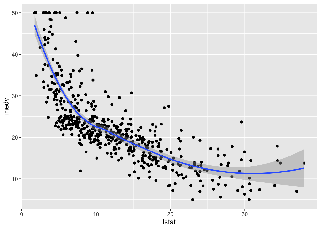 The plot suggests a non-linear relationship between the two variables. Note that the function
 geom_smooth includes by default a non linear model fitted by using the loess method.
We first create a new variable named lstat_ord obtained by transforming lstat into a categorical qualitative variable defined by 4 classes. To do this we use the function cut which divides the range of the variable into intervals and codes its values according to which interval they fall. With the option breaks of the cut function it is possible to specify how many classes we want or the cut-points to be used for defining the classes. In this case we ask for 4 classes that will be automatically created for having approximately the same length:
##
## (1.69,10.8] (10.8,19.9] (19.9,28.9]   (28.9,38]
##         243         187          57          19
As usual we proceed by splitting the data into training (80%) and test set:
set.seed(123)
training.samples = sample(1:nrow(Boston),
                           0.8*nrow(Boston),
                           replace=F)
train.data= Boston[training.samples, ]
test.data = Boston[-training.samples, ]
8.1 Linear regression model
We first estimate a linear regression model (using the training data) even if we know that the relationship between the two studied variables is not linear.
##
## Call:
## lm(formula = medv ~ lstat, data = train.data)
##
## Residuals:
##     Min      1Q  Median      3Q     Max
## -15.073  -3.891  -1.401   1.761  24.602
##
## Coefficients:
##             Estimate Std. Error t value Pr(>|t|)
## (Intercept) 34.49437    0.61789   55.83   <2e-16 ***
## lstat       -0.95445    0.04275  -22.33   <2e-16 ***
## ---
## Signif. codes:  0 '***' 0.001 '**' 0.01 '*' 0.05 '.' 0.1 ' ' 1
##
## Residual standard error: 6.154 on 402 degrees of freedom
## Multiple R-squared:  0.5536,	Adjusted R-squared:  0.5525
## F-statistic: 498.6 on 1 and 402 DF,  p-value: < 2.2e-16
We want now to include the fitted model in the scatterplot. The first way for doing this is to use the ggplot2::geom_smooth function by setting method="lm" (linear model):
## `geom_smooth()` using formula 'y ~ x'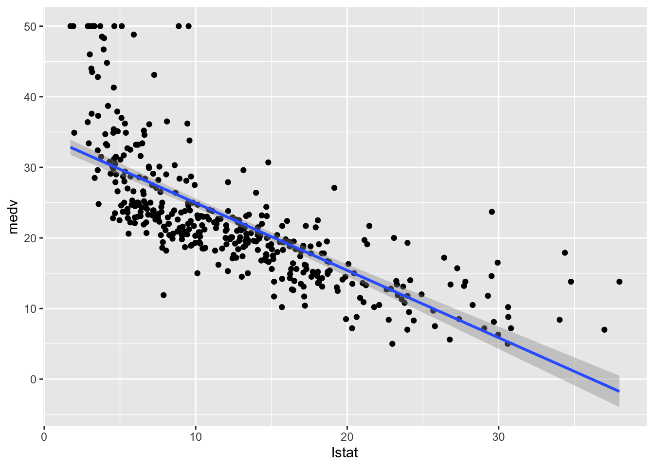 This approach is convenient is you want to display the 95% confidence interval around the fitted line (i.e. the estimated - pointwise - standard error of predictions measuring the uncertainty of the predictions).
Alternatively we can proceed as follows by adding, temporally, the predictions in a new column of the dataframe and then plot it using geom_line (remind that the predictions in this case refer to the training set):
train.data %>%
mutate(pred = mod_lm$fitted.values) %>% #temp column
ggplot(aes(lstat, medv)) +
geom_point() +
geom_line(aes(y=pred), col="blue",lwd=1.5)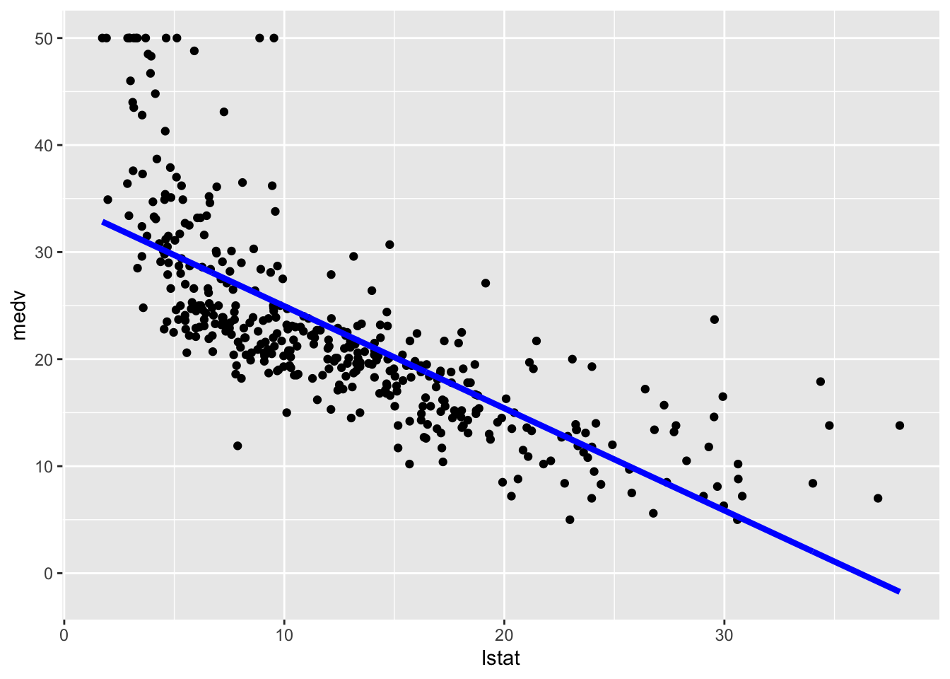 The option
 lwd specifies the line width. In this case obtaining the predictions confidence interval is a bit tricky and we are not going to do it.
We now compute the predictions for the test set. The model performance is assessed by means of the mean square error (MSE) and the correlation (COR) between observed and predicted values:
lm_pred = mod_lm %>% predict(test.data)
# Model performance
lm_perf =
  data.frame(
    MSE = mean((lm_pred - test.data$medv)^2),
    COR = cor(lm_pred, test.data$medv)
)
lm_perf
## MSE COR
## 1 41.70676 0.71400498.2 Linear regression model with step functions
We consider now the case of a linear regression model with step functions defined by the classes of lstat_ord. In this case a constant model will be estimated for each of the 4 regions. We don’t have to do anything special in this case apart from specifying a standard linear model where lstat_ord is the only regressor. R will take care of creating the corresponding three dummy variables:
##
## Call:
## lm(formula = medv ~ lstat_ord, data = train.data)
##
## Residuals:
##      Min       1Q   Median       3Q      Max
## -16.6452  -4.6452  -0.6312   2.7079  21.4548
##
## Coefficients:
##                      Estimate Std. Error t value Pr(>|t|)
## (Intercept)           28.5452     0.4807   59.38   <2e-16 ***
## lstat_ord(10.8,19.9]  -9.8281     0.7368  -13.34   <2e-16 ***
## lstat_ord(19.9,28.9] -16.1452     1.1148  -14.48   <2e-16 ***
## lstat_ord(28.9,38]   -17.2764     1.7540   -9.85   <2e-16 ***
## ---
## Signif. codes:  0 '***' 0.001 '**' 0.01 '*' 0.05 '.' 0.1 ' ' 1
##
## Residual standard error: 6.747 on 400 degrees of freedom
## Multiple R-squared:  0.4661,	Adjusted R-squared:  0.4621
## F-statistic: 116.4 on 3 and 400 DF,  p-value: < 2.2e-16
The value 28.55 is the average predicted value of medv in the first class of lstat_ord; 28.55 - -9.83 is the average predicted value of medv for the second category, and so on.
We plot the fitted model with the two methods. Note that for using geom_smooth it is necessary to specify by means of formula that we are using a transformation of x=lstat:
# Method 1
train.data %>%
  ggplot(aes(x=lstat, y=medv)) +
  geom_point() +
  geom_smooth(method="lm", formula=y~cut(x,4))
# Method 2
train.data %>%
  mutate(pred = mod_cut$fitted.values) %>%
  ggplot(aes(x=lstat, y=medv)) +
  geom_point() +
  geom_line(aes(y=pred),col="blue",lwd=1.5)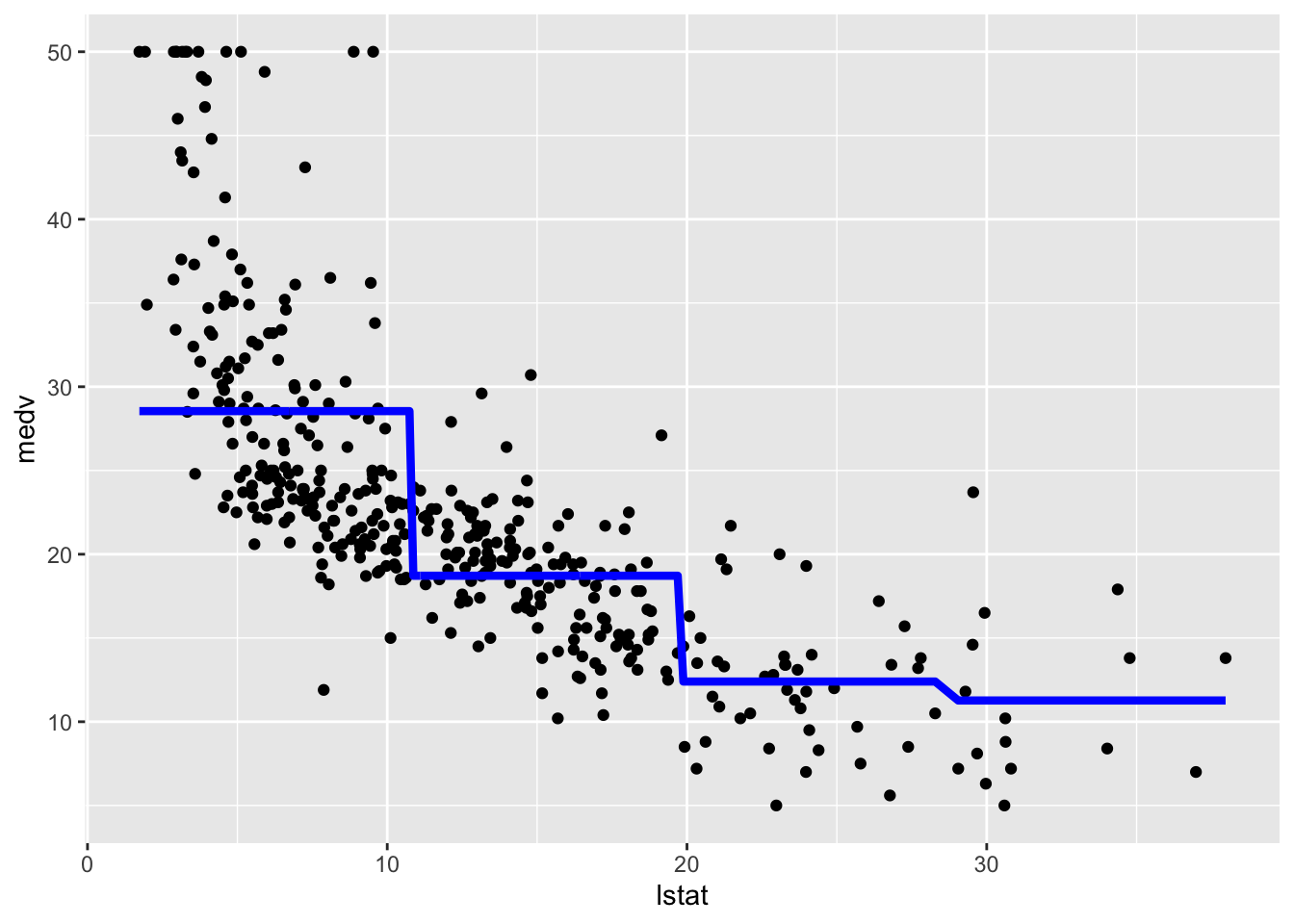
We now compute the predictions for the test set and the two performance indexes.
cut_pred = mod_cut %>% predict(test.data)
# Model performance
cut_perf =
  data.frame(
    MSE = mean((cut_pred - test.data$medv)^2),
    COR = cor(cut_pred, test.data$medv)
)
cut_perf
## MSE COR
## 1 49.53634 0.64482078.3 Piecewise linear regression
As requested by some of you during the lab we are interested in estimating piecewise regression models, instead of constant lines as in the previous case of cut functions (see Section 8.2). The smartest and quickest way I found to do this is by estimating 4 separate linear regression models, one for each category/class of lstat_ord (for each of the models we create a new data frame containing the values of lstat and the corresponding predictions). Note that the number of observatios used for each model is different.
# Class 1
piece1 = lm(medv  ~ lstat,
            data = train.data,
            # select data in the first class of lstat_ord
            subset = lstat_ord==levels(lstat_ord)[1])
piece1df = data.frame(lstat = train.data$lstat[train.data$lstat_ord==levels(train.data$lstat_ord)[1]],
                      pred = piece1$fitted.values)
# Class 2
piece2 = lm(medv  ~ lstat,
            data = train.data,
            # select data in the second class of lstat_ord
            subset = lstat_ord==levels(lstat_ord)[2])
piece2df = data.frame(lstat = train.data$lstat[train.data$lstat_ord==levels(train.data$lstat_ord)[2]],
                      pred = piece2$fitted.values)

# Class 3
piece3 = lm(medv  ~ lstat,
            data = train.data,
            # select data in the third class of lstat_ord
            subset = lstat_ord==levels(lstat_ord)[3])
piece3df = data.frame(lstat = train.data$lstat[train.data$lstat_ord==levels(train.data$lstat_ord)[3]],
                      pred = piece3$fitted.values)

# Class 4
piece4 = lm(medv  ~ lstat,
            data = train.data,
            # select data in the first class of lstat_ord
            subset = lstat_ord==levels(lstat_ord)[4])
piece4df = data.frame(lstat = train.data$lstat[train.data$lstat_ord==levels(train.data$lstat_ord)[4]],
                      pred = piece4$fitted.values)
It is now possible to plot the 4 fitted models. In the following code each geometry is characterized by different data frames:
ggplot() +
geom_point(data=train.data,aes(x=lstat, y=medv)) +
geom_line(data=piece1df,aes(x=lstat,y=pred),col="blue",lwd=1.5)+
geom_line(data=piece2df,aes(x=lstat,y=pred),col="blue",lwd=1.5)+
geom_line(data=piece3df,aes(x=lstat,y=pred),col="blue",lwd=1.5)+
geom_line(data=piece4df,aes(x=lstat,y=pred),col="blue",lwd=1.5)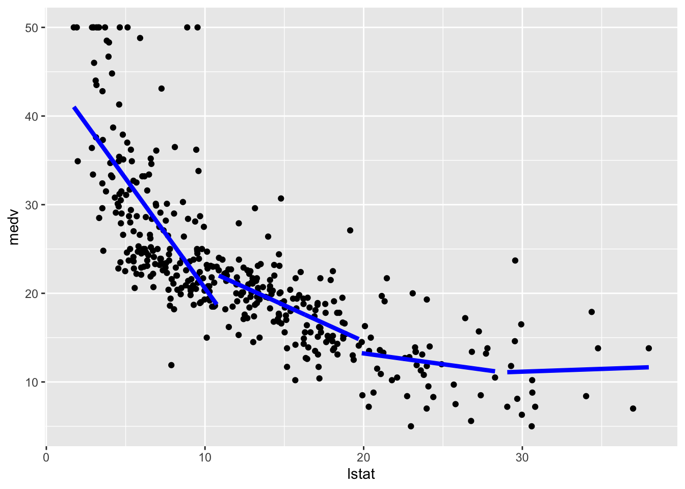 We are not particularly interested in this kind of modelling as the final fitted model is not continuos but has jumps. For this reason we won’t compute the test predictions.
8.4 Polynomial regression
The polynomial regression model was already introduced in Sect. 2. We implement here a model where \(d=5\) and then include the fitted model in the training data scatterplot:
##
## Call:
## lm(formula = medv ~ poly(lstat, 5), data = train.data)
##
## Residuals:
##      Min       1Q   Median       3Q      Max
## -13.9116  -2.9841  -0.6678   1.8604  27.2880
##
## Coefficients:
##                  Estimate Std. Error t value Pr(>|t|)
## (Intercept)       22.5109     0.2545  88.458  < 2e-16 ***
## poly(lstat, 5)1 -137.4146     5.1150 -26.865  < 2e-16 ***
## poly(lstat, 5)2   56.7147     5.1150  11.088  < 2e-16 ***
## poly(lstat, 5)3  -23.8206     5.1150  -4.657 4.38e-06 ***
## poly(lstat, 5)4   25.2578     5.1150   4.938 1.16e-06 ***
## poly(lstat, 5)5  -19.7620     5.1150  -3.864  0.00013 ***
## ---
## Signif. codes:  0 '***' 0.001 '**' 0.01 '*' 0.05 '.' 0.1 ' ' 1
##
## Residual standard error: 5.115 on 398 degrees of freedom
## Multiple R-squared:  0.6947,	Adjusted R-squared:  0.6909
## F-statistic: 181.1 on 5 and 398 DF,  p-value: < 2.2e-16
# Method 1
ggplot(train.data, aes(lstat, medv) ) +
geom_point() +
stat_smooth(method = "lm",
formula = y ~ poly(x, 5))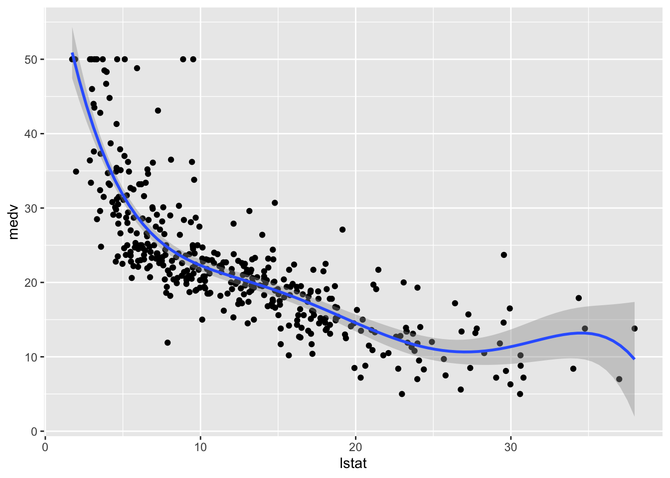
# Method 2
train.data %>%
  mutate(pred = mod_poly$fitted.values) %>%
  ggplot(aes(lstat, medv)) +
  geom_point() +
  geom_line(aes(y=pred),col="blue",lwd=1.5)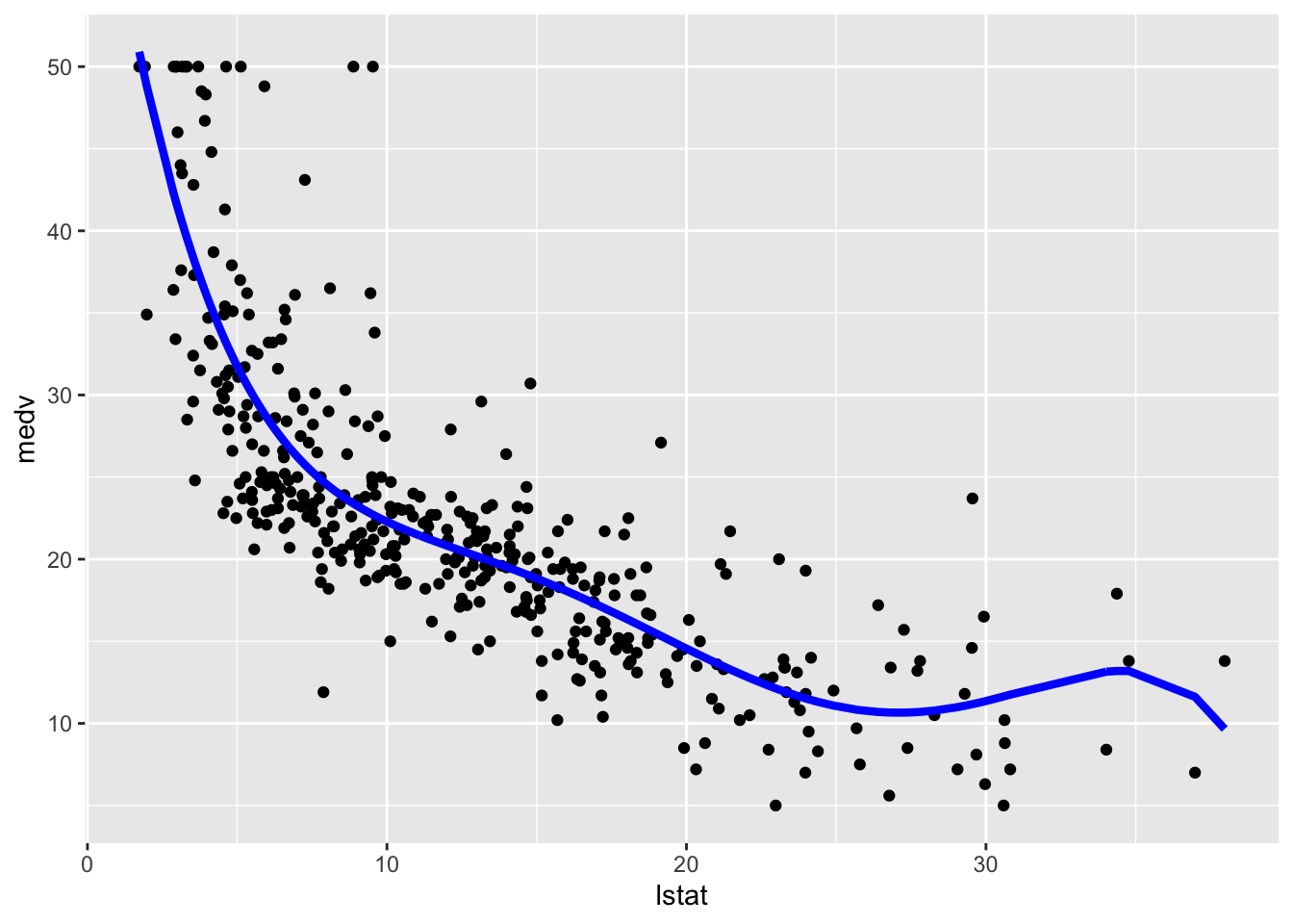
We then compute predictions for the test set together with the model performance indexes.
poly_pred = mod_poly %>% predict(test.data)
# Model performance
poly_perf =
  data.frame(
    MSE = mean((poly_pred - test.data$medv)^2),
    COR = cor(poly_pred, test.data$medv)
)
poly_perf
## MSE COR
## 1 31.47374 0.79665078.5 Regression spline
To estimate a cubic spline and a natural cubic spline regression model we use the function bs and ns from the library splines embedded in the lm function. We use as knots the 3 quartiles (corresponding to the quantiles of order 0.25, 0.5 and 0.75) of lstat. Note that the function bs can implement also splines with an order different from 3 (see the degree input argument. However the function ns doesn’t give this opportunity (it estimates only the natural cubic spline model). For this reason we consider deegree=3 aldo for the function bs (this is the default specification so we don’t need to include it):
library(splines)
knots = quantile(train.data$lstat,
                  p = c(0.25, 0.5, 0.75))
mod_cs = lm(medv ~ bs(lstat, knots = knots),
              data = train.data)
mod_ns = lm(medv ~ ns(lstat, knots = knots),
              data = train.data)
To plot the two fitted models we proceed as follows:
# Method 1
train.data %>%
  ggplot(aes(lstat, medv)) +
  geom_point() +
  geom_smooth(method = "lm",
              formula = y ~ bs(x,knots = knots),col="blue") +
  geom_smooth(method = "lm",
              formula = y ~ ns(x,knots = knots),col="red", lty=2)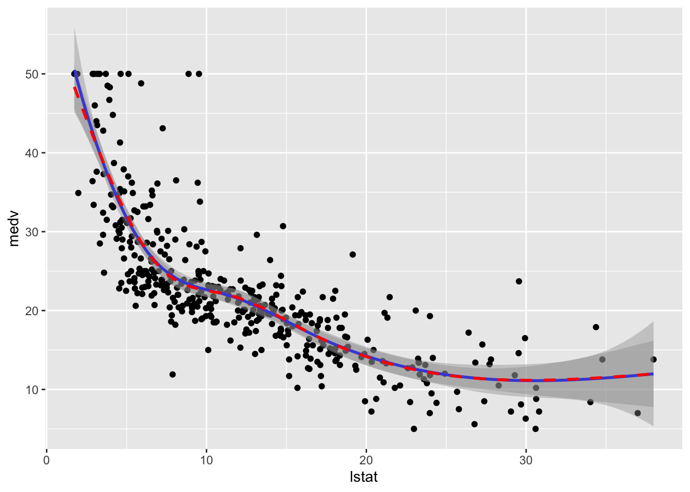
# Method 2
train.data %>%
mutate(pred1 = mod_cs$fitted.values,
pred2 = mod_ns$fitted.values) %>%
ggplot(aes(lstat, medv)) +
geom_point() +
geom_line(aes(y=pred1),col="blue",lwd=1.5)+
geom_line(aes(y=pred2),col="red",lwd=1.5,lty=2)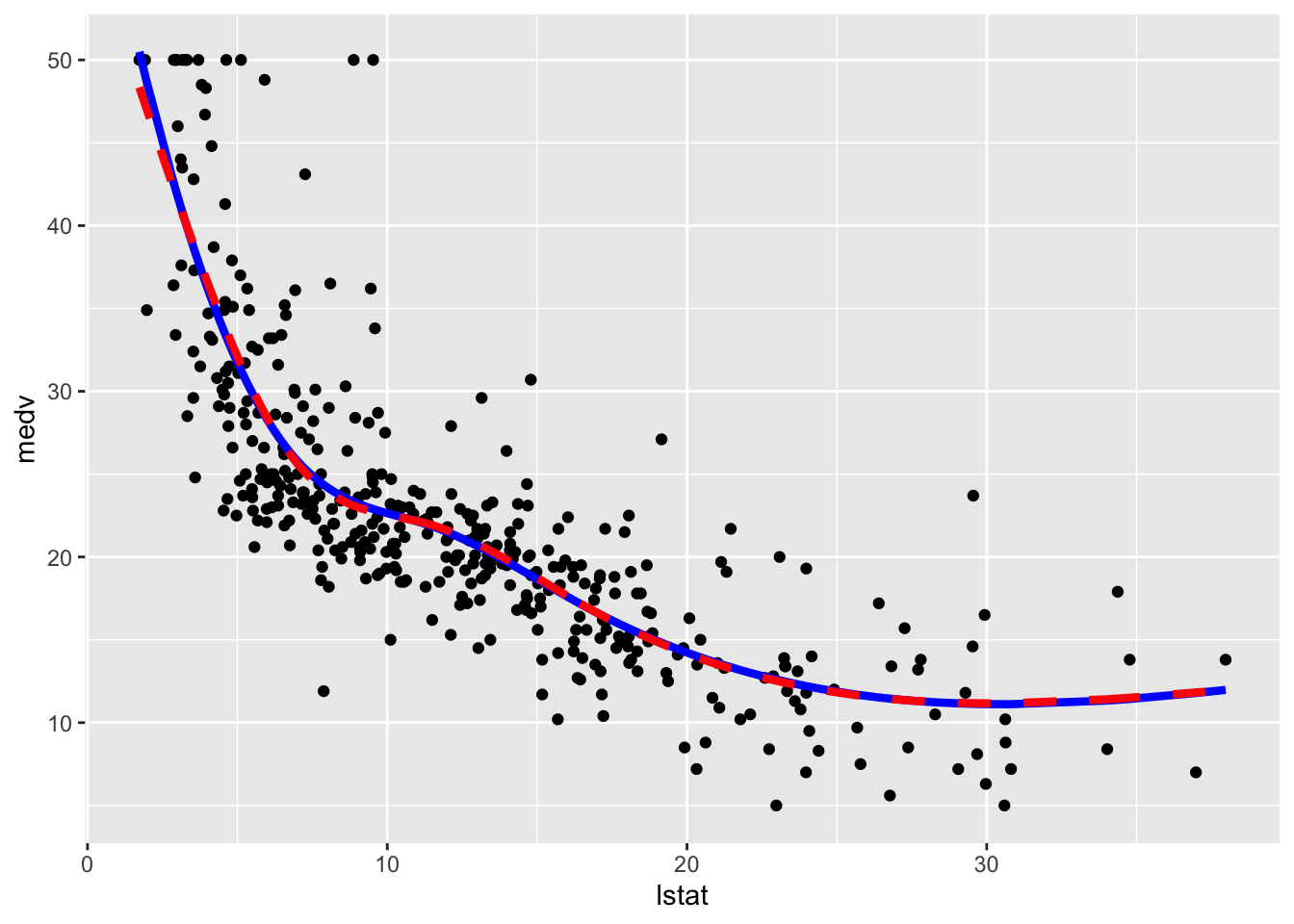 We observe that the two regression spline models are really very similar in terms of fitted lines.
We consider in the following the natural cubic spline model and compute the predictions for the test set and the usual performance indexes.
ns_pred = mod_ns %>% predict(test.data)
# Model performance
ns_perf = data.frame(
  MSE = mean((ns_pred - test.data$medv)^2),
  COR = cor(ns_pred, test.data$medv)
)
ns_perf
## MSE COR
## 1 31.63657 0.79539698.6 Local regression (LOESS)
By using the function loess (see ?loess) it is possible to fit a local regression model (LOESS) to the training data. In this case we decide to use the 20% of the closest points (i.e. the neighborhood size) by means of span=0.1 and fit linear local models (degree=1).
## Call:
## loess(formula = medv ~ lstat, data = train.data, span = 0.2,
##     degree = 1)
##
## Number of Observations: 404
## Equivalent Number of Parameters: 9.26
## Residual Standard Error: 5.071
## Trace of smoother matrix: 10.99  (exact)
##
## Control settings:
##   span     :  0.2
##   degree   :  1
##   family   :  gaussian
##   surface  :  interpolate	  cell = 0.2
##   normalize:  TRUE
##  parametric:  FALSE
## drop.square:  FALSE
Given that now we are not using the lm function we don’t have any parameter estimates in the output. To plot the fitted model and evaluate its performance we use the following code:
# Method 1
train.data %>%
  ggplot(aes(lstat, medv)) +
  geom_point() +
  geom_smooth(method = "loess", span=0.2,
              method.args = list(degree = 2))
## `geom_smooth()` using formula 'y ~ x'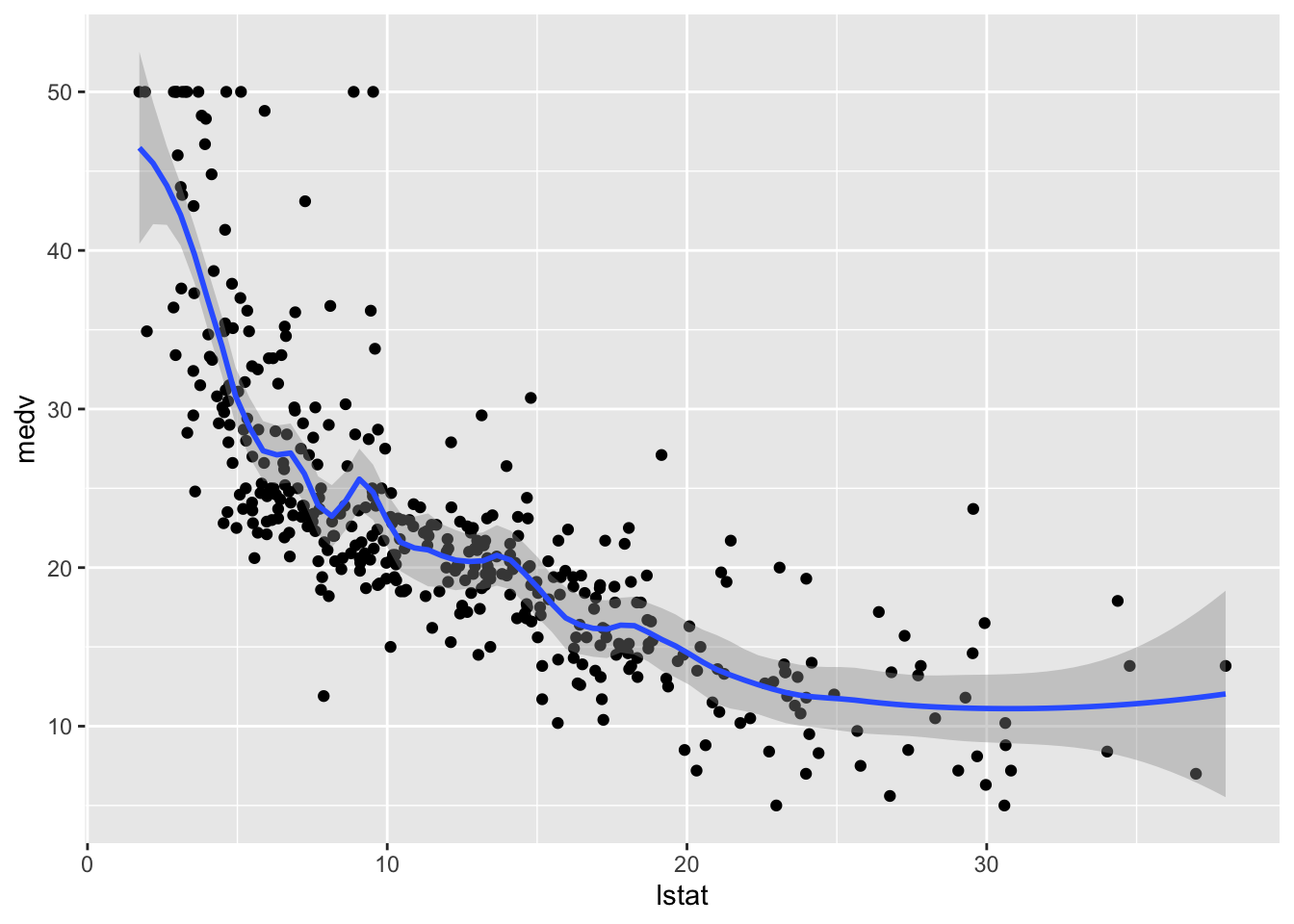
# Method 2
train.data %>%
  mutate(pred = mod_loess$fitted) %>%
  ggplot(aes(lstat, medv)) +
  geom_point() +
geom_line(aes(lstat,pred), col="red", lwd=1.5) 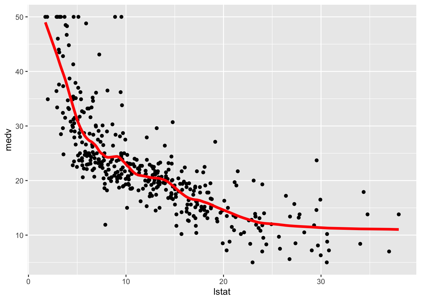
We finally compute the test predictions and the two indexes:
# Compute predictions
loess_pred = mod_loess %>% predict(test.data)
# Model performance
loess_perf = data.frame(
  MSE = mean((loess_pred - test.data$medv)^2),
  COR = cor(loess_pred, test.data$medv)
)
loess_perf
## MSE COR
## 1 31.12398 0.79802488.7 Smoothing splines
We fit now two smoothing splines models by using the function smooth.spline. It works slightly differently from the previous function because it does not take in input the formula but x and y that have to be provided separately. The value of lambda is the smoothing parameter \(\lambda\). As an example we use two values: 0.01 and 1 (in general the higher the value of lambda and the smoother the function).
## Call:
## smooth.spline(x = train.data$lstat, y = train.data$medv, lambda = 0.01)
##
## Smoothing Parameter  spar= NA  lambda= 0.01
## Equivalent Degrees of Freedom (Df): 5.516378
## Penalized Criterion (RSS): 10202.4
## GCV: 27.37522## Call:
## smooth.spline(x = train.data$lstat, y = train.data$medv, lambda = 1)
##
## Smoothing Parameter spar= NA lambda= 1
## Equivalent Degrees of Freedom (Df): 2.380572
## Penalized Criterion (RSS): 13093.4
## GCV: 34.19045Note that the function returns the Equivalent/Effective Degrees of Freedom (Df) number which can be interpreted as a measure of model flexibility (in general the higher the Effective Degrees of Freedom and the more flexible/complex the model). In this case we observe that mod_ss2 is a less flexible model (lower number of Df) and so we expect mod_ss1 to be less smoother.
It is possible to let the function smooth.spline to determine by means of cross-validation the best model flexibility. To use this option we just have to include the option cv=T (and it is not necessary to specify the value of \(\lambda\)):
## Warning in smooth.spline(y = train.data$medv, x = train.data$lstat, cv = T):
## cross-validation with non-unique 'x' values seems doubtful## Call:
## smooth.spline(x = train.data$lstat, y = train.data$medv, cv = T)
##
## Smoothing Parameter spar= 0.9148907 lambda= 0.0008700739 (12 iterations)
## Equivalent Degrees of Freedom (Df): 9.370943
## Penalized Criterion (RSS): 9684.976
## PRESS(l.o.o. CV): 26.5401The corresponding value of lambda can be retrieved by:
## [1] 0.0008700739We now plot the 3 fitted models. Note that in this case it is not possible to use the geom_smooth function, so we proceed with the second method for plotting. Moreover, note that in this case it is not possible to use the $fitted.values option because smooth.spline works differently. We have instead to apply the fitted function to the smooth.spline outputs in order to obtain the fitted values:
# Method 2
train.data %>%
mutate(pred1 = fitted(mod_ss1),
pred2 = fitted(mod_ss2),
pred3 = fitted(mod_ss3)) %>%
ggplot(aes(lstat, medv)) +
geom_point() +
geom_line(aes(y=pred1),col="blue",lwd=1.2) +
geom_line(aes(y=pred2),col="red",lwd=1.2) +
geom_line(aes(y=pred3),col="darkgreen",lwd=1.2) 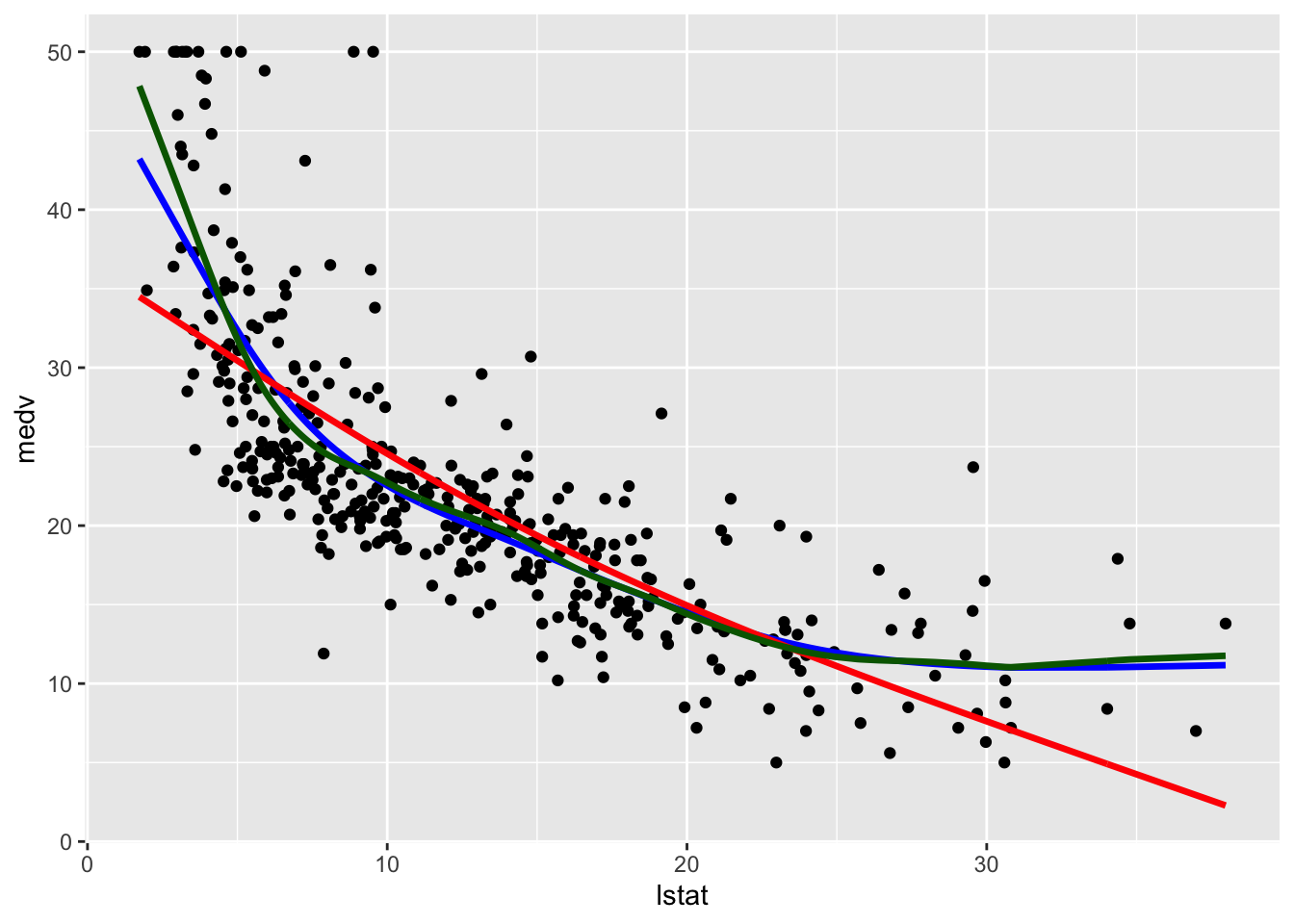 Note that the line with the highest value of
 lambda (and the lowest value of effective degrees of freedom) is the smoothest one (red color, very similar to a straight line). The other two lines are very similar and have a non linear shape.
We use mod_ss3 (i.e. the tuned model) to compute the test predictions and evaluate model performance. Also the predict function works differently here: it takes as input not the entire data frame test.data but only the regressor values test.data$lstat. Additionally the predict argument is composed by two objects named x and y. We are obviously interested in the latter:
# Compute predictions
ss_pred = predict(mod_ss3, test.data$lstat)
# Model performance
ss_perf = data.frame(
  MSE = mean((ss_pred$y- test.data$medv)^2),
  COR = cor(ss_pred$y, test.data$medv)
)
ss_perf
## MSE COR
## 1 31.03266 0.79962718.8 Models comparison
It’s now time to compare all the implemented models in terms of MSE and correlation between predicted and observed values in the test set. By using the rbind function we combine (by rows) all the dataframes containing the performance indexes. By using arrange we also order the methods according to the correlation values (descending order):
rbind(lm = lm_perf,
  poly = poly_perf,
  cut = cut_perf,
  loess = loess_perf,
  ns = ns_perf,
  ss = ss_perf) %>%
  arrange(desc(COR))
## MSE COR
## ss 31.03266 0.7996271
## loess 31.12398 0.7980248
## poly 31.47374 0.7966507
## ns 31.63657 0.7953969
## lm 41.70676 0.7140049
## cut 49.53634 0.6448207Smoothing splines (whose complexity is computed by using cross-validation) is the best method with also the lowest MSE. Local regression (LOESS), polynomial regression and natural spline regression have a similar performance, with a value of the correlation higher than 0.79. The linear model and the linear model with the cut functions are the worst models.
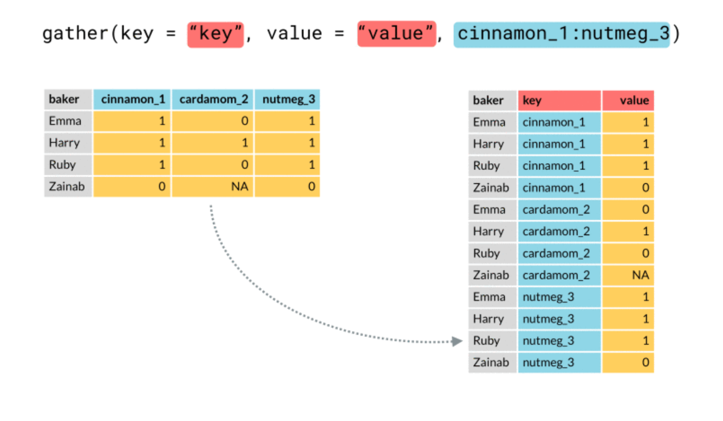
We plot in the following the best three models. In order to include in the plot a legend with the model names we need to create a column containing the model names (then we will use this column in the aes specification of geom_line). This can be done by moving from a wide to a long dataset, by means of the function dplyr::gather, described in the following picture (source: https://github.com/tidyverse/tidyr/issues/515)
In the following code we first include three new columns with the predictions of the best three methods and then transform the dataframe from wide to long format:
train.data.long = train.data %>%
  dplyr::select(lstat,medv) %>%
  mutate(pred_ss = fitted(mod_ss3),
         pred_loess = mod_loess$fitted,
         pred_poly = mod_poly$fitted.values) %>%
  gather(key="model", value="pred", contains("pred"))
## Warning: attributes are not identical across measure variables;
## they will be dropped## lstat medv model pred
## 1 36.98 7.0 pred_ss 11.68768
## 2 13.99 19.5 pred_ss 19.62469
## 3 6.92 29.9 pred_ss 26.10449
## 4 8.26 20.4 pred_ss 24.24279
## 5 4.38 29.1 pred_ss 34.58643
## 6 24.39 8.3 pred_ss 11.85259## [1] 1212 4We now have a new column named model containing the names of the models:
##
## pred_loess  pred_poly    pred_ss
##        404        404        404
This column will be used for setting the legend and the lines’ color. The predictions are all stacked in the pred column.
We plot can be obtained as follows:
train.data.long %>%
ggplot(aes(lstat, medv) ) +
geom_point() +
geom_line(aes(lstat,pred, col=model),lwd=1.5, alpha=0.8)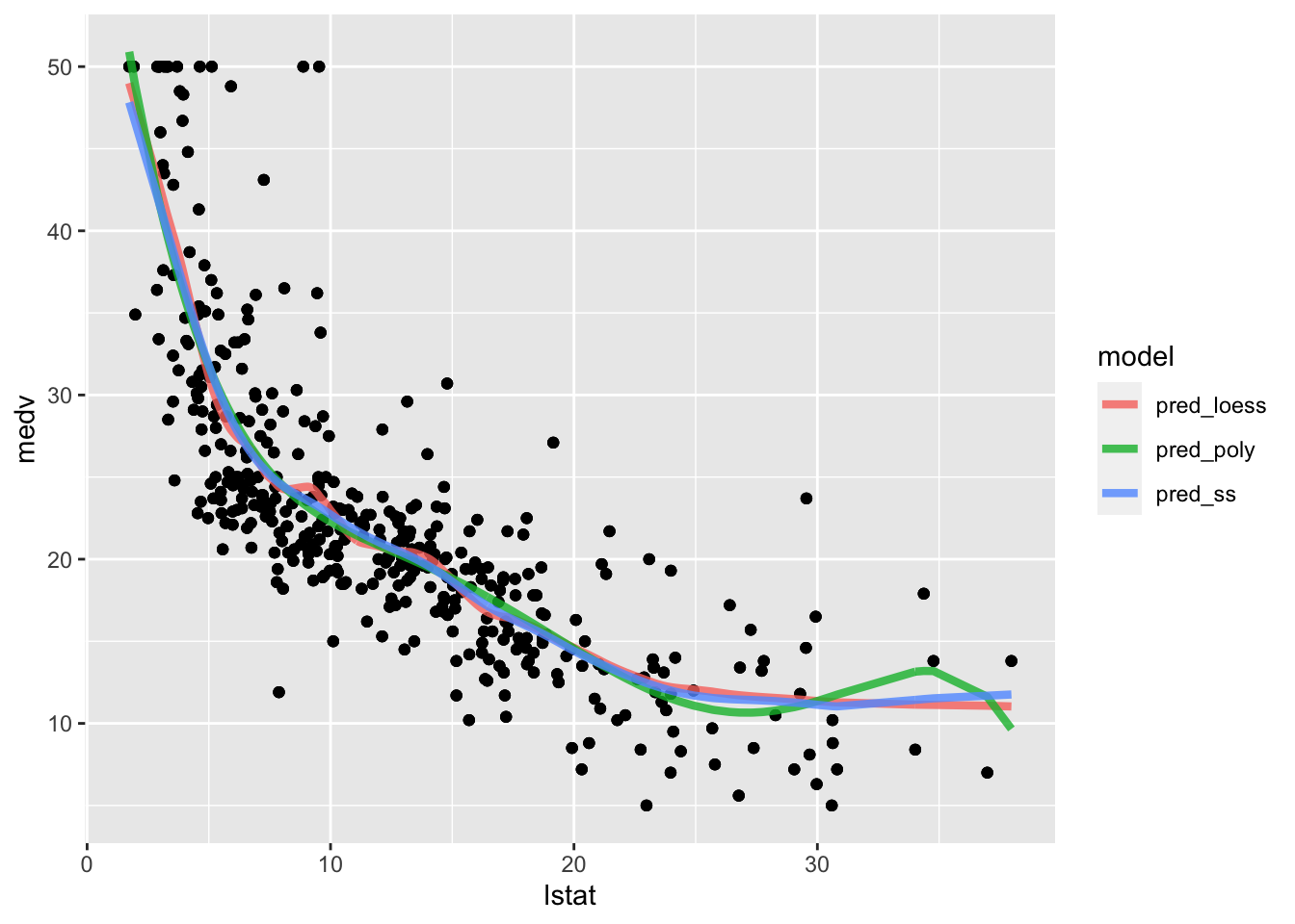 The polynomial fitted model has a weird bump in the right outer values of
 lstat. The loess and polynomial fitted models are very similar but the loess line is slightly wigger.
8.9 Exercises Lab 7
The RMarkdown file Lab7_home_exercises_empty.Rmd contains the exercise for Lab. 7. Write your solutions in the RMarkdown file and produce the final html file containing your code, your comments and all the outputs.