2 Statistics Background for Forecasting
2.1 Review of Random Variables, Distributions, and Moments
2.1.1 Discrete Random Variables:
- Discrete probability distributions
- Countable numbers of values, \(y_{i}, \space i = 1, 2, ...\)
- \(P(Y_{i}=y_{i})=p_{i} > 0 \space \forall i\)
- \(\sum p_{i}=1\)
E.g. Coin Toss (twice): Outcome, \(0 = \{ (H,H), (H,T), (T,H), (T,T) \}\)
\[ \text{Let } Y = \text{ # of heads observed in two flips} \\ \therefore \space for \space y = 0: f(y) = 0.25 \\ y = 1: f(y) = 0.5 \\ y = 2 : f(y) = 0.25 \\ \text{where } f(y) \text{ is the probability distribution }f^{n} \]
2.1.2 Continuous random variables:
\[ \text{P.D.F. } f(y) \ge 0 \\ \int_{-\infty}^{+\infty} f(y)dy = 1\\ \int_{a}^{b} f(y)dy = P(a \le Y \le b) \]
2.1.3 Moments: Expectations of powers of random variables
Consider four:
- Mean / Expected Value: \(E(y) = \sum_{i} p_{i} y_{i} = \mu\)
- measure of location, or “central tendency”
- Variance: \(\sigma^{2} = var(y) = E(y-\mu)^{2}\)
- measure of dispersion, or scale, of \(y\) around its mean
- \(\sigma = std(y) = \sqrt{E(y-\mu)^{2}}\)
- Q: Why prefer \(\sigma\) over \(\sigma^{2}\)?
- same units as \(y\)
- Skewness: \(S = \frac{E(y-\mu)^{3}}{\sigma^{3}}\)
- cubed deviation, scaled by \(\sigma^{3}\) (for technical reasons)
- measure of asymmetry in a distribution
- large positive value means long right tail
- Kurtosis: \(K = \frac{E(y-\mu)^{4}}{\sigma^{4}}\)
- measure of thickness of the tails of a distribution
- \(K \gt 3\)
- fat tails
- leptokurtosis (relative to Gaussian distribution)
- extreme events are more likely to occur than under the case of normality
2.1.4 Multivariate Random Variables
\[ cov(x,y) = E((y-\mu_{y})(x-\mu_{x})) = \gamma_{x,y} \\ corr(x,y) = \frac{cov(x,y)}{\sigma_{y}\sigma_{x}} = \frac{\gamma_{x,y}}{\sigma_{x}\sigma_{y}} = \rho_{x,y} \space \epsilon \space [-1,1] \\ cov(x,y) \gt 0 \to \text{ when } y_{i} \gt \mu_{y} \text{, then } x_{i} \text{ tends to be } \gt \mu_{x} \\ corr(x,y) \text{ is unitless ... hence popular} \]
2.1.5 Statistics
\(\{ y_{t} \}_{t=1}^{t} \sim f(y)\)
\(f\) is an unknown population distribution
Sample mean: \[ \bar y = \frac{1}{T} \sum_{t=1}^{T} y_{t} \]
Sample variance: \[ \hat \sigma^{2} = \frac{\sum_{1}^{T} (y_{t}- \bar y)^{2}}{T} \]
Unbiased estimator of \(\sigma^{2}\): \(s^{2} = \frac{\sum_{1}^{T} (y_{t}- \bar y)^{2}}{T-1}\)
Sample standard deviation: \(\hat \sigma = \sqrt{\hat \sigma^{2}} = \sqrt{\frac{\sum_{1}^{t} (y_{t} - \bar y)^{2}}{T}}; \space s = \sqrt{s^{2}} = \sqrt{\frac{\sum_{1}^{t}(y_{t} - \bar y)^{2}}{T-1}}\)
Sample skewness: \(\hat S = \frac{\frac{1}{T}\sum_{1}^{T}(y_{t} - \bar y)^{3}}{\hat \sigma^{3}}\)
Sample kurtosis: \(\hat K = \frac{\frac{1}{T}\sum_{1}^{T}(y_{t}-\bar y)^{4}}{\hat \sigma^{4}}\)
If \(Y \sim N\), then: \[ Y^{2} \sim X^{2} distribution \\ \frac{N}{X^{2}} \sim t \space distribution \\ \frac{X^{2}}{X^{2}} \sim F \space distribution \]
Test of Normality: Jarque-Bera test statistics \[ JB = \frac{T}{6}(\hat S^{2} +\frac{1}{4}(\hat K - 3)^{2}) \sim_{large \space \pi} X^{2}(\text{2 df}) \] (or \(T-k\), for models with k parameters, testing for residuals)
2.1.6 Time series
\[ y_{t},\space t = 1, 2, ..., T \\ y_{1}, y_{2}, ..., y_{t} \]
Let ‘\(\tau\)’ be the forecast lead time
Then, forecast node at time ‘\(t - \tau\)’ is denoted by \(\hat y(t-1)\)
\(\therefore \hat y(t-\tau)\) is forecast (or predicted) value of \(y_{t}\) that was made at time period \(t-\tau\)
Forecast error: \(e_{t}(\tau) = y_{t} - \hat y_{t}(t-\tau)\)
- \(e_{t}(\tau)\) refers to the ‘lead-\(\tau\)’ forecast error
Regression residual: \(e_{t} = y_{t} - \hat y_{t}\)
- Usually, \(e_{t} \lt e_{t}(\tau)\)
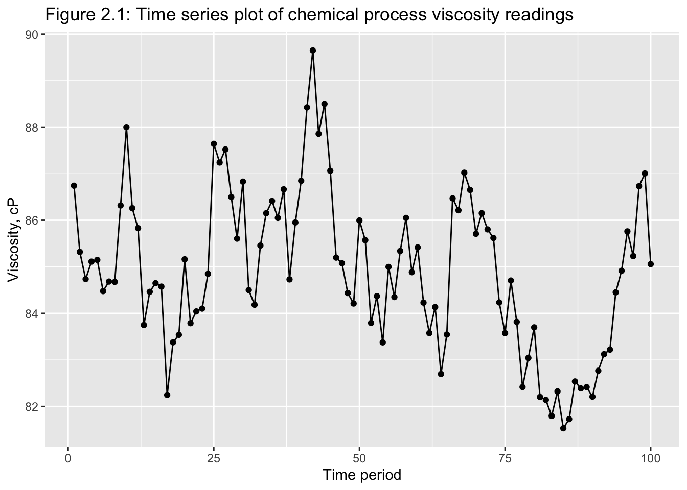
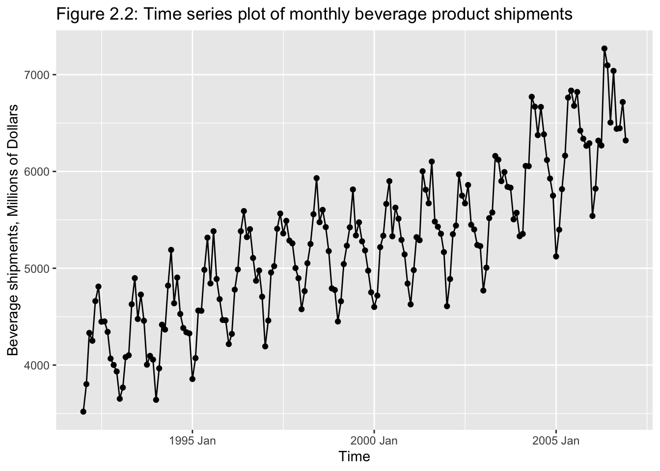
2.2 Graphical Displays
Classical tools of descriptive statistics are not very useful if they lose the time dependent features of a time series
E.g.: Figure 2.1 and 2.219
2.2.1 Smoothing Techniques
Moving-averages: of span N \[ M_{T} = \frac{y_{t} + y_{T-1} + y_{T-2} + ... + y_{T-N+1}}{N} \\ = \frac{1}{N} \sum_{t = T-N+1}^{T} y_{t} \\ \therefore \text{ assigns a weight of } \frac{1}{N}\text{ to N-most recent observations} \]
\(\text{Let } var(y_{t}) = \sigma^{2}\)
\[ \text{Recall: } var(a) = 0 \\ var(ax) = a^{2}var(x) \\ var(\sum_{i = 1}^{N}x_{i}) = \sum_{i = 1}^{N}var(x_{i}) + \sum_{y \ne j}cov(x_{i}, x_{j}) \] If \(x_{1}, ..., x_{N}\) are such that \(cov(x_{i}, x_{j}) = 0, \forall_{i}\)
then, \(var(\sum_{i=1}^{N}X_{i}) = \sum_{i = 1}^{N}var(X_{i})\)
\(\therefore\) If we assume that \(var(y_{t}) = \sigma^{2}\), AND observations are uncorrelated: \(cov(x_{i}, x_{j}) = 0 \forall(i \ne j)\), then
\[ var(M_{t}) = var(\frac{1}{N} \sum_{t = T-N+1}^{N} y_{t}) \\ = \frac{1}{N^{2}} var(\sum_{t=T-N+1}^{N} y_{t}) \\ = \frac{1}{N^{2}} \sum_{t=T-N+1}^{N} var(y_{t}) \\ = \frac{N *\sigma^{2}}{N^{2}} \\ = \frac{\sigma^{2}}{N} \\ \therefore var(M_{T}) \lt var(y) \\ \text{Fig. 2.5 & 2.6} \]
Linear filters can also be created using unequal weights.
Hanning filter: \(M_{t}^{H} = 0.25y_{t+1} + 0.5y_{t} + 0.25t_{t-1}\)
This is an example of a “centered moving-average:”
\(M_{t} = \frac{1}{s+1}\sum_{-s}^{s}y_{t-i}\), where \(\text{span} = 25t\)
Disadvantage of linear filters: Emphasizes outliers in the span duration
Use moving median instead!
\(m_{t}^{[N]} = median(y_{t-u}, ..., y, ..., y_{t+u})\), where \(span = N = 2u+1\)
\(\therefore m_{t}^{[3]} = med(y_{t-1}, y_{t}, y_{t+1})\)
2.3 Numerical Descriptions
Stationary time series: if \[ F_{y}(y_{t}, y_{t+1}, ..., y_{t+n}) = F_{y}(y_{t+k}, y_{t+k+1}, ..., y_{t+k+n}) \\ 1) \space \mu_{y} = E(y) = \int_{-\infty}^{\infty} y*f(y) dy\space \to \text{constant mean} \\ 2) \space \sigma^{2}_{y} = var(y) = \int_{-\infty}^{\infty}(y-\mu_{y})^{2}*f(y)dy \space \to \text{constant variance} \\ 3) \space E[(y_{t+j}-E(y_{t+j}))(y_{t+k}-E(y_{t+k}))] \space \text{only depends on (j-k)} \\ \text{covariance stationarity!} \\ \\ y_{t} \space \text{is covariance stationary iff(if and only if):} \\ 1) \space E(y_{t}) = E(y_{t-s}) = \mu \\ 2) \space E[(y_{t} - \mu)^{2}] = E[(y_{t-s} - \mu)^{2}] = \sigma^{2}_{y} \\ var(y_{t}) = var(y_{t-s}) = \sigma^{2}_{y} \\ 3) \space E[(y_{t}-\mu)(y_{t-s}-\mu)] = E[(y_{t-j} - \mu)(y_{t-j-s}-\mu)] = \gamma_{s} \\ cov(y_{t}, y_{t-s}) = cov(y_{t-j}, y_{t-j-s}) = \gamma_{s} \] This is called weak stationarity, second-order statistics or wide-sense stationarity process.
Strongly stationary processes are not required to have a finite mean &/or variance.
Simply put, a time series is covariance stationarity if its mean and all autocovariances are unaffected by a change of time origin.
\[ \text{Sample: } \bar y = \hat \mu_{y} = \frac{1}{T}\sum_{t=1}^{T}y_{t} \\ s^{2} = \hat \sigma^{2}_{y} = \frac{1}{T} \sum_{t=1}^{T}(y_{t}-\bar y)^{2} \]
2.3.1 Autocovariance and Autocorrelation:
Useful tip: plot \(y_{t}\) vs \(y_{t+1}\)
Recall, autocovariance at lag ‘\(k\)’: \(\gamma_{k} = cov(y_{t}, y_{t+k}) = E([y_{t}-\mu][y_{t+k}-\mu])\)
Autocovariance function: \(\{ \gamma_{k} \} = \{ \gamma_{0}, \gamma_{1}, \gamma_{2}, ... \}\)
Recall, autocorrelation at lag ‘\(k\)’ (for a stationary series): \[ \rho_{k} = \frac{E[(y_{t}-\mu)(y_{t-k}-\mu)]}{\sqrt{E[(y_{t}-\mu)^{2}]*E[(y_{t+k}-\mu)^{2}]}} \\ = \frac{cov(y_{t}, y_{t+k})}{var(y_{t})} = \frac{\gamma_{k}}{\sigma^{2}} = \frac{\gamma_{k}}{\gamma_{0}} \]
Autocorrelation \(f^{n}\)(ACF): \(\{ \rho_{k}\}_{k=0,1, 2, ...}\)
Properties:
- \(\rho_{0} = 1\)
- dimensionless / independent of scale
- symmetric around zero: \(\rho_{k} = \rho_{-k}\)
\[ \text{Sample: } c_{k} = \hat \gamma_{k} = \frac{1}{T} \sum_{t= 1}^{T-k}(y_{t} - \bar y)(y_{t+k} - \bar y); \space k = 0,1,2,... \\ ACF: r_{k} = \hat \rho_{k} = \frac{c_{k}}{c_{0}}; \space k = 0,1,2,..., k \\ \text{Should have } T \ge 50; \space k \le \frac{T}{4} \]
2.3.2 Variogram
\(G_{k} = \frac{var(y_{t+k}-y_{t})}{var(y_{t+1-y_{t}})}; \space k = 1,2,...\)
- variance of differences between observations that are ‘\(k\)’ lags apart and variance of the differences that are one time unit apart.
If \(y_{t}\) is stationary, \(G_{k} = \frac{1-\rho_{k}}{1-\rho_{1}}\)
Stationary series \(\to\) variogram converges to \(\frac{1}{1-\rho_{1}}\) asymptotically
Non-stationary series \(\to\) variogram increases monotonically!
\[ \text{Let } d_{t}^{k} = y_{t+k} - y_{t} \\ \therefore \bar d_{t}^{k} = \frac{1}{T-k} \sum_{T=1}^{T-k} d_{t}^{k} \\ \therefore s^{2}_{k} = \hat \sigma^{2}_{d_{t}^{k}} = \sum_{t=1}^{T-k} \frac{(d_{t}^{k} - \bar d^{k})^{2}}{T-k-1} \\ \therefore \hat G_{k} = \frac{s^{2}_{k}}{s^{2}_{1}}; \space k=1,2,... \]
2.3.3 Data Transformation
- used to stabilize the variance of data
- non-constant variance common in time series data
Power transformations of data:
\[ y^{(\lambda)} = \begin{cases} \frac{y^{\lambda}-1}{\lambda \dot y^{\lambda-1}}, \space \lambda \ne 0; \\ \dot y*ln(y), \space \lambda = 0 \end{cases} \\ \text{where } \dot y = exp[\frac{1}{T} \sum_{t=1}^{T} ln(y)] = \text{geometric mean} \\ \lambda = 0 \to \text{log transformation} \\ \lambda = 0.5 \to \text{square-root transformation} \\ \lambda = -0.5 \to \text{reciprocal square-root transformation} \\ \lambda = -1 \to \text{inverse transformation} \\ \text{Also, } \lim_{\lambda \to 0} \frac{y^{\lambda}-1}{\lambda} = ln(y) \]
Example: log transformation \[ \{ y_{t}\}^{T}_{t=1} \\ \text{Let } x_{t} = \frac{y_{t} - y_{t-1}}{y_{t-1}}*100 \\ = \text{% change in } y_{t} \\ 100[ln(y_{t}) - ln(y_{t-1})] = 100*ln[\frac{y_{t}}{y_{t-1}}] \\ = 100 * ln[\frac{y_{t-1}+y_{t}-y_{t-1}}{y_{t-1}}] \\ = 100 * ln[1+\frac{y_{t}-y_{t-1}}{y_{t-1}}] \\ = 100 * ln[1+\frac{x_{t}}{100}] \\ \cong x_{t} \\ [ln(1+z) \cong_{z_{t \to 0}} z_{t}] \]
2.3.4 Detrending Data
- Linear trend: \(E(y_{t}) = \beta_{0} + \beta_{1}t\)
- Quadratic trend: \(E(y_{t}) = \beta_{0} + \beta_{1}t + \beta_{2}t^{2}\)
- Exponential trend: \(E(y_{t}) = \beta_{0}e^{\beta_{1}t}\)
2.3.5 Differencing Data
Let \(x_{t} = y_{t}-y_{t-1} = \nabla y_{t}\)
Let backshift operator, \(B\) be defined as: \[ By_{t} \equiv y_{t-1} \\ (1-B) = \nabla \\ \therefore x_{t} = (1-B)y_{t} = \nabla y_{t} = y_{t} - y_{t-1} \]
Second difference:
\[ x_{t} = \nabla^{2}y_{t} = \nabla(\nabla y_{t}) \\ = (1-B)^{2}y_{t} \\ = (1-2B+B^{2})y_{t} \\ = y_{t}-2By_{t}+B^{2}y_{t} \\ = y_{t} - 2y_{t-1} + y_{t-2} \\ \therefore x_{t} = \nabla^{2}y_{t} = y_{t} - 2y_{t-1} + y_{t-2} \\ \text{Definition: } B^{d}y_{t} = y_{t-d}; \space \nabla^{d} = (1-B)^{d} \]
Why second difference?
- first difference: accounts for trend (which changes the mean)
- second difference: accounts for change in slope
Second differencing: \[ \nabla_{d}y_{t} = (1-B^{d})y_{t} = y_{t} - y_{t-d}\\ \text{For monthly data: } \nabla_{12}y_{t} = (1-B^{12})y_{t} \\ = y_{t} - y_{t-12} \]
2.3.6 Steps in Time Series Modeling and Forecasting
I.) Plot data, determine basic features:
- trend
- seasonality
- outliers
- change over time in the above
II.) Eliminate trend, eliminate seasonality, transform
- produce “stationary residuals”
III.) Develop a forecasting model
- use historical data to determine model fit
IV.) Validate model performance
V.) Compare values of actual \(y_{t}\) and forecast values of untransformed data
VI.) Construct prediction intervals
VIII.) Monitor forecasts: evaluate stream of forecast errors
2.3.7 Evaluating forecast model
One-step ahead forecast errors: \(e_{t}(1) = y_{t} - \hat y_{t}(t-1)\)
Let \(e_{t}(1), \space t = 1,2,...,n =\) ‘\(n\)’ one-step ahead forecast errors for n forecasts; then
mean error, \(ME = \frac{1}{n} \sum_{t=1}^{n}e_{t}(1);\)
mean absolute deviation: \(MAD = \frac{1}{n} \sum_{t=1}^{n} \lvert e_{t}(1) \rvert\)
mean squared error: \(MSE = \frac{1}{n} \sum_{t=1}^{n} (e_{t}(1))^{2}\)
- we want forecasts to be unbiased \(\to (ME) \approx 0\)
- MAD and MSE measure the variability in forecast error
- In fact, \(MSE = \hat \sigma^{2}_{e(1)};\) Why?
To get a unitless forecast error measurement, use:
Relative forecast error (percent), \(re_{t}(1) = (\frac{e_{t}(1)}{y_{t}})*100; y_{t} \ne 0 \forall t\)
Mean percent forecast error, \(MPE = \frac{1}{n} \sum_{t=1}^{n} \lvert re_{t}(1) \rvert\)
Finally, do a “normal probability plot.”
If \(e_{t}\) is white noise, then sample autocorrelation coefficient at lag \(k\) (for large samples): \(r_{k} \sim N(0,\frac{1}{T})\)
Calculate F-stat: \(F = \frac{y-\bar y}{s.e.}\)
\(F_{0} = \frac{r_{k}}{\sqrt{y_{t}}} = r_{k} \sqrt{T}\)
Check to see if \(\lvert \text{F-stat}\rvert\) [Individual autocorrelation coefficient] \(\gt F_{\frac{\alpha}{2}}\), say \(F_{0.025} = 1.96; \space F_{0.005} = 2.58\)
If we want to evaluate a “set of autocorrelation” jointly to determine if they are white noise;
Let \(\theta_{BP} = T \sum_{k=1}^{K} r^{2}_{k} = \text{Box-Pierce Statistic}\) (recall, if \(x \sim N\), then \(x^{2} \sim X^{2}\))
\(\therefore Q_{BP} \sim X^{2}(K); \space H_{0}:\) r is white noise
In small samples, use Ljung-Box goodness-of-fit stat: \(Q_{LB} = T(T+2) \sum_{k=1}^{K} \frac{r^{2}_{k}}{T-k} \sim X^{2}(k)\)
2.3.8 Model Selection
- avoid overfitting; prefer parsimony
- use data splitting to produce “out-of-sample” forecast errors
- minimize MSE of out-of-sample forecast errors
- this is called “cross-validation”
\[ \text{MSE of residuals, } s^{2}=\frac{\sum_{1}^{T}e_{t}^{2}}{T-p} \\ T = \text{periods of data used to fit the model} \\ p = \text{# of parameters} \\ e_{t} = \text{residual from model fitting in period t} \\ R^{2} = 1 - \frac{\sum_{t=1}^{T} e_{t}^{2}}{\sum_{t=1}^{T}(y_{t} - \bar y)^{2}} = 1 - \frac{RSS}{TSS} \]
Note: A large value of \(R^{2}\) does NOT ensure that out-of-sample one-step-ahead forecast errors will be small.
\(R^{2}_{adj} = 1 - \frac{\frac{RSS}{T-p}}{\frac{TSS}{T-1}} = \frac{1-\frac{\sum_{1}^{T}e_{t}^{2}}{T-p}}{\frac{\sum_{1}^{T}(y_{t}- \bar y)^{2}}{T-1}} = 1 - \frac{s}{\frac{TSS}{RSS}}\)
2.3.9 Information Criteria
\(AIC := ln(\frac{\sum_{1}^{T}e_{t}^{2}}{T}) + \frac{2p}{T}\)
\(BIC/SBC := ln(\frac{\sum_{t=1}^{T}e_{t}^{2}}{T}) + \frac{p*ln(T)}{T}\)
Both penalize the model for additional parameters.
Consistent criterion:
i.) If true model is present among those being considered, then it selects the true model with prob \(\to 1\) as \(T \to \infty\).
ii.) If true model is not among those under consideration, then it selects the best approximation with prob \(\to 1\) as \(T \to \infty\).
\(R^{2}\), \(R^{2}_{adj}\), AIC are inconsistent!
SBC/BIC is consistent! Heavier “size” adjustment penalty.
For asymptotically efficient criterion, use AIC.
\(AIC_{c} = ln(\frac{\sum_{1}^{T}e_{t}^{2}}{T}) + \frac{2T(p+1)}{T-p-2}\)
2.3.10 Monitoring a forecasting model
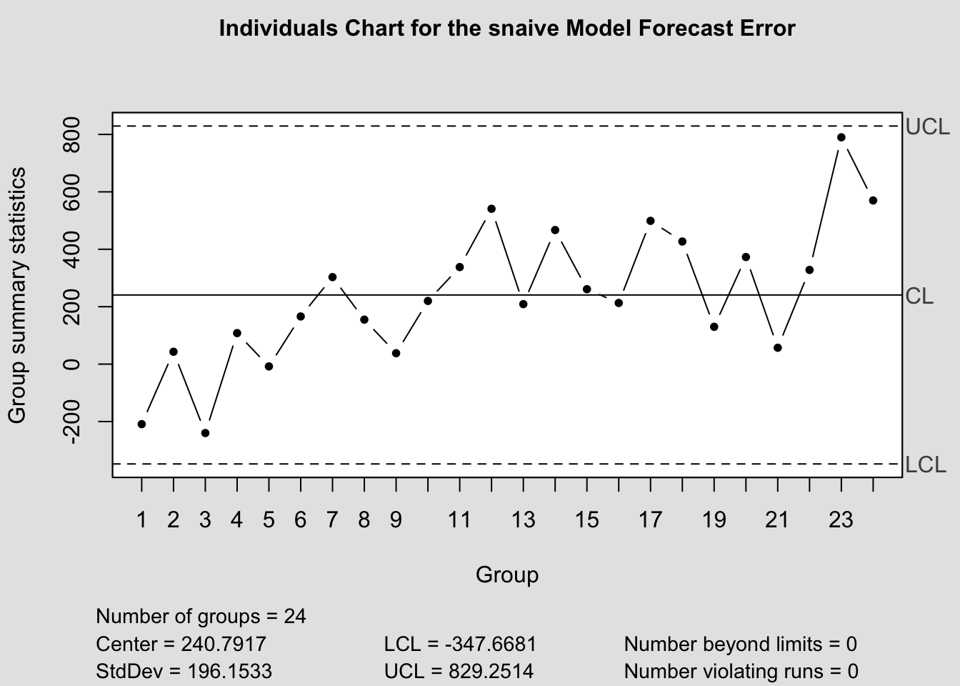
a.) Shewhart Control Charts:
- center line: zero(for unbiased forecast) or ME (\(= \frac{\sum_{1}^{n}e_{t}(1)}{n}\))
- control limits: \(\pm 3\) standard deviations of the center line
Define moving range as the absolute value of the difference between any two successive one-step ahead forecast errors; i.e.
\[ {MR} = \sum_{t=2}^{n} \lvert e_{t}(1) - e_{t-1}(1)\rvert \\ \hat \sigma_{e(1)} = \frac{0.8865{MR}}{n-1} = 0.8865*\sum_{t=2}^{n}\frac{\lvert e_{t}(1) - e_{t-1}(1) \rvert}{n-1} \\ \therefore \hat \sigma_{e(1)} = 0.8865 \bar {MR} \]
Use this to construct upper and lower control limit areas
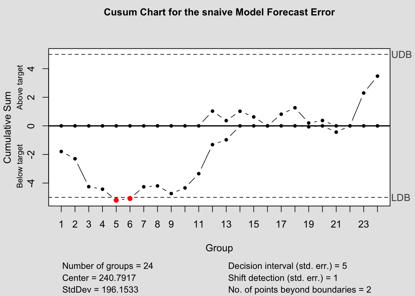
b.) CUSUM: Cumulative Sum Control Chart
- Effective at monitoring “level” changes in the monitored variable
- Set target value, \(T_{0}\) (either zero or ME)
- Upper CUSUM statistic:
- \(C_{t}^{+} = max[0, e_{t}(1) - (T_{0} + K) + C_{t-1}^{+}]\)
- Lower CUSUM statistic:
- \(C_{t}^{-} = min[0, e_{t}(1) - (T_{0} - K) + C_{t-1}^{-}]\)
Here, \(K = 0.5*\sigma_{e(1)}\)
If \(C^{+} \gt 5*\sigma_{e(1)}\) or \(C^{-} \lt -5*\sigma_{e(1)}\)
Note: Can use the MR method to calculate \(\hat \sigma_{e(1)}\)
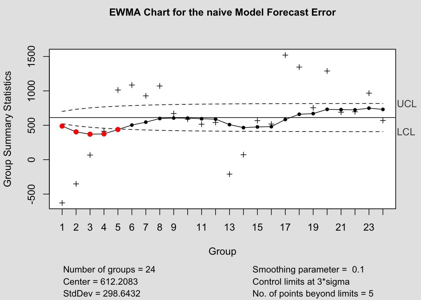
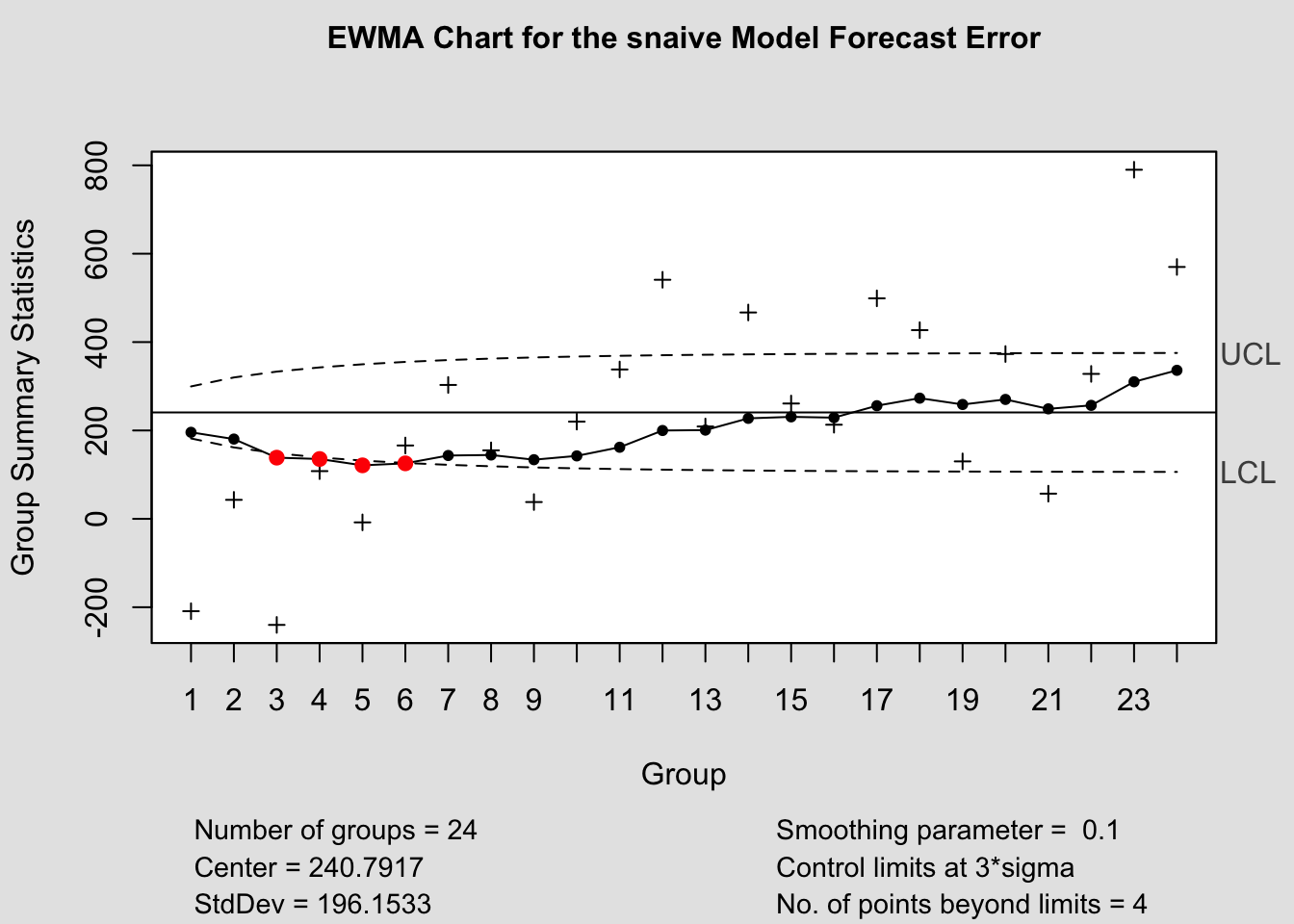
c.) EWMA: Exponentially Weighted Moving Average
\(\bar e_{t}(1) = \lambda e_{t}(1) + (1 - \lambda) \bar e_{t-1}(1); \space 0.05 \lt \lambda \lt 0 \\ \lambda = \text{smoother constant}\)
Note that this is a differential equation!
\(: \text{If } \bar e_{0}(1) = 0\) (or = ME), then:
\[ \bar e_{t}(1) = \lambda e_{t}(1) + (1-\lambda) \bar e_{t-1}(1) \\ = \lambda e_{t}(1) + (1-\lambda)[\lambda e_{t-1}(1) + (1-\lambda) \bar e_{t-2}(1)] \\ \text{substituting recursively ...} \\ = \lambda e_{t}(1) + \lambda(1-\lambda) e_{t-1}(1) + (1-\lambda)^{2} \bar e_{t-2}(1) \]
For n forecast series,
\[ \bar e_{n}(1) = \lambda \sum_{j=0}^{n-1}(1-\lambda)^{j} e_{T-j}(1) + (1-\lambda)^{n} \bar e_{0}(1) \\ \text{Also, } \sigma_{\bar e_{t}(1)} = \sigma_{e(1)} \sqrt{\frac{\lambda}{2-\lambda}[1-(1-\lambda)^{2t}]} \\ \therefore \text{for EWMA, } \\ \text{a.) Center line} = T \\ \text{b.) UCL} = T + 3 \sigma_{\bar e_{t}(1)} \\ \text{c.) LCL} = T - 3 \sigma_{\bar e_{t}(1)} \]
Also see cumulative error tracking signal (CETS) and smoothed error tracking signal (SETS)
2.4 Chapter 2 R-Code
For this example we will use Table B.6 Global Mean Surface Air Temperature Anomaly and Global CO2 Concentration.20 In the code chunk below, I import the data from a .csv file and save it as a tsibble object.
temp <- read_csv("data/SurfaceTemp.csv") |>
  rename(time = Year, temp_anomaly = `Anomaly, C`, co2 = `CO2, ppmv`) |>
  as_tsibble(index = time)
## Rows: 125 Columns: 3
## ── Column specification ───────────────────────────────────────
## Delimiter: ","
## dbl (3): Year, Anomaly, C, CO2, ppmv
##
## ℹ Use `spec()` to retrieve the full column specification for this data.
## ℹ Specify the column types or set `show_col_types = FALSE` to quiet this message.There are two main variables in this data set. The surface air temperature anomaly and global CO2 concentration. There observations are recorded on a yearly basis. In the code chunk below, I create a time plot of each of these variables.
autoplot(temp, temp_anomaly) +
  geom_point(size = 0.25) +
  labs(title = "Yearly Global Surface Air Temperature Anomaly",
       x = "Year",
       y = "Degrees Celsius")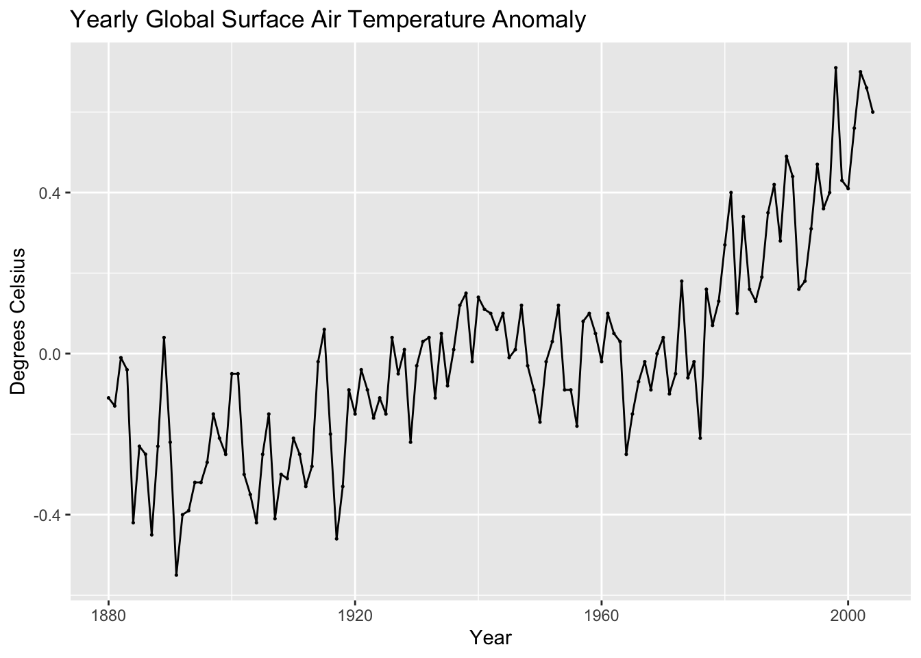
(co2_plot <- autoplot(temp, co2) +
  geom_point(size = 0.25) +
  labs(title = "Yearly Global CO2 Concentration",
       x = "Year",
       y = "Co2"))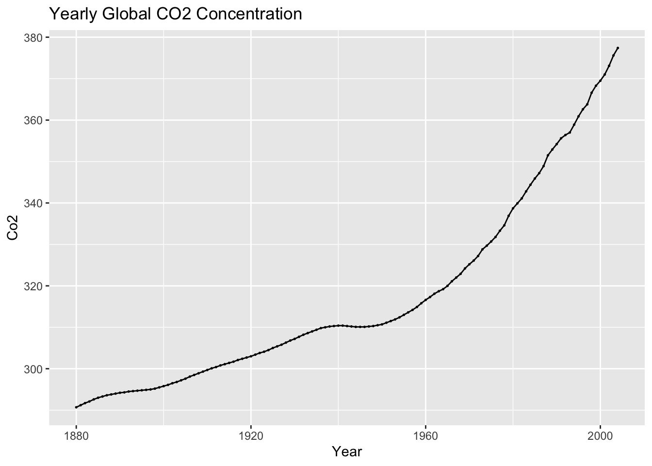
2.4.1 Moving Averages and Moving Medians
To creating moving averages and moving medians we will be using the slider package. slider allows the application of a function to a sliding time window.21 We use the slide_dbl(variable, function, .before = , .after = , .complete = TRUE) function because the data type we are dealing with is a double. .before = and .after = set the number of element before or after the current element to be included in the sliding window. We use .complete = TRUE to indicate that the function should only be evaluated for complete windows (without any missing observations).
In the code chunk below, I create a moving average and moving median with a span of 5 for both the temperature anomaly and atmospheric CO2 variables.
library(slider)
(temp <- temp |> mutate(temp_mov_avg = slide_dbl(temp_anomaly, mean, .before = 2, .after = 2, .complete = TRUE),
                        co2_mov_avg = slide_dbl(co2, mean, .before = 2, .after = 2, .complete = TRUE),
                        temp_mov_med = slide_dbl(temp_anomaly, median, .before = 2, .after = 2, .complete = TRUE),
                        co2_mov_med = slide_dbl(co2, median, .before = 2, .after = 2, .complete = TRUE)))
## # A tsibble: 125 x 7 [1Y]
## time temp_anomaly co2 temp_mov_avg co2_mov_avg temp_mov_med co2_mov_med
## <dbl> <dbl> <dbl> <dbl> <dbl> <dbl> <dbl>
## 1 1880 -0.11 291. NA NA NA NA
## 2 1881 -0.13 291. NA NA NA NA
## 3 1882 -0.01 292. -0.142 292. -0.11 292.
## 4 1883 -0.04 292. -0.166 292. -0.13 292.
## 5 1884 -0.42 293. -0.19 293. -0.23 293.
## 6 1885 -0.23 293 -0.278 293. -0.25 293
## 7 1886 -0.25 293. -0.316 293. -0.25 293.
## 8 1887 -0.45 294. -0.224 294. -0.23 294.
## 9 1888 -0.23 294. -0.222 294. -0.23 294.
## 10 1889 0.04 294 -0.282 294. -0.23 294
## # ℹ 115 more rowsI then graph the moving averages and moving medians against the original data.
temp |>
  select(time, temp_anomaly, temp_mov_avg, temp_mov_med) |>
  rename("Temperature Anomaly (ºC)" = temp_anomaly, "Moving Average" = temp_mov_avg, "Moving Median" = temp_mov_med) |>
  pivot_longer(c(`Temperature Anomaly (ºC)`, `Moving Average`, `Moving Median`), names_to = "Value", values_to = "Temperature (ºC)") |>
  ggplot(aes(x = time, y = `Temperature (ºC)`, color = Value)) +
    geom_point(na.rm = TRUE, size = 0.25) +
    geom_line(na.rm = TRUE, linewidth = 0.25) +
  labs(title = "Yearly Temperaure Anomaly (ºC) Actual Values, Moving Average, and Moving Median", x = "Year")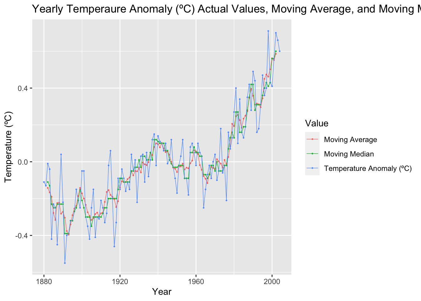
temp |>
  select(time, co2, co2_mov_avg, co2_mov_med) |>
  rename("Global CO2 Concentration" = co2, "Moving Average" = co2_mov_avg, "Moving Median" = co2_mov_med) |>
  pivot_longer(c(`Global CO2 Concentration`, `Moving Average`, `Moving Median`), names_to = "Value", values_to = "Global CO2 Concentration") |>
  ggplot(aes(x = time, y = `Global CO2 Concentration`, color = Value)) +
    geom_point(na.rm = TRUE, size = 0.25) +
    geom_line(na.rm = TRUE, linewidth = 0.25) +
  labs(title = "Yearly Global CO2 Concentration Actual Values and Moving Average", x = "Year")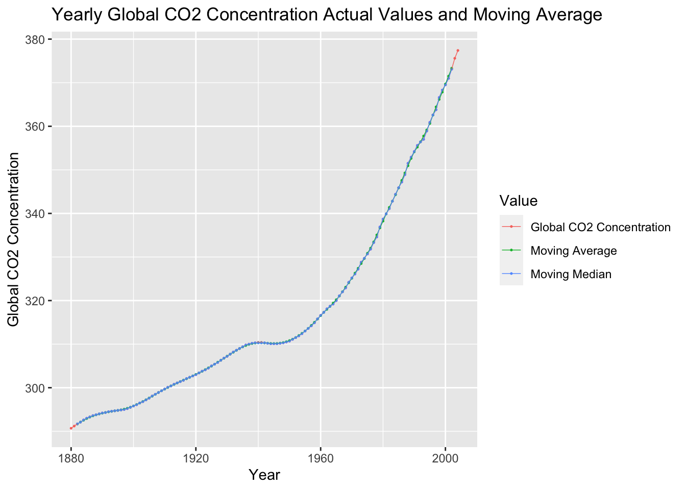
2.4.2 Lag Plots
Lag plots are an effective way to visualize the dimension of the data. This can be done through the gg_lag() function. I find these plots to be most legible when using the parameters geom = "point" and size = 0.25.
temp |>
  gg_lag(temp_anomaly, geom = "point", size = 0.25) +
  labs(x = "lag(Temperature Anomaly, k)",
       y = "Temperature Anomaly, ºC",
       title = "Temperature Anomaly Lag Plot")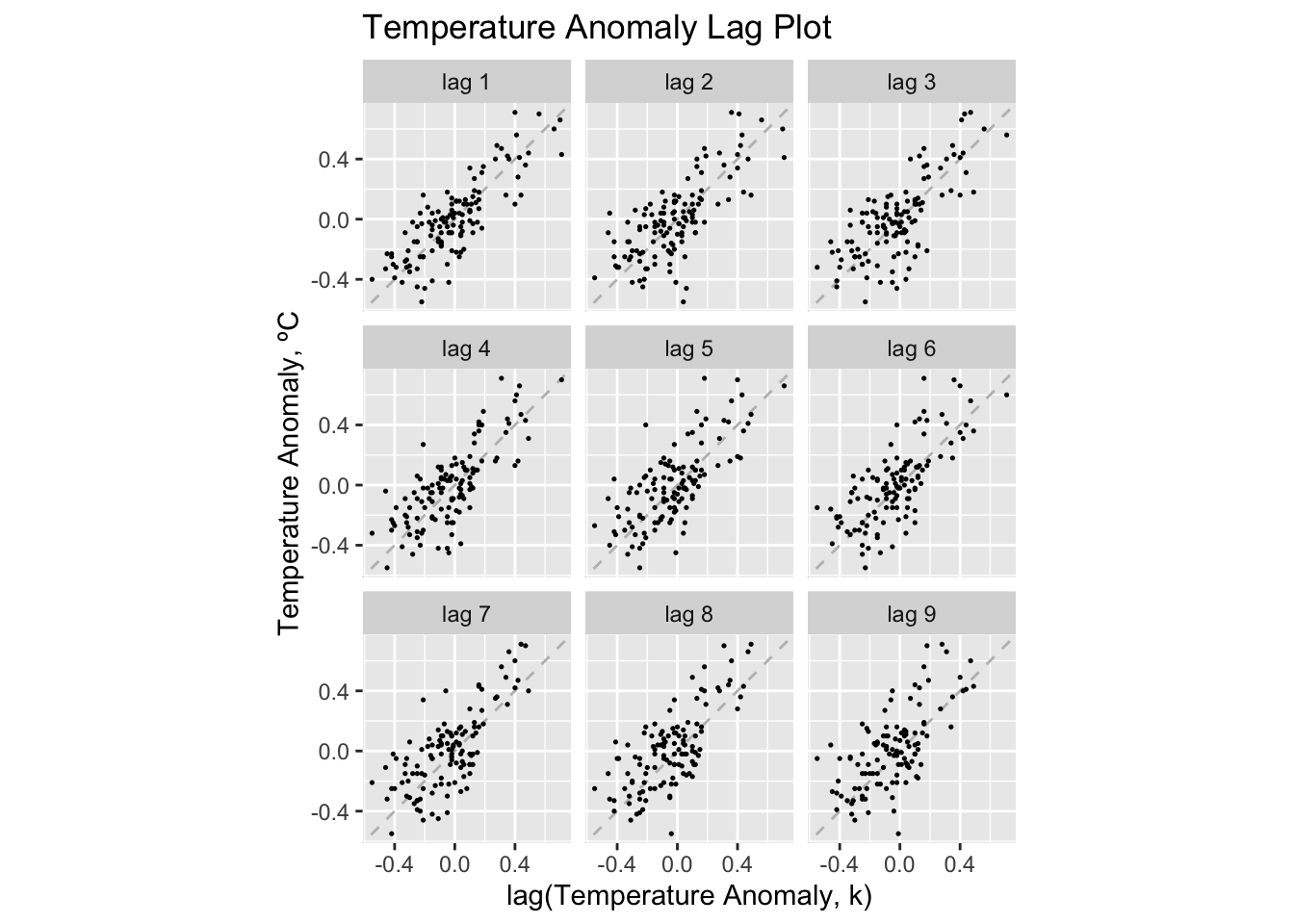
temp |>
  gg_lag(co2, geom = "point", size = 0.25) +
  labs(x = "lag(Atmospheric CO2, k)",
       y = "Atmospheric CO2",
       title = "Atmospheric CO2 Lag Plot")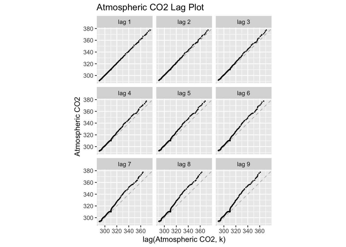
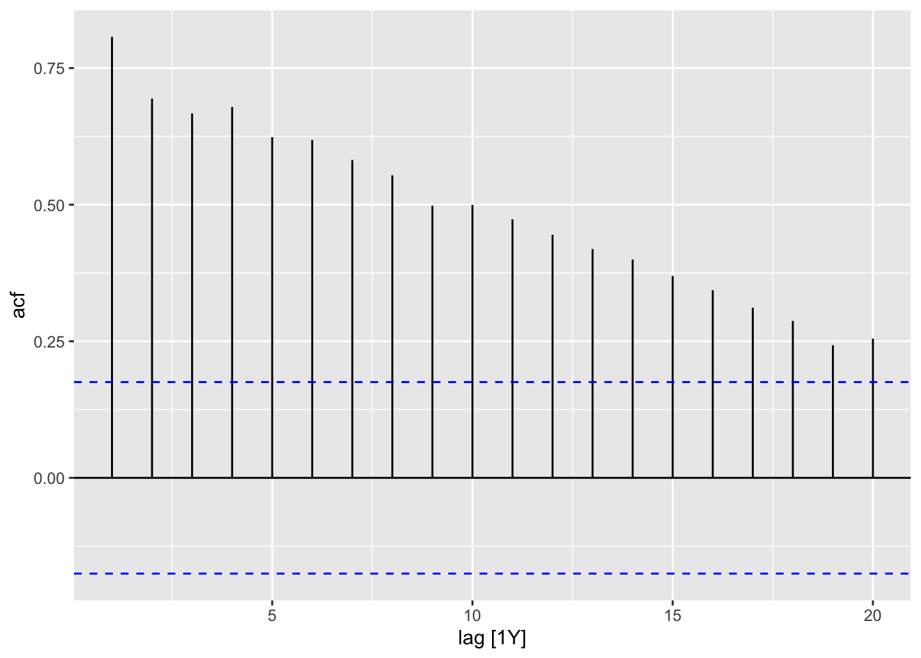
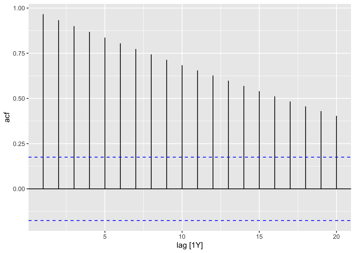
2.4.3 Autocorrelation Function and Plot
In the code chunk below, I demonstrate how to use the ACF(.data, y) function. When applying the autoplot() function to the output of ACF() an ACF plot is generated. I demonstrate this for both the temperature anomaly and atmospheric CO2 variables.
| lag | acf |
|---|---|
| 1Y | 0.8071948 |
| 2Y | 0.6942248 |
| 3Y | 0.6670964 |
| 4Y | 0.6787528 |
| 5Y | 0.6235193 |
| 6Y | 0.6184973 |
| 7Y | 0.5817489 |
| 8Y | 0.5538216 |
| 9Y | 0.4980878 |
| 10Y | 0.4995987 |
| 11Y | 0.4732532 |
| 12Y | 0.4447530 |
| 13Y | 0.4187977 |
| 14Y | 0.3996724 |
| 15Y | 0.3696274 |
| 16Y | 0.3434193 |
| 17Y | 0.3114057 |
| 18Y | 0.2871918 |
| 19Y | 0.2427561 |
| 20Y | 0.2549324 |
| lag | acf |
|---|---|
| 1Y | 0.9660840 |
| 2Y | 0.9325081 |
| 3Y | 0.9000144 |
| 4Y | 0.8682079 |
| 5Y | 0.8365799 |
| 6Y | 0.8048749 |
| 7Y | 0.7735345 |
| 8Y | 0.7435958 |
| 9Y | 0.7135660 |
| 10Y | 0.6839637 |
| 11Y | 0.6550924 |
| 12Y | 0.6268555 |
| 13Y | 0.5981333 |
| 14Y | 0.5690877 |
| 15Y | 0.5402671 |
| 16Y | 0.5115634 |
| 17Y | 0.4831250 |
| 18Y | 0.4561155 |
| 19Y | 0.4297574 |
| 20Y | 0.4037319 |
2.4.4 Data Transformation: Log Transform
To avoid negative values, I will use the CO2 variable for this example. In the code chunk below, I use the mutate function to create a log transformed version of co2 and then plot the transformed data. I use the log() function to transform the data, which when the base = parameter is not specified defaults to the natural log.
I use the grid.arrange() function from the gridExtra package to compare the plot of the original and transformed data side by side.
##
## Attaching package: 'gridExtra'
## The following object is masked from 'package:dplyr':
##
## combinelog_plot <-
temp |> mutate(ln_co2 = log(co2)) |>
autoplot(ln_co2) +
geom_point(size = 0.25) +
labs(title = "Plot of the ln(Atmospheric CO2)", y = "ln(Atmospheric CO2)", x = "Year")
grid.arrange(co2_plot, log_plot, nrow = 1)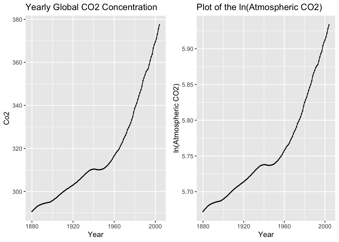
2.4.5 Trend Adjustment
Trend adjustment is meant to simplify the time series to make it easier to model. This will be a recurring topic throughout the course.
2.4.5.1 Linear Trend
The linear model of the data is the same as a simple regression of time on the variable of interest. This simple regression model can be depicted through the following equations:
\[ \hat y = \hat \beta_{0} + \hat \beta_{1} t \\ y = \hat \beta_{0} + \hat \beta_{1}t + \hat \epsilon_{t} \]
There are two methods of producing these models. First, within ggplot there is the geom_smooth() function that produces an line of best fit. This function by default uses LOESS, so to have it generate a linear model, you must set method = "lm", as seen in the example below. This method, while making it easy to visualize a line over existing data, does not provide complete information about the data and is therefore inferior to the second method.
autoplot(temp, temp_anomaly) +
  geom_point(size = 0.25) +
  geom_smooth(method = "lm", linewidth = 0.5) +
  labs(title = "Yearly Global Surface Air Temperature Anomaly", x = "Year", y = "Degrees Celsius")
## `geom_smooth()` using formula = 'y ~ x'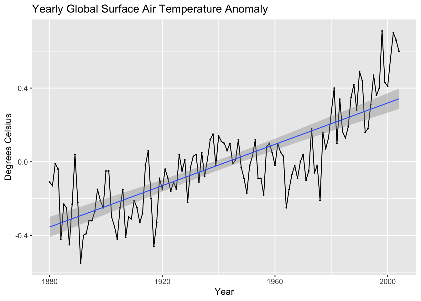
autoplot(temp, co2) +
  geom_point(size = 0.25) +
  geom_smooth(method = "lm", linewidth = 0.5) +
  labs(title = "Yearly Global CO2 Concentration", x = "Year", y = "Co2")
## `geom_smooth()` using formula = 'y ~ x'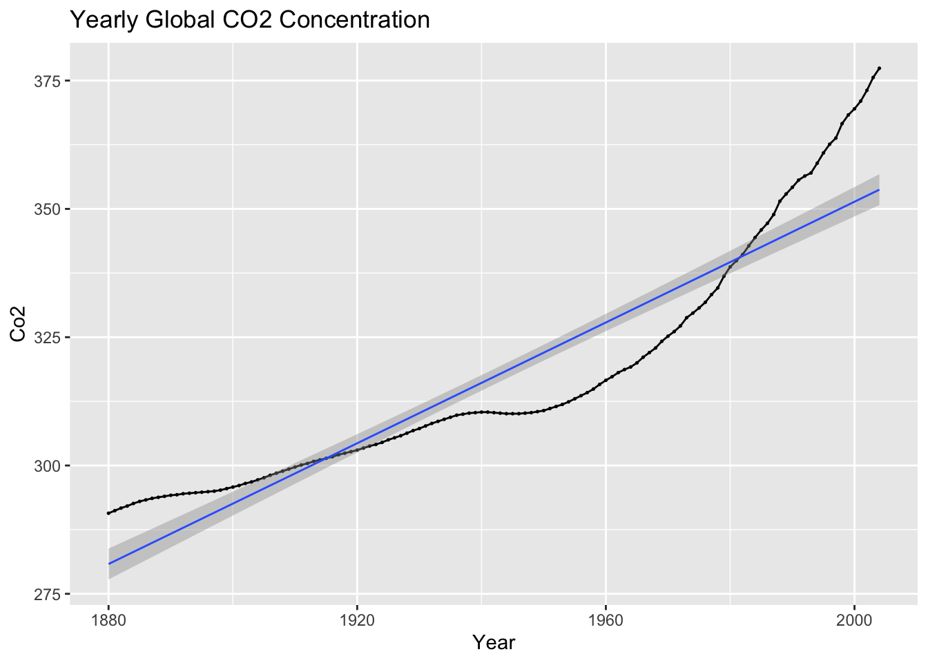
The second method follows the standard modeling procedure when using the methods available through fpp3. The same basic procedure will be used throughout the course for almost any model covered. The example code below shows the basic procedure for generating a model:
data.fit <- data |>
  model(TSLM(var ~ time))
After creating and saving an object containing the model(s), the report() function gives pertinent information about the model, such as coefficients, standard error, p-values, and measures of fit. The model object itself does not provide the fitted value or the residuals. Therefore, instead of graphing the model object itself, you graph the tsibble resulting from augment(data.fit). This will produce a data frame containing all models, the time variable, the original data, the fitted values, the residuals, and the innovation residuals. In the example below, I create a custom plot of the original data and the fitted values together.
## Series: temp_anomaly
## Model: TSLM
##
## Residuals:
##       Min        1Q    Median        3Q       Max
## -0.394506 -0.110917 -0.005503  0.098257  0.402018
##
## Coefficients:
##               Estimate Std. Error t value Pr(>|t|)
## (Intercept) -1.091e+01  7.567e-01  -14.41   <2e-16 ***
## time         5.613e-03  3.896e-04   14.41   <2e-16 ***
## ---
## Signif. codes:  0 '***' 0.001 '**' 0.01 '*' 0.05 '.' 0.1 ' ' 1
##
## Residual standard error: 0.1572 on 123 degrees of freedom
## Multiple R-squared: 0.6279,  Adjusted R-squared: 0.6249
## F-statistic: 207.6 on 1 and 123 DF, p-value: < 2.22e-16## # A tsibble: 125 x 6 [1Y]
## # Key: .model [1]
## .model time temp_anomaly .fitted .resid .innov
## <chr> <dbl> <dbl> <dbl> <dbl> <dbl>
## 1 TSLM(temp_anomaly ~ time) 1880 -0.11 -0.354 0.244 0.244
## 2 TSLM(temp_anomaly ~ time) 1881 -0.13 -0.349 0.219 0.219
## 3 TSLM(temp_anomaly ~ time) 1882 -0.01 -0.343 0.333 0.333
## 4 TSLM(temp_anomaly ~ time) 1883 -0.04 -0.337 0.297 0.297
## 5 TSLM(temp_anomaly ~ time) 1884 -0.42 -0.332 -0.0882 -0.0882
## 6 TSLM(temp_anomaly ~ time) 1885 -0.23 -0.326 0.0962 0.0962
## 7 TSLM(temp_anomaly ~ time) 1886 -0.25 -0.321 0.0706 0.0706
## 8 TSLM(temp_anomaly ~ time) 1887 -0.45 -0.315 -0.135 -0.135
## 9 TSLM(temp_anomaly ~ time) 1888 -0.23 -0.309 0.0794 0.0794
## 10 TSLM(temp_anomaly ~ time) 1889 0.04 -0.304 0.344 0.344
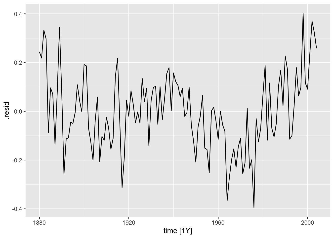
## # ℹ 115 more rowsaugment(temp.fit) |>
ggplot(aes(x = time)) +
geom_line(aes(y = temp_anomaly, color = "Data"), size = 0.25) +
geom_point(aes(y = temp_anomaly, color = "Data"), size = 0.25) +
geom_line(aes(y = .fitted, color = "Fitted"), size = 0.25) +
geom_point(aes(y = .fitted, color = "Fitted"), size = 0.25) +
scale_color_manual(values = c(Data = "black", Fitted = "red")) +
guides(color = guide_legend(title = NULL)) +
labs(y = "Average Amount of Anomaly, ºC", title = "Linear Model of Temperature Change", x = "Year")## Warning: Using `size` aesthetic for lines was deprecated in ggplot2
## 3.4.0.
## ℹ Please use `linewidth` instead.
## This warning is displayed once every 8 hours.
## Call `lifecycle::last_lifecycle_warnings()` to see where this
## warning was generated.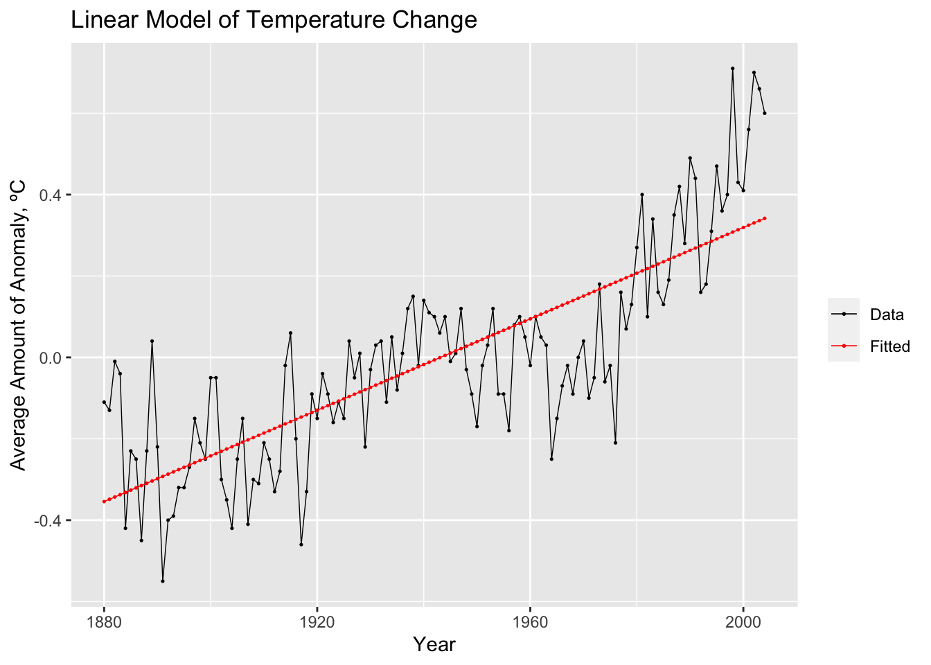
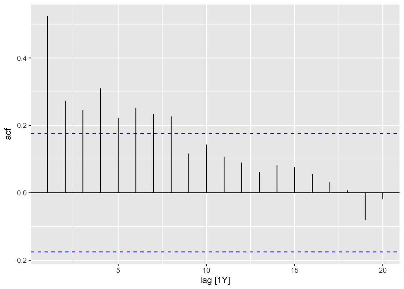
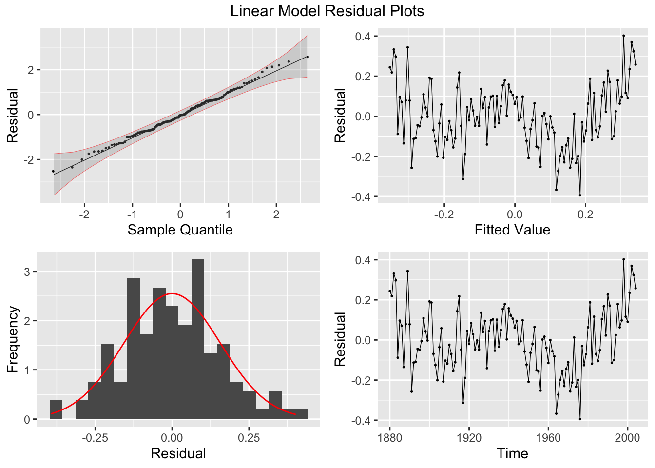
2.4.6 Plotting Residuals
The first step after creating a model is to plot the residuals. In the fable package, the gg_tsresiduals() function, demonstrated below, is used to produce visualizations of the residuals for evaluation. These visualizations are not sufficient for our analysis.
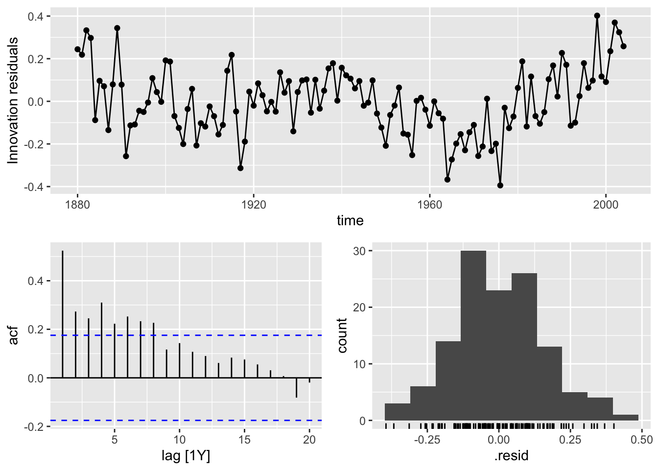
There are five residual plots that we are interested in:
- ACF of the Residuals
- Residual Normality Plot
##
## Attaching package: 'qqplotr'
## The following objects are masked from 'package:ggplot2':
##
## stat_qq_line, StatQqLineaugment(temp.fit) |>
mutate(scaled_res = scale(.resid) |> as.vector()) |>
ggplot(aes(sample = scaled_res)) +
geom_qq(size = 0.25) +
stat_qq_line(linewidth = 0.25) +
stat_qq_band(alpha = 0.3, color = "red") +
labs(x = "Sample Quantile", y = "Residual")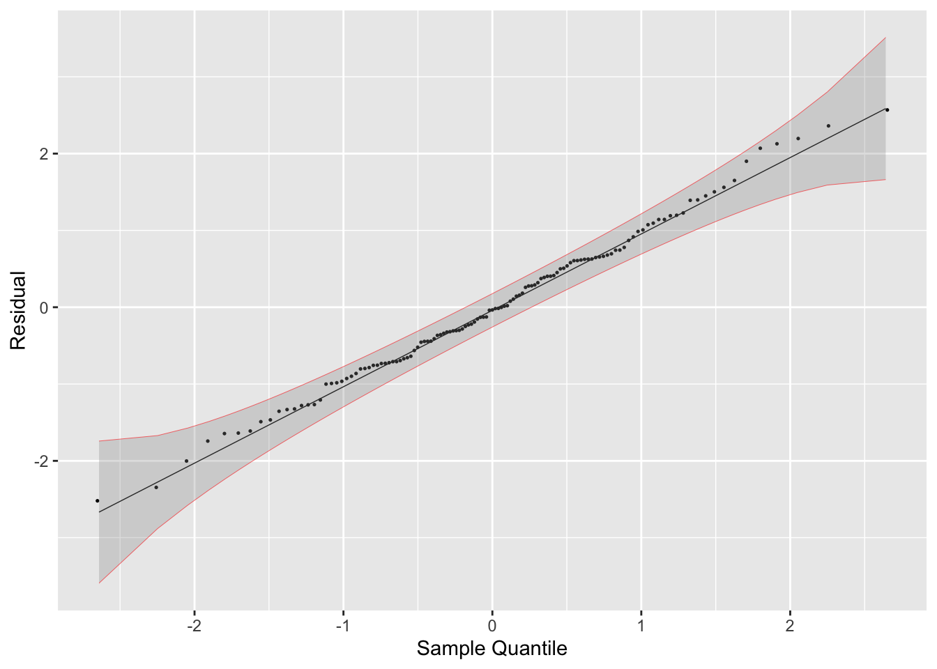
- Residual Histogram
## `stat_bin()` using `bins = 30`. Pick better value with
## `binwidth`.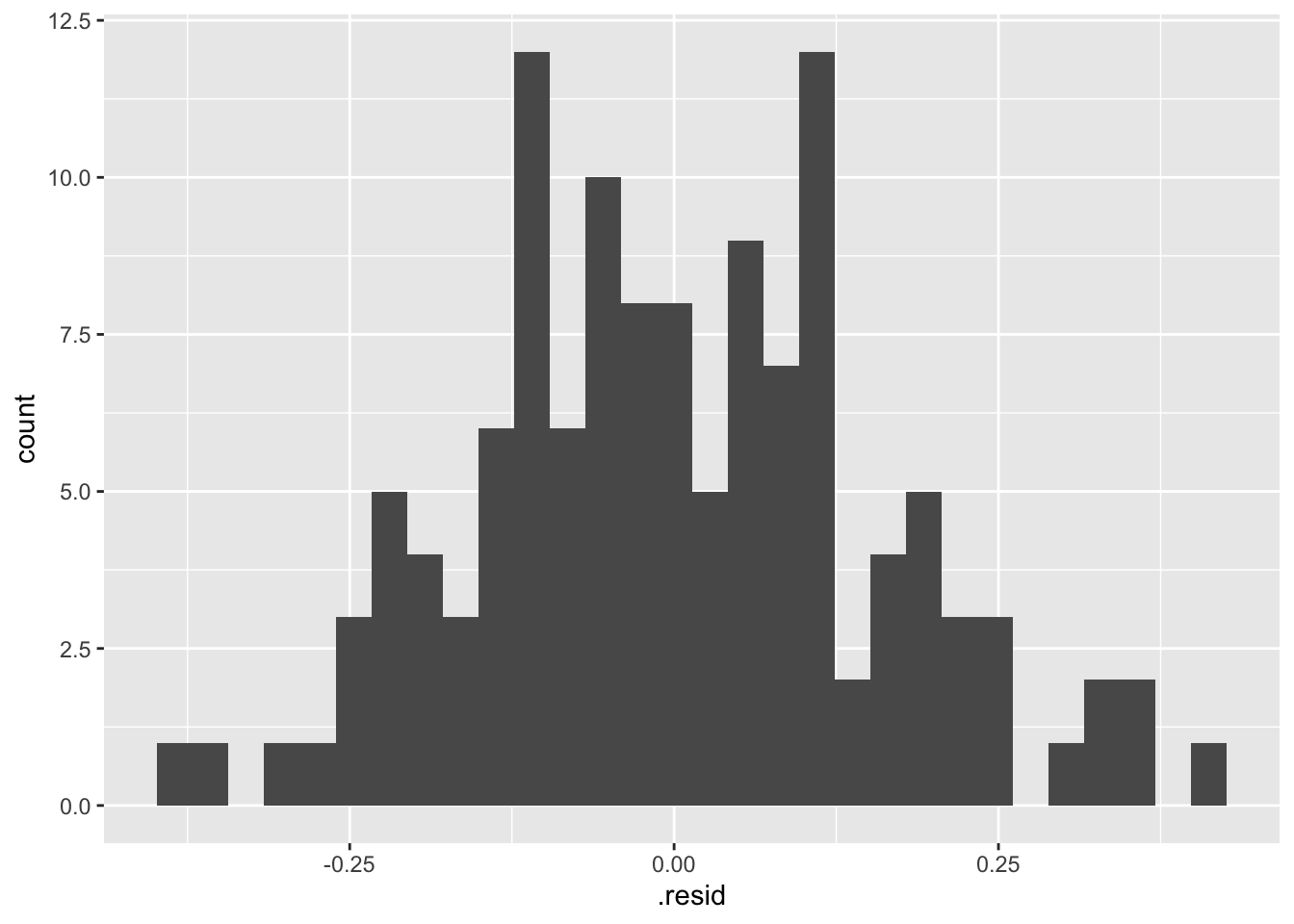
- Residual Plot over Fitted Values

- Residual Plot over Time
When running any model, these plots should be generated to evaluate the model performance. Below, I provide a custom function that generates all these plots from a model object. I use the gridExtra package to arrange all the plots except for the ACF plot in the same visualization. Additionally, I automatically run the Ljung-box test on the residuals, which is covered later in this chapter. Note: make sure the df parameter (an augmented model object) only contains one model at a time. This can be easily done through the filter function.
# required packages
library(qqplotr)
library(gridExtra)
# custom function:
plot_residuals <- function(df, title = ""){
    df <- df |>
    mutate(scaled_res = scale(.resid) |> as.vector())

  lb_test <- df |> features(.resid, ljung_box)
  print(lb_test)

  print(ACF(df, y = .resid, na.action = na.omit) |> autoplot() + labs(title = paste("AFC of", title)))

  plot1 <- df |>
    ggplot(aes(sample = scaled_res)) +
    geom_qq(size = 0.25, na.rm = TRUE) +
    stat_qq_line(linewidth = 0.25, na.rm = TRUE) +
    stat_qq_band(alpha = 0.3, color = "red", na.rm = TRUE) +
    labs(x = "Sample Quantile", y = "Residual")

  plot2 <- df |>
    ggplot(mapping = aes(x = .resid)) +
    geom_histogram(aes(y = after_stat(density)), na.rm = TRUE, bins = 20) +
    stat_function(fun = dnorm, args = list(mean = mean(df$.resid), sd = sd(df$.resid)), color = "red", na.rm = TRUE) +
    labs(y = "Frequency", x = "Residual")

  plot3 <- df |>
    ggplot(mapping = aes(x = .fitted, y = .resid)) +
    geom_point(size = 0.25, na.rm = TRUE) +
    geom_line(linewidth = 0.25, na.rm = TRUE) +
    labs(x = "Fitted Value", y = "Residual")

  plot4 <- df |>
    ggplot(mapping = aes(x = time, y = .resid)) +
    geom_point(size = 0.25, na.rm = TRUE) +
    geom_line(linewidth = 0.25, na.rm = TRUE) +
    labs(x = "Time", y = "Residual")

return(grid.arrange(plot1, plot3, plot2, plot4, top = paste(title, "Residual Plots")))
}
# to use this function you must have this code chunk in your document
Below, I demonstrate how to use the custom plot_residuals() function.
## # A tibble: 1 × 3
##   .model                    lb_stat     lb_pvalue
##   <chr>                       <dbl>         <dbl>
## 1 TSLM(temp_anomaly ~ time)    35.2 0.00000000305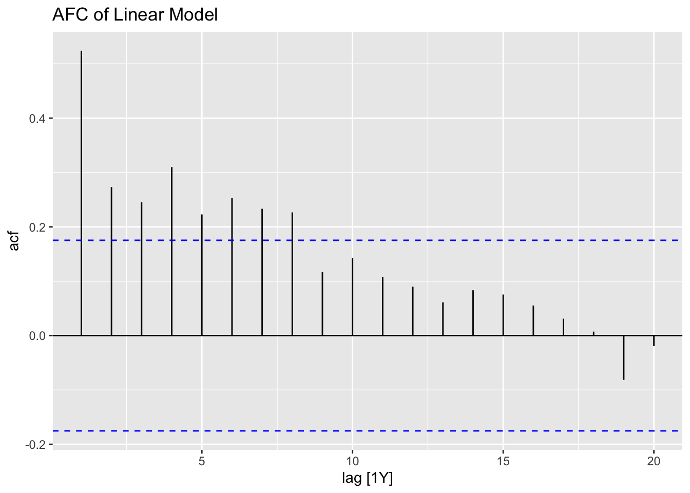
2.4.7 Detrending vs. Differencing
For this section we will use Table B.4: US Production of Blue and Gorgonzola Cheeses.22 In the code chunk below, I read the data into R from a .csv file, create a tsibble object, and plot the time series.
cheese <- read_csv("data/Cheese.csv") |>
  rename(time = Year, prod = `Production, thousand lbs`) |>
  as_tsibble(index = time)
## Rows: 48 Columns: 2
## ── Column specification ───────────────────────────────────────
## Delimiter: ","
## dbl (1): Year
## num (1): Production, thousand lbs
##
## ℹ Use `spec()` to retrieve the full column specification for this data.
## ℹ Specify the column types or set `show_col_types = FALSE` to quiet this message.autoplot(cheese, prod) +
geom_point(size = 0.25) +
labs(title = "Plot of Yearly Blue and Gorgonzola Cheese Production",
y = "Production, thousand lbs",
x = "Year")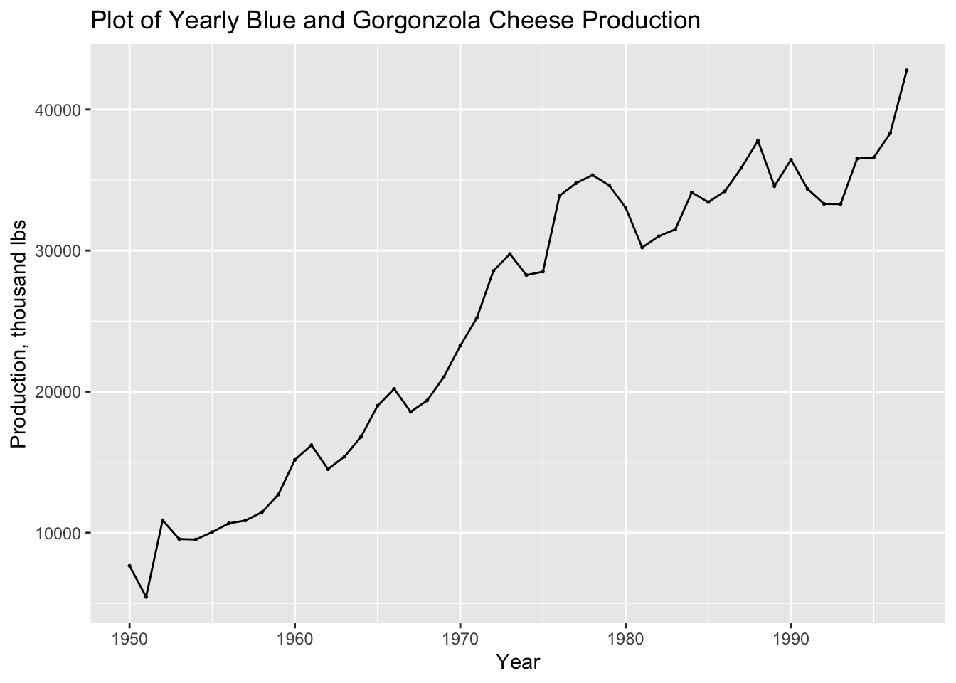
First, I create a linear fit of the cheese data and generate a report, as covered in the previous section.
## Series: prod
## Model: TSLM
##
## Residuals:
##     Min      1Q  Median      3Q     Max
## -5901.1 -1841.1  -374.4  1358.3  7150.1
##
## Coefficients:
##               Estimate Std. Error t value Pr(>|t|)
## (Intercept) -1.402e+06  6.300e+04  -22.25   <2e-16 ***
## time         7.231e+02  3.192e+01   22.65   <2e-16 ***
## ---
## Signif. codes:  0 '***' 0.001 '**' 0.01 '*' 0.05 '.' 0.1 ' ' 1
##
## Residual standard error: 3064 on 46 degrees of freedom
## Multiple R-squared: 0.9177,  Adjusted R-squared: 0.9159
## F-statistic: 513.2 on 1 and 46 DF, p-value: < 2.22e-16
In the code chunk below, I plot the linear model of the cheese data against the original data for visual comparison.
augment(cheese.fit) |>
ggplot(aes(x = time)) +
  geom_line(aes(y = prod, color = "Data"), size = 0.25) +
  geom_point(aes(y = prod, color = "Data"), size = 0.25) +
  geom_line(aes(y = .fitted, color = "Fitted"), size = 0.25) +
  geom_point(aes(y = .fitted, color = "Fitted"), size = 0.25) +
  scale_color_manual(values = c(Data = "black", Fitted = "red")) +
  guides(color = guide_legend(title = NULL)) +
  labs(y = "Cheese Production (thousands lbs)", title = "Linear Model of Yearly Cheese Production", x = "Year")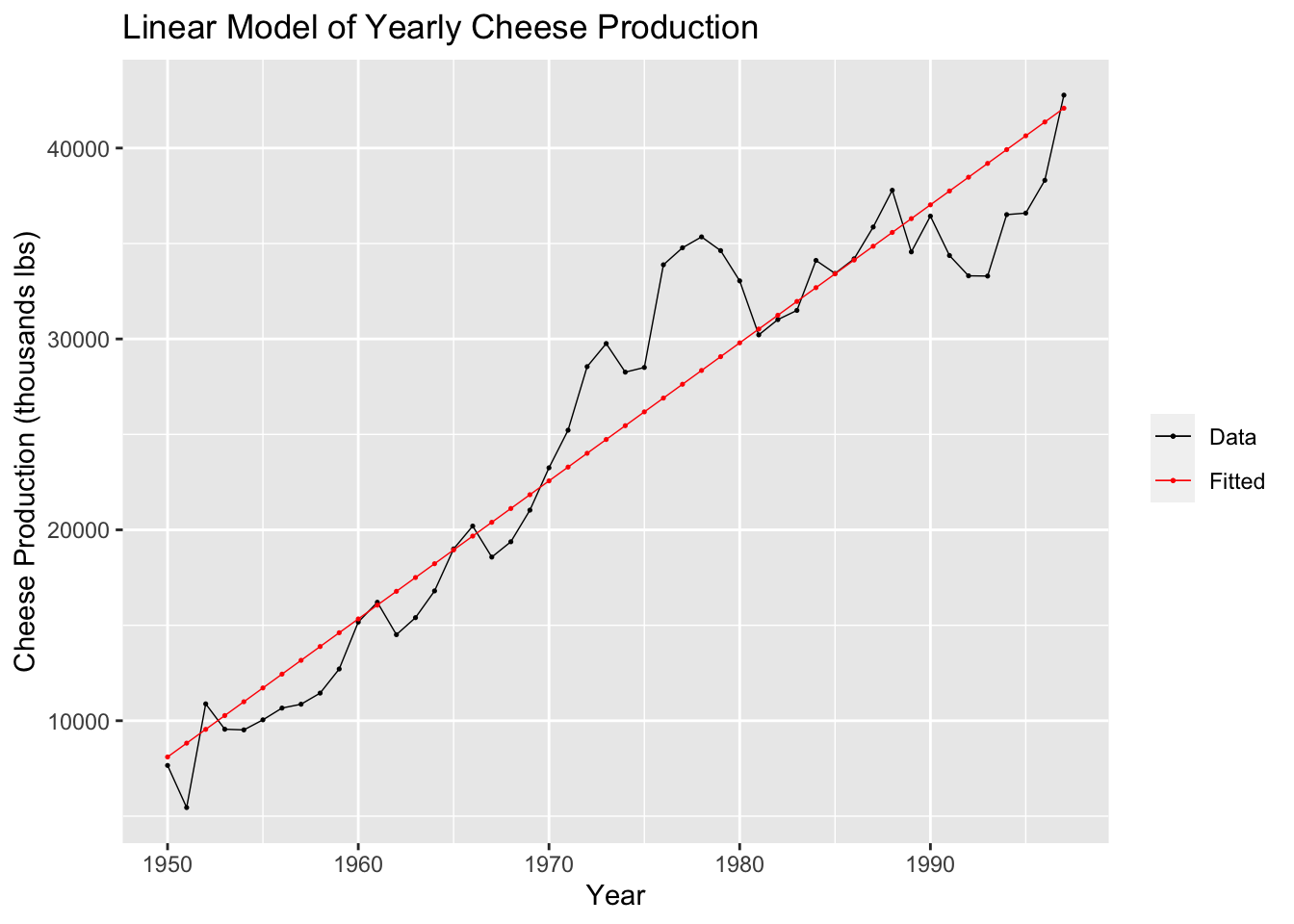
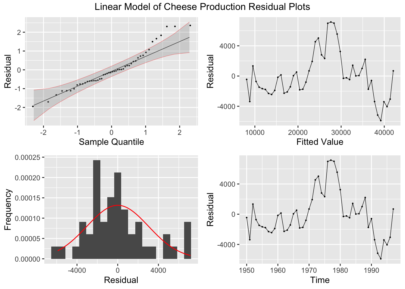
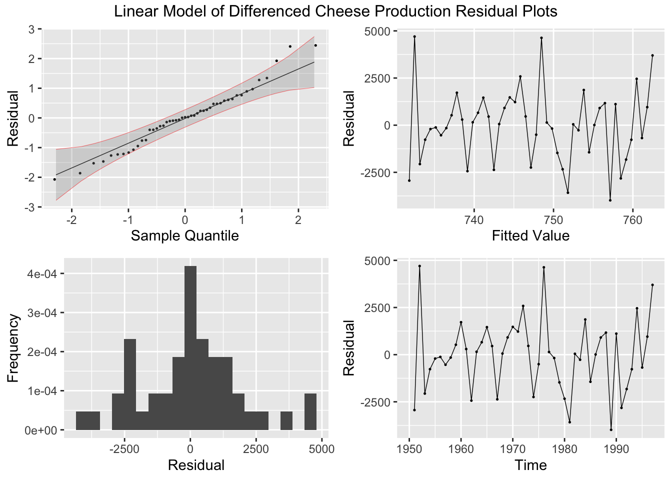
After generating the linear model, I use the plot_residuals() function, discussed above, to generate plots of the residuals for analysis.
## # A tibble: 1 × 3
##   .model lb_stat     lb_pvalue
##   <chr>    <dbl>         <dbl>
## 1 lm        32.9 0.00000000991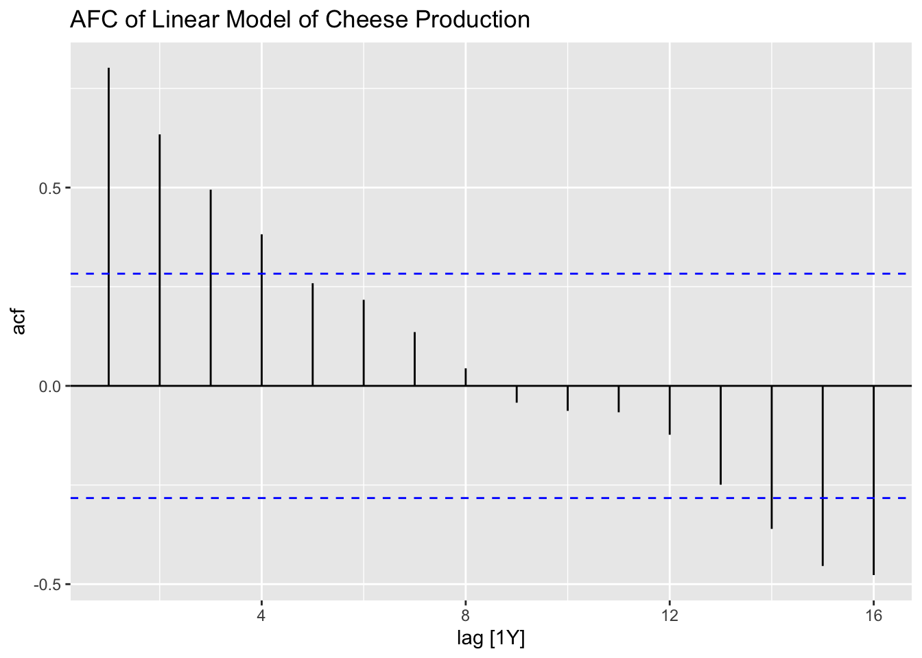
Everything done to this point has been covered before. In the code chunk below, I create a new variable containing the first difference of the cheese production variable and then run a simple linear regression with the first difference of production as the dependent variable instead of the untreated production data. I use the difference() function to find the first difference of the data.
cheese.fit.diff <- cheese |>
  mutate(diff = difference(prod)) |>
  model(lm_diff = TSLM(diff ~ time))

report(cheese.fit.diff)
## Series: diff
## Model: TSLM
##
## Residuals:
## Min 1Q Median 3Q Max
## -3985.14 -1104.14 46.52 1035.69 4699.51
##
## Coefficients:
## Estimate Std. Error t value Pr(>|t|)
## (Intercept) -568.0902 41276.2885 -0.014 0.989
## time 0.6663 20.9095 0.032 0.975
##
## Residual standard error: 1944 on 45 degrees of freedom
## Multiple R-squared: 2.256e-05, Adjusted R-squared: -0.0222
## F-statistic: 0.001015 on 1 and 45 DF, p-value: 0.97472Next, I create a plot containing the differenced data and the model of the differenced data.
augment(cheese.fit.diff) |>
ggplot(aes(x = time)) +
  geom_line(aes(y = diff, color = "Data"), na.rm = TRUE,size = 0.25) +
  geom_point(aes(y = diff, color = "Data"), na.rm = TRUE, size = 0.25) +
  geom_line(aes(y = .fitted, color = "Fitted"), na.rm = TRUE, size = 0.25) +
  geom_point(aes(y = .fitted, color = "Fitted"),na.rm = TRUE,  size = 0.25) +
  scale_color_manual(values = c(Data = "black", Fitted = "red")) +
  guides(color = guide_legend(title = NULL)) +
  labs(y = "Cheese Production, d = 1", title = "Linear Model of Yearly Cheese Production", x = "Year")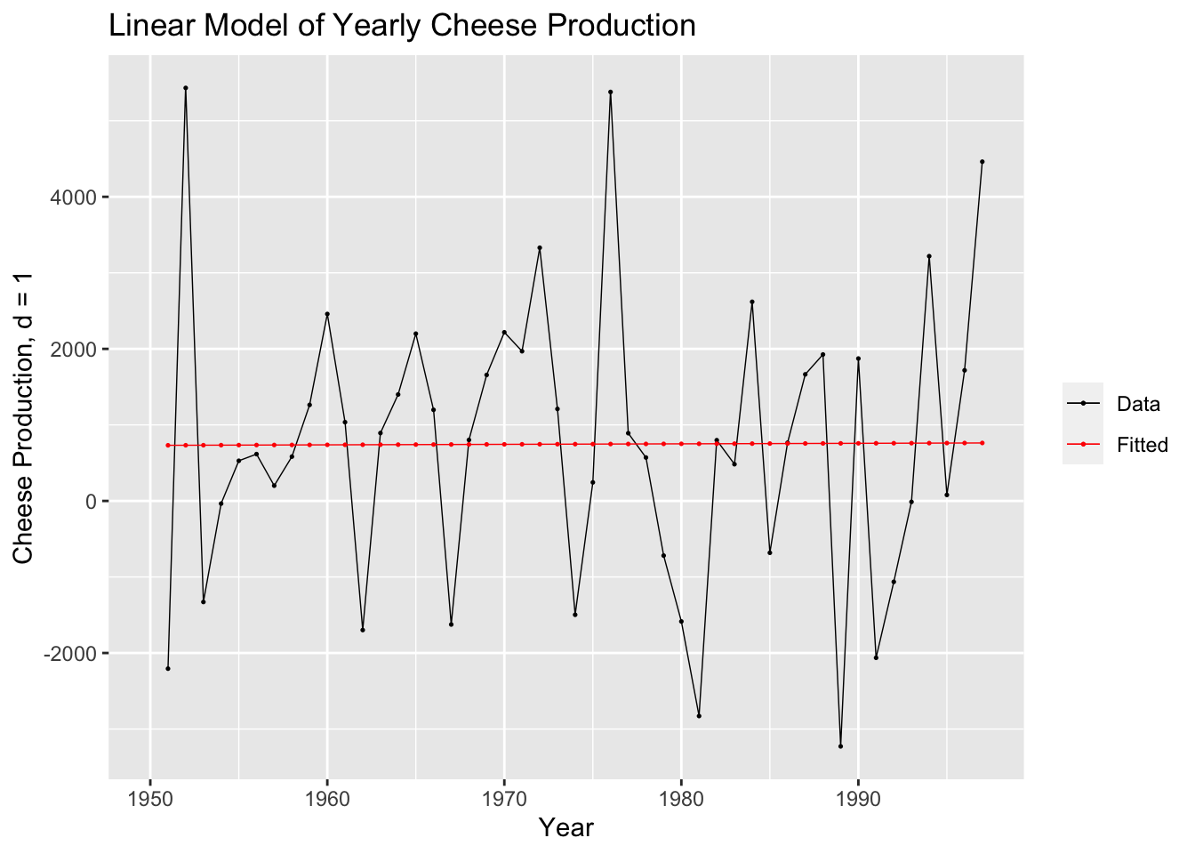
Finally, I create residual plots of the linear model of the differenced data.
## # A tibble: 1 × 3
##   .model  lb_stat lb_pvalue
##   <chr>     <dbl>     <dbl>
## 1 lm_diff   0.229     0.632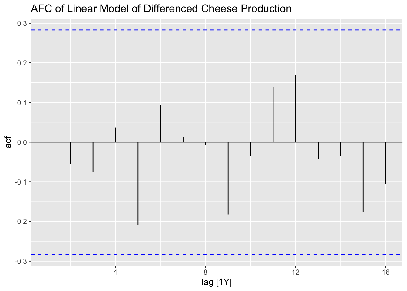
2.4.8 Seasonal Adjustment
For this section we will use data from Table B.5: US Beverage Manufacturer Product Shipment, Unadjusted. In the following code chunk, I import the data from a .csv file, create a tsibble object, and plot the data.
bev <- read_csv("data/Beverage.csv") |>
  mutate(time = yearmonth(Month)) |>
  rename(dollars = `Dollars, in Millions`) |>
  select(time, dollars) |>
  as_tsibble(index = time)
## Rows: 180 Columns: 2
## ── Column specification ───────────────────────────────────────
## Delimiter: ","
## chr (1): Month
## num (1): Dollars, in Millions
##
## ℹ Use `spec()` to retrieve the full column specification for this data.
## ℹ Specify the column types or set `show_col_types = FALSE` to quiet this message.autoplot(bev, dollars) +
geom_point(size = 0.25) +
labs(title = "Plot of Original Beverage Shipments Data", x = "Time", y = "Beverage Shipments, Millions of Dollars")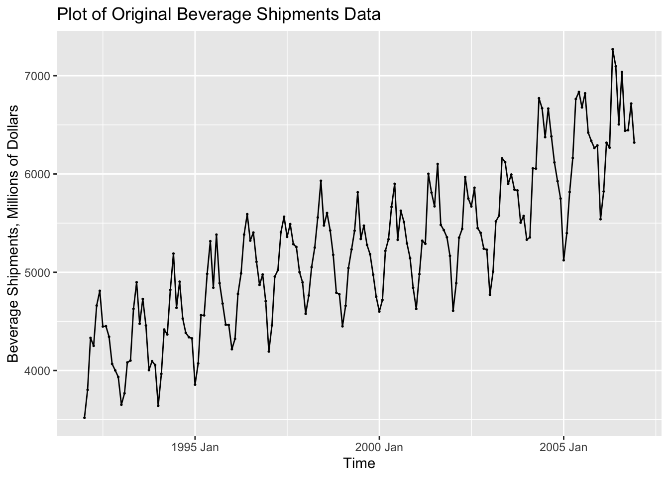
In the code chunk below, I create a new variable containing the seasonally differenced data. I choose the 12th difference because the observations are recorded on a monthly basis. I then plotted the seasonally differenced data. These data no longer has a clear seasonal pattern, as seen in the visualization of the untreated data above. These data do still appear to have a long term trend, which can be seen through the non-constant variance.
bev <- bev |> mutate(sdiff = difference(dollars, 12))

autoplot(bev, sdiff, na.rm=TRUE) +
  geom_point(size = 0.5, na.rm = TRUE) +
  labs(title = "Seasonally Differenced Series", y = "Differenced Dollars, d = 12", x = "Time")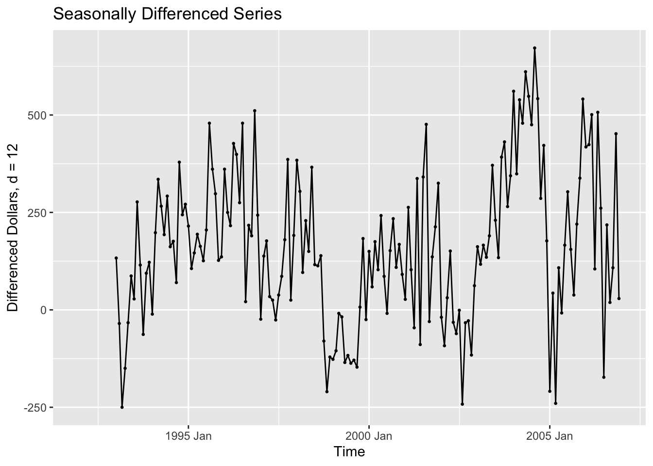
To detrend the data, we then take the seasonally differenced data and take the first difference of it. This is demonstrated in the code chunk below. The resulting plot shows data that does not appear to have any trend and appears to have a constant variance.
bev <- bev |>
  mutate(ddiff = difference(dollars, 12) |> difference())

autoplot(bev, ddiff, na.rm=TRUE) +
  geom_point(size = 0.5, na.rm = TRUE) +
  labs(title = "Doubly Differenced Series", y = "Seasonally and First Differenced Dollars", x = "Time")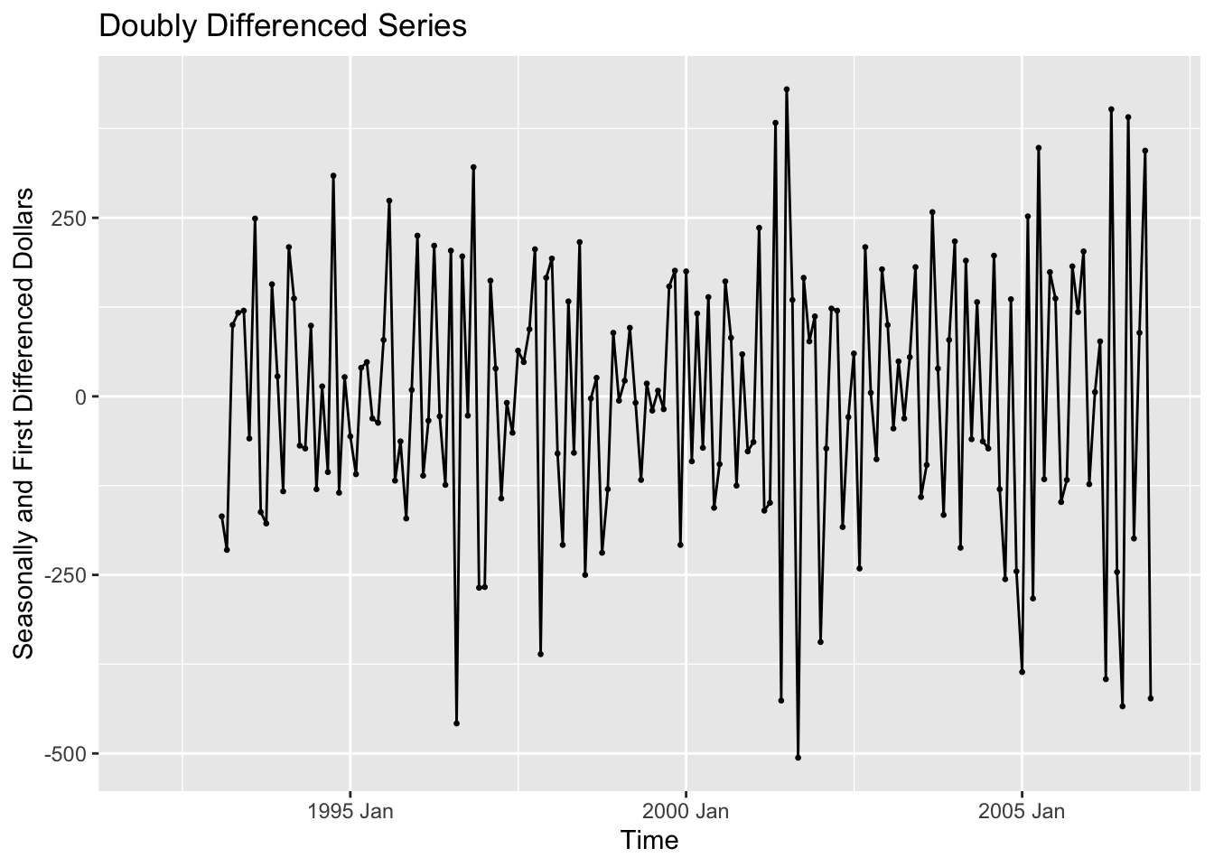
After detrending the data, I then create a linear model of the doubly differenced data and plot the model against the variable of interest.
## Series: ddiff
## Model: TSLM
##
## Residuals:
##      Min       1Q   Median       3Q      Max
## -504.677 -121.959    6.777  135.730  431.252
##
## Coefficients:
##               Estimate Std. Error t value Pr(>|t|)
## (Intercept)  11.973635 108.020906   0.111    0.912
## time         -0.001150   0.009772  -0.118    0.906
##
## Residual standard error: 185.3 on 165 degrees of freedom
## Multiple R-squared: 8.388e-05,   Adjusted R-squared: -0.005976
## F-statistic: 0.01384 on 1 and 165 DF, p-value: 0.90649augment(bev.fit) |>
ggplot(aes(x = time)) +
geom_line(aes(y = ddiff, color = "Data"), na.rm=TRUE, size = 0.25) +
geom_point(aes(y = ddiff, color = "Data"), na.rm=TRUE, size = 0.25) +
geom_line(aes(y = .fitted, color = "Fitted"), na.rm=TRUE, size = 0.25) +
geom_point(aes(y = .fitted, color = "Fitted"), na.rm=TRUE, size = 0.25) +
scale_color_manual(values = c(Data = "black", Fitted = "red")) +
guides(color = guide_legend(title = NULL)) +
labs(y = "Beverage Production", title = "Seasonal and First Differenced Beverage Production", x = "Time")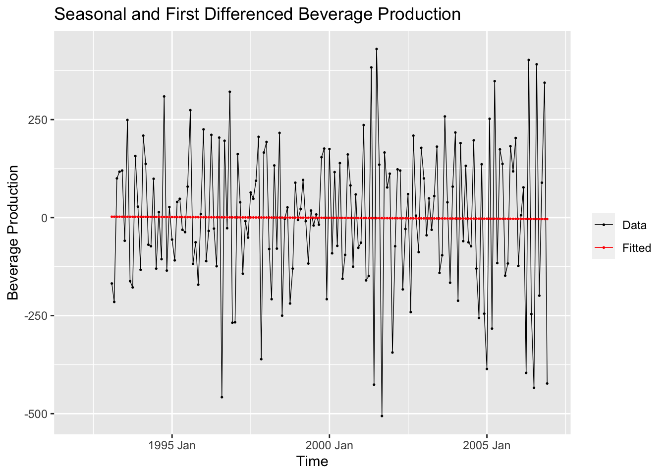
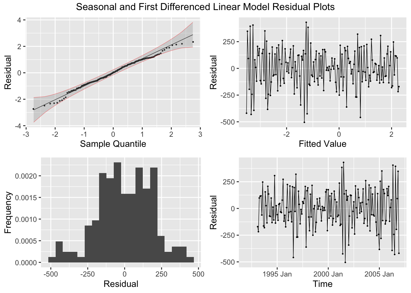
As always, when generating a model I must create the appropriate residual plots or analysis.
## # A tibble: 1 × 3
##   .model             lb_stat   lb_pvalue
##   <chr>                <dbl>       <dbl>
## 1 TSLM(ddiff ~ time)    28.1 0.000000114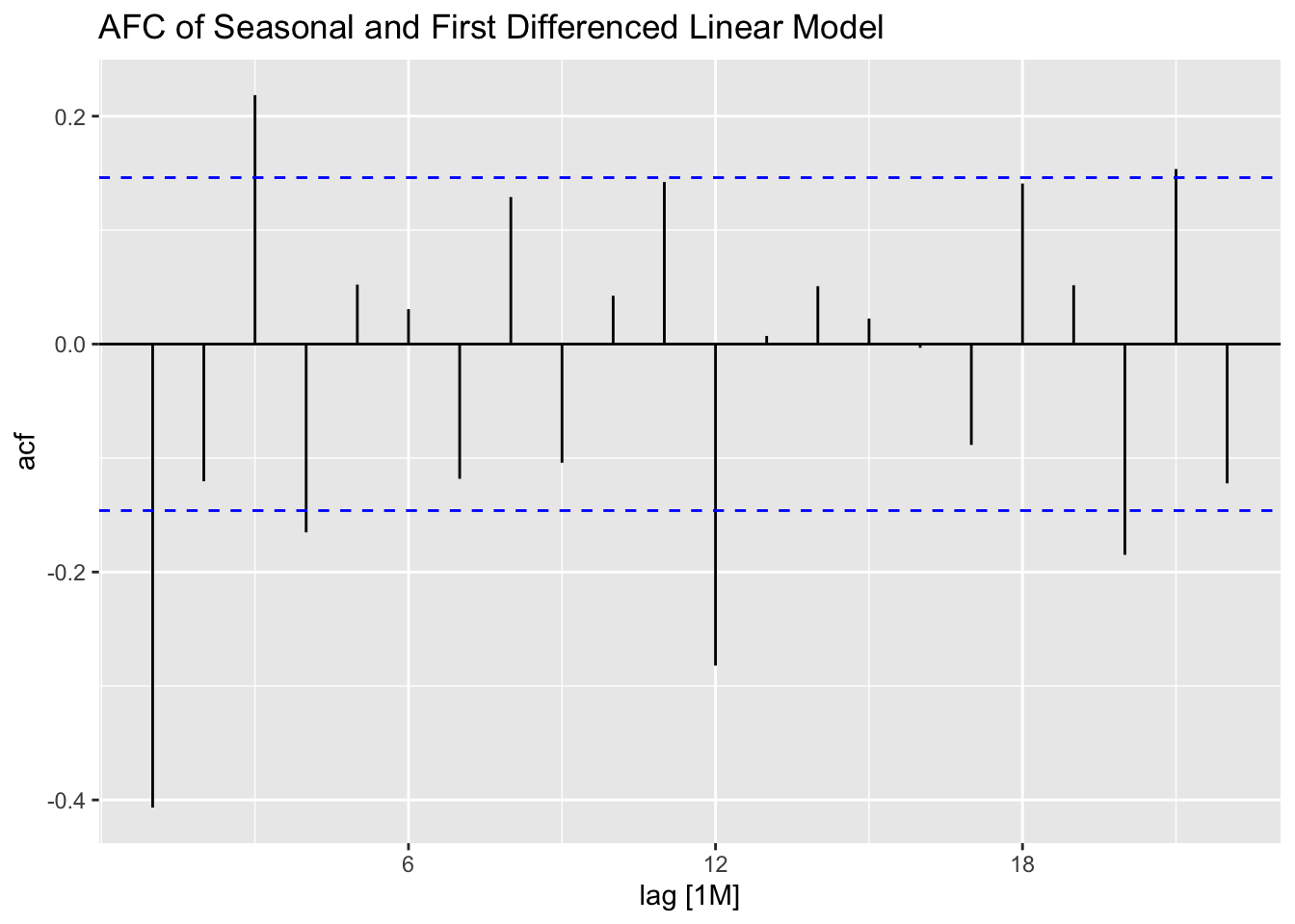
2.4.9 Time Series Decomposition
This sections covers different methods of decomposition. Decomposition is a useful way statistically analyzing the components of your data.
2.4.9.1 Additive Decomposition
bev |>
  model(classical_decomposition(dollars, type = "additive")) |>
  components() |>
  autoplot(na.rm=TRUE)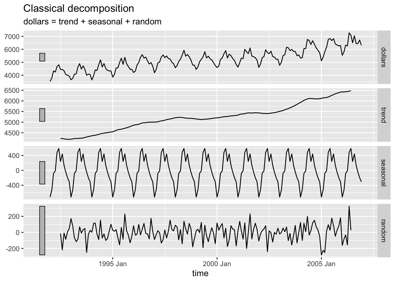
2.4.9.2 Multiplicative Decomposition
bev |>
  model(classical_decomposition(dollars, type = "multiplicative")) |>
  components() |>
  autoplot(na.rm=TRUE)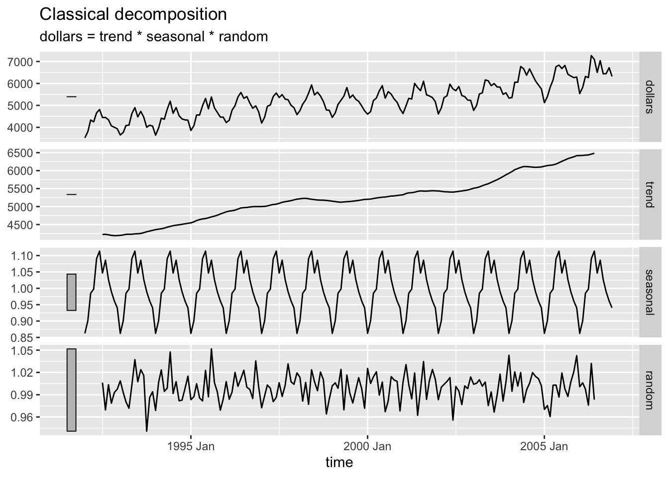
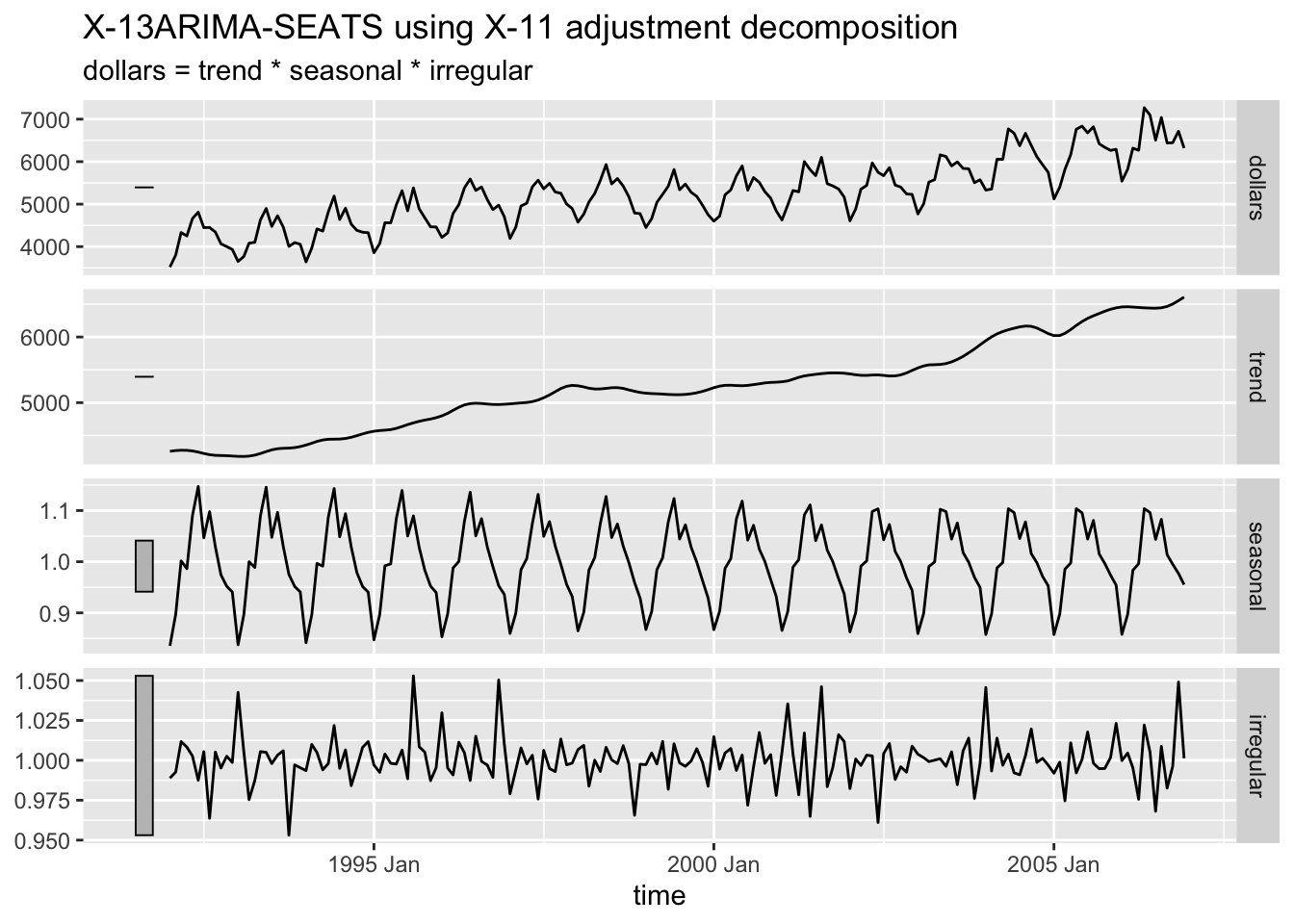
2.4.9.3 X-11 Decomposition
The X-11 decomposition method was originally developed by the U.S. Census Bureau and then further expanded upon by Statistics Canada.23 It is similar to classical decomposition but with trend cycle estimates being available for all observations including end points and the seasonal component being able to vary slowly over time.24
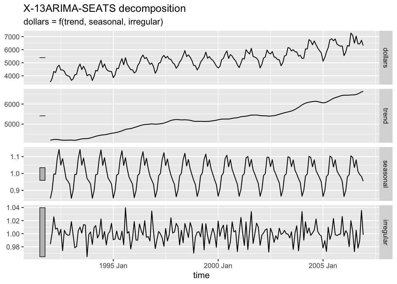
2.4.9.4 SEATS Decompostion
Seasonal Extraction in ARIMA Time Series (SEATS) is a procedure developed by the Bank of Spain which is now widely used by governments around the world.25
2.4.10 Training and Test Sets
When creating forecasts for the future, it is important to be able to evaluate forecasts against actual data. The only way to do this is to create a training set and a test set. The test set can also be called the holdout sample.26
To subset data, we use filtering functions. There are three main functions that can be used to create the training and test set: filter(), filter_index(), and slice().
filter() is part of the dplyr package and must be used carefully with time variables. Often, it is useful to lubridate functions, such as month() or year() to focus on a certain aspect of the time variable. In the code chunk below, I use the year function to separate all but the last two years of the beverage data into a training set.
## # A tsibble: 156 x 4 [1M]
##        time dollars sdiff ddiff
##       <mth>   <dbl> <dbl> <dbl>
##  1 1992 Jan    3519    NA    NA
##  2 1992 Feb    3803    NA    NA
##  3 1992 Mar    4332    NA    NA
##  4 1992 Apr    4251    NA    NA
##  5 1992 May    4661    NA    NA
##  6 1992 Jun    4811    NA    NA
##  7 1992 Jul    4448    NA    NA
##  8 1992 Aug    4451    NA    NA
##  9 1992 Sep    4343    NA    NA
## 10 1992 Oct    4067    NA    NA
## # ℹ 146 more rows
filter_index() is included with the tsibble package and can be used with a string. This is demonstrated in the code chunk below.
## # A tsibble: 156 x 4 [1M]
##        time dollars sdiff ddiff
##       <mth>   <dbl> <dbl> <dbl>
##  1 1992 Jan    3519    NA    NA
##  2 1992 Feb    3803    NA    NA
##  3 1992 Mar    4332    NA    NA
##  4 1992 Apr    4251    NA    NA
##  5 1992 May    4661    NA    NA
##  6 1992 Jun    4811    NA    NA
##  7 1992 Jul    4448    NA    NA
##  8 1992 Aug    4451    NA    NA
##  9 1992 Sep    4343    NA    NA
## 10 1992 Oct    4067    NA    NA
## # ℹ 146 more rows
slice() allows the subsetting of the data by index instead of by time period. This is demonstrated in the code chunk below.
## # A tsibble: 156 x 4 [1M]
##        time dollars sdiff ddiff
##       <mth>   <dbl> <dbl> <dbl>
##  1 1992 Jan    3519    NA    NA
##  2 1992 Feb    3803    NA    NA
##  3 1992 Mar    4332    NA    NA
##  4 1992 Apr    4251    NA    NA
##  5 1992 May    4661    NA    NA
##  6 1992 Jun    4811    NA    NA
##  7 1992 Jul    4448    NA    NA
##  8 1992 Aug    4451    NA    NA
##  9 1992 Sep    4343    NA    NA
## 10 1992 Oct    4067    NA    NA
## # ℹ 146 more rows
2.4.11 Forecast Model Evaluation
For this section we will be using three simple forecasting models:27
- mean method
- all forecasts are equal to the mean of the historical data
- use the
MEAN()function
- a naive forecasting method
- this method sets all forecasts equal to the last observation
- use the
NAIVE()function
- the seasonal naive method
- the forecast is equal to the last observed value from the same season
- use the
SNAIVE()function
- the drift method
- the amount of change over time (called the drift) is set to be the average change seen in the historical data
- the forecast \(T+h\) is given by \(\hat y_{T+h|T}= y_{T} + \frac{h}{T-1} \sum^{T}_{t=2} (y_{t}-y_{t-1}) = y_{T}+h(\frac{y_{T}-y_{1}}{T-1})\)
- use the
NAIVE(var ~ drift())function
In the code chunk below, I demonstrate the code for each of the models discussed above within the same model object, allowing them all to be saved together and plotted together. This can only be done if the models have the same dependent variable and allows the models to be easily analyzed in context with each other.
bev.fit2 <- bev.train |>
  model(mean = MEAN(dollars),
        naive = NAIVE(dollars),
        snaive = SNAIVE(dollars),
        drift = NAIVE(dollars ~ drift()))
report(bev.fit2 |> select(mean))
## Series: dollars
## Model: MEAN
##
## Mean: 5065.8077
## sigma^2: 443595.7563## Series: dollars
## Model: NAIVE
##
## sigma^2: 95468.7078## Series: dollars
## Model: SNAIVE
##
## sigma^2: 35732.0909## Series: dollars
## Model: RW w/ drift
##
## Drift: 14.3935 (se: 24.8179)
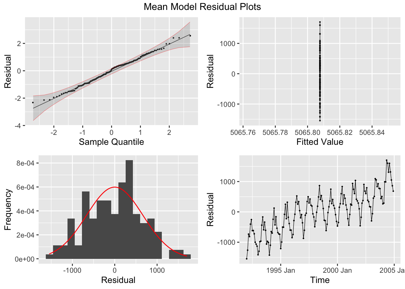
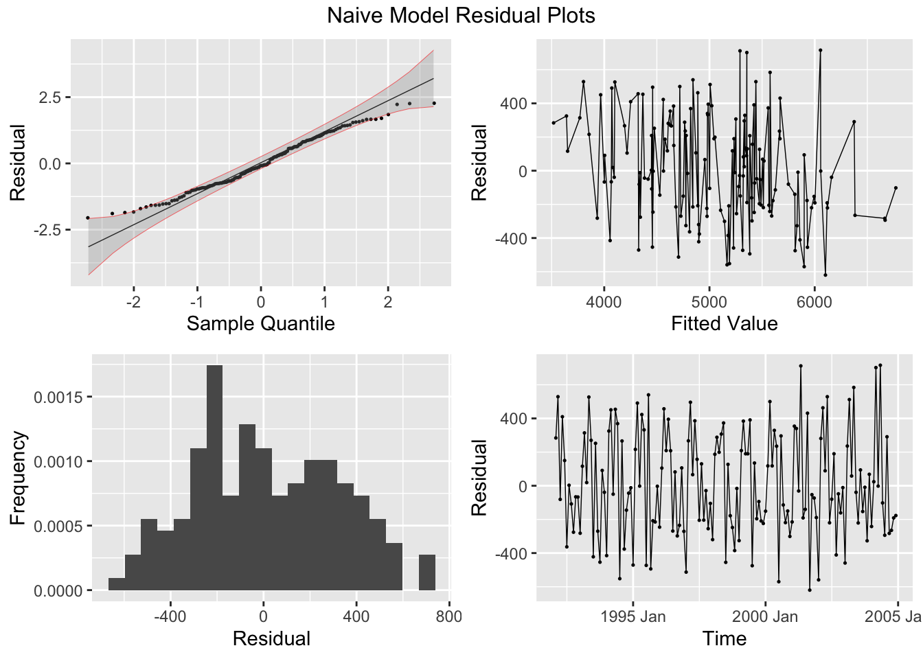
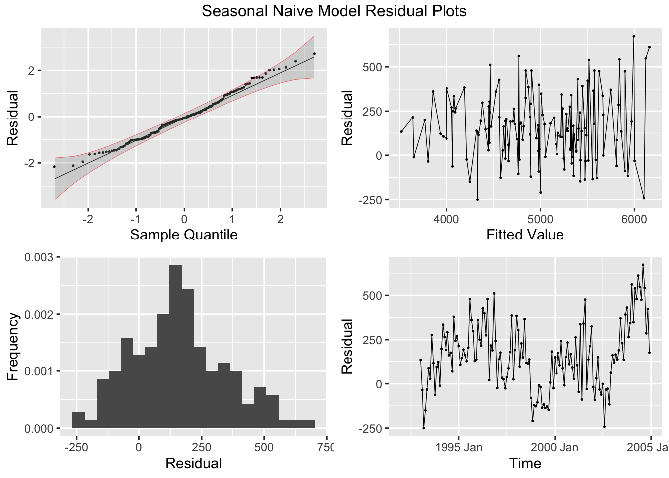
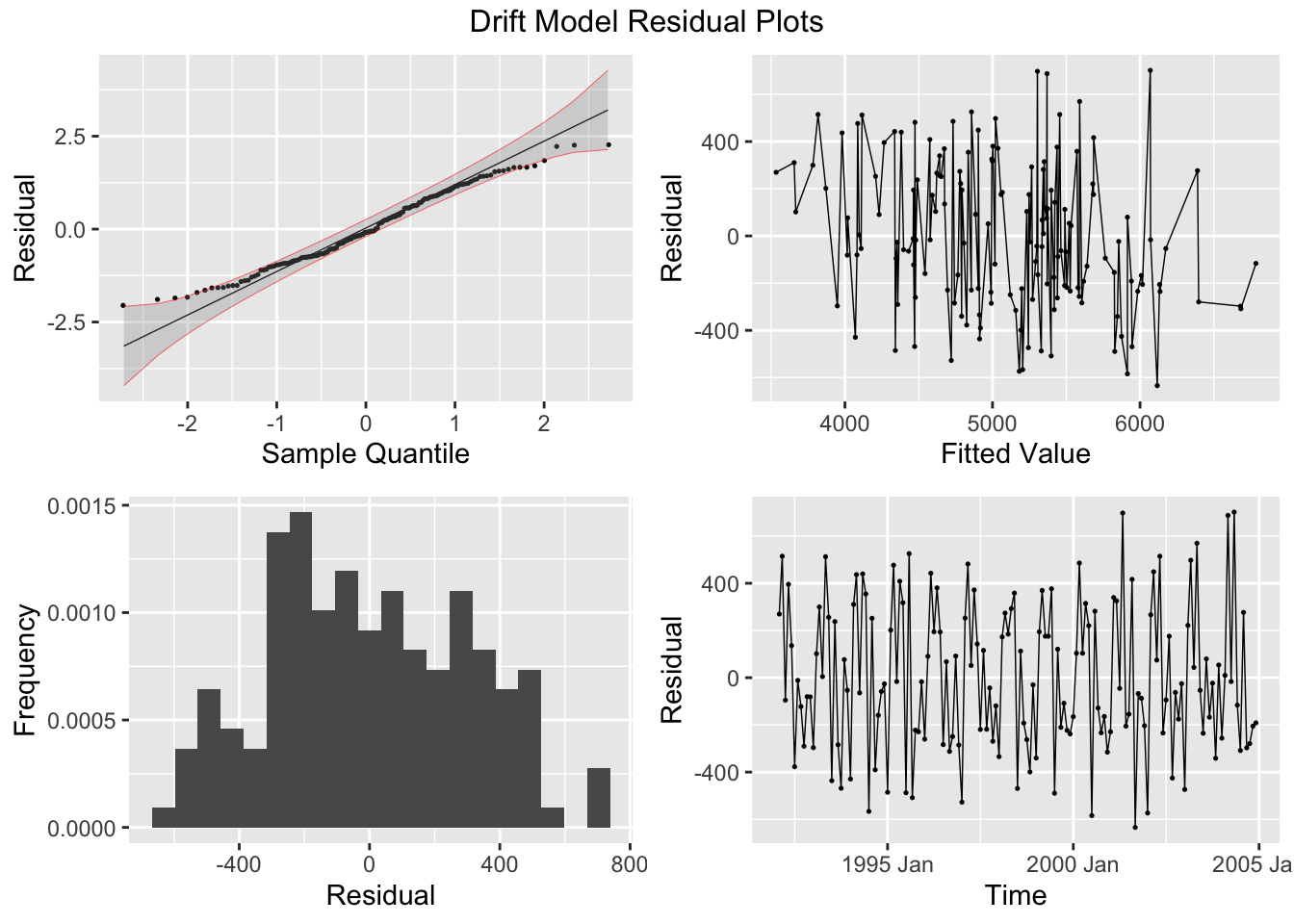
## sigma^2: 95468.7078The plot_residuals() function, given above cannot handle more than one model, so make sure to filter the augmented model object when using this function. This is demonstrated below.
## # A tibble: 1 × 3
##   .model lb_stat lb_pvalue
##   <chr>    <dbl>     <dbl>
## 1 mean      121.         0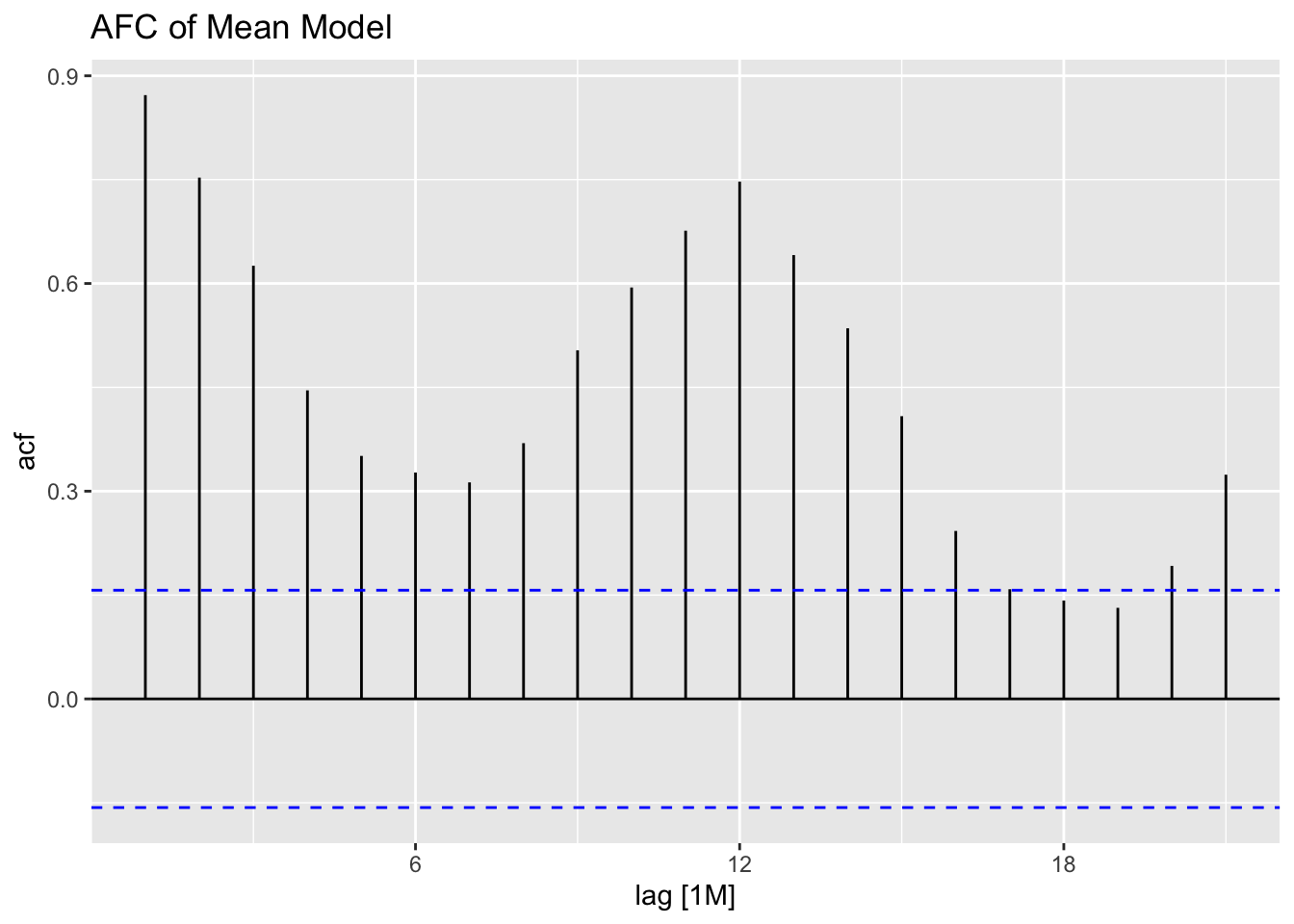
## # A tibble: 1 × 3
##   .model lb_stat lb_pvalue
##   <chr>    <dbl>     <dbl>
## 1 naive   0.0721     0.788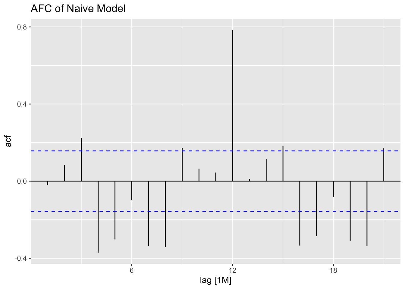
## # A tibble: 1 × 3
##   .model lb_stat lb_pvalue
##   <chr>    <dbl>     <dbl>
## 1 snaive    54.8  1.34e-13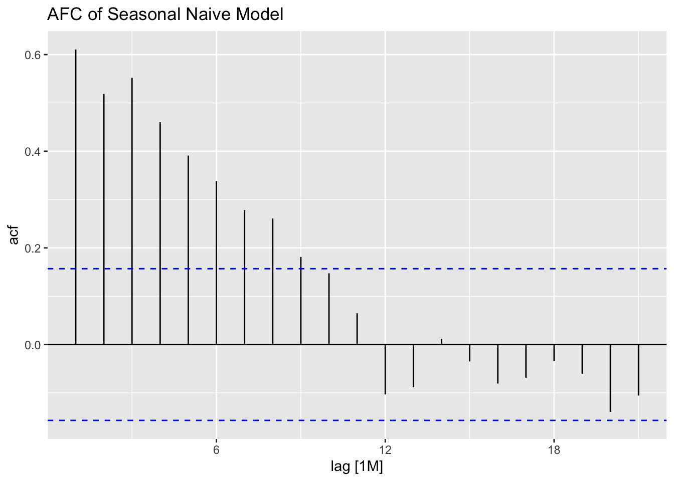
## # A tibble: 1 × 3
##   .model lb_stat lb_pvalue
##   <chr>    <dbl>     <dbl>
## 1 drift   0.0721     0.788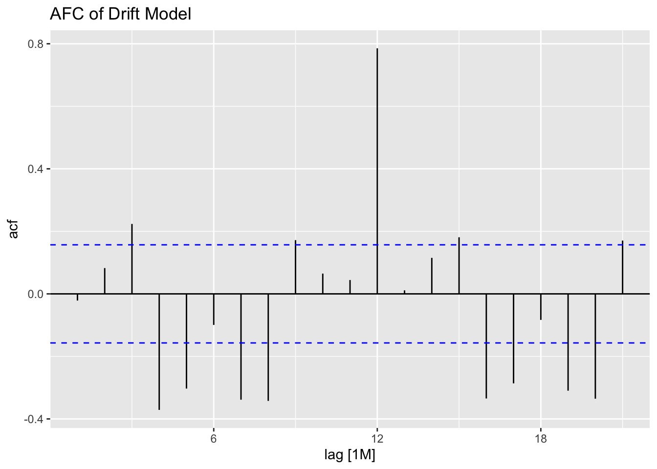
To generate forecasts I use the forecast() function. I provide the withheld observations in the new_data = parameter. To instead just generate forecasts h periods ahead, use the h = parameter.
bev.fc <- bev.fit2 |> forecast(new_data = bev |> filter(year(time) > 2004))

autoplot(bev |> filter(year(time) > 2004), dollars) +
  autolayer(bev.fc, alpha = 0.5) +
  facet_wrap(~.model)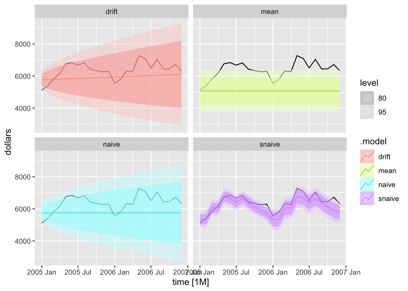
2.4.12 Ljung-Box Test
The Ljung-Box test is a “goodness-of-fit” test statistic for small samples. It is based on:
\[ Q^{*} = T(T+2) \sum_{k=1}^{l} (T-k)^{-1}r^{2}_{k} \\ l = \text{lag} \]28
Large values of \(Q^{*}\) suggest that autocorrelations do not come from a white noise series.29
| .model | bp_stat | bp_pvalue |
|---|---|---|
| drift | 87.1338 | 1.976197e-14 |
| mean | 466.1482 | 0.000000e+00 |
| naive | 87.1338 | 1.976197e-14 |
| snaive | 234.0450 | 0.000000e+00 |
2.4.13 Measures of Error
The accuracy() function is used to generate measures of error for all the models within the object. This is demonstrated below.
| .model | .type | ME | RMSE | MAE | MPE | MAPE | MASE | RMSSE | ACF1 |
|---|---|---|---|---|---|---|---|---|---|
| drift | Test | 432.2890 | 648.4219 | 561.4395 | 6.194741 | 8.610468 | 2.853165 | 2.633325 | 0.5296301 |
| mean | Test | 1296.4006 | 1396.6297 | 1296.4006 | 19.809427 | 19.809427 | 6.588146 | 5.671894 | 0.5642865 |
| naive | Test | 612.2083 | 802.9439 | 711.3750 | 8.978820 | 10.859852 | 3.615119 | 3.260859 | 0.5642865 |
| snaive | Test | 240.7917 | 337.7295 | 278.8750 | 3.657333 | 4.351047 | 1.417208 | 1.371563 | 0.3860599 |
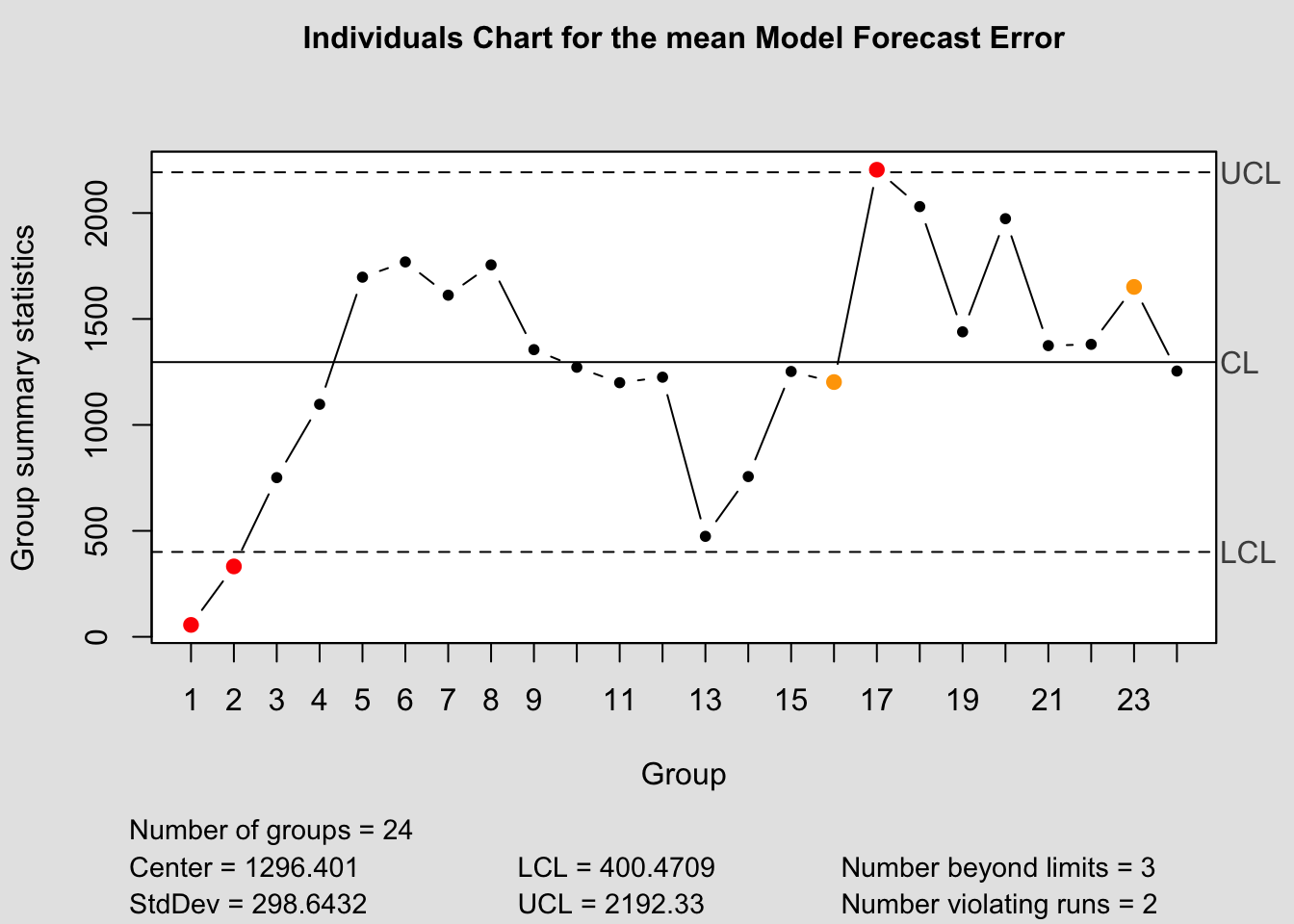
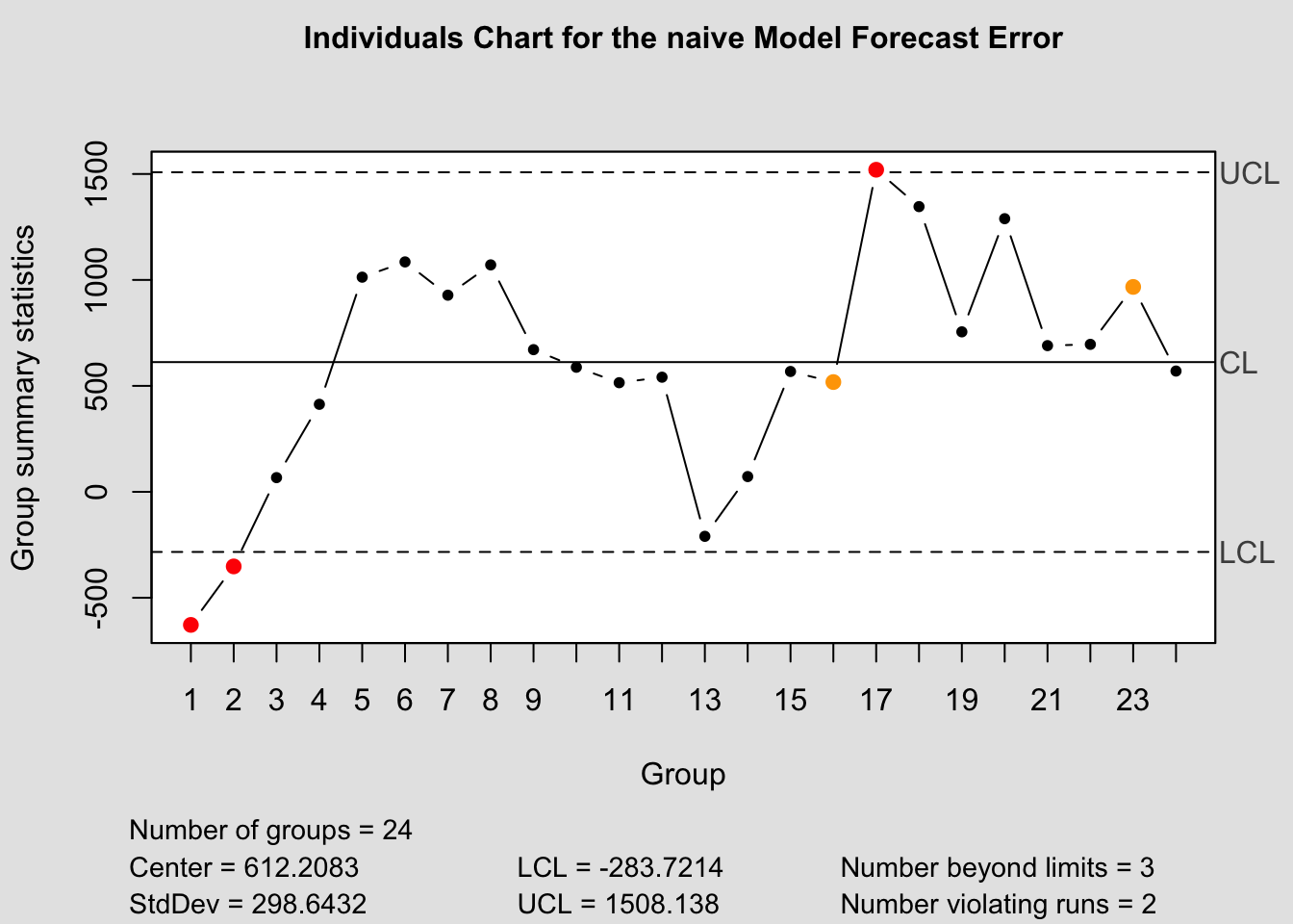
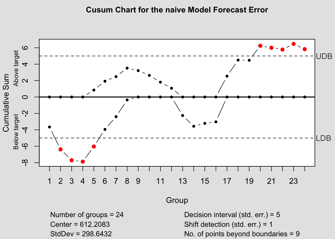
2.4.14 Quality Control Charts
The qcc package provides functions for creating quality control charts. These charts are useful tools in monitoring forecast performance. Unfortunately, they are not integrated for use with the other packages we are using. To correct this you must manually calculate the forecast error when generating these plots. In the code chunk below I demonstrate how to calculate the forecast error.
(forecast_error <- bev.fc |>
   left_join(bev |> select(time, dollars), by = join_by(time)) |>
   rename(dollars = dollars.x, orig = dollars.y) |>
   select(.model, time, dollars, .mean, orig) |>
   mutate(fe = orig - .mean))
## # A tsibble: 96 x 6 [1M]
## # Key: .model [4]
## .model time dollars .mean orig fe
## <chr> <mth> <dist> <dbl> <dbl> <dbl>
## 1 drift 2005 Jan N(5764, 96085) 5764. 5122 -642.
## 2 drift 2005 Feb N(5779, 193401) 5779. 5398 -381.
## 3 drift 2005 Mar N(5793, 291949) 5793. 5817 23.8
## 4 drift 2005 Apr N(5808, 391730) 5808. 6163 355.
## 5 drift 2005 May N(5822, 492742) 5822. 6763 941.
## 6 drift 2005 Jun N(5836, 594986) 5836. 6835 999.
## 7 drift 2005 Jul N(5851, 7e+05) 5851. 6678 827.
## 8 drift 2005 Aug N(5865, 8e+05) 5865. 6821 956.
## 9 drift 2005 Sep N(5880, 909108) 5880. 6421 541.
## 10 drift 2005 Oct N(5894, 1e+06) 5894. 6338 444.
## # ℹ 86 more rowsThere are three types of control charts we are interested in: the Shewart Control Chart, CUSUM chart, and EWMA chart. Note: this data frame contains the forecast errors for all the models. Make sure to filter to only once model before generating a chart with these functions. In the code chunk below, I separate the data frame into different objects by model.
drift_error <- forecast_error |> filter(.model =="drift")
mean_error <- forecast_error |> filter(.model =="mean")
naive_error <- forecast_error |> filter(.model =="naive")
snaive_error <- forecast_error |> filter(.model =="snaive")
2.4.14.1 Shewart Control Chart
It is important to only give all the control chart functions the row containing the forecast error. This is demonstrated below for all the control chart functions.
## Package 'qcc' version 2.7## Type 'citation("qcc")' for citing this R package in publications.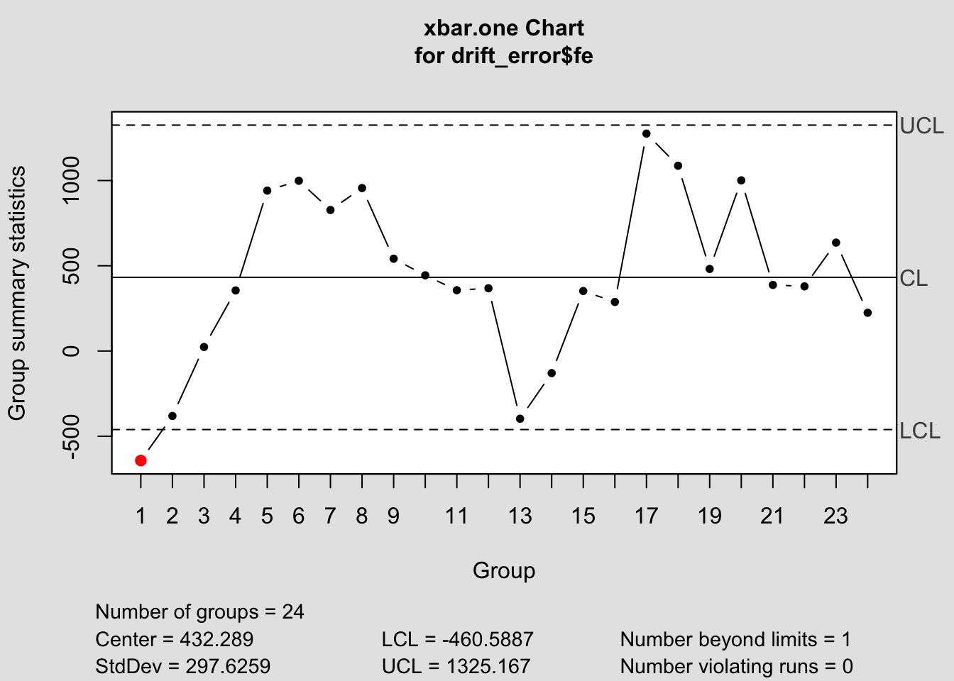
## List of 11
##  $ call      : language qcc(data = drift_error$fe, type = "xbar.one")
##  $ type      : chr "xbar.one"
##  $ data.name : chr "drift_error$fe"
##  $ data      : num [1:24, 1] -642.4 -380.8 23.8 355.4 941 ...
##   ..- attr(*, "dimnames")=List of 2
##  $ statistics: Named num [1:24] -642.4 -380.8 23.8 355.4 941 ...
##   ..- attr(*, "names")= chr [1:24] "1" "2" "3" "4" ...
##  $ sizes     : int [1:24] 1 1 1 1 1 1 1 1 1 1 ...
##  $ center    : num 432
##  $ std.dev   : num 298
##  $ nsigmas   : num 3
##  $ limits    : num [1, 1:2] -461 1325
##   ..- attr(*, "dimnames")=List of 2
##  $ violations:List of 2
##  - attr(*, "class")= chr "qcc"
## List of 11
##  $ call      : language qcc(data = mean_error$fe, type = "xbar.one")
##  $ type      : chr "xbar.one"
##  $ data.name : chr "mean_error$fe"
##  $ data      : num [1:24, 1] 56.2 332.2 751.2 1097.2 1697.2 ...
##   ..- attr(*, "dimnames")=List of 2
##  $ statistics: Named num [1:24] 56.2 332.2 751.2 1097.2 1697.2 ...
##   ..- attr(*, "names")= chr [1:24] "1" "2" "3" "4" ...
##  $ sizes     : int [1:24] 1 1 1 1 1 1 1 1 1 1 ...
##  $ center    : num 1296
##  $ std.dev   : num 299
##  $ nsigmas   : num 3
##  $ limits    : num [1, 1:2] 400 2192
##   ..- attr(*, "dimnames")=List of 2
##  $ violations:List of 2
##  - attr(*, "class")= chr "qcc"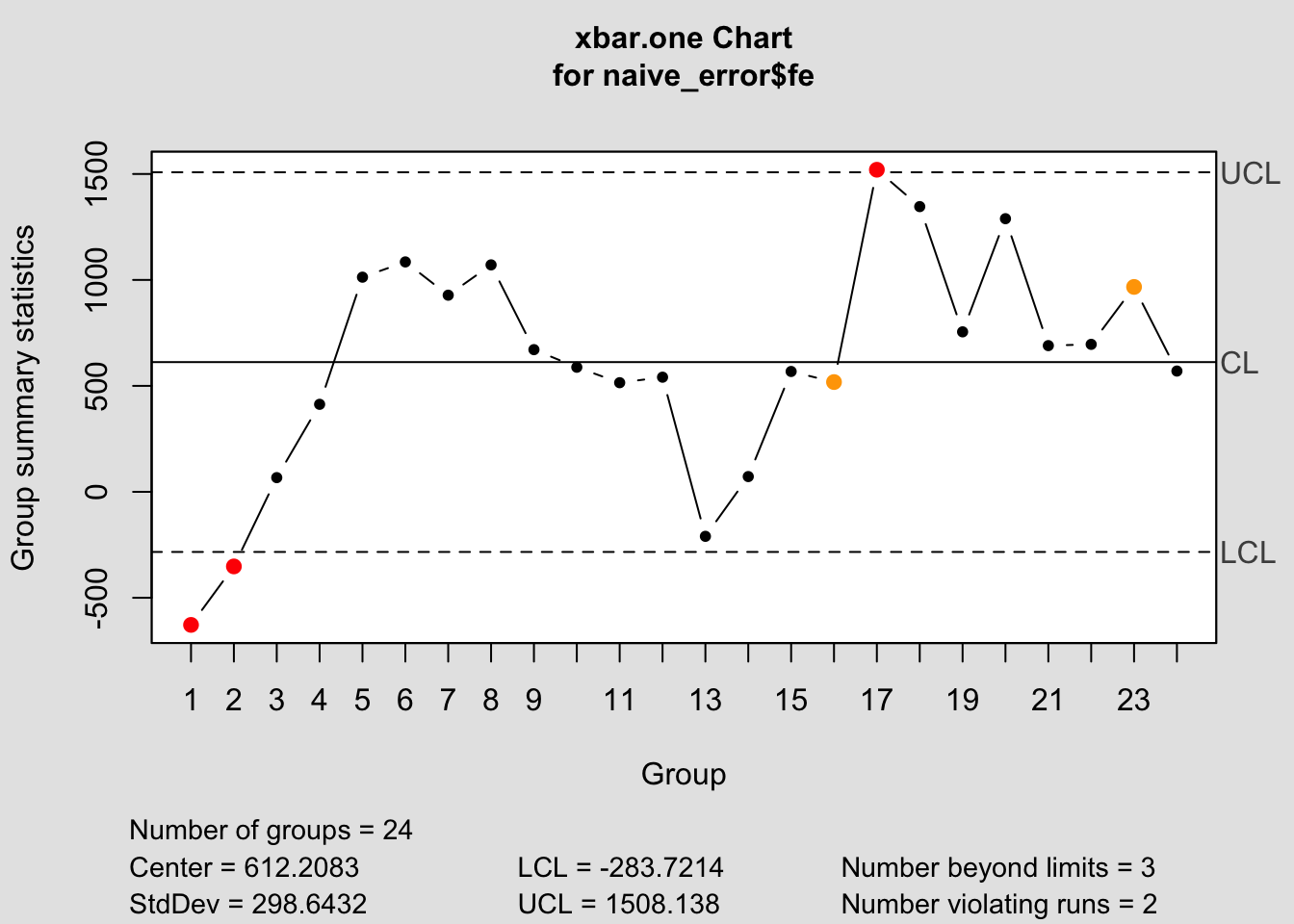
## List of 11
##  $ call      : language qcc(data = naive_error$fe, type = "xbar.one")
##  $ type      : chr "xbar.one"
##  $ data.name : chr "naive_error$fe"
##  $ data      : num [1:24, 1] -628 -352 67 413 1013 ...
##   ..- attr(*, "dimnames")=List of 2
##  $ statistics: Named num [1:24] -628 -352 67 413 1013 ...
##   ..- attr(*, "names")= chr [1:24] "1" "2" "3" "4" ...
##  $ sizes     : int [1:24] 1 1 1 1 1 1 1 1 1 1 ...
##  $ center    : num 612
##  $ std.dev   : num 299
##  $ nsigmas   : num 3
##  $ limits    : num [1, 1:2] -284 1508
##   ..- attr(*, "dimnames")=List of 2
##  $ violations:List of 2
##  - attr(*, "class")= chr "qcc"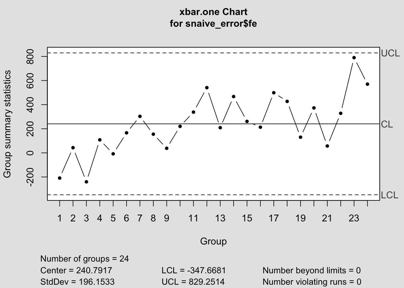
## List of 11
##  $ call      : language qcc(data = snaive_error$fe, type = "xbar.one")
##  $ type      : chr "xbar.one"
##  $ data.name : chr "snaive_error$fe"
##  $ data      : num [1:24, 1] -209 43 -240 108 -8 166 303 155 38 220 ...
##   ..- attr(*, "dimnames")=List of 2
##  $ statistics: Named num [1:24] -209 43 -240 108 -8 166 303 155 38 220 ...
##   ..- attr(*, "names")= chr [1:24] "1" "2" "3" "4" ...
##  $ sizes     : int [1:24] 1 1 1 1 1 1 1 1 1 1 ...
##  $ center    : num 241
##  $ std.dev   : num 196
##  $ nsigmas   : num 3
##  $ limits    : num [1, 1:2] -348 829
##   ..- attr(*, "dimnames")=List of 2
##  $ violations:List of 2
##  - attr(*, "class")= chr "qcc"
2.4.14.2 CUSUM Chart
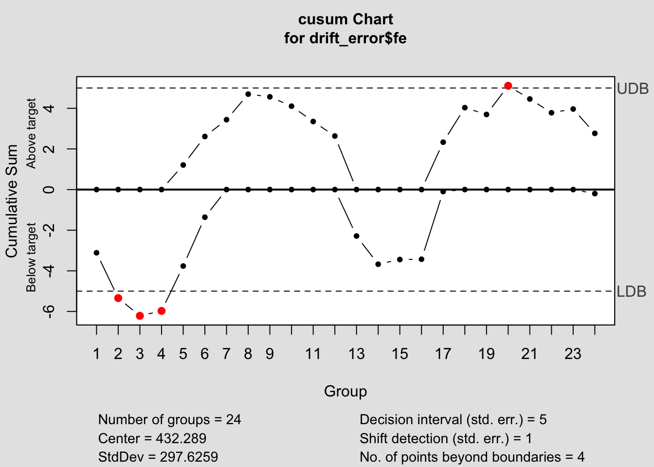
## List of 14
##  $ call             : language cusum(data = drift_error$fe)
##  $ type             : chr "cusum"
##  $ data.name        : chr "drift_error$fe"
##  $ data             : num [1:24, 1] -642.4 -380.8 23.8 355.4 941 ...
##   ..- attr(*, "dimnames")=List of 2
##  $ statistics       : Named num [1:24] -642.4 -380.8 23.8 355.4 941 ...
##   ..- attr(*, "names")= chr [1:24] "1" "2" "3" "4" ...
##  $ sizes            : int [1:24] 1 1 1 1 1 1 1 1 1 1 ...
##  $ center           : num 432
##  $ std.dev          : num 298
##  $ pos              : num [1:24] 0 0 0 0 1.21 ...
##  $ neg              : num [1:24] -3.11 -5.34 -6.22 -5.97 -3.76 ...
##  $ head.start       : num 0
##  $ decision.interval: num 5
##  $ se.shift         : num 1
##  $ violations       :List of 2
##  - attr(*, "class")= chr "cusum.qcc"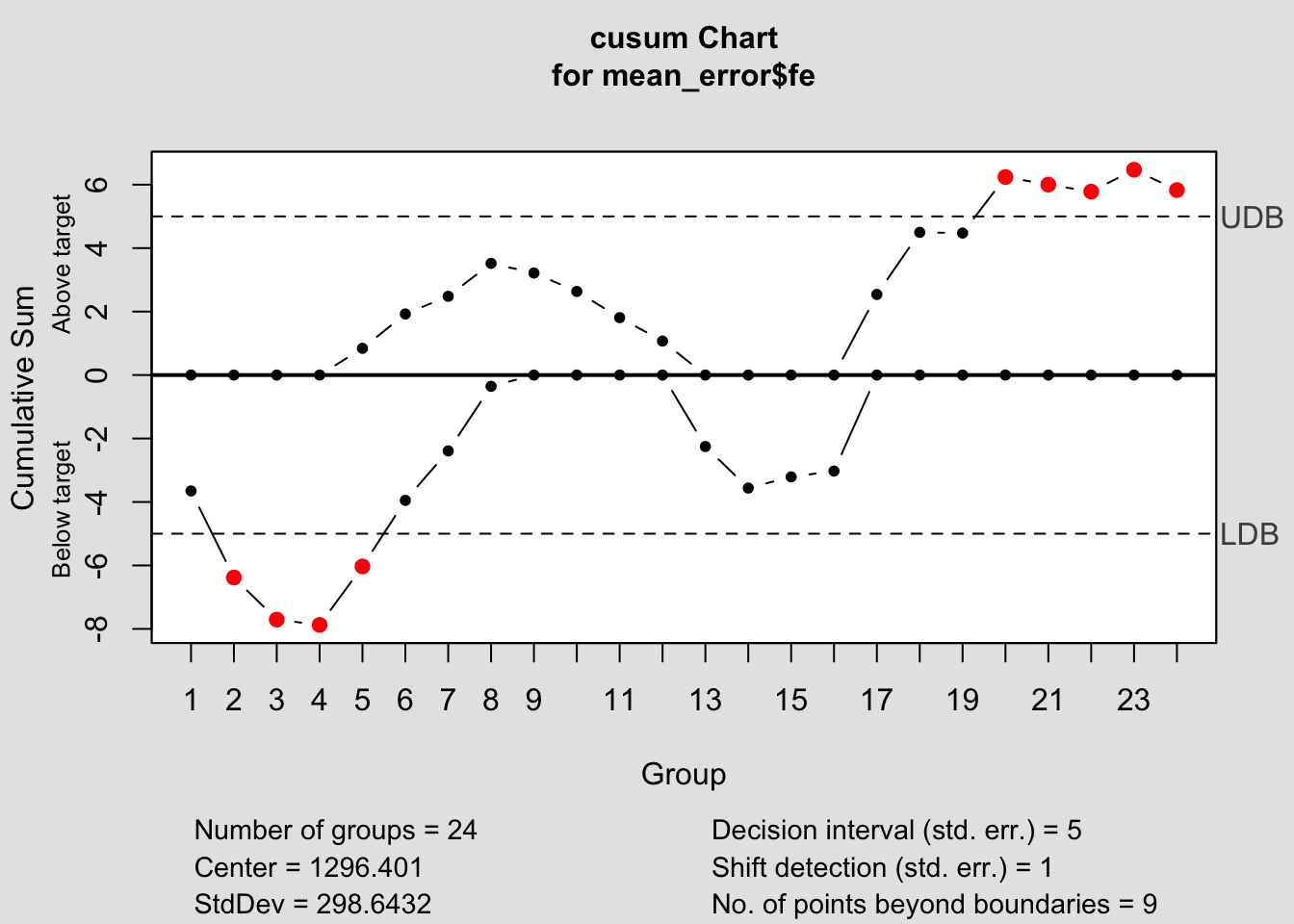
## List of 14
##  $ call             : language cusum(data = mean_error$fe)
##  $ type             : chr "cusum"
##  $ data.name        : chr "mean_error$fe"
##  $ data             : num [1:24, 1] 56.2 332.2 751.2 1097.2 1697.2 ...
##   ..- attr(*, "dimnames")=List of 2
##  $ statistics       : Named num [1:24] 56.2 332.2 751.2 1097.2 1697.2 ...
##   ..- attr(*, "names")= chr [1:24] "1" "2" "3" "4" ...
##  $ sizes            : int [1:24] 1 1 1 1 1 1 1 1 1 1 ...
##  $ center           : num 1296
##  $ std.dev          : num 299
##  $ pos              : num [1:24] 0 0 0 0 0.842 ...
##  $ neg              : num [1:24] -3.65 -6.38 -7.71 -7.87 -6.03 ...
##  $ head.start       : num 0
##  $ decision.interval: num 5
##  $ se.shift         : num 1
##  $ violations       :List of 2
##  - attr(*, "class")= chr "cusum.qcc"
## List of 14
##  $ call             : language cusum(data = naive_error$fe)
##  $ type             : chr "cusum"
##  $ data.name        : chr "naive_error$fe"
##  $ data             : num [1:24, 1] -628 -352 67 413 1013 ...
##   ..- attr(*, "dimnames")=List of 2
##  $ statistics       : Named num [1:24] -628 -352 67 413 1013 ...
##   ..- attr(*, "names")= chr [1:24] "1" "2" "3" "4" ...
##  $ sizes            : int [1:24] 1 1 1 1 1 1 1 1 1 1 ...
##  $ center           : num 612
##  $ std.dev          : num 299
##  $ pos              : num [1:24] 0 0 0 0 0.842 ...
##  $ neg              : num [1:24] -3.65 -6.38 -7.71 -7.87 -6.03 ...
##  $ head.start       : num 0
##  $ decision.interval: num 5
##  $ se.shift         : num 1
##  $ violations       :List of 2
##  - attr(*, "class")= chr "cusum.qcc"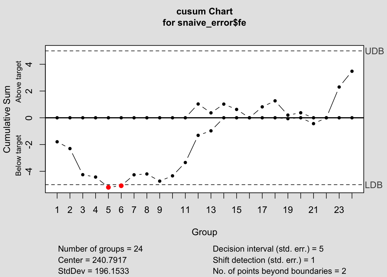
## List of 14
## $ call : language cusum(data = snaive_error$fe)
## $ type : chr "cusum"
## $ data.name : chr "snaive_error$fe"
## $ data : num [1:24, 1] -209 43 -240 108 -8 166 303 155 38 220 ...
## ..- attr(*, "dimnames")=List of 2
## $ statistics : Named num [1:24] -209 43 -240 108 -8 166 303 155 38 220 ...
## ..- attr(*, "names")= chr [1:24] "1" "2" "3" "4" ...
## $ sizes : int [1:24] 1 1 1 1 1 1 1 1 1 1 ...
## $ center : num 241
## $ std.dev : num 196
## $ pos : num [1:24] 0 0 0 0 0 0 0 0 0 0 ...
## $ neg : num [1:24] -1.79 -2.3 -4.25 -4.43 -5.2 ...
## $ head.start : num 0
## $ decision.interval: num 5
## $ se.shift : num 1
## $ violations :List of 2
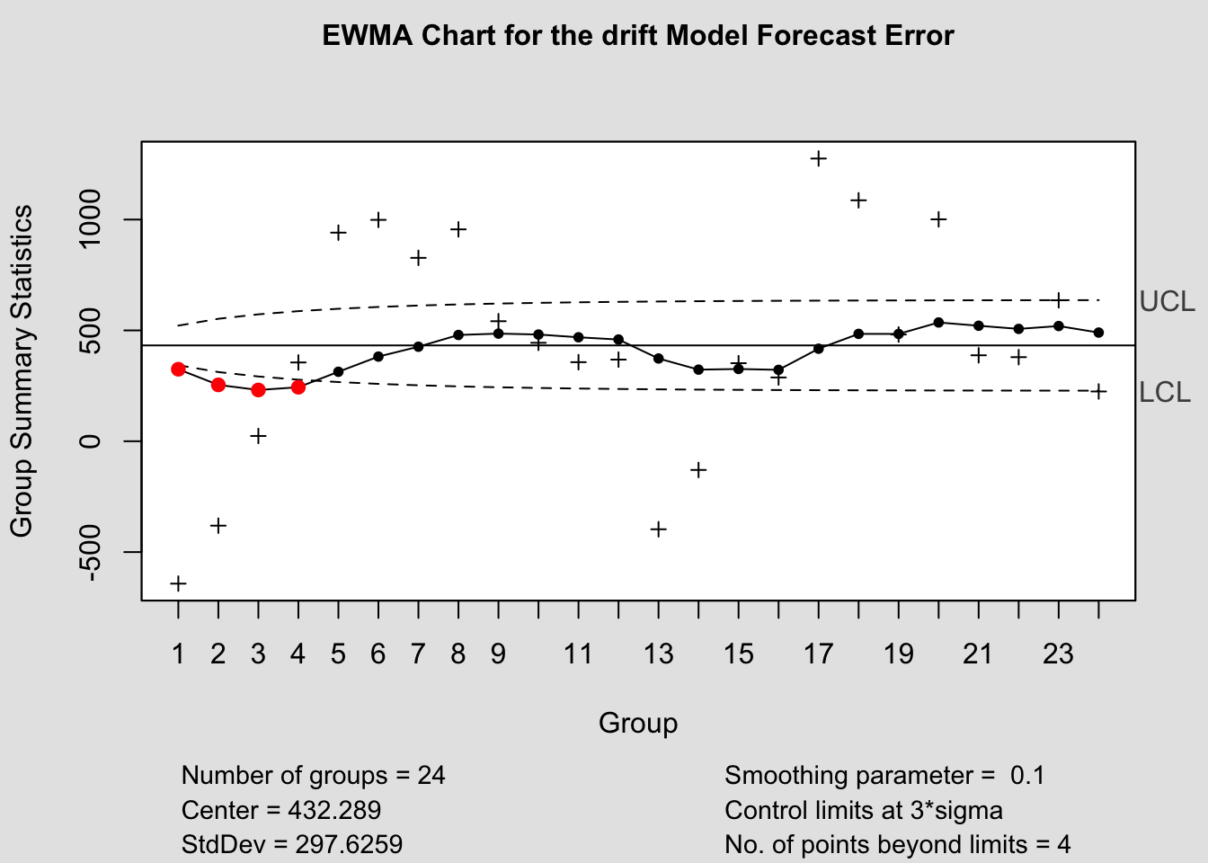
## - attr(*, "class")= chr "cusum.qcc"2.4.14.3 EWMA Chart
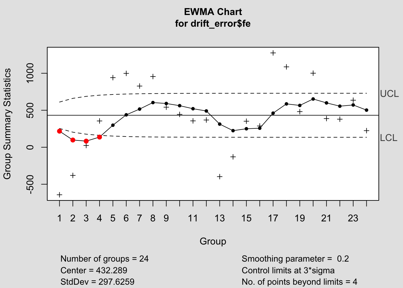
## List of 15
##  $ call      : language ewma(data = drift_error$fe)
##  $ type      : chr "ewma"
##  $ data.name : chr "drift_error$fe"
##  $ data      : num [1:24, 1] -642.4 -380.8 23.8 355.4 941 ...
##   ..- attr(*, "dimnames")=List of 2
##  $ statistics: Named num [1:24] -642.4 -380.8 23.8 355.4 941 ...
##   ..- attr(*, "names")= chr [1:24] "1" "2" "3" "4" ...
##  $ sizes     : int [1:24] 1 1 1 1 1 1 1 1 1 1 ...
##  $ center    : num 432
##  $ std.dev   : num 298
##  $ x         : int [1:24] 1 2 3 4 5 6 7 8 9 10 ...
##  $ y         : Named num [1:24] 217.4 97.7 82.9 137.4 298.2 ...
##   ..- attr(*, "names")= chr [1:24] "1" "2" "3" "4" ...
##  $ sigma     : num [1:24] 59.5 76.2 85.2 90.5 93.7 ...
##  $ lambda    : num 0.2
##  $ nsigmas   : num 3
##  $ limits    : num [1:24, 1:2] 254 204 177 161 151 ...
##   ..- attr(*, "dimnames")=List of 2
##  $ violations: Named int [1:4] 1 2 3 4
##   ..- attr(*, "names")= chr [1:4] "1" "2" "3" "4"
##  - attr(*, "class")= chr "ewma.qcc"
## List of 15
##  $ call      : language ewma(data = mean_error$fe)
##  $ type      : chr "ewma"
##  $ data.name : chr "mean_error$fe"
##  $ data      : num [1:24, 1] 56.2 332.2 751.2 1097.2 1697.2 ...
##   ..- attr(*, "dimnames")=List of 2
##  $ statistics: Named num [1:24] 56.2 332.2 751.2 1097.2 1697.2 ...
##   ..- attr(*, "names")= chr [1:24] "1" "2" "3" "4" ...
##  $ sizes     : int [1:24] 1 1 1 1 1 1 1 1 1 1 ...
##  $ center    : num 1296
##  $ std.dev   : num 299
##  $ x         : int [1:24] 1 2 3 4 5 6 7 8 9 10 ...
##  $ y         : Named num [1:24] 1048 905 874 919 1075 ...
##   ..- attr(*, "names")= chr [1:24] "1" "2" "3" "4" ...
##  $ sigma     : num [1:24] 59.7 76.5 85.5 90.8 94.1 ...
##  $ lambda    : num 0.2
##  $ nsigmas   : num 3
##  $ limits    : num [1:24, 1:2] 1117 1067 1040 1024 1014 ...
##   ..- attr(*, "dimnames")=List of 2
##  $ violations: Named int [1:4] 1 2 3 4
##   ..- attr(*, "names")= chr [1:4] "1" "2" "3" "4"
##  - attr(*, "class")= chr "ewma.qcc"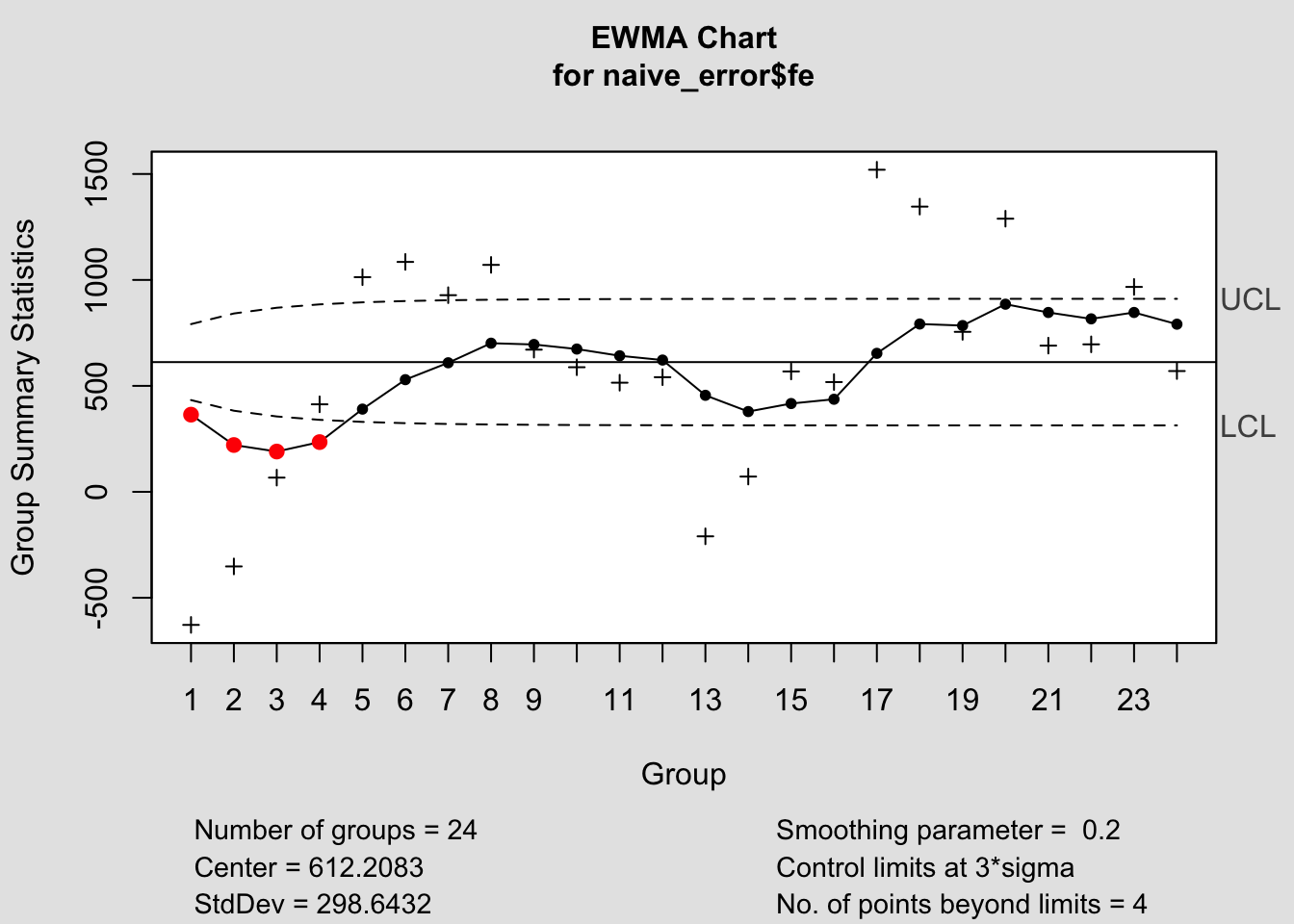
## List of 15
##  $ call      : language ewma(data = naive_error$fe)
##  $ type      : chr "ewma"
##  $ data.name : chr "naive_error$fe"
##  $ data      : num [1:24, 1] -628 -352 67 413 1013 ...
##   ..- attr(*, "dimnames")=List of 2
##  $ statistics: Named num [1:24] -628 -352 67 413 1013 ...
##   ..- attr(*, "names")= chr [1:24] "1" "2" "3" "4" ...
##  $ sizes     : int [1:24] 1 1 1 1 1 1 1 1 1 1 ...
##  $ center    : num 612
##  $ std.dev   : num 299
##  $ x         : int [1:24] 1 2 3 4 5 6 7 8 9 10 ...
##  $ y         : Named num [1:24] 364 221 190 235 390 ...
##   ..- attr(*, "names")= chr [1:24] "1" "2" "3" "4" ...
##  $ sigma     : num [1:24] 59.7 76.5 85.5 90.8 94.1 ...
##  $ lambda    : num 0.2
##  $ nsigmas   : num 3
##  $ limits    : num [1:24, 1:2] 433 383 356 340 330 ...
##   ..- attr(*, "dimnames")=List of 2
##  $ violations: Named int [1:4] 1 2 3 4
##   ..- attr(*, "names")= chr [1:4] "1" "2" "3" "4"
##  - attr(*, "class")= chr "ewma.qcc"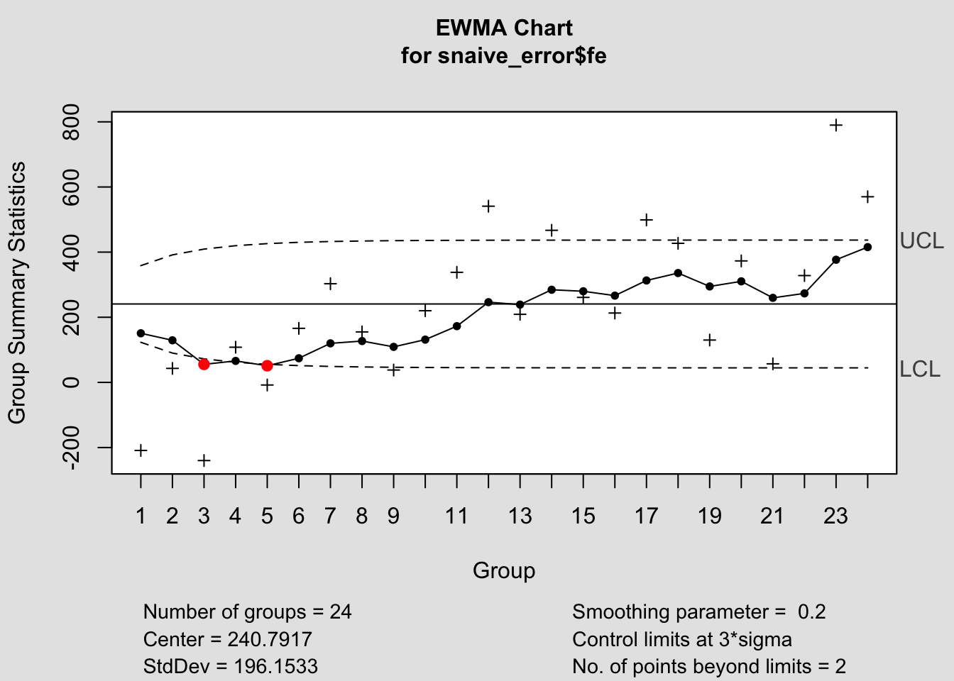
## List of 15
## $ call : language ewma(data = snaive_error$fe)
## $ type : chr "ewma"
## $ data.name : chr "snaive_error$fe"
## $ data : num [1:24, 1] -209 43 -240 108 -8 166 303 155 38 220 ...
## ..- attr(*, "dimnames")=List of 2
## $ statistics: Named num [1:24] -209 43 -240 108 -8 166 303 155 38 220 ...
## ..- attr(*, "names")= chr [1:24] "1" "2" "3" "4" ...
## $ sizes : int [1:24] 1 1 1 1 1 1 1 1 1 1 ...
## $ center : num 241
## $ std.dev : num 196
## $ x : int [1:24] 1 2 3 4 5 6 7 8 9 10 ...
## $ y : Named num [1:24] 150.8 129.3 55.4 65.9 51.1 ...
## ..- attr(*, "names")= chr [1:24] "1" "2" "3" "4" ...
## $ sigma : num [1:24] 39.2 50.2 56.2 59.6 61.8 ...
## $ lambda : num 0.2
## $ nsigmas : num 3
## $ limits : num [1:24, 1:2] 123.1 90.1 72.3 61.8 55.5 ...
## ..- attr(*, "dimnames")=List of 2
## $ violations: Named int [1:2] 3 5
## ..- attr(*, "names")= chr [1:2] "3" "5"
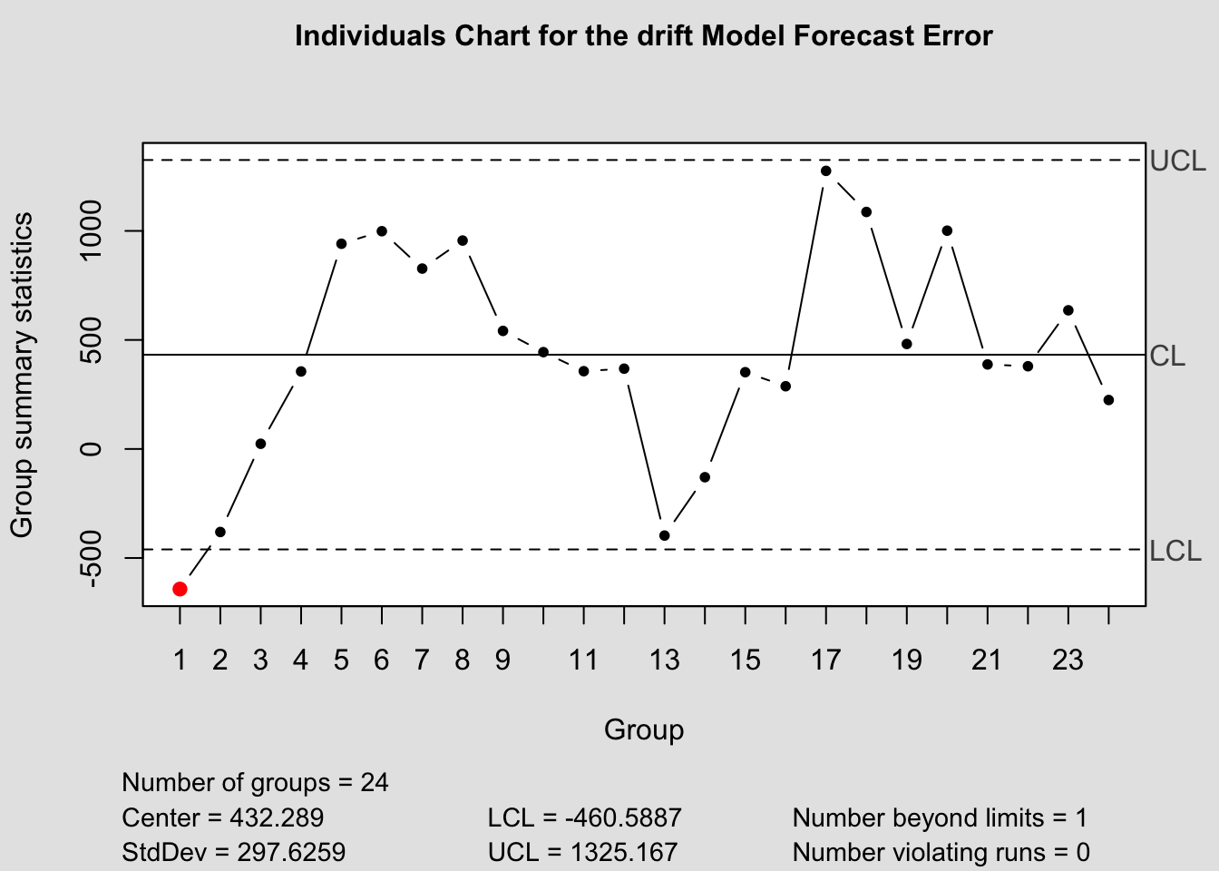
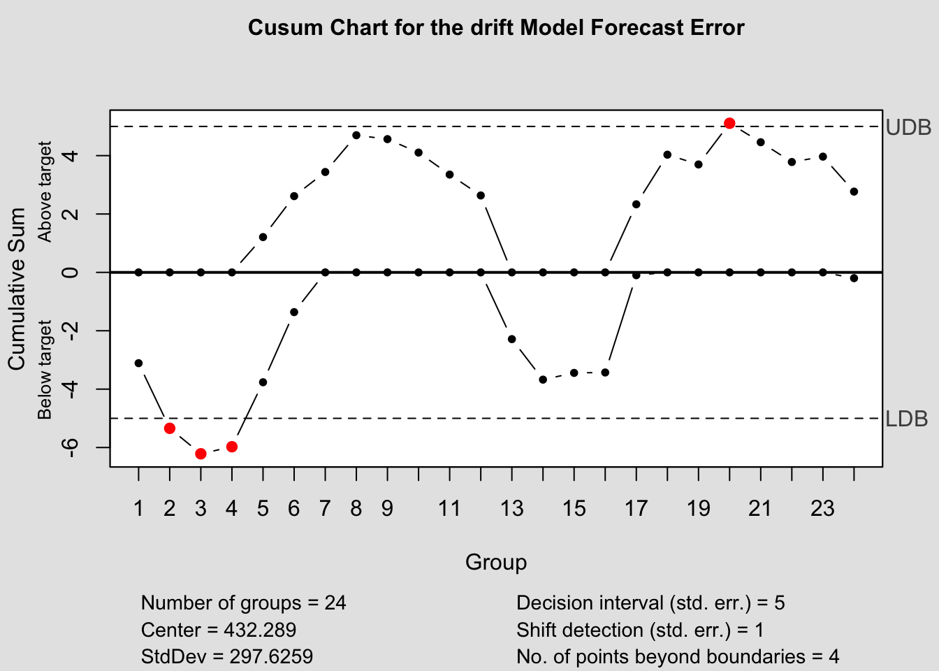
## - attr(*, "class")= chr "ewma.qcc"2.4.14.4 Control Chart Function
To make this process easier, I have written a custom function to automatically generate these charts for each model within a forecast object. The second parameter, original must be a data frame with two columns, the first being time, the second being the original data. This is so it can be used to calculate the forecast error in the function itself.
library(qcc)
qcc_plots <- function(forecast, original, title = ""){
  original <- original |> rename(time = 1, orig = 2) # correct names of original data
  forecast <- forecast[1:4] |> left_join(original, by = join_by(time)) |> mutate(fe = orig - .mean) # create forecast error variable
  models <- unique(forecast$.model) # create vector containing model names
  for (i in models){
    current <- forecast |> filter(.model == i)
    #Shewhart control chart("xbar.one" means data are continuous, one-at-atime)
    qcc(current$fe, type="xbar.one", title=paste("Individuals Chart for the", i,"Model Forecast Error"))
    #CUSUM chart
    cusum(current$fe, title=paste('Cusum Chart for the', i,'Model Forecast Error'), sizes=1)
    #EWMA (Exponentially-Weighted Moving Average) chart
    ewma(current$fe, title=paste('EWMA Chart for the', i,'Model Forecast Error'), lambda=.1,sizes=1)
  }
}


References
Montgomery, Jennings, and Kulahci, Introduction to Time Series Analysis and Forecasting.↩︎
Hyndman and Athanasopoulos, Forecasting Principles and Practice.↩︎
Montgomery, Jennings, and Kulahci, Introduction to Time Series Analysis and Forecasting.↩︎
Hyndman and Athanasopoulos, Forecasting Principles and Practice.↩︎