5 ARIMA Models
When successive observations show serial dependence, forecasting methods based on exponential smoothing may be inefficient.
Why?
They fail to take advantage of the serial dependence in the data effectively.
5.1 Linear models for Stationary Series
Consider the linear filter or linear operator; \(L\):
\[ y_{t} = L(x_{t}) = \sum_{i = - \infty}^{\infty} \psi_{i}x_{t-i}, \space t = ...,-1,0,1,... \]
This is a process that converts the input \(x_{t}\) into an output \(y_{t}\). Also, the conversion includes all values of the input in the form of a summation with different weights that are time-invariant. Finally if \(\sum_{-\infty}^{\infty} \lvert \psi_{i} \rvert \lt \infty\), then this filter is also stable.
5.1.1 Stationarity
Recall that we are interested in “weak stationarity”:
- expected value is not dependent on time
- autocovariance at any lag is NOT a function of time, but of the given lag
\(\therefore \space\) A stationary series exhibits a “similar” statistical behavior (distribution) in time.
5.1.2 Stationary Time Series
Suppose \(\{ x_{t} \}\) is a stationary series, with \(E(x_{t}) = \mu_{x}\), and \(cov(x_{t}, x_{t+k}) = \gamma_{x}(k)\).
Then, if \(y_{t} = L(x_{t}) = \sum_{i=-\infty}^{\infty} \psi_{i} x_{t-i}\) is a linear filter,
\[ E(y_{t}) = \mu_{y} = \sum_{i= -\infty}^{\infty} \psi_{i} \mu_{x} \text{, and} \\ cov(y_{t}, y_{t+k}) = \gamma_{y}(k) = \sum_{i=-\infty}^{\infty} \sum_{j=-\infty}^{\infty} \psi_{i} \psi_{j} \gamma_{x}(i-j+k) \]
Consider the following stable linear processes with white noise, \(\epsilon_{t}\):
\[ y_{t} = \mu + \sum_{i=0}^{\infty}\psi_{i} \epsilon_{t-i}, \space E(\epsilon_{t}) = 0; \space \gamma_{e}(\mu) = \begin{cases} \sigma^{2}; \space h =0 \\ 0; \space h \ne 0 \end{cases} \\ = \mu+ \psi_{0} \epsilon_{t} + \psi_{1} \epsilon_{t-1} + \psi_{2} \epsilon_{t-2}+... \\ \text{Then, }E(y_{t}) = \mu \text{, and} \\ \gamma_{y}(k) = \sigma^{2} \sum_{i=0}^{\infty} \psi_{i} \psi_{i+k} \]
Infinite Moving Average:
\[ y_{t} = \mu + \psi_{0}\epsilon_{t} + \psi_{1} \epsilon_{t-1} + \psi_{2} \epsilon_{t-2}+... \\ = \mu + \sum_{\alpha = 0}^{\infty} \psi_{i}B^{i}\epsilon_{t} = \mu + \Psi(B)*\epsilon_{t} \\ \Psi(B) = \sum_{\alpha = 0}^{\infty} \psi_{i} B^{i} \epsilon_{t} \]
This is the WOLD DECOMPOSITION THEOREM
The Wold Decomposition Theorem states that a stationary time series can be seen as the weighted sum of the present and past “disturbances” that are random.
Note that it is critical that these disturbances are random
- uncorrelated random shocks that have constant variance
Also uncorrelated \(\ne\) independent
- independence \(\to f(x,y) = f_{x}(x)*f_{y}(y)\)
- knowing \(x\) does not give any info about \(y\)
- Uncorrelated \(\to E(xy) = E(x)*E(y)\)
- this happens because \(cov(x,y) = E(xy)-E(x)*E(y) = 0\)
Finally, independent \(=\) uncorrelated, but uncorrelated \(\ne\) independence
For example, consider \(x\) and \(y=\lvert x\rvert\). Clearly, not independent, but can show that they are uncorrelated!
In this chapter when using Wold’s Decomposition Theorem, we will only need “uncorrelated” random disturbances, not “independent” random errors.
5.2 Finite Order Moving Average, \(MA(q)\), processes
\(MA(q): \space y_{t} = \mu + \epsilon_{t} - \theta_{1} \epsilon_{t-1} - ... -\theta_{q} \epsilon_{t-q}\), where \(\{ \epsilon_{t} \}\) is white noise.
In terms of the backshift operator, B:
\[ MA(q): \space y_{t} = \mu + (\epsilon_{t} - \theta_{1}\epsilon_{t-1} - ... - \theta_{q}\epsilon_{t-q}) \\ = \mu + (1-\theta_{1}B-...-\theta_{q}B^{q})\epsilon_{t} \\ = \mu +(1- \sum_{i=1}^{q}\theta_{i}B^{i})\epsilon_{t} \\ \therefore \space y_{t} = \mu + \Theta(B)\epsilon_{t} \text{, where } \Theta B = 1-\sum_{i=1}^{q} \theta_{i}B^{i} \\ \text{Also, a.) } E(y_{t}) = E(\mu+\epsilon_{t} - \theta_{1}\epsilon_{t-1}-...-\theta_{q}\epsilon_{t-q}) \\ = \mu \\ \text{b.) } var(y_{t}) = var(\mu + \epsilon_{t} - \theta_{1}\epsilon_{t-1}-...-\theta_{q}\epsilon_{t-q})\\ \to \gamma_{y}(0) = \sigma^{2}(1+\theta_{1}^{2} + \theta_{2}^{2} + ...+\theta_{q}^{2}) \\ \text{c.) } \gamma_{y}(k) = cov(y_{t}, y_{t+k}) \\ = E[(\epsilon_{t} - \theta_{1}\epsilon_{t-1}-...-\theta_{q}\epsilon_{t-q})(\epsilon_{t+k}-\theta_{1}\epsilon_{t+k-1}-...-\theta_{q}\epsilon_{t+k-q})] \\ = \begin{cases} \sigma^{2}(-\theta_{k}+\theta_{1}\theta_{k+1}+...+\theta_{q-k}\theta_{q}); \space k = 1,2,...,q \\ 0; \space k \gt q \end{cases} \\ \text{d.) } \rho_{y}(k) = \frac{\gamma_{y}(k)}{\gamma_{y}(0)} = \begin{cases} \frac{-\theta_{k}+\theta_{1}\theta_{k+1}+...+\theta_{q-k}\theta_{q}}{1+\theta_{1}^{2}+...+\theta^{2}_{q}}; \space k = 1,2,...,q \\ 0 ; \space k \gt q \end{cases} \]
Note: the ACF of a \(MA(q)\) model “cuts off” after lag ‘q’ [or becomes very small in absolute value after lag ‘q’].
5.2.1 First Order Moving Average Process, \(MA(1)\)
\[ MA(1): \space y_{t} = \mu + \epsilon_{t} - \theta_{1}\epsilon_{t-1}; \space q=1 \\ \gamma_{y}(0) = \sigma^{2}(1+\theta_{1}^{2}) \\ \gamma_{y}(1) = -\theta_{1}\sigma^{2}\\ \gamma_{y}(k) = 0, \space k = 2,3,... \\ \rho_{y}(1) = \frac{-\theta_{1}}{1+\theta_{1}^{2}} \\ \rho_{y}(k) = 0, \space k = 2,3,... \]
Note that the ACF for an \(MA(1)\) process cuts off after 1 lag.
5.2.2 Second-Order Moving Average Process, \(MA(2)\)
\[ y_{t} = \mu + \epsilon_{t} - \theta_{1} \epsilon_{t-1} - \theta_{2}\epsilon_{t-2} \\ = \mu + (1-\theta_{1}B - \theta_{2}B^{2})\epsilon_{t}\\ \gamma_{y}(0) = \sigma^{2}(1+\theta_{1}^{2} + \theta_{2}^{2}) \\ \gamma_{y}(1) = \sigma^{2}(-\theta_{1}+\theta_{1}\theta_{2}) \\ \gamma_{y}(2) = \sigma^{2}(-\theta_{2}) \\ \gamma_{y}(k) = 0, \space k = 3,4,... \space \text{or} \space k \gt 2 \\ \rho_{y}(1) = \frac{-\theta_{1} + \theta_{1}\theta_{2}}{1+\theta_{1}^{2} + \theta_{2}^{2}} \\ \rho_{y}(2) = \frac{-\theta_{2}}{1+\theta_{1}^{2}+\theta_{2}^{2}} \\ \rho_{y}(k) = 0 \text{ for } k \gt 2 \]
Note that the ACF for an \(MA(2)\) process cuts off after lag 2.
5.3 Finite-Order Autoregressive Processes, \(AR(p)\)
Albeit powerful, the Wold decomposition theorem requires us to estimate infinitely many weights, \(\{ \psi_{i} \}\)
One interpretation of the finite order, \(MA(q)\) process is that at any given time, only a finite number of the infinitely many past disturbances “contribute” to the current value of the time series, and as the time window of the contributors moves in time, the oldest disturbance becomes obsolete for the next observation.
5.3.1 First-Order Autoregressive Processes, \(AR(1)\)
\[ y_{t} = \mu + \sum_{i=0}^{\infty} \psi_{i} \epsilon_{t-i} \\ = \mu + \sum_{i=0}^{\infty} \psi_{i} B^{i} \epsilon_{t} \\ = \mu + \Psi(B) \epsilon_{t} \]
One approach is to assume that the contributions of the distrurbances that are way in the past should be small compared to the more recent disturbances.
Since the disurbances are i.i.d; we can assume a set of exponentially decaying weights for this purpose.
So, set \(\psi_{i} = \phi^{i}\), where \(\lvert \phi \rvert \lt 1\). Then,
\[ y_{t} = \mu + \epsilon_{t} + \phi \epsilon_{t-1} + \phi^{2} \epsilon_{t-2} + ... \\ = \mu + \sum_{i=0}^{\infty} \phi^{i} \epsilon_{t-i} \\ \text{Also, } y_{t-1} = \mu + \epsilon_{t-1} + \phi \epsilon_{t-2} + \phi^{2} \epsilon_{t-3} + ... \\ \to \phi y_{t-1} = \phi \mu + \phi \epsilon_{t-1} + \phi^{2}\epsilon_{t-2} + \phi^{3} \epsilon_{t-3} + ... \\ \therefore \space \phi y_{t-1} - \phi \mu = \phi \epsilon_{t-1} + \phi^{2} \epsilon_{t-2} + \phi^{3} \epsilon_{t-3} + ... \\ \text{Substituting this in }y_{t} \text{, we have} \\ y_{t} = \mu + \epsilon_{t} + \phi y_{t-1} - \phi \mu \\ \to y_{t} = \delta + \phi y_{t-1} + \epsilon_{t}; \space \delta = (1-\phi)\mu \]
This is an \(AR(1)\) process regressing \(y_{t}\) on \(y_{t-1}\). This is a CAUSAL AR model. Note also that this model is stationary if \(\lvert \phi \rvert \lt 1\). If \(\lvert \phi \rvert \gt 1\), the time series is explosive. Although there is a stationary solution for an \(AR(1)\) model when \(\lvert \phi \rvert \gt 1\) it results in a NON-CAUSAL model, where forecasting requires knowledge about the future!
\[ AR(1): \space E(y_{t}) = \mu = \frac{\delta}{1-\phi} \\ var(y_{t}) = \gamma_{y}(0) = \sigma^{2}*\frac{1}{1-\phi^{2}} \\ cov(y_{t}, y_{t+k}) = \gamma_{y}(k) = \sigma^{2}*\phi^{k}*\frac{1}{1-\phi^{2}}; \space k = 0,1,2,... \\ \rho(k) = \frac{\gamma_{y}(k)}{\gamma_{y}(0)} = \phi^{k}; \space k = 1,2,... \\ \phi^{k} \text{ is exponential decay form.} \]
5.3.2 Second-Order Autoregressive Process, \(AR(2)\)
\[ y_{t} = \delta + \phi_{1} y_{t-1} + \phi_{2} y_{t-2} + \epsilon_{t} \\ \to y_{t} - \phi_{1}y_{t-1} - \phi_{2}y_{t-2} = \delta + \epsilon_{t} \\ \to (1-\phi_{1}B - \phi_{2}B^{2})y_{t} = \delta + \epsilon_{t} \\ \to \Phi(B)y_{t} = \delta + \epsilon_{t} \\ \to y_{t} = \Phi(B)^{-1}\delta + \Phi(B)^{-1}\epsilon_{t} \\ \mu = \Phi(B)^{-1}\delta; \space \Psi(B) = \Phi(B)^{-1}\epsilon_{t} \\ \to y_{t} = \mu + \Psi(B)\epsilon_{t} \\ \to y_{t} = \mu + \sum_{i=0}^{\infty}\psi_{i}\epsilon_{t-i} \\ \to y_{t} = \mu \sum_{i=0}^{\infty} \psi_{i}B^{i} \epsilon_{t} \\ \therefore \space y_{t} = \mu + \sum_{i=0}^{\infty}\psi_{i}B^{i}\epsilon_{t}, \text{ this is an IMA representation of AR(2) model} \\ \mu = \Phi(B)^{-1}\delta \text{, and} \\ \Phi(B)^{-1} = \sum_{i=0}^{\infty}\psi_{i}B^{i} = \Psi(B) \]
Important question: What makes this \(AR(2)\) model stationary and causal?
Solve the polynomial: \(m^{2} - \phi_{1}m-\phi_{2} = 0\)
Roots of the equation are: \(m_{1}, m_{2} = \frac{\phi_{1} \pm \sqrt{\phi_{1}^{2}+ 4\phi^{2}_{1}}}{2} [\frac{-b\pm\sqrt{b^2-4ac}}{2a}]\)
If \(\lvert m_{1} \rvert, \lvert m_{2} \rvert \lt 1\), then \(\sum_{i=0}^{\infty}\lvert \psi_{i} \rvert \lt \infty\). (Also, for computer roots, see p.343 MIK)
\(\therefore\) For an \(AR(2)\) to be stationary and have an IMA representation:
\[ \phi_{1}+\phi_{2} \lt 1 \\ \phi_{2} - \phi_{1} \lt 1 \\ \lvert \phi_{2} \rvert \lt 1 \\ E(y_{t}) = \mu =\frac{\delta}{1-\phi_{1}-\phi_{2}}; \space 1-\phi_{1}-\phi_{2} \ne 0 \\ var(y_{t}) = \gamma_{y}(0) = \phi_{1}\gamma_{y}(1)+\phi_{2}\gamma_{y}(2) + \sigma^{2} \\ cov(y_{k}, y_{t+k}) = \gamma_{y}(k) = \phi_{1} \gamma_{y}(k-1) + \phi_{2}\gamma_{y}(k-2); \space k=1,2,... \\ \text{The previous two equations are the Yule-Walker equations} \\ \text{Also, } \rho(k) = \phi_{1} \rho(k-1)+ \phi_{2}(k-2), \space k = 1,2,... \]
Case 1: If there are two real roots, the ACF is a mixture of two “exponential decay” terms.
Case 2: If there are two complex roots, the ACF has the form of a “damped simissid”
Case 3: If there is one real root, \(m_{0} \space [m_{1} = m_{2} = m_{0}]\), the ACF will exhibit an “exponential decay” pattern.
5.3.3 General Autoregressive Process, \(AR(p)\)
\[ y_{t} = \delta + \phi_{1}y_{t-1} + \phi_{2}y_{t-2} + ... + \phi_{p}y_{t-p} + \epsilon_{t} \]
This \(AR(p)\) is causal and stationary if the roots of the following polynomial are less than 1 in absoloute value: \(m^{p} - \phi_{1}m^{p-1} - \phi_{2}m^{p-2} - ... - \phi_{p} = 0\)
\[ \text{AR(p): } E(y_{t}) = \mu = \frac{\delta}{1-\phi_{1} - \phi_{2} - ... - \phi_{p}} \\ var(y_{t}) = \gamma_{y}(0) = \sum_{i=1}^{p} \phi_{i} \gamma(i) + \sigma^{2} \\ cov(y_{t}, y_{t+k}) = \gamma_{y}(k) = \sum_{i=1}^{p} \phi_{i} \gamma(k-i); \space k = 1,2,... \\ \text{Yule-Walker Equations: } \rho(k) = \sum_{i=1}^{p} \phi_{i} \rho(k-i); \space k = 1,2,... \]
As before, depending on the roots of the AR(p) process, the ACF of an AR(p) process can be a mixture of exponential decay and damped sinusoidal patterns.
5.4 Partial Autocorrelation Function, PACF
ACF useful for MA(q) processes, but not so for AR(p) processes, because of the structure of the ACF of AR processes (mixture of exponential decay, sinusoidal, ect.)
Partial correlation is the correlation between two variables after adjusting for a common factor(s) that may be affecting them.
PACF between \(y_{t}\) and \(y_{t-k}\) is the autocorrelation between them after adjusting for everything; i.e; \(y_{t-1}, y_{t-2}, ..., y_{t-k+1}\)
Thus, for an AR(p) model, the PACF between \(y_{t}\) and \(y_{t-k}\) should be zero for all \(k>p\).
In summary:
- Use ACF to detect order of ‘q’ of MA(q).
- Use PACF to detect order of ‘p’ of AR(p).
A note on ‘invertibility’ of time series
\[ \text{MA(1): Let } y_{t} = \mu + \epsilon_{t} - \theta_{1} \epsilon_{t-1} \\ \text{WLOG. Let } E(y_{t}) = \mu = 0 \\ \text{Then } y_{t} = \epsilon_{t} - \theta_{1} \epsilon_{t-1} \\ \to \epsilon_{t} = y_{t} + \theta_{1} \epsilon_{t-1} \\ = y_{t} + \theta_{1}[y_{t-1} + \theta_{1} \epsilon_{t-2}] \\ = y_{t} + \theta_{1} y_{t-1} + \theta_{1}^{2} \epsilon_{t-2} \\ ... \\ = y_{t} + \theta_{1} y_{t-1} + \theta_{1}^{2} y_{t-2} + ... \\ = \sum_{i=0}^{\infty} \theta_{1}^{i} y_{t-i} \]
If \(\lvert \theta_{1} \rvert \lt 1\), then \(\{ \epsilon_{t}\}\) is a convergent series. This is called an INVERTIBLE process.
And importantly, an invertible MA(q) process can be expressed as an infinite AR(p) process!!
5.5 Mixed Autoregressive Moving Average Processes, ARMA(p,q)
\[ \text{ARMA(p,q): } y_{t} = \delta + \phi_{1} y_{t-1} + \phi_{2}y_{t-2} + ... + \phi_{p} y_{t-p} + \epsilon_{t} - \theta_{1} \epsilon_{t-1} - \theta_{2} \epsilon_{t-2} - ... - \theta_{q} \epsilon_{t-q} \\ \to y_{t} = \delta + \sum_{i=1}^{p} \phi_{i} y_{t-i} + \epsilon_{t} - \sum_{i=1}^{q} \theta_{i} \epsilon_{t-i} \]
Stationarity: If all roots of the following polynomial are less than 1 in absolute value, then the ARMA(p,q) process is stationary:
\[ m^{p} - \phi_{1} m^{p-1} - \phi_{2} m^{p-2} - ... - \phi_{p} = 0 \]
Invertibility: If all the roots of the following polynomials are less than 1 in absolute value, then the ARMA(p,q) process is invertible:
\[ m^{q} - \theta_{1} m^{q-1} - \theta_{2} m^{q-2} - ... - \theta_{q} = 0 \]
Then, the ARMA(p,q) has an infinite AR representation.
5.6 Nonstationary Processes
A time series, \(y_{t}\), is “homogenous nonstationary” if it is not stationary, but its first difference, or higher order differences produce a stationary series.
\[ \text{E.g: } w_{t} = (y_{t} - y_{t-1}) = (1-B)y_{t} \text{ or }w_{t} = (1-B)^{d}y_{t} \]
If \(w_{t}\) is stationary, then \(y_{t}\) is homogeneous non-stationary.
\[ \text{Let } d=1: y_{t} = w_{t} + y_{t-1} \\ = w_{t} + w_{t-1} + y_{t-2} \\ = w_{t} + w_{t-1} + w_{t-2} + ... + w_{1} + y_{0} \]
We will call an ARIMA(p,d,q) if its d’th difference, \((1-B)^{d}\) produces a stationary ARMA(p,q) process.
Example: ARIMA(0,1,1): \((1-B)y_{t} = \delta + (1-\theta B) \epsilon_{t}\)
5.8 Forecasting ARIMA Processes
Best forecast is the one that minimizes the MSE of forecast errors, i.e;
\[ E[(y_{t+\tau} - \hat y_{T+\tau}(T))^{2}] = E[e_{T}(\tau)^{2}] \]
Consider an ARIMA(p,d,q) process at time \(T+\tau\):
\[ y_{t+\tau} = \delta + \sum_{i=1}^{p+d} \phi_{i} y_{T+\tau - i} + \epsilon_{T + \tau} - \sum_{i=1}^{q} \theta_{i} \epsilon_{T+\tau-i} \]
(Recall that an ARIMA(p,d,q) process can be represented as: \(\Phi(B)(1-B)^{d}y_{t} = \delta + \Theta (B) \epsilon_{t}\))
An ARIMA(p,d,q) process has an IMA representation:
\[ y_{T+\tau} = \mu + \sum_{i=0}^{\infty} \psi_{i} \epsilon_{T+\tau -i} \]
Forecast error:
\[ e_{T}(\tau) = y_{T+\tau} - \hat y_{T+\tau}(T) \\ = \sum_{i=0}^{\tau-1} \psi_{i}\epsilon_{T+\tau-i} \\ \text{Note that: } E[e_{T}(\tau)] = 0 \\ var[e_{T}(\tau)] = \sigma^{2}(\tau), \space \tau=1,2,... \]
The variance of FE gets bigger with increading forecast lead time \(\tau\).
The \(100(1-\alpha)\)% prediction interval for \(y_{T+\tau}\) is:
\[ \hat y_{T+\tau}(T) \pm z_{\frac{\alpha}{2}}* \sigma(\tau) \]
5.9 Seasonal Process
Data may exhibit strong seasonal/periodic patterns.
Consider a simple additive model:
\[ y_{t} = S_{t} + N_{t} \text{, where} \\ S_{t} = \text{Deterministic component with periodicy } s \text{, and} \\ N_{t} = \text{Stochastic component that may be modeled as an ARMA process} \]
Also note that,
\[ S_{t} = S_{t+s} = S_{t-s} \\ \to S_{t} - S_{t-s} = (1-B^{s})S^{t} = 0 \\ \text{Now, } y_{t} = S_{t} + N_{t} \\ \to(1-B^{s})y_{t} = (1-B^{s})S^{t} + (1-B^{s})N^{t} \\ \to (1-B^{s})y_{t} = (1-B^{s})N_{t} \\ \to w_{t} = (1-B^{s})N_{t} \]
Since ARMA process can be used to model \(N_{t}\), we have \(\Phi(B)w_{t} = (1-B^{s})\Theta(B)\epsilon_{t}\), where \(\epsilon_{t}\) is white noise.
A more general seasonal ARIMA model of order (p,d,q) x (P,D,Q) with period \(s\) is: \(\Phi^{*}(B^{s})\Phi(B)(1-B)^{d}(1-B^{s})^{p}y_{t} = \delta + \Theta^{*}(B^{s})\Theta (B) \epsilon_{t}\)
Example: ARIMA(0,1,1)x(0,1,1) model with s = 12
\[ (1-B)(1-B^{12})y_{t} = (1-\theta_{1}B - \theta^{*}_{1}B^{12} + \theta_{1}\theta^{*}_{1}B^{13})\epsilon_{t} \]
See R code for application of SARIMA model to clothing sales data.
5.10 Chapter 5 R-Code
Chapter 5 covers the implementation of ARIMA models. To code ARIMA models, we will be using the methods available through the fable package. In the code chunk below, I load the basic packages we have used so far.
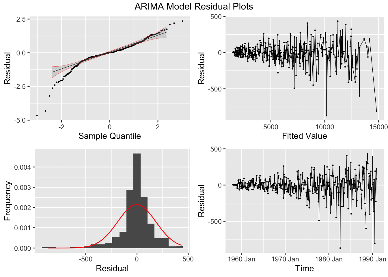
In the code chunk below, I read in a very similar custom function to the plot_residuals() functions from previous chapters, but I plot the PACF as well as the ACF and run the KPSS unitroot test for stationarity in addition to the Ljung-Box test. All plots are printed, but nothing is returned. Plots can be regenerated if they need to be saved, or displayed again with modifications. Additionally, this version of the function is able to handle augmented model objects that contain multiple models. This version loops through each model and generates separate plots for each one. These modifications provide more complete materials to analyze the residuals from models and allow for the quick analysis of the residuals of comparable models using less code. I would recommend using this function for analysis and considering models, but when creating visualizations for a final product of the analysis it is important to carefully consider and craft each visualization.
#library(tidyverse)
#library(fpp3)
library(qqplotr)
library(gridExtra)
# custom function:
plot_residuals <- function(df, title = ""){
  df <- df |>
    mutate(scaled_res = scale(.resid) |> as.vector())

  unique <- unique(df$.model)

  print(df |> features(.resid, ljung_box))

  print(df |> features(.resid, unitroot_kpss))

  if (length(title) != length(unique)){
    if (title == ""){
      title <- unique
    }
  }

  j <- 1
  for (i in unique){
    current_model <- df |> filter(.model == i)

    acf <- ACF(current_model, y = .resid, na.action = na.omit) |> autoplot() + labs(title = paste("AFC of", title[j], "Residuals"))

    pacf <- PACF(current_model, y = .resid, na.action = na.omit) |> autoplot() + labs(title = paste("PAFC of", title[j], "Residuals"))

    plot1 <- current_model |>
      ggplot(aes(sample = scaled_res)) +
      geom_qq(size = 0.25, na.rm = TRUE) +
      stat_qq_line(linewidth = 0.25, na.rm = TRUE) +
      stat_qq_band(alpha = 0.3, color = "red", na.rm = TRUE) +
      labs(x = "Sample Quantile", y = "Residual")

    plot2 <- current_model |>
      ggplot(mapping = aes(x = .resid)) +
      geom_histogram(aes(y = after_stat(density)), na.rm = TRUE, bins = 20) +
      stat_function(fun = dnorm, args = list(mean = mean(df$.resid), sd = sd(df$.resid)), color = "red", na.rm = TRUE) +
      labs(y = "Frequency", x = "Residual")

    plot3 <- current_model |>
      ggplot(mapping = aes(x = .fitted, y = .resid)) +
      geom_point(size = 0.25, na.rm = TRUE) +
      geom_line(linewidth = 0.25, na.rm = TRUE) +
      labs(x = "Fitted Value", y = "Residual")

    plot4 <- current_model |>
      ggplot(mapping = aes(x = time, y = .resid)) +
      geom_point(size = 0.25, na.rm = TRUE) +
      geom_line(linewidth = 0.25, na.rm = TRUE) +
      labs(x = "Time", y = "Residual")

    print(acf)
    print(pacf)
    combined_plot <- grid.arrange(plot1, plot3, plot2, plot4, ncol = 2, nrow = 2, top = paste(title[j], "Residual Plots"))
    j <- j + 1
  }

return()
}
# to use this function you must have this code chunk in your document
5.10.1 Examples of AR, MA, and ARMA Models
To show examples of different AR, MA and ARMA models, we will generate data using the arima.sim() function. This function returns a time series object, which can easily be turned into a tsibble using the as_tsibble() function. The time is automatically recognized as periodic from the time series object.
# MA2 model
(firstma2 <- arima.sim(n=1000,list(ma=c(0.7,-0.28))) |> #generates 1000 obs
  as_tsibble())
## # A tsibble: 1,000 x 2 [1]
## index value
## <dbl> <dbl>
## 1 1 0.344
## 2 2 -0.807
## 3 3 -0.201
## 4 4 1.05
## 5 5 -1.33
## 6 6 -1.36
## 7 7 2.42
## 8 8 0.509
## 9 9 -2.01
## 10 10 -2.68
## # ℹ 990 more rows# gives the moving average coefficients
# first and second lag are significant and then it drops off
# its also is alternating because we have given it the first one positive and the second one negativeAfter generating the data, I then plot the series, its ACF and PACF. This should be the first step whenever you encounter new data. For seasonal data, it can be useful to look at a plot for a single seasonal period or to look at seasonal subseries plots. Different types of time series plots are covered in Chapter 1.
firstma2 |>
  ggplot(aes(x = index, y = value)) +
    geom_point(size = 0.25) +
    geom_line(linewidth = 0.25) +
  labs(title = "Plot of First Simulated MA2 Model",
       x = "Time",
       y = "Value")
ACF(firstma2, value, lag_max = 100) |> autoplot() +
  labs(title = "ACF of First Simulated MA2 Model")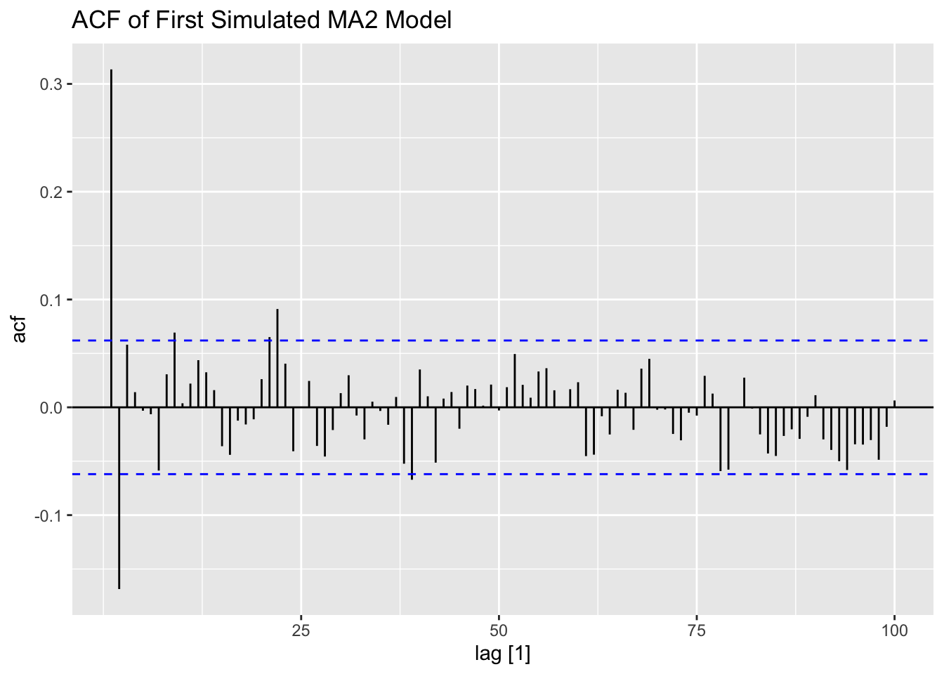
PACF(firstma2, value, lag_max = 100) |> autoplot() +
  labs(title = "PACF of First Simulated MA2 Model")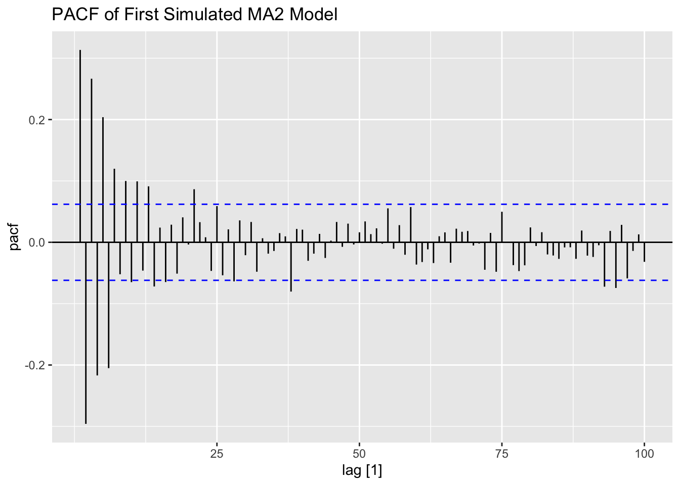
The second MA(2) series, generated below, has a larger variance than the first one. The increased volatility can be clearly seen in the plot of the data.
## # A tsibble: 1,000 x 2 [1]
##    index  value
##    <dbl>  <dbl>
##  1     1 -0.718
##  2     2  1.46
##  3     3 -2.41
##  4     4  1.71
##  5     5 -1.10
##  6     6  1.70
##  7     7 -1.70
##  8     8  1.08
##  9     9  1.44
## 10    10 -1.70
## # ℹ 990 more rows
# coefficient of epsilon is larger than one in abs value
# shows up as an explosive type of behavior in some cases (statistically different from 0)
secondma2 |>
ggplot(aes(x = index, y = value)) +
geom_point(size = 0.25) +
geom_line(linewidth = 0.25) +
labs(title = "Plot of Second Simulated MA2 Model",
x = "Time",
y = "Value")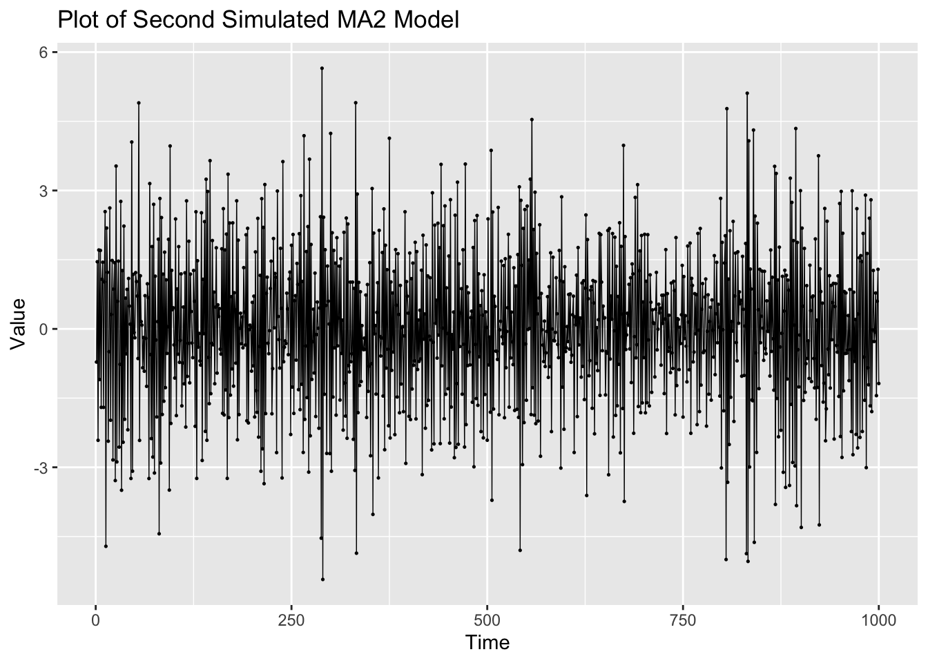
ACF(secondma2, value, lag_max = 100) |> autoplot() +
  labs(title = "ACF of Second Simulated MA2 Model")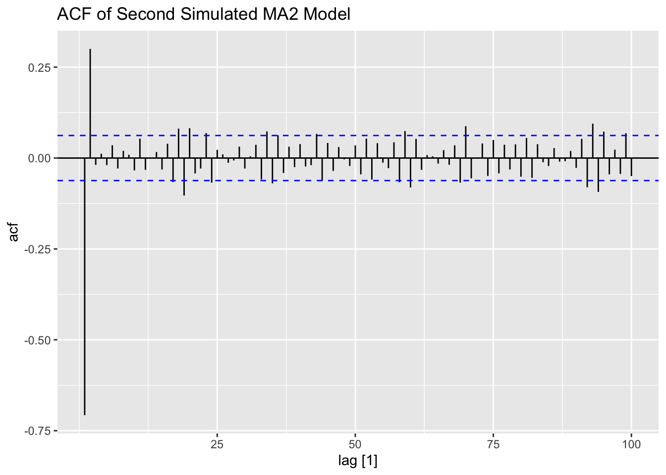
PACF(secondma2, value, lag_max = 100) |> autoplot() +
  labs(title = "PACF of Second Simulated MA2 Model")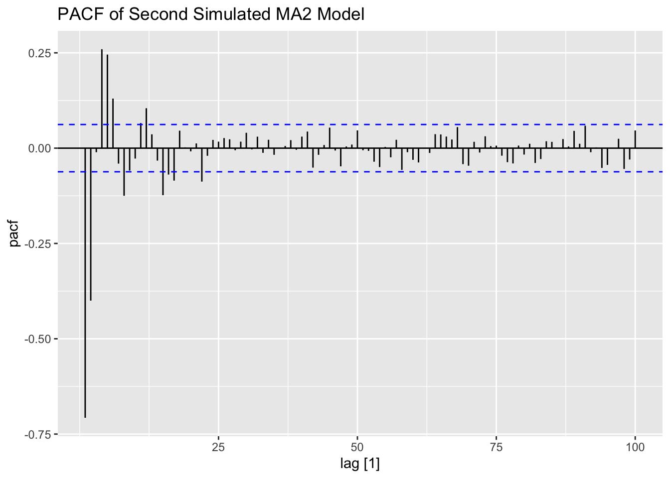
Examining the first generated AR(2) process, the data appears to be much less stationary than the AR processes generated above. This is reflected in both the ACF and PACF.
# Ar2 - coefficients must be betweeen negative and positive one
(firstar2 <- arima.sim(n=1000,list(ar=c(0.4,0.5))) |>
  as_tsibble())
## # A tsibble: 1,000 x 2 [1]
## index value
## <dbl> <dbl>
## 1 1 -1.14
## 2 2 -0.967
## 3 3 -0.228
## 4 4 -1.17
## 5 5 0.228
## 6 6 -1.68
## 7 7 -0.833
## 8 8 -0.903
## 9 9 -1.82
## 10 10 -0.370
## # ℹ 990 more rowsfirstar2 |>
ggplot(aes(x = index, y = value)) +
geom_point(size = 0.25) +
geom_line(linewidth = 0.25) +
labs(title = "Plot of First Simulated AR2 Model",
x = "Time",
y = "Value")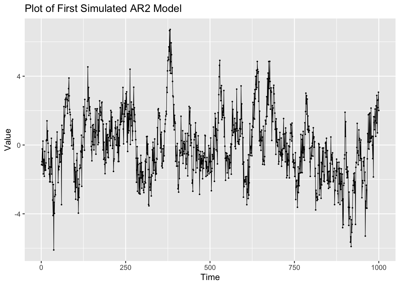
ACF(firstar2, value, lag_max = 100) |> autoplot() +
  labs(title = "ACF of First Simulated AR2 Model")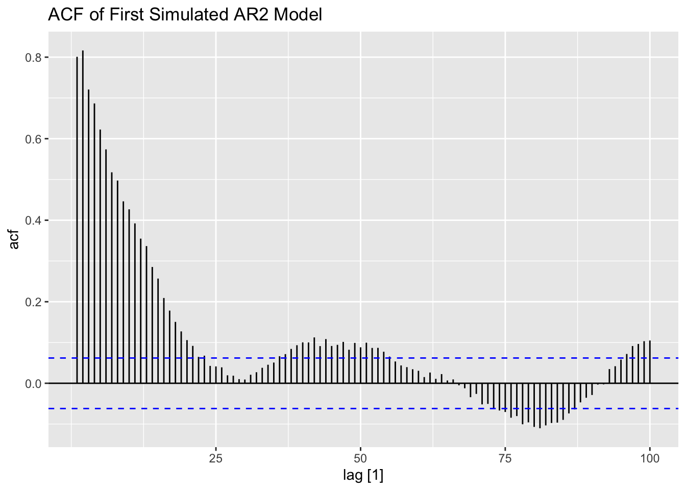
# look at the pacf
PACF(firstar2, value, lag_max = 100) |> autoplot() +
  labs(title = "PACF of First Simulated AR2 Model")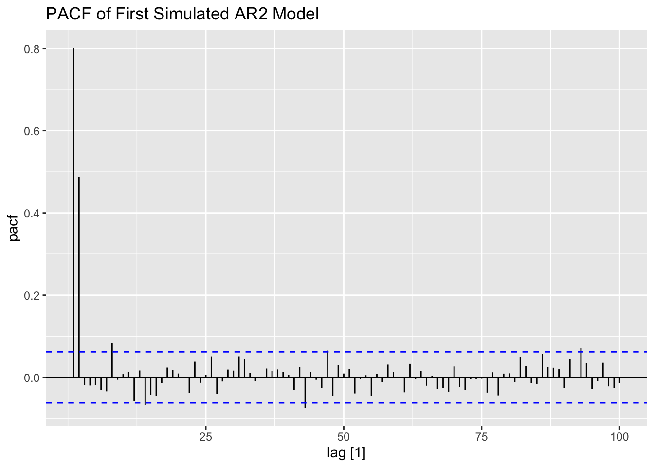
The second simulated AR(2) process only has 100 observations, leading to a much more visualized time plot. The ACF and PACF show that this series contains lingering autocorrelation.
## # A tsibble: 100 x 2 [1]
##    index  value
##    <dbl>  <dbl>
##  1     1  0.340
##  2     2 -0.619
##  3     3  0.579
##  4     4  0.528
##  5     5  0.634
##  6     6  1.10
##  7     7  1.83
##  8     8  0.935
##  9     9  0.149
## 10    10  1.26
## # ℹ 90 more rows
secondar2 |>
ggplot(aes(x = index, y = value)) +
geom_point(size = 0.25) +
geom_line(linewidth = 0.25) +
labs(title = "Plot of Second Simulated AR2 Model",
x = "Time",
y = "Value")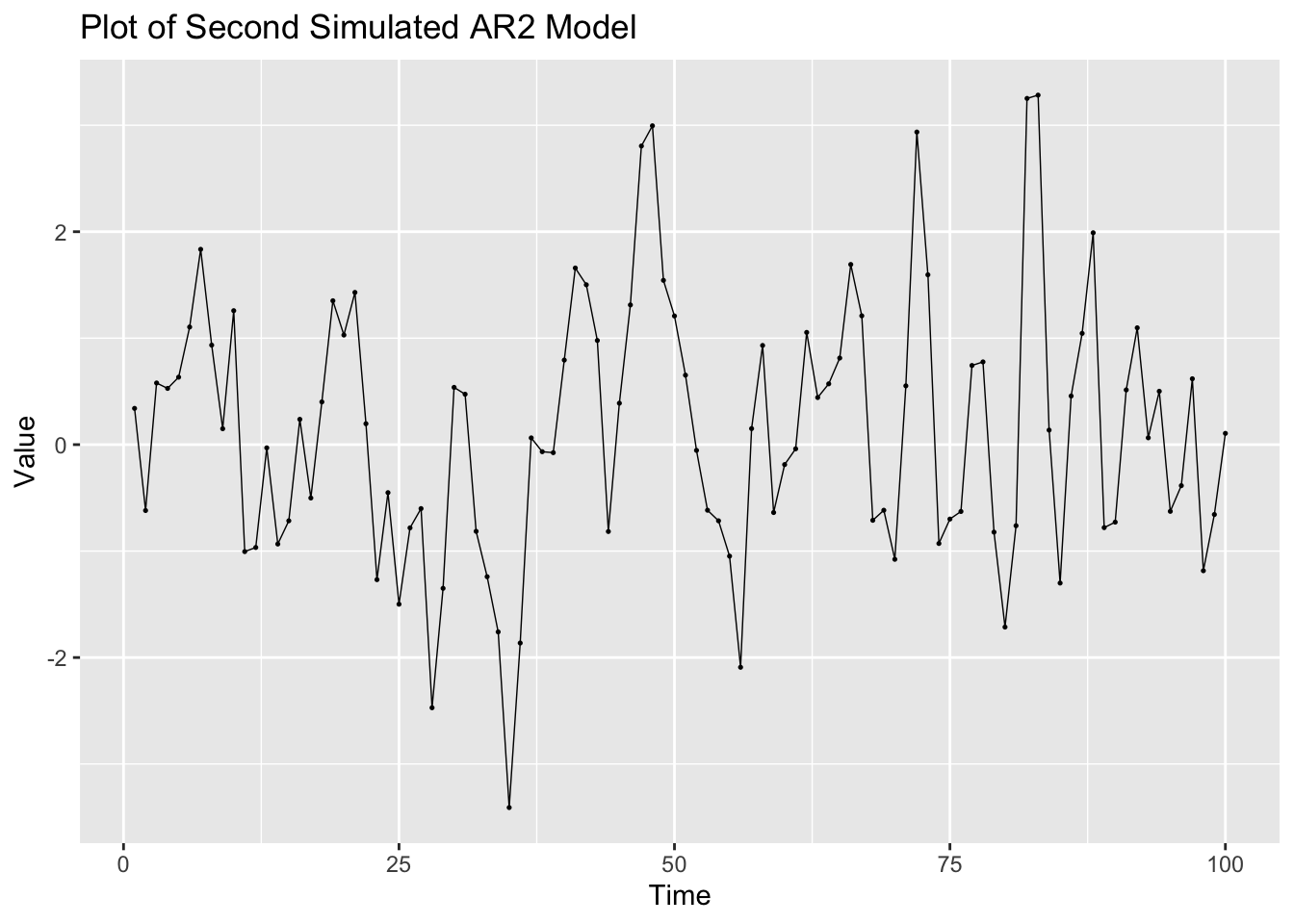
ACF(secondar2, value, lag_max = 25) |> autoplot() +
  labs(title = "ACF of Second Simulated AR2 Model")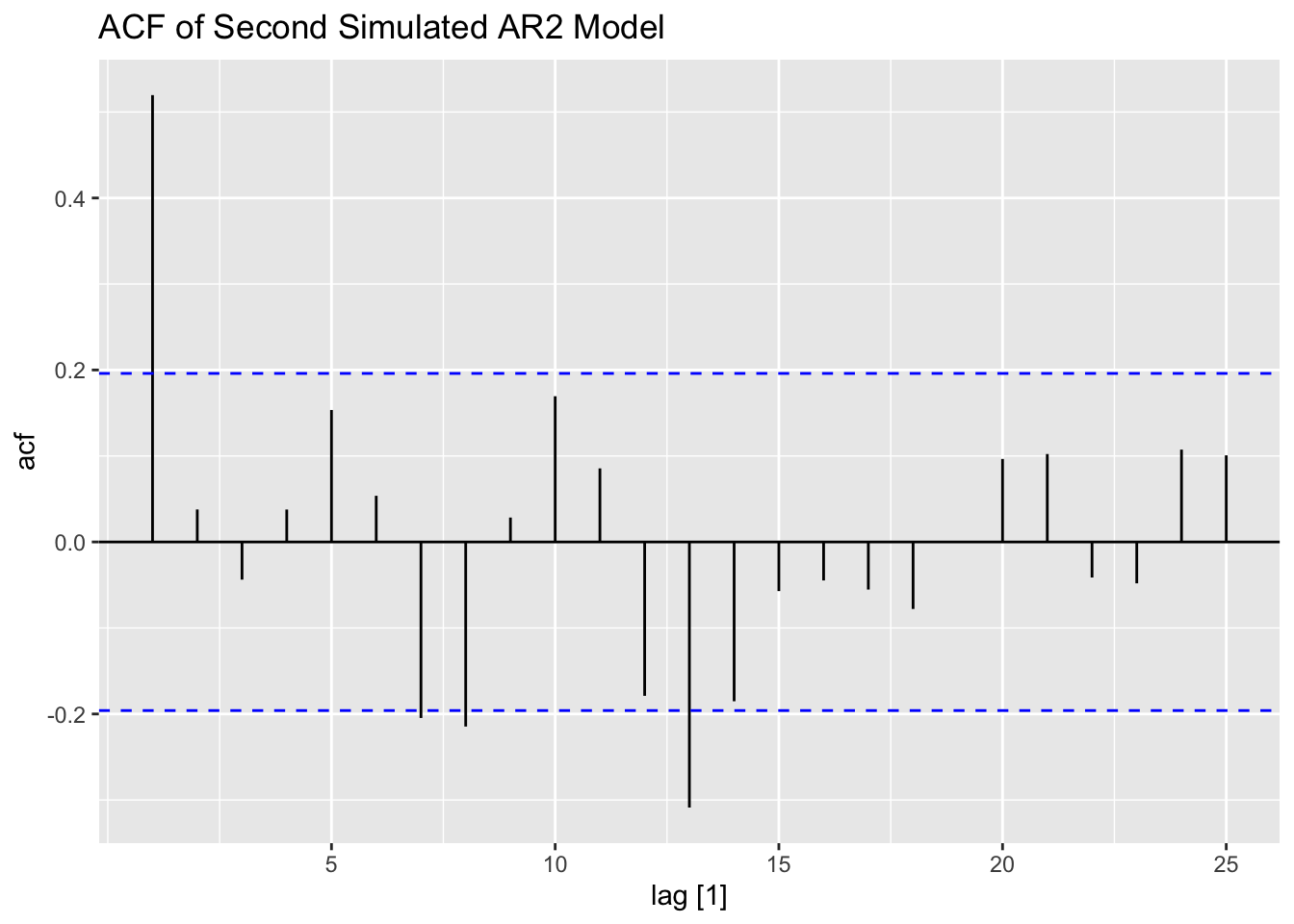
PACF(secondar2, value, lag_max = 25) |> autoplot() +
  labs(title = "PACF of Second Simulated AR2 Model")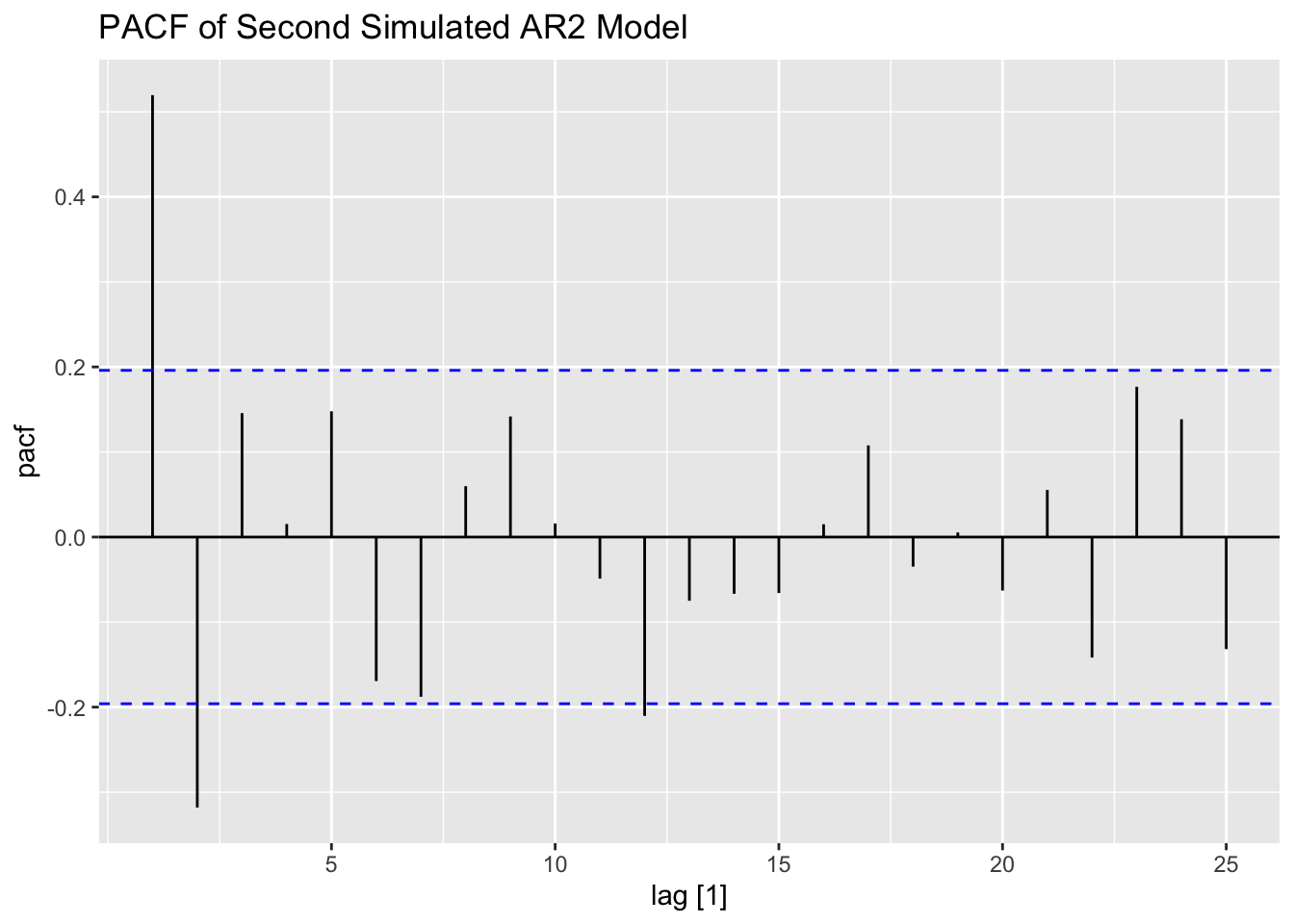
The simulated ARMA process is only 100 observations as well. Again, this series contians lingering autocorrelation in both the ACF and PACF.
## # A tsibble: 100 x 2 [1]
##    index  value
##    <dbl>  <dbl>
##  1     1  0.214
##  2     2 -1.16
##  3     3 -0.981
##  4     4 -0.659
##  5     5 -2.74
##  6     6 -2.75
##  7     7 -0.475
##  8     8  0.983
##  9     9  2.50
## 10    10  1.91
## # ℹ 90 more rows
firstarma |>
ggplot(aes(x = index, y = value)) +
geom_point(size = 0.25) +
geom_line(linewidth = 0.25) +
labs(title = "Plot of First Simulated ARMA Model",
x = "Time",
y = "Value")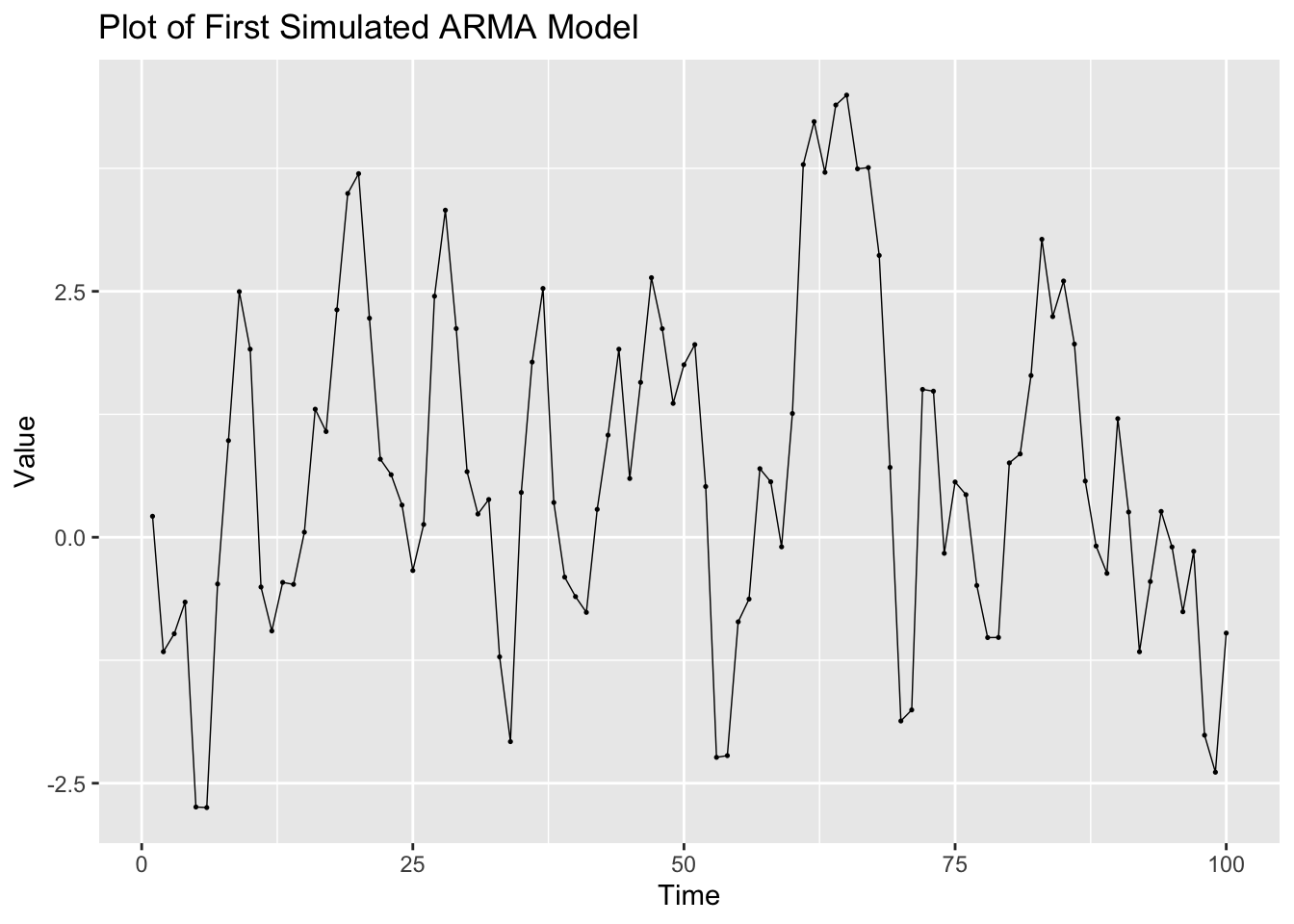
ACF(firstarma, value, lag_max = 25) |> autoplot() +
  labs(title = "ACF of First Simulated ARMA Model")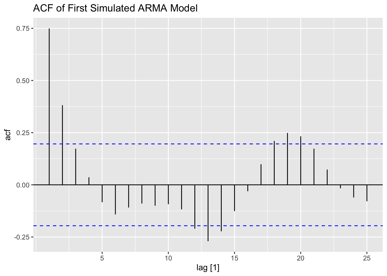
PACF(firstarma, value, lag_max = 25) |> autoplot() +
  labs(title = "PACF of First Simulated ARMA Model")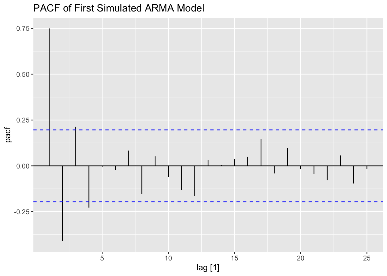
The second ARMA process simulated appears to have a non-constant variance. This is reflected in the ACF and PACF and can be seen on the time plot as well.
## # A tsibble: 100 x 2 [1]
##    index  value
##    <dbl>  <dbl>
##  1     1 -0.170
##  2     2  0.261
##  3     3 -0.651
##  4     4 -1.11
##  5     5  1.45
##  6     6  0.693
##  7     7 -2.02
##  8     8  2.63
##  9     9 -0.855
## 10    10 -0.304
## # ℹ 90 more rows
secondarma |>
ggplot(aes(x = index, y = value)) +
geom_point(size = 0.25) +
geom_line(linewidth = 0.25) +
labs(title = "Plot of Second Simulated ARMA Model",
x = "Time",
y = "Value")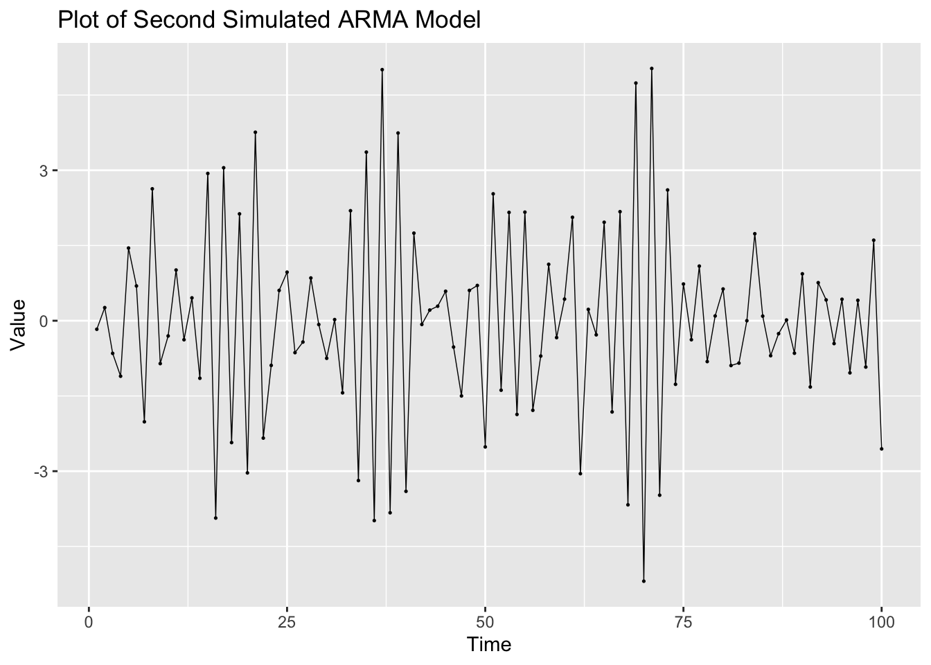
ACF(secondarma, value, lag_max = 25) |> autoplot() +
  labs(title = "ACF of Second Simulated ARMA Model")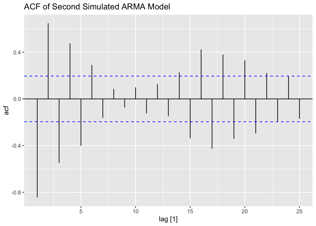
PACF(secondarma, value, lag_max = 25) |> autoplot() +
  labs(title = "PACF of Second Simulated ARMA Model")
5.10.2 Example 5.1: Loan Applications Data
For this example we will be using data from LoanApplications.csv, which contains the weekly total number of loan applications in a local branch of a national bank for the last 2 years.38
(loans <- read_csv("data/LoanApplications.csv") |>
  rename(time = 1, applications = 2) |>
  as_tsibble(index = time))
## Rows: 104 Columns: 2
## ── Column specification ───────────────────────────────────────
## Delimiter: ","
## dbl (2): Week, Applications
##
## ℹ Use `spec()` to retrieve the full column specification for this data.
## ℹ Specify the column types or set `show_col_types = FALSE` to quiet this message.## # A tsibble: 104 x 2 [1]
## time applications
## <dbl> <dbl>
## 1 1 71
## 2 2 57
## 3 3 62
## 4 4 64
## 5 5 65
## 6 6 67
## 7 7 65
## 8 8 82
## 9 9 70
## 10 10 74
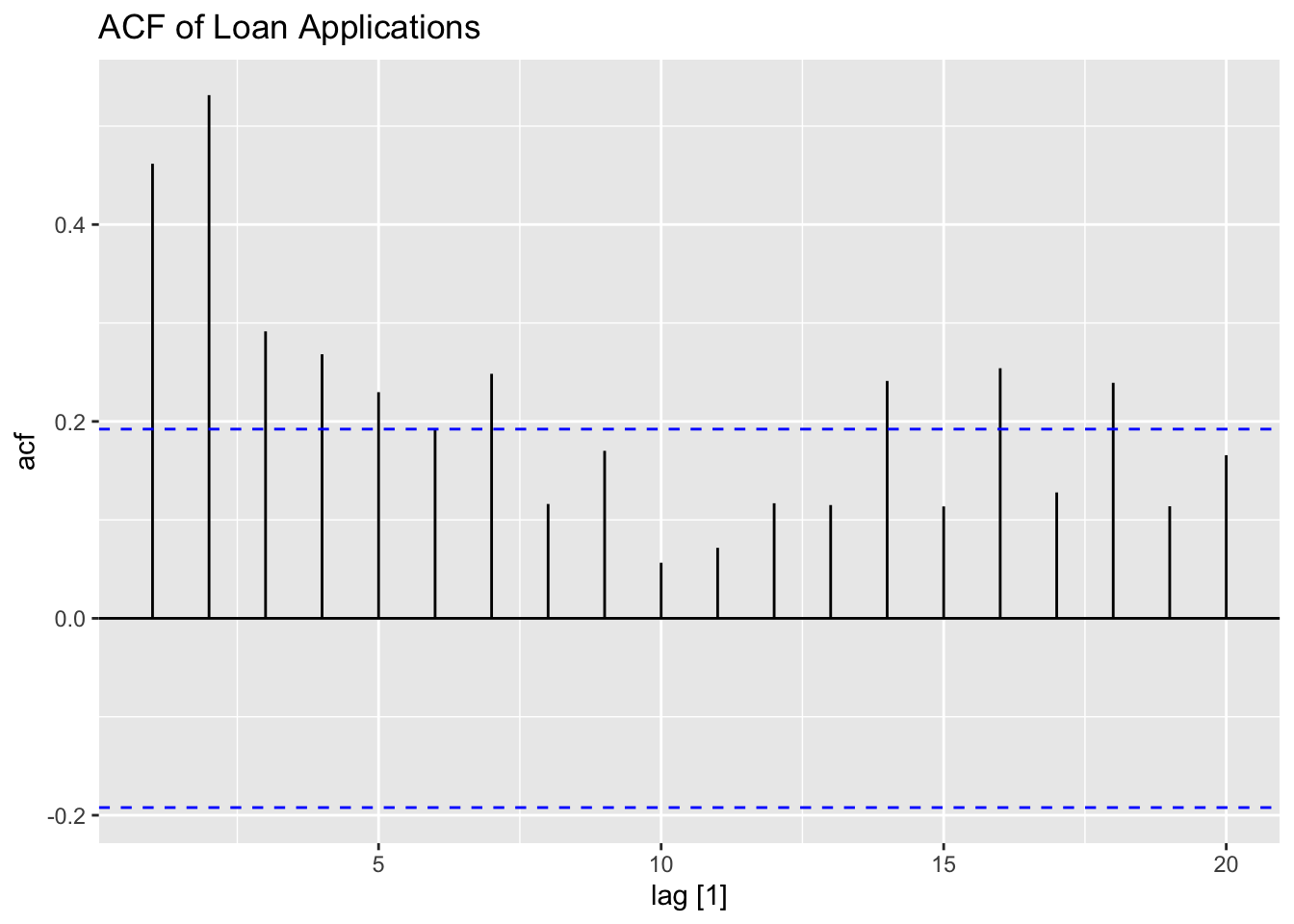
## # ℹ 94 more rowsAs always, we start our analysis by plotting the series. The data appears to have a slight downward trend and could possibly contain some autocorrelation.
loans |>
  ggplot(aes(x = time, y = applications)) +
  geom_point(size = 0.5) +
  geom_line(linewidth = 0.5) +
  labs(title = "Plot of Loan Applications Data over Time")
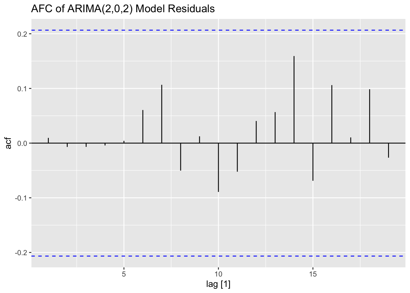
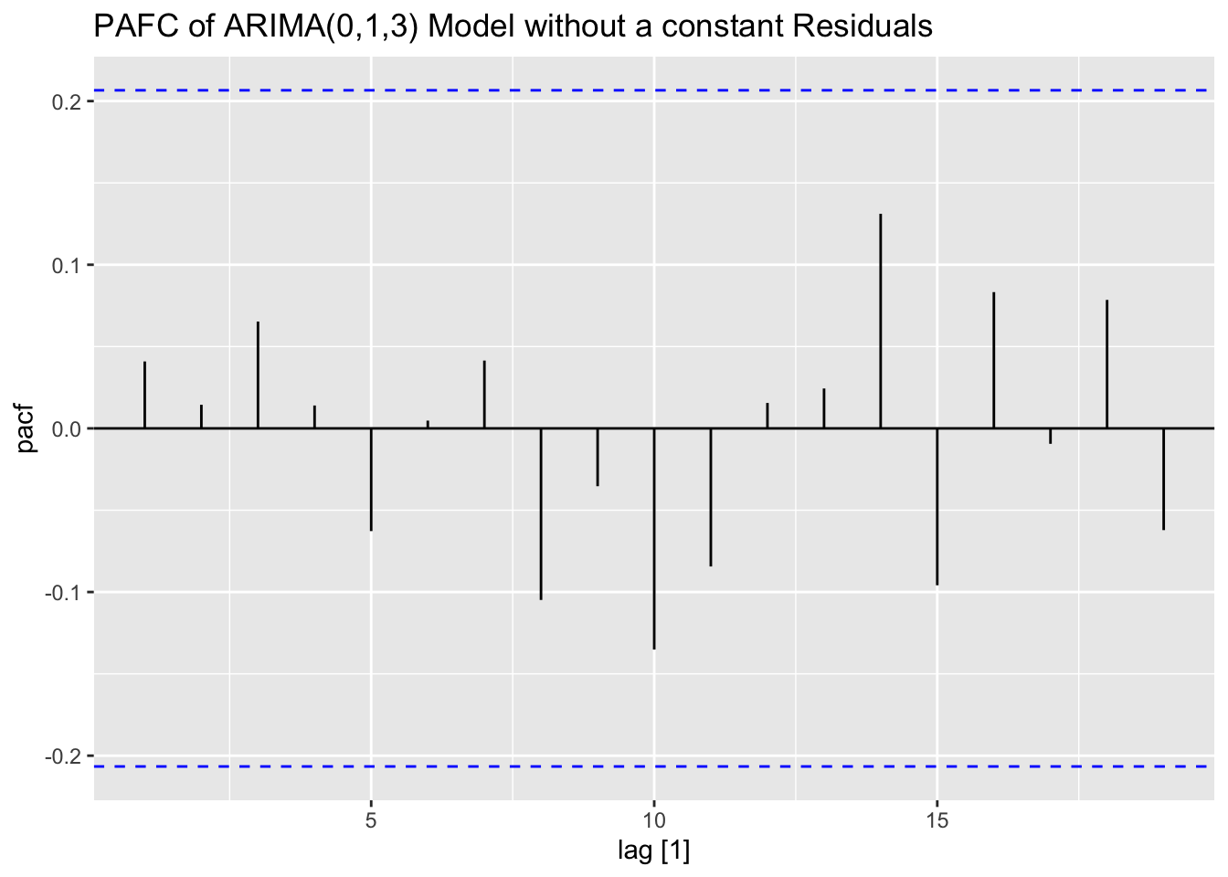
Next, I plot the ACF and PACF of the series. The ACF clearly shows that the data has lingering autocorrelation, suggesting a need for both an AR and MA component. The PACF plot cuts off after lag = 2, which suggests that AR(2) component may be appropriate. The ACF has persistent autocorrelation, but possible an MA(2) or MA(3) component should be tried.

I fit three models to the data: ARIMA(2,0,0), ARIMA(2,0,2), and the best model according to AICc. When using the ARIMA() function, if any component of the model is not specified the function finds the optimal values of the parameter according to ic =. When ic = is not specified, the default criterion is AICc. Note: usually the algorithm uses a stepwise procedure to select the best model, meaning it does not consider all possible models. To consider all possible models, set stepwise = FALSE. The basic structure of each model is: dependent_var ~ 1 + pdq(0,0,0) + PDQ(0,0,0). The 1 indicates that the model contains a constant. If a zero were there instead, there would be no constant. pdq() contains the non-seasonal component specifications of the model while PDQ() contains the seasonal ones. If exogenous regressors are included, the ARIMA component models the residuals from that model. Note: if any components of the model are not specified, they are selected through minimizing the AICc.
loans.fit <- loans |>
  filter(time <= 90) |>
  model(arima200 = ARIMA(applications ~ 1 + pdq(2,0,0) + PDQ(0,0,0)),
        arima202 = ARIMA(applications ~ 1 + pdq(2,0,2) + PDQ(0,0,0)),
        best = ARIMA(applications, ic = "aicc", stepwise = FALSE))
# same as ARMA(2,0) model
The tidy() function produces a table containing all of the coefficients in all models. The accuracy() function produces a table containing the measures of accuracy for each model in the object. This function also works on forecasts as well when using a training set and test set. The report() function generates a report on any single model, which can be isolated using select(). When using the optimization features of the ARIMA() function, report() is the quickest way to find out what kind of model was selected. glance() provides a quick look at different measures of fit and the AR and MA roots. Make sure not to allow an automated function to select any model you are not able to explain mathematically. It is also important to be able to explain how the function selects the best model as well.
dig <- function(x) (round(x, digits = 3))
loans.fit |> tidy() |> mutate_if(is.numeric, dig) |> gt() |>
tab_header(title = "Coefficients of Loans Data Models")| Coefficients of Loans Data Models | |||||
| .model | term | estimate | std.error | statistic | p.value |
|---|---|---|---|---|---|
| arima200 | ar1 | 0.252 | 0.098 | 2.576 | 0.012 |
| arima200 | ar2 | 0.379 | 0.099 | 3.832 | 0.000 |
| arima200 | constant | 24.999 | 0.644 | 38.830 | 0.000 |
| arima202 | ar1 | 0.283 | 0.326 | 0.868 | 0.388 |
| arima202 | ar2 | 0.210 | 0.342 | 0.613 | 0.542 |
| arima202 | ma1 | -0.008 | 0.321 | -0.024 | 0.981 |
| arima202 | ma2 | 0.219 | 0.294 | 0.746 | 0.458 |
| arima202 | constant | 34.497 | 0.785 | 43.947 | 0.000 |
| best | ma1 | -0.737 | 0.105 | -7.004 | 0.000 |
| best | ma2 | 0.231 | 0.145 | 1.593 | 0.115 |
| best | ma3 | -0.354 | 0.101 | -3.521 | 0.001 |
loans.fit |> accuracy() |> mutate_if(is.numeric, dig) |> gt() |>
tab_header(title = "Coefficients of Loans Data Models")| Coefficients of Loans Data Models | |||||||||
| .model | .type | ME | RMSE | MAE | MPE | MAPE | MASE | RMSSE | ACF1 |
|---|---|---|---|---|---|---|---|---|---|
| arima200 | Training | 0.023 | 6.280 | 4.983 | -0.828 | 7.381 | 0.757 | 0.778 | 0.033 |
| arima202 | Training | 0.005 | 6.250 | 5.008 | -0.847 | 7.420 | 0.761 | 0.775 | 0.010 |
| best | Training | -0.296 | 6.306 | 5.023 | -1.260 | 7.483 | 0.763 | 0.782 | 0.041 |
# Loop to generate reports for each model
for (x in 1:ncol(loans.fit)){
  loans.fit[x] |> report()
  print(x)
}
## Series: applications
## Model: ARIMA(2,0,0) w/ mean
##
## Coefficients:
## ar1 ar2 constant
## 0.2523 0.3794 24.9986
## s.e. 0.0980 0.0990 0.6438
##
## sigma^2 estimated as 40.8: log likelihood=-293.31
## AIC=594.63 AICc=595.1 BIC=604.63
## [1] 1
## Series: applications
## Model: ARIMA(2,0,2) w/ mean
##
## Coefficients:
## ar1 ar2 ma1 ma2 constant
## 0.2830 0.2096 -0.0076 0.2193 34.4971
## s.e. 0.3261 0.3421 0.3207 0.2939 0.7850
##
## sigma^2 estimated as 41.37: log likelihood=-292.91
## AIC=597.82 AICc=598.83 BIC=612.82
## [1] 2
## Series: applications
## Model: ARIMA(0,1,3)
##
## Coefficients:
## ma1 ma2 ma3
## -0.7370 0.2305 -0.3542
## s.e. 0.1052 0.1447 0.1006
##
## sigma^2 estimated as 41.61: log likelihood=-291.34
## AIC=590.67 AICc=591.15 BIC=600.63
## [1] 3| .model | sigma2 | log_lik | AIC | AICc | BIC | ar_roots | ma_roots |
|---|---|---|---|---|---|---|---|
| arima200 | 40.799 | -293.314 | 594.628 | 595.098 | 604.627 | 1.32468812197558-0i, -1.98977585025665+0i | |
| arima202 | 41.366 | -292.910 | 597.819 | 598.831 | 612.818 | 1.61111646159226-0i, -2.96099594749206+0i | 0.0174240862748+2.13553726636753i, 0.0174240862748-2.13553726636753i |
| best | 41.611 | -291.336 | 590.672 | 591.148 | 600.627 | 1.09787541275095+0i, -0.22351299524739+1.58796540784205i, -0.22351299524739-1.58796540784205i |
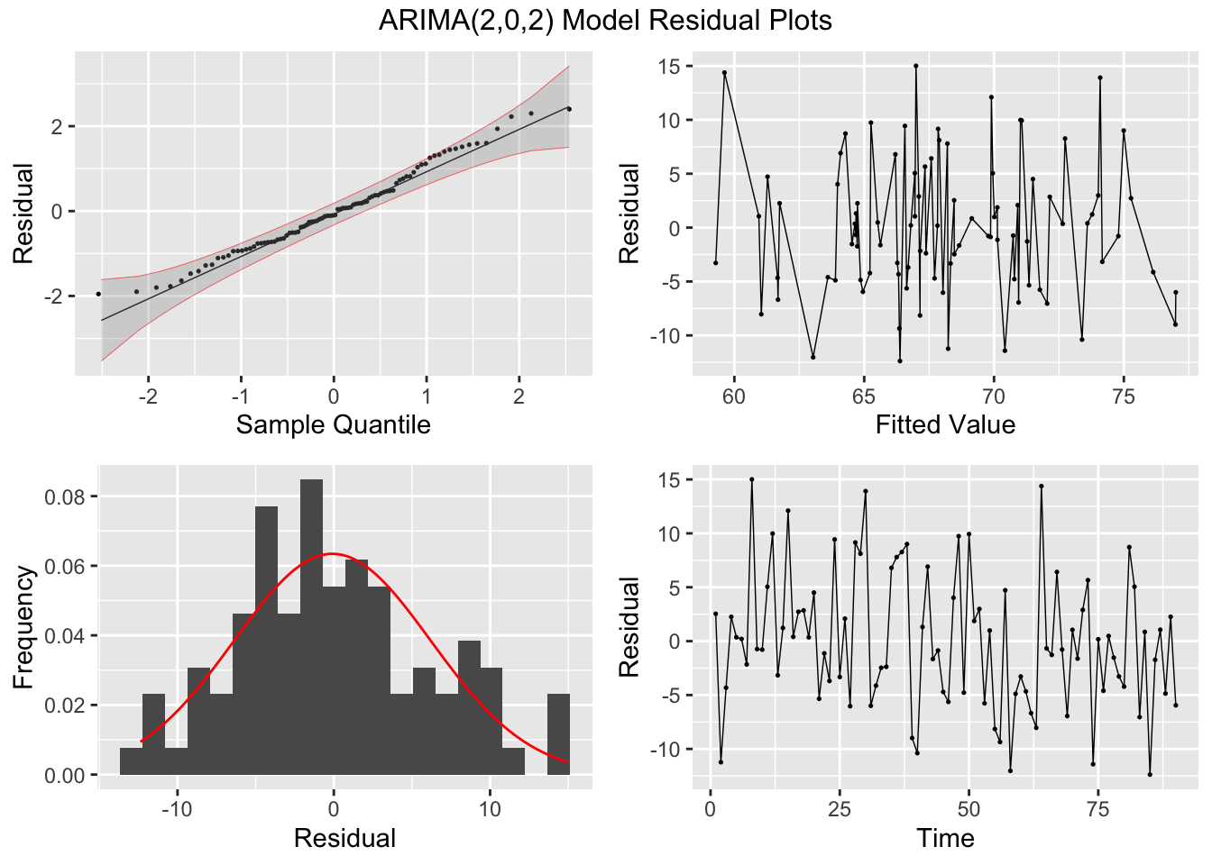
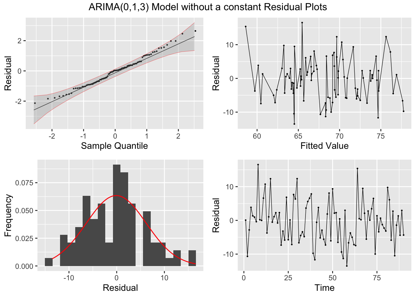
Looking at the measures of error generated by accuracy(), the ARIMA(2,0,2) model with a constant slightly outperforms the ARIMA(0,1,3) model without a constant. This illustrates the importance of including alternative models to the one selected by the algorithm. The best model, as expected, has a lower AIC and AICc than the other models in the training set. I then, conduct the Ljung-Box test, to test for lingering autocorrelation, and the KPSS unitroot test, for stationarity, on the residuals. The Ljung-Box test rejects the null hypothesis that the data is autocorrelated for all models. The KPSS unitroot test rejects the null hypothesis that the data is stationary at the 10% level for all models and the ARIMA(2,0,2) models rejects the null hypothesis at the 5% level. Below, I provide an overview of both statistical tests and their hypotheses:
- Ljung-Box Test
- \(H_{0}:\) The data is independently distributed
- \(H_{A}:\) The data is not independently distributed; they exhibit serial autocorrelation
- KPSS Unitroot Test
- \(H_{0}:\) The data is stationary
- \(H_{A}:\) The data is non-stationary
## # A tibble: 3 × 3
##   .model   lb_stat lb_pvalue
##   <chr>      <dbl>     <dbl>
## 1 arima200    36.1     0.825
## 2 arima202    32.9     0.909
## 3 best 32.2 0.924## # A tibble: 3 × 3
## .model kpss_stat kpss_pvalue
## <chr> <dbl> <dbl>
## 1 arima200 0.374 0.0883
## 2 arima202 0.479 0.0465
## 3 best 0.199 0.1Both of these tests are automatically conducted on the residuals in the updated plot_residuals() function. If the title parameter is not set, the title is the name of the model in the model object.
plot_residuals(augment(loans.fit), title = c("AR2 Model",
"ARIMA(2,0,2) Model",
"ARIMA(0,1,3) Model without a constant"))## # A tibble: 3 × 3
## .model lb_stat lb_pvalue
## <chr> <dbl> <dbl>
## 1 arima200 0.104 0.748
## 2 arima202 0.00854 0.926
## 3 best 0.156 0.693
## # A tibble: 3 × 3
##   .model   kpss_stat kpss_pvalue
##   <chr>        <dbl>       <dbl>
## 1 arima200     0.374      0.0883
## 2 arima202     0.479      0.0465
## 3 best         0.199      0.1
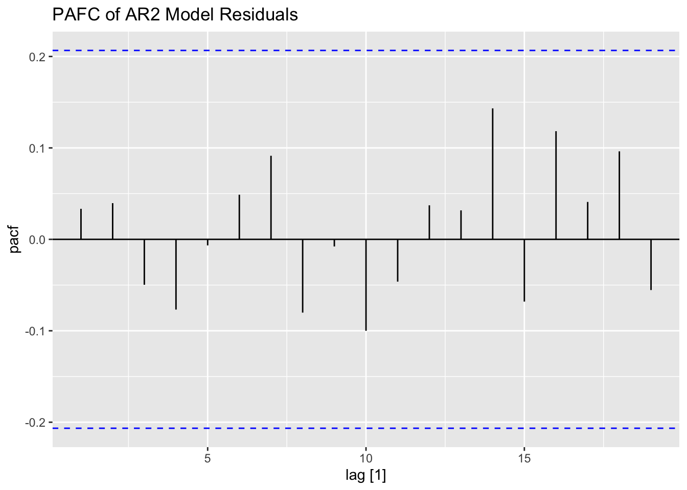
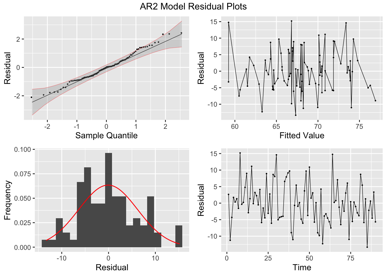


## NULLFinally, I plot the fitted values from the AR(2) model against the original data. As observed in the plot, the fitted series is not as volatile as the original data.
augment(loans.fit) |>
  filter(.model == "arima200") |>
  ggplot(aes(x = time, y = applications)) +
  geom_point(aes(color = "Original"), size = 0.5) +
  geom_line(aes(color = "Original")) +
  geom_point(aes(y = .fitted, color = "Fitted"), size = 0.5) +
  geom_line(aes(y = .fitted, color = "Fitted")) +
  scale_color_manual(values = c(Original = "black", Fitted = "red")) +
  labs(color = "Data",
       title = "Plot of AR2 Model and Loans Application Data")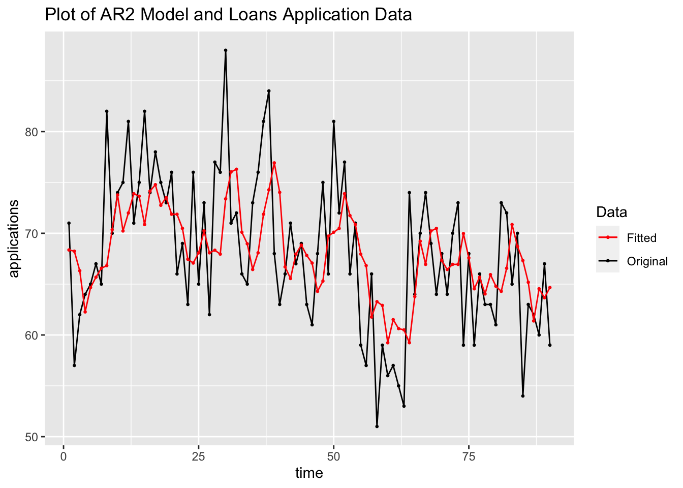
5.10.3 Example 5.2: Dow Jones Index Data
For this example we will be using the monthly average Dow Jones Index from DowJones.csv.39 After reading in the data from the csv, I notice the time variable does not contain the full year, only the last two digits. In the first line, using rename(), I change the index variable’s name to time as well as change the name of variable of interest to index. Then, I modify the time variable adding the correct first two digits of the year and rearraging it so it can be read by yearmonth(). Finally, I change time into a yearmonth type and then make the data into a tsibble.
(dow_jones <- read_csv("data/DowJones.csv") |>
  rename(time = 1, index = `Dow Jones`) |>
  mutate(time = case_when(str_sub(time, start = 5, end = 5) == "9" ~ str_c("19", str_sub(time, start = 5, end = 6), "-", str_sub(time, start = 1, end = 3)),
                          str_sub(time, start = 5, end = 5) == "0" ~ str_c("20", str_sub(time, start = 5, end = 6), "-", str_sub(time, start = 1, end = 3)),
                          str_sub(time, start = 1, end = 1) != "0" | str_sub(time, start = 1, end = 1) != "9" ~ str_c("20", time))) |>
   mutate(time = yearmonth(time)) |>
   as_tsibble(index = time))
## Rows: 85 Columns: 2
## ── Column specification ───────────────────────────────────────
## Delimiter: ","
## chr (1): Date
## dbl (1): Dow Jones
##
## ℹ Use `spec()` to retrieve the full column specification for this data.
## ℹ Specify the column types or set `show_col_types = FALSE` to quiet this message.## # A tsibble: 85 x 2 [1M]
## time index
## <mth> <dbl>
## 1 1999 Jun 10971.
## 2 1999 Jul 10655.
## 3 1999 Aug 10829.
## 4 1999 Sep 10337
## 5 1999 Oct 10730.
## 6 1999 Nov 10878.
## 7 1999 Dec 11497.
## 8 2000 Jan 10940.
## 9 2000 Feb 10128.
## 10 2000 Mar 10922.
## # ℹ 75 more rowsAs with all data, the first step is to plot the variable of interest over time and visually examine the time series. This data is monthly so it could possibly have some seasonality. This series appears to be non-stationary and possible have a changing variance as well.
dow_jones |>
  ggplot(aes(x = time, y = index)) +
  geom_point(size = 0.5) +
  geom_line() +
  labs(title = "Plot of Dow Jones Index over Time")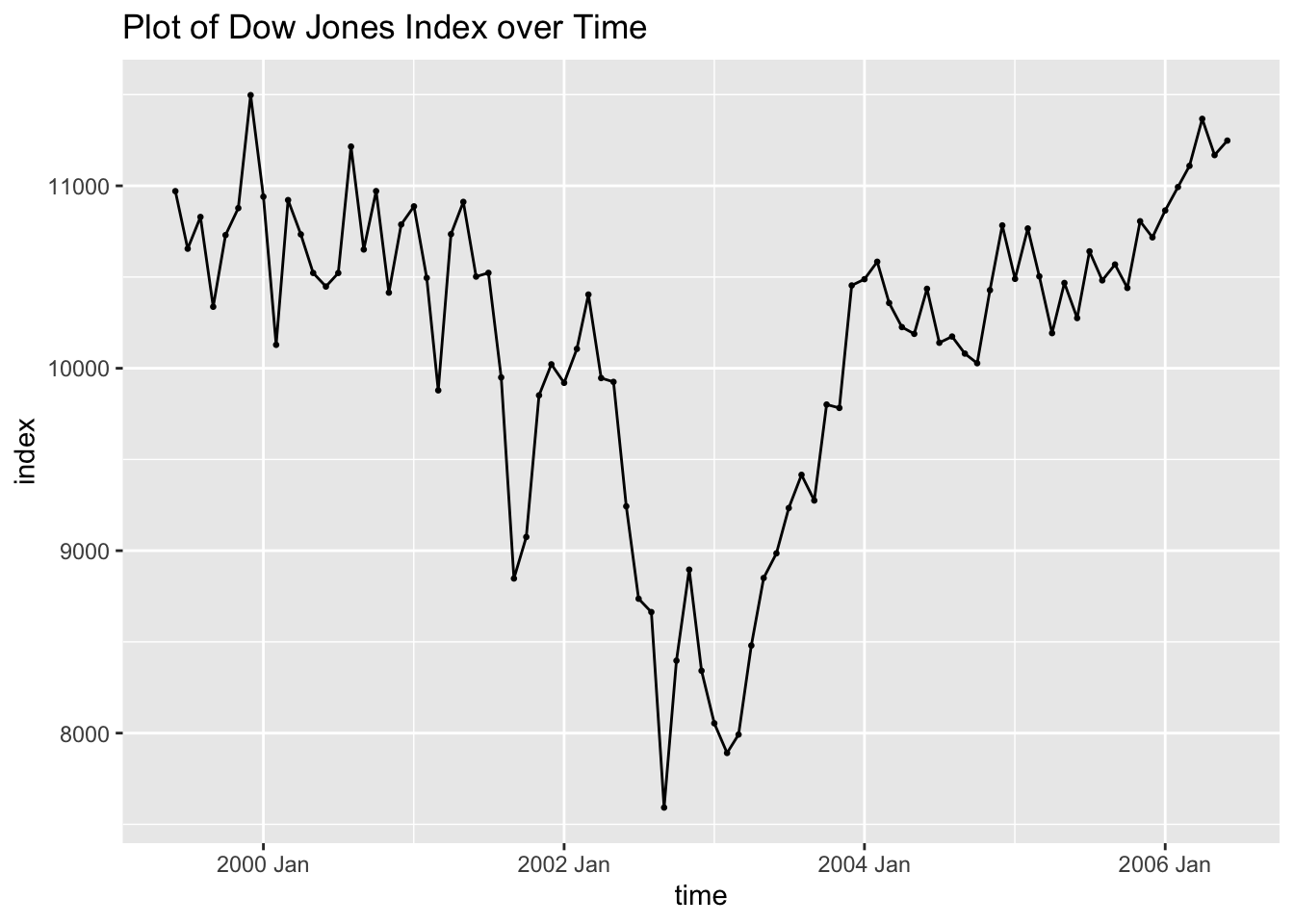
I then plot the ACF of the data, which shows that the data clearly has lingering autocorrelation. The lag persists until the 12 lag, indicating that the data could possible benefit from differencing.

The PACF of the variable of interest also indicates that there is lingering autocorrelation. The spike at the first lag indicates that AR(1) model could possibly fit the data well.

Next, I take the first difference of the series and generate a time plot of the first differenced series as well as the ACF and PACF plots. Note: when considering whether or not to difference data, it is always important to reanalyze the data after differencing to see the effect. The plot of the differenced data over time appears to be much more stationary, though the variance is changing over time. Both the ACF and PACF do not violate the upper or lower bounds.
(dow_jones <- dow_jones |> # create a variable containing the differenced series
  mutate(diff = difference(index, lag = 1)))
## # A tsibble: 85 x 3 [1M]
## time index diff
## <mth> <dbl> <dbl>
## 1 1999 Jun 10971. NA
## 2 1999 Jul 10655. -316.
## 3 1999 Aug 10829. 174.
## 4 1999 Sep 10337 -492.
## 5 1999 Oct 10730. 393.
## 6 1999 Nov 10878. 148.
## 7 1999 Dec 11497. 619.
## 8 2000 Jan 10940. -557.
## 9 2000 Feb 10128. -812.
## 10 2000 Mar 10922. 794.
## # ℹ 75 more rowsdow_jones |>
autoplot(diff, na.rm = TRUE) +
geom_point(size = 0.25, na.rm = TRUE) +
labs(title = "Plot of the First Difference Dow Jones Index Monthly Data")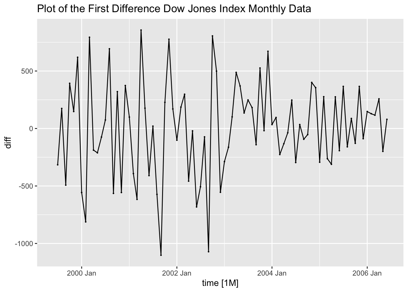
dow_jones |>
  ACF(diff) |>
  autoplot() +
  labs(title = "ACF Plot of the First Differenced Dow Jones Index Monthly Data")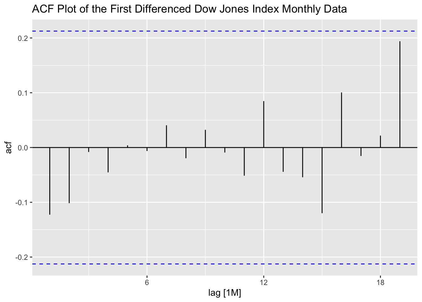
dow_jones |>
  PACF(diff) |>
  autoplot() +
  labs(title = "PACF Plot of the First Differenced Dow Jones Index Monthly Data")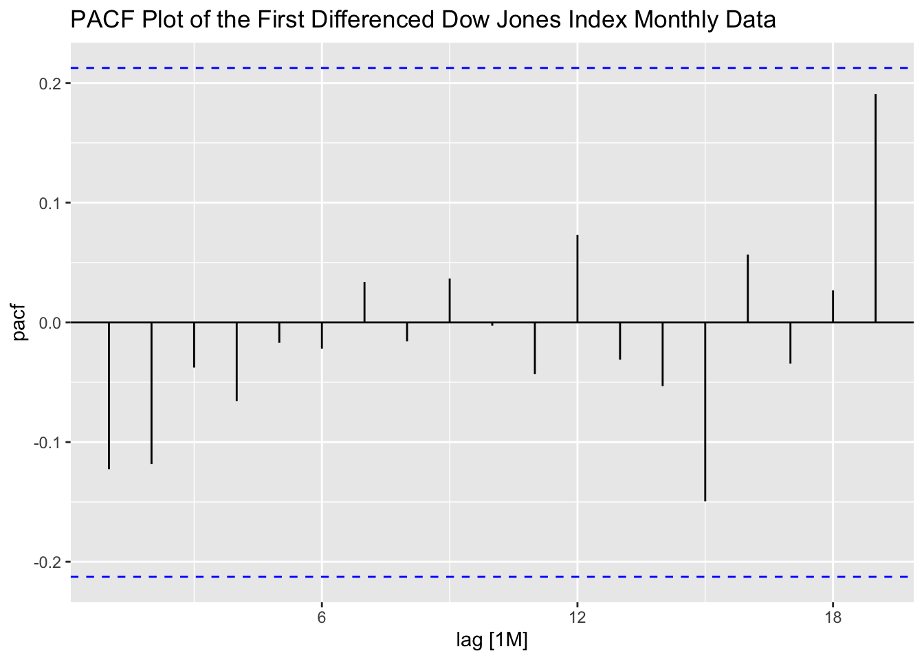
Then using the Dow Jones data I create an AR(1) model, an ARIMA(0,1,0) model, and fit the best model according to AICc. Interestingly, the best model according to AICc is the AR(1) model with a constant that is already fit. All coefficients in the AR(1) model are statisticaly significant. The ARIMA(0,1,0) model out performs the AR(1) model in AIC, AICc, and BIC.
dow_jones.fit <- dow_jones |>
  model(ar1 = ARIMA(index ~ 1 + pdq(1,0,0) + PDQ(0,0,0)),
        arima010 = ARIMA(index ~ 0 + pdq(0,1,0) + PDQ(0,0,0)),
best = ARIMA(index, stepwise = FALSE))## Series: index
## Model: ARIMA(1,0,0) w/ mean
##
## Coefficients:
## ar1 constant
## 0.8934 1097.0271
## s.e. 0.0473 39.8539
##
## sigma^2 estimated as 160467: log likelihood=-629.8
## AIC=1265.59 AICc=1265.89 BIC=1272.92| .model | term | estimate | std.error | statistic | p.value |
|---|---|---|---|---|---|
| ar1 | ar1 | 0.893 | 0.047 | 18.896 | 0 |
| ar1 | constant | 1097.027 | 39.854 | 27.526 | 0 |
| best | ar1 | 0.893 | 0.047 | 18.896 | 0 |
| best | constant | 1097.027 | 39.854 | 27.526 | 0 |
| .model | sigma2 | log_lik | AIC | AICc | BIC | ar_roots |
|---|---|---|---|---|---|---|
| ar1 | 160466.7 | -629.796 | 1265.593 | 1265.889 | 1272.920 | 1.11931637286555+0i |
| arima010 | 165630.1 | -623.926 | 1249.852 | 1249.901 | 1252.283 | |
| best | 160466.7 | -629.796 | 1265.593 | 1265.889 | 1272.920 | 1.11931637286555+0i |
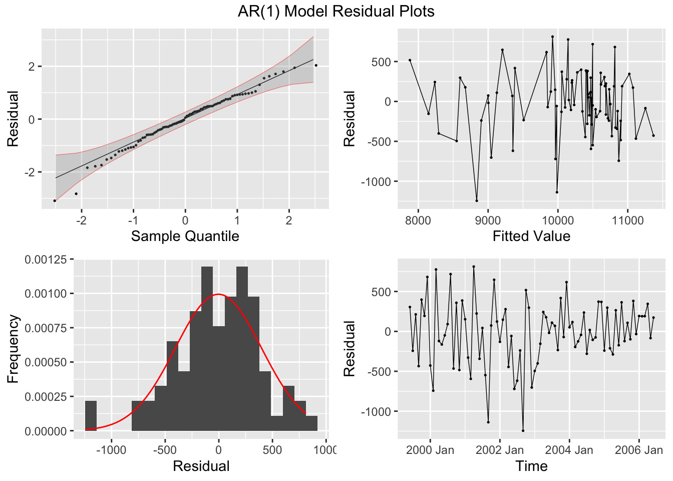
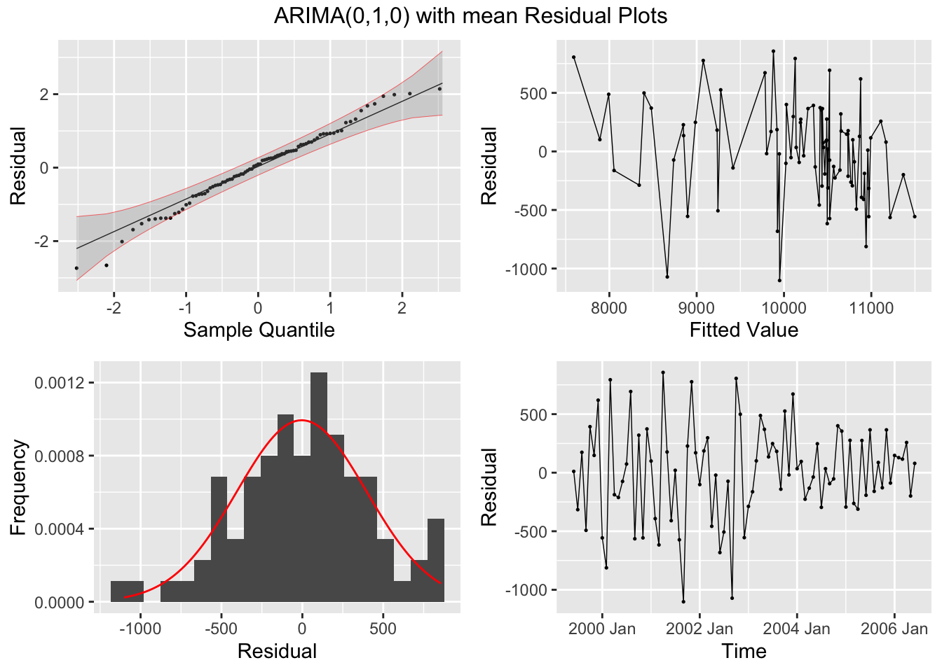
I then plot the residuals of both models, as well as their ACF and PACF, and conduct the Ljung-Box test and KPSS Unitroot test. Both models have residuals that appear approximately normally distributed and in both tests fail to reject the null hypothesis that the residuals are independently distributed (Ljung-Box) or that the data is stationary (KPSS Unitroot). The residuals in both models do not appear to have any lingering autocorrelation or other concerning properties.
dow_jones.fit |>
  select(ar1, arima010) |>
  augment() |>
  plot_residuals(title = c("AR(1) Model", "ARIMA(0,1,0) with mean"))
## # A tibble: 2 × 3
## .model lb_stat lb_pvalue
## <chr> <dbl> <dbl>
## 1 ar1 0.392 0.531
## 2 arima010 1.33 0.249
## # A tibble: 2 × 3
## .model kpss_stat kpss_pvalue
## <chr> <dbl> <dbl>
## 1 ar1 0.216 0.1
## 2 arima010 0.173 0.1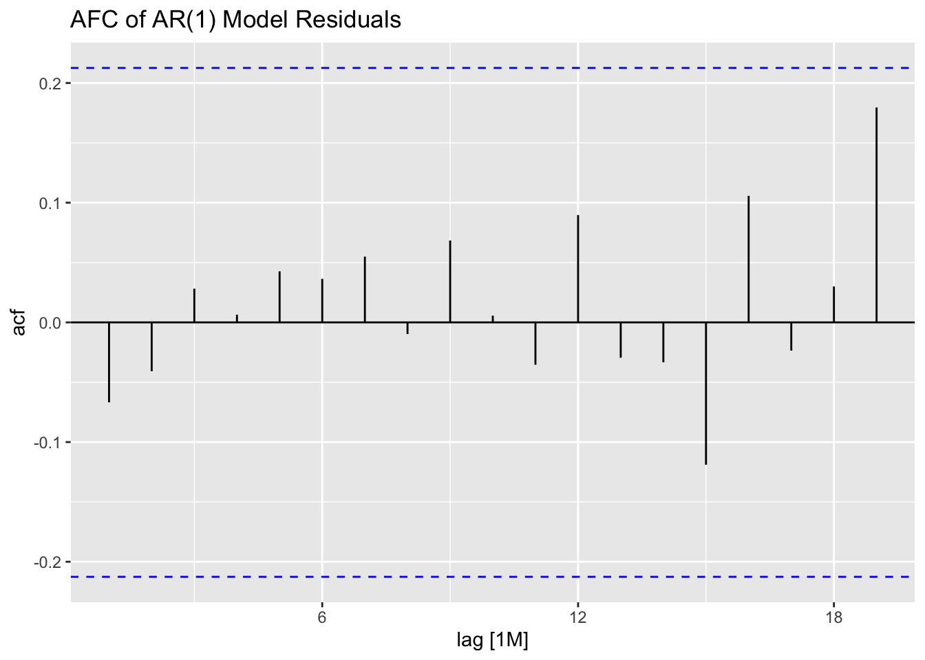


## NULLBelow, I plot the fitted values from the AR(1) model against the original data for visual comparison.
dow_jones.fit |>
  augment() |>
  filter(.model == "ar1") |>
  ggplot(aes(x = time, y = index)) +
  geom_line(aes(color = "Original")) +
  geom_point(aes(color = "Original"), size = 0.5) +
  geom_line(aes(y = .fitted, color = "Fitted")) +
  geom_point(aes(y = .fitted, color = "Fitted"), size = 0.5) +
  scale_color_manual(values = c(Original = "black", Fitted = "red")) +
  labs(title = "Plot of AR(1) Model of the Dow Jones Index and Original Data",
       color = "Data")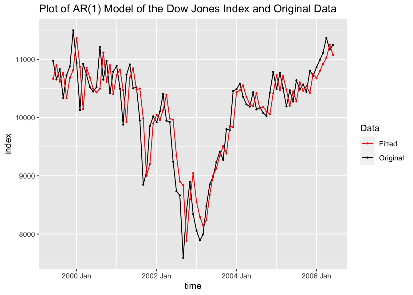
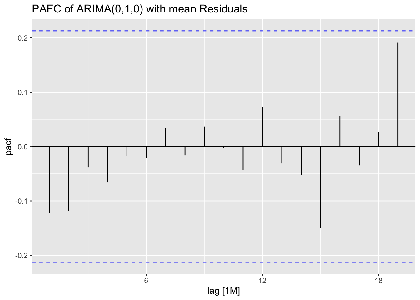
Above, in creating dow_jones.fit I made an ARIMA(0,1,0) model. This model is only the first difference of the data, so the fitted values at \(time = t\) is the actual value at \(time = t-1\).
5.10.4 Example 5.6: Loan Applications Data
For this example we will return to the loan applications data, which has already been read in above and saved as loans. We have already a saved model object, loans.fit, that we will use to generate forecasts from each model in the object. The models are displayed in the code chunk below. This example will focus on the forecasting procedure after models have been fit to the data and evaluated.
## # A mable: 1 x 3
##                 arima200               arima202           best
##                  <model>                <model>        <model>
## 1 <ARIMA(2,0,0) w/ mean> <ARIMA(2,0,2) w/ mean> <ARIMA(0,1,3)>
I generate forecasts for all the models and save them to loans.fc using forecast(h=). This function returns a distribution for the forecast as well as the mean of that distribution. The models are of the first 90 observations, so I will forecast the last 14. This will allow me to use accuracy(forecast, original_data) to generate measures of accuracy for the test set. The ARIMA(0,1,3) model selected by minimizing AICc was more accurate than the other models in the test set by all measures of accuracy shown below. I then plot the forecasts next to each other with the last 25 observations of the original data.
## # A fable: 42 x 4 [1]
## # Key:     .model [3]
##    .model    time applications .mean
##    <chr>    <dbl>       <dist> <dbl>
##  1 arima200    91    N(65, 41)  65.3
##  2 arima200    92    N(64, 43)  63.9
##  3 arima200    93    N(66, 51)  65.9
##  4 arima200    94    N(66, 53)  65.9
##  5 arima200    95    N(67, 55)  66.6
##  6 arima200    96    N(67, 56)  66.8
##  7 arima200    97    N(67, 56)  67.1
##  8 arima200    98    N(67, 57)  67.3
##  9 arima200    99    N(67, 57)  67.4
## 10 arima200   100    N(68, 57)  67.5
## # ℹ 32 more rows## # A tibble: 3 × 10
## .model .type ME RMSE MAE MPE MAPE MASE RMSSE ACF1
## <chr> <chr> <dbl> <dbl> <dbl> <dbl> <dbl> <dbl> <dbl> <dbl>
## 1 arima200 Test -6.46 8.43 7.71 -11.5 13.2 1.17 1.05 0.119
## 2 arima202 Test -6.94 8.84 8.12 -12.3 13.9 1.23 1.10 0.134
## 3 best Test -3.57 6.18 5.09 -6.64 8.72 0.773 0.766 0.0725
5.10.5 Example 5.8: Clothing Sales Data
For this example we will use weekly clothing sales data from ClothingSales.csv. The first thing I do is create two separate variables containing the year and month and use them to create a yearmonth object to bet set as the index.
(clothing <- read_csv("data/ClothingSales.csv") |> mutate(year = case_when(
  str_sub(Date, start = 5, end = 5) == "9" ~ str_c("19", str_sub(Date, start = 5, end = 6)),
  substr(Date, 5, 5) == "0" ~ str_c("20", str_sub(Date, start = 5, end = 6)),
  str_sub(Date, start = 1, end = 1) == "0" ~ str_c("20", str_sub(Date, start = 1, end = 2))
  )) |>
  mutate(month = case_when(str_sub(Date, 1, 1) == "0" ~ str_sub(Date, start = 4, end = 6),
                           str_sub(Date, 1, 1) != "0" ~ str_sub(Date, start = 1, end = 3)
                           )) |>
  mutate(time = yearmonth(str_c(year,"-",month))) |>
  select(time, Sales) |>
  rename(sales = Sales) |>
  as_tsibble(index = time))
## Rows: 144 Columns: 2
## ── Column specification ───────────────────────────────────────
## Delimiter: ","
## chr (1): Date
## dbl (1): Sales
##
## ℹ Use `spec()` to retrieve the full column specification for this data.
## ℹ Specify the column types or set `show_col_types = FALSE` to quiet this message.## # A tsibble: 144 x 2 [1M]
## time sales
## <mth> <dbl>
## 1 1992 Jan 4889
## 2 1992 Feb 5197
## 3 1992 Mar 6061
## 4 1992 Apr 6720
## 5 1992 May 6811
## 6 1992 Jun 6579
## 7 1992 Jul 6598
## 8 1992 Aug 7536
## 9 1992 Sep 6923
## 10 1992 Oct 7566
## # ℹ 134 more rowsOnce the data is read in as a tsibble, I plot the clothing sales data over time. The data appears to be highly seasonal and have a slight upward trend.
clothing |>
  ggplot(aes(x = time, y = sales)) +
  geom_point(size = 0.5) +
  geom_line() +
  labs(title = "Plot of Clothing Sales over Time")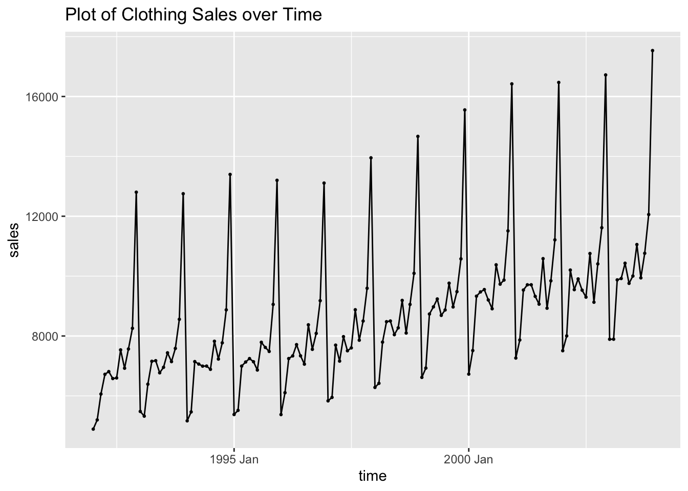
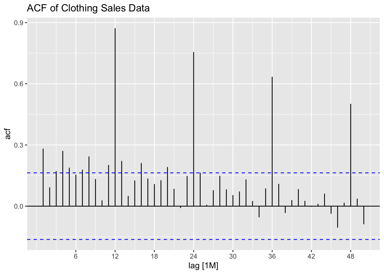
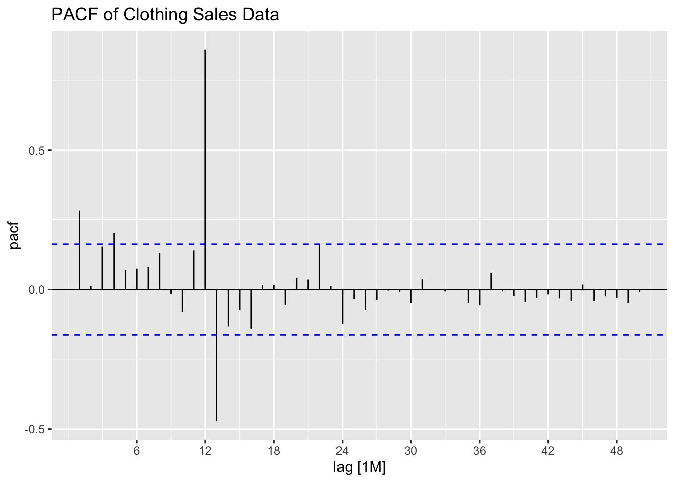
I then plot the ACF and PACF of clothing sales data to identify the components of possible models. The data clearly needs to be seasonally differenced, as there is a consistent spike every 12 lags in the ACF. First differencing could help with the apparent upward trend as well.
I then first and seasonally difference the data as a new variable. Note, doubly differencing the data drops the first 13 observations.
## # A tsibble: 144 x 3 [1M]
##        time sales  diff
##       <mth> <dbl> <dbl>
##  1 1992 Jan  4889    NA
##  2 1992 Feb  5197    NA
##  3 1992 Mar  6061    NA
##  4 1992 Apr  6720    NA
##  5 1992 May  6811    NA
##  6 1992 Jun  6579    NA
##  7 1992 Jul  6598    NA
##  8 1992 Aug  7536    NA
##  9 1992 Sep  6923    NA
## 10 1992 Oct  7566    NA
## # ℹ 134 more rows
Plotting the doubly differenced series shows that the data appears to have lost the trend and the seasonality observed in the plot of the original data.
clothing |>
  ggplot(aes(x = time, y = diff)) +
  geom_point(size = 0.5, na.rm = TRUE) +
  geom_line(na.rm = TRUE) +
  labs(title = "Plot of First and Seasonally Differenced Clothing Sales Data",
       y = "sales")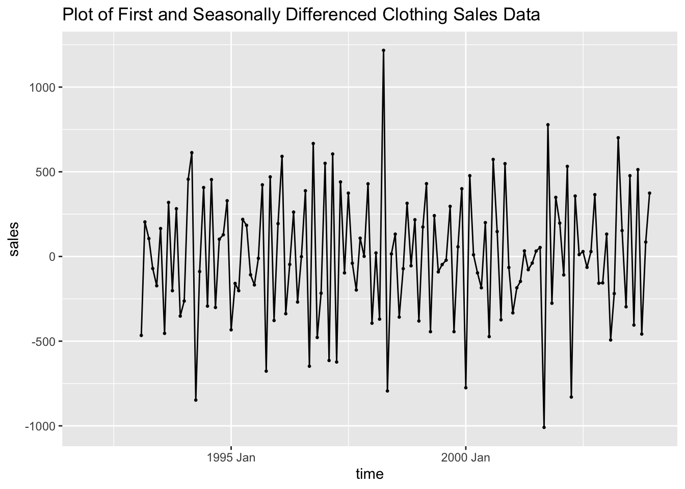
The ACF and PACF for doubly differenced data both still show the data has lingering autocorrelation.
clothing |>
  ACF(diff, lag_max = 50) |>
  autoplot() +
  labs(title = "ACF of First and Seasonally Differenced Clothing Sales")
clothing |>
  PACF(diff, lag_max = 50) |>
  autoplot() +
  labs(title = "PACF of First and Seasonally Differenced Clothing Sales")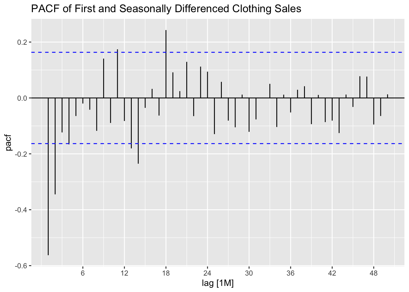
I then fit an ARIMA(0,1,1)(0,1,1)[12] model, an additive ETS model (alpha = 0.2, beta = 0.2, gamma = 0.2) to the data, and allow the algorithm to select the best ARIMA model based on AICc.
clothing.fit <- clothing |>
  model(arima = ARIMA(sales ~ pdq(0,1,1) + PDQ(0,1,1)),
        ets = ETS(sales ~ error("A") + trend("A", alpha = 0.2, beta = 0.2) +
                    season("A", gamma = 0.135)),
        best = ARIMA(sales, stepwise = FALSE))

clothing.fit |> select(best) |> report()
## Series: sales
## Model: ARIMA(1,0,2)(0,1,1)[12] w/ drift
##
## Coefficients:
## ar1 ma1 ma2 sma1 constant
## 0.9374 -0.8706 0.1959 -0.4208 20.3764
## s.e. 0.0420 0.0939 0.0914 0.0907 4.1428
##
## sigma^2 estimated as 70967: log likelihood=-923.36
## AIC=1858.71 AICc=1859.39 BIC=1876.01| .model | term | estimate | std.error | statistic | p.value |
|---|---|---|---|---|---|
| arima | ma1 | -0.775 | 0.052 | -14.981 | 0.000 |
| arima | sma1 | -0.432 | 0.091 | -4.727 | 0.000 |
| ets | alpha | 0.200 | NA | NA | NA |
| ets | beta | 0.200 | NA | NA | NA |
| ets | gamma | 0.135 | NA | NA | NA |
| ets | l[0] | 7002.276 | NA | NA | NA |
| ets | b[0] | -39.340 | NA | NA | NA |
| ets | s[0] | 5624.943 | NA | NA | NA |
| ets | s[-1] | 1179.853 | NA | NA | NA |
| ets | s[-2] | 126.108 | NA | NA | NA |
| ets | s[-3] | -412.183 | NA | NA | NA |
| ets | s[-4] | 349.360 | NA | NA | NA |
| ets | s[-5] | -634.476 | NA | NA | NA |
| ets | s[-6] | -598.033 | NA | NA | NA |
| ets | s[-7] | -262.164 | NA | NA | NA |
| ets | s[-8] | -416.464 | NA | NA | NA |
| ets | s[-9] | -616.906 | NA | NA | NA |
| ets | s[-10] | -2022.362 | NA | NA | NA |
| ets | s[-11] | -2317.676 | NA | NA | NA |
| best | ar1 | 0.937 | 0.042 | 22.332 | 0.000 |
| best | ma1 | -0.871 | 0.094 | -9.274 | 0.000 |
| best | ma2 | 0.196 | 0.091 | 2.142 | 0.034 |
| best | sma1 | -0.421 | 0.091 | -4.638 | 0.000 |
| best | constant | 20.376 | 4.143 | 4.919 | 0.000 |
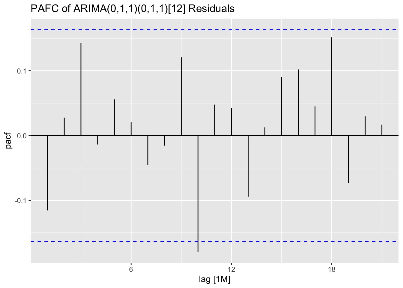
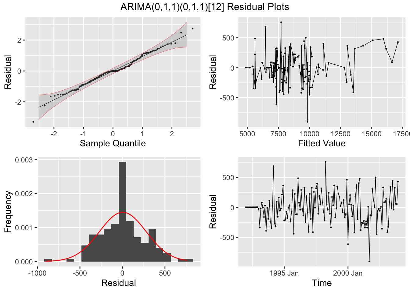
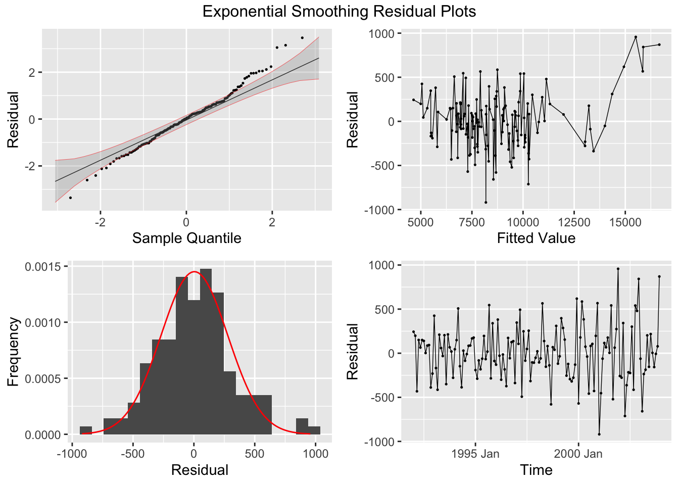
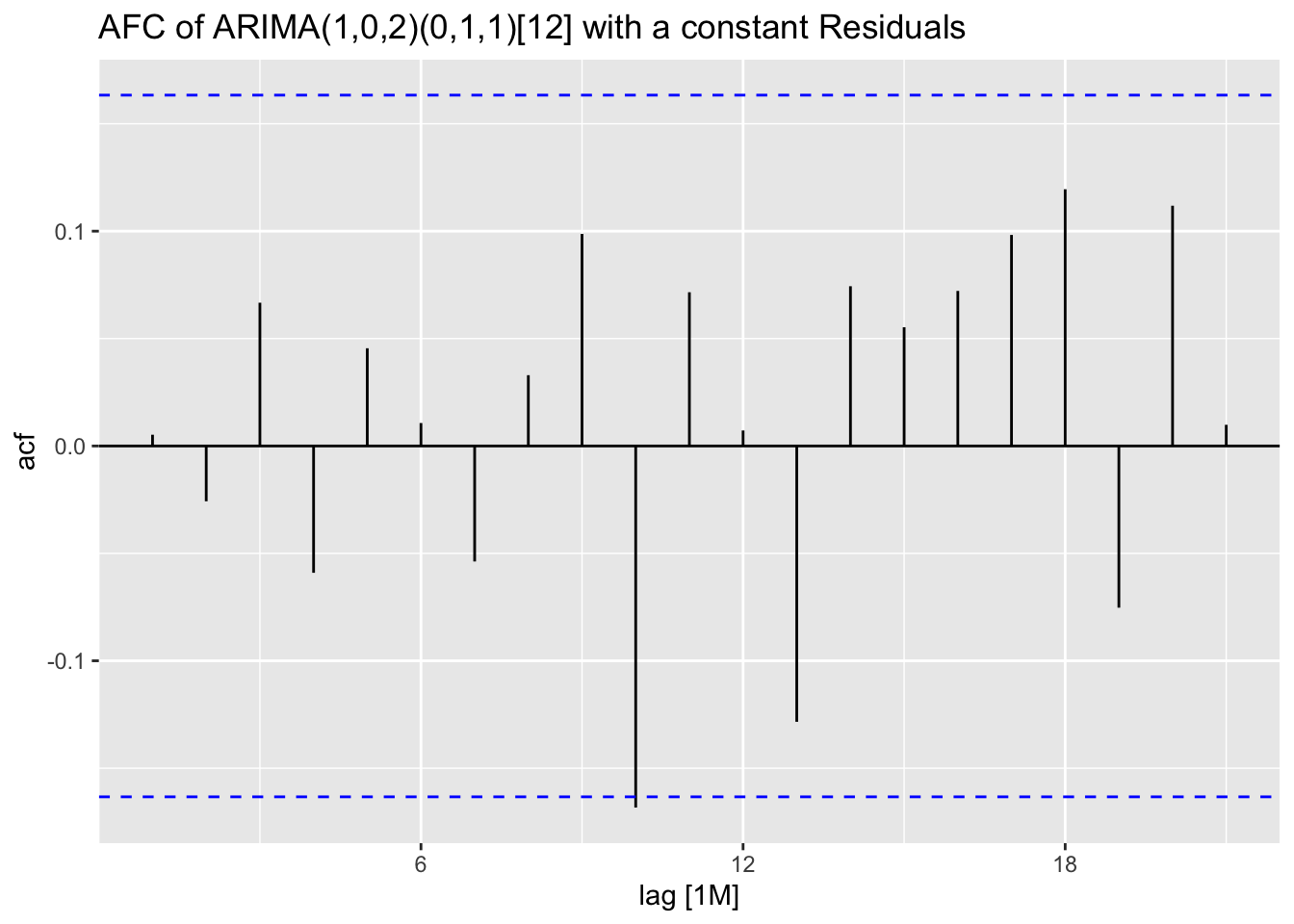
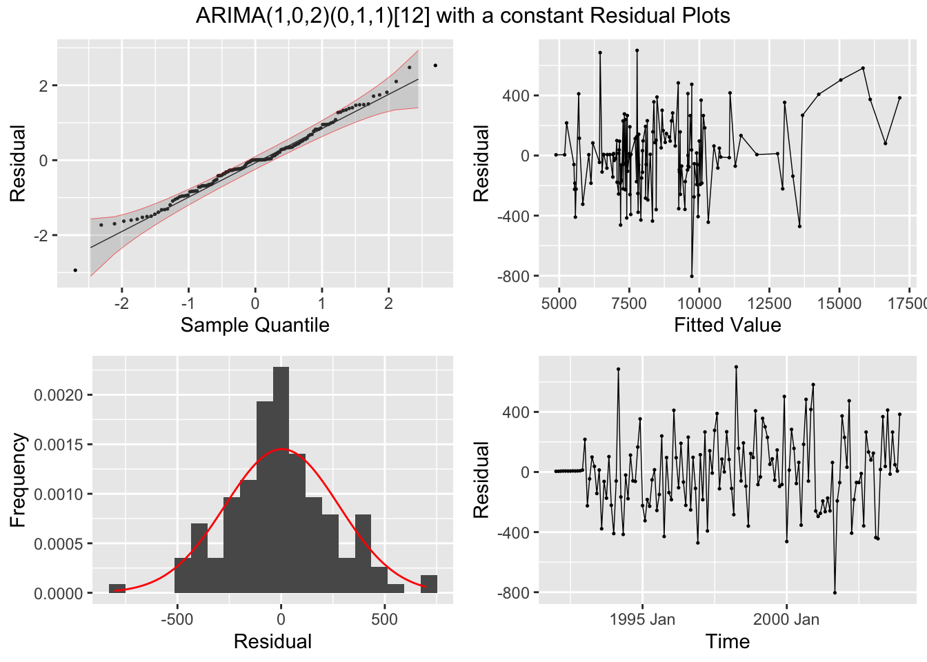
I plot the residuals of all models using the plot_residuals() function. In all models, we fail to reject the null hypothesis on the 10% level that the data is autocorrelated with the Ljung-Box test, and fail to reject the null hypothesis at the 10% level that the data is stationary through the KPSS unitroot test. The residuals from the ARIMA(1,0,2)(0,1,1)[12] model appear to have the least amount of remaining autocorrelation.
augment(clothing.fit) |>
  plot_residuals(title = c("ARIMA(0,1,1)(0,1,1)[12]", "Exponential Smoothing", "ARIMA(1,0,2)(0,1,1)[12] with a constant"))
## # A tibble: 3 × 3
## .model lb_stat lb_pvalue
## <chr> <dbl> <dbl>
## 1 arima 1.96 0.161
## 2 best 0.00403 0.949
## 3 ets 0.256 0.613
## # A tibble: 3 × 3
## .model kpss_stat kpss_pvalue
## <chr> <dbl> <dbl>
## 1 arima 0.130 0.1
## 2 best 0.199 0.1
## 3 ets 0.0294 0.1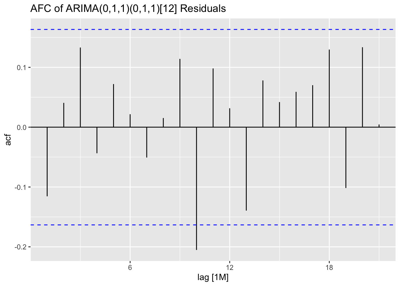


## NULLNext, I plot all models against the original data in separate plots. Visually they do not appear very different.
augment(clothing.fit) |>
  filter(.model == "arima") |>
  ggplot(aes(x = time, y = sales)) +
  geom_point(aes(color = "Original"), size = 0.5) +
  geom_line(aes(color = "Original")) +
  geom_point(aes(y = .fitted, color = "Fitted"), size = 0.5) +
  geom_line(aes(y = .fitted, color = "Fitted")) +
  scale_color_manual(values = c(Original = "black", Fitted = "red")) +
  labs(title = "Plot of ARIMA(0,1,1)(0,1,1)[12] Model and Clothing Sales Data",
       color = "Data")
augment(clothing.fit) |>
  filter(.model == "ets") |>
  ggplot(aes(x = time, y = sales)) +
  geom_point(aes(color = "Original"), size = 0.5) +
  geom_line(aes(color = "Original")) +
  geom_point(aes(y = .fitted, color = "Fitted"), size = 0.5) +
  geom_line(aes(y = .fitted, color = "Fitted")) +
  scale_color_manual(values = c(Original = "black", Fitted = "red")) +
  labs(title = "Plot of ETS Model and Clothing Sales Data",
       color = "Data")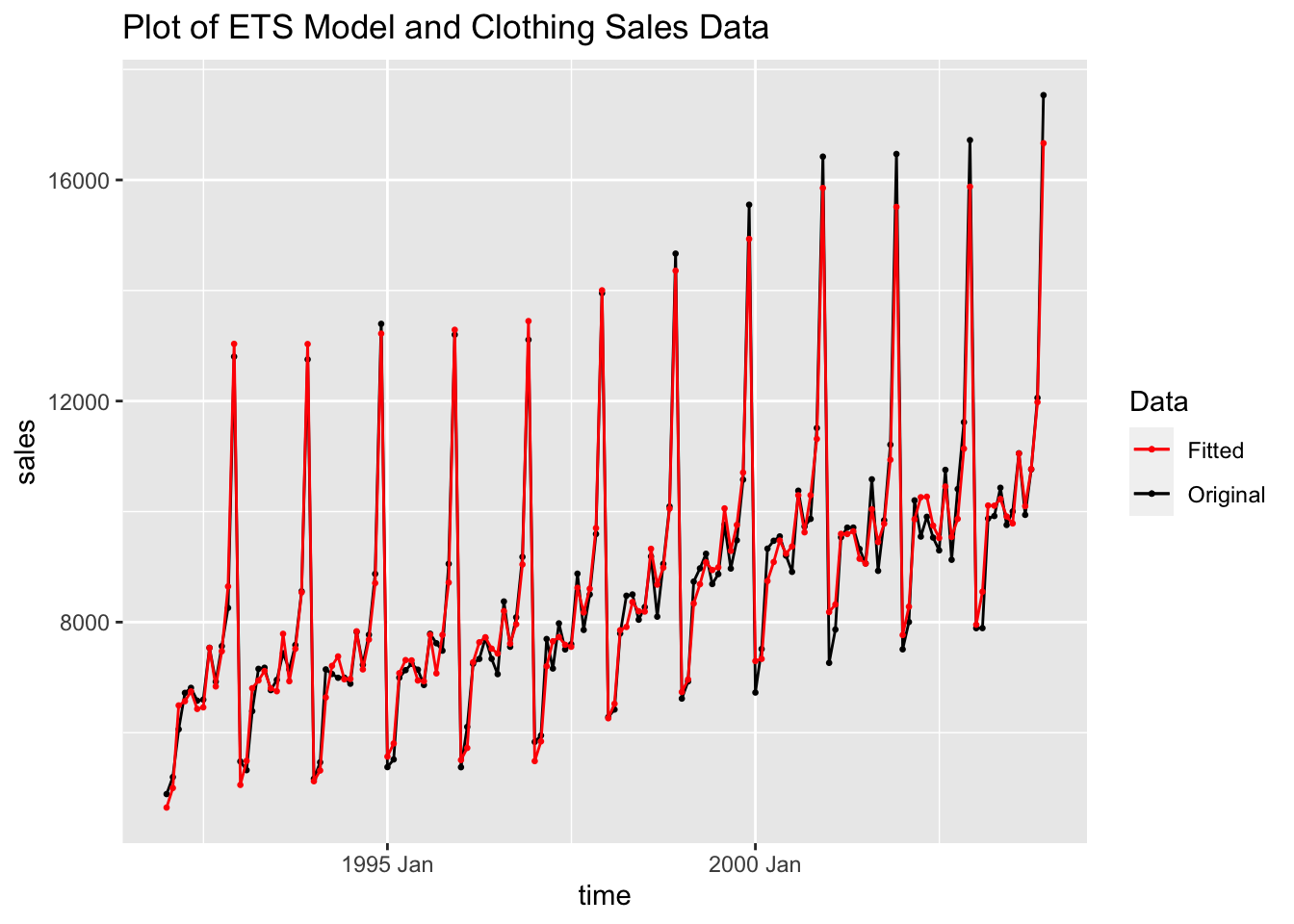
augment(clothing.fit) |>
  filter(.model == "best") |>
  ggplot(aes(x = time, y = sales)) +
  geom_point(aes(color = "Original"), size = 0.5) +
  geom_line(aes(color = "Original")) +
  geom_point(aes(y = .fitted, color = "Fitted"), size = 0.5) +
  geom_line(aes(y = .fitted, color = "Fitted")) +
  scale_color_manual(values = c(Original = "black", Fitted = "red")) +
  labs(title = "Plot of ARIMA(1,0,2)(0,1,1)[12] Model and Clothing Sales Data",
       color = "Data")
Looking at the measures of accuracy, the ARIMA (1,0,2)(0,1,1) model outperforms the other models in all measures of accuracy. This illustrates the point that while visual comparison is an important element, measures of accuracy and model evaluation provide important insight.
| .model | .type | ME | RMSE | MAE | MPE | MAPE | MASE | RMSSE | ACF1 |
|---|---|---|---|---|---|---|---|---|---|
| arima | Training | 3.508 | 256.436 | 191.460 | -0.147 | 2.240 | 0.520 | 0.578 | -0.116 |
| ets | Training | 8.368 | 312.894 | 240.477 | -0.096 | 2.804 | 0.653 | 0.705 | -0.042 |
| best | Training | 0.194 | 250.178 | 190.446 | -0.207 | 2.235 | 0.517 | 0.564 | 0.005 |
| .model | sigma2 | log_lik | AIC | AICc | BIC | MSE | AMSE | MAE |
|---|---|---|---|---|---|---|---|---|
| arima | 73405.76 | -920.431 | 1846.863 | 1847.052 | 1855.488 | NA | NA | NA |
| ets | 110140.77 | -1185.231 | 2398.462 | 2401.718 | 2440.040 | 97902.91 | 112149.9 | 240.477 |
| best | 70967.02 | -923.357 | 1858.715 | 1859.387 | 1876.012 | NA | NA | NA |
5.10.6 Choosing best ARMA order through best AIC
For this section, we will use the monthly data on electricity consumption from cbe.txt. To make this data into a tsibble, first I select only the column containing the electricity data. Then, I use that data to create a time series starting in 1958 with a frequency of 12 indicating that it is monthly data. Finally, I use as_tsibble() to convert the ts object to a tsibble and appropriately rename the columns. Creating a time series object and converting it to a tsibble is an effective and easy way to make sure the time is categorized correctly as it automatically creates a properly formatted index variable.
(cbe <- read.delim("data/cbe.txt") |>
  select(elec) |>
  ts(start = 1958, frequency = 12) |>
  as_tsibble() |>
  rename(time = index, elec = value))
## # A tsibble: 396 x 2 [1M]
## time elec
## <mth> <dbl>
## 1 1958 Jan 1497
## 2 1958 Feb 1463
## 3 1958 Mar 1648
## 4 1958 Apr 1595
## 5 1958 May 1777
## 6 1958 Jun 1824
## 7 1958 Jul 1994
## 8 1958 Aug 1835
## 9 1958 Sep 1787
## 10 1958 Oct 1699
## # ℹ 386 more rowsAs always, my first step is to plot the time series. The data clearly has an upward trend and appears to contain seasonality.
cbe |>
  ggplot(aes(x = time, y = elec)) +
  geom_point(size = 0.5) +
  geom_line() + labs(y = "electricity",
                     title = "Plot of Electricity Data over Time")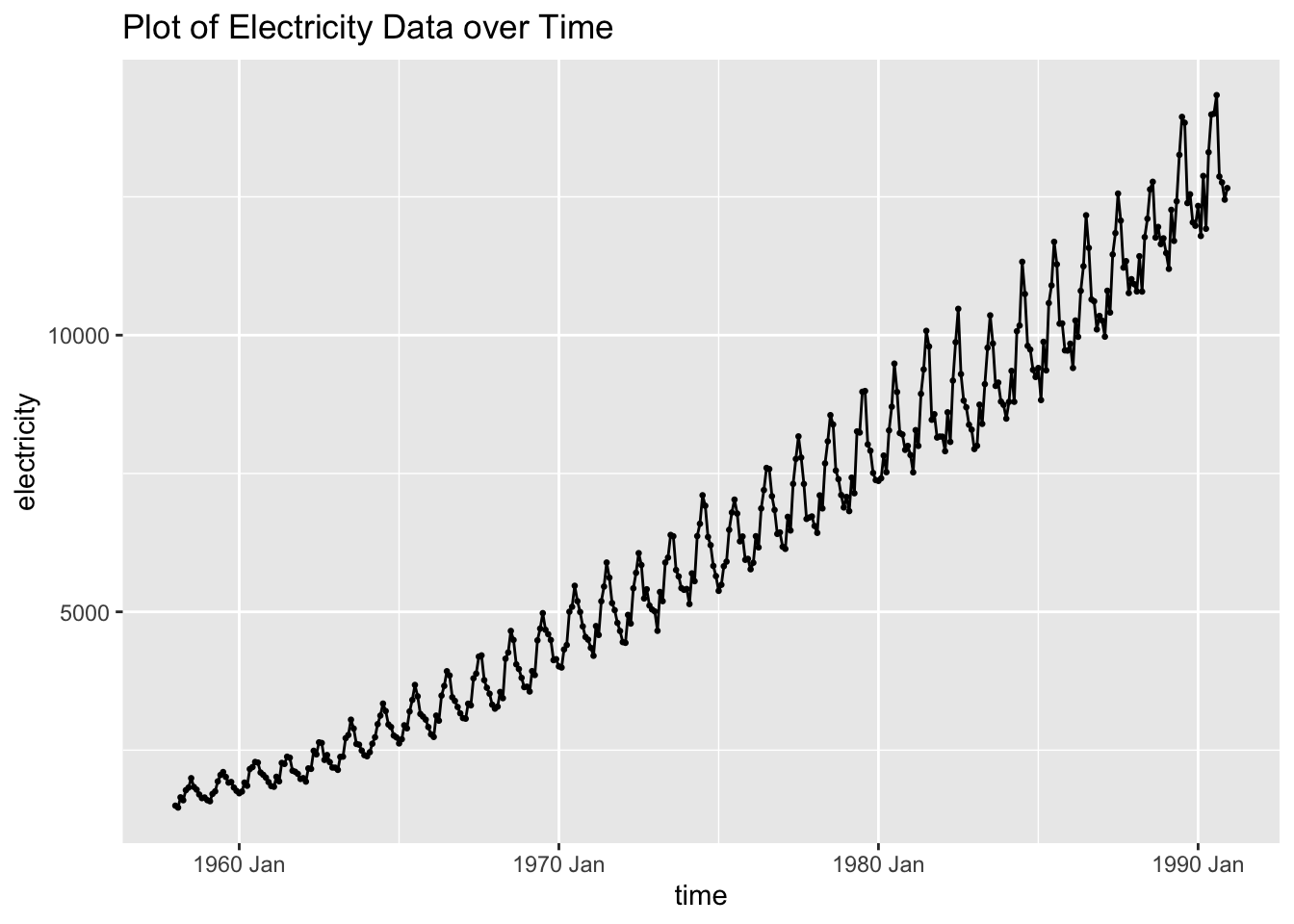
I then run a linear regression of \(log(electricity) = time + time^2 + month\), the same regression with auto selected ARIMA errors, and an automatically selected ARIMA model. Instead of using a time variable in the model, I make a variable containing the row number. This indicates the time through a periodic method, which better lends itself to regression. I also create a variable containing the month and set it as a factor using as.factor(). Setting it as a factor ensures that in the regression, R recognizes it as a categorical variable.
cbe.fit <- cbe |>
  mutate(row = row_number(), month = as.factor(month(time))) |>
  model(lm = TSLM(log(elec) ~ row + I(row^2) + month),
        arima = ARIMA(log(elec) ~ row + I(row^2) + month),
        best_arima = ARIMA(log(elec), stepwise = FALSE))
## Warning in sqrt(diag(best$var.coef)): NaNs produced## Series: elec
## Model: LM w/ ARIMA(2,0,1)(2,0,0)[12] errors
## Transformation: log(elec)
##
## Coefficients:
## ar1 ar2 ma1 sar1 sar2 row I(row^2) month2
## 0.7726 0.0906 -0.4043 0.3810 0.0618 0.0078 0 -0.0209
## s.e. 0.1170 0.0901 0.1190 0.0511 0.0555 0.0002 NaN 0.0071
## month3 month4 month5 month6 month7 month8 month9 month10 month11
## 0.0654 0.0311 0.1437 0.1754 0.2340 0.1961 0.1050 0.0874 0.0403
## s.e. 0.0074 0.0079 0.0082 0.0083 0.0084 0.0083 0.0082 0.0079 0.0075
## month12 intercept
## 0.0222 7.2875
## s.e. 0.0072 0.0192
##
## sigma^2 estimated as 0.0004114: log likelihood=989.89
## AIC=-1939.78 AICc=-1937.54 BIC=-1860.15## Series: elec
## Model: ARIMA(0,1,1)(2,1,1)[12]
## Transformation: log(elec)
##
## Coefficients:
## ma1 sar1 sar2 sma1
## -0.6526 0.1100 -0.0967 -0.7094
## s.e. 0.0443 0.0822 0.0660 0.0692
##
## sigma^2 estimated as 0.000425: log likelihood=941.81
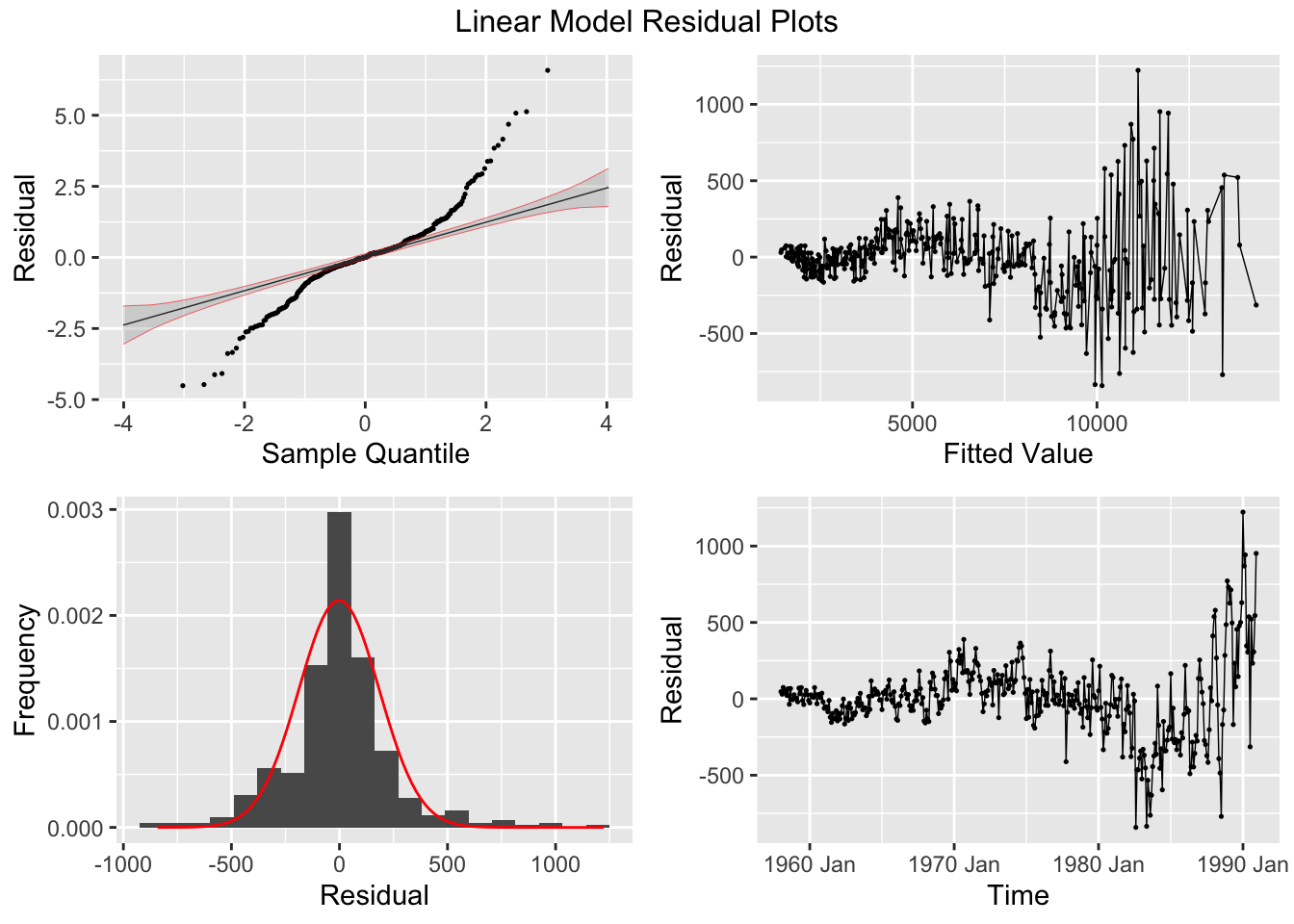
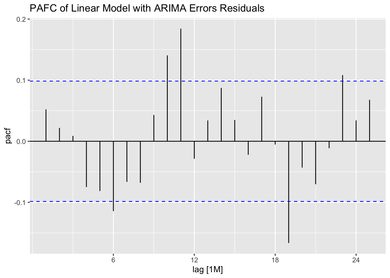
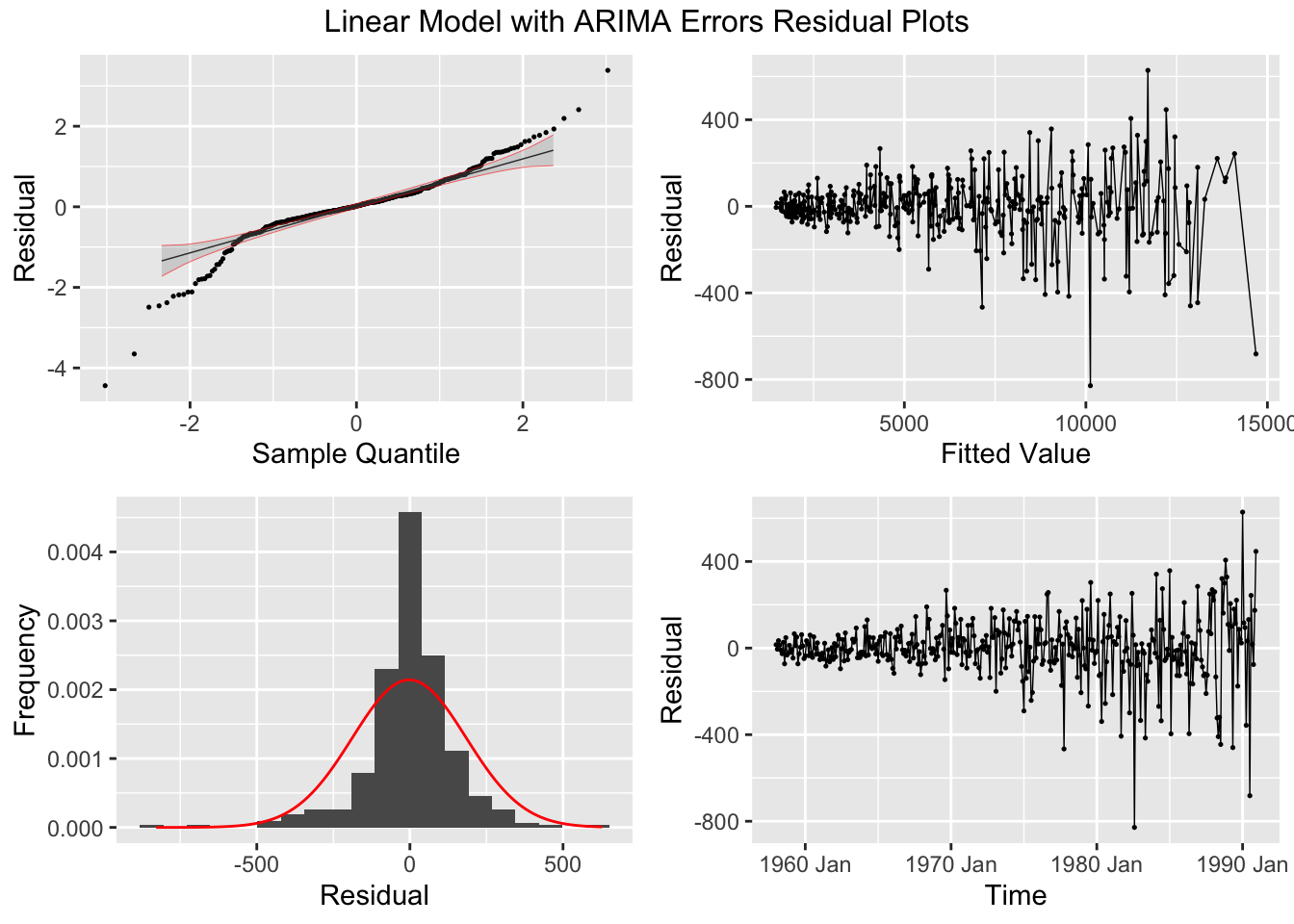
## AIC=-1873.62 AICc=-1873.46 BIC=-1853.88I then plot the residuals of all the models mentioned above using plot_residuals(). The linear model’s residuals clearly still contain a significant amount of signal, as they are definitely autocorrelated.
plot_residuals(augment(cbe.fit), title = c("Linear Model", "Linear Model with ARIMA Errors", "ARIMA Model"))## # A tibble: 3 × 3
## .model lb_stat lb_pvalue
## <chr> <dbl> <dbl>
## 1 arima 1.08 0.298
## 2 best_arima 0.581 0.446
## 3 lm 214. 0
## # A tibble: 3 × 3
## .model kpss_stat kpss_pvalue
## <chr> <dbl> <dbl>
## 1 arima 0.113 0.1
## 2 best_arima 0.0631 0.1
## 3 lm 0.355 0.0967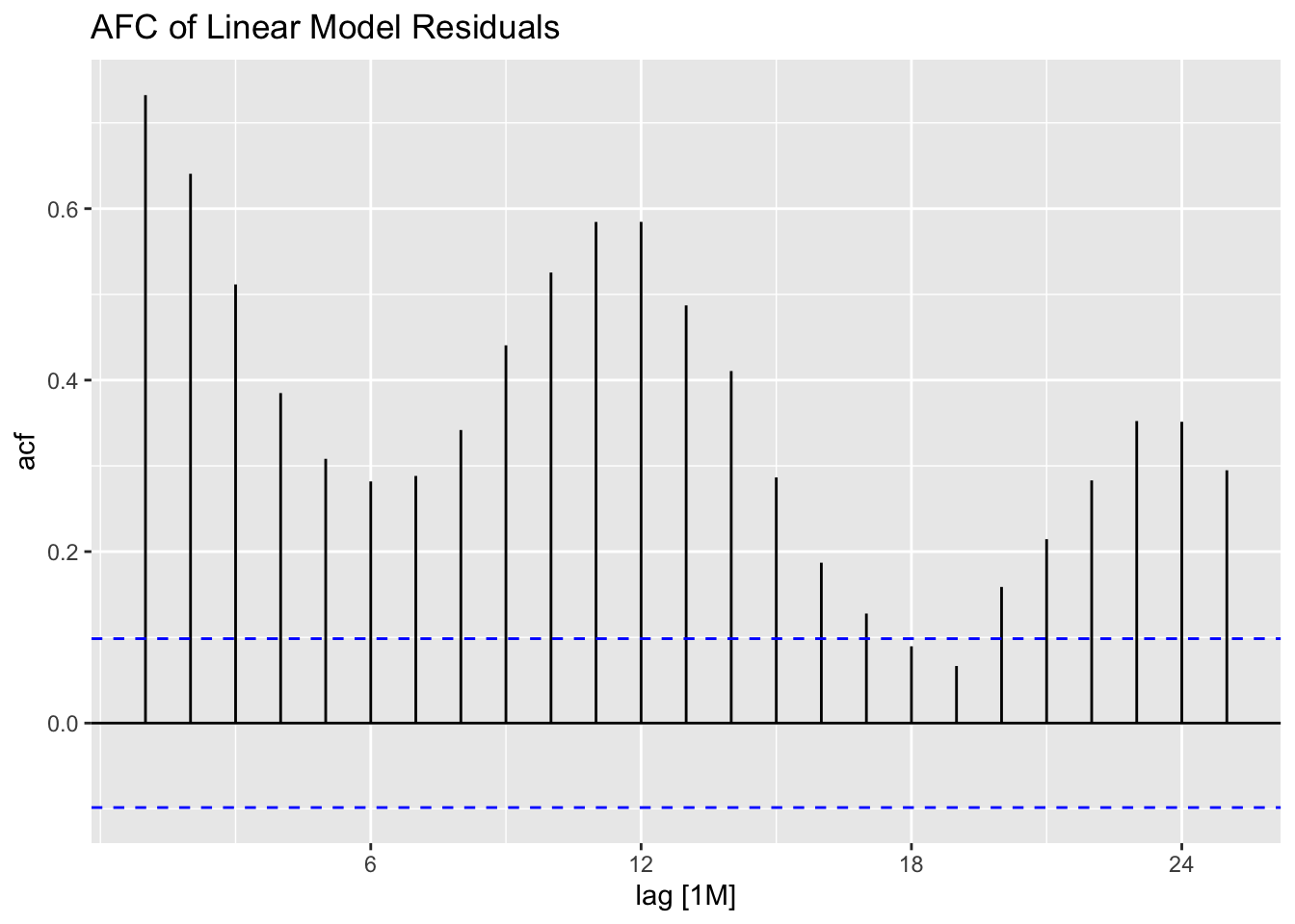


## NULLWhen using an automated function, it will only search possible specified models, so it will not consider other model specifications. For example, the linear model with automated ARIMA errors does not search the same set of models as the automated ARIMA model without any exogenous regressors or linear specification. The table below shows that the automated ARIMA model without exogenous regressors has a lower AICc than the models including variables for time and month.
| .model | r_squared | adj_r_squared | sigma2 | statistic | p_value | df | log_lik | AIC | AICc | BIC | CV | deviance | df.residual | rank |
|---|---|---|---|---|---|---|---|---|---|---|---|---|---|---|
| lm | 0.997 | 0.997 | 0.001 | 11171.91 | 0 | 14 | 810.88 | -2715.558 | -2714.295 | -2655.837 | 0.001 | 0.386 | 382 | 14 |
| arima | NA | NA | 0.000 | NA | NA | NA | 989.89 | -1939.780 | -1937.540 | -1860.152 | NA | NA | NA | NA |
| best_arima | NA | NA | 0.000 | NA | NA | NA | 941.81 | -1873.619 | -1873.460 | -1853.879 | NA | NA | NA | NA |
5.10.7 Choosing best SARIMA order through best AIC
For this example, we will use the models generated above and saved to cbe.fit. The best_arima model in that object has no specified components and stepwise is turned off so all possible ARIMA models are considered. Note, for the selection algorithm to consider seasonal models, the PDQ() component must not be specified. The algorithm selects an ARIMA(0,1,1)(2,1,1)[12] model because it has the lowest AICc.
| .model | term | estimate | std.error | statistic | p.value |
|---|---|---|---|---|---|
| best_arima | ma1 | -0.65261914 | 0.04427203 | -14.741117 | 2.842494e-39 |
| best_arima | sar1 | 0.10999324 | 0.08219973 | 1.338122 | 1.816506e-01 |
| best_arima | sar2 | -0.09671901 | 0.06601119 | -1.465191 | 1.436892e-01 |
| best_arima | sma1 | -0.70935769 | 0.06922529 | -10.247089 | 6.156491e-22 |
## Series: elec
## Model: ARIMA(0,1,1)(2,1,1)[12]
## Transformation: log(elec)
##
## Coefficients:
##           ma1    sar1     sar2     sma1
##       -0.6526  0.1100  -0.0967  -0.7094
## s.e.   0.0443  0.0822   0.0660   0.0692
##
## sigma^2 estimated as 0.000425:  log likelihood=941.81
## AIC=-1873.62 AICc=-1873.46 BIC=-1853.88Looking at measures of accuracy and comparing them between models using accuracy(), the linear model with ARIMA errors outperforms the ARIMA model selected above, though the best_arima model performs better than the linear model.
| .model | .type | ME | RMSE | MAE | MPE | MAPE | MASE | RMSSE | ACF1 |
|---|---|---|---|---|---|---|---|---|---|
| lm | Training | -0.171 | 247.675 | 165.771 | -0.049 | 2.488 | 0.461 | 0.598 | 0.732 |
| arima | Training | 0.168 | 145.004 | 95.533 | -0.033 | 1.534 | 0.266 | 0.350 | 0.052 |
| best_arima | Training | -6.389 | 146.495 | 96.379 | -0.087 | 1.540 | 0.268 | 0.354 | 0.038 |
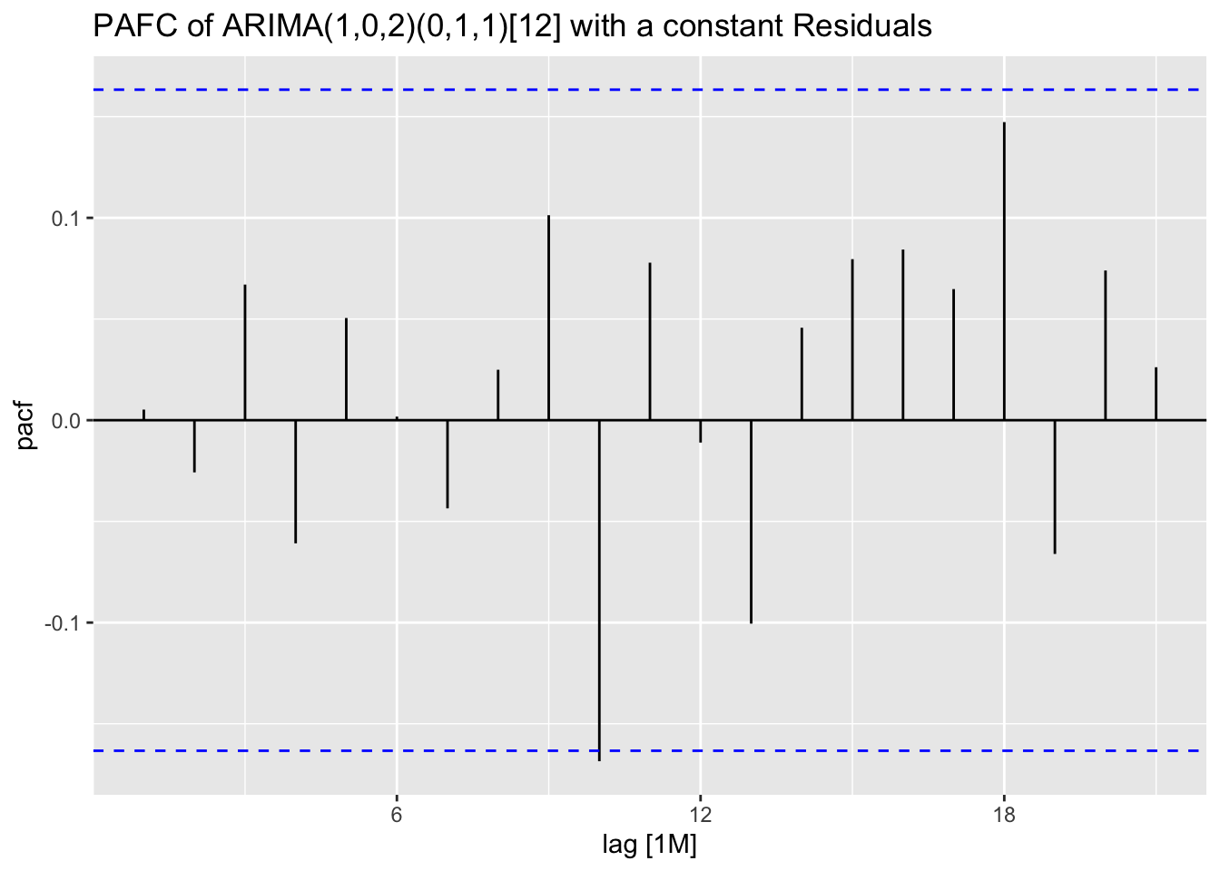
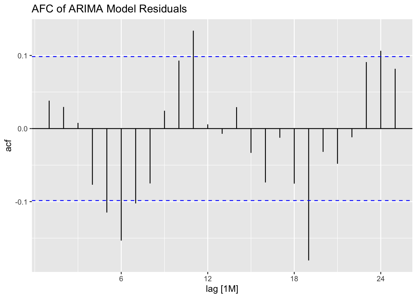
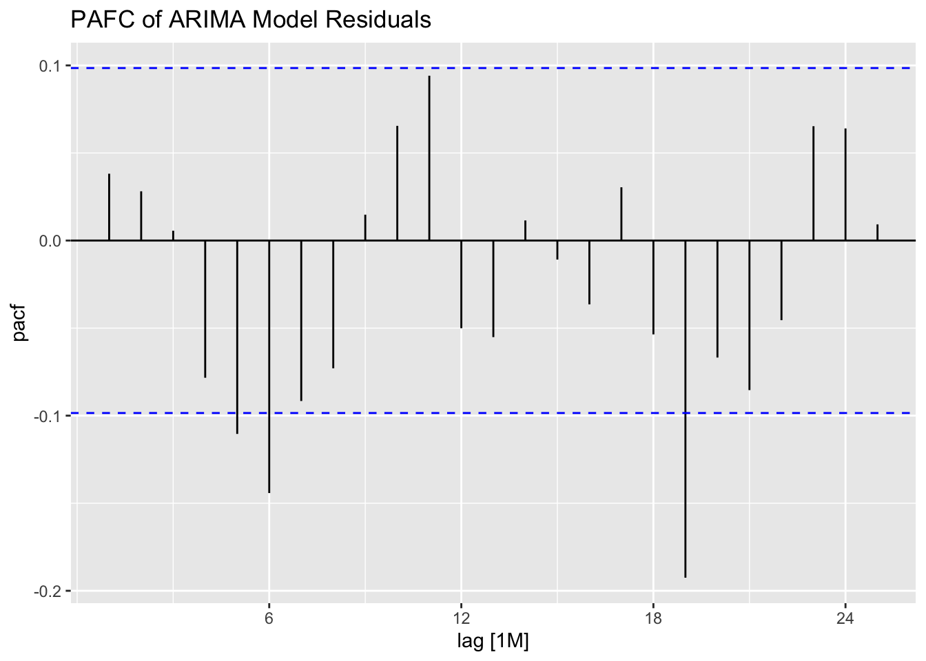
Looking at the ACF and PACF of the residuals of the ARIMA(0,1,1)(2,1,1)[12] model, there appears to be lingering autocorrelation in the residuals.
cbe.fit |>
  select(best_arima) |>
  augment() |>
  ACF(.resid) |>
  autoplot() +
  labs(title = "ACF Plot of the Residuals of the ARIMA(0,1,1)(2,1,1)[12] Model")
cbe.fit |>
  select(best_arima) |>
  augment() |>
  PACF(.resid) |>
  autoplot() +
  labs(title = "PACF Plot of the Residuals of the ARIMA(0,1,1)(2,1,1)[12] Model")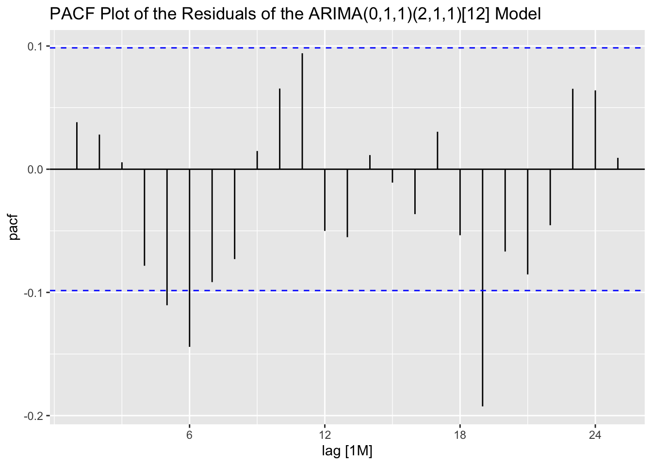
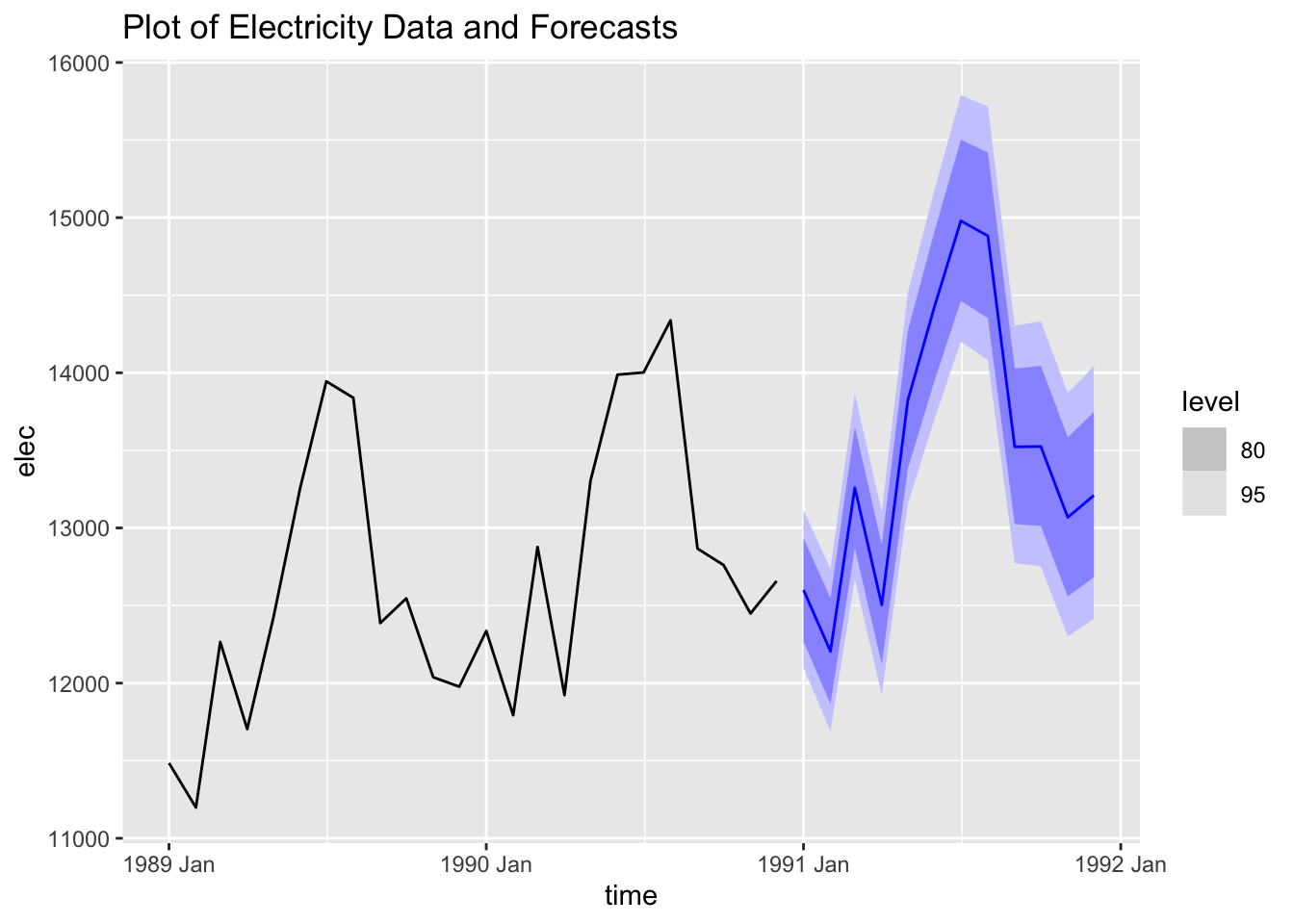
I then generate 12 forecasts from the best ARIMA model and plot them with the original data.
cbe.fit |>
  select(best_arima) |>
  forecast(h = 12) |>
  autoplot(cbe |> filter(year(time) >= 1989)) +
  labs(title = "Plot of Electricity Data and Forecasts")