Chapter 4 Shewhart Control Charts in Phase I
4.1 Introduction
Statistical Quality Control (SQC) consists of methods to improve the quality of process outputs. Statistical Process Control (SPC) is a subset of Statistical Quality Control (SQC). The objective for SPC is to specifically understand, monitor, and improve processes to better meet customer needs.
In Chapter 2 and 3, the MIL-STD documents for acceptance sampling were described. In 1996, the U.S. Depariment of Defense realized that there was an evolving industrial product quality philosophy that could provide defense contractors with better opportunities and incentives for improving product quality and establishing a cooperative relationship with the Government. To this end MIL-STD-1916 was published. It states that process controls and statistical control methods are the preferable means of preventing nonconformances; controlling quality; and generating information for improvement. Additionally, it emphasizes that sampling inspection by itself is an inefficient industrial practice for demonstrating conformance to the requirements of a contract.
Later civilian standards have provided detailed guidelines, and should be followed by all suppliers whether they supply the Government or private companies. ASQ/ANSI/ISO 7870-2:2013 establishes a guide for the use and understanding of the Shewhart control chart approach for statistical control of a process. ISO 22514-1:2014—Part 1: provides general principles and concepts regarding statistical methods in process management using capability and performance studies. ASQ/ANSI/ISO 7870-4:2011 provides statistical procedures for setting up cumulative sum (cusum) schemes for process and quality control using variables (measured) and attribute data. It describes general-purpose methods of decision-making using cumulative sum (cusum) techniques for monitoring and control. ASQ/ANSI/ISO 7870-6:2016 Control charts-Part—6: EWMA control charts: Describes the use of EWMA Control Charts in Process Monitoring. These documents can be accessed at https://asq.org/quality-press/, and the methods will all be described in detail in this chapter and chapter 6.
The output of all processes, whether they are manufacturing processes or processes that provide a service of some kind, are subject to variability. Variability makes it more difficult for processes to generate outputs that fall within desirable specification limits. (Shewhart 1931) designated the two causes for variability in process outputs to be common causes and special or assignable causes. Common causes of variability are due to the inherent nature of the process. They can’t be eliminated or reduced without changing the actual process. Assignable causes for variability, on the other hand, are unusual disruptions to normal operation. They should be identified and removed in order to reduce variability and make the process more capable of meeting the specifications.
Control charts are statistical tools. Their use is the most effective way to distinguish between common and assignable cause for variability when monitoring process output in real time. Although control charts alone cannot reduce process variability, they can help to prevent over-reaction to common causes for variability (which may make things worse), and help to prevent ignoring assignable cause signals. When the presence of an assignable cause for variability is recognized, knowledge of the process can lead to adjustments to remove this cause and reduce the variability in process output.
To illustrate how control charts distinguish between common and assignable causes, consider the simple example described by (Joiner 1994). Eleven year old Patrick Nolan needed a science project. After talking with his father, a statistician, he decided to collect some data on something he cared about; his school bus. He recorded the time the school bus arrived to pick him up each morning, and made notes about anything he considered to be unusual that morning. After about 5 weeks, he made the chart shown in Figure 4.1 that summarized the information he collected.
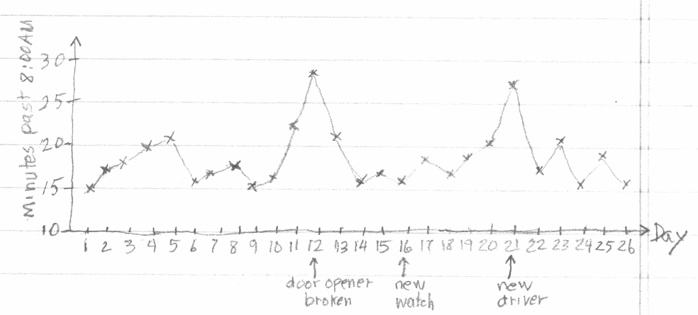
Figure 4.1 Patrick’s Chart
A control chart of the number of minutes past 8:00AM that the bus arrived is shown in Figure 4.2. In this figure, the upper control limit (UCL) is three standard deviations above the mean, and the lower control limit (LCL) is three standard deviations below the mean. The two points in red are above the upper control limit, and they correspond to the day when Patrick noted that the school bus door opener was broken, and the day when there was a new driver on the bus. The control chart shows that these two delayed pickup times were due to special or assignable causes (which were noted as unusual by Patrick). The other points on the chart are within the control limits and appear to be due to common causes. Common causes like normal variation in amount of traffic, normal variation in the time the bus driver started on the route, normal variation in passenger boarding time at previous stops, and slight variations in weather conditions are always present and prevent the pickup times from being exactly the same each day.
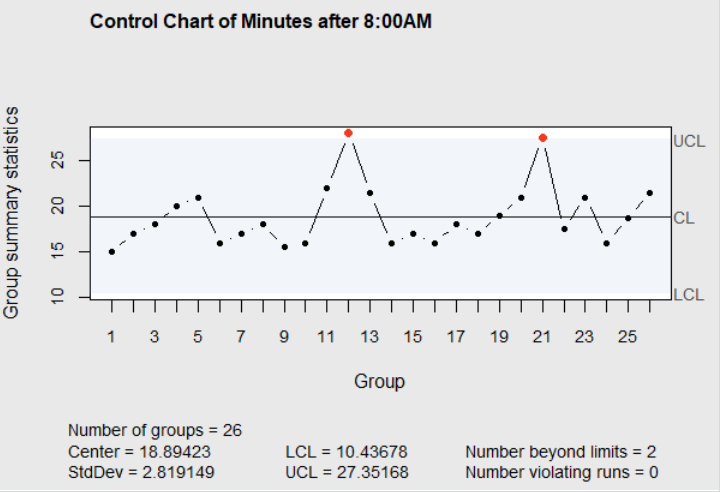
Figure 4.2 Control Chart of Patrick’s Data
There are different types of control charts, and two different situations where they are used (Phase I, and Phase II ((Chakraborti, Human, and Graham 2009))). Most textbooks describe the use of Shewhart control charts in what would be described as Phase II process monitoring. They also describe how the control limits are calculated by hand using tables of constants. The constants used for calculating the limits can be found in the vignette \(\verb!SixSigma::ShewhartConstants!\) in the R package \(\verb!SixSigma!\). There are also functions \(\verb!ss.cc.getd2()!\), \(\verb!ss.cc.getd3()!\), and \(\verb!ss.cc.getc4()!\) in the \(\verb!SixSigma!\) package for retrieving these and other control chart constants. Examples of their use are shown by Cano et. al. (Cano, Mogguerza, and Corcoba 2015). In addition, tables of the constants for computing control chart limits, and procedure for using them to calculate the limits by hand are shown in Section 6.2.3.1 of the online NIST Engineering Statistics Handbook nist.gov(NIST/Sematech E-Handbook of Statistical Methods 2012).
Sometimes Shewhart control charts are maintained manually in Phase II real time monitoring by process operators who have the knowledge to make adjustments when needed. However, we will describe other types of control charts that are more effective than Shewhart control charts for Phase II monitoring in Chapter 6. In the next two sections of this chapter, we will describe the use of Shewhart control charts in Phase I.
4.2 Variables Control Charts in Phase I
In Phase I, control charts are used on retrospective data to calculate preliminary control limits and determine if the process had been in control during the period where the data was collected. When assignable causes are detected on the control chart using the historical data, an investigation is conducted to find the cause. If the cause is found, and it can be prevented in the future, then the data corresponding to the out of control points on the chart are eliminated and the control limits are recalculated.
This is usually an iterative process and it is repeated until control chart limits are refined, a chart is produced that does not appear to contain any assignable causes, and the process appeares to be operating at an acceptable level. The information gained from the Phase I control chart is then used as the basis of Phase II monitoring. Since control chart limits are calculated repeatedly in Phase I, the calculations are usually performed using a computer. This chapter will illustrate the use of R to calculate control chart limits and display the charts.
Another important purpose for using control charts in Phase I is to document the process knowledge gained through an Out of Control Action Plan (OCAP). This OCAP is a list of the causes for out of control points. This list is used when monitoring the process in Phase II using the revised control limits determined in Phase I. When out of control signals appear on the chart in Phase II, the OCAP should give an indication of what can be adjusted to bring the process back into control.
The Automotive Industry Action Group (TaskSubcommittee 1992) recommends preparatory steps be taken before variable control charts can be used effectively. These steps are summarized in the list below.
Establish an environment suitable for action Management must provide resources and support actions to improve processes based on knowledge gained from use of control charts.
Define the process The process including people, equipment, material, methods, and environment must be understood in relation to the upstream suppliers and downstream customers. Methods such as flowcharts, SIPOC diagrams (to be described in the next chapter), and cause-and-effect diagrams described by (Christensen, Betz, and Stein 2013) are useful here.
Determine characteristics to be charted This step should consider customer needs, current and potential problems, and correlations between characteristics. For example, if a characteristic of the customer’s need is difficult to measure, track a correlated characteristic that is easier to measure.
Define the measurement system Make sure the characteristic measured is defined so that it will have the same meaning in the future and the precision and accuracy of the measurement is predictable. Tools such as Guage R&R Studies described in chapter 3 are useful here.
Data for Shewhart control charts are gathered in subgroups. Subgroups, properly called rational subgroups, should be chosen so that the chance for variation among the process outputs within a subgroup is small and represents the inherent process variation. This is often accomplished by grouping process outputs generated consecutively together in a subgroup, then spacing subgroups far enough apart in time to allow for possible disruptions to occur between subgroups. In that way, any unusual or assignable variation that occurs between groups should be recognized with the help of a control chart. If a control chart is able to detect out of control signals, and the cause for these signals can be identified, it is an indication that the rational subgroups were effective.
The data gathering plan for Phase I studies are defined as follows:
Define the subgroup size Initially this is a constant number of 4 or 5 items per each subgroup taken over a short enough interval of time so that variation among them is due only to common causes.
Define the Subgroup Frequency The subgroups collected should be spaced out in time, but collected often enough so that they can represent opportunities for the process to change.
Define the number of subgroups Generally 25 or more subgroups are necessary to establish the characteristics of a stable process. If some subgroups are eliminated before calculating the revised control limits due to discovery of assignable causes, additional subgroups may need to be collected so that there are at least 25 subgroups used in calculating the revised limits.
4.2.1 Use of \(\overline{X}\)-\(R\) charts in Phase I
The control limits for the \(\overline{X}\)-chart are \(\overline{\overline{X}}\pm A_2\overline{R}\), and the control limits for the \(R\)-chart are \(D_3\overline{R}\) and \(D_4\overline{R}.\) The constants \(A_2\), \(D_3\), and \(D_4\) are indexed by the rational subgroup size and are again given in the vignette \(\verb!SixSigma::ShewhartConstants!\) in the R package \(\verb!SixSigma!\). They can also be found in Section 6.2.3.1 of the online NIST Engineering Statistics Handbook. These constants are used when calculating control limits manually. They are not needed when the control charts are created using R functions. We will illustrate the using the \(\verb!qcc()!\) function in the R package \(\verb!qcc!\) for creating \(\overline{X}-R\) Charts in Phase I using data from (Mitra 1998). He presents the following example in which subgroups of 5 were taken from a process that manufactured coils. The resistance values in ohms was measured on each coil, and 25 subgroups of data were available. The data is shown in Table 4.1.
Table 4.1 Coil Resistance
| Subgroup | Ohms | ||||
|---|---|---|---|---|---|
| 1 | 20 | 22 | 21 | 23 | 22 |
| 2 | 19 | 18 | 22 | 20 | 20 |
| 3 | 25 | 18 | 20 | 17 | 22 |
| 4 | 20 | 21 | 22 | 21 | 21 |
| 5 | 19 | 24 | 23 | 22 | 20 |
| 6 | 22 | 20 | 18 | 18 | 19 |
| 7 | 18 | 20 | 19 | 18 | 20 |
| 8 | 20 | 18 | 23 | 20 | 21 |
| 9 | 21 | 20 | 24 | 23 | 22 |
| 10 | 21 | 19 | 20 | 20 | 20 |
| 11 | 20 | 20 | 23 | 22 | 20 |
| 12 | 22 | 21 | 20 | 22 | 23 |
| 13 | 19 | 22 | 19 | 18 | 19 |
| 14 | 20 | 21 | 22 | 21 | 22 |
| 15 | 20 | 24 | 24 | 23 | 23 |
| 16 | 21 | 20 | 24 | 20 | 21 |
| 17 | 20 | 18 | 18 | 20 | 20 |
| 18 | 20 | 24 | 22 | 23 | 23 |
| 19 | 20 | 19 | 23 | 20 | 19 |
| 20 | 22 | 21 | 21 | 24 | 22 |
| 21 | 23 | 22 | 22 | 20 | 22 |
| 22 | 21 | 18 | 18 | 17 | 19 |
| 23 | 21 | 24 | 24 | 23 | 23 |
| 24 | 20 | 22 | 21 | 21 | 20 |
| 25 | 19 | 20 | 21 | 21 | 22 |
4.2.2 \(\overline{X}\) and R Charts
To begin, this historical data is extracted from a database formatted into a computer file so that it can be analyzed. For example, Figure 4.3 shows the first three lines of a .csv (comma separated) file containing this data. The first line contains names for the variables in each subgroup.
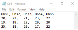
Figure 4.3 Coil.csv file
The data is read into an R data frame using the commands shown below, and the \(\verb!qcc!\) function in the R package \(\verb!qcc!\) is used to create the \(R\)-chart shown in Figure 4.4.
CoilG <- read.table("Coil.csv", header=TRUE,sep=",",na.strings="NA",
      dec=".",strip.white=TRUE)
library(qcc)
qcc(CoilG, type="R")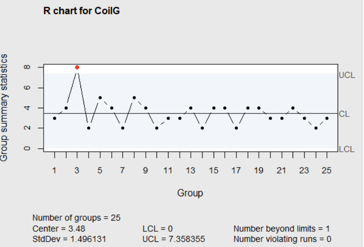
Figure 4.4 \(R\)-chart for Coil Resistance
In Figure 4.4, the range for subgroup 3 is out of the limits for the \(R\)-chart, indicating an assignable cause was present. Including this out-of-control subgroup in the calculations increases the average range to \(\overline{R}=3.48\), and will broaden the control limits for both the \(\overline{X}\) chart and \(R\)-chart and reduce the chances of detecting other assignable causes.
When the cause of the wide range in subgroup 3 was investigated, past information showed that was the day that a new vender of raw materials and components was used. The quality was low, resulting in the wide variability in coil resistance values produced on that day. Based on that fact, management instituted a policy to require new vendors to provide documentation that their process could meet the required standards. With this in mind, subgroup 3 is not representative of the process after implemention of this policy, so it should be removed before calculating and displaying the control charts.
In the R code shown below, subgroup 3 is removed from the updated data frame \(\verb!Coilm3!\) and the \(\overline{X}\) chart shown in Figure 4.5 was produced.
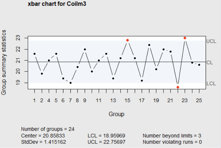
Figure 4.5 \(\overline{X}\)-chart for Coil Resistance
When investigating the causes for the the high averages for subgroups 15 and 23, and the low average for subgroup 22, it was found that the oven temperature was too high for subgroup 22, and the wrong die was used for subgroup 23, but no apparent reason for the high average for subgroup 15 could be found.
Assuming high oven temperatures and use of the wrong die can be avoided in the future, the control chart limits were recomputed eliminating subgroups 22 and 23. This resulted in the upper and lower control limits for the \(R\)-chart (LCL=0, UCL=6.919) and the \(\overline{X}\) chart (LCL=18.975, UCL=22.753). However, one subgroup (15) remains out of the control limits on the \(\overline{X}\) chart, and there are less than 25 total subgroups of data used in calculating the limits.
The next step would be to eliminate the data from subgroup 15, collect additional data, and recompute the limits and plot the chart again. It may take many iterations before charts can be produced that do not exhibit any assignable causes. As this is done, the assignable causes discovered in the process should be documented into an Out of Control Action Plan or OCAP. For example, in the two iterations described above, three assignable causes were discovered. An OCAP based on just these three causes mentioned may look something like the list shown below.
OCAP
Out of Control on \(R\)-Chart–High within subgroup variability
- Verify that the vendor of raw material and component has documented their ability supply within specs. If not, switch vendors.
Out of control on \(\overline{X}\) chart
Check to make sure the proper die was used. If not, switch to the proper die.
Check to make sure oven temperature was set correctly. If not, set correctly for the next production run.
In practice, considerable historical data from process operation may already be routinely collected and stored in data bases. The R package \(\verb!readr!\) has several functions that can be used to load plain text rectangular files into R data frames (see (Wickham and Grolemund 2017)). Most large companies maintain a Quality Information System to be described later in this chapter. As long as the data that is retrieved can be formatted as rational subgroups (with only common cause variability within subgroups), this is a good source of historical data for Phase I control chart applications.
The discovery of assignable causes for out of control signals in real applications can sometimes be a difficult task. If there is not an obvious cause, then the Cause-and-Effect (or Ishakawa) Diagram, presented later in this in Chapter, is useful for organizing and recording ideas for possible assignable causes.
Frequently an out of control signal is caused by a combination of changes to several factors simultaneously. If that is the case, testing changes to one-factor-at a time is inefficient and will never discover the cause. Several factors can be tested simultaneously using Experimental Design plans. Some of these methods will be presented in the next chapter and more details can be found in (Lawson 2015).
Since the control charts produced with the data in Table 4.1 detected out of control signals, it is an indication that the rational subgroups were effective. There was less variability within the subgroups than from group to group, and therefore subgroups with high or low averages were identified on the \(\overline{X}\) chart as potential assignable causes. If data is retrieved from a historical database, and no assignable causes are identified on either the \(\overline{X}\) or \(R\)-charts and subgroup means are close to the center line of the \(\overline{X}\) chart, it would indicate that the subgroups have included more variability within the subgroups than from subgroup to subgroup. These subgroups will be ineffective in identifying assignable causes.
Notice that the control limits for the \(\overline{X}\) and \(R\)-charts computed by the \(\verb!qcc!\) function as shown in Figure 4.3, have no relationship with the specification limits described in Chapter 3. Specification limits are determined by a design engineer or another familiar with the customer needs (that may be the next process). The control limits for the control chart are calculated from observed data, and they show the limits of what the process is currently capable of. The Center (or \(\overline{\overline{X}}\)) and the \(\verb!StDev!\) (or standard deviation) shown in the group of statistics at the bottom of the chart in Figure 4.5 are estimates of the current process average and standard deviation. Specification limits should never be added to the control charts because they will be misleading.
The goal in Phase I is to discover and find ways to eliminate as many assignable causes as possible. The revised control chart limits and OCAP will then be used in Phase II to keep the process operating at the optimal level with minimum variation in output.
4.2.3 Interpreting Charts for Assignable Cause Signals
In addition to just checking individual points against the control limits to detect assignable causes, a list of additional indicators that should be checked.
A point above or below the upper control limit or below the lower control limit
Seven consecutive points above (or below) the center line
Seven consecutive points trending up (or down)
Middle one-third of the chart includes more than 90% or fewer than 40% of the points after at least 25 points are plotted on the chart
Obviously non-random patterns
These items are based on the Western Electric Rules proposed in the 1930s. If potential assignable cause signals are investigated whenever any one of the indicators are violated (with the possible exception of number 3.), it will make the control charts more sensitive for detecting assignable causes. It has been shown that the trends of consecutive points, as described in 3, can sometimes occur by random chance, and strict application of indicator 3 may lead to false positive signals and wasted time searching for assignable causes that are not present.
4.2.4 \(\overline{X}\) and \(s\) Charts
The \(\overline{X}\) and \(s\) Charts can also be computed by the \(\verb!qcc!\) function by changing the option \(\verb!type="R"!\) to \(\verb!type="S"!\) in the function call for the \(R\)-chart. When the subgroup size is 4 or 5, as normally recommended in Phase I studies, there is little difference between \(\overline{X}\) and \(s\) charts and \(\overline{X}\) and \(R\)-charts, and it doesn’t matter which is used.
4.2.5 Variable Control Charts for Individual Values
In some situations there may not be a way of grouping observations into rational subgroups. Examples are continuous chemical manufacturing processes, or administrative processes where the time to complete repetitive tasks (i.e., cycle time) are recorded and monitored. In this case a control chart of individual values can be created. Using \(\verb!qcc!\) function and the option \(\verb!type="xbar.one"!\) a control chart of individual values is made. The block of R code below shows how the chart shown in Figure 4.2 was made.
minutes<-c(15,17,18,20,21,16,17,18,15.5,16,22,28,21.5,16,
      17,16,18,17,19,21,27.5,17.5,21,16,18.75
           ,21.5)
library(qcc)
qcc(minutes, type="xbar.one", std.dev="MR",
    title="Control Chart of Minutes after 8:00AM")
The option \(\verb!std.dev="MR"!\) instructs the function to estimate the standard deviation by taking the average moving range of two consecutive points (i.e., \((|17-15|+|18-17|, \ldots |21.5-18.75|)/25\)). The average moving range is then scaled by dividing by \(d_2\) (from the factors for control charts with subgroup size \(n=2\)). This is how the \(\verb!Std.Dev=2.819149!\) shown at the bottom of Figure 4.2 was obtained. This standard deviation was used in constructing the control limits \(UCL=18.89423+3\times2.819149=27.35168\) and \(LCL=18.89423-3\times2.819149=10.43678\). \(\verb!std.dev="MR"!\) is the default, and leaving it out will not change the result.
The default can be changed by specifying \(\verb!std.dev="SD"!\). This specification will use the sample standard deviation of all the data as an estimate of the standard deviation. However, this is usually not recommended, because any assignable causes in the data will inflate the sample standard deviation, widen the control limits, and possibly conceal the assignable causes within the limits.
4.3 Attribute Control Charts in Phase I
While variable control charts track measured quantities related to the quality of process outputs, attribute charts track counts of nonconforming items. Attribute charts are not as informative as variables charts for Phase I studies. A shift above the upper or below the lower control limit or a run of points above or below the center line on a variables chart may give a hint about the cause. However, a change in the number of nonconforming items may give no such hint. Still attribute charts have value in Phase I.
In service industries and other non-manufacturing areas, counted data may be abundant but numerical measurements rare. Additionally, many characteristics of process outputs can be considered simultaneously using attribute charts.
Section 6.3.3 of the online NIST Engineering Statistics Handbook describes \(p\), \(np\), \(c\) and \(u\) charts for attribute data. All of these attribute charts can be made with the \(\verb!qcc!\) function in the R package \(\verb!qcc!\). The formulas for the control limits for the \(p\)-chart are:
\[\begin{align} UCL&=\overline{p}+3\sqrt{\frac{\overline{p}(1-\overline{p})}{n}} \\ LCL&=\overline{p}-3\sqrt{\frac{\overline{p}(1-\overline{p})}{n}}, \tag{4.1} \end{align}\]
where \(n\) is the number of items in each subgroup. The control limits will be different for each subgroup if the subgroup sizes \(n\) are not constant. For example, the R code below produces a \(p\) chart with varying control limits using the data in Table 14.1 on page 189 of (Christensen, Betz, and Stein 2013). When the lower control limit is negative, it is always set to zero.
library(qcc)
d<-c(3,6,2,3,5,4,1,0,1,0,2,5,3,6,2,4,1,1,6,5,6,4,3,4,1,2,5,0,0)
n<-c(48,45,47,51,48,47,48,50,46,45,47,48,50,50,49,46,50,52,48,
     47,49,49,51,50,48,47,47,49,49)
qcc(d,sizes=n,type="p")
In the code, the vector \(\verb!d!\) is the number of nonconforming, and the vector \(\verb!n!\) is the sample size for each subgroup. The first argument to \(\verb!qcc!\) is the number of nonconforming, and the second argument \(\verb!sizes=!\) designates the sample sizes. It is a required argument for \(\verb!type="p"!\), \(\verb!type="np"!\), or \(\verb!type="u"!\) attribute charts. The argument \(\verb!sizes!\) can be a vector, as shown in this example, or as a constant.
4.3.1 Use of a \(p\) Chart in Phase I
The \(\verb!qcc!\) package includes data from a Phase I study using a \(p\) chart taken from (Montgomery 2013). The study was on a process to produce cardboard cans for frozen orange juice. The plant management reqested that the use of control charts be implemented in effort to improve the process. In the Phase I study, 30 subgroups of 50 cans each were initially inspected at half-hour intervals and classified as either conforming or nonconforming. The R code below taken from the \(\verb!qcc!\) package documentation makes the data available. The first three lines of the data frame \(\verb!orangejuice!\) are shown below the code.
library(qcc)
data(orangejuice)
attach(orangejuice)
orangejuice
   sample  D size trial
1       1 12   50  TRUE
2       2 15   50  TRUE
3       3  8   50  TRUE
        .
        .
        .
The column \(\verb!sample!\) in the data frame is the subgroup number, \(\verb!D!\) is the number of nonconforming cans in the subgroup, \(\verb!size!\) is the number of cans inspected in the subgroup, and \(\verb!trial!\) is an indicator variable. Its value is \(\verb!TRUE!\) for each of the 30 subgroups in the initial sample (there are additional subgroups in the data frame). The code below produces the initial \(p\) chart shown in Figure 4.6.
In this code the \(\verb![trial]!\) (after \(\verb!D!\) and \(\verb!size!\)), restricts the data to the initial 30 samples where \(\verb!trial=TRUE!\).
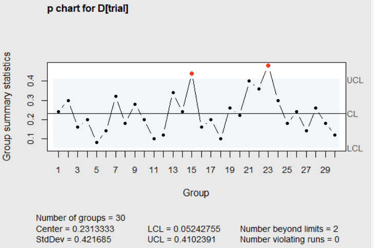
Figure 4.6 \(p\) chart of the number nonconforming
In this Figure, the proportion nonconforming for subgroups 15 and 23 fell above the upper control limit. With only, conforming-nonconforming information available on each sample of 50 cans, it could be difficult to determine the cause of a high proportion nonconforming. A good way to gain insight about the possible cause of an out of control point is to classify the nonconforming items. For example, if the 50 nonconforming items in sample 23 were classified into 6 types of nonconformites. A Pareto diagram, described later in this chapter, could then be constructed.
After a Pareto diagram was constructed, and it showed that the sealing failure and ahesive failure represented more than 65% of all defects. These defects usually reflect operator error. This sparked an investigation of what operator was on duty at that time. It was found that the half-hour period when subgroup 23 was obtained occurred when a temporary and inexperienced operator was assigned to the machine; and that could account for the high fraction nonconforming.
A similar classification of the nonconformities in subgroup 15 led to the discovery that a new batch of cardboard stock was put into production during that half hour period. It was known that introduction of new batches of raw material sometimes caused irregular production performance. Prevetitive measures were put in place to prevent use of inexperienced operators and untested raw materials in th future.
Subsequently, subgroups 15 and 23 were removed from the data, and the limits were recalculated as \(\overline{p}=.2150\), \(UCL=0.3893\), and \(LCL=0.0407\). Subgroup 21 (\(p=.40\)) now falls above the revised \(UCL\).
There were no other obvious patterns, and at least with respect to operator controllable problems, it was felt that the process was now stable.
Nevertheless, the average proportion nonconforming cans is 0.215, which is not an acceptable quality level (AQL). The plant management agreed, and asked the engineering staff to analyze the entire process to see if any improvements could be made. Using methods like those to be described in the Chapter 5, the engineering staff found that several adjustments could be made to the machine that should improve its performance.
After making these adjustments, 24 more subgroups (numbers 31-54) of \(n\)=50 were collected. The R code below plots the fraction nonconforming for these additional subgroups on the chart with the revised limits. The result is shown in Figure 4.7.
library(qcc)
# remove out-of-control points (see help(orangejuice)
  for the reasons)
inc <- setdiff(which(trial), c(15,23))
qcc(D[inc], sizes=size[inc], type="p", newdata=D[!trial],
    newsizes=size[!trial])
detach(orangejuice)
The statement \(\verb!inc <- setdiff(which(trial), c(15,23))!\) creates a vector (\(\verb!inc!\)) of the subgroup numbers, where \(\verb!trial=TRUE!\), excluding subgroups 15 and 23. In the call to the \(\verb!qcc!\) function, the argument \(\verb!D[inc]!\) is the vector containing the number of nonconforming cans for all the the subgroups in the original 30 samples minus groups 15 and 23. This is the set that will be used to calculate the control limits. The argument \(\verb!sizes=size[inc]!\) is the vector of subgroup sizes associated with these 28 subgroups. The argument \(\verb!newdata=D[!!\verb!trial]!\) specifies that the data for nonconformities in the additional 24 subgroups in data frame \(\verb!orangejuice!\), where \(\verb!trial=FALSE!\) should be plotted on the control chart with the previously calculated limits. The argument \(\verb!newsizes=size[!!\verb!trial])!\) is the vector of subgroup sizes associated with the 24 new subgroups. For more information and examples of selecting subsets of data frames see (Wickham and Grolemund 2017).
The immediate impression from the new chart is that the process, after adjustments, is operating at a new lower proportion defective. The run of consecutive points below the center line confirms that impression. The obvious assignable cause for this shift is successful adjustments.
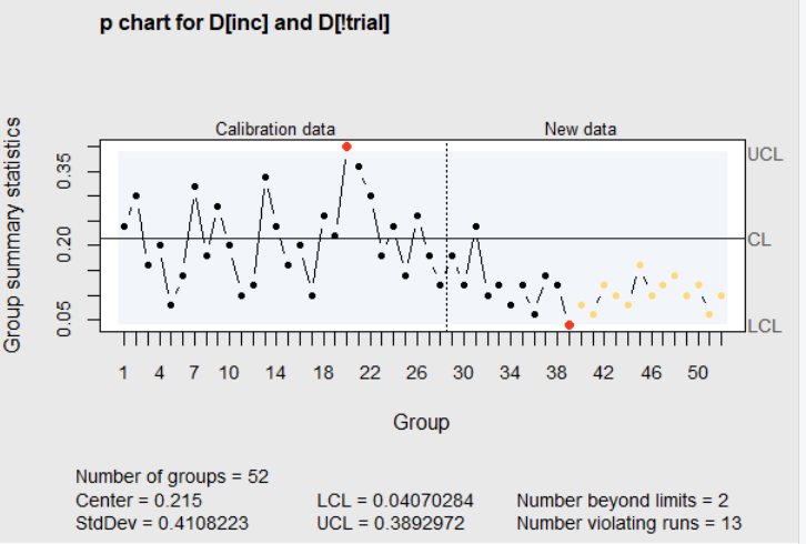
Figure 4.7 Revised limits with additional subgroups
Based on this improved performance, the control limits should be recalculated based on the new data. This was done, and additional data was collected over the next 5 shifts of operation (subgroups 55 to 94). The R code below first loads the data from subgroups 31 to 54, which is in the data frame \(\verb!orangejuice2!\) in the R package \(\verb!qcc!\). In this data set \(\verb!trial=TRUE!\) for subgroups 31 to 54, and \(\verb!trial=FALSE!\) for subgroups 55 to 94. The \(\verb!qcc!\) function call in the code then plots all the data on the control chart with limits calculated from just subgroups 31 to 54. The result is shown in Figure 4.8.
library(qcc)
data(orangejuice2)
attach(orangejuice2)
names(D) <- sample
qcc(D[trial], sizes=size[trial], type="p",
    newdata=D[!trial], newsizes=size[!trial])
detach(orangejuice2)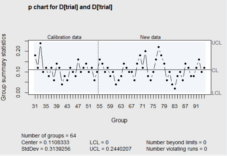
Figure 4.8 Revised limits with additional subgroups
In this chart there is no indication of assignable causes in the new data. The proportion nonconforming varies between 0.02 to 0.22 with an average proportion nonconforming of 0.1108. This is not an acceptable quality level. Due to the fact that no assignable causes are identified in Figure 4.8, the \(p\) chart alone gives no insight on how to improve the process and reduce the number of nonconforming items. This is one of the shortcomings of attribute charts in Phase I studies. Another shortcoming, pointed out by (Borror and Champ 2001), is that the false alarm rate for \(p\) and \(np\) charts increases with the number of subgroups and could lead to wasted time trying to identify phantom assignable causes.
To try to improve the process to an acceptable level of nonconformities, the next step might be to use some of the seven tools to be described in Section 4.4. For example, classify the 351 nonconforming items found in subgroups 31 to 94 and display them in a Pareto Chart. Seeing the most prevalent types of nonconformities may motivate some ideas among those familiar with the process as to their cause. If there is other recorded information about the processing conditions during the time subgroups were collected, then scatter diagrams and correlation coefficients with the proportion nonconforming may also stimulate ideas about the cause for differences in the proportions. These ideas can be documented in cause-and-effect diagrams, and may lead to some Plan-Do-Check-Act investigations. More detail on these ideas will be shown in Section 4.4. Even more efficient methods of investigating ways to improve a process using the Experimental Designs are described in Chapter 5.
Continual investigations of this type may lead to additional discoveries of ways to lower the proportion nonconforming. The control chart (like Figure 4.7) serves as a logbook to document the timing of interventions and their subsequent effects. Assignable causes discovered along the way are also documented in the OCAP for future use in Phase II.
The use of the control charts in this example, along with the other types of analysis suggested in the last two paragraphs, would all be classified as part of the Phase I study. Compared to the simple example from (Mitra 1998) presented in the last section, this example gives a clearer indication of what might be involved in a Phase I study. In Phase I, the control charts are not used to monitor the process but rather as tools to help identify ways to improve and to record and display progress.
Phase I would be complete when process conditions are found where the performance is stable (in control) at a level of nonconformities for attribute charts, or a level of process variability for variable charts that is acceptable to the customer or next process step. An additional outcome of the Phase I study is an estimate of the current process average and standard deviation.
4.3.2 Constructing other types of Attribute Charts with qcc
When the number of items inspected in each subgroup is constant, \(np\) charts for nonconformites are preferable. The actual number of nonconformites for each subgroup are plotted on the \(np\) chart rather than the fraction nonconforming. The control limits, which are based on the Binomial distribution, are calculated with the following formulas:
\[\begin{align} UCL&=n\overline{p}+3\sqrt{n\overline{p}(1-\overline{p})}\\ \\ \texttt{Center line}&=n\overline{p}\\ \\ LCL=&n\overline{p}-3\sqrt{n\overline{p}(1-\overline{p})}\\ \tag{4.2} \end{align}\]
where, \(n\) is constant so that the control limits remain constant for all subgroups. The control limits for a \(p\) chart, on the other hand, can vary depending upon the subgroup size. The R code below illustrates the commands to produce an \(np\) chart with using the data from Figure 14.2 in (Christensen, Betz, and Stein 2013). In this code, \(\verb!sizes=1000!\) is specified as a single constant rather than a vector containing the number of items for each subgroup.
When charting nonconformities, rather than the number of nonconforming items in a subgroup, a \(c\)-chart is more appropriate. When counting nonconforming (or defective) items, each item in a subgroup is either conforming or nonconforming. Therefore, the number of nonconforming in a subgroup must be between zero and the size of the subgroup. On the other hand, there can be more than one nonconformity in a single inspection unit. In that case, the Poisson distribution is better for modeling the situation. The control limits for \(c\)-chart are based on the Poisson distribution and are given by the following formulas:
\[\begin{align} UCL&=\overline{c}+3\sqrt{\overline{c}}\\ \\ \texttt{Center line}&=\overline{c}\\ \\ LCL=&\overline{c}-3\sqrt{\overline{c}}\\ \tag{4.3} \end{align}\]
where, \(\overline{c}\) is the average number of defects per inspection unit.
(Montgomery 2013) describes an example where a \(c\)-chart was used to study the number of defects found in groups of 100 printed circuit boards. More than one defect could be found in a circuit board so that the upper limit for defects is greater than 100. This data is also included in the \(\verb!qcc!\) package. When the inspection unit size is constant (i.e. 100 circuit boards) as it is in this example, the \(\verb!sizes=!\) argument in the call to \(\verb!qcc!\) is unnecessary. The R code below, from the \(\verb!qcc!\) documentation, illustrates how to create a \(c\)-chart.
library(qcc)
data(circuit)
attach(circuit)
qcc(circuit$x[trial], sizes=circuit$size[trial], type="c")\(u\)-charts are used for charting defects when the inspection unit does not have a constant size. The control limits for the \(u\)-chart are given by the following formulas:
\[\begin{align} UCL&=\overline{u}+3\sqrt{\overline{u}/k}\\ \\ \texttt{Center line}&=\overline{u}\\ \\ LCL=&\overline{u}+3\sqrt{\overline{u}/k}\\ \tag{4.4} \end{align}\]
where, \(\overline{u}\) is the average number of defects per a standardized inspection unit and \(k\) is the size of each individual inspection unit. The R code to create an \(u\)-chart using the data in Figure 14.3 in (Christensen, Betz, and Stein 2013) is shown below. The \(\verb!qcc!\) function used in that code uses the formulas for the control limits shown in Equation (4.4) and are not constant. (Christensen, Betz, and Stein 2013) replaces \(k\), in (4.4), with \(\overline{k}\), the average inspection unit size. Therefore, the control limits in that book are incorrectly shown constant. If you make the chart using the code below, you will see that the control limits are not constant.
4.4 Finding Reasons for Assignable Causes and Corrective Actions
4.4.1 Introduction
When an assignable cause appears on a control chart, especially one constructed with retrospective data, the reason for that assignable cause is not always as obvious as the reasons for late bus arrival times on Patrick Nolans’s control chart shown in section 4.1. It may take some investigation to find the reason for, and the way to eliminate, an assignable cause. The people most qualified to investigate the assignable causes that appear on a control chart are those on the front line who actually work in the process that produced the out-of-control points. They have the most experience with the process, and their accumulated knowledge should be put to work in identifying the reasons for assignable causes. When people pool their ideas, spend time discovering faults in their work process, and are empowered to change the process and correct those faults, they become much more involved and invested in their work. In addition, they usually make more improvements than could ever be made by others less intimately involved in the day-to-day process operation.
However, as Deming pointed out, there are often barriers that prevent employee involvement. Often management is reluctant to give workers authority to make decisions and make changes to a process, even though they are the ones most involved in the process details. New workers often receive inadequate training and no explanation of why they should follow management’s rigid rules. Testing the employee’s competency in correct process procedures is usually ignored, and management stresses production as the most important goal. If workers experience issues, they are powerless to stop the process while management is slow to react to their concerns. Management only gets involved when one of the following two things occurs: a production goal is not met, or a customer complains about some aspect of quality.
To address this problem, prior to 1950, Deming wrote what became point 12 in his 14 Points for Management. This point is as follows:
- Remove barriers to the pride of workmanship. People are eager to do a good job and are distressed when they cannot. To often misguided supervisors, faulty equipment, and defective materials stand in the way. These barriers must be removed (Walton 1986).
(Olmstead 1952) remarked that assignable causes can usually be identified by the data patterns they produce. A list of these data patterns are: single points out of control limits, a shift in the average or level, shift in the spread or variability, gradual change in process level (trend), and a regular change in process level (cycle).
To increase and improve the use of workers’ process knowledge, Kaoru Ishikawa, a Deming Prize recipient in Japan, introduced the idea of quality circles. In quality circles, factory foremen and workers met together to learn problem-solving tools that would help in investigating ways to eliminate assignable causes and improve processes.
The problem-solving tools that Ishakawa emphasized were called the 7-tools. This list of tools has evolved over time, and it is not exactly the same in every published description. For purposes of this book they are:
           1. Flowchart
           2. Cause-and-Effect Diagram
           3. Check-sheets or Quality Information System
           4. Line Graphs or Run Charts
           5. Pareto Diagrams
           6. Scatter Plots
           7. Control Charts
Phase I control charts have already been discussed earlier in the chapter. The remainter of this section will be devoted to discussing Shewhart Cycle (or PDCA) along with the first six of the seven tools. They will not be discussed in the order given above, but emphasis will be placed on how each of these tools can be used in finding the reasons for, and eliminating, assignable causes.
4.4.2 Flowcharts
When multiple people (possibly on different shifts) work in the same process, they might not all understand the steps of the process in the same way. Out of control signals may be generated when someone performs a task in one process step differently than others. Process flowcharts are useful for helping everyone who works in a process to gain the same understanding of the process steps. The symbols typically used in a flowchart are shown in Figure 4.9
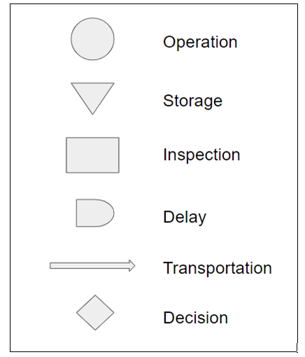
Figure 4.9 Flowchart Symbols
Process flowcharts are usually developed as a group exercise by a team of workers. The initial step in completing the flowchart is for the team to come to a consensus about how things should be done at each step of the process, and then to construct the initial flowchart. Next when everyone working in the process is following the steps as shown in the flowchart, the process results should be observed. If the process output meets the desired objective, the flowchart should be finalized and used as the reference. If the desired process output is not met, the team should reassemble and discuss their opinions regarding the reasons for poor performance and consider modifications to the flowchart. When consensus is again reached on a modified flowchart, the cycle begins again. This process of developing a flowchart is shown in Figure 4.10
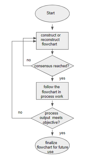
Figure 4.10 Creating a Flowchart
When a Phase I control chart developed with stored retrospective data shows an out-of-control signal of unknown origin, reference the process flowchart and involve the personnel working in the process when the out-of-control data occurred. Was the outlined flowchart followed at that time? Are there any notes regarding how the process was operated during and after the time of the out of control signal? If so, this information may lead to discovering the reason for the assignable cause and a possible remedy, if the process returns to normal in the recorded data.
4.4.3 PDCA or Shewhart Cycle
If one or more steps in a previously finalized process flowchart were not followed, it is not absolute evidence of the reason for an observed out-of-control signal. It could have been caused by some other change that was not noticed or recorded. If you want to discover the cause for an out-of-control signal, you need to do more than simply observe the process in action. An often quoted statement by George Box is “To find out what happens to a system (or process) when you interfere with it, you have to interfere with it not just passively observe it”(Box 1966). This is the basis of the PDCA cycle first described by Shewhart and represented in Figure 4.11.
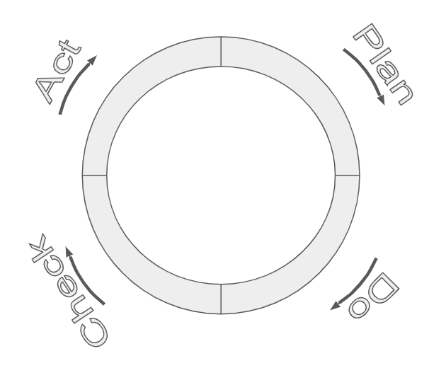
Figure 4.11 PDCA or Shewhart Cycle
The Shewhart Cycle will be demonstrated using flowchart example above.
Plan–in this step a plan would be made to investigate the potential cause of the out-of-control signal (i.e., the failure to follow one of the process steps as outlined on the flowchart.)
Do–in this step the modified process step that was followed at the time of the out-of-control-signal will be purposely followed again at the present time.
Check–in this step the process output that is measured and recorded on a control chart will be checked to see if another out-of-control signal results after the purposeful change in procedure.
Act–if the out-of-control signal returns, it can be tentatively assumed to have been caused by the purposeful change made in step 2. These first three steps are often repeated (or replicated) several times, as indicated by the circular pattern in Figure 5.3, before proceeding to the Act step. When the results of the action performed in the Do step are consistent, it strengthens the conclusion and provides strong evidence for taking action in the Act step of the PDCA. The “Act” taken should then be to prevent the change that was made from occurring in the future. This action would be classified as a preventative action. In Japan during the 1960s Shigeo Shingo, an industrial engineer at Toyota, defined the term Poka-Yoke to mean mistake proofing. Using this method, Japanese factories installed safeguards, such as lane departure warning signals on modern automobiles, to prevent certain mistakes from occurring.
The first three steps of the PDCA or Shewhart cycle are similar to the steps in the scientific method as shown below:
Table 4.2 PDCA and the Scientific Method
| Step | PDCA | Scientific Method |
|---|---|---|
| 1 | Plan | Construct a Hypothesis |
| 2 | Do | Conduct an Experiment |
| 3 | Check | Analyze data and draw Conclusions |
4.4.4 Cause-and-Effect Diagrams
The plan step in the PDCA cycle can begin with any opinions or hypothesis concerning the cause for trouble. One way to record and display opinions or hypotheses is to use a cause-and-effect diagram. These are preferably made in a group setting where ideas are stimulated by interaction within a group of people. The opinions recorded on a cause-and-effect diagram are organized into major categories or stems off the main horizontal branch, as illustrated in the initial diagram shown in Figure 4.12
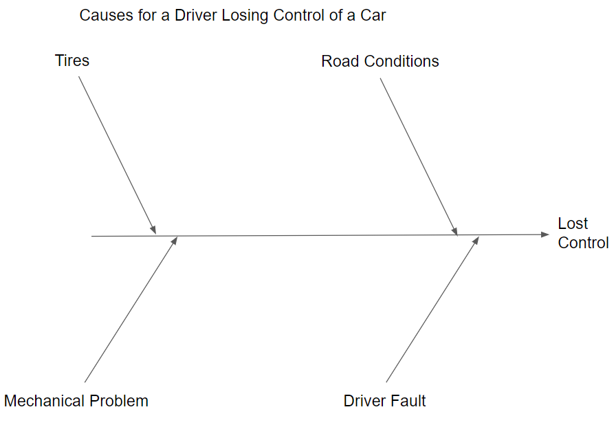
Figure 4.12 Cause-and-Effect Diagram Major Categories
Another way to construct a cause-and-effect diagram is to use a process flowchart as the main branch. In that way, the stems branch off the process steps where the hypotheses or leaves naturally reside.
One way to come up with the major categories or stems is through the use of an affinity diagram (see Chapter 8 (Holtzblatt, Wendell, and Wood 2005)). In the first step of constructing an affinity diagram, everyone in the group writes their ideas or opinions about the cause of a problem on a slip from a notepad or a sticky note. It is important that each person in the group is allowed to freely express their opinion, and no one should criticize or try to suppress ideas at this point. The notes are then put on a bulletin board or white board. Next, members of the group try to reorganize the notes into distinct categories of similar ideas by moving the location of the notes. Notes expressing the same idea can be combined at this point. Finally, the group decides on names for each of the categories and an initial cause-and-effect diagram like Figure 4.12 is constructed, with a stem off the main branch for each category.
The next step is to add leaves to the to the stems. The ideas for the leaves are stimulated by asking why. For example asking, “Why would road conditions cause a driver to lose control of the car?” This might result in the ideas or opinions shown on the right upper stem of the diagram shown in Figure 4.13 Leaves would be added to the other stems, as shown in the Figure, by following the same process.
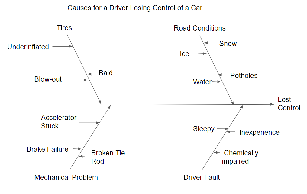
Figure 4.13 Cause-and Effect Diagram-First Level of Detail
More detail can be found by asking why again at each of the leaves. For example asking, “Why would the tire blow out?” This might result in the opinion added to the blow out leaf on the upper left of Figure 4.14.
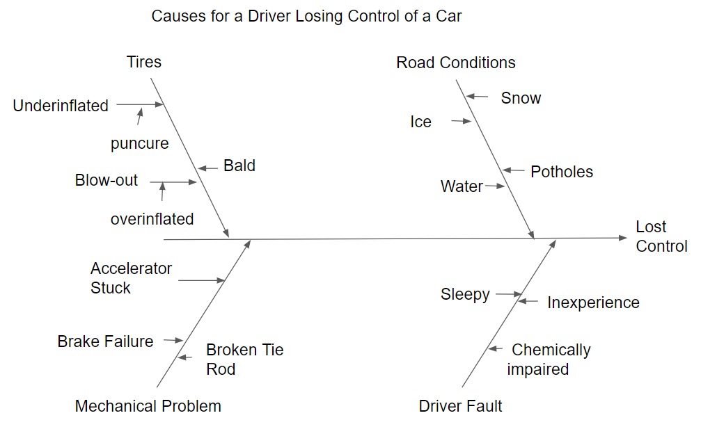
Figure 4.14 Cause-and-Effect Diagram-Second Level of Detail
When the cause-and-effect diagram is completed, members of the group that made the cause-and-effect diagram can begin to test the ideas that are felt by consensus to be most important. The tests are performed using the PDCA cycle to verify or discredit the ideas on the cause-and-effect diagram.
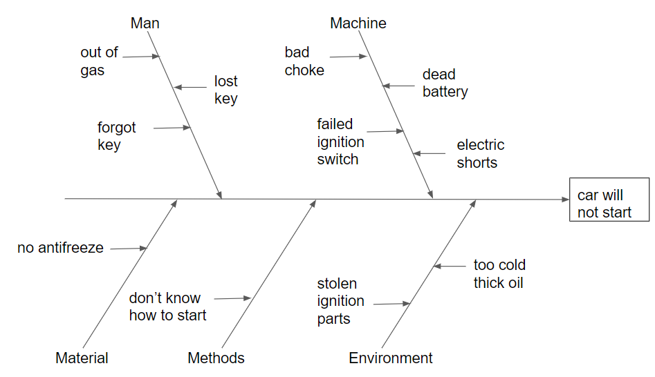
Cause-and-effect diagrams, like flowcharts, are usually handwritten. However, a printed cause-and-effect diagram showing the first level of detail (like Figure 4.13) can be made by the \(\verb!cause.and.effect()!\) function in the R package \(\verb!qcc!\), or the \(\verb!ss.ceDiag()!\) function in the R package \(\verb!SixSigma!\). The section of R code below shows the commands to reproduce Figure 4.13 as Figure 4.15, using the \(\verb!cause.and.effect()!\) function.
library(qcc)
causeEffectDiagram(cause = list(Road = c("Snow",
                                         "Ice",
                                         "Water",
                                         "Potholes"),
                                Driver = c("Inexperience",
                                           "Chemical_impiared",
                                           "Sleepy"),
                                Mechanical = c("Brakes_fail",
                                               "Accelerator_stuck",
                                               "Broken_tie_rod"),
                                Tires = c("Overinflation",
                                          "Bald",
                                          "Underinflation")),
                                effect = "Loss_Control")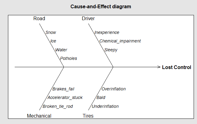
Figure 4.15 qcc Cause-and-Effect Diagram
4.4.5 Check Sheets or Quality Information System
Check sheets are used for collecting data. For example Figure 4.16 shows a Defective item check sheet that would be used by inspectors to record detailed information as they inspect items.
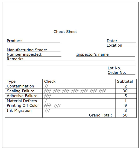
Figure 4.16 Defective Item Check Sheet
Ishikawa defined other types of check sheets such as:
- Defect Location
- Defective Cause
- Check-up confirmation
- Work Sampling
These were devised so that people involved in work within a process could quickly record information on paper to be filed for future reference. Having available data gives insight into the current level of performance, and can be a guide to future action. However, in today’s world, having records stored on paper in file cabinets is obsolete technology and has been replaced by computer files.
A Quality Information System (QIS) is the modern equivalent of check sheets filed by date. A QIS contains quality-related records from customers, suppliers and internal processes. It consists of physical storage devices (the devices on which data is stored such as servers and cloud storage), a network that provides connectivity, and an infrastructure where the different sources of data are integrated. Most large companies maintain a QIS (like those the FDA requires companies in the pharmaceutical industry to maintain).
A QIS (see (Burke and Silvestrini 2017)) can be used to:
- Record critical data (e.g. measurement and tool calibration)
- Store quality process and procedures
- Create and deploy operating procedures (e.g. ISO 9001–based quality management system)
- Document required training
- Initiate action (e.g. generate a shop order from a customer order)
- Control processes (controlling the operation of a laser cutting machine within specification limits)
- Monitor processes (e.g. real time production machine interface with control charting)
- Schedule resource usage (e.g personnel assignments)
- Manage a knowledge base (e.g. capturing storing and retrieving needed knowledge)
- Archive data (e.g. customer order fufillment)
The data in a QIS is often stored in relational databases and organized in a way so that portions of it can be easily be retrieved for special purposes. Additionally, routine reports or “dashboards” are produced for managers to give current information about what has happened and what is currently happening. Quality control tools described in this book, like control charts and process capability studies, can provide additional insight about what is actually expected to happen in the near future. Phase I control charts and related process capability studies can be produced with the data retrieved from the QIS. In addition, when data retrieved from the QIS is used to determine the root cause of out-of-control signals, it can explain the cause for previous undesirable performance, and give direction to what can be done to prevent it in the future.
SQL (pronounced “ess-que-el”) stands for Structured Query Language. SQL is used to communicate with a relational database. According to ANSI (American National Standards Institute), it is the standard language for relational database management systems. An open source relational database management system based on SQL (MySQL) is free to download and use. There is also an enterprise version that is available for purchase on a subscription basis. There are functions in R packages such as \(\verb!RODBC!\), \(\verb!RJDBC!\), and \(\verb!rsqlserver!\) that can connect to an SQL data base and directly fetch portions of the data. An article giving examples of this is available at https://www.red-gate.com/simple-talk/sql/reporting-services/making-data-analytics-simpler-sql-server-and-r/.
4.4.6 Line Graphs or Run Charts
Whether an assignable cause seen on a control chart represents a data pattern, like a shift in the process average or variance or a trend or cyclical pattern, it is often helpful to determine if similar data patterns exist in other variables representing process settings or conditions that are stored in the QIS. A quick way to examine data patterns is to make a line graph or run chart.
A line graph or run chart is constructed by plotting the data points in a sequence on a graph with the y-axis scaled to the values of the data points, and the x-axis tic marks numbered 1 through the number of values in the sequence. For example, Figure 4.17 shows a line graph of a portion of the data from Figure 13 in O’Neill et. al(O’Neill et al. 2012). The data represent the standard deviations of plaque potency assays of a reference standard from monthly measurement studies.
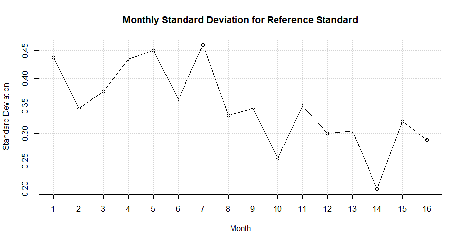
Figure 4.17 Standard Deviations of Plaque Potency Assays of a Reference Standard
It can be seen that the assay values decrease after month 7. If this change coincided with the beginning or end of an out-of-control signal on a retrospective control chart that was detected by a run of points above or below the center line, it could indicate that measurement error was the cause of the problem. Of course, further investigation and testing would be required for verification.
Line graphs can be made with the plot function in R as illustrated in the code below.
s<-c(.45,.345,.375,.435,.45,.36,.46,.335,.348,.252,.35,.30,
.302,.20,.325,.29)
plot(s,type="o",lab=c(17,5,4),ylab="Standard Deviation",
xlab="Month",main = "Monthly Standard Deviation for Reference Standard")
grid()
In this code, \(\verb!s<-c(.45,.345,.375,.435,.45,.36,.46,.335, ... )!\) are the monthly standard deviations, and the command \(\verb!grid()!\) adds a grid to the graph with horizontal and vertical lines at the x and y axis tic marks.
4.4.7 Pareto Diagrams
To find the reason for a change in attribute data, such as an increase in the number for nonconforming items, it is useful to classify or divide the nonconforming items into categories. The Pareto diagram is a graphical tool that clearly exposes the relative magnitude of of various categories. It consists of a bar chart with one bar representing the total number in each category. The bars in the Pareto diagram are arranged by height in descending order with the largest on the left. The bars are augmented by a line graph of the cumulative percent in the combined categories from left to right. Pareto charts can be produced using the \(\verb!pareto.chart()!\) function in the \(\verb!qcc!\) package, the \(\verb!ParetoChart()!\) function in the \(\verb!qualityTools!\) package, or the \(\verb!paretochart()!\) function in the \(\verb!qicharts!\) package. For example, if the defective item counts shown in Figure 4.16 represents a classification of the defective orange juice cans in subgroup 23 shown in Figure 4.6, then the Pareto diagram in Figure 4.18 can be constructed using the \(\verb!pareto.chart()!\) function in the \(\verb!qcc!\) package as shown in the code below.
library(qcc)
nonconformities<-c(2,30,5,1,9,3)
names(nonconformities)<-c("Contamination","Sealing Failure",
  "Adhesive Failure","Material Defects","Printing Off Color",
  "Ink Migration")
paretoChart(nonconformities, ylab = "Nonconformance
            frequency",main="Pareto Chart")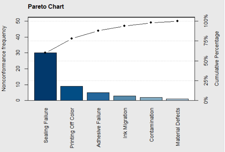
Figure 4.18 Pareto Chart of Noconforming Cans Sample 23
The scale on the left of the graph is for the count in each category and the scale on the right is for the cumulative percent. This Pareto diagram clearly shows that most of defective or nonconforming cans in subgroup 23 were sealing failures that accounted for over 50% of the total. Sealing failure and adhesive failure usually reflect operator error. This sparked an investigation of what operator was on duty at that time. It was found that the half-hour period when subgroup 23 was obtained occurred when a temporary and inexperienced operator was assigned to the machine; and that could account for the high fraction nonconforming.
4.4.8 Scatter Plots
Scatter plots are graphical tools that can be used to illustrate the relationship or correlation between two variables. A scatter plot is constructed by plotting an ordered pair of variable values on a graph where the x-axis usually represents a process variable that can be manipulated, and the y-axis is usually a measured variable that is to be predicted. The scatter plot is made by placing each of the ordered pairs on a graph where the \(x_i\) coordinate lines up with its value on the horizontal scale, and the \(y_i\) coordinate lines up with its value on the vertical scale.
Figure 4.19 is an example scatterplot patterened after one in Figure 2 in the paper by Cunningham and Shanthikumar(Cunningham and Shanthikumar 1996). The R code to produce the Figure is shown below,
where file$cycle_time and file$yield are columns in an R data frame file retrieved from a database.
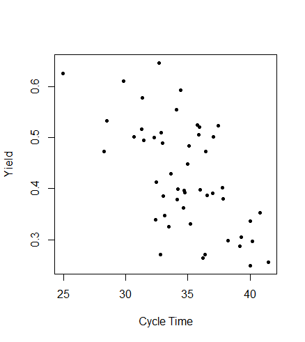
Figure 4.19 Scatter Plot of Cycle Time versus Yield
The x-variable is the cycle time in a semiconductor wafer fabrication facility, and the the y-variable is the yield. The plot shows a negative relationship where as the cycle time increases the process yield tends to decrease. Scatter plots can show negative, positive, or curvilinear relationships between two variables, or no relationship if the points on the graph are in a random pattern. Correlation does not necessarily imply causation and the increase in the x-variable and corresponding decrease in the y-variable may have been both caused by something different.
In the case of Figure 4.19, efforts had been made to reduce cycle times, since it is beneficial in many ways. Customer demands can be met more quickly, costs are reduced when there is less work-in-progress inventory, and the opportunity to enter new markets becomes available. If an assignable cause appeared on a control chart showing a reduction in contamination defects, while these efforts to reduce cycle time were ongoing, the reason for this reduction would need to be determined. If the reason were found, whatever was done to cause the reduction could be incorporated into the standard operating procedures. One way to look for a possible cause of the fortunate change is by examining scatter plots versus manipulated process variables. Figure 4.20 shows a scatter plot of cycle time versus contamination defects on dies within semiconductor wafers.
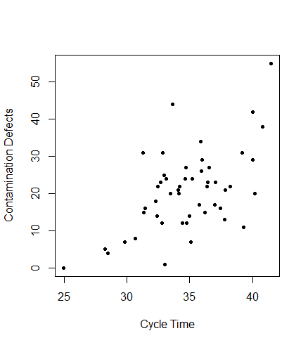
Figure 4.20 Scatter Plot of Cycle Time versus Contamination Defects
This plot shows a positive relationship. The plot itself did not prove that shortened cycle times decreased contamination defects, but it was reasoned that each wafer lot was exposed to possible contamination throughout processing. Therefore, it makes sense that reducing the cycle time reduces exposure and should result in fewer contamination defects and higher yields. When efforts continued to reduce cycle time, and contamination defects continued to decrease and yields continued to increase, these realizations provided proof that reducing cycle time had a positive effect on yields.
4.5 Process Capability Analysis
At the completion of a Phase I study, where control charts have shown that the process is in control at what appears to be an acceptable level, then calculating a process capability ratio (PCR) is an appropriate way to document the current state of the process.
For example, \(\overline{X} - R\)-charts were made using the data in Table 4.3 taken from (Christensen, Betz, and Stein 2013)
Table 4.3 Groove Inside Diameter Lathe Operation
| Subgroup | Measurement | |||
|---|---|---|---|---|
| 1 | 7.124 | 7.122 | 7.125 | 7.125 |
| 2 | 7.123 | 7.125 | 7.125 | 7.128 |
| 3 | 7.126 | 7.128 | 7.128 | 7.125 |
| 4 | 7.127 | 7.123 | 7.123 | 7.126 |
| 5 | 7.125 | 7.126 | 7.121 | 7.122 |
| 6 | 7.123 | 7.129 | 7.129 | 7.124 |
| 7 | 7.122 | 7.122 | 7.124 | 7.124 |
| 8 | 7.128 | 7.125 | 7.126 | 7.123 |
| 9 | 7.125 | 7.125 | 7.121 | 7.122 |
| 10 | 7.126 | 7.123 | 7.123 | 7.125 |
| 11 | 7.126 | 7.126 | 7.127 | 7.128 |
| 12 | 7.127 | 7.129 | 7.128 | 7.129 |
| 13 | 7.128 | 7.123 | 7.122 | 7.124 |
| 14 | 7.124 | 7.125 | 7.129 | 7.127 |
| 15 | 7.127 | 7.127 | 7.123 | 7.125 |
| 16 | 7.128 | 7.122 | 7.124 | 7.126 |
| 17 | 7.123 | 7.124 | 7.125 | 7.122 |
| 18 | 7.122 | 7.121 | 7.126 | 7.123 |
| 19 | 7.128 | 7.129 | 7.122 | 7.129 |
| 20 | 7.125 | 7.125 | 7.124 | 7.122 |
| 21 | 7.125 | 7.121 | 7.125 | 7.128 |
| 22 | 7.121 | 7.126 | 7.120 | 7.123 |
| 23 | 7.123 | 7.123 | 7.123 | 7.123 |
| 24 | 7.128 | 7.121 | 7.126 | 7.127 |
| 25 | 7.129 | 7.127 | 7.127 | 7.124 |
When variables control charts were used in Phase I, then the PCR’s \(C_p\) and \(C_{pk}\) are appropriate. These indices can be calculated with the formulas:
\[\begin{equation} C_p=\frac{USL-LSL}{6\sigma} \tag{4.5} \end{equation}\]
\[\begin{equation} C_{pk}=\frac{Min(C_{Pu},C_{Pl})}{3\sigma}, \tag{4.6} \end{equation}\]
where
\[\begin{align} C_{Pu}&=\frac{USL-\overline{X}}{\sigma}\\ \\ C_{Pl}&=\frac{\overline{X}-LSL}{\sigma}\\ \tag{4.7} \end{align}\]
The measure of the standard deviation \(\sigma\) used in these formulas is estimated from the subgroup data in Phase I control charts. If \(\overline{X} - R\) charts were used, then \(\sigma=\overline{R}/d_2\), where \(d_2\) is taken from vignette \(\verb!SixSigma::ShewhartConstants!\) in the R package \(\verb!SixSigma!\). It can also be found in Section 6.2.3.1 of the online NIST Engineering Statistics Handbook. for the appropriate subgroup size \(n\). If \(\overline{X} - s\) charts were used, then \(\sigma=\overline{s}/c_4\), where \(c_4\) is taken from same tables mentioned above for the appropriate subgroup size \(n\).
Assuming the data in Table 4.3 shows the process is in control, then the \(\verb!process.capability()!\) function in the R package \(\verb!qcc!\), the \(\verb!cp()!\) function in the R package \(\verb!qualityTools!\), or the \(\verb!ss.ca.study()!\) function in the R package \(\verb!SixSigma!\) can compute the capability indices and display the histogram of the data with the specification limits superimposed as in Figure 4.21. The code to do this is shown using the \(\verb!process.capability()!\) function in the R package \(\verb!qcc!\). The output is below the code.
Lathe<-read.table("Lathe.csv",header=TRUE,sep=","
                  ,na.strings="NA",dec=".",strip.white=TRUE)
library(qcc)
qcc(Lathe,type="R")
pc<-qcc(Lathe,type="xbar")
process.capability(pc,spec.limits=c(7.115,7.135))
-- Process Capability Analysis -------------------

Number of obs = 100          Target = 7.125
Center        = 7.1249       LSL    = 7.115
StdDev        = 0.002098106  USL    = 7.135

Capability indices  Value  2.5%  97.5%
              Cp     1.59  1.37   1.81
              Cp_l   1.57  1.38   1.76
              Cp_u   1.60  1.41   1.80
              Cp_k   1.57  1.34   1.80
              Cpm    1.59  1.37   1.81

Exp<LSL 0%	 Obs<LSL 0%
Exp>USL 0%	 Obs>USL 0%
If the process is exactly centered between the lower and upper specification limits, then \(C_p = C_{pk}\). In the example below, the center line \(\overline{\overline{X}}=7.1249\) is very close to the center of the specification range and therefore \(C_p\) and \(C_{pk}\) are nearly equal. When the process is not centered, \(C_{pk}\) is a more appropriate measure than \(C_p\). The indices \(C_{p_l}=1.573\) and \(C_{p_u}=1.605\) are called \(Z_L\) and \(Z_U\) by some textbooks, and they would be appropriate if there was only a lower or upper specification limit. Otherwise \(C_{pk}=min(C_{p_l}, C_{p_u})\), since the capability indices are estimated from data, the report also gives 95% confidence intervals for them.
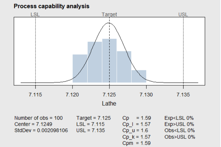
Figure 4.21 Lathe Data in Table 4.3
To better understand the meaning of the capability index, a portion of the table presented by (Montgomery 2013) is shown in Table 4.2. The second column of the table shows the process fallout in ppm when the mean is such that \(C_{Pl}\) or \(C_{Pu}\) is equal to the PCR shown in the first column. The third column shows the process fallout in ppm when the process is centered between the two spec limits so that \(C_P\) is equal to the PCR. The fourth and fifth columns show the process fallout in ppm if the process mean shifted left or right by 1.5\(\sigma\) after the PCR had been established.
Table 4.4 Capability Indices and Process Fallout in PPM
| PCR | Process Fallout | (ppm) | ||
|---|---|---|---|---|
| - | no shift | no shift | 1.5\(\sigma\) shift | 1.5\(\sigma\) shift |
| - | Single spec | Double specs | Single spec | Double specs |
| 0.50 | 66,807 | 133,613 | 500,000 | 500,000 |
| 1.00 | 1,350 | 2,700 | 66,807 | 66,807 |
| 1.50 | 4 | 7 | 1,350 | 1,350 |
| 2.00 | 0.0009 | 0.0018 | 4 | 4 |
In this table it can be seen that a \(C_{p_l}=1.50\) or \(C_{p_u}=1.50\) (when there is only a lower or upper specification limit) would result in only 4 ppm (or a proportion of 0.000004) out of specifications. If \(C_{p}=1.50\) and the process is centered between upper and lower specification limits, then only 7 ppm (or a proportion of 0.000007) would be out of the specification limits. As shown in the right two columns of the table, even if the process mean shifted 1.5\(\sigma\) to the left or right after \(C_{p}\) was shown to be 1.50, there would still be only 1,350 ppm (or 0.00135 proportion) nonconforming. This would normally be an acceptable quality level (AQL).
Table 4.4 makes it clear why Ford motor company demanded that their suppliers demonstrate their processes were in a state of statistical control and had a capability index of 1.5 or greater. That way Ford could be guaranteed an acceptable quality level (AQL) for incoming components from their suppliers, without the need for acceptance sampling.
The validity of the PCR \(C_p\) is dependent on the following.
The quality characteristic measured has a normal distribution.
The process is in a state of control.
For two sided specification limits, the process is centered.
The control chart and output of the \(\verb!process.capability!\) function serve to check these. The histogram of the Lathe data in Figure 4.21 appears to justify the normality assumption. Normal probability plots would also be useful for this purpose.
When Attribute control charts are used in a Phase I study, \(C_p\) and \(C_{pk}\) are unnecessary. When using a \(p\) or \(np\) chart, the final estimate \(\overline{p}\) is a direct estimate of the process fallout. For \(c\) and \(u\) charts, the average count represents the number of defects that can be expected for an inspection unit.
4.6 OC and ARL Characteristics of Shewhart Control Charts
The operating characteristic OC for a control chart (sometimes called \(\beta\)) is the probability that the next subgroup statistic will fall between the control limits and not signal the presence of an assignable cause. The OC can be plotted versus the hypothetical process mean for the next subgroup, similar to the OC curves for sampling plans discussed in Chapters 2 and 3.
4.6.1 OC and ARL for Variables Charts
The function \(\verb!ocCurves!\) in the R package \(\verb!qcc!\) can make OC curves for \(\overline{X}\)-control charts created with \(\verb!qcc!\). In this case \[\begin{equation} OC=\beta=P(LCL \le \overline{X} \le UCL) \tag{4.8} \end{equation}\]
For example, the R code below demonstrates using the \(\verb!ocCurves!\) function to create the OC curve based on the revised control chart for the Coil resistance data discussed in Section 4.2.1.
Coilm <- read.table("Coil.csv", header=TRUE,sep=",",
         na.strings="NA",dec=".",strip.white=TRUE)
library(qcc)
pc<-qcc(Coilm, type="xbar",plot=FALSE)
beta <- ocCurves(pc, nsigmas=3)
Figure 4.22 shows the resulting OC curves for future \(\overline{X}\) control charts for monitoring the process with subgroups sizes of 5, 1, 10, 15, and 20 (the first number is the subgroup size for the control chart stored in \(\verb!pc!\)). It can be seen that if the process shift for the next subgroup is small (i.e., less that .5 \(\sigma\)), then the probability of falling within the control limits is very high. If the process shift is larger, the probability of falling within the control limits (and not detecting the assignable cause) decreases rapidly as the size of the subgroup increases.
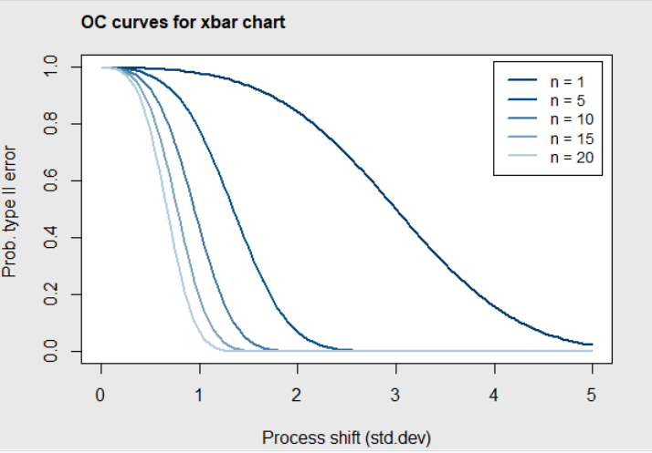
Figure 4.22 OC curves for Coil Data
Figure 4.23 gives a more detailed view. In this figure, it can be seen that when the subgroup size is \(n=5\) and the process mean shifts to the left or right by 1 standard deviation, there is about an 80% chance that the next mean plotted will fall within the control limits and the assignable cause will not be detected. On the other hand, if the process mean shifts by 2 standard deviations, there is less that a 10% chance that it will not be detected. On the right side of the figure, it can be seen that the chance of not detecting a 1 or 2 standard deviation shift in the mean is much higher when the subgroup size is \(n=1\).
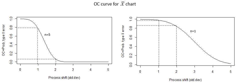
Figure 4.23 OC curves for Coil Data
If the mean shifts by \(k\sigma\) just before the \(i\)th subgroup mean is plotted on the \(\overline{X}\) chart, then the probability that the first mean that falls out of the control limits is for the (\(i+m\))th subgroup is:
\[\begin{equation} [\beta(\mu+k\sigma)]^{m-1}(1-\beta(\mu+k\sigma)). \tag{4.9} \end{equation}\]
This is a Geometric probability with parameter \(\beta(\mu+k\sigma)\). Therefore, the expected number of subgroups before a mean shift is discovered, or the average run length (ARL), is given by
\[\begin{equation} ARL=\frac{1}{(1-\beta(\mu+k\sigma))}, \tag{4.10} \end{equation}\]
the expected value of the Geometric random variable.
Although the \(\verb!qcc!\) package does not have a function to plot the ARL curve for a control chart, the \(\verb!ocCurves!\) function can store the OC curves for the \(\overline{X}\) chart. In the R code below, \(\verb!pc!\) is a matrix created by the \(\verb!ocCurves!\) function. The row labels for the matrix are the process shift values shown on the x-axis of Figure 4.8. The column labels are the hypothetical number of values in the subgroups (i.e., \(n=\) 5, \(n=\) 1, \(n=\) 10, \(n=\) 15, and \(n=\) 20). In the body of the matrix are the OC=\(\beta\) values for each combination of the process shift and subgroup size. By setting \(\verb!ARL5=1/(1-beta[ ,1])!\) and \(\verb!ARL1=1/(1-beta[ ,2])!\) the average run lengths are computed as a function of the OC values in the matrix and plotted as shown in Figure 4.24.
library(qcc)
pc<-qcc(Coilm, type="xbar",plot=FALSE)
nsigma = seq(0, 5, length=101)
beta <- ocCurves(pc, nsigmas=3)
ARL5=1/(1-beta[ ,1])
ARL1=1/(1-beta[ ,2])
plot(nsigma, ARL1, type='l',,lty=3,ylim=c(0,20),ylab='ARL')
lines(nsigma, ARL5, type='l',lty=1)
text(1.2,5,'n=5')
text(2.1,10,'n=1')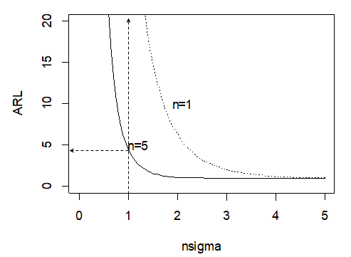
Figure 4.24 ARL curves for Coil Data with Hypothetical Subgroup Sizes of 1 and 5
In this figure, it can be seen that if the subgroup size is \(n=\) 5, and the process mean shifts by 1 standard deviation, it will take 5 (rounded up to an integer) subgroups on the average before before the \(\overline{X}\) chart shows an out of control signal. If the subgroup size is reduced to \(n=\) 1, it will take many more subgroups on the average (over 40) before an out of control signal is displayed.
4.6.2 OC and ARL for Attribute Charts
The \(\verb!ocCurves()!\) function in the \(\verb!qcc!\) package can also make and plot OC curves for \(p\) and \(c\) type attribute control charts. For these charts, \(\beta\) is computed using the Binomial or Poisson distribution. For example, the R code below makes the OC curve for the \(p\) chart shown in Figure 4.6 for the orange juice can data. The result is shown in Figure 4.25.
data(orangejuice)
beta <- with(orangejuice,ocCurves(qcc(D[trial],
             sizes=size[trial], type="p", plot=FALSE)))
print(round(beta, digits=4))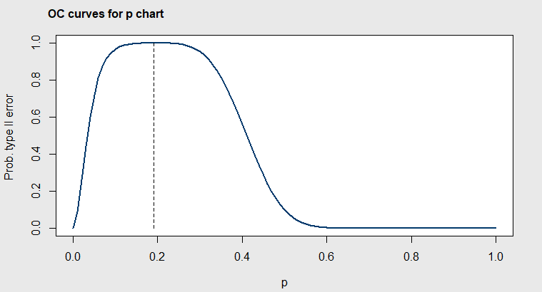
Figure 4.25 OC curves for Orange Juice Can Data, Subgroup Size=50
The center line is \(\overline{p}=0.231\) in Figure 4.6, but in Figure 4.25 it can be seen that the probability of the next subgroup of 50 falling within the control limits of the \(p\) chart is \(\ge 0.90\) for any value of \(p\) between 0.15 and about 0.30. So the \(p\) chart is not very sensitive to detecting small changes in the proportion nonconforming.
ARL curves can be made for the \(p\) chart in a way similar to the last example by copying the OC values from the matrix \(\verb!beta!\) created by the \(\verb!ocCurves!\) function. OC curves for \(c\) charts can be made by changing \(\verb!type="p"!\) to \(\verb!type="c"!\).
4.7 Summary
Shewhart control charts can be used when the data is collected in rational subgroups. The pooled estimate of the variance within subgroups becomes the estimated process variance and is used to calculate the control limits. This calculation assumes the subgroup means are normally distributed. However, due to the Central Limit Theorem, averages tend to be normally distributed and this is a reasonable assumption.
If the subgroups were formed so that assignable causes occur within the subgroups, then the control limits for the control charts will be wide and few if any assignable cause will be detected. If a control chart is able to detect assignable causes, it indicates that the variability within the subgroups is due mainly common causes.
The cause for out of control points are generally easier discover when using Shewhart variable control charts (like \(\overline{X}-R\) or \(\overline{X}-s\)) than Shewhart attribute charts (like \(p\)-charts, \(np\)-charts, \(c\)-charts, or \(u\)-charts). This is important in Phase I studies where one of the purposes is to establish an OCAP containing a list of possible assignable causes.
If characteristics that are important to the customer can be measured and variables control charts can be used, then demonstrating that the process is in control with a capability index \(C_p\ge\) 1.50 or \(C_{pk}\ge\) 1.50 will guarantee that production from the process will contain less that 1,350 ppm nonconforming or defective items. This is the reason (Deming 1986) asserted that no inspection by the customer (or next process step) will be necessary in this situation.
4.8 Exercises
Run all the code examples in the chapter, as you read.
Recreate the Cause and Effect Diagram shown below using the \(\verb!causeEffectDiagram()!\) function or the \(\verb!ss.ceDiag()!\) function, and add any additional ideas you have to the diagram.
Assuming that you believe that a dead battery is the most likely cause for the car not starting, write one or more sentences describing what you would do at each of the PDCA steps to solve this problem.
Construct a Flowchart showing the operations, inspection points and decision points in preparing for an exam over chapters 1-4.
Using the data in the R code block in Section 4.2.5, use R to construct a line graph (like Figure 4.1) of Patrick Nolan’s data.
Create an OC curve and an ARL curve for the \(\overline{X}\)-chart you create using the data from Table 4.3.
Use the R code with the \(\verb!qcc!\) function at the beginning of Section 4.3 to plot the \(p\) chart. Why do the control limits vary from subgroup to subgroup?
If variables control charts (such as \(\overline{X}-R\) or \(\overline{X}-s\)) were used and the process was shown to be in control with a \(C_{pk}=1.00\), then
What proportion nonconforming or out of the specification limits would be expected? (i.e., show how the values in Table 4.4 were obtained)
If an attribute \(p\)-chart were used instead of the \(\overline{X}-R\) or \(\overline{X}-s\) charts, then what subgroup size would be necessary to show the same in control proportion nonconforming as the variables charts in (a) with \(C_{pk}=1.00\)?
- Consider the data in Table 4.5 taken from the Automotive Industry Action Committee (TaskSubcommittee 1992).
Table 4.5 Phase I Study for Bend Clip Diameters “A” (Specification Limits .50 to .90 mm)
| Subgroup | D | D | D | D | D |
|---|---|---|---|---|---|
| 1 | .65 | .70 | .65 | .65 | .85 |
| 2 | .75 | .85 | .75 | .85 | .65 |
| 3 | .75 | .80 | .80 | .70 | .75 |
| 4 | .60 | .70 | .70 | .75 | .65 |
| 5 | .70 | .75 | .65 | .85 | .80 |
| 6 | .60 | .75 | .75 | .85 | .70 |
| 7 | .75 | .80 | .65 | .75 | .70 |
| 8 | .60 | .70 | .80 | .75 | .75 |
| 9 | .65 | .80 | .85 | .85 | .75 |
| 10 | .60 | .70 | .60 | .80 | .65 |
| 11 | .80 | .75 | .90 | .50 | .80 |
| 12 | .85 | .75 | .85 | .65 | .70 |
| 13 | .70 | .70 | .75 | .75 | .70 |
| 14 | .65 | .70 | .85 | .75 | .60 |
| 15 | .90 | .80 | .80 | .75 | .85 |
| 16 | .75 | .80 | .75 | .80 | .65 |
| 17 | .75 | .70 | .85 | .70 | .80 |
| 18 | .75 | .70 | .60 | .70 | .60 |
| 19 | .65 | .65 | .85 | .65 | .70 |
| 20 | .60 | .60 | .65 | .60 | .65 |
| 21 | .50 | .55 | .65 | .80 | .80 |
| 22 | .60 | .80 | .65 | .65 | .75 |
| 23 | .80 | .65 | .75 | .65 | .65 |
| 24 | .65 | .60 | .65 | .60 | .70 |
| 25 | .65 | .70 | .70 | .60 | .65 |
Make an \(R\)-chart for the data. If any points are out of the control limits on the \(R\)-chart, assume that assignable causes were discovered and added to the OCAP.
Remove the subgroups of data you found out of control on the \(R\) chart, and construct \(\overline{X}\) and \(R\)-charts with the remaining data.
Check for out of control signals on the \(\overline{X}\) chart (use the Western Electric Rules in addition to checking points out of the control limits).
Assume that assignable causes were discovered for any-out-of-control points found in subgroups 18 to 25 only (since it was discovered that out of spec raw materials were used while making those subgroups).
Eliminate any out of control subgroups you discovered between 18 to 25, and then make \(\overline{X}\) and \(R\)-charts with the remaining data.
If there are no out of control signals in the control charts you created, then calculate the appropriate capability index and a graph similar to Figure 4.21.
Is the process capable of meeting customer requirements? If not, what is the first thing you might suggest to improve it.
If defective bend clips were classified by the cause resulting in the table below, use R to construct a Pareto diagram.
| Cause | occurances |
|---|---|
| Out of spec raw material | 121 |
| Part misplaced on die | 15 |
| Bend allowance | 9 |
| Spring back | 47 |
References
Borror, C. M., and C. W. Champ. 2001. “Phase 1 Control Charts for Independent Bernoulli Data.” Quality and Reliability Engineering International 17: 391–96.
Box, G. E. P. 1966. “Use and Abuse of Regression.” Technometrics 8 (4): 625–29.
Burke, S. E., and R. T. Silvestrini. 2017. The Certified Quality Engineer Handbook 4th Ed. Milwaukee, Wisconsin: ASQ Quality Press.
Cano, E. L., J. M. Mogguerza, and M. P. Corcoba. 2015. Quality Control with R - an ISO Standards Approach. New York, N.Y: Springer.
Chakraborti, S., S. W. Human, and M. A. Graham. 2009. “Phase I Statistical Process Control Charts: An Overview and Some Results.” Quality Engineering 21: 52–62.
Christensen, C., K. M. Betz, and M. S. Stein. 2013. The Certified Quality Process Analyst Handbook. 2nd ed. Milwaukee, Wisconsin: ASQ Quality Press.
Cunningham, S. P., and J. G. Shanthikumar. 1996. “Empirical Results on the Relationship Between Die Yield and Cycle Time in Semiconductor Wafer Fabrication.” IEEE Transactions on Semiconductor Manufacturing 9 (2): 273–77.
Deming, W. E. 1986. Out of the Crisis. Cambridge, Mass.: MIT Center for Advance Engineering Study.
Holtzblatt, K., J. B. Wendell, and S. Wood. 2005. Rapid Contextual Design. San Francisco, CA: Elsevier Inc. https://doi.org/10.1016/B978-0-12-354051-5.X5000-9.
Joiner, B. L. 1994. Fourth Generation Management - the New Business Consciousness. New York, NY: McGraw-Hill, Inc.
Lawson, J. 2015. Design and Analysis of Experiments with R. Boca Raton, Florida: Chapman; Hall/CRC.
Mitra, A. 1998. Fundamentals of Quality Control and Improvement. Upper Saddle River, New Jersey: Prentice Hall.
Montgomery, D. C. 2013. Introduction to Statistical Quality Control. 7th ed. Hoboken, New Jersey: John Wiley & Sons.
NIST/Sematech E-Handbook of Statistical Methods. 2012. https://www.itl.nist.gov/div898/handbook/pmc/section3/pmc321.htm.
Olmstead, P. S. 1952. “How to Detect the Type of an Assignable Cause.” Industrial Quality Control 9 (4): 22.
O’Neill, J., G. Atkins, D. Curbison, B. Flak, J. M. Lucas, D. Metzger, L. Morse, et al. 2012. “Statistical Engineering to Stabilize Vaccine Supply.” Quality Engineering 24 (2): 227–40.
Shewhart, W. A. 1931. Economic Control of Quality of Manufactured Product. New York: D. Van Nostrand.
TaskSubcommittee, A. I.A. G. 1992. Statistical Process Control (Spc) Reference Manual. Troy Michigan: Automotive Industry Action Group.
Walton, M. 1986. The Deming Management Method. New York, N.Y.: Dodd Mead; and Company, Inc.
Wickham, H., and G. Grolemund. 2017. R for Data Science-Import, Tidy, Transform, Visualize and Model Data. Sebastopol, CA: O’Reiilly Media Inc.