Chapter 7 Multivariate Control Charts
7.1 Introduction
When the quality of a product or service is defined by more than one property, all the properties should be studied simultaneously to control and improve quality ((Kourti and MacGregor 1996)). The rapid growth of online data acquisition makes it possible to collect and study many properties, and there is a need to use control charts to monitor all the properties, or quality characteristics, simultaneously.
Examples of process outputs that have multiple quality characteristics are as follows. First, in the output of a chemical manufacturing process, the presence of several impurities indicates a lack of quality. These impurities can be identified as peaks on a chromatography report, and all should be reduced to improve quality. Another example is in printed circuit board manufacturing, in which there are many variables measured on each board that defines its quality. Third, in healthcare, many simultaneously measured outcomes contribute to the quality of a service to patients. Finally, a manufactured part may have several physical dimensions that can be measured, and they must all be within a joint region to insure the part fitness for use.
If there are \(p\) quality characteristics and separate control charts are maintained on each with \(\pm3 \sigma\) control limits, the probability of a false signal from any one control chart is 0.0027 and the ARL\(_0=370\). However, the probability of a false signal from at least one of the \(p\) control charts is increased to \(1-(1-.0027)^p\), and the overall ARL\(_0\) will be greatly decreased resulting in frequent false positive signals. That is, assuming that the \(p\) quality characteristics being monitored are independent.
One way to compensate for this problem is to widen the control limits on each of the separate control charts, thus increasing each of their individual ARL\(_0\)’s to the point that the overall ARL\(_0\) for obtaining a false signal on least one of the charts is still equal to 370. Again, that can be done if the quality characteristics are jointly independent or uncorrelated.
However, if the several properties or quality characteristics measured on one product or service are interrelated or correlated, the opposite problem may occur. The chance of missing a real change in the process is increased, and although several charts are maintained, together they may be insensitive to detecting real changes in the process. Widening the limits of each individual control chart in this situation makes the charts even less sensitive to detecting real changes.
For example, Figure 7.1 illustrates two interrelated quality characteristics \(X_1\) and \(X_2\). In this figure \(X_1\) and \(X_2\) are negatively correlated. Independent 99% tolerance regions are represented for both \(X_1\) and \(X_2\) as the lengths of the horizontal and vertical lines, and the joint 99% tolerance region for \(X_1\) and \(X_2\) is represented by the ellipse. It can be seen that an observation on (\(X_1\) and \(X_2\)) could be very unusual and outside the tolerance ellipse, yet well within the independent tolerance regions for \(X_1\) and \(X_2\).
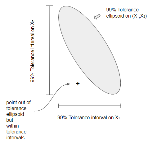
Figure 7.1 Comparison of Elliptical and Independent Control
Thus when several quality characteristics are used in either a Phase I study, to establish the characteristics of an in-control process and to develop an OCAP, or during Phase II monitoring, the following considerations are important (Bersimis, Psarakis, and Panaretos 2007):
Reduce the chance of false positive and false negative signals when determining whether the process is in control.
Take into account any correlation among the quality characteristics studied.
If the process is out of control, be able to identify the nature of the problem.
This chapter will address these concerns using multivariate control charts. There are four distinct situations where multivariate control charts are used:
Phase I with data in rational subgroups
Phase I with individual observations
Phase II with data in rational subgroups
Phase II with individual observations.
All four of these situations will also be discussed in this chapter.
7.2 \(T^2\)-Control Charts and Upper Control Limit for \(T^2\) Charts
If a single quality characteristic \(X\) follows a normal distribution, the statistic for testing the hypothesis \(H_0: \mu=\mu_0\) when \(\sigma\) is known is: \(Z=\frac{\bar{X}-\mu_0}{\sigma/\sqrt{n}}\), and using rational subgroups of size \(n\), a standardized control chart for the mean is made by charting the quantity \(Z_i=\frac{\bar{X}_i-\mu_0}{\sigma/\sqrt{n}}\), where \(\bar{X}_i\) is the \(i\)th subgroup mean, \(\mu_0\) is the known in-control process mean, and \(\sigma\) is the known in-control process standard deviation. The control limits are \(\pm Z_{\alpha/2}\), where \(Z_{\alpha/2}\) is the \(\left(\frac{\alpha}{2}\right)\)th quantile of the standard normal distribution.
When there are \(p\) correlated quality characteristics that follow a multivariate normal distribution, the statistic for testing the hypothesis \(H_0:\mathbf{\mu}=\mathbf{\mu_0}\), where \(\mathbf{\mu_0}=\left( \begin{array}{c} \mu_{01}\\ \mu_{02}\\ \vdots\\ \mu_{0p}\\ \end{array} \right)\) is a hypothesized mean vector, and \(\mathbf{\Sigma}\) is the known covariance matrix, is: \(T^2=n(\mathbf{\bar{x}}-\mathbf{\mu_0})'\mathbf{\Sigma^{-1}}(\mathbf{\bar{x}}-\mathbf{\mu_0})\), and \(\mathbf{\bar{x}}=\left( \begin{array}{c} \bar{x}_1\\ \bar{x}_2\\ \vdots\\ \bar{x}_p\\ \end{array} \right)\) is the sample mean of \(n\) vectors of \(p\) quality characteristics. The distribution of this statistic is \(\chi^2\) with \(p\) degrees of freedom.
Therefore, if rational subgroups of size \(n\) are collected, a standardized control chart for monitoring the mean vector is made by charting the quantities
\[\begin{equation} T^2_i=n(\mathbf{\bar{x}_i}-\mathbf{\mu_0})'\mathbf{\Sigma^{-1}}(\mathbf{\bar{x}_i}-\mathbf{\mu_0}) \tag{7.1} \end{equation}\]
where \(\mathbf{\bar{x}_i}=\left( \begin{array}{c} \bar{x}_1\\ \bar{x}_2\\ \vdots\\ \bar{x}_p\\ \end{array} \right)\) is the \(i\)th subgroup mean vector, \(\mathbf{\mu_0}=\left( \begin{array}{c} \mu_{01}\\ \mu_{02}\\ \vdots\\ \mu_{0p}\\ \end{array} \right)\) is the known in-control process mean vector, and \(\mathbf{\Sigma}\) is the known in-control process covariance matrix. The lower control limit for this chart is zero, and the upper control limit is \(\chi^2_{\alpha/2,p}\). Plotting the quantities in Equation (7.1) along with the upper control limit is called the multivariate \(T^2\) control chart.
When the in-control mean \(\mathbf{\mu_0}=\left( \begin{array}{c} \mu_{01}\\ \mu_{02}\\ \vdots\\ \mu_{0p}\\ \end{array} \right)\) and in-control covariance matrix \(\mathbf{\Sigma}\) are unknown, they must be estimated by \(\mathbf{\bar{\bar{x}}}\) and \(\mathbf{S}\) from a series of in-control subgroups on a Phase I control chart. If a Phase I study used \(m\) subgroups of size \(n\), \(\mathbf{\bar{\bar{x}}}=\left( \begin{array}{c} \mathbf{\bar{ \bar{x}}_1}\\ \mathbf{\bar{ \bar{x}}_2}\\ \vdots\\ \mathbf{\bar{ \bar{x}}_p}\\ \end{array} \right)\) , and
\[\begin{equation*} \mathbf{S} = \begin{bmatrix} \bar{s}^2_j & \dots & \bar{s}_{1p} \\ & \ddots & \\ \bar{s}_{p1} & \dots & \bar{s}^2_p \\ \end{bmatrix}, \end{equation*}\]
where \(\mathbf{\bar{ \bar{x}}_j}\) is the mean over the \(m\) subgroups of the subgroup sample means (\(\bar{x}_j=\sum_{l=1}^{n}{x_{jl}}/n\))) for the \(j\)th quality characteristic, \(\bar{s}^2_j\) is the mean over the \(m\) subgroups of the sample variances (\(s^2_j=\sum_{l=1}^{n}{(x_{jl}}- \bar{x}_l)^2/(n-1)\)) for quality characteristic \(j\) within each subgroup, and \(\bar{s}_{jk}\) is the mean over the \(m\) subgroups of the sample covariances \(s_{jk}= \sum_{l=1}^{n} { (x_{jl}-\bar{x}_j) (x_{kl}-\bar{x}_k)/(n-1) }\) between quality characteristics \(j\) and \(k\) within each subgroup.
If the Phase I control chart used individual samples, then \(\mathbf{\bar{x}}\) is the mean vector of the \(p\) quality characteristics over the \(m\) individual values, and \(\mathbf{S}\) is the sample covariance matrix over the \(m\) individual pairs of the \(p\) quality characteristics.
The control limits for a Shewhart control chart is are normally set at the mean plus or minus three standard deviations. When the process mean and standard deviation are unknown and must be estimated from a Phase I study, the control limit multiplier should be increased to prevent false positive signals. In Chapter 6, section 6.2, the SPCproperty() function in the spcadjust package was used to get larger control limit multipliers for the EWMA charts used in Phase II. The \(\chi^2_p\) limit for a \(T^2\) control chart used when the process mean and covariance matrix are known is similar to the \(\pm\) 3 control limit multipliers for Shewhart charts. However, the upper control limit should again be increased when the process mean and covariance matrix are estimated from a Phase I study.
When the data on \(p\) correlated quality characteristics is gathered in \(m\) subgroups of size \(n\) and the process mean vector and covariance matrix is estimated from the data, the \(i\)th \(T^2\) statistic plotted on the control chart is:
\[\begin{equation} T^2_i=n(\mathbf{\bar{x}_i}-\mathbf{\bar{\bar{x}}})'\mathbf{S^{-1}}(\mathbf{\bar{x}_i}-\mathbf{\bar{\bar{x}}}), \tag{7.2} \end{equation}\]
and the upper control limit for a Phase I control chart changes from \(UCL=\chi^2_{\alpha,p}\) to:
\[\begin{equation} UCL=\frac{p(m-1)(n-1)}{mn-m-p+1}F_{\alpha,p,mn-m-p+1}. \tag{7.3} \end{equation}\]
For Phase II monitoring the \(T^2\) statistic is
\[\begin{equation} T^2_f=n(\mathbf{\bar{x}_f}-\mathbf{\bar{\bar{x}}})'\mathbf{S^{-1}}(\mathbf{\bar{x}_f}-\mathbf{\bar{\bar{x}}}), \tag{7.4} \end{equation}\]
where \(\mathbf{\bar{x}_f}\) is a future subgroup mean to be observed, and the control limit changes to:
\[\begin{equation} UCL=\frac{p(m+1)(n-1)}{mn-m-p+1}F_{\alpha,p,mn-m-p+1}, \tag{7.5} \end{equation}\]
where \(m\) is the number of subgroups of size \(n\) used in the Phase I study to estimate the process mean vector and covariance matrix.
When the data on \(p\) correlated quality characteristics is gathered in a Phase I study with \(m\) individual observations, the \(i\)th \(T^2\) statistic plotted on the control chart is:
\[\begin{equation} T^2_i=(\mathbf{x_i}-\mathbf{\bar{x}})'\mathbf{S^{-1}}(\mathbf{x_i}-\mathbf{\bar{x}}), \tag{7.6} \end{equation}\]
\(\mathbf{\bar{x}}\), and \(\mathbf{S}\) are the sample mean vector and covariance matrix and the upper control limit for a Phase I control chart is:
\[\begin{equation} UCL=\frac{(m-1)^2}{m}\beta_{\alpha,p/2,(m-p-1)/2}, \tag{7.7} \end{equation}\]
where \(\beta_{\alpha,p/2,(m-p-1)/2}\) is the \(\alpha\) percentile of the beta distribution with parameters \(p/2\) and \((m-p-1)/2\). The upper control limit for the Phase II control limit is:
\[\begin{equation} UCL=\frac{p(m+1)(m-1)}{m^2-mp}F_{\alpha,p,mn-p}, \tag{7.8} \end{equation}\]
again where \(m\) is the number of subgroups of size 1 used in the Phase I study to estimate the process mean vector and covariance matrix.
\[\begin{equation} \lambda=(\mathbf{\mu}-\mathbf{\mu_0})'\mathbf{\Sigma}^{-1}(\mathbf{\mu}-\mathbf{\mu_0}), \tag{7.9} \end{equation}\]
is the noncentrality parameter for detecting a shift in the mean from \(\mathbf{\mu_0}\). to \(\mathbf{\mu}\).
7.3 Multivariate Control Charts with Subgrouped Data
7.3.1 Phase I \(T^2\) Control Chart with Subgrouped Data
Table 9.2 in (Ryan 2011) presents data for \(m\)=20 subgroups of \(n\)=4 observations on \(p\)=2 quality characteristics from a Phase I study. That book also illustrates the use of Minitab\(^©\), a commercial program,
to construct a Phase I \(T^2\) control chart. The data is included in as the dataframe RyanMultivar in the R package qcc. That dataframe is in the format for the mqcc() function in the qcc package that makes, \(T^2\) control charts. However, it is not in the format that would normally be used to store multivariate data. The IAcsSPCR package, that contains the dataframes from this book, also contains the same data (Ryan92) in a more familiar format. This format includes one line for each observation and one column for each quality characteristic. The data is in in time order sequence with a subgroup indicator variable in the first column. The R code below illustrates retrieving the dataframe and reformatting it so that the mqcc() function in the qcc package can be used to create a \(T^2\) chart. The first 10 lines of the dataframe are printed with the head() function. It can be seen that the first column is the subgroup number, the second and third columns are the values of the \(p\)=2 quality characteristics x1 and x2.
> library(IAcsSPCR)
> data(Ryan92)
> head(Ryan92,10)
   subgroup x1 x2
1         1 72 23
2         1 84 30
3         1 79 28
4         1 49 10
5         2 56 14
6         2 87 31
7         2 33  8
8         2 42  9
9         3 55 13
10        3 73 22
# reformat as a list of matricies required by the mqcc function
> X1<-matrix(Ryan92$x1,nrow=20,byrow=TRUE)
> X2<-matrix(Ryan92$x2,nrow=20,byrow=TRUE)
> XR = list(X1 = X1, X2 = X2) # a list of matrices, one for each variable
The mqcc() function requires the data be formatted as a list of \(m\) by \(n\) matrices one for each quality characteristic. The next two statements in the code above extract the quality characteristic columns from the data frame, and then reformat each of them into a \(m\) = 20 \(\times\) 4 = \(n\) matrices. Finally these matrices are combined in a list named XR.
The next block of code illustrates the use of the mqcc() function to create the \(T^2\) chart shown in Figure 7.2. The summary of the object q created by the mqcc() function is shown below the code.
> library(qcc)
> q = mqcc(XR, type = "T2",add.stats=TRUE,title="T2 chart for Data in Ryan's Table 9.2")
> summary(q)

-- Multivariate Quality Control Chart ------------

Chart type                 = T2
Data (phase I)             = X
Number of groups           = 20
Group sample size          = 4
Center =
     X1      X2
60.3750 18.4875
Covariance matrix =
         X1        X2
X1 222.0333 103.11667
X2 103.1167  56.57917
|S| = 1929.414

Control limits:
 LCL      UCL
   0 11.03976
in the summary output it can be seen that the estimated mean vector \(\mathbf{\bar{\bar{x}}}=\left( \begin{array}{c} 60.3750\\ 18.4875\\ \end{array} \right)\), and the estimated covariance matrix \[\begin{equation*} \mathbf{S} = \begin{bmatrix} 222.0333 & 103.11667 \\ 103.11667 & 56.57917 \\ \end{bmatrix}. \end{equation*}\]
The UCL=11.03976. The mqcc() function uses \(\alpha=1-(1-.0027)^p\) in order to reduce the chance of false positive results. Knowing this value of \(\alpha\) the UCL can be verified using Equation 7.3
UCL= \(\frac{p(m-1)(n-1)}{mn-m-p+1}F_{\alpha,p,mn-m-p+1}\) as shown in the code below.
> p<-2
> n<-4
> num<-m*n*p-m*p-n*p+p
> dfd<-m*n-m-p+1
> alpha<-1-(1-.0027)^p
> UCL<-(num/dfd)*qf(1-alpha,p,dfd)
> UCL

[1] 11.03976
The \(T^2\) chart in Figure 7.2 shows subgroups 10 and 20 to be out of control. Since the sample covariance matrix \(\mathbf{S}\) is not diagonal, the two quality characteristics x1 and x2 are not independent and we would not expect \(\bar{X}\)-charts constructed for each quality characteristic to be as sensitive to detecting changes as the \(T^2\) chart. The code below Figure 7.2 makes the two \(\bar{X}\)-charts that assuming independence. Running this code (left as an exercise) shows both individual control charts show no out-of-control signals. The last statement in the code produces a plot similar to Figure 7.1 that identifies why subgroups 10 and 20 are unusual. The plot it creates is shown in Figure 7.3.
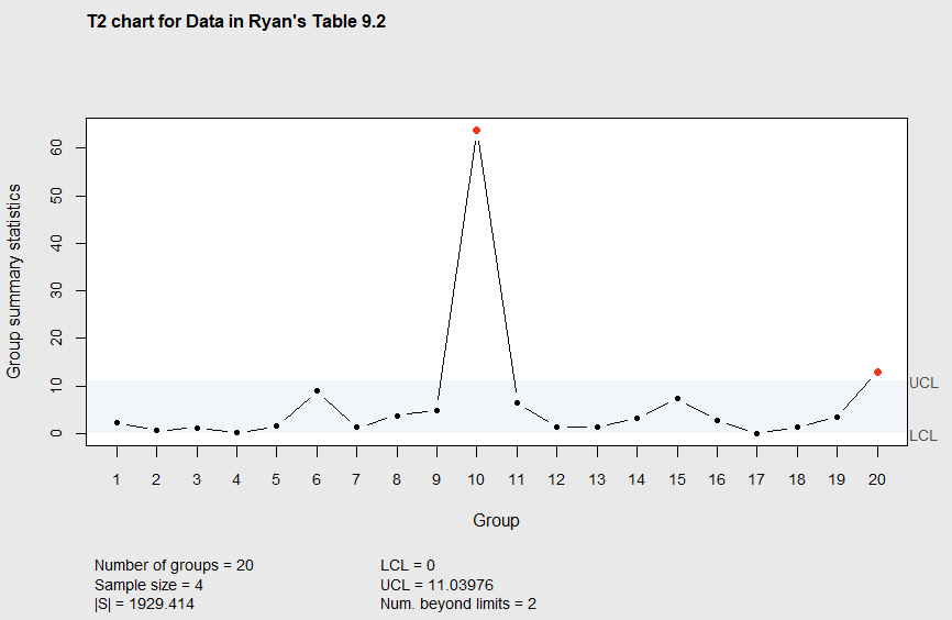
Figure 7.2 Phase I \(T^2\) chart
> qcc(Ryan92$x1,type="xbar",sizes=4)
> qcc(Ryan92$x2,type="xbar",sizes=4)
> ellipseChart(q, show.id = TRUE)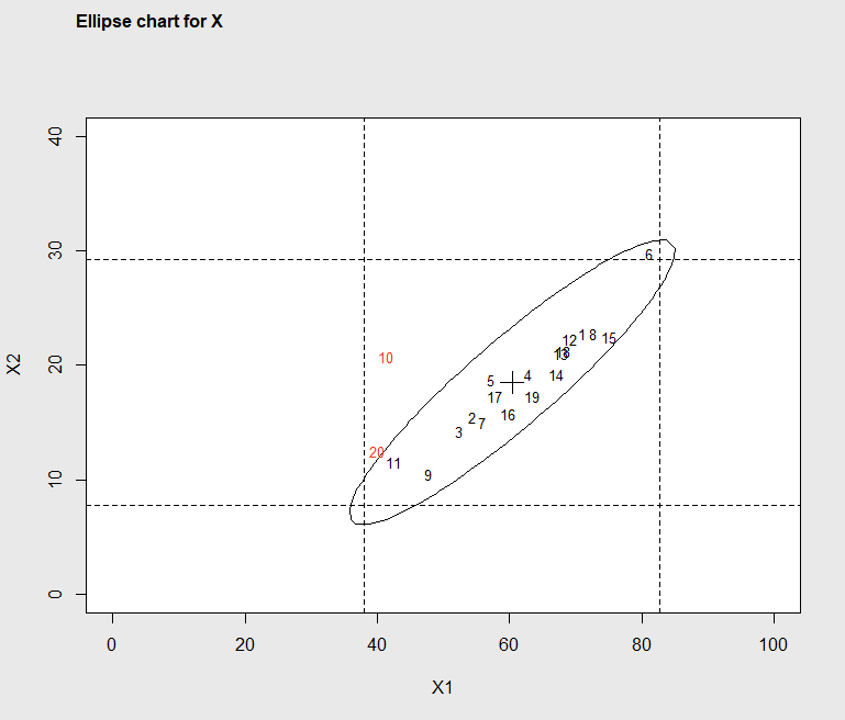
Figure 7.3 Ellipse Plot identifying out-of-control subgroups
In Figure 7.3, it can be seen that although the x1 coordinate and the x2 coordinate for subgroups 10 and 20 are not unusual on their own, but the two pairs of coordinates lie outside the control ellipse. Normally there is a strong positive correlation or relationship between characteristic x1 and x2, but subgroups 10 and 20 are different.
The cause for these two-out of control subgroups should be investigated. Any causes and corrective actions found should be added to the out of control action plan (OCAP) as described in Chapter 4. The control chart should be re-constructed without the out of control points to get better estimates of the in-control mean vector and covariance matrix. This is illustrated in the R code below.
> library(IAcsSPCR)
> data(Ryan92)
> # the following statement eliminates subgroup 10
> Ryan92s<-subset(Ryan92, subgroup != 10)
> # the following statement eliminates subgroup 20
> Ryan92s<-subset(Ryan92s, subgroup != 20)
> X1<-matrix(Ryan92s$x1,nrow=18,byrow=TRUE)
> X2<-matrix(Ryan92s$x2,nrow=18,byrow=TRUE)
> XR2 = list(X1 = X1, X2 = X2) # a list of matrices, one for each variable
> library(qcc)
> q2 = mqcc(XR2, type = "T2",add.stats=TRUE,
         title="T2 chart for Data in Ryan's Table 9.2 eliminating Subgroups 10 and 20")
> summary(q2)
The resulting \(T^2\) chart is shown in Figure 7.4.
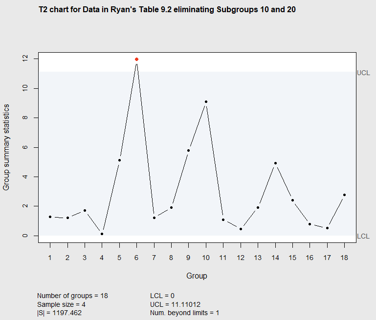
Figure 7.4 Phase I \(T^2\) chart eliminating subgroups 10 and 20
Now it can be seen that subgroup 6 is beyond the UCL. The process of refining the control limits and adding items to the OCAP is often an iterative process as described in Chapter 4. The next step is to search for the cause for subgroup 6 falling out of the limits. The ellipse plot, created using the statement ellipseChart(q2, show.id = TRUE) as illustrated above, may spark ideas in those familiar with the process as to the cause for the unusual subgroup. The result in Figure 7.5 shows subgroup six is slightly above and to the right of the majority of points.
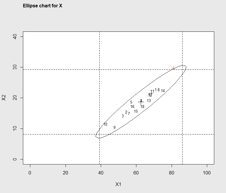
Figure 7.5 Ellipse Plot identifying out-of-control subgroup 6
The code below was used to re-create the \(T^2\) chart eliminating subgroup 6. The output of the summary, below the code, shows the revised estimates of the mean vector, covariance matrix, and the revised UCL.
> # the next statment eliminates subgroup 6
> Ryan92s<-subset(Ryan92s, subgroup != 6)
> X1<-matrix(Ryan92s$x1,nrow=17,byrow=TRUE)
> X2<-matrix(Ryan92s$x2,nrow=17,byrow=TRUE)
> XR3 = list(X1 = X1, X2 = X2) # a list of matrices, one for each variable
> library(qcc)
> q3 = mqcc(XR3, type = "T2",add.stats=TRUE,
>    title="T2 chart for Data in Ryan's Table 9.2 Eliminating Subgroups, 6, 10, and 20")
summary(q3)
-- Multivariate Quality Control Chart ------------

Chart type                 = T2
Data (phase I)             = X
Number of groups           = 17
Group sample size          = 4
Center =
      X1       X2
61.47059 18.04412
Covariance matrix =
         X1        X2
X1 241.7353 105.38235
X2 105.3824  50.90686
|S| = 1200.545

Control limits:
 LCL      UCL
   0 11.15193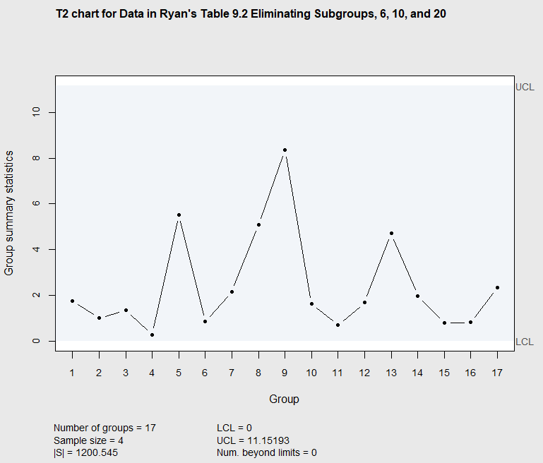
Figure 7.6 Phase I \(T^2\) chart eliminating subgroups 6, 10 and 20
Assuming out-of-control points like subgroups 6, 10, and 20, can be avoided in the future, the process should remain in control with the mean vector and covariance matrix approximately equal to the results shown in the summary output above. In this simple analysis of the data from (Ryan 2011), there were only \(m=20\) subgroups of data. In Chapter 4, Section 4.2, it was recommended that at least 25 subgroups of data be used in a Phase I study in order to get accurate estimates of the in-control process mean and standard deviation when one quality characteristic is charted. When the are are \(p\) quality characteristics being charted, the number of subgroups required for a Phase I control chart should be even larger.
7.3.2 Multivariate Control Charts for Monitoring Variability with Subgrouped Data.
When multivariate data is collected in subgroups, it is possible to monitor the process variability as well as the process mean vector. The covariance matrix \(\mathbf{S}\), that contains the sample variances for the measured quality characteristics on the diagonal and the sample covariances between measured characteristics on the off-diagonals, is the multivariate analog of the variance \(s^2\), and it is the multivariate measure of process variability.
High values for some quality characteristics may be an indicator of a deterioration in quality. But, monitoring the mean vector of quality characteristics is not the only way to detect this possible problem. Increases in the variability correspond to short term spikes that could again indicate sporadic reductions in quality. For that reason, similar to univariate \(s\) or \(R\) control charts, the process variability indicated by \(\mathbf{S}\) should be monitored in addition to the mean vector \(\mathbf{\bar{x}}\).
(Alt 1985) proposed two different control charts for monitoring the covariance matrix \(\mathbf{S}\). The simplest of the two is based on the generalized variance , \(|\mathbf{S}|\) the determinant of the covariance matrix. This is a univariate statistic and Alt constructed a control chart based on the interval \(E(|\mathbf{S}|)\pm 3\sqrt{V(|\mathbf{S}|)}\). The expected value and variance of \(|\mathbf{S}|\) are:
\[\begin{equation*} E(|\mathbf{S}|) = b_1|\mathbf{\Sigma}|, \end{equation*}\]
and
\[\begin{equation*} V(|\mathbf{S}|) = b_2|\mathbf{\Sigma}|, \end{equation*}\]
where
\[\begin{equation*} b_1=\frac{1}{(n-1)^p}\prod_{i=1}^p{(n-i)}, \end{equation*}\]
and
\[\begin{equation*} b_2=\frac{1}{(n-1)^{2p}}\prod_{i=1}^p{(n-i)}\left[\prod_{j=1}^p{(n-j+2)}-\prod_{j=1}^p{(n-j)}\right]. \end{equation*}\]
The center line and control limits for the control chart are given by
\[\begin{align*} UCL&= |\mathbf{\Sigma}|\left( b_1 + 3b_2^{1/2} \right) \\ CL&= b_1|\mathbf{\Sigma}| \\ LCL&=|\mathbf{\Sigma}|\left( b_1 - 3b_2^{1/2} \right), \end{align*}\]
and the generalized variances \(|\mathbf{S}_i|\) computed within each of the \(i\) subgroups are plotted on the chart.
The R package \(\verb!IAcsSPCR!\) contains a function GVcontrol() for constructing a control chart of the generalized variances. The example code below shows how it can be used to create a control chart of the generalized variances for each subgroup in the data from Ryan’s Table 9.2 that was described in the last section. The first argument to the GVcontrol() function is the dataframe. In this case the data does not have to be reformatted, although the function expects the data to have consecutively ordered subgroup numbers and an equal number of observations within each subgroup. Figure 7.7 shows the control chart, and the summary statistics the function returns are shown below the code.
> library(IAcsSPCR)
> data(Ryan92)
> GVcontrol(Ryan92,20,4,2)
$name
[1] "UCL="

$value
[1] 10771.1

$name
[1] "Covariance matrix="

$value
         x1        x2
x1 222.0333 103.11667
x2 103.1167  56.57917

$name
[1] "Generalized Variance |S|"

$value
[1] 1929.414

$name
[1] "mean vector="

$value
     x1      x2
60.3750 18.4875

$name
[1] "Subgroup Generalized Variances="

$value
 [1]   45.0555556 2035.6666667 1195.0555556   30.8888889 9445.5000000   57.0555556
 [7]    4.0000000  452.8333333    1.1111111 3150.1666667  798.7777778  286.6111111
[13]  453.5000000  101.5000000  120.5555556   47.0555556    0.3888889   72.5000000
[19]  156.2777778    1.8888889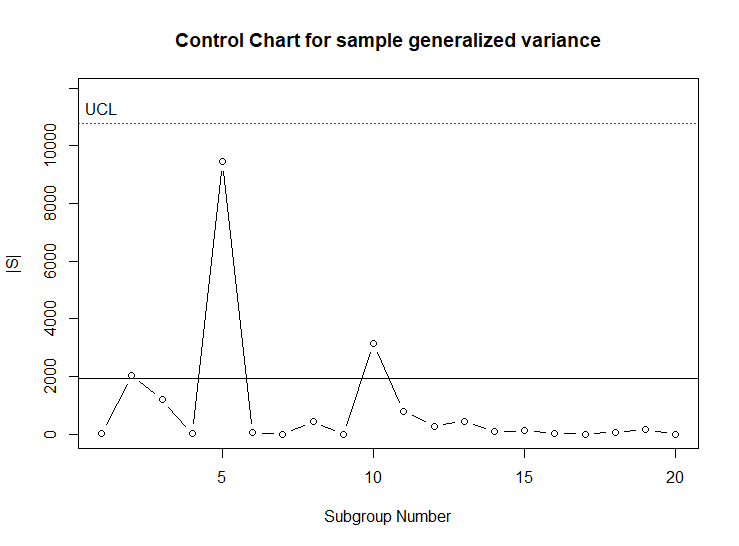
Figure 7.7 Control chart of Generalized Variances |S| for Ryan’s Table 9.2
In this control chart, it can be seen the generalized variances from each subgroup fall within the control limits, and process variability appears to be in control. The data in the dataframe Ryan92 had \(p=2\) quality characteristics and subgroups of size \(n=4\). In order to have accurate estimates of the covariance matrices within each subgroup, the subgroup size \(n\) should be substantially larger than the number of quality characteristics \(p\).
In Phase I studies with subgrouped data, the variance estimates within each subgroup are pooled, or averaged, to get an estimate of the process \(\sigma\) or \(\Sigma\) (for multivariate charts) that becomes the standard for Phase II monitoring. The estimate of the variance is used to judge the magnitude of changes in the mean, or mean vector. Recall, that for univariate charts using variables data, it was recommended that the \(R\)-chart or \(s\)-chart be examined before the \(\bar{X}\)-chart. If there are assignable causes on the \(R\) or \(s\)-chart, that indicate increases in the variance, those subgroups of data should be removed before constructing the \(\bar{X}\)-chart. If not, the the control limits on the \(\bar{X}\)-chart will be too wide, and the chart will be less sensitive in detecting changes in the process mean.
An analogous situation occurs with multivariate data. If there are assignable causes in some subgroups that indicate an increase in the covariance matrix, \(\Sigma\), those subgroups should be removed before finalizing the estimate of \(\Sigma\) and checking for out of control signals on the \(T^2\) chart. The control chart of generalized variances can be used for multivariate data in place of the \(R\) or \(s\)-chart. As an example of this consider the data in the dataframe Frame that is included in the \(\verb!IAcsSPCR!\) package. This dataframe contains \(m=10\) subgroups of data with \(p=3\) quality characteristics. The subgroup size is \(n=10\).
The code below retrieves the dataframe and calls the GVcontrol() function to make a control chart of the generalized variances. The control chart is shown in Figure 7.8.
> library(IAcsSPCR)
> data(Frame)
> GVcontrol(Frame,10,10,3)
$name
[1] "UCL="

$value
[1] 67.46235

$name
[1] "Covariance matrix="

$value
         V2       V3       V4
V2 3.477476 2.623105 1.147732
V3 2.623105 4.625853 1.234318
V4 1.147732 1.234318 2.287319

$name
[1] "Generalized Variance |S|"

$value
[1] 17.09664

$name
[1] "mean vector="

$value
     V2      V3      V4
10.4409 17.3352  9.2669

$name
[1] "Subgroup Generalized Variances="

$value
 [1]   6.710274   3.124969   2.327437   6.346057  16.971770   6.491100   1.070446
 [8]  14.251040   4.186463 112.781321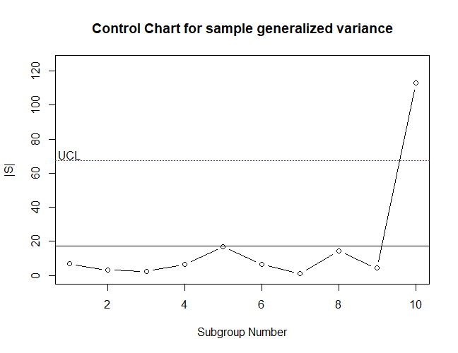
Figure 7.8 Control chart of Generalized Variances |S| for dataframe Frame.
In Figure 7.8, it can be seen that the generalized variance for subgroup 10 falls above the upper control limit. The code below illustrates reformatting the data in Frame so that the mqcc() function can be used to produce a \(T^2\) chart of the data. The \(T^2\) control chart of this data is shown in Figure 7.9.
> # reformat as a list of matricies required by the mqcc function
> X1<-matrix(Frame$V2,nrow=10,byrow=TRUE)
> X2<-matrix(Frame$V3,nrow=10,byrow=TRUE)
> X3<-matrix(Frame$V4,nrow=10,byrow=TRUE)
> X = list(X1 = X1, X2 = X2, X3=X3) # a list of matrices, one for each variable
> > q<-mqcc(X,type="T2",add.stats=TRUE,title="T2 Generated data")
> summary(q)
-- Multivariate Quality Control Chart ------------

Chart type                 = T2
Data (phase I)             = X
Number of groups           = 10
Group sample size          = 10
Center =
     X1      X2      X3
10.4409 17.3352  9.2669
Covariance matrix =
         X1       X2       X3
X1 3.477476 2.623105 1.147732
X2 2.623105 4.625853 1.234318
X3 1.147732 1.234318 2.287319
|S| = 17.09664

Control limits:
 LCL      UCL
   0 11.56047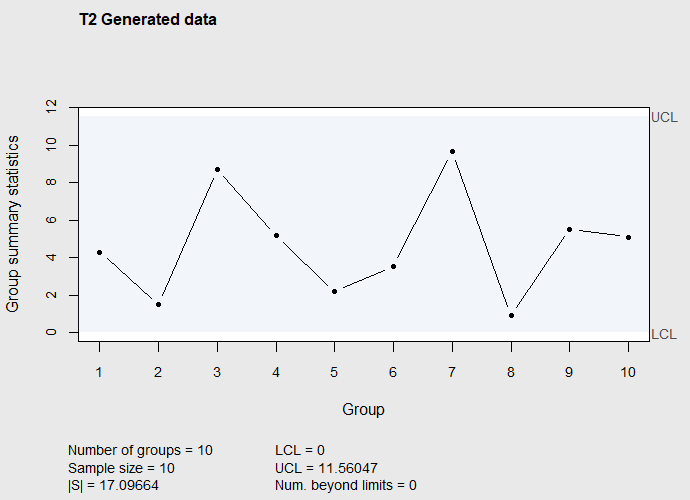
Figure 7.9 \(T^2\) Control chart of subgroup mean vectors in dataframe Frame
The \(T^2\) control chart in Figure 7.9 appears to indicate that there are no assignable causes of differences in the subgroup mean vectors.
However, assuming that whatever caused the increased variances for subgroup 10 can be eliminated in the future, this subgroup should be removed and the two control charts reconstructed. The code below removes subgroup 10 and calls the GVcontrol() function to make a control chart of the generalized variances for the first 9 subgroups.
> sFrame<-subset(Frame,subgroup!=10)
> GVcontrol(sFrame,9,10,3)
$name
[1] "UCL="

$value
[1] 35.73629

$name
[1] "Covariance matrix="

$value
         V2       V3       V4
V2 3.003067 2.794676 1.293888
V3 2.794676 4.337586 1.382692
V4 1.293888 1.382692 2.312179

$name
[1] "Generalized Variance |S|"

$value
[1] 9.056467

$name
[1] "mean vector="

$value
       V2        V3        V4
10.492556 17.338444  9.182111

$name
[1] "Subgroup Generalized Variances="

$value
[1]  6.710274  3.124969  2.327437  6.346057 16.971770  6.491100  1.070446 14.251040  4.186463
The resulting control chart is shown in Figure 7.10. This chart shows the variability now to be in a state of control, and he printed results below the code above shows that the generalized variance \(|\mathbf{S}|\) has decreased from 17.10 to 9.06.
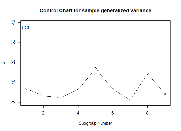
Figure 7.10 Control chart of Generalized Variances |S| for dataframe Frame eliminating subgroup 10.
The code below re-formats the data in the reduced dataframe sFrame and calls the mqcc() function to produce a \(T^2\) control chart. The resulting Chart is shown in Figure 7.11.
> # reformat as a list of matricies required by the mqcc function
> X1<-matrix(sFrame$V2,nrow=9,byrow=TRUE)
> X2<-matrix(sFrame$V3,nrow=9,byrow=TRUE)
> X3<-matrix(sFrame$V4,nrow=9,byrow=TRUE)
> X = list(X1 = X1, X2 = X2, X3=X3) # a list of matrices, one for each variable
> q<-mqcc(X,type="T2",add.stats=TRUE,title="T2 Generated data")
> summary(q)
-- Multivariate Quality Control Chart ------------

Chart type                 = T2
Data (phase I)             = X
Number of groups           = 9
Group sample size          = 10
Center =
       X1        X2        X3
10.492556 17.338444  9.182111
Covariance matrix =
         X1       X2       X3
X1 3.003067 2.794676 1.293888
X2 2.794676 4.337586 1.382692
X3 1.293888 1.382692 2.312179
|S| = 9.056467

Control limits:
 LCL      UCL
   0 11.52832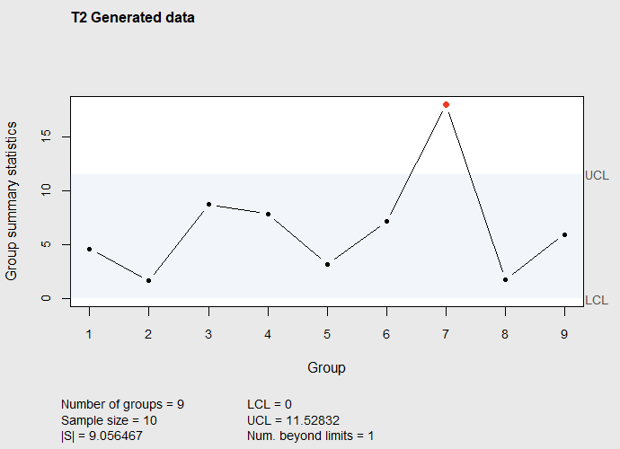
Figure 7.11 \(T^2\) Control chart of subgroup mean vectors in dataframe Frame after eliminating subgroup 10
Figure 7.11 shows the apparent in-control situation shown in Figure 7.9 was caused by the inflated generalized variance estimate \(|\mathbf{S}|=17.10\) that was made prior to eliminating subgroup 10. If this were a Phase I study the next step would be to investigate the cause for the out-of-control subgroup 7 in Figure 7.11.
7.3.3 Phase II \(T^2\) Control Chart with Subgrouped Data
Continuing with the example from Section 7.3.1, suppose new process data was obtained in real time monitoring. The dataframe Xnew in the R package IAcsSPCR contains 20 new subgroups of 4. The R code below creates a control chart using the Phase II control limits based on the mean and covariance matrix estimates from the Phase I study after eliminating subgroups 6, 10, and 20, then the mqcc() function adds the new data on the right side of the control chart.
> library(IAcsSPCR)
> data(Xnew)
> # the next three statements format the new data for the mqcc
   function
> X1<-matrix(Xnew$x1,nrow=20,byrow=TRUE)
> X2<-matrix(Xnew$x2,nrow=20,byrow=TRUE)
> Xn = list(X1 = X1, X2 = X2) # a list of matrices, one for
       each variable
> library(qcc)
> qn = mqcc(XR3, type = "T2", newdata=Xn,add.stats=TRUE,
       limits=FALSE,pred.limits=TRUE,center=q$center,
       cov=q$cov,title="T2 chart for Phase II data")
In the mqcc() function call, the first argument XR3 tells the function to calculate the control limits based on the data in XR3 that was used in making Figure 7.6. That data contained \(m\)=17 subgroups. The argument newdata=Xn tells the function to add the new data on the right. The arguments limits=FALSE and pred.limits=TRUE tell the mqcc() function to use the formula for control limits in Equation 7.5 rather than Equation 7.3. The Phase I control limits in Equation 7.3 are called limits by the mqcc() function, while the Phase II limits in Equation 7.5 are called pred.limits.
Finally, the arguments center=q$center and cov=q$cov tell the function to use the estimates of the in-control mean and in-control covariance matrix, calculated when making the control chart in Figure 7.6, when calculating the \(T^2_i\) values given by: \(T^2_i=n(\mathbf{\bar{x}_i}-\mathbf{\bar{\bar{x}}})'\mathbf{S^{-1}}(\mathbf{\bar{x}_i}-\mathbf{\bar{\bar{x}}})\). The resulting control chart is shown in Figure 7.12.
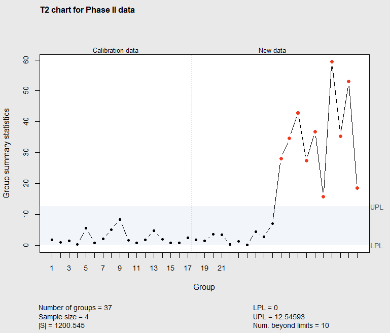
Figure 7.12 Phase II \(T^2\) chart with 20 new subgroups of data
Figure 7.12 shows the process mean values for the 11th through 20th new subgroups have \(T^2\) values that fall above the upper control limit. The UPL=12.54592 can be calculated using Equation 7.5 when \(p=2\), \(m=17\), and \(n=4\), by modifying the code above Figure 7.2.
There is no need to wait for 20 new subgroups of data to construct the Phase II control chart. It can be constructed after the first new subgroup, by creating a dataframe Xnew that contained just one subgroup of data, then reformatting as shown in the code above. The new dataframe Xnew could be expanded adding each additional subgroup, then re-creating the control chart. Doing that, any change in the mean vector would be identified immediately.
7.4 Multivariate Control Charts with Individual Data
7.4.1 Phase I \(T^2\) with Individual Data
(Gonzales de la Parra and Rodriguez-Loaiza 2004) presented data on the impurity profile of a crystalline drug substance determined by high-performance liquid-chromatography. Internal reference standards were available for each impurity level reported in the paper. A Phase I study was conducted with single observations on each of 30 lots. The dataframe DrugI in the IAcsSPCR package contains a subset of this data. The code below retrieves the data and uses the mqcc() function to make a \(T^2\) chart for individuals with this data.
> library(IAcsSPCR)
> qi<-mqcc(DrugI[,-1],type="T2.single",add.stats=TRUE,
         title="Historical data for Drug impurities")
> summary(qi)
-- Multivariate Quality Control Chart ------------

Chart type                 = T2.single
Data (phase I)             = DrugI[, -1]
Number of groups           = 30
Group sample size          = 1
Center =
        A         B         D         E         G
 23.33333  74.00000 625.66667 151.00000 684.00000
Covariance matrix =
           A          B          D           E          G
A  105.74713  -155.1724   294.2529   -51.72414  -551.7241
B -155.17241  4314.4828 -1399.3103  1813.10345  9424.8276
D  294.25287 -1399.3103 20459.8851  2645.86207 -2857.9310
E  -51.72414  1813.1034  2645.8621  9767.93103 10851.0345
G -551.72414  9424.8276 -2857.9310 10851.03448 67217.9310
|S| = 2.893802e+18

Control limits:
 LCL      UCL
   0 12.11333
In this code the argument type="T2.single" specifies that this is a \(T^2\) chart for individuals. The output below the code shows the mean vector (over the 30 observations) for impurities A, B, D, E, G, and the covariance matrix calculated with the 30 observations.
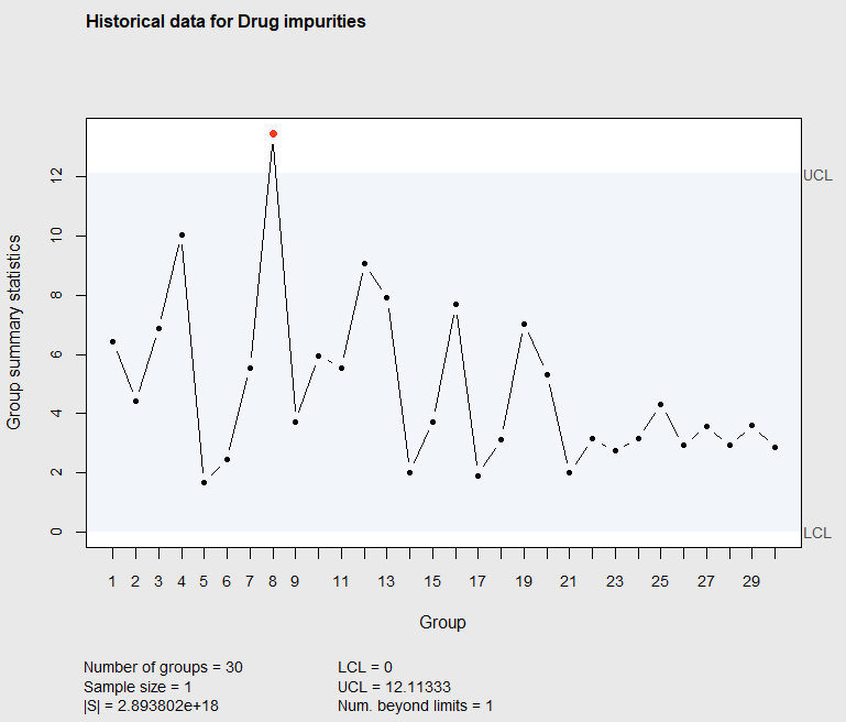
Figure 7.13 Phase I \(T^2\) Chart of Drug Impurities
The upper control limit shown in Figure 7.13 and printed below the graph was calculated using Equation 7.7. That calculation can be reproduced with the code below.
> # upper control limit calculated with equation 7.7
> p<-5
> m<-30
> n<-1
> alpha<-1-(1-.0027)^p
> UCL<-(((m-1)^2)/m)*qbeta(alpha,p/2,(m-p-1)/2,ncp=0,lower.tail=FALSE)
> UCL

[1] 12.11333
The control chart in Figure 7.13 shows the eighth individual observation to be out of the control limits. After investigating the cause of the out-of-control observation and updating the OCAP, the control chart should be re-created eliminating observation 8. The code below eliminates the 8th observation and then re-creates the control chart as shown in Figure 7.14.
> # Redo eliminating observation 8
> DrugIe<-DrugI[-8,]
> qi<-mqcc(DrugIe[,-1],type="T2.single",add.stats=TRUE,
          title="Historical data for Drug impurities")
> summary(qi)
-- Multivariate Quality Control Chart ------------

Chart type                 = T2.single
Data (phase I)             = DrugIe[, -1]
Number of groups           = 29
Group sample size          = 1
Center =
        A         B         D         E         G
 23.44828  75.17241 630.00000 155.51724 665.86207
Covariance matrix =
           A          B          D           E          G
A  109.11330  -164.9015   289.2857   -69.70443  -506.6502
B -164.90148  4425.8621 -1607.1429  1713.30049 10422.1675
D  289.28571 -1607.1429 20607.1429  2132.14286  -517.8571
E  -69.70443  1713.3005  2132.1429  9482.75862 13784.3596
G -506.65025 10422.1675  -517.8571 13784.35961 59396.5517
|S| = 1.79408e+18

Control limits:
 LCL      UCL
   0 12.03526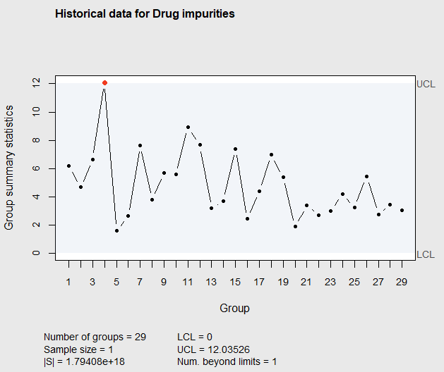
Figure 7.14 Phase I \(T^2\) Chart of Drug Impurities after eliminating observation 8
In Figure 7.14, it can be seen that the 4th observation falls above the upper control limit. Again, after investigating the cause, this observation should be eliminated and the control chart re-constructed. This reconstructed control chart is shown in Figure 7.15.
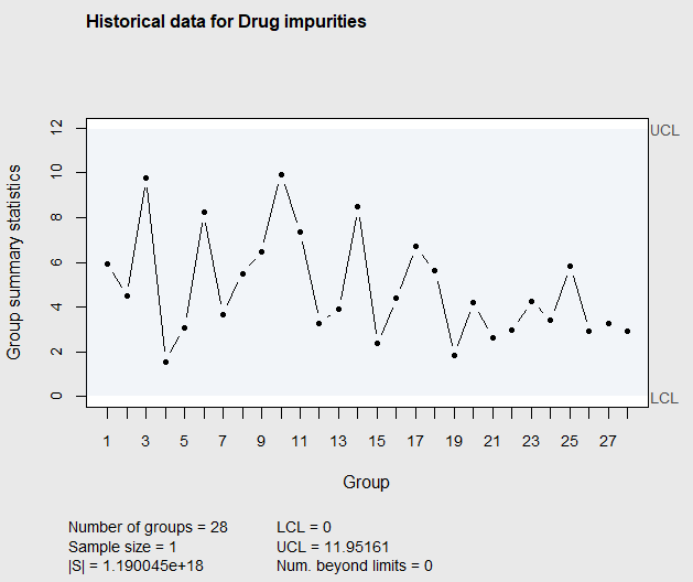
Figure 7.15 Phase I \(T^2\) Chart of Drug Impurities after eliminating observation 8, and 4
Since there are no points out-of-control in Figure 7.15, it would be appropriate to use the data that was used to construct Figure 7.15 to estimate the process mean vector and covariance matrix.
7.4.2 Phase II \(T^2\) Control Chart with Individual Data
Continuing with the last example, the article by (Gonzales de la Parra and Rodriguez-Loaiza 2004) contained 160 additional observations from Phase II monitoring of drug lots. The dataframe DrugIn in the IAcsSPCR package contains the first 10 of these observations. The block of code below illustrates how to construct a Phase II control chart of this new data using the estimates of process mean and covariance matrix from the original 20 observations (eliminating number 4 and 8).
> library(IAcsSPCR)
> library(qcc)
> data(DrugIn)
> qn = mqcc(DrugIe2[,-1], type = "T2.single", newdata=DrugIn[,-1],add.stats=TRUE,
          limits=FALSE,pred.limits=TRUE,center=qi$center,cov=qi$cov,
          title="T2 Individual chart for Phase II data")
-- Multivariate Quality Control Chart ------------

Chart type                 = T2.single
Data (phase I)             = DrugIe2[, -1]
Number of groups           = 28
Group sample size          = 1
Center =
        A         B         D         E         G
 23.92857  71.78571 638.57143 151.78571 668.92857
Covariance matrix =
           A          B          D           E         G
A  106.21693  -122.0899   176.1905   -18.38624  -569.709
B -122.08995  4244.8413  -793.6508  1396.69312 11120.503
D  176.19048  -793.6508 19160.8466  3173.01587 -1327.513
E  -18.38624  1396.6931  3173.0159  9415.21164 14639.021
G -569.70899 11120.5026 -1327.5132 14639.02116 61313.624
|S| = 1.190045e+18

New data (phase II)        = DrugIn[, -1]
Number of groups           = 10
Group sample size          = 1

Prediction limits:
 LPL      UPL
   0 22.43832
The resulting control chart is shown in Figure 7.16.
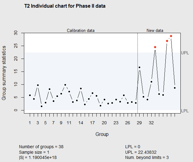
Figure 7.16 Phase II \(T^2\) Chart of Drug Impurities
In Figure 7.16, it can be seen that an assignable cause is signaled at the 5th observation in the new data. The upper control limit called (UPL) by the mqcc() function can be calculated with Equation 7.8 with \(m\)=28, and \(p=5\), and again the new data can be added to the chart one observation at a time.
7.4.3 Interpreting out-of-control signals
When an out-of-control signal appears on a \(T^2\) control chart, the question may be asked which of the \(p\) quality characteristics (or subset of them) is mainly responsible for the change. When there are only two quality characteristics like the example in section 7.2.2.1, the ellipse plot made by the ellipseChart() function can help. For example subgroup 10 was above the upper control limit in Figure 7.2. The \(T^2\) value shown on the chart does not give any information about which quality characteristic contributes most to the high \(T^2\) value. However, the ellipse plot, shown in Figure 7.3, indicates the value of x1 in subgroup 10 is much further from the mean value of x1 than the value of x2, in subgroup 10, is from the mean value of x2. Therefore, the change in quality characteristic x1 from its mean contributes more to the high \(T^2\) value than the change in x2.
When there are more than two quality characteristics, the ellipse plot cannot be made. In that case, one simple way to judge which quality characteristic (or subset of them) contributes most to the high \(T^2\) value is by making a barchart of the the percentage change of each of the quality control characteristic from its mean value. For example, Figure 7.17 is a plot of the out-of-control observation 8 shown in the \(T^2\) chart in Figure 7.13.
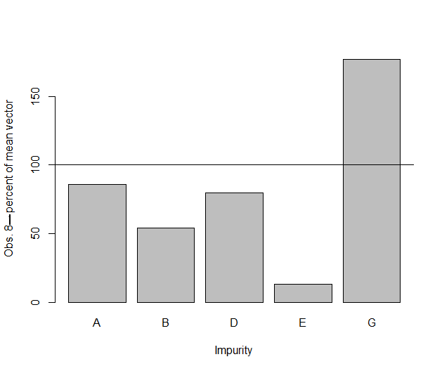
Figure 7.17 Barchart of Imurity percentage changes from the mean for observation 8
Here it can be seen that impurities E and G are furthest from their mean values and therefore changes in these two impurities from their mean probably contribute most to the high \(T^2\) value for observation 8. However, a simple plot like this does not take into account the variance and covariances of the five quality characteristics (or impurities).
(Runger, Alt, and Montgomery 1996) discussed the decomposition of the \(T^2\) statistic for an out of control point to better determine the contribution of each quality characteristic. This takes into account the variances and covariances of the \(p\) quality characteristics. They propose calculating
\[\begin{equation} d_i=T^2-T^2_{(i)} \tag{7.10} \end{equation}\]
where \(T^2\) is the \(T^2\) value of an out-of-control point that is given by Equation 7.2, and \(T^2_{(i)}\) is the \(T^2\) for the same observation omitting quality characteristic \(i\) and only using the other \(p-1\) quality characteristics in the equation.
(Runger, Alt, and Montgomery 1996) recommend computing the values \(d_i\) (\(i\)= 1, 2, \(\ldots\), \(p\)) and then focusing on the variables for which the \(d_i\) values are relatively large. This can be done using the mqcc() function by running it \(p\) times, each time removing one of the \(p\) quality characteristics. The \(T^2\) values for each of the observations (or subgroups) can then be retrieved as the statistics component in the object created by mqcc(). For example when the function call
qi<-mqcc(DrugI[,-1],type="T2.single",add.stats=TRUE,title="Historical data for Drug impurities") was issued above the \(T^2\) values for the 30 individual observations are stored in the vector qi$statistics.
7.4.4 Multivariate EWMA Charts (MEWMA) with Individual Data
When \(\mathbf{\mu_0}\), and \(\mathbf{\Sigma}\) are known, the \(T^2\) chart
\[\begin{equation} T^2_i=n(\mathbf{x_i}-\mathbf{\mu_0})'\mathbf{\Sigma^{-1}}(\mathbf{x_i}-\mathbf{\mu_0})\sim\chi^2_p \end{equation}\]
is based on the most recent observation, \(\mathbf{x_i}\). Therefore it is insensitive to detecting small shifts in the mean vector \(\mathbf{\mu_0}\). (Lowry et al. 1992) developed a Multivariate EWMA \(T^2\) control chart ( called a MEWMA) that has greater sensitivity for detecting small changes in \(\mathbf{\mu_0}\). They explained that the natural extension of the univarite EWMA,
\[\begin{equation} z_i=\lambda x_i+(1-\lambda)z_{i-1} \end{equation}\]
is:
\[\begin{equation} \mathbf{z_i} =\mathbf{R}(\mathbf{x_i}-\mathbf{\mu_0})+(\mathbf{I}-\mathbf{R})\mathbf{z_{i-1}}. \tag{7.11} \end{equation}\]
where \(\mathbf{R}=\)diag(\(r_1\), \(r_2\), , \(r_p\)) and \(0<r_i\le 1\), \(i=1,\ldots,p\).
If there is no a-priori reason to weight past observations differently for the \(p\) quality characteristics, then \(r_1=r_2=\ldots=r_p=r\), and \(\mathbf{z_i}\) simplifies to:
\[\begin{equation} \mathbf{z_i} =r(\mathbf{x_i}-\mathbf{\mu_0})+(1-r)\mathbf{z_{i-1}}. \tag{7.12} \end{equation}\]
The covariance matrix of \(\mathbf{z_i}\) is
\[\begin{equation} \mathbf{\Sigma_{z_{i}}} = (r/(2-r))\mathbf{\Sigma} \tag{7.13} \end{equation}\]
where \(\mathbf{\Sigma}\) is the covariance matrix of \(\mathbf{x_i}\). An out-of control signal for the MEWMA occurs when
\[\begin{equation} T^2_i= \mathbf{z_i}' \mathbf{\Sigma_{z_{i}}}^{-1} \mathbf{z_i}>h_4 \tag{7.14} \end{equation}\]
(Lowry et al. 1992) used simulation to generate the upper control limit \(h_4\) that would result in and ARL\(_0\approx 200\). Table 7.1 contains their simulated limits for MEWMA charts with \(r=0.1\).
Table 7.1 Upper control limits \(h_4\) for MEWMA charts with \(r=.1\)
| \(p\) | \(h_4\) |
|---|---|
| 2 | 8.66 |
| 3 | 10.79 |
| 4 | 12.73 |
| 5 | 14.56 |
| 10 | 22.67 |
| 20 | 37.01 |
To illustrate the use of the MEWMA, consider the the following situation. A random sample of 10 observations from a multivariate normal distribution is generated with an in-control mean of \(\mathbf{\mu_0}=\left( \begin{array}{c} 25\\ 10\\ 17\\ 15\\ \end{array} \right)\) and a known covariance matrix. \[ \mathbf{\Sigma}_0 =\begin{bmatrix} 5.40000000 &0.09583333 & 2.0583333 & 3.1291667\\ 0.09583333 & 0.48400000 &0.2963333& 0.2686667\\ 2.05833330 & 0.29633330 &2.2993333& 1.0056667\\ 3.12916667 & 0.26866667 &1.0056667& 2.2310000 \end{bmatrix}. \quad \] Next, another random sample of 15 observations is generated from a multivariate normal distribution with the same covariance matrix, but the mean is shifted to \(\mathbf{\mu}=\mathbf{\mu_0}+\mathbf{\mu_{\Delta}}\), where \(\mathbf{\mu_{\Delta}}=\left( \begin{array}{c} 1.10\\ 0.60\\ 1.00\\ 0.70\\ \end{array} \right).\) The non-centrality factor for the shift in the mean vector is \[\begin{equation} \lambda=(\mathbf{\mu_{\Delta}})'\mathbf{\Sigma}^{-1}(\mathbf{\mu_{\Delta}})=1.045907. \end{equation}\]
The code below generates this data and then appends the first sample with the second sample below it it to create the matrix D.
> # generate random sample of 10  multivariate obs. with p=4 and mean vector muv
> muv<-c(25,10,17,15)
> covm<-matrix(c(5.40000000, .09583333, 2.0583333, 3.12916667, .09583333, .48400000,  .2963333,
               .26866667, 2.05833333, .29633333, 2.2993333, 1.00566667, 3.12916667, .26866667,
               1.0056667, 2.23100000),nrow=4,ncol=4 )

> # generate a random sample of 10 obs. with p=4 and mean vector muv and covariance matrix covm
> library(MASS)
> set.seed(100)
> d1<-mvrnorm(10,mu=muv,Sigma=covm)
> # generate random sample of 15 multivariate obs. with p=4 and mean vector muv+mud and
> #  covariance matrix covm
> mud<-c(1.1,.6,1.0,.70)
> d2<-mvrnorm(15,mu=muv+mud,Sigma=covm)
> # calculate the noncentrality parameter for detecting the mean shift
> lambda<-mud%*%solve(covm)%*%mud
> lambda
         [,1]
[1,] 1.045907

> #combine the data in the combined data the mean shifts after the 10th obs.
> D<-rbind(d1,d2)
> D
         [,1]      [,2]     [,3]     [,4]
 [1,] 23.75806 10.180360 16.36806 14.52721
 [2,] 25.80020  9.864865 16.93187 14.51697
 [3,] 24.80108  9.839530 17.16286 14.75048
 [4,] 27.39987  9.449689 17.14419 16.24186
 [5,] 24.99657 10.362772 17.00062 15.67339
 [6,] 25.58139 10.273492 17.35958 15.64218
 [7,] 23.42115 10.496906 16.78113 14.27465
 [8,] 26.90254  9.919296 17.15489 15.99281
 [9,] 22.76137 11.021166 17.02295 13.69190
[10,] 25.04470  9.537140 14.01456 15.06273
[11,] 26.22139 10.081466 16.84394 15.80500
[12,] 28.70585 11.749270 20.93433 17.44007
[13,] 22.40994 10.921784 14.03205 14.18671
[14,] 28.58755  9.707084 17.06339 16.06210
[15,] 24.16904 11.976770 18.30165 15.44996
[16,] 28.96276 10.687066 19.70108 17.54689
[17,] 25.23258 11.534847 17.54417 15.23675
[18,] 28.92701 10.482076 19.86350 17.48245
[19,] 26.96799  9.232787 15.32614 16.64555
[20,] 21.26249 11.550983 15.85880 14.05896
[21,] 25.49466 10.611174 18.18041 13.90000
[22,] 22.14921 10.138899 15.55521 13.76772
[23,] 26.32006 11.504986 17.87188 16.42251
[24,] 29.77446 11.810255 20.04525 19.27867
[25,] 20.84429  9.678784 15.86871 12.55590
The R package IAcsSPCR that contains the data sets and functions from this book contains the function MEWMA() that calculates (Lowry et al. 1992)’s MEWMA control chart. This function uses a small value of \(r=0.1\), in order to be sensitive to small shifts in the mean vector.
The code below illustrates the use of this function on the matrix of data D created above. The first argument can either be a matrix or dataframe with one row for each observation and one column for each of the \(p\) quality characteristics being monitored. This function works for \(2\le p \le 10\) quality characteristics. In this example, it is assumed that \(\mathbf{\Sigma}_0\)=covm is known, and it is supplied to the function as the second argument. The in-control mean vector muv is supplied as the third argument, and the argument Sigma.known=TRUE tells the function that these are the assumed known parameters. When Sigma.known=FALSE then the function calculates mu and covm from the data in D, and they don’t need to be supplied to the function.
# MEWMA chart assuming mean and covariance matrix is known
> library(IAcsSPCR)
> MEWMA(D,covm,muv,Sigma.known=TRUE)
$name
[1] "UCL="

$value
[1] 12.73

$name
[1] "Covariance matrix="

$value
           [,1]       [,2]      [,3]      [,4]
[1,] 5.40000000 0.09583333 2.0583333 3.1291667
[2,] 0.09583333 0.48400000 0.2963333 0.2686667
[3,] 2.05833330 0.29633330 2.2993333 1.0056667
[4,] 3.12916667 0.26866667 1.0056667 2.2310000

$name
[1] "mean vector"

$value
[1] 25 10 17 15
The results are shown below the commands and Figure 7.18 shows the MEWMA control chart.
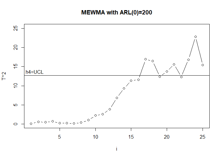
Figure 7.18 MEWMA chart of Lowry et.al data
The first out of control point occurs at the 17th observation. Since the mean shifted after the 10th observation, it took the MEWMA chart 7 observations to detect this change.
In the code below, the \(T^2\) chart is used on the same data. Again the results are shown below the code and the \(T^2\) control chart is shown in Figure 7.19
> library(qcc)
> q <- mqcc(D, type = "T2.single", center=muv,cov=covm,confidence.level = (1-.0027)^4)
> summary(q)
-- Multivariate Quality Control Chart ------------

Chart type                 = T2.single
Data (phase I)             = D
Number of groups           = 25
Group sample size          = 1
Center =
V1 V2 V3 V4
25 10 17 15
Covariance matrix =
           V1         V2        V3        V4
V1 5.40000000 0.09583333 2.0583333 3.1291667
V2 0.09583333 0.48400000 0.2963333 0.2686667
V3 2.05833330 0.29633330 2.2993333 1.0056667
V4 3.12916667 0.26866667 1.0056667 2.2310000
|S| = 0.9210777

Control limits:
 LCL      UCL
   0 10.72589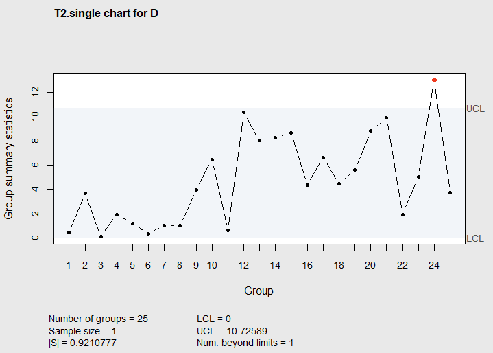
Figure 7.19 \(T^2\) chart of Lowry et.al data
The first out of control signal on the \(T^2\) Chart is at the 24th observation, and it took 7 additional observations to detect the shift in the mean vector.
(Lowry et al. 1992) compared the ARL performance of the MEWMA control chart to the \(T^2\) control chart for detecting mean shifts of various sizes. They assumed the mean shift had occurred prior to the application of the chart and made steady state ARL comparisons. Their results are shown in Table 7.2.
Table 7.2 ARL Comparisons between \(T^2\) and MEWMA(ME) Charts–note: Source Lowry et. al. 34:46-53, 1992}
| \(\lambda\) | \(T^2\) | ME | \(T^2\) | ME | \(T^2\) | ME | \(T^2\) | ME | \(T^2\) | ME | \(T^2\) | ME |
|---|---|---|---|---|---|---|---|---|---|---|---|---|
| \(p=2\) | \(p=2\) | \(p=3\) | \(p=3\) | \(p=4\) | \(p=4\) | \(p=5\) | \(p=5\) | \(p=10\) | \(p=10\) | \(p=20\) | \(p=20\) | |
| 0.0 | 200 | 200 | 201 | 200 | 200 | 201 | 200 | 200 | 200 | 200 | 200 | 200 |
| 0.5 | 116 | 28.1 | 130 | 31.8 | 138 | 34.7 | 145 | 31.8 | 162 | 48.1 | 174 | 64.1 |
| 1.0 | 42.0 | 10.2 | 52.6 | 11.3 | 60.9 | 12.1 | 68.1 | 11.3 | 92.8 | 15.9 | 117 | 20.0 |
| 1.5 | 15.8 | 6.12 | 20.5 | 6.69 | 24.6 | 7.23 | 28.5 | 6.69 | 44.7 | 9.16 | 66.2 | 11.3 |
| 2.0 | 6.9 | 4.41 | 8.8 | 4.86 | 10.6 | 5.18 | 12.4 | 4.86 | 20.6 | 6.55 | 34.3 | 8.00 |
| 2.5 | 3.5 | 3.51 | 4.4 | 3.83 | 5.19 | 4.10 | 5.99 | 3.83 | 9.90 | 5.15 | 17.4 | 6.26 |
| 3.0 | 2.2 | 2.92 | 2.6 | 3.2 | 2.83 | 3.41 | 3.31 | 3.20 | 5.20 | 4.28 | 9.1 | 5.19 |
In this table, it can be seen that the MEWMA has shorter ARL’s for noncentrality factors \(\lambda \le 2.5\). In the example above the noncentrality factor was \(\lambda=1.0459\), and although the MEWMA chart signaled the out of control condition 7 observations sooner than the \(T^2\) chart, on the average it would signal about \(60.9-12.1=48.8\) observations sooner (as can be seen by examining the ARLs in the row for \(\lambda=1.0\), and the columns where \(p=4\)).
When the in-control process mean vector \(\mathbf{\mu_0}\) and the covariance matrix \(\mathbf{\Sigma}\) are unknown, they must be estimated from a Phase I study. The MEWMA control chart should be constructed using historical data, and out of control points should be eliminated before obtaining the estimates of \(\mathbf{\mu_0}\) and \(\mathbf{\Sigma}\). As in all the previous examples, this is usually an iterative process where the estimates are refined and information is obtained for the OCAP.
When using the MEWMA function to create a Phase II control chart, using the estimated mean vector and covariance matrix from a Phase I control chart, the Sigma.known=TRUE option should be used and the estimates supplied to the function as if they were known values. In other examples in this book where Phase I estimated parameters are used in a Phase II control chart, the control limits are usually widened. For the MEWMA function there is no automatic way of increasing the \(h_4\) upper control limit. This would have to be done manually using trial-and-error experience.
7.5 Summary
This chapter has presented multivariate control charts that should be used when several quality characteristics are being monitored simultaneously. \(T^2\) charts are more sensitive in detecting abnormal or out-of-control conditions than many simultaneous univariate \(\bar{X}\)-control charts. Likewise the control chart of the generalized variance will be more sensitive than simultaneous \(S\) or \(R\)-charts for detecting an increase in variability. The MEWMA (multivariate EWMA chart). will be more sensitive in detecting small changes in the mean vector than the \(T^2\) charts.
7.6 Exercises
Run all the sample code from this chapter.
Construct separate univariate control charts for the variables
x1andx2in the data frameRyan92in the R packageIAcsSPCRthat contains the data sets and functions from this book.
Do the results of these two control charts confirm the results the \(T^2\) control chart in Section 7.3.1?
Explain why or why not.
- Open the dataframe
Samplecontained in the R package \(\verb!IAcsSPCR!\). Determine how many variables (\(p\)), how many subgroups (\(m\)), and how many observations in each subgroup (\(n\)).
Make a control chart of the generalized variances for each subgroup.
Is the process variabiliy stable? If not, eliminate any subgroups whose generalized variances are above the UCL.
- Make a \(T^2\) control chart of the subgrouped data in the dataframe
Sample, after having removed any subgroups with generalized variances above the UCL.
Eliminate any out of control points and reconstruct the control chart.
Do this iteratively until the process appears to be in control.
- Make a \(T^2\) chart for individuals using the data in the data frame
boilerin the R package \(\verb!qcc!\).
Calculate the column means for the in-control points and the column means for the out-of-control points and compare them to the overall column means for the data.
Using the comparison you made in (a) can you tell what changes in the temperature readings (or columns) are causing the out of control points.
- The data used to illustrate the MEWMA control chart in (Lowry et al. 1992) is available as the dataframe
Lowryin the R packageIAcsSPCRthat contains the data sets and functions from this book. It contains 10 observations with \(p\)=2 quality characteristics.
Use the
MEWMA()function to construct an MEWMA control chart of that data. The data was generated from a bi-variate normal distribution with unit variances and a correlation coefficient of .5. The process mean was on target for at (0,0) for the first 5 observations and shifted to (1,2) for the last five observations. Supply the known covariance matrix and the in-control mean vector to the function.Does the MEWMA control chart detect the shift in the mean vector? If so how many observations did it take?
Calculate the noncentrality parameter for detecting the shift in the mean vector (Equation 7.9).
Use the
mqcc()function in the package to make a Phase I \(T^2\) chart of the same data. Again supply the known covariance matrix and in-control mean to the function as known values.Does the \(T^2\) Chart detect the shift in the mean vector? If so, how many observations did it take? Based on the noncentrality factor you calculated in (c) is this result surprising?
References
Alt, F. B. 1985. “Multivariate Quality Control.” In Encylclopedia of Statistical Sciences, edited by N. L. Johnson and S. Kotz. Vol. 6. New York: John Wiley; Sonsl.
Bersimis, S., S. Psarakis, and J. Panaretos. 2007. “Multivariate Statistical Process Control Charts: An Overview.” Qual. Reliab. Engng. Int. 23: 517–543.
Gonzales de la Parra, M., and P. Rodriguez-Loaiza. 2004. “Application of the Multivariate \(T^2\) Control Chart and the Mason-Tracy-Young Decomposition Procedure to the Study of the Consistency of Inpurity Profiles of Drug Substances.” Quality Engineering 16: 127–42.
Kourti, T., and J. F. MacGregor. 1996. “Multivariate Spc Methods for and Product Monitoring.” Journal of Quality Technology 28: 409–428.
Lowry, C. A., W. H. Woodall, C. W. Champ, and S. E. Rigdon. 1992. “A Multivariate Exponentially Weighted Moving Average Control Chart.” Technometrics 34: 46–53.
Runger, G. C., F. B. Alt, and D. C. Montgomery. 1996. “Contributors to a Multivariate Statistical Process Control Signal.” Communications in Statistics - Theory and Methods 25: 2203–13.
Ryan, T. P. 2011. Statistical Methods for Quality Improvement. New York, N.Y.: John Wiley; Sons Inc.