6 Visualizations
There are multiple different ways to make graphs in R, this guide focuses the ggplot2 approach There are lots of free resources available to learn about building ggplot2 graphs:
- ggplot2 book
- R for Data Science
- Visualizing Baseball (companion R code for a book)
This chapter will be focusing on baseball specific visualizations. It will cover strike zone plots, pitch release plots, spray charts, contour plots, and heat maps. Most of the graphs we are going to create use pitch-by-pitch data. We will access pitch-by-pitch data from Statcast data using the baseballr package.
library(tidyverse)
library(baseballr)
There are two main data frames that we will use.
First, is Statcast data for Aaron Judge from the entire 2022 season:
judge <- statcast_search(start_date = "2022-04-05", end_date= "2022-10-23", playerid = 592450)Second, is pitch-by-pitch data from a single game. The game chosen is from May 8, 2022 Seattle Mariners vs. Tampa Bay Rays. This was George Kirby’s MLB debut!
game <- statcast_search(start_date = "2022-05-08",
                        end_date = "2022-05-08")
game <- game %>%
  filter(home_team == "SEA")
A list of the Statcast variables and their definitions can be found here.
6.1 Strike Zone Plot
One of the key parts of a strike zone plot is the strike zone. The geom_rect() function plots filled-in rectangles. It requires the arguments xmin, xmax, ymin, and ymax. We need to the the strike zone to be specific to Judge, so we will use the median top (sz_top) and median bottom (sz_bot) strike zone values from the data. There are other arguments that are optional. For example, ‘alpha’ controls the transparency of the plotted geom. Since we want the strike zone to be just the outline of the rectangle, alpha is set to 0.
Here is graph of Aaron Judge’s strike zone for pitches that were called a strike or ball by the umpire.
A subset of the judge data frame was made that only has balls, called_strikes, and that do not have a missing value for the strike zone height.
geom_point()is used to make scatter plots. I am mapping plate_x to the x-axis and plate_z to the y-axis. Since the color is based on a variable (in this case if the call was a ball or a strike) it needs to go inside of aes().geom_rect()makes the box.labs()lets you change things like the title, subtitle, axis labels.- If you want the graph to use specific colors use the
scale_color_manual()function. A list of colors can be found here. coord_fixed()keeps the ratio of the graph fixed regardless of the size of the graph.theme_bw()makes the plot have a white background with light grey grid lines.theme(legend.position = "none")hides the key explaining what each color is representing.theme(text = element_text(family = "serif"))changes the font of the text.facet_wrap()splits the plots by whatever variable is specified. In this case, balls and strikes each have their own separate graph.
judge_filter <- judge %>%
  filter(description %in% c("ball", "called_strike"), !is.na(sz_top), !is.na(sz_bot))
judge_filter %>%
filter(description %in% c("ball", "called_strike"), !is.na(sz_top), !is.na(sz_bot)) %>%
ggplot() +
geom_point(aes(x = plate_x, y = plate_z, color = type), alpha = 0.5) +
geom_rect(aes(xmin = -.7083, xmax = .7083, ymin = median(sz_bot), ymax = median(sz_top)),
alpha = 0, color = "gray60", linewidth = 1) +
labs(title = "Called Balls and Strikes", subtitle = "Aaron Judge 2022 Season",
x = "Horizontal Position", y = "Vertical Position",
caption = "The box plotted is Judge's rule book strike zone.") +
scale_color_manual(values = c("lightskyblue", "cornflowerblue")) +
coord_fixed(ratio = 1) +
theme_bw() +
theme(legend.position = "none") +
theme(text = element_text(family = "serif")) +
facet_wrap(~type) 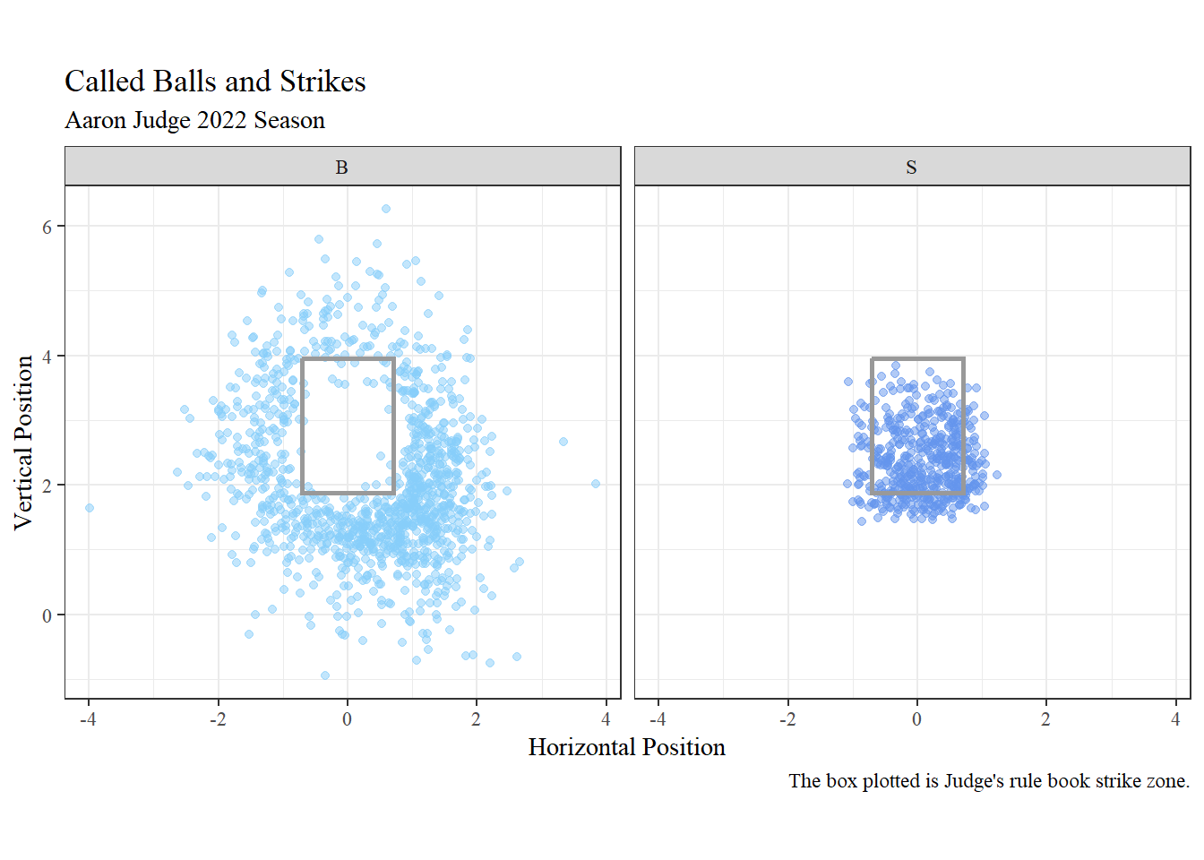
Creating Functions
Instead of writing the full geom_rect() code in every single graph we can make a function. The function can be added to a graph like any other layer (for example, geom_point()) by writing geom_zone(). Once you read it into an R session, you can call this function.
geom_zone <- function(top = 3.75, bottom = 1.5, linecolor = "gray60"){
  geom_rect(xmin = -.7083, xmax = .7083, ymin = bottom, ymax = top,
            alpha = 0, color = linecolor, linewidth = 1.5)
}
geom_zone() will plot an average zone unless otherwise specified. To customize the zone to a specific player, calculate their zone and plug it into the function using the arguments top = and bottom =.
The summarize() function will calculate many summary statistics, including median. Any rows with “NA” need to be removed before the median can be calculated.
judge %>%
  filter(!is.na(sz_top), !is.na(sz_bot)) %>%
  summarize(median(sz_top), median(sz_bot))
## # A tibble: 1 × 2
## `median(sz_top)` `median(sz_bot)`
## <dbl> <dbl>
## 1 3.96 1.87Here is another strike zone plot using our new function geom_zone(). We will use the output from above to make Judge’s strike zone. This graph is faceted by both infield shift and outfield shift. facet_grid() splits the graphs up to show all combinations of the specified variables. The recode() function is similar to the rename() function, but this one allows you to replace the data values instead of the variable names. Both ‘if_fielding_alignment’ and ‘of_fielding_alignment’ used “Standard” said “Strategic”. To make it easier to understand which shift is being talked about we can replace the original values to specify infield or outfield.
judge_shift <- judge %>%
  mutate(if_fielding_alignment = recode(if_fielding_alignment, "Standard" = "Standard IF",
                                        "Strategic" = "Strategic IF"),
         of_fielding_alignment = recode(of_fielding_alignment, "Standard" = "Standard OF",
                                        "Strategic" = "Strategic OF"),
         hit_into_play = case_when(bb_type %in% c("fly_ball", "ground_ball", "line_drive",
                                                  "popup") ~ "hit",
                                   TRUE ~ "not hit"))
judge_shift %>%
filter(!is.na(sz_top), !is.na(sz_bot), if_fielding_alignment != "") %>%
ggplot(aes(x = plate_x, y = plate_z, color = hit_into_play)) +
geom_point(alpha = 0.5) +
geom_zone(top = 3.96, bottom = 1.87) +
labs(title = "Strike Zone Faceted by Shift", subtitle = "Aaron Judge 2022 Season",
x = "Horizontal Position", y = "Vertical Position", color = "Hit Into Play") +
scale_color_manual(values = c("darkorchid1", "lightskyblue")) +
coord_fixed() +
theme_bw() +
theme(text = element_text(family = "serif")) +
facet_grid(of_fielding_alignment~if_fielding_alignment)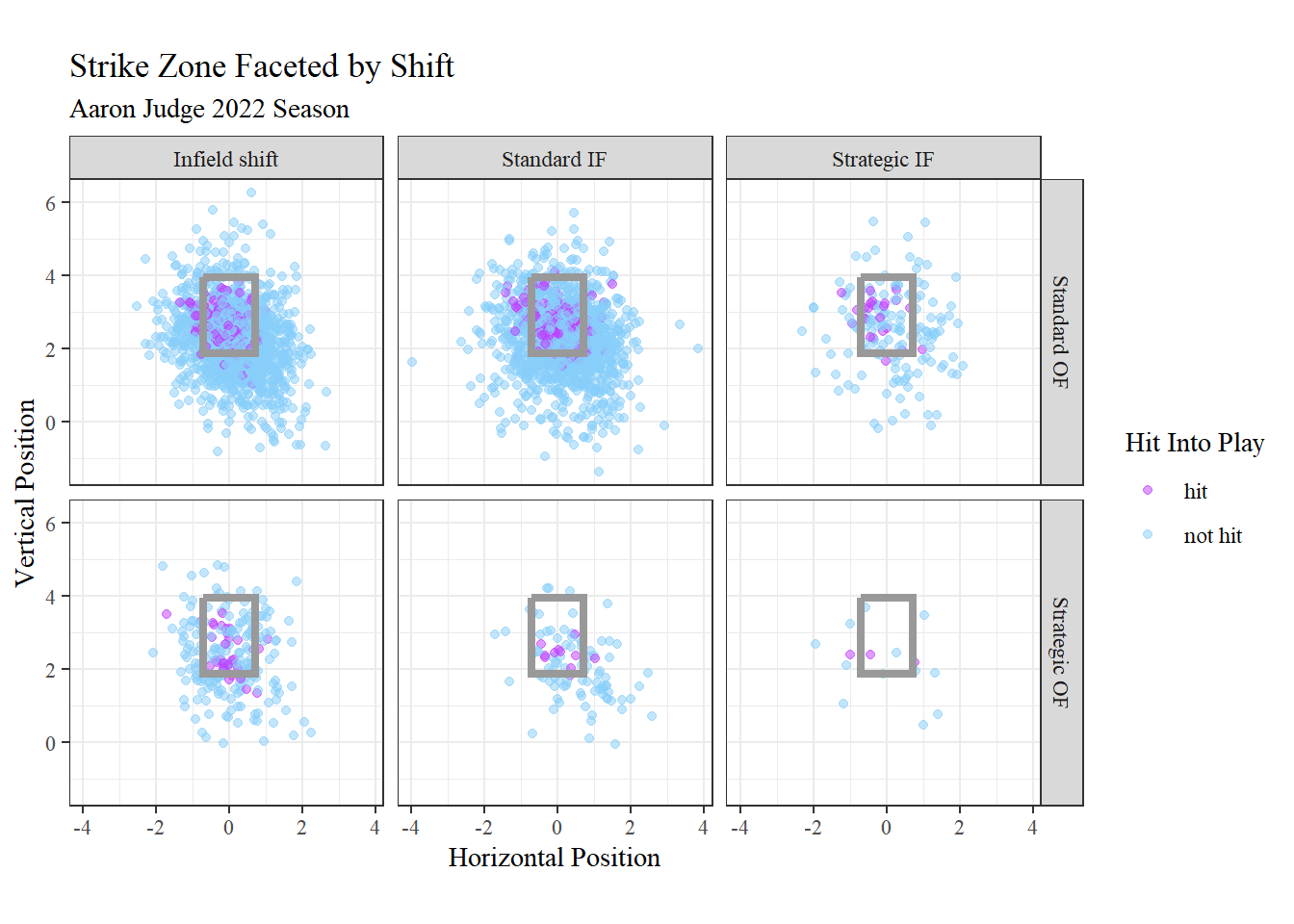
There are some variables not currently present in the data frame that could be interesting to look at. The first is if Aaron Judge swung at the pitch ore not. We know Judge swung at swung at swinging strikes, fouls, or pitches hit into play. Using the mutate() function we can create a variable called ‘swing’ that returns TRUE if the pitch resulted in one of the conditions previous listed, or FALSE is it did not. The second new variable is for scoring position. If there was a runner on second and/or third base ‘scoring_pos’ will return TRUE.
judge_swing <- judge %>%
  mutate(swing = description %in% c("swinging_strike", "swinging_strike_blocked",
                                    "foul", "foul_tip", "hit_into_play"),
         scoring_pos = !is.na(on_2b) | !is.na(on_3b))
Creating Functions
We can create another function to add home plate to a visualization. We will call this geom_plate().
geom_plate <- function(){
  df <- data.frame(x = c(-.7083, .7083, .7083 ,0, -.7083), y = c(0, 0, -.25, -.5, -.25))
  g <- geom_polygon(data = df, aes(x = x, y = y), fill = "white", color = "gray60", linewidth = 1.25)
  g
}
ggplot2 plots sequentially, meaning that the graph keeps building on top of previous layers. To make the dots around home plate visible they need to be on top of the plate. So, geom_plate() needs to come before geom_point().
judge_swing$swing <- as.character(judge_swing$swing)
judge_swing$scoring_pos <- as.character(judge_swing$scoring_pos)

judge_swing %>%
  mutate(swing = recode(swing, "TRUE" = "Swing", "FALSE" = "Did Not Swing"),
         scoring_pos = recode(scoring_pos, "TRUE" = "In Scoring Position",
                              "FALSE" = "Not In Scoring Position")) %>%
  ggplot(aes(x = plate_x, y = plate_z, color = swing)) +
  geom_plate() +
  geom_point(alpha = 0.5) +
  geom_zone() +
  labs(title = "Comparing Swing Decisions With/Without Runners in Scoring Position",
       subtitle = "Aaron Judge 2022 Season",
       x = "Horizontal Position", y = "Vertical Position", color = "Swing") +
  scale_color_manual(values = c("lightskyblue", "darkorchid1")) +
  theme_bw() +
  theme(text = element_text(family = "serif")) +
  coord_fixed() +
  facet_wrap(~scoring_pos)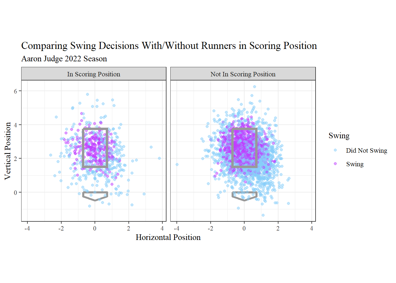
The left graph shows pitches when no one was in scoring position. The right graph shows pitches when runner(s) were in scoring position.
According to the official MLB rules the strike zone is the space above home plate between the top of the batter’s shoulders and their knees. During the game there is no rectangle showing the umpire exactly what that strike zone is. Umpire’s use their judgement for what they consider a strike or a ball.
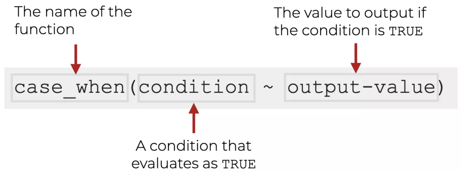
Below is the creation of a variable, ‘true’, that determines if the pitch should have been called a ball or a strike. case_when() is used to tell R if certain conditions are met then return this. The first line of case_when() below is saying if ‘plate_z’ is greater (higher) than ‘sz_top’ OR ‘plate_z’ is less (lower) than ‘sz_bot’ return “ball”. Here is a visual to help reinforce:
calc_sz <- judge_filter %>%
  mutate(correct_call = case_when(plate_z > sz_top | plate_z < sz_bot ~ "ball",
                                  plate_x > .7083 | plate_x < -.7083 ~ "ball",
                                  TRUE ~ "strike"))
We will use this new variable to color the points in a graph.
calc_sz %>%
  filter(description %in% c("ball", "called_strike"), !is.na(sz_top), !is.na(sz_bot)) %>%
  mutate(type = recode(type, "B" = "called ball", "S" = "called strike")) %>%
  ggplot(aes(x = plate_x, y = plate_z, color = correct_call)) +
  geom_point(alpha = 0.5) +
  geom_zone(top = 3.96, bottom = 1.87) +
  labs(title = "Called Strike Zone Colored by Rule Book Strike Zone",
       subtitle = "Aaron Judge 2023 Season",
       x = "Horizontal Position", y = "Vertical Position",
       color = "Rule Book \nStrike Zone \nCall") +
  scale_color_manual(values = c("lightskyblue", "cornflowerblue")) +
  coord_fixed() +
  theme_bw() +
  theme(text = element_text(family = "serif")) +
  facet_wrap(~type)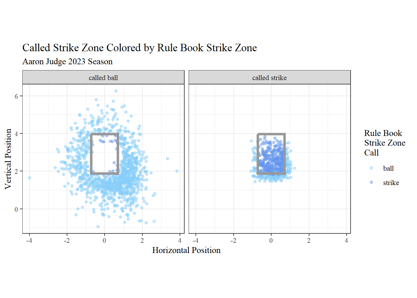
The left graph is what the umpire called as balls, and the right graph is what the umpire called as strikes.
It would be interesting to see what the strike zone looks like according to the umpire’s calls. To do this we need to load the ggforce library.
library(ggforce)The function we need to use isgeom_mark_hull(). Essentially it draws a line around the perimeter of the points. The ‘expand’ argument specifies how much space there should be between the points and line. The ‘size’ and ‘color’ arguments are about the appearance of the line. Following that are two functions, xlim() and ylim(), which can be used to manually specify the limits of each axis.
judge_filter %>%
  filter(type == "S") %>%
  ggplot(aes(x = plate_x, y = plate_z)) +
  geom_point(alpha = 0.5, color = "cornflowerblue") +
  geom_zone(top = median(judge_filter$sz_top), bottom = median(judge_filter$sz_bot)) +
  geom_mark_hull(expand = unit(2, "mm"), size = .8, color = "darkslateblue") +
  labs(title = "Umpire Strike Zone", subtitle = "Aaron Judge 2022 Season",
       x = "Horizontal Position", y = "Vertical Position") +
  xlim(-1.5, 1.5) +
  ylim(1, 4.5) +
  coord_fixed() +
  theme_bw() +
theme(text = element_text(family = "serif")) 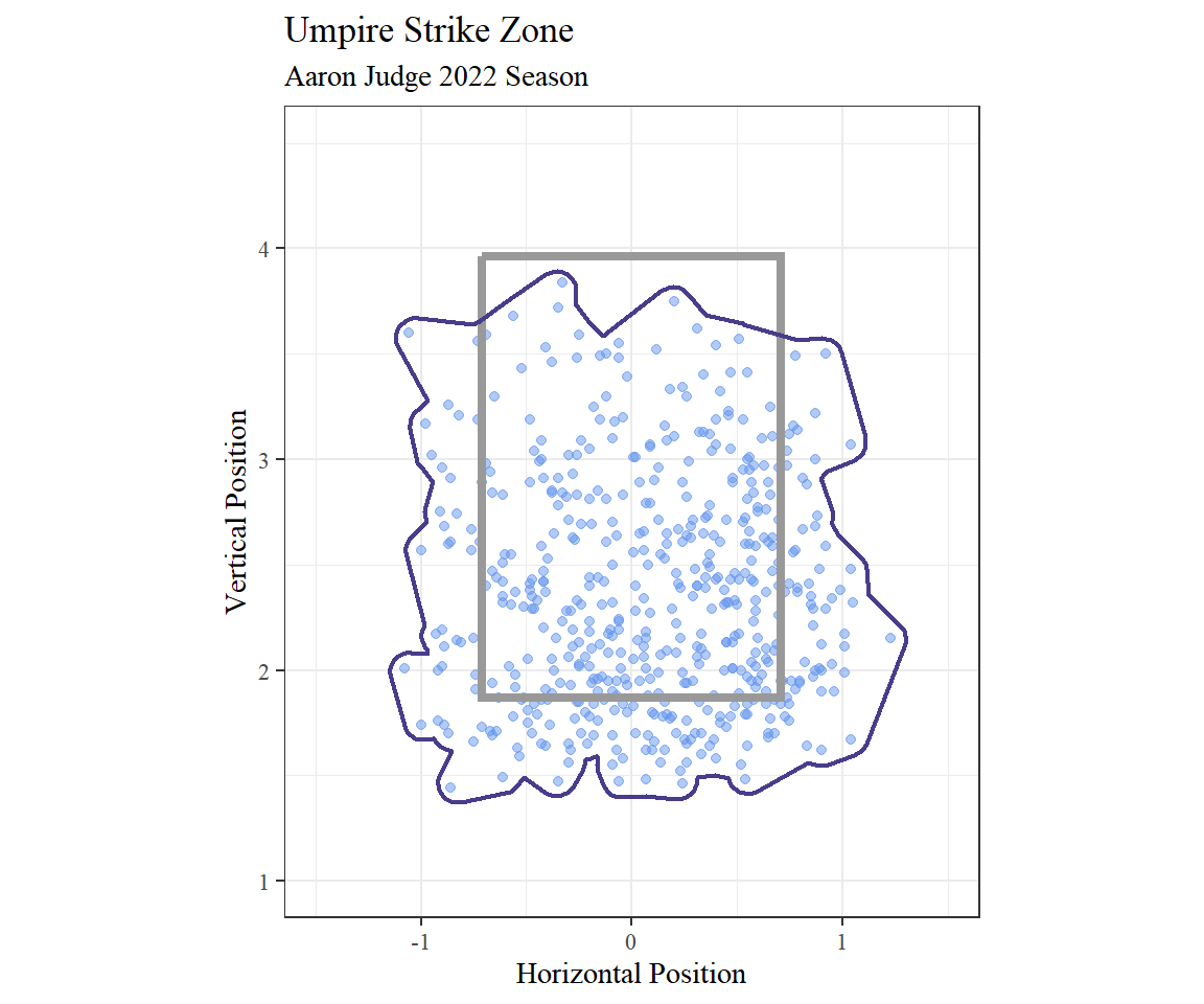
Now let’s try some strike zone plots with the Mariners vs. Rays game data.
This graph shows all of the different pitch types thrown in the game and is colored by the result.
game %>%
  mutate(type = recode(type, "B" = "ball", "S" = "strike", "X" = "in play")) %>%
  ggplot(aes(x = plate_x, y = plate_z, color = type)) +
  geom_point(alpha = 0.5) +
  geom_zone() +
  geom_mark_hull(aes(color = type),
                 expand = unit(2, "mm"), size = .8, show.legend = FALSE) +
  labs(title = "Strike Zone Plots by Pitch Type", subtitle = "Mariners vs. Rays - May 8, 2022",
       x = "Horizontal Position", y = "Vertical Position", color = "Pitch Result") +
  scale_color_manual(values = c("lightskyblue", "cornflowerblue", "darkorchid1")) +
  coord_fixed(ratio = 1) +
  theme_bw() +
  theme(text = element_text(family = "serif")) +
  facet_wrap(~pitch_name, nrow = 2)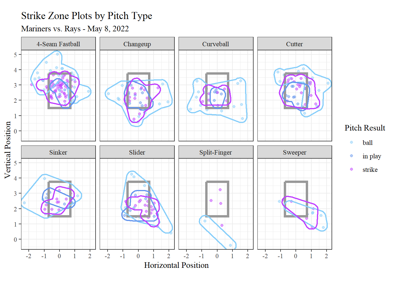
Now let’s look at just Kirby’s arsenal.
game %>%
  filter(pitcher == 669923) %>%
  ggplot(aes(x = plate_x, y = plate_z, color = release_speed)) +
  geom_point(alpha = 0.5) +
  geom_zone() +
  geom_mark_hull(expand = unit(2, "mm"), size = .8, show.legend = FALSE) +
  labs(title = "George Kirby Strike Zone Plots by Pitch Type",
       subtitle = "Mariners vs. Rays - May 8, 2022",
       x = "Horizontal Position", y = "Vertical Position",
       color = "Release Speed") +
  scale_color_viridis_c(direction = -1) +
  coord_fixed(ratio = 1) +
  theme_bw() +
  theme(text = element_text(family = "serif")) +
  facet_wrap(~pitch_name, nrow = 2)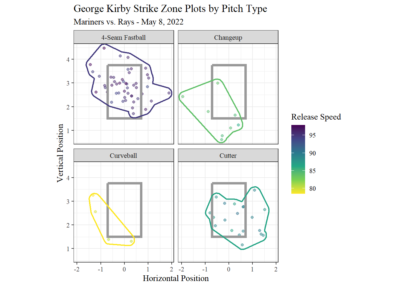
He most frequently throws 4-seam fastballs. Those are his fastest pitches. Kirby only threw a handful of curveballs this game. Those were his slowest pitches.
This graph used the [viridis color scale]. scale_color_viridis_c() is specifically meant for a continuous scale, like release speed.
6.2 Pitch Release Plot
The Statcast data contains variables about release point: ‘release_pos_x’ and ‘release_pos_y’. Just like strike zone plots, pitch release plots are created with geom_point().
We will facet by pitcher. The data includes pitcher id, but not pitcher name. To find the name matching each id number we have to use Baseball Savant. Paste this link into your browser: https://baseballsavant.mlb.com/savant-player/ and type the player id after the last /. For example, the first pitcher would be https://baseballsavant.mlb.com/savant-player/552640. That number belongs to Andrew Kittredge. We can mutate a new variable to store these names.
game <- game %>%
  mutate(pitcher_name = case_when(pitcher == 552640 ~ "Andrew Kittredge",
                                  pitcher == 592094 ~ "Jason Adam",
                                  pitcher == 605538 ~ "Matt Wisler",
                                  pitcher == 608716 ~ "Drew Steckenrider",
                                  pitcher == 621248 ~ "Ralph Garza Jr.",
                                  pitcher == 623149 ~ "Paul Sewald",
                                  pitcher == 642232 ~ "Ryan Yarbrough",
                                  pitcher == 657024 ~ "Erik Swanson",
                                  pitcher == 662253 ~ "Andrés Muñoz",
                                  pitcher == 669923 ~ "George Kirby"))
game %>%
ggplot(aes(x = release_pos_x, y = release_pos_z, color = factor(pitch_name))) +
geom_point(alpha = 0.5) +
labs(title = "Release Point", color = "Pitcher",
x = "Horizontal Release Position", y = "Vertical Release Position") +
theme_bw() +
theme(text = element_text(family = "serif")) +
facet_wrap(~pitcher_name, nrow = 2)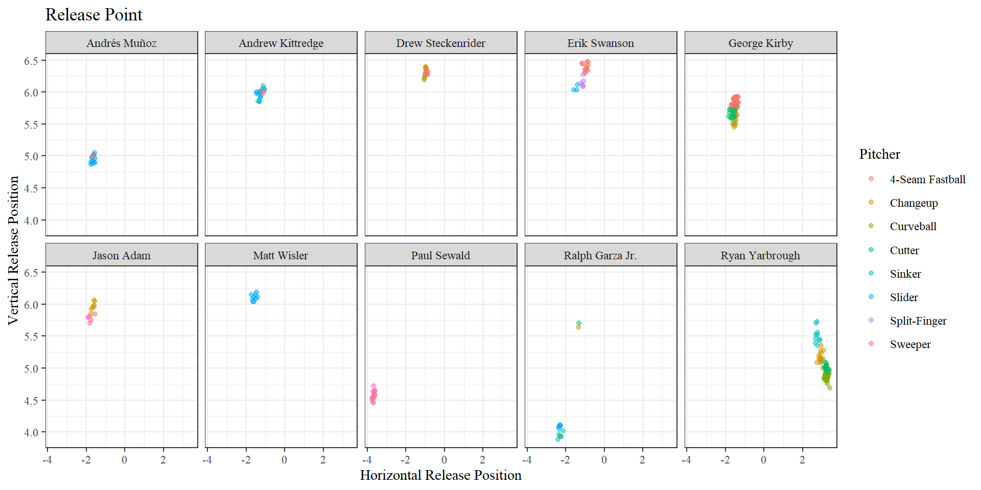
From this we can see that Ryan Yarbrough’s release point is much higher when throwing a sinker than it is when throwing curveball.
6.3 Spray Chart
Spray charts show the location of balls hit into play. One game usually produces around 250-300 rows of data. To get more data points, we will use a large data set. This data set will contain all games played on July 2, 2022 and July 3, 2022.
spray <- statcast_search(start_date = "2022-07-02",
                        end_date = "2022-07-03",
                        player_type = "batter")

# filter out the NAs
spray <- spray %>%
  filter(!is.na(hc_x), !is.na(hc_y))
To plot a spray chart we need to used geom_point().
spray %>%
  ggplot(aes(x = hc_x, y = -hc_y, color = pitch_name)) +
  geom_point(alpha = .5) +
  labs(title = "Spray Chart Without Field Lines",
       subtitle = "All MLB Games July 2 & July 3, 2022",
       color = "Pitch") +
  theme_void() +
theme(text = element_text(family = "serif")) 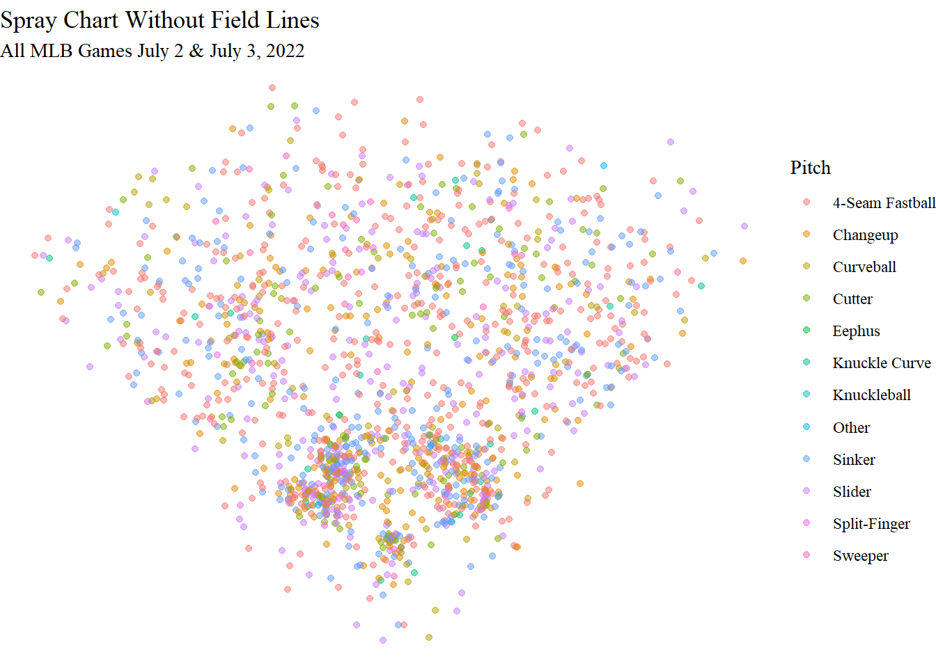
From the concentration of points we can get an idea of the shape of the field, but it would be nice to see the lines of the baseball field. We can create a function to do this!
Creating Functions
geom_spray <- function(...) {
  ggplot(...) +
    geom_curve(x = 33, xend = 223, y = -100, yend = -100, curvature = -.65) +
    geom_segment(x = 128, xend = 33, y = -208, yend = -100) +
    geom_segment(x = 128, xend = 223, y = -208, yend = -100) +
    geom_curve(x = 83, xend = 173, y = -155, yend = -156, curvature = -.65, linetype = "dotted") +
    coord_fixed() +
    scale_x_continuous(NULL, limits = c(25, 225)) +
    scale_y_continuous(NULL, limits = c(-225, -25))
}
It is important to note that geom_spray() plots the lines for an average ballpark. Each park can differ a bit in their dimensions, but overall have this shape.
Here is the same graph from before, but with the ballpark lines added.
spray %>%
  geom_spray(aes(x = hc_x, y = -hc_y)) +
  geom_point(aes(color = pitch_name), alpha = .5) +
  labs(title = "Spray Chart With Field Lines",
       subtitle = "All MLB Games July 2 & July 3, 2022",
       color = "Pitch") +
  theme_void()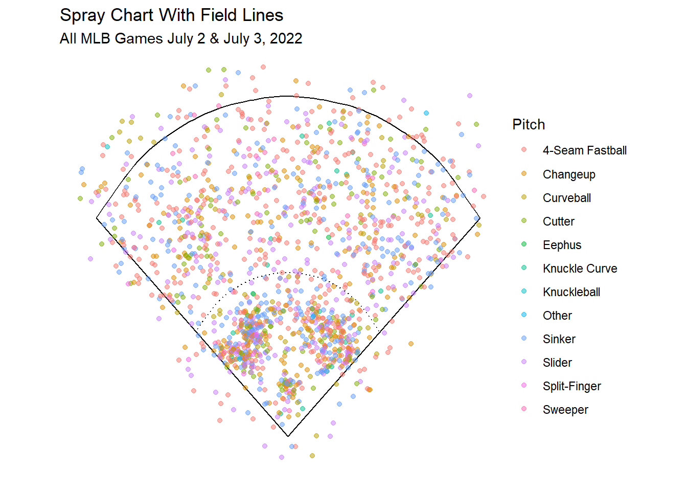
Next let’s make a spray chart to see where Aaron Judge hits to.
judge %>%
  filter(!(events %in% c("", "catcher_interf", "hit_by_pitch", "walk", "strikeout"))) %>%
  mutate(events = recode(events, "grounded_into_double_play" = "GIDP")) %>%
  geom_spray(aes(x = hc_x, y = -hc_y)) +
  geom_point(alpha = .5, aes(color = events)) +
  labs(title = "Spray Chart by Outcome",
       subtitle = "Aaron Judge 2022 Season", color = "Events") +
  theme_void() +
  theme(legend.position = "none") +
  facet_wrap(~events, nrow = 2)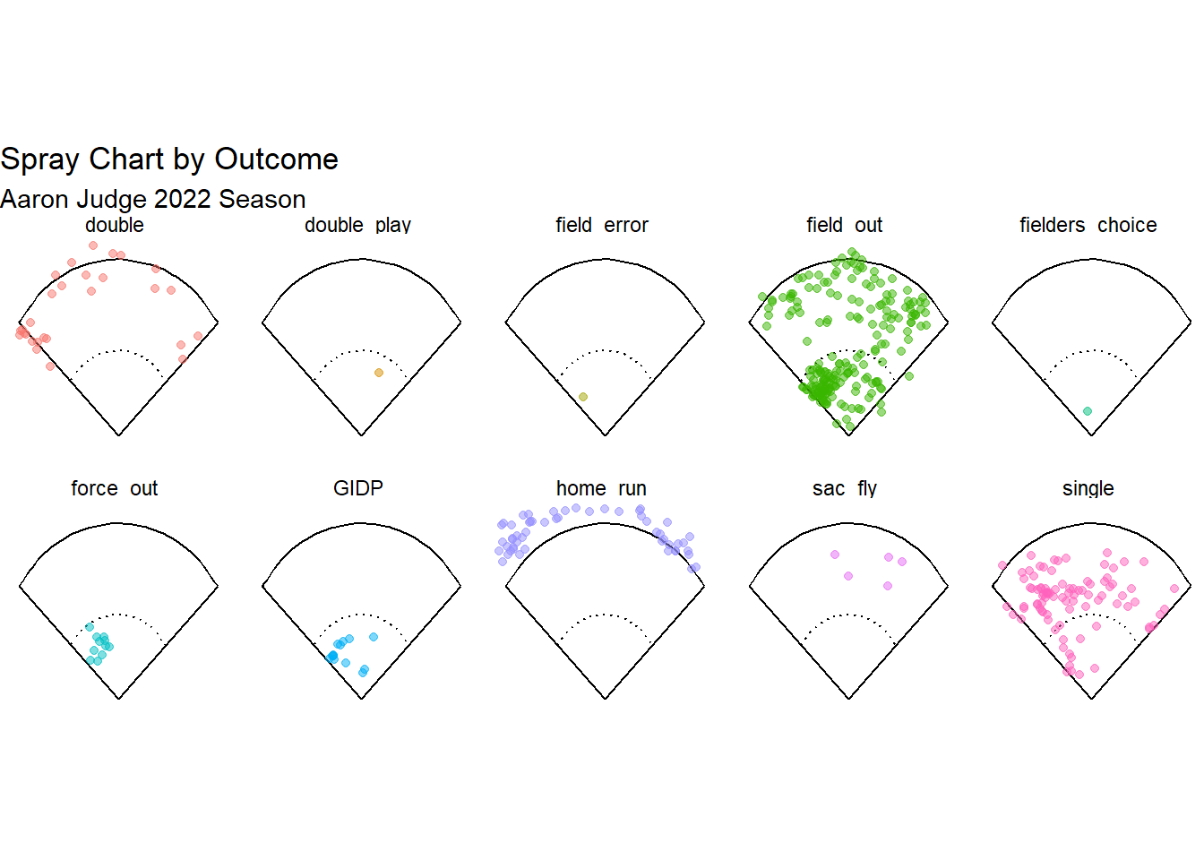
NOTE: this theme is cutting off the bottom part of facet labels
6.4 Contour Plot
Another type of visualization we can make is a contour plot. Contour plots show where values are grouped together. We will use the function geom_density_2d_filled() to make these graphs.
This plot is showing Aaron Judge’s strike zone but only for pitches that he hit a home run on.
judge %>%
  filter(events == "home_run") %>%
  ggplot(aes(x = plate_x, y = plate_z)) +
  geom_density_2d_filled(alpha = 0.5, contour_var = "count") +
  geom_point() +
  xlim(-1.5, 1.5) +
  ylim(1.5, 4.5) +
  geom_zone(top = 3.97, bottom = 1.87, linecolor = "turquoise4") +
  labs(title = "Contour Plot Aaron Judge Home Runs",
       x = "Horizontal Position", y = "Vertical Position") +
  coord_fixed() +
  theme_bw() +
theme(text = element_text(family = "serif")) 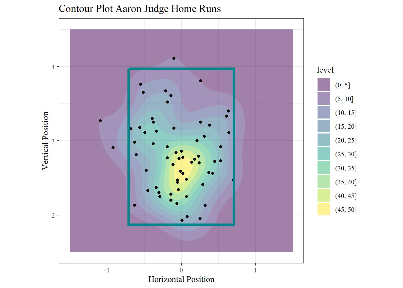
Points were included to help explain the color scale in the legend. Yellow represents areas with a higher concentration of points close together. This indicates that many of the pitches Judge hit a home run on were in the middle of his zone. Dark purple represents where points are the sparsest. This means that Judge hit home runs less frequently on pitches that were near the edge of his zone.
The yellow indicates a that many of the pitches Judge hit a home run on were in the middle of his zone.
Sometimes it can be helpful to look at two plots side-by-side. We can do this using the patchwork package.
library(patchwork)It is a simple process. Save each graph as an object, then write graph1 + graph2 with your graphs names.
g1 <- judge %>%
  filter(!is.na(sz_top), !is.na(sz_bot)) %>%
  filter(description == "swinging_strike") %>%
  ggplot(aes(x = plate_x, y = plate_z)) +
  geom_density_2d_filled(alpha = 0.5, show.legend = FALSE) +
  geom_zone(top = 3.95, bottom = 1.87, linecolor = "turquoise4") +
  labs(title = "Called Strikes with Judge's Strike Zone",
       x = "Horizontal Position", y = "Vertical Position") +
  coord_fixed() +
  theme_bw() +
  theme(text = element_text(family = "serif"))
g2 <- judge %>%
  filter(description == "swinging_strike") %>%
  ggplot(aes(x = plate_x, y = plate_z)) +
  geom_density_2d_filled(alpha = 0.5, show.legend = FALSE) +
  geom_zone(linecolor = "turquoise4") +
  labs(title = "Called Strikes with Default Strike Zone",
       x = "Horizontal Position", y = "Vertical Position") +
  coord_fixed() +
  theme_bw() +
  theme(text = element_text(family = "serif"))
g1 + g2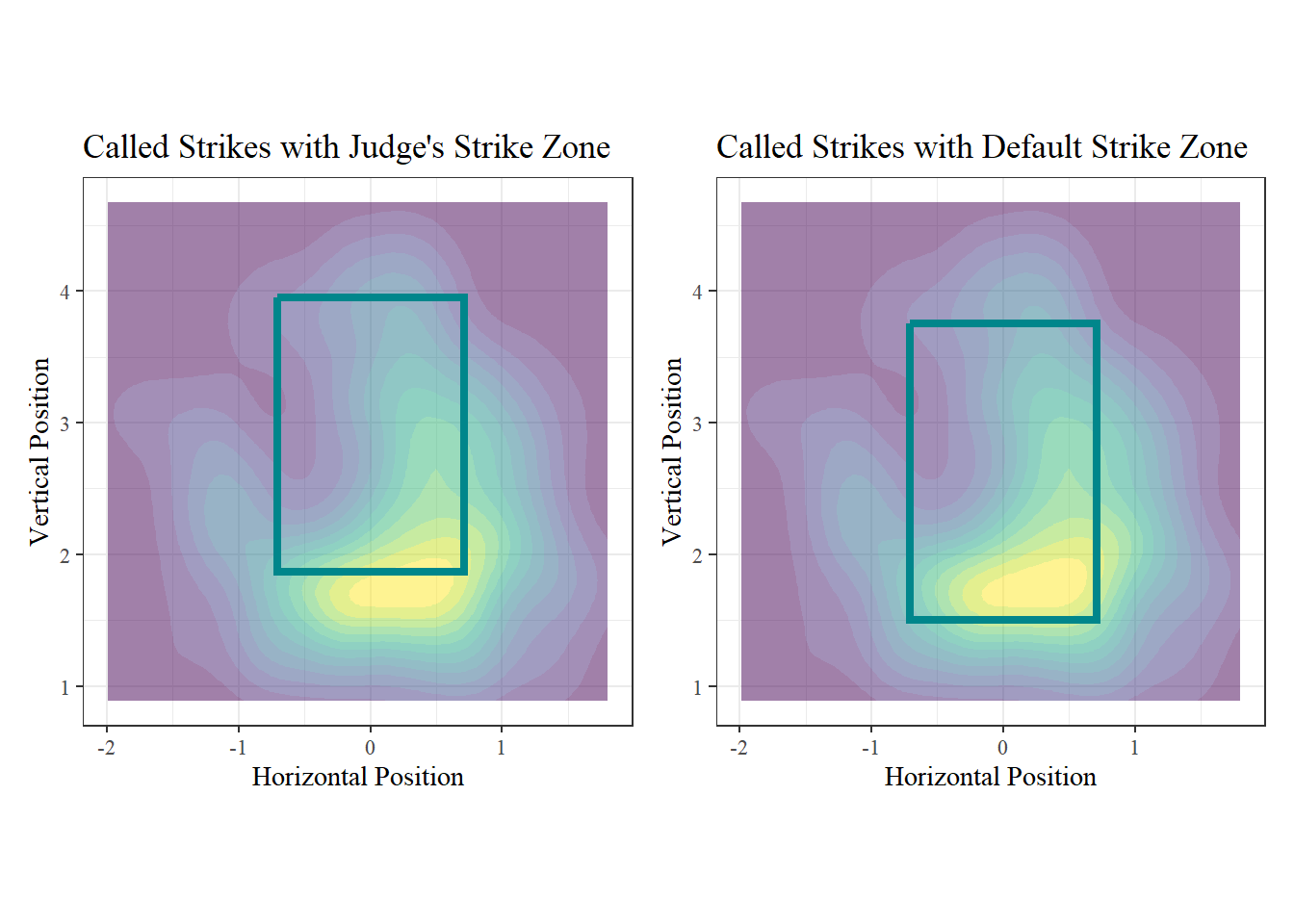
Having the plots next to each other reveals that Judge’s specific strike zone is much higher than the general strike zone.
Contour plots can also be applied to fields.
judge %>%
  geom_spray(aes(x = hc_x, y = -hc_y)) +
  geom_density_2d_filled(alpha = 0.5, show.legend = FALSE) +
  #geom_point() +
  labs(title = "Contour Plot of Full Field",  subtitle = "Aaron Judge 2022 season") +
  theme_void() +
theme(text = element_text(family = "serif")) 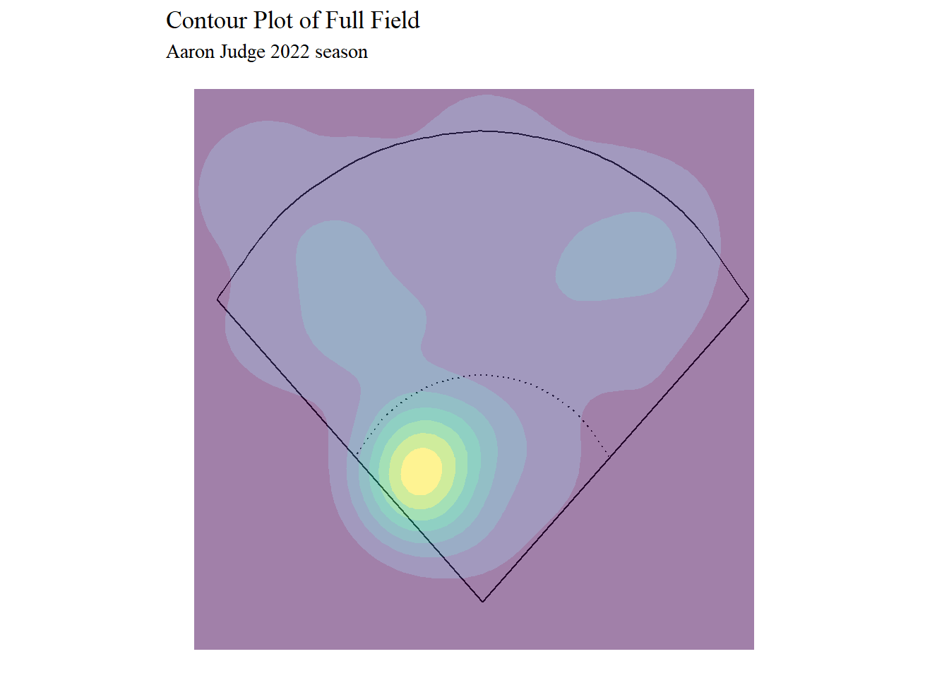
Judge is known to hit a lot of home runs, but this graph shows that the majority of his hits are not home runs. Judge most frequently hits to third base. His longer hits are typically to left or right sides of the outfield.
judge %>%
  filter(events == "home_run") %>%
  geom_spray(aes(x = hc_x, y = -hc_y)) +
  geom_density_2d_filled(alpha = 0.5, show.legend = FALSE) +
  labs(title = "Contour Plot of Home Runs Locations",  subtitle = "Aaron Judge 2022 season") +
  theme_void() +
theme(text = element_text(family = "serif")) 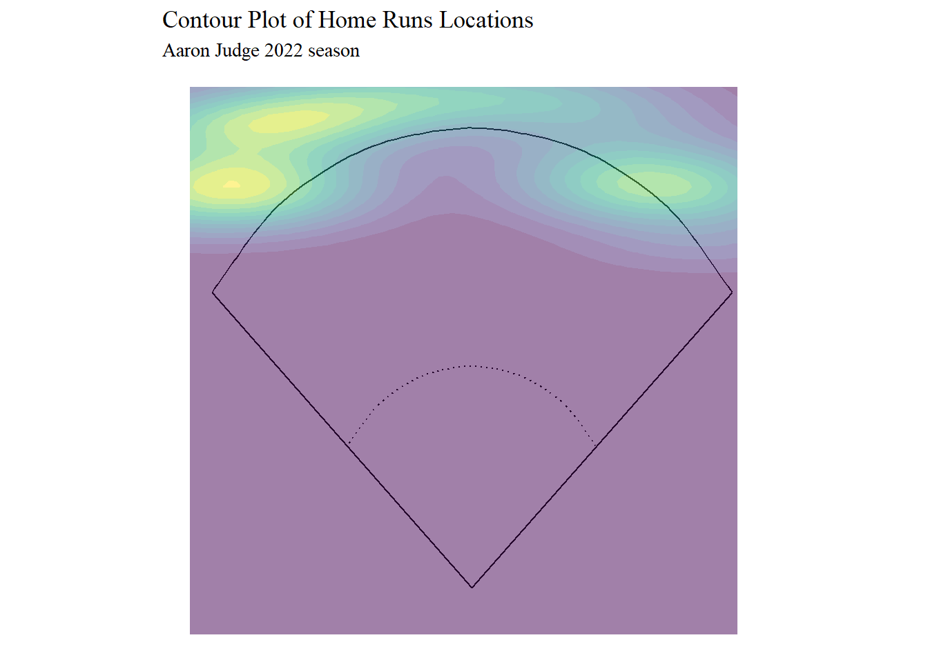
A contour plot of just home runs supports the idea that Judge hits more to the outsides of the outfield than the center. He specifically favors the left, which make sense considering that he is a right-handed hitter.
6.5 Heat Map
Lastly, we will make a heat map. Heat maps work in a similar way to contour plots in the sense that a continuous scale of colors represent a variable. The function for this is geom_tile(). To control the colors of the plot we will use scale_fill_gradient2(). The scale_x_continuous() functions lets you specify what year should be used for the ticks on the x-axis.
We will use the Lahman package to get each MLB team’s season record for the last nine years.
library(Lahman)

records <- Teams %>%
  filter(yearID >= 2013)
records %>%
group_by(yearID, franchID) %>%
mutate(win_perc = W/G) %>%
ggplot(aes(x = yearID, y = franchID, fill = win_perc)) +
geom_tile(color = "gray") +
labs(x = "Year", y = "Team", fill = "Winning \nPercentage") +
scale_fill_gradient2(mid = "white", low = "dodgerblue",
high = "mediumseagreen", midpoint = 0.5) +
scale_x_continuous(breaks = c(2013, 2015, 2017, 2019, 2021)) +
theme_classic() +
theme(text = element_text(family = "serif")) +
facet_wrap(~lgID, scales = "free_y")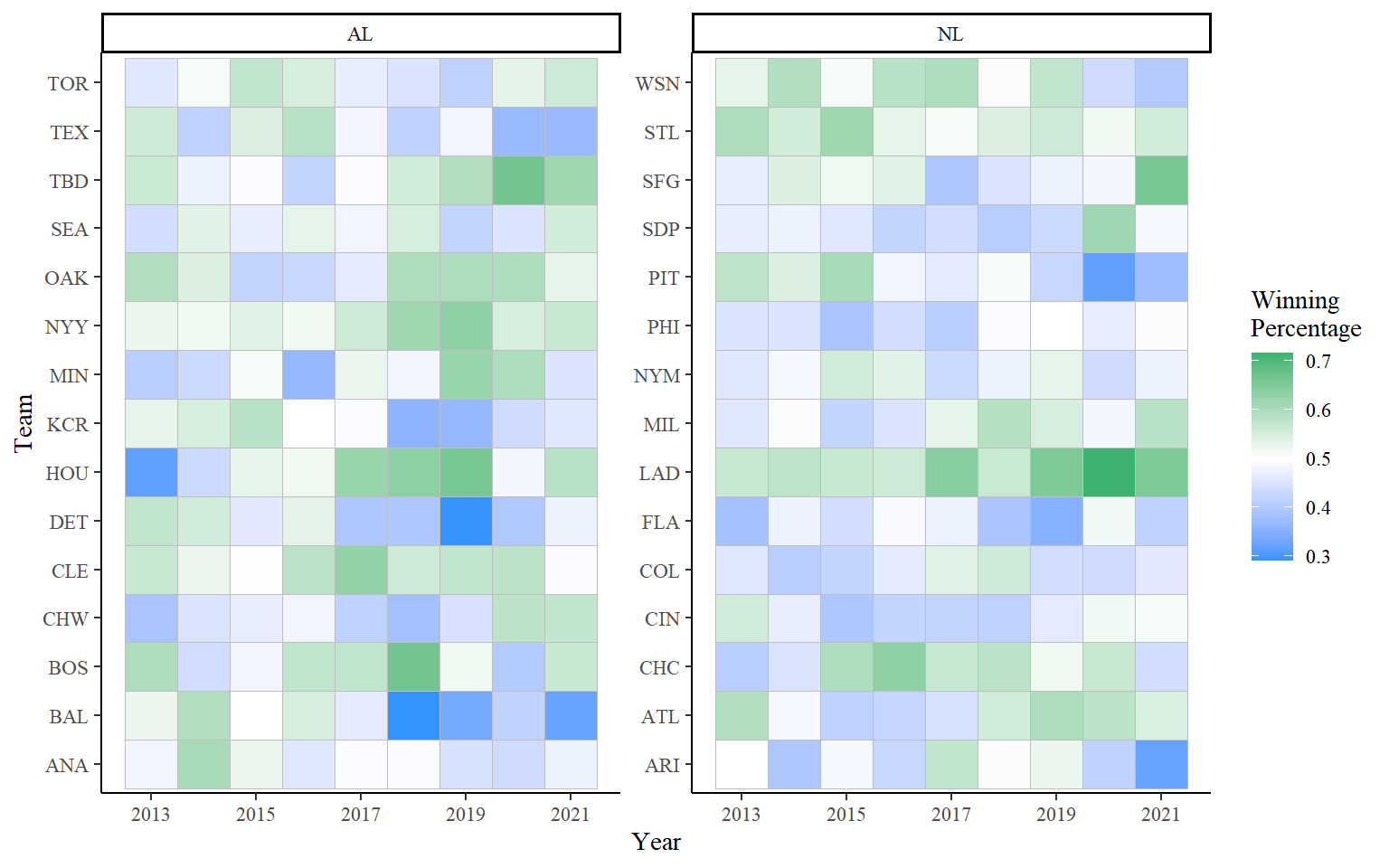
Let’s focus on Houston for a moment. In 2013 their winning percentage was very low, somewhere near 0.300. The following year the tile is a much lighter blue, closer to 0.500. The next five seasons are green, with 2019 being the most saturated green and therefore best season. Their 2020 tile is pure white, indicating an even 0.500 season.
Additional Resources on Visualizations:
The CalledStrike package has functions to create more types of baseball visualizations.
It is possible to create animated graphics. One example where this could be helpful is when looking at changes over a time frame. The gganimate website has lots of explanations and examples.