Chapter 4 Choosing and preparing data
4.1 Objectives
The objectives of this chapter are to:
Enumerate the ecological research questions most often asked of Species Distribution Models, linking those to the underlying statistical form of SDMs. We think about inference, prediction and their associated uncertainties. These models require response and explanatory variables. In the SDM context, the response has the form of distribution data, and the explanatory variables are informed by environmental data.
Discuss the possible distribution data types that could be used in SDMs. We arrange those along a spectrum between spatially- and individually-referenced data. We connect these ideas with the analytical strands of Chapter 3.
Outline different forms of structure (stratification) in the response data (e.g. by behavioral activity, sex, age, etc.).
The diversity of explanatory data is overwhelming. We provide a “classification by bisection” of the key characteristics of these data, hence reviewing the key analytical difficulties associated with the different data types. Hence, although we cannot exhaust the data types, we can be quite comprehensive about the preparation challenges.
Introduce problems associated with missing or coarse data.
Provide a short primer of Geographic Information System (GIS) operations within R.
4.2 You are here
As we saw in Chapter 1, the ecological processes that permeate the associations between species and habitats are dynamic and diverse. The multiscale questions raised in Chapter 1 and the mathematical formalisms proposed in Chapter 2 require more sophisticated SHA models than the ones we currently have available. Nevertheless, as our research community journeys towards the development of fully ecological SHA models, that link population dynamic processes with the spatial distribution of conditions and depletable resources, we need to be able to specify and control the statistical machinery for linking spatial abundance to environmental variables. As we discussed at the end of Chapter 1, Species Distribution Models (SDMs) are the foremost available batch of methods that achieve this statistical connection. Much too often in the contemporary ecological literature, authors including ourselves, dive all too eagerly into the practicalities of running SDMs without paying due attention to high-level ecological questions that might affect the inferences from such models. In such workmanlike papers, attention often returns to ecological interpretation in the Discussion sections, almost as an obligatory afterthought, often admitting that complications such as depletion, density dependence, multispecies interactions and transient dynamics are probably influential, but outside the feasible remit of these studies.
Having appeased our conscience by presenting ecological complexity and notions of fitness upfront (in our Chapters 1 and 2) we now need to focus on the feasible business-at-hand. Getting off the ground with SHAs requires that we get down-and-dirty with the practicalities of SDMs. Many of the statistical methods in the SDM toolbox are neither particularly ecological nor spatial, and most predate the unification brought about by the Inhomogeneous Point Process framework (see Chapter 3). We will, however, try to embed all these methods in the common, unified framework of IPPs. In this chapter, we discuss the basic ingredients of SDMs, the questions they can answer and the response data that we can use with them. To streamline our thinking about the plethora of possible covariates, we introduce a useful taxonomy of explanatory variables and consider problems of missing and imperfect explanatory data.
4.3 Typical questions asked of an SDM
The biological questions we usually try to answer with SDMs fall into the three broad categories outlined in our Preface: estimation, inference, and prediction. In the language of species distributions, we are seeking to know where the organisms are, why they are there and where else they might be, now or in the future (Aarts et al., 2008). SDMs are, first-and-foremost, statistical regression models, so you can use your knowledge of statistical rudiments (think of a generalized linear model) to motivate many of the relevant scientific questions for species distribution.
For starters, SDMs have at least one response variable \(Y\) and at least one explanatory variable \(X\). The response data are generated by some stochastic process \(D()\) with a deterministic component \(\lambda\). The deterministic component is often the expectation of the process and it is modeled as a function of covariates14
\[Y \sim D(\lambda)\] \[\lambda=f(X)\]
The response data (see Section 4.4) relate to the species distribution (e.g., grid counts, telemetry observations, transect detections), and the explanatory data (see Section 4.5) are habitat attributes.
SDMs also inherit the type of questions often asked in correlational analyses, across all empirical disciplines. Statistical estimation and inference are the generic names for the batch of formal quantitative processes used by statisticians to learn from data. Although the phrasing of the questions can be quite statistical and general, they all have an ecological translation in the context of species distributions (i.e. expected abundance patterns in space).
With estimation we seek to describe aspects of model parameters. Consider a model of the form
\[ Y \sim Poisson(\lambda)\]
\[\lambda=exp(a_0+a_1X_1+a_2X_2)\]
where \(Y\) represents the spatial data (a count of species occurrences in a unit of space) and the \(X\) represent the environmental covariates. We may be interested in estimating the values of the parameters \(a_0,a_1,a_2\).15
These point estimates may give us interesting biological clues. For example, the intercept \(a_0\) is associated with the species abundance at a point where all covariates are zero. The value \(X=0\) may represent some interesting baseline scenario. If \(X\) measures altitude, then \(X=0\) is sea-level. Then, the intercept determines the expected abundance of the species at sea level \(\lambda_0=exp(a_0)\). On the other hand, if the covariates have been standardized (i.e. \(\hat{X}=(X-\bar{X})/SD(X)\)), then the intercept represents the expected abundance under the average conditions observed in the data. Biological papers invariably subject the sign and magnitude of the point estimate for the slope \(a_1\) to interpretation (much as we did in Chapter 2). So, questions that we could ask here include:
- What is the expected baseline abundance of a species under a set of reference conditions (i.e. when the X are zero)?
- Is abundance expected to increase or decrease along gradients of \(X\)?
- If the covariate units have been standardized, which covariate has a stronger effect on expected abundance?
Let’s have a look at a simple example. First we will create some simulated response data Y, whose expected value lambda is related to two covariates X1 and X2 via the expression \(\lambda=exp(2+0.2X_1-0.1X_2)\). We have hardwired the three parameters of this expression, so as to represent the underlying truth in the simulation. In real scenarios of statistical inference, these exact values are not known to us16, we will be trying to estimate them statistically.
# Simulating some artificial data
n<-100 # Sample size
X1<-rnorm(n, 10, 1) # Creating values for environmental variable 1
X2<-rnorm(n, 10, 1) # Creating values for environmental variable 2
X3<-rnorm(n, 10, 1) # Creating values for environmental variable 3
lambda<-exp(2+0.2*X1-0.1*X2) # Setting up an expected response
Y<-rpois(n,lambda) # Simulating response values
dat<-data.frame(X1,X2,Y) # Creating the data frame

# Creating marginal plots
par(mfrow=c(1,2))
plot(X1,Y)
plot(X2,Y)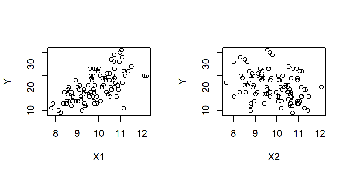
par(mfrow=c(1,1))The parameters and associated standard errors can be retrieved by fitting a GLM to these data.
# Statistical inference
model<-glm(Y~X1+X2+X3, family=poisson, data=dat) # Fitting a model
summary(model)
##
## Call:
## glm(formula = Y ~ X1 + X2 + X3, family = poisson, data = dat)
##
## Deviance Residuals:
## Min 1Q Median 3Q Max
## -2.77868 -0.69363 -0.08104 0.65710 2.13159
##
## Coefficients:
## Estimate Std. Error z value Pr(>|z|)
## (Intercept) 1.878587 0.423568 4.435 9.20e-06 ***
## X1 0.193539 0.023752 8.148 3.69e-16 ***
## X2 -0.088920 0.022836 -3.894 9.86e-05 ***
## X3 0.008277 0.022964 0.360 0.719
## ---
## Signif. codes: 0 '***' 0.001 '**' 0.01 '*' 0.05 '.' 0.1 ' ' 1
##
## (Dispersion parameter for poisson family taken to be 1)
##
## Null deviance: 180.552 on 99 degrees of freedom
## Residual deviance: 93.459 on 96 degrees of freedom
## AIC: 582.67
##
## Number of Fisher Scoring iterations: 4Note that the mathematical and probabilistic properties of this GLM are exactly the same as the ones we used when simulating the data. This idealized situation will never hold in reality17.
We have included a third (irrelevant) variable in this model to try and misguide the parameter estimation. In this particular case, the GLM has not fallen for the ruse, managing to estimate values for the parameters of \(X_1,X_2\) that have the correct direction and magnitude, both absolutely and relative to each other.
Beyond point estimates, inference may ask more nuanced questions about uncertainty in point estimates. This may be done via interval estimates (e.g. confidence intervals in frequentist analyses or credible intervals in Bayesian approaches). For example,
- How uncertain are we about the value of the intercept (e.g., the expected abundance at sea level) or the slope (e.g., the species response to altitude)?
- Does the interval associated with the slope include zero (i.e., is it possible that the species does not really respond to altitude)?
In the above model summary, the estimated standard errors suggest that the uncertainty associated with the first three parameters would lead to confidence intervals that do not enclose zero. In contrast, the fourth parameter could easily have the value zero18.
# Confidence intervals
confint(model)
## Waiting for profiling to be done...## 2.5 % 97.5 %
## (Intercept) 1.04821139 2.70851319
## X1 0.14700950 0.24011929
## X2 -0.13366025 -0.04413877
## X3 -0.03668157 0.05333733Once we start thinking about uncertainty in parameter estimates, more esoteric questions can be asked about the correlations between the estimates of parameters values. For example,
- If the value of the intercept is, in reality, lower than our point estimate, do we expect the slope to be steeper than its point estimate?
These measures of uncertainty, captured by the variance-covariance matrix in regression models, become really important for correctly representing uncertainty in spatial predictions, which we will see later on.
vcov(model)## (Intercept) X1 X2 X3
## (Intercept) 0.179409716 -6.034394e-03 -6.086601e-03 -5.835692e-03
## X1 -0.006034394 5.641633e-04 3.992457e-05 -2.072392e-06
## X2 -0.006086601 3.992457e-05 5.214672e-04 5.684005e-05
## X3 -0.005835692 -2.072392e-06 5.684005e-05 5.273452e-04Following on from parameter estimation we may want to conduct whole model inference, focusing on whether it is worthwhile keeping a covariate in the model. This matters because all empirical models have to tread the fine line between improving their goodness-of-fit to the existing data and preserving their predictive power in new situations. It is always possible to construct models that capture all the variability in the existing data by including more covariates and more flexible functions of these covariates. This added flexibility corresponds to an increase in the effective degrees of freedom in a model enabling it to track the observations accurately. However, models that describe existing data very faithfully are unlikely to predict new data successfully. There are several different schools of thought for model inference (Fieberg et al., 2020). We may ask whether the estimated slope of a covariate is significantly different from zero (a p-value approach), or we may ask whether the addition of more flexibility in the model gives us sufficiently large returns in explanatory power (as a guarantee for predictive power, under some asymptotic argument for information criteria such as the AIC). Alternatively, we may focus directly on predictive power, by approaches such as cross-validation. All of these approaches essentially ask the same ecological question:
- Do the data suggest that a particular environmental variable is a useful covariate of species abundance?
The “usefulness” of a covariate will, of course, depend on whether we are interested more in understanding or prediction (Tredennick, Hooten, & Adler, 2017). The p-values reported in the summary of our GLM model above (whose significance is - almost too conveniently - indicated by a star system) indicate that X3 is probably an irrelevant variable. In this example, the same conclusion can be reached using automatic model selection (using the step() command) with the aid of the AIC19.
modelBest<-step(model, trace=0)
summary(modelBest)
##
## Call:
## glm(formula = Y ~ X1 + X2, family = poisson, data = dat)
##
## Deviance Residuals:
## Min 1Q Median 3Q Max
## -2.72167 -0.65847 -0.09959 0.63003 2.11808
##
## Coefficients:
## Estimate Std. Error z value Pr(>|z|)
## (Intercept) 1.97014 0.33905 5.811 6.22e-09 ***
## X1 0.19357 0.02376 8.147 3.73e-16 ***
## X2 -0.08981 0.02270 -3.957 7.60e-05 ***
## ---
## Signif. codes: 0 '***' 0.001 '**' 0.01 '*' 0.05 '.' 0.1 ' ' 1
##
## (Dispersion parameter for poisson family taken to be 1)
##
## Null deviance: 180.552 on 99 degrees of freedom
## Residual deviance: 93.589 on 97 degrees of freedom
## AIC: 580.8
##
## Number of Fisher Scoring iterations: 4Note that much as we would like to make such statistical conclusions more ecological, the correlational nature of SDMs prevents us. For example, detecting a strong negative relationship between the abundance of our study species and altitude may be the result of temperature tolerances. We may want to conclude that the species struggles to survive in colder, higher ground, but our evidence is purely correlational20. This is the case, no matter which statistical tool (e.g. p-values, information criteria, or cross validation) is used to determine if an explanatory variable should stay in the SDM. Nevertheless, all studies involving SDMs will expend some ink in their concluding sections speculating about why one explanatory variable is negatively related to abundance and why another variable appears not to explain patterns of abundance. These post-hoc interpretations are as unavoidably necessary for publication as they are scientifically vulnerable. Nevertheless, to the extent that they can lead to new hypotheses for targeted experimentation and data collection, they are a constructive part of the scientific process.
As an exercise, try the following. Set the intercept in the above simulation example to -2, so that \(\lambda=exp(-2+0.2X_1-0.1X_2)\).
Does a model with a negative baseline make biological sense? What biological scenario does it represent?
What do you see in the marginal plots of these new simulated data?
What happens to parameter estimation, confidence intervals, p-values following this small change in god’s mind?
What does model selection conclude?
If parameter and model inference address our need for scientific understanding, projections of SDMs to the spatial domain satisfy our need for prediction. Fundamental questions on prediction are the following three:
What was the detailed distribution of the species in space while we were collecting data? This is a question of spatial reconstruction, controlling for the distorting effects of partial, error-prone or imbalanced observation.
What would be the detailed distribution of the species in space if the environment was different? This is a question of extrapolation, a task performed deceptively easily in practice, but almost always guaranteed to give the wrong answers.
How certain are we about these spatial predictions at different parts of space? This is a question of propagating different types of uncertainty all the way to final predictions, and finding a concise way of communicating this complex information numerically and visually, in maps (Jansen et al., 2022).
Environmental covariates are not the only explanatory input in a model. We may be able to understand more about a system by appealing to structure in the data (e.g. when data chunks can be attributed to particular study animals or spatial units). These may be investigated via hierarchical models. For example, we may ask:
- How much of the observed variability in the association between organisms and habitats is attributable to individual variation and how much is due to differences in the environments that different individuals experience? Are individuals consistently different from each other, or are all individuals equal (and equally erratic) in their day-to-day behavior?
Similarly, the idea of propagating uncertainty can lead us to ask challenging questions about “things we know we don’t know” and “things we don’t know that we don’t know”21. A good question here might be:
- Are there residual patterns in the spatial data indicating that the organisms cluster (e.g. due to social attraction), or that we may have missed an important covariate of their distribution that creates aggregations?
All of the above questions come with associated caveats. Answers to descriptive questions make no attempt to explain or extrapolate from the data. In answering questions of scientific understanding we inadvertently use statistical inference as an indirect but necessary substitute to direct experimentation. In questions of prediction, as we move gradually from spatial map reconstruction towards forecasting and extrapolation, we risk losing predictive power, without even realizing it.
4.4 Distribution data
4.4.1 Spatially versus individually-referenced data
In Chapter 3, we looked at the different methods that can be used to collect species distribution data in the field (plot-based surveys, telemetry, transect surveys, camera traps). Our priority there was to unify the analysis of all these data types under the all-encompassing framework of point processes. However, the specifics of the statistical analysis will differ depending on features of the data. Most importantly, there are two aspects that determine the analysis. First, whether the response data are amenable to log-linear or logistic regression, (or something in-between). Second, what the distribution of sampling effort was across space, time and population sub-components.
To improve our analytical orienteering, here, we present an overview of distribution data that leads to a more compact taxonomy of data-types. We will point out the connections with the material of Chapter 3 along the way.
There is a bewildering diversity of methods that can be used in the field for collecting distribution data, but not all need to be treated differently at the stage of statistical analysis. For example, a line transect survey may be conducted from many different platforms, such as observers on-foot, on-board planes/ships/cars, drones with standard or infrared cameras. The surveys may detect organisms visually, they may detect visible cues (e.g. nests, latrines) or vocalizations. Clearly, the experience of the field workers conducting these different surveys will be drastically different. The attentiveness, expertise and effort demanded of the field worker will also differ greatly. Similarly, the responsibility for dealing with characteristically different observation biases, weighs heavily on the analyst. However, the basic principles of line transect survey analysis remain the same across all these practical variations on the survey theme. So, how can we categorize distribution data in a way that helps us choose the specifics of statistical analysis?
A good starting point is to ask whether the focus of data collection is the individual organism or the unit of space. This leads to the following fundamental distinction between two pure-form data types:
Survey data (Section 3.8.3): The focus of data collection is the unit of space (at any given time, the observer is actively looking at a place, the drone is recording footage from a place, the camera is stationed at a place, etc.). In theory, any individual in the study population can be detected if it happens to be where the observer is looking, but not all places will be surveyed. So, sampling effort in the case of surveys has a characteristically spatial-temporal flavor (How much area did we sweep through, how long did it take us?).
Telemetry data (Section 3.11): These are primarily of interest for moving organisms, or propagules and the focus is on the individual (a particular tag is placed on a single animal). In theory (particularly with modern global positioning systems), any place in G-space may be visited by a tagged animal, but only a finite number of individuals will be tagged. So, effort in the case of telemetry is characterized by individual-temporal dimensions (How many individuals did we catch for tagging, how long did the batteries last on the tags?).
OK, so what about the other methods that can be used to glean spatial information about a species? We can actually think of them either as specific versions or as mixtures of the above two pure-forms. Here are four examples:
Plot-based data (Section 3.7.1): A comprehensive sampling of space in the form of a grid is just a form of survey in which a given cell in the grid is represented by a spot observation (usually, either made, or notionally assigned to the cell’s centroid). Despite the impression that, with a grid, we are performing a space-covering survey, for a given amount of effort, the sampling is no more exhaustive than any other type of survey since an infinite amount of effort is required to cover all cells, as the resolution of the grid becomes ever-finer.
Occupancy data (Section 3.7.2): These are most clearly understood as depaupered survey data (i.e. abundance data with lowered information content, where all non-zero entries replaced by ones, signalling species presence). Between the occupancy and the abundance scenario, we can envisage a whole spectrum of abundance classifications (e.g. a three-level classification might involve categories for no detection, some individuals and lots of individuals). There are increasingly user-friendly approaches for modeling such categorical response data (Wood, Pya, & Säfken, 2016)22.
Spatial mark-recapture (which could be an extension of e.g., camera methodology, see Section 3.12): Trapping may be invasive, as in catching and ringing of birds, or non-invasive, as in the case of camera photography. This is an interesting example because it is actually a hybrid between the two extremes. The data are individually-referenced (i.e. we have repeated observations from known individuals, as in telemetry data) and the spatial effort is restricted to the neighborhoods around the locations where trapping occurs (i.e. we have spatially localized observations, as in survey data).
Platform of opportunity data (Section 3.9): This encompasses a vast array of data sources. Tourist boat and safari observations of charismatic megafauna, citizen scientist (volunteer) records, deer-vehicle roadside collision data, marine mammal strandings, seabird by-catch on longlines, museum data on the geographical locations of specimens, fossil record data are all apparently rich sources of information on the spatial distributions of species. They are essentially surveys with none, little or some information on the distribution of spatial effort. Take the example of the fossil record. The geological conditions under which fossils are created and preserved may have nothing to do with the original distribution of a species, but they will undoubtedly influence the final distribution of discovered fossils. Similarly, the effort of paleontologists (and, certainly, natural historians from past centuries) is not uniform, since their motives are not typically related to spatial analysis, but rather efficient fossil discovery. Hence, museum records are challenging to analyze for species distribution (Graham, Ferrier, Huettman, Moritz, & Peterson, 2004; Chakraborty et al., 2011). At the other extreme, many of the more contemporary citizen scientist schemes recognize the need to record effort (Bonney et al., 2009; Kelling et al., 2009; Silvertown, 2009; Hochachka et al., 2012; Bird et al., 2014) and may therefore provide data of comparable qualityto those obtained by formal scientific surveys.
4.4.2 Stratified response data
Response data may have natural structure which, if known to us, might usefully target particular biological questions. Here are four examples of structured response data:
Behavioural structure: Survey and telemetry studies have occasionally recorded the activity performed by particular individuals at the time of spatial observation. Some studies have chosen to filter out particular activities (such as commuting or resting) in order to focus on the foraging association between species and habitat.
Spatial and temporal scale: Apparent species-habitat associations may differ at different scales. For example, a herd of wildebeest might want to be in the broad vicinity of water but, in the presence of crocodiles, no member of the herd would want to spend much time right on the riverbank. So, apparent preference for water detected by a large-scale model of herd movement might translate to apparent avoidance of water at the finer scale of individuals within the spatial range of the herd.
Population structure: Related to issues of scale is the possibility of population structure, particularly in individually-referenced data. A single telemetry location belongs to a particular foray (e.g. a foraging trip), which belongs to the complete set of forays from a particular animal. The animal itself may belong to a group of individuals (e.g. organized by age, sex or herd/pack membership) making up a population sub unit (e.g. a colony). (Fig. 2 in Aarts et al., 2008).
Taxonomic structure: More recently, tackling multiple species in a single SDM is becoming increasingly possible and appealing because of the ability to control for the intera between species, such as the effects of trophic or competitive interactions (Ovaskainen & Abrego, 2020; Tikhonov et al., 2020).
It might be that some of this information can be used to filter the analysis (as in the case of focusing only on foraging responses - Jonsen, Myers, & James (2007); Camphuysen, Shamoun-Baranes, Bouten, & Garthe (2012); Langrock et al. (2012)), but it may be desirable to incorporate as explanatory data in the analysis (e.g. behavioral state, age or sex can be used as covariates - Aarts et al. (2008)). Alternatively, it may be preferable to recognize structure in the form of a random effect (e.g., individual id used in a population structured data set - Photopoulou, Fedak, Thomas, & Matthiopoulos (2014); Muff, Signer, & Fieberg (2019)) or to run the analysis with more than one response variable (as is the case of stacked models - Distler, Schuetz, Velásquez-Tibatá, & Langham (2015); Calabrese, Certain, Kraan, & Dormann (2014))
4.5 Explanatory data
In contrast with distribution data, which usually come in only a handful of possible forms (telemetry, survey, mark-recapture, occupancy, grid), the list of possible explanatory data is endless. There are as many explanatory variables as the biological hypotheses an ecologist can conceive to explain what drives the distribution of their study species (See? Endless!). Hence, probably the best way to discuss explanatory variables is in terms of dichotomies 23. These divisions bring to the surface some of the challenges of dealing with particular types of explanatory data, at all stages (proposition, preparation, fitting, selection, prediction).
4.5.1 Intrinsic versus extrinsic
Although SHA models seek to explain the spatial responses of organisms to habitats, and therefore, by default they should use extrinsic (e.g. environmental) variables to explain distribution, the observed responses are often moderated by the type and state of the individuals concerned. Such intrinsic characteristics may include sex, energetic condition, age, reproductive state, behavioral state and phenotypic morph (think of the stark comparison between the spatial patterns of grasshoppers and swarming locusts, (Fig. 4.1)). Some of that information (such as the sex of an individual) may be known and constant. Others, (such as age) will be known and variable. Others yet, (such as an individuals energetic or mental state) will be both variable and potentially unobservable. Statistically, the easiest method of including this information is as a latent covariate, possibly in interaction with the responses to environmental variables.
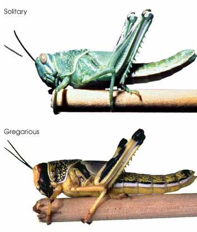
Figure 4.1: Gryllus rufescens is a species of short-horned grasshopper in the family Acrididae whose populations periodically morph into desert locusts (equivalently named Schistocerca gregaria). The change is triggered by environmental conditions and, in addition to morphological changes, it causes drastic changes in the range and coordination of movement of individuals. Photo: Wikimedia Creative Commons.
During data collection, it is never guaranteed that observations of individuals will be representative of the population. Males may be sampled more than females because larger and more aggressive individuals may present themselves more easily for capture. So, the key challenge with using such intrinsic information comes at the prediction stage, where the imbalances of sampling must be redressed by a re-weighting operation according to population structure. Therefore, to compile a prediction about the population’s distribution, we need to have access to independent information about the population’s structure.
For example, let us consider a model fitted to telemetry data from an animal species as a function of some environmental variables \(\mathbf{X}\) and the age \(a=\{0,1,2,3,...\}\) of the animals (an intrinsic variable). For a particular location \(\mathbf{s}\) the model’s prediction of expected usage by animals of age \(a\) is:
\[ \lambda(\mathbf{s},a)=f(\mathbf{X}(\mathbf{s}), a)\]
We can create these predictions for any-and-all age classes in the population. Averaging those age-specific predictions would give us an aggregate prediction of usage. However, a straight average would be inappropriate since not all ages are equally prevalent in the population (e.g., there will usually be fewer very old individuals). To generate population-level predictions, we can create an age-weighted average by using information on the age structure of the population (let’s denote this by some function \(\psi(a)\), giving the proportion of individuals in the \(a^{th}\) age class). The re-weighted prediction would then take the form
\[ \lambda(\mathbf{s})=\sum_{a=0}^{\infty} \lambda(s,a) \psi(a)\]
A SHA model that was structured by sex, age, behavior and condition should ideally have data on the joint distribution of these traits (i.e., be able to first answer a question like: “What is the probability that a randomly chosen individual from the population is a fat male, aged 5 that is currently resting?”).
The importance of such considerations for prediction may be high. Consider, for example, a small population that is increasing because of superabundance of resources. Everything about this population will affect key aspects of its structure. Its age structure will be biased towards young individuals (growing populations typically present this characteristic), there may be more males than in crowded populations (e.g., because the low frequency of agonistic encounters would inflict fewer losses to territorial males), and the activity budgets of population members may present smaller proportions of foraging (due to high-density resources). Any characteristic attributes in the association between younger/well-fed individuals and their habitats may result in noticeable, and not always intuitive responses at the level of population distribution. In our example, even if they have the same size currently, growing populations may distribute themselves very differently to declining ones (Schurr et al., 2012; Barela et al., 2020; Barnett, Ward, & Anderson, 2021).
It is worth noting here that the association between individual traits and species distribution is not causal only in one direction (i.e. traits shaping spatial distribution). Certainly, animals adapt their use of space in accordance with their individual needs and state. Ultimately, the composition of populations and the genotypes of species will depend on the habitats they use (i.e., distribution shaping traits). So, habitat availability will eventually shape animal traits. In the case of plants, the causal direction from environment to functional traits is observed more readily. This requires us to model plant species traits (such as wood density, leaf thickness, flowering patterns) in response to habitat, a question known as the fourth corner problem (Sarker, Reeve, & Matthiopoulos, 2021). These considerations can somewhat blur the boundary between response and explanatory variables, so we will leave them for now.
4.5.2 Dynamic versus static
Attributes like altitude, sea depth, geomorphology and, in many cases, land cover, can be assumed static for the duration of a particular study. In these cases, the expected abundance of the species at a location \(\mathbf{s}\) and time \(t\) is a function of the explanatory variable at the same place, at any time.
\[\lambda(\mathbf{s},t)=f(X(\mathbf{s}))\]
Other variables may be dynamic, but may be conveniently averaged into summary measures (e.g. prevailing wind speed or direction) over a time interval24.
\[\begin{equation} \lambda(\mathbf{s},t)=f(\bar{X}(\mathbf{s})) \tag{4.1} \end{equation}\]
However, this will not necessarily be the case for all relevant features of habitat (Fig. 4.2). For instance, grazing availability (observable as NDVI), prey availability and predator risk are particularly important for understanding the distribution of a study species, but they are likely to change, either annually, seasonally or even diurnally, so that we must model the rate as an explicitly temporal function
\[\lambda(\mathbf{s},t)=f(X(\mathbf{s},t))\]
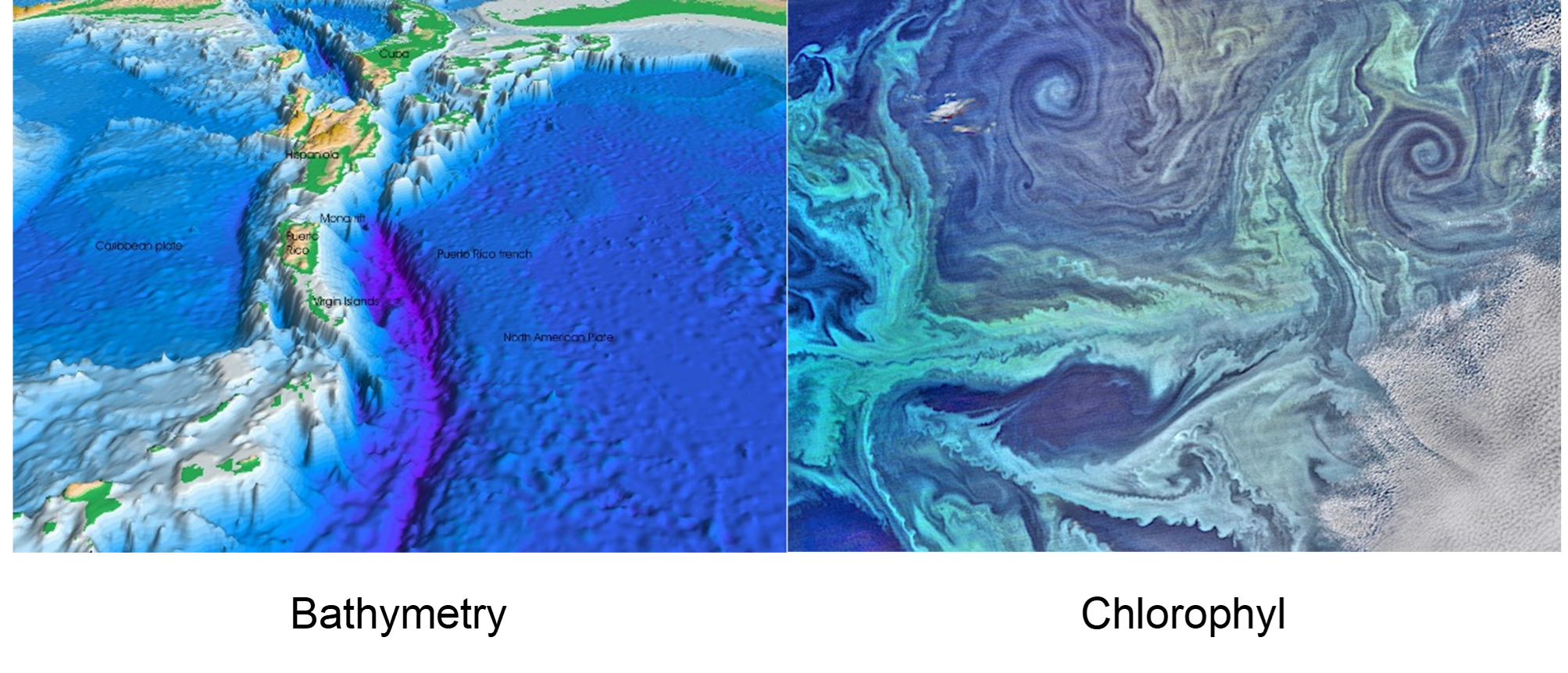
Figure 4.2: Bathymetry (from the Greek “metro” - meaning measuring - and “bathos” - meaning depth) and its terrestrial equivalent hypsometry (“hypsos” - meaning altitude/height/elevation) are probably the first environmental variables to be reliably added to most SDMs. They are more accurately measured than other variables, they are biologically influential for most organisms, and, importantly, they are static in ecological time scales. By comparison, variables such as phytoplankton distribution might be accurately known via remote sensing and might even be more biologically relevant, since many organisms rely more directly on primary production than depth. However, they are less frequently encountered in SDMs because they are dynamic. This trait means that phytoplankton maps must either be averaged into aggregate layers (potentially losing their biological relevance) or treated as successive frames in an animation of synchronous distribution data. Images: Wikipedia Creative Commons.
The immediate inclination of the ecological analyst is to allow such variables to participate in the model in their true dynamic form, for the sake of ecological realism. However, two practical challenges may advocate against such an inclusion.
At the stage of model fitting, use of dynamic variables means that every value of the response data needs to be accompanied by synchronous values of the explanatory variables. “What was the state of the tide, the local temperature and the phytoplankton density at a given location when a given number of seabirds were counted?” This can be a tall order since such dynamic data are almost never available continuously and comprehensively. So, creating the model-fitting data frame for a dynamic SHA may require quite a hefty stage of pre-processing, during which interpolation techniques are used to estimate the value of the explanatory variable in the proximity of the response observation.
At the stage of prediction, we are either required to specify the dynamic models to a particular time frame (e.g. producing a map of species distribution for January 2030), or to combine predictions across a given time period (e.g. annual distribution of species in 2030, obtained by averaging 12 monthly predictions). As well as the higher data requirements, such models may rely on the availability of forecasts for the explanatory variables. These may either not be available (e.g., “What will be the distribution of prey for a focal species in 2030?”), but even if they are, they will come with their own intrinsic uncertainties, posing unique challenges for uncertainty propagation towards the final SDM results.
So, although dynamic explanatory variables are not impossible to include in SHA models, this should be done advisedly, taking into account the hunger of such models for data, and the challenges of pre-processing (either to spatially interpolate or to forecast explanatory data).
4.5.3 Interactive versus non-interactive
In Chapter 1, we considered extensively how ecological dynamics can affect our interpretation of field observations on species distributions. For example, we argued that resources that are depleted by the action of the study species may not be good explanatory variables of its distribution. So it is worth considering if a candidate explanatory variable merely sets the scene25 for the study species or if it is an actor itself.
4.5.4 Local versus neighborhood
Explanatory variables can act in a proximate or lagged fashion. An example frequently encountered in SDMs looks at the distance from a feature, or the delay following an event. In many cases, we are not interested in whether an organism is observed exactly at a feature (such as a road, a river, the coastline, or a human dwelling) but whether its use of space is affected more regionally by that feature. Proximity to the feature, and thus neighborhoods of different size, can be defined in terms of spatial distance or temporal distance.
Once again, here we are aiming for a comprehensive classification, so we distinguish between three broad cases of neighborhood effects, depending on whether the distance is evaluated with reference to a single, multiple, or all points in the map. The covariate layer depicted is some function of distance (e.g. raw distance, inverse distance, minimum distance, average distance or some more sophisticated function such as a kernel). We present these three cases with a selection of examples to make them comprehensible.
Case 1: Distance from single point In the first case, every point in space is evaluated with reference to its distance from a single, influential point (such as the position of the nuclear plant in Fig. 4.3). Hence, the effect on the usage of a point in space will depend on its distance from the influential point of reference.
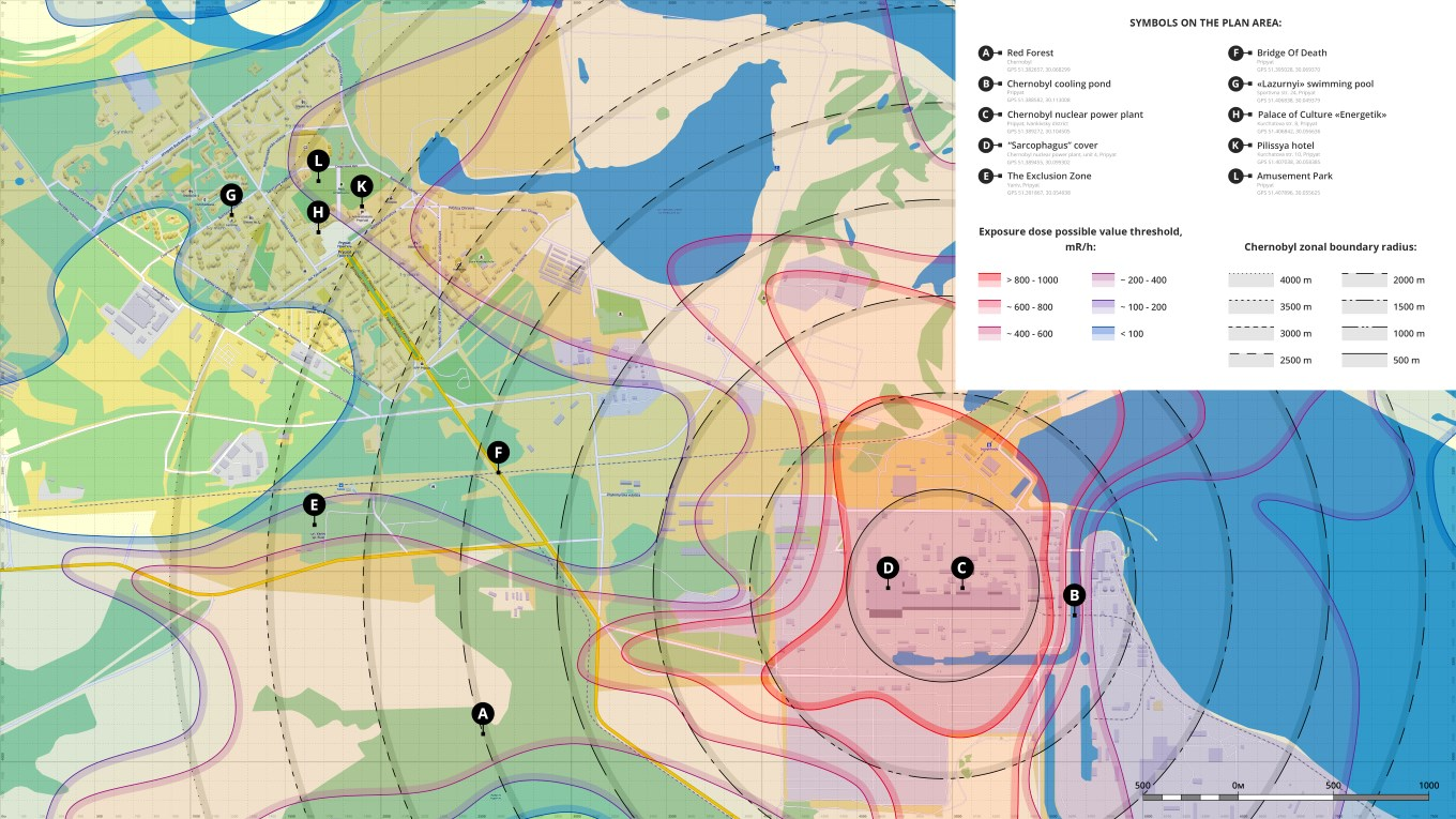
Figure 4.3: Chernobyl and Pripyat radiation exposure intensity (colour contours) and distance (black contours) from the Chernobyl nuclear power station. Note that prevailing winds and geomorphology affected the exposure contours, creating asymmetries compared to the distance contours. Nevertheless, for many applications where we have no direct information on the explanatory variable (here, radiation exposure), the distance-from-point map is a good substitute. Photo: Wikimedia Creative Commons.
Such features can be both attracting and repelling. Patterns of space use by a central-place forager would be affected by the location of its nest (any energy-conserving, risk-averse animal would be reluctant to forage too far from its nest), so it should present a negative relationship with the variable “distance from nest”. Conversely, the use of space of an animal that is intimidated by anthropogenic structures would decrease near these structures. This aversion would yield a positive relationship between usage and “distance from road/city/light or noise pollution”. In general we may write,
\[\lambda(\mathbf{s},t)=f(X(\mathbf{s}-\Delta \mathbf{s},t-\Delta t)),\]
where, the variable \(X\) is calculated as a function of distance (\(\Delta \mathbf s\)) or time lag (\(\Delta t\)).
In the example of radiation exposure (Fig. 4.3), we know (or would like to hypothesize) that radiation levels may be lower further away from the reactor, but we may not have access to the detailed color contours shown there. How can we offer this hypothesis to an SDM? We might postulate that radiation diffuses in the area around the nuclear reactor, so that radiation intensity at any point will depend, not only on how far it is from the reactor, but also how much time has elapsed since the meltdown. Diffusion models have a long tradition in the biological sciences (Okubo, 1980) and could be used to construct an elegant model for \(X\). Indeed, we may choose to integrate time out of this problem as we did in eq. (4.1), to get a proxy of aggregate, or average radiation received over time by a particular location.
To better illustrate the point, let’s first look at a simple example of this distance-based scenario26. Let us consider a central-place forager whose nest is in the middle of a square grid. We can define the grid as an R matrix and calculate Euclidean distances using the coordinates of the rows and columns
d<-101 #Grid cells in each direction
x0<-y0<-round(d/2) # Coordinates of nest
coords<-expand.grid((1:d),(1:d)) # Paired coordinates in grid
dis<-sqrt((coords[,1]-x0)^2+(coords[,2]-y0)^2) #Vector of distances by Pythagoras
dists<-matrix(dis, nrow=d, ncol=d) # Matrix definition
Having created a matrix of distances, we can then go ahead and modify this according to whichever mathematical transformation we want to use. In Figs 4.4a,b,c we show three examples of such transformations.
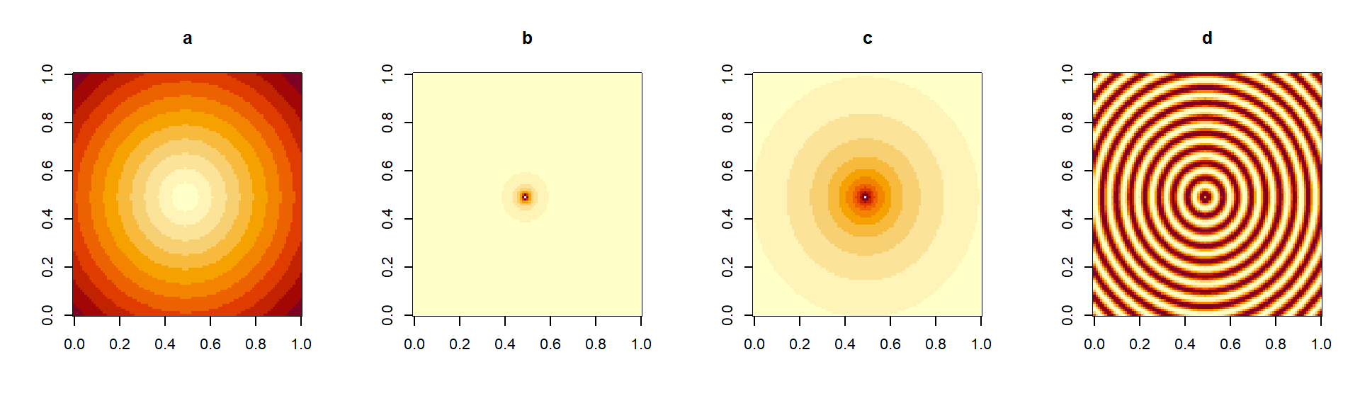
Figure 4.4: Simple transformations of a square distance matrix. In (a), the untransformed distances from the center (large values in dark, small values in light colors). In (b), the inverse distance (\(1/d\)), tending to zero away from the center. In (c) \(1/d^{0.01}\), presenting a slower decay away from the center. In (d), a periodic function of distance (\(sin(d)\)) producing a ripple effect.
There are also several raster-based libraries for generating distances in R. In Fig. 4.5 we show two applications of a distance operation via the command gridDistance. In Fig. 4.5a, we show calculated distances along a regular grid. These distances are approximate, based on the repeated application of a 3x3 mask of distances to local cells in the raster. The approximate nature of the calculations gives rise to the hexagonal appearance of the color bands (compare with the more exact distance calculation of Fig. 4.4. However, paying this price (of approximation) enables us to calculate other measures of distance, such as the ones shown in Fig. 4.5b. In this example, we have introduced a vertical wall on the left side of the arena. The central place forager needs to circumnavigate that obstacle to reach cells behind the wall, which increases the effective distance of those obscured (or “shaded”) cells from the center of the raster.
d<-101 #Grid cells in each direction
x0<-y0<-round(d/2) # Coordinates of nest
m1<-matrix(1, d, d) # Square arena
m1[x0,y0]<-2 # Characteristic value for nest
m1[35:40,10:90]<-0 # Introduction of obstacle

# Creation of the raster
dat1<-list("x"=seq(0,d,len=d),
           "y"=seq(0,d,len=d),
           "z"=m1)
r1<-raster(dat1)

d1<-gridDistance(r1,origin=2) # Obstacle is permeable
## Loading required namespace: igraphd2<-gridDistance(r1,origin=2, omit=0) # Obstacle is impermeable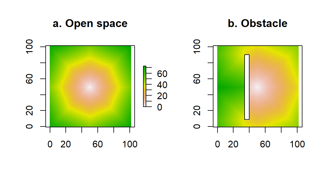
Figure 4.5: Calculation of distance from the center of a raster, via the command gridDistance. In (a), the accessibility of points is unobstructed, whereas in (b) we have introduced an obstacle to movement.
Case 2: Distance from several points
In many physical scenarios we are interested in the distance of any given point in the map from entire shapes (e.g., coastlines or other isopleths, rivers), linear structures (e.g., fences, roads), boundaries around structures (e.g., designated parks, wind turbine complexes), or complex networks of scattered points (e.g. a set of colonies, food patches, small water bodies). In these cases, every point on the map will have multiple distances, from every point on the shape of interest. In order to assign a single value to each point in the map, we need to somehow summarize all these distances into a single value. Typical choices of summaries are the minimum or the average. We can, for instance, consider the minimum distance of a point from water (i.e., coastlines, river networks and lakes) or we could consider the average distance of a point from all nearby human dwellings (e.g. within a 1km radius). The example in Fig. 4.6 illustrates the use of the gridDistance() function in determining minimum distances from a structure. A more interesting illustration of this idea, generated by cartographer Joshua Stevens is shown in Fig. 4.7.
 d3<-gridDistance(r1,origin=0)
 plot(d3, main="Coastline distance")
 polygon(c(34,40,40,34),c(9,9,90,90))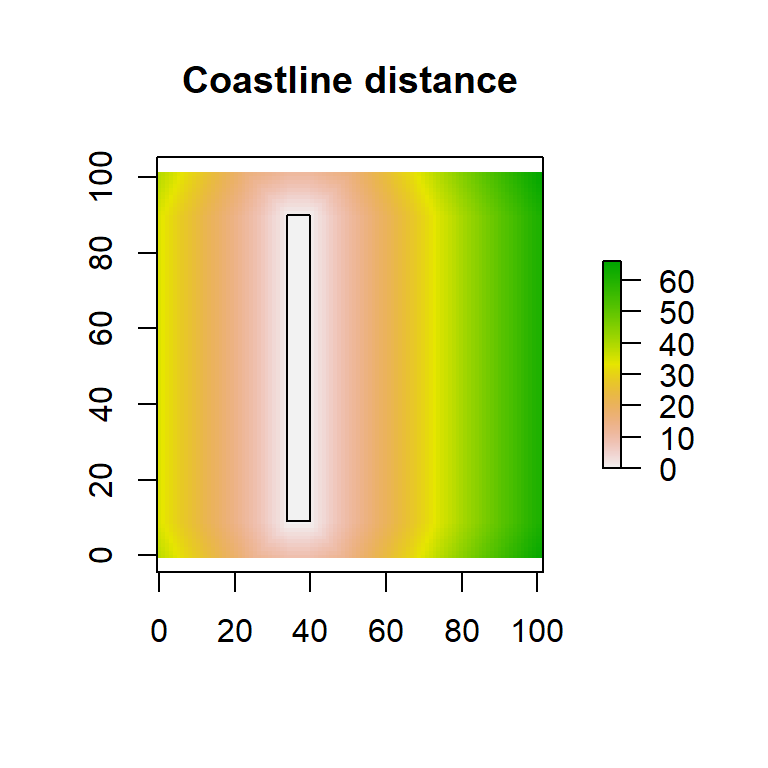
Figure 4.6: Distance from a linear feature. The same rectangular island previously used as an obstacle is now used as the origin. Every point on the rectangular “coast” is considered in combination with every other point on the plane and the minimum distance to the island is plotted.
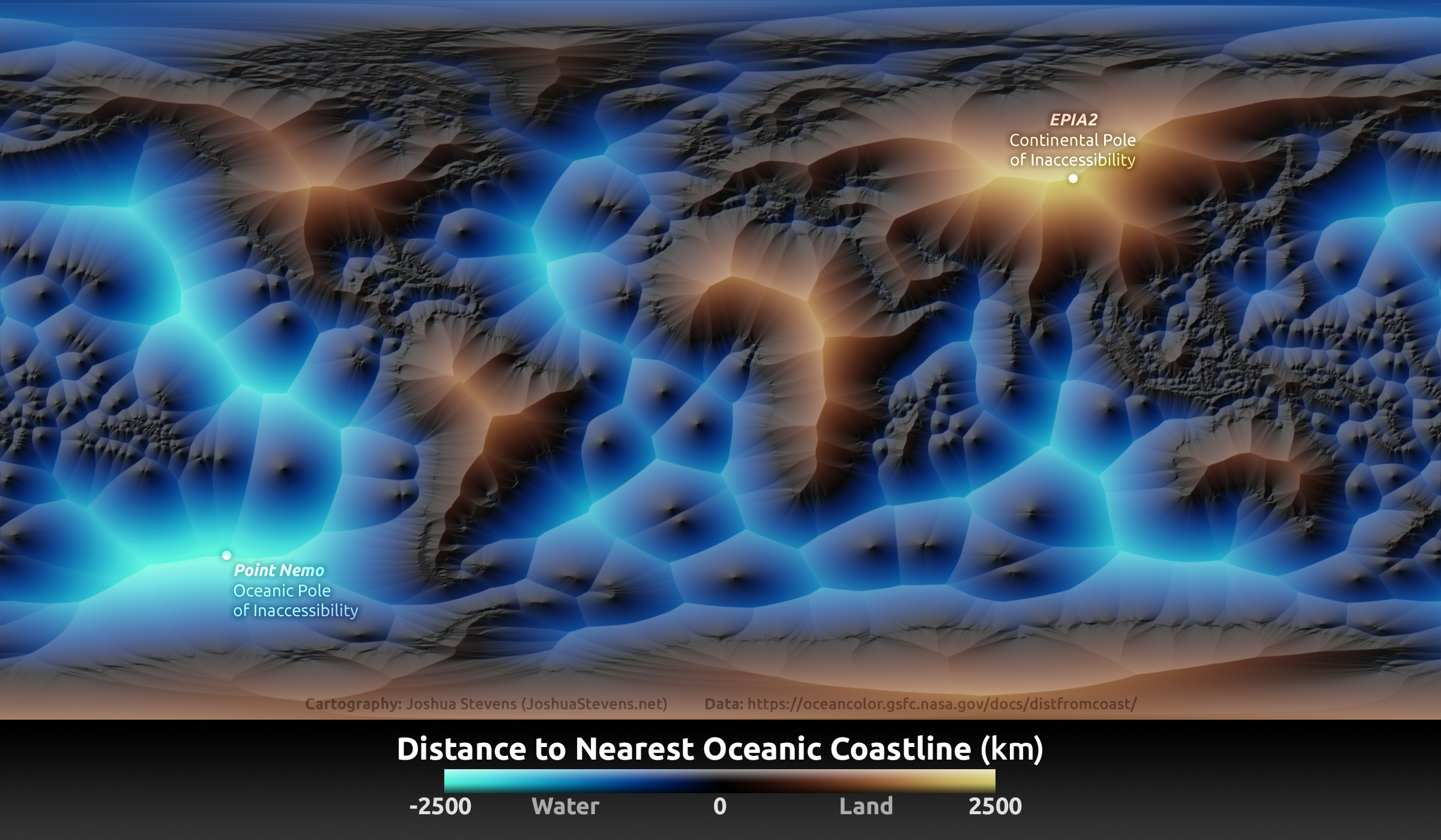
Figure 4.7: Nearest distance to coast shown with the aid of color and relief. The points most remote to the shore (at land and at sea) are indicated (oceanic and continental poles of inaccessibility). Photo: Joshua Stevens (https://www.joshuastevens.net/blog/mapping-the-distance-to-the-nearest-coastline/).
Case 3: Distance from all points The nuclear power-plant example in Fig. 4.3 is a good (if grim) metaphor for thinking about the influence of a single point on the space around it. Other examples might include plumes of pollen emanating from a plant or the density of foraging activity around a colony of bees, bats, seabirds or seals. We can generalize this concept of “influence” to all the points on the map. The idea is the following: Each point \(\mathbf{s}_j\) can potentially affect every other point \(\mathbf{s}_i\). Let us call that influence \(U_{i\rightarrow j}\). This function generalizes to the point itself so that we can also consider \(U_{i\rightarrow i}\). What does this self-impact mean physically? Simply, that there will always be some radiation reading at the exact location of the Chernobyl reactor, that there is almost certainly some pollen right on-top of a pollinating tree and that some colony members will, at any time, be located at the colony itself.
The magnitude \(U_{i\rightarrow j}\) of the influence will depend on two quantities. First, some measure \(I_i\) of how influential the \(i^{th}\) point is at-the-source. In the three examples we have been using, this would be the total radiation released by the Chernobyl explosion, the total amount of pollen produced by the plant and the total number of colony members. Since different sources will not have the same overall intensity, it is useful to distinguish between them. The second quantity, will be generated by a function \(K_{i\rightarrow j}\) describing how amenable the \(j^th\) point is to be influenced from the location of the \(i^{th}\) point. This function we will call a kernel, and express it in terms of the distance \(d(\mathbf{s}_i,\mathbf{s}_j)\) between the source and the receiver of influence. In the simplest scenario, a kernel is a function of straight-line (i.e., Euclidean) distance. In more sophisticate scenarios (as was the dynamic, non-isotropic diffusion contours in the Chernobyl reactor), we might also consider a kernel that depends on elapsed time, or asymmetry-inducing forces, such as wind fields or sea currents. These more elaborate scenarios can be tackled by merely redefining the measure of distance between two points so, to keep things simple without losing generality, you can think of \(d(\mathbf{s}_i,\mathbf{s}_j)\) as the Euclidean distance in space.
A simple, but extensively used mathematical model for a kernel is the Gaussian model
\[K(d)=K_0exp(-\kappa d^2).\]
Here, the crucial coefficient is \(\kappa\), which determines how far-reaching the influence of the source point is (large values of \(\kappa\) give a steep exponential decay and therefore result in very localized influence). The coefficient \(K_0\) ensures that the total volume under the surface \(K\) integrates to one27.
Putting, everything we have so far together we get the following expression for the influence received by point \(\mathbf{s}_j\) from point \(\mathbf{s}_i\):
\[U_{i\rightarrow j}=I_iK(d(\mathbf{s}_i,\mathbf{s}_j))\] Now, of course, point \(\mathbf{s}_j\) is not just influenced by a single point \(\mathbf{s}_i\), but from every point \(\mathbf{s}_i\). The total influence it receives is
\[U(\mathbf{s}_j)=\sum_{All\ i} I_iK(d(\mathbf{s}_i,\mathbf{s}_j))\] This operation is known as kernel smoothing because it takes an initial surface \(I\) and smooths (or smudges, or blurs) it into a new surface \(U\). When the kernel is a Gaussian function, then the operation is known as a Gaussian blur (see Fig. 4.8). How does all this relate to constructing biologically useful covariates for SDMs?
Consider, for example, the effect of primary production on an apex predator such as a dolphin, a tuna, a bull shark or a seabird. None of these animals feeds directly on phytoplankton and yet, it is certain that they are indirectly affected, as energy percolates through the marine food web. This process of energy flow takes time, and as the species concerned move across the seas, they are almost certainly consumed by their predators at a different place from which they consumed plankton. Hence, a model of the distribution of krill, might show a closer association with plankton in space and time, than a model of the distribution of an apex predator. As the energy of plankton travels through the food web, driven by the forcing of sea currents, its impact on the predators may be felt at another place and time in the future.

Figure 4.8: The blurring operation in this figure (implemented by a filter called Gaussian Blur) is a good metaphor for neighborhood effects. As the range of influence of each point in the map increases, the combined effects of multiple neighboring points have the effect of blurring the sharpness of the colors. A process of diffusion over time can also be imagined by thinking of the three frames in the picture as time frames of increasing lag from the starting instant. Photo: Photo: Wikimedia Creative Commons.
4.6 Data scales and missing data
The discussion related to smoothing in the previous section opens up the wider topic of density estimation. The general issue we want to consider in this section is how best to deal with deficiencies in the explanatory data28. We will think of two types of deficiencies, limited sample size and observation error. Our illustrations will use the standard data layer of altitudes available in R named volcano which comes as a matrix (Fig. 4.9a). We will artificially damage this complete and precise data layer. First, we will assume that the spatial coverage of our sampling is partial. We will do this by taking a random subset of points uniformly from space. These points will be treated as the locations of sampling stations, or alternatively, the visible areas from a satellite on a cloudy day (Fig. 4.9b). Second, we will assume that, in addition to the gaps, the data contain errors. There are many mechanisms that could corrupt the data in this way. For example, the instruments used for measurement (e.g. handheld instrument, or satellite remote sensors) may be imprecise. Alternatively, the variable being measured may be intrinsically stochastic, so that replicate measurements are needed to summarize it. In our example, we will assume that the standard deviation of observation error scales with the underlying mean value (Fig. 4.9c).
# Recording dimensions of true covariate layer
zmin<-min(volcano)
zmax<-max(volcano)
xmax<-dim(volcano)[1]
ymax<-dim(volcano)[2]

# Creating data set with gaps
n<-500 #Number of sampling locations
# Random placement of locations
allCells<-expand.grid(1:xmax,1:ymax) #Coordinates of all map cells
si<-sample(1:nrow(allCells), n, replace=F) # A sample of cells
sx<-allCells[si,1]
sy<-allCells[si,2]
vol1<-volcano*0 # Creating empty data layer
vol1[cbind(sx,sy)]<-volcano[cbind(sx,sy)] #Reading values at sampling locations

# Creating data set with gaps and errors
vol2<-vol1 # Copying layer with gaps
# Adding normal errors
vol2[cbind(sx,sy)]<-vol2[cbind(sx,sy)]+rnorm(n,0,20)
So, the task of density estimation is to retrieve the picture in Fig. 4.9a from the data in Figs 4.9b and c. In the case of Fig. 4.9b, this is just-about-possible by squinting really hard when you look at the picture, but quite a bit harder in the case of Fig. 4.9c. There is an easy way to improve coverage of space at the same time as achieving an element of error correction, by simply plotting the data in a coarser scale. We will do this here with simple base-R operations, but (as always with these operations) there are efficient methods for adjusting the resolution when working with rasters. We will introduce the down-scaling factor sc which will determine how many of the original cells need to fit inside each new (larger) cell. Based on that scalar, we define the new limits of the map (Step 1) and the coordinates of the new cells (Step 2). The new maps are generated by binning the high resolution values into this coarser map and averaging replicate values falling inside the down-scaled cells (Step 3).
sc<-10 # Down-scaling factor for new map

# Step 1: New map maxima (nunber of coarser cells)
xmaxN<-ceiling(xmax/sc) # New xmax
ymaxN<-ceiling(ymax/sc) # New ymax

# Step 2: New coordinates of original sampling stations
sxN<-ceiling(sx/sc) # New x coords
syN<-ceiling(sy/sc) # New y coords

# Step 3: New maps generated by binning and averaging in new, coarser resolution
vol1N<-tapply(vol1[cbind(sx,sy)], list(sxN, syN), mean)
vol2N<-tapply(vol2[cbind(sx,sy)], list(sxN, syN), mean)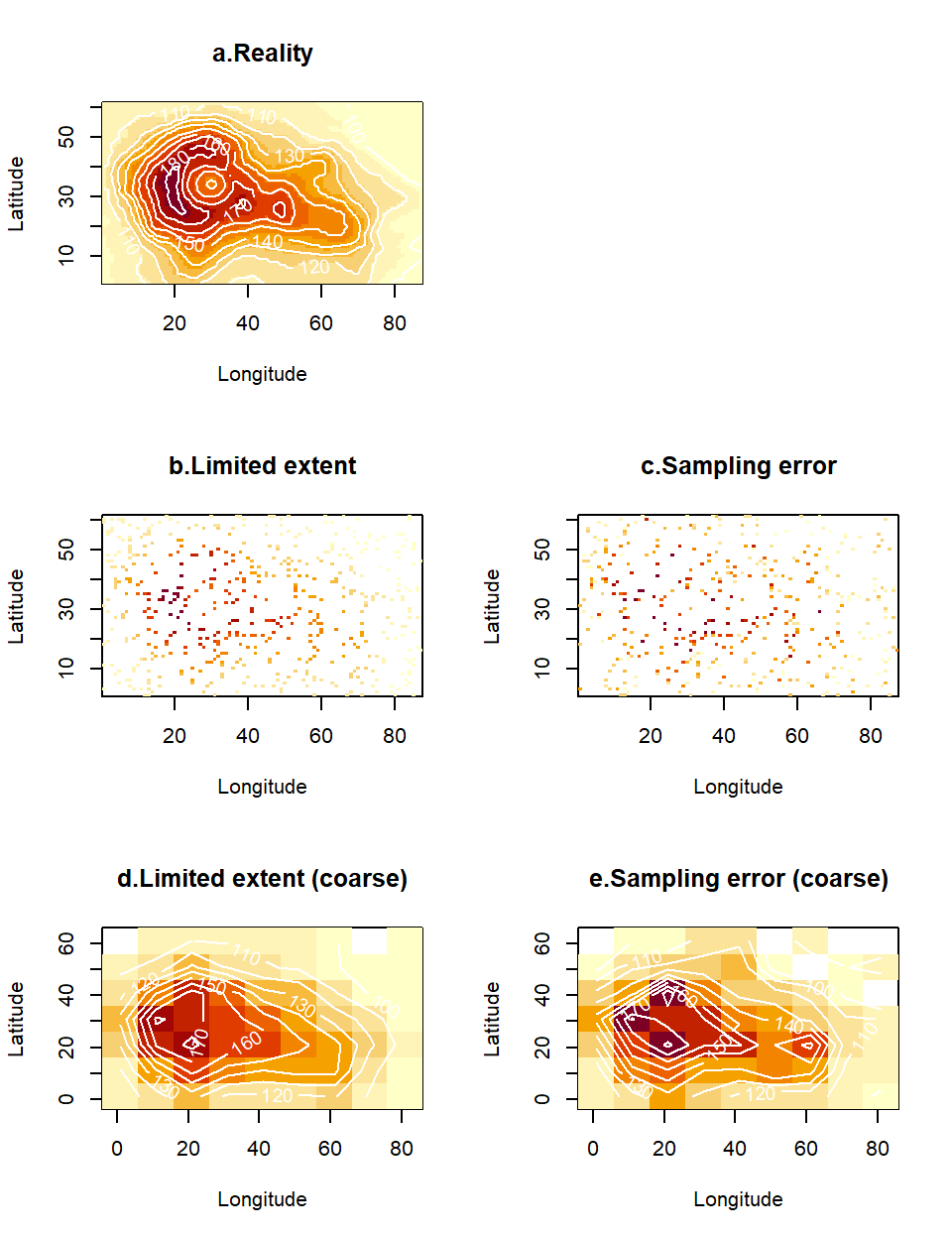
Figure 4.9: A spatial layer for an environmental variable (a) may be corrupted by imperfect sampling. We consider two such imperfections. First, the data collection may only have covered a subset of G-space (b), hence presenting multiple gaps between the data. Alternatively, (or simultaneously, as in c), the data may contain errors, either because the measurements are imprecise, or because the true variable is stochastic and not enough replicates have been taken to remove the effect of such stochasticity in the data plotted on the map. Binning these data in a coarser grid and averaging any observations that happen to fall together inside the new (larger) cells leads to plots (d) and (e), correspondingly for the data sets without and with observation error.
This operation has some rather spectacular results. The sparse data in Fig. 4.9b, (representing 9% of the cells in the original map), has given rise to a shape (Fig. 4.9d) that reconstructs the original map reasonably well - at least requiring less squinting from you! More impressively, the even more heavily corrupted data in Fig. 4.9c (containing observation errors), have been tortured into confessing a pattern (Fig. 4.9e) vaguely reminiscent of the truth. What the human eye could not reconstruct was accomplished via two fairly commonplace operations:
Binning: The aggregation of cells into larger units via a scaling operator increased the chance that, at least one observation fell in each new larger cell, hence achieving better coverage of space with color. This countered the effect of observation gaps.
Averaging: The combination of replicate values via an estimator (the average) resulted in less pronounced stochastic variations in the map. This countered the effect of observation errors.
Let’s formalize what we have done in symbols. First, the binning operation. We defined a unit region (a square cell) as all the points in the neighbourhood of a position \((x_i,y_i)\). The \(i^{th}\) cell is therefore defined as follows: \(C_i=(x_i-\Delta x,x_i+\Delta x]\times(y_i-\Delta y,y_i+\Delta y]\). We collected all the observations of altitude (say \(H\)) in that cell. The vector of observations in the \(i^{th}\) cell (say \(\mathbf{H}_i\)) is the subset of all observations located in the cell (\(\mathbf{H}_i=\{ H_j \ \forall\ j\ s.t. (x_j,y_j) \in C_i\}\)). Let’s denote the number of observations in \(\mathbf{H}_i\) by \(n_i\).
We can we then, think about the averaging operation. The new value (i.e. the estimate) represented in the \(i^{th}\) cell is:
\[\begin{equation} \hat{H}_i=\frac{1}{n_i}\sum_{j=1}^{n_i}H_j \tag{4.2} \end{equation}\]
Of course, the benefits of this form of space-filling and error-correction are not cost-free. They have involved two penalties. First, there is information loss. We have lost resolution, and by representing several observations by their average, we have lost information on how variable the observations were within each cell. In particular averaging observations in the data set that contained no observation error has led to diminished variation, where extreme (very high or very low) observations are replaced by less pronounced values. Second, the value of sc was chosen (via a process of trial-and-error, not shown above) until we achieved continuity without losing too much of the fine detail in the maps. This was a subjective decision, that could be challenged as arbitrary. We will discuss methods that achieve reconstruction of the underlying surface more objectively, while preserving resolution and information. However, first, we need to introduce the important concept of autocorrelation.
4.7 Autocorrelation, a spatial modeller’s best friend
If “auto” means self and correlation measures similarity, autocorrelation must imply a statistical measure of self-similarity. But what is being correlated with what? Informally, we compare an observation with a temporally lagged or spatially shifted version of itself. Given a measure of distance between two points (in space, but also in time), the concept of positive autocorrelation expresses the notion that everywhere can be similar to everywhere else, but nearby places (or times) are more likely to be similar than faraway ones.29 That is not to say that abrupt changes do not exist in the natural world, but that they are rare (metaphorically speaking, environmental variables are more often characterized by smoothly undulating hills, than precipitous grand canyons).
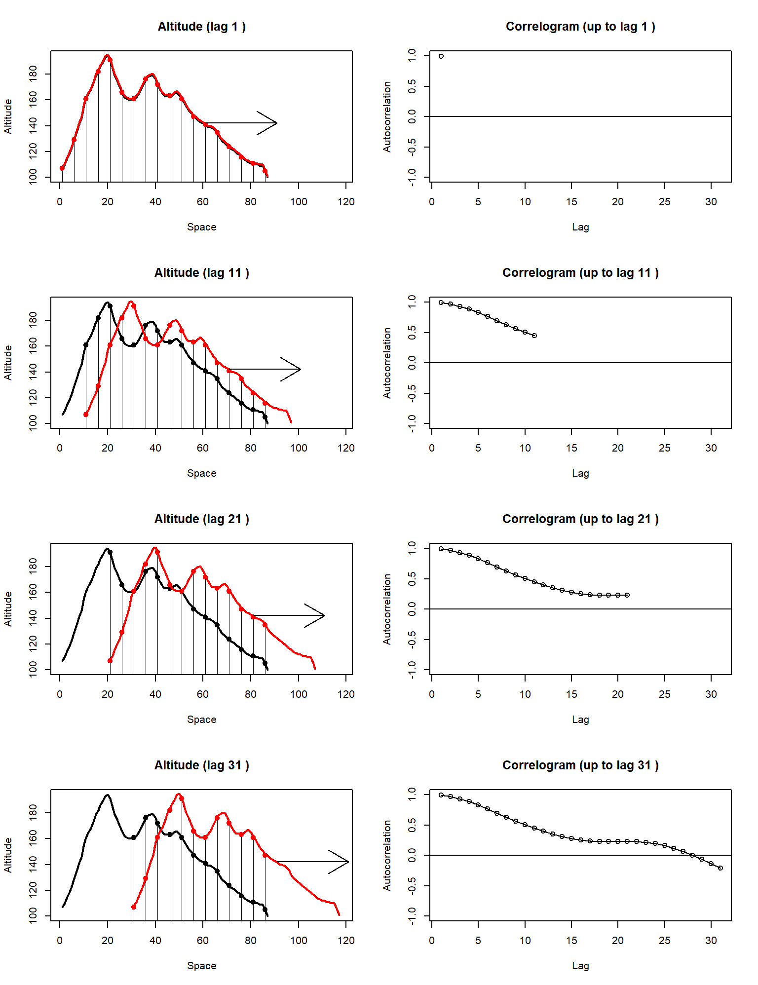
Figure 4.10: Shown on the left-hand panels are the correspondences between a curve (in black) and a copy of itself (in red), shifted at ever-increasing lags. Shown on the right-hand panels are the pairwise Pearson correlation coefficients calculated from each correspondence, at each lag.
We can make the concept of spatial autocorrelation more tangible with a simple experiment in one-dimensional G-space. The black curve on the left-hand panels of Fig. 4.10 is a cross-section from the middle of the volcano altitude data layer (the volcano’s crater is the dip seen between points 20 and 40 on the x-axis). The red curves in the left hand plots are exact replicas of the black curves, but they are shifted to the right, at ever increasing lags. Every time we re-position the red curves, we pair up the corresponding black and red points in the region where the curves overlap, and we calculate a simple Pearson correlation. The right-hand plots show the correlation coefficients calculated in this way, at different lags between the two curves. The correlation, calculated in this way, is called autocorrelation, and the plot of autocorrelation against lag is known as a correlogram. The correlograms on the right-hand column of Fig. 4.10 raise four interesting points:
The left-most point of the correlogram is always 1.
As lag increases, the correlogram decreases because points further apart on the volcano need not have the same altitude.
The correlogram does not need to decrease monotonically (it can go up as well as down), and it can even take negative values.
Of the above observations, the mechanism generating point 1 is obvious. We have maximum autocorrelation on the left because we are correlating a curve with an exact (minimally shifted) copy of itself. Point 3 is more interesting. Negative autocorrelations at larger lags can be the result of spurious relationships. In our example, as we shift the red version of the volcano to the right, eventually we end up correlating the western incline of the mountain with the eastern decline. These are sloped in opposite directions, giving us overall negative values in the correlogram30. However, point 2 is of most interest for our discussion here. Although it is not profound that autocorrelation should tend to decrease in intermediate lags, the rate at which it drops away from 1, is vitally important for describing a landscape. If autocorrelation decays slowly towards zero, that means that similarity is preserved even for relatively large lags, and therefore the landscape is not changing very abruptly. Conversely, if autocorrelation collapses from 1 to a small value within a couple of lags, that implies a highly variable environment (in essence, taking a couple of steps away from your current position, places you in a totally different environment). Hence, environmental layers with high autocorrelation are our proverbial “undulating hills” whereas low-autocorrelation layers are our “precipitous grand canyons”.
The idea of autocorrelation certainly extends to more than one dimension. For spatial layers, such as the volcano altitude example, it is perhaps a little hard to imagine a shifting landscape since there are many directions in which a landscape can me moved in relation to itself. The algorithms for calculating autocorrelation in these cases involve looking at pairwise combinations of points in the landscape, recording their distances and estimating correlations between pairwise samples that are characterized by similar distances (lags). Spatial correlograms can be found in the package ncf via the function correlog(). Fig. 4.11 is an illustration of the correlog() function using the full volcano layer (instead of just a one-dimensional cross-section from it). The function uses a lag increment (here, set to 2) to decide on the width of the distance bins into which pairs of points will be organized. The re-sampling option (here set to zero, to reduce computation) is used to evaluate significant variations of the correlation from zero (to help the user filter out spurious correlations). Here, we have simply truncated the plot at distances greater than 60, to avoid plotting such spurious correlations.
x<-seq(1,xmax,2) # x coordinates at steps of 2
y<-seq(1,ymax,2) # y coordinates at steps of 2
coords<-expand.grid(x,y) # combinations of coordinates

# Calculation and plot of correlogram for altitude at the predefined coordinates.
xi<-coords[,1]
yi<-coords[,2]
zi<-volcano[cbind(xi,yi)]
co<-correlog(xi,yi,zi, increment=2, resamp=0)
plot(co, xlim=c(0,60), ylim=c(-1,1), main="Correlogram for volcano data")
abline(0,0)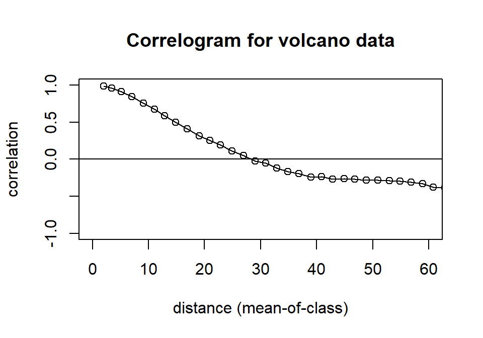
Figure 4.11: Correlogram of the volcano data set.
So, what is the role of autocorrelation in spatial modeling? Quite simply, it is the most central and useful concept for spatially-explicit analyses. In fact, the phrase “spatially-explicit analysis”, can be thought of as an abbreviation for “analysis relying on spatial autocorrelation”31. In Section 4.6 we introduced the problem of incomplete spatial coverage and observation stochasticity (due to inherent variability or measurement error). In the next two sections we will examine how the idea of autocorrelation can be used to interpolate between data and to reduce (smooth out) the amount of error in the final results. The skill required of you, as the reader of the next three sections will be to identify where autocorrelation is hiding in the methods introduced, and how it is being employed.
4.8 Estimation by weighted average
The property of positive autocorrelation was employed to great effect in the binning and subsequent averaging operation implemented in eq. (4.2). We were effectively generating an estimate of altitude for the center-point of the square cell from measurements in the neighborhood of that center-point. The average is a well recognized and widely used statistical estimator. Using only neighboring points to generate the estimate is where the assumption of positive autocorrelation is hiding: We are using proximity to determine what is relevant and what is not. Perhaps you can see that binning and averaging has two shortcomings. First, by setting the size of the square cell, we arbitrarily decided what the appropriate “scale of relevance” was. Second, by simply averaging all observations in the cell, we have implicitly assumed that all observations inside the cell are equally relevant and all observations outside the cell are totally irrelevant. This is obviously not true, since there is nothing magical about the scale of the grid that we arbitrarily selected. There is a solution that takes care of both of these problems simultaneously. It involves creating our estimate from all observations in the data, but weighting their influence on the estimate according to their relevance.
\[\begin{equation} \hat{H}_i=\sum_{j=1}^nw_{ij}H_j, \tag{4.3} \end{equation}\]
where \(n\) is the total number of observations in the spatial data set and \(w_{ij}\) is the weight associated with the \(j^{th}\) observation when attempting to estimate the variable for the \(i^th\) point in a prediction grid32. Here, “relevance” is a function of distance. By the assumption of positive spatial autocorrelation, we would expect close-by observations to be more informative (relevant) to the point being estimated and far-away observations to be less relevant. The rate at which relevance and the weights in the above equation decay with distance must therefore be written as some function of the spatial autocorrelation characterizing the landscape. There are different ways of achieving this. In the next two sections, we will examine two, the variogram and the variance of a kernel. Furthermore, an interesting question arises when we consider the special scenario of a prediction point coinciding with an observation point. In other words, if we are generating an estimate for a position where we also have an observation, do we believe that our estimate should be identical to the observation, implying that there is no intrinsic error or variability in such a measurement? If we do, then we want our space-filling surface to go directly through the cloud of measurements, an operation that we will call interpolation. Alternatively, if we permit some mobility around the observations (presumably because our variable is stochastic or our observations imprecise), then we are in the realm of an operation called smoothing. We will examine those in more detail below.
4.9 Interpolation by Kriging
The very general method of Kriging is a cornerstone of the branch of geostatistics (an area of statistics that was developed around mining exploration, initially). Estimation by Kriging is based on the weighted average operation of eq. (4.3), and the way that it calculates the weights is based on a curve, called the variogram. The variogram is not too dissimilar, as a concept, to the correlogram because it also measures similarity of points at increasing distances. Consider a point \(\mathbf s_i\) in space that has a corresponding value \(H_i\) for the random variable of interest. In order to produce an estimate \(\hat H_i\) via weighted averaging of the values \(H_j\) at proximate locations, we want to quantify the gradual decay of relevance of all our observation points at increasing distances from \(\mathbf s_i\). Kriging does this by first learning from the relationships between available observations. To organize our presentation, we focus on rings of non-zero thickness33 around an observation at \(\mathbf s_i\) (see Fig. 4.12).
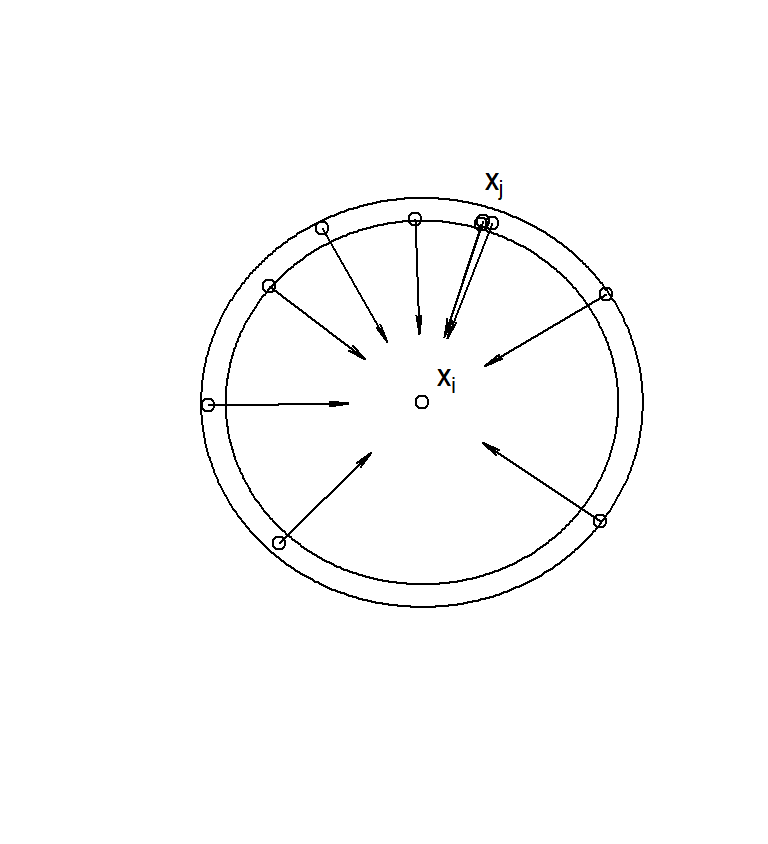
Figure 4.12: To construct the variogram for a particular landscape we need to begin by considering a point of interest (in the center of the plot). Each annulus of given thickness around this point may contain a number of observations. To determine the relevance of these observations (and hence the relevance of any observation at that particular distance, we can look at variance of these measurements from the true value at the focal point.
We therefore select the subset of data points whose distance from \(\mathbf s_i\) is in some range \((r,r+\Delta r]\) (note that this is essentially a bin in polar coordinates). The relevance of those points can be defined as their variance from the value \(H_i\), at \(\mathbf s_i\)
\[\text{var}(\mathbf s_i, \mathbf s_j)=\frac{1}{n_r}\sum (H_i-H_j)^2,\]
where \(n_r\) is the total number of observation points found in the annulus defined by \((r,r+\Delta r]\) (ten points in the illustration of Fig. 4.12). Here, we make the assumption that the process is isotropic, meaning that points within the annulus have the same relevance, no matter in which direction they are, in relation to the central point. This process can be repeated for all annuli around the observation \(H_i\) and then repeated for every observation, in relation to all other observations. Each time we view a particular annulus of radius \(r\) around a particular observation, we obtain a value of \(\text{var}(\mathbf s_i, \mathbf s_j)\), which we can plot on the axes of \(r\) and \(\text{var}(r)\). Plotting all those values together gives us a scatterplot called the empirical variogram. In Fig. 4.13, we generate a tidier version of that scatterplot by combining the variances obtained for each distance band. If you want to see the full scatterplot of variances calculated from the perspective of each data point, simply switch on the option cloud=TRUE in the variogram function from the package gstat. The quantity usually plotted on the y-axis, is called the semivariance, defined as \(\gamma(r)=\frac {1}{2}\text {var}(r)\).
# Construction of volcano data frame from error-free sample
dat<-data.frame("x"=sx,"y"=sy,"H"=vol1[cbind(sx,sy)])
# Conversion of data frame to spatial object
coordinates(dat)= ~ x+y
# Calculation of the variogram
vg<-variogram(H~1, data=dat, cutoff=60, width=1)
# Use the following instead, if you want to see the detailed cloud of calculated variances
# vg<-variogram(H~1, data=dat, cutoff=60, width=2, cloud=TRUE)

# Fitting a variogram curve to the cloud
fit.vg<-fit.variogram(vg, model=vgm(model="Sph"))

# Visualisation
# The following is the easy way to plot the empirical and model fitted variograms

# plot(vg, xlab="Distance", model=fit.vg)

# However, we wanted to have more control over the graph output
# So we extract and plot the raw values from the fit.vg object

fittedValues<-variogramLine(fit.vg, maxdist=60, n = 60)

par(bg="white")
plot(vg$dist, vg$gamma, xlab="Distance",ylab="Semivariance")
lines(fittedValues, lwd=2)

# Creation of inset
par(fig = c(0.4,.98, 0.05, .8), new = T)
image(xl,yl,vol1, zlim=c(zmin,zmax), axes=F, frame=T, ylab=NA, xlab=NA)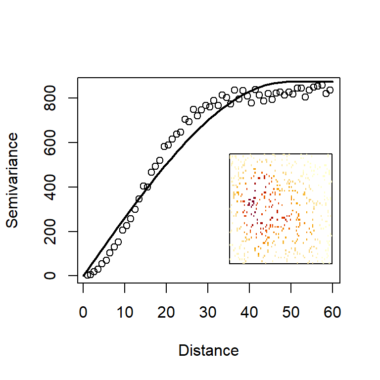
Figure 4.13: The empirical and model variograms derived from the volcano data set. Inset is a reminder of the data being used to construct these variograms.
We have taken one step further by fitting and plotting a model variogram to the points (the curve in Fig. 4.13). We have a selected a so-called spherical model because it has a suitably asymptotic shape that followed the characteristics of our empirical semivariogram well. However, there is a wealth of pre-implemented models in gstat (just type vgm() for a list of all available models). There are three observations we can make about the shape of this curve.
Increasing variogram: As distance from the focal point increases, the variance does too. This means that, the further away we go, the more uncertain we become about the value of the focal point. Further-away points are less relevant to and informative about the value at the focal point.
Variogram intercept on left-hand-side: In geostatistical terminology, the intercept of the variogram is called the nugget. We can see that the empirical and model variograms in Fig. 4.13) both start from zero. This implies that an observation made at the focal point contains no uncertainty about the variable’s true value at that location. This is a key, desirable characteristic of interpolation. However, the variogram need not have a zero intercept. If we suspect that there is some variability, even at zero distances, we can change the nugget to a non-zero value.
Variogram plateau on right-hand-side: In geostatistical terminology, the asymptote of the variogram is called a sill. But why should the variance present an asymptote as distance increases? Strictly speaking, it need not have this property, unless the landscape is what statisticians might call stationary. Imagine a landscape seen at very large scale and summarised by a histogram of altitudes. Plotted for the entire landscape, this histogram presents the overall variability of altitudes. Now imagine that we cut out a circular region from that landscape. How large does the circle need to be before we get a good approximation of altitudes in the entire landscape? In stationary landscapes a large enough cirular region will achieve a good approximation of the overall landscape. In non-stationary landscapes the statistical composition of altitudes changes from one region to the next and the variogram keeps on increasing as new parts of the landscape present us with new information at ever-increasing distances.
Kriging uses the properties of the variogram model to assign weights to observations at different distances. So, having estimated the variogram parameters from the similarity between observations and other observations, Kriging can go on to make predictions about points where no observations have been made. That is how we can “fill” space by an interpolation methods, such as this. The word “fill” is in inverted commas because, of course, we cannot possibly make predictions about every point in space, just about points on a regular grid with a sufficiently fine resolution to give us detailed plots. There are two ways to generate kriging predictions in gstat. Either by using the command predict which requires some manipulation of gstat objects, or by using the wrapper function krige. We will follow the latter approach here. The options provided to krige below are the simplest possible, and collectively, they are known as ordinary kriging. We prepare the prediction data frame datPred which comprises the centrepoints of cells in our regular grid. The resulting kriging object contains information for the mean prediction var1.pred (in our example, the complete map of interpolated altitude for the volcano), as well as a map of associated variances for the predictions in all cells var1.var.
# Construction of prediction data frame
datPred<-data.frame("x"=allCells[,1],"y"=allCells[,2])
# Conversion to spatial data frame
coordinates(datPred) <- ~ x + y
# Application of kriging
H.kriged <- krige(H ~ 1, locations=dat, datPred, model=fit.vg)
## [using ordinary kriging]H.kriged ## class : SpatialPointsDataFrame
## features : 5307
## extent : 1, 87, 1, 61 (xmin, xmax, ymin, ymax)
## crs : NA
## variables : 2
## names : var1.pred, var1.var
## min values : 93.9999999999999, -1.70530256582424e-12
## max values : 193, 162.677743822435We can plot the spatial predictions from this kriging objects very quickly using a spatial object plot (Fig. 4.14b). The interpolated object also contains a map of estimation variances (Fig. 4.14c). Note that these fluctuate in space depending on how close a prediction point is to the location of sampling stations (where altituse is assumed to be known without error).
volci<-data.frame("x"=allCells[,1],"y"=allCells[,2], "H"=volcano[as.matrix(allCells)])
coordinates(volci)<- ~ x+y
p1<-spplot(volci, cuts=20, colorkey=TRUE, main="a. Truth")
p2<-spplot(H.kriged["var1.pred"], cuts=20, colorkey=TRUE, main="b. Interpolated altitude")
p3<-spplot(H.kriged["var1.var"], cuts=20, colorkey=TRUE, main="c. Variance of estimate")
# The plots produced by spplot are trellis plots (library lattice) so
# we use grid.arrange to combine them
grid.arrange(p1,p2,p3, ncol=3)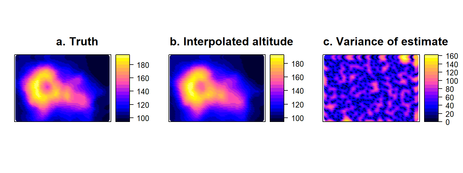
Figure 4.14: True volcano values (a) compared to Interpolated surface (b) obtained by Kriging the error-free sample of volcano altitude, accompanied by the corresponding variances of the estimates at all points on the map (c).
4.10 Smoothing by nuggets and kernels
The idea of smoothing simply relaxes the interpolation requirement (i.e., forcing the reconstructed surface to pass exactly through the measurements). Physically, smoothing acknowledges that for some variables, a single observation at a given location does not reveal the true value of the variable. In the case of a static variable, such as the altitude of our volcanic landscape, it is hard to justify the need for smoothing if the measurement is precise enough. Satellite radar or laser altimeters can measure with a precision of 2cm. However, if measurements at the same place were likely to vary, we might conceive of schemes in the field that can avoid elaborate statistics after the data-collection has happened. For example, if the altimeter was not entirely precise, the surveyor could stay at that location and take repeat measurements. Interpolation could then be performed on the average of, say, 5 measurements. In many cases however, one fleeting measurement is all that the survey platform (e.g., the sonar of a traveling boat) can grab. Even, in the altitude case, measurements can suffer from bias on any given day. For example, barometric altimeters use air pressure to infer altitude, but as a result they are vulnerable to changing weather conditions. So, the altitude of our volcano’s caldera may appear to change between a fine and a stormy day, and repeat measurements would be needed on different days to try and counter the issue.
The broader set of geostatistical extensions to kriging can account for this by letting the intercept of the variogram (the nugget) move up from zero. A non-zero variance at a zero distance means that uncertainty is permitted at the exact locations of the sampling stations. Most geostatistical libraries, including the gstat library we use above, will assume that the nugget has been measured via replication in the field and therefore ask for an estimate of its value to be provided as a user input. For example, if we know that the variance of replicate measurements at any given location is 22.45, then we could suggest that the nugget of the semivariogram model is vgm(model="Sph", nugget=11.225).
In Section 4.6 we had generated noisy observations of altitude (you can see them in Fig. 4.9c), by adding Gaussian errors to the measurements, from the distribution \(\epsilon \sim N(0,20)\). The semivariance of this distribution is \(\frac{20^2}{2}=200\). We can attempt to reconstruct the volcano map from these error-prone observations:
# Note, use of vol2, i.e. the sample containing errors
datE<-data.frame("x"=sx,"y"=sy,"H"=vol2[cbind(sx,sy)])
coordinates(datE)= ~ x+y
vgE<-variogram(H~1, data=datE, cutoff=60, width=1)
fit.vgE<-fit.variogram(vgE, model=vgm(model="Sph", nugget=T))fittedValuesE<-variogramLine(fit.vgE, maxdist=60, n = 60)
par(bg="white")
plot(vgE$dist, vgE$gamma, xlab="Distance",ylab="Semivariance")
lines(fittedValuesE, lwd=2)
# Creation of inset
par(fig = c(0.4,.98, 0.05, .8), new = T)
image(xl,yl,vol2, zlim=c(zmin,zmax), axes=F, frame=T, ylab=NA, xlab=NA)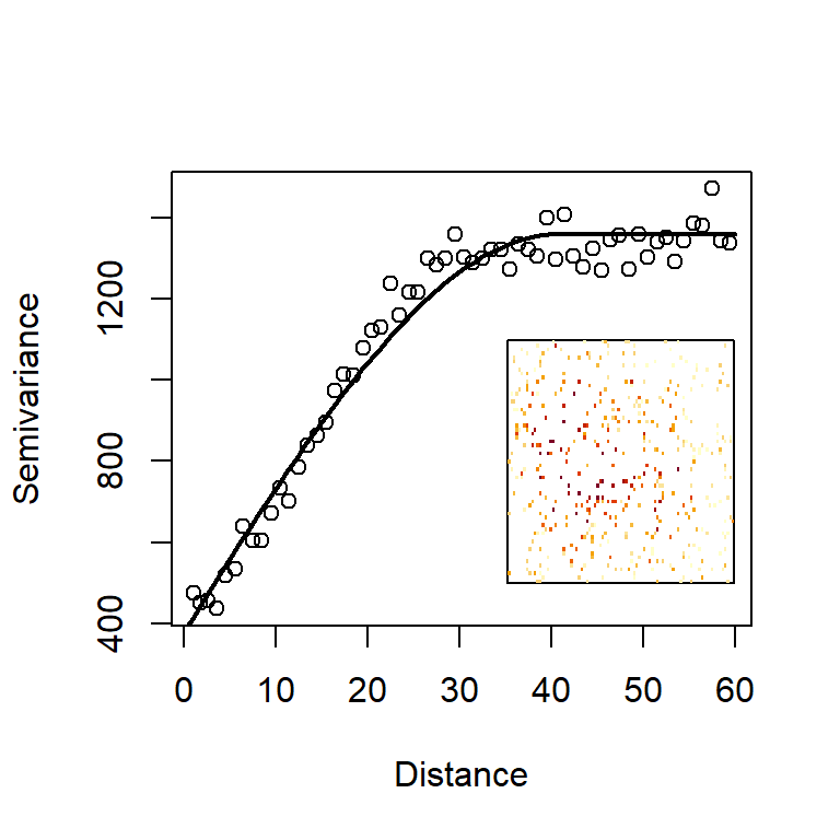
Figure 4.15: Semivariogram of altitude dataset containing measurement errors. The raw data are shown in the inset.
The resulting empirical variogram in Fig. 4.15 is a little noisier than Fig. 4.13, but still presents a surprisingly clear pattern of increasing and asymptoting variance (would you have been able to discern this pattern simply by looking at the raw data in the inset of Fig. 4.15?). Remember, that the points of the empirical semivariogram are averages of several variances, each calculated from the viewpoint of each point. If you really want to see this ugly cloud, try:
vgE<-variogram(H~1, data=datE, cutoff=60, width=1, cloud=TRUE)
plot(vgE, xlab="Distance")
Note also that the intercepts of the empirical and fitted semivariograms start from a higher value, close to 400. How do we use this object for spatial prediction? Here, we need a sleight-of-hand. If we try to use a prediction grid which has points exactly overlapping with the locations of the sampling stations, then kriging will revert those points to the measured values. So, instead, we define a dataPred data frame whose coordinates are very slightly shifted by 0.01 units of length to the north-east (any other small shift would have done the job). The predictions shown in Fig. 4.16b are distinctly distorted through the effects of the error, but the volcano shape is clearly reconstructed. Also, look at the very high uncertainty values produced in Fig. 4.16c, compared to Fig. 4.14c.
datPred<-data.frame("x"=allCells[,1]+0.01,"y"=allCells[,2]+0.01)
coordinates(datPred) <- ~ x + y
H.krigedE <- krige(H ~ 1, locations=datE, datPred, model=fit.vgE)
## [using ordinary kriging]p2<-spplot(H.krigedE["var1.pred"], cuts=20, colorkey=TRUE, main="b. Smoothed altitude")
p3<-spplot(H.krigedE["var1.var"], cuts=20, colorkey=TRUE, main="c. Variance of estimate")
grid.arrange(p1,p2,p3, ncol=3)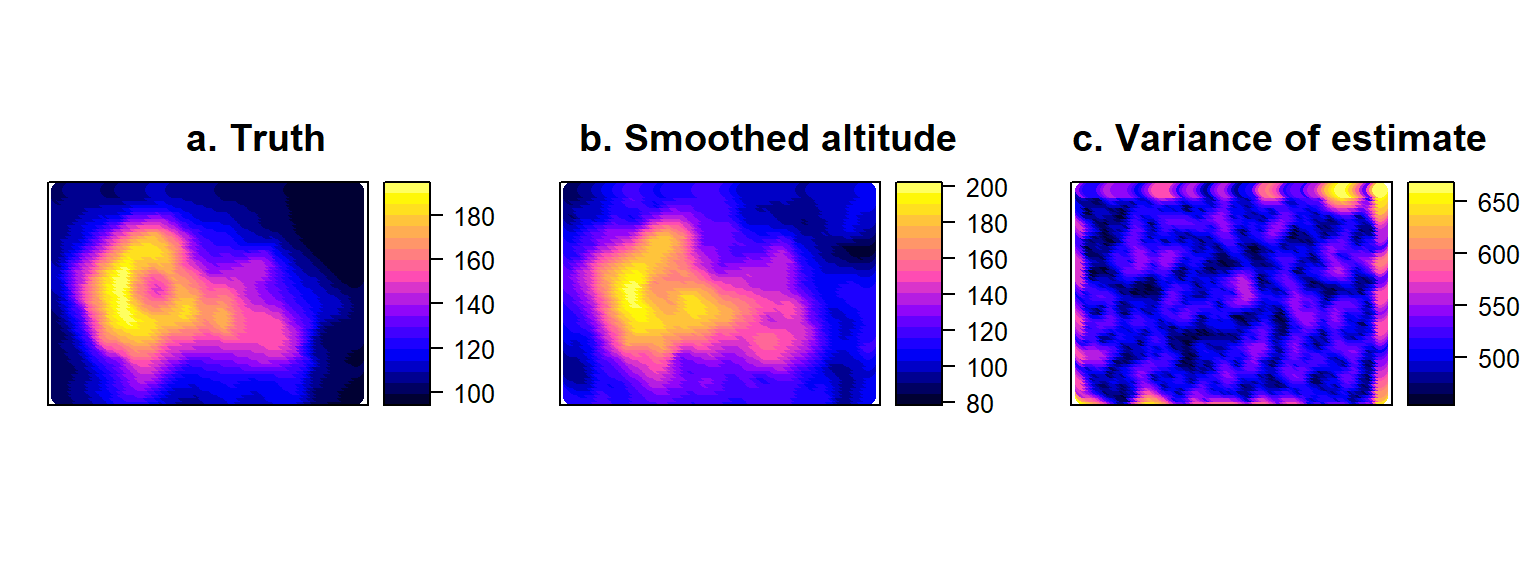
Figure 4.16: True volcano altitude layer (a) compared with smoothed surface (b) obtained by Kriging the error-prone sample of volcano altitude, accompanied by the corresponding variances of the estimates at all points on the map (c).
If we compare the numerical summaries of the original data containing error, with the smoothed map, we note that the range of values generated by smoothing (78, 202) is narrower than the original range of the data (50, 239) and much closer to the range of values in the true volcano altitude map (94, 195). So, the extra dispersion in the data that was introduced by sampling error, has been “ironed out” via the effect of smoothing.
#-------- Summary of the original data --------
datE
## class : SpatialPointsDataFrame
## features : 500
## extent : 1, 87, 1, 61 (xmin, xmax, ymin, ymax)
## crs : NA
## variables : 1
## names : H
## min values : 49.5520234047013
## max values : 239.142250930605#----- Summary of the smoothed estimates -----
H.krigedE["var1.pred"]## class : SpatialPointsDataFrame
## features : 5307
## extent : 1.01, 87.01, 1.01, 61.01 (xmin, xmax, ymin, ymax)
## crs : NA
## variables : 1
## names : var1.pred
## min values : 78.1468908853042
## max values : 202.461843911943The main ingredients that have gone into the smoothing and interpolation operations above could be summarized as follows:
Ingredient 1. Estimation is via weighted average: Predictions at new (unobserved) locations are generated as the weighted average of locations where measurements have been made.
Ingredient 2. Weights are distance functions: The weights in the weighted average estimator determine the influence of a given measurement on a particular prediction. The influence (or, relevance) of any given surveyed location on a prediction decays with distance from the predicted location. The derivation of weights in the case of kriging, is fairly mathematical, so above we have not presented any of its details (you could do a lot worse than Wikipedia for a short introduction to the technical details of kriging weights).
Ingredient 3. Autocorrelation is learned from data: The rate of decay of influence is determined by spatial autocorrelation. We saw that a correlogram is one way to visualise autocorrelation in one or two spatial dimensions, but in the case of kriging, the task is performed by a kindered function, the semivariance. There is an optimization (model fitting) algorithm that determines the rate of decay, by tuning the model to the existing data.
These same conceptual ingredients can be baked into a completely different cake, a method called kernel smoothing, that we have encountered before in Chapter 3, when talking about utilization distributions and, also, this chapter, in our discussion of the Gaussian blur filter. Keeping an eye on the above three properties, we can efficiently describe how kernel smoothing operates.
Ingredient 1: Prediction by kernel smoothing uses the same weighted average estimator seen in eq. (4.3): the estimate of the variable at new locations is the linear combination of all observations, weighted by some set of values that collectively add up to 1.
Ingredient 2: In kernel smoothing the weights are derived in a more straightforward way compared to kriging. We use a positive and real-valued function, the kernel, that decays symmetrically as distance from the observation increases. In 1D space, this could be a bell-shaped curve, and in 2D space it could be a bell-shaped surface. The one- and two-dimensional Gaussian function is often used as the default (see Gaussian blur in Section 4.5.4), but many other kernel shapes are possible (once again, if you scroll down this Wikipedia page you will find a list of kernels: uniform, tirangular, etc.).
Ingredient 3: The width of the kernel is determined by a single parameter (e.g., in the case of a Gaussian kernel, it would be the standard deviation). The parameter is known as the smoothing bandwidth and that’s where spatial autocorrelation is hiding in kernel smoothing. A wide kernel means that influence of an observation on the estimate at a point (i.e., the autocorrelation) decays slowly with distance. Conversely, a narrow kernel means that the influence of points at large distances is practically zero (low autocorrelation in the landscape). The bandwidth parameter can be estimated from the data. A training data set is required, as was the case in kriging. The gold-standard technique is cross-validation, but approximate criteria exist to save on computation.
Previous occurrences of kernels in this book were applications to two different data sets. In Section 3.11.2, we used kernel smoothing (via the command kde from the library ks) on point process data. In that example, each occurrence of the animal in space was allowed to diffuse its influence in the area around it. Biologicallty the justification for smoothing was a little as follows: We observed the animal at a particular location and not at a location nearby. This was the result of chance, since it is unlikely that nearby locations are qualitatively very different (spatial autocorrelation!). To represent the intensity of the point process, we therefore diffused the influence of a single point to the nearby locations.
In section 4.5.4 we discussed kernel smoothing as a blurring operation, to try and reduce the sharpness of a completely known spatial layer. In that context, the data were error-free and complete maps, but we wanted to represent spatiotemporal lags in their effect on species. Smoothing there, was a metaphor used to manipulate precise information. There are several image-processing libraries in R that can do this (e.g., command blur in package spatstat).
In the volcano example we are looking at here, we want to apply smoothing to an incomplete map of measurements containing error. We seek to fill space with estimates where observations were not made and we want to reduce the variability in the data wherever observations were made. An appropriate R implementation for the task is the command sm.regression in library sm. The library also has the command h.select for automatic estimation of the kernel’s bandwidth. An alternative function - but without cross validation options in smoothing - is smooth.2d in library fields, which also has extensive functions for broader geostatistical analysis.
# Using existing data-frame of observations with error
datE<-data.frame("x"=sx,"y"=sy,"H"=vol2[cbind(sx,sy)])
head(datE)
## x y H
## 1 57 21 154.7813
## 2 31 16 193.1606
## 3 4 27 109.1924
## 4 75 35 113.6469
## 5 63 12 153.1291
## 6 54 46 131.7169# Bandwidth estimation
bandw<-h.select(datE[,1:2], datE[,3], method="cv")
# Application of smoothing with found bandwidth
mod<-sm.regression(datE[,1:2], datE[,3], h=bandw, ngrid=200,display="none", hull="FALSE")Note that we have requested the results to be produced for a very high resolution grid (ngrid=200), compared to the resolution of the original volcano data. We have also silenced the default graphical output to customize the graphics a little (delete the display option for a perspective plot or use the options slice for a contour plot, image for an image plot). The default option hull="TRUE" generates predictions within a convex hull defined by the positions of the outermost sampling stations in the data. We have set this to "FALSE" because we want the full prediction grid to be populated. However, this default choice used by the authors of the library makes a more philosophical point about the analysts’ reluctance to use density estimation methods such as smoothing for extrapolation, outside the spatial span of the data. To access the kernel estimates for plotting (such as the map shown in Fig. 4.17c), you can obtain the matrix mod$estimate from the object estimated via sm.regression, above.
zmin<-min(datE$H)
zmax<-max(datE$H)

par(mfrow=c(1,3))

image(xl,yl,volcano, main="a.Reality", xlab="Longitude", ylab="Latitude")
contour(xl,yl,volcano, col="White",add=T)

image(xl,yl,vol2, zlim=c(zmin,zmax), main="b.Sampling error", xlab="Longitude", ylab="Latitude")

image(mod$estimate, zlim=c(zmin,zmax), main="c.Kernel smoothing estimates", xlab="Longitude", ylab="Latitude")
contour(mod$estimate, col="White",add=T)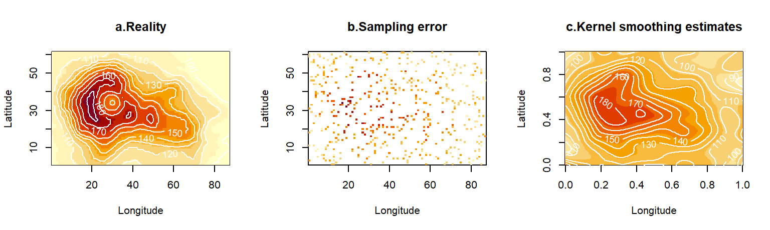
Figure 4.17: The true volcano altitude map (a), sampled with error at a subset of locations (b). Reconstruction of the altitude layer using kernel smoothing with bandwidth obtained via cross-validation (c).
par(mfrow=c(1,1))4.11 Concluding remarks
Most broadly, the questions asked of SDMs pertain to two key priorities, scientific understanding and spatial/temporal prediction. Both of these are, at some level, scientifically vulnerable. The correlational nature of SDMs means that any statistical finding will be circumstantial, so ecological understanding can only be extracted with caution, at the user’s own risk. Although such models can get quite complicated, as we will see in the following chapters, they are always, in principle, regression models. As such, they always require some response data and some explanatory data. The response data in the case of SDMs come in a handful of formats, but for the most part, they are either survey or telemetry data. The explanatory data come in a much wider variety of forms. Their types can be best understood in terms of dichotomies (e.g., intrinsic versus extrinsic, dynamic versus static, interactive versus non-interactive, local versus neighborhood). Much of the preparation of explanatory data for use in SDMs requires us to treat possible deficiencies in spatial data layers, usually related to data-gaps and observation errors. Both of these can be tackled by binning explanatory data into spatial grids of coarser resolution, but better approaches exist under the banner of density estimation techniques. The two density estimation techniques we have examined (kriging and smoothing) both use a weighted averaging approach, where the weights are derived from the fundamental concept of spatial autocorrelation.
References
This function is a combination of the predictor function (e.g., a linear combination of the covariates) and the link function, is usually thought of as a transformation operating on \(\lambda\).↩︎
Please note that, in contrast to common terminology misuse in the ecological literature, the \(X\)’s are not parameters, they are covariates. We estimate parameters, but we collect data about covariates. Parameters re-weight the influence of covariates on the response. So, next time you review a paper that talks about “the effect of environmental parameters on space use”, please put the authors right!↩︎
In the future, we will tentatively refer to this kind of simulation as FITMOG - Found In The Mind Of God!↩︎
This is the advantage of FITMOG simulations here. We can exclude model misspecification as an explanation for any parameter estimation problems↩︎
The default option in R for confidence intervals relies on profile likelihood. Read more about these here: https://fw8051statistics4ecologists.netlify.app/mle.html#profile↩︎
Note that p-values and information criteria give similar but not identical conclusions (Murtaugh, 2014). Indeed, different information criteria may often recommend different final models and these may be different to the suggestions of cross-validation↩︎
The old “correlation is not causation” adage still bears reminding, although statistics has pushed the envelope towards causal models in the 20th century (Granger, 1969; Damos, 2016; Loehlin & Beaujean, 2016)↩︎
Rather annoyingly, one of the best statements about uncertainty did not come from a statistician, but from an individual of, arguably, deeply flawed logic. This particular tongue-twister is attributed to Donald Rumsfeld (1932-2021): “There are known knowns. These are things we know that we know. There are known unknowns. That is to say, there are things that we know we don’t know. But there are also unknown unknowns. There are things we don’t know we don’t know.”↩︎
These are examples of polytomous or polychotomous models - have a look at the next footnote!↩︎
From the ancient Greek, meaning “to cut into two parts” or to bisect, if you are more into the hip Roman terminology! The act of splitting into more than one parts is known as polytomy, or polychotomy.↩︎
For a time interval, say \(\Delta t\), such that \(\bar{X}(\mathbf{s})=\Delta t^{-1}\int_t^{t+\Delta t}X(\mathbf{s},t)dt\)↩︎
The classic ecological literature calls such variables scenopoetic (J. A. Miller & Holloway, 2017)↩︎
These sort of operations are efficiently performed by spatial analysis packages such as
raster, and more recently, terra` (https://rspatial.org/terra/).↩︎The full form of the Gaussian kernel is \(K(d)=\frac{1}{2\pi\sigma}exp\left(-\frac{1}{2}\frac{d^2}{\sigma^2}\right),\) where, the dispersion parameter \(\sigma\) determines the rate of decay with distance and the scaling parameter \(K_0=(2\pi \sigma)^{-1}\) adapts to the choice of \(\sigma\)↩︎
The concepts of scale, autocorrelation, smoothing and interpolation introduced in this last part of the chapter, go much deeper into the heart of spatial modelling, but we will motivate them from the point of view of explanatory variables for now.↩︎
Geographers may not have introduced the concept of spatial autocorrelation, but they certainly nailed its intuitive definition. Tobler’s first law of geography says that everything is related to everything else, but near things are more related than distant things (Tobler, 1970). Admittedly, other laws of geography are harder to find. The second law of geography anticipates that over larger areas, geographic variables are unpredictably heterogeneous. Statisticians might say, non-stationary.↩︎
There are sometimes more interesting reasons for negative or non-monotonic correlograms. These are particularly interesting when the x-dimension is time, instead of space. Wave-like (periodic) curves can give rise to successive positive-negative-positive autocorrelations as the curves go in-and-out of phase with themselves at increasing lags↩︎
Ironically, in much of the applied literature, autocorrelation is treated as a curse.↩︎
In general, the term “weight” in statistics implies that the sum of weights is equal to 1, so that, here, \(\sum_{j=1}^nw_{ij}=1\).↩︎
Singular, annulus, plural annuli.↩︎