Chapter 5 Statistical Inference
This chapter offers a review of statistical inference and an introduction to ideas that will be foundational for later chapters on of regression modelling.
Here are some additional resources on statistical inference:
- Introductory Statistics with Randomization and Simulation. See chapters 2 - 4 for introductory material on statistical inference from a simulation perspective.
- DataCamp: Data Analysis and Statistical Inference These are the labs for the open intro textbook above. See especially labs 3A - 5.
- DataCamp: Foundations of Inference. This course offers a nice introduction to statistical inference using permutation and bootstrapping.
- Onlinestatbook.com. A basic reference.
5.1 Samples and populations
A population consists in all the participants or objects that are relevant for a particular study. For example, if you were studying the average weight of a species of rat then the population for your study would be all the rats belonging to that species—a very large number, presumably. Because studying a population is often practically infeasible (as in this example), we study a sample.
A sample is any subset, large or small, of the population under study. However, samples vary and give imperfect information about the population. For example, if you took 100 different samples from the rat population and calculated average weight for each one you would likely get 100 different values. That’s because each sample, though drawn from the same population, consists in different individuals. Each sample, consequently, is similar but different.
Let’s call the average weight in our hypothetical rat population \(\mu\) and the average weight in each sample \(\bar{x}\). \(\mu\) is an example of what is known as a “population parameter.” \(\bar{x}\) is a “sample statistic.” Similarly, standard deviation, or \(s\), is a sample statistic; \(\sigma\) is the corresponding population parameter.13
Estimating population parameters from sample statistics is the business of inferential statistics.14
The fundamental problem of inference is that we usually don’t have information about the population. Instead, we have information about samples. In this respect, \(\mu\) is a theoretical entity, which we must estimate using sample data. But sample data offers imperfect clues about the characteristics of the population. In particular, the size of the sample and the underlying variablity in the population affect our ability to generalize reliably from sample statistics to to population parameters.
Let’s explore sample variability using simulation.
5.2 Simulation
One of the great things about R is that simulation tools are built in. We can easily simulate from many different probability distributions, such as, among others:
- Normal (or Gaussian):
rnorm() - Uniform:
runif() - Poisson
rpois() - Exponential:
rexp() - Binomial:
rbinom()
For example, below are two random samples from a normal distribution with mean of 0 and standard deviation of 1 (which we denote \(N(0,1)\)).
Before simulating from \(N(0,1)\), we use set.seed() to ensure reproducibility.
set.seed(1234)
(sample1 <- rnorm(n = 10, mean = 0, sd = 1))
## [1] -1.2070657 0.2774292 1.0844412 -2.3456977 0.4291247 0.5060559
## [7] -0.5747400 -0.5466319 -0.5644520 -0.8900378mean(sample1)## [1] -0.3831574Note that the default arguments in rnorm() are mean = 0 and sd = 1, so the following code is exactly equivalent to the code above.
(sample2 <- rnorm(10))## [1] -0.47719270 -0.99838644 -0.77625389 0.06445882 0.95949406
## [6] -0.11028549 -0.51100951 -0.91119542 -0.83717168 2.41583518mean(sample2)## [1] -0.1181707The observations in each sample are different and the sample means are consequently also different—this despite identical population parameters, \(\mu\) and \(\sigma\). This variability illustrates the problem of inference: samples give unreliable information about populations.
5.3 Sample mean variability
Let’s further develop intuition about sampling. We will simulate 1000 random samples of size 5, 50, 500 and 5000 from \(N(0,1)\) and calculate their respective means. This will yield 1000 sample means at each sample size. A distribution of sample means, incidentally, is known as the “sampling distribution of the sample mean.”
First, we create a dataframe with columns for sample means from samples of different sizes—5, 50, 500 and 5000. We use the replicate() function to repeatedly take the mean of a random sample of the specified size.
samples <- data.frame(n5 = replicate(1000, mean(rnorm(5))),
                      n50 = replicate(1000, mean(rnorm(50))),
                      n500 = replicate(1000, mean(rnorm(500))),
                      n5000 = replicate(1000, mean(rnorm(5000))))

names(samples) <- c("n = 5","n = 50","n = 500","n = 5000")
We need to tidy this dataframe by gathering the values in these multiple columns into one column. This can be accomplished using the gather() function in the tidyr package.
library(tidyr)

samples <- samples %>%
gather(key = size, value = means,`n = 5`,`n = 50`,`n = 500`,`n = 5000`)ggplot(samples, aes(means)) +
geom_density() +
facet_wrap(~size) +
geom_vline(xintercept = 0, col = "red", lty = 2) +
labs(title = "Sampling distributions of sample means for samples of different sizes",
subtitle = "Dashed red line at x = 0",
x = "Sample means")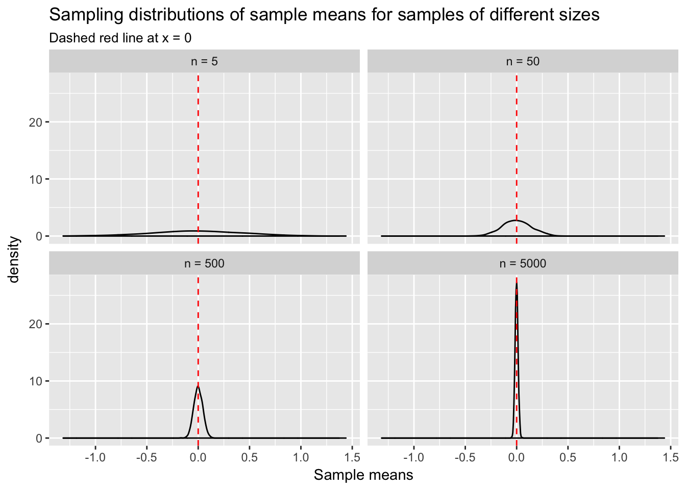
What does this plot tell us? As sample size increases from 5 to 5000 the variability of sample means, \(\bar{x}\), decreases. We have defined \(\mu\) to be 0. Thus, \(\bar{x}\) tends to get closer to the true mean, \(\mu\), with larger \(n\). There is still variability in \(\bar{x}\) at \(n\) = 5000, but much less than there was at \(n\) = 5. This is why researchers worry about sample size: the smaller the \(n\), the less certain they can be that their sample statistic of interest resembles the population parameter.
Sample statistics such as \(\bar{x}\) can also be misleading when the variance in the population is large. Think about it: the more variability in the population, the greater the chance that the observations sampled, and consequently \(\bar{x}\) also, will be a long way from \(\mu\). We can create a visualization similar to the one above, but this time fixing \(n\) at 100, and varying \(\sigma\). Again we take the mean of each sample to get a distribution of sample means at each level of \(\sigma\).
data.frame(sd1 = replicate(1000, mean(rnorm(100, sd = 1))),
           sd5 = replicate(1000, mean(rnorm(100, sd = 5))),
           sd10 = replicate(1000, mean(rnorm(100, sd = 10))),
           sd15 = replicate(1000, mean(rnorm(100, sd = 15)))) %>%
  dplyr::rename(`sd = 1` = sd1, `sd = 5` = sd5,`sd = 10` = sd10,`sd = 15` = sd15) %>%
  gather(size, means, `sd = 1`, `sd = 5`,`sd = 10`,`sd = 15`) %>%
  mutate(size = factor(size, levels = c("sd = 1", "sd = 5", "sd = 10", "sd = 15"))) %>%
  ggplot(aes(means)) +
  geom_density() +
  facet_wrap(~size) +
  geom_vline(xintercept = 0, col = "red", lty = 2) +
  labs(title = "Sampling distributions of sample means from populations with differing variability",
       subtitle = "Dashed red line at x = 0",
       x = "Sample means")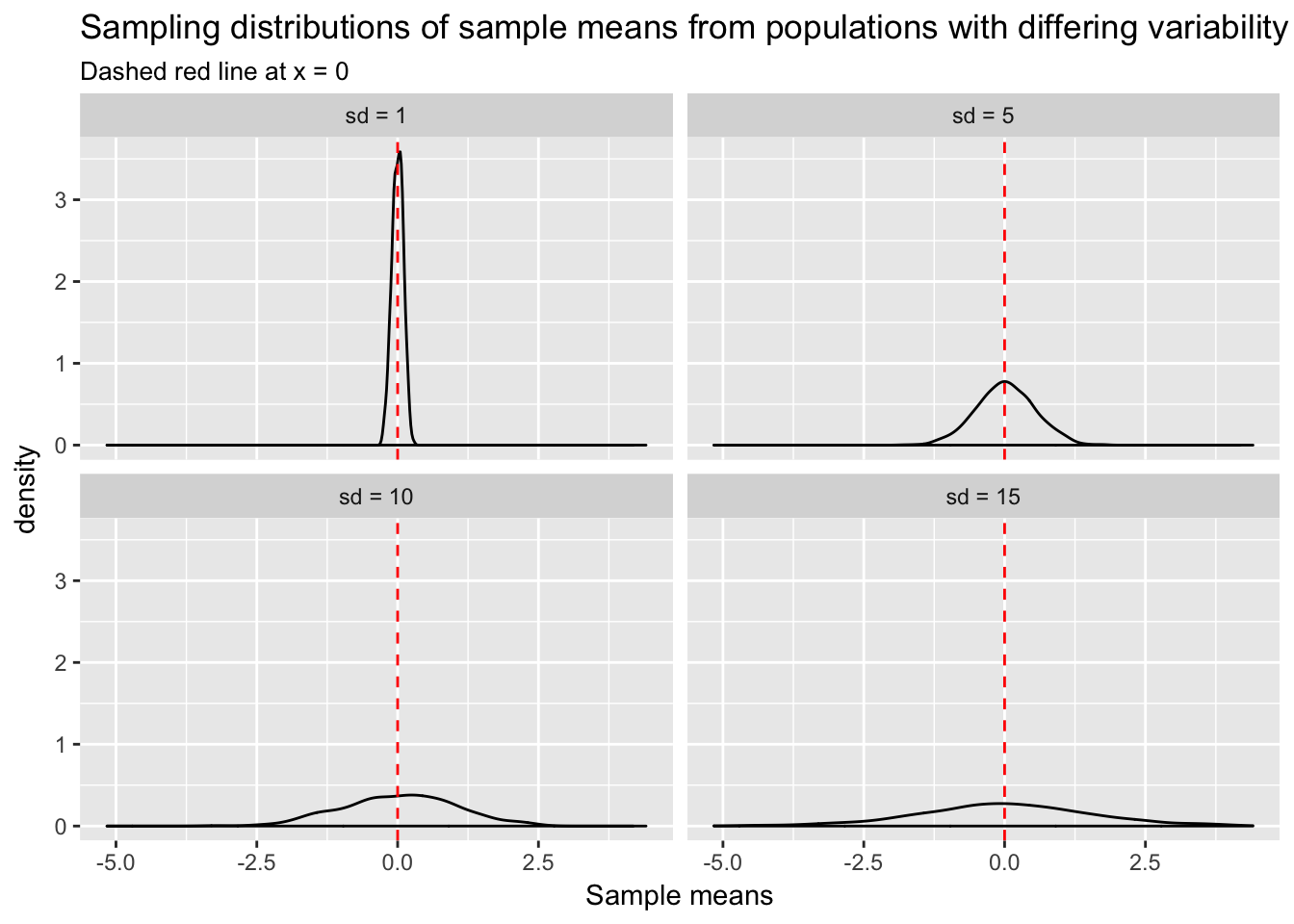
Sample means in the high variance cases have a higher probability of being far from \(\mu\). For any given sample, \(\bar{x}\) could be a misleading estimate of \(\mu\).
5.4 Repeated sampling and the Central Limit Theorem
Any single \(\bar{x}\) may be misleading, but repeated random sampling has an extremely important characteristic: if we were to calculate the mean of each sample, then the mean of those sample means would converge to \(\mu\). Another way of saying this: as \(n\) increases the mean of the sampling distribution of the sample mean will converge to \(\mu\).
The Central Limit Theorem (CLT) ensures that no matter what the shape of the underlying population distribution is, the sampling distribution of the sample mean will be normal with mean \(\mu\) and variance \(\frac{\sigma^2}{n}\).
Let’s test this idea by repeatedly sampling from a uniform distribution, \(U(0, 1)\), and calculating the sample mean.
The default setting for runif() is to sample numbers between a = 0 and b = 1 with equal probability.
runif(10)## [1] 0.6437847 0.9320686 0.9659377 0.7207580 0.7483175 0.7116569 0.8925371
## [8] 0.6006890 0.9462905 0.9366601data.frame(unif = runif(10000)) %>%
ggplot(aes(unif)) +
geom_histogram() +
ggtitle("Distribution of U(0, 1)") +
xlab("U(0,1)")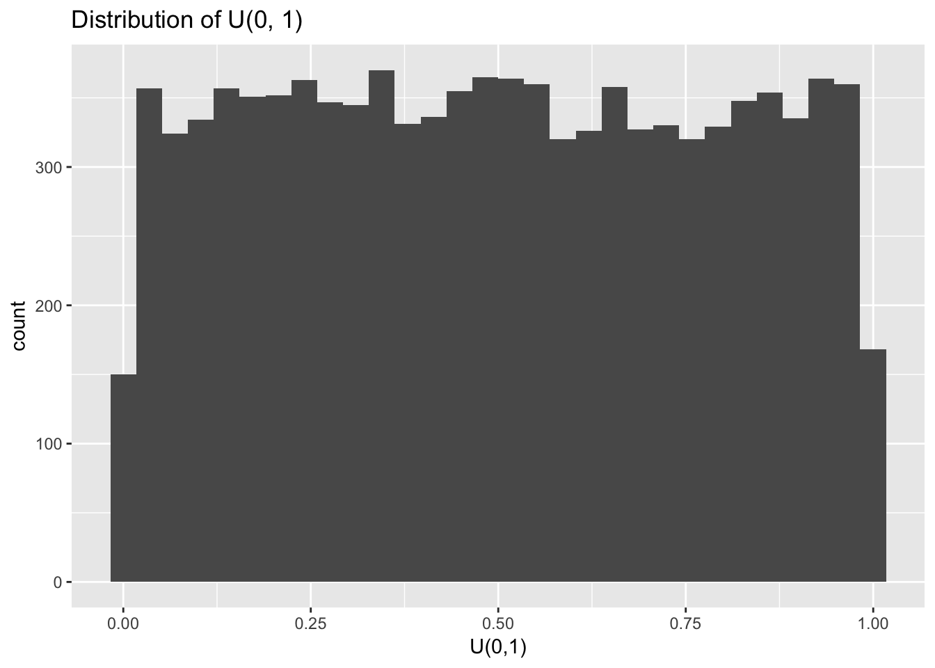
With large enough \(n\) it becomes clear that random sampling from \(U(0,1)\) indeed returns numbers between 0 and 1 with equal probability. Let’s now repeatedly calculate the means of samples from \(U(0,1)\). Will the mean of the sampling distribution of these sample means indeed be normal?
data.frame(means = replicate(10000, mean(runif(10)))) %>%
  ggplot(aes(means)) +
  geom_histogram() +
  labs(title = "Sampling distribution of sample means from U(0, 1)",
       subtitle = "Dashed red line at x = .5",
       x = "Sample means") +
  geom_vline(xintercept = .5, col = "red", lty = 2)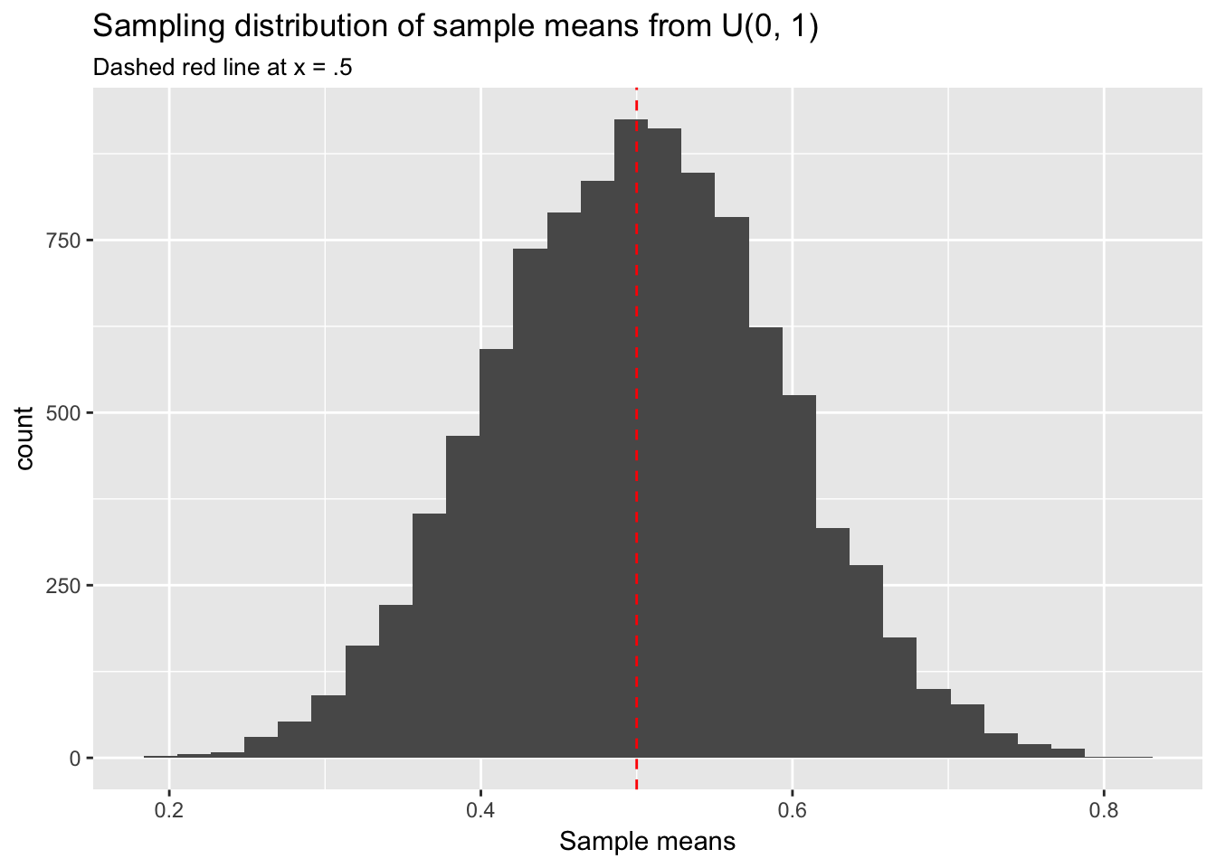
Yes, this sampling distribution of means looks normal. We have sampled from \(U(0,1)\) but we could have chosen any underlying population distribution—poisson, exponential, whatever—and obtained the same result. This fact will be important when doing statistical inference in the context of regression modeling. Note also that the mean of any uniform distribution, \(U(a,b)\), is \(\frac{b - a}{2}\), which in the case of \(U(0,1)\) is .5. The center point of the sampling distribution of sample means has converged to approximately \(\mu\) = .5.
We can generate a sampling distribution for any sample statistic, not just the sample mean, and it will have the same properties as the sampling distribution of the sample mean: normally distributed with the mean centered at the population parameter. For example, suppose we are interested in standard deviation, \(s\), as our sample statistic. The sampling distribution of sample standard deviations will be normal with the mean of the distribution centered at the population parameter, in this case \(\sigma\).
data.frame(sd = replicate(1000, sd(rnorm(100, sd = 5)))) %>%
  ggplot(aes(sd)) +
  geom_histogram() +
  geom_vline(xintercept = 5, col = "red", lty = 2) +
  labs(title = "Sampling distribution of sample standard deviations from Normal (0, 5)",
       subtitle = "Dashed red line at x = 5",
x = "Sample sd") 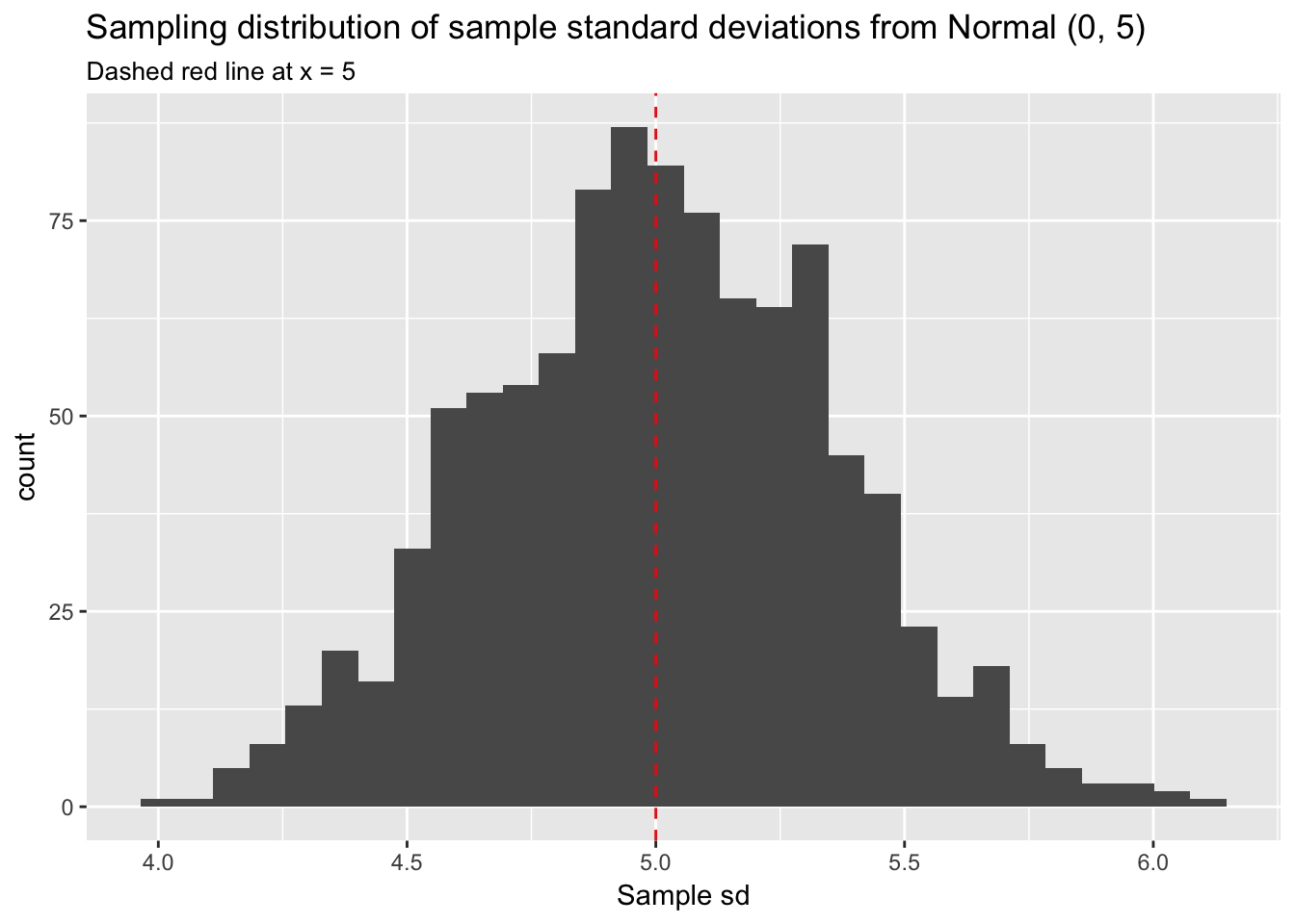
We have defined \(\sigma\) as 5 and have taken 1000 samples of 100 observations each. The histogram of the sampling distribution of \(s\) makes it clear the the distribution is roughly normal and centered at 5.
Explore the properties of sampling distributions further here: onlinestatbook.
5.5 Estimating population parameters
One obvious objection at this point is that we are rarely in a position to take large numbers of samples from the population to develop a sampling distribution of our statistic of interest. Think about our hypothetical rat study. Catching rats is hard. We aren’t going to be able to take 10,000 samples in order to estimate the average species weight!
Instead, we simply use \(\bar{x}\) to estimate \(\mu\). Admittedly, this solution is imperfect because the relationship between any single \(\bar{x}\) and \(\mu\) is uncertain—more or less so depending on \(n\) and \(\sigma\). But it is the best we can do. With large \(n\) and small \(\sigma\) the estimate is likely to be accurate, whereas with small \(n\) or large \(\sigma\) the estimate is more uncertain: it might be fairly close to \(\mu\) or it might be misleadingly far away. Which it is, close or far away, depends on chance—which sample you happen to be working with. Thus, we use \(\bar{x}\) to estimate \(\mu\) but do so with the knowledge that this estimate will be wrong, and we quantify our uncertainty about how wrong with standard error or \(SE\). The \(SE\) of the sample mean in particular is known as the “standard error of the mean” or \(SEM\).15 The \(SEM\) is simply an estimate of the standard deviation of the sampling distribution of \(\bar{x}\). Essentially, the \(SEM\) uses information we have—the number and standard deviation of observations in the sample, \(s\) and \(n\)—to estimate what we don’t have—the spread of sample means in the sampling distribution—using this formula: \(\frac{{s }}{\sqrt{n}}\) (where \(n\) is the number and \(s\) is the standard deviation of observations in the sample).16 The idea is that the dispersion of observations around \(\bar{x}\) in any given sample provides information about the likely dispersion of \(\bar{x}\) around \(\mu\). In estimating that dispersion, the \(SEM\) allows us to express our uncertainty about how close \(\bar{x}\) might be to \(\mu\).
We can calculate an \(SE\) for any sample statistic. The \(SE\) of a sample proportion, for example, can be estimated using this formula: \(\sqrt{\frac{p(1 - p)}{n}}\).
Here are some example calculations.
- Sample from \(N(0, 1)\) and estimate SEM:
set.seed(1234)
N <- rnorm(n = 100, mean = 0, sd = 1)
sd(N)/sqrt(100)
## [1] 0.1004405Thus, based on information from this sample, we estimate that the standard deviation of sample means in the sampling distribution will be .1.
- Sample from \(Binomial(1, .5)\) and estimate \(SE\) for the proportion:
B <- rbinom(n = 100, size = 1, prob = .5)
sqrt( sum(B)/100*(1 - sum(B)/100)/100)
## [1] 0.04995998Likewise, the standard deviation of sample proportions will be .05.
However, it is not straightforward to calculate the \(SE\) analytically for some sample statistics. In these cases we can use the bootstrap, discussed below.
5.6 Confidence intervals
We typically use the \(SE\) to construct confidence intervals or CIs around the sample statistic of interest. By convention we set \(\alpha\) = .05 and calculate \(1 - \alpha\) or 95% CIs. (\(\alpha\) is an arbitrary value chosen to set the width of the CI.) The interpretation of CIs is, unfortunately, somewhat subtle in frequentist statistics. A 95% CI does not mean that the interval has a .95 probability of containing the population parameter. Instead, it has a sampling interpretation. A 95% CI means that if we were to repeatedly sample from the population and calculate intervals for a sample statistic, then the population parameter, the true value, would be in 95% of those intervals.
In practice, we will think of CIs as representing the range of sample statistic estimates that are consistent with our data, that are plausible. They are a tool for factoring estimation uncertainty into our thinking about data.
To calculate a 95% CI for the sample mean we use this formula: [\(\bar{x}\) - 1.96 x \(SEM\), \(\bar{x}\) + 1.96 x \(SEM\)]. Here are calculations using our above sample from \(N(0,1)\).
mean(N)## [1] -0.1567617mean(N) - 1.96 * sd(N)/sqrt(100)## [1] -0.3536252mean(N) + 1.96 * sd(N)/sqrt(100)## [1] 0.0401017In this case our CI for \(\mu\) extends from -0.35 to 0.04, an interval that, appropriately, contains \(\mu\), which we defined to be 0. If we were to sample from \(N(0,1)\) 100 times and calculate 95% CIs each time we would expect 95 of those CIs to contain 0.
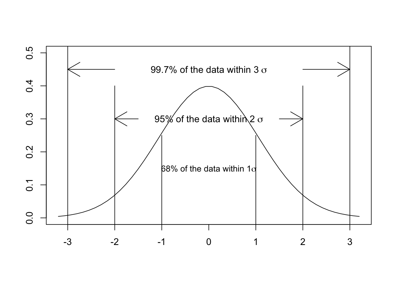
Why do we use 1.96 in this calculation? Remember that, according to the CLT, the sampling distribution of a sample statistic is normal regardless of the underlying population distribution. And recall, furthermore, that 95% of the area under a normal curve is captured by an interval that extends from the mean minus approximately 2 standard deviations to the mean plus approximately 2 standard deviations. (The exact number is 1.96.) Similarly, 68% of the area under a normal curve is captured by an interval that extends from the mean minus 1 standard deviation to the mean plus 1 standard deviation. This plot should look familiar from previous stats classes:
The CLT guarantees the normality of any sampling distribution. We can use this fact to create CIs that will contain a defined proportion of the distribution—defined in this case by the \(SE\), our estimate of the standard deviation of the sampling distribution, and our choice of \(\alpha\).
5.7 The bootstrap
Above we have estimated the \(SE\) for sample statistics using formulas. But we could also estimate the \(SE\) empirically using an extremely clever technique called “the bootstrap.” The problem in calculating the \(SE\) is that we don’t actually have the sampling distribution of the sample statistic of interest. Collecting samples in the real world is time-consuming and expensive, so we may only have one sample. But what we can do is resample from that one sample by taking repeated random versions of it—random subsets—and treating those as if they were random samples from the population. We then construct what is essentially a simulated sampling distribution of our sample statistic by calculating that statistic in each resample. The standard deviation of that sampling distribution is an estimate of the \(SE\) for that statistic. Such resampling is called bootstrapping.17
Bootstrapping works like this:
First, we sample \(n\) observations with equal probability from our sample of size \(n\), with replacement. This is known as a “bootstrap sample.” “With replacement” means that every time an observation is randomly selected we return it to the sample to be potentially selected again. Note also that we sample \(n\) observations. The R function we use to create a bootstrap sample is sample() with the replace = T argument. Suppose our dataset consists in the numbers 1 to 10. To sample without replacement—not a bootstrap sample—means that no one observation can be chosen more than once.
numbers <- 1:10
sample(numbers, replace = F)
## [1] 4 9 5 10 6 3 1 8 2 7sample(numbers, replace = F)## [1] 10 7 4 3 1 6 5 2 8 9Sampling without replacement essentially just shuffles the observations. To sample with replacement—a bootstrap sample—means that some observations will be oversampled (chosen more than once) and some will be undersampled (not chosen at all):
sample(numbers, replace = T)## [1] 2 9 4 2 4 4 5 2 7 10sample(numbers, replace = T)## [1] 8 9 10 2 5 4 4 1 10 5Second, for each bootstrap sample we calculate and save the sample statistic of interest, and repeat this procedure a large number of times. (1000 times should be sufficient.) The result is a simulated sampling distribution for that sample statistic.
Third, to obtain the \(SE\) of the sample statistic we simply calculate the standard deviation of our simulated sampling distribution. We could then use that \(SE\) to calculate CIs (as in the formula above for the mean: [\(\bar{x}\) - 1.96 x \(SEM\), \(\bar{x}\) + 1.96 x \(SEM\)]).18 Or we could create CIs even more conveniently using the quantile() function, implementing what we’ll call “the percentile method.” We simply define the interval we want in the probs argument to quantile(). For example, if we want 95% CIs then we select a range that symmetrically covers 95% of the sampling distribution, from the \(2.5^{th}\) to the \(97.5^{th}\) percentile: quantile(x, probs = c(.025, .975)). Similarly, a 90% CI would extend from the \(5^{th}\) to the \(95^{th}\) percentile: quantile(x, probs = c(.5, .95)).
Let’s use the bootstrap to estimate a 95% CI for \(\mu\) using a sample from \(N(0,1)\) and compare it to an estimate using the formula.
First, initialize a vector for storing the simulated sampling distribution of sample means.
set.seed(1234)
n <- 100
x <- rnorm(n)
boot_mean <- NULL
Next, set up a loop that will repeatedly resample from x and calculate the sample mean.
for (i in 1:1000){
  boot_sample <- sample(x, replace = T)
  boot_mean[i] <- mean(boot_sample)
}

head(boot_mean)
## [1] -0.12181723 0.11964083 -0.20251118 0.01141111 -0.24382811 -0.10012781These are the sample means that constitute our bootstrap sampling distribution.
Next, calculate the standard deviation of this sampling distribution and compare this estimate of the \(SEM\) to the formula estimate.
sd(boot_mean)## [1] 0.0974346This bootstrap estimate of the \(SEM\) is very close to the estimate we previously calculated analytically:
sd(x)/sqrt(n)## [1] 0.1004405Let’s now calculate a 95% CI using the percentile method and compare it to the CI calculated using the formula:
quantile(boot_mean, probs = c(.025, .975))## 2.5% 97.5%
## -0.34560792 0.03145061mean(x) - 1.96 * sd(x)/sqrt(n)## [1] -0.3536252mean(x) + 1.96 * sd(x)/sqrt(n)## [1] 0.0401017Again, both methods return similar results. Importantly, both CIs contain 0, as they should.
The virtue of the bootstrap is its simplicity and its generality. Even if you don’t know the relevant formula for calculating an \(SE\) for a sample statistic—and often you won’t—bootstrapping an estimate is straightforward because the process is always the same and is easy to code. Here is an example for calculating a 95% CI for sample standard deviation:
boot_sd <- NULL

for(i in 1:1000){
  boot_sample <- sample(x, replace = T)
  boot_sd[i] <- sd(boot_sample)
}

quantile(boot_sd, probs = c(.025, .975))
## 2.5% 97.5%
## 0.8575227 1.1419187We should be reassured that this CI contains \(\sigma\), which we’ve defined as 1.
5.8 Null hypothesis significance testing
We have so far discussed statistical inference as the process of estimating population parameters from sample statistics. Often—and perhaps most typically—statistical inference is discussed in the context of statistical decision procedures. For example, we might want to know whether two samples differ from each other, by which we mean really differ, above and beyond the random variation we would expect among samples from the same population. The samples being compared may have different means, but the inferential question is whether they come from populations with different underlying parameters. The decision procedures for answering this question are known, in frequentist statistics, as “null hypothesis significance testing” or NHST.
We use NHST to decide whether sample statistic differences between samples, or between a sample and a comparison value, are—as the saying goes—“statistically significant.” What sorts of questions can we address with NHST?
- Do groups differ on a particular measurement?
- Is a coefficient in a regression different from 0?19
- Are sample proportions different from what we expect?
NHST works according to the logic of comparison, seeking to determine whether observed differences are real (do they exist in the underlying population) or are merely apparent (are they due to random variation among samples). We first specify a “null hypothesis,” or \(H_0\), which proposes that chance alone is responsible for any observed difference. The “distribution under the null” is the distribution of differences we would expect if the null hypothesis were true. We can think of the null distribution as the sampling distribution of differences in the absence of a population difference. The alternative hypothesis, or \(H_a\), states that the observed difference is real, deriving from an underlying population difference. If the null hypothesis proves to be statistically unfounded based on the data (meaning that the observed difference occurs only very rarely in the null distribution, less than 5% of the time), then we can reject \(H_0\) as probably false.20
As an example, let’s consider two groups, A and B, which we’ll draw from different population distributions, the first from \(N(1,1)\) and the second from \(N(1.25,1)\):
n <- 100
set.seed(512)
A <- rnorm(n, mean = 1, sd = 1)

B <- rnorm(n, mean = 1.25, sd = 1)

mean(A) - mean(B)
## [1] -0.4731108\(H_0\) asserts that the difference in means is 0. The inferential question consists in whether -0.47 is different from 0 because of an underlying population difference or because of random variation among samples from the same population. (In this case we know it is not.) The question we need to assess, then, is how unlikely the observed difference would be under the null hypothesis of no difference. One informal approach would be to simulate a sampling distribution, as we did earlier, for \(H_0\) to see how often our observed sample difference occurs under the null. The standard deviation of the null distribution should be approximately \(\sqrt{2}\) (because \(Var(X - Y) = Var(X) + Var(Y)\)) but we will estimate it directly from our samples.
set.seed(513)
null <- replicate(10000, mean(rnorm(n, mean = 0, sd = sqrt(var(A) + var(B)))))

ggplot(data.frame(null=null), aes(null)) +
  geom_density() +
  xlim(c(-.5, .5)) +
  geom_vline(xintercept = mean(A) - mean(B), col = "red", lty = 2) +
  labs(title = "Null distribution based on sampling distribution of sample means of A - B",
       subtitle = "Red dashed line at observed A - B",
x = "Difference of A and B") 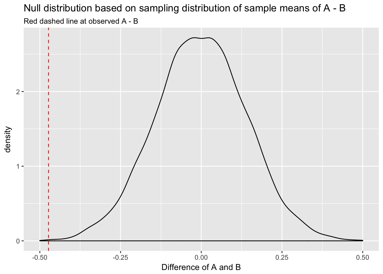
We can see that the observed difference of A and B would be very unlikely in the null distribution.
An equivalent method would be to use R’s dnorm() function to calculate the normal density curve for the null distribution: \(N(0, \frac{s^2}{n})\), where \(s^2\) in this case equals the variance of the difference, defined by \(var(A) + var(B)\). (The denominator in this equation is \(n\) because, as discussed above, the sampling distribution of sample means is distributed \(N(\mu, \frac{\sigma^2}{n})\).) We use dnorm() by first defining a vector of values at which to evaluate the normal density function.
null_df <- data.frame(x = seq(-.5, .5, by = .001))
null_df$d <- dnorm(null_df$x, mean = 0, sd = sqrt(var(A) + var(B))/sqrt(n))


ggplot(null_df, aes(x, d)) +
  geom_line() +
  xlim(c(-.5,.5)) +
  geom_vline(xintercept = mean(A) - mean(B), col = "red", lty = 2) +
  labs(title = "Null distribution based on normal density function",
       subtitle = "Red dashed line at observed A - B",
       x = "Difference of A and B")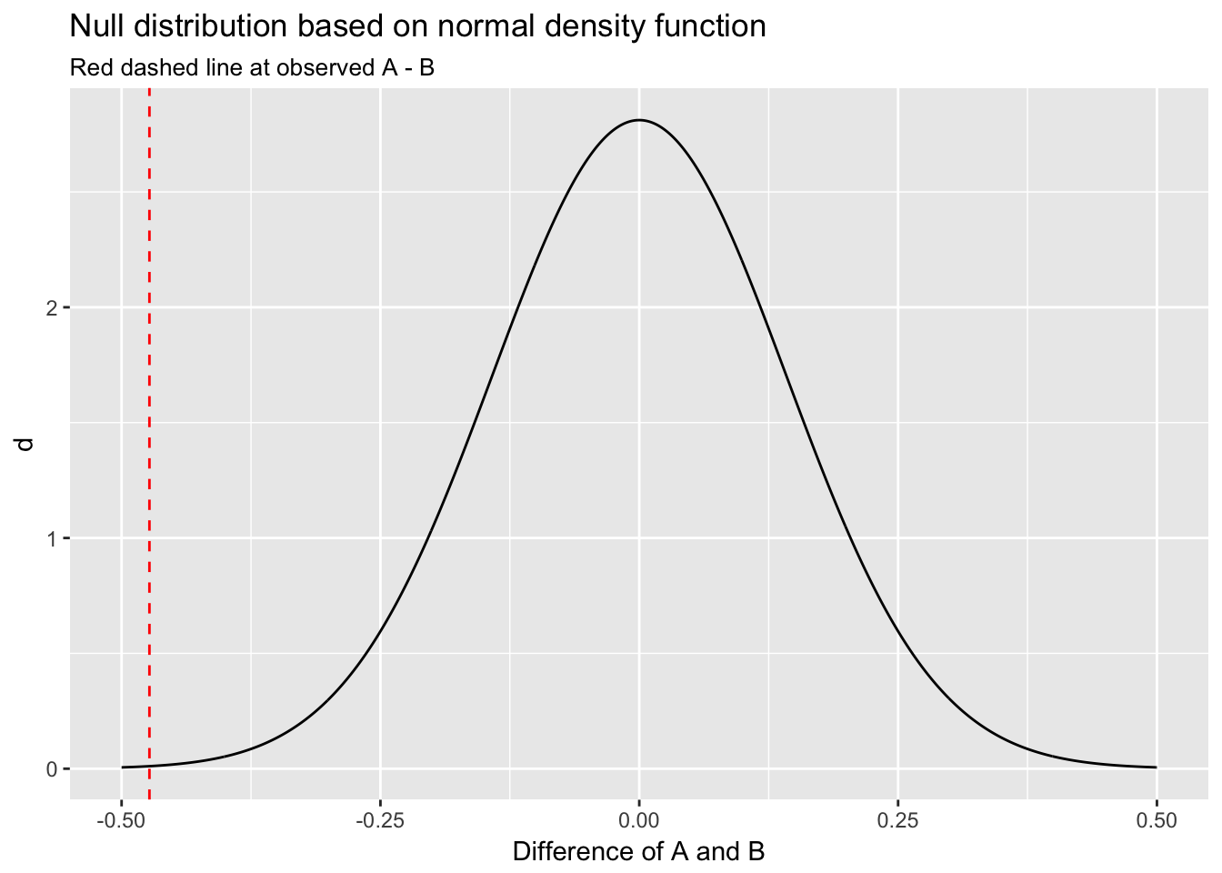
This plot also indicates the observed difference would be very unlikely under the null.
We can generate the null distribution in yet another manner using permutation or randomization, which, like the bootstrap, is an entirely empirical method utilizing only our samples. Permutation works by randomly mixing, or scrambling, the samples under consideration using the sample() function. For permutation, however, rather than taking bootstrap samples, we set the sample() function’s replace argument to FALSE.21 We will start by creating a function to perform the permutation.
scramble <- function(a, b, length){
  new_vector <- sample(c(a, b))
  new_a <- new_vector[1:length]
  new_b <- new_vector[(length + 1):(2*length)]
  (difference <- new_a - new_b)
}

set.seed(513)
null <- replicate(10000, mean(scramble(A, B, n)))

ggplot(data.frame(null=null), aes(null)) +
  geom_density() +
  xlim(c(-.5, .5)) +
  geom_vline(xintercept = mean(A) - mean(B), col = "red", lty = 2) +
  labs(title = "Null distribution based on permutation",
       subtitle = "Red dashed line at observed A - B",
       x = "Difference of A and B")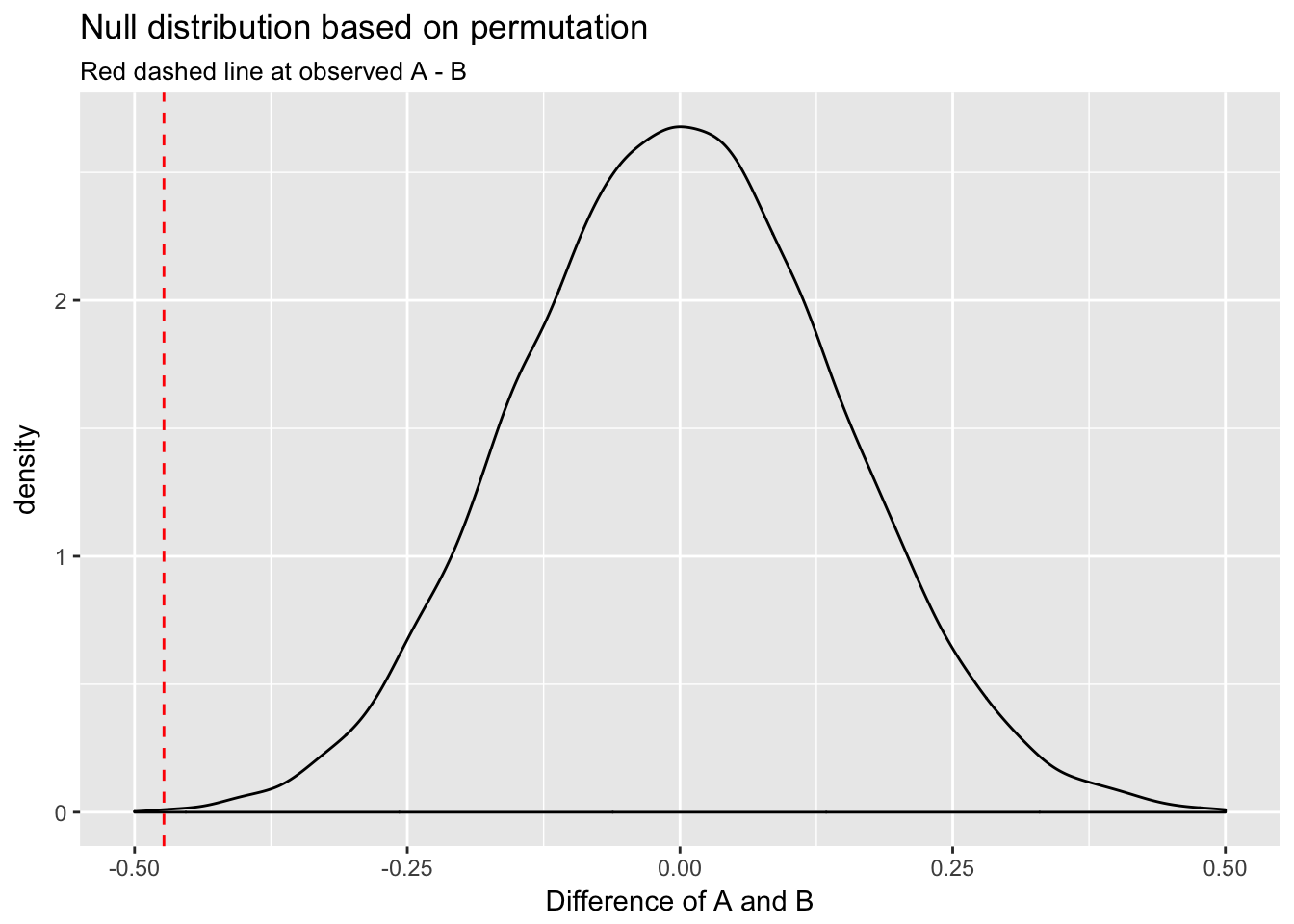
These methods return very similar results: the observed difference would rarely happen under the null.
We can construct a CI for the null distribution using both the percentile method and the formula for \(SE\): \(\frac{s}{\sqrt{n}}\).
quantile(null, probs = c(.025, .975))## 2.5% 97.5%
## -0.2804295 0.29183240 - 1.96 * sqrt(var(A) + var(B))/sqrt(n)## [1] -0.27814250 + 1.96 * sqrt(var(A) + var(B))/sqrt(n)## [1] 0.2781425The CIs are similar, indicating that the observed difference in means, -0.47, would happen rarely under the null distribution. We thus have strong evidence for rejecting \(H_0\); the data are more consistent with the alternative hypothesis, \(H_a\), that these two samples really were drawn from different populations.
5.9 T-test
We can approach our inferential question more formally using a t-test, which was designed for exactly this sort of comparison. Here we will use a 2-sided test for two independent samples with alpha set at the conventional value of .05:22
t.test(x = A, y = B, alternative = "two.sided", paired = F, var.equal = T)##
## Two Sample t-test
##
## data: A and B
## t = -3.3339, df = 198, p-value = 0.001022
## alternative hypothesis: true difference in means is not equal to 0
## 95 percent confidence interval:
## -0.7529586 -0.1932629
## sample estimates:
## mean of x mean of y
## 0.9543445 1.4274553A t-test uses the following test statistic, \(t\), to assess a difference in means:
\[
t = \frac{\bar{x}_1 - \bar{x}_2}{\sqrt{\frac{s_1^2}{n_1} + \frac{s_2^2}{n_2}}}
\]
where \(\bar{x}_1\) and \(\bar{x}_2\) are the sample means and \(s_1^2\) and \(s_2^2\) are the sample variances. The \(t\) statistic for a two-sample test follows a student’s \(t\) distribution with \(n_1 + n_2 - 2\) degrees of freedom.23 The \(t\) statistic we calculate by hand should match exactly the \(t\) statistic calculated by the t.test() function.
(t <- (mean(A) - mean(B))/sqrt(sd(A)^2/n + sd(B)^2/n))## [1] -3.333892It does. The null distribution for a t-test is the \(t\) distribution with \(n_1 + n_2 - 2\) degrees of freedom.24 Let’s simulate values for the null distribution for T(198) and add the \(t\) statistic:
t_null <- data.frame(t_dist = rt(10000, df = n + n - 2))

ggplot(t_null, aes(t_dist)) +
  geom_density() +
  xlim(c(t -.5, max(t_null$t_dist))) +
  geom_vline(xintercept = t, col = "red", lty = 2) +
  labs(title = "Null distribution based on student's t-distribution",
       subtitle = "Red dashed line at observed t statistic",
       x = "T(198)")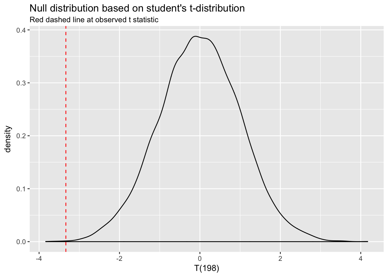
Again, we can see that a difference as large as the one represented by our \(t\) statistic rarely happens under the null distribution—the probability is very low. The p-value automatically generated by t.test() represents exactly that probability. “P-value,” in fact, stands for “probability value.”
5.10 P-values
We can therefore calculate the p-value associated with this t-test by simply calculating the proportion of \(t\) statistics under the null that are equal to or more extreme than the one we have observed. For purposes of illustration, we can use the null distribution we simulated for the above plot:
sum(t_null < t)## [1] 4sum(t_null < t)/10000## [1] 0.0004For a more precise calculation, we use pt(), the probability distribution function for the student’s \(t\) distribution, which we will multiply by 2 for the equivalent of a two-tailed test:25
2*pt(q = t, df = n + n - 2) ## [1] 0.001022196This probability matches the p-value returned by the t-test above.26
In this example our observed difference in means would occur with very low probability under the null distribution. The statistical test in this case has told us something that we already knew to be true, of course, since we defined the population means to be different. More generally, how do we know when a p-value is low enough to justify rejecting the null hypothesis?
Inference in the context of NHST is usually aimed at discovering whether the difference under investigation is “statistically significant” at the p-value threshold of .05. Differences associated with p < .05 are deemed “significant” (meaning that probability of a result that extreme under the null is less than 5%), and the null hypothesis is rejected. Differences associated with p > .05 are “not significant,” and the null is not rejected. (Note that a 95% CI for the null distribution conveys exactly the same information as p < .05.) Why is the threshold set at .05? Convention. The choice is arbitrary.
P-values are useful tools. But transforming a continuous probability into a binary decision threshold, as is usually done with p-values, carries risks. P-values have recently come under a lot of criticism. See for example, this editorial from the American Statistical Association (ASA): The ASA’s Statement on p-Values: Context, Process, and Purpose.
Significance at p < .05 is often a function of \(n\): larger sample sizes make it easier to detect very small differences, which may be practically insignificant. In fact, in large datasets all coefficients are significant, which makes p-values largely worthless. Conversely, there may be very large and important differences that are not statistically significant simply because the sample size is small.
The cutoff for statistical significance is arbitrary: Why have we chosen .05? We might easily have chosen .01 or .1. (In fact, it is conventional in some fields to regard p < .1 as constituting evidence against \(H_0\).) If we set the threshold at .05, then what do we do if p = .055? .051? .049? The ASA, as noted above, has cautioned against getting fixated on the magic .05 number for this very reason.
P-values are usually dichotomized (significant / not significant) or trichotomized (no evidence / weak evidence / strong evidence). But they can’t easily be compared in this way: the difference between significant and non-significant p-values is not itself statistically significant!
Bottom line: don’t use p-values mechanically! Think about your data and weigh the evidence.
CIs are a better way to weigh the evidence. Whereas p-values represent the exact probability of the observed data under the null hypothesis, \(p(D|H)\), CIs represent the range of sample statistic estimates that are consistent with the data. Critics of NHST say that the null hypothesis is virtually always false, and that rejecting it using a statistical test is therefore a trivial and unilluminating achievement. CIs are preferable from this perspective because they place the emphasis not on the (possibly) unrealistic null hypothesis, and whether it should be rejected, but instead on the variability in parameter estimates. They thus encourage more flexible and nuanced thinking about data. If you can use and report CIs then do so.
In general, population parameters can be distinguished from sample statistics notationally because are denoted with Greek letters: \(\mu\), \(\sigma\).↩
For clarity, we should contrast inferential statistics with descriptive statistics. The objective in descriptive statistics is to describe the characteristics of a sample, ignoring any consideration of the variability of samples within the population.↩
We can estimate \(SE\) for any sample statistic.↩
Key point. This formula is very similar to the one above for the standard deviation of the sampling distribution of sample means: \(\frac{\sigma}{\sqrt{n}}\). In this case we simply estimate \(\sigma\) with the sample standard deviation.↩
The name for the technique, “bootstrapping,” is derived from the phrase, “To pull oneself up by one’s bootstraps,” which means to do something on one’s own without external help or support. Bootstrapping allows us to estimate population parameters using just the sample.↩
This approach is known as the “parametric” bootstrap.↩
A coefficient represents the slope of the line summarizing the relationship between two variables. A slope of 0 indicates no relationship.↩
5% is the conventional threshold. We should note, also, that rejecting \(H_0\) is not the same as proving \(H_a\) true.↩
Though permutation and bootstrapping are superficially similar, it is important to recognize that they have different objectives as discussed here. We use bootstrapping to calculate the \(SE\) for any sample statistic. We use permutation to simulate the null distribution.↩
We use a two-sided test because we have no reason to expect the difference to be larger or smaller than 0.↩
Note that the \(t\) distribution is very similar to a normal distribution at n > 30. At n < 30 it has slightly fatter tails and has better inferential properties than a normal distribution. We use a \(t\) distribution, for example, to do inference on \(\beta\) coefficients in linear regression.↩
Degrees of freedom is the single parameter for the \(t\) distribution.↩
pt()returns the probability associated with a particular quantile.↩We are now in a position to calculate a p-value using the normal distribution function as well. Above we simulated the the null distribution as the sampling distribution for a difference of 0 between sample A and sample B. We could also summarize this distribution analytically: it will have mean of 0 and standard deviation of
sqrt(var(A) - var(B))/sqrt(n). What is the probability under the null distribution of seeing a value such asmean(A) - mean(B)? We can calculate this.2*pnorm(q = mean(A) - mean(B), mean = 0, sd = sqrt(var(A) - var(B))/sqrt(n))= … well, essentially 0. This result is a smaller p-value than the one returned by the t-test, which makes sense: the t-distribution has fatter tails, reflecting a higher probability of extreme events than in the normal distribution.↩