Chapter 8 Logistic Regression
This chapter covers logistic regression, the parametric regression method we use when the outcome variable is binary.
Additional resources on linear regression:
- Introduction to Statistical Learning. See chapter 4.
- Data Analysis Using Regression and Hierarchical/Multilevel Models by Gelman and Hill. Find chapter 5 on Canvas.
8.1 Introduction to logistic regression
Until now our outcome variable has been continuous. But if the outcome variable is binary (0/1, “No”/“Yes”), then we are faced with a classification problem. The goal in classification is to create a model capable of classifying the outcome—and, when using the model for prediction, new observations—into one of two categories. Logistic regression is probably the most commonly used statistical method for classification. The machine learning algorithms we have been using for comparison in the previous chapters—KNN, random forest, gradient boosting—will do classification. What makes logistic regression somewhat different from these other methods is that it produces a probability model of the outcome. In other words, the fitted values in a logistic or logit model are not binary but are rather probabilities representing the likelihood that the outcome belongs to one of two categories.
Unfortunately, we must deal with new complications when working with logistic regression, making these models inherently more difficult to interpret than linear models. The complications stem from the fact that with logistic regression we model the probability that \(y\) = 1, and probability is always scaled between 0 and 1. But the linear predictor, \(X_i\beta\), ranges from \(\pm \infty\) (where \(X\) represents all of the predictors in the model). This scale difference necessitates transforming the outcome variable, which is accomplished with the logit function:
\[ \text{logit}(x) = \text{log}\left( \frac{x}{1-x} \right) \]
The logit function maps the range of the outcome (0,1) to the range of the linear predictor \((-\infty, +\infty)\). The transformed outcome, \(\text{logit}(x)\), is expressed in log odds.37 Here is another way of writing the same model:
\[\text{Pr}(y_i = 1) = p_i\]
\[\text{logit}(p_i) = X_i\beta\]
Log odds do not have a meaningful interpretation (other than sign and magnitude) and must be transformed back into interpretable quantities, either into probabilities, using the inverse logit, or into odds ratios, by exponentiating. We discuss both transformations below.
8.2 The inverse logit function
The logistic model can be written, alternatively, using the inverse logit:
\[
\operatorname{Pr}(y_i = 1 | X_i) = \operatorname{logit}^{-1}(X_i \beta)
\] where \(y_i\) is a binary response, \(\operatorname{logit}^{-1}\) is the inverse logit function, and \(X_i \beta\) is the linear predictor. We can interpret this formulation as saying that the probability that \(y = 1\) is equal to the inverse logit of the linear predictor \((X_i, \beta)\). Thus, we can express logistic model fitted values and coefficients as probabilities using the inverse logit transformation. What is the inverse logit exactly? \[\operatorname{logit}^{-1}(x) = \frac{e^{x}}{1 + e^{x}} \] where \(e\) is the exponential function.
We can get a sense of how the inverse logit function transforms the linear predictor by plotting it. Here we use an arbitrary range of x values (-6, 6) to demonstrate the transformation.
x <- seq(-6, 6, .01)
y <- exp(x)/(1 + exp(x))
ggplot(data.frame(x = x, y = y), aes(x, y)) +
  geom_line() +
  ylab(expression(paste(logit^-1,"(x)"))) +
  ggtitle(expression(paste("y = ", logit^-1,"(x)")))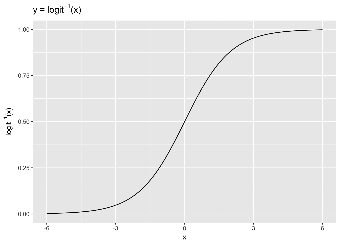
The \(x\) values, ranging from -6 to 6, are compressed by the inverse logit function into the 0-1 range. The inverse logit is curved, so the expected difference in \(y\) corresponding to a fixed difference in \(x\) is not constant. At low values and high values of \(x\) a unit change corresponds to very little change in \(y\), whereas in the middle of the curve a small change in \(x\) corresponds to a relatively large change in \(y\). In linear regression the expected difference in \(y\) corresponding to a fixed difference in \(x\) is, by contrast, constant. Thus, when we interpret logistic results we must choose where on the curve we want to evaluate the probability of the outcome, given the model.
8.3 Logistic regression example
Let’s illustrate these concepts using the Default dataset from the ISLR. This simulated dataset contains a binary variable representing credit card default, which we will model as a function of “balance” (the amount of debt carried on the card) and “income.” We’ll first plot these relationships.
library(ISLR); data(Default)
glimpse(Default)
## Observations: 10,000
## Variables: 4
## $ default <fctr> No, No, No, No, No, No, No, No, No, No, No, No, No, N...
## $ student <fctr> No, Yes, No, No, No, Yes, No, Yes, No, No, Yes, Yes, ...
## $ balance <dbl> 729.5265, 817.1804, 1073.5492, 529.2506, 785.6559, 919...
## $ income <dbl> 44361.625, 12106.135, 31767.139, 35704.494, 38463.496,...ggplot(Default, aes(x = balance, y = income, col = default)) +
geom_point(alpha = .4) +
ggtitle("Balance vs. Income by Default")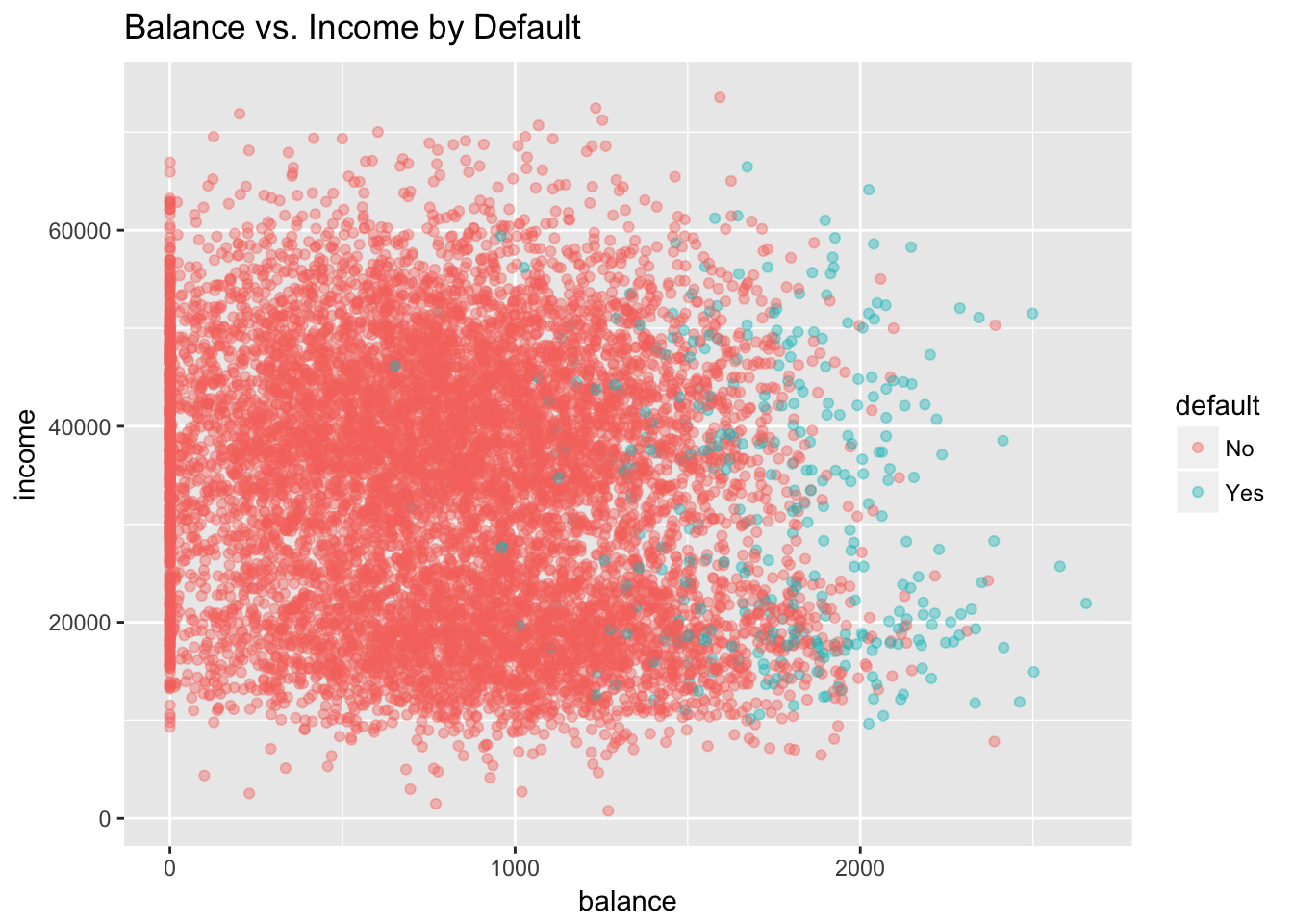
grid.arrange(
ggplot(Default, aes(default, balance)) +
  geom_boxplot() +
  ggtitle("Balance by Default") +
  ylab("balance"),

ggplot(Default, aes(default, income)) +
  geom_boxplot() +
  ggtitle("Income by Default") +
  ylab("income"),
ncol = 2)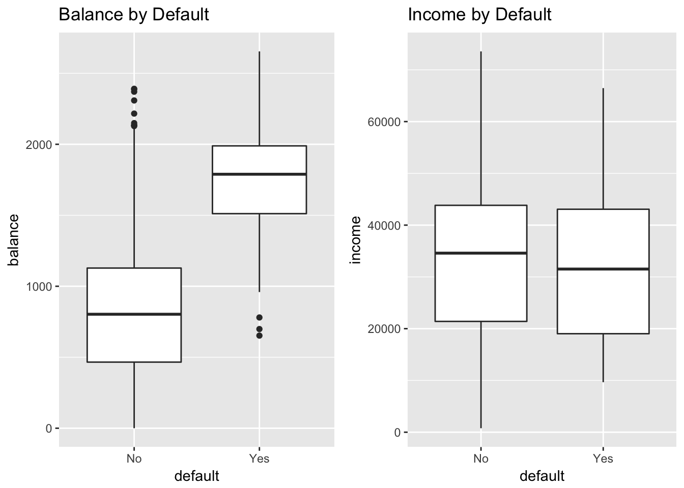
Clearly, high values of balance are associated with default, across levels of income. This suggests that income is actually not a strong predictor of default, compared to balance, which is exactly what we see in the boxplots.
Let’s explore these relationships using logistic regression. In R we fit a logistic model using the glm() function with family = binomial.38 We will center and scale the inputs.
glm(default ~ balance + income,
      data = Default,
      family = binomial) %>%
    standardize %>%
    display
## glm(formula = default ~ z.balance + z.income, family = binomial,
## data = Default)
## coef.est coef.se
## (Intercept) -6.13 0.19
## z.balance 5.46 0.22
## z.income 0.56 0.13
## ---
## n = 10000, k = 3
## residual deviance = 1579.0, null deviance = 2920.6 (difference = 1341.7)We interpret this output exactly as we would for a linear model with a centered and scaled predictor:
- Intercept: -6.13 represents the log odds of default when balance is average (835.37) and income is average (3.351710^{4}). (Average because the inputs have been centered.)
- z.balance: 5.46 represents the predicted change in the log odds of default associated with a 1 unit increase in z.balance, holding z.income constant. A 1 unit increase in z.balance is equivalent to a 2 standard deviation increase in balance (967.43). This coefficient is statistically significant since 5.46 - 2 x .22 > 0. (A 95% CI that does not contain 0 indicates statistical significance.)
- z.income: .56 represents the predicted change in the log odds of default associated with a 1 unit increase in z.income, holding z.balance constant. A 1 unit increase in z.income is equivalent to a 2 standard deviation increase in income (2.667310^{4}). This coefficient is also statistically significant since .56 - 2 x .13 > 0.
What does it mean for the log odds of default to increase by 5.46 or .56? In precise terms, who knows? To make these quantities meaningful we need to transform them, either into probabilities or odds ratios. However, we should point out that the sign and magnitude of the coefficients do carry information: the relationship with default is positive in both cases, and, as was apparent in the boxplots, the effect size of balance is much larger than income.
8.4 Logistic regression coefficients as probabilties
To move beyond these general observations about size and magnitude we can use the inverse logit function to convert the log odds of default (when balance and income are average) into a probability:
invlogit <- function(x) exp(x)/(1 + exp(x))

 invlogit(-6.13 + 5.46 * 0 + .56 * 0)
## [1] 0.002171854The probability of default for those with an average credit card balance of (835.37) and average income of (3.351710^{4}) is therefore quite low: only 0.002. Likewise we can calculate the change in the probability of default associated with a 1 unit increase in z.balance from 0, holding income constant at the average (z.income = 0). This would be equivalent to increasing balance by almost $1000, from 835.37 to 1802.8.
invlogit(-6.13 + 5.46 * 1) - invlogit(-6.13 + 5.46 * 0)## [1] 0.336325The probability of default is predicted to increase by .34.
In linear regression, the slope of the regression line (represented by the \(\beta\) coefficient) defines the linear relationship between a predictor, \(x\), and the outcome, \(y\). If we were to increase \(x\) by one unit, \(y\) would change by \(\beta\). We use the same logic to evaluate the relationship between \(x\) and \(y\) in logistic regression, with one major difference: The relationship between \(x\) and \(y\) is non-linear. Thus, the probability we derive from the model depends on where we evaluate the predictor on the inverse logit curve. Above, it mattered that we were interpreting the change in the probability of default associated with a 1 unit increase in z.balance from 0. Our result would have been different had we evaluated the the change in default associated with a 1 unit increase from 1. Compare:
invlogit(-6.13 + 5.46 * 2) - invlogit(-6.13 + 5.46 * 1)## [1] 0.6532592According to this calculation, the probability of default increases by .65 if we increase balance from from 1 to 2 (corresponding to an increase from 1802.8 to 2770.23). We can make sense of this in terms of the inverse logit curve.
 x <- seq(-3, 3, .01)
 y <- invlogit(-6.13 + 5.46*x)

ggplot(data.frame(x = x, y = y), aes(x, y)) +
  geom_line() +
  ggtitle(expression(paste("y = ", logit^-1,"(-6.13 + 5.46*z.balance)"))) +
  ylab("probability of default") +
  xlab("z.balance")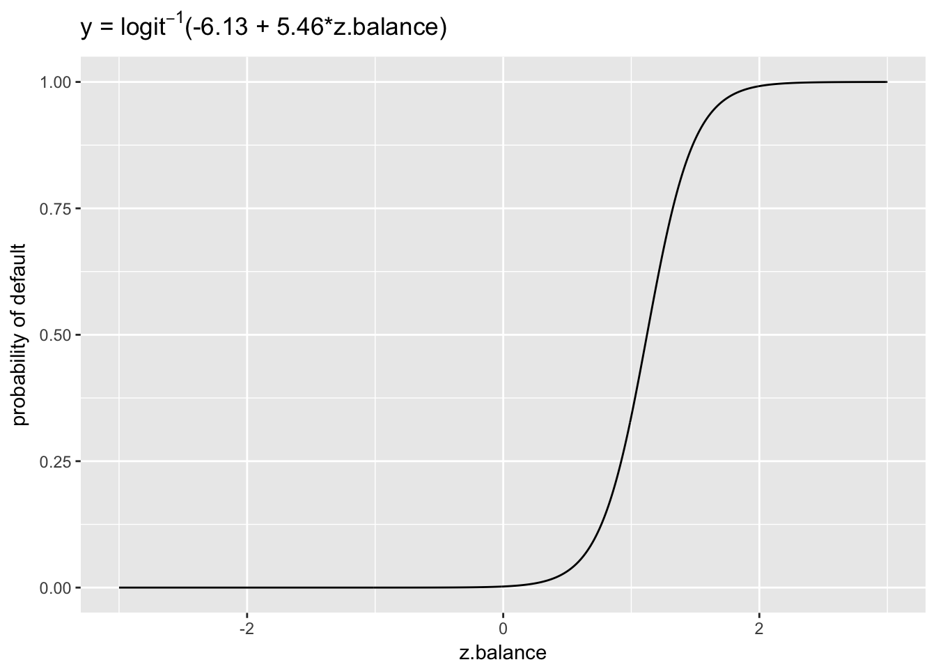
The plot reveals that the probability curve between 0 to 1 is much less steep than between 1 and 2, which explains why the probability change between z.balance = 1 and z.balance = 2 was so much greater than the change between z.balance = 0 and z.balance = 1. So, it matters a great deal where on the probability curve we choose to evaluate our coefficients. This is what makes it challenging to interpret logit models.
Note that we can fit a linear model to binary data. In fact, the default behavior of glm() is to pick family = gaussian unless otherwise specified, which is a linear model. The function will work but the model it produces is not a good one.
linear_fit <-
  lm(ifelse(default == "No", 0, 1) ~ balance + income, data = Default) %>%
  standardize

y_linear <- predict(linear_fit, newdata = data.frame(z.balance = x, z.income = 0))

ggplot(data.frame(y_linear = y_linear), aes(y_linear)) +
  geom_density() +
  ggtitle("Probabilities predicted by linear model of binary default")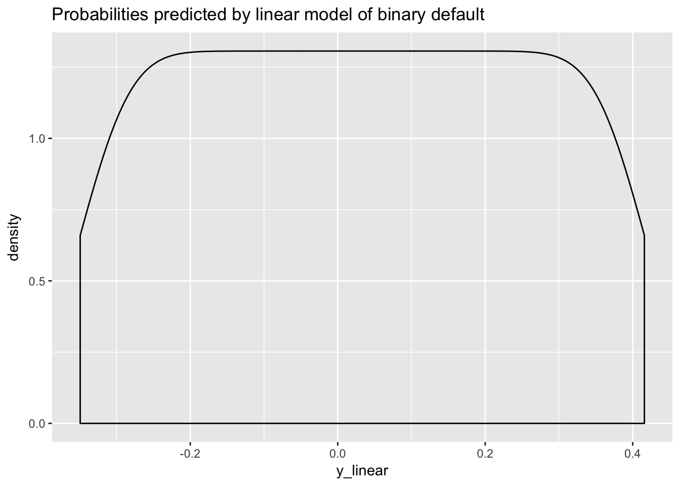
The model predicts negative probabilities, which is logically not possible. Here is the OLS line superimposed on the inverse logit curve.
ggplot(data.frame(x = x, y = y), aes(x, y)) +
  geom_line() +
  ggtitle(expression(paste("y = ", logit^-1,"(-6.13 + 5.46*z.balance) vs. linear fit (dashed red line)"))) +
  ylab("probability of default") +
  xlab("z.balance") +
  geom_line(data = data.frame(x = x, y_linear = y_linear), aes(x, y_linear), col = 2, lty = 2)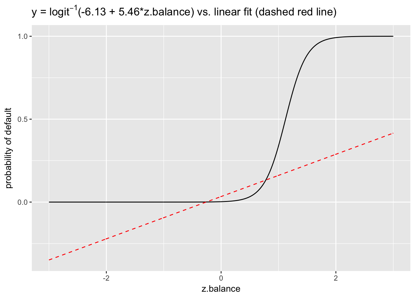
8.5 Logistic regression coefficients as odds ratios
We can also interpret logistic regression coefficients as odds ratios (ORs).39 If two outcomes have the probabilities \((p, 1-p)\), then \(\frac{p}{1-p}\) is known as the odds of the outcome. Odds and probabilities are simply different ways of representing the same information: \(\text{odds} = \frac{p}{1-p}\) and \(p = \frac{\text{odds}}{1+\text{odds}}\). For example, an odds of 1 is equivalent to a probability of .5—that is, equally likely outcomes for \(p\) and \(1-p\): \(\text{odds(p=.5)} = \frac{.5}{1-.5} = 1\) and \(p(\text{odds}=1) = \frac{\text{1}}{1+1} = .5.\)
The ratio of two odds is an OR:
\[ \frac{\frac{p_2}{1-p_2}}{\frac{p_1}{1-p_1}} \]
An odds ratio can be interpreted as a change in probability. For example, a change in probability from \(p_1 = .33\) to \(p_2 = .5\) results in an OR of 2, as follows:
\[ \frac{\frac{.5}{.5}}{\frac{.33}{.66}} = \frac{1}{.5} = 2 \]
We can also interpret the OR as the percentage increase in the odds of an event. Here, an OR of 2 is equivalent to increasing the odds by 100%, from .5 to 1.
Recall that we represent the logit model this way:
\[ \text{log} \left(\frac{p}{1-p}\right) = \alpha + \beta x \]
The left side of the equation, expressed as log odds, is on the same unbounded scale as the right: \(\pm \infty\). Hence there is no non-linearity in this relationship, and increasing \(x\) by 1 unit has the same effect as in linear regression: it changes the predicted outcome by \(\beta\). So going from \(x\) to \(x+1\) is equivalent to adding \(\beta\) to both sides of the above equation. Focusing just on the left hand side, we have, after exponentiating, the original odds multiplied by \(e^\beta\):
\[ e^{\text{log} \left(\frac{p}{1-p}\right) + \beta} = \frac{p}{1-p} *e^ \beta \] (because \(e^{a+b} = e^a*e^b\)).
We can think of \(e^\beta\) as the change in the odds of the outcome when \(x\) increases by 1 unit, which we could represent, using our earlier formulation, as an OR:
\[ \frac{\frac{p_2}{1-p_2}}{\frac{p_1}{1-p_1}} = \frac{\frac{p_1}{1-p_1} * e^\beta }{\frac{p_1}{1-p_1}} = e^\beta. \]
Thus, \(e^\beta\) can be interpreted as the change in the odds associated with a 1 unit increase in \(x\), expressed in percentage terms. In the case of OR = \(\frac{1}{.5} =2\) the percentage increase in the odds of the outcome is 100%.
Let’s apply this insight to our previous model of default by exponentiating the coefficients for balance and income:
exp(5.46)## [1] 235.0974exp(.56)## [1] 1.750673We can interpret these exponentiated coefficients as the percentage or multiplicative change in the odds associated with a 1 unit increase in the predictor (while holding the others constant), from 1 to 235 (a 23,400% increase) in the case of balance, and from 1 to 1.75 (a 75% increase) for income.
Gelman and Hill remark: “We find that the concept of odds can be somewhat difficult to understand, and odds ratios are even more obscure. Therefore we prefer to interpret coefficients on the original scale of the data” as probabilities (83). ORs may be obscure but they make it possible to interpret coefficients linearly and therefore allow us to avoid the complications of non-linearity we otherwise face when transforming coefficients expressed in log odds into probabilities with the inverse logit function. Still, it is much easier to understand and explain probabilities. If we say, for example, that an increase in balance from 835.37 to 1802.8 is associated with a predicted increase of .34 in the probability of default, what we mean is that 34 more people out of 100 will default with the higher balance than would have defaulted at the lower.
8.6 Assessing logistic model performance
We can assess logistic model performance using AIC as well as with several other measures of model fit, such as residual deviance, accuracy, sensitivity, specificity and area under the curve (AUC).
Like AIC, deviance is a measure of error, so lower deviance means a better fit to the data. We expect deviance to decline by 1 for every predictor, so with an informative predictor deviance will decline by more than 1. Deviance = \(-2ln(L)\), where \(ln\) is the natural log and \(L\) is the likelihood function. We can illustrate using two different models of default:
logistic_model1 <-
  glm(default ~ balance,
      data = Default,
      family = binomial)
logistic_model1$deviance
## [1] 1596.452logistic_model2 <-
glm(default ~ balance + income,
data = Default,
family = binomial)
logistic_model2$deviance## [1] 1578.966In this case, deviance declined by more than 1, indicating that income improves model fit. We can do a formal test of the difference using, as for linear models, the likelihood ratio test:
lrtest(logistic_model1, logistic_model2)## Likelihood ratio test
##
## Model 1: default ~ balance
## Model 2: default ~ balance + income
## #Df LogLik Df Chisq Pr(>Chisq)
## 1 2 -798.23
## 2 3 -789.48 1 17.485 2.895e-05 ***
## ---
## Signif. codes: 0 '***' 0.001 '**' 0.01 '*' 0.05 '.' 0.1 ' ' 1We can also translate the probabilities from a logistic model of default into class predictions by assigning “Yes” (default) to probabilities greater than or equal to .5 and “No” (no default) to probabilities less than .5, and then count the number of times the model assigns the right default class and divide by the total number of observations. This is known as “accuracy.” Accuracy is often used as a measure of model performance.
## [1] 97.37This model is 97.37% accurate.
One important basic metric for evaluating a classification model is that the accuracy is better the 50%, which is the performance we’d expect from random guessing. Over the long run random guessing should be, on average, about 50% accurate, as the following simulation demonstrates:
random_guessing <- NULL
for(i in 1:10000){
  guesses <- sample(rep(c("Yes", "No"), 500), replace = T)
  random_guessing[i] <- (length(which(guesses == Default$default)) / nrow(Default))*100
}

head(random_guessing)
## [1] 48.67 50.53 50.01 49.19 50.81 50.67mean(random_guessing)## [1] 50.00185The model with balance and income is a big improvement over random guessing, of course.
Another basic metric for evaluating a classification model is that it does better than results produced by following a simple rule to always predict the majority class. So, for example, in the Default data the majority class is “No,” by a large margin (9667 to 333). Most people do not default. What is our accuracy, then, if we simply predict “No” for all cases? The proportion of “No” in the data is 96.67%, so if we always predicted “No” that would be our accuracy (9667 / (9667 + 333) = .9667). The logistic model, surprisingly, offers only a slight improvement.
In assessing classifier performance, however, we need to recognize that not all errors are alike, and that accuracy has limitations as a performance metric. In some cases the model may have predicted default when there was no default. This is known as a “false positive.” In other cases the model may have predicted no default when there was default. This is known as a “false negative.” In classification, we use a what is known as a confusion matrix to summarize these different types of model errors—so named because the matrix summarizes how the model is confused. We will use the caret package’s confusionMatrix() to quickly calculate these values:
confusionMatrix(preds, Default$default, positive = "Yes")## Confusion Matrix and Statistics
##
## Reference
## Prediction No Yes
## No 9629 225
## Yes 38 108
##
## Accuracy : 0.9737
## 95% CI : (0.9704, 0.9767)
## No Information Rate : 0.9667
## P-Value [Acc > NIR] : 3.067e-05
##
## Kappa : 0.4396
## Mcnemar's Test P-Value : < 2.2e-16
##
## Sensitivity : 0.3243
## Specificity : 0.9961
## Pos Pred Value : 0.7397
## Neg Pred Value : 0.9772
## Prevalence : 0.0333
## Detection Rate : 0.0108
## Detection Prevalence : 0.0146
## Balanced Accuracy : 0.6602
##
## 'Positive' Class : Yes
## This function produces a lot of output. We can see that it reports the same accuracy that we calculated above: .97. The 2 x 2 confusion matrix is at the top. We can characterize these 4 values in the matrix as follows:
- 9629 true negatives (TN): when the model correctly predicts “No”
- 108 true positives (TP): when the model correctly predicts “Yes”
- 225 false negatives (FN): when the model incorrectly predicts “No”
- 38 false positives (FP): when the model incorrectly predicts “Yes”
The following table summarizes these possibilities:
| Reference | ||
| Predicted | No | Yes |
| No | TN | FN |
| Yes | FP | TP |
There are two key measures, in addition to accuracy, for characterizing model performance. While accuracy measures overall error, sensitivity and specificity measure class specific errors.
- Accuracy = 1 - (FP + FN) / Total:
1 - (38 + 225) / 10000## [1] 0.9737- Sensitivity (or the true positive rate): TP / (TP + FN). In this case, sensitivity measures the proportion of defaults that were correctly classified as such.
108 / (108 + 225) ## [1] 0.3243243- Specificity (or the true negative rate): TN / (TN + FP). In this case, specificity measures the proportion of non-defaults that were correctly classified as such.
9629 / (9629 + 38) ## [1] 0.9960691Why should we consider these class specific errors? All models have errors, but not all model errors are equally important. For example, a false negative—predicting incorrectly that a borrower will not default—may be a costly mistake for a bank, if default could have been prevented through intervention. But, on the other hand, a false positive—predicting incorrectly that a borrower will default—may trigger an unneeded warning that irritates customers. The mistakes that a model makes can be controlled by adjusting the decision threshold used to assign predicted probabilities to classes. We used a probability threshold of .5 to classify defaults. If the threshold were set at .1, by contrast, the overall accuracy would go down, but so would the number of false negatives, which might be desirable. The model would then catch more defaulters, which would save the bank money, but that would come at a cost: more false positives (potentially irritated customers).
confusionMatrix(ifelse(fitted(logistic_model2) >= .1, "Yes", "No"), Default$default)$table## Reference
## Prediction No Yes
## No 9105 90
## Yes 562 243The question of how to set the decision threshold—.5, .1 or something else—should be answered with reference to the business context.
A receiver operating characteristic (ROC) curve visualizes the trade-offs between kinds of errors by plotting specificity against sensitivity. Calculating the area under the ROC curve (AUC) allows us, furthermore, to summarize model performance and compare models. The curve itself shows the sorts of errors the model would make at different decision thresholds. To create a ROC curve we use the roc() function from the pROC package, and display the sensitivity/specificity values associated with decision thresholds of .1 and .5:
library(pROC); library(plotROC)

invisible(plot(roc(factor(ifelse(Default$default == "Yes", 1, 0)), fitted(logistic_model2)), print.thres = c(.1, .5), col = "red", print.auc = T))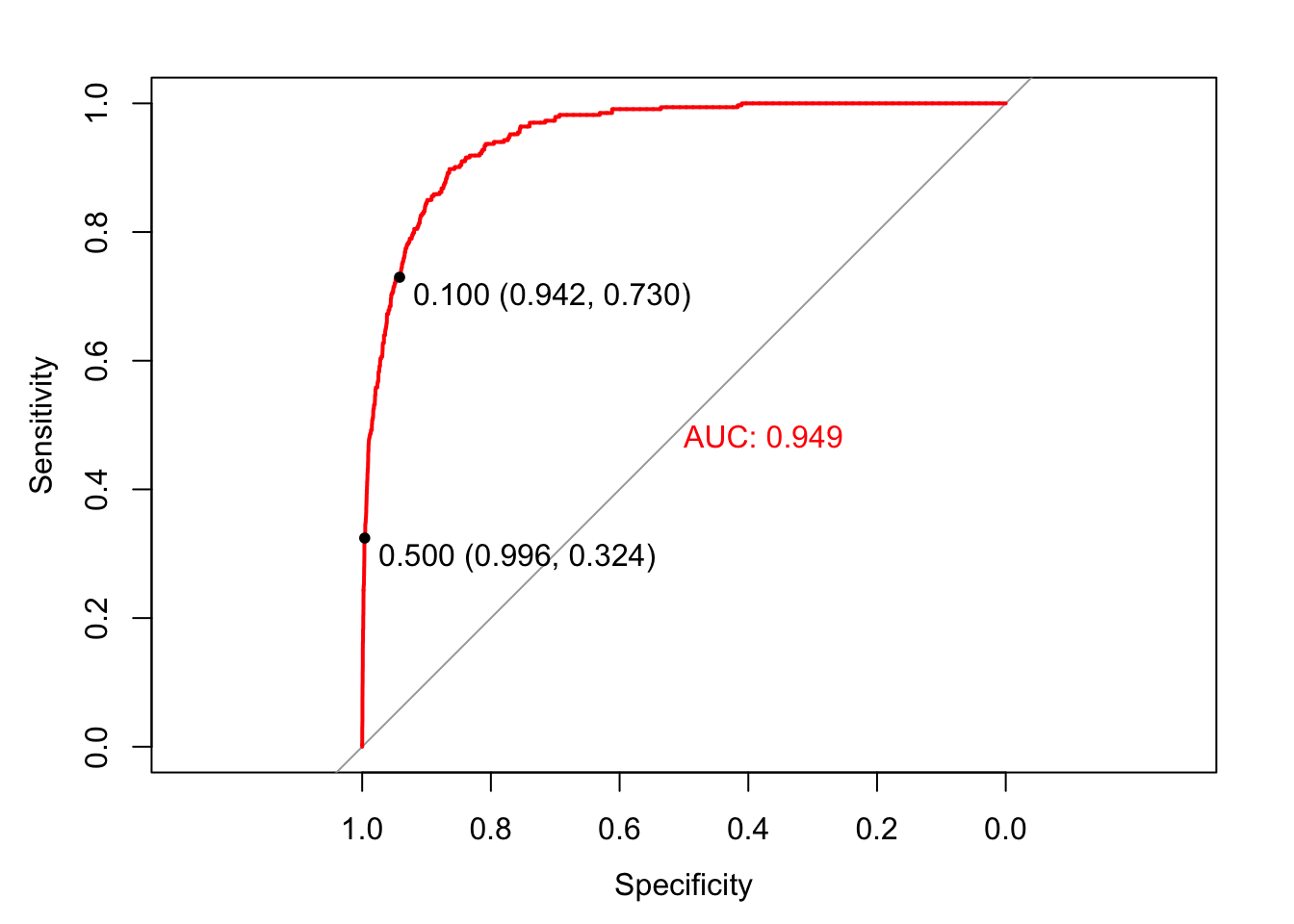
A model with accuracy of 50%, a random classifier, would have a ROC curve that followed the diagonal reference line. A model with accuracy of 100%, a perfect classifier, would have a ROC curve following the margins of the upper triangle. Each point on the ROC curve represents a sensitivity/specificity pair corresponding to a particular decision threshold. When we set the decision threshold to .1 the sensitivity was .73 (243 / (243 + 90)) and the specificity was .94 (9105 / (9105 + 562)). That point is displayed on the curve. Likewise when we set the decision threshold to .5 the sensitivity was .32 and the specificity was .996. That point is also on the curve. Which decision threshold is optimal? Again, it depends on the business application. ROC curves allow us to choose the class specific errors we make.
AUC is the summary of how the model does at every decision threshold. In general, models with higher AUC are better. The AUC for the logistic model was .95. We can use the ROC curve and AUC to compare classifiers. Let’s compare the logistic model with a KNN model.
##           Reference
## Prediction   No  Yes
##        No  9626  212
##        Yes   41  121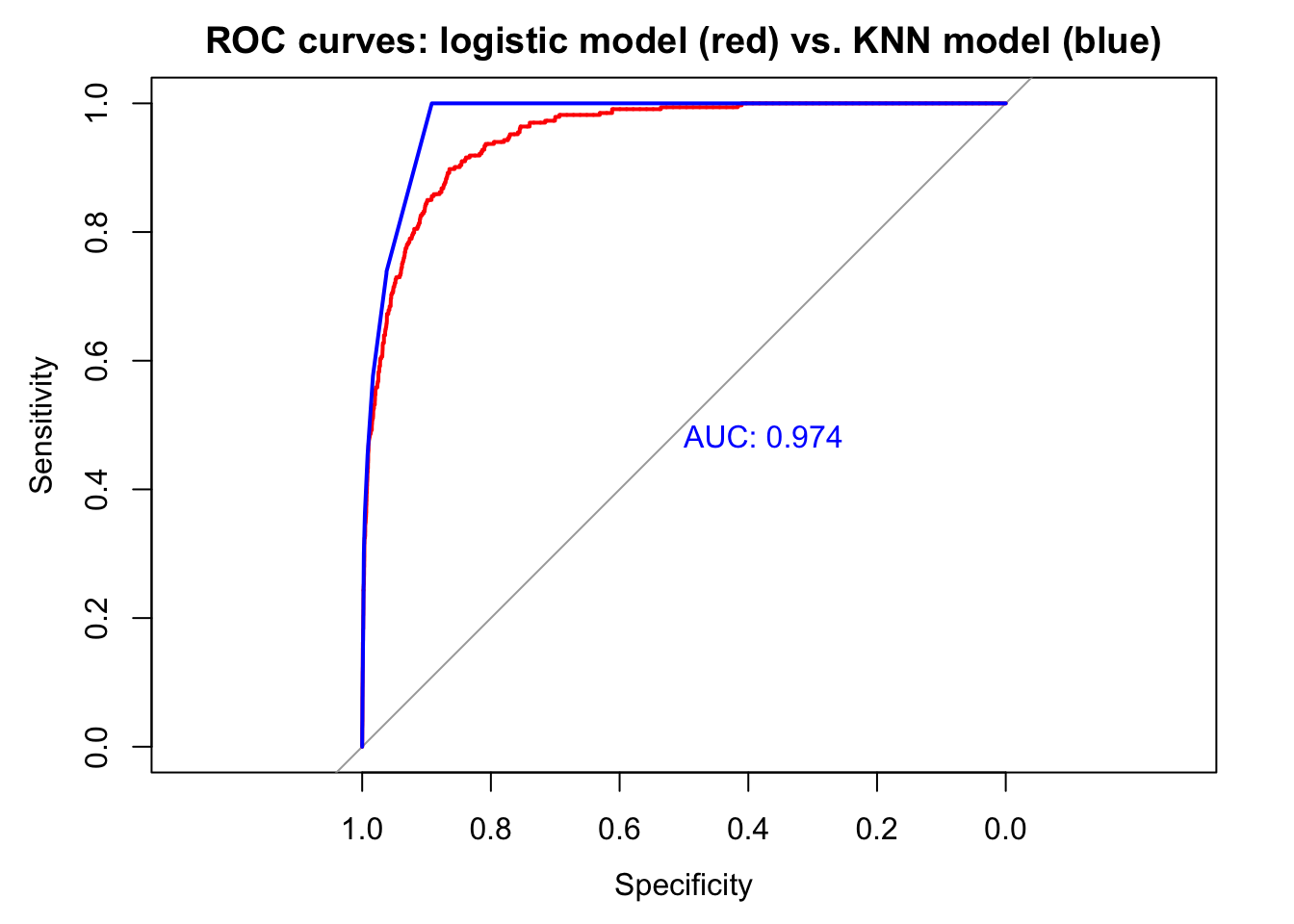
The KNN model appears to be a slightly more accurate classifier in sample. AUC is higher and accuracy at the .5 decision threshold is higher. The model produces more false positives (41 vs. 38) but fewer false negatives (212 vs. 225). We would need to use cross validation to assess which model performs better with new data. The logistic model does better with description, however, since it provides exact information, in the form of coefficients, about how much each predictor contributes to the model. And if we wanted to assess whether balance depends on income in predicting default—a reasonable supposition, which we could not explore with KNN—we could include an interaction in the logistic model:
display(interaction_model <-
          standardize(glm(default ~ balance * income,
                          data = Default,
                          family = binomial)))
## glm(formula = default ~ z.balance * z.income, family = binomial,
## data = Default)
## coef.est coef.se
## (Intercept) -6.13 0.19
## z.balance 5.48 0.22
## z.income 0.31 0.36
## z.balance:z.income 0.31 0.42
## ---
## n = 10000, k = 4
## residual deviance = 1578.4, null deviance = 2920.6 (difference = 1342.2)The interaction is not significant: .31 - 2 x .42 < 0.
8.7 Assessing logistic model fit
Traditional residual plots are not very helpful with logistic regression. Consider, for example, this residual plot for the above interaction model:
plot(interaction_model, which=1)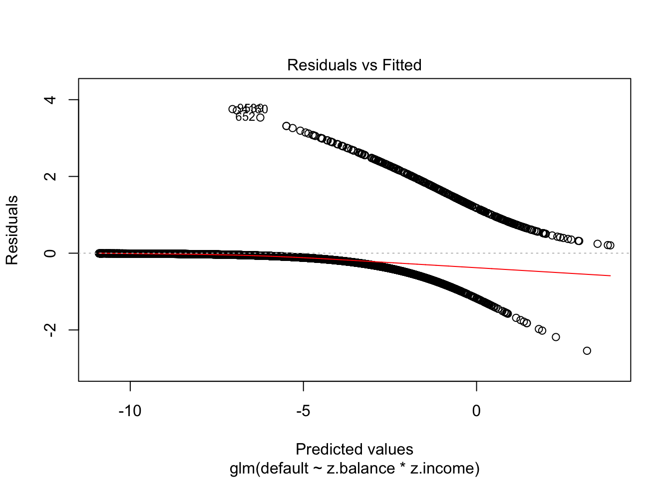
A binned residual plot, available in the arm package, is better. From the documentation:
In logistic regression, as with linear regression, the residuals can be defined as observed minus expected values. The data are discrete and so are the residuals. As a result, plots of raw residuals from logistic regression are generally not useful. The binned residuals plot instead, after dividing the data into categories (bins) based on their fitted values, the average residual versus the average fitted value for each bin.40
binnedplot(fitted(interaction_model),
           residuals(interaction_model, type = "response"),
           nclass = NULL,
           xlab = "Expected Values",
           ylab = "Average residual",
           main = "Binned residual plot",
           cex.pts = 0.8,
           col.pts = 1,
           col.int = "gray")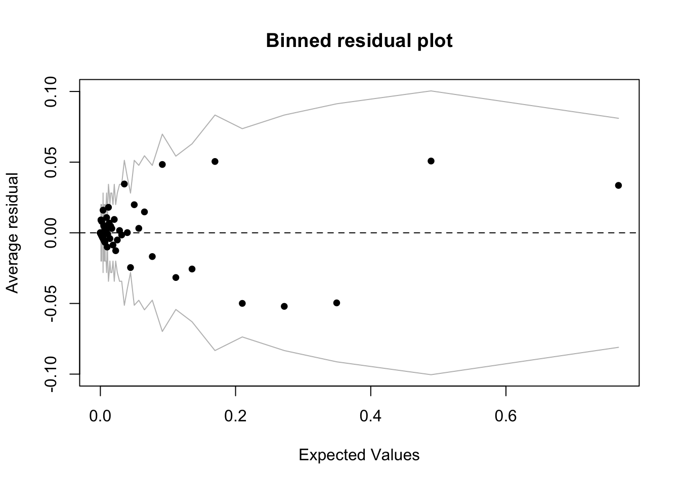
The grey lines represent \(\pm\) 2 SE bands, which we would expect to contain about 95% of the observations. This model looks reasonable (though it is a little hard to tell with the bunching on the left hand side of the plot), in that majority of the fitted values seem to fall within the SE bands. It is also possible to use binnedplot() to investigate residuals versus individual predictors. See Gelman, page 98, and below, for an example.
8.8 Logistic regression example: modeling diabetes
For this example we will use the Pima dataset, included in the MASS library, which is introduced this way:
A population of women who were at least 21 years old, of Pima Indian heritage and living near Phoenix, Arizona, was tested for diabetes according to World Health Organization criteria. The data were collected by the US National Institute of Diabetes and Digestive and Kidney Diseases. We used the 532 complete records after dropping the (mainly missing) data on serum insulin.
The dataset includes the following variables:
- npreg: Number of times pregnant
- glu: Plasma glucose concentration a 2 hours in an oral glucose tolerance test
- bp: Diastolic blood pressure (mm Hg)
- skin: Triceps skin fold thickness (mm)
- bmi: Body mass index (weight in kg/(height in m)^2)
- ped: Diabetes pedigree function
- age: Age (years)
- type: Yes or No (diabetes)
The outcome variable is type, indicating whether a person has diabetes. The data is split into a train and test set, which we will combine together.
library(MASS)
data("Pima.tr")
data("Pima.te")

d <- rbind(Pima.te, Pima.tr)

glimpse(d)
## Observations: 532
## Variables: 8
## $ npreg <int> 6, 1, 1, 3, 2, 5, 0, 1, 3, 9, 1, 5, 3, 10, 4, 9, 2, 4, 3...
## $ glu <int> 148, 85, 89, 78, 197, 166, 118, 103, 126, 119, 97, 109, ...
## $ bp <int> 72, 66, 66, 50, 70, 72, 84, 30, 88, 80, 66, 75, 58, 78, ...
## $ skin <int> 35, 29, 23, 32, 45, 19, 47, 38, 41, 35, 15, 26, 11, 31, ...
## $ bmi <dbl> 33.6, 26.6, 28.1, 31.0, 30.5, 25.8, 45.8, 43.3, 39.3, 29...
## $ ped <dbl> 0.627, 0.351, 0.167, 0.248, 0.158, 0.587, 0.551, 0.183, ...
## $ age <int> 50, 31, 21, 26, 53, 51, 31, 33, 27, 29, 22, 60, 22, 45, ...
## $ type <fctr> Yes, No, No, Yes, Yes, Yes, Yes, No, No, Yes, No, No, N...All the predictors are either integer or numeric. Our objective is to build a logistic model of diabetes to practice interpreting coefficients.
8.8.1 Simple model
Let’s start with a simple model.
bin_model1 <-
  glm(type ~ bmi + age,
      data = d,
      family = binomial)

display(bin_model1)
## glm(formula = type ~ bmi + age, family = binomial, data = d)
## coef.est coef.se
## (Intercept) -6.26 0.67
## bmi 0.10 0.02
## age 0.06 0.01
## ---
## n = 532, k = 3
## residual deviance = 577.2, null deviance = 676.8 (difference = 99.6)- Intercept: -6.26 is the log odds of diabetes when balance is bmi = 0 and age = 0. Since neither age nor bmi can equal 0 the intercept is not interpretable in this model. It would therefore make sense to center the inputs, though for now we will leave them unchanged.
- bmi: .1 is the predicted change in the log odds of diabetes associated with a 1 unit increase in bmi, holding age constant. This coefficient is statistically significant since .1 - 2 x .02 > 0. (A 95% CI that does not contain 0 indicates statistical significance.) We can translate this coefficient into an OR by exponentiating: \(e^.1\) = 1.11. A 1 unit increase in bmi, holding age constant, is associated with an 11% increase in the odds (or, more colloquially, the chance) of diabetes.41 Translating the coefficient into a probability is more challenging because we must choose where to evaluate it. Average bmi is 32.89 so we evaluate bmi around this region: a 1 unit change in bmi from 33 to 34, while age is constant. The change in probability associated with increasing bmi from 33 to 34 is logit\(^{-1}\)(-6.26 + .1 x 34 + 0 x .06) - logit\(^{-1}\)(6.26 + .1 x 33 + 0 x .06) or 0.006.
- age: .06 is the predicted change in the log odds of diabetes associated with a 1 unit increase in age, holding bmi constant. This coefficient is also statistically significant since .06 - 2 x .01 > 0. The OR for age is \(e^.06\) = 1.06 indicating a 6% increase in the odds of diabetes associated with a 1 unit increase in age. The change in probability associated with increasing age from 32 to 33 (average age is 31.61) is logit\(^{-1}\)(-6.26 + .06 x 33) - logit\(^{-1}\)(6.26 + .06 x 32) or 0.001. We culd adjust the grain of this estimate as needed by the context. For example, it mght make sense to calculate the increase in the probability of diabetes for 40 year olds compared to 30 year olds.
8.8.2 Adding predictors and assessing fit
Now we will fit a more complete model (excluding skin, since it seems to be measuring close to the same thing as bmi). Does the fit improve?
bin_model2 <-
  glm(type ~ bmi + age + ped + glu + npreg + bp ,
      data = d,
      family = binomial)
display(bin_model2)
## glm(formula = type ~ bmi + age + ped + glu + npreg + bp, family = binomial,
## data = d)
## coef.est coef.se
## (Intercept) -9.59 0.99
## bmi 0.09 0.02
## age 0.03 0.01
## ped 1.31 0.36
## glu 0.04 0.00
## npreg 0.12 0.04
## bp -0.01 0.01
## ---
## n = 532, k = 7
## residual deviance = 466.5, null deviance = 676.8 (difference = 210.3)Deviance declines from 577 in the prior model to 466.5 in this model, far in excess of the 4 points it should go down simply by including 4 additional predictors. In addition we could compare the models using the LRT:
lrtest(bin_model1, bin_model2)## Likelihood ratio test
##
## Model 1: type ~ bmi + age
## Model 2: type ~ bmi + age + ped + glu + npreg + bp
## #Df LogLik Df Chisq Pr(>Chisq)
## 1 3 -288.60
## 2 7 -233.27 4 110.67 < 2.2e-16 ***
## ---
## Signif. codes: 0 '***' 0.001 '**' 0.01 '*' 0.05 '.' 0.1 ' ' 1The second model is much better than the first, which is also apparent when we look at the confusion matrices (with the decision threshold set at .5) to explore misclassification errors.
confusionMatrix(ifelse(fitted(bin_model1) > .5, "Yes", "No"), d$type)$table## Reference
## Prediction No Yes
## No 312 112
## Yes 43 65confusionMatrix(ifelse(fitted(bin_model2) > .5, "Yes", "No"), d$type)$table## Reference
## Prediction No Yes
## No 318 73
## Yes 37 104As expected, the larger model makes fewer errors. We can formalize this impression by calculating and comparing model accuracy: 1 - (112 + 43) / (112 + 43 + 312 + 65) = 0.71 for the first model, compared to 1 - (73 + 37) / (73 + 37 + 318 + 104) = 0.79 for the second, larger model. The numbers of true negatives are close, but the larger model increases the number of true positives substantially and drives down the number of false negatives—predicting incorrectly that a person does not have diabetes (though this remains the largest error class). We should check to see that these models improve accuracy over a model that always predicts the majority class. In this dataset, “No” is the majority category at 66.7%. So if we always predicted “No” we would be correct 66.7% of the time, which is lower accuracy than either model. ROC curves provide a more systematic account of model performance in terms of misclassification errors.
invisible(plot(roc(d$type,
                   fitted(bin_model1)),
               col = "red",
               main = "ROC curves: logistic model 1 (red) vs. logistic model 2 (blue)"))

invisible(plot(roc(d$type,
                   fitted(bin_model2)),
               print.auc = T,
               col = "blue",
               add = T))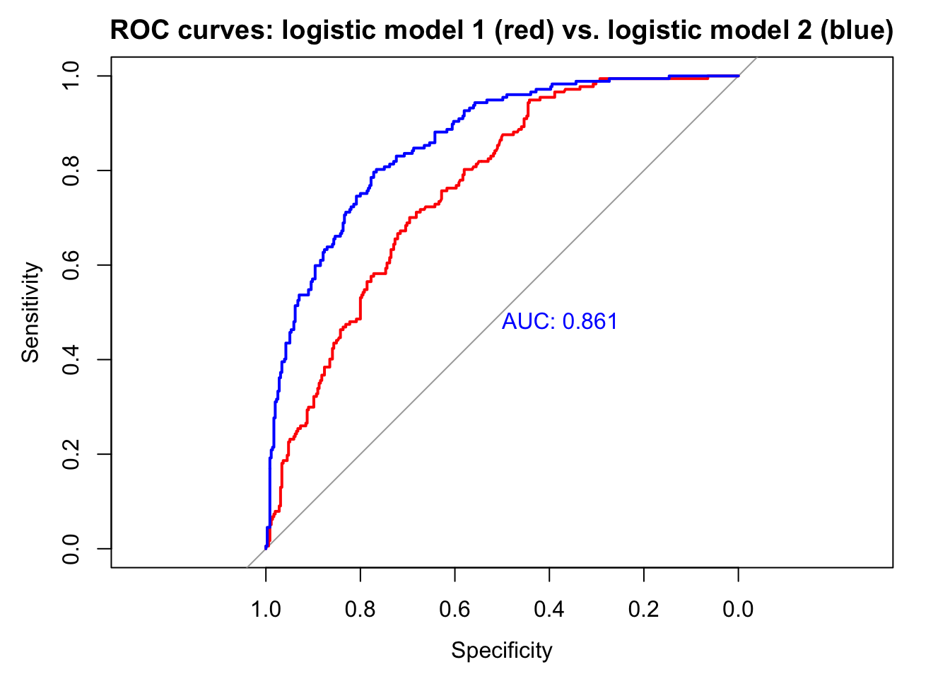
The larger model is clearly better: AUC is higher.
We should assess the quality of the fit for the larger model by looking at binned residuals.
binnedplot(fitted(bin_model2),
           residuals(bin_model2, type = "response"),
           nclass = NULL,
           xlab = "Expected Values",
           ylab = "Average residual",
           main = "Binned residual plot",
           cex.pts = 0.8,
           col.pts = 1,
           col.int = "gray")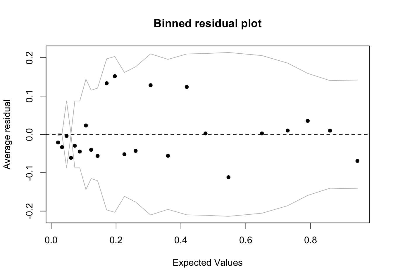
The model looks reasonable, but there are more outliers among the residuals than we would expect from chance alone (< .05): 23 binned residuals but 3 outliers = 0.13. The model does well when fitted values are larger than about .1, but struggles below .1, where we find the 3 outliers, all of which are negative. This means that in these bins the model is predicting a higher average rate of diabetes than is actually the case. Residuals are observed minus fitted values. So if, for example, the rate of observed diabetes is less than what the model predicts, then the residuals will be negative. In this case, at low levels of predicted diabetes, the model is overpredicting diabetes. We can take a look at the individual predictors against the binned residuals to see where we might refine the model. All of them look good except for bmi, where we see the same pattern:
binnedplot(d$bmi,
           residuals(bin_model2, type = "response"),
           nclass = NULL,
           xlab = "bmi",
           ylab = "Average residual",
           main = "Binned residual plot",
           cex.pts = 0.8,
           col.pts = 1,
           col.int = "gray")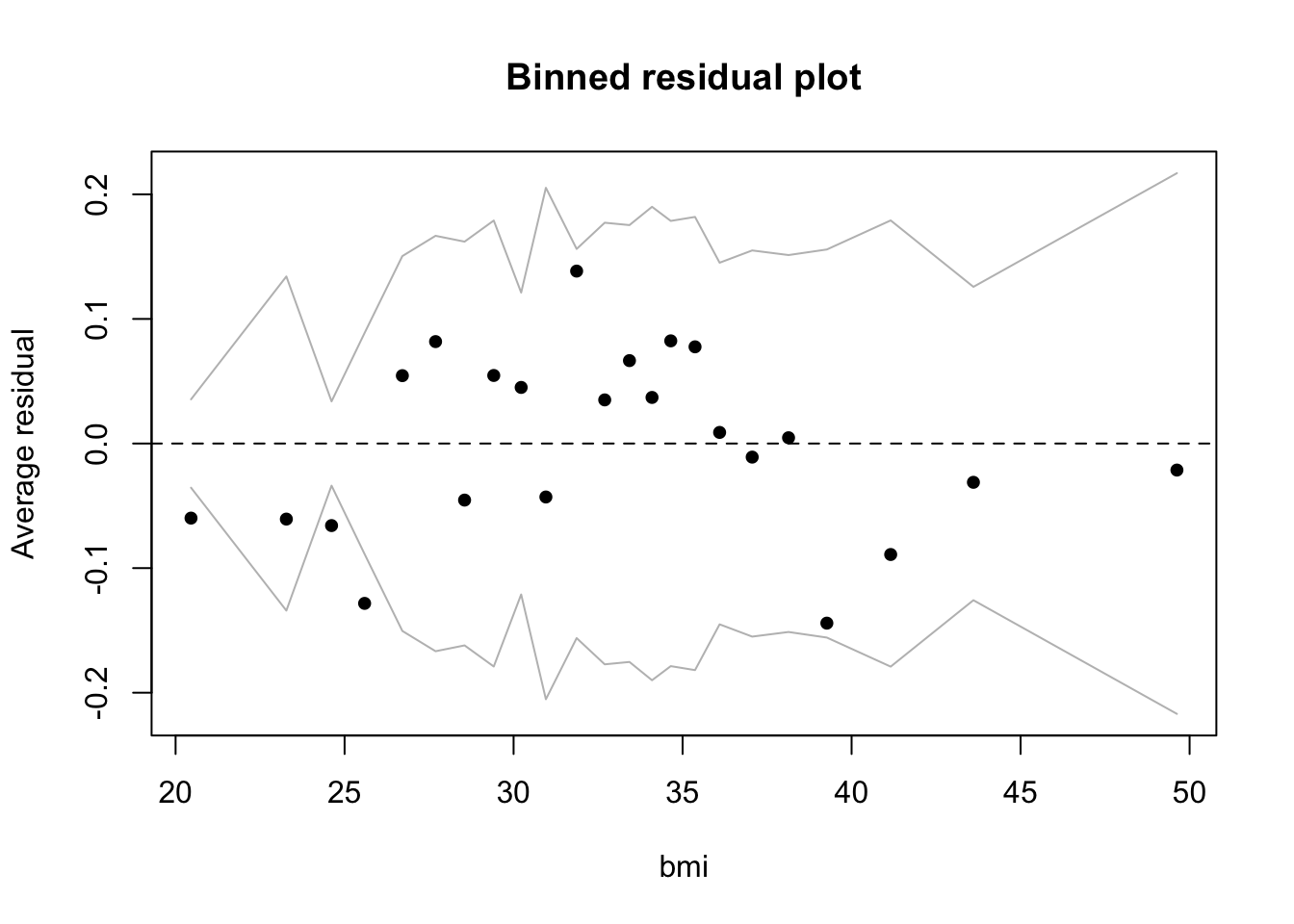
At low levels of bmi the model is also overpredicting diabetes. Bmi may work as a predictor at higher but not at lower levels, where there may be other factors operating. The model may, in fact, be missing a key predictor. For example, the data dictionary noted that the insulin variable had been removed due to many NA values. With insulin included the model might do a better job predicting diabetes at low bmi.
8.8.3 Adding an interaction
Let’s add an interaction between two continuous predictors, ped and glu. We will center and scale the inputs so that the coefficient for the interaction is interpretable.
bin_model3 <-
  standardize(glm(type ~ bmi  + ped * glu +  age + npreg + bp ,
      data = d,
      family = binomial))
display(bin_model3)
## glm(formula = type ~ z.bmi + z.ped * z.glu + z.age + z.npreg +
## z.bp, family = binomial, data = d)
## coef.est coef.se
## (Intercept) -1.02 0.13
## z.bmi 1.29 0.26
## z.ped 1.02 0.24
## z.glu 2.31 0.27
## z.age 0.53 0.30
## z.npreg 0.87 0.29
## z.bp -0.19 0.26
## z.ped:z.glu -1.15 0.41
## ---
## n = 532, k = 8
## residual deviance = 460.0, null deviance = 676.8 (difference = 216.7)The interaction improves the model but does not change the general picture of model fit in the binned residual plot (not included).
- Intercept: -1.02 is the log odds of diabetes when all the predictors are average (since we have centered and scaled the inputs). The probability of having diabetes for the average woman in this dataset (average on the input variables) is logit\(^{-1}\)(-1.02) = 0.27.
- z.bmi: 1.29 is the predicted change in the log odds of diabetes associated with a 1 unit increase in z.bmi, holding the other predictors constant. \(e^{1.29}\) = 3.63 so a 1 unit increase in z.bmi, holding the other predictors constant, is associated with an 263% increase in the odds of diabetes.
- z.ped: 1.02 is the predicted change in the log odds of diabetes associated with a 1 unit increase in z.ped, when z.glu = 0 and holding the other predictors constant. \(e^{1.02}\) = 2.77 so a 1 unit increase in z.ped, when z.glu = 0 and holding the other predictors constant, is associated with an 177% increase in the odds of diabetes.
- z.glu: 2.31 is the predicted change in the log odds of diabetes associated with a 1 unit increase in z.glu, when z.ped = 0 and holding the other predictors constant. \(e^{2.31}\) = 10.07 so a 1 unit increase in z.glu, when z.ped = 0 and holding the other predictors constant, is associated with an 907% increase in the odds of diabetes.
- z.age: .53 is the predicted change in the log odds of diabetes associated with a 1 unit increase in z.age, holding the other predictors constant. \(e^{.53}\) = 1.7 so a 1 unit increase in z.age, holding the other predictors constant, is associated with a 70% increase in the odds of diabetes. Age is not statistically significant.
- z.npreg: .87 represents the predicted change in the log odds of diabetes associated with a 1 unit increase in z.npreg, holding the other predictors constant. \(e^{.87}\) = 2.39 so a 1 unit increase in z.npreg, holding the other predictors constant, is associated with a 139% increase in the odds of diabetes.
- z.bp: -.19 represents the predicted change in the log odds of diabetes associated with a 1 unit increase in z.bp, holding the other predictors constant. \(e^{-.19}\) = 0.83 so a 1 unit increase in z.bp, holding the other predictors constant, is associated with a 17% decline (1 - .83) in the odds of diabetes. Bp is not statistically significant.
- z.ped:z.glu: -1.15 is added to the log odds of z.ped when z.glu increases by 1 unit, holding the other predictors constant. Or, alternatively, -1.15 is added to the log odds of z.glu for each additional unit of z.ped. We calculate the OR, as in the other cases, by exponentiating: \(e^{-1.15}\) = 0.32. The OR for z.ped declines by 68% (1 - .32 = .68) when z.glu increases by 1 unit, holding the other predictors constant. Or, alternatively, the OR for z.glu declines by 68% with each additional unit of z.ped.
8.8.4 Plotting the interaction
As always, we must visualize the interaction to understand it. This is especially true when the relationships are expressed in terms of log odds and odds ratios. As we’ve done previously for purposes of visualization, we will dichotomize the predictors in the interaction, and in this case, for ease of interpretation, present the relationships in terms of probabilities. The purpose of the plots is understanding and illustration, so we are not too concerned with statistical precision. We will summarize the relationships using a loess curve to capture the nonlinearity involved in translating the range of the predictor (\(\pm \infty\)) to the range of the binary outcome (0, 1).
d$ped_bin <- ifelse(d$ped > mean(d$ped), "above avg","below avg")
d$glu_bin <- ifelse(d$glu > mean(d$glu), "above avg","below avg")
d$prob <- fitted(bin_model3)
d$type_num <- ifelse(d$type == "Yes", 1, 0)

ggplot(d, aes(glu, type_num)) +
  geom_point() +
  stat_smooth(aes(glu, prob, col = ped_bin), se = F) +
  labs(y = "Pr(diabetes)", title = "Diabetes ~ glu varying by ped_bin")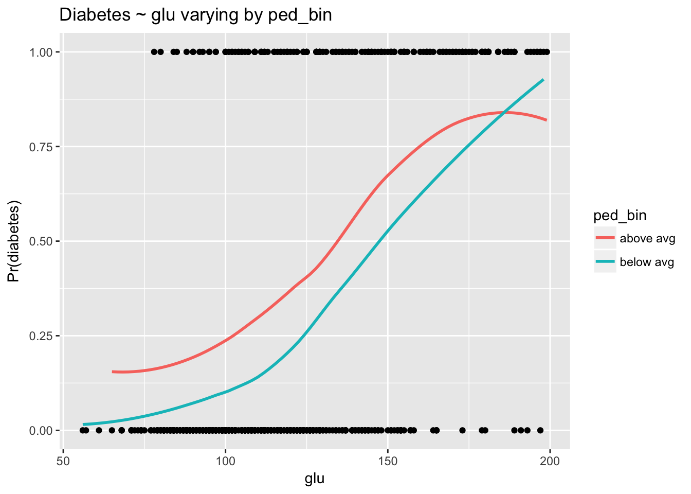
The relationship between glu and diabetes clearly depends on levels of ped. As in the linear case, converging lines indicate an interaction. The negative log odds coefficient for the interaction from the model indicates that as ped goes up the strength of the relationship between glu and type goes down. This is exactly what we see here.
ggplot(d, aes(ped, type_num)) +
  geom_point() +
  stat_smooth(aes(ped, prob, col = glu_bin), se = F) +
  labs(y = "Pr(diabetes)", title = "Diabetes ~ ped varying by glu_bin")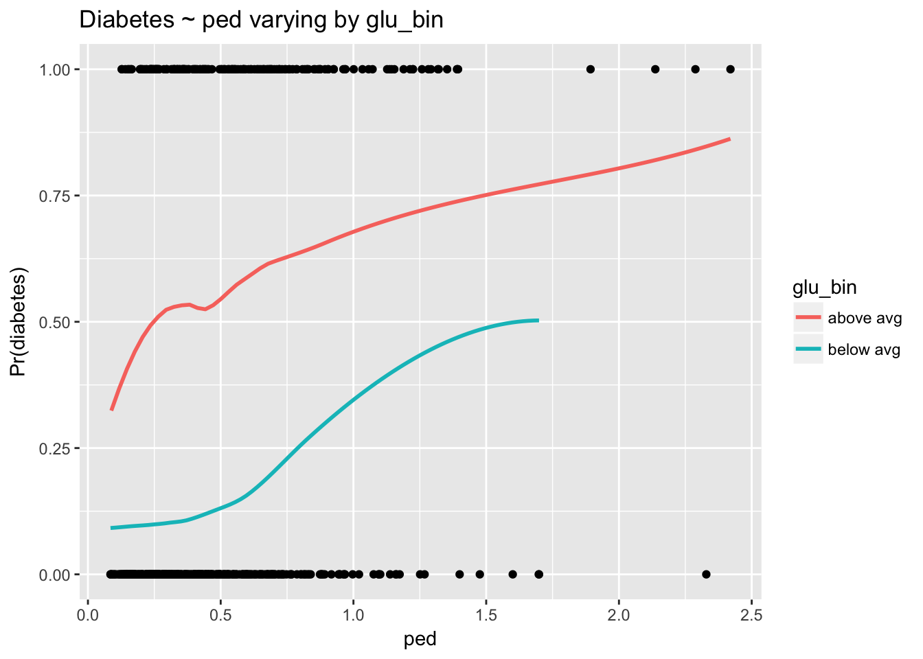
The interaction is harder to see here because the scale of ped is compressed, with the majority of observations near 0. Nevertheless, we can see that as glu increases the strength of the relationship between ped and diabetes declines. Again, non parallel lines indicate the presence of an interaction.
8.8.5 Using the model to predict probabilities
The largest effect size in the above model with the interaction, by far, is z.glu. To communicate the results of this model we might therefore want to concentrate on glu. But coefficients expressed as log odds are somewhat obscure, and odds ratios, unfortunately, do not help clarify things that much. We should go to the extra work of translating model coefficients into probabilities, but to do so we must identify where on the probability curve we’d like to evaluate glu. We’ll pick the region near the average of z.glu—0—and examine the effect of increasing z.glu by 1 unit (which is equal to 2 standard deviations of glu) when the other predictors are average. The simplest way to do this is to create a data frame with the desired predictor values to use with the predict() function.
(lo <- as.numeric(invlogit(predict(bin_model3, newdata = data.frame(z.bmi = 0, z.ped = 0, z.glu = 0, z.age = 0, z.npreg = 0, z.bp = 0)))))## [1] 0.2652028(hi <- as.numeric(invlogit(predict(bin_model3, newdata = data.frame(z.bmi = 0, z.ped = 0, z.glu = 1, z.age = 0, z.npreg = 0, z.bp = 0)))))## [1] 0.7841357round(hi - lo, 2)## [1] 0.52Notice that the probability of diabetes when all the predictors are set at 0 is identical to the inverse logit of the intercept calculated earlier. A 1 unit increase in z.glu corresponds to an increase of 62 in glu. Thus, the model indicates that increasing glue by two standard deviations from the average, 121.03, to 183.03, is predicted to increase the probability of diabetes by .52. In other words, 52 out of 100 more people will have diabetes at the high level of glu than at the lower.
8.8.6 Comparing models
How does the logistic model compare to other methods? We’ll use caret to fit all the models. Remember that the results caret prints to the screen are cross-validation estimates of the model’s out of sample performance. For classification, caret’s default performance metric is accuracy.
Logistic regression:
set.seed(818)
(train(type ~ bmi  + ped * glu +  age + npreg + bp,
      data = d,
      method = "glm"))
## Generalized Linear Model
##
## 532 samples
## 6 predictor
## 2 classes: 'No', 'Yes'
##
## No pre-processing
## Resampling: Bootstrapped (25 reps)
## Summary of sample sizes: 532, 532, 532, 532, 532, 532, ...
## Resampling results:
##
## Accuracy Kappa
## 0.7744921 0.4714253
##
## Random forest:
set.seed(818)
(train(type ~ bmi  + ped * glu +  age + npreg + bp,
      data = d,
      preProcess = c("center", "scale"),
      method = "ranger"))
## Random Forest
##
## 532 samples
## 6 predictor
## 2 classes: 'No', 'Yes'
##
## Pre-processing: centered (7), scaled (7)
## Resampling: Bootstrapped (25 reps)
## Summary of sample sizes: 532, 532, 532, 532, 532, 532, ...
## Resampling results across tuning parameters:
##
## mtry Accuracy Kappa
## 2 0.7621027 0.4506742
## 4 0.7551537 0.4375313
## 7 0.7543057 0.4358891
##
## Accuracy was used to select the optimal model using the largest value.
## The final value used for the model was mtry = 2.KNN:
set.seed(818)
(train(type ~ bmi  + ped * glu +  age + npreg + bp,
      data = d,
      preProcess = c("center", "scale"),
      method = "knn"))
## k-Nearest Neighbors
##
## 532 samples
## 6 predictor
## 2 classes: 'No', 'Yes'
##
## Pre-processing: centered (7), scaled (7)
## Resampling: Bootstrapped (25 reps)
## Summary of sample sizes: 532, 532, 532, 532, 532, 532, ...
## Resampling results across tuning parameters:
##
## k Accuracy Kappa
## 5 0.7273785 0.3602777
## 7 0.7317659 0.3682213
## 9 0.7407292 0.3862904
##
## Accuracy was used to select the optimal model using the largest value.
## The final value used for the model was k = 9.Gradient boosted machine:
set.seed(818)
(gbm <- train(type ~ bmi  + ped * glu +  age + npreg + bp ,
      data = d,
      method = "gbm",
      preProcess = c("center", "scale"),
      verbose = F))
## Stochastic Gradient Boosting
##
## 532 samples
## 6 predictor
## 2 classes: 'No', 'Yes'
##
## Pre-processing: centered (7), scaled (7)
## Resampling: Bootstrapped (25 reps)
## Summary of sample sizes: 532, 532, 532, 532, 532, 532, ...
## Resampling results across tuning parameters:
##
## interaction.depth n.trees Accuracy Kappa
## 1 50 0.7766689 0.4620889
## 1 100 0.7783786 0.4759922
## 1 150 0.7772751 0.4751202
## 2 50 0.7756300 0.4715080
## 2 100 0.7735278 0.4741809
## 2 150 0.7670126 0.4615437
## 3 50 0.7754150 0.4756381
## 3 100 0.7702891 0.4696694
## 3 150 0.7698212 0.4700320
##
## Tuning parameter 'shrinkage' was held constant at a value of 0.1
##
## Tuning parameter 'n.minobsinnode' was held constant at a value of 10
## Accuracy was used to select the optimal model using the largest value.
## The final values used for the model were n.trees = 100,
## interaction.depth = 1, shrinkage = 0.1 and n.minobsinnode = 10.Logistic regression compares well, with accuracy of 77.4%. The gradient boosted machine is slightly better with accuracy (at interaction.depth = 1 and n.trees = 100) of 77.8%, though we should remember that these are estimates for out-of-sample performance that will vary somewhat depending on the bootstrap sample selected by caret’s cross-validation algorithm. Remember, too, that accuracy is a rough cut performance metric: we should follow up by considering the sorts of misclassification errors the models are making by examining confusion matrices and ROC curves.
\(\frac{x}{1-x}\) is known as the odds of the outcome.↩
GLM stands for generalized linear model. This function will fit a variety of non-linear models. For example, we could specify a poisson regression with
family = poisson.↩For more detail, see How Do I Interpret Odds Ratios in Logistic Regression?.↩
Binned residual plots are also discussed on page 97 in Gelman and Hill. Note that it is essential to use
type = "response"in the argument toresiduals()to ensure that the residuals are on the same scale as the fitted values.↩As when we exponentiate a coefficient after log transformation of the input, log odds close to 0 have a quick interpretation: simply multiply by 100 and treat the result as an approximation of the OR percentage increase. In this case the coefficient is .1, which is close to 0, so we would approximate the OR as 10%, which is close to the computed OR.↩