Chapter 4 Exploratory Data Analysis
Exploratory Data Analysis, or EDA, is the more or less time-consuming and messy process of data exploration that we must go through before doing any statistical modeling. Our goal in EDA, in preparation for modelling, is to understand our data, especially relationships between variables.
Roger Peng aptly compares EDA with the editing process for a film:
Exploratory data analysis is what occurs in the “editing room” of a research project or any data-based investigation. EDA is the process of making the “rough cut” for a data analysis, the purpose of which is very similar to that in the film editing room. The goals are many, but they include identifying relationships between variables that are particularly interesting or unexpected, checking to see if there is any evidence for or against a stated hypothesis, checking for problems with the collected data, such as missing data or measurement error, or identifying certain areas where more data need to be collected. At this point, finer details of presentation of the data and evidence, important for the final product, are not necessarily the focus.5
In this chapter we will be focusing not only on process—what should we focus on when conducting EDA?—but also tools. We’ll be covering the basics of using both the dplyr and ggplot2 packages for EDA.
Here are some excellent additional resources on EDA:
- Peng, Roger (2016). Exploratory Data Analysis. Leanpub. https://leanpub.com/exdata.
- DataCamp: Exploratory Data Analysis
Here are additional resources on dplyr and ggplot2 in particular:
- DataCamp: Data Manipulation in R with dplyr
- DataCamp: Data Visualization with ggplot2 (part 1)
- DataCamp: Data Visualization with ggplot2 (part 2)
- DataCamp: Data Visualization with ggplot2 (part 3)
4.1 Why EDA?
Consider the following dataset consisting in an outcome variable, y1, and a predictor variable, x1.
data(anscombe)
subset(anscombe, select = c("y1", "x1"))[1:6, ]
## y1 x1
## 1 8.04 10
## 2 6.95 8
## 3 7.58 13
## 4 8.81 9
## 5 8.33 11
## 6 9.96 14We can use a simple linear model to quantify the relationship between these two variables:
summary(lm(y1 ~ x1, data = anscombe))##
## Call:
## lm(formula = y1 ~ x1, data = anscombe)
##
## Residuals:
## Min 1Q Median 3Q Max
## -1.92127 -0.45577 -0.04136 0.70941 1.83882
##
## Coefficients:
## Estimate Std. Error t value Pr(>|t|)
## (Intercept) 3.0001 1.1247 2.667 0.02573 *
## x1 0.5001 0.1179 4.241 0.00217 **
## ---
## Signif. codes: 0 '***' 0.001 '**' 0.01 '*' 0.05 '.' 0.1 ' ' 1
##
## Residual standard error: 1.237 on 9 degrees of freedom
## Multiple R-squared: 0.6665, Adjusted R-squared: 0.6295
## F-statistic: 17.99 on 1 and 9 DF, p-value: 0.00217Those who are familiar with interpreting regression output will notice that x1 is “statistically significant”—the p-value for its coefficient, .002, in the right-most column of the summary table, is less than the .05 conventional cutoff for significance. The model thus indicates that there is a relationship between these two variables that is likely not due to chance.
Now consider another dataset consisting in an outcome variable, y2, and a predictor variable, x2.
subset(anscombe, select = c("y2", "x2"))[1:6, ]## y2 x2
## 1 9.14 10
## 2 8.14 8
## 3 8.74 13
## 4 8.77 9
## 5 9.26 11
## 6 8.10 14These values appear to be very close to y1 and x1. Let’s also model the relationship between y2 and x2 using regression:
summary(lm(y2 ~ x2, data = anscombe))##
## Call:
## lm(formula = y2 ~ x2, data = anscombe)
##
## Residuals:
## Min 1Q Median 3Q Max
## -1.9009 -0.7609 0.1291 0.9491 1.2691
##
## Coefficients:
## Estimate Std. Error t value Pr(>|t|)
## (Intercept) 3.001 1.125 2.667 0.02576 *
## x2 0.500 0.118 4.239 0.00218 **
## ---
## Signif. codes: 0 '***' 0.001 '**' 0.01 '*' 0.05 '.' 0.1 ' ' 1
##
## Residual standard error: 1.237 on 9 degrees of freedom
## Multiple R-squared: 0.6662, Adjusted R-squared: 0.6292
## F-statistic: 17.97 on 1 and 9 DF, p-value: 0.002179This output is nearly identical. It looks like we’ve got equally good linear models in both cases: not only are the \(R^2\) values for the two models similar, but also the coefficient estimates for x1 and x2 are the same and both are statistically significant.6 However, this conclusion—that both models fit the data similarly—is premature. We should have plotted our data first, before jumping into modeling.
plot(anscombe$x1, anscombe$y1, main = "y1 ~ x1")
abline(lm(anscombe$y1 ~ anscombe$x1), col = 2) 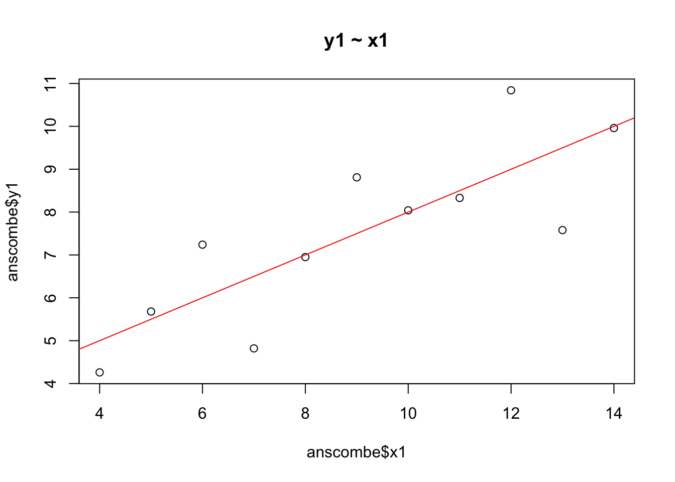
The regression line from the linear model is shown in red. The model clearly fits these data pretty well—the data points are randomly distributed around the regression line.
plot(anscombe$x2, anscombe$y2, main = "y2 ~ x2")
abline(lm(anscombe$y2 ~ anscombe$x2), col = 2) 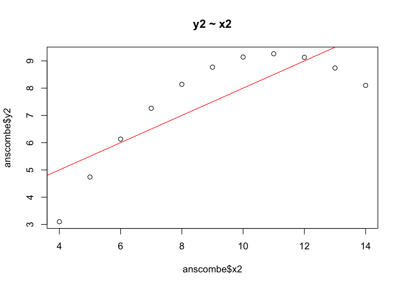
A linear model is clearly not a good fit to for these data, which have a quadratic, not a linear, shape. The regression line does not capture the true relationship between y2 and x2 very well at all.
The moral of the story: If we proceed too quickly to modelling we are likely to make mistakes. We must do EDA to understand the underlying distributions of our variables and the relationships between them! What we learn through that process will help us avoid basic errors and improve subsequent modeling decisions.
4.2 Tools
Two packages developed by Hadley Wickham greatly simplify the task of exploring and graphing data: dplyr for exploring and ggplot2 for graphing. Additionally, the piping syntax offered in the magrittr package (included withdplyr) enables us not only to write more understandable dplyr code but also to use the two packages together.
Documentation and examples for both packages are widely available on the web.
4.3 dplyr
dplyr implements the “split-apply-combine” strategy for data analysis. The strategy, package author Hadley Wickham explains, is to “break up a big problem into manageable pieces, operate on each piece independently and then put all the pieces back together.”7 dplyr contains 5 core functions, or “verbs,” for implementing the strategy:
select()filter()arrange()mutate()summarize()
These functions become more powerful in combination with the group_by() function.
Those who are familiar with SQL will find these functions intuitive. Essentially, dplyr allows us to perform SQL-like operations on a dataframe stored in R memory.
The backend of dplyr is written in C, so it is extremely fast. Implementing the “split-apply-combine” strategy using a loop, for example, could take hours for large datasets. In dplyr run time would be a fraction of that.
Let’s load a dataset to use below for examples:
data(mtcars)Standing for “Motor Trend Cars,” mtcars is a dataframe that contains information on the design and performance characteristics of older model cars (1973-4).
4.3.1 Piping syntax
The piping syntax from the magrittr package makes code easier to conceptualize and read. The traditional syntax for R functions operates according to a nesting logic: if we want the structure of mtcars we would type, str(mtcars), where the data object is nested within the function. Pipes, coded as “%>%,” instead work on a sequential logic: the equivalent of str(mtcars) using pipes would be mtcars %>% str(). Rather than a function operating on a dataset we have datasets on which functions operate. Particularly as nesting gets involved, pipes are much easier to read and understand. For example, rather than head(subset(mtcars, cyl == 6)) we would write the following in dplyr:
library(dplyr)
mtcars %>%
  filter(cyl == 6) %>%
  head
## mpg cyl disp hp drat wt qsec vs am gear carb
## 1 21.0 6 160.0 110 3.90 2.620 16.46 0 1 4 4
## 2 21.0 6 160.0 110 3.90 2.875 17.02 0 1 4 4
## 3 21.4 6 258.0 110 3.08 3.215 19.44 1 0 3 1
## 4 18.1 6 225.0 105 2.76 3.460 20.22 1 0 3 1
## 5 19.2 6 167.6 123 3.92 3.440 18.30 1 0 4 4
## 6 17.8 6 167.6 123 3.92 3.440 18.90 1 0 4 4This code we can read as a sequential operation rather than a nested one: using mtcars, filter for cyl = 6, then return the first 6 rows. Each line in this little program defines an action to be taken on the dataset inherited from the previous line.
4.3.2 Tibbles
dplyr automatically converts a dataframe to a tibble. A tibble is simply a dataframe with certain convenient features, including (among others):
- Tibbles never print more than 10 rows to the console, or a viewable number of columns.
- Strings are not automatically coerced to factors.
We can always turn a tibble back into an R dataframe with the `data.frame() command. For the most part, tibbles function exactly as we expect dataframes to function, so you can safely ignore the difference while enjoying the benefits.
4.3.3 select()
select() subsets a dataset by columns. We simply list the columns we want to select. While doing so we can also rename columns. The order the columns are listed within select() defines the order in the new dataframe. Sometimes functions in multiple packages have the same name. We can eliminate the confusion by specifying the package and function, for example, dplyr::select().
mtcars %>%
  dplyr::select(disp, mpg, cylinder = cyl) %>%
  head
## disp mpg cylinder
## Mazda RX4 160 21.0 6
## Mazda RX4 Wag 160 21.0 6
## Datsun 710 108 22.8 4
## Hornet 4 Drive 258 21.4 6
## Hornet Sportabout 360 18.7 8
## Valiant 225 18.1 6Column names in base R dataframes must not contain empty spaces. However, with select() (or with the dplyr rename() function) we can include spaces in column names using back ticks.
mtcars %>%
  dplyr::select(disp, mpg, `count of cylinders` = cyl) %>%
  head
## disp mpg count of cylinders
## Mazda RX4 160 21.0 6
## Mazda RX4 Wag 160 21.0 6
## Datsun 710 108 22.8 4
## Hornet 4 Drive 258 21.4 6
## Hornet Sportabout 360 18.7 8
## Valiant 225 18.1 6We can also define a dataframe by deselecting columns using the minus sign:
mtcars %>%
  dplyr::select(-hp, -drat, -wt, -qsec, -vs, -am, -gear, -carb) %>%
  head
4.3.4 filter()
filter() subsets a dataframe by rows. It has the same subsetting functionality as base R’s subset() function or the double bracket notation. To use it we specify the logical condition for including rows using logical operators:
- “==” (equal)
- “!=” (not equal)
- “<” (less than)
- “<=” (less than or equal to)
- “>” (greater than)
- “>=” (greater than or equal to)
- is.na()
- !is.na()
- “|” (pipe operator, or)
- “&” (and)
- isTRUE()
- !isTRUE()
mtcars %>%
  dplyr::select(cyl, mpg) %>%
  filter(cyl == 6 & mpg > 20) %>%
  head
## cyl mpg
## 1 6 21.0
## 2 6 21.0
## 3 6 21.4We could have written the same filter statement using a comma rather than an ampersand (“&”). filter() treats a comma as equivalent to “&.”
4.3.5 arrange()
arrange sorts the rows in a dataframe according the the values in the specified column(s).
mtcars %>%
  dplyr::select(mpg, cyl) %>%
  arrange(desc(cyl), mpg) %>%
  head
## mpg cyl
## 1 10.4 8
## 2 10.4 8
## 3 13.3 8
## 4 14.3 8
## 5 14.7 8
## 6 15.0 8arrange() by default sorts rows in ascending order based on column items. The desc() function within arrange() reverses this default ordering. Additionally, the order of the variables listed within arrange() determines the sort sequence. Above we first sort rows by cylinders (in descending, from large to small) and then by mpg (in ascending order, from least to most).
Sorting is often a very important step when creating a calculated variable that includes sequence information, such as a cumulative sum (cumsum()) or mean (cummean()).
4.3.6 mutate()
mutate() creates a new variable, leaving the number and order of rows unaffected. For example, if we wanted to create a binary mpg variable we could use ifelse() within mutate():
mtcars %>%
  mutate(mpg_bin = ifelse(mpg > mean(mpg), 1, 0)) %>%
  dplyr::select(mpg, mpg_bin) %>%
  head
## mpg mpg_bin
## Mazda RX4 21.0 1
## Mazda RX4 Wag 21.0 1
## Datsun 710 22.8 1
## Hornet 4 Drive 21.4 1
## Hornet Sportabout 18.7 0
## Valiant 18.1 04.3.7 summarize()
summarize()aggregates rows to produce summary statistics in a new dataframe. It does not preserve columns or rows from the original dataframe, returning values only for the summary variables defined withinsummarize():
mtcars %>%
  summarize(mean_mpg = mean(mpg),
            median_mpg = median(mpg),
            min_mpg = min(mpg),
            max_mpg = max(mpg))
## mean_mpg median_mpg min_mpg max_mpg
## 1 20.09062 19.2 10.4 33.94.3.8 group_by()
The above functions, particularly mutate() and summarize(), become more powerful in combination with group_by(). For example, using group_by() we can easily compute conditional summary statistics produced by summarize(). In this case, let’s say that we want mean, median, min and max mpg for each number of cylinders. We could accomplish this by adapting the above code with group_by():
mtcars %>%
  group_by(cyl) %>%
  dplyr::summarize(mean_mpg = mean(mpg),
            median_mpg = median(mpg),
            min_mpg = min(mpg),
            max_mpg = max(mpg))
## # A tibble: 3 x 5
## cyl mean_mpg median_mpg min_mpg max_mpg
## <dbl> <dbl> <dbl> <dbl> <dbl>
## 1 4 26.66364 26.0 21.4 33.9
## 2 6 19.74286 19.7 17.8 21.4
## 3 8 15.10000 15.2 10.4 19.2group_by() essentially says: compute the following statistics for each group. Note that you will usually want the group_by variable to be a factor or a character variable.
We can also use group_by() with mutate() to create new variables that are conditional on groups:
mtcars %>%
  group_by(cyl) %>%
  mutate(mpg_bin = ifelse(mpg > mean(mpg), 1, 0)) %>%
  dplyr::select(mpg, mpg_bin) %>%
  head
## # A tibble: 6 x 3
## # Groups: cyl [3]
## cyl mpg mpg_bin
## <dbl> <dbl> <dbl>
## 1 6 21.0 1
## 2 6 21.0 1
## 3 4 22.8 1
## 4 6 21.4 1
## 5 8 18.7 0
## 6 6 18.1 0In the first example above we defined mpg_bin to be 1 if mpg was greater than its mean (that is, greater than mean mpg in the entire dataset) and 0 otherwise. Here the group_by() statement entails that mpg_bin is 1 if mpg is greater than mean mpg in that cyl group and 0 otherwise. group_by() makes the calculation group-relative.
If we compute a summary statistic using mutate() the default behavior of the function is to repeat the value for every row.
mtcars %>%
  group_by(cyl) %>%
  mutate(mpg_bin = ifelse(mpg > mean(mpg), 1, 0),
         mean_mpg = round(mean(mpg), 2)) %>%
  dplyr::select(mpg, mpg_bin, mean_mpg) %>%
  head
## # A tibble: 6 x 4
## # Groups: cyl [3]
## cyl mpg mpg_bin mean_mpg
## <dbl> <dbl> <dbl> <dbl>
## 1 6 21.0 1 20.09
## 2 6 21.0 1 20.09
## 3 4 22.8 1 20.09
## 4 6 21.4 1 20.09
## 5 8 18.7 0 20.09
## 6 6 18.1 0 20.09The additional variable, mean_mpg, makes the operation of group_by() clear: the mean is being calculated differently for each level of cyl.
4.4 ggplot2
Base R plotting is powerful and flexible but it can be cumbersome. ggplot2 simplifies things, especially when it comes to implementing the “split-apply-combine” strategy mentioned earlier in which we want to split a dataset by group, apply a function—like an OLS fit—and then recombine the groups for display and comparison. As a motivating example, consider the challenge from the previous chapter: creating an OLS fit for the three sexes in the abalone dataset. This is a fairly simple operation with ggplot2.
ggplot(a, aes(x = Length, y = Whole_weight, col = Sex, group = Sex)) +
   geom_point(alpha = .5) + # alpha sets point transparency
   stat_smooth(method = "lm", se = F) + # se stands for "standard error" bands
   ggtitle("Abalone weight by length and sex")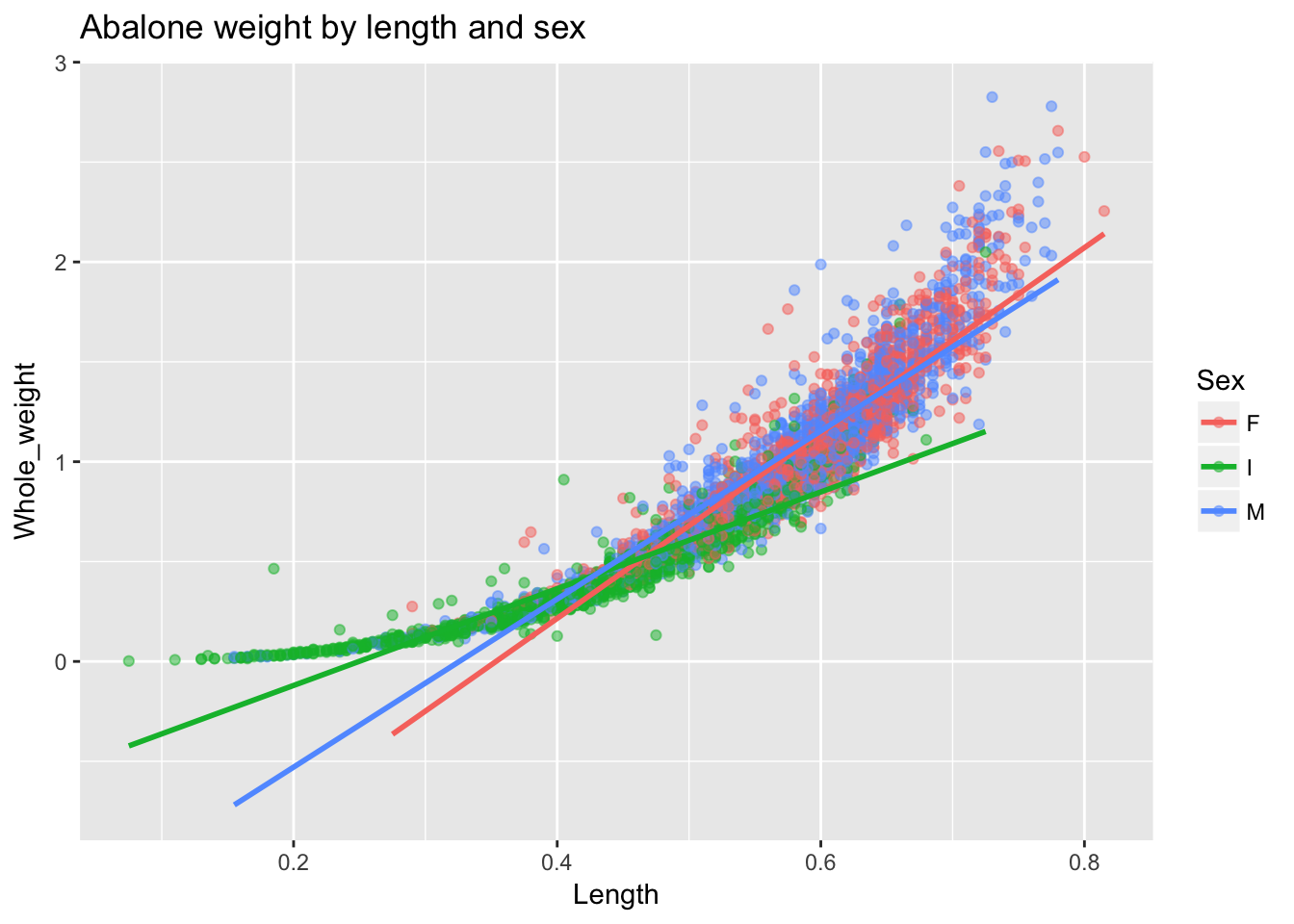
ggplot2 automatically handles the colors, the legend and the linear fit by group. Towards the end of the previous chapter we asked the following question: “is what looks like a nonlinear relationship between length and weight actually just a linear relationship that varies by group?” We can answer this question fairly easily using another strategy in ggplot2 for investigating group differences: facetting. Using facets we can create a separate plots for each sex and fit a flexible regression line to each.
In general, facetting allows us to implement what is known as the “small multiple” strategy for visualization. Rather than trying to cram everything onto one plot (which tends to increase rather than dispel confusion), split the plot into many small plots by group for easy comparison.
ggplot(a, aes(Length, Whole_weight)) +
   geom_point() +
   stat_smooth(se = F) +
   facet_wrap(~ Sex) +
   ggtitle("Abalone weight by length and sex")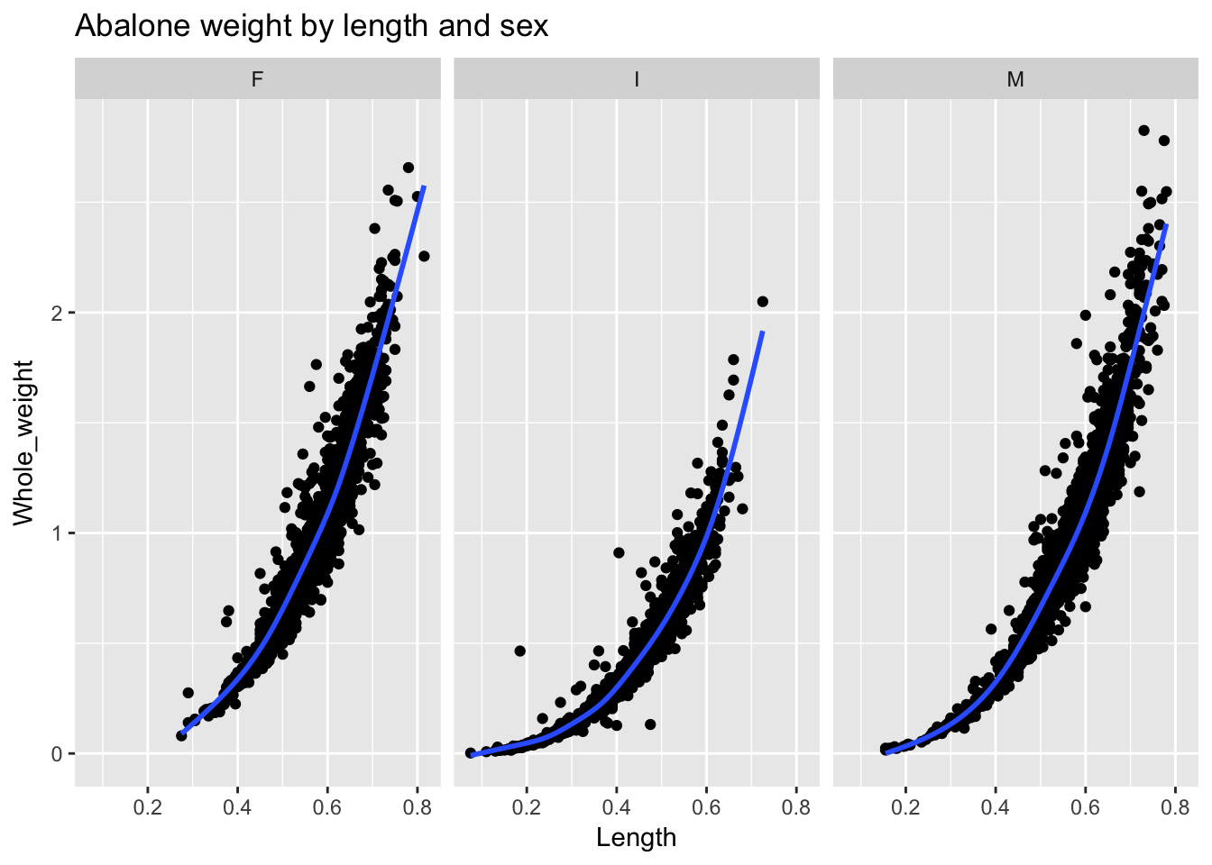
The command that handles facetting is facet_wrap(), which offers a paradigmatic example of “split-apply-combine”: we split the data into three groups, apply a nonlinear fit (the default fit in ggplot2’s stat_smooth() function is a Loess curve, which fits a summary line to local portions of the data), and then combine the plots for comparison. (The syntax of the argument to facet_wrap()— in this case, facet_wrap(~Sex)—can be read as: split or facet the plot on sex.) ggplot2 automatically handles the facetting and all of the associated formatting issues: from the titles of the facets to consistent x- and y-axis scaling in each panel for easy comparability. As to our question: we can now see that the relationship between abalone Length and Weight is in fact somewhat non-linear for each sex.8
One of our primary goals when doing EDA is to see how values vary across groups. ggplot2 makes this sort of data exploration quick and straightforward.
4.4.1 geoms and aesthetic mapping
ggplot2 is organized by the idea of layering: start with a blank canvas and add layers. That is why each ggplot line is separated by “+.” Each additional line adds a layer to the plot.
- The first layer creates the blank plot, providing information about the source dataframe and the aesthetic mapping. The
aes()function defined the mapping, telling ggplot which variables should be on the x- and y-axes, and if the elements of the plot should be colored or grouped. The syntax goes like this:ggplot(data, aes(x, y, col = grouping_variable, group = grouping_variable)). The resulting blank plot will have axis labels and scales established by the data and aesthetic mapping.
ggplot(a, aes(x = Length, y = Whole_weight)) 2. We next declare a “geom” indicating the sort of plot we want. The most common geom types, discussed below, include: geom_point(), geom_histogram(), geom_bar(), geom_boxplot(), geom_line().
ggplot(a, aes(x = Length, y = Whole_weight)) +
  geom_point()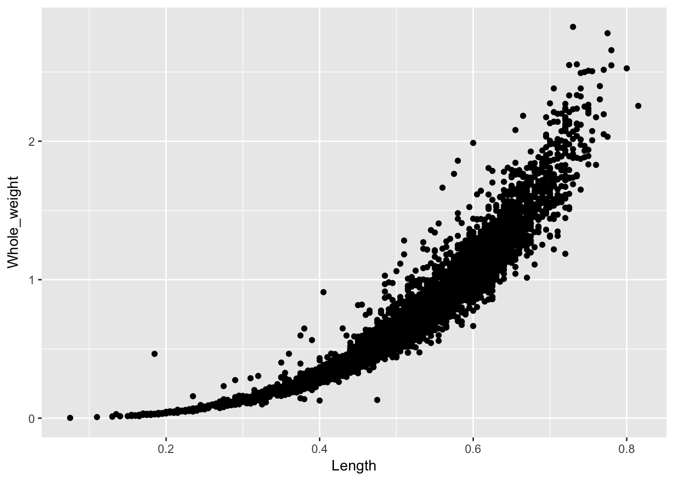
- We can then add additional layers, which typically involve splitting and applying, which is to say, grouping and summarizing. Grouping is usually handled within the aesthetic mapping declared in the base layer
ggplot()function, and a range of statistical functions will handle the summary, such asstat_smooth(). Here we will add only an additional summary layer.
ggplot(a, aes(x = Length, y = Whole_weight)) +
  geom_point() +
  stat_smooth(se = F)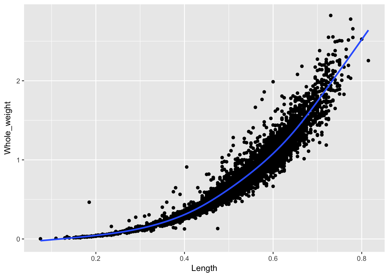
So, three layers to build this plot: the blank canvas, the points, and the statistical summary. ggplot2 handles all the other plot elements automatically.
4.4.2 geom_point()
geom_point() produces a scatterplot and is usually used to plot the relationship between two continuous variables. However, we can also use geom_point() with a binary variable. Let’s demonstrate by making Length into a binary variable, which we’ll call Length_bin, with two values: “short” (below average) and “long” (above average). We’ll plot Length_bin against Whole_weight:
a$Length_bin <- ifelse(a$Length < mean(a$Length), "short", "long")

ggplot(a, aes(Length_bin, Whole_weight)) +
  geom_point() +
  ggtitle("Abalone weight by length")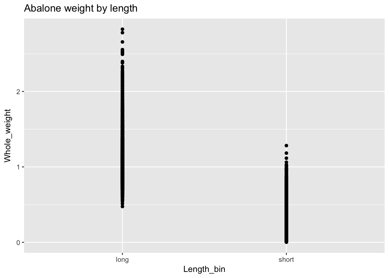
We can do better. For one thing we expect “short” before “long” but ggplot has automatically set the order of the variables alphabetically. We need to explicitly set the levels of Length_bin as a factor to control this behavior. Also the default plotting in geom_point() superimposes points and makes it difficult to see the distributions. We’ll add an argument, position = "jitter", to geom_point() to offset points and improve visibility.
a$Length_bin <- factor(a$Length_bin, levels = c("short", "long"))

ggplot(a, aes(Length_bin, Whole_weight)) +
  geom_point(position = "jitter") +
ggtitle("Abalone weight by length") 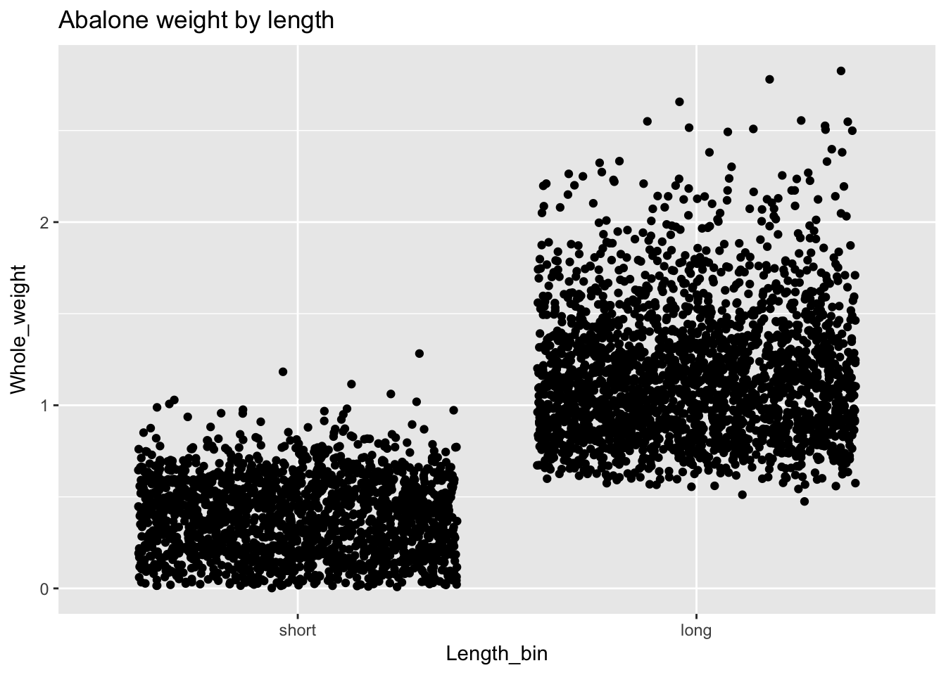
And we can use facet_wrap() if we’d like to see how the relationship between weight and binary length varies by sex:
ggplot(a, aes(Length_bin, Whole_weight)) +
  geom_point(position = "jitter") +
  facet_wrap(~Sex) +
ggtitle("Abalone weight by length and sex") 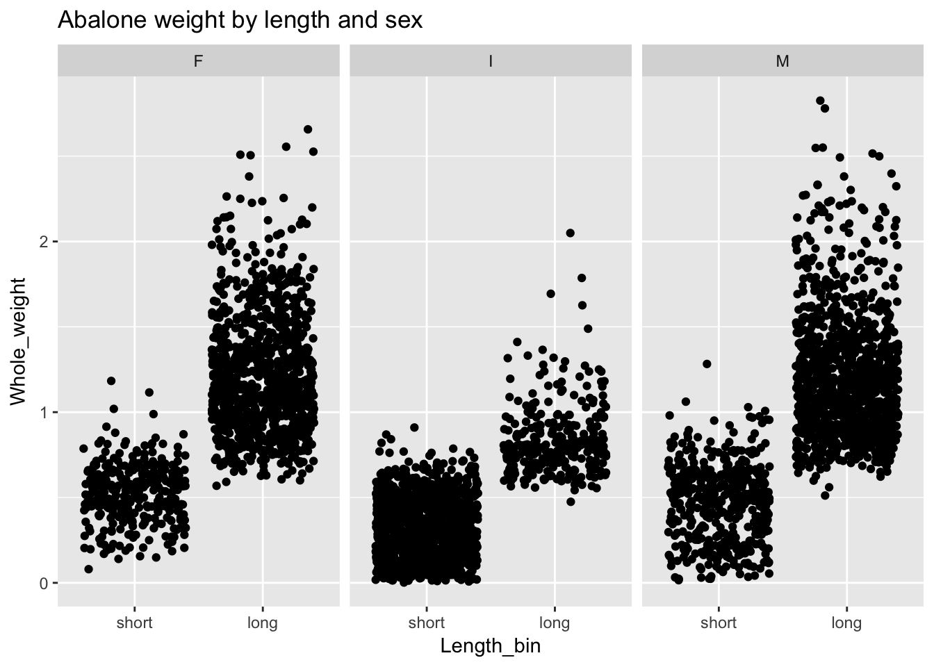
4.4.3 geom_histogram()
geom_histogram() plots the frequency distribution of a single variable.9 Thus, we only need to specify one argument, x, to ggplot’s aes() function. As above, we can facet by sex:
ggplot(a, aes(Length)) +
  geom_histogram() +
  facet_wrap(~Sex) +
ggtitle("Frequency of abalone length by sex") 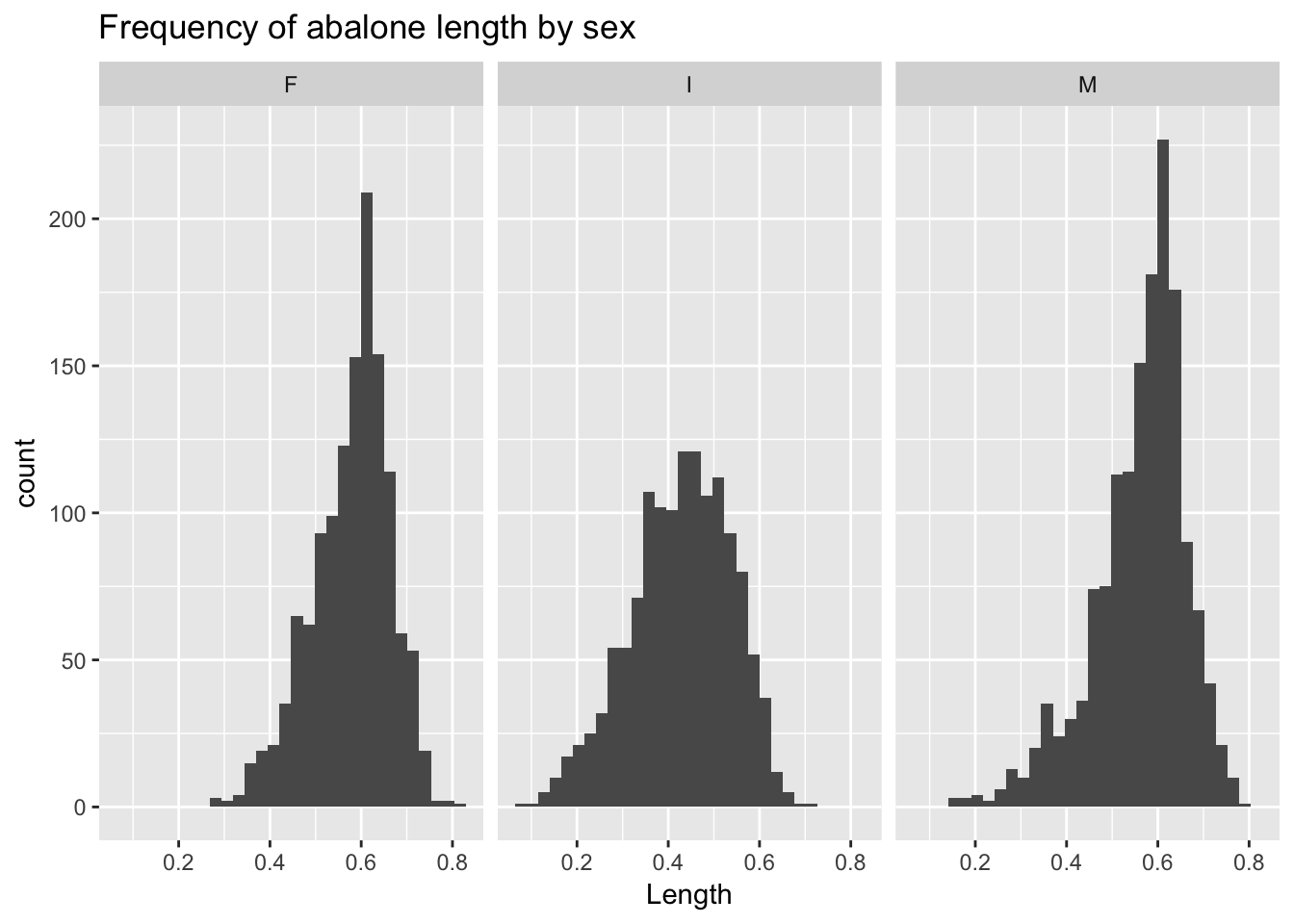
geom_density() produces a density plot.
ggplot(a, aes(Length)) +
  geom_density() +
  facet_wrap(~Sex) +
ggtitle("Density of abalone length by sex") 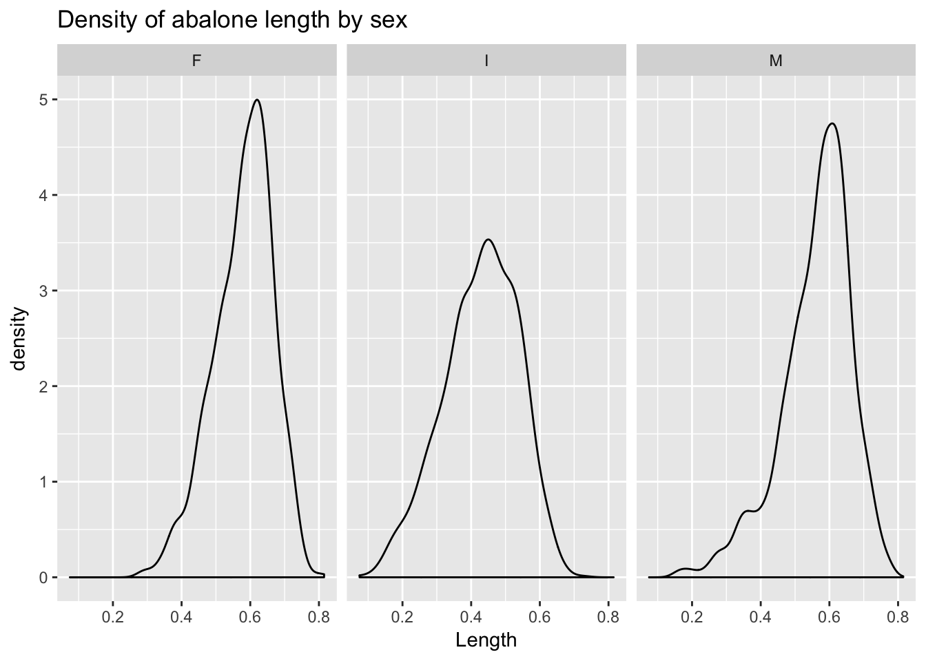
We can also superimpose density lines, which in this case makes comparison easier.
ggplot(a, aes(Length, col = Sex)) +
  geom_density() +
ggtitle("Density of abalone length by sex") 
4.4.4 geom_bar()
geom_bar() will produce counts much like geom_histogram() but is best used to display a value from the data—say, mean abalone length. We can use dplyr’s ‘summarize()’ function to calculate mean length, then pipe the result to a ggplot barplot. Note that when we pre-calculate values from dplyr we must use the stat = "identity" argument to geom_bar():
a %>%
  group_by(Sex) %>%
  dplyr::summarize(`Mean Length` = mean(Length)) %>%
  ggplot(aes(Sex, `Mean Length`)) +
  geom_bar(stat = "identity") +
ggtitle("Average abalone length by sex") 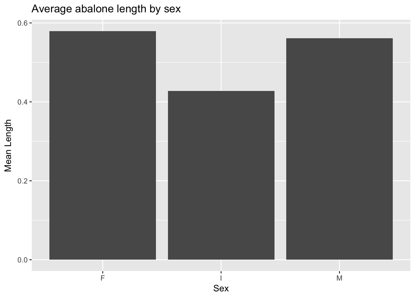
4.4.5 geom_boxplot()
geom_boxplot() creates a boxplot.10 In a “notched” boxplot, the notches approximate the 95% confidence interval for the median and extend +/- 1.58 IQR/\(\sqrt{n}\). We can, additionally, superimpose the actual observations on the boxes (with transparency to preserve visibility) to provide a more detailed picture of the distributions:
ggplot(a, aes(Sex, Length)) +
  geom_boxplot(notch = T) +
  geom_jitter(alpha = .1, width = .75) +
ggtitle("Abalone length by sex") 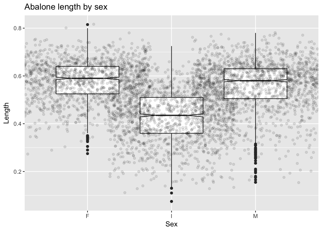
4.4.6 geom_line()
geom_line() produces a line plot, which we can think of as a scatterplot in which the points are connected then suppressed. Compare the scatterplot of weight vs. miles per gallon from mtcars with the corresponding line plot:
ggplot(mtcars, aes(wt, mpg)) +
  geom_point() +
  facet_wrap(~cyl) +
  ggtitle("Relationship between wt and mpg, varying by cyl")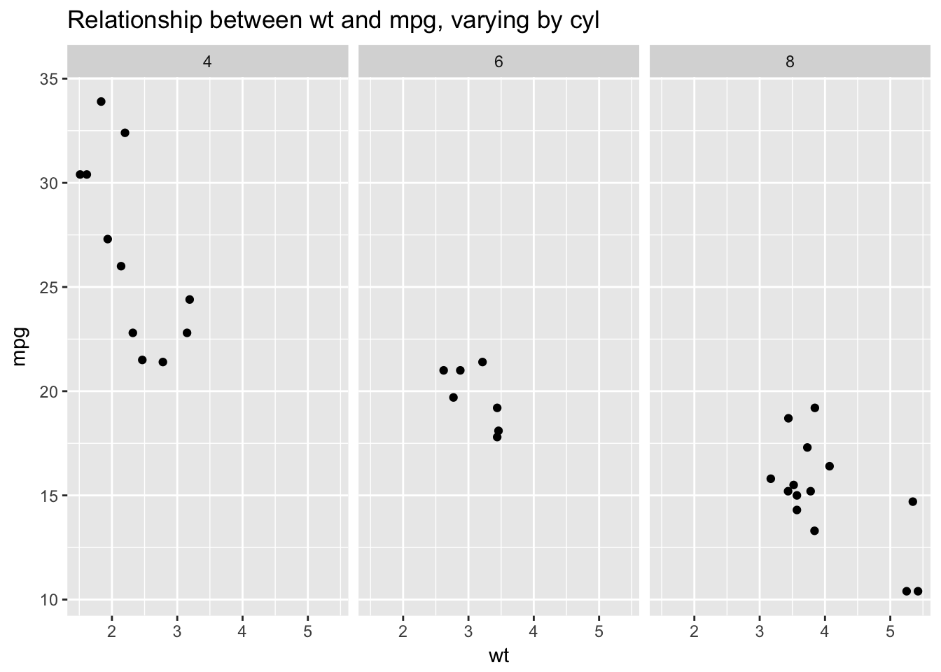
ggplot(mtcars, aes(wt, mpg)) +
geom_line() +
facet_wrap(~cyl) +
ggtitle("Relationship between wt and mpg, varying by cyl")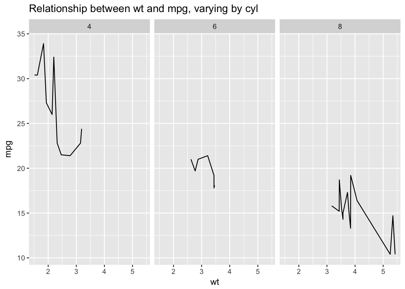 I would argue that these data are actually best represented with a scatterplot, not a line plot. We tend to understand line plots as representing sequentially related points. In the above plots there is no sequential relationship. Line plots consequently work really well for representing time series where the points are sequentially related:
data("BJsales")
ts <- data.frame(Time = seq(1, length(BJsales)), Sales = as.numeric(BJsales))
ggplot(ts, aes(Time, Sales)) +
  geom_line() +
  ggtitle("Sales through time")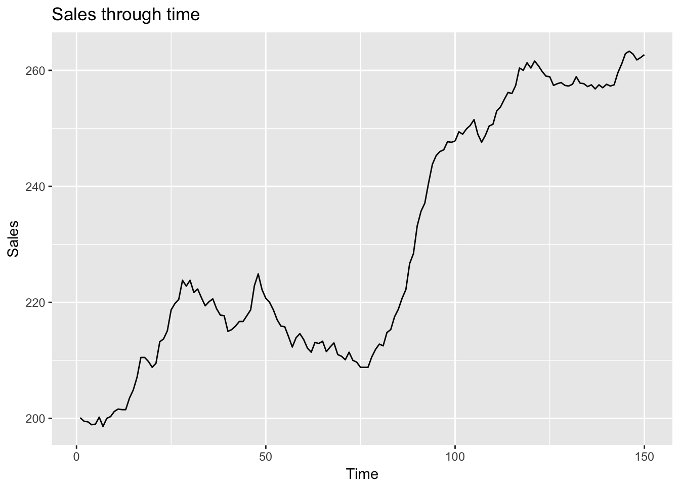
4.5 EDA process
In Exploratory data Analysis Peng usefully includes an EDA checklist. I’ve adapted that checklist here.
Develop a question. Usually we start EDA with a question that helps focus our interrogation.11 We could ask, for example: “is there a relationship between car weight and miles per gallon in the mtcars dataset?” Questions beget questions; this one provides us with a starting point but will likely lead to other, more nuanced questions.
- Read in your data and check the structure. Questions to ask:
- What are the dimensions of the data (rows, columns)?
- What are the variable types?
- Have character variables been coerced to factors? If so, is that appropriate?
- Which numeric variables are continuous, which are integers, and which are binary? The difference between continuous and integer variables can be important because, among other things, it is possible to to treat integer variables with limited values as if they were factors, for use with
group_by().
str(mtcars)## 'data.frame': 32 obs. of 11 variables:
## $ mpg : num 21 21 22.8 21.4 18.7 18.1 14.3 24.4 22.8 19.2 ...
## $ cyl : num 6 6 4 6 8 6 8 4 4 6 ...
## $ disp: num 160 160 108 258 360 ...
## $ hp : num 110 110 93 110 175 105 245 62 95 123 ...
## $ drat: num 3.9 3.9 3.85 3.08 3.15 2.76 3.21 3.69 3.92 3.92 ...
## $ wt : num 2.62 2.88 2.32 3.21 3.44 ...
## $ qsec: num 16.5 17 18.6 19.4 17 ...
## $ vs : num 0 0 1 1 0 1 0 1 1 1 ...
## $ am : num 1 1 1 0 0 0 0 0 0 0 ...
## $ gear: num 4 4 4 3 3 3 3 4 4 4 ...
## $ carb: num 4 4 1 1 2 1 4 2 2 4 ...glimpse(mtcars) # The dplyr equivalent of str()## Observations: 32
## Variables: 11
## $ mpg <dbl> 21.0, 21.0, 22.8, 21.4, 18.7, 18.1, 14.3, 24.4, 22.8, 19....
## $ cyl <dbl> 6, 6, 4, 6, 8, 6, 8, 4, 4, 6, 6, 8, 8, 8, 8, 8, 8, 4, 4, ...
## $ disp <dbl> 160.0, 160.0, 108.0, 258.0, 360.0, 225.0, 360.0, 146.7, 1...
## $ hp <dbl> 110, 110, 93, 110, 175, 105, 245, 62, 95, 123, 123, 180, ...
## $ drat <dbl> 3.90, 3.90, 3.85, 3.08, 3.15, 2.76, 3.21, 3.69, 3.92, 3.9...
## $ wt <dbl> 2.620, 2.875, 2.320, 3.215, 3.440, 3.460, 3.570, 3.190, 3...
## $ qsec <dbl> 16.46, 17.02, 18.61, 19.44, 17.02, 20.22, 15.84, 20.00, 2...
## $ vs <dbl> 0, 0, 1, 1, 0, 1, 0, 1, 1, 1, 1, 0, 0, 0, 0, 0, 0, 1, 1, ...
## $ am <dbl> 1, 1, 1, 0, 0, 0, 0, 0, 0, 0, 0, 0, 0, 0, 0, 0, 0, 1, 1, ...
## $ gear <dbl> 4, 4, 4, 3, 3, 3, 3, 4, 4, 4, 4, 3, 3, 3, 3, 3, 3, 4, 4, ...
## $ carb <dbl> 4, 4, 1, 1, 2, 1, 4, 2, 2, 4, 4, 3, 3, 3, 4, 4, 4, 1, 2, ...- Summarize the data. Use
summary()andtable()and ask the following sorts of questions:
- Are there missing observations (NAs) ?
- What is the range of the numeric variables?
- Do the ranges seem reasonable, or are there values that cause you to worry about data quality?
- Where are the means and medians of each variable with respect to their minimums and maximums? (Eyeballing this will give you a rough sense of the shape of the distributions: similar means and medians imply symmetric distributions, whereas discrepant means and medians imply skewed distributions.)
- For factor and character variables: How many observations are there in each level or category?
- If it wasn’t clear from examining the structure of the data: which variables are continuous, integer or binary?
- Table the integer and binary variables: do the counts seem reasonable? If they don’t seem reasonable, then inspect the questionable rows.
summary(mtcars)## mpg cyl disp hp
## Min. :10.40 Min. :4.000 Min. : 71.1 Min. : 52.0
## 1st Qu.:15.43 1st Qu.:4.000 1st Qu.:120.8 1st Qu.: 96.5
## Median :19.20 Median :6.000 Median :196.3 Median :123.0
## Mean :20.09 Mean :6.188 Mean :230.7 Mean :146.7
## 3rd Qu.:22.80 3rd Qu.:8.000 3rd Qu.:326.0 3rd Qu.:180.0
## Max. :33.90 Max. :8.000 Max. :472.0 Max. :335.0
## drat wt qsec vs
## Min. :2.760 Min. :1.513 Min. :14.50 Min. :0.0000
## 1st Qu.:3.080 1st Qu.:2.581 1st Qu.:16.89 1st Qu.:0.0000
## Median :3.695 Median :3.325 Median :17.71 Median :0.0000
## Mean :3.597 Mean :3.217 Mean :17.85 Mean :0.4375
## 3rd Qu.:3.920 3rd Qu.:3.610 3rd Qu.:18.90 3rd Qu.:1.0000
## Max. :4.930 Max. :5.424 Max. :22.90 Max. :1.0000
## am gear carb
## Min. :0.0000 Min. :3.000 Min. :1.000
## 1st Qu.:0.0000 1st Qu.:3.000 1st Qu.:2.000
## Median :0.0000 Median :4.000 Median :2.000
## Mean :0.4062 Mean :3.688 Mean :2.812
## 3rd Qu.:1.0000 3rd Qu.:4.000 3rd Qu.:4.000
## Max. :1.0000 Max. :5.000 Max. :8.000table(mtcars$cyl)##
## 4 6 8
## 11 7 14table(mtcars$vs)##
## 0 1
## 18 14table(mtcars$am)##
## 0 1
## 19 13table(mtcars$gear)##
## 3 4 5
## 15 12 5table(mtcars$carb) ##
## 1 2 3 4 6 8
## 7 10 3 10 1 1The carb variable in this dataset counts the number of carburetors.12 In this dataset one car has 6 carburetors and one has 8. Is there something wrong with these observations? Let’s look at these individual observations.
subset(mtcars, carb == 6)## mpg cyl disp hp drat wt qsec vs am gear carb
## Ferrari Dino 19.7 6 145 175 3.62 2.77 15.5 0 1 5 6subset(mtcars, carb == 8)## mpg cyl disp hp drat wt qsec vs am gear carb
## Maserati Bora 15 8 301 335 3.54 3.57 14.6 0 1 5 8These are both high performance sports cars from the mid-1970’s. (Current values for both are in the six figures.) It would seem that the number of carburetors is related to car type in these cases and is not a data error.
- Look at the top and the bottom of your data using
head()andtail(). Be alert to structure and possible data problems or anomalies.
head(mtcars)## mpg cyl disp hp drat wt qsec vs am gear carb
## Mazda RX4 21.0 6 160 110 3.90 2.620 16.46 0 1 4 4
## Mazda RX4 Wag 21.0 6 160 110 3.90 2.875 17.02 0 1 4 4
## Datsun 710 22.8 4 108 93 3.85 2.320 18.61 1 1 4 1
## Hornet 4 Drive 21.4 6 258 110 3.08 3.215 19.44 1 0 3 1
## Hornet Sportabout 18.7 8 360 175 3.15 3.440 17.02 0 0 3 2
## Valiant 18.1 6 225 105 2.76 3.460 20.22 1 0 3 1tail(mtcars)## mpg cyl disp hp drat wt qsec vs am gear carb
## Porsche 914-2 26.0 4 120.3 91 4.43 2.140 16.7 0 1 5 2
## Lotus Europa 30.4 4 95.1 113 3.77 1.513 16.9 1 1 5 2
## Ford Pantera L 15.8 8 351.0 264 4.22 3.170 14.5 0 1 5 4
## Ferrari Dino 19.7 6 145.0 175 3.62 2.770 15.5 0 1 5 6
## Maserati Bora 15.0 8 301.0 335 3.54 3.570 14.6 0 1 5 8
## Volvo 142E 21.4 4 121.0 109 4.11 2.780 18.6 1 1 4 2- Try to answer your question using descriptive methods. The question we’ve posed for ourselves here is whether gas mileage is correlated with weight. Use dplyr to create summary tables of this relationship and follow up with ggplot2 to create plots.
# Split wt into quartiles
# By default the quantile() function returns quartiles
quantile(mtcars$wt)
## 0% 25% 50% 75% 100%
## 1.51300 2.58125 3.32500 3.61000 5.42400quantile(mtcars$wt, probs = c(0, .25, .5, .75, 1))## 0% 25% 50% 75% 100%
## 1.51300 2.58125 3.32500 3.61000 5.42400# The cut() function is very useful for creating categorical variables
# based on threshold values defined in the "breaks" argument.
mtcars %>%
mutate(weight_cat = cut(wt, breaks = quantile(wt), include.lowest = T)) %>%
group_by(weight_cat) %>%
summarize(mean_mpg = round(mean(mpg), 2))## mean_mpg
## 1 20.09Because weight is continuous and, as such, can’t be conveniently summarized, I have binned it using the cut() function with the quantile() function as an argument. This procedure will divide weight into roughly four equal bins corresponding to the quartiles of weight. I then use this binned weight variable (weight_cat for “categorical weight”) as the grouping variable in group_by() and calculate average mpg for each weight quartile. Clearly there is a strong relationship between weight and mileage. We can plot this tabular summary or just plot the relationship between the two continuous variables and then summarize that relationship with a linear fit.
mtcars %>%
  mutate(weight_cat = cut(wt, breaks = quantile(wt), include.lowest = T)) %>%
  group_by(weight_cat) %>%
  dplyr::summarize(`Average gas mileage` = mean(mpg)) %>%
  ggplot(aes(weight_cat, `Average gas mileage`)) +
  geom_bar(stat = "identity") +
  ggtitle("Relationship between car weight and gas mileage") +
  xlab("Weight categories (1000 lbs)")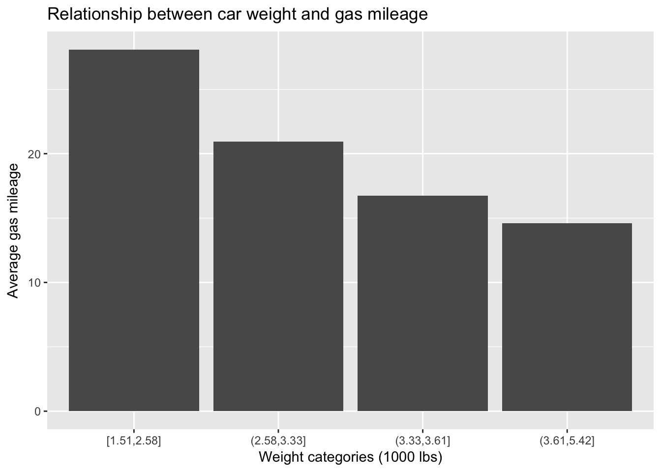
mtcars %>%
  ggplot(aes(wt, mpg)) +
  geom_point() +
  stat_smooth(method = "lm") +
  ggtitle("Relationship between car weight and gas mileage") +
  xlab("Weight (1000 lbs)")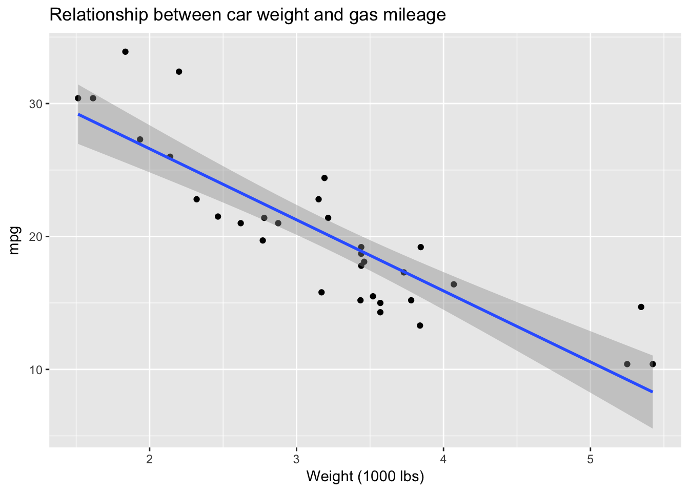
Who needs inferential statistics? Here, using EDA, we have managed to answer our question: yes, there does seem to be a strong negative relationship between car weight and gas mileage in this dataset. As weight goes up, miles per gallon—not surprisingly—goes down. Actually, it is not quite accurate to imply that we have achieved this conclusion without inferential statistics, since ggplot is drawing the least squares line, with standard error bands, using the lm() function. We could also very roughly derive the slope of that line from the plot, which would be equivalent to the \(\beta\) coefficient for weight from a linear model: as weight goes up by 1 unit (1000 lbs) mpg goes down by approximately 5 mpg. So the coefficient for wt should be around -5. Let’s check:
lm(mpg ~ wt, data = mtcars)##
## Call:
## lm(formula = mpg ~ wt, data = mtcars)
##
## Coefficients:
## (Intercept) wt
## 37.285 -5.344Pretty close! According to the model the coefficient for wt is -5.34
- Follow up with additional questions. It makes sense that weight would influence gas mileage but there must be other factors affecting mpg What about horsepower? Bigger engines probably use more fuel.
mtcars %>%
  ggplot(aes(hp, mpg)) +
  geom_point() +
  stat_smooth() +
  ggtitle("Relationship between car horsepower and gas mileage") +
  xlab("Horsepower")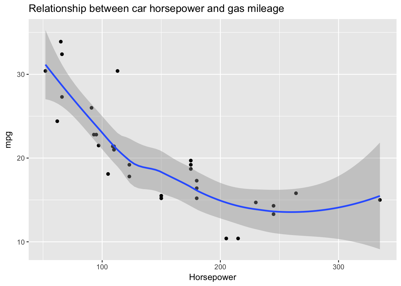
Yes, again we see a strong negative relationship, this time between horsepower and gas mileage. In this case, however, the strength of the relationship is not constant across the values of the predictor. I’ve used a local regression line to show a possible non-linearity in the relationship between horsepower and gas mileage: after about 200, additional horsepower does not further detract from mileage. There are very few data points in that region, however, so these results are inconclusive. (Notice how the standard error bands widen at that point to represent uncertainty in the fit due to low n.)
We might also wonder how weight and horsepower work together to influence gas mileage. Let’s bin horsepower and use it to create a small multiples plot of the relationship between weight and gas mileage.
mtcars %>%
  mutate(`horsepower (quantiles)` =
           cut(hp, breaks = quantile(hp), include.lowest = T)) %>%
  ggplot(aes(wt, mpg)) +
  geom_point() +
  stat_smooth(method = "lm") +
  facet_wrap(~`horsepower (quantiles)`) +
  ggtitle("Relationship between car weight and gas mileage
          by horsepower (quantiles)") +
  xlab("weight") +
  ylab("gas mileage")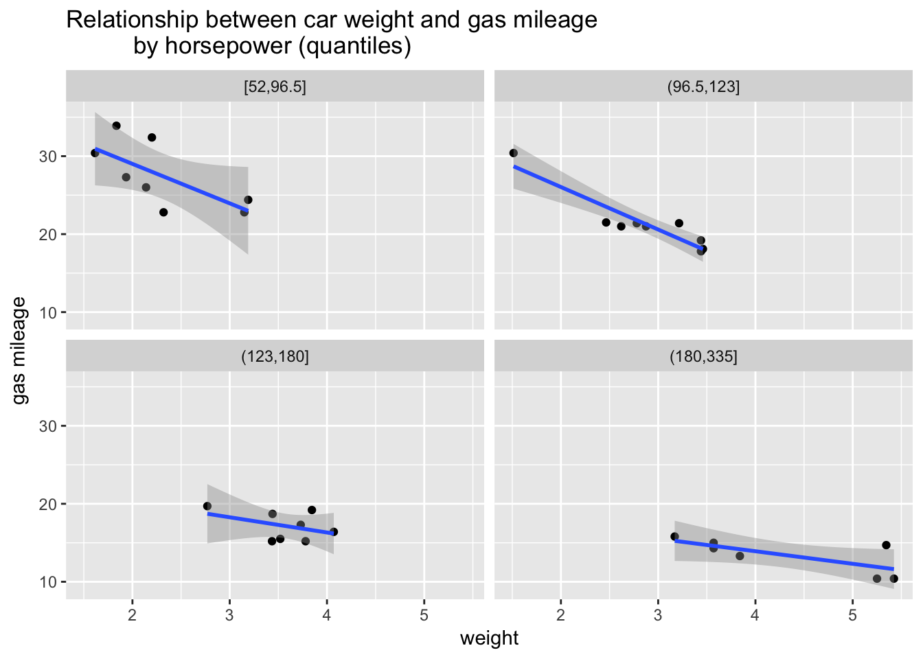
This plot gives us a perspective on our question. We can see that the relationship between weight and gas mileage varies by horsepower. That is, the slopes of the regression lines change, flattening out at higher levels of horsepower. As horsepower goes up the relationship between weight and gas mileage becomes less strong. What can we conclude? Weight strongly predicts gas mileage but higher levels of horsepower seem to erase the negative effect of more weight. Or something like that. There might be other factors that we should investigate. EDA has given us some strong insights to explore further with more formal modeling.
Peng, Roger (2016) Exploratory Data Analysis. Leanpub. Retrieved from https://leanpub.com/exdata.↩
\(R^2\) is a measure of model fit that we will cover on detail in a later chapter.↩
Wickham, Hadley. The Journal of Statistical Software. Volume 40, Issue 1 (2011), page 1. Retrieved from https://www.jstatsoft.org/article/view/v040i01.↩
This foray into EDA has thus provided crucial information for any subsequent modelling we might do of abalone weight. Note to self: include a quadratic term for length.↩
See the previous chapter for further details on histograms.↩
See the discussion of boxplots in the previous chapter. The hinges in the ggplot2 implementation, in contrast to base R, are exactly the first and third quartiles.↩
It would certainly be possible, of course, to have a dataset before having a question. But in that case it seems to me that the purpose of initial data exploration would be to find a question to guide further exploration. Without a question you are adrift.↩
Cars aren’t made with carburetors anymore; the mixing of air and fuel is handled by fuel injection systems.↩