Chapter 6 Linear Regression
This chapter introduces linear regression, the parametric regression method we use when the outcome or response variable is continuous. When the outcome is binary, we use logistic regression—the subject of a later chapter.
Additional resources on linear regression:
- Introduction to Statistical Learning. See chapters 2 and 3.
- Data Analysis Using Regression and Hierarchical/Multilevel Models by Gelman and Hill. Find chapters 3 and 4 on Canvas.
Datacamp also has multiple tutorials/courses on linear regression.
6.1 Preliminaries
What are models? Models simplify reality for purposes of understanding or prediction. While they can be powerful tools, we should keep in mind that they are, after all, not reality. Consequently, as the statistician George Box reputedly said, “All models are wrong, but some are useful.”
Broadly speaking statistical modeling has these two sometimes divergent goals:
Description: using a model to describe the relationship between an outcome variable of interest and one or more predictor variables.
Prediction: using a model to predict unknown instances of the outcome variable such that out-of-sample predictive error is minimized.
It is possible in modeling to focus on description and ignore prediction, and vice versa. For example, many machine learning algorithms are black boxes: they create models that do a good job of predicting but are difficult, if not impossible, to interpret, and consequently often don’t help us understand relationships between variables. Linear regression may not be the flashiest technique in the toolbox, but used correctly its predictive accuracy compares well with algorithms such as random forest or gradient boosting, and it offers descriptive insights, in the form of variable coefficients, that are unmatched. It does a good job with both description and prediction. In this chapter we will be learning these uses of linear regression.
6.2 The basics
Let’s start by briefly introducing the linear model along with some of the terminology and concepts we’ll be using throughout the course.
A linear model is parametric because we assume that the relationship between two variables is linear and can be defined by the parameters of a line—an intercept and slope. We’ll start by considering a simple linear model.
6.2.1 Simple linear model
A simple linear model has an outcome, \(y\), and one predictor, \(x\). It is defined by the following equation.
\[ y_i = \beta_0 + \beta_1x_i + \epsilon_i, \] where \(i = 1, \ldots, n.\)
The subscript in this equation, \(i\), indexes the \(n\) observations in the dataset. (Think of \(i\) as a row number.) The equation can be read as follows: the value of \(i^{th}\) outcome variable, \(y_i\), is defined by an intercept, \(\beta_0\), plus a slope, \(\beta_1\), multiplied by the \(i^{th}\) predictor variable, \(x_i\). These elements define the systematic or deterministic portion of the model. However, because the world is uncertain, containing randomness, we know that the model will be wrong (as George Box said). To fully describe the data we need an error term, \(\epsilon_i\), which is also indexed by row. The error term is the stochastic portion of the model. \(\epsilon_i\) measures the distance between the fitted or expected values of the model—calculated from the deterministic portion of the model—and the actual values. The errors in a linear model—also known as model residuals—are the part of the data that remains unexplained by the deterministic portion of the model. One of the key assumptions of a linear model is that the residuals are normally distributed with mean = 0 and variance = \(\sigma^2\), which we denote, in matrix notation, as \(N(0,\sigma^2)\).
6.2.2 Multivariable linear regression
We can add additional predictors, \(p\), to a simple linear model, thereby making it a multivariable linear model, which we define as follows:
\[ y_i =\beta_0 + \beta_1 x_{i1} + \cdots + \beta_p x_{ip} + \varepsilon_i, \] where \(i = 1, \ldots, n\) and \(p = 1, \ldots, p.\) In this equation \(y_i\) is again the \(i^{th}\) outcome variable, \(\beta_0\) is the intercept, \(\beta_1\) is the coefficient for the first predictor variable, \(x_{1}\), \(\beta_p\) is the coefficient for the \(p^{th}\) predictor variable, \(x_{p}\), and \(\epsilon_i\) represents the stochastic portion of the model, the residuals, indexed by row. The deterministic portion of the model can be summarized, notationally, as \(X \beta\), a \(p\) x \(n\) matrix, which we will call the “linear predictor.”
6.2.3 Uncertainty
Uncertainty is intrinsic to statistical modeling. We distinguish between Estimation uncertainty and Fundamental uncertainty:
Estimation uncertainty derives from lack of knowledge of the \(\beta\) parameters. It vanishes as \(n\) gets larger and \(SE\)s get smaller.
Fundamental uncertainty derives from the stochastic component of the model, \(\epsilon\). It exists no matter what the researcher does, no matter how large \(n\) is. We can reduce fundamental uncertainty with cleverly chosen predictors, but we can never eliminate it.
6.3 Fitting a linear model
To fit a linear model we use the lm() function. (The glm() function also fits a linear model by default, defined by family = gaussian. We also use glm() to fit a logistic regression, with family = binomial.) For example, let’s use the mtcars dataset to find out whether gas mileage (mpg) is correlated with car weight (wt):
data(mtcars)

(simple_model <- lm(mpg ~ wt, data = mtcars))
##
## Call:
## lm(formula = mpg ~ wt, data = mtcars)
##
## Coefficients:
## (Intercept) wt
## 37.285 -5.344The model equation is: \(\widehat{mpg} = 37.285 - 5.344wt\). (The hat notation, \(\widehat{mpg}\), means “estimate of.”) With the error term included, however, we are no longer estimating mpg but describing it exactly: \(mpg = 37.285 - 5.344wt + error\). (Hence, no hat notation.) Model components can be extracted from the model object using fitted(), or, equivalently in this case, predict(), and residuals():
mtcars_new <- mtcars %>%
  mutate(cars = rownames(mtcars),
         fitted = fitted(simple_model),
         residuals = residuals(simple_model)) %>%
  dplyr::select(cars, mpg, wt, fitted, residuals)

head(mtcars_new)
## cars mpg wt fitted residuals
## Mazda RX4 Mazda RX4 21.0 2.620 23.28261 -2.2826106
## Mazda RX4 Wag Mazda RX4 Wag 21.0 2.875 21.91977 -0.9197704
## Datsun 710 Datsun 710 22.8 2.320 24.88595 -2.0859521
## Hornet 4 Drive Hornet 4 Drive 21.4 3.215 20.10265 1.2973499
## Hornet Sportabout Hornet Sportabout 18.7 3.440 18.90014 -0.2001440
## Valiant Valiant 18.1 3.460 18.79325 -0.6932545The model can be used to calculate fitted values for individual cars in the dataset. For example, the fitted value for the Mazda RX4, \(\widehat{mpg_1}\), can be derived from the model equation, \(\beta_0 + \beta_1 x_{i1}\): 37.29 - 5.34 x 2.62 = 23.28. (The actual value of the Mazda RX4, calculated from the model, would be: 37.29 - 5.34 x 2.62 + 2.28 = 21.) The model can also be used for prediction. What would mpg be for a car weighing 5000 pounds? According to the model: 37.29 - 5.34 x 5 = 10.56.
6.3.1 Residuals
Model residuals—represented by the vertical line segments in the plot below—are the differences between the fitted and the actual values of mpg.
ggplot(mtcars_new, aes(x = wt, y = mpg)) +
  geom_smooth(method = "lm", se = FALSE, color = "lightgrey") +
  geom_segment(aes(xend = wt, yend = fitted), alpha = .2) +
  geom_point() +
  geom_point(aes(y = fitted), shape = 1) +
  ggtitle("Model residuals for mpg ~ wt")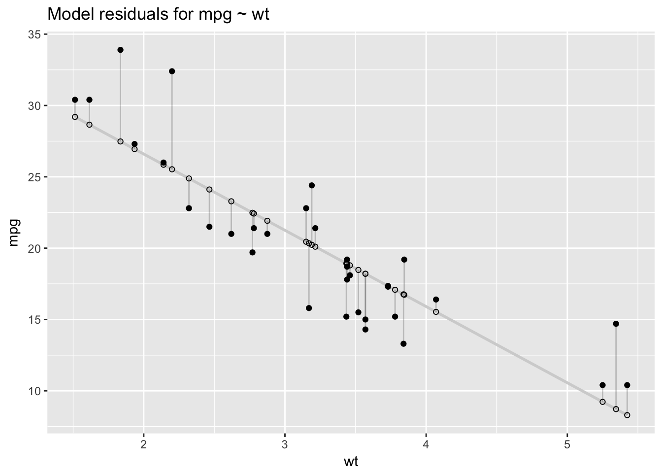
We can summarize the residuals with a measure called the residual sum of squares (RSS), which is calculated by subtracting the actual outcomes, \(y_i\), from the fitted values, \(\hat{y}_i\), squaring those differences, then summing the squares.
\[ \operatorname{RSS} = \sum_{i=1}^n ((\beta_0 + \beta_1x_i) - y_i)^2 = \sum_{i=1}^n (\hat{y}_i - y_i)^2 \]
In summarizing model errors, RSS allows us to quantify model performance with a single number:
rss <- function(fitted, actual){
  sum((fitted - actual)^2)
}

rss(fitted(simple_model), mtcars$mpg)
## [1] 278.32196.3.2 Intepreting coefficients
How do we interpret the output from the lm() function? Let’s start with the simple model of mpg.
- Intercept: 37.29 represents the predicted value of mpg when wt is 0. Since wt can’t equal 0—cars can’t be weightless!—the intercept is not interpretable in this model. To make it interpretable we need to center the wt variable at 0, which we can easily do by subtracting the mean of wt from each observation (\(x_{centered} = x - \bar{x}\)). This is a linear transformation that will change the scaling of the predictor, and thus \(\beta_0\) also, but not the fit of the model: \(\beta_1\) will remain the same (-5.34) as will RSS (278.32). After the transformation, average car weight is 0, and the intercept represents predicted mpg for cars of average weight.
mtcars$wt_centered <- mtcars$wt - mean(mtcars$wt)
(simple_model <- lm(mpg ~ wt_centered, data = mtcars))
##
## Call:
## lm(formula = mpg ~ wt_centered, data = mtcars)
##
## Coefficients:
## (Intercept) wt_centered
## 20.091 -5.344rss(fitted(simple_model), mtcars$mpg)## [1] 278.3219Now the intercept, 20.09, is meaningful and represents the predicted value of mpg when wt_centered is 0—that is, when wt is average.
There are two ways to interpret coefficients in a linear model:
Counterfactual: the coefficient represents the predicted change in the outcome associated with a 1 unit increase in the predictor, while holding the other predictors constant (in the multivariable case).
Predictive: the coefficient represents the predicted difference in the outcome between two groups that differ by 1 unit in the predictor, while holding the other predictors constant.
In these notes I will usually interpret coefficients according to the counterfactual paradigm. Hence,
- wt_centered: -5.34 represents the predicted change in the outcome, mpg, associated with a 1 unit increase in wt_centered.
Let’s add a second predictor to the model, a binary version of horsepower (hp_bin), which we will define as 0 for values of hp that are below average and 1 for values greater than or equal to the average.
mtcars$hp_bin <- ifelse(mtcars$hp < mean(mtcars$hp), 0, 1)

(multivariable_model <- lm(mpg ~ wt_centered + hp_bin , data = mtcars))
##
## Call:
## lm(formula = mpg ~ wt_centered + hp_bin, data = mtcars)
##
## Coefficients:
## (Intercept) wt_centered hp_bin
## 21.649 -4.168 -3.324rss(fitted(multivariable_model), mtcars$mpg)## [1] 231.3121This multivariable model is an improvement over the simple model: RSS is lower.
Intercept: 21.65 represents predicted mpg when the continuous or binary predictors equal 0 or (not applicable in this case) when factor variables are at their reference level. The intercept is the model’s predicted mpg for cars of average weight that have below average horsepower.
wt_centered: -4.17 represents predicted change in mpg associated with a 1 unit increase in wt_centered (say, from 1 to 2) while holding the other predictor, hp_bin, constant. Multivariable regression coefficients thus capture how the outcome varies uniquely with a given predictor, after accounting for the effects of all the other predictors. In practice, this means that the coefficient describing the relationship between mpg and wt_centered has been averaged across the levels of hp_bin, so it is the same at each level of hp_bin.
hp_bin: -3.32 represents the predicted change in mpg associated with a 1 unit increase in hp_bin (from 0 to 1) while holding the other predictor, wt_centered, constant.
6.3.3 Interactions
We can add an interaction to this model. Often the relationship between a predictor and an outcome may depend on the level of another predictor variable. For example, the slope of the regression line defining the relationship between wt_centered and mpg may vary with the levels of hp_bin. If so, then we say there is an interaction between wt_centered and hp_bin in predicting mpg. To include an interaction between two variables in the model formula we simply replace + with * in the model formula. This formula, mpg ~ wt_centered * hp_bin, is exactly equivalent to mpg ~ wt_centered + wt_centered * hp_bin, since lm() automatically adds the main effect along with the interaction. By “main effect” we mean the interacted terms by themselves. In this model, the interaction effect is wt_centered:hp_bin, while wt_centered and hp_bin by themselves are the main effects.
(multivariable_model <- lm(mpg ~ wt_centered * hp_bin, data = mtcars))##
## Call:
## lm(formula = mpg ~ wt_centered * hp_bin, data = mtcars)
##
## Coefficients:
## (Intercept) wt_centered hp_bin
## 20.276 -6.391 -3.163
## wt_centered:hp_bin
## 3.953rss(fitted(multivariable_model), mtcars$mpg)## [1] 170.3792RSS improves yet again.
Interactions can be challenging to interpret. It helps to visualize them to understand what is going on.
ggplot(mtcars, aes(wt_centered, mpg, col = factor(hp_bin), group = factor(hp_bin))) +
  geom_point() +
  stat_smooth(method="lm", se = F) +
  ggtitle("mpg ~ wt_centered * hp_bin")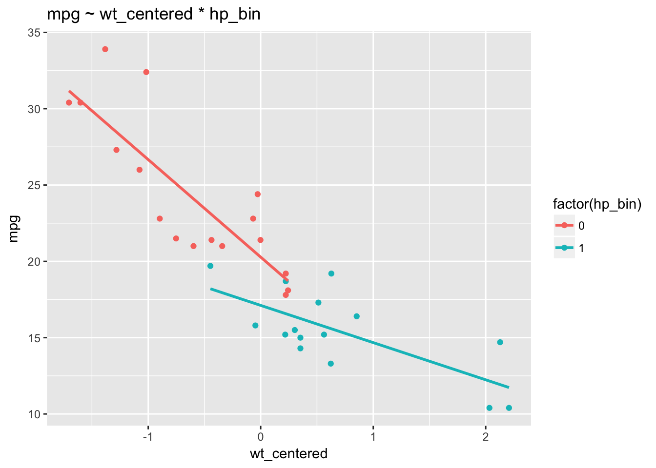
We can see that the relationship between wt and mpg indeed depends on the levels of hp_bin: the slopes of the regression lines differ. Non-parallel regression lines indicate the presence of an interaction. We observe a stronger relationship between wt and mpg among cars with below average horsepower (a stronger negative relationship) than among cars with more horsepower. The regression lines for hp_bin get flatter as wt_centered increases.
Note: the presence of an interaction changes the interpretation of the the main effects. In a model without an interaction, the main effects are independent of particular values of the other predictors. By contrast, an interaction makes the main effects dependent on particular values of the other predictors.
wt_centered:hp_bin: 3.95 represents the difference in the slope of wt_centered for hp_bin = 1 as compared to hp_bin = 0. In other words, when we increase hp_bin from 0 to 1 the slope of the regression line for wt_centered is predicted to increase by 3.95. Or, when we increase wt_centered by 1, the regression line for hp_bin is predicted to increase by 3.95.
wt_centered: -6.39 represents the predicted change in mpg associated with a 1 unit increase in wt among those cars where hp_bin = 0.
hp_bin: -3.16 represents the predicted change in mpg associated with a 1 unit increase in hp_bin from 0 to 1 among those cars with wt_centered = 0 (average).
It can be instructive to see what lm() is doing in the background to fit this model. The model.matrix() command shows how the predictor matrix has been reformatted for the regression:
head(model.matrix(multivariable_model))## (Intercept) wt_centered hp_bin wt_centered:hp_bin
## Mazda RX4 1 -0.59725 0 0.00000
## Mazda RX4 Wag 1 -0.34225 0 0.00000
## Datsun 710 1 -0.89725 0 0.00000
## Hornet 4 Drive 1 -0.00225 0 0.00000
## Hornet Sportabout 1 0.22275 1 0.22275
## Valiant 1 0.24275 0 0.00000The intercept is a vector of 1s. The vector for the interaction term, wt_centered:hp_bin, consists simply in the product of the two component vectors.
6.4 Least squares estimation
For the model \(y = X\beta + \epsilon\), where \(\beta\) is the vector of fitted coefficients and \(\epsilon\) is the vector of model residuals, the least squares estimate is the \(\hat{\beta}\) that minimizes RSS for the given data \(X, y\). We can express the least squares estimate as \(\hat{\beta} = (X'X)^{-1}X'y\), where \(X'\) is the matrix transpose of \(X\). Here is a derivation of this formula.27
\[ RSS = \epsilon^2 = (y - X\beta)'(y - X\beta) \]
\[ RSS = y'y - y'X\beta -\beta'X'y + \beta'X'X\beta \] \[ RSS = y'y - (2y'X)\beta + \beta'(X'X)\beta \] Fox notes: “Although matrix multiplication is not generally commutative, each product [above] is 1 x 1, so \(y'X\beta = \beta'X'y.\)”
To minimize RSS we find the partial derivative with respect to \(\beta\):
\[ \frac{\partial RSS}{\partial\beta}= 0 - 2X'y + 2X'X\beta \] We set this derivative equal to 0 and solve for \(\beta\):
\[ X'X\beta = X'y \]
\[
\beta = (X'X)^{-1}X'y
\] We can use this equation and the model matrix for the multivariable model to estimate \(\hat{\beta}\) for mpg ~ wt_centered * hp_bin + hp_centered:
X <- model.matrix(multivariable_model)
y <- mtcars$mpg

solve(t(X) %*% X) %*% t(X) %*% y
## [,1]
## (Intercept) 20.276155
## wt_centered -6.390834
## hp_bin -3.162983
## wt_centered:hp_bin 3.953027This method returns the same coefficient estimates as lm().
6.5 Additional measures of model fit
As we’ve seen, RSS allows us to compare how well models fit the data. A related measure is root mean squared error (RMSE), the square root of the average of the squared errors:
\[ \operatorname{RMSE}= \sqrt{\frac{\sum_{i=1}^n ((\beta_0 + \beta_1x_i) - y_i)^2}{n}} \]
\[ = \sqrt{\frac{\sum_{i=1}^n (\hat{y}_i - y_i)^2}{n}} \]
The nice thing about RMSE is that, unlike RSS, it returns a value that is on the scale of the outcome.
rss(fitted(multivariable_model), mtcars$mpg)## [1] 170.3792rmse <- function(fitted, actual){
sqrt(mean((fitted - actual)^2))
}
rmse(fitted(multivariable_model), mtcars$mpg)## [1] 2.307455On average, then, this model is off by about 2.31 mpg for each car.
\(R^2\) is another measure of model fit that is convenient because it is a standardized measure—scaled between 0 and 1—and is therefore comparable across contexts.
\[ R^2 = 1 - \frac{SS_\text{resid}}{SS_\text{tot}}, \] where \(SS_\text{tot}=\sum_i (y_i-\bar{y})^2\) and \(SS_\text{res}=\sum_i (y_i - \hat{y}_i)^2\). In words: \(R^2\) represents the variation in the outcome variable explained by the model as a proportion of the total variation. In the plot below, the left hand panel, TSS, serves as the denominator in calculating \(R^2\), and the right hand panel, RSS, is the numerator.
require(gridExtra)

mtcars$mean <- mean(mtcars$mpg)
plot1 <- ggplot(mtcars, aes(wt, mpg)) +
  geom_hline(yintercept=mean(mtcars$mpg), col = 2) +
  geom_segment(aes(xend = wt, yend = mean), alpha = .2) +  geom_point() +
  ggtitle(paste("Total Sum of Squares \n",tss))

plot2 <- ggplot(mtcars, aes(wt, mpg)) +
  geom_smooth(method = "lm", se = FALSE, col=2) +
  geom_segment(aes(xend = wt, yend = fitted(lm(mpg~wt, data=mtcars))), alpha = .2) +
  geom_point() +
  ggtitle(paste("Residual Sum of Squares \n",rss))

grid.arrange(plot1, plot2, ncol=2)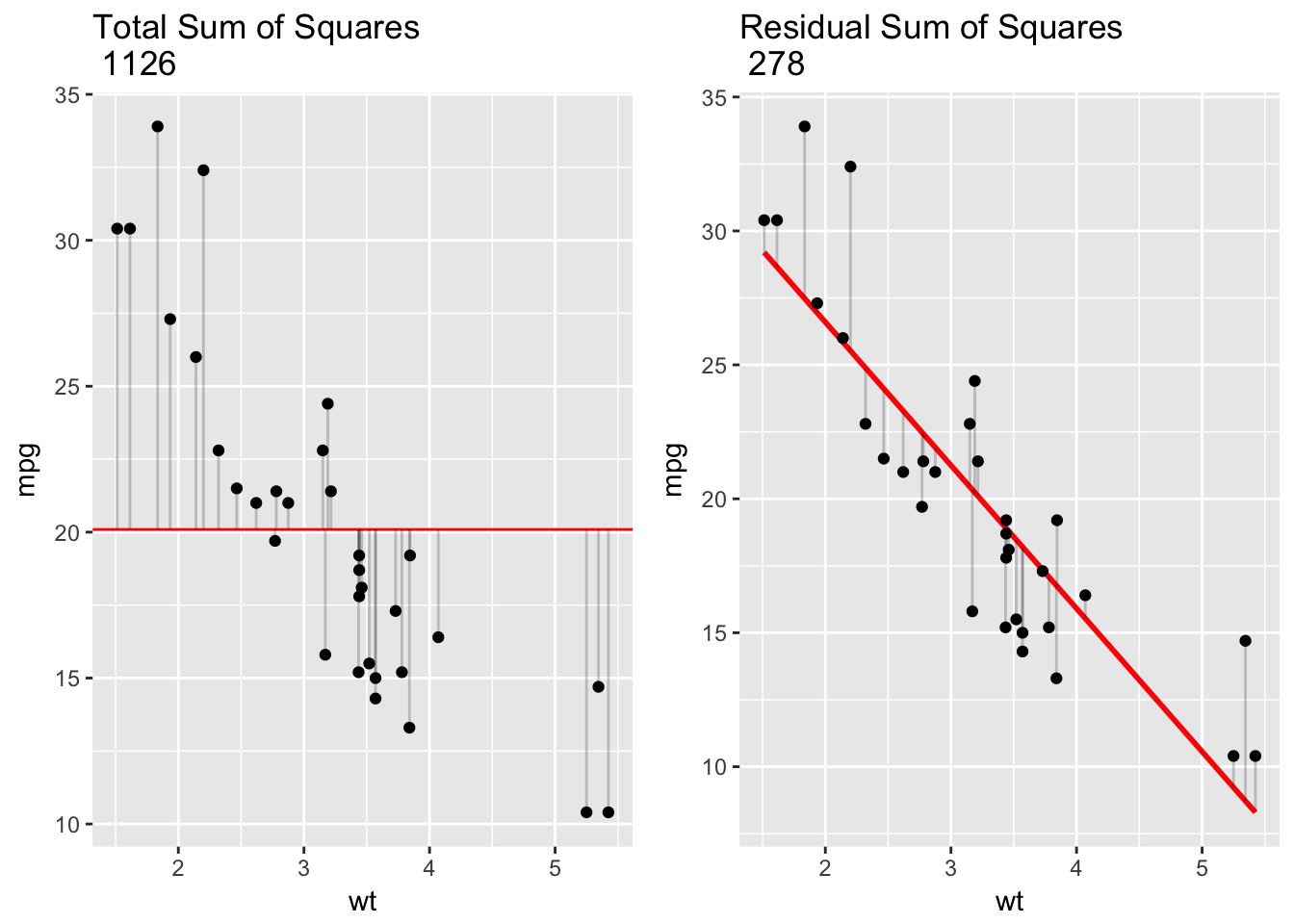
For our simple linear model, mpg ~ wt, \(R^2\) was .75, which matches our calculation here: 1 - 278/1126 = .75. This means that wt explained 75% of the overall variation in mpg. The better the linear regression fits the data in comparison to the simple average the closer the value of \(R^2\) is to 1. For simple linear regression, \(R^2\) is just the squared correlation between outcome and predictor.
cor(mtcars$mpg, mtcars$wt)^2## [1] 0.7528328One problem with \(R^2\) is that adding variables to the model tends to improve it, even when those additions lead to overfitting. A variant of \(R^2\) has been developed that penalizes the measure for additional predictors: adjusted \(R^2\).
\[ \bar R^2 = {1-(1-R^2){n-1 \over n-p-1}} \bar R^2 = {R^2-(1-R^2){p \over n-p-1}}, \]
where \(n\) is the number of observations in the dataset and \(p\) is the number of predictors in the model.
6.6 Bias, variance, overfitting
What do we mean by “overfitting”? The following are key concepts for thinking about model performance, to which we will return throughout the course:
- In-sample performance: how the model performs on the data that was used to build it.
- Out-of-sample performance: how the model performs when it encounters new data.
- If the model performs better in-sample than out-of-sample then we say that the model overfits the in-sample or training data.
- Overfitting occurs when a model fits the sample too well: the model has been optimized to capture the idiosyncrasies—the random noise—of the sample.
- Bias refers to high in-sample predictive accuracy. Low bias is good.
- Variance refers to higher in-sample than out-of-sample predictive accuracy. Low variance is good.
- A model that overfits has low bias and high variance.
- The bias-variance trade-off refers to the idea that you can’t have low bias and low variance at once.
We will guard against—or evaluate the amount of—overfitting using a technique called cross-validation.
6.7 Regression as estimation of a conditional mean
Given the above complexities, it can help to demystify linear regression by seeing it as nothing more (and nothing less!) than a tool for estimating a conditional mean. What is a conditional mean?
Consider the following example. In 2011 a bike sharing program was started in Washington DC and data was collected during 2011 and 2012 on seasonal bike usage and weather conditions. (Bikesharing dataset. The relevant file is “day.csv.”) The outcome variable we’re interested in is “count”—the total number of riders renting bikes on any given day. The dataset has a row for every day, with variables for (among others) season, year, month, holiday, weekday, temperature, perceived temperature, humidity and windspeed.
day <- read.csv("day.csv")

day <- day %>%
  dplyr::select(count = cnt,
         season,
         year= yr,
         month = mnth,
         holiday,
         weekday,
         temperature = temp,
         atemp,
         humidity = hum,
windspeed)glimpse(day)## Observations: 731
## Variables: 10
## $ count <int> 985, 801, 1349, 1562, 1600, 1606, 1510, 959, 822, ...
## $ season <int> 1, 1, 1, 1, 1, 1, 1, 1, 1, 1, 1, 1, 1, 1, 1, 1, 1,...
## $ year <int> 0, 0, 0, 0, 0, 0, 0, 0, 0, 0, 0, 0, 0, 0, 0, 0, 0,...
## $ month <int> 1, 1, 1, 1, 1, 1, 1, 1, 1, 1, 1, 1, 1, 1, 1, 1, 1,...
## $ holiday <int> 0, 0, 0, 0, 0, 0, 0, 0, 0, 0, 0, 0, 0, 0, 0, 0, 1,...
## $ weekday <int> 6, 0, 1, 2, 3, 4, 5, 6, 0, 1, 2, 3, 4, 5, 6, 0, 1,...
## $ temperature <dbl> 0.3441670, 0.3634780, 0.1963640, 0.2000000, 0.2269...
## $ atemp <dbl> 0.3636250, 0.3537390, 0.1894050, 0.2121220, 0.2292...
## $ humidity <dbl> 0.805833, 0.696087, 0.437273, 0.590435, 0.436957, ...
## $ windspeed <dbl> 0.1604460, 0.2485390, 0.2483090, 0.1602960, 0.1869...An initial exploratory question is: how does bike usage vary by year? We can answer this question by simply calculating an average for each year:
day %>%
  mutate(year = ifelse(year == 0, 2011, 2012)) %>%
  group_by(year) %>%
  dplyr::summarize(`average ridership` = round(mean(count)))
## # A tibble: 2 x 2
## year `average ridership`
## <dbl> <dbl>
## 1 2011 3406
## 2 2012 5600Average ridership in this summary represents a conditional mean: the mean of the count variable, conditional on year. What does linear regression tell us about average ridership by year?
lm(count ~ year, data = day)##
## Call:
## lm(formula = count ~ year, data = day)
##
## Coefficients:
## (Intercept) year
## 3406 2194The model output includes an intercept and a coefficient for year. The intercept is the average of the outcome variable when the numeric predictors equal zero. Thus, 3406 is average ridership when year = 0 (that is, 2011), and the coefficient for year, 2194, is the expected increase in ridership associated with a 1 unit increase in year (that is, when year goes from 0 to 1). Average ridership in year 1 (2012) is therefore just the sum of the two coefficients—3406 + 2194 = 5600—which is identical to the conditional mean for 2012 that we calculated above using dplyr.
In general, given two random variables, X and Y (think: year and ridership), we can define the conditional mean as the expected or average value of Y given that X is constrained to have a specific value, \(x\), from its range: \(\mathbf{E}[Y \mid X = x]\). Example: \(\mathbf{E}[Ridership \mid Year = 2012]\) is the average number of riders given that year = 2012. A conditional mean has descriptive value—we know that the \(\beta\) coefficient for year from our model, 2194, represents the relationship between ridership and year, with the magnitude or absolute value of the coefficient indicating the strength of the relationship, positive of negative. Coefficients can also be used for prediction. How many more riders should we expect in 2013? Use the model: \(\mathbf{E}[ridership \mid year = 2013]\) equals the number in 2012, 5600, plus the coefficient for year: 5600 + 2194 = 7794.
The model enables us to predict, but we should remember that there is nothing magic about the prediction. We should think critically about it. For one thing, it assumes a constant year-over-year trend. Is this a reasonable assumption?
6.8 The regression function
Let’s consider mean ridership conditional on temperature (which in this dataset has been normalized and converted to Celsius). We can define a function that will return the conditional mean. For any temperature, \(t\), define \(\mu(t) =\mathbf{E}[Riders \mid Temperature = t]\), which is the mean number of riders when temperature = \(t\). Since we can vary \(t\), this is indeed a function, and it is known as the regression function relating riders to temperature. For example, \(\mu(.68)\) is the mean number of riders when \(t\) = .68 and \(\mu(.05)\) is the mean number of riders when \(t\) = .05, etc.
Note that the actual value of \(\mu(.68)\) is unknown because it is a population value. It does exist, just not in our sample. So our estimate, \(\hat{\mu}(.68)\), must be based on the riders-temperature pairs we have in our data: \((r_{1}, t_{1}), ..., (r_{731}, t_{731})\). How exactly? One approach would be to simply calculate the relevant conditional means from our data. To find \(\hat{\mu}(t)\) using this method, we will simplify the data by rounding temperature to two decimal places.
day %>%
  group_by(temperature = round(temperature, 2)) %>%
  dplyr::summarize(mean = round(mean(count)))
## # A tibble: 77 x 2
## temperature mean
## <dbl> <dbl>
## 1 0.06 981
## 2 0.10 1201
## 3 0.11 2368
## 4 0.13 1567
## 5 0.14 1180
## 6 0.15 1778
## 7 0.16 1441
## 8 0.17 1509
## 9 0.18 1597
## 10 0.19 2049
## # ... with 67 more rowsNotice, however, that there are values missing from the sequence. Here is plot showing the gaps in the data.
day %>%
  group_by(temperature = round(temperature, 2)) %>%
  dplyr::summarize(mean = round(mean(count))) %>%
  dplyr::right_join(data.frame(temperature=seq(.01, .9, .01)), by = "temperature") %>%
  ggplot(aes(temperature, mean)) +
  geom_line() +
  ggtitle("Estimated mean daily riders (with missing observations)") +
  labs(x = "temperature", y = "mean riders")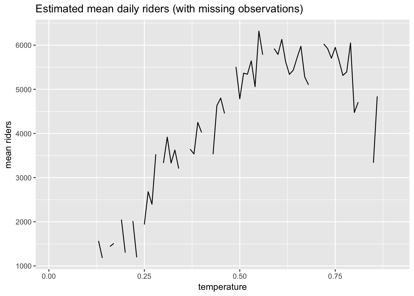
This approach to estimating the regression function, \(\hat{\mu}(t)\), will run into problems when, for example, we want to predict ridership at a temperature for which we have no data.
Using conditional means to estimate \(\hat{\mu}(t)\) is a non-parametric approach. That is, we have assumed nothing about the shape of the unknown function \(\mu(t)\) if it were plotted on a graph, but have simply estimated it directly from our data. K-nearest neighbors regression (KNN) is a generalization of this non-parametric approach.
Note that we could make some assumptions about that shape, possibly improving our estimates, which would make our approach parametric, as in the case of linear regression.
6.9 Non-parametric estimation of the regression function: KNN regression
Sometimes it is not possible to calculate good conditional means for the outcome due to missing predictor values. Suppose we wanted to find \(\hat{\mu}(.12)\). There were no days in our dataset when the temperature was .12! The KNN algorithm solves this problem by using the \(k\) closest observations to \(t\) = .12 to calculate the conditional mean, \(\hat{\mu}(.12)\). If we defined \(k\) = 4 then we would take the four closest values to .12 in the dataset—perhaps .1275, .134783, .138333, .1075. (“Closest” in this case is defined as Euclidean distance, which in 1-dimensional space, a number line, is just: \(\sqrt{(x-y)^2}\).) These \(k\) = 4 closest values of the function would then be averaged to calculate \(\hat{\mu}(.12)\).
Setting the value of \(k\) is obviously a critical decision. If we used \(k\) = 100, for example, our estimates might not be very good. And perhaps \(k\) = 4 is too low—it might lead to overfitting. In the case of \(k\) = 4 the within-sample error (bias) might be low, but the error when predicting new observations (variance) might be high.
Here, for example, is a plot of the fitted values from a KNN model of riders ~ temperature when \(k\) = 4.
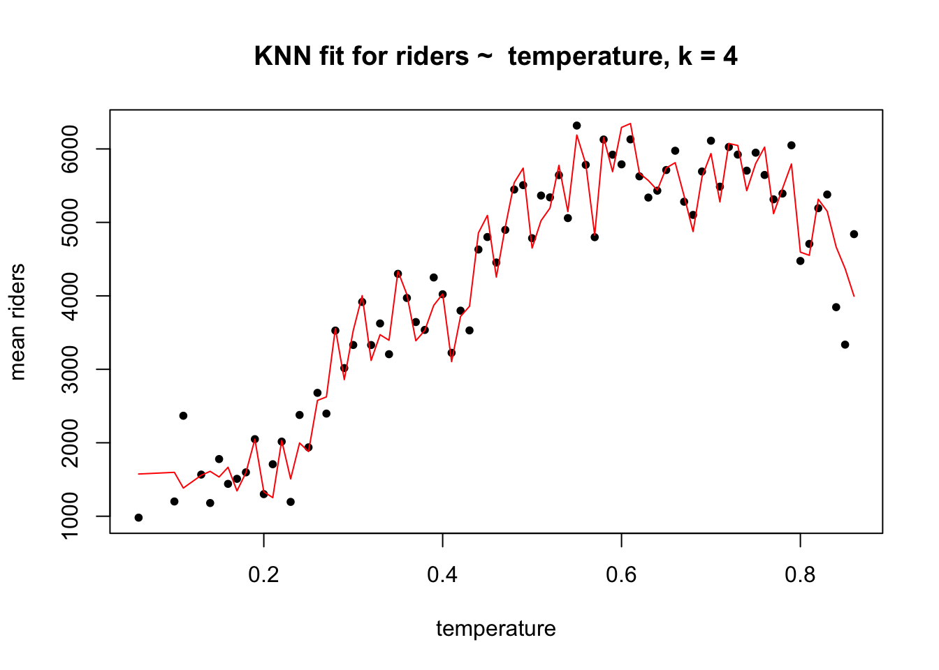
The bias in this model is presumably low because the fit is very flexible: the fitted values are very close to the actual values. The problem is that the KNN regression function at \(k\) = 4 might be doing too good a job describing the sample. When this model encounters new data, without the same idiosyncrasies, its performance might be very poor, with high variance. The model may be overfitting the sample. The bias-variance trade off expresses this idea: when the bias is low, the variance is likely to be high, and vice versa.
Here is an example of a higher bias, possibly lower variance case when \(k\) = 40.
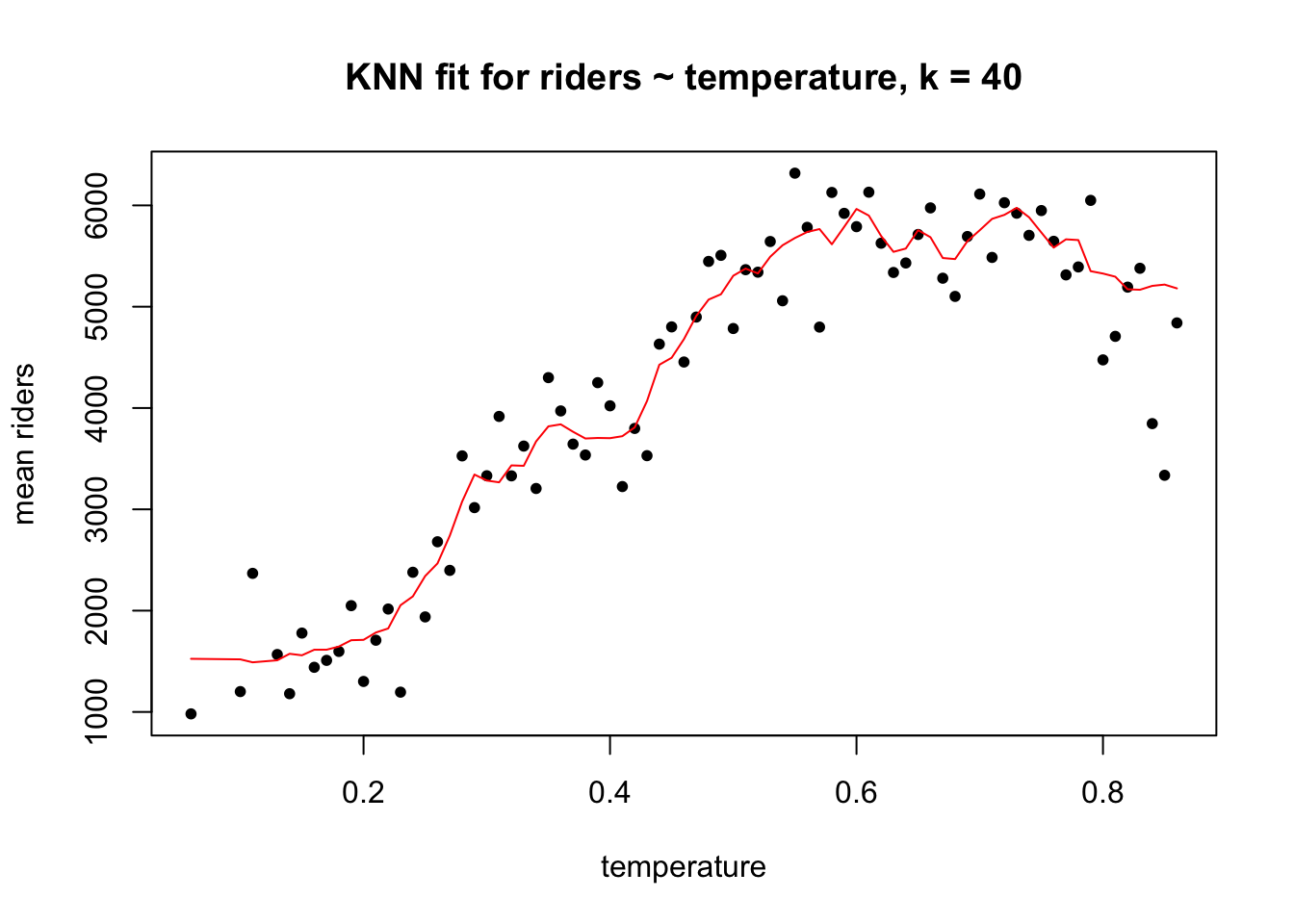
The bias is higher here because the in-sample model error is visibly greater than in the \(k\) = 4 case, but for that very reason the variance is likely to be lower. There is no way to achieve low bias and low variance simultaneously. All you can do is try to balance the two, accepting moderate bias in order to achieve better out-of-sample performance. The technique we use to achieve this balance is cross-validation, which we will cover later in the course. For now we can note that the best value for \(k\) in KNN regression is the one that minimizes variance, not bias.
For reference, here is code for fitting a KNN regression using the caret package in R. We will use caret frequently in the course because it provides a consistent syntax for fitting a wide range of models (including, if we wanted, linear regression) and because, very conveniently, it runs cross-validation in the background to choose optimal model parameters like \(k\). When fitting a KNN model we must always center and scale the variables.
library(caret)
(knn_fit <- train(count ~ temperature,
      preProcess = c("center","scale"),
      method = "knn",
      data = day))
## k-Nearest Neighbors
##
## 731 samples
## 1 predictor
##
## Pre-processing: centered (1), scaled (1)
## Resampling: Bootstrapped (25 reps)
## Summary of sample sizes: 731, 731, 731, 731, 731, 731, ...
## Resampling results across tuning parameters:
##
## k RMSE Rsquared
## 5 1616.086 0.3575109
## 7 1569.875 0.3782257
## 9 1549.347 0.3884773
##
## RMSE was used to select the optimal model using the smallest value.
## The final value used for the model was k = 9.The RMSE and R\(^2\) values that caret prints to the screen are estimates of the model’s out-of-sample error for different \(k\). They are not the model’s in-sample error.28
knn_data <- day %>%
  group_by(temperature = round(temperature,2)) %>%
  dplyr::summarize(`mean riders` = mean(count))

knn_data$prediction <- predict(knn_fit, newdata = knn_data)

ggplot(knn_data, aes(temperature, `mean riders`)) +
  geom_point() +
  geom_line(aes(temperature, prediction), col ="red") +
  ggtitle("KNN fit for riders ~ temperature, k = 9")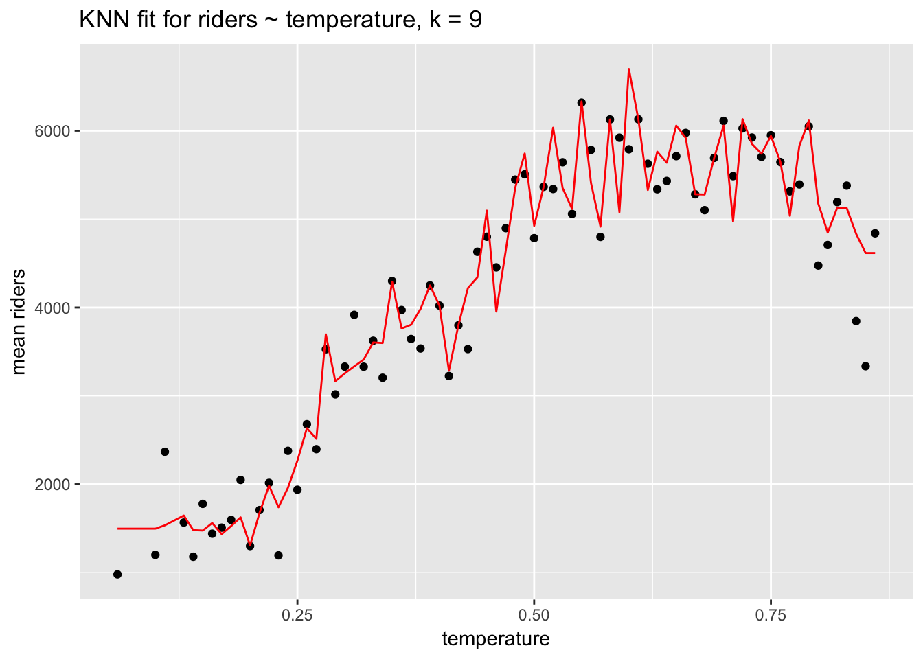
Keep in mind that while KNN regression may offer a good fit to the data, it offers no details about the fit aside from RMSE: no coefficients or p-values. KNN regression—and this is true of many machine learning algorithms—is useful for prediction not description.
6.10 Parametric estimation of the regression function: linear regression
With KNN regression we assumed nothing about the shape of the regression function but instead estimated it directly from the data. Let’s now assume that \(\mu(t)\) is linear and can be described with the parameters of a line: \(\mu(t) = \beta_0 + \beta_1t\), where \(\beta_0\) is the line’s intercept and \(\beta_1\) is the slope. In this case, then, \(\widehat{riders} = \beta_0 + \beta_1(temperature)\). Since \(\mu(t)\) is a population function, the \(\beta_0\) and \(\beta_1\) parameters are population values, and are unknown, but we can easily estimate them.
summary(linear_fit <- lm(count ~ temperature, data = day))##
## Call:
## lm(formula = count ~ temperature, data = day)
##
## Residuals:
## Min 1Q Median 3Q Max
## -4615.3 -1134.9 -104.4 1044.3 3737.8
##
## Coefficients:
## Estimate Std. Error t value Pr(>|t|)
## (Intercept) 1214.6 161.2 7.537 0.000000000000143 ***
## temperature 6640.7 305.2 21.759 < 0.0000000000000002 ***
## ---
## Signif. codes: 0 '***' 0.001 '**' 0.01 '*' 0.05 '.' 0.1 ' ' 1
##
## Residual standard error: 1509 on 729 degrees of freedom
## Multiple R-squared: 0.3937, Adjusted R-squared: 0.3929
## F-statistic: 473.5 on 1 and 729 DF, p-value: < 0.00000000000000022ggplot(day, aes(temperature, count)) +
geom_point() +
stat_smooth(method = "lm", se=F) +
ggtitle("riders ~ temperature, with linear fit")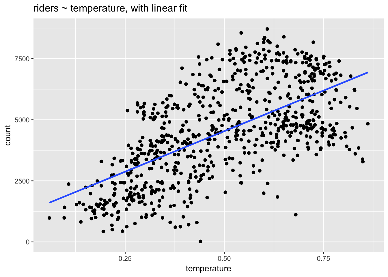
Let’s interpret these model coefficients:
Intercept: 1214.6 represents predicted ridership when temperature equals 0. The intercept is not meaningful because the minimum temperature in the dataset is 0.06. We could make it meaningful by centering the temperature variable at 0, in which case the intercept would represent average ridership at the average temperature. (Remember: linear transformations such as centering don’t change the model fit.) The
summary()function also outputs a standard error, t-value and p-value (“Pr(>|t|)”) for the intercept. We will explain these values below when we review inference in the context of regression.temperature: 6640.7 represents predicted change in ridership associated with a 1 unit increase temperature. Unfortunately, this coefficient is, like the intercept, not very interpretable because the range of the temperature variable is only 0.8, which means that temperature actually can’t increase by 1 unit. We could apply another linear transformation here, to denormalize temperature, but, again, that transformation would not change the fit: the slope of the regression line would remain the same.
We can now ask: which of these two models of ridership—the parametric model using linear regression or the non-parametric model using KNN—is better? What do we mean by better? One answer to that question is in terms of the in-sample fit. What is the RMSE of the KNN model compared to the RMSE of the linear model?
rmse(predict(linear_fit), day$count)## [1] 1507.322rmse(predict(knn_fit), day$count)## [1] 1321.889(predict() is equivalent to fitted() in this context.) Here we can see that the KNN model outperforms the linear model in-sample: on average the KNN model is off by about 1322 riders per day, while the linear model is off by about 1507. This sort of model comparison can be very useful. In this case it suggests there is room for improvement in the linear model. For one thing, we can see that the relationship between temperature and riders is not exactly linear: ridership increases with temperature until about .6 at which point it levels off and declines. KNN regression is better at modeling this non-linearity. We can, however, use a linear model to model a non-linear outcome by adding predictors.
Ridership is likely to vary quite a bit by season. Let’s add a variable for season to see if it improves the model. We need to define season explicitly as a factor, which we can do within the lm() function using factor(). This is appropriate because season is not a continuous variable but rather an integer representing the different seasons and taking only four values: 1 - 4. R will misunderstand season as a continuous variable unless we explicitly define it as a factor. The numeric order of the values of season will automatically define the levels. The lm() function will treat the first level, season = 1, as the reference level, to which the other levels will be compared.
How do we know when a predictor should be defined as continuous and when it should be defined a factor? Here is a rule of thumb: if we subtract one level from another and the difference makes sense, then we can safely represent that variable as an integer. Think about years of education. The difference between 10 years of schooling and 11 years is one year of education, which is a meaningful difference. We aren’t required to represent education as a continuous variable, but we could. (Coding education as a factor would essentially fit a separate regression to each level, which might risk overfitting.) By contrast, consider zip code: a difference of 1 between two 5-digit zip codes is meaningless because zip codes have no intrinsic ordering; they represent categorical differences, which should never be coded as integers. Instead, such variables should always be coded as factors. (For additional information see UCLA’s page describing different types of variables.)
summary(linear_fit2 <- lm(count ~ temperature + factor(season), data = day))##
## Call:
## lm(formula = count ~ temperature + factor(season), data = day)
##
## Residuals:
## Min 1Q Median 3Q Max
## -4812.9 -996.8 -271.3 1240.9 3881.1
##
## Coefficients:
## Estimate Std. Error t value Pr(>|t|)
## (Intercept) 745.8 187.5 3.978 0.00007645038559603 ***
## temperature 6241.3 518.1 12.046 < 0.0000000000000002 ***
## factor(season)2 848.7 197.1 4.306 0.00001886999215746 ***
## factor(season)3 490.2 259.0 1.893 0.0588 .
## factor(season)4 1342.9 164.6 8.159 0.00000000000000149 ***
## ---
## Signif. codes: 0 '***' 0.001 '**' 0.01 '*' 0.05 '.' 0.1 ' ' 1
##
## Residual standard error: 1433 on 726 degrees of freedom
## Multiple R-squared: 0.4558, Adjusted R-squared: 0.4528
## F-statistic: 152 on 4 and 726 DF, p-value: < 0.00000000000000022rmse(predict(linear_fit), day$count)## [1] 1507.322rmse(predict(linear_fit2), day$count)## [1] 1428.151The fit has improved; the model with season has lower RMSE.
How do we interpret the coefficients for a factor variable?
Notice that there are only 3 coefficients for 4 seasons. Shouldn’t there be 4 coefficients? Has the lm() function made a mistake? No. For a factor variable like season each coefficient represents the change in the response associated with a change in the predictor from the first or reference level to each subsequent factor level. (This coding, the default in lm(), can be adjusted with the contrasts argument.) The reference level is typically not shown in the model output. If a predictor has \(k\) levels, then there will be \(k - 1\) coefficients representing predicted changes in the outcome associated with increases from the reference level in the predictor.
factor(season)2: 848.7 is the predicted change in spring riders over winter (season = 1).
factor(season)3: 490.2 is the predicted change in summer riders, again over winter, the reference case.
Increases in temperature might have different impacts on ridership in different seasons. We could test this notion by including an interaction between season and temperature.
The output from the summary() function can become unwieldy. We will instead use the display() function from the arm package, which offers a more concise model summary.
display(linear_fit3 <- lm(count ~ temperature * factor(season), data = day))## lm(formula = count ~ temperature * factor(season), data = day)
## coef.est coef.se
## (Intercept) -111.04 321.28
## temperature 9119.04 1020.33
## factor(season)2 1513.43 571.76
## factor(season)3 6232.96 1079.33
## factor(season)4 2188.52 534.98
## temperature:factor(season)2 -2524.78 1326.47
## temperature:factor(season)3 -9795.26 1774.32
## temperature:factor(season)4 -2851.25 1414.93
## ---
## n = 731, k = 8
## residual sd = 1406.35, R-Squared = 0.48rmse(predict(linear_fit2), day$count)## [1] 1428.151rmse(predict(linear_fit3), day$count)## [1] 1398.634The interaction improves the model fit.
temperature:factor(season)2: -2524.8 represents the difference in the slope of temperature comparing season 2 to season 1. The negative coefficient means that a 1 unit increase in temperature is associated with a smaller change in ridership in spring compared to winter.
temperature:factor(season)3: -9795.3 represents the difference in the slope of temperature comparing season 3 to season 1 And so on.
In a model with interactions, we must take care to interpret main effects accurately.
temperature: 9119 is the main effect for temperature and represents the predicted change in riders associated with a 1 unit increase in temperature when season = 1 (the reference category). In a model without the interaction the coefficient for temperature would represent the average change in riders associated with a 1 unit change in temperature holding season constant.
factor(season)2: 1513.4 represents the predicted change in riders associated with a 1 unit increase in season (i.e., from season 1 to season 2) when temperature = 0. And so on. Because temperature doesn’t equal 0 in this data, the main effects for season are not meaningful.
To understand an interaction, it is essential to plot it!
ggplot(day, aes(temperature, count)) +
  geom_point() +
  stat_smooth(aes(group = factor(season), col = factor(season)), method="lm", se = F) +
  ggtitle("Riders ~ temperature, varying by season")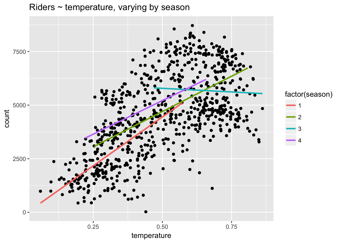
Here we can see that the relationship between temperature and riders is most strongly positive (steepest) in season 1, flatter in seasons 2 and 4, and negative in season 3. Clearly, temperature has different effects in different seasons. In January and February a warmer day leads to a large increase in riders: the weather is better for riding. In July a warmer day leads to a decrease in riders: the weather is worse for riding.
The coefficients in the linear model provide a great deal of insight into the factors influencing ridership. However, our linear model still underperforms the KNN model.
rmse(predict(knn_fit), day$count)## [1] 1321.889rmse(predict(linear_fit3), day$count)## [1] 1398.634Linear regression will often have higher bias than a flexible method like KNN regression, but it will also tend to have lower variance. We will explore these properties further when we get to cross-validation.
Let’s take a look at the model matrix.
head(model.matrix(linear_fit3))## (Intercept) temperature factor(season)2 factor(season)3 factor(season)4
## 1 1 0.344167 0 0 0
## 2 1 0.363478 0 0 0
## 3 1 0.196364 0 0 0
## 4 1 0.200000 0 0 0
## 5 1 0.226957 0 0 0
## 6 1 0.204348 0 0 0
## temperature:factor(season)2 temperature:factor(season)3
## 1 0 0
## 2 0 0
## 3 0 0
## 4 0 0
## 5 0 0
## 6 0 0
## temperature:factor(season)4
## 1 0
## 2 0
## 3 0
## 4 0
## 5 0
## 6 0We can see that lm() has turned the season variable into 3 dummy variable vectors: factor(season)2, factor(season)3 and factor(season)4. (If a factor has \(k\) levels, then a dummy variable for that factor encodes \(k - 1\) of those levels as binary variables, with the values 0 or 1 indicating the absence or presence of that level.) The columns for the interaction terms consist in the products of the component vectors.
6.11 Prediction using the model object
We can use a linear model not only for description but also for prediction. If, for example, we were interested in using the above model to predict ridership for a particular season and temperature—say, a hot day in spring—we could simply use the regression equation. We’ll define a hot day as .85. Thus:
-111 + 9119*.85 + 1513*1 + 6233*0 + 2189*0 - 2525*.85*1 - 9795*.85*0 - 2851*.85*0 ## [1] 7006.9Here is a more precise way of doing the calculation that avoids rounding errors by referencing the model object:
t <- .85
coefs <- coef(linear_fit3)
coefs[1] + coefs[2]*t + coefs[3]*1 + coefs[4]*0 +
  coefs[5]*0 + coefs[6]*t*1 + coefs[7]*t*0 + coefs[8]*t*0
## (Intercept)
## 7007.501The results different because of rounding error in the first case. The second method is more accurate.
We can do the same calculation treating the vector of coefficients as a matrix and using matrix multiplication. This requires less typing but, as with the above method, requires paying close attention to the order of the terms.
coefs %*% c(1, t, 1, 0, 0, t*1, 0, 0)## [,1]
## [1,] 7007.501Simplest of all is to define a data frame with our desired values and use predict():
predict(linear_fit3, newdata = data.frame(season = 2, temperature = .85))## 1
## 7007.5016.12 Inference in the context of regression
In addition to the coefficient estimates for each predictor variable (including the intercept), the output from lm() (using summary()) contains the following: “Std. Error,” “t value,” and “Pr(>|t|)” (the p-value). Let’s review these.
Remember that statistical inference allows us to estimate population characteristics from the properties of a sample. Usually we want to know whether a difference or a relationship we observe in a sample is true in the population—is “statistically significant”—or is likely due to chance. In the context of regression, we want to know specifically whether the slope of the regression line, \(\beta\), summarizing a variable’s relationship to the outcome is different from 0. Is there a positive or negative relationship? In the frequentist paradigm, we answer this question using Null Hypothesis Statistical Testing (NHST).
Recall that NHST works by asserting a “null hypothesis,” \(H_0\). In regression, \(H_0\) is that the slope of the regression line, \(\beta\), is 0. A slope of 0 means that a predictor has no effect on, or no relationship with, the outcome. Regression software automatically calculates a hypothesis test for \(\beta\) using the t-statistic, defined as:
\[
t = \frac{\beta - 0}{SE(\beta)}
\] The \(t\) statistic for one-sample follows a Student’s \(t\) distribution with n - 2 degrees of freedom. (For multivariable linear regression the \(t\) statistic follows a Student’s \(t\) distribution with \(n - k - 1\) degrees for freedom, where \(k\) represents the number of predictors in the model. ) The \(t\) distribution is used because it is more conservative than a normal distribution at lower \(n\) (it is fatter tailed) but converges to normal at higher \(n\) (above about \(n\) = 30). \(SE(\beta)\) is defined as \[
SE(\beta) = \frac{RSE}{\sqrt{\sum_{i=1}^n (x_i -\bar{x}_i)}},
\]
where residual standard error (RSE) =
\[ RSE = \sqrt{\frac{RSS}{n - 2}}, \] and the residual sum of squares (RSS) can be defined as (in a slightly different formulation than we’ve used before):
\[ RSS = \sum_{i=1}^n (y_i - f(x_i))^2. \]
For further details, see Statistical Learning, page 66.
After computing the t-statistic we use a t-test to compare it to the relevant critical value for the \(t\) distribution with n - 2 degrees of freedom.
summary(linear_fit)##
## Call:
## lm(formula = count ~ temperature, data = day)
##
## Residuals:
## Min 1Q Median 3Q Max
## -4615.3 -1134.9 -104.4 1044.3 3737.8
##
## Coefficients:
## Estimate Std. Error t value Pr(>|t|)
## (Intercept) 1214.6 161.2 7.537 0.000000000000143 ***
## temperature 6640.7 305.2 21.759 < 0.0000000000000002 ***
## ---
## Signif. codes: 0 '***' 0.001 '**' 0.01 '*' 0.05 '.' 0.1 ' ' 1
##
## Residual standard error: 1509 on 729 degrees of freedom
## Multiple R-squared: 0.3937, Adjusted R-squared: 0.3929
## F-statistic: 473.5 on 1 and 729 DF, p-value: < 0.00000000000000022rse <- sqrt(sum((day$count - predict(linear_fit))^2)/(nrow(day) - 2))
(seb <- rse/sqrt(sum((day$temperature - mean(day$temperature))^2)))## [1] 305.188(t <- as.numeric((coef(linear_fit)[2] - 0) / seb))## [1] 21.75941Our calculation matches the linear model output exactly.
Let’s plot this t-statistic against the null distribution of T(729). We use the dt() function to generate a density plot for a t-distribution with 729 degrees of freedom, and qt() to identify the critical values for a 95% CI on the null distribution; values with low probability (p < .05) will lie to the left of the lower CI or to the right of the upper CI. P-values and CIs provide the same information about the unusualness of an observed value under the null.
tdist <- data.frame(x = seq(-5, 25, .01), y = dt(seq(-5, 25, .01), df = 729))

qt(c(.025, .975), df = 729)
## [1] -1.963223 1.963223ggplot(tdist, aes(x, y)) +
geom_line() +
geom_vline(xintercept = t, col = "red", lty = 2) +
geom_vline(xintercept = qt(.025, df = 729), lty = 2) +
geom_vline(xintercept = qt(.975, df = 729), lty = 2) +
ggtitle("T(n - 2 = 729) with critical values (black) and observed t-statistic (red)") +
xlab("t-statistic") +
ylab("density")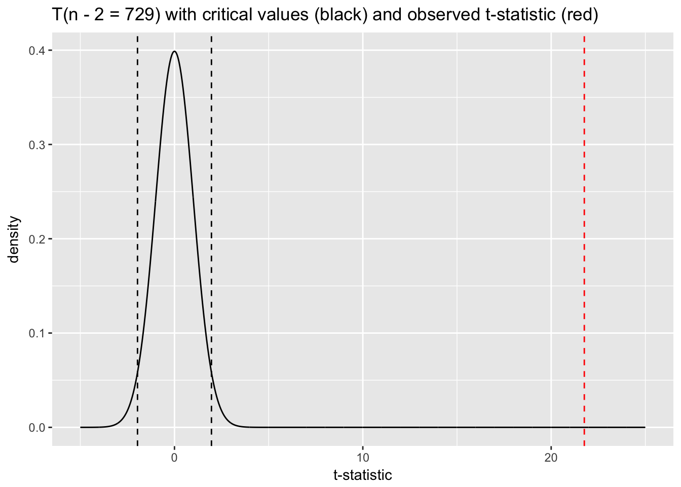
A t-statistic of 21.76 would essentially never happen under the null distribution, which allows us to confidently “reject the null.” The p-value associated with the \(\beta\) coefficient for temperature in the model summary—essentially zero—reflects this result. We can calculate our own p-value with the following code:
2 * pt(t, df = 729, lower.tail = FALSE)## [1] 2.810622e-81We use lower.tail = F because we are interested in the probability of t = 21.76 on the upper tail.
The model summary also outputs something called an f-statistic with an associated p-value:
\[ F = \frac{\frac{TSS - RSS}{p - 1}}{\frac{RSS}{n - p}} \]
The null hypothesis for the f-test is: \(H_0: \beta_1 = ... \beta_{p-1} = 0\). In other words, the test answers the question, “Are any of the predictors useful in predicting the response?” This is not a terribly useful measure of model performance since models almost always have some predictive value.
We could very easily estimate \(SE(\beta)\) using the bootstrap. Use this approach if you have reason to distrust \(SE(\beta)\) calculated analytically by lm(). For example, in the case of heteroskedastic errors (discussed below) lm() will tend to underestimate \(SE(\beta)\). At the very least, similar results for bootstrapped \(SE(\beta)\) would indicate the reliability of the results reported by lm().
temperature_coef <- NULL

for(i in 1:1000){
  rows <- sample(nrow(day), replace = T)
  boot_sample <- day[rows, ]
  model <- lm(count ~ temperature, data = boot_sample)
  temperature_coef[i] <- coef(model)[2]
}

sd(temperature_coef)
## [1] 290.1053In this case the bootstrap estimate of \(SE(\beta_{temp})\) is similar to but smaller than the one calculated analytically. Thus, the lm() estimate is actually more conservative in this case.
The \(SE\) for coefficients in the output from lm() can be used to calculate CIs for the coefficient estimate. \(\hat{\beta} + 1.96(SE)\) gives the upper 95% CI, and \(\hat{\beta} - 1.96(SE)\) gives the lower. 95% CIs that do not include 0 indicate that the coefficient is statistically significant—equivalent to a coefficient p-value of less than .05.
As noted in the previous chapter, using CIs rather than p-values promotes more flexible thinking about data. This is another reasons for using the arm package’s display() function. Not only does it present the output from lm() more compactly, it also reports no t-statistics or p-values. As we’ve seen, \(SE\)s convey the same information.
display(linear_fit)## lm(formula = count ~ temperature, data = day)
## coef.est coef.se
## (Intercept) 1214.64 161.16
## temperature 6640.71 305.19
## ---
## n = 731, k = 2
## residual sd = 1509.39, R-Squared = 0.39The plausible values for temperature are 6641 \(\pm 2(305)\) or about [6031, 7251].29 This CI does not include 0, from which we can conclude that temperature is statistically significant. (The p-value for temperature reported in summary() agrees.)
6.13 Regression assumptions
Regression results are only accurate given a set of assumptions (in order of importance):30
Validity of the data for answering the research question.
Linearity of the relationship between outcome and predictor variables.
Independence of the errors (in particular, no correlation between consecutive errors as in the case of time series data).
Equal variance of errors (homoscedasticity).
Normality of errors.
Don’t stress about these assumptions: most of these problems are not fatal and can be fixed by improving your model—by picking different or additional variables or using a different distribution or modelling framework. Residual plots are the best tool for assessing whether model assumptions have been satisfied.
1. Validity of the data for answering the research question
This may seem obvious but it needs to be emphasized:
The outcome measure should accurately reflect the phenomenon of interest.
The model should include all the relevant variables.
The model should generalize to all the cases to which it is applied.
For example, a model of earnings will not necessarily tell you about total assets, nor will a model of test scores tell you about intelligence or cognitive development. Make sure that your data provides accurate and relevant information for answering your research question!
2. Linearity assumption
The most important mathematical assumption of the regression model is that the outcome is a deterministic linear function of the separate predictors: \(y = \beta_{0} + \beta_{1}x_{1} + \beta_{2}x_{2}...\). We can check this assumption visually by plotting predictor variables against the outcome:
ggplot(day, aes(temperature, count)) +
  geom_point() +
  stat_smooth(method = "lm", se = F) +
  ggtitle("count ~ temperature")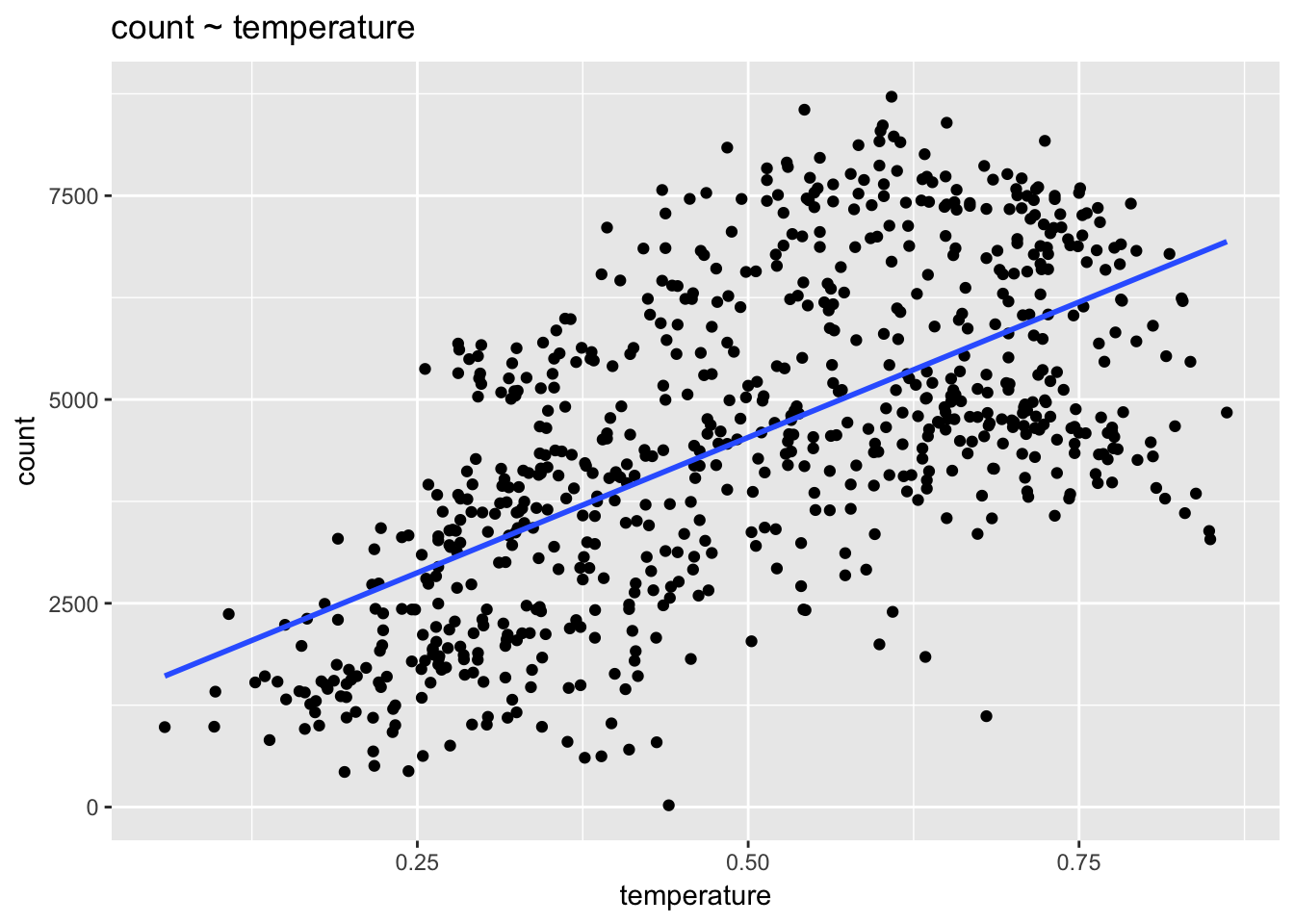
The data are clearly not linear. What do we do? We can add predictors to the model, such as season, that allow a linear model to fit non-linear data. We could also consider adding a quadratic term to the model: count ~ temperature + temperature\(^2\).
linear_fit4 <- lm(count ~ temperature + I(temperature^2), data = day)
ggplot(day, aes(temperature, count)) +
  geom_point() +
  geom_line(aes(temperature, fitted(linear_fit4)), col= "red") +
  ggtitle("count ~ temperature + temperature^2")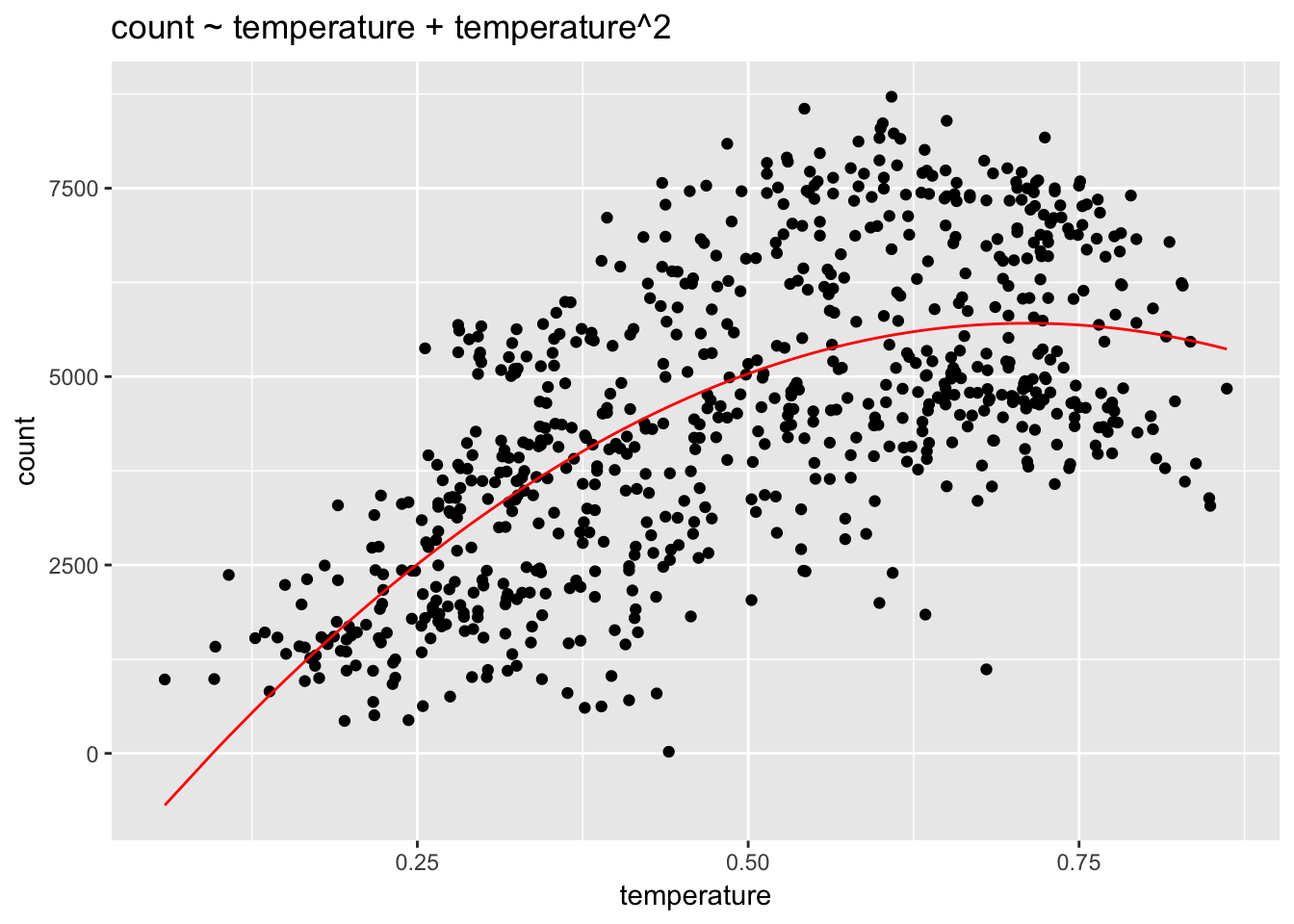
Once additional predictors have been added we can check residual plots, since the failure to model non-linearity will show up in the residuals. plot() is a built-in R function for checking a model’s error distribution.
plot(linear_fit, which = 1)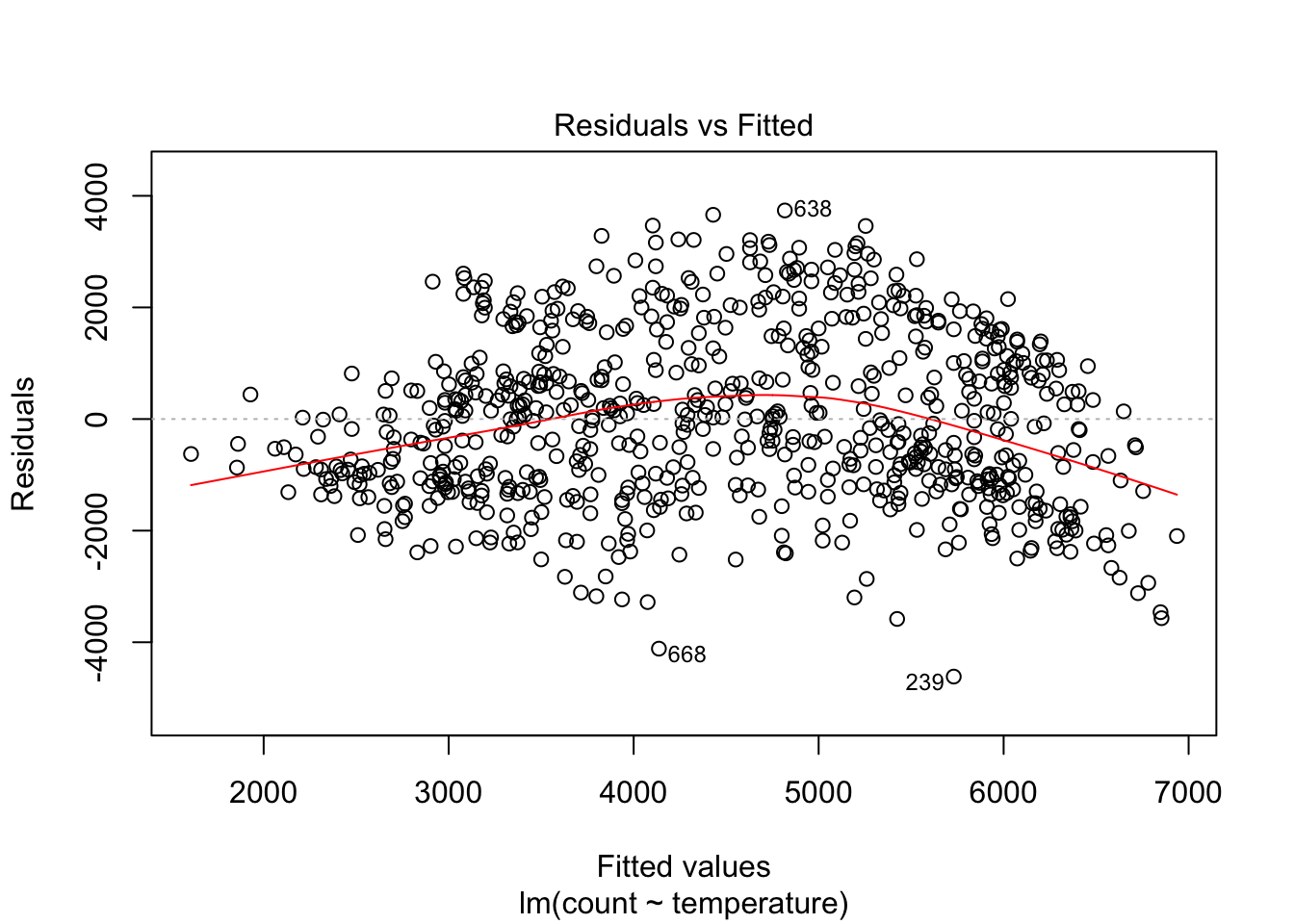
We can see, as expected, significant non-linearity in the residual plot for the model with temperature alone. We expect the residuals to have no visible structure, no pattern. In terms of the linearity assumption, the red summary line should have no curvature. When we add season, the residual plot, while not perfect, improves a lot.
plot(linear_fit2, which = 1)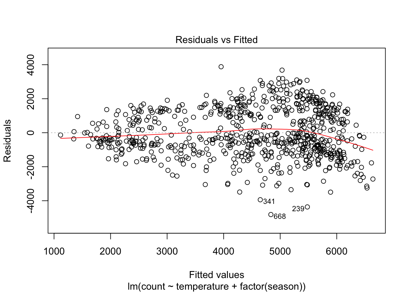
However, the model still struggles with high volume days, with more than 5000 predicted riders. Let’s see if adding an interaction between season and temperature helps:
plot(linear_fit3, which = 1)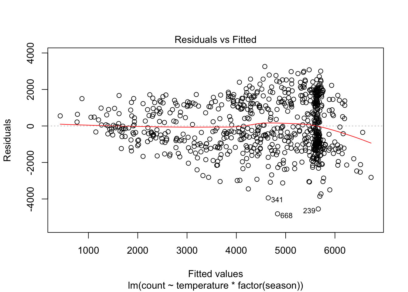
Perhaps this is better. The non-linearity involves fewer observations, most of them on the days with fitted values greater than 6000. But another problem has emerged with this model: heteroskedastic errors. We will discuss this assumption before independence of errors.
4. Equal variance of errors (homoscedasticity)
Notice how the errors in the above residual plot have a funnel shape. The model’s errors are not equally distributed across the range of the fitted values, a situation known as heteroskedasticity. One solution is to transform the outcome variable by taking the log (only works with positive values). If this doesn’t work, remember that the main consequence of heteroskedastic errors is that the \(SE(\beta)\)s are smaller than they should be, leading to more significant p-values than there should be. One remedy for this inferential problem is to calculate adjusted standard errors that are robust to unequal variance; the MASS package offers the rlm() function for fitting such a model.
Here is the residual plot for a model of log(count):
plot(lm(log(count) ~ temperature * season, data = day), which = 1)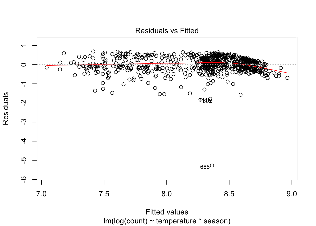
Heteroskedasticity may have improved but now some outliers have emerged and we still have a non-linearity problem. What to do?
After reviewing these residual plots we should step back and think about our data. One problem becomes clear. Ridership on subsequent days is likely to be very similar due to temperature, weather and season. Consequently, the model residuals will be clustered. If the model does not do a good job of accounting for ridership on, say, high temperature days, large errors will not be randomly distributed but will instead occur together—produced by a heat wave in July, for example. The errors on subsequent days will be similar. Linear regression may not a great method for these data, then, because it depends on the assumption of error independence. This may be why KNN regression has consistently outperformed our various linear models. Keep in mind, though, that KNN regression may better fit the data and possibly offer better predictions, but it offers no help at all in understanding relationships between variables. Linear regression, even if the model is not perfect, provides insight into the factors affecting ridership—insight that may be extremely valuable to, for example, administrators of the bike share program—whereas KNN regression can only offer a prediction.
3. Non-independence of errors (correlated residuals)
Non-independence of errors occurs in time-series data or in data with clustered observations—when, for example, multiple data points come from single individuals, stores, or classrooms. We can diagnose correlated residuals in the bike ridership data by looking at a residual plot by date.
data.frame(day = seq(1,nrow(day)),
             residuals = residuals(linear_fit3)) %>%
ggplot(aes(day, residuals)) +
  geom_point() +
  ggtitle("Residuals by day: count ~ temperature * season") +
  geom_hline(yintercept = 0, lty = 2, col = "red")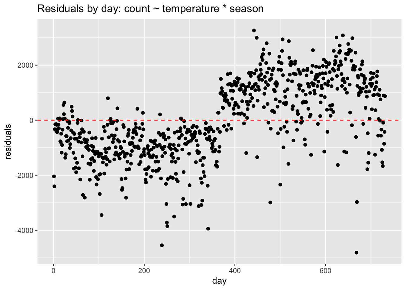
We can see very plainly that the errors occur in clusters related to date. Perhaps the biggest pattern is by year. Without a term for year, the model struggles, under-predicting in the first year and over-predicting in the second. If we add year to the model, the residuals look better but clustering is still evident.
data.frame(day = seq(1,nrow(day)),
             residuals = residuals(update(linear_fit3, ~ . + year))) %>%
ggplot(aes(day, residuals)) +
  geom_point() +
  ggtitle("Residuals by day: count ~ temperature * season + year") +
  geom_hline(yintercept = 0, lty = 2, col = "red")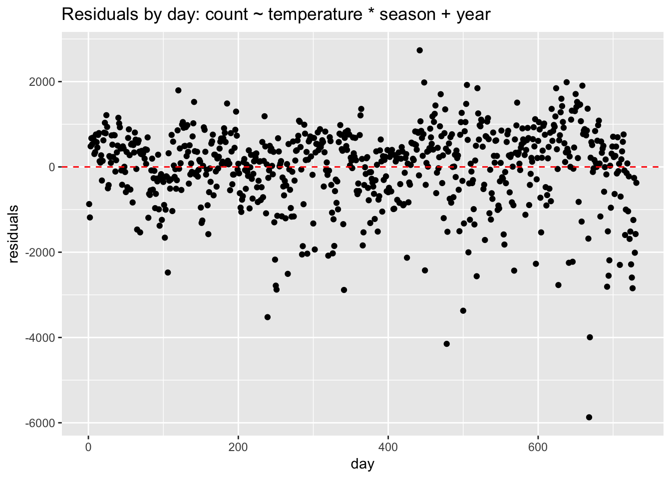
How do we address non-independent errors? If the non-independence is time-related, then we should use an appropriate model for time series data, such as ARIMA. If the clustering is due to some other structure in the data—for example, grouping due to location—then we could consider using a multilevel or hierarchical model. To handle non-independent errors with a linear model we need to add variables that control for the clustering. The clustering in this case is due to seasonality, so we add predictors such as year, season, month, or weekday. If the resulting model is still not a great fit to the data, and we are only interested in prediction, then we could consider using a nonparametric model such as KNN.
5. Normality of the residuals
Compared to the other assumptions, this one is not very important. Linear regression is extremely robust to violations of normality. We can visually check the normality of the residuals with a histogram:
data.frame(residuals = residuals(linear_fit3)) %>%
  ggplot(aes(residuals)) +
geom_histogram() +
  ggtitle("Residuals:  count ~ temperature * season")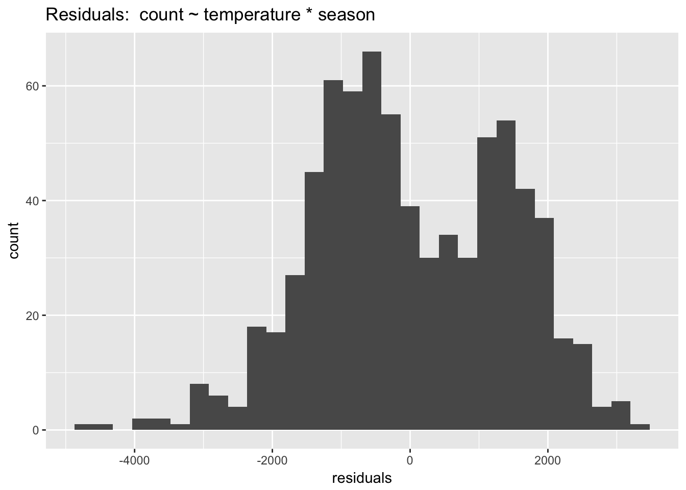
The model without year is definitely not normal! The bimodality of this distribution offers a clue that year is a key seasonal term. The car package includes a function, qqPlot() that (from the documentation) “plots empirical quantiles of a variable, or of studentized residuals from a linear model, against theoretical quantiles of a comparison distribution.”
library(car)
qqPlot(linear_fit3, pch = 20)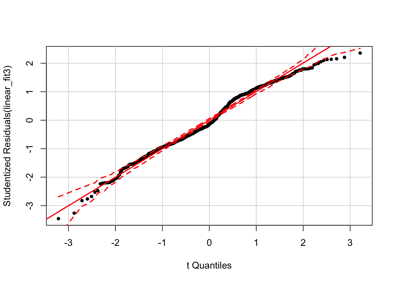
Here we can see deviations from normality that also have a discernible annual structure.
In sum, we use residual plots to interrogate and improve model fit. While there are functions available to formally test most of the above model assumptions, it is better (in my opinion) to avoid such binary tests in favor of plotting residuals and thinking about the data and how to improve a model.
6.14 Additional examples of model interpretation
For these examples we will be using the Boston housing dataset, which records house prices in the Boston area in the 1970s along with various predictors. The outcome variable is the median value of owner-occupied homes in $1000s, coded as “medv.” The predictors include the following:
- chas: Charles River dummy variable (= 1 if tract bounds river; 0 otherwise).
- lstat: lower status of the population (percent). The data dictionary is not explicit, but this variable seems to be a measure of the socioeconomic status of a neighborhood, represented as the percentage of working class or poor families. We will center this variable so that main effects are interpretable.
- rm: average number of rooms per dwelling in a given geographic area. We will center this variable so that main effects are interpretable.
6.14.1 Interpreting the intercept and \(\beta\) coefficients for a model with continuous predictors
library(MASS); data(Boston)
Boston$rm_centered  <- Boston$rm - mean(Boston$rm)
Boston$lstat_centered <-  Boston$lstat - mean(Boston$lstat)
display(lm(medv ~ rm_centered + lstat_centered, data = Boston))
## lm(formula = medv ~ rm_centered + lstat_centered, data = Boston)
## coef.est coef.se
## (Intercept) 22.53 0.25
## rm_centered 5.09 0.44
## lstat_centered -0.64 0.04
## ---
## n = 506, k = 3
## residual sd = 5.54, R-Squared = 0.64- The intercept is the predicted value of the outcome variable when the predictors = 0. Sometimes the intercept will not be interpretable because a predictor cannot = 0. The solution is to center the variable so that 0 is meaningful.
- Intercept: The predicted value of medv when all the predictors are 0: 22.53 + 5.09(0) - .64(0).
- rm_centered: 5.09 represents the predicted change in medv when rm_centered increases by one unit (1 room), while holding the other variables constant.
- lstat_centered: -.64 represents the predicted change in medv when lstat_centered increases by one unit, while holding the other variables constant.
6.14.2 Interpreting the intercept and \(\beta\) coefficients for a model with binary and continuous predictors
display(lm(medv ~ rm_centered + lstat_centered + chas, data = Boston))## lm(formula = medv ~ rm_centered + lstat_centered + chas, data = Boston)
## coef.est coef.se
## (Intercept) 22.25 0.25
## rm_centered 4.96 0.44
## lstat_centered -0.64 0.04
## chas 4.12 0.96
## ---
## n = 506, k = 4
## residual sd = 5.45, R-Squared = 0.65- The intercept is the predicted value of the outcome variable when the binary predictor is 0 and the continuous variable is 0 (which, for centered variables, is the average).
- Intercept: The predicted value of medv when all the predictors are 0: 22.25 + 4.96(0) -.64(0) + 4.12(0).
- rm_centered: 4.96 represents the predicted change in medv when rm_centered increases by one unit (1 room), while holding the other variables constant.
- lstat_centered: -.64 represents the predicted change in medv when lstat_centered increases by one unit, while holding the other variables constant.
- chas: 4.12 represents the predicted change in medv when chas increases by one unit, while holding the other variables constant.
6.14.3 Interpreting the intercept and \(\beta\) coefficients for a model with binary and continuous predictors, with interactions
display(lm(medv ~ rm_centered* chas + lstat_centered, data = Boston))## lm(formula = medv ~ rm_centered * chas + lstat_centered, data = Boston)
## coef.est coef.se
## (Intercept) 22.25 0.25
## rm_centered 4.98 0.46
## chas 4.17 0.99
## lstat_centered -0.64 0.04
## rm_centered:chas -0.22 1.13
## ---
## n = 506, k = 5
## residual sd = 5.45, R-Squared = 0.65Always plot interactions!
ggplot(Boston, aes(rm_centered, medv, col= factor(chas))) +
  geom_point() +
  stat_smooth(method="lm", se=F)+
  ggtitle("medv ~ rm_centered by chas")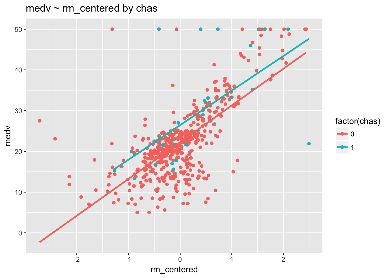
These regression lines are pretty much parallel, indicating that there is no interaction. This result is confirmed by the fact that the p-value for rm_centered:chas is .85 (p > .05).
- Intercept: 4.98 is the predicted value of medv when all the predictors are 0.
- rm_centered: 4.98 represents the predicted change in medv when rm_centered increases by one unit (1 room), among those homes where chas = 0.
- chas: 4.17 represents the predicted change in medv when chas increases by one unit, , among homes with average rooms (rm_centered = 0).
- lstat_centered: -.64 represents the predicted change in medv when lstat_centered increases by one unit, while holding the other variables constant.
- rm_centered:chas: -.21 is added to the slope of rm_centered, 4.98, for chas increases from 0 to 1. Or, alternatively, -.21 is added to the slope of chas, 4.17, for each additional unit of rm__centered.
6.14.4 Interpreting the intercept and \(\beta\) coefficients for a model with continuous predictors, with interactions
display(lm(medv ~ rm_centered * lstat_centered, data = Boston))## lm(formula = medv ~ rm_centered * lstat_centered, data = Boston)
## coef.est coef.se
## (Intercept) 21.04 0.23
## rm_centered 3.57 0.39
## lstat_centered -0.85 0.04
## rm_centered:lstat_centered -0.48 0.03
## ---
## n = 506, k = 4
## residual sd = 4.70, R-Squared = 0.74First, we’ll visualize the interaction by dichotomizing lstat.
Boston$lstat_bin <- ifelse(Boston$lstat > mean(Boston$lstat), "above avg","below avg")
ggplot(Boston, aes(rm_centered, medv, col= lstat_bin) ) +
  geom_point() +
  stat_smooth(method="lm") +
  ggtitle("medv ~ rm varying by lstat")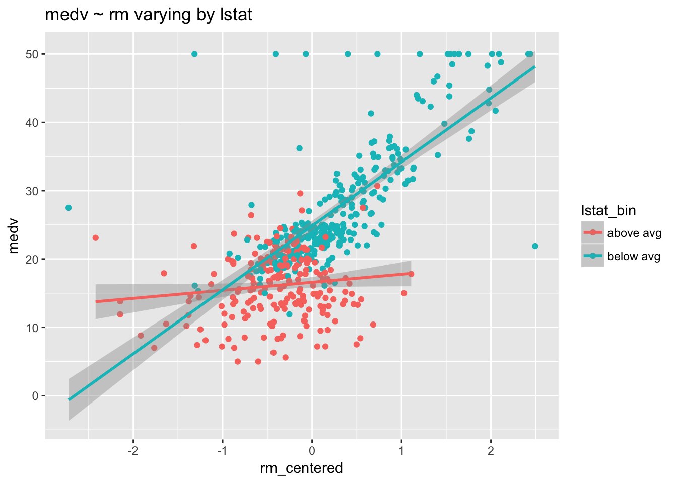
The number of rooms in a home clearly affects value—both regression lines are positive. But this positive relationship is more pronounced among homes with lower lstat. Increasing the number of rooms has a bigger impact in poorer neighborhoods than it does in wealthier neighborhoods.
Next, we’ll dichotomize rm.
Boston$rm_bin <- ifelse(Boston$rm > mean(Boston$rm), "above avg","below avg")
ggplot(Boston, aes(lstat_centered, medv, col = rm_bin) ) +
  geom_point() +
  stat_smooth(method="lm") +
  ggtitle("medv ~ lstat varying by rm")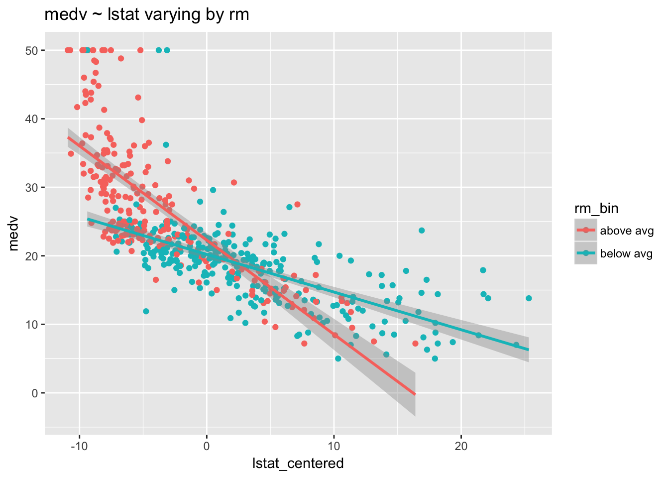
The average socioeconomic status in a neighborhood clearly affects home value—both regression lines are negative. But this negative relationship is more pronounced among homes with above average rooms. Low socioeconomic status (increased lstat) has a bigger impact on the value of homes with above average rooms than it does on homes with below average rooms.
- Intercept: 21.04 is the predicted value of medv when both rm and lstat are average.
- rm_centered: 3.57 is the predicted change in medv if rm_centered goes up by 1 unit, among those homes where lstat_centered is average (= 0).
- lstat_centered: .85 is the predicted change in medv if lstat_centered goes up by 1 unit, among those homes where rm_centered is average (= 0)
- rm_centered:lstat_centered: .48 is added to the slope of rm_centered, 3.57, for each additional unit of lstat_centered. Or, alternatively, -.48 is added to the slope of lstat_centered, -.85, for each additional unit of rm__centered. We can understand the interaction as saying that the importance of lstat as a predictor of medv decreases at higher numbers of rooms, and, similarly, that the importance of rm as a predictor of medv decreases at higher levels of lstat.
6.15 Centering and scaling
We have seen how centering predictors can aid model interpretation. In addition to centering, we can scale predictors, which makes the resulting model coefficients directly comparable. The rescale() function in the arm package automatically centers a variable and divides by 2 standard deviations (\(\frac{x_i - \bar{x}}{2sd}\)). The default setting ignores binary variables. Dividing by 2 standard deviations, instead of 1 (as when computing a traditional z-score), makes rescaled continuous variables comparable to untransformed binary variables. After centering and scaling, model coefficients can be used to assess effect sizes and to identify the strongest predictors.
Which is a stronger predictor of bike ridership, windspeed or year?
display(lm(count ~ windspeed + year, data = day))## lm(formula = count ~ windspeed + year, data = day)
## coef.est coef.se
## (Intercept) 4496.05 161.80
## windspeed -5696.31 733.60
## year 2183.75 113.63
## ---
## n = 731, k = 3
## residual sd = 1535.95, R-Squared = 0.37This model makes it look like windpseed is by far the stronger predictor: the absolute value of the coefficient is more than 2 times larger. But this result is misleading, an artifact of variable scaling.
display(lm(count ~ arm::rescale(windspeed) + year, data = day))## lm(formula = count ~ arm::rescale(windspeed) + year, data = day)
## coef.est coef.se
## (Intercept) 3410.98 80.40
## arm::rescale(windspeed) -882.90 113.70
## year 2183.75 113.63
## ---
## n = 731, k = 3
## residual sd = 1535.95, R-Squared = 0.37Model fit has not changed—\(R^2\) is the same in both models—but centering and scaling allows us to see that year actually has a much larger effect size than windspeed: a 1 unit increase in year is associated with a larger change in ridership. We could, equivalently, use the standardize() function, also from the arm package, which conveniently rescales all of the variables in a model at once.
display(standardize(lm(count ~ windspeed + year, data= day)))## lm(formula = count ~ z.windspeed + c.year, data = day)
## coef.est coef.se
## (Intercept) 4504.35 56.81
## z.windspeed -882.90 113.70
## c.year 2183.75 113.63
## ---
## n = 731, k = 3
## residual sd = 1535.95, R-Squared = 0.37The standardize() function alerts us that windspeed is now a z-score (z.windspeed), and that year has been centered (c.year). The interpretation of c.year is the same as for year: an increase of 1 unit (-.5 to .5) is associated with a predicted increase of 2183.75 riders. However, the interpretation of z.windspeed is now different, since a 1 unit increase in z.windspeed is 2 standard deviations. Thus, a 2 standard deviation increase in windspeed (0.15) is associated with a predicted change in ridership of -882.
Why do we care about being able to compare coefficients? The absolute value of \(\beta\) is a measure of the strength of the relationship between a predictor and the outcome and hence of the importance of that predictor in explaining the outcome. P-values offer no guidance on the strength of a predictor: a statistically significant predictor could have a tiny, and practically inconsequential, effect size. The absolute value of \(\beta\) is thus a measure of practical significance, as opposed to statistical significance. Statistical significance expresses the unlikeliness of a result, whereas \(\beta\) represents the effect size—how much we expect the outcome to change as the result of varying the predictor. Standardizing \(\beta\) allows us to interpret effect size without being misled by arbitrary differences in variable scaling.
6.16 Log transformation
So far we have considered transformations that do not change the model fit but merely aid interpretation. Sometimes, however, we want to change variables so that a linear model fits better. The widely used log transformation is an example. We should consider a log transformation if our data is skewed, shows a non-linear increase or has a large range. Rule of thumb: If a variable has a spread greater than two orders of magnitude (x 100) then log transforming it will likely improve the model.
For log transformation we will use the natural log, designated \(log_e\), or \(ln\), or, in R code: log(). \(e\) is a mathematical constant approximately equal to 2.718281828459. The natural logarithm of a number, \(x\), is the power to which \(e\) would have to be raised to equal \(x\). For example, \(ln(7.5)\) is 2.0149…, because \(e^{2.0149...}\) = 7.5.
The natural log is the inverse function of the exponential function (and vice versa): they undo each other. Hence, these identities: \(e^{\ln(x)} = x\) (if \(x > 0\)); \(\ln(e^x) = x\). To put a log transformed variable back on the original scale we simply exponentiate: \(x = e^{ln(x)}\). In R code: x = exp(log(x)). One reason to use natural logs is that coefficients on the natural log scale are, roughly, interpretable as proportional differences. Example: for a log transformed variable, a coefficient of .06 means that a difference of 1 unit in \(x\) corresponds to an approximate 6% difference in \(y\), and so forth. Why? exp(.06) = 1.06, a 6% increase from 1 as baseline. With larger coefficients, however, this doesn’t work exactly: exp(.42) = 1.52, a 52% difference.
The US population from 1790 - 1970 is an example of a variable we would want to transform, since the increase is non-linear and large:
data("uspop")
plot(uspop, main = "US population, 1790 - 1970, in millions")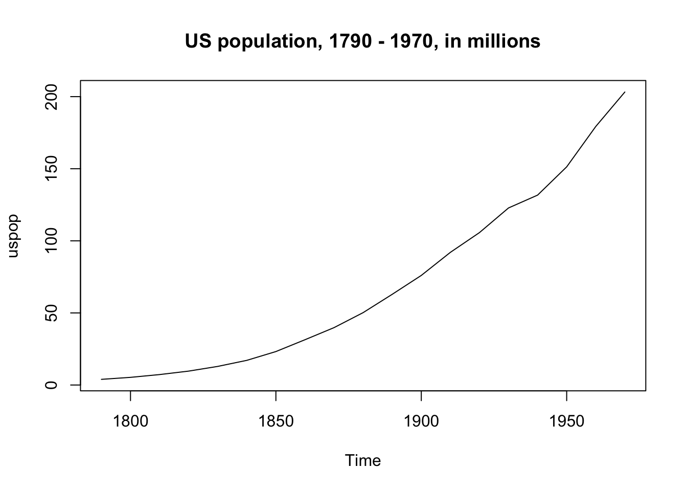
But when we take the log of population the increase is (more) linear:
plot(log(uspop), main = "Logged US population, 1790 - 1970, in millions")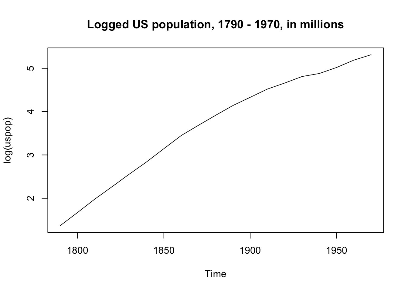
Log transformation is used frequently with prices or income, since the top end of the scale for such variables is often exponentially greater than the bottom. We can log home values in the Boston housing dataset to improve model fit.
Boston %>%
  arrange(medv) %>%
  mutate(observations = seq(1, length(medv)),
         log_medv = log(medv)) %>%
  dplyr::select(medv, log_medv, observations) %>%
  gather(type, home_value, -observations) %>%
  ggplot(aes(observations, home_value)) +
  geom_line() +
  facet_wrap(~type, scales = "free_y")+
  ggtitle("Comparison of log(medv) and medv")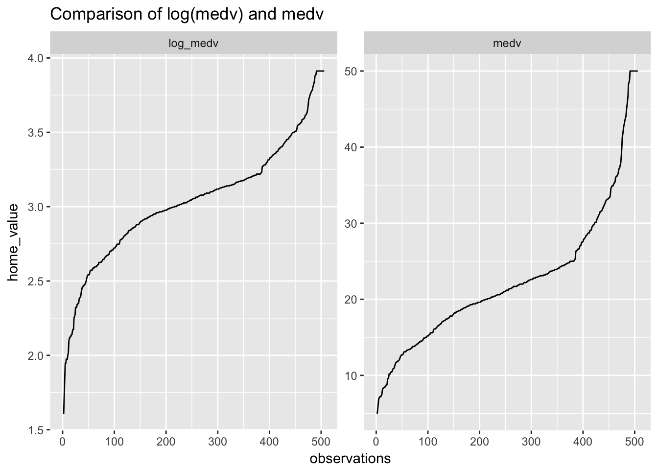
Taking the log of medv has not shifted medv towards linearity as much as we might have expected. Will it nevertheless improve the fit?
display(standardize(lm(medv ~ rm + lstat, data = Boston)))## lm(formula = medv ~ z.rm + z.lstat, data = Boston)
## coef.est coef.se
## (Intercept) 22.53 0.25
## z.rm 7.16 0.62
## z.lstat -9.17 0.62
## ---
## n = 506, k = 3
## residual sd = 5.54, R-Squared = 0.64display(standardize(lm(log(medv) ~ rm + lstat, data = Boston)))## lm(formula = log(medv) ~ z.rm + z.lstat, data = Boston)
## coef.est coef.se
## (Intercept) 3.03 0.01
## z.rm 0.18 0.03
## z.lstat -0.55 0.03
## ---
## n = 506, k = 3
## residual sd = 0.23, R-Squared = 0.68A little. \(R^2\) has improved from .64 to .68.
Care must be taken in interpreting a log transformed model.
- Intercept: 3.03 represents the predicted log(medv) value when both rm and lstat are average (since both variables have been centered and scaled). To put this back on the original scale, exponentiate: \(e^{3.03}\) = 20.7. Thus, the model’s predicted medv for homes with average lstat and rm in dollars is $2.0710^{4}.
- z.rm: .18 or 18% represents the predicted percentage change in medv associated with a two standard deviation increase in rm (1.41).
- z.lstat: .55 or 55% represents the predicted percentage change in medv associated with a two standard deviation increase in lstat (14.28).
- residual sd: .23 is the standard deviation of the logged residuals. To put this back on the original scale, exponentiate: \(e^.23\) = $1.2586.
And if both outcome and predictor are log transformed?
display(lm(log(medv) ~ log(lstat), data = Boston))## lm(formula = log(medv) ~ log(lstat), data = Boston)
## coef.est coef.se
## (Intercept) 4.36 0.04
## log(lstat) -0.56 0.02
## ---
## n = 506, k = 2
## residual sd = 0.23, R-Squared = 0.68Log transforming a predictor as well as the outcome is a perfectly reasonable tactic if you think that non-normality in both might be contributing to problematic residual plots. In this case, \(R^2\) has not changed suggesting that log transformation of lstat is not necessary.
Remember: log(lstat) = 0 when lstat = 1 (since log(1) = 0)
- Intercept: log(medv) is 4.36 when lstat = 1. (Note that we can’t center lstat in this case because we can’t take the log of a negative number.)
- log(lstat): -.56 or -56% represents the the predicted percentage change in medv associated with a 1% increase in lstat.
6.17 Collinearity
Collinearity occurs when two predictor variables are strongly correlated with each other. While not a regression assumption per se, collinearity can nevertheless affect the accuracy of coefficients, as well as inflating standard errors. Collinearity is less a concern when we are only interested in prediction.
A good example is temperature and perceived temperature, atemp, in the bike data. These measures of temperature are very close:
ggplot(day, aes(temperature)) +
  geom_density()+
  geom_density(aes(atemp), col= "red") +
  ggtitle("Density of temp (black) vs. percieved temp (red)")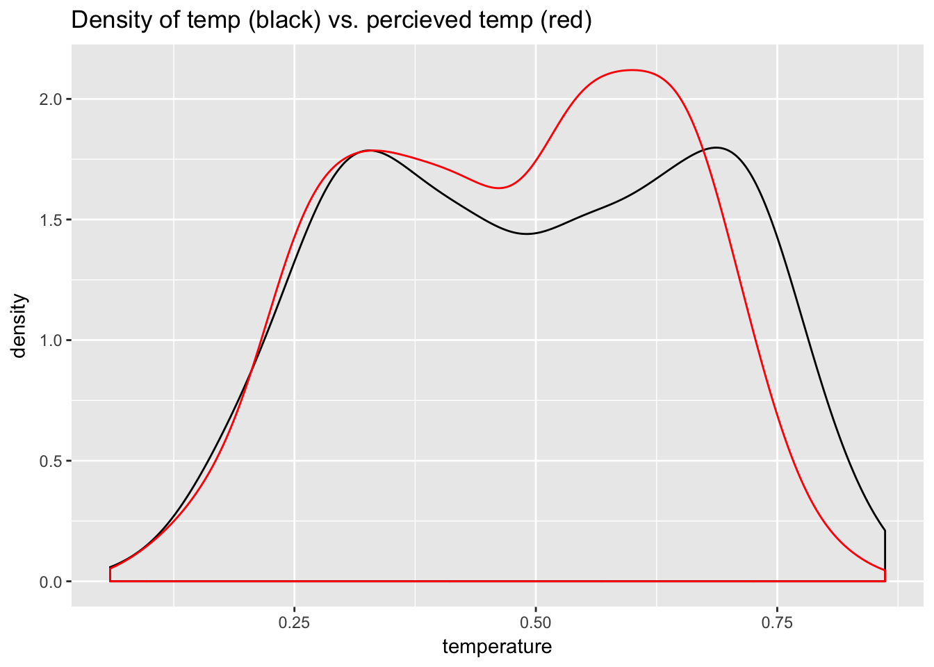
Now compare the model of bike usage with just temperature as a predictor to the model with temperature and atemp. Notice what happens to the standard errors and coefficients:
display(standardize(lm(count ~ temperature, data = day)))## lm(formula = count ~ z.temperature, data = day)
## coef.est coef.se
## (Intercept) 4504.35 55.83
## z.temperature 2431.18 111.73
## ---
## n = 731, k = 2
## residual sd = 1509.39, R-Squared = 0.39display(model <- standardize(lm(count ~ temperature + atemp, data = day)))## lm(formula = count ~ z.temperature + z.atemp, data = day)
## coef.est coef.se
## (Intercept) 4504.35 55.65
## z.temperature 390.34 866.32
## z.atemp 2057.91 866.32
## ---
## n = 731, k = 3
## residual sd = 1504.60, R-Squared = 0.40The \(SE\)s blow up and the coefficients become unreliable.
The practical fix in the above case is to use just one of these variables with the knowledge that they contain the same information. But variables are often correlated. How much correlation is okay? The variance inflation factor (VIF) can help us decide.
Estimated sampling variance of the \(j^{th}\) regression coefficient can be written as:
\[{\rm \widehat{var}}(\hat{\beta}_j) = \frac{\hat{\sigma}^2}{(n-1)s_j^2}\cdot \frac{1}{1-R_j^2}\]
where \(\hat{\sigma}^2\) is the estimated error variance, \(s_j^2\) is the sample variance of \(x_j\) and \(\frac{1}{1-R_j^2}\) is the variance inflation factor, or \(VIF_j\).
The term \(R_j^2\) is the \(R^2\) from a linear regression model in which predictor \(X_j\) is used as a response variable, and all other covariates as explanatory variables. A high \(R^2\) in such a model means that most of the variation in predictor \(X_j\) is explained by all other covariates, which means that there is collinearity. This inflates standard errors, making CIs wider and decreasing the likelihood of detecting an effect. To assess colinearity among predictors use vif() from the car package:
cor(day$temperature, day$atemp)## [1] 0.9917016These variables are almost perfectly correlated.
car::vif(model)## z.temperature z.atemp
## 60.50328 60.50328This result means that the standard errors are approximately \(\sqrt{60.5}\) = 7.8 larger than they would be without the other variable! I’ve seen VIF thresholds of 4 (John Fox) or 5-10 (Hastie & Tibshirani) recommended for removal of a variable.
6.18 Outliers
Outliers can affect the fit of a regression model. It is better not to remove them (at least not at first) but to understand them. (Of course, some extreme values could be coding errors, in which case you’d want to remove them.) Remember that outliers are primarily a concern after the model has been fit, in which case they show up among the residuals. Predictors included in the model may take care of observations that show up as outliers in univariate or bivariate analysis. As an example, let’s consider a dataset included in the ISLR library, Hitters, which contains information of the performance statistics and salaries of major league baseball players in the 1986 season. Let’s create a model of log(salary) using at bats, hits, years in the league, home runs, RBIs, walks and assists.
library(ISLR); data(Hitters)

display(standardize(m <- lm(log(Salary) ~ AtBat + Hits + Years +
                              HmRun + RBI + Walks + Assists, data = Hitters)))
## lm(formula = log(Salary) ~ z.AtBat + z.Hits + z.Years + z.HmRun +
## z.RBI + z.Walks + z.Assists, data = Hitters)
## coef.est coef.se
## (Intercept) 5.88 0.04
## z.AtBat -0.81 0.34
## z.Hits 1.29 0.32
## z.Years 0.91 0.08
## z.HmRun 0.11 0.17
## z.RBI 0.02 0.23
## z.Walks 0.34 0.10
## z.Assists 0.03 0.09
## ---
## n = 263, k = 8
## residual sd = 0.63, R-Squared = 0.51plot(m, which=1)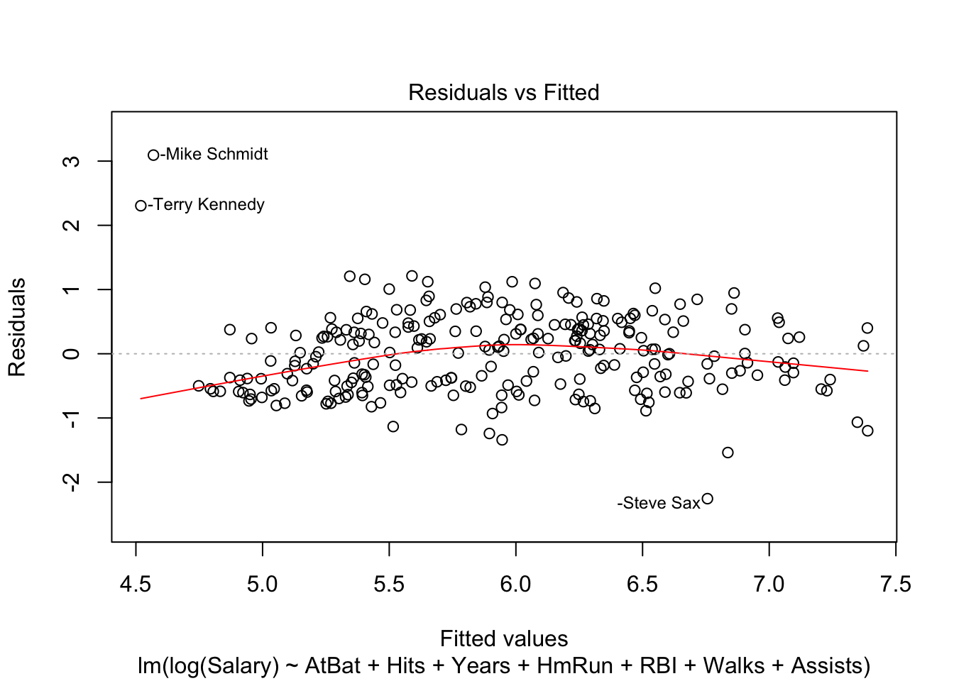
The salaries of three players—Mike Schmidt, Terry Kennedy and Steve Sax—are clearly not very well explained by this model. The model predicts that the first two should be getting paid less and that the third should be getting paid more. We can get another perspective on these observations using a metric called “Cook’s distance,” which is a commonly used influence measure.
plot(m, which=4)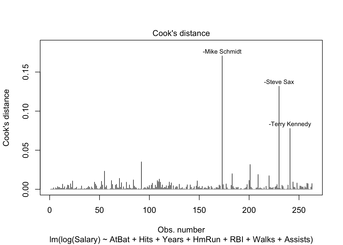
An influential point is one that, if removed from the data, would significantly change the fit. The point could be an outlier or have high leverage. Cook’s distance > 1 is often used as a rough threshold to identify influential points. The Cook’s distnce for these three players is less than 1, but at the same time they are not well explained by the model. What to do?
First, think about your data. Talk to domain experts to help you understand it.
In the case of the hitters dataset we have data from just one year, 1986—potentially very noisy! But we have career stats in the dataset. Perhaps we should use average career stats as predictors instead?
We could do some historical research to find out why Schmidt and Kennedy were paid so much relative to their performance—perhaps they got injured during the season?—and why Sax was paid comparatively little. Such research might help us identify additional explanatory information that could be encoded in variables and included in the model and that might improve model fit.
Is there a characteristic shared by these outliers that we could code in a variable and include as a predictor in the regression?
Bottom line: there are no hard and fast rules about what to do with outliers (or even what counts as an outlier). We use these diagnostic tools—Cook’s distance and residual plots—to understand our data better and devise approaches that make sense in the context of our project. Be very cautious about discarding data.
From Fox, John (2016). Applied Regression and Generalized Linear Models. Sage: Los Angeles.↩
It is possible to customize caret’s grid search for user-specified parameters like \(k\).↩
We use 2 here rather than 1.96 for quick calculation.↩
From Gelman and Hill (2007). Data Analysis Using Regression and Multilevel/Hierarchical Models. Cambridge: Cambridge UP.↩