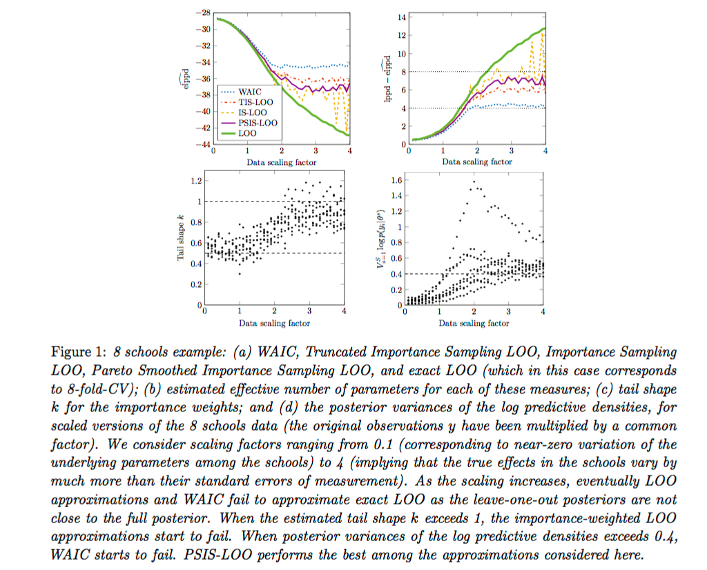
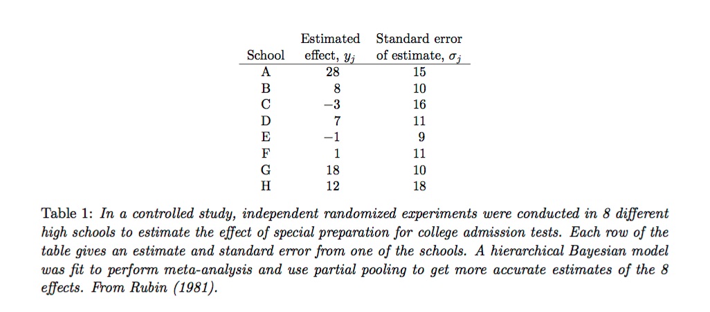
Chapter 9 Statistical Communication
Additional resources:
- King, Tomz & Wittenberg. Making the Most of Statistical Analyses: Improving Interpretation and Presentation. American Journal of Political Science, Vol. 44, No. 2, April 2000, Pp. 341–355.
- Data Analysis Using Regression and Hierarchical/Multilevel Models by Gelman and Hill. Find chapter 7 on Canvas.
This chapter is about how to communicate results so that colleagues and clients, who may not be expert in statistics or machine learning, can understand the real-world significance of our analyses.
Explaining our model is obviously less important in situations where predictive performance is the only metric that matters. Then we may only care about the model’s RMSE (for continuous outcomes) or accuracy (for binary outcomes). The black box nature of machine learning algorithms is not a particular concern in such cases: clients and colleagues may not care how we got our results, just that we go them. However, explaining results is still important, and we should think of illuminating ways—other than RMSE or accuracy, for example, which may remain obscure to non-statisticians—to communicate model performance in terms of real-world quantities that will make intuitive sense to the audience.
When our goal is description rather than prediction then the demands on our communicative abilities are even greater. The challenge is to translate obscure model output into, as above, real-world quantities that will make intuitive sense to our audience. We should never, for example, report model coefficients or standard errors. We may have created a sophisticated and accurate model, but if decision-makers don’t understand the model then they won’t trust it and consequently won’t use its results for decision-making.
We first discuss some guidelines for writing effective technical reports, and then introduce techniques for using models to simulate quantities of interest.
9.1 Technical reports
Technical writing should be clear and spare, relying on visualizations of the central findings. The importance of clear writing in business settings can’t be overstated. Here are some guidelines.
9.1.1 Figures
People read quickly and sloppily. They will miss the main point if it isn’t emphasized. The best way to emphasize, and convey, the main point is in a plot. Pick one or two plots to convey the main point. They should tell the “story.” We can include more than one plot but should make sure we have one that conveys the central result. And we should make sure that if we include more than one plot they add value to the storyline. If a plot doesn’t add value then it shouldn’t be there. (Never include a plot just because.)
Plots are usually better than tables. Why? It is easier to discern important information—especially relationships or comparisons—when it is presented visually. Sometimes, of course, a table works better than a plot: for example, when exact numbers are required.
Always use captions that provide context and that tell the reader what the plot or table means (what key point does it convey?). The plot and caption should stand alone, in the sense of being interpretable even if the reader does not read the full text (since most won’t). It is okay for the caption to repeat the text of the report. Always number figures and tables and reference them in the text: “In Figure 2, we see that ….”
Here is an example of a plot with a lengthy caption.
And here is an example of a table with a caption.
The writer—Andrew Gelman, in both cases—is not assuming that the reader will automatically know what is going on in the plots or in the table but is rather explaining it in great detail.
9.1.2 Organization
Use white space and structure—bolded headings, subheadings, lists with italicized main points—to help convey findings. Specifically:
Avoid big blocks of text unless the main point is summarized in an informative heading or subheading.
Write so that a reader could read the headings, subheadings, bulleted points and the table and figure captions and still get the gist of the report.
Redundancy is usually not a virtue but it has a place in report writing: we don’t worry about repeating our figure and table captions in the text and again in our summary section.
Start with an enumerated summary or findings section.
Here is an example of an effective use of white space and headings:
Our goal as technical writers should be to write in such a way that a reader could skim the report—reading the executive summary, headings, plots and tables (with informative captions)—and understand the main findings.
9.2 Simulating quantities of interest
Never report model coefficients or performance metrics without first translating them into quantities that make sense in terms of the business context. We call these “quantities of interest” (QI). Whereas model coefficients and performance metrics are easy to produce (which is why they get reported so often), QI are difficult to produce since we must figure out what, given our audience, would be of interest. Producing QI requires imagination and knowledge of the business context—what would our audience want to know given their business objectives? QI cannot be generated automatically but are rather unique to each analytic situation, as audiences, research objectives, and business contexts vary.
However, once we’ve decided on the appropriate QI, there are simulation techniques we can use to calculate QI. We use simulation because it allows us not only to use the model to generate point estimates of QI but also to express our uncertainty about those estimates. It is important to include uncertainty in our discussion of QI to drive home the point that we are working with samples, not the population, and that our estimates are, after all, just estimates.
9.2.1 Uncertainty
There are two kinds of uncertainty in any statistical model: between Estimation uncertainty and Fundamental uncertainty:
Estimation uncertainty is lack of knowledge of the \(\beta\) parameters. It vanishes as \(n\) gets larger and \(SE\)s get smaller.
Fundamental uncertainty is represented by the stochastic component of the model, \(\epsilon\). It exists no matter what the researcher does, no matter how large \(n\) is.
When calculating QI we express uncertainty about our point estimates with 95% CIs. A 95% CI based on estimation uncertainty only will be less conservative—that is, narrower—than one based on both estimation uncertainty and fundamental uncertainty, reflects the variability in expected values. A CI based on estimation uncertainty and fundamental uncertainty reflects variability based on predicted values. We cover both below.
9.2.2 QI simulation
With QI simulation the goal is to use the model to create many sets of plausible coefficients either by bootstrapping or by simulating from the multivariate normal sampling distribution of the model coefficients.42 We then compute QI using those simulated coefficients. The technique we demonstrate here is the bootstrap, using a dataset that we are already familiar with: the bikeshare data.
We define appropriate QI in this case by imagining a business context. Let’s say that the manager of the bikeshare program has seen the program grow over the past two years and, knowing that bike usage is heavier in the summer months, is nervous about having enough bikes for the upcoming summer, especially in June—the heaviest riding month. The QI we decide to report is expected ridership in June. (We will tackle predicted ridership later.)
9.2.3 Expected ridership
We first substitute temperature in Fahrenheit for the normalized Celsius scale in the data. Here is the data and the model we will use.
day <- read.csv("day.csv")


day <- day %>%
  dplyr::select(count = cnt,
         season,
         year = yr,
         month = mnth,
         holiday,
         weekday,
         temperature = temp,
         humidity = hum,
         windspeed,
         weather = weathersit,
         workingday) %>%
  mutate(temp_f = (47 * temperature - 8) * (9/5) + 32 )

display(ride_model <-
  lm(count ~ year +  month + temp_f + humidity + windspeed + I(temp_f^2),
     data = day))
## lm(formula = count ~ year + month + temp_f + humidity + windspeed +
## I(temp_f^2), data = day)
## coef.est coef.se
## (Intercept) -5149.71 489.06
## year 1899.30 64.55
## month 64.99 9.95
## temp_f 326.52 18.06
## humidity -3400.41 243.40
## windspeed -4695.14 436.59
## I(temp_f^2) -2.15 0.15
## ---
## n = 731, k = 7
## residual sd = 859.57, R-Squared = 0.80We know from previous modelling that temperature is an important determinant of ridership. The QI for this analysis will therefore be expected bike ridership in June at three different temperature levels. What should those levels be? We’ll determine that empirically, setting temperature at three levels: the 5th percentile will define “cool” for the month, and the 95th percentile will define “hot.” The mean will define “warm.” (These cut-offs are of course somewhat arbitrary and we would want to sanity check them with the client.)
We also know that there is a strong yearly trend, but to avoid overestimating in the next year we will assume that usage will be similar to the 2012.
day %>%
  filter(month == 6) %>%
  summarize(cool = quantile(temp_f, probs = .05),
            warm = mean(temp_f),
            hot = quantile(temp_f, probs = .95)) %>%
  round(1)
## cool warm hot
## 1 66.9 75.5 83.9The question is: how will bike ridership in June vary across these temperature thresholds? We will use the bootstrap to calculate estimates with uncertainty intervals. We first set up a data frame, “newdata,” that includes the predictor values at which we want to estimate ridership.
newdata <-
  data.frame(year = 2,
             month = 6,
             temp_f = c(66.9, 75.5, 83.9),
             humidity = mean(subset(day, month == 6)$humidity),
             windspeed = mean(subset(day, month == 6)$windspeed))

newdata
## year month temp_f humidity windspeed
## 1 2 6 66.9 0.5758055 0.1854199
## 2 2 6 75.5 0.5758055 0.1854199
## 3 2 6 83.9 0.5758055 0.1854199predictions <- data.frame(cool = rep(NA, 1000),
warm = rep(NA, 1000),
hot = rep(NA, 1000))
for(i in 1:1000){
rows <- sample(nrow(day), replace = T)
boot_sample <- day[rows, ]
temp_model <- lm(count ~ year + month + temp_f + humidity + windspeed ,
data = boot_sample)
predictions$cool[i] <- predict(temp_model, newdata = newdata[1,])
predictions$warm[i] <- predict(temp_model, newdata = newdata[2,])
predictions$hot[i] <- predict(temp_model, newdata = newdata[3,])
}
head(predictions)## cool warm hot
## 1 7990.280 8567.117 9130.539
## 2 8206.183 8831.546 9442.364
## 3 8017.416 8663.888 9295.325
## 4 8121.189 8756.958 9377.941
## 5 8156.482 8794.051 9416.793
## 6 7960.679 8542.033 9109.868The result of the bootstrap, the predictions data frame, includes expected values of ridership simulated from the model under three different scenarios: cool, warm and hot. We can work with these distributions to produce various summaries, starting with density.
library(tidyr)
predictions %>%
  gather(temperature, ridership) %>%
  mutate(temperature = factor(temperature, levels = c("cool","warm", "hot"))) %>%
  ggplot(aes(ridership, col = temperature)) +
  geom_density() +
  ggtitle("Simulated expected ridership by temperature")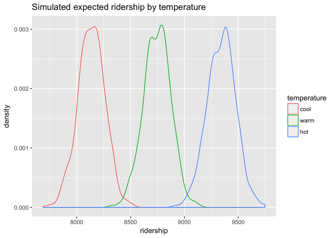
We can calculate the mean for ridership under each scenario, as well as 95% CIs, to produce the desired QI.
expected <- data.frame(
  c(round(mean(predictions$cool),2),
    quantile(predictions$cool, c(.025, .975)),
    round(2*sd(predictions$cool))),
   c(round(mean(predictions$warm),2),
    quantile(predictions$warm, c(.025, .975)),
    round(2*sd(predictions$warm))),
   c(round(mean(predictions$hot),2),
    quantile(predictions$hot, c(.025, .975)),
    round(2*sd(predictions$hot)))
)

names(expected) <- c("cool", "warm", "hot")
rownames(expected) <- c("mean", "2.5 quantile", "97.5 quantile", "2 SE")
t(expected)
## mean 2.5 quantile 97.5 quantile 2 SE
## cool 8136.12 7884.465 8371.331 251
## warm 8746.44 8492.889 8983.464 254
## hot 9342.57 9078.637 9606.076 264On cool days in June (defined as 66.9 degrees Fahrenheit) with average windspeed and humidity, and assuming that usage in 2013 will be similar to 2012, the bikeshare manager should expect 8136 riders on average \(\pm\) 251 riders (\(\pm\) 2 SD). Similarly, on hot days (defined as 83.9 degrees Fahrenheit) the bikeshare manager should expect 9343 riders on average \(\pm\) 264 riders. A warm day, defined by the average temperature for June, 75.5 degrees, is predicted to have 8746 riders on average \(\pm\) 254 riders.
These are QI expected values, corresponding to the fitted values of the model, and our calculated 95% CIs represent estimation uncertainty, ignoring fundamental uncertainty. Bootstrapping allows us to simulate what would happen to the QI in repeated sampling. The more sampling we do, the more precise we can be about the range of QI values based on the model’s fitted values. However, as noted above, every model has two stochastic components: estimation uncertainty and fundamental uncertainty. We know that the fitted values of a model will understate actual variability in the world; the model residuals represent the difference between fitted and actual values. To obtain more realistic QI estimates, then, we would include the model’s fundamental uncertainty by basing our calculation not just on the fitted values but on the fitted values plus estimated residuals. Our QI would then be based on estimated actual values.
9.2.4 Predicted values
The bootstrap calculation of predicted values will be very similar to the code above for estimated values except that we simulate model residuals also. For each bootstrap sample we refit the model but add in the variability associated with residuals. To do this we need to estimate \(\hat\sigma\) using the following formula:
\[ \hat\sigma = \sqrt{\frac{\sum_{i=1}^{n}{(Y_i - X_i\hat\beta)^2}}{n-p}} \]
The numerator is just the residual sum of squares (RSS). The denominator scales the estimate by the degrees of freedom. We can derive the latter using the df.residual() function.
We will adapt our procedure as follows. At the point in the bootstrap loop where, above, we predicted based on the model, we will now use that prediction within the rnorm() function as the mean argument and our calculation of \(\hat\sigma\) as the sd argument.
predictions_p <- data.frame(cool = rep(NA, 1000),
                            warm = rep(NA, 1000),
                            hot = rep(NA, 1000))

for(i in 1:1000){
  rows <- sample(nrow(day), replace = T)
  boot_sample <- day[rows, ]
  temp_model <- lm(count ~ year +  month  + temp_f + humidity + windspeed ,
     data = boot_sample)
  rss <- sum((boot_sample$count - fitted(temp_model))^2)
  mu_cool <- predict(temp_model, newdata = newdata[1,])
  mu_warm <- predict(temp_model, newdata = newdata[2,])
  mu_hot <- predict(temp_model, newdata = newdata[3,])
  sigma <- sqrt(rss/df.residual(temp_model))

  predictions_p$cool[i] <- rnorm(1, mean = mu_cool, sd = sigma)
  predictions_p$warm[i] <- rnorm(1, mean = mu_warm, sd = sigma)
  predictions_p$hot[i] <- rnorm(1, mean = mu_hot, sd = sigma)
}

head(predictions_p)
## cool warm hot
## 1 7760.220 9442.973 10743.850
## 2 8676.822 10491.849 8762.297
## 3 7755.939 9471.350 9589.771
## 4 7328.532 7675.067 9158.227
## 5 6542.577 7681.233 10292.124
## 6 8368.263 7807.807 7808.191There will be a great deal more variability in the predicted values than there was in the expected values.
predictions_p %>%
  gather(temperature, ridership) %>%
  mutate(temperature = factor(temperature, levels = c("cool","warm", "hot"))) %>%
  ggplot(aes(ridership, col = temperature)) +
  geom_density() +
  ggtitle("Simulated predicted ridership by temperature")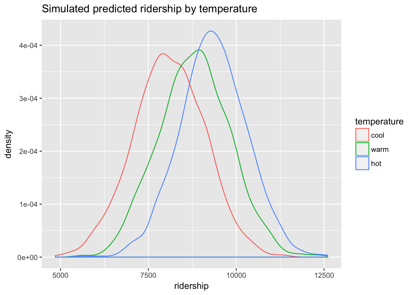
We still see differences in ridership under the three scenarios, but those differences are now less clear with the additional variability. These QI are, however, likely more realistic estimates of ridership in the real world.
compare <- data.frame(
  c(round(mean(predictions$cool),2),
    round(mean(predictions$warm),2),
    round(mean(predictions$hot),2)),
  c(round(mean(predictions_p$cool),2),
    round(mean(predictions_p$warm),2),
    round(mean(predictions_p$hot),2)),
  c(round(2*sd(predictions$cool),2),
    round(2*sd(predictions$warm),2),
    round(2*sd(predictions$hot),2)),
    c(round(2*sd(predictions_p$cool),2),
      round(2*sd(predictions_p$warm),2),
      round(2*sd(predictions_p$hot),2)))

names(compare) <- c("Expected means", "Predicted means", "Expected 2 SE", "Predicted 2 SE")
rownames(compare) <- c("cool", "warm", "hot")
compare
## Expected means Predicted means Expected 2 SE Predicted 2 SE
## cool 8136.12 8090.60 250.96 2014.57
## warm 8746.44 8805.83 253.62 2022.10
## hot 9342.57 9336.87 264.30 1903.04We should note that for non-statistically literature audiences density plots are hard to understand. What do they represent exactly? (Good luck explaining that to the client.) A more intuitive way of representing the same information is a bar graph with error bars:
predictions_p %>%
  gather(temperature, ridership) %>%
  group_by(temperature) %>%
  dplyr::summarize(`mean riders` = mean(ridership),
                   low = quantile(ridership, prob = .025),
                   high = quantile(ridership, prob = .975)) %>%
  mutate(temperature = factor(temperature, levels = c("cool","warm", "hot"))) %>%
  ggplot(aes(temperature, `mean riders`)) +
    geom_bar(stat="identity", fill = "blue") +
    geom_errorbar(aes(ymin=low, ymax=high),
                  width=.2) +
  ggtitle("Simulated predicted ridership by temperature")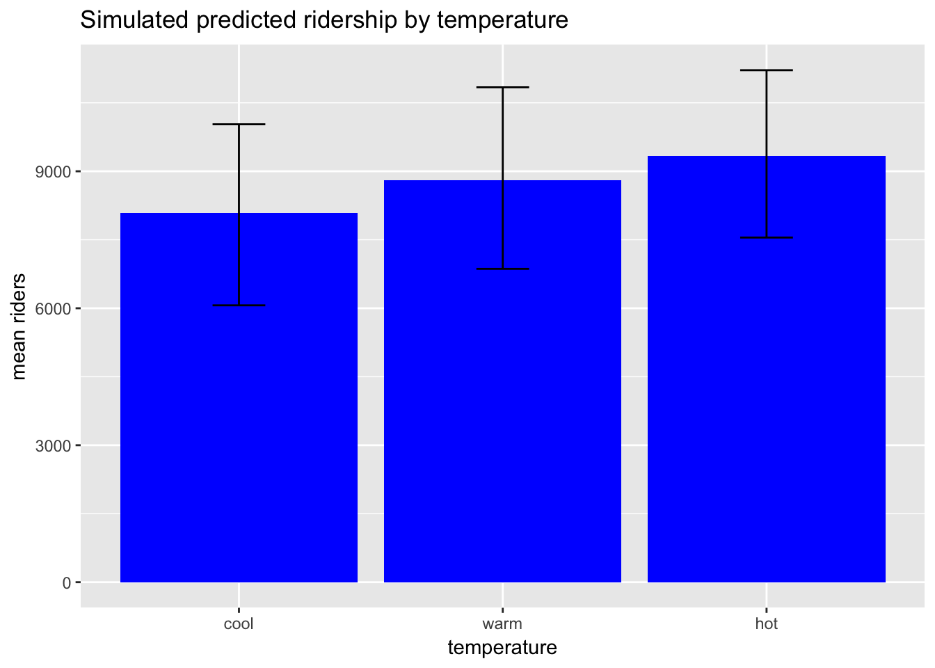
See Gelman, chapter 7.↩