1.3 Underlying Process
Let’s first look at conducting a PCA manually. We are first going to just try to summarise the variables of Alcohol Content and overall Drinker Rating. We do this just to illustrate the underlying mathematics, not necessarily because it is useful in practice. PCA as a whole will repeat the steps outlined below, but generalising to multiple different variables.
Let’s examine two potential properties of the beer that could be combined into one summary score: strength of beer (measured in alcohol by volume, ABV %) vs. the overall rating (measured on a 5 point Likert scale).
We produce a scatter plot of these two variables, and we conclude that as the strength of the beer increases, so does the drinker rating.
ggplot(beers, aes(x = abv, y = rating)) +
  geom_point(aes(color = style)) +
  geom_smooth(method = lm, se = F, color = "black") +
  theme_bw() +
  labs(title = "Strength of Beer vs. Drinker Rating",
       x = "Alcohol by Volume",
       y = "Drinker Rating")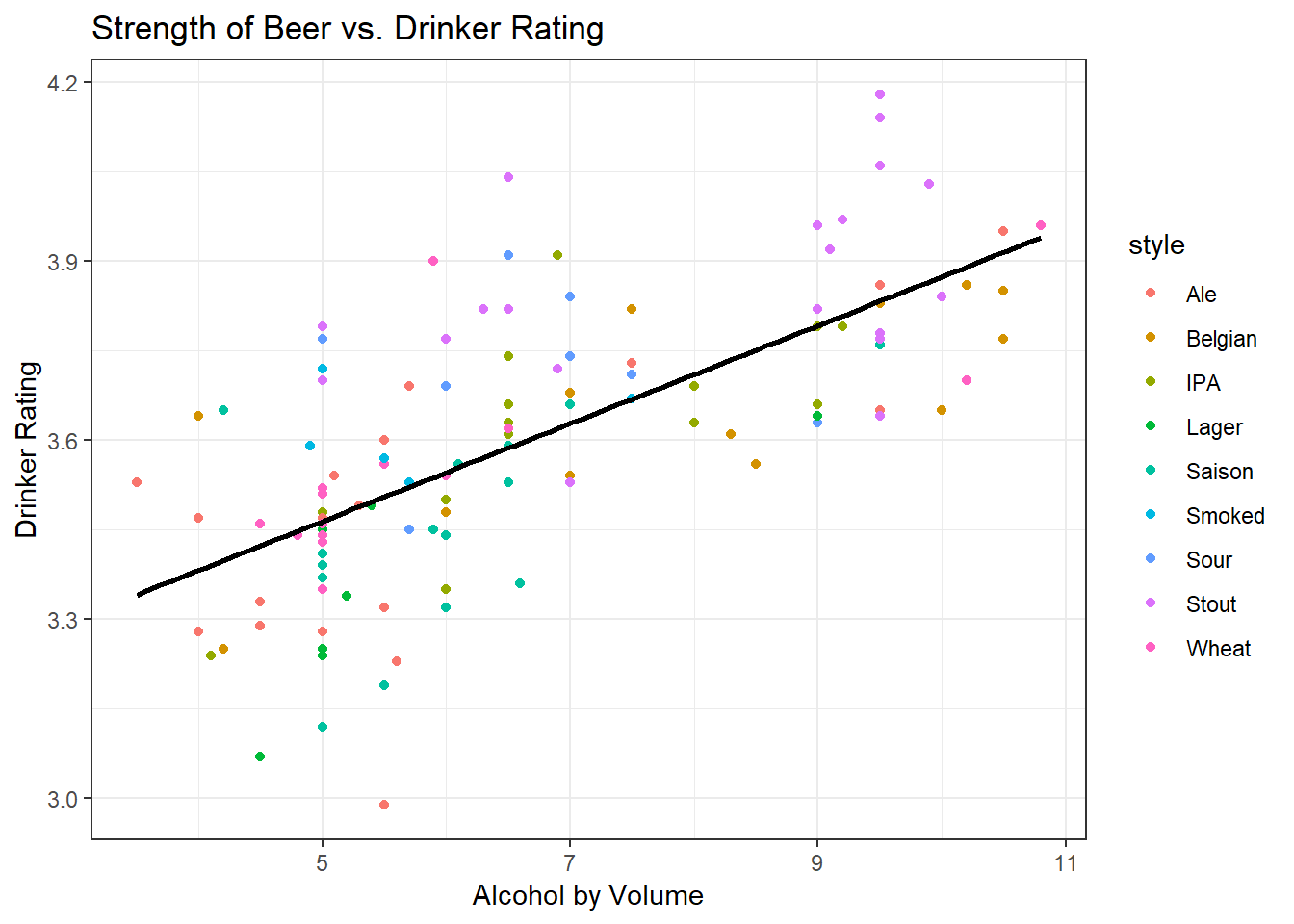
Step 1: Standardise
The scale() function makes sure that each variable is standardised to have mean 0 and variance 1 such that they are comparable. This is to prevent the scale of measurement of the variables obscuring the variability in the dataset: consider that the unscaled variance of a variable measured between 0-100 (e.g. style.rating in this dataset) must be more than the unscaled variance of a variable measured 1-5 (e.g. rating in this dataset).
#--- Standardise the variables
beers$abv.standard <- scale(beers$abv, scale = T)
beers$rating.standard <- scale(beers$rating, scale = T)
Step 2: Extract Covariances and Variances
Now that we’ve standardised each of the variables, we might want to know how they vary together. We do this by extracting the covariance. With standardised variables, the covariance is equal to the correlation.
We also know that the variance of each individual variable is 1, because we standardised each variable to have this value. The total amount of variance in the dataset is thus equal to 2.
We can summarise these variances and covariances in a matrix that shows how the variables are related to one another. If we had more variables, we could imagine extending the matrix to see how each variable is related to each of the others.
\[\begin{array}{ccc} & Rating & ABV \\ Rating & 1.000 & 0.683 \\ ABV & 0.683 & 1.000 \end{array}\]
#--- Extract the covariance
beers %$% cov(rating.standard, abv.standard)
## [,1]
## [1,] 0.6833148#--- Note that the covariance is the same as the correlation
beers %$% cor(rating.standard, abv.standard)## [,1]
## [1,] 0.6833148#--- Recreate the variance/covariance above
vcov <- c(1.000, 0.683, 0.683, 1.000)
dim(vcov) <- c(2,2)Let’s briefly return to our plot, this time using the standardised variables.
ggplot(beers, aes(x = abv.standard, y = rating.standard)) +
  geom_point(aes(color = style)) +
  geom_smooth(method = lm, se = F, color = "black") +
  geom_abline(intercept = 0, slope = -1/0.683) +
  theme_bw() +
  labs(title = "Strength of Beer vs. Drinker Rating",
       x = "Alcohol by Volume",
       y = "Drinker Rating") +
  coord_equal(ratio=1)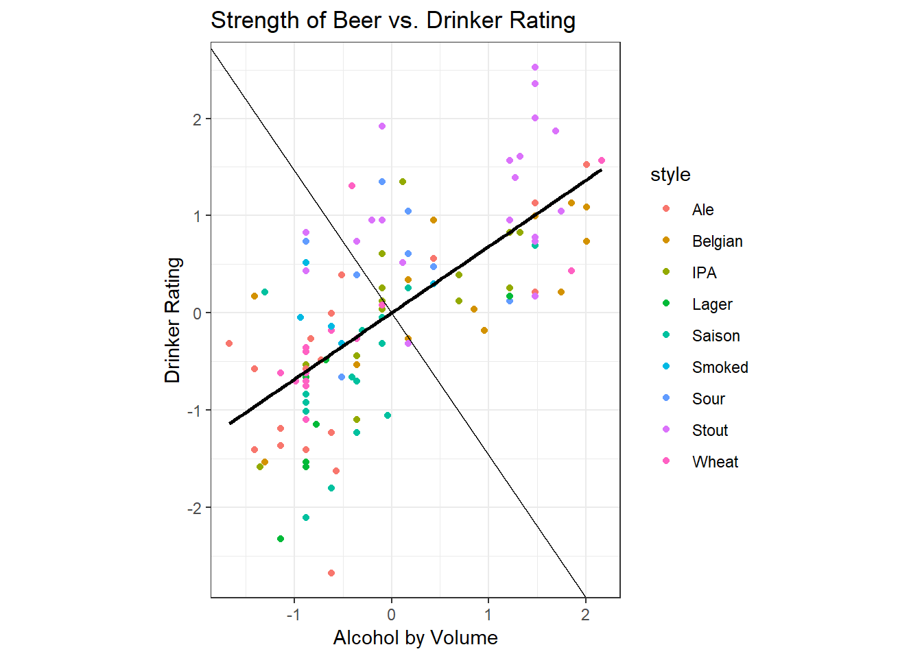
We observe that the plot is the same, but the scale of the axes has changed. Note that the line of best fit shown on the graph happens to be the line that maximises the variance - the spread is slightly greater on ABV than it is in rating, so the line of best fit extends further in the horizontal direction than in the vertical. You can intuitively observe that the line of best fit given maximises the variance - it captures both the spread in the data along the horizontal axis and along the vertical axis.
Recall also Intro Stats, where you learned that the line of best fit (regression line) is one that minimises the distance from each of the points to the line. The sum of the squared distances from the points to the line is also known as the error.
Since this line maximises variance and minimises error, it is a good candidate for summarising the cloud of points into a line. We call this line of best fit the ‘first principal component’, PC1 for short. Note that the equation of the line for PC1 is defined by both ABV and Drinker Rating.
The second principal component is determined by the line perpendicular to the first principal component. We have already maximised variance in one direction, but there still remains some residual variance. The residual variance is maximised in the direction perpendicular to the previous line of best fit, and this is what is shown on the graph as the light black line.
How do we usefully turn this line of best fit into a summary score?
Step 3: Find the eigenvectors and rotate
One way to visualise what to do with this line of best fit is to rotate the data such that the first principal component is the new x-axis. Thus, the maximum variance (or spread) is along the x axis, and the residual variance is along the y axis. The second principal component will then be on the y-axis.
The quantity by which we rotate the original data to put the first principal component on the x axis is determined by the eigenvectors from the variance-covariance matrix that we calculated above. We multiply the original data by the eigenvectors to get the new transformed data. Eigenvectors are sometimes called loadings: the importance of eigenvectors to interpreting PCA will become clear in a later example.
#--- Get the eigenvectors
eigens <- eigen(vcov)
eigenvectors <- eigens$vectors

#--- Extract the values of standardised ABV and standardised Rating into a matrix
vals <- as.matrix(beers %>% select(abv.standard, rating.standard))

#--- Multiply the data by the eigenvectors
rotated <- as.data.frame(vals %*% eigenvectors)
The resulting rotated data are called scores and the scores are displayed on the plot below along with the Style colour coding.
Note that now if we put a line of best fit through this data, it would be horizontal. This implies that principal component 1 and principal component 2 are independent from one another.
#--- Extract the beer style data
style <- as.data.frame(beers$style)

#--- Link rotated data to style data and change names
rotated <- cbind(rotated, style)
colnames(rotated) <- c("pc1", "pc2", "style")

#--- Plot the new data
ggplot(rotated, aes(x = pc1, y = pc2)) +
  geom_point(aes(color = style)) +
  theme_bw() +
  labs(title = "Strength of Beer vs. Drinker Rating",
       x = "PC1",
       y = "PC2")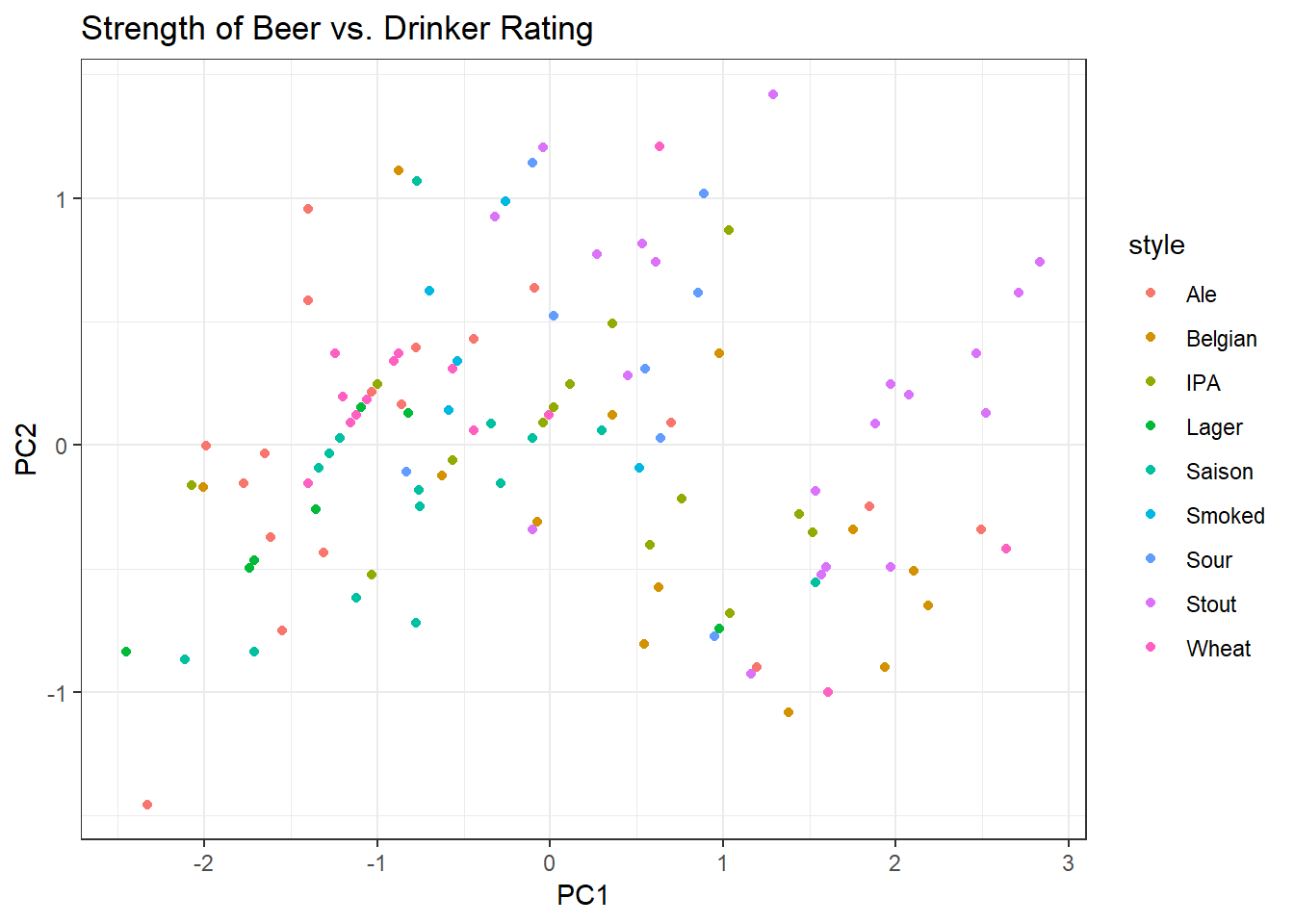
Step 4: Find the eigenvalues
We know that there are 2 units of variance in the total dataset. What if we wanted to see how much of the total variance was accounted for by PC1?
We can extract the eigenvalues from the variance covariance matrix we constructed. PC1 explains 1.68/2.00 = 84% of the total variance in the dataset. Note that this new summary variable PC1 (composed of both Drinker Rating and ABV alone) explains more of the spread of the data than either Drinker Rating or ABV.
For further information on both eigenvectors and eigenvalues see this Khan Academy video.
#--- Extract the eigenvalues
eigenvalues <- eigens$values
round(eigenvalues, 2)
## [1] 1.68 0.32