3.4 Concentration Curve & Index
One more extensive analysis we can conduct to ascertain the association between SEP and HIV status is to construct a concentration curve. A concentration curve is designed to investigate inequality. A concentration curve ranks everyone from lowest SEP to highest SEP and compares the distribution of some health outcome against that ranking.
Consider: if everyone had equal chance of contracting HIV regardless of their SEP, then as we move from lowest SEP to highest SEP, the proportion of individuals with HIV should remain the same.
So we want to compare how distribution of HIV status against the SEP score that we generated with the PCA.
#--- Take a selection of the dataset for clarity, arrange from lowest to highest SEP and drop NAs
conc <- tz %>% select(ID, serostat, pc1) %>%
               arrange(pc1) %>%
               drop_na()

#--- Convert 'serostat' to 0s/1s with "hiv positive" as 1
conc <- conc %>% mutate(serostat = as.numeric(serostat)-1)


#--- Get the cumulative proportion of serostat
conc$c.sero <- cumsum(conc$serostat)/sum(conc$serostat)

# The cumulative sum is a 'running total' of the number who have HIV as we go from low SEP to high SEP
# The cumulative proportion is the cumulative sum expressed as a percentage of the overall total individuals with HIV
# Note: the cumulative proportion goes from 0 to 1


#--- Get the cumulative ranking of the SEP score (i.e. this represents the proportion of individuals with a lower SEP)
conc$c.sep <- conc %$% cume_dist(pc1)

#--- Plot the concentration curve
ggplot(conc, aes(x = c.sep, y = c.sero)) +
  geom_point(color = "red") +
  geom_line() +
  geom_abline(color = "forestgreen") +
  labs(title = "Concentration Curve: HIV Status vs SEP",
       x = "Cumulative SEP Rank",
       y = "Cumulative HIV")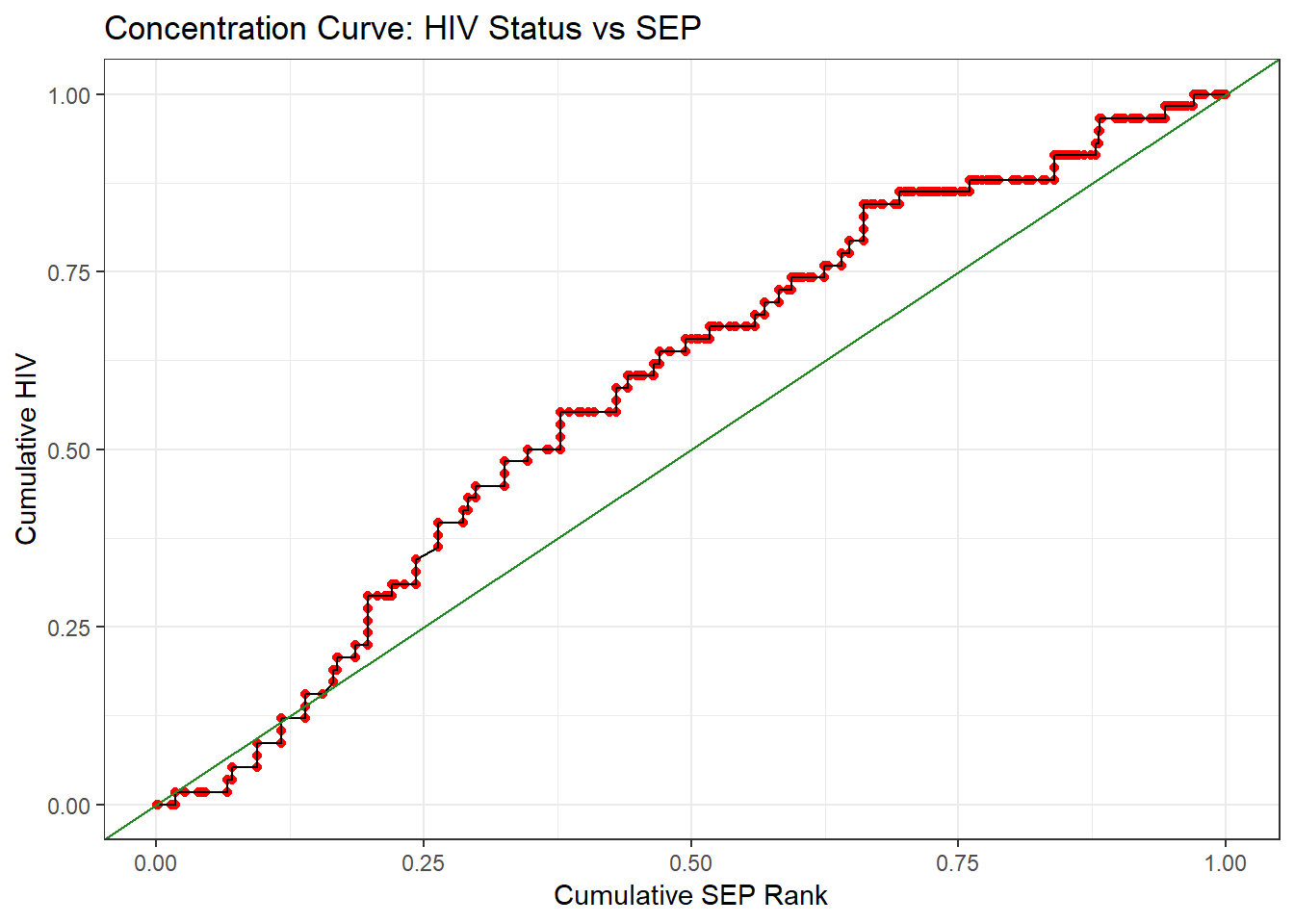
# The green line represents perfect equality: HIV being gotten at the same rate as SEP increases.What do you conclude from this plot? Is there a suggestion of inequality in the patterning of HIV risk? If the answer is unclear, note that 50% of the HIV cases are accounted for by ~35% of the individuals - which 35% of the population are those individuals?
Another way we can numerically quantify this inequality is through the concentration index. The concentration index represents the amount of socioeconomic inequality in a given health variable. It is useful as it can be compared across health variables, so we can see the relative inequality for a number of different variables. The concentration index is the area between the calculated concentration curve and the line of perfect equality. A negative value indicates disproportionate concentration amongst the poor, while a positive value indicates disproportionate concentration amongst the rich.
#--- Calculate the concentration index (using formula)
2/mean(conc$serostat) * cov(conc$serostat, conc$c.sep)
## [1] -0.183You may have heard of the Gini coefficient, a standardised measure of inequality. The Gini coefficient is calculated in the same way as the concentration index, by calculating the area under a particular type of concentration curve. The curve used to calculate the Gini index is called the Lorenz curve, and it uses income in place of SEP.