Chapter 23 Model Basics
Author: Ron Reviewer:
23.1 Introduction
23.2 A simple model
23.2.1 Exercises
- One downside of the linear model is that it is sensitive to unusual values because the distance incorporates a squared term. Fit a linear model to the simulated data below, and visualise the results. Rerun a few times to generate different simulated datasets. What do you notice about the model?
sim1a <- tibble(
  x = rep(1:10, each = 3),
  y = x * 1.5 + 6 + rt(length(x), df = 2)
)
Run linear model and visualize it
fit <- lm(y~x, data = sim1a)
ggplot(sim1a,aes(x,y))+
geom_point(size = 2, color = "grey30")+
geom_abline(intercept = fit$coefficients[1],slope = fit$coefficients[2])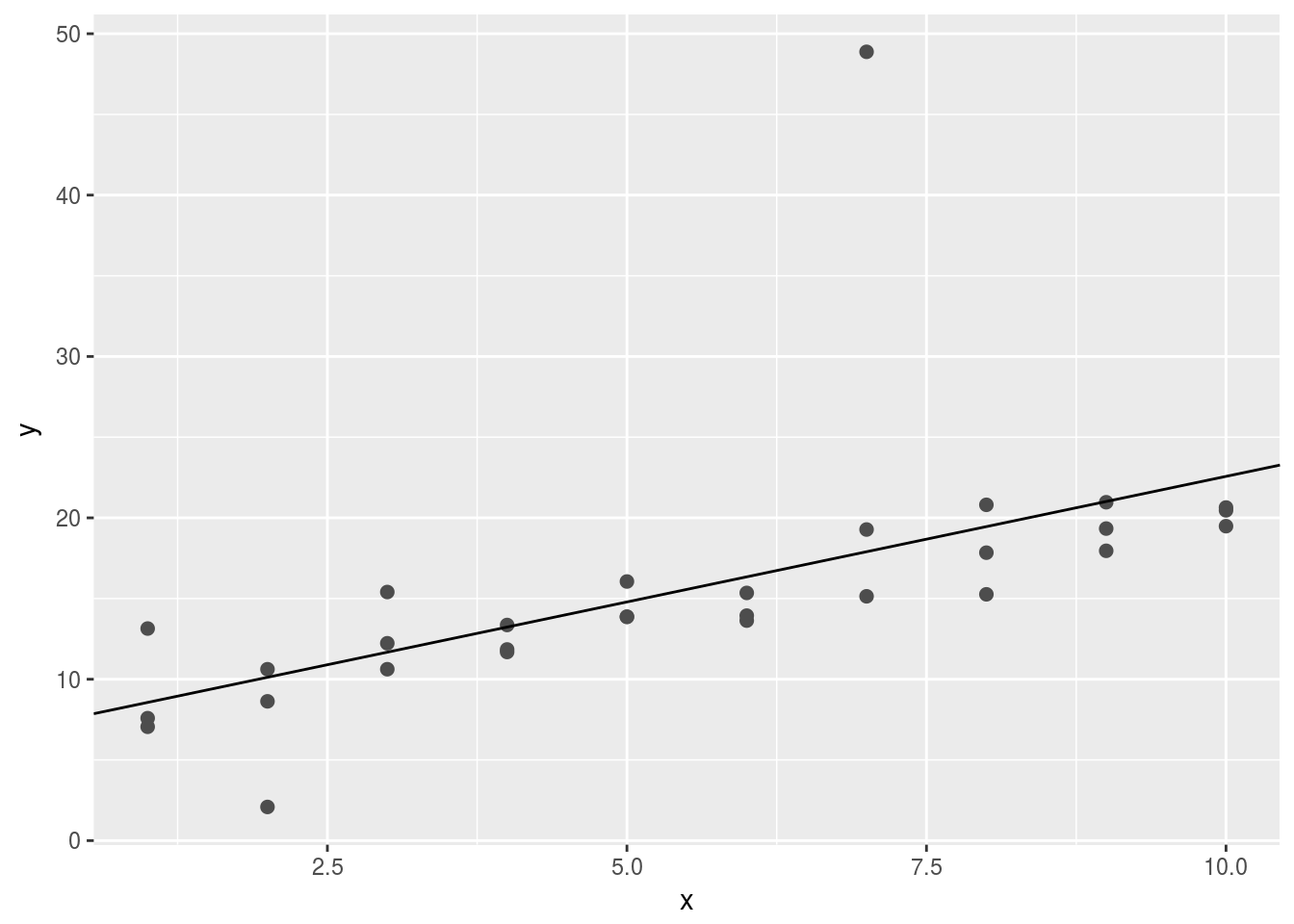 Sometimes, one single abnormal value forces the fitted line deviate from the “intutively” best lines.
2.One way to make linear models more robust is to use a different distance measure. For example, instead of root-mean-squared distance, you could use mean-absolute distance:
model1 <- function(a, data) {
  a[1] + data$x * a[2]
}

measure_distance <- function(mod, data) {
  diff <- data$y - model1(mod, data)
  mean(abs(diff))
}

measure_distance2 <- function(mod, data) {
  diff <- data$y - model1(mod, data)
  sqrt(mean(diff ^ 2))
}
Compare the two measures of distance
sim1a <- tibble(
x = rep(1:10, each = 3),
y = x * 1.5 + 6 + rt(length(x), df = 2)
)
best1 <- optim(c(0,0), measure_distance, data = sim1a)
best2 <- optim(c(0,0), measure_distance2, data = sim1a)
ggplot(sim1a, aes(x, y)) +
geom_point(size = 2, colour = "grey30") +
geom_abline(intercept = best1$par[1], slope = best1$par[2], color = "red")+
geom_abline(intercept = best2$par[1],slope = best2$par[2], color = "cyan")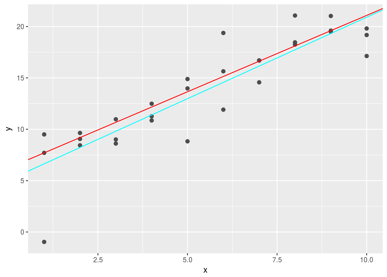 When there are many abnormal points, the
 cyan line will perform better using absolute distances. It is better because measn-square-distance tends to overemphasize abnormal values. 3. One challenge with performing numerical optimisation is that it’s only guaranteed to find one local optima. What’s the problem with optimising a three parameter model like this?
model1 <- function(a, data) {
  a[1] + data$x * a[2] + a[3]
}

measure_distance3 <- function(mod, data) {
  diff <- data$y - model1(mod, data)
  sqrt(mean(diff ^ 2))
}

sim1a <- tibble(
  x = rep(1:10, each = 3),
  y = x * 1.5 + 6 + rt(length(x), df = 2)
)
best3 <- optim(c(0,0,0), measure_distance3, data = sim1a)
best3$par
## [1] -3.706809 1.475589 9.937808ggplot(sim1a, aes(x, y)) +
geom_point(size = 2, colour = "grey30") +
geom_abline(intercept = best3$par[1] + best3$par[3], slope = best3$par[2], color = "red")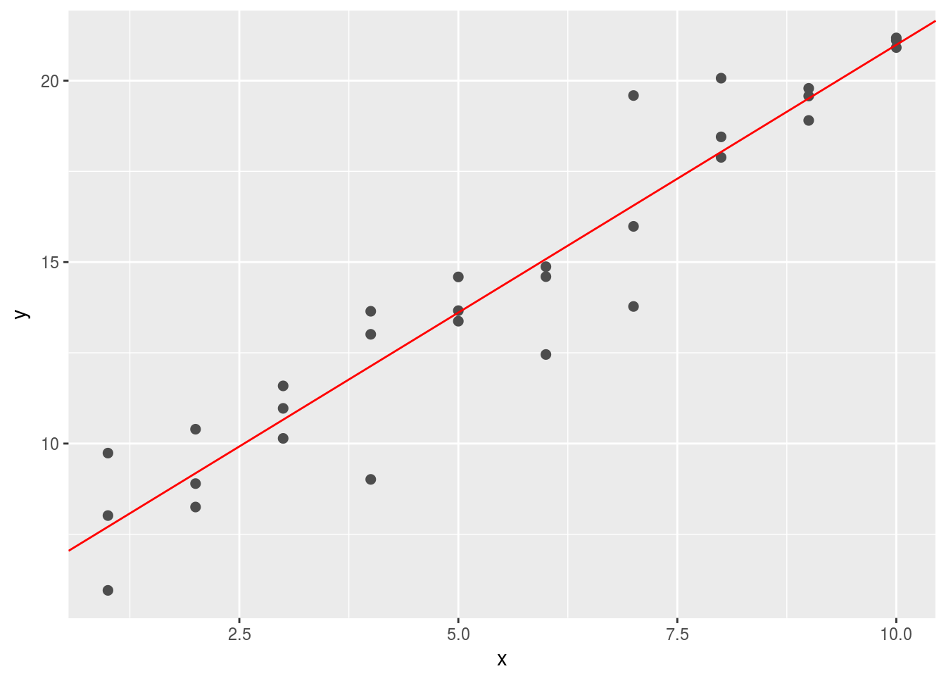 There are essentially infinitely many solutions since the model we built contains redudant information in
 a[1] and a[3].
23.3 Visualising models
23.3.3 Exercises
1.Instead of using lm() to fit a straight line, you can use loess() to fit a smooth curve. Repeat the process of model fitting, grid generation, predictions, and visualisation on sim1 using loess() instead of lm(). How does the result compare to geom_smooth()?
fit1 <- lm(y~x, data = sim1)
fit2 <- loess(y~x, data = sim1,degree = 2)

grid <- sim1 %>% data_grid(x)
grid1 <- grid %>%
  add_predictions(fit1)
sim1_1 <- sim1 %>% add_residuals(fit1)

grid2 <- grid %>%
  add_predictions(fit2)
sim1_2 <- sim1 %>% add_residuals(fit2)
plot the predictions
ggplot(sim1,aes(x=x))+
  geom_point(aes(y=y))+
  geom_line(data = grid1, aes(y = pred), color = 'red')+
  geom_smooth(data = grid2, aes(y = pred),color = 'cyan')
## `geom_smooth()` using method = 'loess'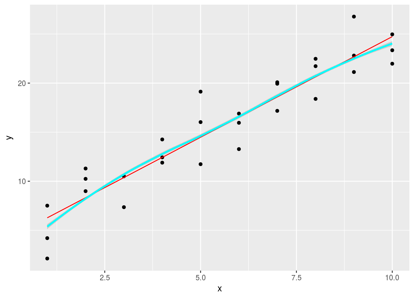 Plot the residuals
ggplot() +
geom_freqpoly(data = sim1_1, aes(resid),binwidth = 0.5,color = 'red') +
geom_freqpoly(data = sim1_2, aes(resid),binwidth = 0.5, color = 'cyan')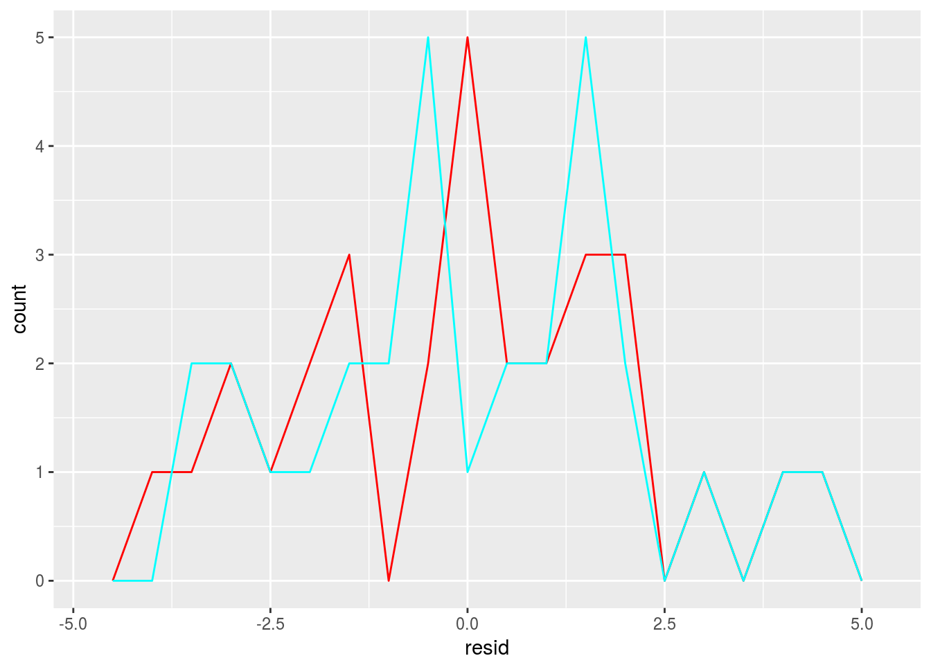 2.
2. add_predictions() is paired with gather_predictions() and spread_predictions(). How do these three functions differ?
Similar to the idea of gather and spread in the tidyr package. spread_predicitions will create a fat table with each model creating a column of its own prediction. gather_predictions will create two columns with one columns indicating the type of the model and another one it prediction, resulting in a tall table.
- What does
geom_ref_line()do? What package does it come from? Why is displaying a reference line in plots showing residuals useful and important?
geom_ref_line() add a reference line in the graph, it comes from modelr package. It is useful for you to detect the trend and disribution of residuals visually.
- Why might you want to look at a frequency polygon of absolute residuals? What are the pros and cons compared to looking at the raw residuals?
ggplot() +
  geom_freqpoly(data = sim1_1, aes(abs(resid)),binwidth = 0.5,color = 'red')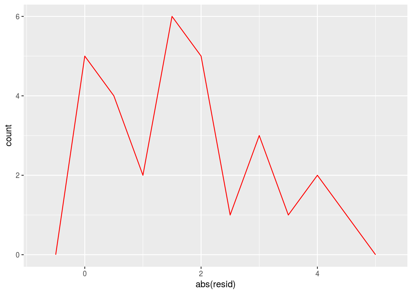
You want to check the absolute residuals because it helps to see the overall quality of the prediction but it won’t give you the hint about the distribution of residuals with respect to 0. For example, it may be possible that there is only one large possitve residual and many small negative ones.
23.4 Formulas and model families
23.4.5 Exercises
1.What happens if you repeat the analysis of sim2 using a model without an intercept. What happens to the model equation? What happens to the predictions?
mod1 <- lm(y~x - 1, data = sim2)
mod2 <- lm(y~x, data = sim2)
mod1$coefficients
## xa xb xc xd
## 1.152166 8.116039 6.127191 1.910981mod2$coefficients## (Intercept) xb xc xd
## 1.1521664 6.9638728 4.9750241 0.7588142grid1 <- sim2 %>%
data_grid(x)%>%
gather_predictions(mod1,mod2)
grid1## # A tibble: 8 x 3
## model x pred
## <chr> <chr> <dbl>
## 1 mod1 a 1.152166
## 2 mod1 b 8.116039
## 3 mod1 c 6.127191
## 4 mod1 d 1.910981
## 5 mod2 a 1.152166
## 6 mod2 b 8.116039
## 7 mod2 c 6.127191
## 8 mod2 d 1.910981The equation will have no intercept term.
sim2 %>%
ggplot(aes(x))+
geom_point(aes(y=y))+
geom_point(data = grid1, aes(y = pred),color = "red",size = 4)+
facet_grid(~model)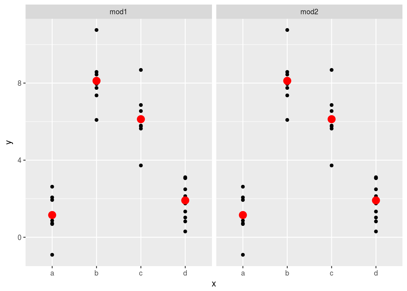 However, the prediction doesn’t change. Categorical predictors are not affected by the removal of intercept terms.
2.Use model_matrix() to explore the equations generated for the models I fit to sim3 and sim4. Why is * a good shorthand for interaction?
# sim3

model_matrix(data = sim3, y ~ x1 + x2)
## # A tibble: 120 x 5
## `(Intercept)` x1 x2b x2c x2d
## <dbl> <dbl> <dbl> <dbl> <dbl>
## 1 1 1 0 0 0
## 2 1 1 0 0 0
## 3 1 1 0 0 0
## 4 1 1 1 0 0
## 5 1 1 1 0 0
## 6 1 1 1 0 0
## 7 1 1 0 1 0
## 8 1 1 0 1 0
## 9 1 1 0 1 0
## 10 1 1 0 0 1
## # ... with 110 more rowsmodel_matrix(data = sim3, y ~ x1 * x2)## # A tibble: 120 x 8
## `(Intercept)` x1 x2b x2c x2d `x1:x2b` `x1:x2c` `x1:x2d`
## <dbl> <dbl> <dbl> <dbl> <dbl> <dbl> <dbl> <dbl>
## 1 1 1 0 0 0 0 0 0
## 2 1 1 0 0 0 0 0 0
## 3 1 1 0 0 0 0 0 0
## 4 1 1 1 0 0 1 0 0
## 5 1 1 1 0 0 1 0 0
## 6 1 1 1 0 0 1 0 0
## 7 1 1 0 1 0 0 1 0
## 8 1 1 0 1 0 0 1 0
## 9 1 1 0 1 0 0 1 0
## 10 1 1 0 0 1 0 0 1
## # ... with 110 more rows# sim4
model_matrix(data = sim4, y ~ x1 + x2)## # A tibble: 300 x 3
## `(Intercept)` x1 x2
## <dbl> <dbl> <dbl>
## 1 1 -1 -1.0000000
## 2 1 -1 -1.0000000
## 3 1 -1 -1.0000000
## 4 1 -1 -0.7777778
## 5 1 -1 -0.7777778
## 6 1 -1 -0.7777778
## 7 1 -1 -0.5555556
## 8 1 -1 -0.5555556
## 9 1 -1 -0.5555556
## 10 1 -1 -0.3333333
## # ... with 290 more rows#model_matrix(data = sim4, y ~ x1 + x2 + I(x1*x2))
model_matrix(data = sim4, y ~ x1 * x2)## # A tibble: 300 x 4
## `(Intercept)` x1 x2 `x1:x2`
## <dbl> <dbl> <dbl> <dbl>
## 1 1 -1 -1.0000000 1.0000000
## 2 1 -1 -1.0000000 1.0000000
## 3 1 -1 -1.0000000 1.0000000
## 4 1 -1 -0.7777778 0.7777778
## 5 1 -1 -0.7777778 0.7777778
## 6 1 -1 -0.7777778 0.7777778
## 7 1 -1 -0.5555556 0.5555556
## 8 1 -1 -0.5555556 0.5555556
## 9 1 -1 -0.5555556 0.5555556
## 10 1 -1 -0.3333333 0.3333333
## # ... with 290 more rows* is good because 1. It is simple and efficient to treat categorical predictors, which is tedious to do using +. Or even impossible? 2. It is simple to create interaction term for continuous varaibles too.
- Using the basic principles, convert the formulas in the following two models into functions. (Hint: start by converting the categorical variable into 0-1 variables.)
mod1 <- lm(y ~ x1 + x2, data = sim3)
mod2 <- lm(y ~ x1 * x2, data = sim3)
Convert x2 to bianry variables. Thanks to this StackOverflow answer
library(tidyr)
sim3 <- sim3 %>%
  mutate(present = 1)%>%
  spread(x2,present,fill=0)
mod1 <- lm(y ~ x1 + a + b + c + d, data = sim3)
mod2 <- lm(y ~ x1*a*b*c*d, data = sim3)
# all possible combinations
head(model.matrix(data = sim3, y ~ x1*a*b*c*d))## (Intercept) x1 a b c d x1:a x1:b a:b x1:c a:c b:c x1:d a:d b:d c:d
## 1 1 1 1 0 0 0 1 0 0 0 0 0 0 0 0 0
## 2 1 1 0 0 0 1 0 0 0 0 0 0 1 0 0 0
## 3 1 1 0 0 1 0 0 0 0 1 0 0 0 0 0 0
## 4 1 1 0 1 0 0 0 1 0 0 0 0 0 0 0 0
## 5 1 1 1 0 0 0 1 0 0 0 0 0 0 0 0 0
## 6 1 1 0 0 0 1 0 0 0 0 0 0 1 0 0 0
## x1:a:b x1:a:c x1:b:c a:b:c x1:a:d x1:b:d a:b:d x1:c:d a:c:d b:c:d
## 1 0 0 0 0 0 0 0 0 0 0
## 2 0 0 0 0 0 0 0 0 0 0
## 3 0 0 0 0 0 0 0 0 0 0
## 4 0 0 0 0 0 0 0 0 0 0
## 5 0 0 0 0 0 0 0 0 0 0
## 6 0 0 0 0 0 0 0 0 0 0
## x1:a:b:c x1:a:b:d x1:a:c:d x1:b:c:d a:b:c:d x1:a:b:c:d
## 1 0 0 0 0 0 0
## 2 0 0 0 0 0 0
## 3 0 0 0 0 0 0
## 4 0 0 0 0 0 0
## 5 0 0 0 0 0 0
## 6 0 0 0 0 0 0- For
sim4, which ofmod1andmod2is better? I thinkmod2does a slightly better job at removing patterns, but it’s pretty subtle. Can you come up with a plot to support my claim?
Let’s check the distribution of the residuals.
mod1 <- lm(y ~ x1 + x2, data = sim4)
mod2 <- lm(y ~ x1 * x2, data = sim4)

grid <- sim4 %>%
  data_grid(x1,x2)
grid <- grid %>%
  gather_predictions(mod1, mod2)

sim4 <- sim4 %>% gather_residuals(mod1,mod2)
Plot the residual’s distribution
med1 <- median((sim4 %>% filter(model == "mod1"))$resid)
med2 <- median((sim4 %>% filter(model == "mod2"))$resid)
ggplot(sim4, aes(resid,color = model))+
geom_histogram(binwidth = 0.01,position = "stack")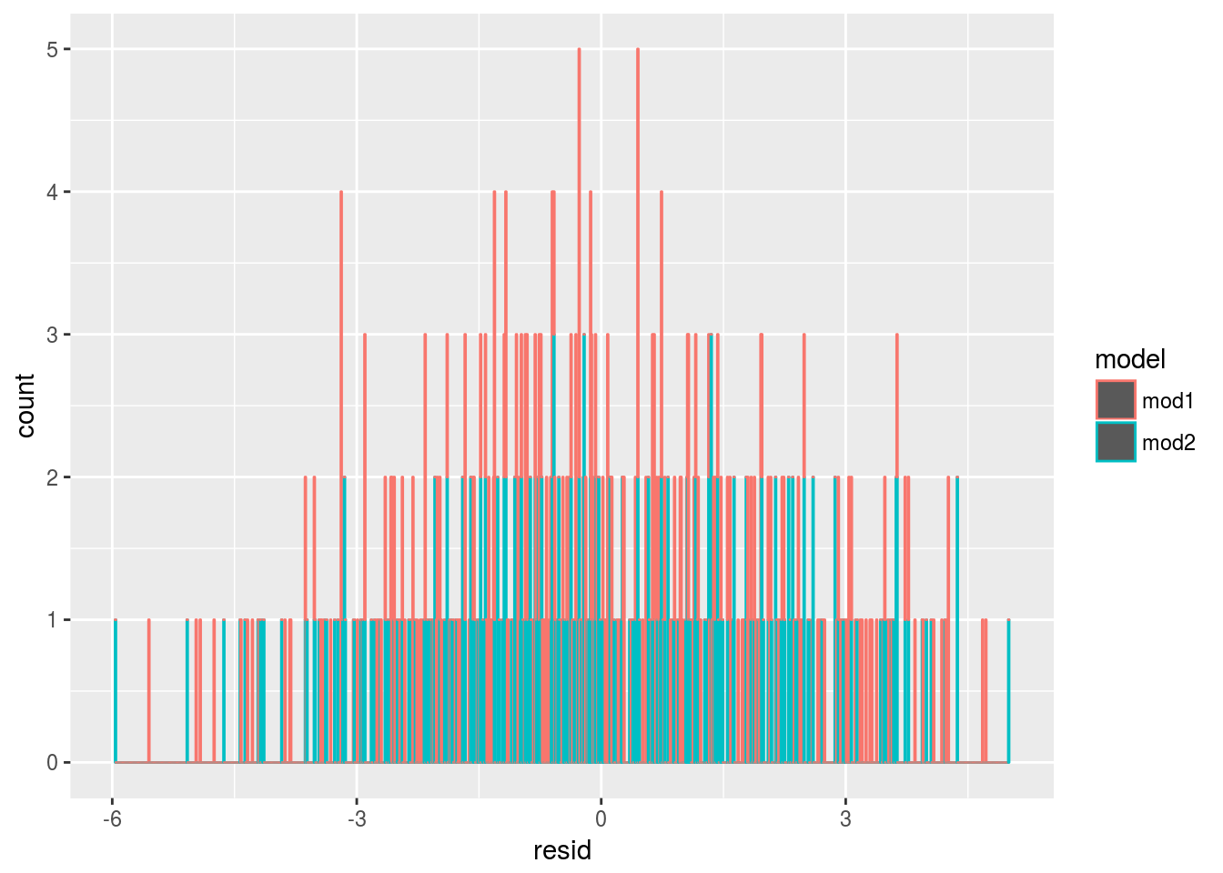 From the exploratory analysis, we may plot the residue as a function of
 x1
sim4 %>% group_by(model)%>%
  summarize(mean_abs_resid = mean(abs(resid)))
## # A tibble: 2 x 2
## model mean_abs_resid
## <chr> <dbl>
## 1 mod1 1.708070
## 2 mod2 1.670054# the mean of absolute residual for mod2 is smaller for mod1
sim4 %>%
ggplot(aes(y=abs(resid),x = as.factor(x1)))+
geom_boxplot()+
facet_grid(~model)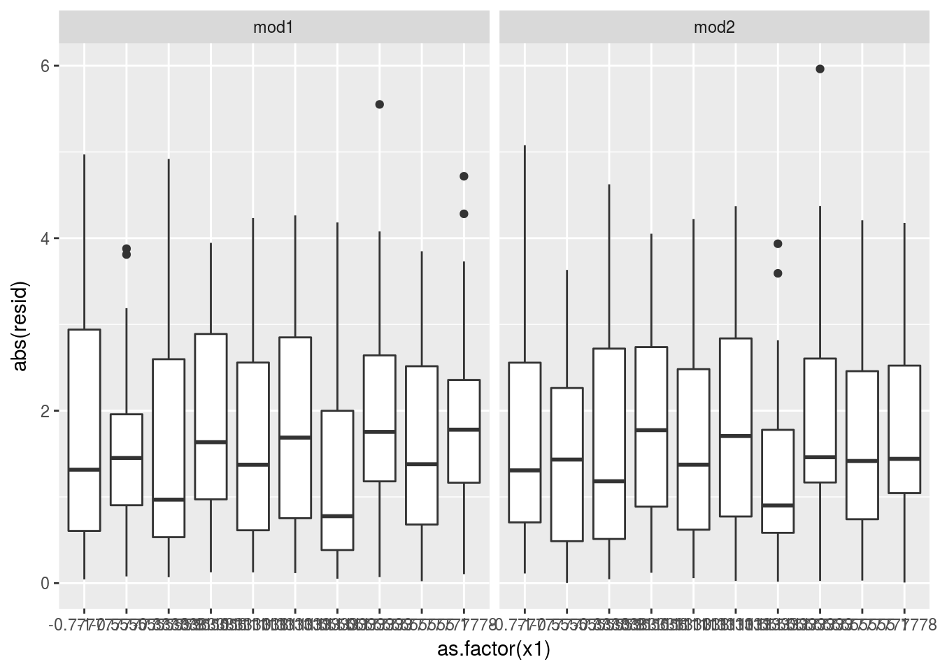 It is not that obvious but visually detectable.
23.5 Missing values
Notes on handling NA behaviors.
# get warning
options(na.action = na.warn)
# suppress warning in an operation
lm(y~x,data = sim1, na.action = na.exclude)
##
## Call:
## lm(formula = y ~ x, data = sim1, na.action = na.exclude)
##
## Coefficients:
## (Intercept) x
## 4.221 2.05223.6 Other model families
Note:
- Generalised linear models
- remove assumptions that response is continuous and error is normally distributed.
- define distance metric based on the statistical idea of likelihood.
- Generalised additive models
- incorporate arbitrary smooth functions beyond
GLM.
- incorporate arbitrary smooth functions beyond
- Penalised linear models
- penalize complex models.
- Robust linear models
- tweak distances which are too long.
- Trees
- separate data into pieces. Aggregated trees like random forests and gradient boosting machines are powerful models.