Chapter 7 Exploratory Data Analysis
Author: CW
Status: On-going
Reviewer:
7.1 Introduction
7.1.1 Prerequisites
library(tidyverse)
library(nycflights13)
7.2 Questions
7.3 Variation
ggplot(data = diamonds) +
  geom_bar(mapping = aes(x = cut))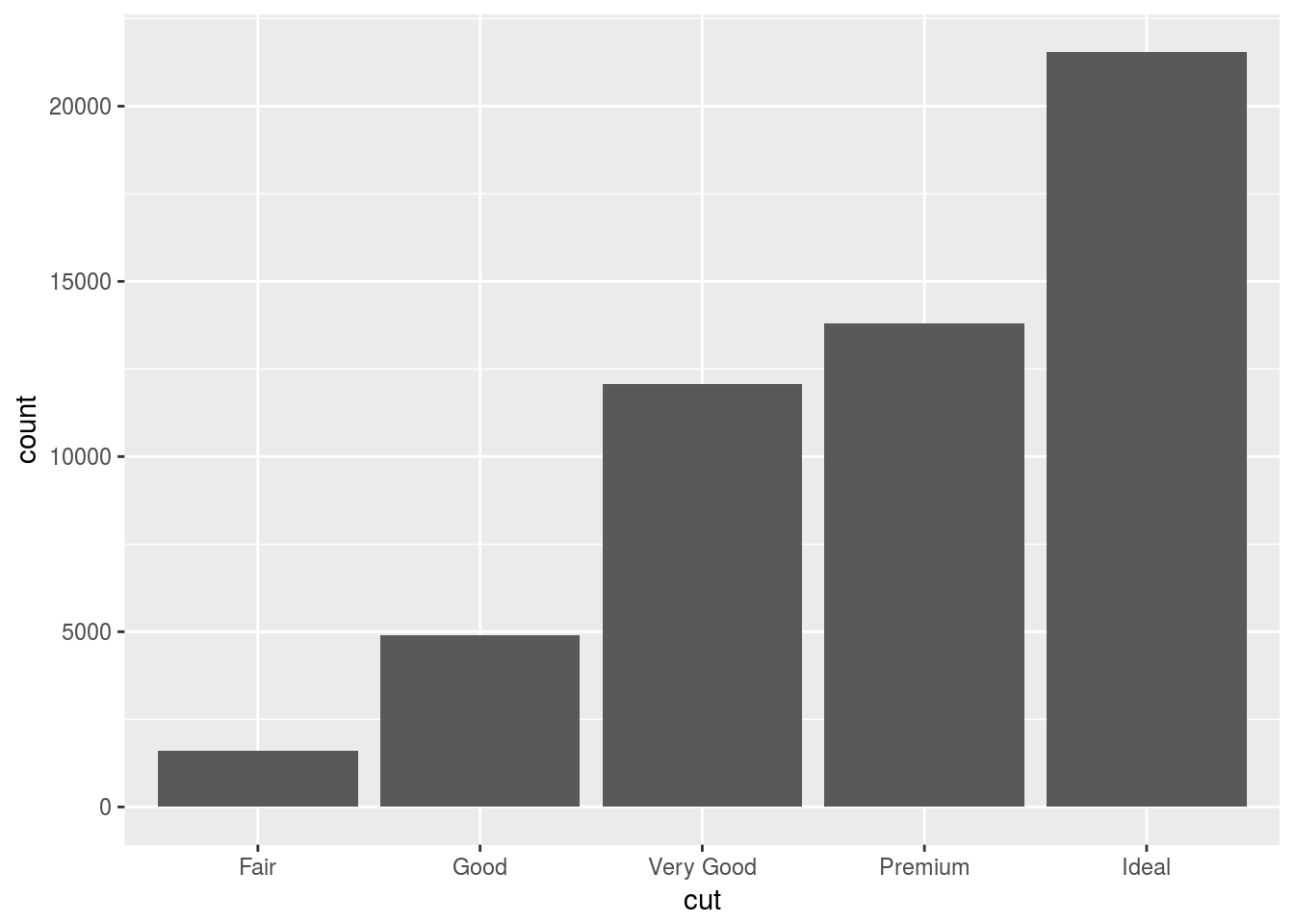
smaller <- diamonds %>%
  filter(carat < 3)
7.3.4 Exercises
- Explore the distribution of each of the
x,y, andzvariables in diamonds. What do you learn? Think about a diamond and how you might decide which dimension is the length, width, and depth.
# remove false data points
diamonds <- diamonds %>% filter(2 < y & y < 20 & 2 < x & 2 < z & z < 20)
ggplot(diamonds) +
  geom_freqpoly(aes(x = x), binwidth = 0.01)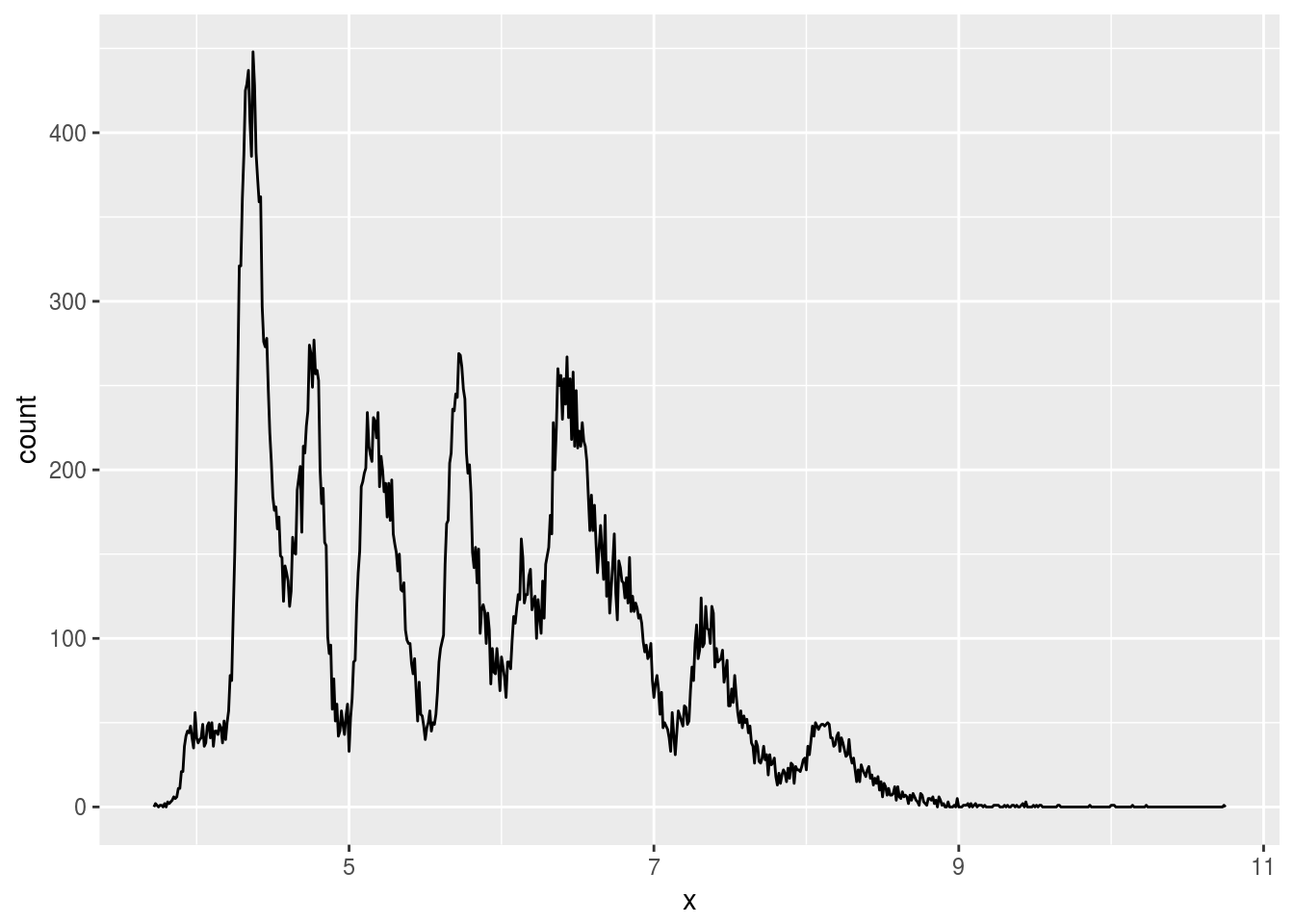
ggplot(diamonds) +
  geom_freqpoly(aes(x = y), binwidth = 0.01)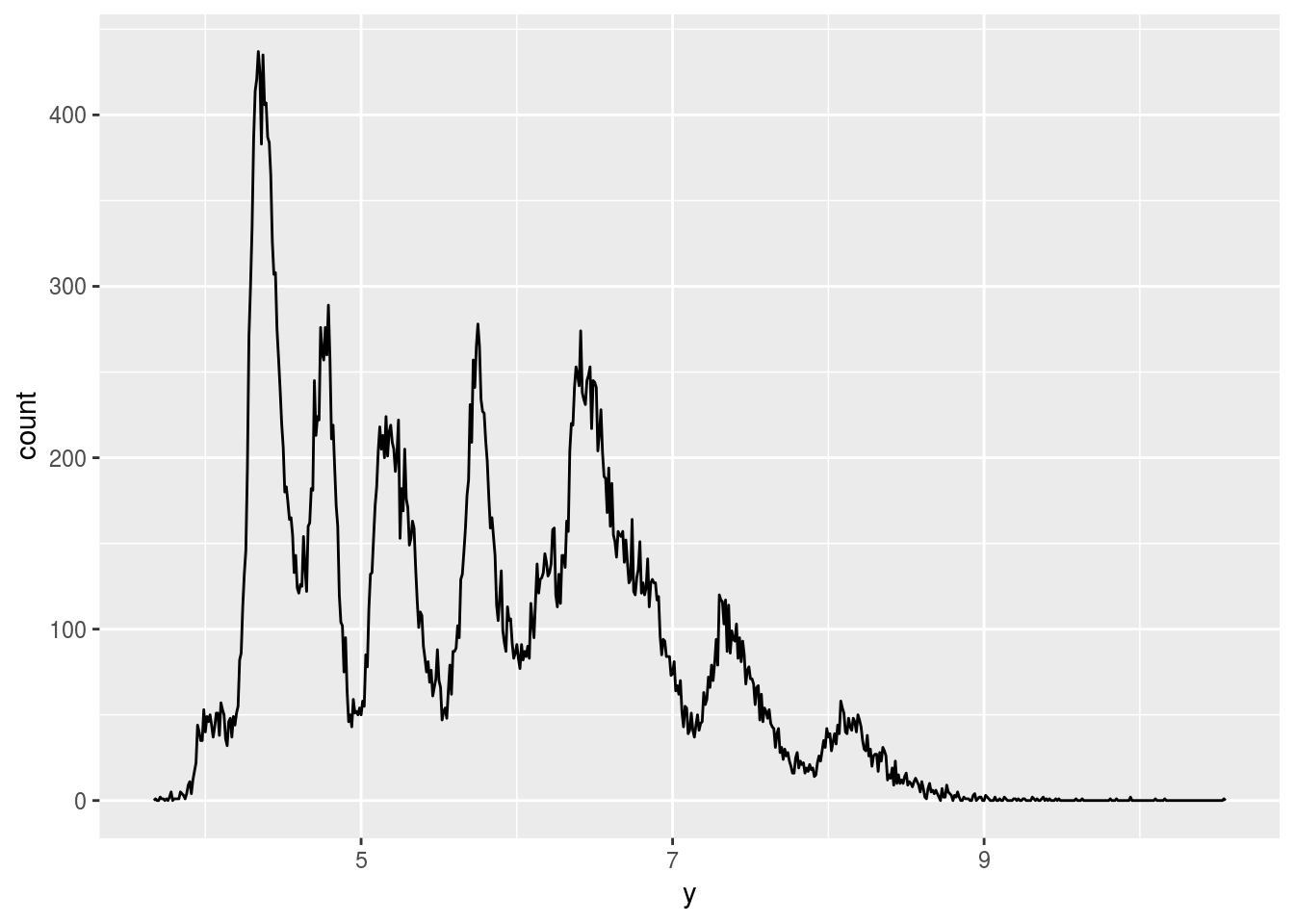
ggplot(diamonds) +
  geom_freqpoly(aes(x = z), binwidth = 0.01)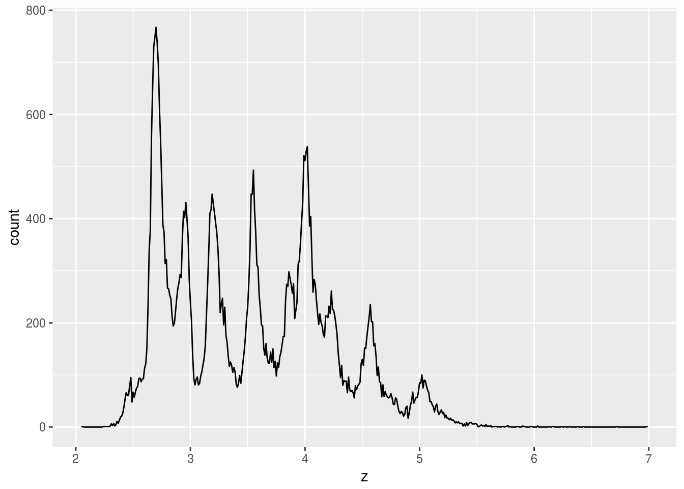
# x and y often share value
ggplot(diamonds) +
  geom_point(aes(x = x, y = y)) +
  geom_point(aes(x = x, y = z), color = "blue") +
  coord_fixed()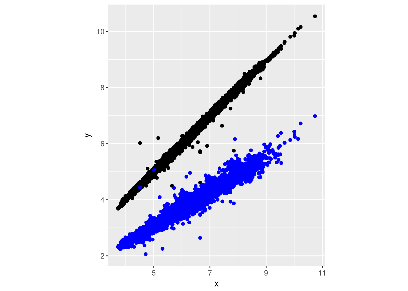
Seems like x and y should be length and width, and z is depth.
- Explore the distribution of
price. Do you discover anything unusual or surprising? (Hint: Carefully think about thebinwidthand make sure you try a wide range of values.)
# remove false data points
diamonds <- diamonds %>% filter(2 < y & y < 20 & 2 < x & 2 < z & z < 20)
ggplot(diamonds) +
  geom_freqpoly(aes(x = price), binwidth = 10) +
  xlim(c(1000, 2000))
## Warning: Removed 44207 rows containing non-finite values (stat_bin).## Warning: Removed 2 rows containing missing values (geom_path).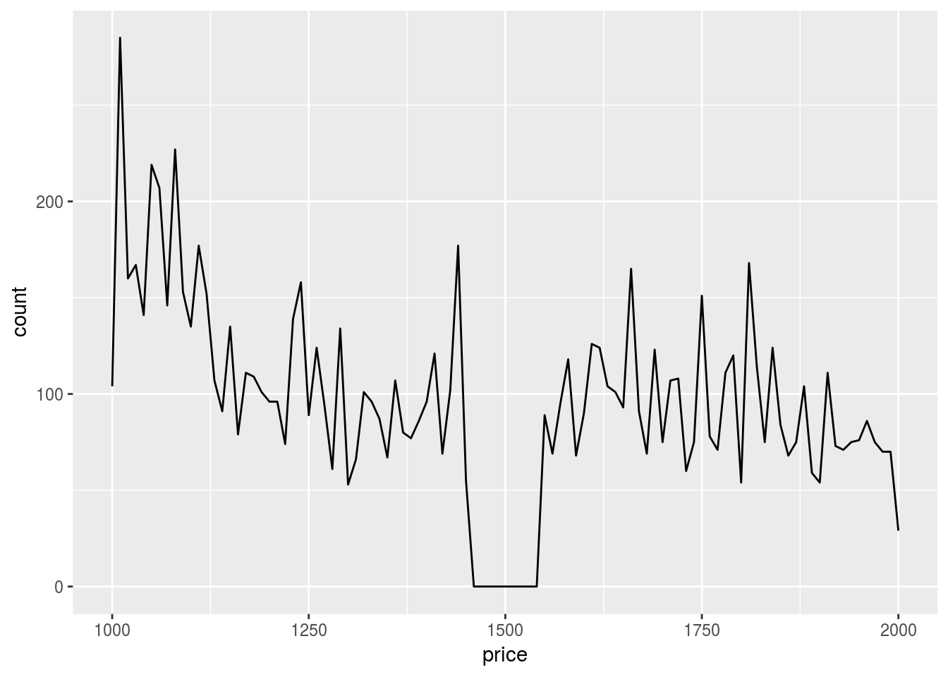
Somehow we don’t have diamonds that are priced around $1500.
- How many diamonds are 0.99 carat? How many are 1 carat? What do you think is the cause of the difference?
diamonds %>% filter(carat == 0.99) %>% count()## # A tibble: 1 x 1
## n
## <int>
## 1 23diamonds %>% filter(carat == 1) %>% count()## # A tibble: 1 x 1
## n
## <int>
## 1 1556ggplot(diamonds) +
geom_histogram(aes(x = carat), binwidth = 0.01) +
xlim(c(0.97, 1.03))## Warning: Removed 48599 rows containing non-finite values (stat_bin).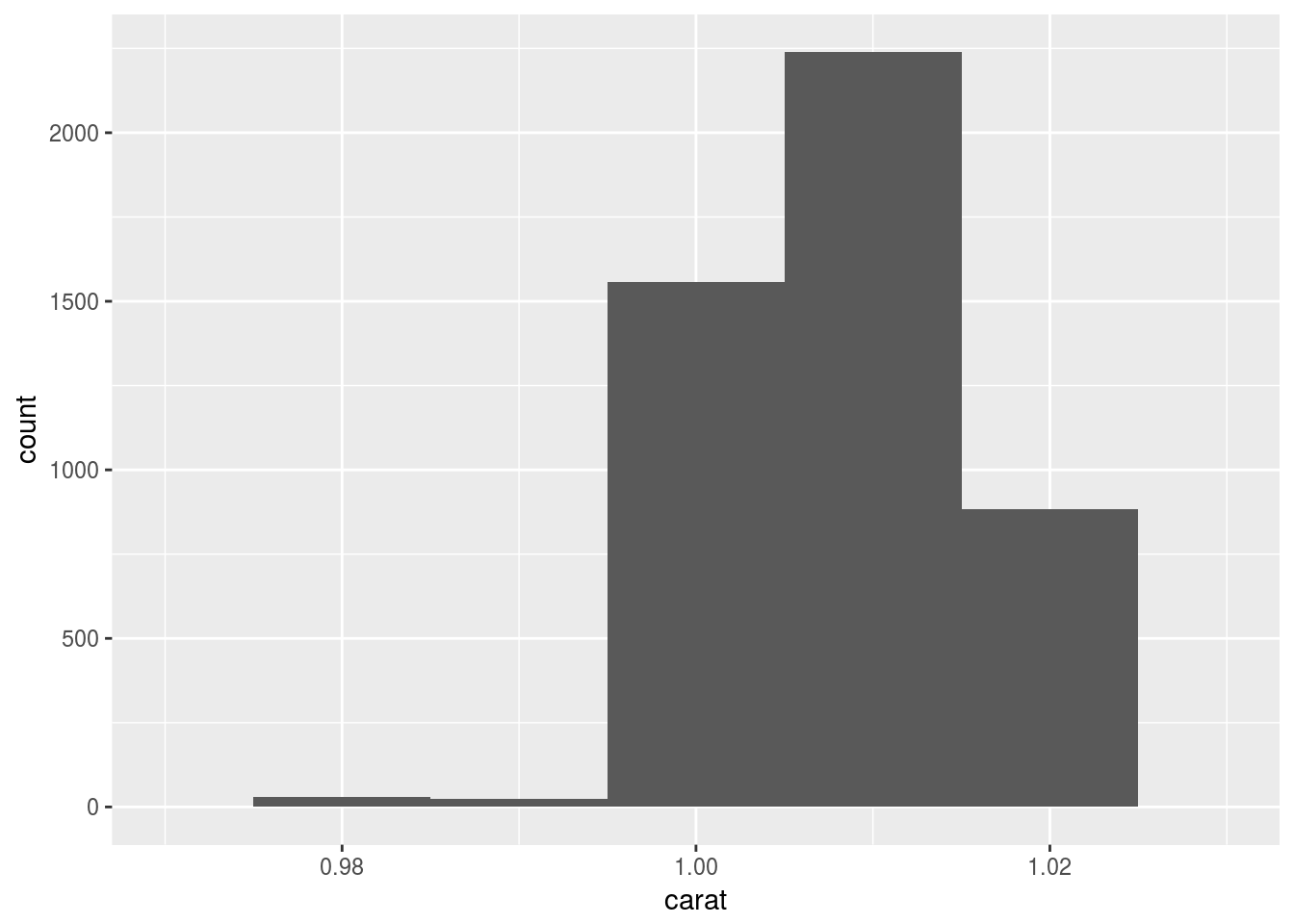 There are much more diamonds with 1 carat. I think it is because psychologically, 1 carat represent a whole new level from 0.99 carat, so for makers, it is little more material for much more value.
- Compare and contrast
coord_cartesian()vsxlim()orylim()when zooming in on a histogram. What happens if you leavebinwidthunset? What happens if you try and zoom so only half a bar shows?
ggplot(diamonds) +
  geom_histogram(aes(x = carat)) +
  xlim(c(0.97, 1.035))
## `stat_bin()` using `bins = 30`. Pick better value with `binwidth`.## Warning: Removed 48599 rows containing non-finite values (stat_bin).## Warning: Removed 1 rows containing missing values (geom_bar).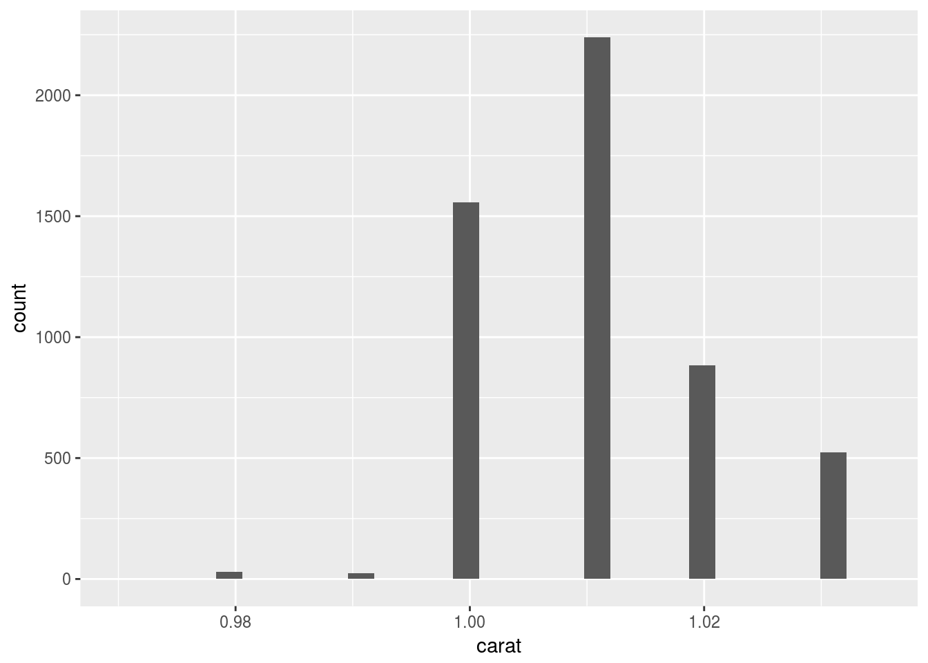
ggplot(diamonds) +
  geom_histogram(aes(x = carat)) +
  coord_cartesian(xlim = c(0.97, 1.035))
## `stat_bin()` using `bins = 30`. Pick better value with `binwidth`.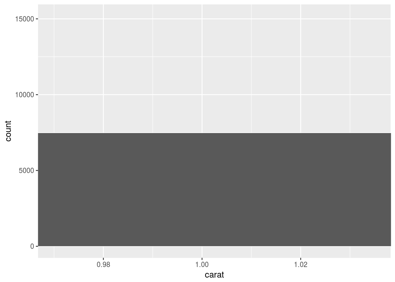
ggplot(diamonds) +
  geom_histogram(aes(x = carat), binwidth = 0.01) +
  xlim(c(0.97, 1.035))
## Warning: Removed 48599 rows containing non-finite values (stat_bin).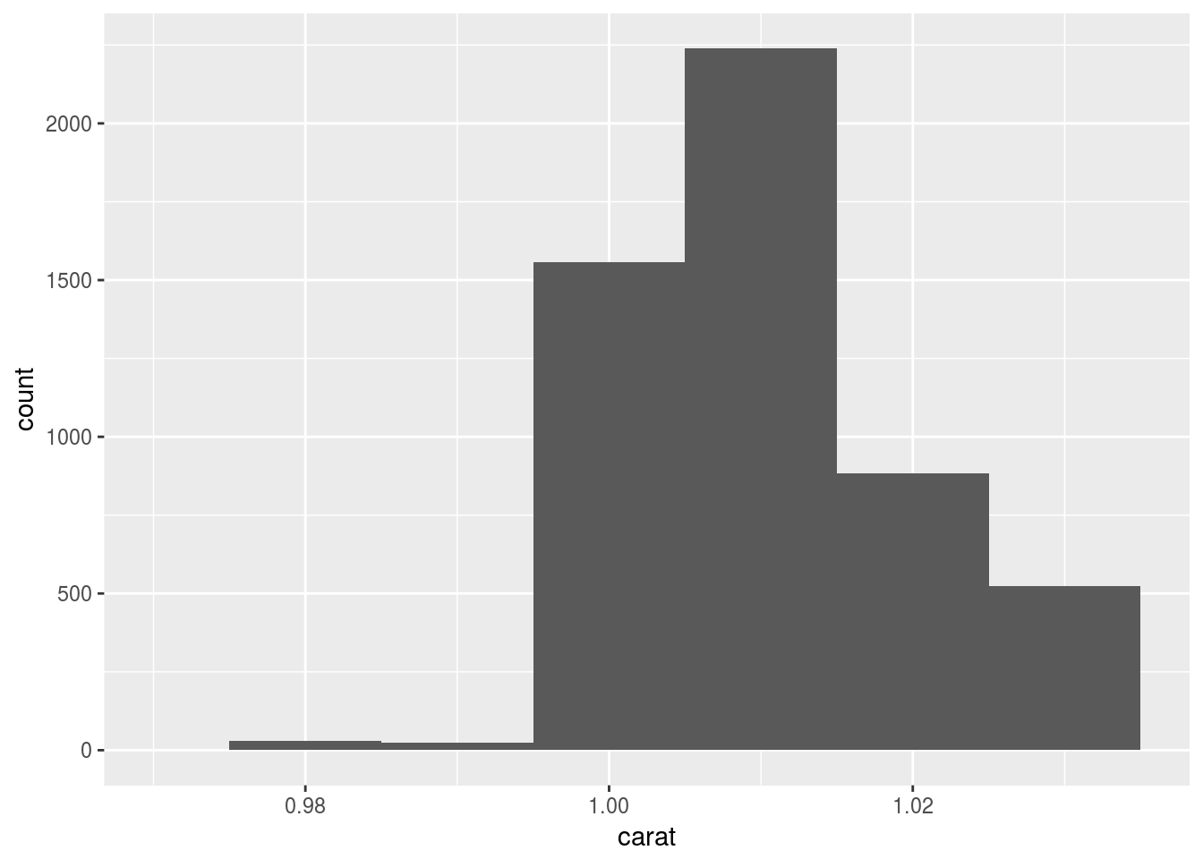
ggplot(diamonds) +
  geom_histogram(aes(x = carat), binwidth = 0.01) +
  coord_cartesian(xlim = c(0.97, 1.035))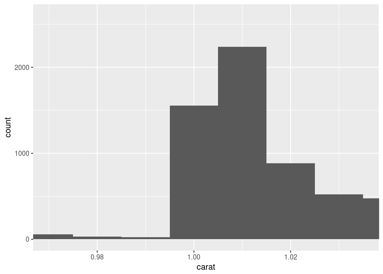
coord_cartesian() plots and cuts, while xlim() cuts and plots. So xlim() does not show the half bar.
7.4 Missing values
7.4.1 Exercises
- What happens to missing values in a histogram? What happens to missing values in a bar chart? Why is there a difference?
In a bar chart,NAis considered as just another category. In a histogram,NAis ignored because the x exis has order.
set.seed(0)
df <- tibble(norm = rnorm(100)) %>% mutate(inrange = ifelse(norm > 2, NA, norm))
ggplot(df) +
  geom_histogram(aes(x = inrange))
## `stat_bin()` using `bins = 30`. Pick better value with `binwidth`.## Warning: Removed 2 rows containing non-finite values (stat_bin).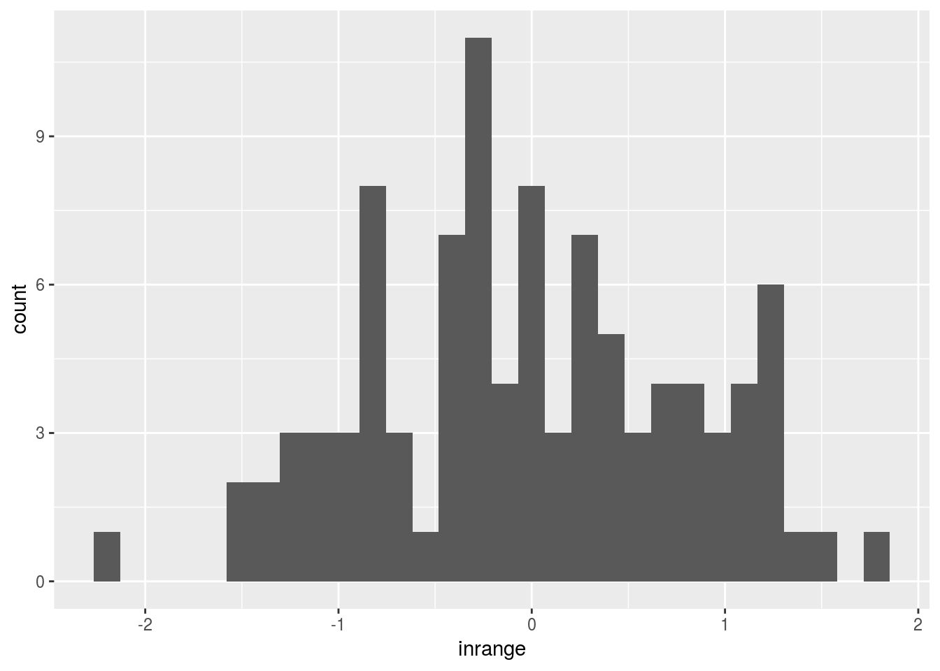
geom_histogram() removed rows with NA values;
df <- diamonds %>% mutate(cut = as.factor(ifelse(y > 7, NA, cut)))
ggplot(df) + geom_bar(aes(x = cut))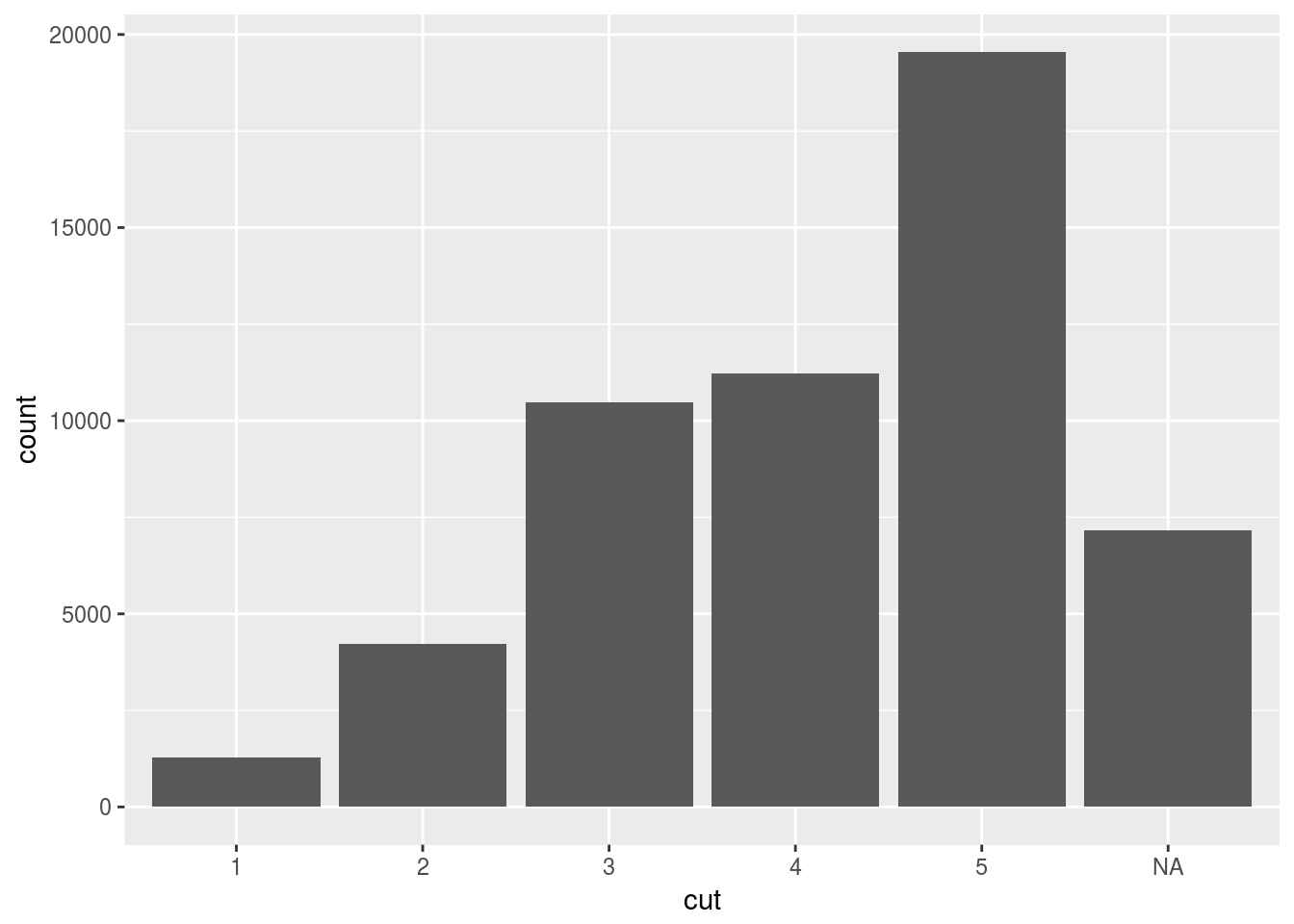
Apparently geom_bar() doesn’t remove NA, but rather treat it as another factor or category.
- What does
na.rm = TRUEdo inmean()andsum()?
To ignoreNAs when calculating mean and sum.
7.5 Covariation
7.5.1 A categorical and continuous variable
7.5.1.1 Exercises
- Use what you’ve learned to improve the visualisation of the departure times of cancelled vs. non-cancelled flights.
flights %>%
  mutate(cancelled = is.na(dep_time) | is.na(arr_time)) %>%
  ggplot() +
  geom_boxplot(aes(x = cancelled, y = dep_time))
## Warning: Removed 8255 rows containing non-finite values (stat_boxplot).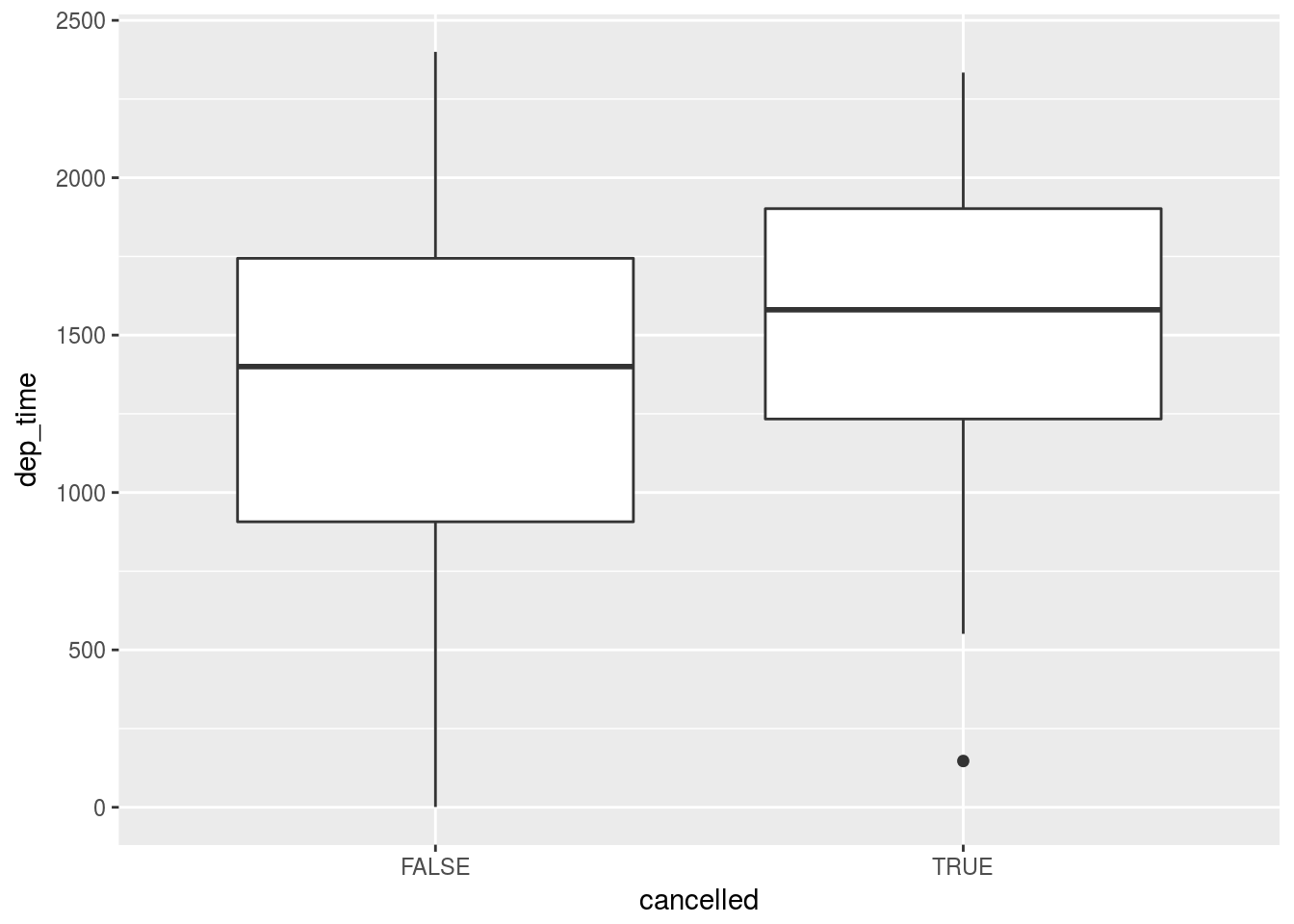
flights %>%
  mutate(cancelled = is.na(dep_time) | is.na(arr_time)) %>%
  filter(cancelled) %>%
  select(dep_time)
## # A tibble: 8,713 x 1
## dep_time
## <int>
## 1 2016
## 2 NA
## 3 NA
## 4 NA
## 5 NA
## 6 2041
## 7 2145
## 8 NA
## 9 NA
## 10 NA
## # ... with 8,703 more rowsPuzzled by this question: how do we have departure times of cancelled flights?
- What variable in the diamonds dataset is most important for predicting the price of a diamond? How is that variable correlated with cut? Why does the combination of those two relationships lead to lower quality diamonds being more expensive?
ggplot(diamonds) +
  geom_point(aes(x = carat, y = price), color = "blue", alpha = 0.5)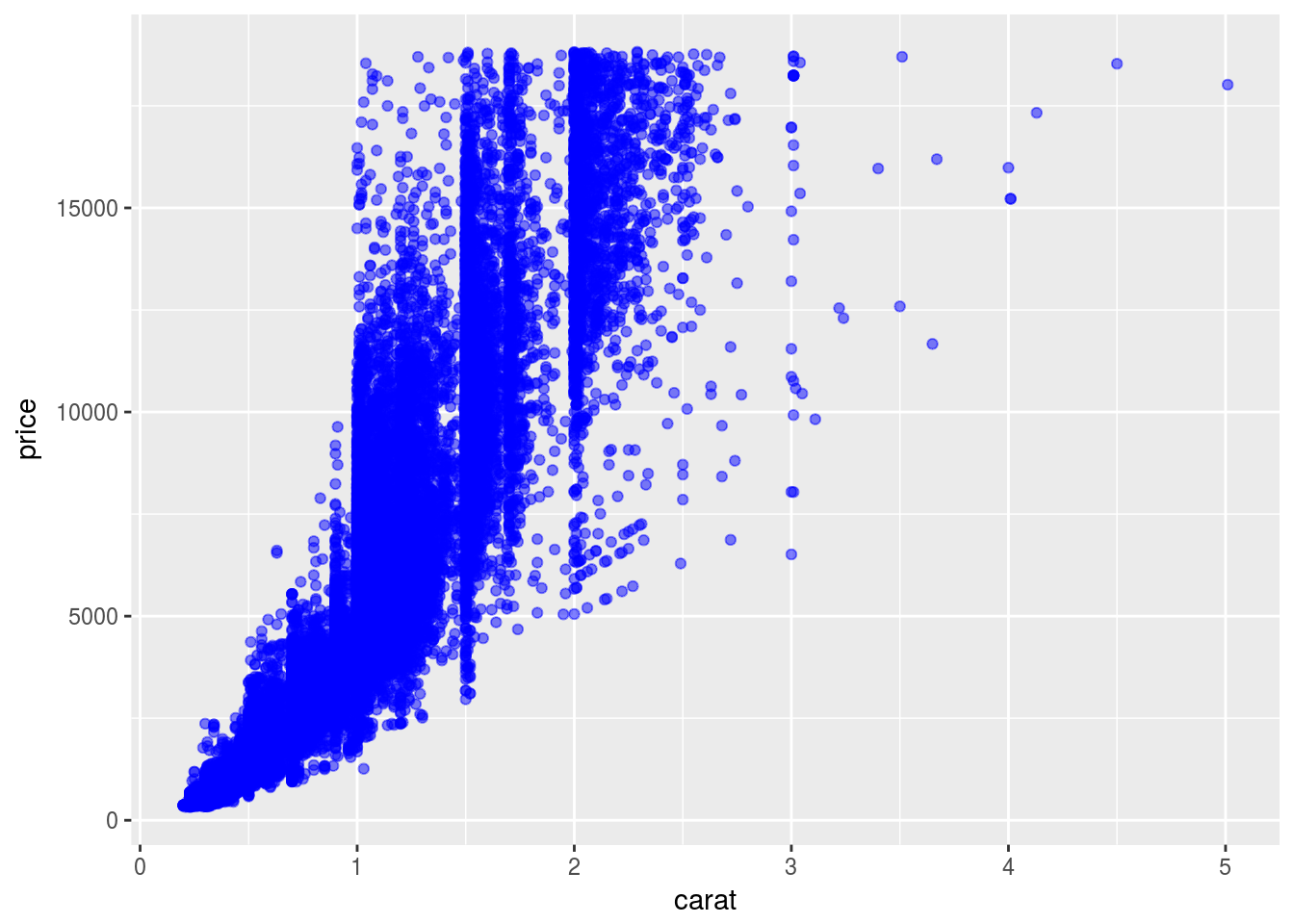
ggplot(diamonds) +
  geom_point(aes(x = depth, y = price), color = "red", alpha = 0.5)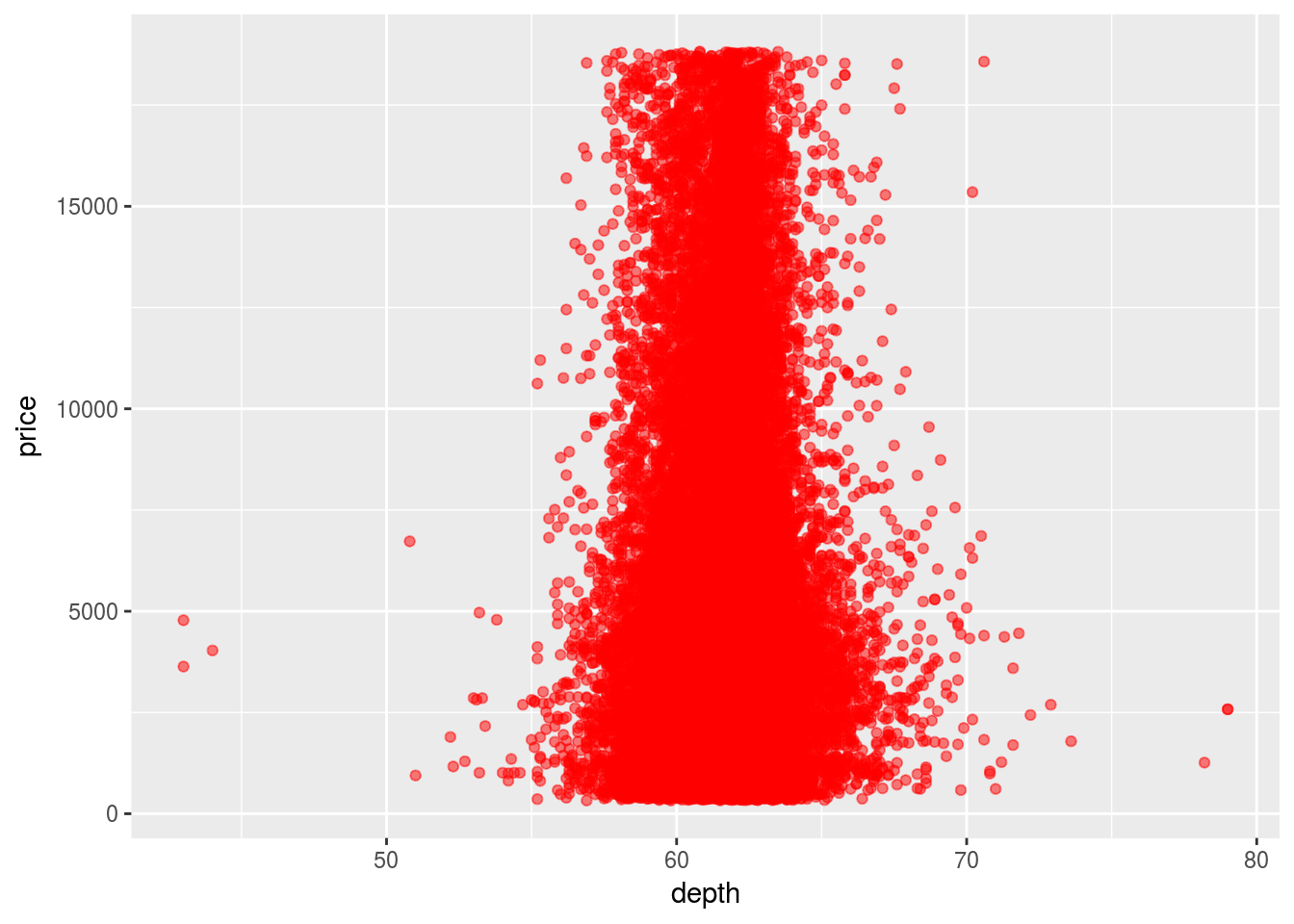
ggplot(diamonds) +
  geom_point(aes(x = table, y = price), color = "red", alpha = 0.5)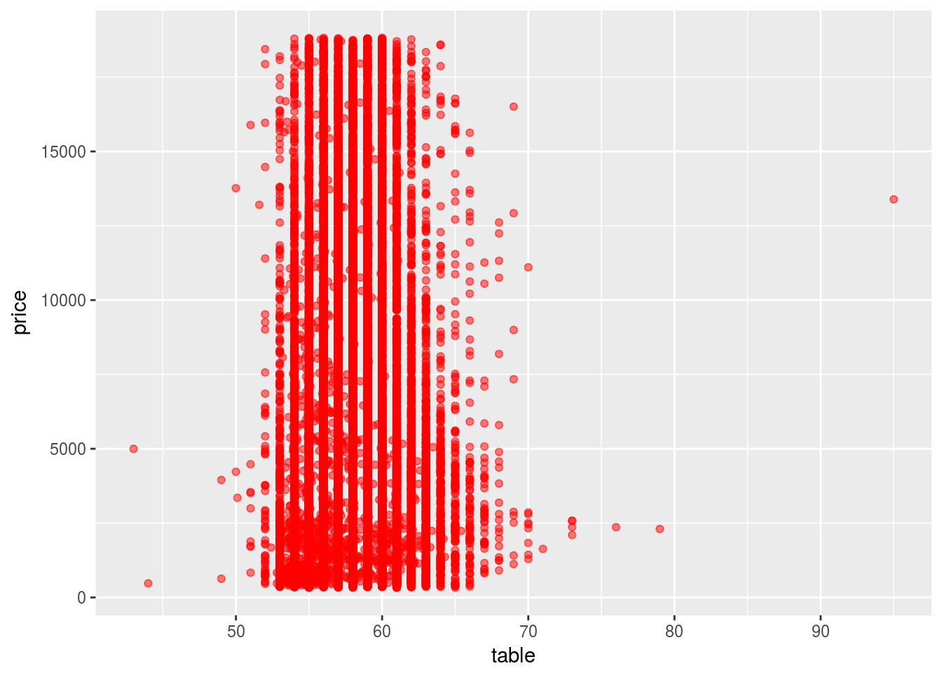
ggplot(diamonds) +
  geom_point(aes(x = x, y = price), color = "red", alpha = 0.5)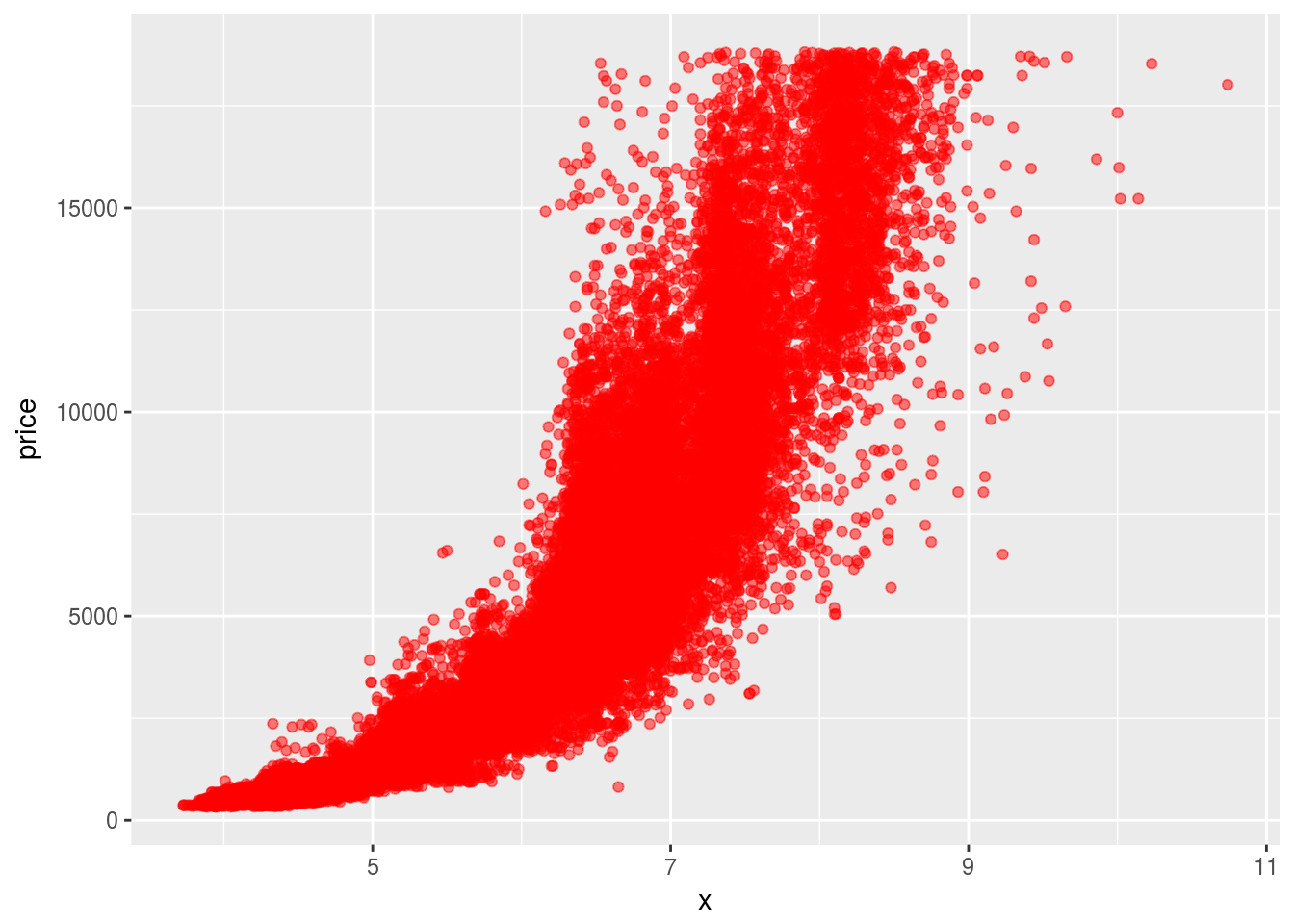
ggplot(diamonds) +
  geom_point(aes(x = z, y = price), color = "red", alpha = 0.5)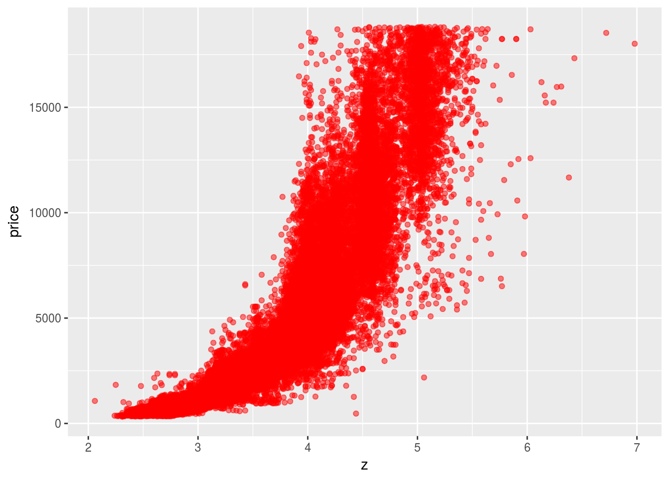
Volumn and weight are two variables that is most important for predicting the price. Since volumn is highly correlated with weight, they can be considered to be one variable.
ggplot(diamonds) +
  geom_boxplot(aes(x = cut, y = carat))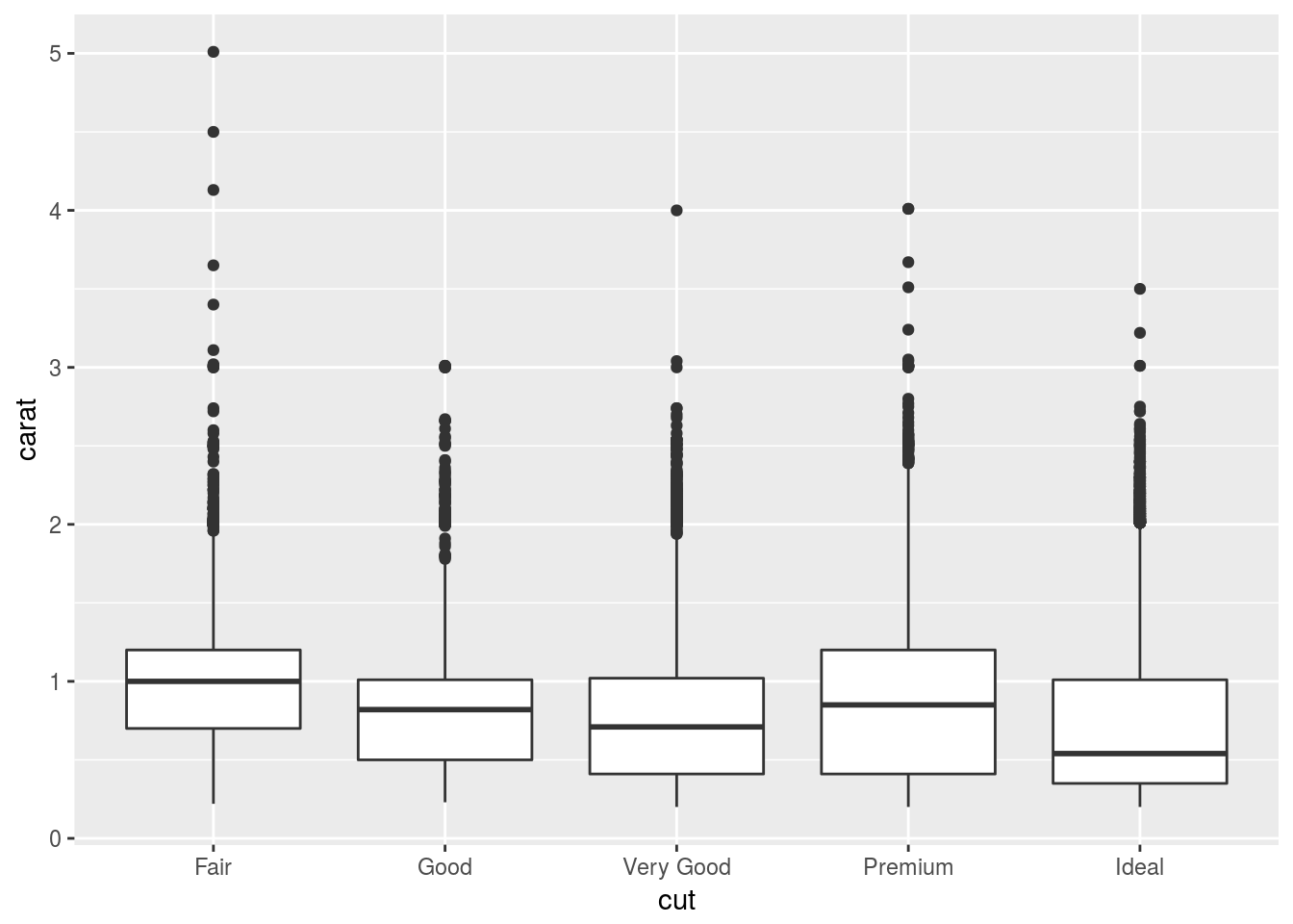
Because better cut has lower carat which makes their price lower, so if we don’t look at carat, it would appear that better cut has lower price.
- Install the
ggstancepackage, and create a horizontal boxplot. How does this compare to usingcoord_flip()?
library(ggstance)##
## Attaching package: 'ggstance'## The following objects are masked from 'package:ggplot2':
##
## geom_errorbarh, GeomErrorbarhggplot(diamonds) + geom_boxplot(aes(x = cut, y = carat)) + coord_flip()
ggplot(diamonds) + geom_boxploth(aes(x = carat, y = cut))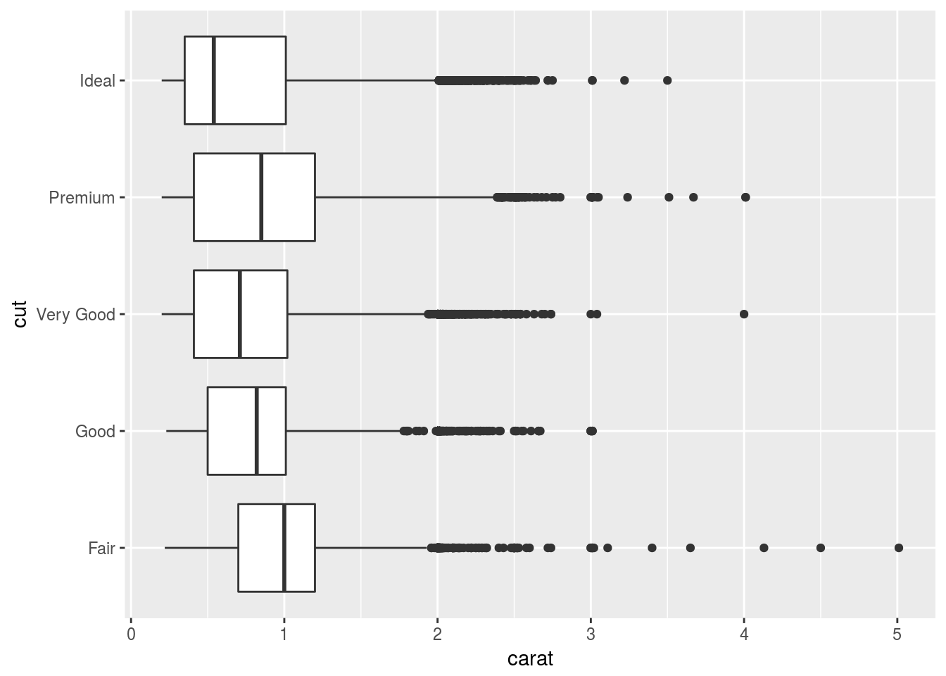
Seems like the result is the same; but the call of the function seems more natural.
- One problem with boxplots is that they were developed in an era of much smaller datasets and tend to display a prohibitively large number of “outlying values”. One approach to remedy this problem is the letter value plot. Install the
lvplotpackage, and try usinggeom_lv()to display the distribution ofpricevscut. What do you learn? How do you interpret the plots?
library(lvplot)
ggplot(diamonds) + geom_lv(aes(x = cut, y = price))
While the boxplot only shows a few quantiles and outliers, the letter-value plot shows many quantiles.
- Compare and contrast
geom_violin()with a facettedgeom_histogram(), or a colouredgeom_freqpoly(). What are the pros and cons of each method?
ggplot(diamonds) +
  geom_histogram(aes(x = price)) +
  facet_wrap(~cut)
## `stat_bin()` using `bins = 30`. Pick better value with `binwidth`.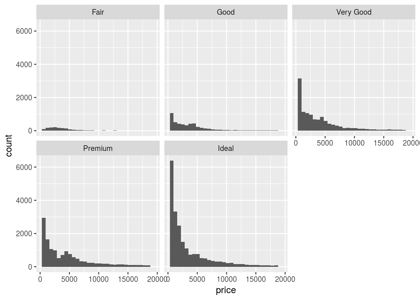
ggplot(diamonds) +
  geom_freqpoly(aes(x = price)) +
  facet_wrap(~cut)
## `stat_bin()` using `bins = 30`. Pick better value with `binwidth`.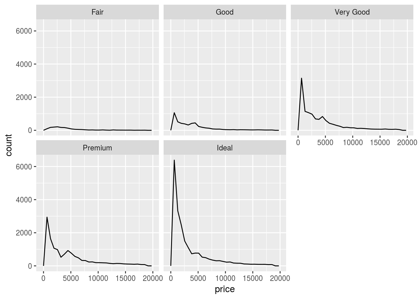
ggplot(diamonds) +
  geom_violin(aes(x = cut, y = price))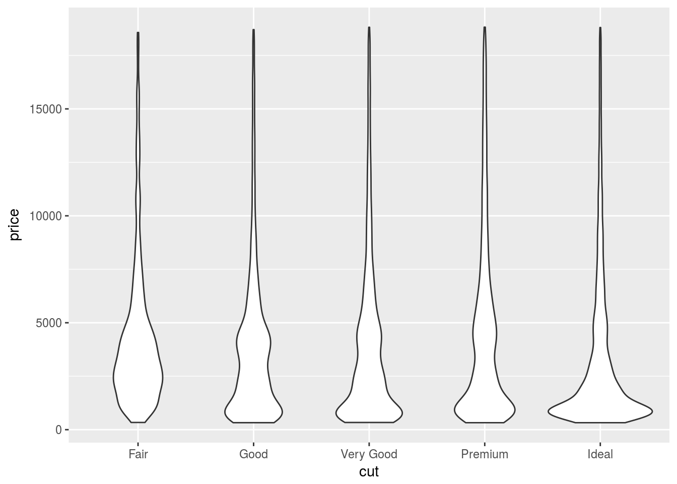
ggplot(diamonds) +
  geom_lv(aes(x = cut, y = price))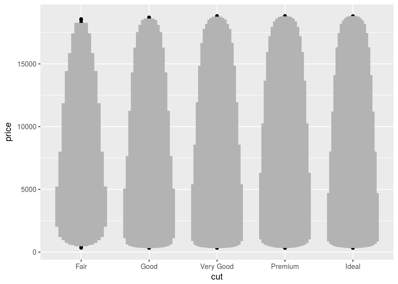
Violin plot is best to compare the density distribution across different categories.
- If you have a small dataset, it’s sometimes useful to use
geom_jitter()to see the relationship between a continuous and categorical variable. The ggbeeswarm package provides a number of methods similar togeom_jitter(). List them and briefly describe what each one does.