Chapter 5 Exploratory Data Analysis, part 2
5.1 Lesson 1: Basic Statistics in R
This is a lesson that will recap the main ways to do descriptive statistics in R. This is not a lesson in how to do statistics, as this has already been covered in earlier modules. However, if you’d like a deep dive into statistics, I’d recommend: https://www.coursera.org/instructor/~20199472.
With a lot of things you can do in the R programming language, there are a number of ways to do the same thing. Hence, here, we will look at a number of different coding styles, too, drawing on the ‘tidy’ way, among base R across a number of packages.
For this, we will use the iris dataset. PLEASE BE CAREFUL OF WHICH PACKAGE YOU ARE CALLING DUE TO COMMANDS WITH THE SAME NAME. This is a common issue that will break your code. For example, if you want to use describe() – do you want the psych package or Hmisc? Ensure you know your packages and how they overlap in command names and also whether one package masks another (e.g., sometimes the order of package loading is important…)
5.1.1 Descriptive Statistics
One of the simplest ways to capture descriptives from a dataframe uses the summary() function in base R. This provides: mean, median, 25th and 75th quartiles, min, and max values:
#loading typical packages just in case you've not already for todays lesson
library('dplyr')
library('magrittr')
library('ggplot2')
library('tidyverse')

head(iris) #ensure you've loaded packages and iris is accessible
## Sepal.Length Sepal.Width Petal.Length Petal.Width Species
## 1 5.1 3.5 1.4 0.2 setosa
## 2 4.9 3.0 1.4 0.2 setosa
## 3 4.7 3.2 1.3 0.2 setosa
## 4 4.6 3.1 1.5 0.2 setosa
## 5 5.0 3.6 1.4 0.2 setosa
## 6 5.4 3.9 1.7 0.4 setosa#lets get the means for variables in iris
# we will exclude missing values
base::summary(iris)## Sepal.Length Sepal.Width Petal.Length Petal.Width Species
## Min. :4.300 Min. :2.000 Min. :1.000 Min. :0.100 setosa :50
## 1st Qu.:5.100 1st Qu.:2.800 1st Qu.:1.600 1st Qu.:0.300 versicolor:50
## Median :5.800 Median :3.000 Median :4.350 Median :1.300 virginica :50
## Mean :5.843 Mean :3.057 Mean :3.758 Mean :1.199
## 3rd Qu.:6.400 3rd Qu.:3.300 3rd Qu.:5.100 3rd Qu.:1.800
## Max. :7.900 Max. :4.400 Max. :6.900 Max. :2.500This of course provides a variety of statistics that may be of use. Similarly, the Hmisc package provides some useful and more detailed statistics that includes: n, number of missing values, number of unique values (disctinct), mean, 5, 10, 25, 50, 75, 90, 95th percentiles, 5 lowest and 5 highest scores:
library('Hmisc')## Loading required package: survival## Loading required package: Formula##
## Attaching package: 'Hmisc'## The following objects are masked from 'package:dplyr':
##
## src, summarize## The following objects are masked from 'package:base':
##
## format.pval, unitsHmisc::describe(iris) #make sure this command is coming from the Hmisc package## iris
##
## 5 Variables 150 Observations
## ------------------------------------------------------------------------------------------------------------
## Sepal.Length
## n missing distinct Info Mean Gmd .05 .10 .25 .50 .75 .90
## 150 0 35 0.998 5.843 0.9462 4.600 4.800 5.100 5.800 6.400 6.900
## .95
## 7.255
##
## lowest : 4.3 4.4 4.5 4.6 4.7, highest: 7.3 7.4 7.6 7.7 7.9
## ------------------------------------------------------------------------------------------------------------
## Sepal.Width
## n missing distinct Info Mean Gmd .05 .10 .25 .50 .75 .90
## 150 0 23 0.992 3.057 0.4872 2.345 2.500 2.800 3.000 3.300 3.610
## .95
## 3.800
##
## lowest : 2.0 2.2 2.3 2.4 2.5, highest: 3.9 4.0 4.1 4.2 4.4
## ------------------------------------------------------------------------------------------------------------
## Petal.Length
## n missing distinct Info Mean Gmd .05 .10 .25 .50 .75 .90
## 150 0 43 0.998 3.758 1.979 1.30 1.40 1.60 4.35 5.10 5.80
## .95
## 6.10
##
## lowest : 1.0 1.1 1.2 1.3 1.4, highest: 6.3 6.4 6.6 6.7 6.9
## ------------------------------------------------------------------------------------------------------------
## Petal.Width
## n missing distinct Info Mean Gmd .05 .10 .25 .50 .75 .90
## 150 0 22 0.99 1.199 0.8676 0.2 0.2 0.3 1.3 1.8 2.2
## .95
## 2.3
##
## lowest : 0.1 0.2 0.3 0.4 0.5, highest: 2.1 2.2 2.3 2.4 2.5
## ------------------------------------------------------------------------------------------------------------
## Species
## n missing distinct
## 150 0 3
##
## Value setosa versicolor virginica
## Frequency 50 50 50
## Proportion 0.333 0.333 0.333
## ------------------------------------------------------------------------------------------------------------Similarly, we’ll look at the pastecs package, which gives you nbr.val, nbr.null, nbr.na, min max, range, sum, median, mean, SE.mean, CI.mean, var, std.dev, and coef.var as a series of more advanced statistics.
library('pastecs')##
## Attaching package: 'pastecs'## The following object is masked from 'package:magrittr':
##
## extract## The following objects are masked from 'package:dplyr':
##
## first, last## The following object is masked from 'package:tidyr':
##
## extractstat.desc(iris)## Sepal.Length Sepal.Width Petal.Length Petal.Width Species
## nbr.val 150.00000000 150.00000000 150.0000000 150.00000000 NA
## nbr.null 0.00000000 0.00000000 0.0000000 0.00000000 NA
## nbr.na 0.00000000 0.00000000 0.0000000 0.00000000 NA
## min 4.30000000 2.00000000 1.0000000 0.10000000 NA
## max 7.90000000 4.40000000 6.9000000 2.50000000 NA
## range 3.60000000 2.40000000 5.9000000 2.40000000 NA
## sum 876.50000000 458.60000000 563.7000000 179.90000000 NA
## median 5.80000000 3.00000000 4.3500000 1.30000000 NA
## mean 5.84333333 3.05733333 3.7580000 1.19933333 NA
## SE.mean 0.06761132 0.03558833 0.1441360 0.06223645 NA
## CI.mean.0.95 0.13360085 0.07032302 0.2848146 0.12298004 NA
## var 0.68569351 0.18997942 3.1162779 0.58100626 NA
## std.dev 0.82806613 0.43586628 1.7652982 0.76223767 NA
## coef.var 0.14171126 0.14256420 0.4697441 0.63555114 NAFinally, the psych package is very common for social science scholars, which provides another series of descriptive outputs that include: item name, item number, nvalid, mean, sd, median, mad, min, max, skew, kurtosis, and se:
library(psych)##
## Attaching package: 'psych'## The following object is masked from 'package:Hmisc':
##
## describe## The following object is masked from 'package:randomForest':
##
## outlier## The following objects are masked from 'package:ggplot2':
##
## %+%, alphapsych::describe(iris) #calling psych:: to ensure we are using the correct package## vars n mean sd median trimmed mad min max range skew kurtosis se
## Sepal.Length 1 150 5.84 0.83 5.80 5.81 1.04 4.3 7.9 3.6 0.31 -0.61 0.07
## Sepal.Width 2 150 3.06 0.44 3.00 3.04 0.44 2.0 4.4 2.4 0.31 0.14 0.04
## Petal.Length 3 150 3.76 1.77 4.35 3.76 1.85 1.0 6.9 5.9 -0.27 -1.42 0.14
## Petal.Width 4 150 1.20 0.76 1.30 1.18 1.04 0.1 2.5 2.4 -0.10 -1.36 0.06
## Species* 5 150 2.00 0.82 2.00 2.00 1.48 1.0 3.0 2.0 0.00 -1.52 0.07Another useful element of the psych package is that you can describe by group, whereby we can get the same descriptive statistics as above, but specifically for each species:
describeBy(iris, group = 'Species')##
## Descriptive statistics by group
## Species: setosa
## vars n mean sd median trimmed mad min max range skew kurtosis se
## Sepal.Length 1 50 5.01 0.35 5.0 5.00 0.30 4.3 5.8 1.5 0.11 -0.45 0.05
## Sepal.Width 2 50 3.43 0.38 3.4 3.42 0.37 2.3 4.4 2.1 0.04 0.60 0.05
## Petal.Length 3 50 1.46 0.17 1.5 1.46 0.15 1.0 1.9 0.9 0.10 0.65 0.02
## Petal.Width 4 50 0.25 0.11 0.2 0.24 0.00 0.1 0.6 0.5 1.18 1.26 0.01
## Species* 5 50 1.00 0.00 1.0 1.00 0.00 1.0 1.0 0.0 NaN NaN 0.00
## ---------------------------------------------------------------------------------
## Species: versicolor
## vars n mean sd median trimmed mad min max range skew kurtosis se
## Sepal.Length 1 50 5.94 0.52 5.90 5.94 0.52 4.9 7.0 2.1 0.10 -0.69 0.07
## Sepal.Width 2 50 2.77 0.31 2.80 2.78 0.30 2.0 3.4 1.4 -0.34 -0.55 0.04
## Petal.Length 3 50 4.26 0.47 4.35 4.29 0.52 3.0 5.1 2.1 -0.57 -0.19 0.07
## Petal.Width 4 50 1.33 0.20 1.30 1.32 0.22 1.0 1.8 0.8 -0.03 -0.59 0.03
## Species* 5 50 2.00 0.00 2.00 2.00 0.00 2.0 2.0 0.0 NaN NaN 0.00
## ---------------------------------------------------------------------------------
## Species: virginica
## vars n mean sd median trimmed mad min max range skew kurtosis se
## Sepal.Length 1 50 6.59 0.64 6.50 6.57 0.59 4.9 7.9 3.0 0.11 -0.20 0.09
## Sepal.Width 2 50 2.97 0.32 3.00 2.96 0.30 2.2 3.8 1.6 0.34 0.38 0.05
## Petal.Length 3 50 5.55 0.55 5.55 5.51 0.67 4.5 6.9 2.4 0.52 -0.37 0.08
## Petal.Width 4 50 2.03 0.27 2.00 2.03 0.30 1.4 2.5 1.1 -0.12 -0.75 0.04
## Species* 5 50 3.00 0.00 3.00 3.00 0.00 3.0 3.0 0.0 NaN NaN 0.005.1.1.1 Activity
Part 1: Use all of the packages and commands above that we have discussed and use the mpg package. For the group descriptives, use any of the grouping variables such as class or manufacturer.
Part 2: From last week, add in some missing values (10-15%), and rerun all of your code from part 1 with na.rm = TRUE and again na.rm = FALSE and see the differences.
5.1.2 Correlations
Correlation or dependence is any statistical relationship, whether causal or not (this is important!), between two random variables or bivariate data. In the broadest sense, a correlation is any statistical association between two variables, though it commonly refers to the degree to which a pair of variables are linearly related.
Thre are a number of ways we can capture a correlation both numerically or visually. For instance, in base R we can use cor() to get the correlation. You can define the method: perason, spearman, or kendall. However, if you’d like to see the p-value, you’d need to use the cor.test() function to get the correlation coefficient. Similarly, using the Hmisc package, the rcorr() command produces correlations, covariances, and significance levels for pearson and spearman correlations. Lets have a look:
cor(mtcars, use = "everything", method ="pearson")## mpg cyl disp hp drat wt qsec vs am
## mpg 1.0000000 -0.8521620 -0.8475514 -0.7761684 0.68117191 -0.8676594 0.41868403 0.6640389 0.59983243
## cyl -0.8521620 1.0000000 0.9020329 0.8324475 -0.69993811 0.7824958 -0.59124207 -0.8108118 -0.52260705
## disp -0.8475514 0.9020329 1.0000000 0.7909486 -0.71021393 0.8879799 -0.43369788 -0.7104159 -0.59122704
## hp -0.7761684 0.8324475 0.7909486 1.0000000 -0.44875912 0.6587479 -0.70822339 -0.7230967 -0.24320426
## drat 0.6811719 -0.6999381 -0.7102139 -0.4487591 1.00000000 -0.7124406 0.09120476 0.4402785 0.71271113
## wt -0.8676594 0.7824958 0.8879799 0.6587479 -0.71244065 1.0000000 -0.17471588 -0.5549157 -0.69249526
## qsec 0.4186840 -0.5912421 -0.4336979 -0.7082234 0.09120476 -0.1747159 1.00000000 0.7445354 -0.22986086
## vs 0.6640389 -0.8108118 -0.7104159 -0.7230967 0.44027846 -0.5549157 0.74453544 1.0000000 0.16834512
## am 0.5998324 -0.5226070 -0.5912270 -0.2432043 0.71271113 -0.6924953 -0.22986086 0.1683451 1.00000000
## gear 0.4802848 -0.4926866 -0.5555692 -0.1257043 0.69961013 -0.5832870 -0.21268223 0.2060233 0.79405876
## carb -0.5509251 0.5269883 0.3949769 0.7498125 -0.09078980 0.4276059 -0.65624923 -0.5696071 0.05753435
## gear carb
## mpg 0.4802848 -0.55092507
## cyl -0.4926866 0.52698829
## disp -0.5555692 0.39497686
## hp -0.1257043 0.74981247
## drat 0.6996101 -0.09078980
## wt -0.5832870 0.42760594
## qsec -0.2126822 -0.65624923
## vs 0.2060233 -0.56960714
## am 0.7940588 0.05753435
## gear 1.0000000 0.27407284
## carb 0.2740728 1.00000000#please note: under use, this allows you to specify how to use missing data, where all.obs = assumes no missing data
#and if there is missing data this will error; complete.obs will perform listwise deletion, etc.
#As above, if we wanted to see the correlation coefficients, using cor.test() is one way to do this.
#this provides correlation statistics for a SINGLE COEFFICIENT (see below)
cor.test(mtcars$mpg, mtcars$cyl)##
## Pearson's product-moment correlation
##
## data: mtcars$mpg and mtcars$cyl
## t = -8.9197, df = 30, p-value = 6.113e-10
## alternative hypothesis: true correlation is not equal to 0
## 95 percent confidence interval:
## -0.9257694 -0.7163171
## sample estimates:
## cor
## -0.852162#using Hmisc package
#note: input MUST be a matrix and pairwise deletion must have been useed
Hmisc::rcorr(as.matrix(mtcars))## mpg cyl disp hp drat wt qsec vs am gear carb
## mpg 1.00 -0.85 -0.85 -0.78 0.68 -0.87 0.42 0.66 0.60 0.48 -0.55
## cyl -0.85 1.00 0.90 0.83 -0.70 0.78 -0.59 -0.81 -0.52 -0.49 0.53
## disp -0.85 0.90 1.00 0.79 -0.71 0.89 -0.43 -0.71 -0.59 -0.56 0.39
## hp -0.78 0.83 0.79 1.00 -0.45 0.66 -0.71 -0.72 -0.24 -0.13 0.75
## drat 0.68 -0.70 -0.71 -0.45 1.00 -0.71 0.09 0.44 0.71 0.70 -0.09
## wt -0.87 0.78 0.89 0.66 -0.71 1.00 -0.17 -0.55 -0.69 -0.58 0.43
## qsec 0.42 -0.59 -0.43 -0.71 0.09 -0.17 1.00 0.74 -0.23 -0.21 -0.66
## vs 0.66 -0.81 -0.71 -0.72 0.44 -0.55 0.74 1.00 0.17 0.21 -0.57
## am 0.60 -0.52 -0.59 -0.24 0.71 -0.69 -0.23 0.17 1.00 0.79 0.06
## gear 0.48 -0.49 -0.56 -0.13 0.70 -0.58 -0.21 0.21 0.79 1.00 0.27
## carb -0.55 0.53 0.39 0.75 -0.09 0.43 -0.66 -0.57 0.06 0.27 1.00
##
## n= 32
##
##
## P
## mpg cyl disp hp drat wt qsec vs am gear carb
## mpg 0.0000 0.0000 0.0000 0.0000 0.0000 0.0171 0.0000 0.0003 0.0054 0.0011
## cyl 0.0000 0.0000 0.0000 0.0000 0.0000 0.0004 0.0000 0.0022 0.0042 0.0019
## disp 0.0000 0.0000 0.0000 0.0000 0.0000 0.0131 0.0000 0.0004 0.0010 0.0253
## hp 0.0000 0.0000 0.0000 0.0100 0.0000 0.0000 0.0000 0.1798 0.4930 0.0000
## drat 0.0000 0.0000 0.0000 0.0100 0.0000 0.6196 0.0117 0.0000 0.0000 0.6212
## wt 0.0000 0.0000 0.0000 0.0000 0.0000 0.3389 0.0010 0.0000 0.0005 0.0146
## qsec 0.0171 0.0004 0.0131 0.0000 0.6196 0.3389 0.0000 0.2057 0.2425 0.0000
## vs 0.0000 0.0000 0.0000 0.0000 0.0117 0.0010 0.0000 0.3570 0.2579 0.0007
## am 0.0003 0.0022 0.0004 0.1798 0.0000 0.0000 0.2057 0.3570 0.0000 0.7545
## gear 0.0054 0.0042 0.0010 0.4930 0.0000 0.0005 0.2425 0.2579 0.0000 0.1290
## carb 0.0011 0.0019 0.0253 0.0000 0.6212 0.0146 0.0000 0.0007 0.7545 0.12905.1.3 Visual Correlations using corrplot
mtcars_mat <- cor(mtcars) #need to have the correlations to plot

corrplot::corrplot(mtcars_mat, method = 'ellipse', type = 'upper')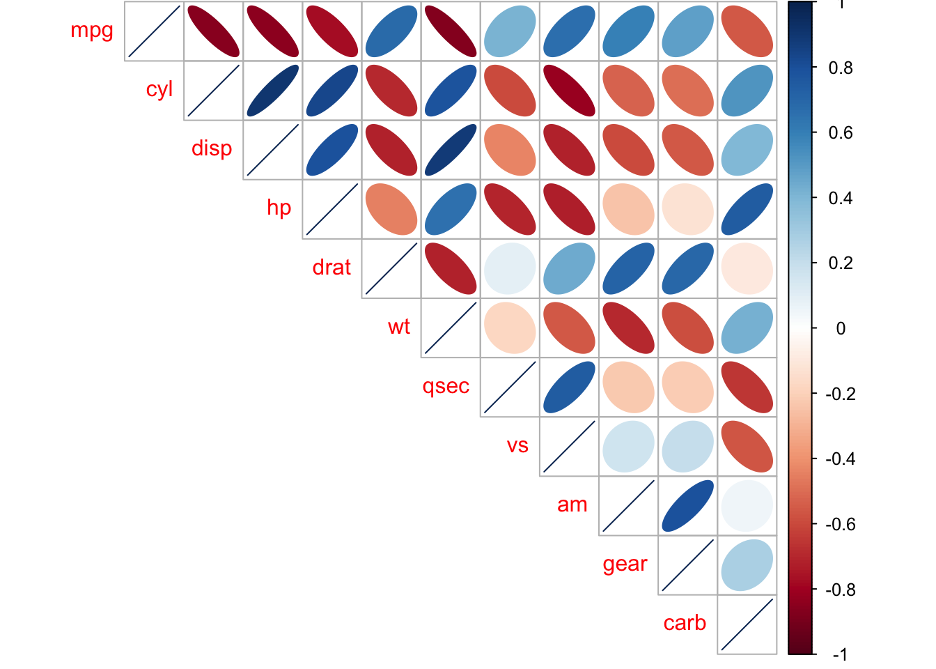
5.1.3.1 Activity
Read through this tutorial: (https://cran.r-project.org/web/packages/corrplot/vignettes/corrplot-intro.html) and (https://cran.r-project.org/web/packages/corrplot/corrplot.pdf) and experiment with all of the various parameters (e.g., method = circle, square, ellispse, number, shade…) – use the iris, diamonds, and mpg datasets.
5.1.4 t-tests
t-tests compare two groups, for instance, control group and experimental groups. There are different types of t-tests, where the most common you’ll be looking at are independent t-tests or paired t-tests.
Briefly, an independent or unpaired t-test is when you’re comparing groups that are independent of one another, aka, each observation or participant was exposed to one of the groups only. For instance, in an exeriemtn you are only in the CONTROL or the EXPERIMENTAL condition.
In contrast, paired t-tests or repeated measures t-tests is where the participants are in BOTH groups, typically this is where participants are tested on one day and tested again at a later time. For example, you might be analyzing anxiety at the start of the week (Monday) versus the end of the week (Friday), so you ask participant to fill out the GAD7 on Monday and again on Friday and compare the difference.
5.1.4.1 Independent Samples t-test
Let’s create a dataset to use for an INDEPENDENT samples t-test:
# Data in two numeric vectors
women_weight <- c(38.9, 61.2, 73.3, 21.8, 63.4, 64.6, 48.4, 48.8, 48.5)
men_weight <- c(67.8, 60, 63.4, 76, 89.4, 73.3, 67.3, 61.3, 62.4)

# Create a data frame
my_data <- data.frame(
                group = rep(c("Woman", "Man"), each = 9),
                weight = c(women_weight,  men_weight)
                )

#check
print(my_data)
## group weight
## 1 Woman 38.9
## 2 Woman 61.2
## 3 Woman 73.3
## 4 Woman 21.8
## 5 Woman 63.4
## 6 Woman 64.6
## 7 Woman 48.4
## 8 Woman 48.8
## 9 Woman 48.5
## 10 Man 67.8
## 11 Man 60.0
## 12 Man 63.4
## 13 Man 76.0
## 14 Man 89.4
## 15 Man 73.3
## 16 Man 67.3
## 17 Man 61.3
## 18 Man 62.4It is always important to do some descriptive summary statistics across groups:
group_by(my_data, group) %>%
  dplyr::summarise(
    count = n(),
    mean = mean(weight, na.rm = TRUE),
    sd = sd(weight, na.rm = TRUE)
  )
## # A tibble: 2 × 4
## group count mean sd
## <chr> <int> <dbl> <dbl>
## 1 Man 9 69.0 9.38
## 2 Woman 9 52.1 15.6#or we can of course use describeBy
describeBy(my_data, group = 'group')##
## Descriptive statistics by group
## group: Man
## vars n mean sd median trimmed mad min max range skew kurtosis se
## group* 1 9 1.00 0.00 1.0 1.00 0.0 1 1.0 0.0 NaN NaN 0.00
## weight 2 9 68.99 9.38 67.3 68.99 8.9 60 89.4 29.4 0.98 -0.28 3.13
## ---------------------------------------------------------------------------------
## group: Woman
## vars n mean sd median trimmed mad min max range skew kurtosis se
## group* 1 9 1.0 0.0 1.0 1.0 0.00 1.0 1.0 0.0 NaN NaN 0.0
## weight 2 9 52.1 15.6 48.8 52.1 18.38 21.8 73.3 51.5 -0.49 -0.89 5.2As you will know, there are a number of assumptions that need to be checked before doing t-tests (or any linear tests, e.g., regression). For instance:
are your data normally distributed?
do the two sampls have the same variances? (e.g., looking for homogenetity, where we do not want significant differences between variances)
Let’s check those assumptions. We will use the Shapiro-Wilk normality test to test for normality in each group, where the null hypothesis is that the data are normally distributed and the alternative hypothesis is that the data are not normally distributed.
We’ll use the functions with() and shapiro.test() to compute Shapiro-Wilk test for each group of samples (without splitting data into two using subset() and then using the shapiro.test() function).
# Shapiro-Wilk normality test for Men's weights
with(my_data, shapiro.test(weight[group == "Man"]))
##
## Shapiro-Wilk normality test
##
## data: weight[group == "Man"]
## W = 0.86425, p-value = 0.1066# Shapiro-Wilk normality test for Women's weights
with(my_data, shapiro.test(weight[group == "Woman"]))##
## Shapiro-Wilk normality test
##
## data: weight[group == "Woman"]
## W = 0.94266, p-value = 0.6101Here we can see that both groups have a p-value that are greater than 0.05 whereby we interpret that the distributions are nor significantly different from a normal distribution. We can assume normality.
TO check for homogeneity in variances, we’ll use var.test(), which is an F-test:
res.ftest <- var.test(weight ~ group, data = my_data)
res.ftest
##
## F test to compare two variances
##
## data: weight by group
## F = 0.36134, num df = 8, denom df = 8, p-value = 0.1714
## alternative hypothesis: true ratio of variances is not equal to 1
## 95 percent confidence interval:
## 0.08150656 1.60191315
## sample estimates:
## ratio of variances
## 0.3613398Here, the p-value of F-test is p = 0.1713596. It is greater than the significance level alpha = 0.05, whereby here is no significant difference between the variances of the two sets of data. Therefore, we can use the classic t-test witch assume equality of the two variances.
Now, we can go ahead and do a t-test:
#there are multiple ways you can write this code

# Compute t-test method one:
res <- t.test(weight ~ group, data = my_data, var.equal = TRUE)
res
##
## Two Sample t-test
##
## data: weight by group
## t = 2.7842, df = 16, p-value = 0.01327
## alternative hypothesis: true difference in means is not equal to 0
## 95 percent confidence interval:
## 4.029759 29.748019
## sample estimates:
## mean in group Man mean in group Woman
## 68.98889 52.10000# Compute t-test method two
res <- t.test(women_weight, men_weight, var.equal = TRUE)
res##
## Two Sample t-test
##
## data: women_weight and men_weight
## t = -2.7842, df = 16, p-value = 0.01327
## alternative hypothesis: true difference in means is not equal to 0
## 95 percent confidence interval:
## -29.748019 -4.029759
## sample estimates:
## mean of x mean of y
## 52.10000 68.98889Briefly, the p-value of the test is 0.01327, which is less than the significance level alpha = 0.05. Hence, we can conclude that men’s average weight is significantly different from women’s average weight.
5.1.4.2 Paired Sample t-test
Here, we will look at the paired sample t-test. Lets create a dataset:
# Weight of the mice before treatment
before <-c(200.1, 190.9, 192.7, 213, 241.4, 196.9, 172.2, 185.5, 205.2, 193.7)
# Weight of the mice after treatment
after <-c(392.9, 393.2, 345.1, 393, 434, 427.9, 422, 383.9, 392.3, 352.2)
# Create a data frame
my_data_paired <- data.frame(
                group = rep(c("before", "after"), each = 10),
                weight = c(before,  after)
                )

print(my_data_paired)
## group weight
## 1 before 200.1
## 2 before 190.9
## 3 before 192.7
## 4 before 213.0
## 5 before 241.4
## 6 before 196.9
## 7 before 172.2
## 8 before 185.5
## 9 before 205.2
## 10 before 193.7
## 11 after 392.9
## 12 after 393.2
## 13 after 345.1
## 14 after 393.0
## 15 after 434.0
## 16 after 427.9
## 17 after 422.0
## 18 after 383.9
## 19 after 392.3
## 20 after 352.2group_by(my_data_paired, group) %>%
dplyr::summarise(
count = n(),
mean = mean(weight, na.rm = TRUE),
sd = sd(weight, na.rm = TRUE)
)## # A tibble: 2 × 4
## group count mean sd
## <chr> <int> <dbl> <dbl>
## 1 after 10 394. 29.4
## 2 before 10 199. 18.5#or we can of course use describeBy
describeBy(my_data_paired, group = 'group')##
## Descriptive statistics by group
## group: after
## vars n mean sd median trimmed mad min max range skew kurtosis se
## group* 1 10 1.00 0.0 1.00 1.00 0.00 1.0 1 0.0 NaN NaN 0.0
## weight 2 10 393.65 29.4 392.95 394.68 28.24 345.1 434 88.9 -0.23 -1.23 9.3
## ---------------------------------------------------------------------------------
## group: before
## vars n mean sd median trimmed mad min max range skew kurtosis se
## group* 1 10 1.00 0.00 1.0 1.00 0.00 1.0 1.0 0.0 NaN NaN 0.00
## weight 2 10 199.16 18.47 195.3 197.25 10.82 172.2 241.4 69.2 0.87 0.26 5.84You can also visualize this, where there are specific packages for paired data (boxplots are another useful method):
library('PairedData')

# Subset weight data before treatment
before <- subset(my_data_paired,  group == "before", weight,
                 drop = TRUE)
# subset weight data after treatment
after <- subset(my_data_paired,  group == "after", weight,
                 drop = TRUE)
# Plot paired data
pd <- paired(before, after)
plot(pd, type = "profile") + theme_bw()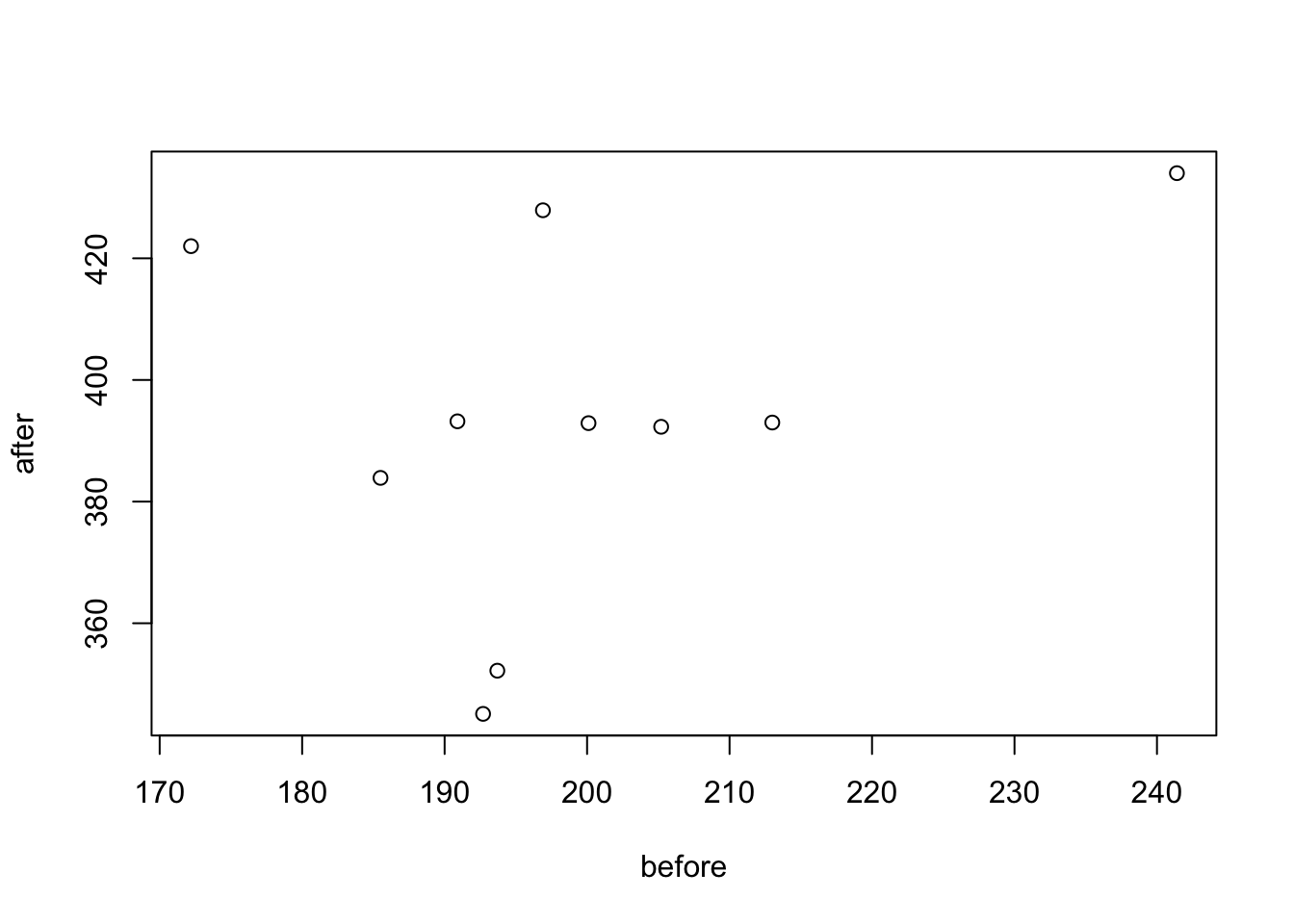
Due to the small sample size we will want to check again for normality:
# compute the difference between the before and after
d <- with(my_data_paired,
        weight[group == "before"] - weight[group == "after"])

# Shapiro-Wilk normality test for the differences
shapiro.test(d)
##
## Shapiro-Wilk normality test
##
## data: d
## W = 0.94536, p-value = 0.6141Here, as the Shapiro-Wilk normality test p-value is greater than 0.05, we can assume normality.
Let’s so the paired sample t-test:
# Compute t-test
res <- t.test(weight ~ group, data = my_data_paired, paired = TRUE)
res
##
## Paired t-test
##
## data: weight by group
## t = 20.883, df = 9, p-value = 6.2e-09
## alternative hypothesis: true difference in means is not equal to 0
## 95 percent confidence interval:
## 173.4219 215.5581
## sample estimates:
## mean of the differences
## 194.49So the conclusion here is that the p-value of the test is less than the significance level alpha = 0.05, so we can then reject null hypothesis and conclude that the average weight of the mice before treatment is significantly different from the average weight after treatment.
Please also note: if your data are not normally distributed, there are non-parametric tests that you can use instead. For independent t-tests we can use the Mann-Whitney test, which is the wilcox.test() function and for paired t-tests we can use Wilcoxon Rank tests, by using the wilcox.test() function with the paired = TRUE command.
5.2 Lesson 2: Data Visualization
Data visualization is the graphical representation of information and data. By using visual elements like charts, graphs and maps, data visualization tools provide an accessible way to see and understand trends, outliers, or patterns in data. Data visualization is an incredibly powerful tool and one that it worth learning about. Sometimes this can be trail and error to see what type of visual works best with data, however, there are some excellent ‘rules of thumb’, that we will look into. In the world of big data, data visualization tools and technologies are even more essential for analyzing various types of data, information, and formulating insights from them.
The history of data visualization can be argued to be the history of many millennia, this often consisted of start constellations, maps for navigation—where the Egyptians were using early coordinates to pay out towns, earthly and heavenly positions as early as 200 B.C. (Friendly, 2008). In other kinds of visualization, some of the earliest artwork of hands drawn by humans even as early as 40,000 years ago. It was not until the 14th Century that the concept of ‘plotting’ came into fruition, where the link between tabulate data and the ability to visualize this as a graphical plot appeared by Nicole Oresme (1323-1382). Please read more about this [here] (https://link.springer.com/chapter/10.1007/978-3-540-33037-0_2).
Brefly, it is important to remember that data visualization is far more than simply visualizing numbers. For instance, we can visualize ‘artistic data’, such as da Vinci’s famous work spanning both art and science is arguably another highly influential example of data visualization. For instance, da Vinci’s masterfully depicted human and animal bodies, demonstrating great detail and annotation to visualize biological structures from skeletal to muscular, which are incredibly beautiful piece of art, but also science. There is a great creative side to data visualization, so when going through this lesson – experiment!
5.2.1 The ggplot way
In earlier modules, you’ve had some interactions with data visualization, so this will be a recap for the most part in R using ggplot2.
Let’s focus on the mpg dataset, and we will just start with a simple plot:
ggplot(data = mpg) +
  geom_point(mapping = aes(x = displ, y = hwy))
Here, as with all ggplots – we follow the usual template, of calling data, and then stating which type of plot (e.g., point, bar, smooth), and defining the aesthetics (x, y, and grouping variables, potentially color and shape types).
The same plot above can be coded differently, too. This is a short hand version, but also we are defining the aesthetics in the overall plot call rather than specifically in the geom_point. There are reasons why you might do one over the other, for instance, if you are doing highly complex plots with multiple layers, the first method of defining aesthetics in each plot layer (e.g., geom_point) is more sensible.
ggplot(mpg, aes(displ, hwy)) +
  geom_point()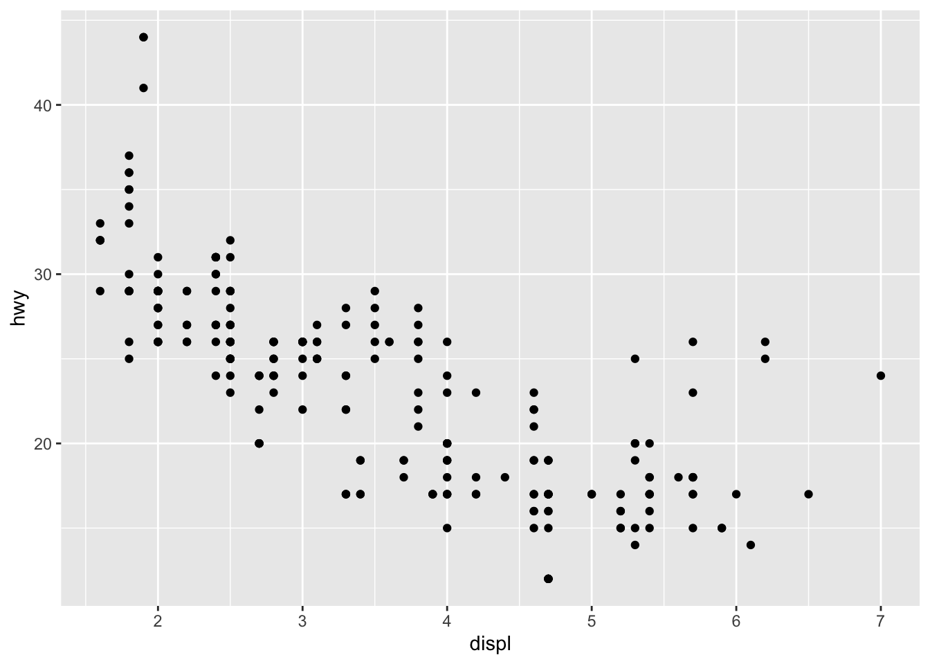
We can add more information into this plot by coloring the points by a categorical variable, like class.
ggplot(data = mpg) +
geom_point(mapping = aes(x = displ, y = hwy, color = class))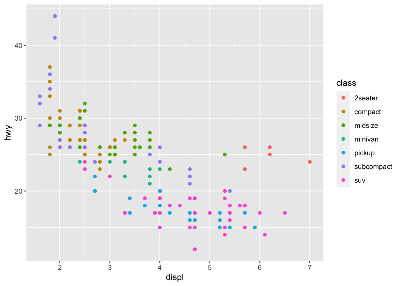 There is a lot we can continue to edit, where we might want the size of the circles to change according to number of cyliners…
ggplot(data = mpg) +
  geom_point(mapping = aes(x = displ, y = hwy, size = cyl))
You can force size to use unordered variables like class, but this is not a great idea as you should want the size of bubbles to be meaningful and to not cause confusion.
We could also use the alpha aesthetic, which increases transparency, which is especially useful when we have a lot of points and it is difficult to distinguish and see density. Simialrly, we can use different shapes, too. However, please be careful when using shapes, as sometimes ggplot has limits of 6, where the additional groups are unplotted (here thats suv).
#looking at alpha and transparency
ggplot(data = mpg) +
  geom_point(mapping = aes(x = displ, y = hwy, alpha = class))
## Warning: Using alpha for a discrete variable is not advised.
#looking at different shapes
ggplot(data = mpg) +
  geom_point(mapping = aes(x = displ, y = hwy, shape = class))
## Warning: The shape palette can deal with a maximum of 6 discrete values because more than 6 becomes
## difficult to discriminate; you have 7. Consider specifying shapes manually if you must have
## them.## Warning: Removed 62 rows containing missing values (geom_point). You can easily edit and adapt your plots in terms of color, too, which is very simple, but remember brackets are extremely important here. When you are defining the aesthetic arguments, aka defining which variables are used where and how remain in bracket. Anything you manually change typically goes outside of the aes()
bracket… this includes color (string), size of points (in mm), and shapes. See here for colors, linetypes, and shape choices in [ggplot2] (http://sape.inf.usi.ch/quick-reference/ggplot2/colour)
You can easily edit and adapt your plots in terms of color, too, which is very simple, but remember brackets are extremely important here. When you are defining the aesthetic arguments, aka defining which variables are used where and how remain in bracket. Anything you manually change typically goes outside of the aes()
bracket… this includes color (string), size of points (in mm), and shapes. See here for colors, linetypes, and shape choices in [ggplot2] (http://sape.inf.usi.ch/quick-reference/ggplot2/colour)
ggplot(data = mpg) +
  geom_point(mapping = aes(x = displ, y = hwy), color = "darkorchid3")
Note: when using color, note when you need to use color = ‘red’ and fill = ‘red’. Certain shapes that are ‘hollow’ need to be filled and if you use color it will just change the color of the outline. For example, R has 25 built in shapes that are identified by numbers (see http://sape.inf.usi.ch/quick-reference/ggplot2/shape). Some may look like duplicates: for example, 0, 15, and 22 are all squares. The difference comes from the interaction of the color and fill aesthetics. The hollow shapes (0–14) have a border determined by colour; the solid shapes (15–20) are filled with color; the filled shapes (21–24) have a border of color and are filled with fill.
5.2.1.1 Activity
Using the mpg dataset and plot various variables and change the color, shape, and size of the points.
Specifically then also:
Use shape 23 and ensure it is completely blue.
Use shape 14 and color it purple.
Plot displ and hwy and make the points bigger than the usual ggplot size.
Fix this code to ensure the points are green:
ggplot(data = mpg) +
geom_point(mapping = aes(x = displ, y = hwy, color = "green")) 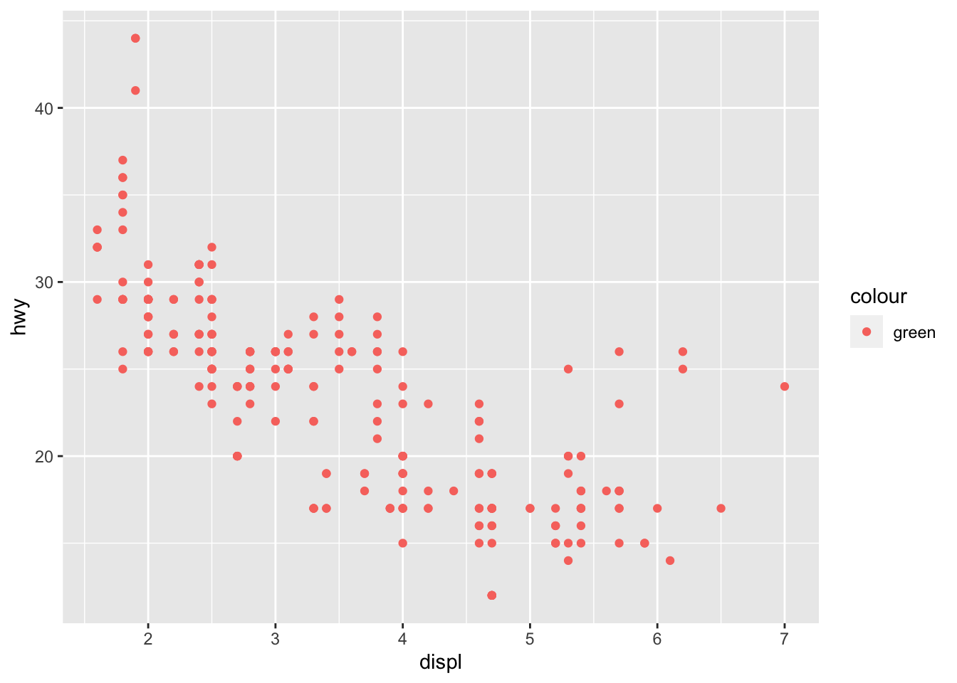
Map a continuous variable to color, size, and shape. What happens? How do these aesthetics behave differently for categorical vs. continuous variables?
What happens if you map the same variable to multiple aesthetics?
What happens if you map an aesthetic to something other than a variable name, like aes(color = displ < 5)? Note, you’ll also need to specify x and y.
5.2.2 Facets
Another way we can add in additional variables rather than just using aesthetics is using facets. These are sub-plots that display different parts of the data, therefore each sub-plot plots a subset of the dataset using the facet_wrap() command:
ggplot(data = mpg) +
  geom_point(mapping = aes(x = displ, y = hwy)) +
  facet_wrap(~ class, nrow = 2)
You can also facet plots on the combination of two variables, where you use facet_grid() instead.
ggplot(data = mpg) +
  geom_point(mapping = aes(x = displ, y = hwy)) +
  facet_grid(drv ~ cyl)
5.2.2.1 Activity
Using the iris dataset, create a facet plot using “Species” to facet the plots (which other variables you use does not matter).
What happens if you facet on a continuous variable?
What does nrow do? Try changing it using either dataset.
Now try ncol, what does that do?
5.3 Lesson 3: More Advanced Data Visualization
There are a number of ways we can visualize the same variables. For instance, the two plots below, both contain the same x variable, the same y variable, and both describe the same data. However, each plot uses a different visual object to represent the data. In ggplot2 syntax, we say that they use different geoms, specifically plot A uses geom_point() as we used above, and plot B uses geom_smooth():
library('cowplot')
a <- ggplot(data = mpg) +
  geom_point(mapping = aes(x = displ, y = hwy))

b <- ggplot(data = mpg) +
  geom_smooth(mapping = aes(x = displ, y = hwy))


plot_grid(a, b, labels = c('A', 'B'))
## `geom_smooth()` using method = 'loess' and formula 'y ~ x' A geom is the geometrical object that a plot uses to represent data. People often describe plots by the type of geom that the plot uses. For example, bar charts use bar geoms: geom_bar(), line charts use line geoms: geom_line(), boxplots use boxplot geoms: geom_boxplot(), and so on. Scatterplots break the trend; they use the point geom. As we see above, you can use different geoms to plot the same data. The plot on the left uses the point geom, and the plot on the right uses the smooth geom, a smooth line fitted to the data.
As we looked at briefly above, we can change the aesthetics… Here geom_smooth() separates the cars into three lines based on their drv value. Here, 4 stands for four-wheel drive, f for front-wheel drive, and r for rear-wheel drive. Hence, there are 3 separate lines describing each drive type.
ggplot(data = mpg) +
  geom_smooth(mapping = aes(x = displ, y = hwy, linetype = drv))
## `geom_smooth()` using method = 'loess' and formula 'y ~ x'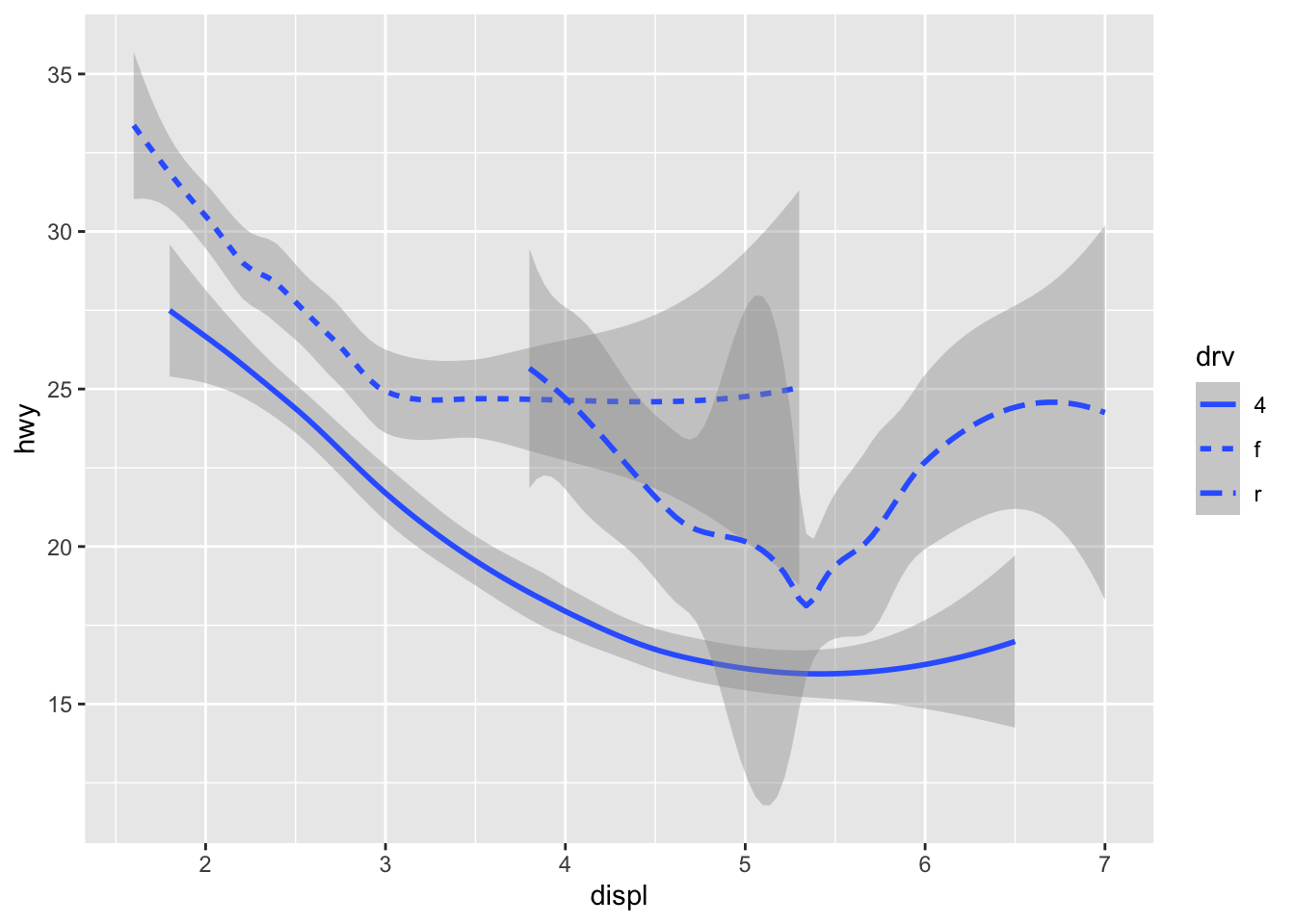 You can add color and actually plot the points, too, as this might make the relationships clearer:
ggplot(data = mpg) +
  geom_point(aes(displ, hwy, color=drv)) +
  geom_smooth(aes(displ, hwy, linetype = drv, color = drv))
## `geom_smooth()` using method = 'loess' and formula 'y ~ x'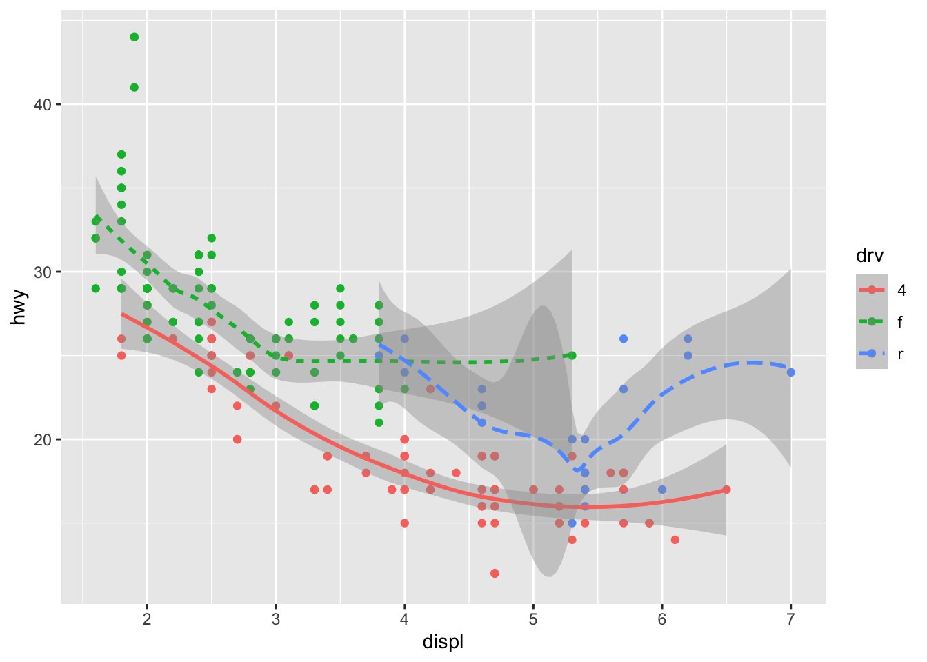 You can see in the previous code that you can build up a number of layers and mappings using color, linetypes, shapes, sizes… You can control whether you see the legend too, which is another line of code to remove this. However, think wisely as to whether this is a good idea or not.
ggplot(data = mpg) +
  geom_smooth(
    mapping = aes(x = displ, y = hwy, color = drv),
    show.legend = FALSE
  )
## `geom_smooth()` using method = 'loess' and formula 'y ~ x'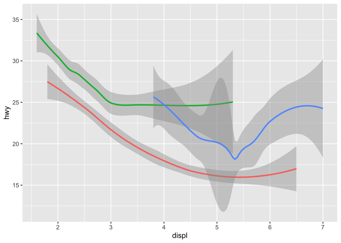 Do not forget you can label your axes better and also add titles…
ggplot(data = mpg) +
  geom_point(aes(displ, hwy, color=drv)) +
  geom_smooth(aes(displ, hwy, linetype = drv, color = drv)) +
  xlab("A nice x axes label") +
  ylab("Another nice label") +
  ggtitle("A very sensible title")
## `geom_smooth()` using method = 'loess' and formula 'y ~ x'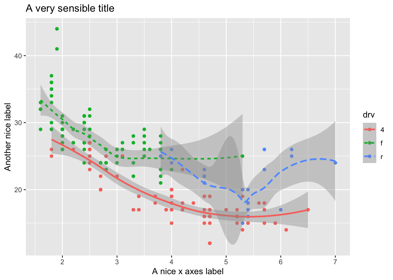
There are a lot of additional ways you can edit your plots, for example, using the ggthemes package, you have access to a number of additional overall aesthetics on your plots… for example:
library('ggthemes')##
## Attaching package: 'ggthemes'## The following object is masked from 'package:cowplot':
##
## theme_map#here we are changing the last line of code to try
#different themes that change the overall look (look up the package to see more)
a <- ggplot(data = mpg) +
geom_point(mapping = aes(x = displ, y = hwy)) +
theme_bw()
b <- ggplot(data = mpg) +
geom_point(mapping = aes(x = displ, y = hwy)) +
theme_fivethirtyeight()
c <- ggplot(data = mpg) +
geom_point(mapping = aes(x = displ, y = hwy)) +
theme_gray()
d <- ggplot(data = mpg) +
geom_point(mapping = aes(x = displ, y = hwy)) +
theme_economist()
e <- ggplot(data = mpg) +
geom_point(mapping = aes(x = displ, y = hwy)) +
theme_solarized_2()
f <- ggplot(data = mpg) +
geom_point(mapping = aes(x = displ, y = hwy)) +
theme_foundation()
plot_grid(a,b,c,d,e,f)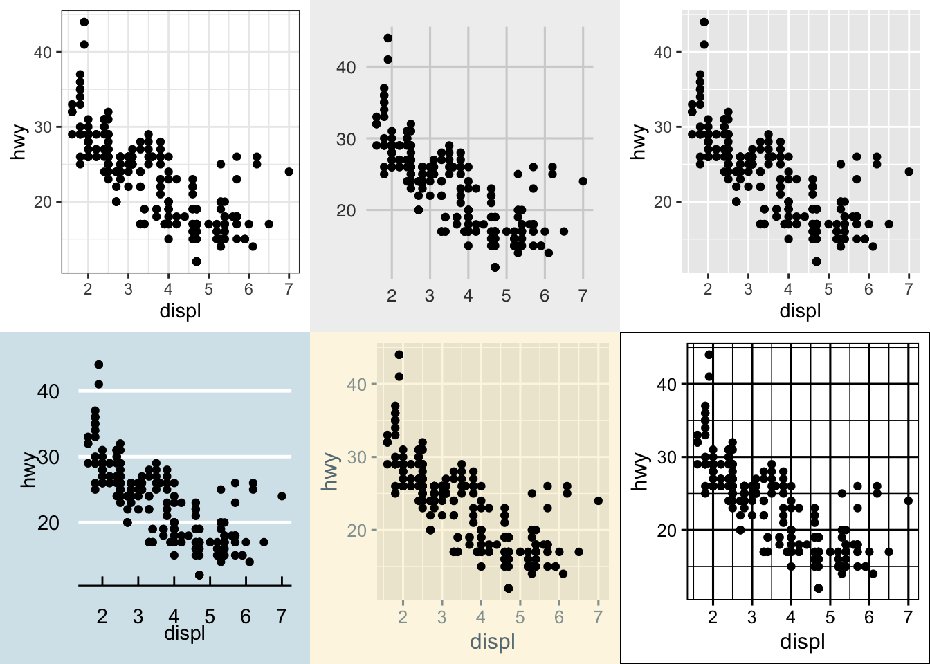
5.3.0.1 Activity
What geom would you use to draw a line chart? A boxplot? A histogram? An area chart? Try each of these using the iris or mpg dataset.
What does the se argument to geom_smooth() do? Try changing it and see what happens.
Recreate the following plots:
## `geom_smooth()` using method = 'loess' and formula 'y ~ x'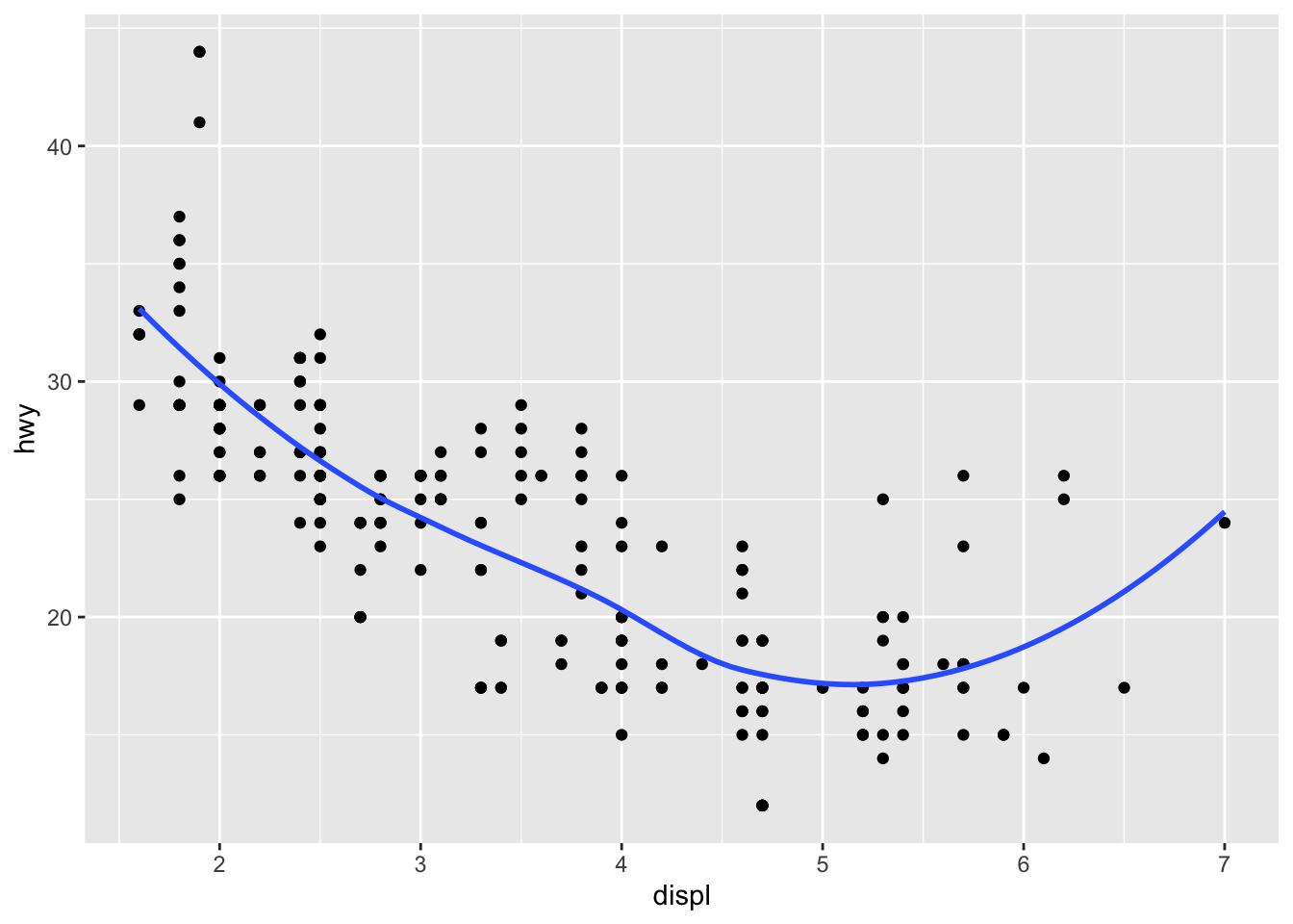
## `geom_smooth()` using method = 'loess' and formula 'y ~ x'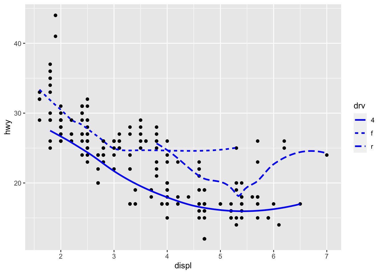
## Warning: Using size for a discrete variable is not advised.## `geom_smooth()` using method = 'loess' and formula 'y ~ x'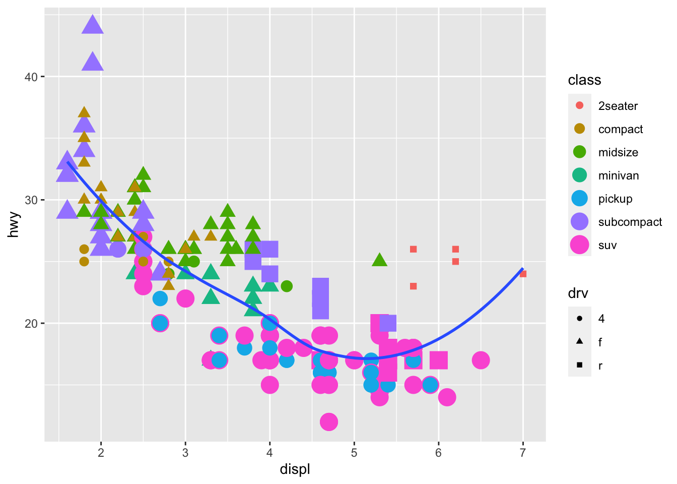
5.3.1 Bar Plots
While bar plots in theory appear to be a simple kind of plot, they can actually become quite complex to plot how you want them. Lets look at the diamonds dataset and look at cut. gpglot is clever in that it will use count here, despite it is not in the dataset itself.
ggplot(data = diamonds) +
  geom_bar(mapping = aes(x = cut))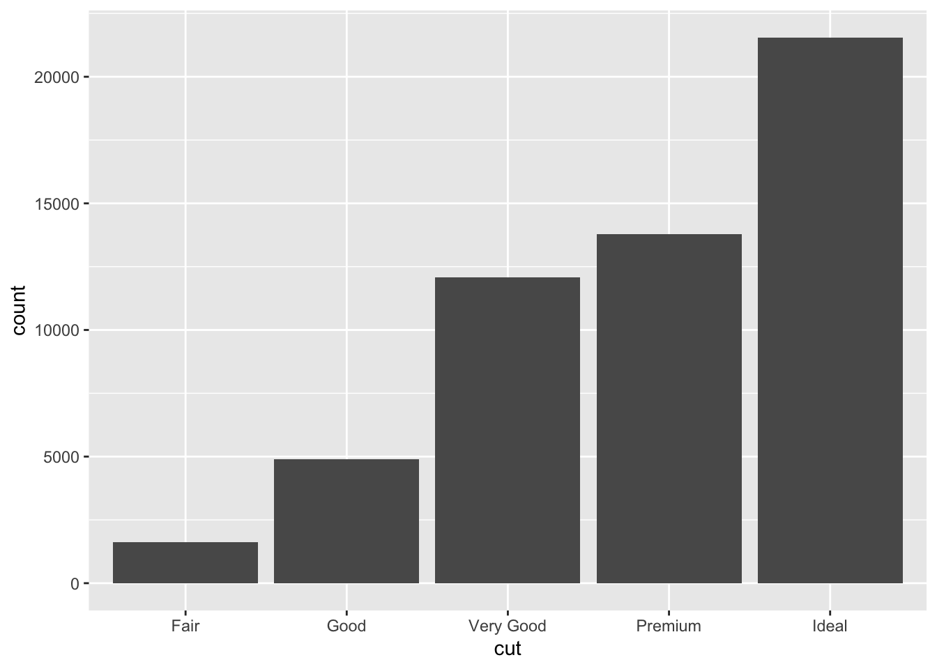
This is not the only type of plot that will create it’s own variables in orer to plot…While many graphs, like scatterplots, plot the raw values of your dataset… other graphs, like bar charts, calculate new values to plot:
bar charts, histograms, and frequency polygons bin your data and then plot bin counts, the number of points that fall in each bin.
smoothers fit a model to your data and then plot predictions from the model.
boxplots compute a robust summary of the distribution and then display a specially formatted box.
For geom_bar(), the default behavior is to count the rows for each x value. It doesn’t expect a y-value, since it’s going to count itself – in fact, it will flag a warning if you give it one, since it thinks you’re confused. How aggregation is to be performed is specified as an argument to geom_bar(), which is stat = “count” for the default value. Hence, if you explicitly say stat = “identity” in geom_bar(), you’re telling ggplot2 to skip the aggregation and that you’ll provide the y values. This mirrors the natural behavior of geom_col(), which is a very similar geom_object, see below for the example:
#notice the additional line to rotate axis labels as they overlapped.

a <- ggplot(mpg) +
  geom_bar(aes(x = class, y = hwy), stat = "identity") +
  theme(axis.text.x = element_text(angle = 45, vjust = 0.5, hjust=1))

b<- ggplot(mpg) +
  geom_col(aes(x = class, y = hwy)) +
  theme(axis.text.x = element_text(angle = 45, vjust = 0.5, hjust=1))

plot_grid(a,b, labels = c("geom_bar", "geom_col"))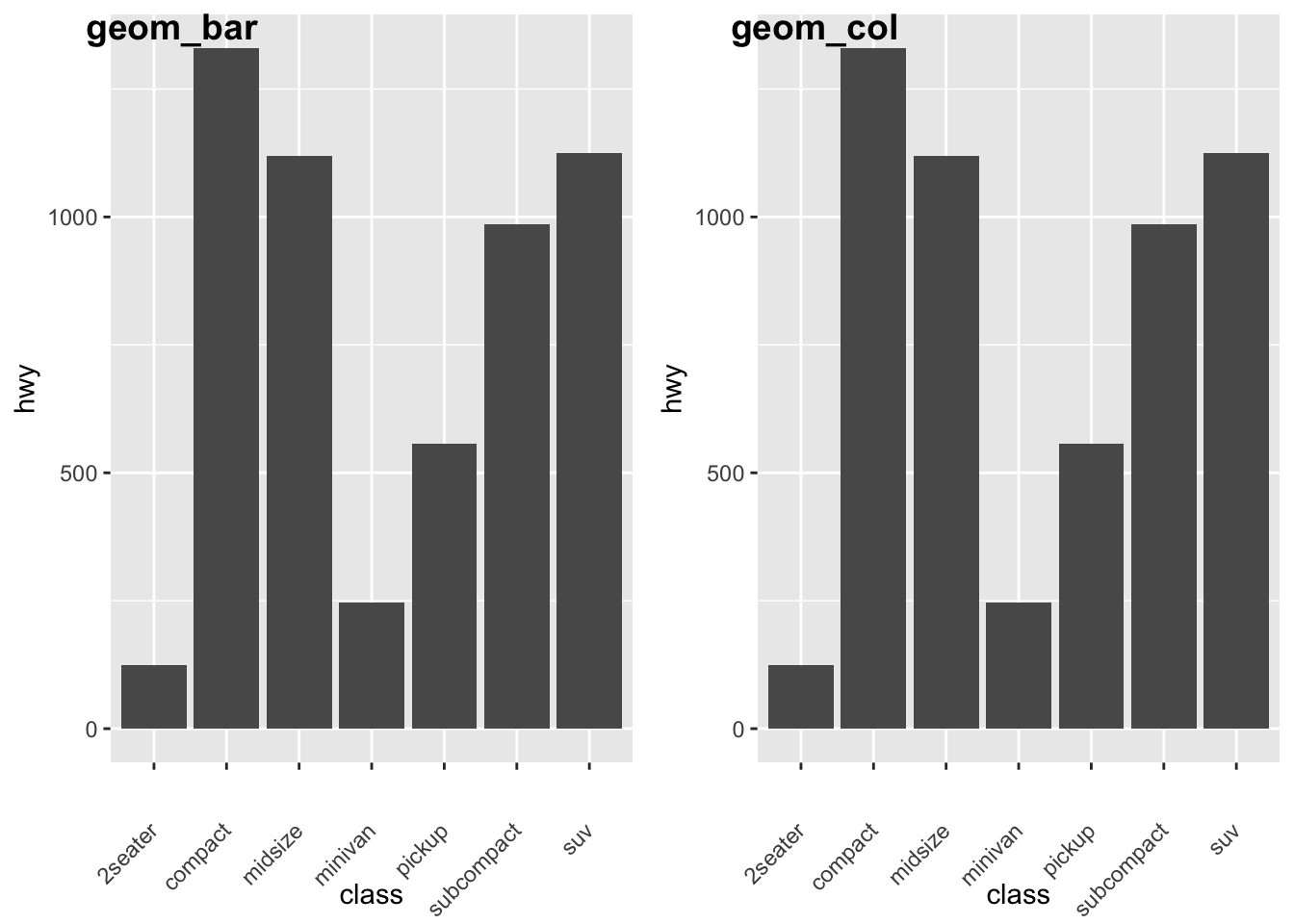
Let’s look some more at how we can display more information. Remember earlier we looked at the difference between fill and color? Let’s look again here to show how these color arguments effect var plots:
a<- ggplot(data = diamonds) +
  geom_bar(mapping = aes(x = cut, colour = cut))+
  theme(axis.text.x = element_text(angle = 45, vjust = 0.5, hjust=1))

b<- ggplot(data = diamonds) +
  geom_bar(mapping = aes(x = cut, fill = cut))+
  theme(axis.text.x = element_text(angle = 45, vjust = 0.5, hjust=1))

plot_grid(a,b, labels = c("color", "fill"))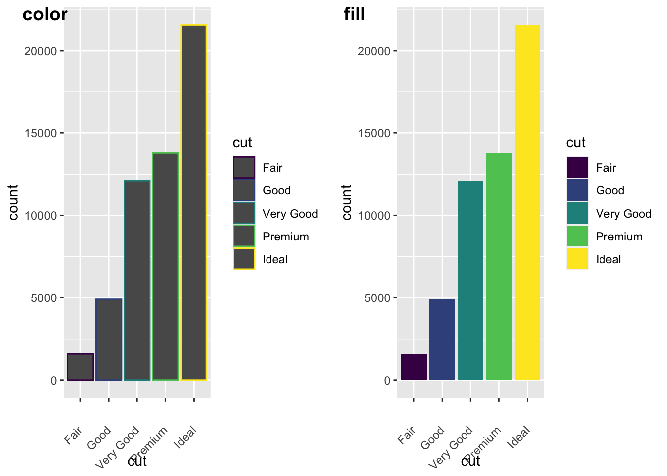
We can also add grouping variables, too… and these can be displayed differently (e.g., identity, dodge, or fill). Essentially, dodge is a grouping effect around a specific variable, and here it is cut; essentially it places overlapping objects directly beside one another. This makes it easier to compare individual values. Whereas, fill will give you a % barplot; and works like stacking, but makes each set of stacked bars the same height. This makes it easier to compare proportions across groups.
#lets look at the different positions...

a<-ggplot(data = diamonds, mapping = aes(x = cut, fill = clarity)) +
  geom_bar(position = "dodge")+
  theme(axis.text.x = element_text(angle = 45, vjust = 0.5, hjust=1))


b<- ggplot(data = diamonds, mapping = aes(x = cut, fill = clarity)) +
  geom_bar(position = "fill")+
  theme(axis.text.x = element_text(angle = 45, vjust = 0.5, hjust=1))


c<- ggplot(data = diamonds, mapping = aes(x = cut, fill = clarity)) +
  geom_bar(position = "identity")+
  theme(axis.text.x = element_text(angle = 45, vjust = 0.5, hjust=1))

plot_grid(a,b,c, labels = c("dogde", "fill", 'identity'))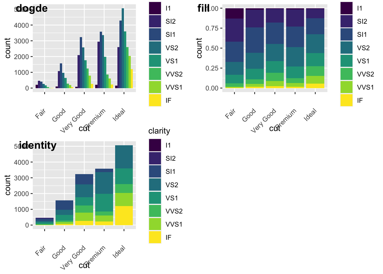
5.3.1.1 Activity
Go to this [website] (https://datavizcatalogue.com/search.html) and read up about different types of data visualization.
Spend at least 60 minutes experimenting with various types of data visualizations in R and use any of the datasets, iris, mpg, diamonds, or nycflights.