Chapter 5 Data Visualization
5.1 An introduction and very brief history
Data visualization is the graphical representation of information and data. By using visual elements like charts, graphs and maps, data visualization tools provide an accessible way to see and understand trends, outliers, or patterns in data. Data visualization is an incredibly powerful tool and one that it worth learning about. Sometimes this can be trail and error to see what type of visual works best with data, however, there are some excellent ‘rules of thumb’, that we will look into. In the world of big data, data visualization tools and technologies are even more essential for analyzing various types of data, information, and formulating insights from them.
The history of data visualization can be argued to be the history of many millennia, this often consisted of start constellations, maps for navigation—where the Egyptians were using early coordinates to pay out towns, earthly and heavenly positions as early as 200 B.C. (Friendly, 2008). Other early quantitative imagery were time-series graphs of the most prominent heavenly bodies, aka planetary movements – and these plots also captured the cyclic inclinations, too (Funkhouser, 1936, p 261; Friendly, 2008):
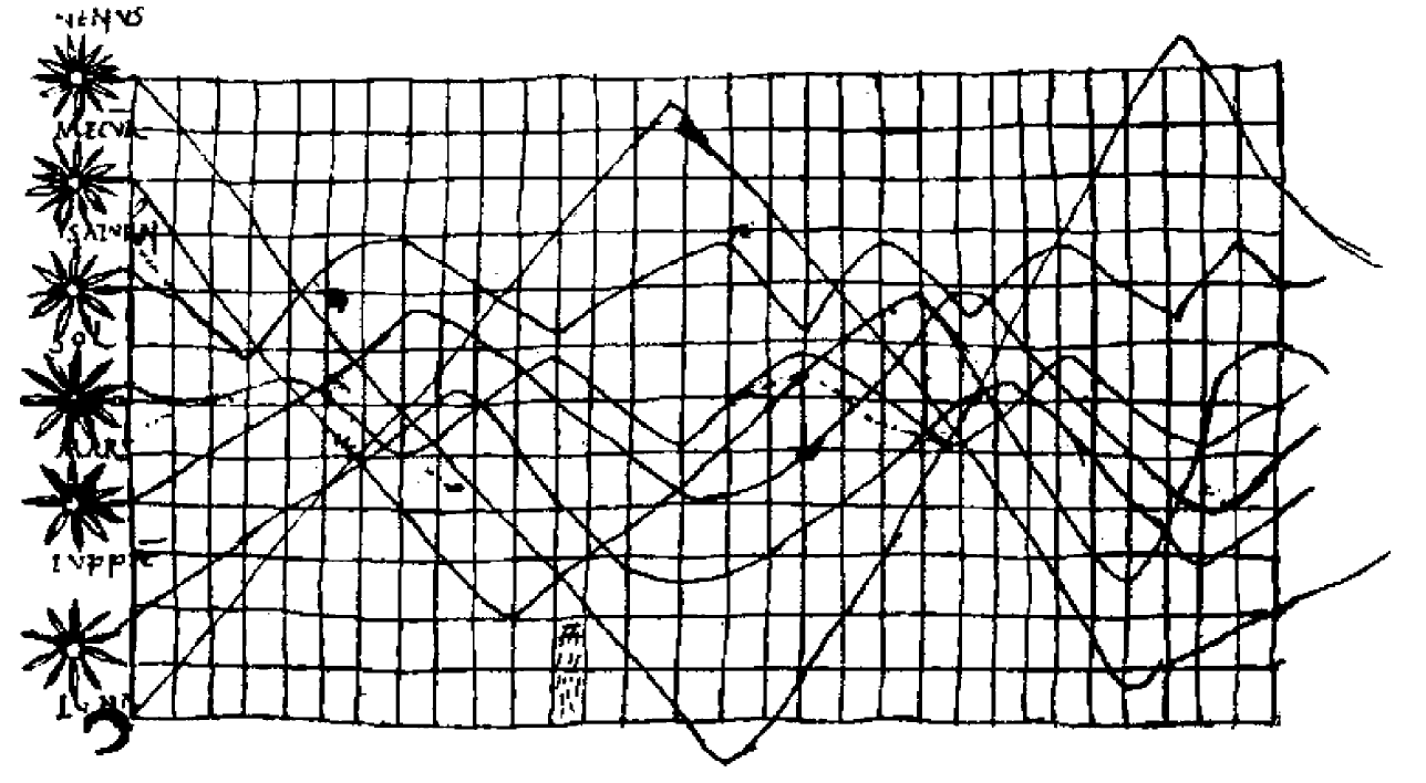
Figure 4. Time Series Plot of the Prominent Heavenly Bodies (Funkhouser, 1936; Friendly, 2008)
In other kinds of visualization, some of the earliest artwork of hands drawn by humans even as early as 40,000 years ago. It was not until the 14th Century that the concept of ‘plotting’ came into fruition, where the link between tabulate data and the ability to visualize this as a graphical plot appeared by Nicole Oresme (1323-1382). Please read more about this [here] (https://link.springer.com/chapter/10.1007/978-3-540-33037-0_2). Similarly, we can look at the 17th Cent, where there was greater interest in physical measurement, including astronomy (above), but also maps and navigation – geometry and coordinate systems, theories of measurement, probability, and the beginnings of statistics (Friendly, 2008).
<<BID – come back and expand this>>
Briefly, it is important to remember that data visualization is far more than simply visualizing numbers. For instance, we can visualize ‘artistic data’, such as da Vinci’s famous work spanning both art and science is arguably another highly influential example of data visualization. For instance, da Vinci’s masterfully depicted human and animal bodies, demonstrating great detail and annotation to visualize biological structures from skeletal to muscular, which are incredibly beautiful piece of art, but also science. There is a great creative side to data visualization, so when going through this chapter – experiment!
5.2 What makes a good graphic?
Well, it’s complicated. We see graphics and imagery everywhere, in scientific publications, newspapers, performance reports, maps, among so much more. We have all come across the saying ‘A photo is worth a thousand words’, and this in itself is an interesting concept – images and graphics will always have some subjective elements – whether that is perferences on color, font, side, presentation, captions… whether the image conveys the information intended – which ironically, can be the hardest part. From some experience, if there is one bit of information I’d like you to take from this chaper, it would be this:
SHOW OTHERS YOUR PLOTS AND SENSE-CHECK THEY UNDERSTAND WHAT YOU ARE TRYING TO CONVEY.
Why? Well, often when you get to a phase of data visualization for a report or publication, you know your data pretty well and you might take for granted your pre-acquired knowledge that others might not have. It is important to take a step back and notice this and get feedback, and have many options – there are often several ways to present the same information, so do not shy away from trying and experimenting.
Lets consider we had the following dataframe:
#create a df with columns
example_data = tibble(id = c('A', 'B', 'C', 'D', 'E', 'F'), num = c(115, 80, 261, 47, 141, 151))

#have a look
print(example_data)
## # A tibble: 6 × 2
## id num
## <chr> <dbl>
## 1 A 115
## 2 B 80
## 3 C 261
## 4 D 47
## 5 E 141
## 6 F 151So, what can we do here? Well, a lot of things, we have a simple categorical variable A to F, and a numeric variable with a range of 47 to 261. We could look at this as a bar plot, mosaic plot, line graph… pie chart…for the sake of ease, just using excel for the sake of ease and demonstration of a few concepts, we can create all of these in moments:
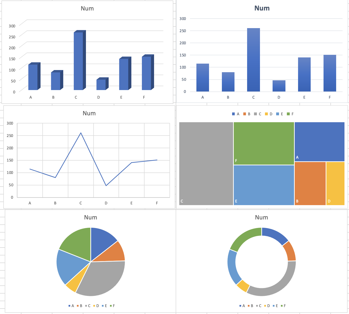
Figure 5. Multiple ways to plot the same data
Lets look at these… beyond the questionable font and text size for starters, let’s take a closer look at these 6 plots. Looking at the top LHS, we have a 3D plot… is the 3D element adding anything? The realistic answer here is no, as we are not conveying anything on the z-axis (however, this can be useful and we’ll look at some examples later of relative coordinates using x, y, and z coordinates and plotting them). Therefore, let’s scrap that. Top RHS – well, in comparison, this in general is perhaps better as it is clearer at conveying relative counts of ‘Num’ and there are no complicating factors such as being 3D that may confuse the information being conveyed. The middle LHS plot is using a simple line graph – depending on our data and the meaning of it, this may be useful. Here, it depends whether we want to show a trend and does it make sense to given the x-axis are categories? The middle RHS is whats known as a mosaic plot, which aims to display relative size with color for different categories. This could be appropriate here as a simple way to navigate which categories are the biggest or smallest in a colorful manner. The bottom LHS and RHS are both types of pie charts, which have very mixed usage and are often vaguely frowned upon. It is important to note that these charts end up using percentages of the total, too – and this can be useful but again, it is best to think whether this is the best way to convey these data. Is ‘Num’ meant to be totalled? Does it make sense to show these categories like this?
5.2.1 The ggplot way
In earlier modules, you’ve had some interactions with data visualization, so this will be a recap for the most part in R using ggplot2.
Let’s focus on the mpg dataset, and we will just start with a simple plot:
ggplot(data = mpg) +
  geom_point(mapping = aes(x = displ, y = hwy))
Here, as with all ggplots – we follow the usual template, of calling data, and then stating which type of plot (e.g., point, bar, smooth), and defining the aesthetics (x, y, and grouping variables, potentially color and shape types).
The same plot above can be coded differently, too. This is a short hand version, but also we are defining the aesthetics in the overall plot call rather than specifically in the geom_point(). There are reasons why you might do one over the other, for instance, if you are doing highly complex plots with multiple layers, the first method of defining aesthetics in each plot layer (e.g., geom_point()) is more sensible.
ggplot(mpg, aes(displ, hwy)) +
  geom_point()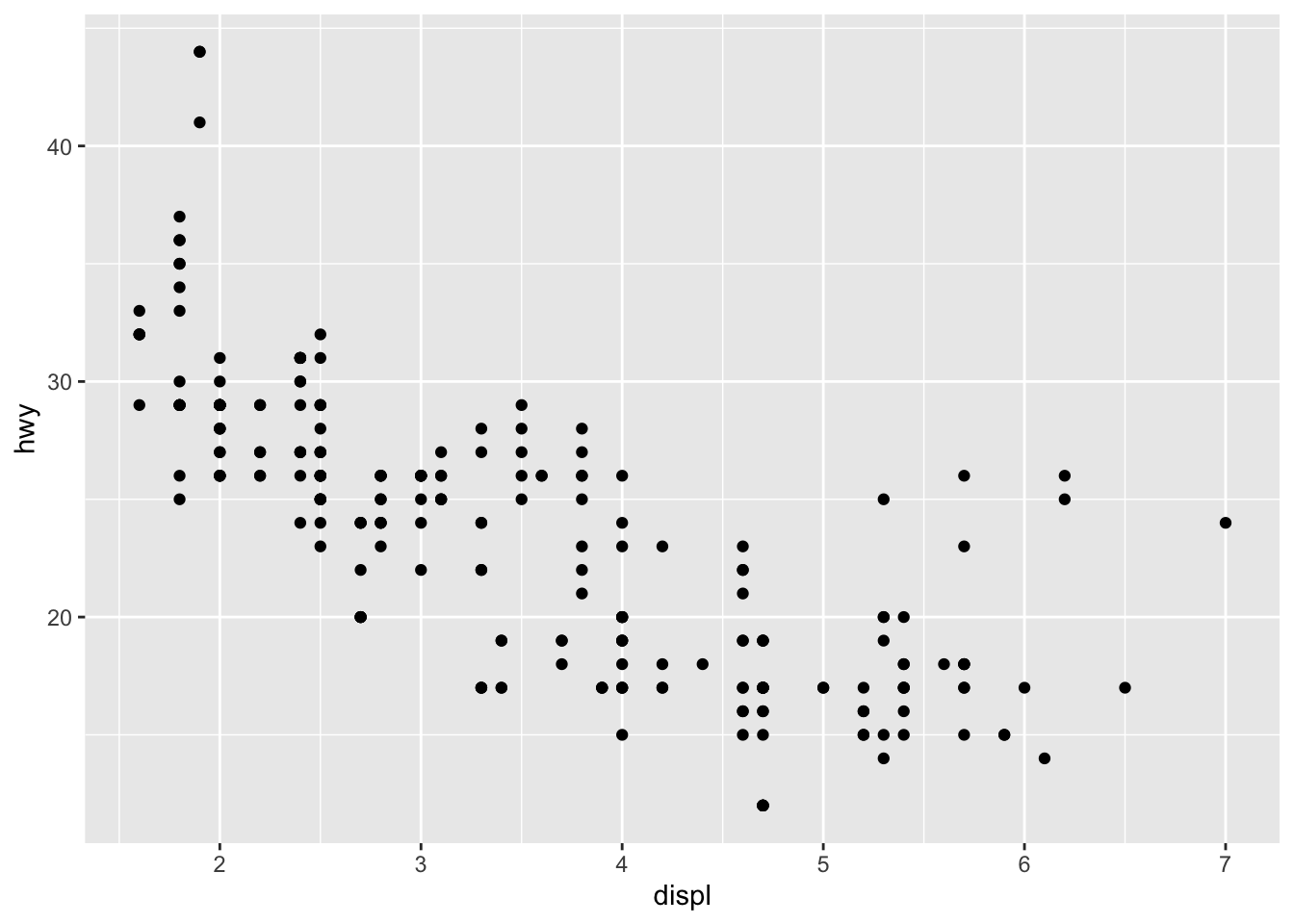
We can add more information into this plot by coloring the points by a categorical variable, like class.
ggplot(data = mpg) +
geom_point(mapping = aes(x = displ, y = hwy, color = class))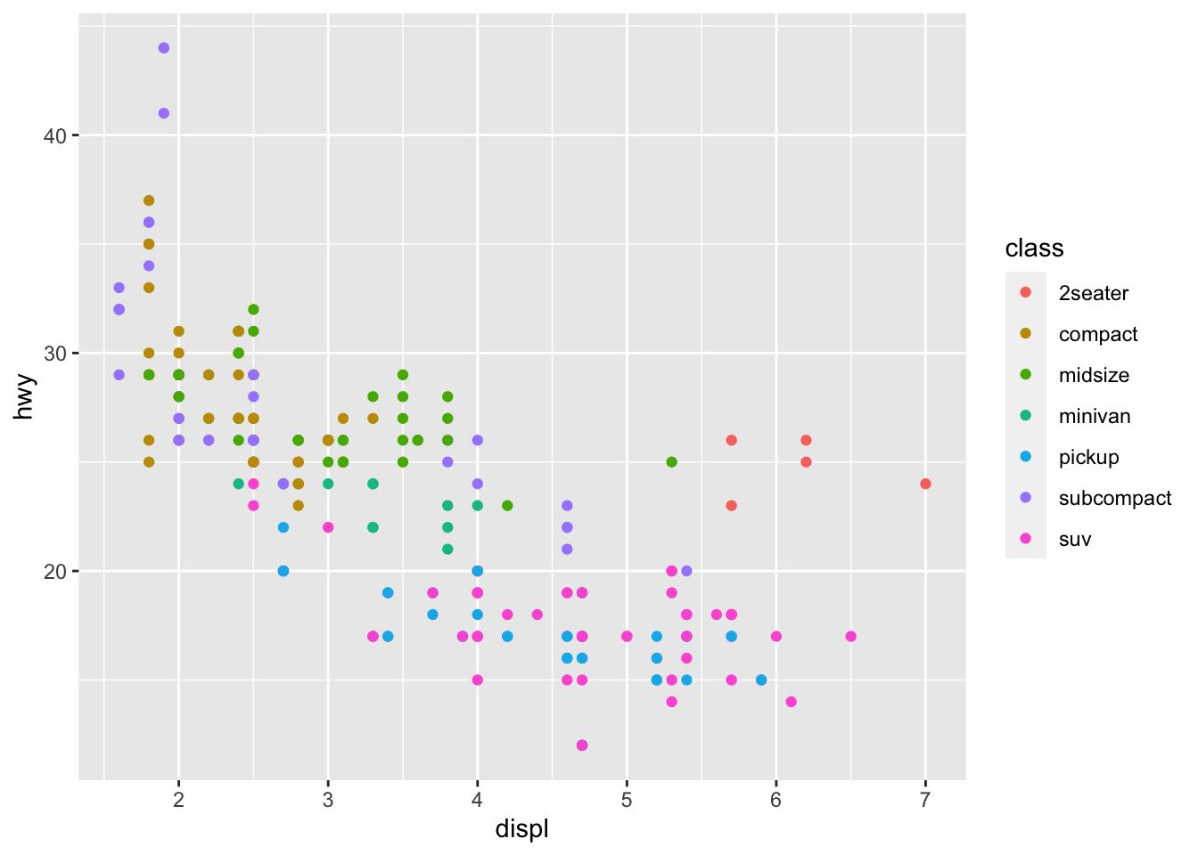 There is a lot we can continue to edit, where we might want the size of the circles to change according to number of cyliners…
ggplot(data = mpg) +
geom_point(mapping = aes(x = displ, y = hwy, size = cyl))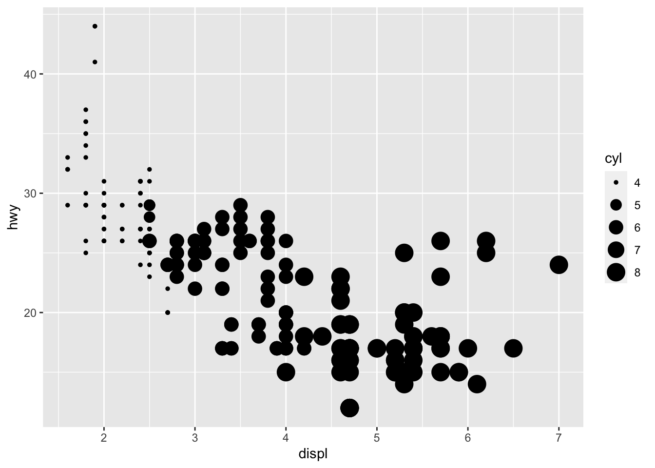 You can force size to use unordered variables like class, but this is not a great idea as you should want the size of bubbles to be meaningful and to not cause confusion.
We could also use the alpha aesthetic, which increases transparency, which is especially useful when we have a lot of points and it is difficult to distinguish and see density. Simialrly, we can use different shapes, too. However, please be careful when using shapes, as sometimes ggplot has limits of 6, where the additional groups are unplotted (here thats suv).
#looking at alpha and transparency
ggplot(data = mpg) +
  geom_point(mapping = aes(x = displ, y = hwy, alpha = class))
## Warning: Using alpha for a discrete variable is not advised.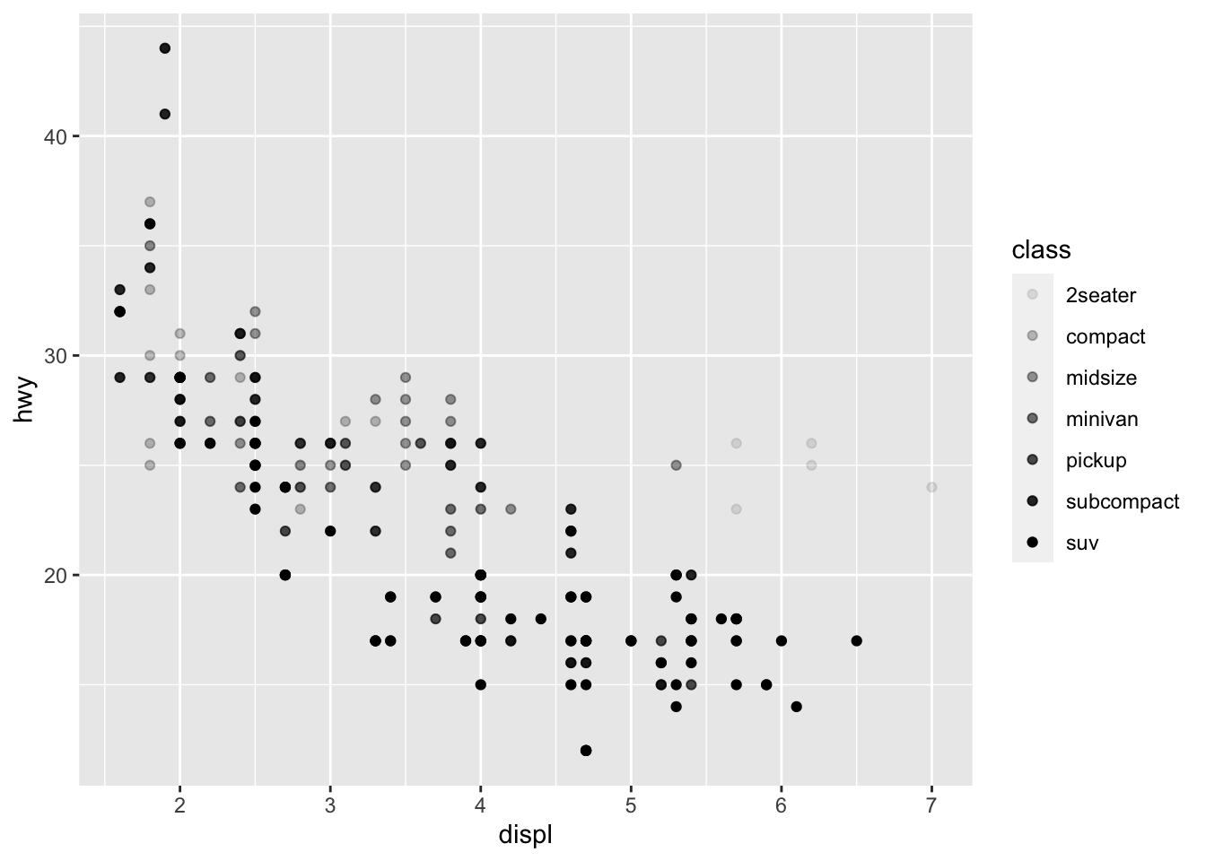
#looking at different shapes
ggplot(data = mpg) +
  geom_point(mapping = aes(x = displ, y = hwy, shape = class))
## Warning: The shape palette can deal with a maximum of 6 discrete values because more than 6 becomes difficult to discriminate; you have 7.
## Consider specifying shapes manually if you must have them.## Warning: Removed 62 rows containing missing values (geom_point).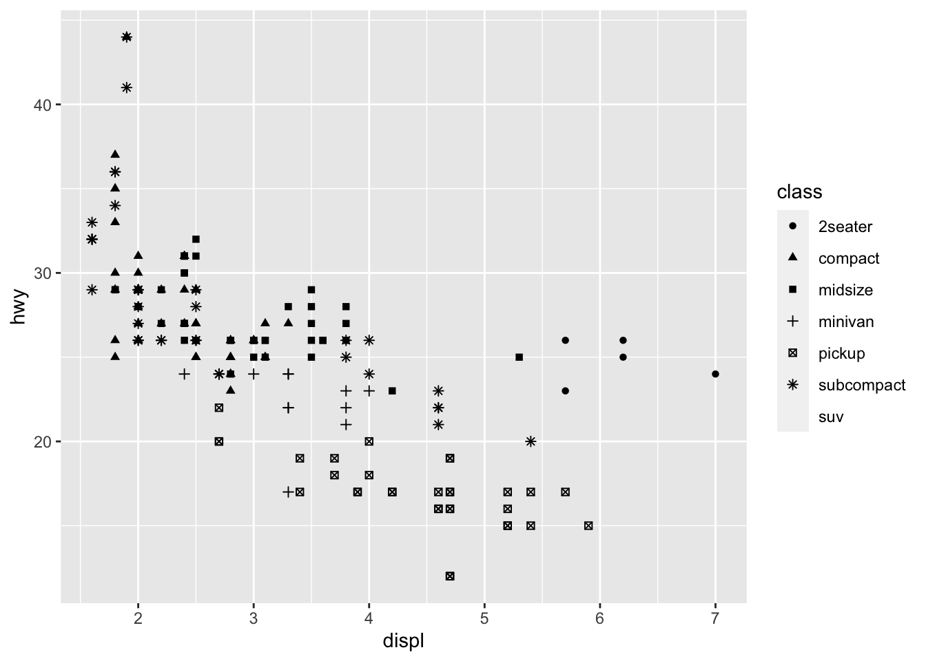 You can easily edit and adapt your plots in terms of color, too, which is very simple, but remember brackets are extremely important here. When you are defining the aesthetic arguments, aka defining which variables are used where and how remain in bracket. Anything you manually change typically goes outside of the aes()
bracket… this includes color (string), size of points (in mm), and shapes. See here for colors, linetypes, and shape choices in [ggplot2] (http://sape.inf.usi.ch/quick-reference/ggplot2/colour)
You can easily edit and adapt your plots in terms of color, too, which is very simple, but remember brackets are extremely important here. When you are defining the aesthetic arguments, aka defining which variables are used where and how remain in bracket. Anything you manually change typically goes outside of the aes()
bracket… this includes color (string), size of points (in mm), and shapes. See here for colors, linetypes, and shape choices in [ggplot2] (http://sape.inf.usi.ch/quick-reference/ggplot2/colour)
ggplot(data = mpg) +
geom_point(mapping = aes(x = displ, y = hwy), color = "darkorchid3")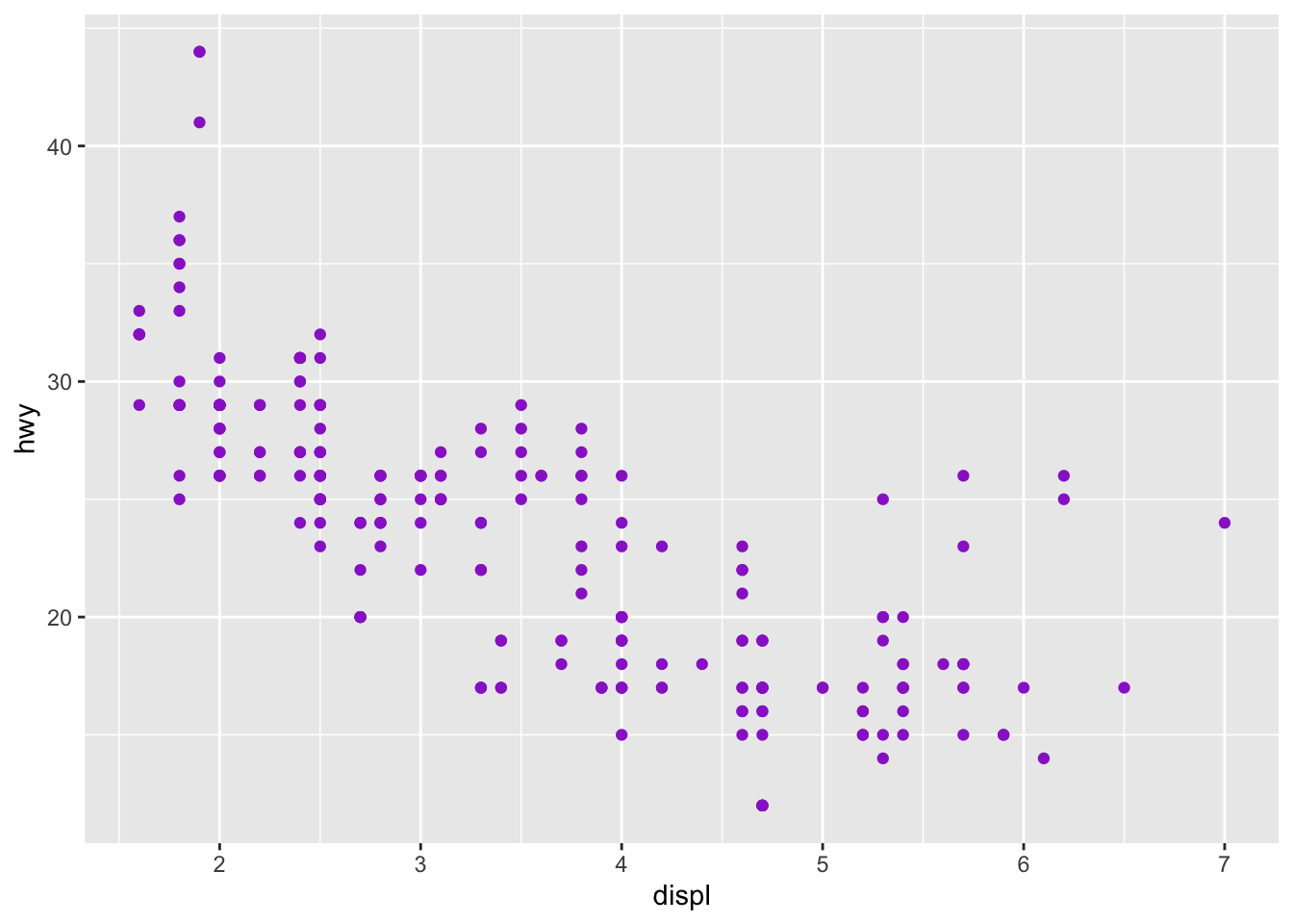 Note: when using color, note when you need to use color = ‘red’ and fill = ‘red’. Certain shapes that are ‘hollow’ need to be filled and if you use color it will just change the color of the outline. For example, R has 25 built in shapes that are identified by numbers (see http://sape.inf.usi.ch/quick-reference/ggplot2/shape). Some may look like duplicates: for example, 0, 15, and 22 are all squares. The difference comes from the interaction of the color and fill aesthetics. The hollow shapes (0–14) have a border determined by colour; the solid shapes (15–20) are filled with color; the filled shapes (21–24) have a border of color and are filled with fill.
5.2.2 Facets
Another way we can add in additional variables rather than just using aesthetics is using facets. These are sub-plots that display different parts of the data, therefore each sub-plot plots a subset of the dataset using the facet_wrap() command:
ggplot(data = mpg) +
geom_point(mapping = aes(x = displ, y = hwy)) +
facet_wrap(~ class, nrow = 2)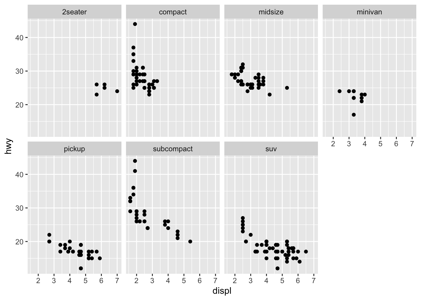 You can also facet plots on the combination of two variables, where you use facet_grid() instead.
ggplot(data = mpg) +
  geom_point(mapping = aes(x = displ, y = hwy)) +
  facet_grid(drv ~ cyl)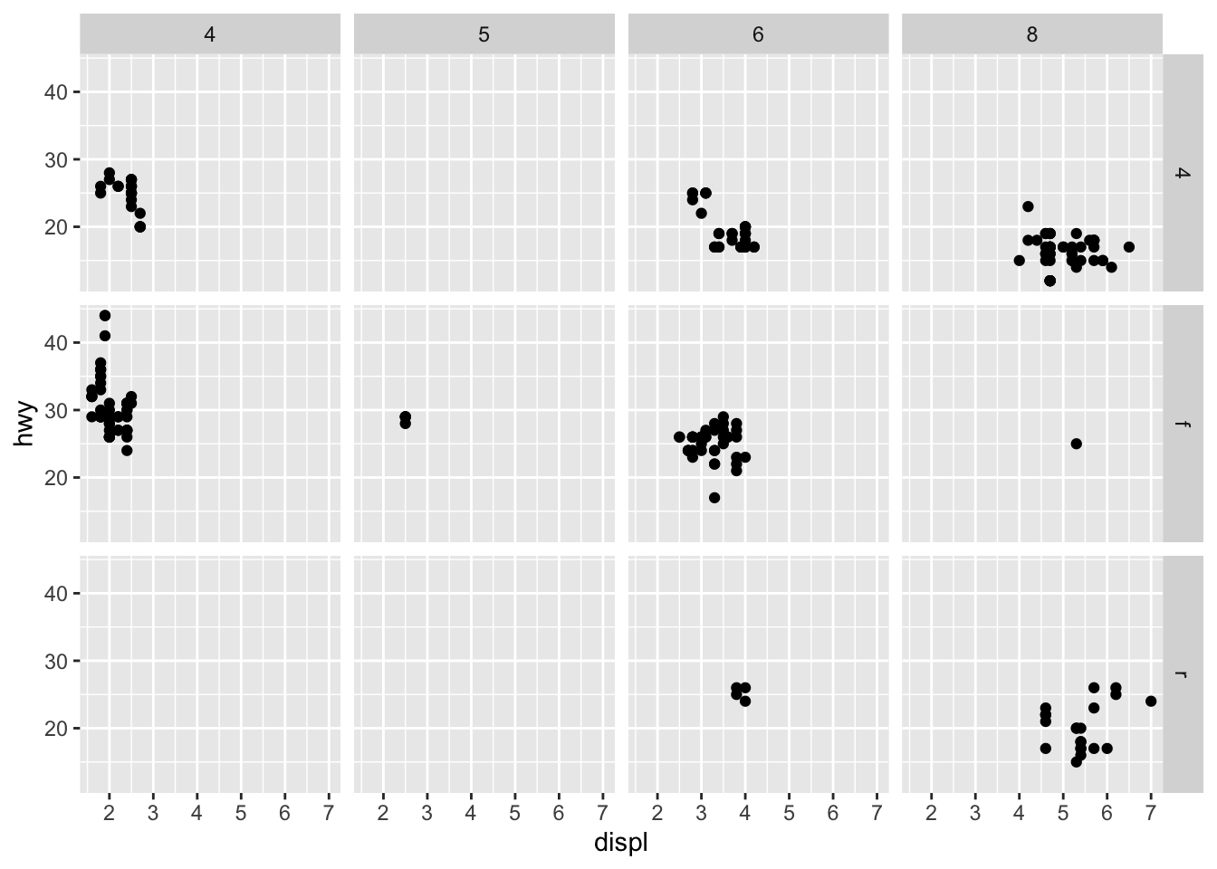
5.3 More Advanced Data Visualization
There are a number of ways we can visualize the same variables. For instance, the two plots below, both contain the same x variable, the same y variable, and both describe the same data. However, each plot uses a different visual object to represent the data. In ggplot2 syntax, we say that they use different geoms, specifically plot A uses geom_point() as we used above, and plot B uses geom_smooth():
library('cowplot')
a <- ggplot(data = mpg) +
  geom_point(mapping = aes(x = displ, y = hwy))

b <- ggplot(data = mpg) +
  geom_smooth(mapping = aes(x = displ, y = hwy))


plot_grid(a, b, labels = c('A', 'B'))
## `geom_smooth()` using method = 'loess' and formula 'y ~ x'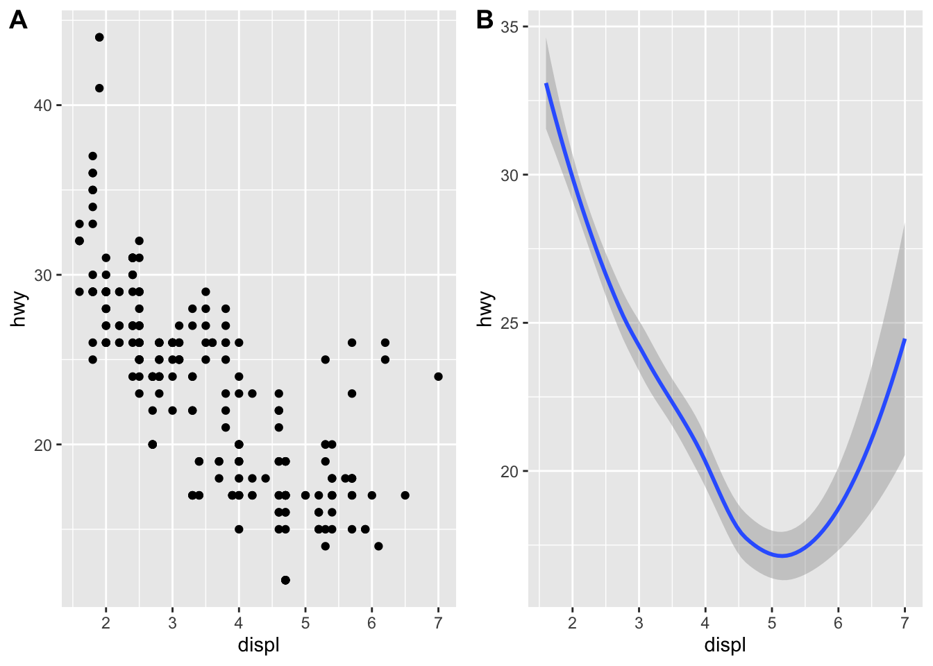 A geom is the geometrical object that a plot uses to represent data. People often describe plots by the type of geom that the plot uses. For example, bar charts use bar geoms:
 geom_bar(), line charts use line geoms: geom_line(), boxplots use boxplot geoms: geom_boxplot(), and so on. Scatterplots break the trend; they use the point geom. As we see above, you can use different geoms to plot the same data. The plot on the left uses the point geom, and the plot on the right uses the smooth geom, a smooth line fitted to the data.
As we looked at briefly above, we can change the aesthetics… Here geom_smooth() separates the cars into three lines based on their drv value. Here, 4 stands for four-wheel drive, f for front-wheel drive, and r for rear-wheel drive. Hence, there are 3 separate lines describing each drive type.
ggplot(data = mpg) +
  geom_smooth(mapping = aes(x = displ, y = hwy, linetype = drv))
## `geom_smooth()` using method = 'loess' and formula 'y ~ x'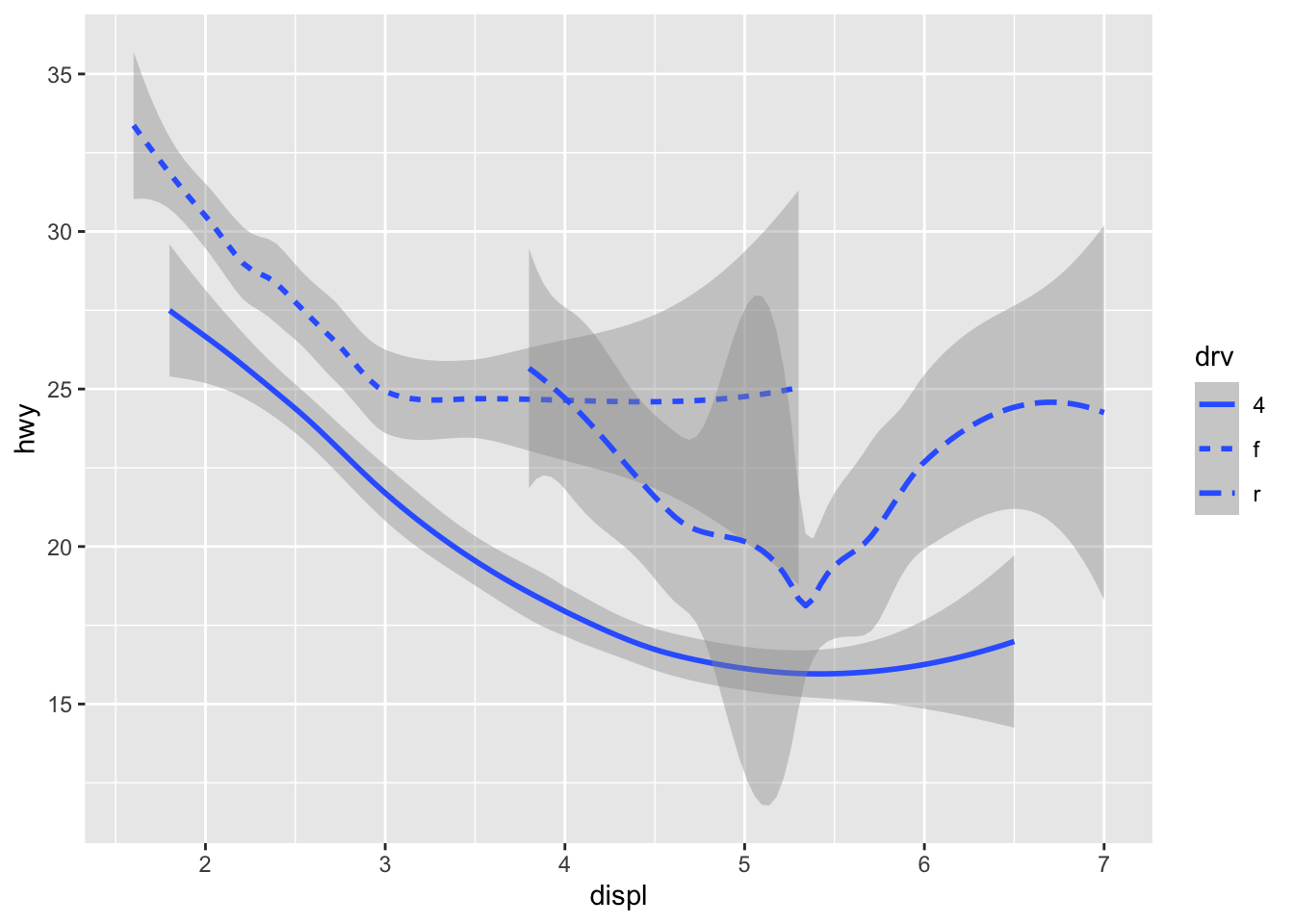 You can add color and actually plot the points, too, as this might make the relationships clearer:
ggplot(data = mpg) +
  geom_point(aes(displ, hwy, color=drv)) +
  geom_smooth(aes(displ, hwy, linetype = drv, color = drv))
## `geom_smooth()` using method = 'loess' and formula 'y ~ x'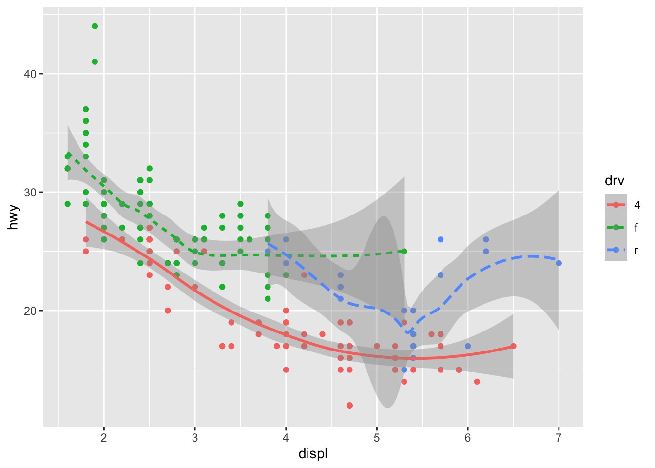 You can see in the previous code that you can build up a number of layers and mappings using color, linetypes, shapes, sizes… You can control whether you see the legend too, which is another line of code to remove this. However, think wisely as to whether this is a good idea or not.
ggplot(data = mpg) +
  geom_smooth(
    mapping = aes(x = displ, y = hwy, color = drv),
    show.legend = FALSE
  )
## `geom_smooth()` using method = 'loess' and formula 'y ~ x'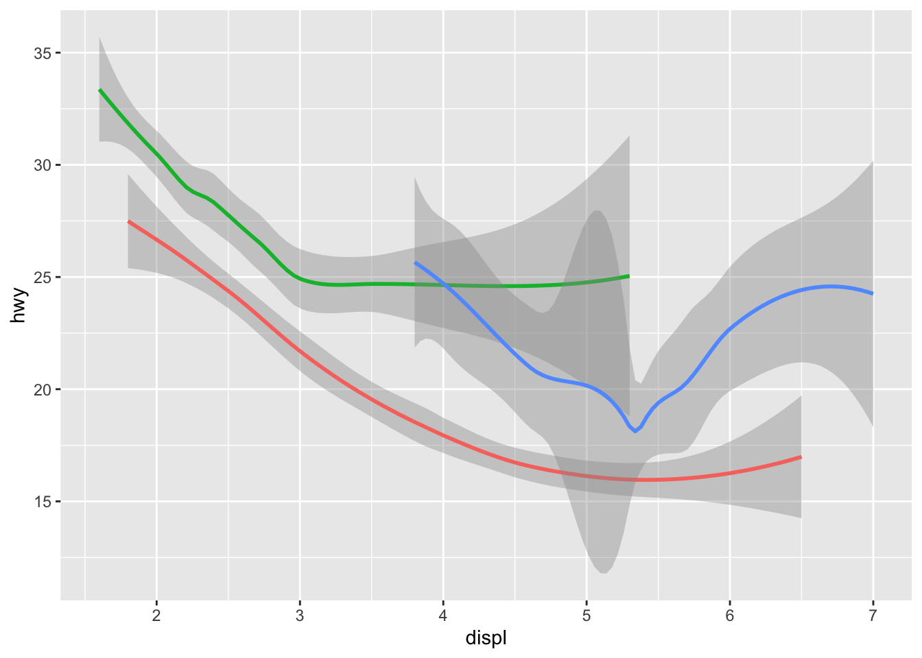 Do not forget you can label your axes better and also add titles…
ggplot(data = mpg) +
  geom_point(aes(displ, hwy, color=drv)) +
  geom_smooth(aes(displ, hwy, linetype = drv, color = drv)) +
  xlab("A nice x axes label") +
  ylab("Another nice label") +
  ggtitle("A very sensible title")
## `geom_smooth()` using method = 'loess' and formula 'y ~ x'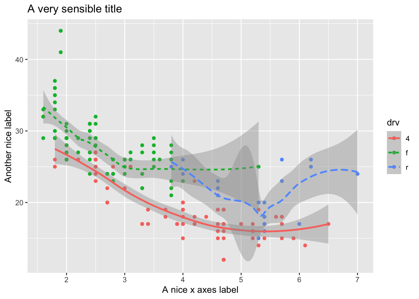
There are a lot of additional ways you can edit your plots, for example, using the ggthemes package, you have access to a number of additional overall aesthetics on your plots… for example:
library('ggthemes')
#here we are changing the last line of code to try
#different themes that change the overall look (look up the package to see more)
a <- ggplot(data = mpg) +
  geom_point(mapping = aes(x = displ, y = hwy)) +
  theme_bw()

b <- ggplot(data = mpg) +
  geom_point(mapping = aes(x = displ, y = hwy)) +
  theme_fivethirtyeight()

c <- ggplot(data = mpg) +
  geom_point(mapping = aes(x = displ, y = hwy)) +
  theme_gray()

d <- ggplot(data = mpg) +
  geom_point(mapping = aes(x = displ, y = hwy)) +
  theme_economist()

e <- ggplot(data = mpg) +
  geom_point(mapping = aes(x = displ, y = hwy)) +
  theme_solarized_2()

f <- ggplot(data = mpg) +
  geom_point(mapping = aes(x = displ, y = hwy)) +
  theme_foundation()

plot_grid(a,b,c,d,e,f)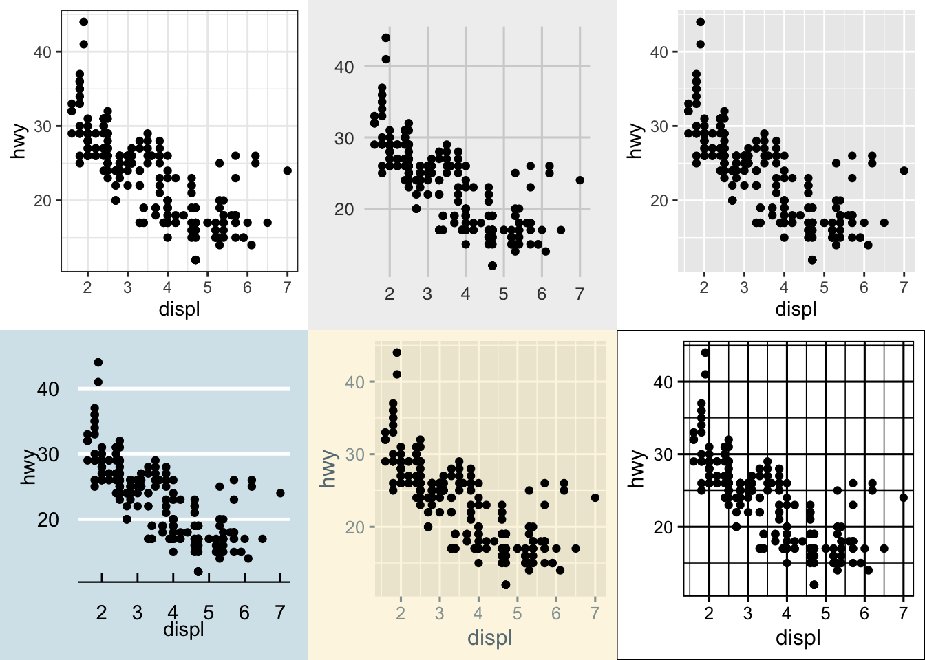
5.3.1 Bar Plots
While bar plots in theory appear to be a simple kind of plot, they can actually become quite complex to plot how you want them. Lets look at the diamonds dataset and look at cut. gpglot is clever in that it will use count here, despite it is not in the dataset itself.
ggplot(data = diamonds) +
  geom_bar(mapping = aes(x = cut))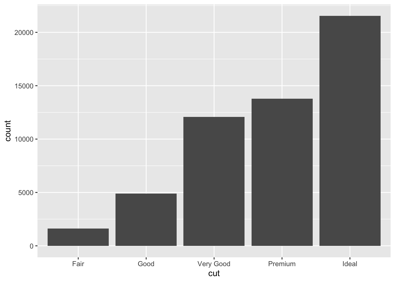
This is not the only type of plot that will create it’s own variables in orer to plot…While many graphs, like scatterplots, plot the raw values of your dataset… other graphs, like bar charts, calculate new values to plot:
bar charts, histograms, and frequency polygons bin your data and then plot bin counts, the number of points that fall in each bin.
smoothers fit a model to your data and then plot predictions from the model.
boxplots compute a robust summary of the distribution and then display a specially formatted box.
For geom_bar(), the default behavior is to count the rows for each x value. It doesn’t expect a y-value, since it’s going to count itself – in fact, it will flag a warning if you give it one, since it thinks you’re confused. How aggregation is to be performed is specified as an argument to geom_bar(), which is stat = “count” for the default value. Hence, if you explicitly say stat = “identity” in geom_bar(), you’re telling ggplot2 to skip the aggregation and that you’ll provide the y values. This mirrors the natural behavior of geom_col(), which is a very similar geom_object, see below for the example:
#notice the additional line to rotate axis labels as they overlapped.

a <- ggplot(mpg) +
  geom_bar(aes(x = class, y = hwy), stat = "identity") +
  theme(axis.text.x = element_text(angle = 45, vjust = 0.5, hjust=1))

b<- ggplot(mpg) +
  geom_col(aes(x = class, y = hwy)) +
  theme(axis.text.x = element_text(angle = 45, vjust = 0.5, hjust=1))

plot_grid(a,b, labels = c("geom_bar", "geom_col"))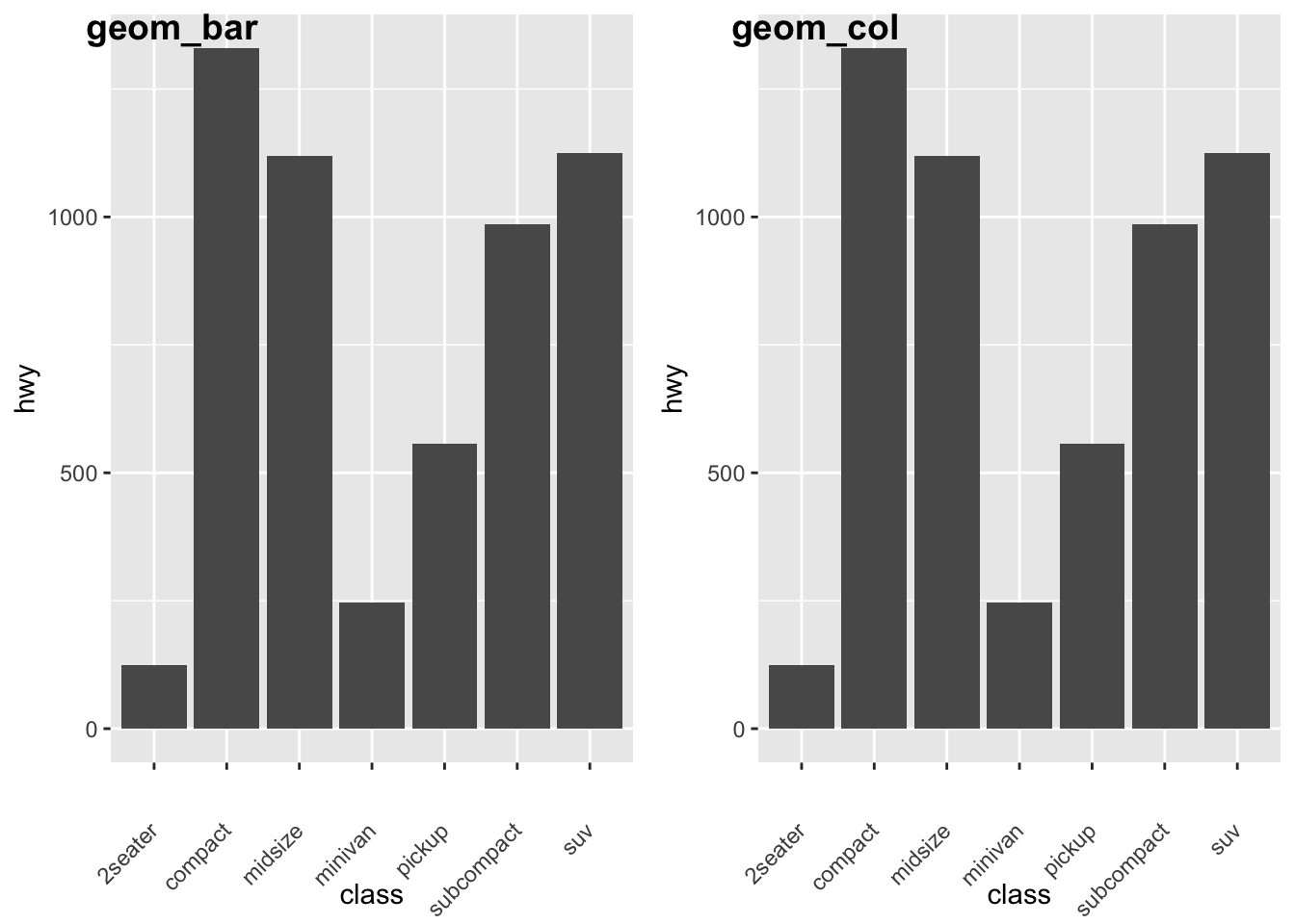
Let’s look some more at how we can display more information. Remember earlier we looked at the difference between fill and color? Let’s look again here to show how these color arguments effect var plots:
a<- ggplot(data = diamonds) +
  geom_bar(mapping = aes(x = cut, colour = cut))+
  theme(axis.text.x = element_text(angle = 45, vjust = 0.5, hjust=1))

b<- ggplot(data = diamonds) +
  geom_bar(mapping = aes(x = cut, fill = cut))+
  theme(axis.text.x = element_text(angle = 45, vjust = 0.5, hjust=1))

plot_grid(a,b, labels = c("color", "fill"))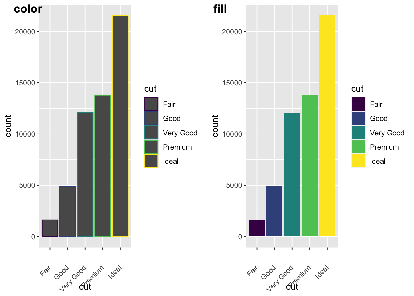
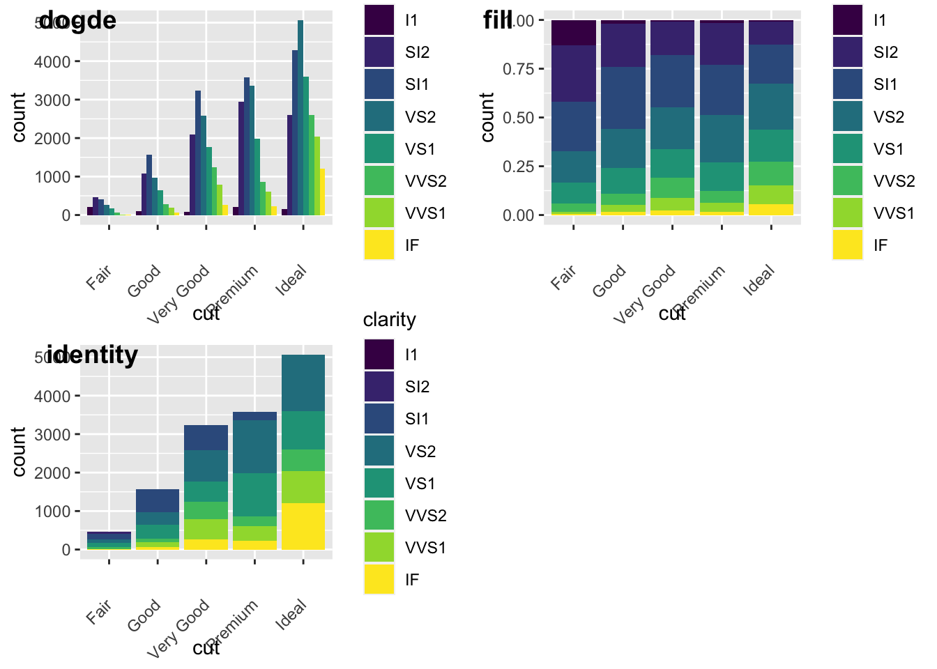
We can also add grouping variables, too… and these can be displayed differently (e.g., identity, dodge, or fill). Essentially, dodge is a grouping effect around a specific variable, and here it is cut; essentially it places overlapping objects directly beside one another. This makes it easier to compare individual values. Whereas, fill will give you a % barplot; and works like stacking, but makes each set of stacked bars the same height. This makes it easier to compare proportions across groups.
#lets look at the different positions...

a<-ggplot(data = diamonds, mapping = aes(x = cut, fill = clarity)) +
  geom_bar(position = "dodge")+
  theme(axis.text.x = element_text(angle = 45, vjust = 0.5, hjust=1))


b<- ggplot(data = diamonds, mapping = aes(x = cut, fill = clarity)) +
  geom_bar(position = "fill")+
  theme(axis.text.x = element_text(angle = 45, vjust = 0.5, hjust=1))


c<- ggplot(data = diamonds, mapping = aes(x = cut, fill = clarity)) +
  geom_bar(position = "identity")+
  theme(axis.text.x = element_text(angle = 45, vjust = 0.5, hjust=1))

plot_grid(a,b,c, labels = c("dogde", "fill", 'identity'))