Chapter 6 Cluster Analysis
6.1 Introduction to Cluster Analysis
Drawn from the textbook, Chapter 10.1: Cluster analysis or simply clustering is the process of partitioning a set of data objects (or observations) into subsets. Each subset is a cluster, such that objects in a cluster are similar to one another, yet dissimilar to objects in other clusters. The set of clusters resulting from a cluster analysis can be referred to as a clustering. In this context, different clustering methods may generate different clusterings on the same data set. The partitioning is not performed by humans, but by the clustering algorithm. Hence, clustering is useful in that it can lead to the discovery of previously unknown groups within the data.
Clustering is known as a type of unsupervised machine learning because the class label is not present and is something the data scientist/you will need to infer from the data based on the cluster parameters. This also means the data scientist/you will need to know your data intimately to ensure your inferences and ways of understanding what the data shows and what each cluster is, is fair and transparent.
Clustering is a form of learning by observation, rather than learning by examples. Clustering is also called data segmentation as in some applications, clustering is used on large datasets to split data into groups according to their similarity (e.g., customer segmentation). Clustering can also be used for outlier detection, where outliers (values that are “far away” from any cluster) may be more interesting than common cases. (e.g., network intrusion or abnormal network activity). Applications of outlier detection include the detection of credit card fraud and the monitoring of criminal activities in electronic commerce. For example, exceptional cases in credit card transactions, such as very expensive and infrequent purchases, may be of interest as possible fraudulent activities.
There are broadly two types of clustering:
Hard Clustering: each data point either belongs to a cluster completely or not. For example, in the above example each customer is put into one group out of the 10 groups.
Soft (fuzzy) Clustering: instead of putting each data point into a separate cluster, a probability or likelihood of that data point to be in those clusters is assigned. For example, from the above scenario each costumer is assigned a probability to be in either of 10 clusters of the retail store.
Throughout this and next week we will look at:
- Partitional Clustering
Broadly, partitional clustering is where you have a given set of n objects, and a partitioning algorithm constructs k partitions of the data. With these methods, k is defined by us, and there are a number of methods we can use to determine the most suitable k. The basic partitioning methods typically adopt exclusive cluster separation, whereby each observation must belong to only one cluster. However, this requirement can be relaxed, for example, in soft (fuzzy) partitioning techniques, which we will cover next week.
- Hierarchical Clustering
Hierarchical approaches create a hierarchical decomposition of the given set of data objects. These can be classified as being agglomerative or divisive, based on how the hierarchical decomposition is formed. The agglomerative approach (bottom-up) starts with each object as a separate clsuter, and it mergess the objects or clusters close to one another, until all the groups are merged into one (the topmost level of the hierarchy), or a termination condition holds. The divisive approach (top-down), starts with all the objects in the same cluster. In each successive iteration, a cluster is split into smaller clusters, until eventually each object is in one cluster, or a termination condition holds.
- Density-Based Clustering
Most partitioning methods cluster objects based on the distance between objects, hence they find only spherical-shaped clusters and will struggle to discover clusters of arbitrary shapes. Therefore, other types clustering methods have been developed based on the notion of density. Their general idea is to continue growing a given cluster as long as the density (number of objects or data points) in the “neighborhood” exceeds some threshold. For example, for each data point within a given cluster, the neighborhood of a given radius has to contain at least a minimum number of points. Such a method can be used to filter out noise or outliers and discover clusters of arbitrary shape.
- Fuzzy Clustering
In non-fuzzy clustering (also known as hard clustering), data is divided into distinct clusters, where each data point can only belong to exactly one cluster. In fuzzy clustering, data points can potentially belong to multiple clusters. For example, an apple can be red or green (hard clustering), but an apple can also be red AND green (fuzzy clustering). Here, the apple can be red to a certain degree as well as green to a certain degree. Instead of the apple belonging to green [green = 1] and not red [red = 0], the apple can belong to green [green = 0.5] and red [red = 0.5]. These value are normalized between 0 and 1; however, they do not represent probabilities, so the two values do not need to add up to 1. This is also known as memberships, which are assigned to each of the data points. These membership grades indicate the degree to which data points belong to each cluster. Thus, points on the edge of a cluster, with lower membership grades, may be in the cluster to a lesser degree than points in the center of cluster.
6.2 Partitional Clustering
Here, we will look at three main types of partitional clustering:
K-Means Clustering
K-Medoids Clustering (PAM)
Clustering Large Applications (CLARA)
6.2.1 K-Means
The basic idea behind k-means clustering consists of defining clusters so that the total intra-cluster variation (known as total within-cluster variation) is minimized.
The k-means algorithm broadly works in the following steps:
Specify the number of clusters, k – this is for the data scientist/scholar to do, and we will go over various methods for this
Select randomly k objects from the dataset as the initial cluster centers or means
Assigns each observation to their closest centroid, based on the Euclidean distance between the object and the centroid
For each of the k clusters update the cluster centroid by calculating the new mean values of all the data points in the cluster
Iteratively minimize the total within sum of square. That is, iterate steps 3 and 4 until the cluster assignments stop changing or the maximum number of iterations is reached. By default, the R software uses 10 as the default value for the maximum number of iterations.
Let’s use the iris dataset again…The data must contains only continuous variables, so we will drop the ‘species’ variable, as the k-means algorithm uses variable means. As we don’t want the k-means algorithm to depend to an arbitrary variable unit, we will scale the data using the R function scale():
df <- iris #loading data

df <- dplyr::select(df,
                    -Species) #removing Species

df <- scale(df) #scaling

head(df)
## Sepal.Length Sepal.Width Petal.Length Petal.Width
## [1,] -0.8976739 1.01560199 -1.335752 -1.311052
## [2,] -1.1392005 -0.13153881 -1.335752 -1.311052
## [3,] -1.3807271 0.32731751 -1.392399 -1.311052
## [4,] -1.5014904 0.09788935 -1.279104 -1.311052
## [5,] -1.0184372 1.24503015 -1.335752 -1.311052
## [6,] -0.5353840 1.93331463 -1.165809 -1.048667We will use the kmeans() function that is within the stats package, which works as follows: kmeans(x, centers, iter.max = 10, nstart=1), where, x = numeric vector, centers = k, iter.max = maximum number of iterations, default is set to 10, nstart= number of random starting partitions when centers is a number. We will also use the package factoextra to create visualizations, too. First, how many clusters do we need?
library('factoextra')

factoextra::fviz_nbclust(x=df,kmeans,method = c("wss")) +
  geom_vline(xintercept = 3,linetype=2) +
  geom_vline(xintercept = 4, linetype=2)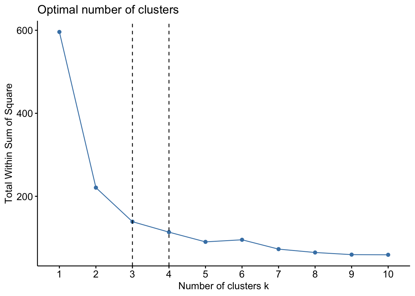
factoextra::fviz_nbclust(x=df,kmeans,method = c("silhouette"))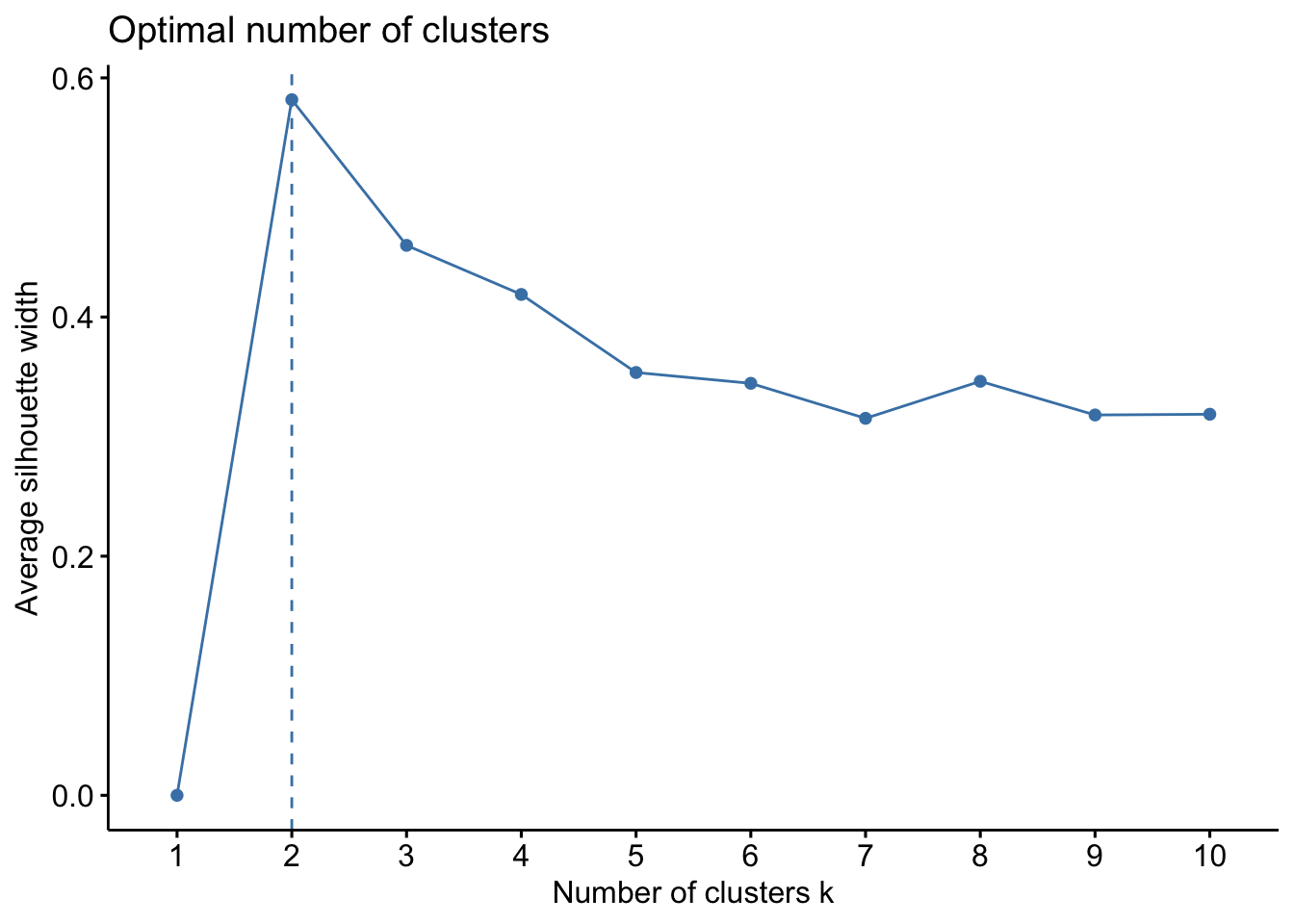
When looking at the first plot using within sum of squares (wss), we are looking for the “bend” in the plot where the the bend indicates that additional clusters provide diminishing returns and value. We might interpret here that k=3 is likely appropriate. Essentially, if the line chart looks like an arm, then the “elbow” on the arm is the value of k that is the best. The idea is that we want a small WSS, but that the WSS tends to decrease toward 0 as we increase k. So our goal is to choose a small value of k that still has a low WSS, and the elbow usually represents where we start to have diminishing returns by increasing k.
The second plot, this uses the silhouette method, which works differently. For each point p, we first find the average distance between p and all other points in the same cluster (this is a measure of cohesion, call it A). Then find the average distance between p and all points in the nearest cluster (this is a measure of separation from the closest other cluster, call it B). The silhouette coefficient for p is defined as the difference between B and A divided by the greater of the two (max(A,B)). Essentially, we are trying to measure the space between clusters. If cluster cohesion is good (A is small) and cluster separation is good (B is large), the numerator will be large, etc. So, looking back to the second plot, we can see that k=2 is the ideal.
Another method we can use for clustering can relate to ‘prior knowledge’, whereby we know there are 3 species of iris (and we might know other things about the data) where we could infer that k=3 might be a better fit. However, this is to be used with caution and you can run this multiple times and we can inspect the clusters to examine which k is most suitable. We will proceed with k=3.
set.seed(127) #DO NOT FORGET THIS STEP!

km.res <- kmeans(df, 3, nstart = 25)

print(km.res)
## K-means clustering with 3 clusters of sizes 50, 47, 53
##
## Cluster means:
##   Sepal.Length Sepal.Width Petal.Length Petal.Width
## 1  -1.01119138  0.85041372   -1.3006301  -1.2507035
## 2   1.13217737  0.08812645    0.9928284   1.0141287
## 3  -0.05005221 -0.88042696    0.3465767   0.2805873
##
## Clustering vector:
## [1] 1 1 1 1 1 1 1 1 1 1 1 1 1 1 1 1 1 1 1 1 1 1 1 1 1 1 1 1 1 1 1 1 1 1 1 1 1 1 1 1 1 1 1 1 1 1 1 1 1 1 2 2 2 3 3 3 2 3 3 3 3 3 3 3 3 2 3 3 3 3
## [71] 2 3 3 3 3 2 2 2 3 3 3 3 3 3 3 2 2 3 3 3 3 3 3 3 3 3 3 3 3 3 2 3 2 2 2 2 3 2 2 2 2 2 2 3 3 2 2 2 2 3 2 3 2 3 2 2 3 2 2 2 2 2 2 3 3 2 2 2 3 2
## [141] 2 2 3 2 2 2 3 2 2 3
##
## Within cluster sum of squares by cluster:
## [1] 47.35062 47.45019 44.08754
## (between_SS / total_SS = 76.7 %)
##
## Available components:
##
## [1] "cluster" "centers" "totss" "withinss" "tot.withinss" "betweenss" "size" "iter" "ifault"As the final result of k-means clustering result is sensitive to the random starting assignments, we specify nstart = 25. This means we will 25 different random starting assignments and then select the best results corresponding to the one with the lowest within cluster variation. The default value of nstart in R is one. But, it’s strongly recommended to compute k-means clustering with a large value of nstart such as 25 or 50, in order to have a more stable result.
We can compute the mean of each of the variables by clusters using the original data:
aggregate(df, by=list(cluster=km.res$cluster), mean) #getting the mean of each variable by cluster## cluster Sepal.Length Sepal.Width Petal.Length Petal.Width
## 1 1 -1.01119138 0.85041372 -1.3006301 -1.2507035
## 2 2 1.13217737 0.08812645 0.9928284 1.0141287
## 3 3 -0.05005221 -0.88042696 0.3465767 0.2805873#we can also add the cluster assignment back to the original data
df <- cbind(df, cluster = km.res$cluster)
head(df)## Sepal.Length Sepal.Width Petal.Length Petal.Width cluster
## [1,] -0.8976739 1.01560199 -1.335752 -1.311052 1
## [2,] -1.1392005 -0.13153881 -1.335752 -1.311052 1
## [3,] -1.3807271 0.32731751 -1.392399 -1.311052 1
## [4,] -1.5014904 0.09788935 -1.279104 -1.311052 1
## [5,] -1.0184372 1.24503015 -1.335752 -1.311052 1
## [6,] -0.5353840 1.93331463 -1.165809 -1.048667 1We can also find out more information about the clusters, for instance, how many observations are in each cluster and also what the cluster means are:
km.res$size## [1] 50 47 53km.res$centers## Sepal.Length Sepal.Width Petal.Length Petal.Width
## 1 -1.01119138 0.85041372 -1.3006301 -1.2507035
## 2 1.13217737 0.08812645 0.9928284 1.0141287
## 3 -0.05005221 -0.88042696 0.3465767 0.2805873There are a number of other results you may be interested in examining. Read more about each of these and consider why these will be useful:
cluster: A vector of integers (from 1:k) indicating the cluster to which each point is allocated
centers: A matrix of cluster centers (cluster means)
totss: The total sum of squares (TSS), i.e ∑(xi−x¯)2. TSS measures the total variance in the data.
withinss: Vector of within-cluster sum of squares, one component per cluster
tot.withinss: Total within-cluster sum of squares, i.e. sum(withinss)
betweenss: The between-cluster sum of squares, i.e. totss−tot.withinss
size: The number of observations in each cluster
We can visualize these clusters, which is an important way to examine overlap in clusters and/or whether another k might be necessary (this can also be inferred by the clsuter results itself too). Remember, we have to infer the results, so looking at the km.res$clusters output, does it make coherent sense?
#you should read more about the different functions and ways to plot -- use ?fviz_cluster() in your console
fviz_cluster(km.res, df,
             ellipse.type = "convex",
             geom=c("point"),
             palette = "jco",
             ggtheme = theme_classic()) #you can change the color palette and theme to your preferences
So, k-means is a simple and fast algorithm, however there are some disadvantages to it:
It assumes prior knowledge of the data and requires the analyst to choose the appropriate number of cluster k in advance
The final results obtained is sensitive to the initial random selection of cluster centers. Why is it a problem? Because, for every different run of the algorithm on the same dataset, you may choose different set of initial centers. This may lead to different clustering results on different runs of the algorithm. This is why using set.seed(x) is critical for reproducible results!
It’s sensitive to outliers.
If you rearrange your data, it’s very possible that you’ll get a different solution every time you change the ordering of your data….
There are some ways to combat this: 1. Solution to issue 1: Compute k-means for a range of k values, for example by varying k between 2 and 10. Then, choose the best k by comparing the clustering results obtained for the different k values.
- Solution to issue 2: Compute K-means algorithm several times with different initial cluster centers. The run with the lowest total within-cluster sum of square is selected as the final clustering solution.
6.2.2 K-Medoids Clustering (PAM)
The k-medoids algorithm is a clustering approach related to k-means clustering for partitioning a data set into k clusters. In k-medoids clustering, each cluster is represented by one of the data point in the cluster. These points are the cluster medoids. A medoid refers to an object within a cluster for which average dissimilarity between it and all the other the members of the cluster is minimal, aka it is the most centrally located point in the cluster. These objects can be considered as a representative or protoypical example of the members of that cluster which may be useful in some situations. To be clear, in k-means clustering, the center of a given cluster is calculated as the mean value of all the data points in the cluster in comparison.
K-medoid is a robust alternative to k-means clustering. They are less sensitive to noise and outliers, compared to k-means, because it uses medoids as cluster centers instead of means (used in k-means). Like k-means, the k-medoids algorithm requires the user to specify k, too. We will look at the Partitioning Around Medoids (PAM) algorithm, which is the most common k-medoids clustering method.
The PAM algorithm works broadly as follows:
Building phase:
Select k objects to become the medoids
Calculate the dissimilarity matrix (this can use euclidean distances or Manhatten)
Assign every object to its closest medoid
Swap phase:
- For each cluster search, if any of the objects of the cluster decreases the average dissimilarity coefficient select the entity that decreases this coefficient the most as the medoid for this cluster. If at least one medoid has changed go to, end the algorithm.
We will use the iris datast again.
library('cluster')
library('factoextra')

df <- iris #loading data

df <- dplyr::select(df,
                    -Species) #removing Species

df <- scale(df) #scaling

head(df)
## Sepal.Length Sepal.Width Petal.Length Petal.Width
## [1,] -0.8976739 1.01560199 -1.335752 -1.311052
## [2,] -1.1392005 -0.13153881 -1.335752 -1.311052
## [3,] -1.3807271 0.32731751 -1.392399 -1.311052
## [4,] -1.5014904 0.09788935 -1.279104 -1.311052
## [5,] -1.0184372 1.24503015 -1.335752 -1.311052
## [6,] -0.5353840 1.93331463 -1.165809 -1.048667The simple format for the pamk() command in the cluster package is as follows: pamk(df, k, metric = "", stand =F), where df is a dataframe or it can be a numeric matrix; k is the number of clusters (note: you do not have to specify), metric relates to the distancing metric, and stand relates to whether variables are standardized before calculating the dissimilarities.
As above, we need to estimate the optimal number of clusters. This will give the same output as before, where we proceeded with k-means as k=3.
factoextra::fviz_nbclust(x=df,FUNcluster=pam, method = c("wss")) +
  geom_vline(xintercept = 3,linetype=2) +
  geom_vline(xintercept = 4, linetype=2)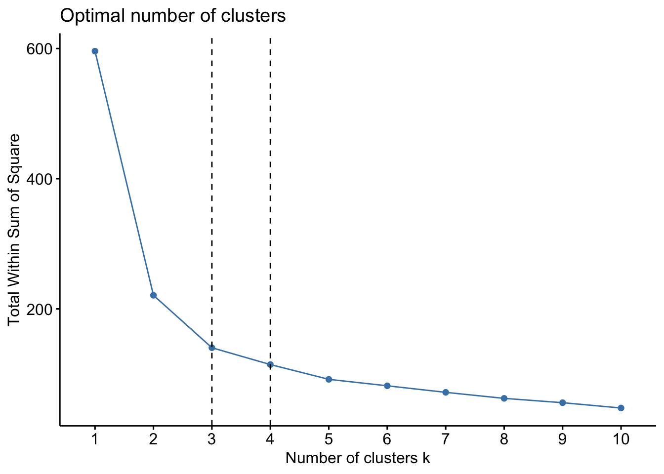
factoextra::fviz_nbclust(x=df, FUNcluster =pam, method = c("silhouette"))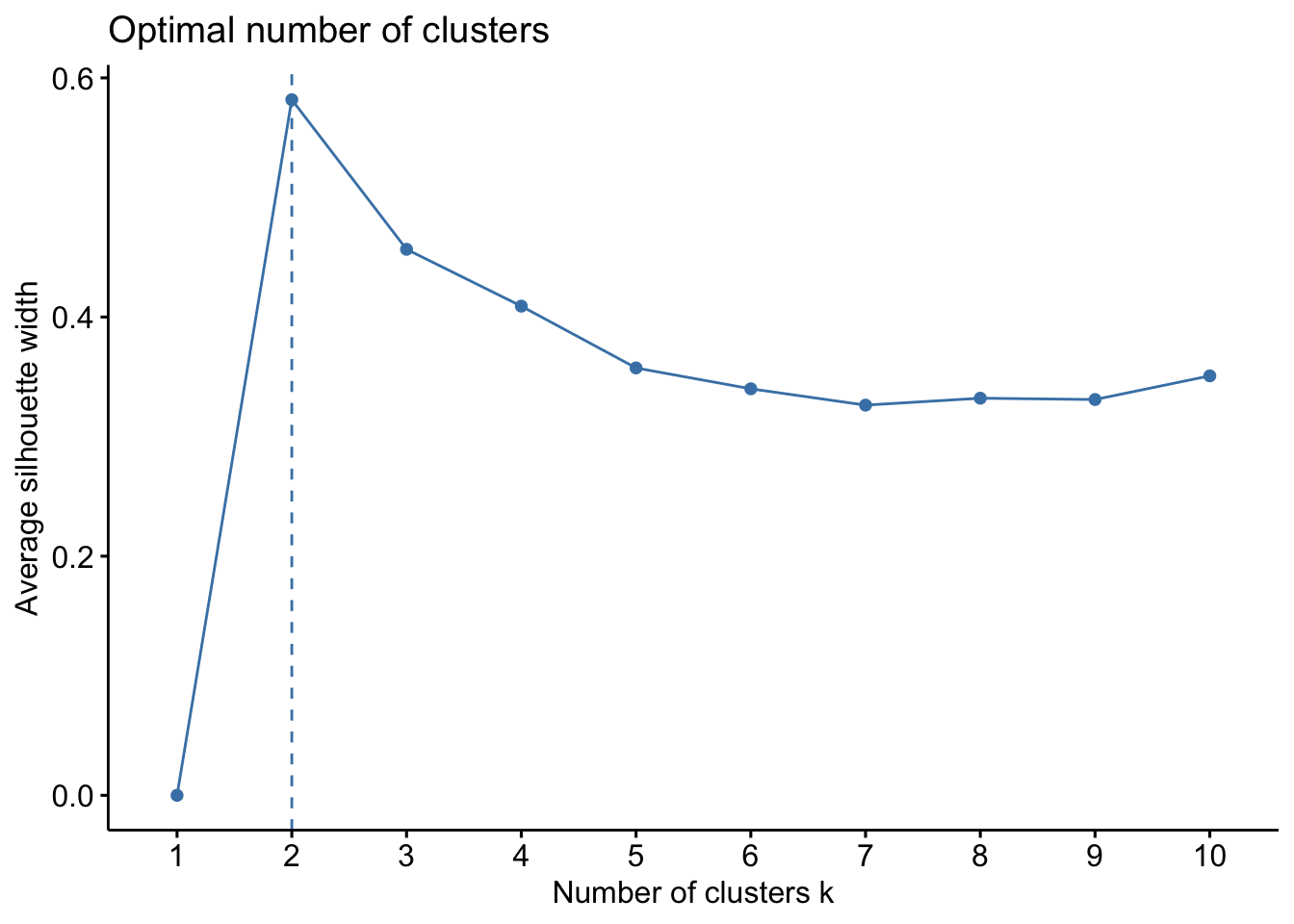 Lets proceed with k=3 to computer the PAM algorithm.
pam.res <- pam(df, 3)

print(pam.res)
## Medoids:
## ID Sepal.Length Sepal.Width Petal.Length Petal.Width
## [1,] 8 -1.0184372 0.7861738 -1.2791040 -1.3110521
## [2,] 113 1.1553023 -0.1315388 0.9868021 1.1816087
## [3,] 56 -0.1730941 -0.5903951 0.4203256 0.1320673
## Clustering vector:
## [1] 1 1 1 1 1 1 1 1 1 1 1 1 1 1 1 1 1 1 1 1 1 1 1 1 1 1 1 1 1 1 1 1 1 1 1 1 1 1 1 1 1 1 1 1 1 1 1 1 1 1 2 2 2 3 3 3 2 3 3 3 3 3 3 3 3 2 3 3 3 3
## [71] 3 3 3 3 3 2 2 2 3 3 3 3 3 3 3 3 2 3 3 3 3 3 3 3 3 3 3 3 3 3 2 3 2 2 2 2 3 2 2 2 2 2 2 3 2 2 2 2 2 3 2 3 2 3 2 2 3 3 2 2 2 2 2 3 3 2 2 2 3 2
## [141] 2 2 3 2 2 2 3 2 2 3
## Objective function:
## build swap
## 0.9205107 0.8757051
##
## Available components:
## [1] "medoids" "id.med" "clustering" "objective" "isolation" "clusinfo" "silinfo" "diss" "call" "data"Lets add the cluster assignments back to the dataframe.
df <- cbind(df, cluster = pam.res$cluster)
head(df)
## Sepal.Length Sepal.Width Petal.Length Petal.Width cluster
## [1,] -0.8976739 1.01560199 -1.335752 -1.311052 1
## [2,] -1.1392005 -0.13153881 -1.335752 -1.311052 1
## [3,] -1.3807271 0.32731751 -1.392399 -1.311052 1
## [4,] -1.5014904 0.09788935 -1.279104 -1.311052 1
## [5,] -1.0184372 1.24503015 -1.335752 -1.311052 1
## [6,] -0.5353840 1.93331463 -1.165809 -1.048667 1Lets look at the results further:
pam.res$medoids## Sepal.Length Sepal.Width Petal.Length Petal.Width
## [1,] -1.0184372 0.7861738 -1.2791040 -1.3110521
## [2,] 1.1553023 -0.1315388 0.9868021 1.1816087
## [3,] -0.1730941 -0.5903951 0.4203256 0.1320673We can also visualize this, using similar code we used with the k-means. From both the results and the data visualization, can you see the differences in outputs?
#you should read more about the different functions and ways to plot -- use ?fviz_cluster() in your console
fviz_cluster(pam.res, df,
             ellipse.type = "convex",
             geom=c("point"),
             palette = "jco",
             ggtheme = theme_classic()) #you can change the color palette and theme to your preferences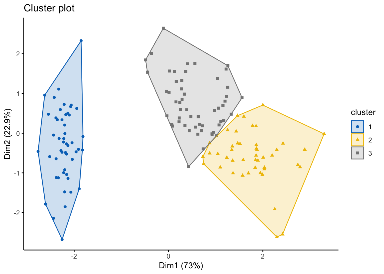
6.2.3 Clustering Large Applications (CLARA)
CLARA is an approach that extends k-medoids (PAM) where it can better handle large datasets and reduces the computing time needed. How does it do that? Well, instead of finding medoids for an entire data set, CLARA takes a sample of the data with fixed size and applies the PAM algorithm to generate an optimal set of medoids for the sample. The quality of resulting medoids is measured by the average dissimilarity between every object in the entire data set and the medoid of its cluster, defined as the cost function. CLARA repeats the sampling and clustering processes a pre-specified number of times in order to minimize the sampling bias.
Broadly, CLARA works as follows:
Create a fixed number of subsets from the original/full dataset
Compute PAM algorithm on each subset and choose the corresponding k representative objects (medoids). Then, assign each observation of the entire data set to the closest medoid.
Calculate the mean (or the sum) of the dissimilarities of the observations to their closest medoid. This will be used as a measure of the “goodness of the clustering”.
Retain the sub-dataset for which the mean (or sum) is minimal. A further analysis is carried out on the final partition.
Lets create a dataset for this:
set.seed(127)

# Generate 5000 objects, divided into 2 clusters.
df <- rbind(cbind(rnorm(2000,0,8), rnorm(2000,0,8)),
           cbind(rnorm(3000,50,8), rnorm(3000,50,8)))

# Specify column and row names
colnames(df) <- c("x", "y") #labels x and y
rownames(df) <- paste0("ID", 1:nrow(df)) #gives a row ID

# Previewing the data
head(df)
## x y
## ID1 -4.54186992 4.125079
## ID2 -6.51808463 -13.546435
## ID3 -3.95151677 3.049288
## ID4 0.01455076 2.828887
## ID5 6.55827947 -5.993205
## ID6 7.97406286 -3.228765The format for the clara() function in the cluster package is as follows: clara(df, k, metric = "", stand = F, samples = y, pamLike = T), where df refers to the dataset (note: NA values are OK here), k is the number of clusters, metric relate to the distance metric (e..g, euclidean, manhattan), stand relates to whether data are standardized, samples is the number of samples for CLARA to generate, pamLike indicates if the the algorithm in pam() should be used, always set to TRUE. First, lets estimate the number of clusters…
library('cluster')
library('factoextra')

factoextra::fviz_nbclust(x=df,clara,method = c("wss"))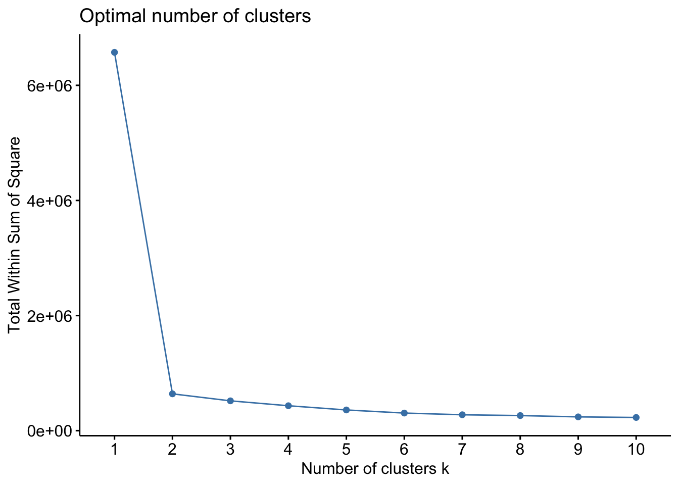
factoextra::fviz_nbclust(x=df,clara,method = c("silhouette"))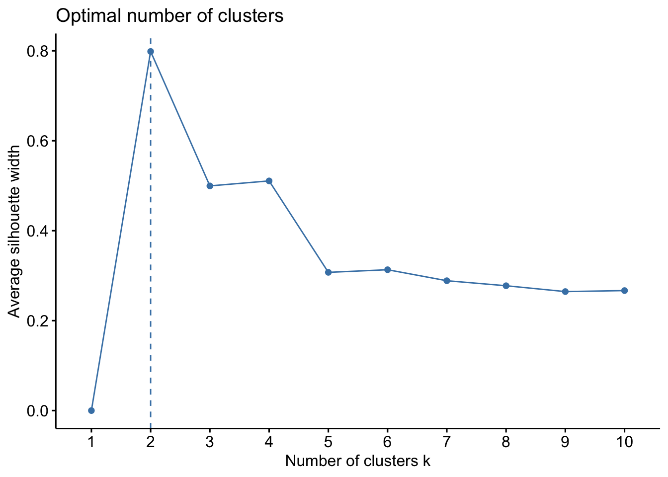 Both plots here suggest 2 clusters, so we will proceed with k=2.
clara.res <- clara(df, 2, samples = 100, pamLike = T)

print(clara.res)
## Call: clara(x = df, k = 2, samples = 100, pamLike = T)
## Medoids:
## x y
## ID1094 -0.1163506 0.7543765
## ID3232 49.4433059 49.5316854
## Objective function: 10.00427
## Clustering vector: Named int [1:5000] 1 1 1 1 1 1 1 1 1 1 1 1 1 1 1 1 1 1 ...
## - attr(*, "names")= chr [1:5000] "ID1" "ID2" "ID3" "ID4" "ID5" "ID6" "ID7" ...
## Cluster sizes: 2000 3000
## Best sample:
## [1] ID41 ID124 ID633 ID642 ID664 ID735 ID973 ID1068 ID1094 ID1519 ID1564 ID1886 ID1911 ID2114 ID2167 ID2271 ID2291 ID2300 ID2321 ID2470
## [21] ID2527 ID2529 ID2610 ID2664 ID2712 ID3027 ID3118 ID3185 ID3232 ID3245 ID3397 ID3429 ID3575 ID3609 ID3694 ID3696 ID3910 ID3983 ID4077 ID4128
## [41] ID4139 ID4307 ID4593 ID4818
##
## Available components:
## [1] "sample" "medoids" "i.med" "clustering" "objective" "clusinfo" "diss" "call" "silinfo" "data"As we can see, there are a number of outputs we can look at from medoids, clustering, and samples. Let’s look closer at the results:
#first lets combine cluster assignements back into the dataframe
df <- cbind(df, cluster = clara.res$cluster)
head(df)
## x y cluster
## ID1 -4.54186992 4.125079 1
## ID2 -6.51808463 -13.546435 1
## ID3 -3.95151677 3.049288 1
## ID4 0.01455076 2.828887 1
## ID5 6.55827947 -5.993205 1
## ID6 7.97406286 -3.228765 1#lets look at the medoids
clara.res$medoids## x y
## ID1094 -0.1163506 0.7543765
## ID3232 49.4433059 49.5316854#we can see the two cluster medoids are ID1094 and ID3232
#lets look at the clustering
head(clara.res$clustering, 50) #only looking at the top 50 as it will print everything## ID1 ID2 ID3 ID4 ID5 ID6 ID7 ID8 ID9 ID10 ID11 ID12 ID13 ID14 ID15 ID16 ID17 ID18 ID19 ID20 ID21 ID22 ID23 ID24 ID25 ID26 ID27 ID28 ID29
## 1 1 1 1 1 1 1 1 1 1 1 1 1 1 1 1 1 1 1 1 1 1 1 1 1 1 1 1 1
## ID30 ID31 ID32 ID33 ID34 ID35 ID36 ID37 ID38 ID39 ID40 ID41 ID42 ID43 ID44 ID45 ID46 ID47 ID48 ID49 ID50
## 1 1 1 1 1 1 1 1 1 1 1 1 1 1 1 1 1 1 1 1 1As before, we can also visualize these:
#you should read more about the different functions and ways to plot -- use ?fviz_cluster() in your console
fviz_cluster(clara.res, df,
             ellipse.type = "convex",
             geom=c("point"),
             palette = "jco",
             ggtheme = theme_classic()) #you can change the color palette and theme to your preferences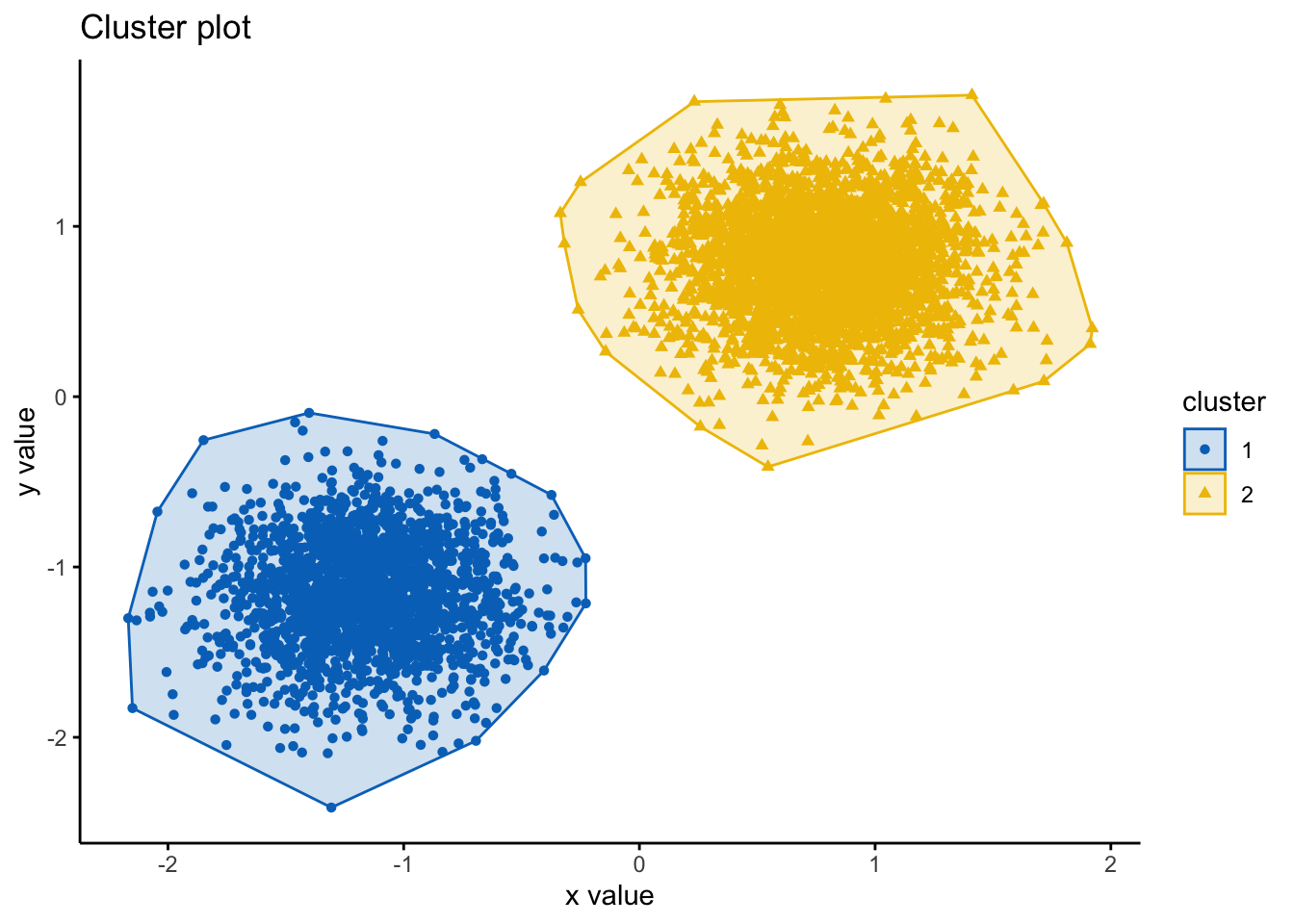
6.3 Hierarchical Clustering
Here, we will look at two main types of Hierarchical Clusterng:
Agglomerative
Divisive
The agglomerative clustering is the most common type of hierarchical clustering used to group objects into clusters based on similarity, this is also known as AGNES (Agglomerative Nesting). Agglomerative clustering works in a “bottom-up” manner. That is, each object is initially considered as a single-element cluster (leaf). At each step of the algorithm, the two clusters that are the most similar are combined into a new bigger cluster (nodes). This procedure is iterated until all points are member of just one single big cluster (root). The result is a tree-based representation of the objects, named dendrogram.
Divisive clustering is the opposite of agglomerative clustering, which is also known as DIANA (Divise Analysis), and it works in a “top-down” manner. It begins with the root, in which all objects are included in a single cluster. Then, each step of iteration, the most heterogeneous cluster is divided into two. The process is iterated until all objects are in their own cluster. Hence, agglomerative clustering is good at identifying small clusters, whereas divisive clustering is typically good at identifying large clusters in comparison.
A key factor in hierarchical clustering is how we measure the dissimilarity between two clusters of observations. There are a number of different cluster agglomeration methods (i.e, linkage methods) have been developed to answer to this question. The most common types methods are:
Maximum or complete linkage clustering: It computes all pairwise dissimilarities between the elements in cluster 1 and the elements in cluster 2, and considers the largest value (i.e., maximum value) of these dissimilarities as the distance between the two clusters. It tends to produce more compact clusters.
Minimum or single linkage clustering: It computes all pairwise dissimilarities between the elements in cluster 1 and the elements in cluster 2, and considers the smallest of these dissimilarities as a linkage criterion. It tends to produce long, “loose” clusters.
Mean or average linkage clustering: It computes all pairwise dissimilarities between the elements in cluster 1 and the elements in cluster 2, and considers the average of these dissimilarities as the distance between the two clusters.
Centroid linkage clustering: It computes the dissimilarity between the centroid for cluster 1 (a mean vector of length p variables) and the centroid for cluster 2. Ward’s minimum variance method: It minimizes the total within-cluster variance. At each step the pair of clusters with minimum between-cluster distance are merged.
6.3.1 Agglomerative Hierarchical Clustering
Broadly, agglomerative hierarchical clustering works as follows:
Computing (dis)similarity between every pair of objects in the data set.
Using a linkage function to group objects into hierarchical cluster tree, based on the distance information generated at step 1. Objects/clusters that are in close proximity are then merged/linked.
Determining where to cut the hierarchical tree into clusters, which creates a partition of the data.
Lets have a go! Data should be a numeric matrix. We will use the iris dataset, here, and remove the ‘Species’ label.
library('factoextra')
df <- iris #loading data

df <- dplyr::select(df,
                    -Species) #removing Species

df <- scale(df) #scaling

head(df)
## Sepal.Length Sepal.Width Petal.Length Petal.Width
## [1,] -0.8976739 1.01560199 -1.335752 -1.311052
## [2,] -1.1392005 -0.13153881 -1.335752 -1.311052
## [3,] -1.3807271 0.32731751 -1.392399 -1.311052
## [4,] -1.5014904 0.09788935 -1.279104 -1.311052
## [5,] -1.0184372 1.24503015 -1.335752 -1.311052
## [6,] -0.5353840 1.93331463 -1.165809 -1.048667In order to decide which objects/clusters should be combined, we need to specify the methods for measuring the similarity. There are a number of methods for this, including Euclidean and manhattan distances. By default, the function dist() computes the Euclidean distance between objects; however, it’s possible to indicate other metrics using the argument method by putting ?dist() into your console.
# Compute the dissimilarity matrix
res.dist <- dist(df, method = "euclidean")

as.matrix(res.dist)[1:10, 1:10] #plots the first 10 rows and cols
## 1 2 3 4 5 6 7 8 9 10
## 1 0.0000000 1.1722914 0.8427840 1.0999999 0.2592702 1.0349769 0.6591230 0.2653865 1.6154093 0.9596625
## 2 1.1722914 0.0000000 0.5216255 0.4325508 1.3818560 2.1739229 0.9953200 0.9273560 0.6459347 0.2702920
## 3 0.8427840 0.5216255 0.0000000 0.2829432 0.9882608 1.8477070 0.4955334 0.5955157 0.7798708 0.3755259
## 4 1.0999999 0.4325508 0.2829432 0.0000000 1.2459861 2.0937597 0.7029623 0.8408781 0.5216255 0.3853122
## 5 0.2592702 1.3818560 0.9882608 1.2459861 0.0000000 0.8971079 0.6790442 0.4623398 1.7618861 1.1622978
## 6 1.0349769 2.1739229 1.8477070 2.0937597 0.8971079 0.0000000 1.5150531 1.2770882 2.6114809 1.9751253
## 7 0.6591230 0.9953200 0.4955334 0.7029623 0.6790442 1.5150531 0.0000000 0.5037468 1.1796095 0.8228272
## 8 0.2653865 0.9273560 0.5955157 0.8408781 0.4623398 1.2770882 0.5037468 0.0000000 1.3579974 0.7110069
## 9 1.6154093 0.6459347 0.7798708 0.5216255 1.7618861 2.6114809 1.1796095 1.3579974 0.0000000 0.7717279
## 10 0.9596625 0.2702920 0.3755259 0.3853122 1.1622978 1.9751253 0.8228272 0.7110069 0.7717279 0.0000000Lets run the algorithm. We do this using the hclust() command, which works as follows hclust(d, method = ""), where d is a matrix (produced by the dist() function) and method is the method of linkage. Typically complete linkage or Ward’s methods are preferred for this.
#compute
res.hc <- hclust(d = res.dist, method = "ward.D2")

#plot denrogram
fviz_dend(res.hc, cex = 0.5)
## Warning: `guides(<scale> = FALSE)` is deprecated. Please use `guides(<scale> = "none")` instead.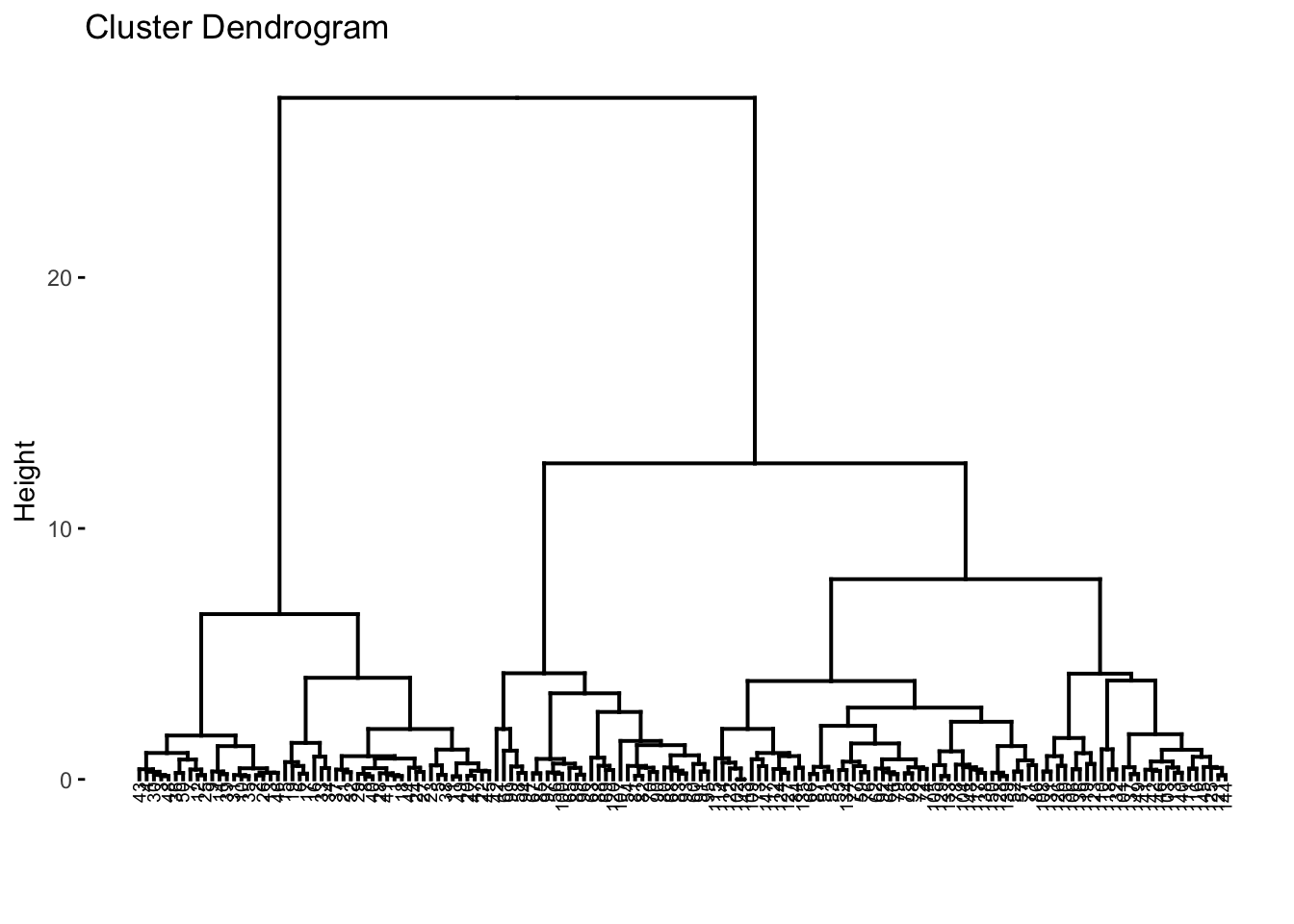 In the dendrograms, each leaf corresponds to one datapoint or object. Reading up the plot, objects that are similar to each other are combined into branches, until everything merges into one cluster. The height of the merging on the vertical axis indicates the (dis)similarity/distance between two objects/clusters. The higher the height of the fusion, the less similar the objects are. This height is known as the cophenetic distance between the two objects.
We can reflect on how well the tree reflects the actual data via the distance matrix calculated via the dist() function. This essentially acts as a way to verify the tree/distances comptuted. We can do this by calculating the correlation betwen the cophenetic distances and the original distances, and this in theory should have a high correlation. Ideally, a correlation would be above 0.75. Here, we can see the correlation is 0.82, which is great.
# Compute cophentic distance
res.coph <- cophenetic(res.hc)

# Correlation between cophenetic distance and the original distance
cor(res.dist, res.coph)
## [1] 0.8226304If the correlation was not sufficient, you can try other linkage methods to examine if another method fits the data better.
Next, we can actually label the clusters, as of course, the algorithm produces a tree plot (dendrogram), but we need to interpret it. We need to identify k, where we know it will be 3, however you can use other methods to choose a most suitable k by looking and examining the dendrogram itself. We will proceed with k=3.
cut_avg <- cutree(res.hc, k = 3)

#coloring by k
fviz_dend(res.hc, cex = 0.5, k = 3, color_labels_by_k = TRUE)
## Warning: `guides(<scale> = FALSE)` is deprecated. Please use `guides(<scale> = "none")` instead.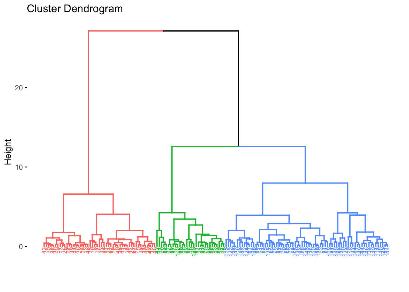
#coloring by k and adding boxes
fviz_dend(res.hc, cex = 0.5, k = 3,
 color_labels_by_k = FALSE, rect = TRUE)
## Warning: `guides(<scale> = FALSE)` is deprecated. Please use `guides(<scale> = "none")` instead.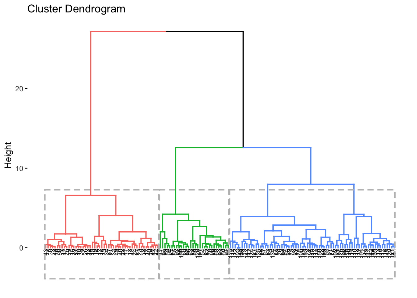
#cluster plots can be done, too -- need to use the cutree() beforehand
cut_avg <- cutree(res.hc, k = 3)

fviz_cluster(list(data = df, cluster=cut_avg),
             palette = "jco",
             ggtheme = theme_classic())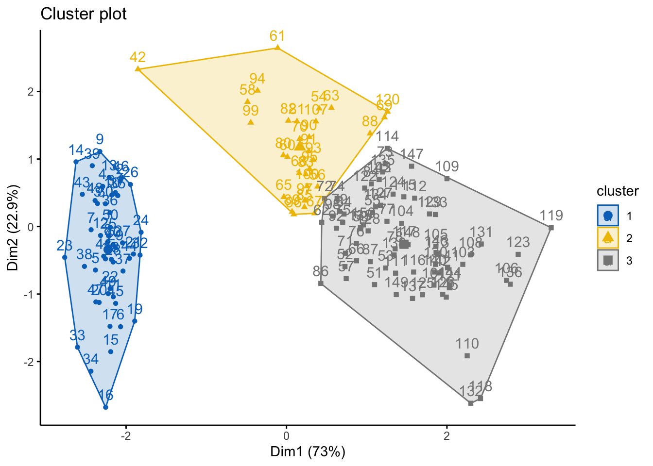
6.3.1.1 Alternative Method
Using the library cluster, you can also run agglomerative (and divisive) hierarchical clustering. As with many things in R, here are many ways to do the same series of tasks.
library('cluster')

#using agglomerative -- AGNES
res.agnes <- agnes(x = df, # data matrix
                   stand = TRUE, # Standardize/scale data
                   metric = "euclidean", # distance method
                   method = "ward") #linkage method

#and visualize it
fviz_dend(res.agnes, cex = 0.6, k = 3)
## Warning: `guides(<scale> = FALSE)` is deprecated. Please use `guides(<scale> = "none")` instead.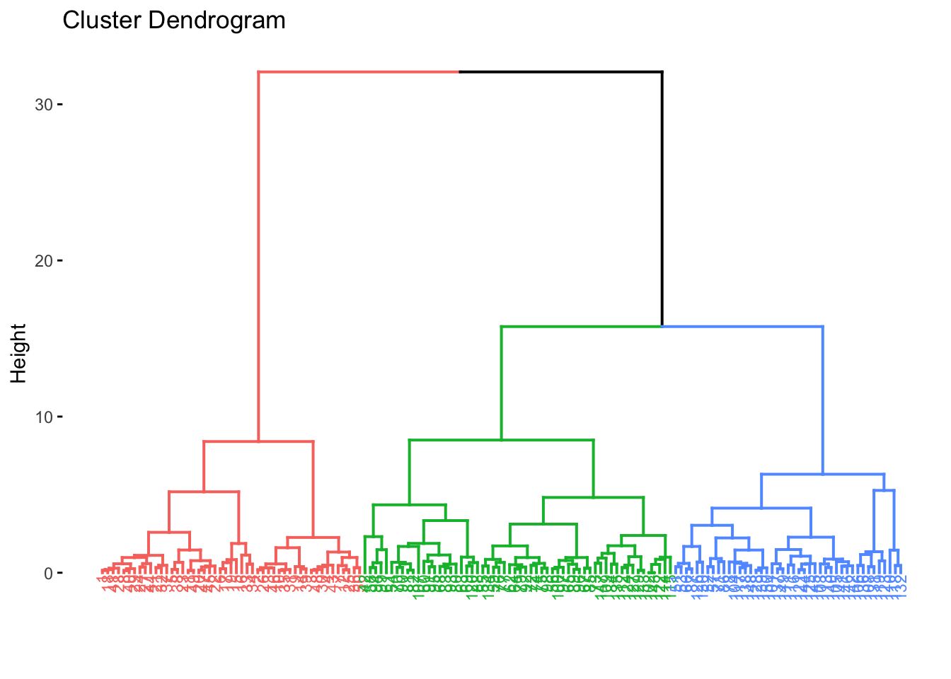
6.3.2 Divisive Hierarchical Clustering
Divisive clustering begins with all objects/observations of the dataset as a single large cluster. Then, each iteration, the most heterogeneous cluster is divided into two. The process is iterated until all objects are in their own cluster, aka the opposite of agglomerative clustering.
Let’s get started, we’ll use the iris dataset again here… note: this method does not require a method of linkage.
library('cluster')

#using divisive -- diana
res.diana <- diana(x = df, # data matrix
                   stand = TRUE, # Standardize/scale data
                   metric = "euclidean") # distance method


# Divise coefficient; amount of clustering structure found
#this essentially is the dissimilarity to the first (overall cluster)
# divided by the dissimilarity of the merger in the final step
res.diana$dc
## [1] 0.9408201#and visualize it
fviz_dend(res.diana, cex = 0.6, k = 3)## Warning: `guides(<scale> = FALSE)` is deprecated. Please use `guides(<scale> = "none")` instead.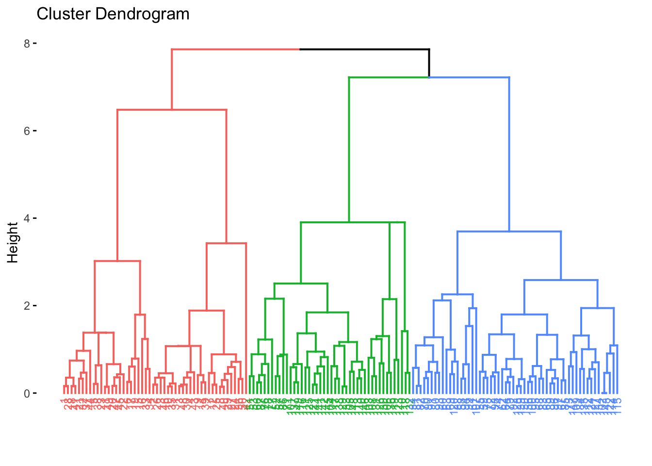 ### Comparing Dendrograms
When you’re computing dendeogram, you might want to have a nice and easy way to compare them. Using the dendextend package, we can do this. Let’s use the iris dataset again.
### Comparing Dendrograms
When you’re computing dendeogram, you might want to have a nice and easy way to compare them. Using the dendextend package, we can do this. Let’s use the iris dataset again.
library('dendextend')
library('factoextra')

df <- iris #loading data

df <- dplyr::select(df,
                    -Species) #removing Species

df <- scale(df) #scaling

head(df)
## Sepal.Length Sepal.Width Petal.Length Petal.Width
## [1,] -0.8976739 1.01560199 -1.335752 -1.311052
## [2,] -1.1392005 -0.13153881 -1.335752 -1.311052
## [3,] -1.3807271 0.32731751 -1.392399 -1.311052
## [4,] -1.5014904 0.09788935 -1.279104 -1.311052
## [5,] -1.0184372 1.24503015 -1.335752 -1.311052
## [6,] -0.5353840 1.93331463 -1.165809 -1.048667We will only use a subset of the data so we can make the posts more legible.
set.seed(127)
ss <- sample(1:50, 10)
df <- df[ss,]
Lets start by making 2 dendrograms using different linkage methods, Ward and Average.
# Compute distance matrix
res.dist <- dist(df, method = "euclidean")

# Compute 2 hierarchical clusterings
hc1 <- hclust(res.dist, method = "average")
hc2 <- hclust(res.dist, method = "ward.D2")

# Create two dendrograms
dend1 <- as.dendrogram(hc1)
dend2 <- as.dendrogram(hc2)

# Create a list to hold dendrograms
dend_list <- dendlist(dend1, dend2)
So, we want to compare these two dendrograms and we can do this visually using the following commands
untangle()will find the best layout to align the dendrograms (this uses heuristic methods)tanglegram()plots both of the dendrograms and connects the twoentangelment()computes the quality of the trees/dendrograms and gives a score between 0-1, where 1 is full entanglement and 0 is no entanglement. The lower the entanglement coefficient means there is better alignment
Let’s give it a go:
# Align and plot two dendrograms side by side
#note you can change the colors and look of this a lot!
dendlist(dend1, dend2) %>%
  untangle(method = "step1side") %>% # Find the best alignment layout
  tanglegram()                       # Draw the two dendrograms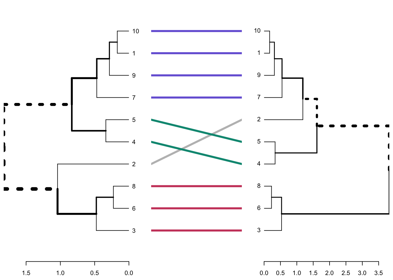
# Compute alignment quality. Lower value = good alignment quality
dendlist(dend1, dend2) %>%
  untangle(method = "step1side") %>% # Find the best alignment layout
  entanglement()                     # Alignment quality
## [1] 0.03838376Rather than only comparing visually, we can also compare by looking at the correlation between these dendrograms, too. To do this, we are looking at the cophenetic correlation, which we saw earlier. To recap, this is a measure of how well a dendrogram preserves the pairwise distances between the original unmodeled data points. There are two methods, Baker or Cophenetic, which can be comptued as a matric or simple the coefficient, as below:
# Cophenetic correlation matrix
cor.dendlist(dend_list, method = "cophenetic")
## [,1] [,2]
## [1,] 1.000000 0.755396
## [2,] 0.755396 1.000000# Baker correlation matrix
cor.dendlist(dend_list, method = "baker")## [,1] [,2]
## [1,] 1.0000000 0.7639014
## [2,] 0.7639014 1.0000000# Cophenetic correlation coefficient
cor_cophenetic(dend1, dend2)## [1] 0.755396# Baker correlation coefficient
cor_bakers_gamma(dend1, dend2)## [1] 0.76390146.4 Density-based Clustering
Last week we looked at partitioning and hierarchical methods for clustering. In particular, partitioning methods (k-means, PAM, CLARA) and hierarchical clustering are suitable for finding spherical-shaped clusters or convex clusters. Hence, they work well when there are well defiend clusters that are relatively distinct. They also tend to struggle when there are extreme values, outliers, and/or when datasets are noisy.
In contrast, Density-Based Clustering of Applications with Noise (DBScan) is an interesting alternative approach, which is an unsupervised, non-linear algorithm. Rather than focusing entirely on distance between objects/data points, here the focus relates to density. The data is partitioned into groups with similar characteristics or clusters but it does not require specifying the number of clusters for data to be partitioned into. A cluster here, is defined as a maximum set of densely connected points. The bonus of DBSCAN is that can handle clusters of arbitrary shapes in spatial databases with noise.
The goal with DBSCAN is to identify dense regions within a dataset. There are a couple of important parameters for DBSCAN:
epsilon (eps): defines the radius of the neighborhood around a given point
minimum points (MinPts): the minumun number of neighbors within an eps radius
Therefore, if a point has a neighbor count higher than or equal to the MinPts, it is a core point (as in theory this means it will be central to the cluster as it is dense there)… in contrast, if a point has less neighbors than the MinPts, this is a broader point, whereby it is more periheral. Similarly, points can be so far away, they are then deemed noise or an outlier.
Broadly, DBSCAN works as follows:
Randomly select a point p. Retrieve all the points that are density reachable from p (e.g., are within the Maximum radius of the neighbourhood(EPS) and minimum number of points within eps neighborhood(Min Pts))
Each point, with a neighbor count greater than or equal to MinPts, is marked as core point or visited.
For each core point, if it’s not already assigned to a cluster, create a new cluster. Find recursively all its density connected points and assign them to the same cluster as the core point
Iterate through the remaining unvisited points in the dataset
Lets have a go. We will use the multishapes dataset from the factoextra package:
library('factoextra')

data("multishapes")
df <- multishapes[,1:2] #removing the final column using BASE R which is the cluster label

plot(df$x, df$y) #to show you what this data looks like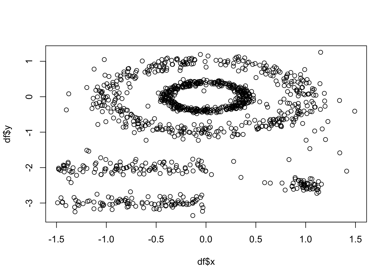
As above, k-means (among other partitioning algorithms) are not great at identifying objects that are non-spherical. So, lets quickly see how k-means handles these data. We can see there are 5 clusters, so we wil proceed with k=5.
set.seed(127)
km.res <- kmeans(df, 5, nstart = 25)
fviz_cluster(km.res, df,ellipse.type = "point",
geom=c("point"),
palette = "jco",
ggtheme = theme_classic())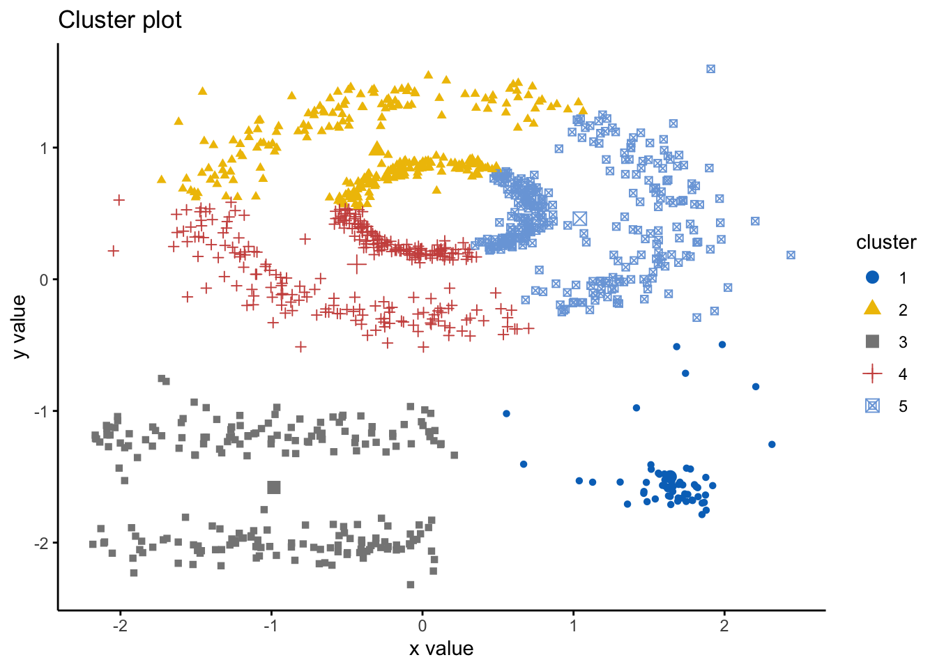 As we can see here, the k-means has indeed spliced the data and found 5 clusters, however, it ignores the spaces between clusters that we would expect. Hence, this is where DBSCAN is an alternative way to mitigate these issues. Here we will use the DBSCAN package and the fpc package and the
 dbscan() command. The simple format of the command dbscan() is as follows: dbscan(data, eps, MinPts, scale = F, method = ""); where: data is the data as a datafreame, matrix or dissimiliarity matrix via the dist() function; eps is the reachability maximum distance, MinPts is the reachability minimum number of points, scale - if true means the data will be scaled, method can be “dist” where it treats data as a raw matrix, “raw” where it is treated as raw data, and “hybrid” where it expects raw data but calculates partial distance matrices. Note that the plot.dbscan() command uses different points for outliers.
We said above that DBSCAN algorithm requires users to specify the optimal eps values and the parameter MinPts. However, how do we know what those values should be? Well, there are ways! It is important to note that a limitation of DBSCAN is that it is sensitive to the choice of epsilon, in particular if clusters have different densities.
If the epsilon value is too small, sparser clusters will be defined as noise. If the value chosen for the epsilon is too large, denser clusters may be merged together. This implies that, if there are clusters with different local densities, then a single epsilon value may not suffice…So what do we do? Well, a common way is to compute the k-nearest neighbours distances, where we can use this to calculate the average distance to every point to its nearest neighbors. Here, the value of k will be specified by the data scientist/analyst and will be the MinPts value. We will produce an almost inverse elbow plot (like with k-means), known as a knee plot, where we want point where there is a sharp bend upwards as our eps value.
Lets have a look:
library('fpc')
library('dbscan')

dbscan::kNNdistplot(df, k =  5)

#so we can see that the knee is around 0.15 (as seen on the dotted line)
dbscan::kNNdistplot(df, k =  5) +
  abline(h = 0.15, lty = 2)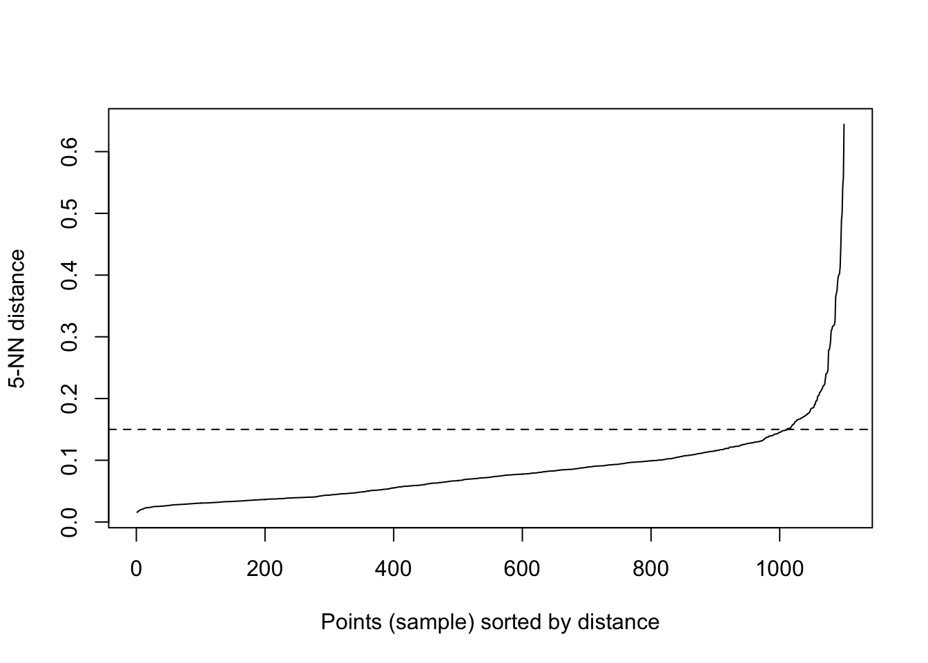
## integer(0)So, lets use these values and run the dbscan algorithm:
# Compute DBSCAN using fpc package
set.seed(127)

db <- fpc::dbscan(df, eps = 0.15, MinPts = 5)

# Plot DBSCAN results
plot(db, df, main = "DBSCAN", frame = FALSE)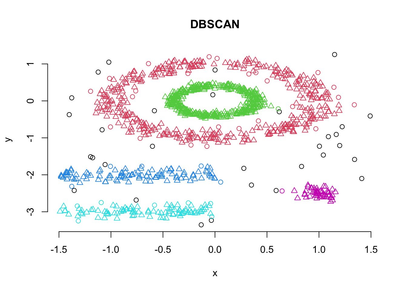
#also visualising the fiz_cluster, too:
fviz_cluster(db, df,ellipse.type = "point",
geom=c("point"),
palette = "jco",
ggtheme = theme_classic())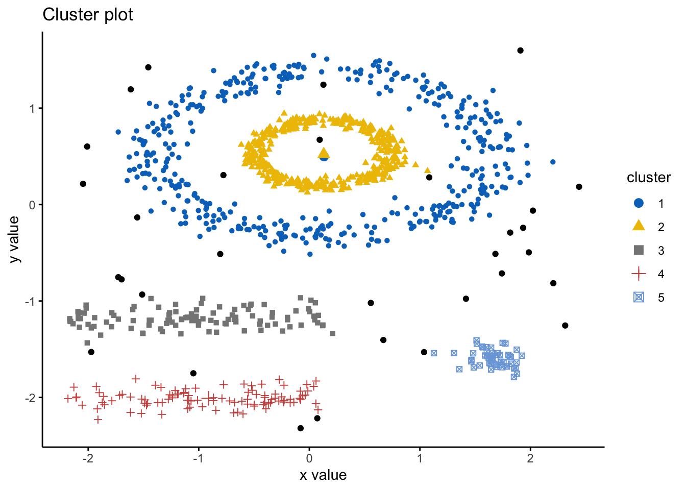 We can look at the numerical results by printing db:
print(db)## dbscan Pts=1100 MinPts=5 eps=0.15
## 0 1 2 3 4 5
## border 31 24 1 5 7 1
## seed 0 386 404 99 92 50
## total 31 410 405 104 99 51Note here that cluster 0 refers to the outliers.
6.5 Soft Clustering
As introduced before, there are two types of clustering: hard and soft. The methods we have looked at are types of hard clustering whereby a point is assigned to only one cluster. However, soft clustering, also known as fuzzy clustering, is where each point is assigned a probability of belonging to each cluster. Hence, each cluster will have a membership coefficient that is the degree to which they belong to a given cluster. So, in fuzzy clustering, the degree to which an element belongs to a given cluster, is a numerical value varying from 0 to 1. One of the most common methods is the fuzzy c-means (FCM) algorithm. The centroid of a cluster is calculated as the mean of all points, weighted by their degree of belonging to the cluster.
To do this, we can use the function fanny() from the cluster package, which takes this format: fanny(data, k, metric, stand), where data is a dataframe or matrix, or similiarity matrix from the dist() command, k is the number of clusters, metric is the method for calculating similarities between points, and stand if true is where data are standardized before computing similarities.
Here, we will output membership as a matrix containing the degree to which each point belongs to each cluster, coeff as Dunn’s partition coefficient. We are given also the normalized form of this coefficient, which has a value between 0-1. A low value of Dunn’s coefficient indicates a very fuzzy clustering, whereas a value close to 1 indicates a near-crisp clustering, and finally, we also are given clustering and this is a vector of the nearest crisp grouping of points.
Lets use the iris dataset and try this:
library('cluster')

df <- iris #loading data

df <- dplyr::select(df,
                    -Species) #removing Species

df <- scale(df) #scaling

head(df)
## Sepal.Length Sepal.Width Petal.Length Petal.Width
## [1,] -0.8976739 1.01560199 -1.335752 -1.311052
## [2,] -1.1392005 -0.13153881 -1.335752 -1.311052
## [3,] -1.3807271 0.32731751 -1.392399 -1.311052
## [4,] -1.5014904 0.09788935 -1.279104 -1.311052
## [5,] -1.0184372 1.24503015 -1.335752 -1.311052
## [6,] -0.5353840 1.93331463 -1.165809 -1.048667Lets now compute the soft clustering and wew will also inspect the membership, coeff, and clustering results
res.fanny <- fanny(df, 3) #as we know k=3 here, we will use that

head(res.fanny$membership, 20) # here we can look at the first 20  memberships
## [,1] [,2] [,3]
## [1,] 0.8385968 0.07317706 0.08822614
## [2,] 0.6704536 0.14154548 0.18800091
## [3,] 0.7708430 0.10070648 0.12845057
## [4,] 0.7086764 0.12665562 0.16466795
## [5,] 0.8047709 0.08938753 0.10584154
## [6,] 0.6200074 0.18062228 0.19937035
## [7,] 0.7831685 0.09705901 0.11977247
## [8,] 0.8535825 0.06550752 0.08090996
## [9,] 0.5896668 0.17714551 0.23318765
## [10,] 0.7289922 0.11770684 0.15330091
## [11,] 0.7123072 0.13395910 0.15373372
## [12,] 0.8306362 0.07568357 0.09368018
## [13,] 0.6703940 0.14236702 0.18723902
## [14,] 0.6214078 0.16611879 0.21247344
## [15,] 0.5557920 0.21427105 0.22993693
## [16,] 0.4799971 0.25653355 0.26346938
## [17,] 0.6276064 0.17692368 0.19546993
## [18,] 0.8367988 0.07391816 0.08928306
## [19,] 0.6053432 0.18726365 0.20739316
## [20,] 0.7037729 0.13851778 0.15770936res.fanny$coeff #looking at the Dunns partition coefficients ## dunn_coeff normalized
## 0.4752894 0.2129341head(res.fanny$clustering, 20) #looking at the groups as the first 20 points## [1] 1 1 1 1 1 1 1 1 1 1 1 1 1 1 1 1 1 1 1 1Of course, as always, we can visualize this using the factoextra package!
#note you can change the ellipse type from point, convex, norm, among others
# try them out!
fviz_cluster(res.fanny, df,ellipse.type = "norm",
             geom=c("point"),
             palette = "jco",
             ggtheme = theme_classic())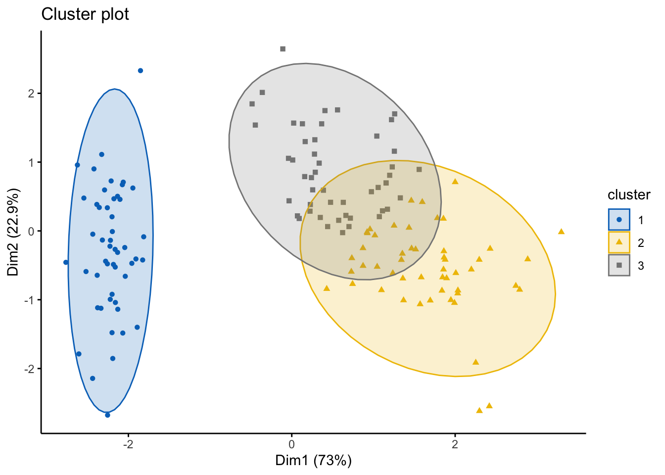
6.6 Evaluation Techniques
When doing any machine learning and data analytics it is important to pause, reflect, and consider how well our analysis fits with the data. This is particularly important with UNsupervised learning, such as clustering, as of course, we –the data scientist/analyst–are the ones who need to interpret these clusters. While it is relatively simple for the datasets we have used here as with the iris dataset, we know the species that the points will generally cluster into. However, this is often not what would happen when you’re using clustering in practice will be. It is more likely you’ll be given a dataset with a variety of metrics and you have no idea what the naturally occurring clusters will be, and therefore, the interpretation is critical.
For instance, if you had heart rate from a wearable device, what could you realistically infer from this if we notice a cluster had particularly high heart rates? Well, it depends… on what the other data are and the context. This might mean they were exercising hard when those measurements were taken, it might mean they are stressed if they were on a phonecall when the measurement was taken, it might infer an underlying health condition. Hence, we must be extremely careful with how we interpret and what biases we bring when analyzing these data. Again, if we had a dataset where we had information about how much someone uses their smartphone, and there is a cluster with ‘high’ smartphone usage–what do we infer? They use their phone too much? What about people who use phones for work and therefore are taking a lot of calls or answering emails on the device? Context and understanding your data are key, alongside knowing what questions you want to answer are.
Other than visual inspection via the plots we have created and also interpreting the clusters and thinking ‘do these clusters make sense?’, there are other statistics and diagnostics we can do in R that will help us also understand whether the clusters are appropriate. However, it is important that the human interpretation is key.
6.6.1 Internal Clustering Validation Methods
Remember here, the goal of clustering is to minimize the average distance within clusters; and to maximize the average distance between clusters. Therefore, some measures we can conisider to evaluate our clustering output are:
Compactness measures: to evaluate how close objects are within clusters, whereby low within-cluster variation implies good clustering
Separation measures: to determine how well separated a cluster is from another, which can be the distance between cluster centers, and pairwise minimum distances between objects in each cluster
Connectivity measures: relates to the nearest neighbors within clusters
The first way we can look at this is by running a Silhouette Analysis. This analysis measures how well an observation is clustered and it estimates the average distance between clusters. The silhouette plot displays a measure of how close each point in one cluster is to points in the neighboring clusters. Essentially, clusters with a large silhouette width are well very clustered, those with width near 0 mean the observation lies between two clusters, and negative silhouette widths mean the observation is likely in the wrong cluster.
We can run this analysis using the silhouette() function in the cluster package, as follows: silhouette(x, dist), where x is a vector of the assigned clusters, and the dist is the distance matrix via the dist() function. We will be returned an object that has the cluster assignment of each observation, the neighbor of the cluster, and the silhouette width.
We will use the iris dataset:
library('cluster')

df <- iris #loading data
df <- dplyr::select(df,
                    -Species) #removing Species
df <- scale(df) #scaling
head(df)
## Sepal.Length Sepal.Width Petal.Length Petal.Width
## [1,] -0.8976739 1.01560199 -1.335752 -1.311052
## [2,] -1.1392005 -0.13153881 -1.335752 -1.311052
## [3,] -1.3807271 0.32731751 -1.392399 -1.311052
## [4,] -1.5014904 0.09788935 -1.279104 -1.311052
## [5,] -1.0184372 1.24503015 -1.335752 -1.311052
## [6,] -0.5353840 1.93331463 -1.165809 -1.048667# lets run a quick K-means algo
km.res <- eclust(df, "kmeans", k = 3,
nstart = 25, graph = FALSE)
#running the silhouette analysis
sil <- silhouette(km.res$cluster, dist(df))
head(sil[, 1:3], 10) #looking at the first 10 observations## cluster neighbor sil_width
## [1,] 1 2 0.7341949
## [2,] 1 2 0.5682739
## [3,] 1 2 0.6775472
## [4,] 1 2 0.6205016
## [5,] 1 2 0.7284741
## [6,] 1 2 0.6098848
## [7,] 1 2 0.6983835
## [8,] 1 2 0.7308169
## [9,] 1 2 0.4882100
## [10,] 1 2 0.6315409#we can create an pretty visual of this
library('factoextra')
fviz_silhouette(sil)## cluster size ave.sil.width
## 1 1 50 0.64
## 2 2 53 0.39
## 3 3 47 0.35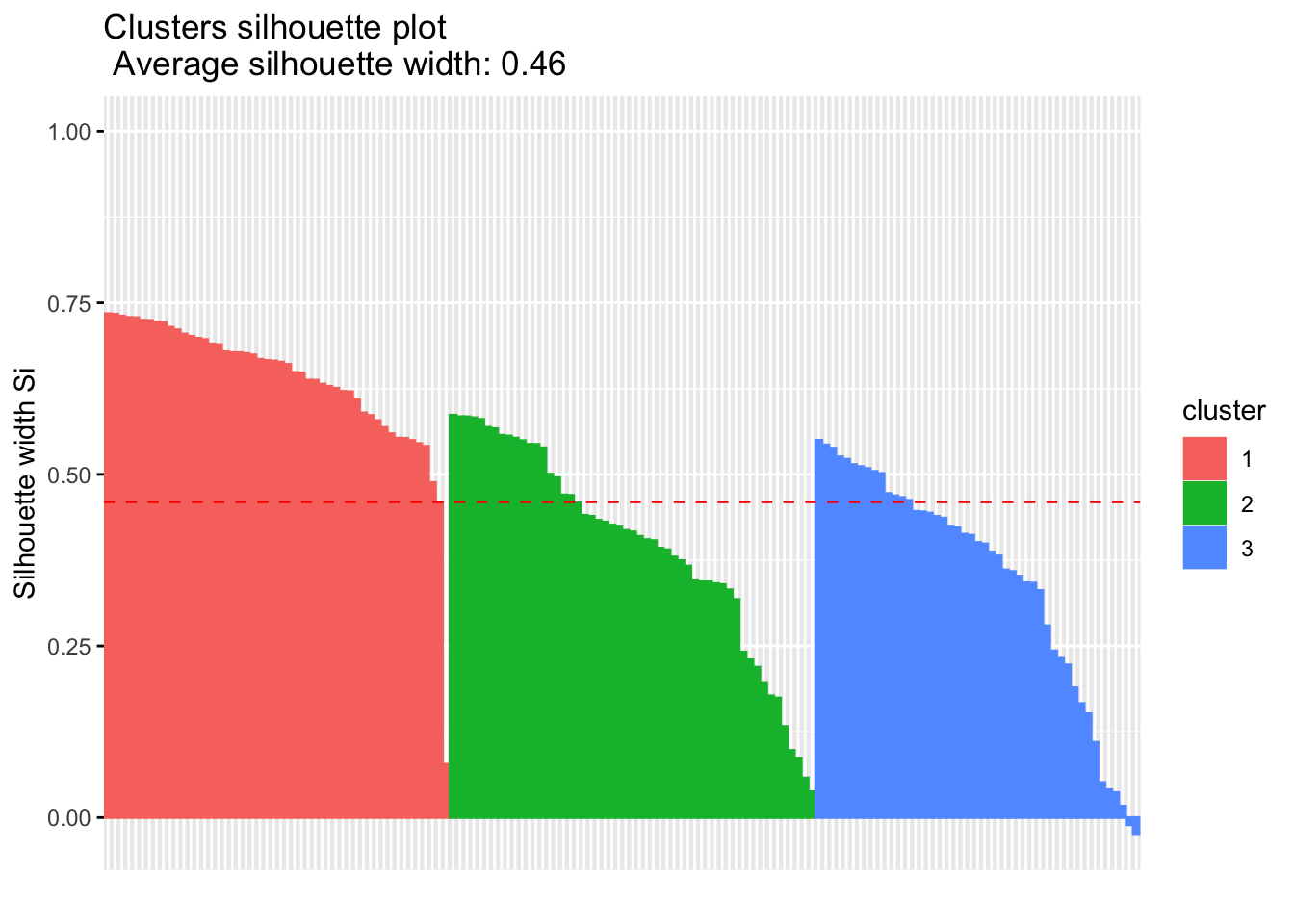
We can look at the results of this analysis as follows:
# Summary of silhouette analysis
si.sum <- summary(sil)
# Average silhouette width of each cluster
si.sum$clus.avg.widths
## 1 2 3
## 0.6363162 0.3933772 0.3473922What about the negative silhouette coefficients? This means that these observations may not be in the right cluster. Lets have a look at these samples and inspect them further:
# Silhouette width of observation
sil <- km.res$silinfo$widths[, 1:3]
# Objects with negative silhouette
neg_sil_index <- which(sil[, 'sil_width'] < 0)
sil[neg_sil_index, , drop = FALSE]## cluster neighbor sil_width
## 112 3 2 -0.01058434
## 128 3 2 -0.02489394There are a few options, where typically if there were many observations, we might need to try different values for k on the clustering algorithm, or we might reassign these observations to another cluster and examine whether this improves the performance.
Another metric we can use to evaluate clusters is the Dunn Index, which should be familiar… Essentially, if the data set contains compact and well-separated clusters, the diameter of the clusters is expected to be small and the distance between the clusters is expected to be large. Hence, Dunn index should be maximized. This can be done using the cluster.stats() command in the fpc package as follows: cluster.stats(d, clustering, al.clustering = NULL), where d is a distance matrix from the dist() function, clustering is the vector of clusters for each data point, and alt.clustering is a vector for clustering, indicating an alternative clustering.
Please note, the cluster.stats() command also has wide capabilities, where we can look at a number of other statistics:
cluster.number: number of clusterscluster.size: vector containing the number of points within each clusteraverage.distance, median.distance: vector containing the cluster-wise within average/median distancesaverage.between: average distance between clusters. (this would be as large as possible)average.within: average distance within clusters. (this should be as small as possible)clus.avg.silwidths: vector of cluster average silhouette widths (this should be as close to 1 as possible, and no negative values)within.cluster.ss: a generalization of the within clusters sum of squares (k-means objective function)dunn,dunn2: Dunn indexcorrected.rand,vi: Two indexes to assess the similarity of two clustering: the corrected Rand index and Meila’s VI
Let’s look at this closer using the scaled iris dataset from before:
library('fpc')
# Compute pairwise-distance matrices
df_stats <- dist(df, method ="euclidean")
# Statistics for k-means clustering
km_stats <- cluster.stats(df_stats, km.res$cluster) #this is using the kmeans clustering we did for the silhouette
km_stats #this prints all the statistics## $n
## [1] 150
##
## $cluster.number
## [1] 3
##
## $cluster.size
## [1] 50 53 47
##
## $min.cluster.size
## [1] 47
##
## $noisen
## [1] 0
##
## $diameter
## [1] 5.034198 2.922371 3.343671
##
## $average.distance
## [1] 1.175155 1.197061 1.307716
##
## $median.distance
## [1] 0.9884177 1.1559887 1.2383531
##
## $separation
## [1] 1.5533592 0.1333894 0.1333894
##
## $average.toother
## [1] 3.647912 2.674298 3.081212
##
## $separation.matrix
## [,1] [,2] [,3]
## [1,] 0.000000 1.5533592 2.4150235
## [2,] 1.553359 0.0000000 0.1333894
## [3,] 2.415024 0.1333894 0.0000000
##
## $ave.between.matrix
## [,1] [,2] [,3]
## [1,] 0.000000 3.221129 4.129179
## [2,] 3.221129 0.000000 2.092563
## [3,] 4.129179 2.092563 0.000000
##
## $average.between
## [1] 3.130708
##
## $average.within
## [1] 1.224431
##
## $n.between
## [1] 7491
##
## $n.within
## [1] 3684
##
## $max.diameter
## [1] 5.034198
##
## $min.separation
## [1] 0.1333894
##
## $within.cluster.ss
## [1] 138.8884
##
## $clus.avg.silwidths
##         1         2         3
## 0.6363162 0.3933772 0.3473922
##
## $avg.silwidth
## [1] 0.4599482
##
## $g2
## NULL
##
## $g3
## NULL
##
## $pearsongamma
## [1] 0.679696
##
## $dunn
## [1] 0.02649665
##
## $dunn2
## [1] 1.600166
##
## $entropy
## [1] 1.097412
##
## $wb.ratio
## [1] 0.3911034
##
## $ch
## [1] 241.9044
##
## $cwidegap
## [1] 1.3892251 0.7824508 0.9432249
##
## $widestgap
## [1] 1.389225
##
## $sindex
## [1] 0.3524812
##
## $corrected.rand
## NULL
##
## $vi
## NULL6.6.2 External Clustering Validation Method
Sometimes we might have data that we can compare results (hence, external validation), for instance the iris dataset has the species label we clustered. Hence, we can compare the clustering outputs and the species label already in the dataset. Note: we will not always have this, so this is not always possible.
So, using our kmeans clustering above, lets compare against the original iris dataset labels:
table(iris$Species, km.res$cluster)##
## 1 2 3
## setosa 50 0 0
## versicolor 0 39 11
## virginica 0 14 36So, lets interpret this:
All setosa species (n = 50) has been classified in cluster 1
A large number of versicor species (n = 39 ) has been classified in cluster 3, however, some of them ( n = 11) have been classified in cluster 2
A large number of virginica species (n = 36 ) has been classified in cluster 2, however, some of them (n = 14) have been classified in cluster 3
This shows there is some misclassifcation between clusters due to lack of distinctive features. Hence, we might want to try different clustering methods IF our question relates to whether we can cluster according to species.