Chapter 10 Applied Data Analytics: Principle Components Analysis (PCA)
PCA is a pretty powerful and interesting analysis, where essentially it is a type of data reduction. The key idea here is to take data and to reduce it and by doing this, we reveal complex and hidden structures within the original, larger dataset. This analysis can also help highlight important information within datasets while simultaneously reducing it’s size via component reduction. (Please note, this is slightly paraphrased from my paper, which can be read here: https://www.sciencedirect.com/science/article/pii/S0747563222000280) this subsequently is also where half of the analysis will come from as an example of various R packages one can use for PCA (and more generally, factor analyses).
The example in the paper above is a very specific use of a PCA. Here, we were looking at various psychometric scales used to measure people’s smartphone use. By psychometric scales, I mean being given a questionnaire and participants respond to rating scales (often from ‘strongly agree to strongly disagree). There are literally 100s of these scales that claim to measure various types of technology use, and many of which claim to measure unique types of usage, such as ’smartphone addiction’, ‘absent-minded smartphone use’, ‘phobia of being without a smartphone’, or ‘problematic smartphone use’. Each of these in their respective papers (see citations in the paper itself) pertain to be unique constructs. If this is so, when running a PCA over these data, we should find the same number of components as scales, as they should be unique enough, right?
Well, we found here, these scales are all measuring the same thing as they reduce down to only ONE component, whereby none of these scales are unique (nor do they actually measure technology use as we’ve found in other work – I’ll write more about this and add in more of this work ad examples of data analysis using real world data).
Anyway, lets have a look at how we run a PCA (I will expand the above to talk more about this, but I wanted to give a little background).
library('readr')
library('ltm') #for dependencies and the MASS package
library('dplyr') #data wrangling
library("nFactors") #parts of factor analyses
library('factoextra') #parts of factor analysis
library('magrittr') #piping
library('psych') #stats/data analysis

StudyOne_IJHCS <- read.csv("StudyOne_IJHCS.csv", header = T)

head(StudyOne_IJHCS) # so here we have 10 columns, each are a different scale
## MPPUS NS ES Sat SAS SABAS PMPUQ MTUAS SUQ_G SUQ_A
## 1 126 93 23 21 124 17 29 6.111111 42 54
## 2 154 124 18 20 98 13 28 6.444444 48 58
## 3 121 70 26 20 99 17 28 6.000000 43 54
## 4 102 89 23 22 94 16 27 5.666667 44 48
## 5 132 106 18 17 108 22 36 6.222222 50 59
## 6 77 74 16 13 87 10 27 6.222222 57 57When running a PCA, we need to be aware of correlations, often when doing a PCA we check that things are not highly correlated. We know that some these scales are well-correlated and generally you’d even drop some before running the PCA as it already suggests they’re measuring something similar (if not the same thing)…
Anyway, for the purposes of the study, we kept in all 10 scales and we create a correlation matrix as this is the data type required for the analysis. As a note, we are also doing whats known as a parallel analysis too to ensure our results are robust. A parallel analysis creates simulated random datasets (we used N=100) to then compare the eigenvalues from the simulated datastes against our dataset. (To be expanded…)
Prior to doing a PCA analysis, it is important to check sampling adequacy (MSA), which is done via the Kaiser-Meyer-Olkin (KMO) test. The average MSA for our sample was 0.9, more than sufficient to proceed (generally anything above 0.6 is good, see paper for more info).
PCA = cor(StudyOne_IJHCS)# for the parallel analysis, this needs to be a correlation matrix

# checking sampling adequacy (KMO)
KMO(PCA) #overall MSA = 0.9, which is "marvelous"
## Kaiser-Meyer-Olkin factor adequacy
## Call: KMO(r = PCA)
## Overall MSA = 0.9
## MSA for each item =
## MPPUS NS ES Sat SAS SABAS PMPUQ MTUAS SUQ_G SUQ_A
## 0.90 0.96 0.87 0.86 0.92 0.93 0.96 0.83 0.86 0.90From here, everything looks OK for us to proceed with a PCA analysis. This is quite a simple set of code and includes the parallel analysis in there. Just be careful to adapt the numbers in the code to fit your dataset…
PCAParallel <- fa.parallel(PCA,
                           n.obs=238, #make sure this is correct for your sample
                           fm="minres",
                           fa="pc", #pc = PCA, both = PCA and Factor Analysis, fa = Factor analysis only
                           nfactors=1,
                  main="Parallel Analysis Scree Plots",
                  n.iter=100, #how many simulated datasets?
                  error.bars=FALSE,
                  se.bars=FALSE,
                  SMC=FALSE,
                  ylabel=NULL,
                  show.legend=TRUE,
                  sim=T,
                  quant=.95,
                  cor="cor",
                  use="pairwise",
                  plot=TRUE,correct=.5)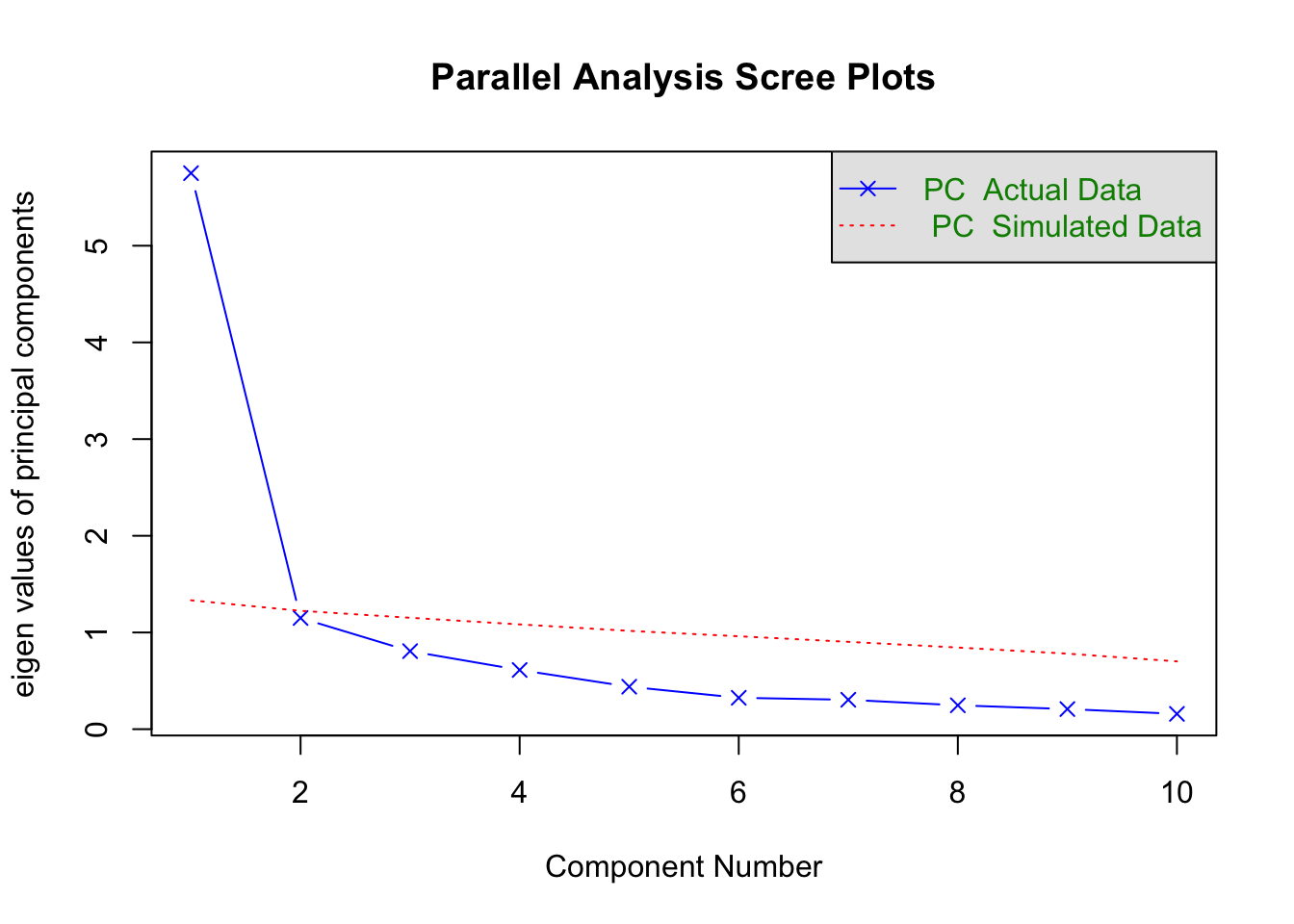
## Parallel analysis suggests that the number of factors = NA and the number of components = 1print(PCAParallel)## Call: fa.parallel(x = PCA, n.obs = 238, fm = "minres", fa = "pc", nfactors = 1,
## main = "Parallel Analysis Scree Plots", n.iter = 100, error.bars = FALSE,
## se.bars = FALSE, SMC = FALSE, ylabel = NULL, show.legend = TRUE,
## sim = T, quant = 0.95, cor = "cor", use = "pairwise", plot = TRUE,
## correct = 0.5)
## Parallel analysis suggests that the number of factors = NA and the number of components = 1
##
## Eigen Values of
##
## eigen values of factors
## [1] 5.33 0.57 0.30 0.04 -0.03 -0.04 -0.11 -0.14 -0.25 -0.33
##
## eigen values of simulated factors
## [1] NA
##
## eigen values of components
## [1] 5.75 1.15 0.81 0.61 0.44 0.32 0.30 0.25 0.21 0.16
##
## eigen values of simulated components
## [1] 1.33 1.22 1.15 1.08 1.02 0.96 0.90 0.84 0.78 0.70So, how do we interpret this? Well, if the eigenvalues from our dataset exceed the simulated average eigenvalues, we retain them as a component. The PA here revealed only one component, which you can also see in the figure plotted. Our simulated eigenvalue was 1.33 in comparison to 5.75 (our dataset). You can see the rest of the eigen values in our dataset are lower than the simulated and are therefore dropped.
We can also create other visualizations from a PCA, for instance a biplot:
#biplot viz
res.pca <- prcomp(StudyOne_IJHCS, scale = TRUE)
fviz_eig(res.pca)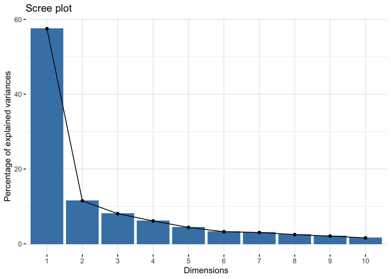
fviz_pca_var(res.pca,
             col.var = "contrib", # Color by contributions to the PC
             gradient.cols = c("#00AFBB", "#E7B800", "#FC4E07"),
             repel = TRUE     # Avoid text overlapping
)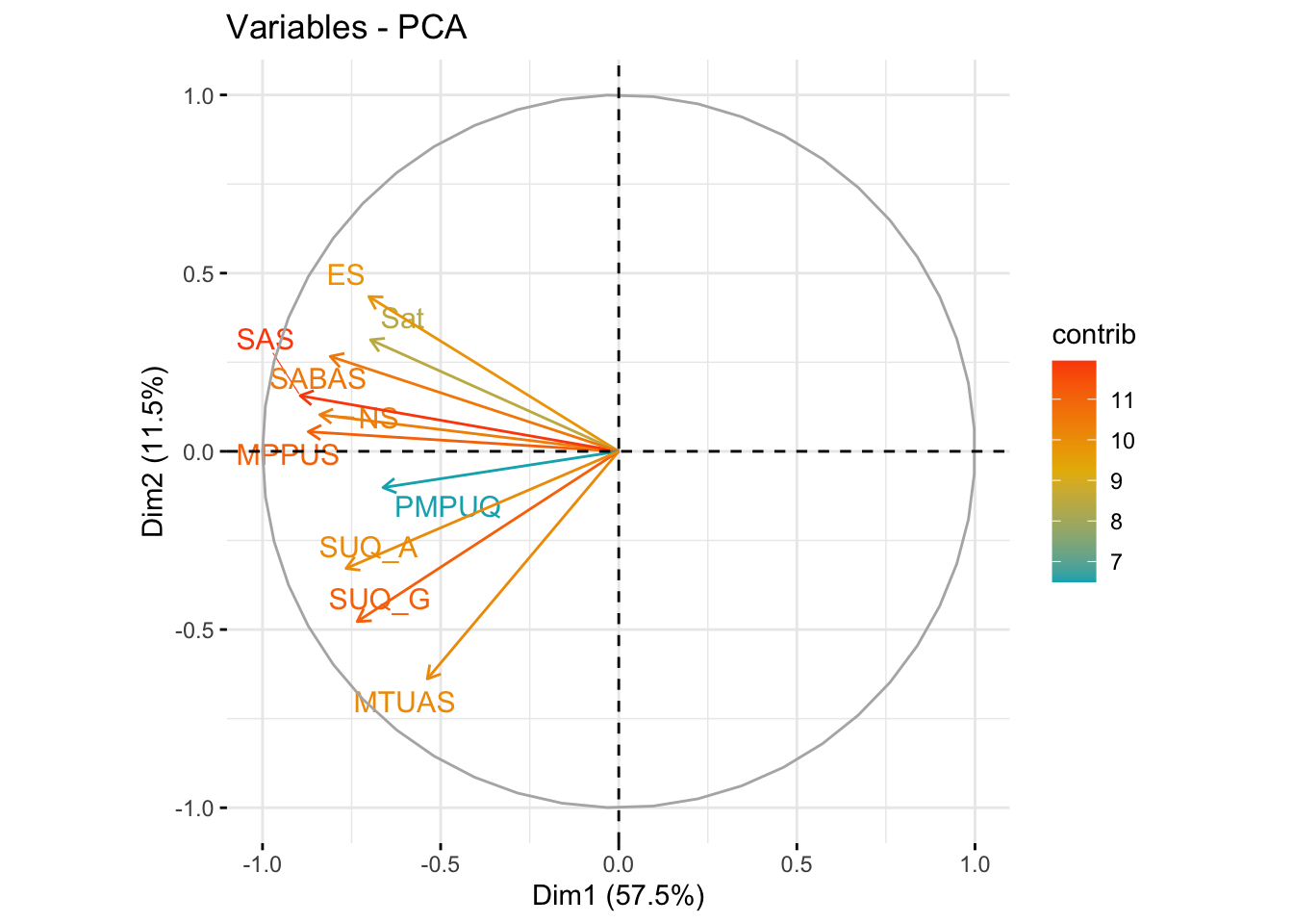
A biplot allows us to visualize and assess the quality of representation (cosine2) across all scales by plotting the amount of variance explained across two components. Most scales aligned with component one (57.5% variance explained) (x-axis) with few aligning with component two (y-axis) (11.5% variance explained).
This essentially further shows the lack of the existence of more than one component. The cosine2 value/coloring of the lines for each scale reveals which scale(s) contribute the most to each component… what we can see here is that the SAS (smartphone addiction scale) is the most representative scale across the whole sample.
Generally what this overall shows is that these scales all fall into one cluster and appear to measure a very similar, if not identical, construct.