第 3 章 数据可视化
数据可视化是R里面非常重要的一项功能,R语言作图非常强大,不仅仅R base基本自带的功能可以实现大多数作图要求,而且还有海量的安装扩展包,使得作图内容更加丰富,这个章节我除了简单介绍R基本作图方法,还会着重介绍一下 ggplot2这个安装包,这个是一个非常强大的也在R安装包里面最为出名的绘图包,拥有丰富多彩的绘图语言,而且可以根据自己的喜好自由修改各个参数,非常适合于科研绘图。首先我先将R里面常见的绘图方法给大家简单介绍一下。
3.1 散点图
这类的图很常见,在R里面实现非常简单。下面我们看一个示例。我们调用R自带的一个数据iris3来进行绘图。
data("iris")
plot(iris)## plot 程序默认使用散点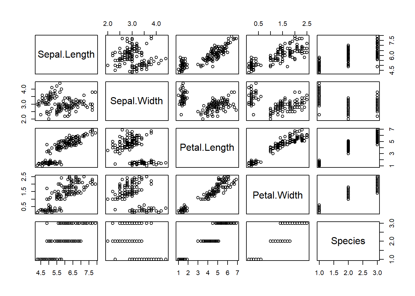
图3.1: 整个数据集的散点图
可以看到,如果直接把这个数据plot出来的话,会将每个因子一一作成相关图,这样非常方面粗略判断数据的形式,各个因子的相关性,如果你不想看到全部因子的相关性,你只想对其中两个因子的关系进行绘图,我们可以进行下一步,比如我想具体查看一下 Sepal.Width 和 Petal.Length的相关性,我们可以用 $符号跟在数据集名字后面进行特定因子选择,如下:
# 横坐标为Sepal.Width,纵坐标为Petal.Length
plot(iris$Sepal.Width,iris$Petal.Length)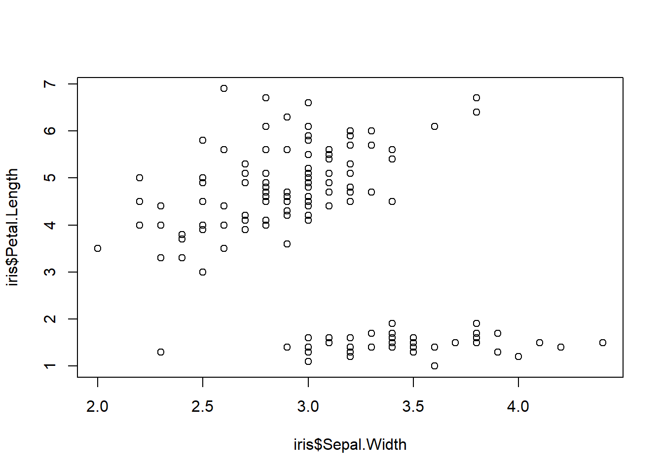
图3.2: 两个因子的散点图
3.1.1 改变标题和坐标轴字体
data("iris")
library(showtext)
showtext.auto(enable = TRUE)
plot(iris$Sepal.Width,iris$Petal.Length,
    family= "kaishu",
     xlab= '我是x轴',# 设定x轴名称
     ylab = '我是y轴',# 设定y轴名称
     main = '我是个标题(I am a title)')# 设定标题名称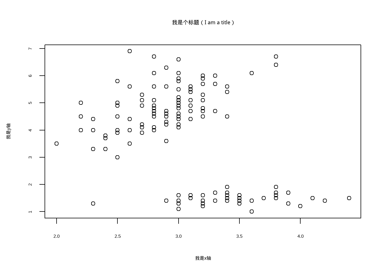
图3.3: 改变标题和坐标轴字体
3.1.2 改变散点及字体大小
cex在plot程序里用来调节图中散点的大小。cex.lab、cex.axis 和cex.main可以调节标题和坐标轴的大小,值可以取大于零的任何数,同样的,我们也可以根据分组,按照不同的分组进行大小调节,如果分组不是numeric形式而是factor或者 character 的话,要转换成这个形式numeric才可以用哦.
library(showtext)
showtext.auto(enable = TRUE)
plot(iris$Sepal.Width,iris$Petal.Length,
     main = '我是个标题(I am a title)',
     family= "kaishu",
      xlab= '我是x轴',# 设定x轴名称
     ylab = '我是y轴',# 设定y轴名称
     cex=2,
     cex.lab= 1,
     cex.axis= 2,
     cex.main = 2)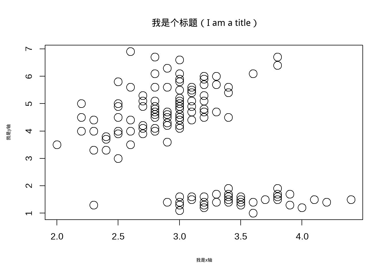
图3.4: 改变散点及字体大小
#根据分组变大小

plot(iris$Sepal.Width,iris$Petal.Length,
     main = '我是个标题(I am a title)',#标题
     family= "kaishu",#指定字体类型
     cex=as.numeric(iris$Species),# 散点大小,按分组
     xlab= '我是x轴',# 设定x轴名称
     ylab = '我是y轴',# 设定y轴名称
     cex.lab= 1,# 坐标标签字体大小
     cex.axis= 2,# 坐标轴字体大小
     cex.main = 2)# 标题字体大小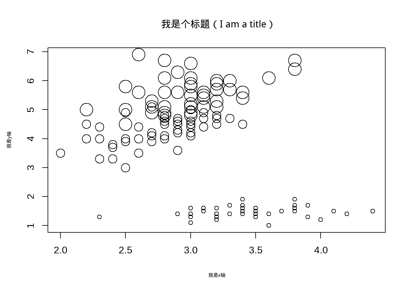
图3.5: 改变散点及字体大小
3.1.3 改变散点颜色和类型
col在plot程序里用来调节图中散点的颜色。pch、 可以调节散点类型,值可以取大于零的任何数,也可以是指定名字,具体颜色和pch类型种类很多,我这里就不展开讲,同样,也可以根据分组进行颜色和类型作图:
##
plot(iris$Sepal.Width,iris$Petal.Length,main = '我是个标题(I am a title)',family= "kaishu",
     cex=2,cex.lab= 1,
     cex.axis= 2,
     cex.main = 2,
     xlab= '我是x轴',# 设定x轴名称
     ylab = '我是y轴',# 设定y轴名称
     col=2,# or col= 'red',
     pch=as.numeric( iris$Species)#或者不同数值
     )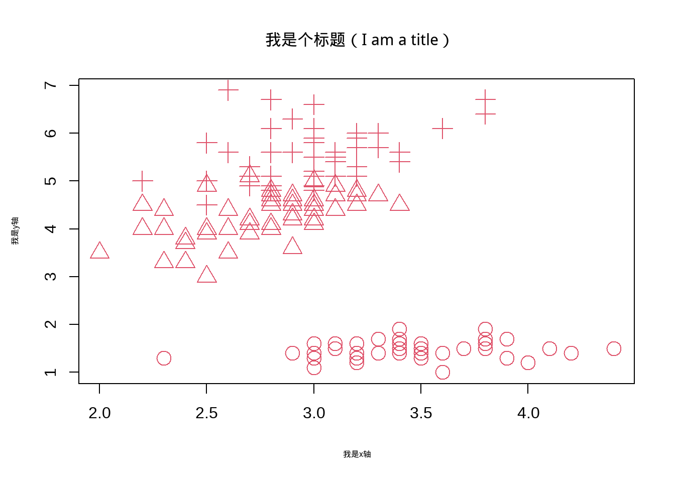
图3.6: 改变颜色和散点类型
plot(iris$Sepal.Width,iris$Petal.Length,main = '我是个标题(I am a title)',family= "kaishu",
     cex=2,cex.lab= 1,
     cex.axis= 2,
     cex.main = 2,
     xlab= '我是x轴',# 设定x轴名称
     ylab = '我是y轴',# 设定y轴名称
     col=iris$Species,#根据分组
     pch=as.numeric( iris$Species)#或者不同数值
     )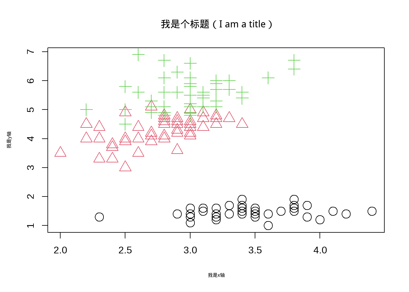
图3.7: 改变颜色和散点类型
3.2 ggplot 散点图
接下来的每个小章节,在介绍完如何用R基础或者其他安装包完成各种图形的绘制时,都会着重讲一下如何用ggplot来实现。前面我们介绍了使用R常规方法来进行散点图的绘制,下面我们来看一下如何用ggplot2这个安装包的 ggplot程序来进行散点图绘制。同样的使用iris这个数据。ggplot的代码结构很简单,首先我们使用ggplot 程序来调用程序,括号里面首先我们需要告诉ggplot 我们使用什么数据,这里我们使 iris这个数据,然后我们aes在ggplot里面是要告诉我们使用这个数据里面的那两个值进行散点图得绘制,这里我们选择的是跟前面的一样的变量,Sepal.Width和 Sepal.Length,系统默认第一个是x坐标,第二个是y坐标,你也可以使用 x=和 y= 来指定这个数据里面的变量做x 和y。 然后这个主题就做好了,接下来是要用geom_ 告诉ggplot我们要用什么形式做散点图。这里我们用到 geom_point(),下面就是例子:
data("iris")
library(ggplot2)

ggplot( iris, aes(Sepal.Width,Sepal.Length))+
  geom_point()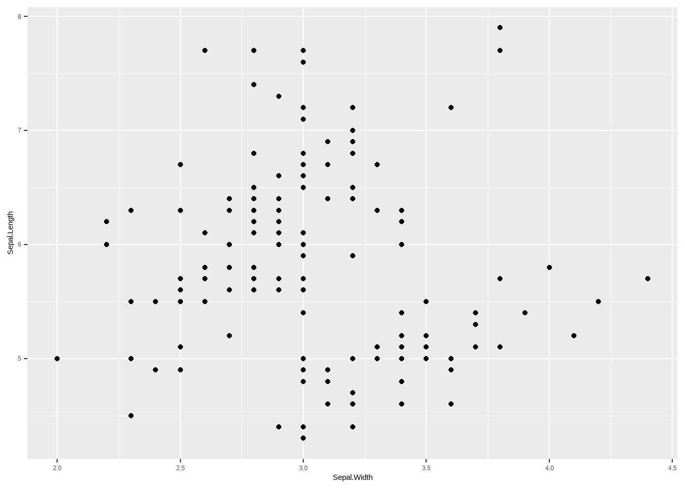
图3.8: ggplot 散点图
3.2.1 改变散点特征、大小及颜色
data("iris")
library(ggplot2)

##指定颜色大小
## size用来设定大小
## col 用来设置颜色
ggplot( iris, aes(Sepal.Width,Sepal.Length))+
  geom_point(size =2,col = 'red')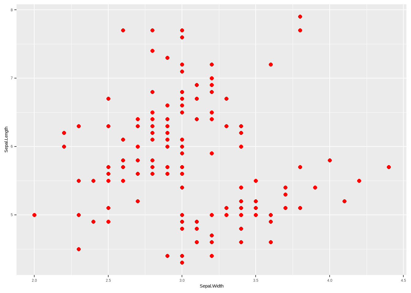
图3.9: 改变散点特征、大小及颜色
##按分组颜色与大小
ggplot( iris, aes(Sepal.Width,Sepal.Length))+
  geom_point(size =as.numeric(iris$Species),col = as.numeric(iris$Species))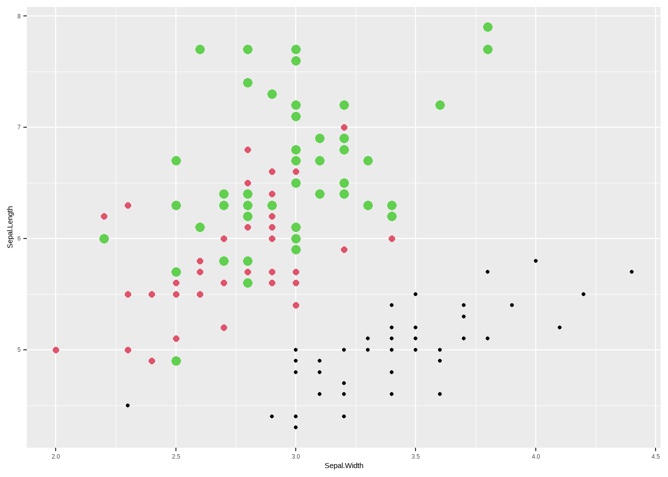
图3.10: 改变散点特征、大小及颜色
##按分组的特征、大小与颜色
# shape 用来设置特征
ggplot( iris, aes(Sepal.Width,Sepal.Length))+
  geom_point(size =as.numeric(iris$Species),
             shape= as.numeric(iris$Species),
             col = as.numeric(iris$Species))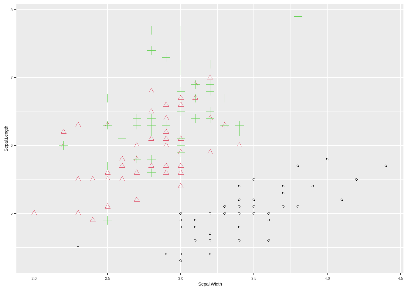
图3.11: 改变散点特征、大小及颜色
3.2.2 改变坐标轴相关指标
theme 可以用来对 ggplot所作图形进行参数修改,相当于添加很多个图层在原始图片上,非常方便。接下来我们介绍几种常见的设置。
data("iris")
library(ggplot2)

##指定颜色大小
## size用来设定大小
## col 用来设置颜色
##按分组颜色与大小
### 把背景变为经典白  theme_classic()
##base_size用来调节坐标轴字体大小
ggplot( iris, aes(Sepal.Width,Sepal.Length))+
  geom_point(size =as.numeric(iris$Species),
             col = as.numeric(iris$Species))+
  theme_classic(base_size = 16)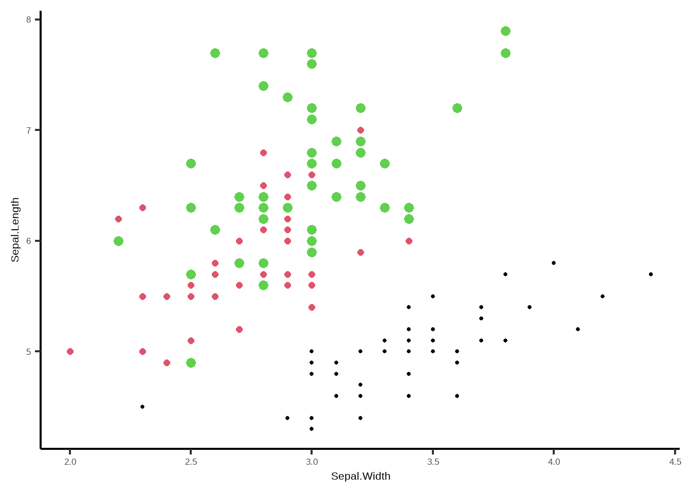
图3.12: 改变坐标轴相关指标
### 把背景变为经典黑  theme_dark()
ggplot( iris, aes(Sepal.Width,Sepal.Length))+
  geom_point(size =as.numeric(iris$Species),
             col = as.numeric(iris$Species))+
theme_dark()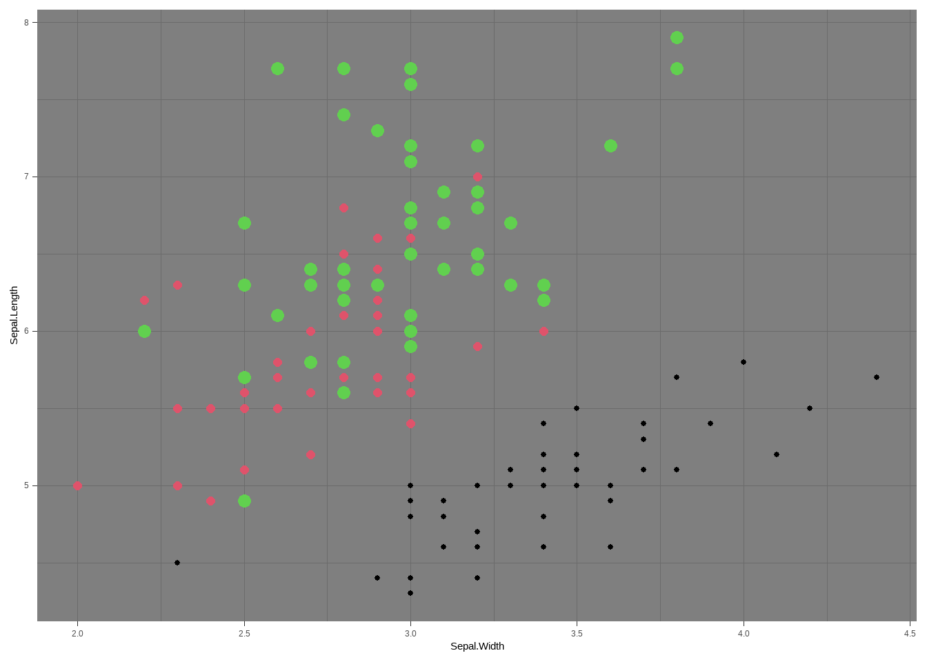
图3.13: 改变坐标轴相关指标
### 根据自己需要进行坐标轴相关修改
ggplot( iris, aes(Sepal.Width,Sepal.Length))+
  geom_point(size =as.numeric(iris$Species),
             col = as.numeric(iris$Species))+
##axis.text 用来修改坐标轴数字的大小颜色等指标
theme(axis.text  = element_text(size = 15),
##axis.title  用来修改坐标轴lable字体相关内容,可以修改,字体类型,字体大小,字体颜色,字体粗斜体等
      axis.title = element_text(size = 15),
##axis.line.x  用来修改横坐标X 线条的相关指标
      axis.line.x = element_line(colour = 'black'),
##axis.line.y  用来修改纵坐标Y 线条的相关指标
      axis.line.y  = element_line(colour = 'black'),
##  panel.background 用来修改整个图层底部颜色等相关指标
      panel.background = element_rect(color ='grey',fill = "white",linetype =0 ),
## panel.grid 用来修改图中网格,这里我设置成blank,就是没有网格。
      panel.grid = element_blank()
  ) +
  ##xlab 和 ylab 用来修改横纵坐标的名称。
  xlab(label = 'x lables ') +
  ylab('y lables')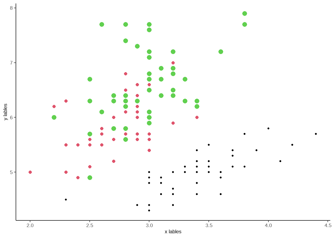
图3.14: 改变坐标轴相关指标
你也可以通过 ?theme 来查看所有theme里面的代码
3.3 线性图
线性图也是一种常见的数据分析图,R里面实现线性图非常简单,对于大量的光谱数据,我们可以继续使用 matplot程序。这里我们用光谱数据来举例,光谱数据,每个样本都会有一个光谱数据,我们这里的光谱数据为9000 cm^-1 到 4000 cm^-1, 我们这里将这个光谱数据用线性图表达出来。我们用数据的 colnames 做横坐标,然后每个点的值做纵坐标。
data <- readRDS('my_data.rds')
# 将 光谱数据提取出来当成一个数据
nir <- as.matrix(data[1:1296])
x <- as.numeric(colnames(nir))
#这里的 t 是转置的意思,将数据转置一下,以达到x,y的 有同样的row数据
#这里我对col、cex 等进行了设置,让大家可以清楚如何设置

matplot(x, t(nir),type='l',xlim =c(9000,4000),
        xlab = expression(paste('Wavelength (cm'^'2',')')),
        ylab = 'Absorbance',
#lty 是设置linetype 类型,可以数字,也可以是指定名字
        lty = 1,
# lwd 是设置线性的粗细度
        lwd = 2,
        main = 'I am a title',
        cex.lab=2,
        cex.axis =2,
        col.lab = 'red',
         col.axis = 'red'
        )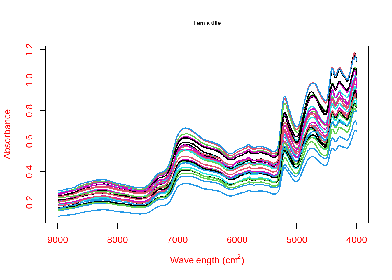
图3.15: 线性图
3.4 ggplot线性图
我们当然也可以使用ggplot来做线性图,而且图形更容易进行编辑。
#调取 光谱数据
data <- readRDS('my_data.rds')
## 给光谱数据增加一行factor变量
data$rowname <- rownames(data)
library(reshape2)
## 将数据由宽变窄
melt_data <- melt(data,id.vars = 'rowname')
str(melt_data)
## 'data.frame': 36288 obs. of 3 variables:
## $ rowname : chr "B1-11.0000" "B1-11.0001" "B1-11.0002" "B1-11.0003" ...
## $ variable: Factor w/ 1296 levels "8995","8991",..: 1 1 1 1 1 1 1 1 1 1 ...
## $ value : num 0.206 0.26 0.201 0.275 0.213 ...## 这里varible是factor形式,需要变成
ggplot(melt_data,aes(as.numeric(as.character(variable)),value,group = rowname))+
geom_line(col = 'grey',size= 1)+
##axis.text 用来修改坐标轴数字的大小颜色等指标
theme(axis.text = element_text(size = 15,colour = 'red'),
##axis.title 用来修改坐标轴lable字体相关内容,可以修改,字体类型,大小,颜色,粗斜体等
axis.title = element_text(size = 15,colour = 'red'),
##axis.line.x 用来修改横坐标X 线条的相关指标
axis.line.x = element_line(colour = 'black'),
##axis.line.y 用来修改纵坐标Y 线条的相关指标
axis.line.y = element_line(colour = 'black'),
## panel.background 用来修改整个图层底部颜色等相关指标
panel.background = element_rect(color ='grey',fill = "white",linetype =0 ),
## panel.grid 用来修改图中网格,这里我设置成blank,就是没有网格。
panel.grid = element_blank()
) +
xlim(9000,4000)+
##xlab 和 ylab 用来修改横纵坐标的名称。
xlab(label = 'x lables ') +
ylab('y lables')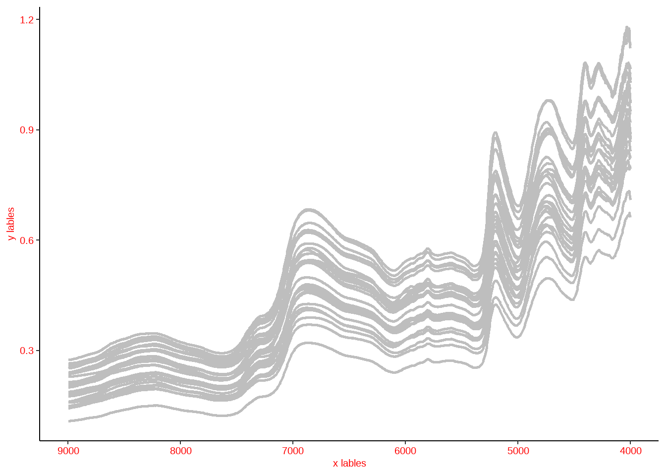
图3.16: ggplot线性图
3.5 箱型图(boxplot)
箱型图可以用来比较各个因子之间的对比关系,以 iris数据为例,我想知道三种 Species 里面 Sepal.Length的分布情况,这时候我们就可以用boxplot 来完成。
#调取 光谱数据
data("iris")
##其中参数修改参考
boxplot(Sepal.Length  ~ Species,data = iris)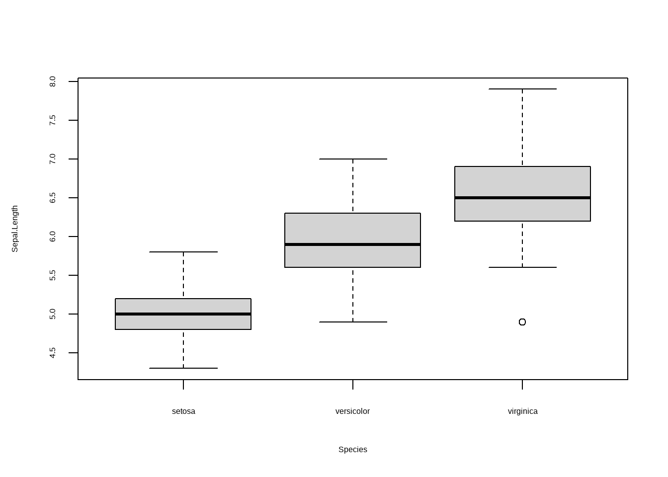
图3.17: 箱型图
3.6 ggplot箱型图
我们当然也可以使用ggplot来做箱型图也很简单。其中的参数修改可以参考 3.2和 3.4。
#调取 光谱数据
data("iris")
library(ggplot2)
##其中参数修改参考
ggplot(iris,aes(Species,Sepal.Length,fill = Species))+geom_boxplot(
   # custom boxes
        # color="blue",
  ##alpha用来设置透明度
        alpha=0.7,
        # Notch?试试notch=T
        notch=F,
        notchwidth = 0.8,

        # custom outliers
        outlier.colour="red",
        outlier.fill="red",
        outlier.size=3
)+
##你也可以指定三个分组的fill颜色
  scale_fill_manual(values = c('red','red','black'))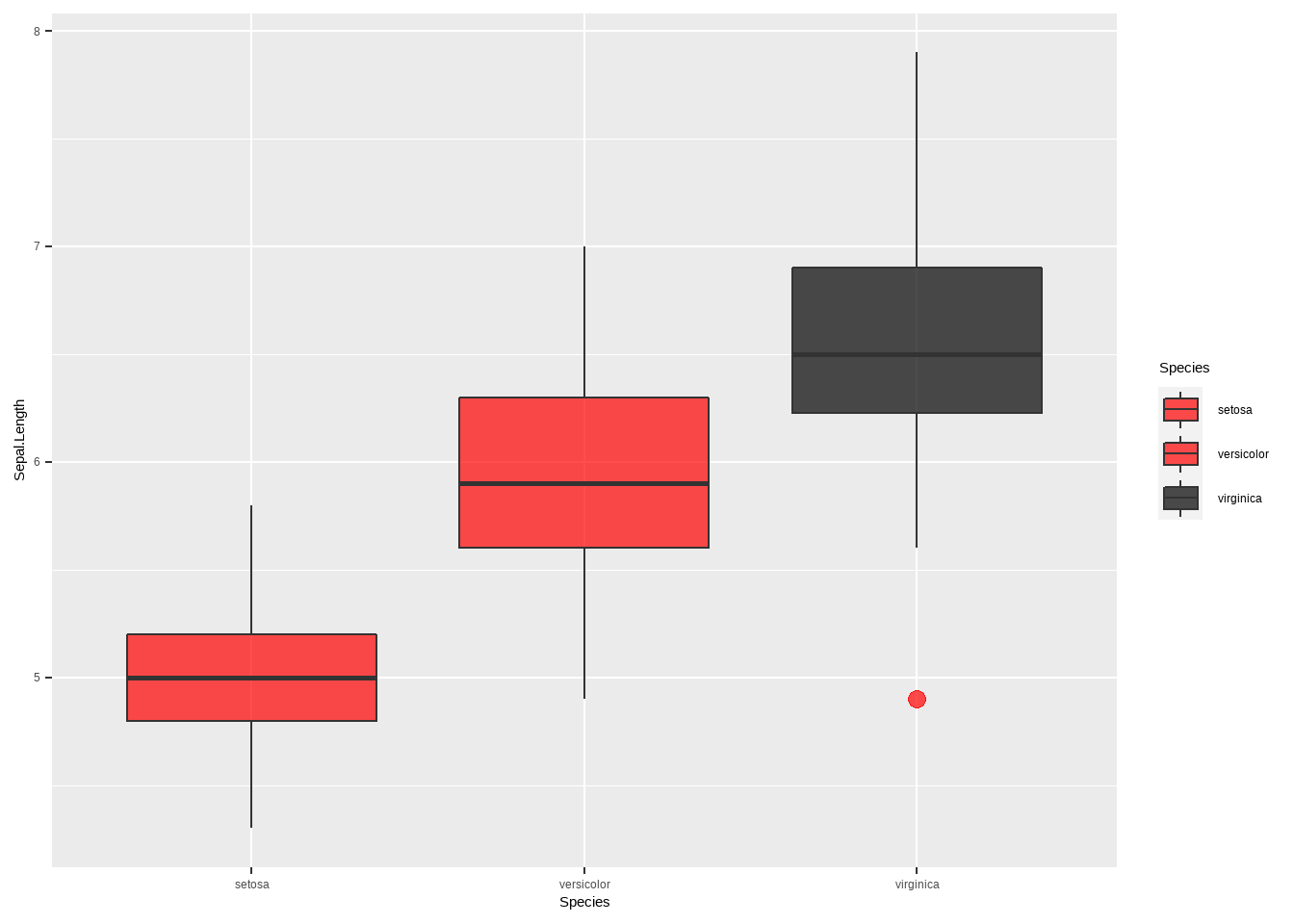
图3.18: ggplot箱型图
你也可以做一些比较有趣的箱形图,这个可以通过viridis和 ggExtra安装包来实现.
#调取 光谱数据
data("iris")
library(ggplot2)
library(viridis)
## 载入需要的程辑包:viridisLitelibrary(ggExtra)
##其中参数修改参考
ggplot(iris,aes(Species,Sepal.Length,fill = Species))+
# geom_boxplot(
# # custom boxes
# # color="blue",
# ##alpha用来设置透明度
# alpha=0.7,
# # Notch?试试notch=T
# notch=F,
# notchwidth = 0.8,
#
# # custom outliers
# outlier.colour="red",
# outlier.fill="red",
# outlier.size=3
# )+
geom_violin() +
# scale_fill_viridis(discrete = TRUE, alpha=0.6, option="A")+
##你也可以指定三个分组的fill颜色
scale_fill_manual(values = c('red','red','black'))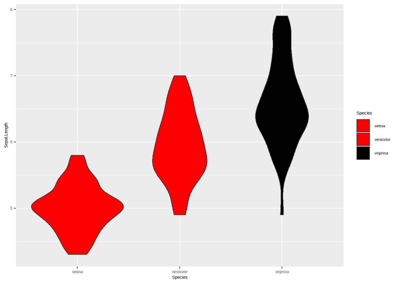
#调取 光谱数据
data("iris")
library(ggplot2)
library(viridis)
library(ggExtra)

p <- ggplot(iris,aes(Sepal.Width,Sepal.Length,fill = Species))+
#   geom_boxplot(
#    # custom boxes
#         # color="blue",
#   ##alpha用来设置透明度
#         alpha=0.7,
#         # Notch?试试notch=T
#         notch=F,
#         notchwidth = 0.8,
#
#         # custom outliers
#         outlier.colour="red",
#         outlier.fill="red",
#         outlier.size=3
# )+
  geom_point() +
# scale_fill_viridis(discrete = TRUE, alpha=0.6, option="A")+

##你也可以指定三个分组的fill颜色
scale_fill_manual(values = c('red','red','black'))library(ggplot2)
library(viridis)
library(ggExtra)
ggMarginal(p, type="boxplot")
ggMarginal(p, type="density")
ggMarginal(p, type="histogram")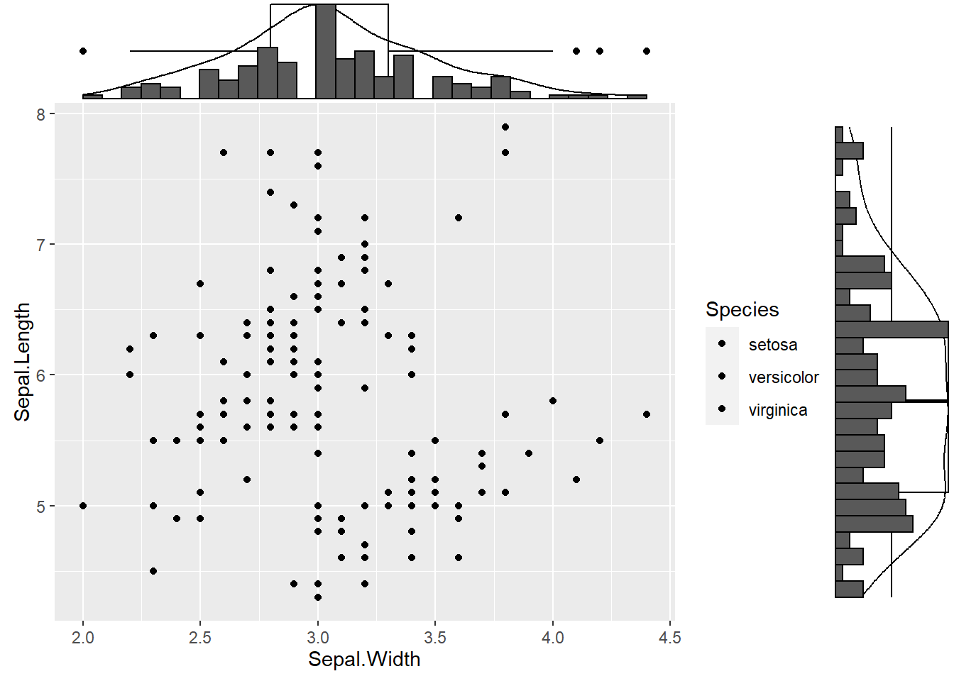
图3.19: ggplot箱型图3
3.7 热图
热图是一种比较常见的相关图的一种,通常都会结合相关图进行相关性数据可视化。R里面自带绘制热图程序,heatmap(),我们继续用iris数据为例。由于热图要求数据必须是matrix形式,因此不能出现factor的行。
#调取 光谱数据
data("iris")
##其中参数修改参考
heatmap(as.matrix(iris[1:4]))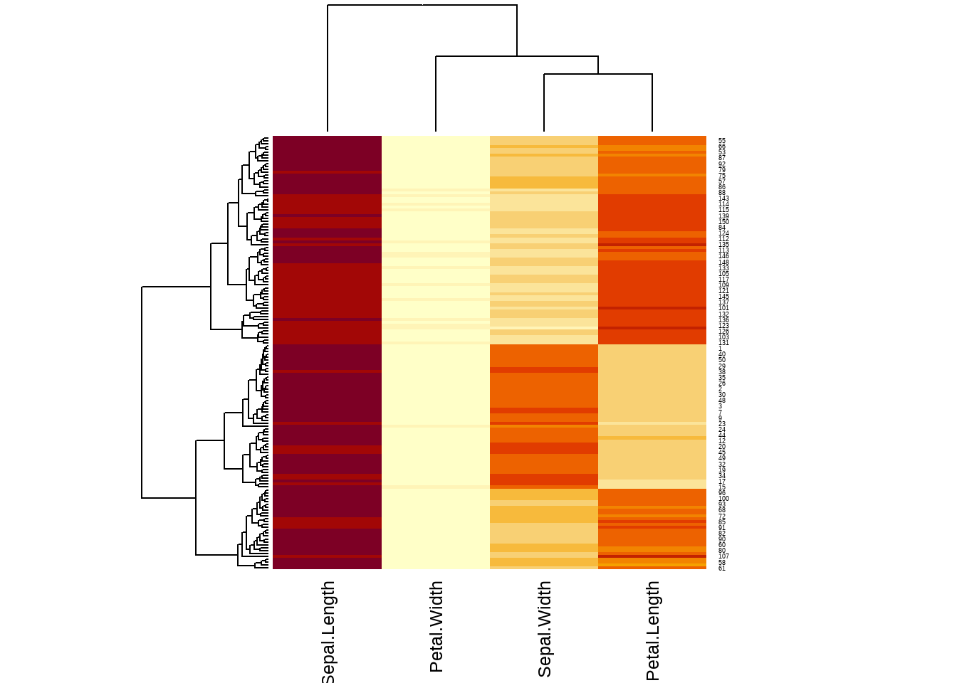
图3.20: 热图
#数据标准化
heatmap(as.matrix(iris[1:4]),scale = 'column',col = cm.colors(256))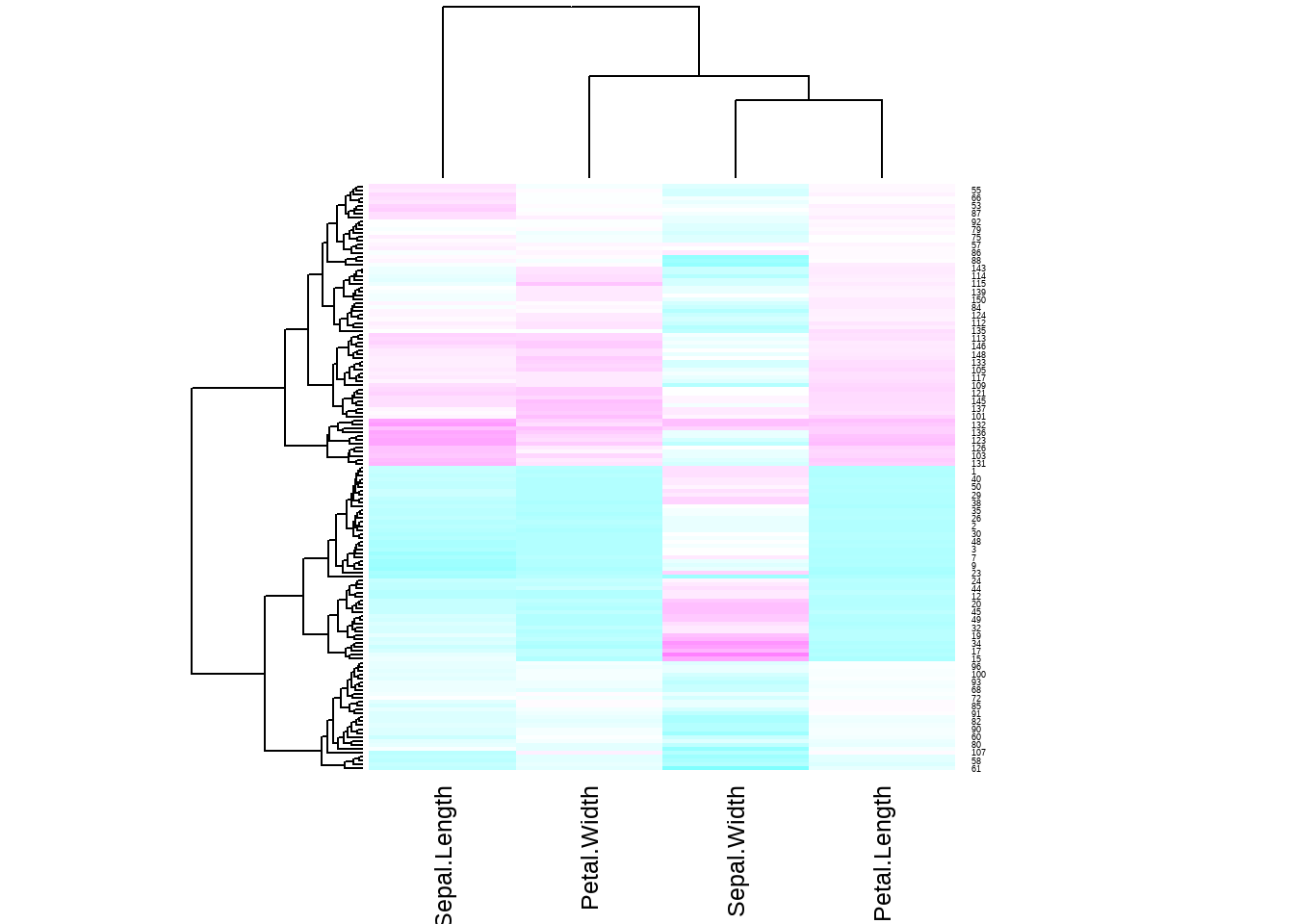
图3.21: 热图
3.8 ggplot热图
热图是一种比较常见的相关图的一种,通常都会结合相关图进行相关性数据可视化。R里面自带绘制热图程序,heatmap(),我们继续用iris数据为例。由于热图要求数据必须是matrix形式,因此不能出现factor的行。
#调取 光谱数据
data("iris")
library(reshape2)
mar_iris <- as.matrix(iris[1:4])
data_iris <- melt(mar_iris )
names(data_iris) <- c('x','y','value')
# Heatmap
ggplot(data_iris, aes(x,y, fill=value)) +
  geom_tile()+
#scale_fill_gradient() 可以对 热图进行调色
scale_fill_gradient(low="white", high="blue") 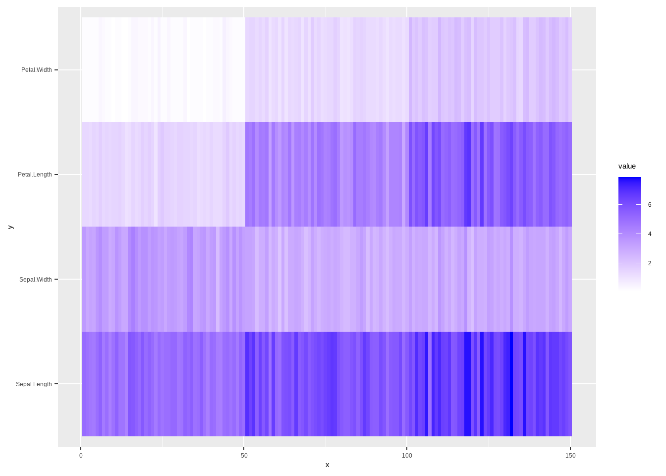
图3.22: ggplot热图
3.9 相关图
相关性图表在分析数据关联性上非常好用,R在这方面也非常强大,我们先来看看R里面的安装包library(corrplot)来做相关图,依然用iris数据为例,我们想了解一下数据集里面 Sepal.Length,Sepal.Width,Petal.Length,Petal.Width这四个性状的相关性,首先我们先来做一下相关性分析,
library(corrplot)
## corrplot 0.84 loaded
library(RColorBrewer)
data("iris")
#round 在这里是统一小数点后几位数
corr <- round(cor(iris[1:4]),1)
head(corr)
##              Sepal.Length Sepal.Width Petal.Length Petal.Width
## Sepal.Length          1.0        -0.1          0.9         0.8
## Sepal.Width          -0.1         1.0         -0.4        -0.4
## Petal.Length          0.9        -0.4          1.0         1.0
## Petal.Width           0.8        -0.4          1.0         1.0
corrplot(corr, type="full",
         method = "circle",
         tl.col = 'black',
         tl.cex = 1,
        col=brewer.pal(n=4, name="RdYlBu"),
         order="hclust")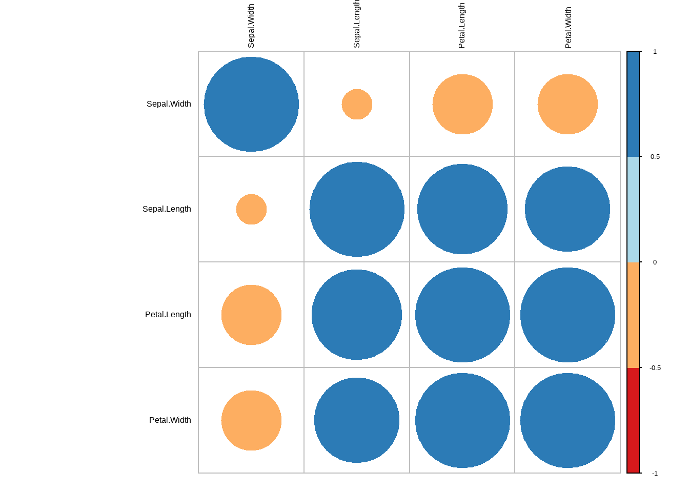
图3.23: 相关图
##通过?corrplot 可以查看所有的参数设置3.10 ggplot相关图
library(ggcorrplot)
data("iris")

#round 在这里是统一小数点后几位数
corr <- round(cor(iris[1:4]),1)
head(corr)
##              Sepal.Length Sepal.Width Petal.Length Petal.Width
## Sepal.Length          1.0        -0.1          0.9         0.8
## Sepal.Width          -0.1         1.0         -0.4        -0.4
## Petal.Length          0.9        -0.4          1.0         1.0
## Petal.Width           0.8        -0.4          1.0         1.0
#计算P值
p.mat <- cor_pmat(corr)
ggcorrplot(corr,
           hc.order = TRUE,
           lab = TRUE,

            type = "full",
           outline.col = "white",
           p.mat = p.mat,
            colors = c("#6D9EC1", "white", "#E46726"),
  #你也可以选择‘circle’等hao
           method = "square")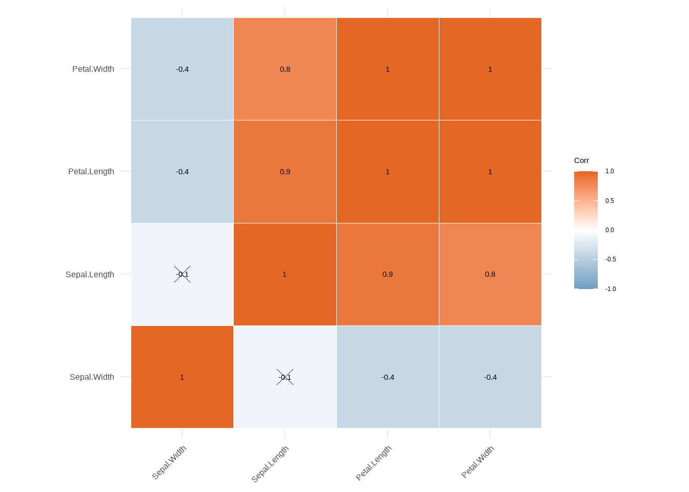
图3.24: ggplot相关图
##通过?corrplot 可以查看所有的参数设置3.11 直方图
先看一下如何用R基础方程作直方图,其中一些参数修改可以参考 plot程序。
data("iris")
h <- hist(iris$Sepal.Length)
text(h$mids,h$counts,labels=h$counts)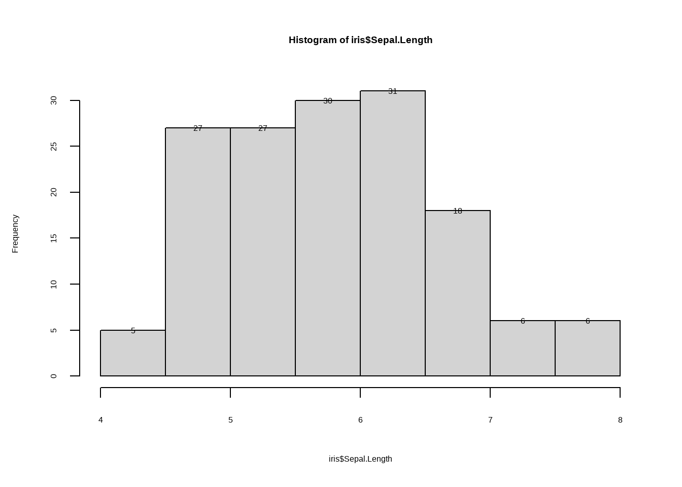
图3.25: 直方图
3.12 ggplot直方图
data("iris")
library(reshape2)
mar_iris <- as.matrix(iris[1:4])
data_iris <- melt(mar_iris )
names(data_iris) <- c('x','y','value')

ggplot(data_iris,aes(value))+ geom_histogram()+
  facet_grid(.~y,scales = 'free')
## `stat_bin()` using `bins = 30`. Pick better value with `binwidth`.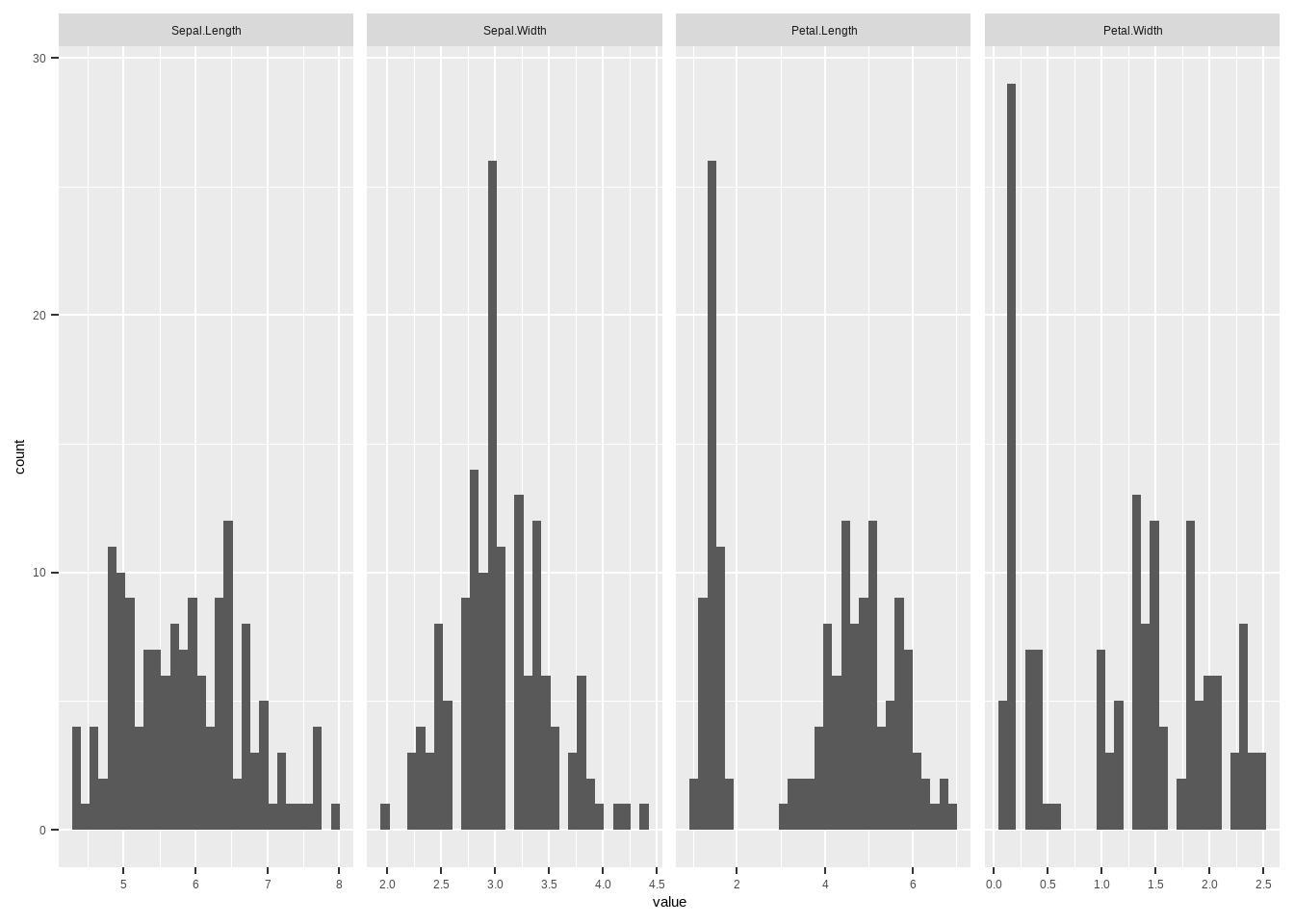
图3.26: ggplot直方图
ggplot(data_iris,aes(value,color=y))+ geom_histogram(
 fill="white", alpha=0.5, position="identity"

)+geom_density(alpha=0.6)+
  theme(legend.position = 'bottom')
## `stat_bin()` using `bins = 30`. Pick better value with `binwidth`.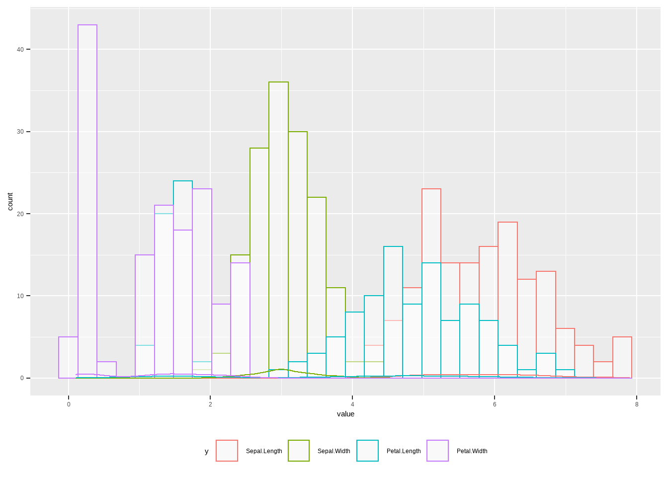
图3.27: ggplot直方图
3.13 ggplot残差图
我们也可以做残差图,这里我们介绍两种表达方式,直方残差图和线性残差图。
data("iris")
library(reshape2)
mar_iris <- iris
data_iris <- melt(mar_iris,id.vars = 'Species' )

#直方残差图
# use se
ggplot(data_iris, aes(x = variable, y = value,fill= variable)) +
  stat_summary(fun.y = mean, geom = "bar") +
  stat_summary(fun.data = mean_se, fun.args = list(mult = 1), geom = "errorbar", width = 0.2)+
  facet_wrap(Species~.,scales = 'free')+
  theme(axis.text.x = element_text(angle = 45),
        legend.position = 'bottom')
## Warning: `fun.y` is deprecated. Use `fun` instead.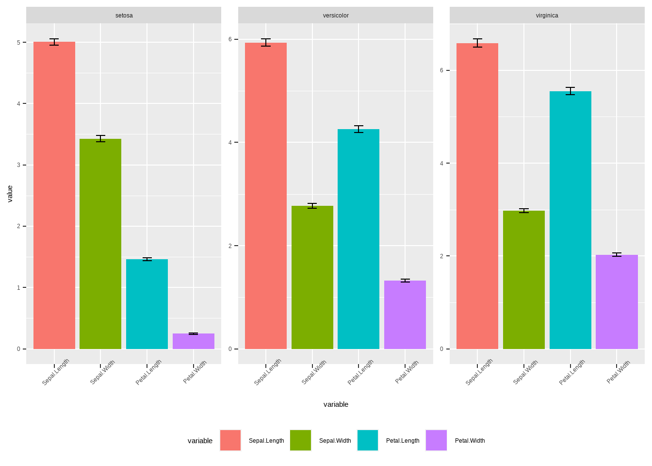
图3.28: ggplot直方残差图
# use sd
ggplot(data_iris, aes(x = variable, y = value,fill= variable)) +
  stat_summary(fun.y = mean, geom = "bar") +
  stat_summary(fun.data = mean_sdl, fun.args = list(mult = 1), geom = "errorbar", width = 0.2)+
  facet_wrap(Species~.,scales = 'free')+
  theme(axis.text.x = element_text(angle = 45),
        legend.position = 'bottom')
## Warning: `fun.y` is deprecated. Use `fun` instead.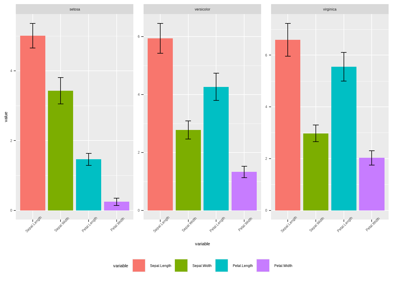
图3.29: ggplot直方残差图
接下来是线性残差图,用另一种计算sd,se和ci值得方法。
# Calculates mean, sd, se and IC
my_sum <- data_iris %>%
  group_by(Species,variable) %>%
  summarise(
    n=n(),
    mean=mean(value),
    sd=sd(value)
  ) %>%
  mutate( se=sd/sqrt(n))  %>%
  mutate( ic=se * qt((1-0.05)/2 + .5, n-1))
## `summarise()` has grouped output by 'Species'. You can override using the `.groups` argument.# use sd
ggplot(my_sum, aes(x=variable, y=mean, group=Species,col=Species)) +
geom_line()+ geom_point()+
geom_errorbar(aes(ymin=mean-sd, ymax=mean+sd), width=.2,
position=position_dodge(.9)) +
facet_wrap(Species~.,scales = 'free')+
theme(axis.text.x = element_text(angle = 45),
legend.position = 'bottom')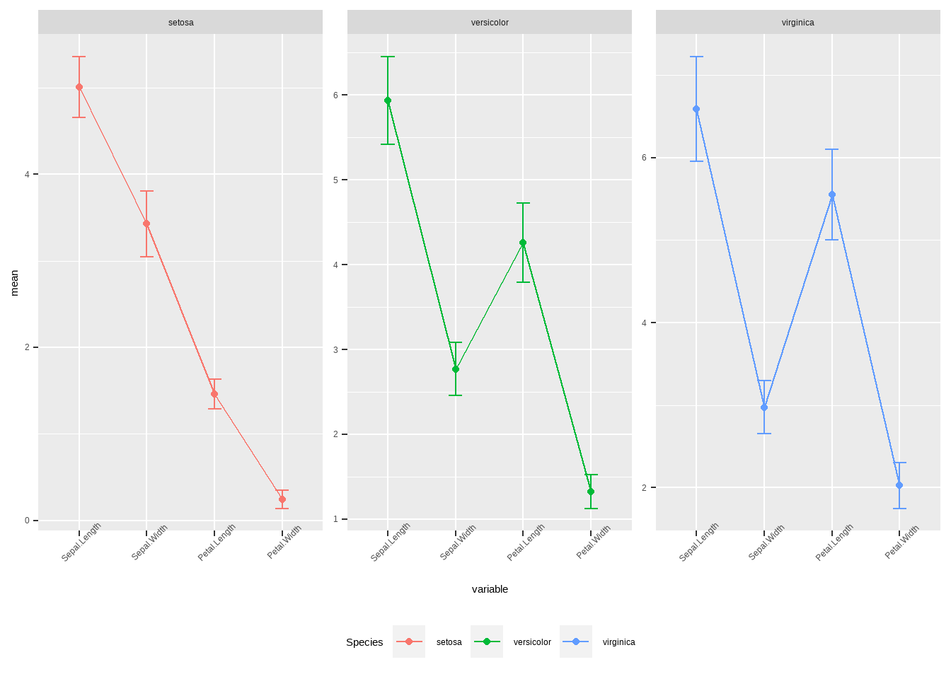
图3.30: ggplot线性残差图
# use se
ggplot(my_sum, aes(x=variable, y=mean, group=Species,col=Species)) +
 geom_line()+ geom_point()+
  geom_errorbar(aes(ymin=mean-se, ymax=mean+se), width=.2,
                 position=position_dodge(.9)) +
   facet_wrap(Species~.,scales = 'free')+
  theme(axis.text.x = element_text(angle = 45),
        legend.position = 'bottom')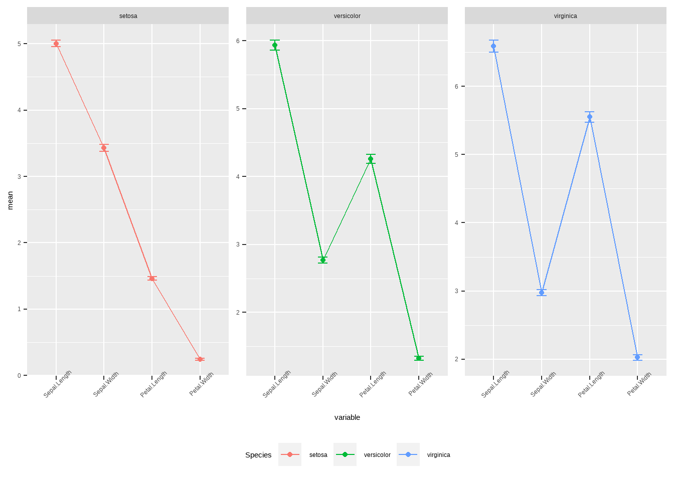
图3.31: ggplot线性残差图
3.14 ggplot 地图
ggplot 也可以用来绘制世界各个国家的地图,然后根据需求对各个国家的地理位置进行数据可视化,这里我们需要一些其他安装包来与ggplot结合进行地图绘制。
library(maps)
# library(maptools)
library(mapproj)
library(ggplot2)
library(mapdata)
library(mapproj)
data(countyMapEnv)
hmap <-map_data('italy')
head(hmap )
## long lat group order region subregion
## 1 11.83295 46.50011 1 1 Bolzano-Bozen <NA>
## 2 11.81089 46.52784 1 2 Bolzano-Bozen <NA>
## 3 11.73068 46.51890 1 3 Bolzano-Bozen <NA>
## 4 11.69115 46.52257 1 4 Bolzano-Bozen <NA>
## 5 11.65041 46.50721 1 5 Bolzano-Bozen <NA>
## 6 11.63282 46.48045 1 6 Bolzano-Bozen <NA>ggplot(hmap,aes(long,lat,group=group,fill=order))+geom_polygon()+
# geom_polygon(color='black')+
coord_map('polyconic')+guides(fill=F)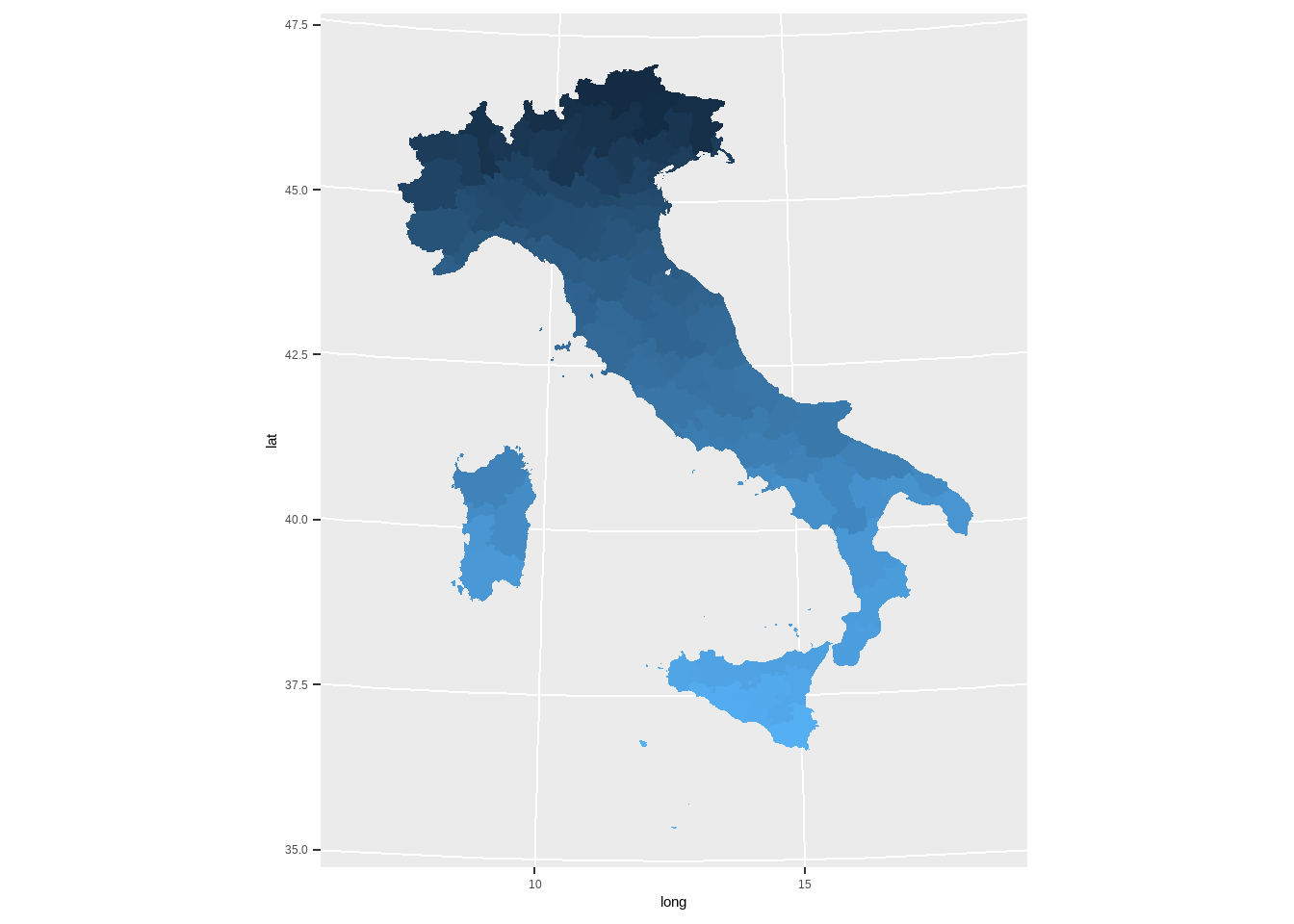
图3.32: 意大利地图
##中国地图
library(mapdata)
# library(maptools)
library(rgdal)
library(tidyverse)
mydat = rgdal::readOGR ("china/bou2_4p.shp")
## OGR data source with driver: ESRI Shapefile
## Source: "F:\bookdown\china\bou2_4p.shp", layer: "bou2_4p"
## with 925 features
## It has 7 fields
## Integer64 fields read as strings: BOU2_4M_ BOU2_4M_IDnames(mydat)## [1] "AREA" "PERIMETER" "BOU2_4M_" "BOU2_4M_ID" "ADCODE93"
## [6] "ADCODE99" "NAME"table(iconv(mydat$NAME,to = 'utf8', from = "GBK"))##
## 安徽省 北京市 福建省 甘肃省
## 1 1 168 1
## 广东省 广西壮族自治区 贵州省 海南省
## 154 6 2 79
## 河北省 河南省 黑龙江省 湖北省
## 9 1 1 1
## 湖南省 吉林省 江苏省 江西省
## 1 1 5 1
## 辽宁省 内蒙古自治区 宁夏回族自治区 青海省
## 94 1 1 1
## 山东省 山西省 陕西省 上海市
## 86 1 1 12
## 四川省 台湾省 天津市 西藏自治区
## 1 57 1 1
## 香港特别行政区 新疆维吾尔自治区 云南省 浙江省
## 53 1 1 179
## 重庆市
## 1china <- fortify(mydat)
china %>%
# filter(!id == '464')%>%
ggplot(aes(long,lat,group=group,fill=id))+geom_polygon()+
# geom_polygon(color='black')+
coord_map('polyconic')+guides(fill=F)+theme_classic(base_size = 16)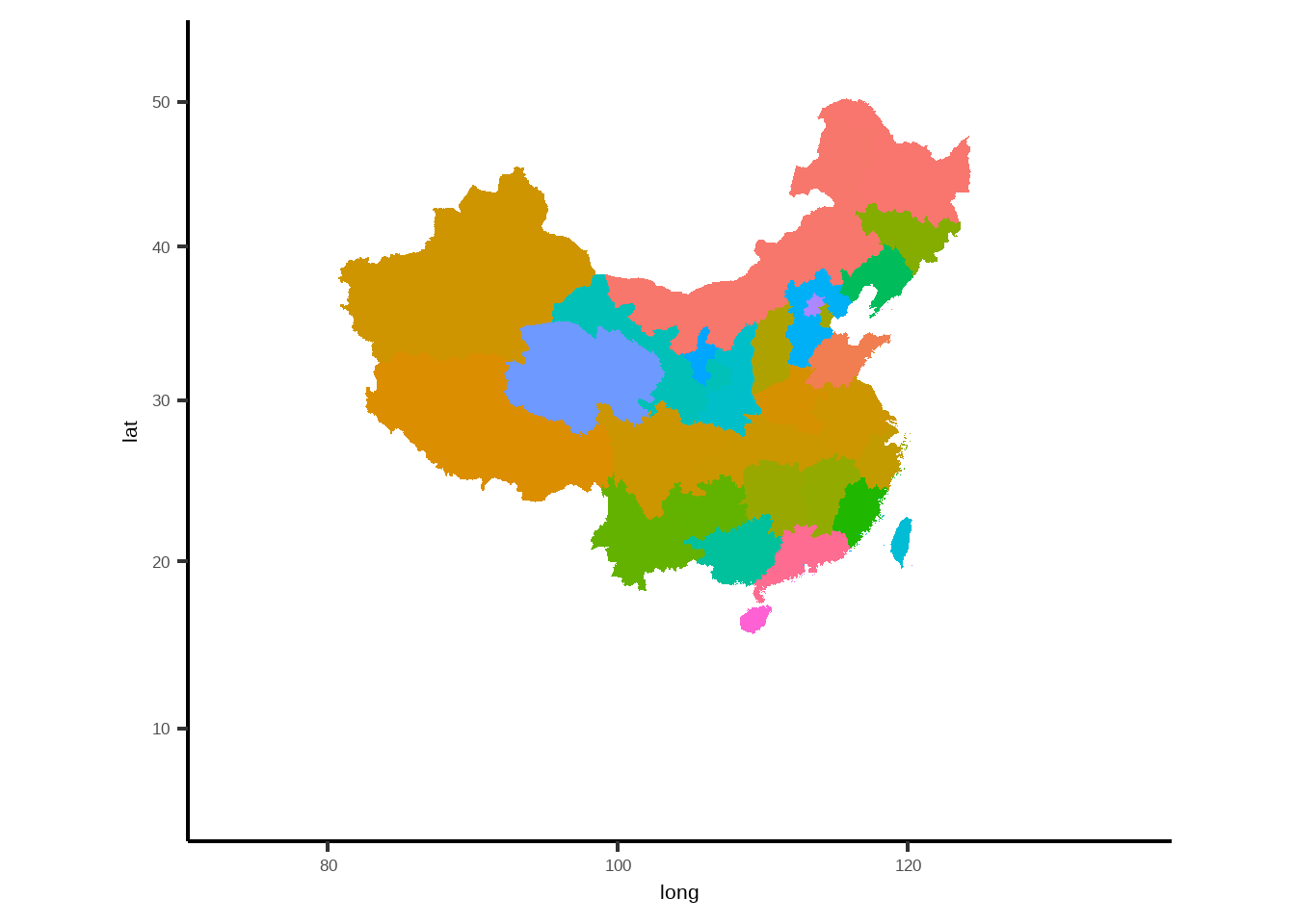
图3.33: 中国地图
3.15 小结
讲到这里,我们已经基本上把R里面的数据分析与可视化的主要内容讲完了,但是值得注意的是,我讲的只是一些基础,R里面还有很多很多的可利用的数据分析能力与作图方法,读者可以在理解基本的绘图能力以后,根据自身需要,去探索更深层次更复杂的绘图。尤其是
ggplot以及其延申的各种安装包。详情可以参考ggplot的官方网站 ggplot2去了解更多内容。