8 Plots in 2.5 and 2.6 with ggplot or plotly
This section will show you (one way of) how to generate those plots in Slide 2.5&2.6 with ggplot and plotly.
8.1 Set up
We will be using the StudentSurvey dataset from Lock5withR package again and iris dataset from ISLR. Also the CricketChirps dataset from Lock5withR is used in the Regression Line part.
library(Lock5withR)
library(ISLR)
library(ggplot2)
library(ggpmisc)
8.2 Scatterplot
Scatterplots are used to visualise paired data, where each data point has values for both quantitative variables.
8.2.1 Two example scatter plots
Preparation for plotting.
dataStu <- na.omit(StudentSurvey[c('TV', 'Exercise')])
corStu <- round(cor(dataStu$TV, dataStu$Exercise), digits=2)
corIris <- round(cor(iris$Petal.Length, iris$Petal.Width), digits=2)

annotation <- data.frame( x = c(30,5),y = c(30,0.5),
                          label = c(paste('r=',corStu,sep=''),
                                    paste('r=',corIris,sep='')))
8.2.1.1 Exercise hours Vs TV hours
The variables are TV (quantitative variable for the number of hours spent watching TV per week) and Exercise (quantitative variable for the number of hours spent exercising per week). These data come from the StudentSurvey dataset, where the participants are students.27
p <- ggplot(StudentSurvey, aes(x=TV, y=Exercise)) +
  geom_point(col='salmon') +
  geom_label(data=annotation[1,], aes(x=x, y=y, label=label),
             color="#FC4E07", fill='#E7B800' )+
  labs(title='Numbers of hours a week of exercise vs TV watching',
       x='TV hours', y='Exercise hours')+
  theme(legend.position = 'none')

p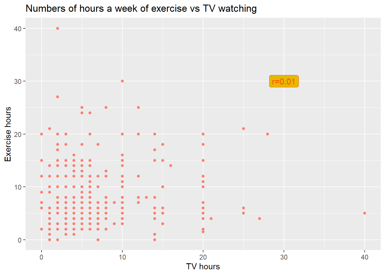
8.2.1.2 Petal Width vs Petal Length
This is the famous Iris (flower) dataset (used by R. A. Fisher, a genius who created the foundation for modern Statistics). The variables are Petal Length (quantitative variable) and Petal Width (quantitative variable) 28
plotIris<-ggplot(iris, aes(x=Petal.Length, y=Petal.Width)) +
  geom_label(data=annotation[2,], aes(x=x, y=y, label=label),
             color="#FC4E07", fill='#E7B800' )+
  labs(title='Petal width vs length of iris',
       x='Petal Length (mm)', y='Petal Width (mm)')
plotIris + geom_point(col='#a767a2')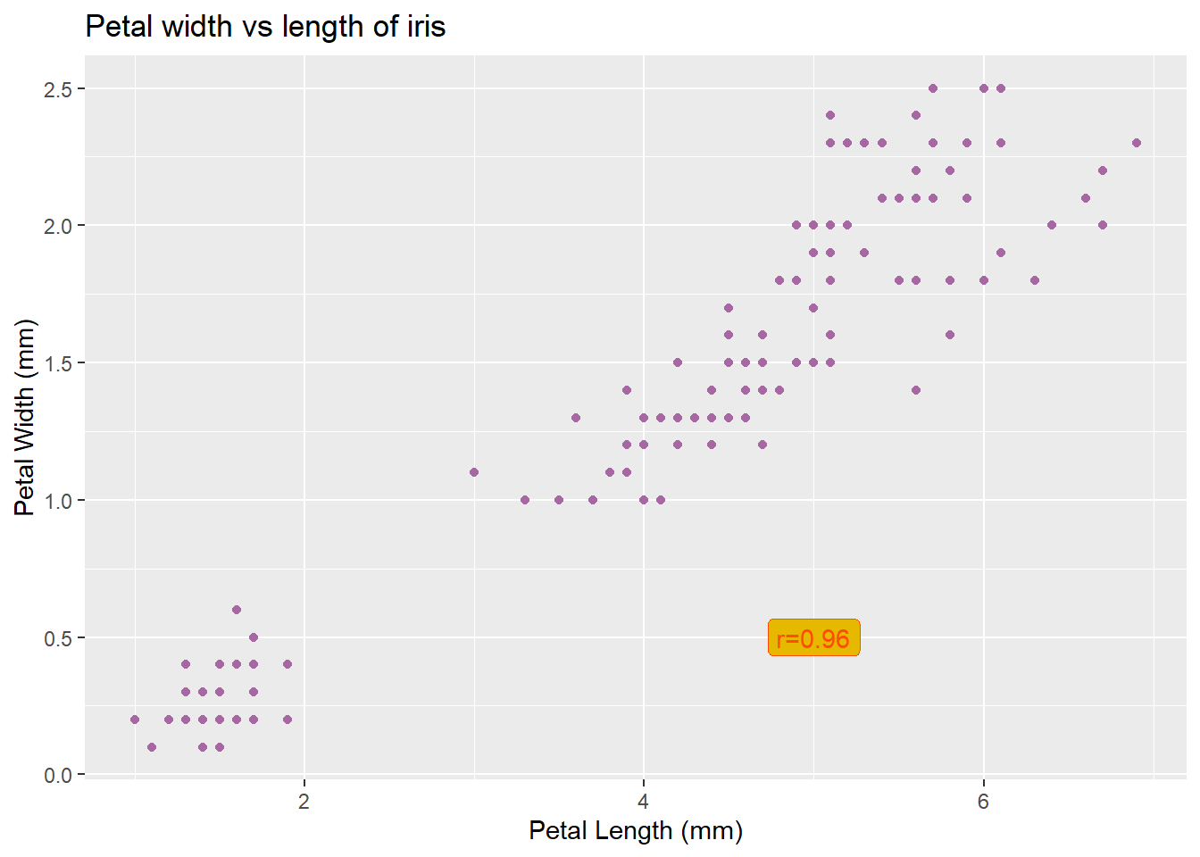
8.2.2 Scatterplots, including a third variable
8.2.2.1 Iris data
There are three different species in the Iris data, it is quite clear that different species has different petal length and width range.
plotIris +
  geom_point(aes(col=Species)) +
  stat_ellipse(aes(col=Species),
               type = "norm")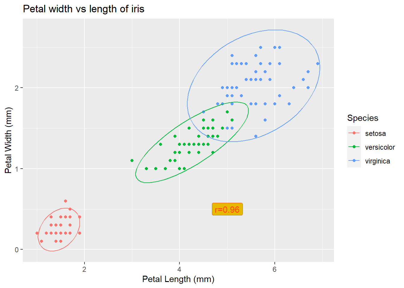
8.2.2.2 Student and Balance
Average Balance that customer had on their credit card and their Income. Use different colors or symbols to display difference groups in the third variable. In this case, red indicates Student while black represents Non-student. 29
data <- Default
data$student <- factor(data$student, levels=c("Yes", "No"))
p<-ggplot(data, aes(x=balance, y=income, col=student)) +
  labs(title='Credit Card Data',
       x='Balance($)', y='Income($)')+
  geom_point(alpha=0.3) +
  scale_color_manual(values=c('red', 'black'))

p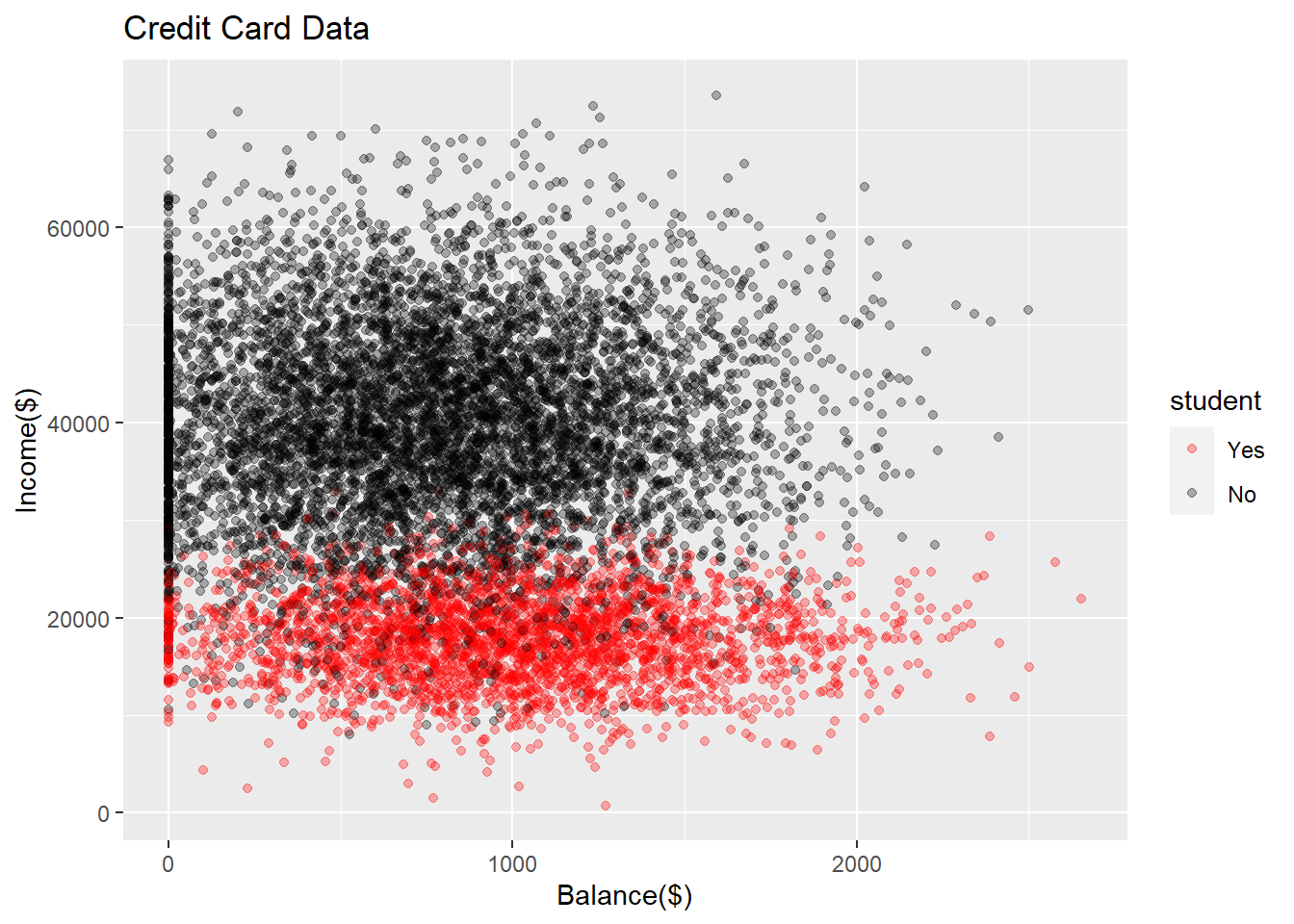
8.3 Regression Line
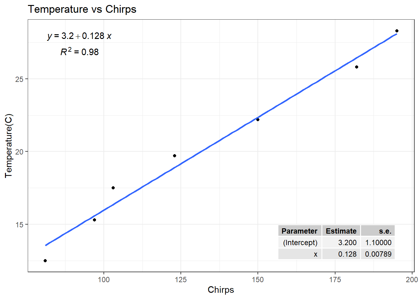
Is the chirp rate of crickets associated with temperature?
Data was collected (in 1898) by two researchers who measured Chirps (quantitative variable – chirps per minute) and temperature (quantitative variable, recorded in Celsius). The data are available in StatKey, called CricketChirps (although their dataset uses Fahrenheit instead of Celsius). 30
8.3.1 Scatter plot
p<-ggplot(CricketChirps, aes(x=Chirps, y=round((Temperature-32)/1.8, 1))) +
  labs(title='Temperature vs Chirps',
       x='Chirps', y='Temperature(C)')+
  geom_point() +
  theme_bw()

p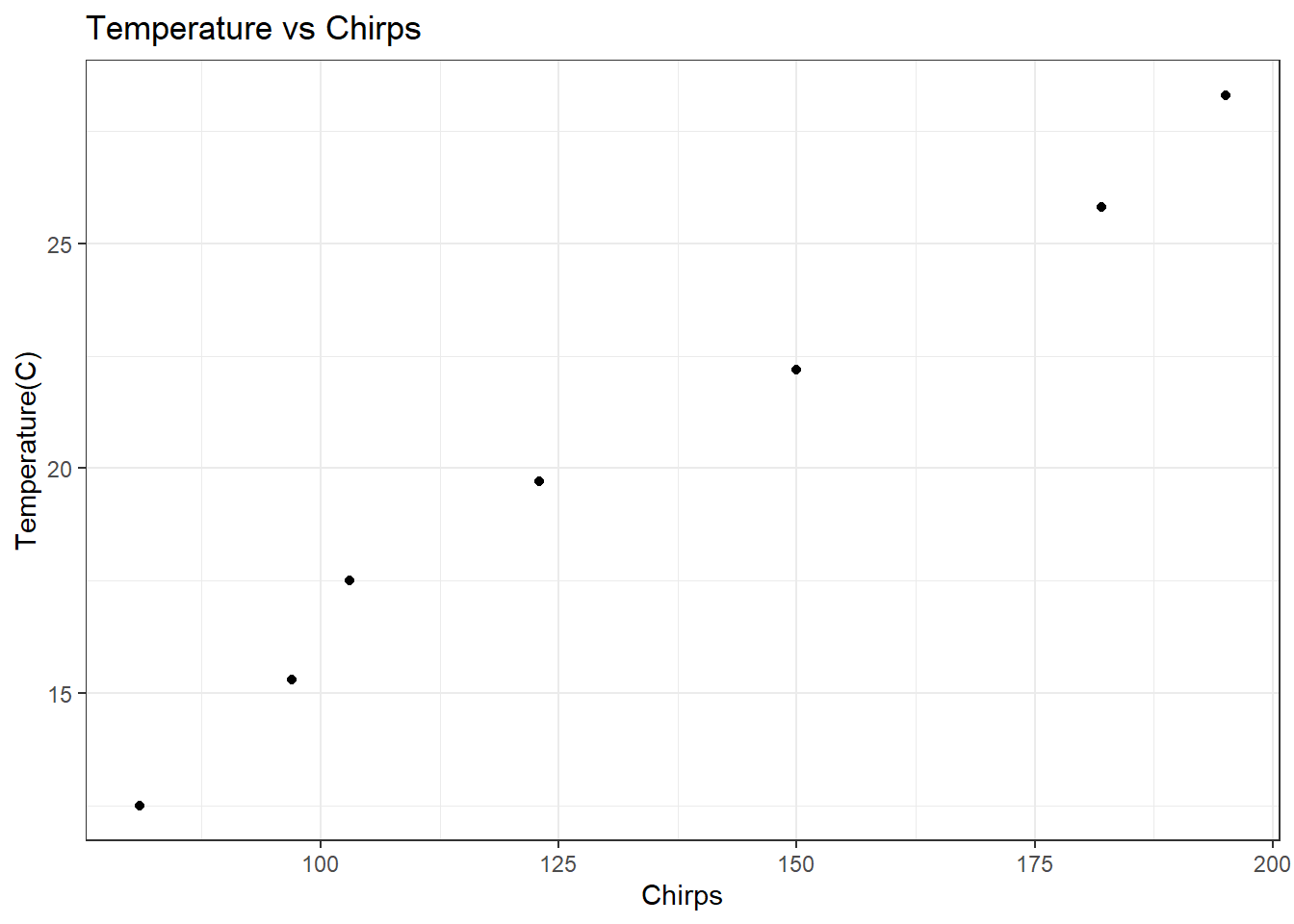
8.3.2 Regression model
Using stat_fit_tb() to display the regression line on the plot.
Using stat_poly_eq() to display the equation and r square on the plot.
p + geom_smooth(method='lm', se=FALSE) +
  stat_fit_tb(method = "lm",
              method.args = list(formula = y~x),
              tb.vars = c(Parameter = "term",
                          Estimate = "estimate",
                          "s.e." = "std.error"),
              label.y = "bottom", label.x = "right") +
  stat_poly_eq(aes(label = paste0("atop(", ..eq.label.., ",", ..rr.label.., ")")),
               formula = y~x,
parse = TRUE) 