4 Plots in 2.2 with ggplot or plotly
This section will show you (one way of) how to generate those plots in Slide 2.2 with ggplot and plotly.
4.1 Set up
We need the Hollywood movies dataset from Lock5withR package and the plot_ly() function from the plotly package to plot the dotplot.
library(Lock5withR)
library(ggplot2)
library(plotly)
4.2 World Gross of all Hollywood Movies in 2011
The HollywoodMovies20116 dataset contains data on Hollywood movies released in 2011, with 136 cases and 14 variables. In this section, the quantitative variable of interest is WorldGross7 - the gross income for all viewers (in millions of dollars). Note: this is a population because it contains all Hollywood movies released in 2011.
4.2.1 Dotplot
# the diameter of each dot(x axis wise), same with the binwidth of histogram
d = 25

# re-arrange the data frame, numbering the movies in the same 'bin' and sort them
df_dot <- Lock5withR::HollywoodMovies2011 %>%
  mutate(group = .data[["WorldGross"]]%/% d) %>%
  arrange(group, .data[["WorldGross"]]) %>%
  group_by(group) %>%
  mutate(numbering = row_number())

dot_plot <- plot_ly(data = df_dot,
                    x = ~group,
                    y = ~numbering,
                    type = "scatter",
                    mode = "markers",
                    marker = list(
                      size = 12 #this can be adjusted to preference
                    ),
                    text = ~WorldGross, # set what we want to display in tooltip
                    hovertemplate = "%{text}<extra></extra>" # one way of tooltip displaying
) %>%
  layout(title = "World gross for all 2011 Hollywood movies",
         xaxis = list(
           zeroline = FALSE, # hide y-axis line
           showgrid = TRUE,
           title = "World Gross (in millions of dollars)",
           tickmode = "array", # set tick display with ticktext and tickvals
           ticktext = seq(0,1400,200),
           tickvals = seq(0,1400/d,8)-0.5
           # since the bin width is a range in this case,
           # we shift the grid by it's radius
         ),
         yaxis = list(
           range = c(-1,34),
           showgrid = TRUE,
           title = "Count",
           ticktext = seq(0,30,5),
           tickvals = seq(0,30,5),
           showticklabels = TRUE
         ),
         plot_bgcolor = "#e5ecf6"
  ) %>%
  config(modeBarButtons = list(list("toImage")), #download the plot as a png file
         displaylogo = FALSE)
dot_plot
In this dotplot, each dot corresponds to one case (movie) in the dataset. If there are multiple cases with the same (or similar) values, we stack the dots vertically8. This allows us to see the shape of the data, the shape of the data’s distribution. In this example, we see that world gross ranges from 0 to around 1.3 billion dollars. Most of the cases are piled up on the left (more relatively low world gross values - this is called skewed to the right) and there are three cases with unusually large values (values greater than 1 billion dollars – these are called outliers). We can also see that a large proportion of Hollywoodmovies make less than 300 million dollars (gross). You can obtain a lot of useful information by simply plotting the data. Always plot your data!
4.2.2 with median and mean
# get the mean and the median
movieMean <- mean(Lock5withR::HollywoodMovies2011$WorldGross, na.rm = TRUE)
movieMedian <- median(Lock5withR::HollywoodMovies2011$WorldGross, na.rm = TRUE)

# set up a function to draw vertical line for plotly
vline <- function(x = 0, color = "blue") {
  list(
    type = "line",
    y0 = 0,
    y1 = 1,
    yref = "paper",
    x0 = x,
    x1 = x,
    line = list(color = color, dash="dot")
  )
}

dot_plot %>%
  layout(
    shapes = list(
      # we shifted the dots by its radius earlier, we need match the setting here
      vline(movieMean/d-0.5),
      vline(movieMedian/d-0.5, 'red')
    )
  ) %>% add_annotations(
    x=movieMedian/d-0.5,
    y=30,
    xref = "x",
    yref = "y",
    text = paste("Median = <br>", round(movieMedian, 2), sep = ""),
    xanchor = 'right',
    showarrow = F,
    font = list(color = 'red')
  ) %>% add_annotations(
    x=movieMean/d-0.5,
    y=30,
    xref = "x",
    yref = "y",
    text = paste("Mean = <br>", round(movieMean, 2), sep = ""),
    xanchor = 'left',
    showarrow = F,
    font = list(color = 'blue')
  )
A few very large world gross values have pulled up the population mean (pulled in the direction of skewness). These large values do not affect the median because the median splits the data in half (67 values above the median and 67 values below). In this example, there is a substantial difference between these measures of centre and almost 2/3 of the cases are below the mean.
4.2.3 Histogram
To produce a histogram, we must choose a bin width or specify the total number of bins. In this example, we set binwidth to 25, the same as the dotplot above, but other choices are possible.
p <- ggplot(data=Lock5withR::HollywoodMovies2011 , aes(x=WorldGross)) +
  geom_histogram(binwidth = 25, color="black", fill="thistle4", boundary = 0) +
  scale_x_continuous(breaks = seq(0, 1400, 200),
                     labels=seq(0,1400,200),
                     minor_breaks = NULL) +
  scale_y_continuous(limits = c(0,30),
                     breaks = seq(0, 30, 5),
                     labels=seq(0,30,5),
                     minor_breaks = NULL) +
  coord_fixed(ratio = 25) +
  labs(title = 'World gross for all 2011 Hollywood movies',
       x = 'World Gross(in millions of dollars)',
       y = 'Count') +

  theme(panel.grid.major.x = element_line(colour="grey", linetype="dashed"))+
  theme_light()

p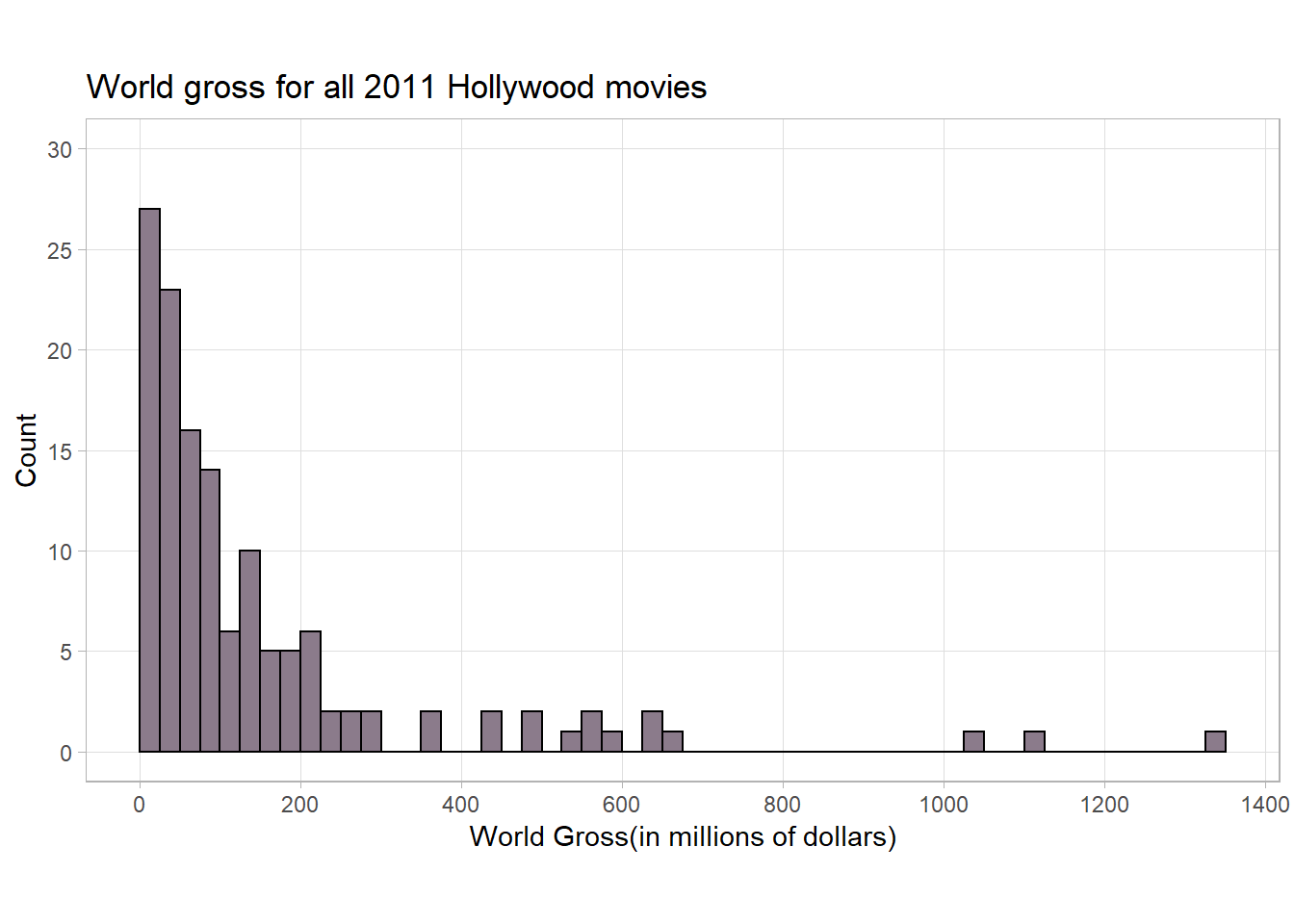
4.3 Skewness
4.3.1 Bell shaped
First, let’s take a look at a Bell-shaped distribution, this is the most important symmetric distribution in science and we’ll see a lot of bell-shaped distributions in this course!
set.seed(1)
meanC = 0
sdC = 0.25
groupCenter<-data.frame(rnorm(1000,mean=meanC,sd=sdC))
colnames(groupCenter) <- 'Value'

pc<-ggplot(data=groupCenter , aes(x=Value)) +
  geom_density(aes(y = ..density..*(1000*0.1)), col='green',size= 1)+
  geom_histogram(color="black", fill="thistle4", binwidth = 0.1,
                 boundary = 0,alpha = 0.5) +
  geom_vline(xintercept = mean(groupCenter$Value), size = 1,
             color = 'blue', linetype = 'dashed')+
  annotate('label', x = 0.25, y = 150, fill = 'blue',
           label = paste('Mean', round(mean(groupCenter$Value), 2), sep = '=') )+
  geom_vline(xintercept = median(groupCenter$Value), size = 1,
             color = 'red', linetype = 'dashed')+
  annotate('label', x = -0.35, y = 150, fill = 'red',
           label = paste('Median', round(median(groupCenter$Value), 2),
                         sep = '='))+
  labs(title = 'Bell-shaped',
       y = 'Frequency') +
  scale_x_continuous(limits = c(-1.1,1.1),
                     breaks = seq(-1,1,0.25)) +
  theme(panel.grid.minor = element_blank())

pc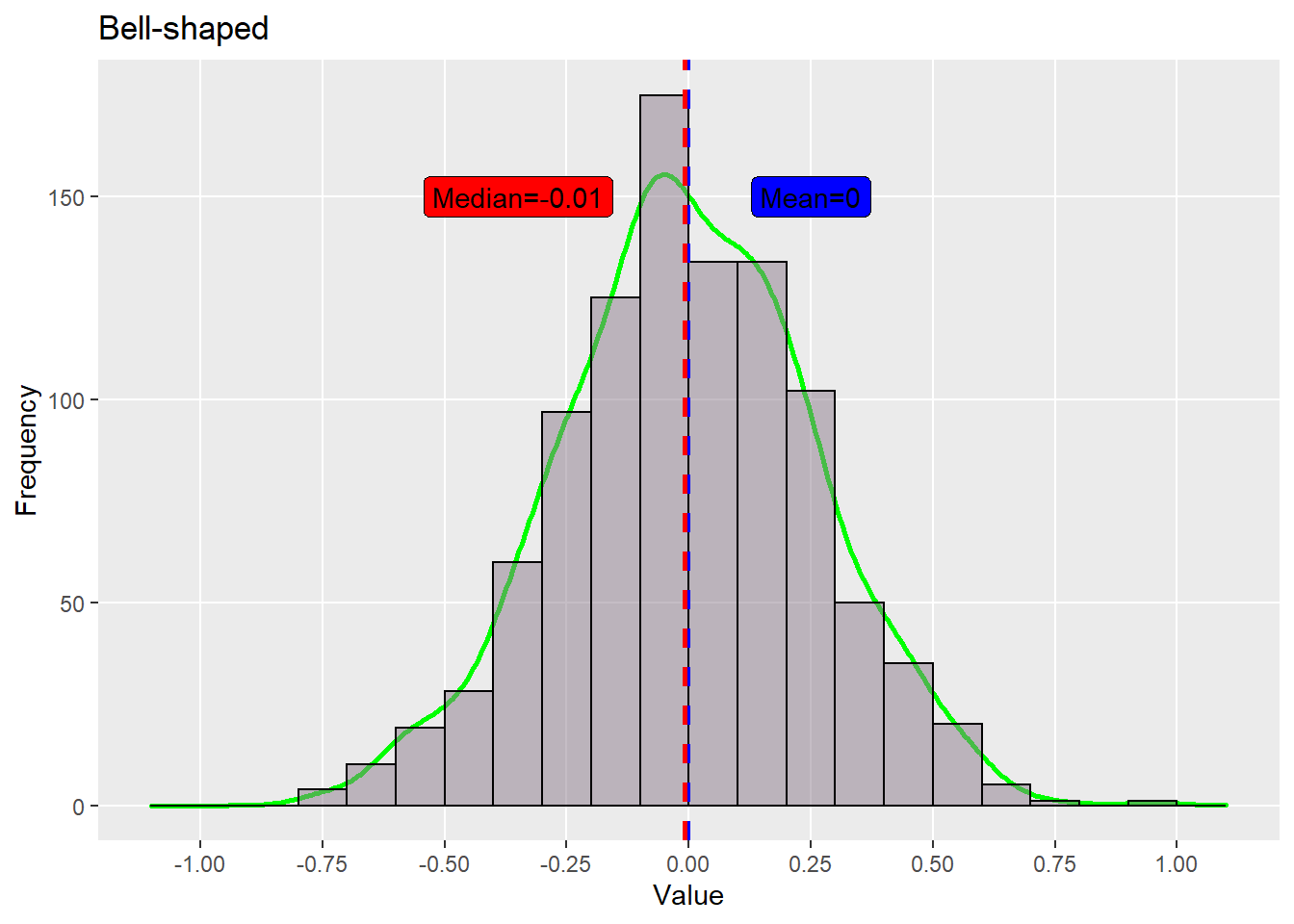
If we have a bigger standard deviation(3 times in this case), we will have a flatter shape/distribution.
set.seed(1)
value <- c(rnorm(1000,0,0.25), rnorm(1000,0,0.25*3))
group <- c(rep("mean = 0, sd = 0.25, n = 1000", 1000),
           rep("mean = 0, sd = 0.25*3, n = 1000", 1000))
df_centers <- data.frame(value, group)
df_centers$group <- ordered(df_centers$group,
                            levels=c("mean = 0, sd = 0.25, n = 1000",
                                     "mean = 0, sd = 0.25*3, n = 1000"))

plotCenters <- ggplot(df_centers, aes(value)) +
  geom_density(aes(y = ..density..*(1000*0.1)), col='green',size= 1)+
  geom_histogram(color="black", fill="thistle4", binwidth = 0.1,
                 boundary = 0,alpha = 0.5) +
  scale_x_continuous(limits = c(-3,3),
                     breaks = seq(-3,3,1))+
  labs(
    y = 'Frequency') +
  facet_wrap(vars(group), ncol = 1, scales = "free_x")

plotCenters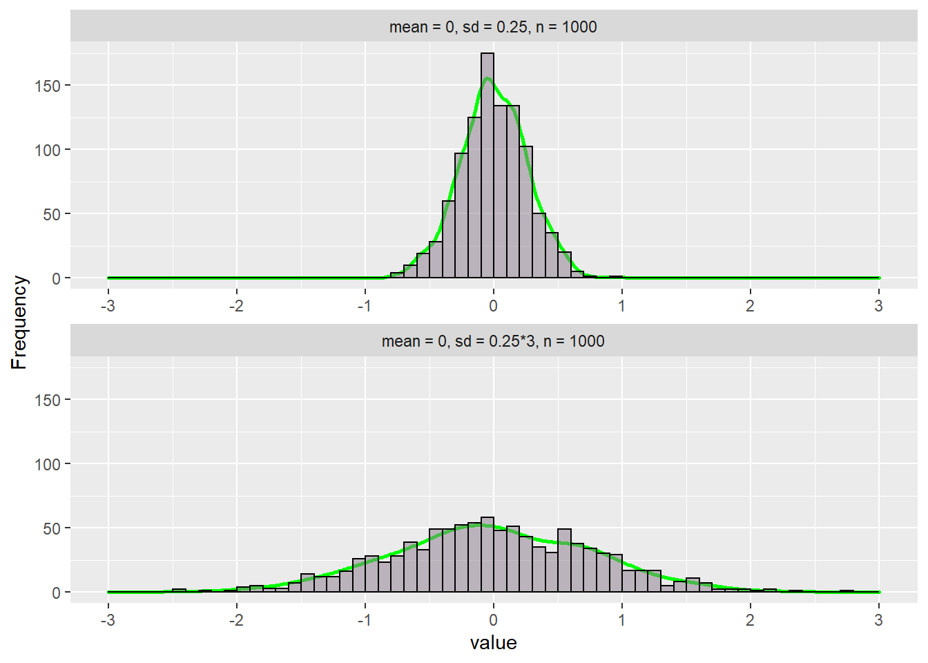
4.3.2 Right-skewed
A distribution is called skewed to the right if the data are piled up on the left and the tail extends relatively far out to the right.
set.seed(1)
groupRight <- data.frame(sort(rnorm(1189, 0.2, 0.2))[190:1189])
colnames(groupRight) <- 'Value'

pr<-ggplot(data=groupRight , aes(x=Value)) +
  geom_density(aes(y = ..density..*(1000*0.05)), col='green', size = 1)+
  geom_histogram(color="black", fill="thistle4", breaks = seq(0,1,0.05),
                 boundary = 0, alpha = 0.5) +
  geom_vline(xintercept = mean(groupRight$Value), size = 1,
             color = 'red', linetype = 'dashed')+
  annotate('label', x = 0.37, y = 145, fill = 'red',
           label = paste('Mean', round(mean(groupRight$Value), 2), sep = '=') )+
  geom_vline(xintercept = median(groupRight$Value), size = 1,
             color = 'blue', linetype = 'dashed')+
  annotate('label', x = 0.1, y = 145, fill = 'blue',
           label = paste('Median', round(median(groupRight$Value), 2),
                         sep = '='))+
  geom_segment(
    aes(x = 0, y = 0,xend = 1, yend = 0))+
  labs(title = 'Right Skewed',
       y = 'Count') +
  lims(x= c(0,1),
       y = c(0, 150)) +
  theme(panel.grid.minor = element_blank())

pr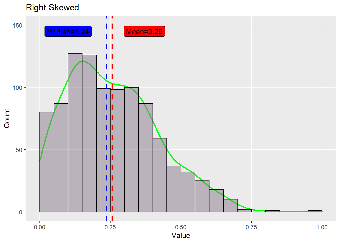
4.3.3 Left-skewed
A distribution is called skewed to the let if the data are piled up on the right and the tail extends relatively far out to the left.
set.seed(1)
groupLeft <- data.frame(sort(rnorm(1189, 0.8, 0.2))[1:1000])
colnames(groupLeft) <- 'Value'

pl<-ggplot(data=groupLeft , aes(x=Value)) +
  geom_density(aes(y = ..density..*(1000*0.05)), col='green',size = 1 )+
  geom_histogram(color="black", fill="thistle4", breaks = seq(0,1,0.05),
                 boundary = 0, alpha = 0.5) +
  geom_vline(xintercept = mean(groupLeft$Value), size = 1,
             color = 'red', linetype = 'dashed')+
  annotate('label', x = 0.65, y = 145, fill = 'red',
           label = paste('Mean', round(mean(groupLeft$Value), 2), sep = '=') )+
  geom_vline(xintercept = median(groupLeft$Value), size = 1,
             color = 'blue', linetype = 'dashed')+
  annotate('label', x = 0.85, y = 145, fill = 'blue',
           label = paste('Median', round(median(groupLeft$Value), 2),
                         sep = '='))+
  geom_segment(
    aes(x = 0, y = 0,xend = 1, yend = 0))+
  labs(title = 'Left Skewed',
       y = 'Count') +
  lims(x= c(0,1),
       y = c(0, 150)) +
  theme(panel.grid.minor = element_blank())

pl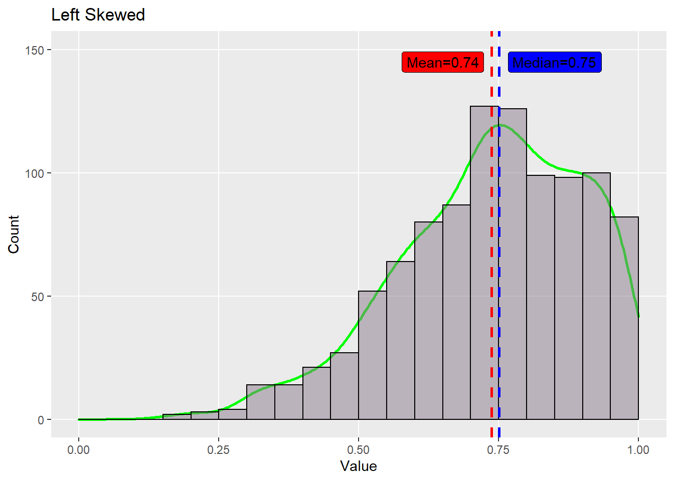
You can find this dataset (and many others) on the textbook’s website: https://www.lock5stat.com/datapage.html↩︎
Slide 2.2, page 3↩︎
It’s hard to tell the bin width with Statkey’s dotplot or histogram, we use 25(in millions of dollars) as bin width, the result varies from the plot in slides, but we can tell it shares the same distribution.↩︎