6 Plots in 2.3 and 2.4 with ggplot or plotly
This section will show you (one way of) how to generate those plots in Slide 2.3&2.4 with ggplot and plotly.
6.1 Set up
We will be using the StudentSurvey dataset from Lock5withR package for the first couple of plots and again, using plot_ly() from plotly package, HotDogs, ImmuneTea datasets from Lock5withR are used for boxplots.
Also, a dataset named Default from ISLR is used in side-by-side graphs.
library(Lock5withR)
library(mosaic)
library(ISLR)
library(ggplot2)
library(tidyverse)
library(ggrepel)
library(plotly)
library(gridExtra)
library(latex2exp)
6.2 Histogram of pulse data from StudentSurvey
Get the pulse data from StudentSurvey.
dfPulse = StudentSurvey %>% select(Pulse)
meanPulse = mean(dfPulse$Pulse)
stdPulse = sd(dfPulse$Pulse)
6.2.1 mean and standard devation
# histogram

p <- ggplot(data=dfPulse, aes(x=Pulse)) +
  geom_histogram(color="black", fill="#C3D7A4", breaks = seq(35,135,5)) +
  labs(x = 'Pulse',  y = 'Frequency',
       title = 'Pulse data from StudentSurvey') +
  scale_x_continuous(limits = c(30,135), breaks = seq(30,130,10)) +
  scale_y_continuous(limits = c(0,75), breaks = seq(0,80,10)) +
  theme(panel.grid.minor = element_blank())

# add dashed lines and annotate with mean and standard deviation
p + geom_vline(
  xintercept = seq(meanPulse-2*stdPulse, meanPulse+2*stdPulse, stdPulse),
  size = 1,
  color = '#D16103',
  linetype = 'dashed') +
  annotate(
    'label',
    fill = 'cornsilk',
    x = seq(meanPulse-2*stdPulse, meanPulse+2*stdPulse, stdPulse),
    y = 75,
    label = TeX(c("$\\bar{x}-2s$",
                  "$\\bar{x}-s$",
                  "$\\bar{x}$",
                  "$\\bar{x}+s$",
                  "$\\bar{x}+2s$"),
                # to render successfully, need to set output as character
                output="character"),
    # and set parse to TRUE
    parse = TRUE) +

  annotate(
    'label',
    fill = 'cornsilk',
    x = seq(meanPulse-2*stdPulse, meanPulse+2*stdPulse, stdPulse),
    y = 70,
    label = round(seq(meanPulse-2*stdPulse, meanPulse+2*stdPulse, stdPulse), 2))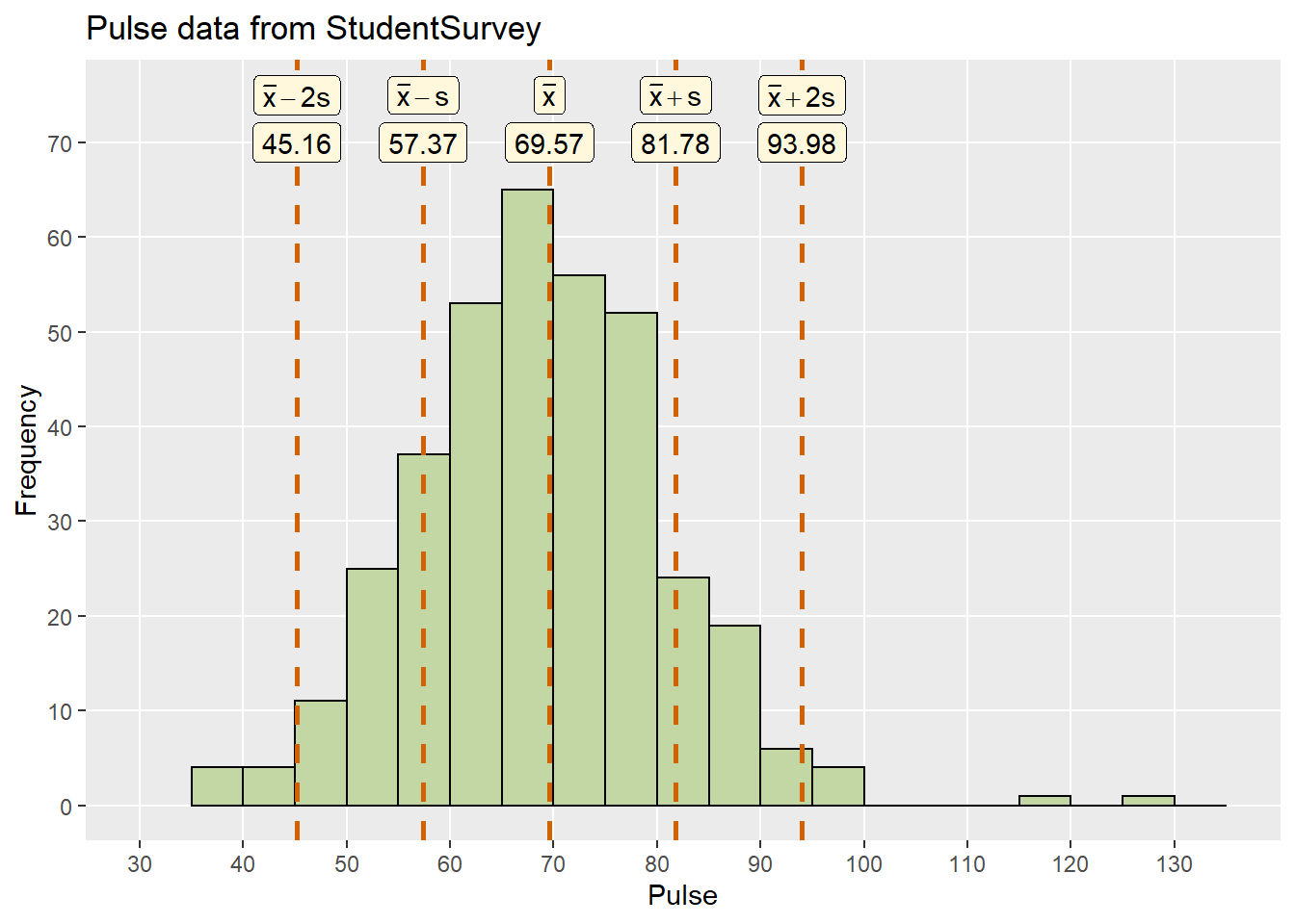
6.2.2 The 95% rule
If a distribution of data is approximately symmetric and bell-shaped, about 95% of the data should fall within two standard deviations of the mean.
p+  geom_vline(xintercept = c(42.5, 97.5),
               size = 1, color = '#D16103', linetype = 'dashed') +
  annotate('label', fill = 'cornsilk',
           x = c(42.5, 97.5),
           y = 65, label = c(42.5, 97.5))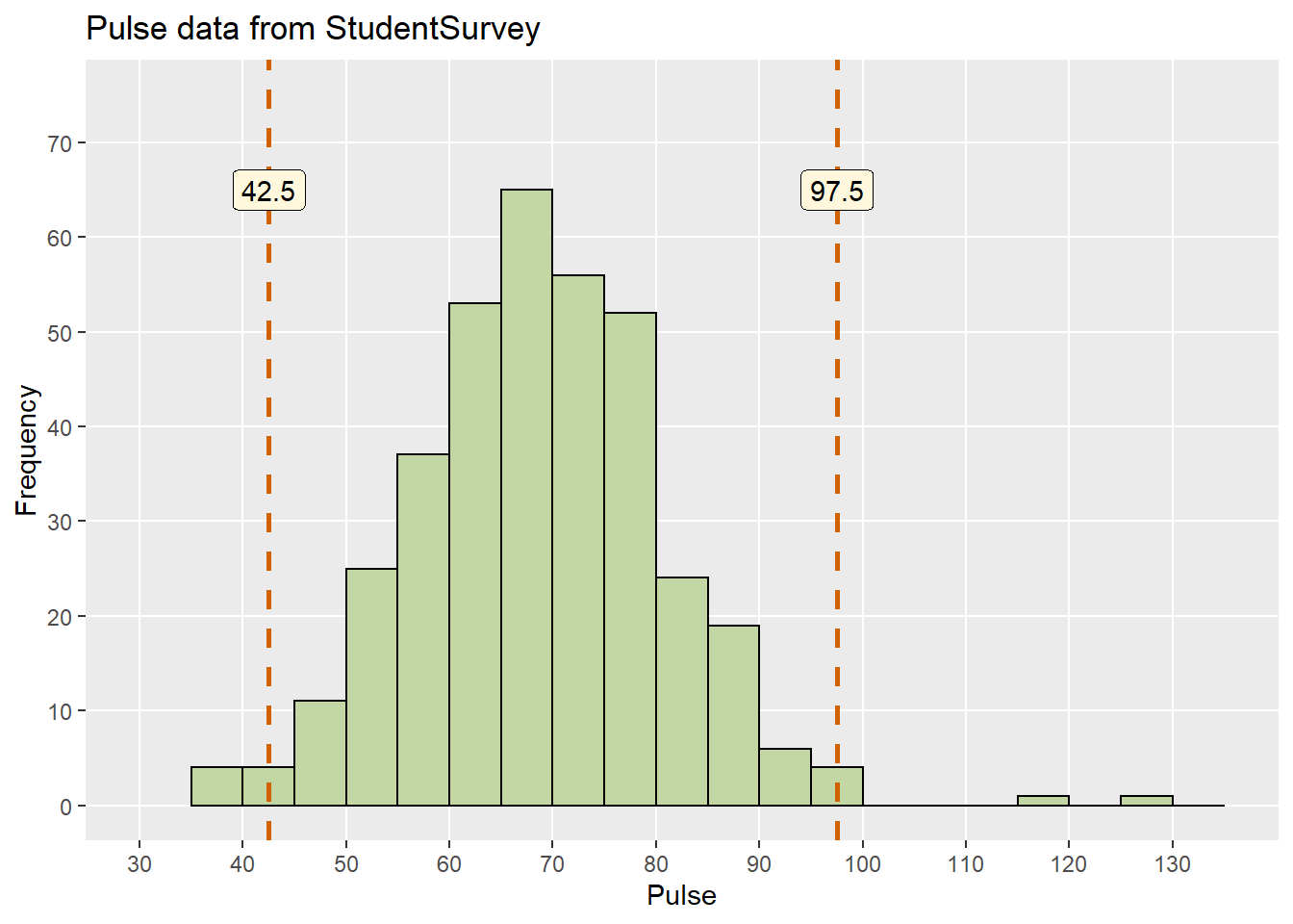
- The sample mean is approximately \(\bar{x} = 70\) (actual sample mean is \(\bar{x} = 69.6\))
- The sample standard deviation is approximately \(s = (95 - 40)/4 = 13.75\), where we guessed that 95% of the data values were between 40 and 95(actual sample standard deviation is \(s = 12.2\)).
- Hence, we expect 95% of the pulse rates in this sample to be in the interval \((\bar{x}-2s, \bar{x}+2s,) = (70 - 27.5, 70 + 27.5) = (42.5, 97.5)\)
Note: a range of values are possible here, but they should be similar to this one.
6.2.3 25th and 50th percentiles
The Pth percentile is the value of a quantitative variable which is greater than P percent of the data.
Let’s use the same histogram of the pulse rates to estimate the 25th and 50th percentiles.
p + geom_vline(xintercept = quantile(dfPulse$Pulse, c(.25, .5)),
               size = 1, color = '#D16103', linetype = 'dashed') +
  annotate('label', fill = 'cornsilk',
           x = quantile(dfPulse$Pulse, c(.25, .5)),
           y = 70, label = round(quantile(dfPulse$Pulse, c(.25, .5))))
- For the 50th percentile (the median), we want to find the middle of the data (half the cases are above the median and half are below). Our guess, based on the histogram, is 70 (somewhere between 60 and 75 is fine - the actual value is 70).
- For the 25th percentile, we need to find a value for which 25% of the data values are below it and 75% are above it. Our guess, based on the histogram, is 55 (somewhere between 50 and 70 is fine - the actual value is 62).
6.3 Dotplot of exercise hours data from StudentSurvey
Randomly select 100 exercise hours data16 from the StudentSurvey, set a seed17 so the result is consistent.
set.seed(11)
dfExer <- sample_n(StudentSurvey %>%
                     filter(is.na(Exercise) == FALSE) %>%
                     select(Exercise), 100)
dfExer <- arrange(dfExer, Exercise)

dfExer <- dfExer %>%
  # to identiy the 5th and 90th percentile
  mutate(Percentile=seq(1,100,1)) %>%
  mutate(Percentile = ifelse(Percentile == 5|Percentile ==90,
                             as.character(Percentile), 'rest'))
6.3.1 Distribution
# the diameter of each dot(x axis wise), same with the binwidth of histogram
d = 1

# re-arrange the data frame, numbering the movies in the same 'bin' and sort them
df_dot <- dfExer%>%
  mutate(group = .data[["Exercise"]]%/% d) %>%
  arrange(group, .data[["Exercise"]]) %>%
  group_by(group) %>%
  mutate(numbering = row_number())

dot_plot <- plot_ly() %>%
  layout(title = "100 random samples on exercise hours from StudentServey",
         xaxis = list(
           range = c(-1,30),
           zeroline = FALSE, # hide y-axis line
           showgrid = TRUE,
           title = "Exercise hours",
           tickmode = "array", # set tick display with ticktext and tickvals
           ticktext = seq(0,30,5),
           tickvals = seq(0,30/d,5)
           # since the bin width is a range in this case,
           # we shift the grid by it's radius
         ),
         yaxis = list(
           range = c(-1,20),
           showgrid = TRUE,
           title = "Count",
           ticktext = seq(0,20,5),
           tickvals = seq(0,20,5),
           showticklabels = TRUE
         ),
         legend= list(
           x = 0.8, y = 0.9,
           title=list(text='<b> Percentile </b>'),
           font = list(
             family = "sans-serif",
             size = 12,
             color = "#000"),
           bgcolor = "#E2E2E2",
           bordercolor = "#FFFFFF",
           borderwidth = 2),
         plot_bgcolor = "#e5ecf6") %>%
  config(modeBarButtons = list(list("toImage")), #download the plot as a png file
         displaylogo = FALSE)

dot_plot %>% add_markers(data = df_dot,
                         x = ~group,
                         y = ~numbering,
                         type = "scatter",
                         mode = "markers",
                         marker = list(
                           size = 20 #this can be adjusted to preference
                         ),
                         hovertemplate = "Exercise hours: %{x}<extra></extra>" # one way of tooltip displaying

)
6.3.2 5th and 90th percentiles
Since there are 100 cases, the 5th percentile is the 5th dot from left, likewise, 90th percentile is the 11th dot from right.
dot_plot %>% add_markers(data = df_dot,
                         x = ~group,
                         y = ~numbering,
                         type = "scatter",
                         mode = "markers",
                         marker = list(
                           size = 20 #this can be adjusted to preference
                         ),
                         hovertemplate = "Exercise hours: %{x}<extra></extra>",
                         # distinguish the 5th and 90th percentile
                         color = ~Percentile

)
We fixed problem from previous chapter.
6.3.3 Associated histogram
histPlot <- ggplot(data = dfExer, aes(x=Exercise, text = Exercise)) +
  geom_histogram( color="black", fill="#46718c",
                  closed = 'right', boundary = 0.5, binwidth = 1)
ggplotly(histPlot, tooltip = "x") %>%
  layout(title = "100 random samples on exercise hours from StudentServey",
         xaxis = list(
           range = c(-1,30),
           zeroline = FALSE, # hide y-axis line
           showgrid = TRUE,
           title = "Exercise hours",
           tickmode = "array", # set tick display with ticktext and tickvals
           ticktext = seq(0,30,5),
           tickvals = seq(0,30/d,5)
           # since the bin width is a range in this case,
           # we shift the grid by it's radius
         ),
         yaxis = list(
           range = c(-1,20),
           showgrid = TRUE,
           title = "Count",
           ticktext = seq(0,20,5),
           tickvals = seq(0,20,5),
           showticklabels = TRUE
         ),
         plot_bgcolor = "#e5ecf6") %>%
  config(modeBarButtons = list(list("toImage")), #download the plot as a png file
         displaylogo = FALSE)
6.4 Boxplots
6.4.1 World Gross of all Hollywood movies in 2011
Remember which three movies have the top gross?
movie <- HollywoodMovies2011 %>%
  filter(is.na(WorldGross) == FALSE) %>%
  select(Movie,WorldGross)

iqr = quantile(movie$WorldGross, 0.75)- quantile(movie$WorldGross, 0.25)
ul = quantile(movie$WorldGross, 0.75) + 1.5*iqr
ll = quantile(movie$WorldGross, 0.25) - 1.5*iqr

movie <- movie %>% mutate(Outlier = ifelse(
  WorldGross > ul|WorldGross < ll, TRUE, FALSE
))p<-ggplot(movie, aes(x=WorldGross, y = 0)) +
scale_x_continuous(limits = c(0,1500), breaks = seq(0,1400, 200)) +
scale_y_continuous(breaks = NULL,name = NULL)+
labs(title = 'All Hollywood Movies in 2011',
x = 'World Gross (in millions)') +
theme(panel.grid.minor = element_blank())+
geom_boxplot(outlier.colour = 'salmon') +
geom_text_repel( data = movie[which(movie$Outlier==TRUE),],
aes(label = Movie,
segment.square = TRUE,
segment.inflect = FALSE),
size = 2.5,
nudge_y = 0.05,
direction = "x",
angle = 270,
hjust = 1,
segment.size = 0.2,
segment.curvature = 0.1)
p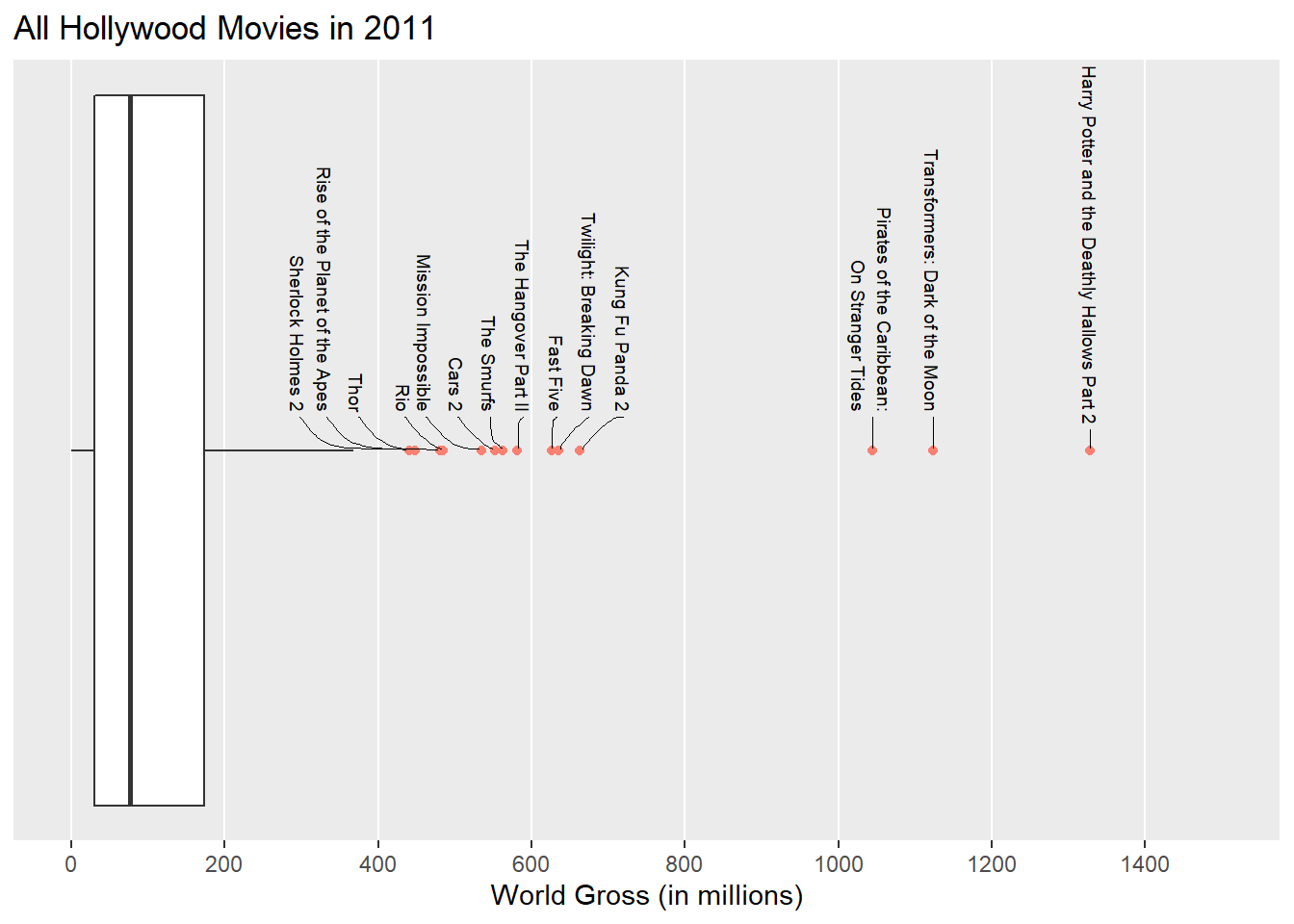
6.4.2 Hot Dog Eating
How many hot dogs can you eat in 10 minutes?
The boxplot below shows the number of hot dogs eaten by the winners of Nathan’s Famous hot dog eating contest 2002-2015.18
df <- as.data.frame(array(fivenum(HotDogs$HotDogs), dim=c(1,5)))

df_label <- data.frame(fivenum(HotDogs$HotDogs),
                       c('Min', 'Q1', 'Median','Q3', 'Max'))
colnames(df_label) <- c('Value', 'Summary')p<-ggplot(df, aes(y= V1)) +
scale_x_continuous(limits = c(45,70),
breaks = seq(45,70,5)) +
scale_y_continuous(breaks = NULL,name = NULL)+
labs(title = 'Hot Dog Eating',
x = 'Hot Dogs Consumed') +
theme(panel.grid.minor = element_blank())+
geom_boxplot(orientation = 'y',
fill = '#e7cac2',color= '#6b8896',
aes(xmin = V1, xlower = V2, xmiddle = V3,
xupper = V4, xmax = V5),
stat='identity') +
# scale_fill_manual(values=)+
geom_text_repel(data=df_label, color = '#6b8896',
arrow = arrow(length = unit(0.03, "npc"), type = "closed", ends = "first"),
aes(x = Value,y=45,
label = paste(Summary,Value,sep= '=')),
angle=270,nudge_y = 0.2,nudge_x = 1,
box.padding = 1)
p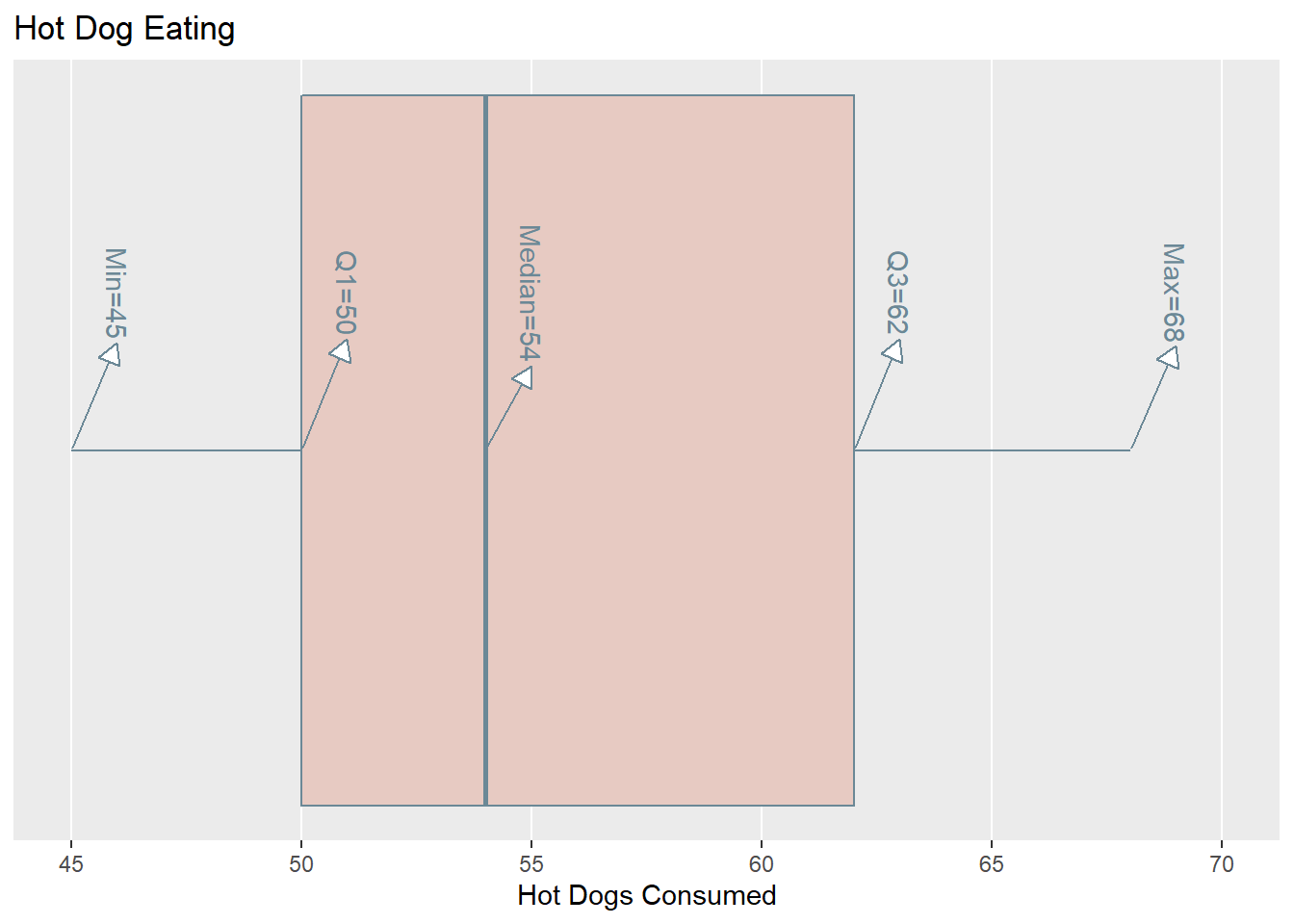
6.5 Side-by-side Graphs
One of the best ways to visualise differences in groups is to use side-by-sideplots (dotplots, histograms, or boxplots), where each plot uses a commonnumerical axis.
6.5.1 Higher SAT Vs. TV hours
Who watches more TV, students that score higher on their Math or English exam? The variables of interest here are TV (quantitative variable for the number of hours spent watching TV per week) and Best Exam (categorical variable with two categories: Math and Verbal). This data comes from the StudentSurvey dataset, where the participants are students.19
- Side-by-side boxplot allow us to easily compare the median,IQR and the range of the groups.
- Side-by-side dotplot/histogram allow us to compare the shape,central tendency and the variability of the groups.
data <- StudentSurvey

plotB<-ggplot(data, aes(x=TV, y=Gender)) +
  scale_x_continuous(limits = c(0,40),
                     breaks = seq(0,40,5)) +
  labs(x = 'TV Hours') +
  theme(panel.grid.minor = element_blank())+
  geom_boxplot(fill = c('#e7cac2','#cdb768'),color= '#6b8896',
               outlier.colour = 'salmon')

data$Gender = factor(StudentSurvey$Gender, levels=c('M','F'))

plotH <-ggplot(data, aes(x=TV,fill=Gender)) +
  scale_x_continuous(limits = c(0,40),
                     breaks = seq(0,40,5)) +
  labs(x = 'TV Hours',y=NULL) +
  theme(panel.grid.minor = element_blank(),
        legend.position = 'none')+
  geom_histogram(breaks = seq(0,40,1),color= '#6b8896')+
  scale_fill_manual(values = c('#cdb768','#e7cac2'))+
  facet_wrap(~Gender,nrow=2)

plotD <- ggplot(data=data,aes(x=TV,fill=Gender,color=Gender)) +
  scale_y_continuous(limits=c(0,35), breaks = seq(0,35,5),
                     labels = seq(0,35,5)) +
  scale_x_continuous(limits = c(0,40), breaks = seq(0,40,5),
                     labels=seq(0,40,5)) +
  labs(title = NULL,
       x = 'TV Hours', y = NULL) +
  theme(panel.grid.minor = element_blank(),
        legend.position = 'none',
        plot.margin=unit(c(0,0,0,0), "null")) +
  coord_fixed(ratio = 1) +
  geom_dotplot(stackgroups = TRUE, binwidth = 1,
               binpositions = "all") +
  scale_fill_manual(values = c('#cdb768','#e7cac2'))+
  scale_color_manual(values = c('#cdb768', '#e7cac2')) +
  facet_wrap(~Gender,nrow=2)

grid.arrange(plotB, plotD, ncol = 2)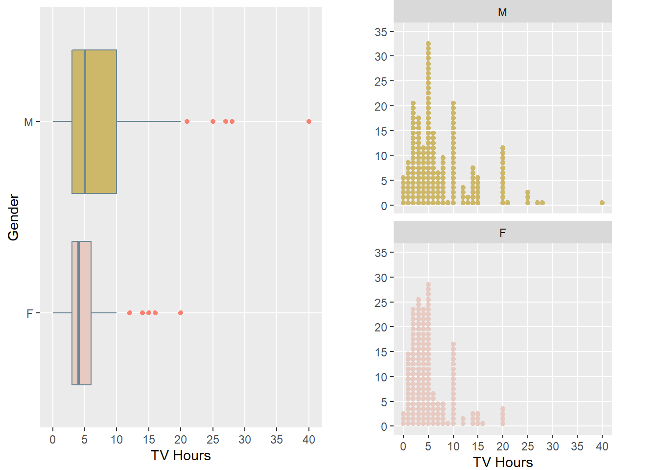
Many observations can be made about the distributions, let’s list some below:
- Using the side-by-side boxplots (or dotplots), we see that both distributions are skewed to the right (the data values are piled up on the left). The skew is greater for Math, so the mean will likely be higher for Math.
- There are outliers for both Math and Verbal (students that watch a lot of TV)
- The medians are similar
- The IQR is larger for Math than Verbal.
- For Verbal, students in the study that watched more than approximately 10hours of TV were considered outliers. However, for Math, outliers weregreater than 20 hours of TV.
6.5.2 Credit Card Default Data
6.5.2.1 Income of defaulters
Customers that defaulted on their credit card payments (Default = Yes) and their annual Income. 20
data <- Default
data$student = factor(data$student, levels=c('Yes','No'))


defaultIncome <- ggplot(data, aes(x=income, y=default)) +
  labs(title='Income of Credit Card Defaulters',
       x='Income($)', y='Default')+
  theme(panel.grid.minor = element_blank())+
  theme_light()+
  geom_boxplot(fill = c('#885a89','#d1b490'),color= '#3f6c51',
               outlier.colour = 'salmon')
defaultIncome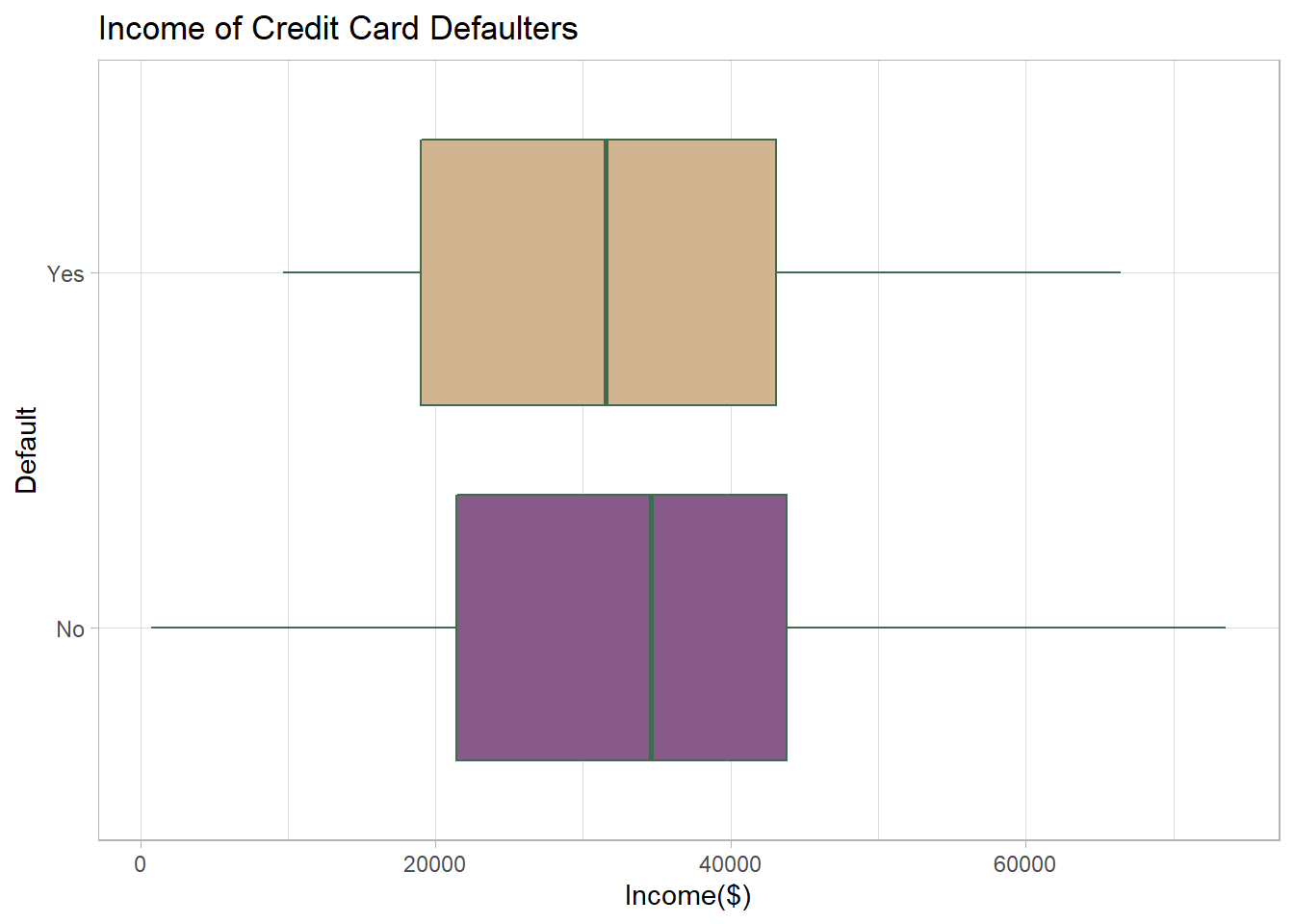
Here is another example of side-by-side boxplots. The credit card dataset contains a number of variables including whether a person has defaulted on their credit card payments (categorical variable: Default = Yes or Default = No)and their annual income (quantitative variable). The side-by-side boxplots show that the distributions of annual income for defaulters and non-defaulters are similar (we cannot differentiate defaulters and non-defaulters based on annual income). The medians and IQR are similar, but the range for non-defaulters is larger.
6.5.2.2 Balance of defaulters
- Customers that defaulted on their credit card payments (Default = Yes) and the average Balance that the customer had remaining on their credit card after making their monthly payment. 21
defaultBalance <- ggplot(data, aes(x=balance, y=default)) +
  labs(title='Balance of Credit Card Defaulters',
       x='Balance($)', y='Default')+
  theme(panel.grid.minor = element_blank())+
  geom_boxplot(fill = c('#885a89','#d1b490'),color= '#adb6c4',
               outlier.colour = 'salmon')

defaultBalance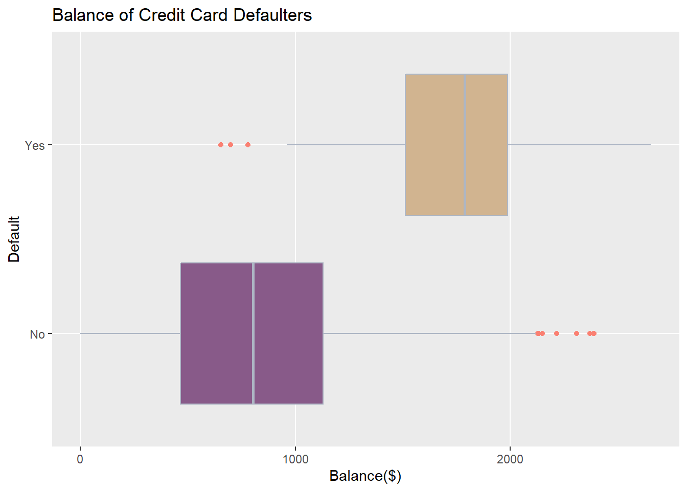
Another quantitative variable in the credit card dataset is Balance - the average balance that the customer had remaining on their credit card account after making their monthly payment. The side-by-side boxplots show that the distributions of Balance for defaulters and non-defaulters are very different.The median for defaulters is much larger than the median for non-defaulters,the IQRs do not overlap and outliers were present in both groups.Unsurprisingly, customers with larger credit card balances in these data were more likely to default on their monthly payments.
6.5.2.3 Income of students non-students
- Side-by-side histograms allow us to compare the shape, central tendency, and the variability of the students or non-students based on their Income.22
studentIncome <-ggplot(data, aes(x=income,fill=student)) +
  labs(x = 'Income($)',y=NULL) +
  theme(panel.grid.minor = element_blank())+
  geom_histogram(breaks = seq(0,80000,1250),color= '#76b4d6')+
  scale_fill_manual(values = c('#f0908a','#fee5cb'))+
  facet_wrap(~student,nrow=2)

studentIncome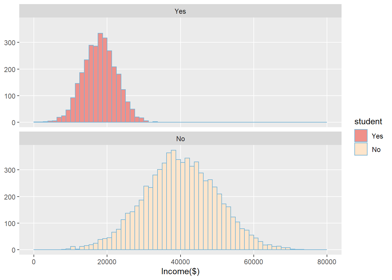
Another categorical variable in the credit card dataset is Student – whether the credit carder holder is a student or not (Student = Yes or Student = No).The side-by-side histograms show that the distributions of annual income for students and non-students are different, but they do have similar shapes(both are symmetric and bell-shaped). Students tended to have lower annual incomes with less spread (smaller standard deviation) than non-students for these data.
6.5.3 Tea and Immune System
- Participants were randomised to drink five or six cups of either tea or coffee everyday for two weeks(both drinks have caffeine but only tea has L-theanine) Kamath et al. (2003)
- After two weeks, blood samples were exposed to an antigen, and production of interfereon gamma(immune system response) was measured
- Explanatory variable: tea or coffee
- Response variable: measure of interferon gamma
ImmuneTea$Drink <- factor(ImmuneTea$Drink , levels=c("Tea", "Coffee"))
drinkImmune <- ggplot(ImmuneTea, aes(x=InterferonGamma, y=Drink)) +
  labs(title='Tea and Immune system',
       x='Interferon Gamma')+
  theme(panel.grid.minor = element_blank())+
  geom_boxplot(fill = c('#aebfa0','#d1b490'),color= '#9da2ad',
               outlier.colour = 'salmon')

drinkImmune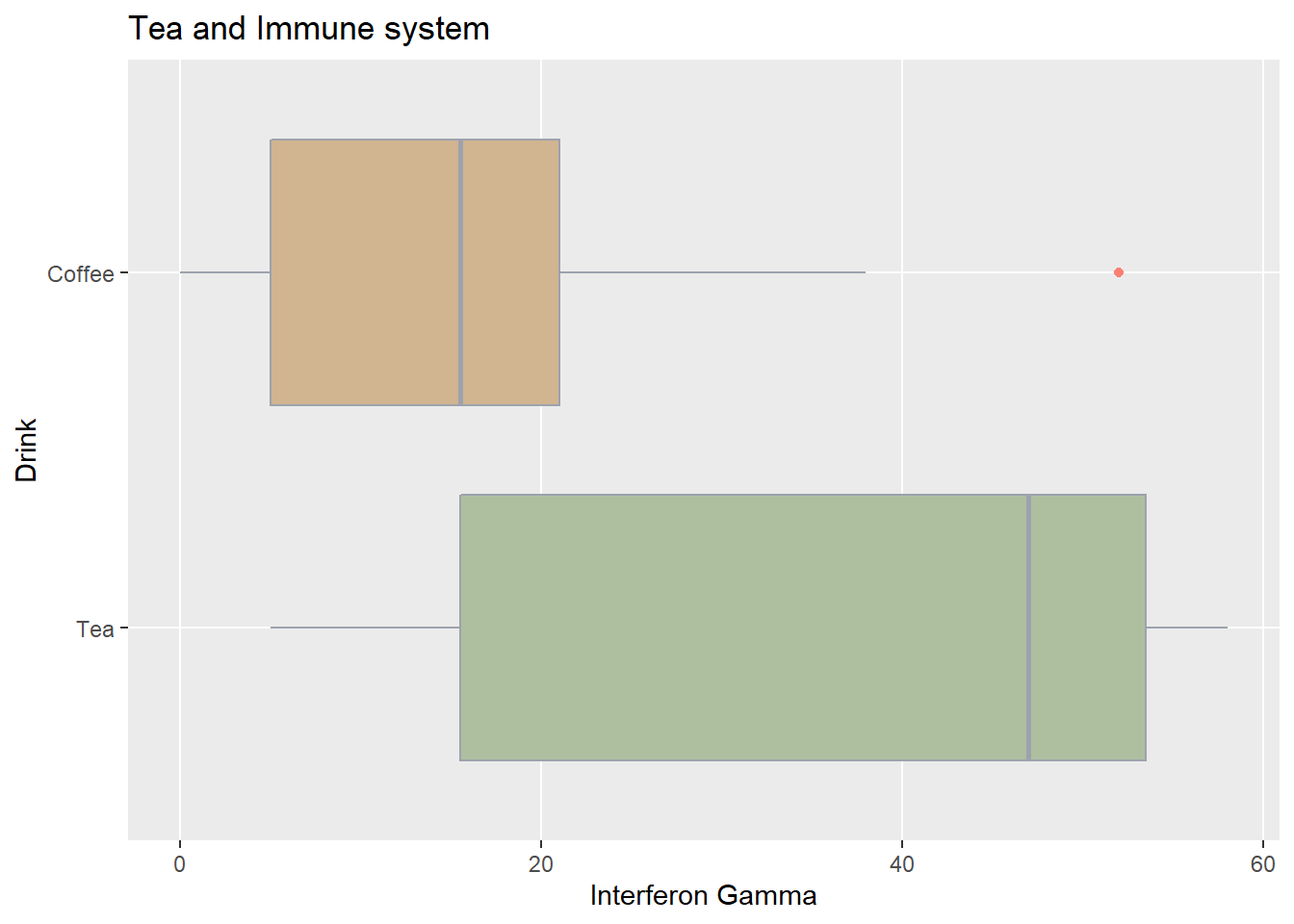
From the side-by-side box plots, we see that there is a difference between the distributions of Interferon Gamma for coffee and tea drinkers. Half of the coffee drinkers have Interferon Gamma levels less than 15 compared to only 25% of the tea drinkers. Furthermore, more than half of the tea drinkers have Interferon Gamma values above what’s considered an outlier for coffee drinkers. It looks like tea drinkers do have higher levels of interferon gamma. However, to test claims like this, we need to use formal statistical tests, which will be covered later in STAT101.